
Behavioural Insights and CRO - Measurecamp 2014 Presentation
Upload
sean-burtonCategory
view
546download
0
Data Visualisation
18th September 2015 14:00 – 16:45
Sean Burton


19:00 20:00 21:00 22:00 23:00 0:00 1:00 2:00 3:00 4:00 5:00 6:000%
10%
20%
30%
40%
50%
60%
70%
80%
90%
100%
Me Daughter Wife
Amou
nt o
f bed
occ
upie
d


Overview
• A bit about me…
• Who’s in the room…
• Some background…
• Getting started…
• Exercise!
• Bringing it all together…
• Next steps…
• The wrap up.

Intros…Sean [email protected] | @analytdata | analyt.co.uk
I'm passionate about improving customer experience & business value using a blend of data, technology and psychology.
About me:
• Formerly the Director of Measurement at Seren Design Ltd.
• A 15 year career covering: eLearning, Content Management Systems, Interaction Design, Product Management, Web Analytics, and Data Visualisation.
• Extensive experience with FTSE 100 companies across financial, telecommunication, gaming, and retail sectors.

Who’s in the room…

In the room…
• Removed for public posting

A bit of backgroundHow we perceive


http://xkcd.com/1080/large/

Perception: Colour blindness
See: https://en.wikipedia.org/wiki/Color_blindness

Perception: Visual Processing Pathways

Perception: Components & Orientation


Perception: Beauty – Fibonacci & the Golden Ratio• Finonacci
• 0 0 1 1 2 3 5 8 13 21 …• Each number is the sum of the preceding two numbers• Equates to a ratio of 1:1.618033987
• The Golden Ratio (Divine proportion, Golden Mean, or Phi) refers to the fact that this ratio appears repeatedly in nature as well as works of art
• Constructal Law (Bejan, 1996 (http://constructal.org/)):• “The eye scans an image the fastest when it is shaped as a golden ratio rectangle.”

Perception: Information Overload

Perception: Working Memory: 7 ±2• Theory that “the number of objects an average human can hold in
working memory is 7 ± 2”
• From the paper “The Magical Number Seven, Plus or Minus Two: Some Limits on Our Capacity for Processing Information” by George Miller 1956.
• ‘Chunking’ allows for people to apply meaning to individual objects to group them together making them easier to remember.
• Cowan (2001) has proposed that working memory has a capacity of about four chunks in young adults.
• Allowing audience to get the gist will significantly aid retension
Examples of Visualisation

Examples of Visualisation: Digg Labs

Examples of Visualisation: Tree Diagrams
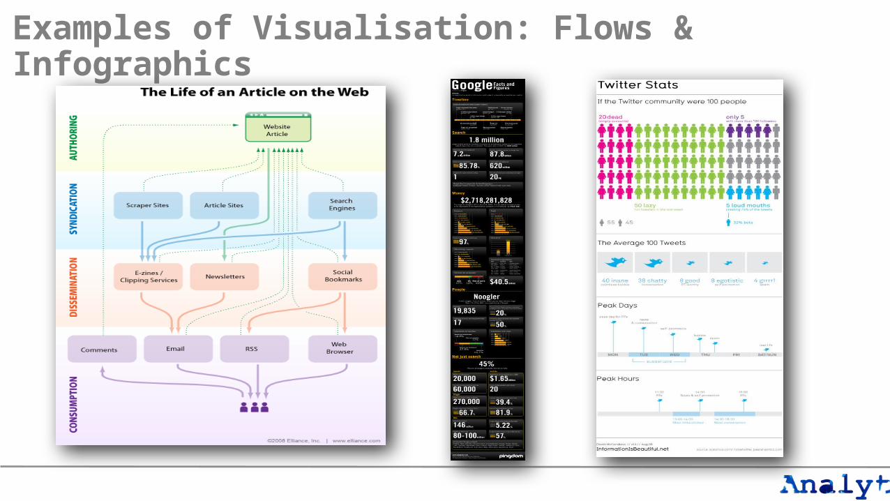
Examples of Visualisation: Flows & Infographics

Examples of Visualisation: Mapping

Examples of Visualisation: Mapping

Examples of Visualisation: Mapping

Examples of Visualisation: Mapping
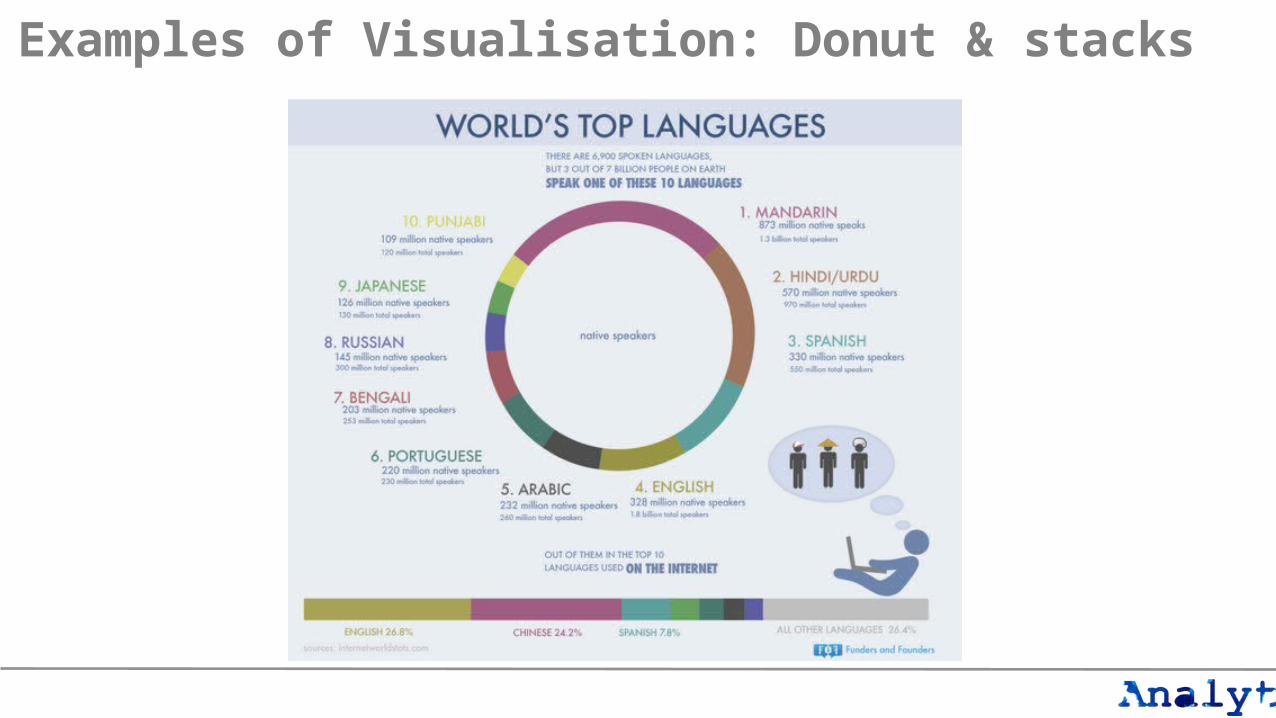
Examples of Visualisation: Donut & stacks

Examples of Visualisation: Bubble

Examples of Visualisation: Venn & Word Clouds

Examples of Visualisation: Augmentation

Examples of Visualisation: Corrections

Exercise…

Exercise• Get into groups of 3 or 4…
• Plan out a visualisation of the other groups in terms of: name, age, gender, job role, etc. (5 mins)
• Draw appropriate charts to tell the story of the group (5 mins)
• Present back (5 mins each group)

Bring it all together…

Data Types and how to use them• Nominal Scale
• Clustering or grouping
• Ordinal Scale• Ranked
• Interval Scale• Allows for the degree of
difference between items
• Ratio Scale• Referenced against a non-
arbitrary zero, e.g. absolute zero. Basically means ‘how much’ or ‘how many’.
*Theory of typology – Stevens 1946 (On the theory of scales and measurement, Science)

• A quick experiment…

Sales
1st Qtr2nd Qtr3rd Qtr4th Qtr

• … what was the best quarter?• … what % of sales did the 2nd quarter have?
Sales
1st Qtr2nd Qtr3rd Qtr4th Qtr
1st Qtr 2nd Qtr 3rd Qtr 4th Qtr0123456789
Sales


Everything should be made as simple as possible but
not simpler. “
”

Ethos of Design• Simple but not simplistic
• Visualisations should be sophisticated without being complex.• Less is often more!
• Interactive and meaningful• Goal is to make data tangible/tactile so that the end user can relate to it easily, view it from a
different perspective, and gleam insight.
• Context, Context, Context!
• Balance of form and function• Every element of the visualisation must have purpose, however the aesthetic must also be
maintained to retain emotional connection.• it’s all about visual patterns
• Tell a story

Ethos of Design• Audience.
• Who are you writing for?
• Purpose. • What will the data be used for? If they are intended for reference and further calculation you
might present them differently to if you are demonstrating a particular fact.
• Clarity. • Will people understand what you're showing? A specialist audience may allow you to use more
complex and unusual presentation techniques, but you should still aim to present the data clearly and correctly.
• Medium. • Will the data appear in a book or on a website? A large table or graphic might work fine on
paper but be less suitable online if it forces users to scroll around. • On the other hand, online technology might allow you to make the data interactive in a way that
would be impossible on paper.

Ethos of Design• Relevance.
• Avoid unnecessary data. Don't put extra variables in a table, or extra features on a map just because you think they're interesting. Will they be useful to the reader? If not, you probably don't need them.
• Ink to data ratio. • If there's ink on the page which doesn't add to the description or interpretation of data you should ask
yourself whether it's necessary.• Whilst some lines and annotations can make things clearer and add visual appeal, too many add clutter.
• Colour association. • This applies to charts and particularly maps. Most people associate red with Labour and blue with
Conservative, for example, so producing a chart where the colours of the bars are reversed would be confusing.
• Colour recognition.• Consider too the suitability of your colour choice for colour-blind people - http://www.vischeck.com is an
interesting way of checking. Also think of the implications if people are likely to photocopy your work, or if they use a black and white printer.

Applying to realityGetting started!

Simplicity• Drop background as it delivers nothing of value• Remove pointless decimals from vertical scale• Place data labels with data series, and remove legend• Retain gridlines but reduce their prominence

DashboardsDisplaying critical data

…but as Albert said…

Good KPIs are “Übermetrics”…
Good KPI
Strategic measures of success
ActionableEasy tounderstand
Based onvalid data

Components of a good dashboard
Appropriate real-time information
Warning lights and graphics
Capacity andcurrent levels
Relevant historic data
Key information displayed clearly
Ability to adjust metrics through action

Dashboard development process
Requirements analysis• Interviews
with stakeholders
Data and systems review• Review data
sources• Review current
reports• Review reporting
systems
Design• Conceptual
reporting model• Data model• Dashboard
wireframes• Mock ups
Prototype• Dashboard
design and prototyping
• Reporting technology selection
Automation• Production
systems• Disseminatio
n

Dashboard: Stephen Few

Dashboards customised to desired reporting periods.
Commentary section to allow additional context for known events or insight.
KPIs requiring attention are clearly
highlighted.
Sparklines are used to give trended view of relevant metric.
Each metric is shown in context to the last reporting period and to the
average over last year.
Example Dashboard

Examples: Membership Dashboard
51
Engagement
PerformanceAcquisition
Buzz
MoM: -2 (-%3)YoY: +16 (%8)
MoM: -16 (-%3)YoY: +19 (%11)
New Visits
Repeat Visits
Star Users
Mentions
Re-Tweets
Followers
245
110 70MoM:+26 (+10%)YoY: +6 (+3%)
MoM: -16 (-9%) YoY: -6 (-3%)
PPC
Organic
Qual. visits
Train Visits
Bookstore
Executive DashboardSite: www.mysite.comDate: 01/07/2010 – 31/07/2010
Buzz
Acquisition
PerformanceEngagement
Insight and Action1. Insightful comment about data
• Recommended action2. Insightful comment about data
• Recommended action

Examples: Charity Dashboard

Dashboards: 5 key elements1. Relevance
• Make sure you’re showing the right stuff to the right person at the right time!
2. Context• Try to ‘ground’ each metric, by showing: the metric, it’s
trend; and a comparator• Also think about other associated metrics
3. Colour• Use sparingly, e.g. only red for alerts• Don’t depend on the colour to convey meaning – couple
with an icon, e.g. green up-arrow vs red down-arrow.
4. Story• Try to configure your dashboard to tell a story. Most
people read top-left to bottom-right – try to layout metrics accordingly
5. Aesthetic• Be driven by the function and not the form. Tailor your
design to your audience, you don’t want an exec to be put off your dashboard simply because it’s ugly!
Read more: analyt.co.uk/v3

Work through…Excel Dashboards

Dashboards: Excel, PowerPoint and the web• PowerPoint is great for mocking up dashboards and testing
navigation designs.
• VBA within MS Office documents can pull new data directly from Google Analytics and other sources*
• Excel is massively powerful – Can be interactive & doesn’t have to boring!
*Analyt Dashboard builds on work by: Mikael Thuneberg & Tim Hall

The wrap up.

A few helpful links…• Data vis tools
• Datawrapper• Infogr.am• PiktoChart• Google Fusion Tables• Visumap & Ggobi (High-dimensionality data
visualisation)• http://supermetrics.com/
• Web libraries• Chartjs (http://www.chartjs.org/)• D3 (http://d3js.org/) and DC (http://dc-js.github.io/dc.js/)
• Examples for inspiration• http://dadaviz.com/i/851
• Golden Ratio• http://www.hongkiat.com/blog/golden-ratio-in-moden-
designs/
A couple of great books:• The Visual Display of Quantitative Information
(Edward Tufte)http://www.amazon.co.uk/dp/0961392142
• Information Dashboard Design (Stephen Few) http://www.amazon.co.uk/dp/1938377001
• Information is Beautifuk (David McCandless)http://www.amazon.co.uk/dp/0007492898


