Marissa Dashboard Design - Dimensional Insight · layout components that are agreed upon and have...
57
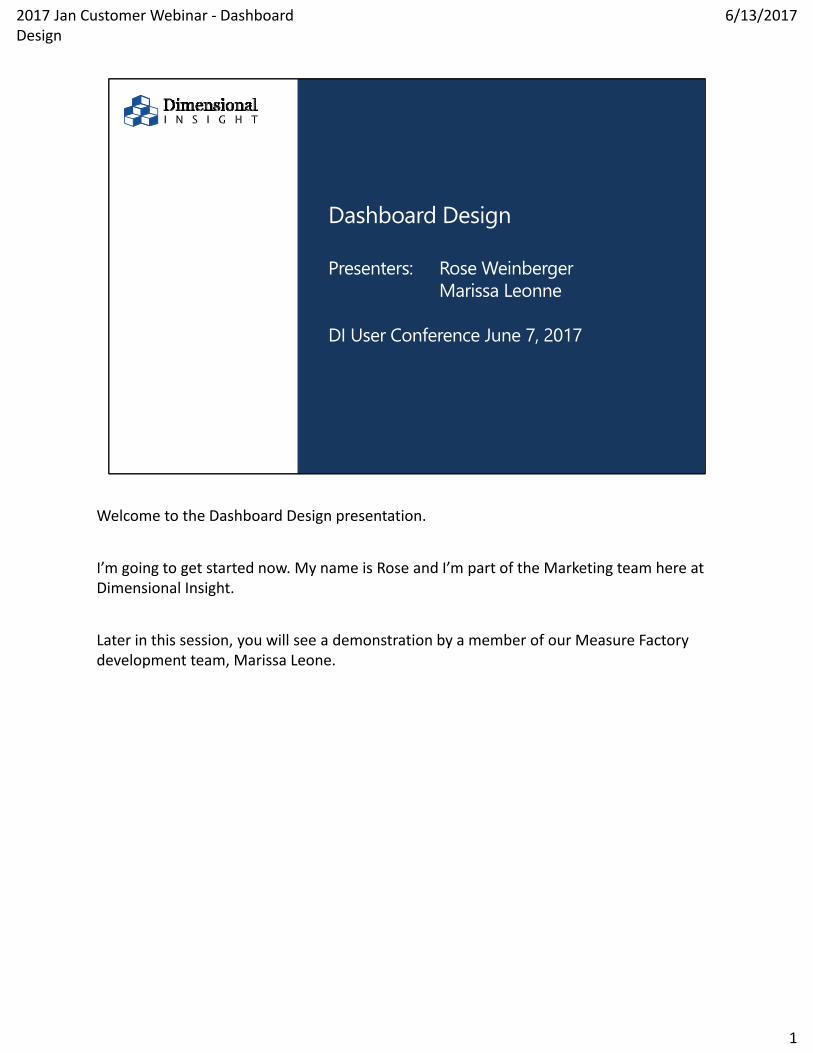
Dashboard Design Presenters: Rose Weinberger Marissa Leonne DI User Conference June 7, 2017 Welcome to the Dashboard Design presentation. I’m going to get started now. My name is Rose and I’m part of the Marketing team here at Dimensional Insight. Later in this session, you will see a demonstration by a member of our Measure Factory development team, Marissa Leone. 1 6/13/2017 2017 Jan Customer Webinar ‐ Dashboard Design
Transcript of Marissa Dashboard Design - Dimensional Insight · layout components that are agreed upon and have...
©2017 Dimensional Insight, Inc.
Dashboard Design
Presenters: Rose WeinbergerMarissa Leonne
DI User Conference June 7, 2017
Welcome to the Dashboard Design presentation.
I’m going to get started now. My name is Rose and I’m part of the Marketing team here at Dimensional Insight.
Later in this session, you will see a demonstration by a member of our Measure Factory development team, Marissa Leone.
1
6/13/20172017 Jan Customer Webinar ‐ Dashboard Design

©2017 Dimensional Insight, Inc.
Today I’m going to be talking to you about design in the visual sense.
2
6/13/20172017 Jan Customer Webinar ‐ Dashboard Design

©2017 Dimensional Insight, Inc.
A word about style
Conservative FlashyFunctional
People sometimes confuse design with style. Design principles do not change. Yet style is changing constantly.
Here are 3 shoe styles: conservative, functional and flashy.
The choice of style is a personal one. Take these shoes for example. Your audience may have a preference for one style over another.
Their preference MAY differ from what YOU prefer.
My advice is to have a conversation about style early in your process. Ask questions about style in your survey of stakeholders. Get agreement about the direction of your style BEFORE you begin any work.
Get the agreement in writing. Say “These are the style parameters that we will work within.” And then list the font names, color codes, style descriptions like “conservative” and layout components that are agreed upon and have everyone sign the document like a contract.
3
6/13/20172017 Jan Customer Webinar ‐ Dashboard Design

If you do not use this method, disagreements about style can eat up a lot of valuable time. If disagreements arise, go back to the agreed upon style document and point out that you have adhered to the agreed upon style.
2017 Jan Customer Webinar ‐ Dashboard Design
6/13/2017
3

©2017 Dimensional Insight, Inc.
Agenda
Key Considerations– Hierarchy of Information– Ideal Number of Metrics– Fundamentals of Design
Mechanics– Fonts– Colors
Simplified User Interface Self Service Dashboard
Design Resources
let’s cover some key considerations about design and at the end of my presentation I’ll review some improvements we’ve made to assist dashboard design.
Please note that you do not need to take notes unless you just like to do it.
All of my slides and notes will be made available to all registrants after the conference is over.
4
6/13/20172017 Jan Customer Webinar ‐ Dashboard Design

©2017 Dimensional Insight, Inc.
Attendees have Version 6.4 and 7.0
Version 6.4 is “Classic” interface.– The Version 7.0 Interface may be changed to “Classic” in
environment settings Version 7.0 defaults to “Simplified User Interface”
– Benefit of built in tools to improve:• Navigation• Visual Design
BOTH environments require color, font and layout choices … that is the realm of this presentation
Customers attending this session may be using version 6.4 or 7.0 of DivePort.
6.4 uses the “Classic” environment.
7.0 has both the Classic environment and the new Simplified User Interface environment.
Dashboard designers working in both environments will find a use for thinking about these key considerations.
5
6/13/20172017 Jan Customer Webinar ‐ Dashboard Design

©2017 Dimensional Insight, Inc.
Key Considerations
The most important consideration is your audience. Do you know what they need in a dashboard?
6
6/13/20172017 Jan Customer Webinar ‐ Dashboard Design

©2017 Dimensional Insight, Inc.
Addressing key considerations
Survey users– Types of Users– Personal Preferences– Individual Needs
Decide on Content– Content for Implementation– Content per Page
Design Activities– Hierarchy– Style– Layout on a Single Page
There are some key considerations to address for dashboard design that will hold true for all dashboards, regardless of the intended audience or industry.
Starting with the most important consideration that I have already mentioned – your audience – you can start to build a very useful dashboard.
The entire process flows like the shape of a funnel.
You’re going to start with lots of information and hone all of it down to only what is needed.
7
6/13/20172017 Jan Customer Webinar ‐ Dashboard Design

©2017 Dimensional Insight, Inc.
Hierarchy of Information
Once you’ve surveyed your users and gathered all the content you’ll need, you need to make some decisions about layout.
8
6/13/20172017 Jan Customer Webinar ‐ Dashboard Design

©2017 Dimensional Insight, Inc.
Sales by Product Sales Growth Sales by Region % Goal % Discounted Items
Cost of Goods Sold Total Quantities Sold Quantities Sold by
Product Current Inventory
Sales Manager Example
Here’s some content that might go on a Sales Manager’s dashboard.
9
6/13/20172017 Jan Customer Webinar ‐ Dashboard Design

©2017 Dimensional Insight, Inc.
Hierarchy of Information
If everything has equal importance to the end user, the dashboard might look like this.
10
6/13/20172017 Jan Customer Webinar ‐ Dashboard Design

©2017 Dimensional Insight, Inc.
Hierarchy of Information
But when we know that Sales by Product is the most important thing to the audience, we make it larger and display it in the upper left hand corner of the page.
Essentially, you are contrasting size and position to differentiate the “Sales by Product” portlet from other portlets on the page. I noticed yesterday that Johan’s dashboard used the same method to differentiate the 5 user role buttons. He had 5 larger buttons at the top of the page separated by their location – the use of a row.
The highest contrast on a page will receive the most attention.
Other forms of contrast you could use instead of size and position are: Shape, Hue, Saturation and Value.
11
6/13/20172017 Jan Customer Webinar ‐ Dashboard Design

©2017 Dimensional Insight, Inc.
Hierarchy of Information
SalesGrowth
Sales byProduct
% Saels by Region
Sales ‐ %Discounted Items
Total QuantitiesSold
Sales –% Goal
Current InventoryCost of Goods
SoldQuantities Soldby Product
To contrast Shape – You might have the most important item displayed within a circle instead of a rectangle.
12
6/13/20172017 Jan Customer Webinar ‐ Dashboard Design

©2017 Dimensional Insight, Inc.
Hierarchy of Information
SalesGrowth
% Saels by Region
Sales ‐ %Discounted Items
Total QuantitiesSold
Sales –% Goal
Current InventoryCost of Goods
SoldQuantities Soldby Product
Sales byProduct
For Hue contrast – If all of your portlets exude a gray feeling, use a colorful background behind the most important item.
You’re probably starting to get the picture. So you could contrast saturation or value too.
Saturation is the intensity of the hue. Value refers to lightness and darkness of a hue.
13
6/13/20172017 Jan Customer Webinar ‐ Dashboard Design

©2017 Dimensional Insight, Inc.
Ideal Number of Metrics
You might wonder just how many portlets you should display on a dashboard.
It depends on your audience. Airplane pilots have hours and hours of training and need to know all of the information displayed on their dashboard to get their jobs done.
Are your analysts used to looking at this many pieces of data all at once? Is this amount of data even needed for them to do their jobs?
14
6/13/20172017 Jan Customer Webinar ‐ Dashboard Design

©2017 Dimensional Insight, Inc.
High information density
Will users “get it all”? Limits to human capacity for
seeing and comprehending
When there is a lot of data to communicate, one has to wonder if the audience will be able to effectively USE all of it.
Just like the riddle: “How do you eat an elephant?” … “One bite at a time.” … data displayed on a dashboard can only be consume one piece at a time.
The data must be processed by the end user in order to turn than data into meaningful information.
Good dashboard design makes it easier for the audience to see and process the data they are seeing.
15
6/13/20172017 Jan Customer Webinar ‐ Dashboard Design

©2017 Dimensional Insight, Inc.
???357122430!
So how much data SHOULD you display on a dashboard?
16
6/13/20172017 Jan Customer Webinar ‐ Dashboard Design

©2017 Dimensional Insight, Inc.
7 metrics per screen, (plus or minus 2)
Densely populated dashboards obstruct readability—Difficult to quickly
locate and understand information
Poor readability leads to poor user adoption
"The Magical Number Seven, Plus or Minus Two: Some Limits on Our Capacity for Processing Information" (Miller 1956)
You might want to try using “Miller’s Law”. Miller’s law states that humans can only process between 5 and 9 pieces of data in short term memory.
In other words, 7 plus or minus 2 is the ideal amount of “stuff” to display.
When there are more than 9 pieces of data, use “chunking” to facilitate use of the data in short term memory.
17
6/13/20172017 Jan Customer Webinar ‐ Dashboard Design

©2017 Dimensional Insight, Inc.
Ideal Number of Metrics
Here’s an example of visually chunking.
18
6/13/20172017 Jan Customer Webinar ‐ Dashboard Design

©2017 Dimensional Insight, Inc.
Ideal Number of Metrics
And this is another example of chunking.
19
6/13/20172017 Jan Customer Webinar ‐ Dashboard Design

©2017 Dimensional Insight, Inc.
Ideal Number of Metrics
How do you go about chunking portlets on a dashboard?
You might want to think about it like an exercise in fashion.
20
6/13/20172017 Jan Customer Webinar ‐ Dashboard Design

©2017 Dimensional Insight, Inc.
Ideal Number of Metrics
Just as Glamour magazine advises women NOT to combine too many conflicting patterns and shapes in one outfit …
21
6/13/20172017 Jan Customer Webinar ‐ Dashboard Design

©2017 Dimensional Insight, Inc.
Ideal Number of Metrics
Too many different graph types can lead to confusion
versus
… I advise not to combine too many different sizes and shapes on one dashboard. If you have a lot of similar shapes, chunk them together.
22
6/13/20172017 Jan Customer Webinar ‐ Dashboard Design

©2017 Dimensional Insight, Inc.
Ideal Number of Metrics
A refrigerator can be a sort of dashboard.
In an emergency, one might leave a note on the ‘frige.
23
6/13/20172017 Jan Customer Webinar ‐ Dashboard Design

©2017 Dimensional Insight, Inc.
Ideal Number of Metrics
But if the surface is cluttered and too busy, that important note will never be noticed.
It’s the same with dashboards. If a dashboard is too busy, an important alert may not be noticed.
Don’t clutter your dashboards.
24
6/13/20172017 Jan Customer Webinar ‐ Dashboard Design

©2017 Dimensional Insight, Inc.
Ideal Number of Metrics
You’ve got to act like a filter. You’ve got to filter all of this information about your users and come up with a solution that’s right for them.
What is the minimum amount of data needed for the user to get their job done?
25
6/13/20172017 Jan Customer Webinar ‐ Dashboard Design

©2017 Dimensional Insight, Inc.
Limiting factors
Short-term memory capacity Familiarity with data
If you have a power user that number might be 42!
So chunk the 42 items into 5 to 9 smaller areas.
26
6/13/20172017 Jan Customer Webinar ‐ Dashboard Design

©2017 Dimensional Insight, Inc.
Physiological Factors:
Capacity for seeing Illumination needs Color contrast perception Color blindness
When you survey your users, you may also want to find out if they have any
physiological limitations that would be important to know as you design the dashboard.
For instance, some people have trouble distinguishing levels of gray in low light
settings. For these people, muted colors are nearly impossible to tell apart.
27
6/13/20172017 Jan Customer Webinar ‐ Dashboard Design

©2017 Dimensional Insight, Inc.
Technological Capabilities:
Computer experience Browser interface experience Experience with Diver
You should also survey users about their technical backgrounds.
28
6/13/20172017 Jan Customer Webinar ‐ Dashboard Design

©2017 Dimensional Insight, Inc.
Walk A Mile In Your User's Shoes:
Ask Users:—What data do you want to see?—How do you want to see it?
– Are you a visual thinker?…verbal?
Identify key metrics:—Have users rank key metrics
by importance
As you act like a filter, you’ll be keeping the needs of the user at the forefront of your key considerations.
29
6/13/20172017 Jan Customer Webinar ‐ Dashboard Design

©2017 Dimensional Insight, Inc.
Then create a dashboard for userreview.
Iterative processWhat-if scenarios
You can then start your first dashboard.
Get feedback. Revise.
And repeat until you have the audience’s ideal dashboard.
30
6/13/20172017 Jan Customer Webinar ‐ Dashboard Design

©2017 Dimensional Insight, Inc.
Fundamentals of Design
ELEMENTS
Size
Shape
Distance
Hue
Saturation
Value
TECHNIQUES
Comparison
Contrast
Repetition
Juxtaposition
Proximity
EFFECT
Harmony
Agitation
Rhythm
Focus
Balance
Hierarchy
FEELING
Comfort
Discomfort
Joy
Sadness
Alarm
Security
It’s all about leveraging the fundamentals of design…
31
6/13/20172017 Jan Customer Webinar ‐ Dashboard Design

©2017 Dimensional Insight, Inc.
Fundamentals of Design
FEELING
Comfort
Discomfort
Joy
Sadness
Alarm
Security
To lead the audience to see what is most important to see.
32
6/13/20172017 Jan Customer Webinar ‐ Dashboard Design

©2017 Dimensional Insight, Inc.
Simplified User Interface
Let’s look at how Diver’s user interface design has changed.
33
6/13/20172017 Jan Customer Webinar ‐ Dashboard Design

©2017 Dimensional Insight, Inc.
Auto Parts Demo
Our Auto Parts Demo showcases the look and feel available with version 6.4 of Diver and DivePort.
Although there is nothing “wrong” with these styles, we wanted our version 7.0 of Diver to have a fresh look and feel.
34
6/13/20172017 Jan Customer Webinar ‐ Dashboard Design

©2017 Dimensional Insight, Inc.
DiveTab‘s original look and feel
Here is the look of one of our latest products, DiveTab.
With DiveTab, we wanted to provide a simple and consistent user experience for our customers.
The iconic user interface element of DiveTab is the menu page that you see here on the left.
The menu has large banners on top and buttons with big icons.
You can click on one of the buttons to view reports or presentations on the full screen.
DiveTab is super easy to use.
35
6/13/20172017 Jan Customer Webinar ‐ Dashboard Design

©2017 Dimensional Insight, Inc.
Healthcare Demo
Because the look and feel of DiveTab was so popular, we decided to bring the DiveTab design principles into DivePort.
You can see the result of integrating these design principles in the new look and feel of our healthcare demo.
Two major user interface changes have been implemented in this demo:
1. the Simplified User Interface (SUI) and
2. the Skyline skin.
The Simplified User Interface brings the same navigation system from DiveTab to DivePort.
And the Skyline skin was the skin we developed in our product, Teamer.
These two changes made the DivePort display look cleaner ‐‐ even though there are many things on a single page. This resulted ultimately in an application that is easier to use.
36
6/13/20172017 Jan Customer Webinar ‐ Dashboard Design

©2017 Dimensional Insight, Inc.
Self-Service Dashboards
So, as you can see, dashboard design is easier with the Simplified User Interface. Now, Dimensional Insight has gone one step further to make dashboard creation easier for everyone, not just administrators.
2017 Jan Customer Webinar ‐ Dashboard Design
6/13/2017
37

©2017 Dimensional Insight, Inc.
Self Service Dashboard Functionality
Version 7.0 Solution
Self-service dashboard functionality?
NO
Version 7.0 Platform
Self-service dashboard functionality?
YES
Version 7.0 Platform
+ Measure FactorySelf-service dashboard
functionality?
YES+ automation functionality
The self‐service functionality is part of the 7.0 platform.
It is NOT available in 7.0 solution.
And for clients that add Measure Factory to 7.0 platform, there is increased automation functionality.
2017 Jan Customer Webinar ‐ Dashboard Design
6/13/2017
38

©2017 Dimensional Insight, Inc.
Demonstration
But what IS self service dashboard functionality?
To help illustrate this functionality I’d like to have Marissa Leonne give you a short demonstration.
Marissa is a Registered Nurse. She also has a Master’s Degree in Healthcare Informatics. And she’s a member of the Measure Factory development team.
[Marissa/Nishtha gives demo.]
2017 Jan Customer Webinar ‐ Dashboard Design
6/13/2017
39

©2017 Dimensional Insight, Inc.
Thank You
So you can see just how easy it is to create dashboards with this Self Service Functionality!
If you want to see more of the Self‐Service Dashboard Functionality, there are several things you can do.
You can sit in on the Measure Factory session with Jamie Clark or one of the Rules sessions with George Dealy.
Or, you can check out our Product Showcase today at 3:50 in the SkyLine Ballroom.
Marissa will be there to demonstrate what can be done …
… and you will be able to ask any questions you have about how it is set up, or used, and so on.
[If there is more time, go into resources slides.]
2017 Jan Customer Webinar ‐ Dashboard Design
6/13/2017
40

©2017 Dimensional Insight, Inc.
Resources
Let’s review the resources that you can use on your own after this presentation is over.
As I said before, attendees will be able to get a copy of this presentation after it is over … so there is no need to write notes at this time.
41
6/13/20172017 Jan Customer Webinar ‐ Dashboard Design

©2017 Dimensional Insight, Inc.
Content selection
Survey users or key stakeholder for content requirements: https://www.surveymonkey.com/user/sign-up/
In this presentation, I mentioned several times that you should interview your users prior to building your dashboard.
Some of our customers have a handful of users …. Some have thousands.
When you have a lot of user to survey, it may be useful to use a tool like Survey Monkey.
It is easy to use and free to get started.
42
6/13/20172017 Jan Customer Webinar ‐ Dashboard Design

©2017 Dimensional Insight, Inc.
Sample QuestionsWhat type of BI user do you consider yourself to be: ExecutiveAnalystPower User Casual User
When it comes to colors, I prefer:Company Colors Muted ColorsBright Colors Dark Colors
Please adjust colors for me:Deuteranope Protanope Tritanope
Which of these fonts is available on your system:Arial Courier NewGeorgiaTimes New RomanTrebuchet MS Verdana Don’t know
Please indicate yourcomputer platform:PCMac Workstation
Please indicate your operating system: WindowsMac Linux
Monitor Resolution:1024 x 7681280 x 8001344 x 10081600 x 12001920 x 1200Other:
What metrics would you like displayed?
There are many question you’ll need to ask your user.
Here are a few to help you start thinking about what to ask.
43
6/13/20172017 Jan Customer Webinar ‐ Dashboard Design

©2017 Dimensional Insight, Inc.
Content selection
Select the right graphs for each data display.http://www.dimins.com/blog/2016/08/18/how-to-select-charts-for-effective-data-display
I’ve written several blog articles that focus on certain aspects of dashboard design.
This article addresses the issue of selecting the right type of chart to accurately display user data.
44
6/13/20172017 Jan Customer Webinar ‐ Dashboard Design

©2017 Dimensional Insight, Inc.
Layout - Size in pixels &Device
Use GA to determine most commonly used screen size/device.http://www.dimins.com/blog/2016/01/20/how-to-determine-the-ideal-screen-dimensions-for-dashboards/
This article shows how to use Google Analytics to uncover your users’ most commonly used screen dimensions.
45
6/13/20172017 Jan Customer Webinar ‐ Dashboard Design

©2017 Dimensional Insight, Inc.
Color
Leverage your company’s corporate colorshttp://www.dimins.com/blog/2013/05/09/how-to-make-your-dashboard-interface-more-visually-appealing/
If you are having trouble deciding on a good color combination for your environment, this article shows how you can leverage your company’s corporate colors, which can improve user adoption rates.
I noticed that Johan was leverage the colors of the Dalarna University logo in his new dashboards. You can see how that change made the program feel more like it is part of the school’s activities – I love it!
46
6/13/20172017 Jan Customer Webinar ‐ Dashboard Design

©2017 Dimensional Insight, Inc.
Color - Trends
Check out this cool tool for exploring color combinations:http://www.dimins.com/blog/2016/02/16/a-cool-tool-for-experimenting-with-dashboard-and-portal-color-schemes/
Color can be fun or frustrating to determine. The tool found in this article makes color fun.
47
6/13/20172017 Jan Customer Webinar ‐ Dashboard Design

©2017 Dimensional Insight, Inc.
Colors – accommodating Color blindusers
Blog article on color blind users:– http://www.dimins.com/blog/2015/03/23/how-to-design-a-
dashboard-for-colorblind-users/
You may not realize that some of your users are color blind. If they are, you should follow the instructions in this article to accommodate their needs.
48
6/13/20172017 Jan Customer Webinar ‐ Dashboard Design

©2017 Dimensional Insight, Inc.
Current trend: add icons
https://thenounproject.com/ Access a seemingly unlimited amount of icons to use on
dashboards Remember: some people are more visual than literal
and these icons help them quickly understand the information being displayed
Finding high quality low cost imagery is not a problem when you go to this web site.
(You may recall that the new menu page uses images on every button so you might need a few images that are unique to your own company.)
49
6/13/20172017 Jan Customer Webinar ‐ Dashboard Design

©2017 Dimensional Insight, Inc.
Dashboard Design Take Away
Content needed on a dashboard depends on the user needs; get their input! See Blog article about feedback loop: http://www.dimins.com/blog/2016/03/31/how-to-refine-your-dashboard-design-using-a-feedback-loop/
This article shows how to implement a feedback loop so that you can continue to learn what is working and what is NOT working on your dashboards.
50
6/13/20172017 Jan Customer Webinar ‐ Dashboard Design

©2017 Dimensional Insight, Inc.
Use collaboration tool to gather feedback
I use Teamerto share design ideas in my office.
Another way to gather user information is to use an information sharing tool like Teamer.
That’s what I use in our office.
Now, you could also use the new Diveport collaboration functionality.
51
6/13/20172017 Jan Customer Webinar ‐ Dashboard Design

©2017 Dimensional Insight, Inc.
Easy way to get up-to-datesuggestions
Subscribe to our blog
And if you go to none of the other Resources referenced in this presentation … you should at least go to this resource and sign up for our blog.
That’s where all of the articles I wrote “live” … and by signing up for the Blog you’ll be notified of my future articles, as well as the valuable articles written by other staff here at Dimensional Insight.
52
6/13/20172017 Jan Customer Webinar ‐ Dashboard Design

©2017 Dimensional Insight, Inc.
How to learn more
6.4 User Manual
If you would like to learn more …
Information about how to adjust the colors and fonts in a portlet for version 6.4 can be found in the user manual that is available on our customer web site.
Just go to our web site and click on “Sign in” in the upper right hand corner of the screen.
This takes you to the sign in page where you can click the link to sign in to either the customer site or partner site.
You WILL need a password to log in to these sites. If you do not have a password, contact support at [email protected].
53
6/13/20172017 Jan Customer Webinar ‐ Dashboard Design

©2017 Dimensional Insight, Inc.
How to learn moreManuals
6.4 User Manual 7.0 Online HelpOnline help for 7.0 is bundled with the software. The DivePort section of 7.0 online help is currently under development and coming soon. In the meantime, 7.0 users should refer to the 6.4 manual that can be accessed through 7.0’s Workbench.
On the Customer or Partner site home page, click the link for Downloads.
On the Downloads page shown here with a huge gray box blocking my own personal information … there is a “Manual” column on the far right hand side of the page.
This is where you will find the 6.4 manual.
Online help for 7.0 is bundled with the software. The DivePort section of 7.0 online help is currently under development and coming soon. In the meantime, 7.0 users should refer to the 6.4 manual that can be accessed through 7.0’s Workbench.
54
6/13/20172017 Jan Customer Webinar ‐ Dashboard Design

©2017 Dimensional Insight, Inc.
Dashboard Design Training
http://www.dimins.com/training/ [email protected]
If you would like EVEN more help, you can sign up for our class on Dashboard Design through our Training department … it is excellent!
The best way to sign up is to contact support at the email address shown here.
55
6/13/20172017 Jan Customer Webinar ‐ Dashboard Design

©2017 Dimensional Insight, Inc.
Questions?
OK. Let’s see if we have time for questions.
If you do have a question, please send it to us via the chat box of the GoToWebinar portal.
If we do not have time to answer your question right now, we will follow up with an answer by email.
56
6/13/20172017 Jan Customer Webinar ‐ Dashboard Design