Marc Chagall - Modern Master Printmakers I
130
MARC CHAGALL Modern Master Printmakers I GALERIE EDITION RAPHAEL Frankfurt am Main
-
Upload
galerie-edition-raphael -
Category
Documents
-
view
241 -
download
0
description
Online version of the catalogue "Marc Chagall - Modern Master Printmakers I" which was published on the occassion of the Chagall exhibtion at Galerie Edition Raphael Frankfurt in 2012.
Transcript of Marc Chagall - Modern Master Printmakers I

MARC CHAGALLModern Master Printmakers I
GALERIE EDITION RAPHAELFrankfurt am Main

www.galerieraphael.com

MARC CHAGALLModern Master Printmakers I
GALERIE EDITION RAPHAELFrankfurt am Main


Ein Farbenspiel
zunächst zaghaft später dann
mit viel
Verve vor uns schimmernd
bezaubernd wie ein Regenbogen flimmernd
märchenhafte Landschaften
der Maler uns erschließt
auf Leinwand
Papier
Stein
oder Kupfer
seine Kreativität sich ergießt
endlos fließt
aus dem Nichts
ein Liebespaar entsprießt
und man hört erst dann zu staunen auf
Wenn eines Tages der Kreis sich schließt...
R.P. Hommage à P.A.B.


7
Die in diesem Katalog abgebildeten Werke konstituieren die Ausstellung “Marc Chagall – Modern Master Printmakers I”.
Unter diesem Arbeitstitel startet die Galerie Raphael eine Ausstellungsreihe, deren Ziel es ist - jährlich alternierend - eine wichtige Posi-tion der Modernen beziehungsweise der Zeitgenössischen druckgraphischen Kunstschöpfung umfassend und anschaulich in Form von Einzelausstellungen darzustellen.
Marc Chagall ist als erster Master Printmaker (Meister Druckgraphiker) erwählt worden, da sich sein graphisches Werk nahezu über das gesamte 20. Jahrhundert, vor allem aber über die Jahre 1920 – 1980 erstreckt, welche klassischer Weise als „Moderne“ in der Kunst-geschichte bezeichnet werden.
Auch spannen die prächtigen Farblithographien Chagalls Bögen zu seinem malerischen Œuvre und erlauben interessante Rückschlüsse und Quervergleiche wie bei kaum einem Maler des vergangenen Jahrhunderts.
Darüber hinaus ist die Graphik Chagalls seit Beginn unserer Tätigkeit vor nunmehr über drei Jahrzehnten einer der Schwerpunkte unseres Galerieprofils gewesen.
The works reproduced in this catalogue constitute the exhibition “Marc Chagall – Modern Master Printmakers I”.
With this working title, Galerie Raphael is initiating exhibition series, the aim of which is to show - annually alternating - an important position of modern, respectively contemporary artistic printmaking in the form of comprehensive and descriptive solo exhibitions.
Marc Chagall has been chosen as the first Master Printmaker, since his graphic work spreads practically over the entire 20th century, in particular the years 1920 – 1980, a period in art history which in classical terminology is referred to as Modernism.
The magnificent colour lithographs by Chagall draw a line to his painted œuvre, thereby allowing interesting conclusions and compari-sons that can hardly be applied to any other painter of the last century. Furthermore have Chagall’s prints constituted one of the main focal points of the gallery’s profile since the beginning of our activitiesmore than three decades ago.
Das graphische Werk Marc Chagalls zählt zu den umfangreichsten und bedeutendsten des 20. Jahrhunderts.
Von den frühen schwarz-weiß Lithographien, welche in den 1920er Jahren im Auftrag Paul Cassirers in Berlin entstanden; über die drei monumentalen Illustrationszyklen von je 100 Radierungen zu den Fables von La Fontaine, den Ames Mortes von Gogol und natürlich der Bible, welche Ambroise Vollard in den 1930er Jahren in Paris in Auftrag gab; zu Chagall’s ersten Farblithographien, die 1948 in New York zur Illustration der Four Tales from the Arabian Nights gedruckt wurden, hat Marc Chagall darüber hinaus bis zu seinem Tode 1985 an die 1500 Lithographien, Radierungen, Holz- und Linolschnitte als separate Blätter oder ganze Werkzyklen geschaffen.Dabei ist die Lithographie stets sein bevorzugtes Medium geblieben. Zu erklären ist dies zunächst durch die unmittelbare praktische Gegebenheit, dass Chagall das Glück besaß, wie auch die renommiertesten seiner Zeitgenossen, sprich Pablo Picasso, Joan Miró oder etwa Georges Braque, im Pariser Druckatelier von Fernand Mourlot arbeiten zu dürfen. Die weltweit gerühmte Kompetenz der dortigen Mitarbeiter, sowie das besonders herzliche und kollegiale Arbeitsklima der Werkstatt, waren dem Künstler bei seinen kreativen Recherchen sicherlich hilfreich. Hilfreich war zweifellos auch die Begegnung mit dem Mann, den Fernand Mourlot Chagall bei seiner Ankunft im Atelier an die Seite stellte: Charles Sorlier. Er hatte nach dem Krieg bei Mourlot als Lithograph angefangen und erwies sich schnell als äußerst begabt und eingebungsreich beim Umsetzen auch schwierigster Projekte.Er führte Chagall in die verschiedenen Lithotechniken ein und stand ihm bei der Realisierung jedes einzelnen Blattes zur Seite. Sorlier erprobte mit Chagall sowohl die klassische Lithographie, bei der das Sujet direkt auf den Stein gemalt wird (ein Stein für jede Farbe), die Zinkographie, bei der eine Zinkplatte den schwereren Lithostein als Malgrund ersetzt, als auch die Lithographie auf Umdruckpapier, bei der das Sujet mittels transparenter Folie erst nach vollständiger Bearbeitung durch den Künstler auf den Druckstein übertragen wird. Oftmals wurden zur Fertigung eines Blattes auch Kombinationen dieser Verfahren angewandt.Chagall war jedenfalls ebenso experimentierfreudig wie lern- und wissbegierig. Schnell begriff er, daß das Medium Lithographie künstlerische Ausdrucksmöglichkeiten liefern konnte, die der Natur seines Schaffens sehr entgegenkamen. Grob vereinfacht ließe sich sagen, dass die Lithographie im Gegensatz zur klassischen Radierung eine Behandlung und Darstellung des Sujets erlaubt, die näher an der flächigen Malerei denn der Linienzeichnung ist. Dies entsprach augenscheinlich sowohl Chagalls Konzep-tion der Malerei als auch seinen tatsächlichen malerischen Kreationen.Es sei an dieser Stelle bemerkt, dass Chagall die größte Wertschätzung für Rembrandt, aber auch für die späteren Meister Gaugin und Monet hegte. Wie eben diese Maler suchte auch Chagall den Ausdrucksschwerpunkt seiner Arbeiten in der Farbe und ihrer Wertigkeit. Die Farbe moduliert die Form und steht somit noch über der Zeichnung, da letztere sich im Bildraum stets der gesamten Orchestra-tion von Farbharmonien und Spannungen unterzuordnen hat. Dies ist das zentrale Stichwort zur Analyse und Erschließung Chagalls malerischen Konzeptes: die Orchestration der Farbe, das heißt die Anordnung von Farbflächen im Bildraum mit Hinblick auf einen gewollten Harmonie- oder Kontrasteffekt. Hierbei wird allerdings nicht nur Rücksicht auf die Darstellungsweise, sondern vor allem auch
8

auf das Dargestellte genommen. Obige Formulierung kann also wie folgt weitergedacht werden: Das Bildkonzept Chagalls umfasst eine Orchestration der Farbe auf technischer sowie auf inhaltlicher Ebene. Das heißt die Stimmigkeit der Farbe korrespondiert stets mit dem dargestellten Sujet. Dies auf eine so unverwechselbar charakteristische Art und Weise, dass Chagall über die Jahrzehnte einen Bildkosmos geschaffen hat, der den Betrachter schon beim ersten Blick in seinen Bann zu ziehen vermag.
Es ist eine Traumwelt, die Chagall uns offenbart, bevölkert von Liebespaaren, Fabelwesen, mythologischen und biblischen Figuren sowie einer Vielzahl verschiedenster Bewohner einer realen oder fiktiven Fauna. Immer auf dem schmalen Grat zwischen purer lieblicher Narra-tion und ernster, symbolschwangerer Gesellschaftsmetaphorik; zwischen purer Fiktion und künstlerischer Wunschvorstellung einer realen Gesellschaft.
Marc Chagall hat in sein gesamtes Werk einen hohen Grad an persönlicher Sensibilität einfließen lassen. Dieser ist auch und vor allem in seinem graphischen Werk spürbar. Finden sich ja gerade hier oftmals Illustrationsarbeiten, das heißt malerische Interpretationen bestehe-nder literarischer Werke wie zum Beispiel La Bible, Four Tales from the Arabian Nights, Daphnis et Chloé, L’Odyssée, u.v.a. Chagall selbst maß diesen Arbeiten eine große Bedeutung bei und vermochte es immer wieder, besonders lebendige und sensible Interpretationen dieser klassischen Texte zu liefern.Am Beispiel der Arbeit an den Lithographien zur Illustration des Spätantiken Pastoralromans Daphnis et Chloé von Longus ist dies besonders deutlich ersichtlich. Vor dem eigentlichen Beginn der Illustrationsarbeit unternahm Chagall zwei ausgedehnte Reisen auf das griechische Festland und die ägäischen Inseln, um sich ein unverfälschtes Stimmungsbild der original Schauplätze zu machen. Anschließend fertigte er eine Reihe von Gouachen.Im Anschluß begann man bei Mourlot diese Studien in Farblithographien umzusetzen. Sorlier schreibt dazu in seinen Mémoiren, daß Chagall bis zur Besessenheit an jedem einzelnen Stein gearbeitet hat – immer wieder Zustände verwerfend oder überarbeitend.Letztendlich waren für die Umsetzung mancher Blätter bis zu 25 Farbpassagen, d.h. 25 separate Lithosteine nötig. Bei 42 individuellen Blättern, welche der Zyklus enthält, läßt sich also erahnen, welches Ausmaß an Arbeits-, Material- und vor allem Zeitaufwand die Fertigung Daphnis et Chloés bedeutet haben muß. Heute gilt es als Hauptwerk seines lithographischen Œuvres und neben der Suite Vollard Picassos wohl als bedeutendster graphischer Zyklus des 20. Jahrhunderts.
Im weiteren Verlauf dieses Kataloges finden sich Auszüge aus sechs Schaffensjahrzehnten Chagalls graphischen Werkes, welche wir zu der Ausstellung Marc Chagall – Modern Master Printmakers I zusammentragen konnten. Ich wünsche Ihnen beim Betrachten der Arbeiten und bei der Lektüre des Kataloges viel Freude.
Raphael Petrov
9

Marc Chagall’s prints are among the most comprehensive and significant of their kind in the 20th century.
From the early black and white lithographs commissioned by Paul Cassirer and produced in Berlin in the 1920s; the three monumental illustration series including 100 etchings each for La Fontaine’s Fables, Gogol’s Ames mortes and of course for the Bible, which were commissioned by Ambroise Vollard in the 1930s in Paris; to his first colour lithographs, which were printed in New York in 1948 to illustrate Four Tales from the Arabian Nights, Marc Chagall, until the time of his death in 1985, produced almost 1500 lithographs, etchings, wood- and linocuts as separate sheets or as cycles of works.During all this time the lithograph continued to remain his favourite medium. This can be explained first of all by the immediate practical situation in which Chagall found himself. Like many of his famous contemporaries such as Pablo Picasso, Joan Miró or Georges Braque, he had the enormous good fortune to have the privilege of working in Fernand Mourlot’s print studio in Paris. The much-vaunted competency of their employees as well as the warm and cordial working atmosphere in this workshop were undoubtedly most helpful and inspiring for Chagall’s creative research.
Without a doubt helpful too was the encounter with the man that Fernand Mourlot introduced Chagall to upon his arrival in the studio: Charles Sorlier. He had started as a lithographer with Mourlot after the war and was soon to show his great talent and intuition in the implementation and realisation of even the most difficult projects. He introduced Chagall to the various lithographical techniques and assisted him in the realisation of every sheet. Sorlier and Chagall experimented with classical lithography, in which the subject is painted directly on the stone (one stone for each colour); with zincography, in which the zinc plate substitutes the heavy litho stone as a painting base, as well as with the lithograph on spirit duplicator copy paper, a process where the subject is transferred to the printing stone with the aid of transparent foil after it has been completely finished by the artist. Often a combination of all these techniques was employed in the production of a single sheet. Chagall, however, was just as intellectually curious as he was inquiring and adventurous. Soon he was to learn that the medium lithography could provide forms of artistic expression that admirably matched the nature of his creativity. In somewhat simplified terms it may be alleged that lithography - as opposed to the classic etching - allows a treatment and depiction of the subject which is closer to the laminar painting than the line-drawing is. This corresponded obviously both to Chagall’s conception of painting as also to his actual painterly creations. It shall be recalled here that Chagall held Rembrandt as well as the late masters Gaugin and Monet in highest esteem. Just like these painters, Chagall, too, sought the expressive focus of his works in colour and its significance. The colour modulates the form and is there-fore above the drawing, since the latter has only a subordinate role in the image space of the entire orchestration of colour harmonies and tensions. This is the central cue to the analysis and interpretation of Chagall’s artistic, painterly concept: the orchestration of colour, by means of arranging colour areas within the image space with regard to a desired harmonious or contrasting effect. In doing this, however, not only the manner of representation is taken into account, but, above all, the subject being represented. The above formulation can
10

be further developed or imagined as follows: Chagall’s concept of a picture includes the orchestration of colour not only on a technical level but also in terms of content i.e. the coherence or consistency of the colours always corresponds to the subject represented. This is achieved in such an unmistakably characteristic manner that over the decades Chagall succeeded in creating a picture cosmos that draws the viewer into its spell from the very first glance.
It is a dream world that Chagall reveals to us, populated by lovers, chimeras and fabulous beings, mythological and biblical figures as well as a multitude of the most diverse residents of a real or fictitious fauna. Always on the narrow crest between pure, mellifluous narration and serious societal metaphor, pregnant with symbolic significance. Somewhere between pure fiction and the artistic wishful thinking of a real society.
Marc Chagall’s Œuvre is marked by a very high level of personal sensibility, and this is as well and above all perceptible in his graphic work. This can be sensed especially in his illustraWtory works, meaning the artistic interpretations of existing literary works such as La Bible, Four Tales from the Arabian Nights, Daphnis et Chloé, L’Odyssée, etc. Chagall attributed great significance to these works and succeeded again and again in producing vivid and sensitive interpretations of these classical texts.This is particularly evident in the lithographic illustrations of the late antique pastoral novel Daphnis et Chloé by Longus. Prior to the commencement of the actual work on the illustrations, Chagall undertook two extensive journeys through the Greek mainland and the Aegean Isles to acquire a genuine feeling for the atmosphere of the original settings. Subsequently, he prepared a series of gouaches.
Eventually, work got under way in Mourlot’s studios to transform these studies into colour. In his memoirs, Sorlier recalls that Chagall worked to the point of sheer obsession on each individual stone - constantly discarding or reworking the efforts. In the end, up to 25 colour passages i.e. 25 litho stones were used for the realisation of some sheets. With 42 individual sheets contained in the series, it is easy to imagine the extent of the work and material as well as the time-consuming effort required to complete the Daphnis et Chloé project. Today, it is regarded as the magnum opus of Chagall’s lithographic Œuvres and - along with Picasso’s Suite Vollard - surely the most renowned graphic cycle of the 20th century.
In the course of this catalogue we will reveal several examples of Chagall’s graphic works, spanning six creative decades which we have managed to compile for the exhibition Marc Chagall – Modern Master Printmakers I. I very much hope that you will enjoy viewing the works and also take pleasure in studying the catalogue.
Raphael Petrov
11


So I came forth of the Sea and down on the edge of an island in the moonshine… aus Four Tales from the Arabian Nights, 1948Original Lithographie. 43,5 x 33 cm. Auflage: 90 Ex., handsigniert. WV M 40.
14


So she came down from the tree and drawing near him strained him to her bosom… aus Four Tales from the Arabian Nights, 1948Original Lithographie. 43,5 x 33 cm. Auflage: 90 Ex., handsigniert. WV M 41.
16


Mounting the ebony horse he took her up behind him and made her fast to himself… aus Four Tales from the Arabian Nights, 1948Original Lithographie. 43,5 x 33 cm. Auflage: 90 Ex., handsigniert. WV M 47.
18


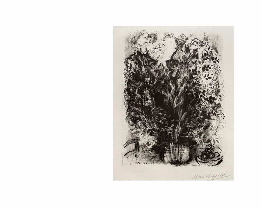
Le Bouquet Noir, 1951Original Lithographie. 57 x 38 cm. Auflage: 11 Ex., handsigniert. WV Lithograph III S. 19.
20

Bonjour sur Paris, 1952 aus Album du Centenaire de L’Imprimerie Mourlot, 1963Original Lithographie. 47 x 54,5 cm. Auflage: 75 Ex., handsigniert. WV M 71.
22


Maternité, 1954Von C. Sorlier ausgeführte Farb-Lithographie nach dem gleichnamigen Gemälde. 59,5 x 78,5 cm.
Auflage: 300 Ex., handsigniert. WV M CS 7.
24


Quai de Bercy aus Derrière le Miroir, 1954Original Lithographie. 38 x 46 cm. Auflage: 2500 Ex. WV M 93.
28


30
links. Nuit à Paris / rechts: La Tour Eiffel à l’Ane aus Derrière le Miroir, 1954Original Lithographien. 38 x 28 cm. Auflage: 2500 Ex. WV M 96 & 97.


32
links: Le Dimanche / rechts: Quai aux fleurs aus Derrière le Miroir, 1954Original Lithographien. 38 x 28 cm. Auflage: 2500 Ex. WV M 98 & 99.


34
links: Saint-Germain-des-Prés / rechts: Les Monstres de Notre-Dame aus Derrière le Miroir, 1954Original Lithographien. 38 x 28 cm. Auflage: 2500 Ex. WV M 100 & 101.


36
links: L’Opéra / rechts: Le Carrousel du Louvre aus Derrière le Miroir, 1954Original Lithographien. 38 x 28 cm. Auflage: 2500 Ex. WV M 102 & 103.


Moїse, 1956Original Lithographie. 65,3 x 42,2 cm. Auflage: 50 Ex., handsigniert. WV M 114.
38


40
David et Bathseba aus La Bible, 1956Original Lithographie. 35 x 26 cm. Auflage: 6500 Ex. WV M 132.

42
David à la Harpe aus La Bible, 1956Original Lithographie. 35 x 26 cm. Auflage: 6500 Ex. WV M 134.


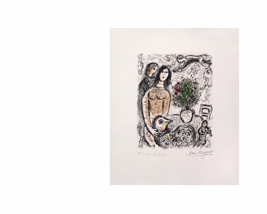
Les Amoureux en gris aus Chagall par Lassaigne, 1957Original Lithographie. 47,5 x 37,5 cm. Auflage: 90 Ex., sowie einige E.A., handsigniert. WV M 194.
44

46
Ohne Titel (Blatt 1 & 2) aus De mauvais sujets, 1958Original Radierungen. Gesamtauflage: 163 Ex. 43 x 33 cm. WV K 106 & 107.


48
Ohne Titel (Blatt 3 & 6) aus De mauvais sujets, 1958Original Radierungen. Gesamtauflage: 163 Ex. 43 x 33 cm. WV K 108 & 111.


50
Ohne Titel (Blatt 7 & 10) aus De mauvais sujets, 1958Original Radierungen. Gesamtauflage: 163 Ex. 43 x 33 cm. WV K 112 & 115.


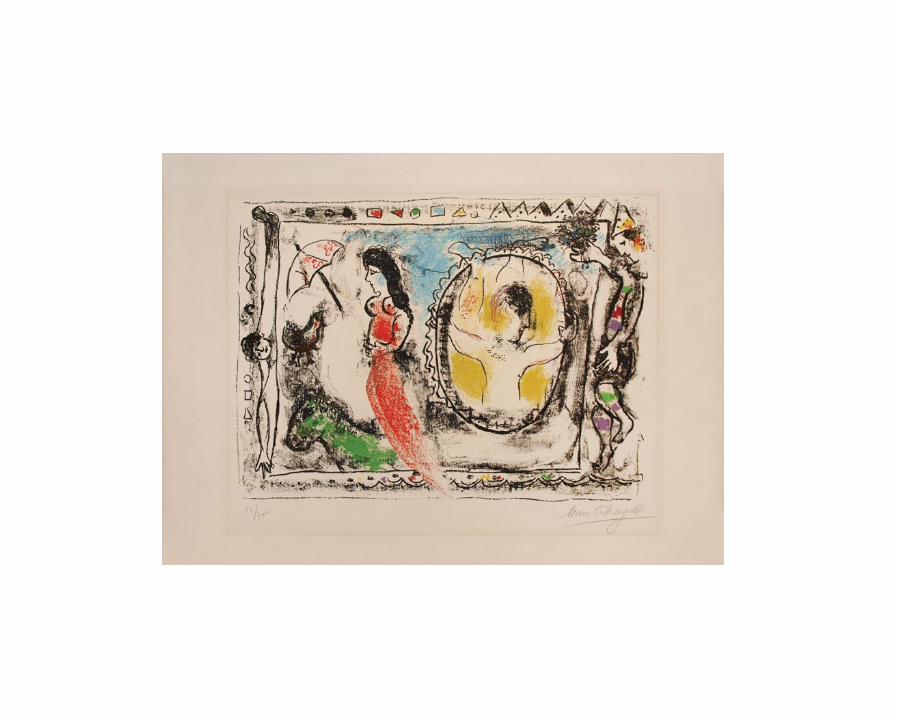
Paysage au Coq, 1958Original Lithographie. 48,5 x 67,5 cm. Auflage: 100 Ex., handsigniert. WV M 208.
52


Le Jugement de Chloé aus Daphnis et Chloé, 1961Original Lithographie. 42 x 64 cm. Auflage: 250 Ex. der Buchausgabe. WV M 315.
54

56
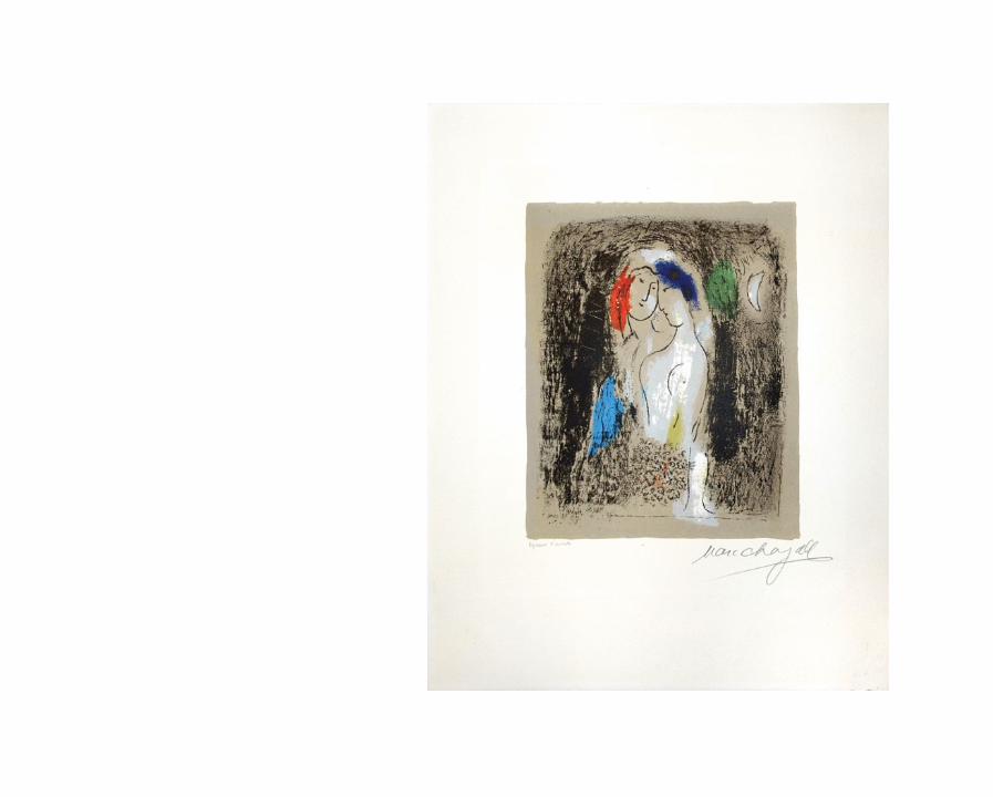
Les Jeunes Gens de Méthymne aus Daphnis et Chloé, 1961Original Lithographie. 42 x 32 cm. Auflage: 250 Ex. der Buchausgabe. WV M 324.


Enlèvement de Chloé aus Daphnis et Chloé, 1961Original Lithographie. 42 x 64 cm. Auflage: 250 Ex. der Buchausgabe. WV M 327.
60


Le repaz chez Dryas aus Daphnis et Chloé, 1961Original Lithographie. 42 x 64 cm. Auflage: 250 Ex. der Buchausgabe. WV M 334.
62


L‘été aus Daphnis et Chloé, 1961Original Lithographie. 53,5 x 75,7 cm. Auflage: 60 Ex., handsigniert. WV M 335.
64


66
Daphnis et Lycénion aus Daphnis et Chloé, 1961Original Lithographie. 42 x 32 cm. Auflage: 250 Ex. der Buchausgabe. WV M 336.


68
Le Dauphin mort et les trois cents Écus aus Daphnis et Chloé, 1961Original Lithographie. 42 x 32 cm. Auflage: 250 Ex. der Buchausgabe. WV M 338.


Hyménée aus Daphnis et Chloé, 1961Original Lithographie. 42 x 64 cm. Auflage: 250 Ex. der Buchausgabe. WV M 349.
70


72
La Baie des Anges, 1962Original Lithographie. 94,5 x 65,5 cm. Auflage: 50 Ex., sowie 25 Ex. E.A. römisch nummeriert, handsigniert. WV M 350.

74
La Nymphe bleue, 1962Original Lithographie. 75,5 x 54,5 cm. Auflage: 50 Ex., handsigniert. WV M 379.


76
Le Ciel Bleu, 1964Original Lithographie. 77 x 56,8 cm. Auflage: 90 Ex., handsigniert. WV M 409.

Sans titre, 1964Original Lithographie. 47,4 x 64,7 cm. Auflage: 75 Ex., handsigniert. WV M 412.
78


Roméo et Juliette, 1964Plakat, von C. Sorlier ausgeführte Farb-Lithographie nach einem Ausschnitt des Entwurfs zur Decke der Pariser Oper.
Auflage: 5000 Ex. mit Text. 65 x 101 cm. WV PL 105.
82


84
Le Jeu, 1966Original Lithographie. 65,5 x 47 cm. Auflage: 50 Ex., sowie 25 Ex. E.A. römisch nummeriert, handsigniert. WV M 439.


86
Le Poète, 1966Original Lithographie. 65 x 47 cm. Auflage: 50 Ex., sowie 25 Ex. E.A., handsigniert. WV M 442.


Le dompteur, la dompteuse et les lions aus Le cirque, 1967Original Lithographie. 42 x 64 cm. Auflage: 250 Ex. der Buchausgabe. WV M 506.
88


90
L’équilibriste aus Le cirque, 1967Original Lithographie. 42 x 32 cm. Auflage: 250 Ex. der Buchausgabe. WV M 516.


92
Carmen, 1967Plakat, von C. Sorlier ausgeführte Farb-Lithographie nach einem Entwurf zu Der Sieg der Musik für die Metropolitan Opera, New York
Auflage: 3000 Ex. mit Text, hier mit Gefälligkeitssignatur. 102 x 66,5 cm. WV PL 117.


94
Soleil Couchant aus Nice et la Côte d’Azur, 1967Von C. Sorlier ausgeführte Farb-Lithographie nach dem gleichnamigen Gemälde. 73 x 52 cm.
Auflage: 150 Ex. arabisch nummeriert & handsigniert, sowie 75 Ex. römisch nummeriert & handsigniert. WV M CS 26.


96
Couple et Poisson aus Nice et la Côte d’Azur, 1967Von C. Sorlier ausgeführte Farb-Lithographie nach dem gleichnamigen Gemälde. 74,5 x 52,3 cm.
Auflage: 150 Ex. arabisch nummeriert & handsigniert, sowie 75 Ex. römisch nummeriert & handsigniert. WV M CS 34.


98
Nature morte au Grand Oiseau, 1968Original Radierung. 37,5 x 28 cm. Auflage: 50 Ex., handsigniert. WV C 38.


100
Le Chevalet, 1969Original Lithographie. 71,5 x 57 cm. Auflage: 50 Ex., handsigniert. WV M 561.


102
La Famille au Coq, 1969Original Lithographie. 76 x 53,5 cm. Auflage: 50 Ex., handsigniert. WV M 567.


106
Rêve familier, 1969Original Lithographie. 49,7 x 64,8 cm. Auflage: 50 Ex., handsigniert. WV M 582.


108
Le Baou de St. Jeannet II, 1969Original Lithographie. 53,3 x 43,2 cm. Auflage: 50 Ex., handsigniert. WV M 585.


110
Ève, 1971Original Lithographie. 97 x 72 cm. Auflage: 50 Ex., handsigniert. WV M 636.

112
Multiflore, 1974Original Lithographie. 96 x 68,6 cm. Auflage: 50 Ex. + einige E.A., handsigniert. WV M 724.

114
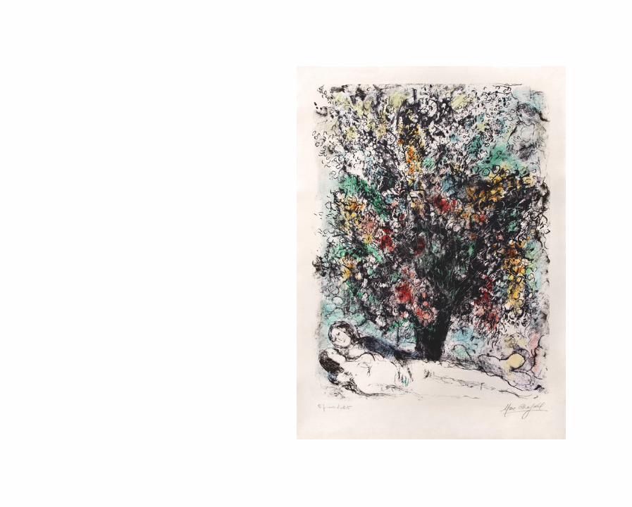
Bouquet à l’Arc-en-Ciel, 1975Original Lithographie. 54 x 43,5 cm. Auflage: 50 Ex., sowie einige E.A., handsigniert. WV M 743.


116
Les Bords de Seine, 1978Original Lithographie. 57 x 45 cm. Auflage: 50 Ex., sowie einige E.A., handsigniert. WV M 930.


118
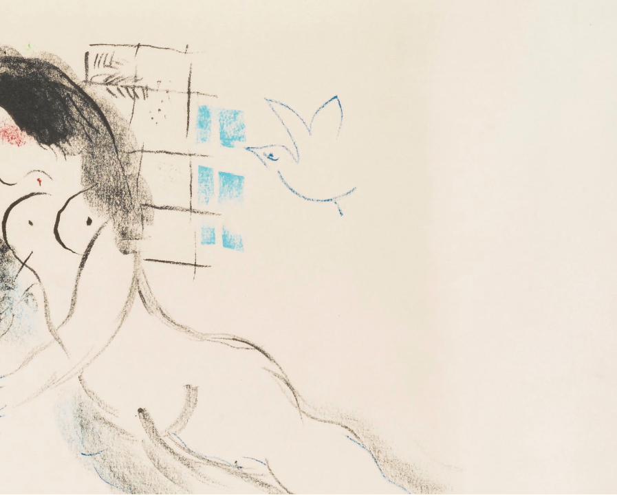
L’Intérieur, 1978Original Lithographie. 57 x 45,4 cm. Auflage: 50 Ex., sowie einige E.A., handsigniert. WV M 931.

120
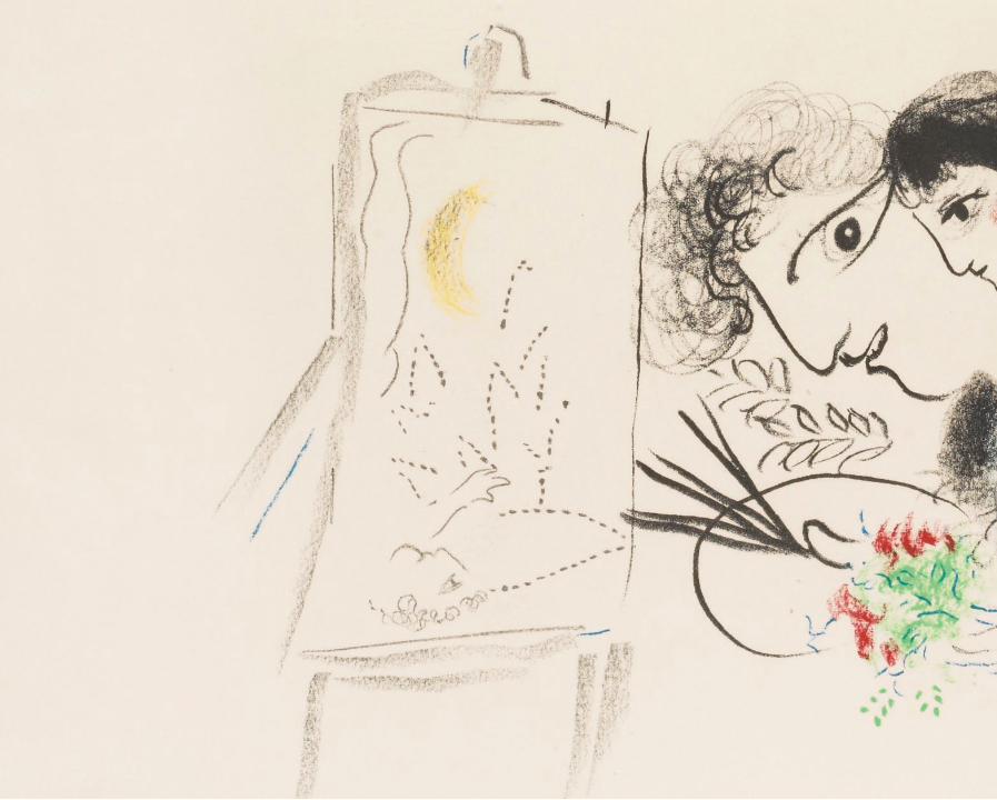
Le Peintre devant le Tableau, 1978Original Lithographie. 62 x 46,7 cm. Auflage: 50 Ex., sowie einige E.A., handsigniert. WV M 932.


124
Fleurs des champs, 1980Original Lithographie. 65 x 47 cm. Auflage: 50 Ex., handsigniert. WV M 960.


126
Vers l’autre Clarté, 1985Original Lithographie. 63 x 47,5 cm. Auflage: 500 Ex., stempelsigniert. WV M 1050.
Bei diesem Blatt handelt es sich um die letzte von Chagall ausgeführte lithographische Arbeit.


128
Dieser Katalog erscheint anläßlich der Ausstellung “Marc Chagall - Modern Master Printmakers I”
Auflage: 500 ExemplareHerausgeber: Raphael PetrovVerlag: Galerie Raphael, Inhaber Raphael Petrov e.K., Frankfurt am MainTexte: Raphael PetrovSatz, Gestaltung & Fotografie: Sami NigmEnglische Übersetzung: James BanksDruck: Arte Grafiche de Pietri S.R.L., Castelnovo Di Sotto, Italien
ISBN 3-930519-37-2
Galerie Raphael, Inhaber Raphael Petrov e.K.Domstraße 6D-60311 Frankfurt am MainTel +49 (0)69 - 29 13 38 Fax +49 (0)69 - 29 77 [email protected]
Abbildung auf dem Cover: “Fleur des Champs”, 1980 (Detail). Siehe Seite 110.
Alle Maßangaben beziehen sich auf das Blattmaß. Die Abkürzung “WV” steht für Werkverzeichnis, der Buchstabe danach spezifiziert ob:Mourlot (M), Kornfeld (K), Cramer (C), oder C. Sorlier Plakate (PL). Mögliche farbliche Abweichungen der Abbildungen zum Original sind technisch bedingt.
2012 © Raphael Petrov & Galerie Raphael

129
This catalogue is published on occasion of the exhibition “Marc Chagall - Modern Master Printmakers I”
Edition: 500 CopiesEditor: Raphael PetrovPublisher: Galerie Raphael, Inhaber Raphael Petrov e.K., Frankfurt am MainTexts: Raphael PetrovLayout & Photography: Sami NigmEnglish Translation: James BanksPrint: Arte Grafiche de Pietri S.R.L., Castelnovo Di Sotto, Italy ISBN 3-930519-37-2
Galerie Raphael, Inhaber Raphael Petrov e.K.Domstraße 6D-60311 Frankfurt am MainTel +49 (0)69 - 29 13 38 Fax +49 (0)69 - 29 77 [email protected]
Reproduction on the cover: “Fleur des Champs”, 1980 (Detail). See page 110.
All dimensions refer to the sheet size.The abbrevation “WV” stands for Werkverzeichnis (Catalogue Raisonné), the letter after specifies if:Mourlot (M), Kornfeld (K), Cramer (C), oder C. Sorlier Posters (PL). Possible color differences between reproductions and originals are due to technical reasons.
2012 © Raphael Petrov & Galerie Raphael