Maps as Media - York Region District School Board
24
Maps as Media Projecting Cultural Biases
Transcript of Maps as Media - York Region District School Board
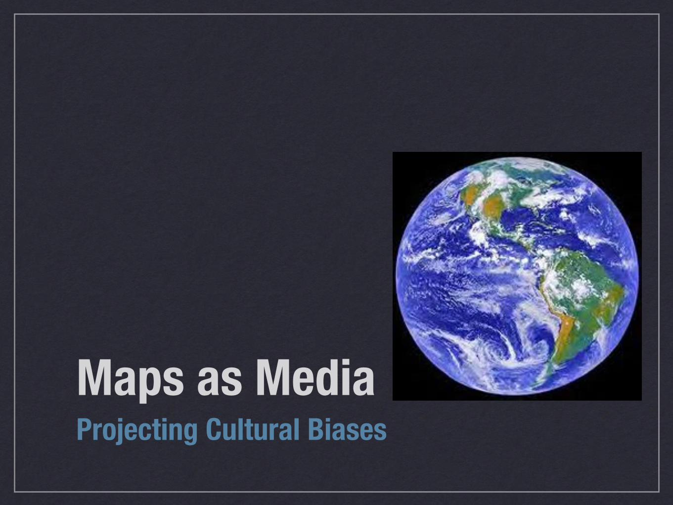
Maps as Media Projecting Cultural Biases

Maps and Bias • Traditional paper maps are inherently biased because
we cannot accurately project a 3-D world onto paper
• Maps are human creations, however people rarely question what they see on maps
• Maps must generalize, symbolize and simplify complex information and interrelationships
“Maps are subject to distortions arising from ignorance, greed, ideological blindness or motive” Mark Monmonier

Maps can be biased… Based on their…
• Projection
• Cartographic convections (colours, symbols, titles etc.)
• Messaging and purpose (intended or unintended)

Mercator Projection " Developed in the
16th century
" Great for navigation because all lines of longitude and latitude are the same
" Continent shapes are realistic but size is inaccurate

Mercator Distortions:
" Which is bigger Australia or Greenland?
• On the map Greenland. In reality, Australia is three times larger!
" As you move away from the equator the map becomes more stretched
AUSTRALIA
GREENLAND

Gall-Peters Projection
" Created in the 1970s as an alternative to Mercator
" Creator stated it was more neutral and less “racist” than Mercator

Gall-Peters Distortion " Which is bigger Australia or
Greenland?
• On this map Australia is bigger, nation sizes are closer to reality
" However the shape of nations is distorted
" This projection is often referred to as “hanging laundry”
GREENLAND
AUSTRALIA

Robinson Projection
" Created in 1963
" Purposely distorted to create a more pleasant appearance

Robinson Distortion: " The most popular and
commonly used map projection
" The major areas of distortions are at the poles
" Still has a Eurocentric view of the world

Cultural Biases in Maps!
Taking a closer look...!

An American Map!
❖ United States and the Western Hemisphere are central!
❖ Splits up Asia !

Projecting Bias: "The World from an “American” Perspective


An Australian Map!
❖ Australia and the southern hemisphere are the centre rather than Europe and the western hemisphere

Toronto Centric Map!❖ Leonard Guelke created this
projection to show exactly how far any location on Earth is to or from Toronto
❖ By drawing a straight line on this map from Toronto to anywhere in the world and, with some simple math, you've got the real-world distance
❖ In order to achieve this benefit, you need to sacrifice some shapes and sizes


Maps tell stories


Your Task
• With a partner, locate a visual of your choice (map, advertisement, photograph, infographic, comic) and explain how the visual can:
a) distort our view of reality and;
b) influence public opinion.
• Submit your visual (or a link to it) and your response on Moodle so we can share our findings. Comment on one other students’ entry.

Alternative Task • Locate a visual of your choice (map, advertisement, photograph, comic)
and explain how the visual can a) distort our view of reality and b) influence public opinion.
• Submit your visual (or a link to it) and your response on Moodle so we can share our findings. Comment on one other students’ entry.
Moodle Forum Responses Should…
- Identify what you agree and/or disagree with in the student’s response and why
- Identify what you find interesting about their findings/analysis
- Include 1-2 questions for the student for them to consider
- Be constructive, offer new perspectives and make the student think “oh, I never thought of that…”
Moodle Forum Responses Should NOT…
- Simply say “I agree with what you’re saying” or “this is a great point”
- Re-state exactly what the student has already said.