MAKING TRANSIT COUNT - nacto.org · MAKING TRANSIT COUNT PERFORMANCE MEASURES THAT MOVE TRANSIT...
16
MAKING TRANSIT COUNT PERFORMANCE MEASURES THAT MOVE TRANSIT PROJECTS FORWARD 1 Tell a better story about streets & transit. Good data powers transit programs. Cities that succeed at implementing transit improvements, and make their streets safer and more efficient for people, do so because they prioritize collecting and leveraging data that emphasizes rider experience and service quality. Performance measures should reflect the daily experience of people riding the bus. This will help cities realize beer designs, beer projects, and beer management of streets. While every agency has an embedded set of practices for performance reporting, many agencies stop at collecting standardized, vehicle-based data points that are missing many of the most pressing needs for riders. Metrics that prioritize the movement of people—rather than just car traffic—enable cities and operators to refocus investments on improving service for customers and retrofiing streets to move more people. New metrics also allow agencies to tell a beer story, oſten simply using existing data in new ways. Drawing from case studies and best practices in North American cities, this document offers example performance metrics and proposes ways to use these metrics to connect technical solutions to the daily bus trip. NACTO TRANSIT LEADERSHIP RESOURCE PAPER APRIL 2018
Transcript of MAKING TRANSIT COUNT - nacto.org · MAKING TRANSIT COUNT PERFORMANCE MEASURES THAT MOVE TRANSIT...

MAKING TRANSIT COUNT
PERFORMANCE MEASURES THAT MOVE TRANSIT PROJECTS FORWARD
1
Tell a better story about streets & transit.Good data powers transit programs. Cities that succeed at implementing transit improvements, and make their streets safer and more efficient for people, do so because they prioritize collecting and leveraging data that emphasizes rider experience and service quality. Performance measures should reflect the daily experience of people riding the bus. This will help cities realize better designs, better projects, and better management of streets.
While every agency has an embedded set of practices for performance reporting, many agencies stop at collecting standardized, vehicle-based data points that are missing many of the most pressing needs for riders. Metrics that prioritize the movement of people—rather than just car traffic—enable cities and operators to refocus investments on improving service for customers and retrofitting streets to move more people. New metrics also allow agencies to tell a better story, often simply using existing data in new ways. Drawing from case studies and best practices in North American cities, this document offers example performance metrics and proposes ways to use these metrics to connect technical solutions to the daily bus trip.
NACTO TRANSIT LEADERSHIPRESOURCE PAPER
APRIL 2018
2
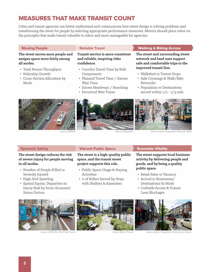
Systemic Safety
The street moves more people and assigns space more fairly among all modes.
• Total Person Throughput• Ridership Growth• Cross-Section Allocation by
Mode
Transit service is more consistent and reliable, inspiring rider confidence.
• Corridor Travel Time by Ride Components
• Planned Travel Time / Excess Wait Time
• Excess Headways / Bunching• Perceived Wait Times
The street and surrounding street network and land uses support safe and comfortable trips to the improved transit line.
• Walkshed to Transit Stops• Safe Crossings & Walk/Bike
Networks• Population or Destinations
served within 1/3 - 2/3 mile
Economic Vitality
Walking & Biking Access
Vibrant Public Space
Moving People Reliable Travel
The street design reduces the risk of severe injury for people moving in all modes.
• Number of People Killed or Severely Injured
• High-End Speeding• Spatial Equity; Disparities in
Injury Risk by Socio-Economic Status Factors
The street is a high-quality public space, and the transit street project supports this role.
• Public Space Usage & Staying Activities
• % of Riders Served by Stops with Shelters & Amenities
The street supports local business activity by delivering people and goods, and by being a quality public space.
• Retail Sales or Vacancy• Arrival to Businesses/
Destinations by Mode• Curbside Access & Transit
Lane Blockages
Cities and transit agencies can better understand and communicate how street design is solving problems and transforming the street for people by selecting appropriate performance measures. Metrics should place value on the principles that make transit valuable to riders and more manageable for agencies.
MEASURES THAT MAKE TRANSIT COUNT
Source: SFMTA
Source: MTA New York City Transit
Source: BeyondDC Source: Adam Coppola for Places for Bikes
Source: Metro Transit Source: Adam Coppola for Green Lanes Project

3
Moving Vehicles Minimizing Delay
The street moves a set number of cars and buses per hour.
• Traffic Counts• Bus Running Speed
The average car does not wait at traffic signals.
• Level of Service• Percent On-Time Arrival
Property is protected.
• Total Accident Reports• Transit Vehicle Collisions
Mismatched Vehicle Measurements Typically Applied to Transit
Many agencies today use metrics based on car traffic that don’t directly address the most important success or failure of the transit system: customer experience. Vehicle movement contributes to but is not the whole story of how riders experience transit.
Reducing Collisions
Before & After Photos
Photos can emphasize the changes made in the project, and can be especially powerful in showing how street space is reassigned to high-capacity modes. For example, projects that reallocate street space or shorten crossing distances are best photographed from high angles, such as from a third-floor window or a bucket truck.
» Project plan drawings can be used to identify ‘Before’ photo sites where major changes are planned, allowing an exact match with the ‘After’ photo. For projects that primarily change operations or time allocation, a series of photos showing a bus progressing through an intersection can be illustrative.
Name of the performance measure. →
Why this performance metric matters
and what kinds of projects this metric is
well suited to.
→
What data is needed, and how to collect
that data.→
↑Illustration of how the metric is being
applied to transit street projects.
Project Location, City
↓
HOW TO USE THIS PAPERThis paper is structured in six sections based on the six core types of Transit-Centric Metrics described on page 2. Each section is broken into a set of suggested performance measures, with guidance on application, data collection, and example cases from North American cities. Below is a map for reading each of the suggested metrics.
Before
After
WEBSTER AVE, NEW YORK

4
MEASURES FOR MOVING PEOPLEStreets with effective transit move more people in the same space, and make room for growth in the number of people moving. Like other standard measures in transportation, such as peak-hour and all-day motor vehicle volume, every mode that matters in a project should be measured. Use detailed data on mode share and spatial allocation to change the conversation about street design. These measures of capacity and throughput encompass the current and long-term potential of a street to serve the city.
Total Person Throughput Growth
Growth in the number of people using the street demonstrates the street’s increased capacity to serve a growing city without increasing the space dedicated to mobility. Some projects reduce motor vehicle capacity while increasing total person movement, while others increase transit or bicycling use with relatively little change in private vehicle use.
On projects that involve key bus routes, measuring total person throughput is vital. It is also essential to emphasize other measurable goals, such as reducing speeding or increasing walking and cycling. Reporting on ridership emphasizes that serving transit riders is a central part of the street design process.
» Daily or hourly volume by mode, at a specific point or points on a corridor, can be presented to explain the change in person volume before and after a project is implemented. Use data that compares fairly across modes—total bus passenger loads for all lines at a specific screenline point can be compared to vehicle counts, but bus boardings or pedestrian crossings at a single intersection are not a complete comparison.
» Use APC or farebox data for transit ridership counts, automated counts (ATR tube, loop detector, video detection, or large-scale data sources) for motor vehicle counts or bicycles on bike lanes, and video or manual counts for people walking and mixed-traffic bicycling. Count all modes in the same location and in the same time period. Using three-day or multi-week averages can avert common measurement errors in both manual and automated counts.
» 24-hour counts or 12-to-18 hour counts are usually preferred for capturing a variety of trip purposes and understanding transit’s off-peak travel contributions, but afternoon peak period volumes can be substituted on many streets. Morning-only volume tends to include only commute-to-work trips, while 4-7 pm counts capture a variety of trip types.
~19.7k
~22.4k
DEXTER AVENUE N, SEATTLEAverage Daily Person Throughput
A project on Dexter Avenue N reduced the street from four general travel lanes to two, and added buffered bike lanes and in-lane stops for buses. In spite of the lane reduction, total person throughput increased 14% following the project without growing travel times.1
Before:
After:
+14%Total Person Throughput
Source: Seattle Department of Transportation and King County Metro
= 100 Vehicles = 100 Bikes = 100 Transit Riders
= 100 Vehicles = 100 Bikes = 100 Transit Riders

5
Ridership Growth
Ridership growth is a primary measure for transit street projects and for transit services. While many agencies already report on growth, illustrating changes relative to major upgrades sends a clear message about how investments are paying off.
Reporting line ridership changes in the context of system-wide ridership, or discussing multiple lines that operate on the same or nearby corridors, allow agencies to communicate programmatic successes on corridors and across the system.
» Compare combined local and rapid ridership on the street, before and after implementation, ideally year-over-year.
» For each route involved in a project, use APC or farebox data to calculate Average Daily Ridership or Average Weekday Ridership for a month or more. Use comparable months for before and after analysis if seasonal differences are present.
Cross-Section Allocation
The high volume of bus riders on urban streets is often news to policymakers and the public. On busy streets, private vehicles are visually dominant, obscuring the mobility contributions of transit, bicycling, and walking. Simple comparisons of space consumption and people moved on a street can be used to explain why even an ‘empty-looking’ transit lane with a bus every eight minutes can move more people than a lane fully occupied by low-occupancy private vehicles.
Associating the number of people using each mode with the amount of space they have on the street helps make the case for a more efficient distribution of space, and shows that the project has improved many people’s travel experience after the fact. Cross-section allocation diagrams help visualize why transit riders need more space.
» Create graphics to compare Total Person Throughput with Right-of-Way Width or acreage assigned to each mode before and after the project.
Source: King County Metro, Seattle
80,000
60,000
40,000
20,000
RAPIDRIDE, SEATTLE 2
Ridership Growth over Route BaselinesKing County Metro & Seattle DOT compare ridership growth on their six rapid bus routes to the expected baseline ridership on those routes, had no improvement been implemented.
RapidRideridership
Baseline Ridership(previous routes)
2011 2012 2013 2014 2015 2016 2017
A LineB Line
C&D Lines
E LineF Line
Street Space:
Mode Share:
Transit
Source: City of Toronto
Vehicles
BikesTransitVehicles
Pedestrians52%
30%
28%
22%
Bikes: 1%
Pedestrians
Before:
After:
20%
47%
14%
31%
23%
16%
39%
46%
24%
7%
Street Space:Mode Share:
QUEENS QUAY WEST, TORONTOCross-Section Allocation
When Queens Quay West was reconstructed, the City of Toronto rebalanced the street’s cross-section to more equitably allocate width according to the number of users in each mode, and with the goals of increasing people walking, bicycling, and riding transit.
Vehicles

6
MEASURES FOR RELIABLE TRAVELSuccessful transit systems require reliability even more than they require speed, both for passengers and for operators. While On-Time Performance is an important metric, using it as a sole master metric for understanding transit success gives an incomplete picture of performance. Whether a rider is planning a trip or an agency is scheduling service and allocating resources, using more nuanced metrics to understand where and why delays are occurring, and how those delays translate to rider experience and perception, is crucial to operating a more competitive and functional mobility service. Improved reliability, even without changes to travel time, is significant, and should be conveyed in meaningful terms to riders.
Travel Time Range
In many cases, street design itself does not change the average travel time for an entire bus line, but instead reduces delays on the worst segments, improving service as experienced by the most riders. Perhaps more importantly, reduced variability in travel time allows transit operators to schedule service more efficiently and accurately, potentially even enabling more service provision with the same resources, or maintaining the same service while using fewer resources. The first metric for the transit agency to understand and communicate reliability is the difference between the fastest, slowest, and average travel times on a corridor.
» GTFS data for total or segment travel times can be used to assess ranges before and after a transit street project. Typically, the median 90% of all trips will provide an actionable band while eliminating outliers. Separate travel directions, AM and PM Peak Periods, and potentially segments where delay is common to assess and convey reduced travel time range.
KING STREET TRANSIT PILOT, TORONTOTransit Travel Time Range
Following a pilot transit priority implementation for the King Street streetcar, travel time ranges shrunk as much as 44% during peak periods.3
15.3 15.9 15.2 15.2
18.9
16.6
19.0
16.6
18.7 19.3 19.0 18.3
25.0
20.0
24.0
20.3
11.7 12.311.3 12.0
13.0 13.3 14.013.0
15m
in25
min
Eastbound Westbound Eastbound Westbound
PM PeakAM Peak
Source: City of Toronto, “February 2018 Dashboard Update”

7
Components of Delay
To pinpoint potential improvements to a corridor, cities and agencies should use detailed sources of transit runtime: how a bus or train spends its time during its route. These components typically include boarding or dwell time, running time, and time stopped at signals. Comparing the components of travel time before and after a project promotes further targeted improvements. For example, all-door boarding, in-lane stops, and stop consolidation shorten the time spent at bus stops, while dedicated lanes and signal priority reduce the time spent stopped or crawling in traffic and at intersections.
» Use AVL, passive GPS, or similar location data if available to gather data on a large sample size of bus travel runs. Sample runs should be taken over a long period of time such as a month, or use manual time studies on a smaller sample of runs.
» Use Automated Passenger Counters (APC) to track stop dwell time, and match APC data to location data to segment transit trips into Running Time, Dwell Time, and Signal Delay. Using APC data to track when bus doors are open is especially useful when passengers pay fares off-board.
Excess Headway
Typical measures of On-Time Performance are based around Scheduled Service (i.e. whether the bus reaches the stop less than 1 minute or 5 minutes late compared to the scheduled arrival time). However, on routes with frequent service, on-time performance can fail to capture factors that frustrate efficient transit. For example, on a route with 8-minute headways, a bus arriving 4 minutes late may still be considered “on-time,” in spite of adding more than 50% to the expected wait time for passengers. Especially on frequent routes with high ridership, uneven spacing precipitates bunching and cascading delays. Measuring Excess Headway rather than Schedule Adherence is a strategy to understand and ultimately reduce bunching on headway-based services.
» Excess headway defines delay as a percentage deviation from the headway goal; on a route with 8-minute frequency, being either 2 minutes early or late would equal 25% excess headway. Operationalizing the metric involves counting the percentage of routes within a tolerable headway threshold.
» Another method is to measure “bunched service,” or the percent of runs that arrive within either 25% of the headway behind the previous run, or within 2 minutes after. Using bunching as a performance measure is distinct from using headway adherence as a dispatch method, and is compatible with several methods of dispatching. When service is delayed, the metric counts the second bus, not the delayed bus, as bunched, rewarding fast and flexible responses to service disruptions, rather than forcing subsequent buses to run empty after a delayed bus.
Source: Metropolitan Transportation Authority
B44 LIMITED
37.4 min / 45%Bus in
Motion
Stopped in Traffic
Stopped at Bus Stops
37.3 min / 57%
12.5 min / 19%
15.4 min / 24%20.0 min / 24%
25.8 min / 31%
83.2 min
65.2 min
B44 SBS
BEDFORD / NOSTRAND AVE B44, NEW YORKTravel Time by Trip Components
Red bus lanes, in-lane stops, off-board fare collection, longer stop spacing, and signal priority improved all components of delay on the B44. However, the greatest improvements were realized in reducing dwell and signal delay.4

8
MEASURES FOR RELIABLE TRAVELExcess Wait Time
While on-time performance and headway reliability are critical measures for internal benchmarking, using and publishing customer-focused metrics are valuable to communicating the impact of service quality in a clear and meaningful way to riders. One such measure is Excess Wait Time, which contextualizes the impact of service disruptions on actual riders. Excess Wait Time values delay in minutes, giving users a more tangible value to evaluate delay. Additionally, excess wait time weights delay by the number of riders affected, so delays during peak hours are understood as having much greater impact than off-peak delays.
» Excess wait time is calculated by multiplying the amount of delay time for each run by the estimated number of passengers affected. For example, if a bus is expected to arrive every 8 minutes, and is delayed 3 minutes, each passenger who waits more than the expected headway experiences excess wait time. Estimate the number of passengers affected using boardings per hour to place a value on excess wait time experienced for each delay.
Excess Journey Time
The reliability of a complete transit trip measures how well the service and the street are working for riders, and adds to the picture provided by travel time for buses on a particular link.
» Reliability can be measured as the difference between the actual time it takes to use the transit system to get from door to door and the time it should take when services are working well. Planned travel time is the amount of time a rider needs to allocate to the entire trip in order to arrive on time at their destination. This measure encompasses the full experience of wait time, travel time, and reliability.
» Planned travel time for a corridor can be calculated as the 85th percentile wait-plus-bus travel time within the peak hour, or the wait-plus-bus travel time on the worst day of the typical week. This metric makes use of excess wait time (late bus) data, but puts it in the context of bus frequency as well as bus travel time.
Worst Day in 5
Best Day in 5
15-Minute Transit Travel-Shed(adapted from SFMTA Muni Travel Times) 5
Visualizing the difference in trip time or travel distance between the average and 85th percentile travel days is a powerful way to illustrate the difference between a good day and a bad one. 85th percentile can be broadly understood as the worst travel day each week.
Excess Wait Time: 10 minutes.
8min planned 8min planned4min late
4min
8min 8min
Excess Wait Time: 0 minutes.
Excess Wait Time CalculationOn a route with 60 boardings per hour operating 8-minute headways, a bus arriving 4 minutes late can be estimated to impact four passengers, causing them 10 minutes of excess wait time.

9
Queue Length as a Design Input: Traffic Analysis Beyond LOS
Long lines of motor vehicles at intersections, called queues, are a persistent issue for bus operations. Vehicle queue length calculations are a prediction of how many vehicles will be waiting at a particular intersection at a random time during the peak hour of the day. Queue length is not a performance measure, but can be useful in transit street design because transit lanes are a specific remedy for long motor vehicle queues, and because the selection of transit signal priority measures is affected by whether the transit vehicle is or is not stuck behind queued cars.
For example, at an intersection with a 95th percentile peak queue length of ten vehicles, a transit approach lane that is as long as ten queued cars can be expected
to let buses reach the intersection without delay in about 19 of 20 cases during the peak hour. In addition, queue length can be used, in combination with detailed knowledge of the specific intersection and networks in question, to understand the risk of intersection blockages (pre-gridlock conditions) in a given street design.
Queue length and level of service (LOS) are usually the output of the same type of traffic models, but level of service should generally not be used as a design input on transit streets due to its prioritization of private vehicle traffic, even when intended to minimize transit delay.
Reliable Motor Vehicle Travel Time
Discussions of transit streets are much stronger when they include a factual measure of travel time changes for private motor vehicles. Drivers tend to overestimate the length of time spent stopped in traffic, often by a large factor, so measurement is an important way to inform decision-makers of genuine effects. Travel time data can never encompass every driver’s experience, but can be measured with increasing completeness using anonymized sensor data and third-party data when available. Level of Service (LOS) cannot be used as a substitute due to its modeling limitations; LOS is not a performance measure, it is a performance projection.
Measure travel time data for general motor vehicle traffic, and report changes in a format that emphasizes reliability throughout the day or reliability within a peak period. Like transit passengers, drivers benefit when the likelihood of major congestion is reduced.
» Measure Corridor Travel Time for motor vehicles by time of day (peak and off-peak) using large-sample datasets where available. Many cities use city fleet GPS data or anonymized data collected using bluetooth readers set up at key points on a corridor, or data collected by telecom providers or third-party smartphone apps. Data collected using the “floating car” method can be used to provide finer block-by-block geographic detail with a smaller sample size, or if large-sample sets are not available.
Source: New York City Department of Transportation
-8.4%
Southbound
28:0125:41
-4.2%
26:04 24:58
Northbound
BX41 WEBSTER AVENUE, NEW YORKMotor Vehicle Travel Times
Following a 5-to-3 lane reduction project that dedicated lanes to transit in both directions, motor vehicle travel times along Webster Avenue actually decreased slightly.6
AfterBefore AfterBefore

10
MEASURES FOR SAFE STREETSTransit projects have a core role in meeting city safety goals, often organized under the rubric of Vision Zero or systemic safety. A relatively small number of major streets, often with high-ridership buses, are the site of over half of traffic fatalities in U. S. cities; many of the victims of motor vehicle traffic crashes are transit riders crossing to reach transit stops. Projects designed to improve the transit, bicycle, or public space functions of the street often involve a reorganization of the street, and should be assessed in part based on their safety benefits. Further, transit is the only motorized mode whose growth is demonstrated to support, rather than erode, safety outcomes; city safety outcomes are closely linked with their transit mode share.
Misinformation related to safety is common in the public dialogue about transit, including the belief that transit quality and safety for people walking and bicycling are at odds. Transit projects benefit when systemic safety is a core part of the discussion about a street project, both in planning and in evaluation.
Decreasing the Toll of Traffic Deaths through Transit Improvement Projects
Reducing the number of people killed or severely injured in traffic crashes (KSI) is a key measure of improvements to the street. On a project basis, street redesigns that reduce speeding among private vehicles, while dedicating more space to on-street transit, have been shown to decrease corridor-wide KSI significantly. In some cases, total collisions increase (including property-damage-only crashes), even though injuries or KSI decrease, but this may not be evident immediately.
» Agencies should collect and report 3 to 5 years of crash history before implementation and 1 to 3 years of ‘after’ data for a simple and reliable assessment of safety on a corridor. Use the longer end of this time for streets with relatively few crashes, or for subsets such as KSI.
B44 NOSTRAND AVENUE, NEW YORKInjury Crash Comparisons
Implementation of bus bulbs that shortened crossing distances and re-striped crosswalks reduced injury crashes 37% at treated locations. Corridor wide, injury crashes fell 2% following the project.7
Injuries per Year
Before After Change
2014 Bus Lane Section 583 574 -2%
Intersections with Bulbs 100 63 -37%
Source: New York City Department of Transportation

11
Safety at a Citywide Scale
In addition to measuring results at a corridor- or project-specific scale, the safety benefits of transit at a citywide scale can be communicated using fatalities or KSI per 100,000 residents. Increases in non-automobile mode share have a demonstrated correlation with decreases in fatality rates. System safety is an especially important metric as safety programs (such as Vision Zero) and bus improvement programs expand over time, and a higher percentage of trips shift to transit, walking, and bicycling.
In quantifying these effects, it is important to account for transit’s contribution to safety and ensure that safety calculations use exposure levels to control for significant increases in walking and cycling.
» Equity in safety should be evaluated specifically at a neighborhood- or tract-level, either by examining KSI risk to people of color, to low-income people, or to people born outside the U.S.
Speeding & Decreases in Top Speeds
When streets are redesigned for safer speeds as well as improved transit service, agencies can immediately measure traffic speeds as a leading indicator for safety, long before crash data are available.
» From radar speeds or similar collection methods, cities can calculate average speed, the percent of drivers speeding, or the number of drivers speeding over a set high-end threshold such as 35 mph, before and after a project is implemented. These data points are easy to understand and supportive of system-wide safety goals. The presence of high speeds on a corridor makes a powerful case for a safety project.
Rainier Ave S, Vehicles Driving over 40mph
Direction Before After Change
NB 4.1% 0.8% -80.5%SB 6.2% 1.7% -72.6%
Source: Seattle Department of Transportation
RAINIER AVENUE S, SEATTLEHigh-End Speeding Incidents
Rainier Avenue S was reduced from four lanes to three, with managed turn lanes and bus queue jumps. Average motor vehicle speed fell from 33mph to 26mph, and vehicles speeding over 40mph fell more than 72%, with no serious injury crashes in the year after the project.8
55.9%
56.3%
55.7%
54.9%54.8%54.6%54.2%
54.6%
0201620152005 2006 2007 2008 2009 20142013201220112010
52%
58%
54%
56%
2.75 2.69
3.05
3.563.33
3.01
3.333.10
3.46
3.31
3.933.91
56.6%57%57.1%
56.7%
4
2
Traffi
c Fa
talit
ies
per
100,
000
Res
iden
ts
Tran
sit M
ode
Shar
e (C
omm
ute
Trip
s)
Source: American Community Survey 2016, & NYC DOT
CITYWIDE, NEW YORKTraffic Fatality Rate & Mode Share
Between 2009 and 2016, the estimated number of commuters in New York City increased by 275,000—nearly all of the growth occurred in people riding transit, biking, and walking to work (while drive-to-work commuting declined nominally).9 Robust transit options enabled commute growth without increasing exposure to traffic violence.10

12
MEASURES FOR WALKING & BICYCLING ACCESS TO TRANSITThe transit network is only as valuable as its first- and last-mile connections—if riders face unsafe, uncomfortable, or inconvenient conditions to access the transit stop or station, they are incentivized to choose other modes. Safe and connected walking and biking networks to and around the transit stop are crucial to measuring and improving service quality and safety.
The Walking Network and Conditions
Comfortable and safe walking networks are crucial to providing access to successful transit. The percentage of a city or analysis area’s population served by an accessible network to the transit stop is a valuable metric for understanding the basic usability of the transit system for people of all abilities. Many agencies measure the number of people or jobs that have access to the transit system using a “Transit Walkshed” analysis with a 1/4-mile catchment area around the transit stop. However, as many as half of all riders may originate beyond the quarter-mile catchment area, and will benefit from improvements.11
» Calculate the number of residents or jobs within a 1/3-mile walkshed of transit stops using a network path analysis of blocks with complete routes of sidewalks, curb ramps, and safe crossings to the transit network. As route- or corridor-level improvements are implemented, increase the transit walkshed to 1/2-mile.12
» To identify needed improvements, count barriers within the Transit Walkshed, such as major arterial crossings where average motor vehicle speed exceeds 30mph, distances between formal pedestrian crossings greater than 1/4 mile, or the presence of non-walkable infrastructure that restrict walking access. Consider establishing detailed guidelines for unsignalized crossings.
» Nominal measures can be used to illustrate progress on the pedestrian network, such as the number of ADA curb ramps or linear distance of sidewalk installed. The length of traffic-calmed blocks and number of street trees installed are also relevant measures.
All Ages & Abilities Bicycling Networks
Bicycle infrastructure that aims for safety and comfort is a powerful strategy for extending the reach of bus and rail systems, especially rapid transit routes with larger catchment areas. However, for bicycling to complement transit, riders need enabling infrastructure (e.g. on-street routes, parking, & bike share systems) that provides strong assurances of safety, connected routes, and regular opportunities to ride.
» Growth in bicycle transportation can be measured using an annual or seasonal all-day multi-location screenline counts, either at representative locations around a cordon or within a discreet geographic area.
» Growth in bike share trip origins & destinations near transit stations can reveal complementary usage of bikes and transit.
Source: East River Annual Bike Counts, NYC DOT
EAST RIVER BRIDGES, NEW YORKAverage Bike Counts &
Protected Bike Lane Mileage14
1986 20161996 2006
10k
20k
Pathway Arterial
Pathway Collector
Legend
Transit Hub
Wayfinding
Bus Stop
Bike Route
PATHWAY TOOLBOX, LA METROCore Walk Network Route Improvements
In its First Last Mile Strategic Plan, Los Angeles Metro built a framework for identifying and prioritizing key walking and biking route improvements around transit hubs based on key access routes, nearby destinations and land uses, average vehicle speeds and collision locations, and multi-modal connections like bike share and car share.13
Source: First Last Mile Strategic Plan, LA Metro
80m
i40
mi
Total Protected
Bike Lane MileageAverage Daily
East R. Crossings

13
MEASURES FOR TRANSIT STREETS AS PUBLIC SPACE
Public Space Quality: Staying Activities
Inviting streets and transit station areas memorialize the spaces around transit as vibrant public places. Comfortable transit stops increase riders’ feelings of comfort and satisfaction while waiting for transit. Attractive streets that invite people to stop and stay deliver value to abutting destinations. Observed stationary activities are a core measure of the value of a street as a great public space. A public space survey is a simple and effective way to quantify the usefulness of a street for activities besides transportation.
» Use short ‘pass-through’ manual data collection to count and classify stationary activities. Canvassers walk through a sidewalk, transit station, plaza, or other public space with a diagram of the area, noting the location of people engaged in stationary activities. Useful at the design stage as well as before-after analysis, the public space survey can be used to demonstrate that more people are actively using a space.
» Establish categories of activities (eating, talking, using a phone, resting, reading, commerce) and engage local businesses and civic groups in data collection.
Transit streets are linear public spaces that can be evaluated in part on how well they serve local institutions, businesses, and residents. The value of the street for public life is a core part of its performance.
Transit Shelters & Comfortable Waiting Areas
High-quality transit stops with shelters, accurate service information, adequate visibility and lighting, and regular activity reinforce rider confidence and provide safe, comfortable places to wait for the bus. When developing guidance for transit stop enhancements like shelter installation and real-time information, utilize criteria such as daily boardings, adjacent destinations, equity in coverage, and key bus routes.15
» Calculating the percentage of system-wide stops with shelters and amenities—including the percentage and demographic characteristics of system riders served—is a simple and effective method to assess stop quality and equity.
» Conduct stop intercept surveys with riders to gather qualitative and quantitative feedback on perceptions of safety, comfort, and service quality.
Adapted from SOMERVILLE BY DESIGN16
Public Space CanvasWhen a transit project expands pedestrian or plaza space, field canvasses quantify the activation of a public space.
Weekday
Weekend
100
0
50
7am 9pm2pm
Standing
Sitting
Eating
Playing
Working
Locate & Count Stationary Users:
Count Stationary Users by Time of Day & Activities:
Observe Stationary Users in the Field:
Source: Somerville by Design, Gehl Architects for City of Somerville
TRIMET, PORTLANDMetrics for Siting Bus Shelters
Portland’s TriMet has adopted guidelines for stop upgrades based on daily boardings, adjacent land uses, average lift usage, and planned future activity.
Source: SE Division Street, Portland, TriMet

14
Most measures of travel time and reliability inherently focus on movement through a street; however, the core purpose of streets is facilitating access to opportunities. Short- and long-term commercial access and economic performance measures can act as compelling proxies for understanding the value of a street as a community asset.
Delivering People
Vehicle-centric measures of a street’s capacity to deliver people to destinations (e.g. traffic counts & parking occupancy) undervalue the core user base of urban commercial streets and overvalue through-movement. People who arrive by walking, biking, or riding transit are more likely to be frequent customers,17 but are likely to be missed by retail value estimates based on passing vehicles. Counting arrivals by mode better indicates the relationship between street design and local economic activity.
» Intercept surveys can quantify the number of people arriving as bus or rail riders, on foot and in personal mobility devices, on bike share, on personal bikes, and in for-hire and private motor vehicles.
MEASURES FOR ECONOMIC VITALITY
Curbside Access & Goods
Goods delivery needs can be evaluated by surveying local businesses and institutions about freight needs, quantifying the time- and distance-sensitivity of deliveries, and the relative ease of finding loading spaces to make deliveries.
» Curbside management can be assessed by counting bus blockages by loading uses, achievement of curbside occupancy targets, and goods delivery satisfaction. Surveying the number of motor vehicles cruising for parking or loading spaces is also a valuable performance measure. See NACTO’s Curb Appeal: Curbside Management Strategies for Improving Transit Reliability for in-depth discussion.
Source: B44 Progress Report, NYC DOT & NYCT
Prefer a delivery zone in front of your store in effect for 2–3 hours per day
Prefer a delivery zone down the block or across the street in effect all day
Prefer a delivery zone around the corner that is in effect all day
Prefer the existing situation
7–10 AM
<10 mins
A delivery zone in front of your store in e�ect for 2–3 hours per day
A delivery zone down the block or across the street in e�ect all day
I prefer the existing situation
10–30 mins >30 mins
19%
37%51% 12%
31% 26% 13% 11%
10 AM–1 PM 1–4 PM 4–7 PM Other
46%
33%11%10%
46% 33% 10%11%
A delivery zone around the corner that is in e�ect all
Delivery Zone Requests by Merchants
BEDFORD / NOSTRAND AVE B44, NEW YORKSurveyed Curbside Access Needs
Pre-project surveys found that business owners overwhelmingly preferred active curb management for deliveries and access, including time-of-day or around-the-corner designations.19
16%
3%
44%
17%
27%
11%
How do people travelto Commercial Drive?
Where are peoplecoming from?
0%
2%W 16th Ave
Gra
nvill
e St 3%
Fras
er S
t
Mai
n St
Cla
rk D
r
Nan
aim
o St
E 16th Ave
E 33rd AveKingsway
Terminal Ave
8%
2%4%
44%
Commercial Dr
Source: City of Vancouver, 2016 Commercial Drive Intercept Survey
COMMERCIAL DRIVE, VANCOUVER, BCBusiness Arrivals by Mode & Locality
During public consultation for the project, planners conducted business intercept surveys to find that nearly half of all arrivals to the corridor live locally (44%), and the vast majority of people surveyed on Commercial Drive arrived by walking, transit, or bicycle (82%).18
15
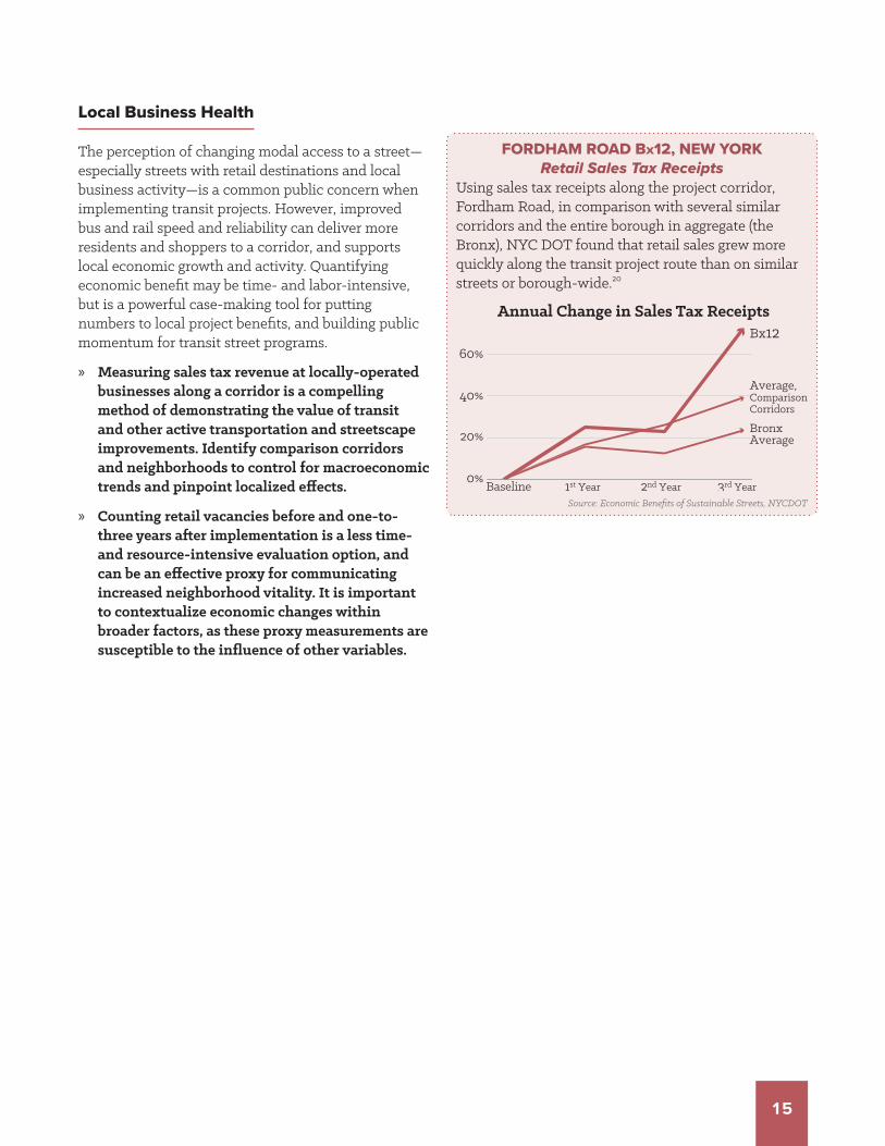
Local Business Health
The perception of changing modal access to a street—especially streets with retail destinations and local business activity—is a common public concern when implementing transit projects. However, improved bus and rail speed and reliability can deliver more residents and shoppers to a corridor, and supports local economic growth and activity. Quantifying economic benefit may be time- and labor-intensive, but is a powerful case-making tool for putting numbers to local project benefits, and building public momentum for transit street programs.
» Measuring sales tax revenue at locally-operated businesses along a corridor is a compelling method of demonstrating the value of transit and other active transportation and streetscape improvements. Identify comparison corridors and neighborhoods to control for macroeconomic trends and pinpoint localized effects.
» Counting retail vacancies before and one-to-three years after implementation is a less time- and resource-intensive evaluation option, and can be an effective proxy for communicating increased neighborhood vitality. It is important to contextualize economic changes within broader factors, as these proxy measurements are susceptible to the influence of other variables.
Source: Economic Benefits of Sustainable Streets, NYCDOT
Baseline 1st Year 2nd Year 3rd Year
60%
40%
20%
0%
Bx12
Average,ComparisonCorridors
BronxAverage
FORDHAM ROAD BX12, NEW YORKRetail Sales Tax Receipts
Using sales tax receipts along the project corridor, Fordham Road, in comparison with several similar corridors and the entire borough in aggregate (the Bronx), NYC DOT found that retail sales grew more quickly along the transit project route than on similar streets or borough-wide.20
Annual Change in Sales Tax Receipts

16
References & Further Reading
1. National Association of City Transportation Officials. “Prioritizing Transit on a Small Corridor, Dexter Avenue, Seattle.” Transit Street Design Guide, Island Press, 2016. Accessed via https://nacto.org/case-study/dexter-avenue-seattle/.
2. “Monthly Performance Measures: Ridership.” King County Metro Accountability Center. Accessed via http://metro.kingcounty.gov/am/reports/annual-measures/ridership.html
3. “February Update.” King Street Transit Pilot. City of Toronto, March 2018. Accessed via: https://www.toronto.ca/city-government/planning-development/planning-studies-initiatives/king-street-pilot/.
4. “B44 +selectbusservice on Nostrand Avenue: Progress Report.” New York City Department of Transportation & MTA New York City Transit. 2016. Accessed via http://www.nyc.gov/html/brt/downloads/pdf/brt-nostrand-progress-report-june2016.pdf.
5. Dan Howard (UC-Berkeley) & Chris Pangilinan (formerly SFMTA); data via SFMTA.
Accessed via https://www.ocf.berkeley.edu/~djhoward/transitmap/transit.html.
6. “Bx41 on Webster Avenue: Progress Report.” New York City Department of Transportation & MTA New York City Transit. 2014. Accessed via http://web.mta.info/mta/planning/sbs/docs/WebsterAveSBS-ProgressReport-2014.pdf.
7. “B44 +selectbusservice on Nostrand Avenue: Progress Report.” New York City Department of Transportation & MTA New York City Transit. 2016.
8. “Rainier Avenue South Safety Corridor: Rainier Pilot Project Evaluation.” Seattle Department of Transportation, 2017. Accessed via http://www.seattle.gov/Documents/Departments/SDOT/MaintenanceProgram/RainierAveS_BeforeAfter.pdf
9. American Community Survey. “S0801 : Commuting (Journey to Work).” 1-Year Estimates 2006 – 2016, New York City, NY. U.S. Census Bureau, 2017. Accessed via http://factfinder2.census.gov.
10. “Vision Zero Year Four Report.” City of New York, 2018. Accessed via http://www1.nyc.gov/assets/visionzero/downloads/pdf/vision-zero-year-4-report.pdf.
11. Kittelson & Assoc, Inc., Parsons Brinckerhoff, Inc., KFH Group, Inc., Texas A&M Transportation Institute, & Arup. (2013). “Ch. 4 Service Quality Concepts.” Transit Capacity and Quality of Service Manual. Third Edition. Transit Cooperative Highway Research Program (TCRP) Report 165, published by Transportation Research Board, Washington.
12. Mulley, Corinne, Chinh Ho, Loan Ho, David Hensher, and John Rose. Will Bus Travellers Walk Further for a More Frequent Service? An International Study Using a Stated Preference Approach. No. 18-00415.
13. “First Last Mile Strategic Plan.” Los Angeles Metro, 2014.
14. “Cyclist Counts At East River Bridge Locations 24-Hour Weekday Counts.” New York City Department of Transportation. 2017.
15. Bus Stop Guidelines: July 2010 Revision. TriMet, 2010. Accessed via https://nacto.org/docs/usdg/bus_stop_guidelines_trimet.pdf.
Fitzpatrick, K., Hall, K., Perkinson, D., Nowlin, L., & Koppa, R. TCRP Report 19: Guidelines for the Location and Design of Bus Stops. Transportation Research Board of the National Academies, Washington, DC, 1996.
16. Gehl Studio. “A Snapshot of Public Space, Public Life in Somerville,MA.” Prepared for the City of Somerville, MA, for Somerville by Design, 2016. Accessed via https://www.somervillebydesign.com.
17. Clifton, Kelly, et al. “Consumer behavior and travel mode: An exploration of restaurant, drinking establishment, and convenience store patrons.” International Journal of Sustainable Transportation 10.3, 2016.
18. “2016 Intercept Survey.” Commercial Drive Complete Street Public Consultation & Process, City of Vancouver, BC, 2016. Accessed via http://vancouver.ca/files/cov/commercial-drive-complete-street-display-boards-oct2016.pdf
19. “B44 +selectbusservice on Nostrand Avenue: Progress Report.” New York City Department of Transportation & MTA New York City Transit. 2016.
20. Measuring the Street: New Metrics for the 21st Century. New York City Department of Transportation, 2012. Accessed via http://www.nyc.gov/html/dot/downloads/pdf/2012-10-measuring-the-street.pdf
National Association of City Transportation Officials
www.nacto.orgThis paper was made possible thanks to a grant from TransitCenter.