Making an Effective Poster -...
20
Making an Effective Poster
Transcript of Making an Effective Poster -...
Making an Effective Poster

Why Posters?
• Too many papers, not enough time
– used for at least 20 in medicine, 10 years in ecology NOW in social sciences
• An effective, relaxed way to communicate
• Encourage discussion
• Performance anxiety
• Prestige: Posters vs Papers?

What you should be aiming for• Conveying your message to maximum number
of people
• Getting people interested in your research
• Engaging Discussion
• Not boring your audience
• Having fun, but not spending weeks on it
• A poster – NOT a paper!!!
• Punch line immediately; details in 5 min
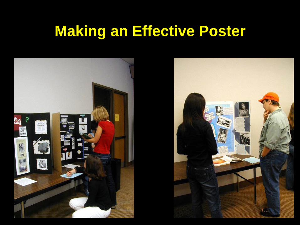
The Essentials• Figure out main points; make them easy to find
• Stay focused.
• Keep it simple! Edit out extra unnecessary details
• Use bold, large font, lots of graphics
• Plan on spending time on the graphics
• Get several people to edit for content AND style
• Make bold, simple statements
• Show us, don’t tell us!!!!!

The Components of a Poster• Title, Author Affiliation, No abstract• Introduction
– make it snappy, inviting, provide context– include an inviting photo– < 100 words
• Methods– Gen. keep to min; ~ 100 words– Figures, photos
• Results – Text: strong statement about how great your results are
& why. Refer to figures– Figures with titles and explanatory captions– Few words (~200), lots of figures
• Conclusion– Bullet if possible; set in larger context
• Acknowledgments? Lit Cited? Further info?
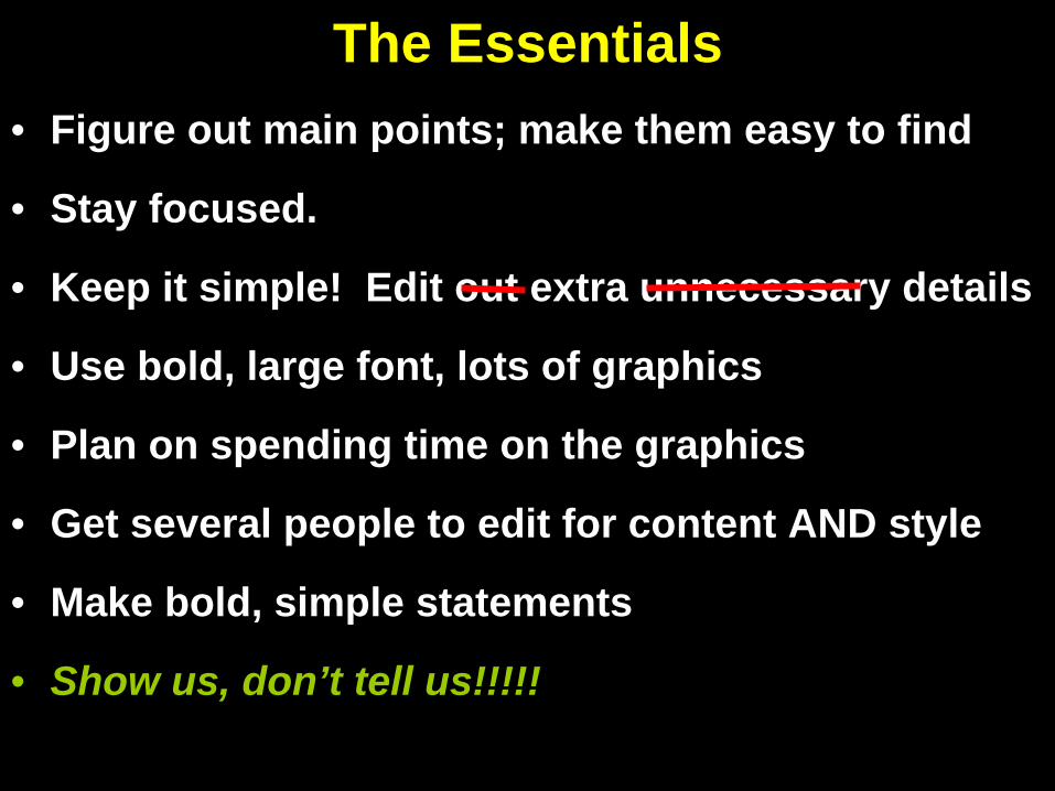
Title, Author Affiliation, No Abstract
• Title = informative• At least 36 font• Bold• No colons• One line• Centered• Font style: you choose

Choosing Title Font & Capitalization Styles
Choosing title font & capitalization styles
Choosing Title Font & Capitalization Styles

The Components of a Poster• Title, Author Affiliation, No abstract• Introduction
– make it snappy, inviting, provide context– include an inviting photo if possible– < 100 words
• Methods– Gen. keep to min; ~ 100 words– Figures, photos
• Results – Text: strong statement about how great your results are
& why. Refer to figures– Figures with titles and explanatory captions– Few words (~200), lots of figures
• Conclusion– Bullet if possible; set in larger context
• Acknowledgments? Lit Cited? Further info?

Introduction, Methods

The Components of a Poster• Title, Author Affiliation, No abstract• Introduction
– make it snappy, inviting, provide context– include an inviting photo if possible– < 100 words
• Methods– Gen. keep to min; ~ 100 words– Figures, photos
• Results – Text: strong statement about how great your results are
& why. Refer to figures– Figures with titles and explanatory captions– Few words (~200), lots of figures
• Conclusion– Bullet if possible; set in larger context
• Acknowledgments? Lit Cited? Further info?

Results: Bold, Simple Statements

The Components of a Poster• Title, Author Affiliation, No abstract• Introduction
– make it snappy, inviting, provide context– include an inviting photo if possible– ~ 100 words
• Methods– Gen. keep to min; ~ 100 words– Figures, photos
• Results – Text: strong statement about how great your results are
& why. Refer to figures– Figures with titles and explanatory captions– Few words (~200), lots of figures
• Conclusion– Bullet if possible; set in larger context
• Acknowledgments? Lit Cited? Further info?

Conclusions: Make it Snappy
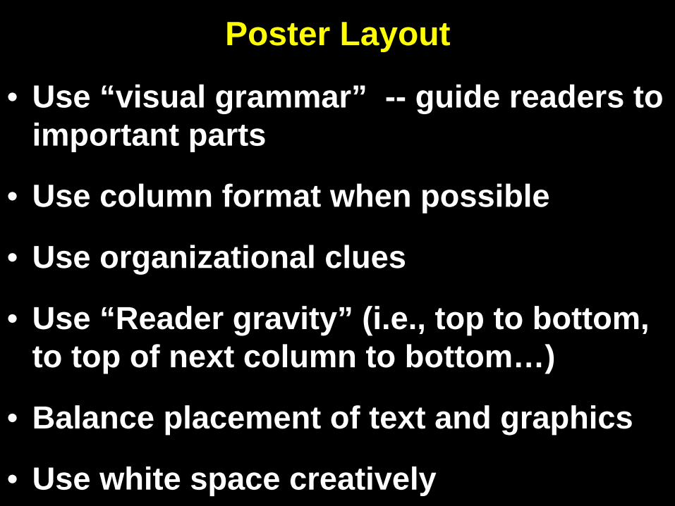
Poster Layout
• Use “visual grammar” -- guide readers to important parts
• Use column format when possible
• Use organizational clues
• Use “Reader gravity” (i.e., top to bottom, to top of next column to bottom…)
• Balance placement of text and graphics
• Use white space creatively

Visual Grammar: Graphic Hierarchy

Columns, Organizational Clues, Reader Gravity

Balance & White Space
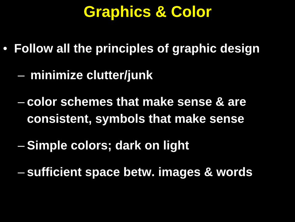
Graphics & Color
• Follow all the principles of graphic design
– minimize clutter/junk
– color schemes that make sense & are consistent, symbols that make sense
– Simple colors; dark on light
– sufficient space betw. images & words

Fonts/Text• Minimize text – let images, headings, &
captions speak for themselves
• Large font (>24 font)
• Watch text size in figures
• Simple language, bullets, etc.
• Print on 8.5 x 11 – can you read it?
• Serif or not serif, that is the question?
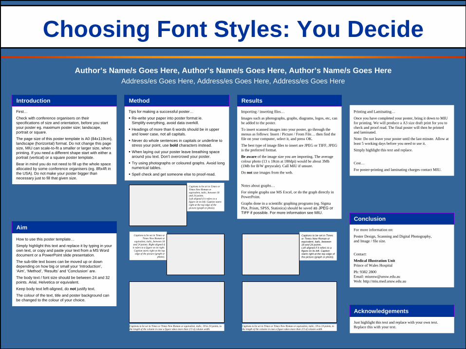
First…
Check with conference organisers on their specifications of size and orientation, before you start your poster eg. maximum poster size; landscape, portrait or square.
The page size of this poster template is A0 (84x119cm), landscape (horizontal) format. Do not change this page size, MIU can scale-to-fit a smaller or larger size, when printing. If you need a different shape start with either a portrait (vertical) or a square poster template.
Bear in mind you do not need to fill up the whole space allocated by some conference organisers (eg. 8ftx4ft in the USA). Do not make your poster bigger than necessary just to fill that given size.
Tips for making a successful poster…
Re-write your paper into poster format ie.Simplify everything, avoid data overkill.
Headings of more than 6 words should be in upper and lower case, not all capitals.
Never do whole sentences in capitals or underline to stress your point, use bold characters instead.
When laying out your poster leave breathing space around you text. Don’t overcrowd your poster.
Try using photographs or coloured graphs. Avoid long numerical tables.
Spell check and get someone else to proof-read.
Importing / inserting files…
Images such as photographs, graphs, diagrams, logos, etc, can be added to the poster.
To insert scanned images into your poster, go through the menus as follows: Insert / Picture / From File… then find the file on your computer, select it, and press OK.
The best type of image files to insert are JPEG or TIFF, JPEG is the preferred format.
Be aware of the image size you are importing. The average colour photo (13 x 18cm at 180dpi) would be about 3Mb (1Mb for B/W greyscale). Call MIU if unsure.
Do not use images from the web.
Notes about graphs…
For simple graphs use MS Excel, or do the graph directly in PowerPoint.
Graphs done in a scientific graphing programs (eg. Sigma Plot, Prism, SPSS, Statistica) should be saved as JPEG or TIFF if possible. For more information see MIU.
Printing and Laminating…
Once you have completed your poster, bring it down to MIU for printing. We will produce a A3 size draft print for you to check and proof read. The final poster will then be printed and laminated.
Note: Do not leave your poster until the last minute. Allow at least 5 working days before you need to use it.
Simply highlight this text and replace.
Cost…
For poster-printing and laminating charges contact MIU.
Choosing Font Styles: You DecideAuthor’s Name/s Goes Here, Author’s Name/s Goes Here, Author’s Name/s Goes Here
Address/es Goes Here, Address/es Goes Here, Address/es Goes Here
How to use this poster template…
Simply highlight this text and replace it by typing in your own text, or copy and paste your text from a MS Word document or a PowerPoint slide presentation.
The sub-title text boxes can be moved up or down depending on how big or small your ‘Introduction’, ‘Aim’, ‘Method’, ‘Results’ and ‘Conclusion’ are.
The body text / font size should be between 24 and 32 points. Arial, Helvetica or equivalent.
Keep body text left-aligned, do not justify text.
The colour of the text, title and poster background can be changed to the colour of your choice.
For more information on:
Poster Design, Scanning and Digital Photography, and Image / file size.
Contact:
Medical Illustration Unit Prince of Wales Hospital
Ph: 9382 2800 Email: [email protected] Web: http://miu.med.unsw.edu.au
Just highlight this text and replace with your own text. Replace this with your text. Captions to be set in Times or Times New Roman or equivalent, italic, 18 to 24 points, to
the length of the column in case a figure takes more than 2/3 of column width.
Captions to be set in Times or Times New Roman or equivalent, italic, between 18 and 24 points. Left aligned if it refers to a figure on its left. Caption starts right at the top edge of the picture (graph or photo).
Captions to be set in Times or Times New Roman or
equivalent, italic, between 18 and 24 points. Right aligned if it refers to a figure on its right.
Caption starts right at the top edge of the picture (graph or
photo).
Captions to be set in Times or Times New Roman or equivalent, italic, 18 to 24 points, to the length of the column in case a figure takes more than 2/3 of column width.
Captions to be set in Times or Times New Roman or equivalent, italic, between 18 and 24 points. Left aligned if it refers to a figure on its left. Caption starts right at the top edge of the picture (graph or photo).
Introduction Method
Aim
Results
Conclusion
Acknowledgements