MAINTAINING BRAND STANDARDS - Kids Shouldn't · PDF fileMAINTAINING BRAND STANDARDS. ids...
29
MAINTAINING BRAND STANDARDS
Transcript of MAINTAINING BRAND STANDARDS - Kids Shouldn't · PDF fileMAINTAINING BRAND STANDARDS. ids...

Kids Shouldn’t Have Cancer Foundation Brand Standards
1
M A I N T A I N I N G B R A N D S T A N D A R D S

Kids Shouldn’t Have Cancer Foundation Brand Standards
2
1.01 Branding . . . . . . . . . . . . . . . . . . . . . . . . . . . . . . . . . . . . . . . . . . . . . . . . . . . . . . . . . . . . . . . . . . . . . . . . . . . . . . . . . . . . . . . . 3
1.02 Logo Usage . . . . . . . . . . . . . . . . . . . . . . . . . . . . . . . . . . . . . . . . . . . . . . . . . . . . . . . . . . . . . . . . . . . . . . . . . . . . . . . . . . 4
1.03 Logo . . . . . . . . . . . . . . . . . . . . . . . . . . . . . . . . . . . . . . . . . . . . . . . . . . . . . . . . . . . . . . . . . . . . . . . . . . . . . . . . . . . . . . . . . . . . . . . . . 6
1.04 Logo – No Qual i f ier . . . . . . . . . . . . . . . . . . . . . . . . . . . . . . . . . . . . . . . . . . . . . . . . . . . . . . . . . . . . . . . . . 7
1.05 Logo Mark . . . . . . . . . . . . . . . . . . . . . . . . . . . . . . . . . . . . . . . . . . . . . . . . . . . . . . . . . . . . . . . . . . . . . . . . . . . . . . . . . . . . . 8
1.06 Logo Qual i f ier . . . . . . . . . . . . . . . . . . . . . . . . . . . . . . . . . . . . . . . . . . . . . . . . . . . . . . . . . . . . . . . . . . . . . . . . . . . . . . 9
1.07 Logo Versions . . . . . . . . . . . . . . . . . . . . . . . . . . . . . . . . . . . . . . . . . . . . . . . . . . . . . . . . . . . . . . . . . . . . . . . . . . . . . 10
1.08 Screen-Print Logo . . . . . . . . . . . . . . . . . . . . . . . . . . . . . . . . . . . . . . . . . . . . . . . . . . . . . . . . . . . . . . . . . . . 12
1.09 Sc al ing . . . . . . . . . . . . . . . . . . . . . . . . . . . . . . . . . . . . . . . . . . . . . . . . . . . . . . . . . . . . . . . . . . . . . . . . . . . . . . . . . . . . . . . . . . . . 15
1.10 Logo Don’ts . . . . . . . . . . . . . . . . . . . . . . . . . . . . . . . . . . . . . . . . . . . . . . . . . . . . . . . . . . . . . . . . . . . . . . . . . . . . . . . . . . 16
2.01 Pr imar y Palette. . . . . . . . . . . . . . . . . . . . . . . . . . . . . . . . . . . . . . . . . . . . . . . . . . . . . . . . . . . . . . . . . . . . . . . . . . . . 17
2.02 Secondar y Palette . . . . . . . . . . . . . . . . . . . . . . . . . . . . . . . . . . . . . . . . . . . . . . . . . . . . . . . . . . . . . . . . . . . . 18
2.03 Pr imar y Tints . . . . . . . . . . . . . . . . . . . . . . . . . . . . . . . . . . . . . . . . . . . . . . . . . . . . . . . . . . . . . . . . . . . . . . . . . . . . . . . 19
2.04 Secondar y Tints . . . . . . . . . . . . . . . . . . . . . . . . . . . . . . . . . . . . . . . . . . . . . . . . . . . . . . . . . . . . . . . . . . . . . . . 20
3.01 Typeface Hierarchy . . . . . . . . . . . . . . . . . . . . . . . . . . . . . . . . . . . . . . . . . . . . . . . . . . . . . . . . . . . . . . . . 21
3.02 Pr imar y Typeface . . . . . . . . . . . . . . . . . . . . . . . . . . . . . . . . . . . . . . . . . . . . . . . . . . . . . . . . . . . . . . . . . . . . . 22
3.03 Secondar y Typeface . . . . . . . . . . . . . . . . . . . . . . . . . . . . . . . . . . . . . . . . . . . . . . . . . . . . . . . . . . . . . 23
3.04 Ter t iar y Typefaces . . . . . . . . . . . . . . . . . . . . . . . . . . . . . . . . . . . . . . . . . . . . . . . . . . . . . . . . . . . . . . . . . . 24
3.05 Type Structure . . . . . . . . . . . . . . . . . . . . . . . . . . . . . . . . . . . . . . . . . . . . . . . . . . . . . . . . . . . . . . . . . . . . . . . . . . . 25
4.01 Basel ine and Grid . . . . . . . . . . . . . . . . . . . . . . . . . . . . . . . . . . . . . . . . . . . . . . . . . . . . . . . . . . . . . . . . . . . . . 26
4.02 Appl ic at ion . . . . . . . . . . . . . . . . . . . . . . . . . . . . . . . . . . . . . . . . . . . . . . . . . . . . . . . . . . . . . . . . . . . . . . . . . . . . . . . . . . . . 27
5.01 Conclusion . . . . . . . . . . . . . . . . . . . . . . . . . . . . . . . . . . . . . . . . . . . . . . . . . . . . . . . . . . . . . . . . . . . . . . . . . . . . . . . . . . . . 2 9
TABLE OF CONTENTS

Kids Shouldn’t Have Cancer Foundation Brand Standards
3
B R A N D STAT E M E N T
The staff of the Kids Shouldn’t Have Cancer Foundation
in Memor y of Jonny Wade, along with our vendors and
par tners, are stewards of our brand. This guide clearly
and concisely detai ls brand standards in order to
reinforce consistency.
The resources found in this guide govern the usage of our
logo and other marks. Adhering to these standards ensures
that representat ions of the brand accurately communic ate
our ident ity. This guide is a power ful and eff ic ient tool for
anyone implementing a mark .
B R A N D U SAG E
Upon f irst reference, the organizat ion must always
be referred to as the Kids Shouldn’ t Have Cancer
Foundation in Memor y of Jonny Wade . In subsequent
references, the organizat ion may be referred to as the Kids
Shouldn’t Have Cancer Foundation or the foundation, as
deemed appropriate.
R E F E R E N C E
1.01BRANDING
M I S S I O N
To conquer pediatr ic c ancer through
research and pol i t ic al act ion, with an
emphasis on responsible spending.

Kids Shouldn’t Have Cancer Foundation Brand Standards
4
When sending this guide to a third par ty, the guide should be accompanied by
the logo in a range of formats, including EPS , JP G and PNG .
P R I N T LO G O FO R M ATS
EPS (preferred for large signs and banners)
EPS (Enc apsulated PostScript) is a vector format designed for pr int ing to
PostScript pr inters and image-setters. I t is considered the best choice for
pr int ing i l lustrat ions in high resolut ion. EPS f i les are created and edited in
i l lustrat ion programs, such as Adobe I l lustrator.
JP G (preferred for images)
JPG (Joint Photographic Exper ts Group, pronounced jay-peg) is a f i le format
best used for photo images that must have ver y smal l f i le s izes – for example,
those used in websites or emai l . However, i t a lso has appl ic at ions in pr int media .
W E B LO G O FO R M AT
PNG (preferred for images that require transparent backgrounds)
PNG (Por table Network Graphic s) is a f i le format created as a more power ful
a lternat ive to the GIF. PNGs are not restr icted to 256 colors, as GIF f i les are,
and have better compression. A PNG f i le c an be saved with a transparent
background, which al lows you to place your image atop another image without
an out l in ing white box.
R E F E R E N C E
1.02LOGO USAGE

Kids Shouldn’t Have Cancer Foundation Brand Standards
5
Logos c an be provided in the fol lowing color breakdowns
upon request for specif ic appl ic at ions.
Spot
For use in pr int appl ic at ions where special inks are used
(e.g. , logo pr int ing on specialty i tems).
CMYKFor use in most four-color pr int appl ic at ions
(e.g. , adver t isements in color pr int publ ic at ions) .
RGB
For use in digital appl ic at ions (e.g. , Word documents
or digital presentat ions) .
Black and White
For use when color c annot be appl ied (e.g. , newspaper
inside pages, fax documents) .
Hex For use on websites and in e-marketing.
R E F E R E N C E
1.02LOGO USAGE II

Kids Shouldn’t Have Cancer Foundation Brand Standards
6
R E F E R E N C E
1.03LOGO
The logo for the Kids Shouldn’t Have Cancer Foundation
is memorable, fun, relaxed and easi ly recognizable.
The safe space around the logo
should be at least the width of
the “k” in “k ids. ”

Kids Shouldn’t Have Cancer Foundation Brand Standards
7
R E F E R E N C E
For instances in which the logo wi l l be below the recommended size,
use this version without the qual i f ier.
1.04LOGO – NO QUALIFIER
The safe space around the logo
should be at least the width of
the “k” in “k ids. ”

Kids Shouldn’t Have Cancer Foundation Brand Standards
8
The safe space around the logo
mark should be equal to half the
height of the mark .
R E F E R E N C E
The logo mark is a unique identif ier for the Kids Shouldn’t Have Cancer
Foundation. The logo mark c an only be used as a design element, not
as a replacement for the ful l logo.
1.05LOGO MARK

Kids Shouldn’t Have Cancer Foundation Brand Standards
9
R E F E R E N C E
“ In Memor y of Jonny Wade” is not a tagl ine – i t should almost always
accompany the logo whenever pr inted. Should the qual i f ier become
too smal l to read, use the alternate logo shown on page 7.
1.06LOGO QUALIFIER

Kids Shouldn’t Have Cancer Foundation Brand Standards
10
R E F E R E N C E
F U L L - C O L O R
On a white background, use the ful l-color logo.
On a white background where only one-color pr int ing is avai lable, use the one-color logo.
On a black background, use the ful l-color logo with white text .
On a black background where only one-color pr int ing is avai lable, use the reversed one-color logo.
O N E - C O L O R , B L AC K
F U L L - C O L O R , W H I T E T E X T
O N E - C O L O R , R E V E R S E D
Bec ause logo usage may var y, mult iple logo formats are avai lable, including
ful l-color and one-color.
1.07LOGO VERSIONS

Kids Shouldn’t Have Cancer Foundation Brand Standards
11
R E F E R E N C E
T h i s i s a n exa m p l e of t h e l o g o i n ava i l a b l e o n e - c o l o r o pt i o n s . T h i s w i l l b e
u s e d a s a re fe re n c e fo r p r i n te r s to c re ate o n e - c o l o r ve r s i o n s u s i n g t h e
c o r re c t c o l o r p a l ette .
1.07LOGO VERSIONS II

Kids Shouldn’t Have Cancer Foundation Brand Standards
12
R E F E R E N C E
O N E - C O L O R S C R E E N - P R I N T I N G O N E - C O L O R S C R E E N - P R I N T I N G , W H I T E T E X T
For screen-print ing appl ic at ions, use the fol lowing one-color logo designs.
1.08SCREEN-PRINT LOGO
Kids Shouldn’t Have Cancer Foundation Brand Standards
13
R E F E R E N C E
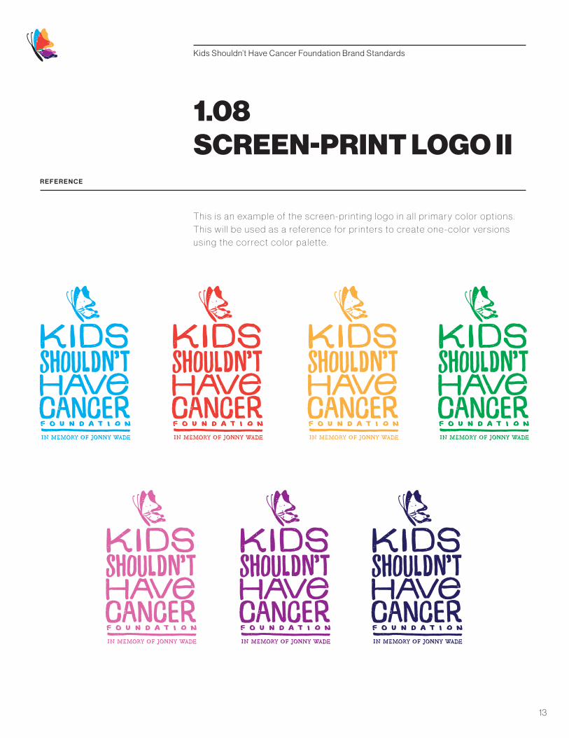
1.08SCREEN-PRINT LOGO II
T h i s i s a n exa m p l e of t h e s c re e n - p r i n t i n g l o g o i n a l l p r i m a r y c o l o r o pt i o n s .
T h i s w i l l b e u s e d a s a re fe re n c e fo r p r i n te r s to c re ate o n e - c o l o r ve r s i o n s
u s i n g t h e c o r re c t c o l o r p a l ette .

Kids Shouldn’t Have Cancer Foundation Brand Standards
14
R E F E R E N C E
T H R E E - C O L O R S C R E E N - P R I N T I N G
This three-color logo for screen-print ing is to be used only on
a red background. Versions for other background colors c an be
made avai lable upon request .
1.08SCREEN-PRINT LOGO III

Kids Shouldn’t Have Cancer Foundation Brand Standards
15
R E F E R E N C E
Appropriate sc al ing of the Kids Shouldn’t Have Cancer Foundation
logo is required to maintain both a consistent brand and an acceptable
contrast for readabi l i ty.
1.09SCALING
FULL LOGO, VERTICAL
Minimum Width: 1.25 inches
1 . 2 5 I N C H E S
LOGO WITHOUT QUALIFIER, VERTICAL
Minimum Width: 0.5 inches
0. 5 I N C H E S
2 I N C H E S
FULL LOGO, HORIZONTAL
Minimum Width: 2 inches
LOGO WITHOUT QUALIFIER, HORIZONTAL
Minimum Width: 1 inch
1 I N C H
LOGO MARK
Minimum Width: 0.25 inches
0. 2 5 I N C H E S

Kids Shouldn’t Have Cancer Foundation Brand Standards
16
in memory of jonny wade
R E F E R E N C E
1. Do not stack the qual i f ier on mult iple l ines.
2. Do not use the logo mark in addit ional places.
3. Do not alter the logo mark .
1.10LOGO DON’TS
4. Do not alter the typography.
5. Do not change the size of an element relat ive to the rest of the logo.
6. Never improperly sc ale the logo.
1
2
3
4
5
6

Kids Shouldn’t Have Cancer Foundation Brand Standards
17
R E F E R E N C E
Color and memorabi l i ty are impor tant to the Kids Shouldn’t Have Cancer
Foundation brand. The palette for the logo mark consists of several main
colors, l isted here in Pantone, CMYK , RGB and hex for use in a var iety
of formats.
2.01PRIMARY PALETTE
PA N TO N E 3 0 6 U
C M Y K 1 0 0 , 0 , 0 , 0
R G B 0 , 1 7 3 , 2 3 9
H E X # 0 0 A D E F
PA N TO N E 2 1 8 C
C M Y K 8 , 74 , 0 , 0
R G B 2 2 2 , 1 0 4 , 1 6 5
H E X # D E 6 7 A 7
PA N TO N E 1 7 9 C
C M Y K 0 , 9 0 , 8 5 , 0
R G B 2 3 8 , 6 4 , 5 5
H E X # E F 4 0 3 6
PA N TO N E 2 0 7 0 C
C M Y K 5 0 , 1 0 0 , 0 , 0
R G B 1 4 4 , 3 9 , 1 4 2
H E X # 9 2 2 7 8 F
PA N TO N E 1 2 9 U
C M Y K 0 , 3 5 , 8 5 , 0
R G B 2 5 1 , 1 7 5 , 6 5
H E X # F B B 0 4 0
PA N TO N E 2 1 1 2 C
C M Y K 1 0 0 , 1 0 0 , 2 5 , 2 5
R G B 3 8 , 3 3 , 9 7
H E X # 2 6 2 2 6 2
PA N TO N E 2 2 5 7 C
C M Y K 1 0 0 , 0 , 1 0 0 , 0
R G B 0 , 1 6 5 , 8 1
H E X # 0 0 A 6 5 1
PA N TO N E B L AC K 6 C
C M Y K 0 , 0 , 0 , 1 0 0
R G B 3 5 , 3 1 , 3 2
H E X # 2 3 1 F 2 0

Kids Shouldn’t Have Cancer Foundation Brand Standards
18
R E F E R E N C E
T h i s s e c o n d a r y p a l ette of fe r s c o l o r o pt i o n s t h at w i l l c o m p l e m e n t a n d
c o n t ra st t h e l o g o i n d e s i g n – t h e s e a re i d e a l fo r u s e b e h i n d t h e l o g o.
They are l isted here in Pantone, CMYK , RGB and hex for use in a var iety
of formats.
2.02SECONDARY PALETTE
PA N TO N E 1 3 0 C
C M Y K 0 , 4 5 , 1 0 0 , 0
R G B 2 4 9 , 1 5 7, 2 8
H E X # F 9 9 D 1 C
PA N TO N E 3 9 5 C
C M Y K 0 , 0 , 8 8 , 0
R G B 2 5 5 , 2 4 3 , 5 1
H E X # F F F 3 3 3
PA N TO N E 4 8 5 U
C M Y K 2 , 8 0 , 7 0 , 0
R G B 2 3 5 , 9 0 , 7 9
H E X # E B 5 A 4 F
PA N TO N E 2 2 7 U
C M Y K 3 5 , 1 0 0 , 3 5 , 1 0
R G B 1 5 8 , 3 1 , 9 9
H E X # 9 E 1 F 6 3
PA N TO N E 2 2 2 7 U
C M Y K 6 5 , 2 , 3 0 , 0
R G B 74 , 1 8 9 , 1 8 8
H E X # 4 A B D B C

Kids Shouldn’t Have Cancer Foundation Brand Standards
19
R E F E R E N C E
In color theor y, a t int is the mixture of a color with white, which increases
l ightness. Tints are useful in pr int ing – they reduce costs by negating the
need for addit ional color plates.
2.03PRIMARY TINTS
1 0 0 %
75 %
5 0 %
2 5 %

Kids Shouldn’t Have Cancer Foundation Brand Standards
20
R E F E R E N C E
In color theor y, a t int is the mixture of a color with white, which increases
l ightness. Tints are useful in pr int ing – they reduce costs by negating the
need for addit ional color plates.
2.04SECONDARY TINTS
1 0 0 %
75 %
5 0 %
2 5 %

Kids Shouldn’t Have Cancer Foundation Brand Standards
21
3.01TYPEFACE HIERARCHY
Subheader
Header
Pull Quote
Bold Copy
Body Copy
Ordered List
Caption
N E U E H A AS G R OT ES K 4 5 L I G H T, 1 8 PT
N E U E H A AS G R OT ES K 9 5 B L AC K , 24 PT
C R I M S O N T E X T I TA L I C, 1 6 PT
C R I M S O N T E X T B O L D, 1 2 PT
C R I M S O N T E X T R O M A N , 1 2 PT
C R I M S O N T E X T R O M A N , 11 PT
C R I M S O N T E X T I TA L I C, 1 0 PT
R E F E R E N C E
We have established a typographic hierarchy – an organizational system for content
that emphasizes some pieces of information and diminishes others. A hierarchy
helps readers scan text: it makes clear where to enter and exit, as well as how to pick
and choose sections. Each level of the hierarchy should be signaled by one or more
cues applied consistently across a body of text. These cues can be spatial (indents,
line spacing, placement on page) or graphic (size, style, typeface color).

Kids Shouldn’t Have Cancer Foundation Brand Standards
22
P R I M A R Y T Y P E FAC E
Neue Haas Groteska A b B c C d D e E f F g G h H i I j J k K l L m M n N o O p P q Q r R s S t Tu U v V w Wx Xy Yz Z1 2 3 4 5 6 7 8 9 0 ! @ # $ % ^ & * ( ) _
3.02PRIMARY TYPEFACE
4 5 L I G H T
9 5 B L AC K
45 Light
95 Black
Lorem ipsum dolor sit amet, massa vivaus vulputate quam sed at adipiscing, diam dolor, imperdiet massa sem egestas non vestibulum, risus erat.
Lorem ipsum dolor sit amet, massa vivaus vulputate quam sed at adipiscing, diam dolor, imperdiet massa sem egestas non vestibulum, risus erat.
R E F E R E N C E
Neue Haas Grotesk is the pr imar y typeface for the Kids Shouldn’t Have Cancer
Foundation. This typeface should be used for headers and subheaders .

Kids Shouldn’t Have Cancer Foundation Brand Standards
23
3.03SECONDARY TYPEFACE
S E C O N DA R Y T Y P E FAC E
Crimson Texta A b B c C d D e E f F g G h H i I j J k K l L m M n N o O p P q Q r R s S t T u U v V w W x X y Y z Z1 2 3 4 5 6 7 8 9 0 ! @ # $ % ^ & * ( ) _
R E G U L A R
I TA L I C
B O L D
Regular
Italic
Bold
Lorem ipsum dolor sit amet, massa vivaus vulputate quam sed at adipiscing, diam dolor, imperdiet massa sem egestas non vestibulum, risus erat.
Lorem ipsum dolor sit amet, massa vivaus vulputate quam sed
at adipiscing, diam dolor, imperdiet massa sem egestas non
vestibulum, risus erat.
Lorem ipsum dolor sit amet, massa vivaus vulputate
quam sed at adipiscing, diam dolor, imperdiet massa
sem egestas non vestibulum, risus erat.
R E F E R E N C E
Crimson Text is the secondar y typeface for the Kids Shouldn’t Have Cancer
Foundation. This typeface should be used for body copy, ordered list s , pull quotes and c aptions .

Kids Shouldn’t Have Cancer Foundation Brand Standards
24
3.04TERTIARY TYPEFACES
G E O R G I A R E G U L A R ( A LT E R N AT E F O R C R I M S O N T E X T ) AV E N I R R O M A N ( A LT E R N AT E F O R N E U E H A A S G R OT E S K )
G E O R G I A I TA L I C AV E N I R O B L I Q U E
G E O R G I A B O L D AV E N I R H E AV Y
Regular Regular
Italic Italic
Bold Bold
Lorem ipsum dolor sit amet, massa vivaus vulputate quam sed at adipiscing, diam dolor, imperdiet vestibulum.
Lorem ipsum dolor sit amet, massa vivaus vulputate quam sed at adipiscing, diam dolor, imperdiet vestibulum.
Lorem ipsum dolor sit amet, massa vivaus vulputate quam sed at adipiscing, diam dolor, imperdiet vestibulum.
Lorem ipsum dolor sit amet, massa vivaus vulputate quam sed at adipiscing, diam dolor, imperdiet vestibulum.
Lorem ipsum dolor sit amet, massa vivaus vulputate quam sed at adipiscing, diam dolor, imperdiet vestibulum.
Lorem ipsum dolor sit amet, massa vivaus vulputate quam sed at adipiscing, diam dolor, imperdiet vestibulum.
R E F E R E N C E
Depending on the computer being used, the preferred t ypefaces may not be available . In these c ases, use the typefaces l isted below.

Kids Shouldn’t Have Cancer Foundation Brand Standards
25
E X A M P L E
Use the example below to maintain the hierarchy of type and structure
throughout brand materials .
3.05TYPE STRUCTURE
Header : Neue Haas Grotesk 95 Black , 24 PT
L ine Spacing: 26 PT
B ody C opy : Cr imson Text Roman, 12 PTL ine Spacing: 16 PT
B ody C opy : Cr imson Text Roman, 12 PTL ine Spacing: 16 PT
Ordered L ist : Cr imson Text Roman, 11 PTL ine Spacing: 20 PT
Pull Quote: Cr imson Text I tal ic , 16 PTL ine Spacing: 16 PT
Header L ine Break: 16 PT
Paragraph Break: 23 PT
Subheader : Neue Haas Grotesk 45 Light , 18 PT
Subheader : Neue Haas Grotesk 45 Light , 18 PT
Subheader L ine Break: 16 PT
Subheader L ine Break: 16 PT
Kids Shouldn’t Have Cancer FoundationThe Kids Shouldn’t Have Cancer Foundation in Memory of Jonny Wade was founded shortly after Jonny’s death. Despite the circumstances, Jonny believed he could – and should – make a difference. With our mission, we honor his selfless wish that no other kid should have cancer.
Our Mission
To conquer pediatric cancer through research and political action, with an emphasis on responsible spending.
“I don’t want any other kid to have cancer.”
– Jonny Wade, 2007-2015
Our Initiatives
· Funding pediatric cancer research for treatments and cures.
· Improving access to and awareness of clinical trials for families facing pediatric cancer.
· Raising public awareness of the issues surrounding pediatric cancer funding.
· Influencing the organizations that allocate federal cancer research funding.

Kids Shouldn’t Have Cancer Foundation Brand Standards
26
R E F E R E N C E
“A gr id c an be simple or complex, specif ic or generic , t ight ly def ined or loosely
interpreted. Typographic gr ids are al l about control . They establ ish a system
for arranging content with the space of page, screen or bui l t environment. ”
– El len Lupton, “ Thinking With Type”
4.01BASELINE AND GRID
“I don’t want any other
kid to have cancer.”
– Jonny Wade,
2007-2015
The Kids Shouldn’t Have Cancer Foundation in Memory of
Jonny Wade was founded shortly after Jonny’s death. Despite the
circumstances, Jonny believed he could – and should – make a
difference. With our mission, we honor his selfless wish that
no other kid should have cancer.
You Can Make a Difference
E X A M P L E

Kids Shouldn’t Have Cancer Foundation Brand Standards
27
R E F E R E N C E
Maintaining an appropriate amount of empty space around the logo, as
wel l as maintaining the type hierarchy, ensures legibi l i ty and contrast .
4.02APPLICATION
E X A M P L E

Kids Shouldn’t Have Cancer Foundation Brand Standards
28
R E F E R E N C E
4.02APPLICATION II
A properly sc aled logo, used in the
appropriate context , looks per fect
wherever i t ’s appl ied. Col lateral
should v isual ly and verbal ly create
brand awareness by strategic al ly
repl ic at ing the brand’s personal i ty.

Kids Shouldn’t Have Cancer Foundation Brand Standards
29
5.01CONCLUSION
We expect al l of our vendors and par tners to treat our brand
with respect by adhering to the rules provided in this guide.
Thank you for your di l igent cooperat ion.
Kimberly WadeFounder
Kids Shouldn’t Have Cancer Foundation
P.O. Box 225
Jersey vi l le, IL 62052
C: 417-230-9951
Questions about usage?
204 N. Robinson Ave. , Suite 2000
Oklahoma City, OK 73102
P: 405-601-9430
staplegun.us