Magazines 1
14
These magazines are all on sale in the UK and they are all aimed at pre- school children. You can clearly tell who they are aimed at because of the topics they are featuring in the magazine. All the topics interest pre- school children such as Disney and Thomas The Tank Engine. The magazine appeals to the target market because of the use of bright colours and clear writing so it easy for them to understand. They feature a lot of images to interest the children and to show that they won’t just get bored of one topic. The layout may look a bit chaotic to someone older but to the children it makes sense because they will instantly recognise the images, the font is very clear and bold. The craft ideas appeal to children as it something fun for them to do and the different characters appeals as it shows there will be a lot to look at/read. This a general magazine as it covers craft to stories to puzzles and facts. Pre-School Magazines
Transcript of Magazines 1

These magazines are all on sale in the UK and they are all aimed at pre-school children. You can clearly tell who they are aimed at because of the topics they are featuring in the magazine. All the topics interest pre-school children such as Disney and Thomas The Tank Engine. The magazine appeals to the target market because of the use of bright colours and clear writing so it easy for them to understand. They feature a lot of images to interest the children and to show that they won’t just get bored of one topic. The layout may look a bit chaotic to someone older but to the children it makes sense because they will instantly recognise the images, the font is very clear and bold. The craft ideas appeal to children as it something fun for them to do and the different characters appeals as it shows there will be a lot to look at/read. This a general magazine as it covers craft to stories to puzzles and facts.
Pre-School Magazines
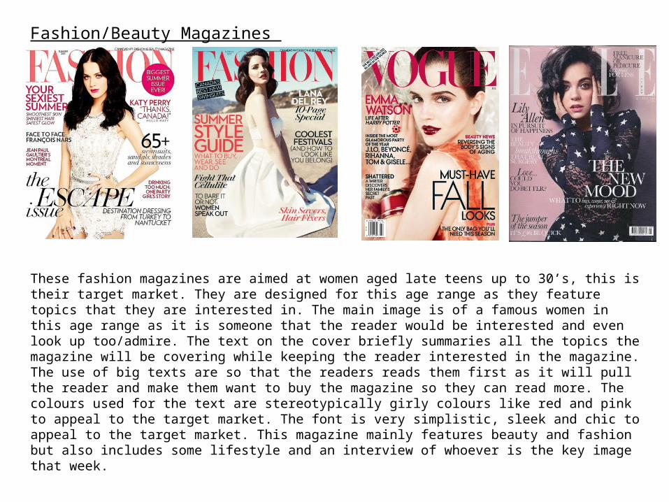
Fashion/Beauty Magazines
These fashion magazines are aimed at women aged late teens up to 30’s, this is their target market. They are designed for this age range as they feature topics that they are interested in. The main image is of a famous women in this age range as it is someone that the reader would be interested and even look up too/admire. The text on the cover briefly summaries all the topics the magazine will be covering while keeping the reader interested in the magazine. The use of big texts are so that the readers reads them first as it will pull the reader and make them want to buy the magazine so they can read more. The colours used for the text are stereotypically girly colours like red and pink to appeal to the target market. The font is very simplistic, sleek and chic to appeal to the target market. This magazine mainly features beauty and fashion but also includes some lifestyle and an interview of whoever is the key image that week.
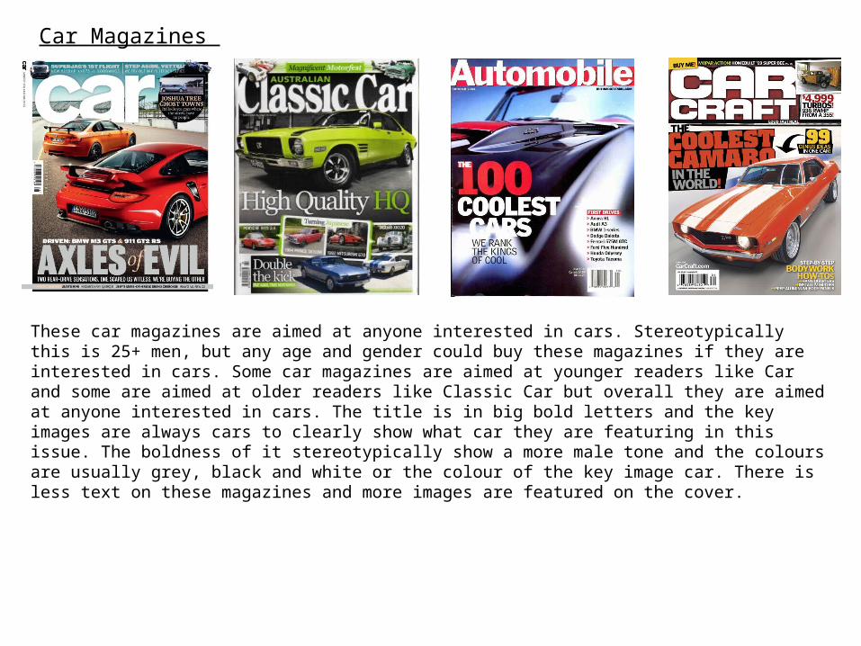
Car Magazines
These car magazines are aimed at anyone interested in cars. Stereotypically this is 25+ men, but any age and gender could buy these magazines if they are interested in cars. Some car magazines are aimed at younger readers like Car and some are aimed at older readers like Classic Car but overall they are aimed at anyone interested in cars. The title is in big bold letters and the key images are always cars to clearly show what car they are featuring in this issue. The boldness of it stereotypically show a more male tone and the colours are usually grey, black and white or the colour of the key image car. There is less text on these magazines and more images are featured on the cover.

The key image is a celebrity, Lana Del Rey. She is using direct mode of address to make it more personal. Lana Del Rey is the aspiration for this magazine, she is what the readers aspire to be like.
The image is in the centre of the page so it catches the readers attention. Lana is wearing clothes that are fashionable but also unique to her, she has her own style.
This anchorage text links the key image to the magazine.
Offers advice to the reader about hair and skin. This will make the reader want to buy the magazines. It engages the audience.
The text is all in black, red and white. The red is used to tie in with her red lipstick so it all works well together.
The text is only in two different fonts. This is so it is easy for the reader to understand and so that it all links together. The different fonts makes the reader look all over the page.
Buzz sentence for the most emphasises.
Conventions Of Film Magazines
All film magazines follow the same conventions just with their own house style. On the cover of the magazine the key image will normally be an actor or actors from a very recent film. They can be from any genre of film as unless you are reading a specialist film magazine, most cover all genres of film. They will have anchorage text not just talking about the film relating to key image but also new or soon to be released films. The name of the magazine will be on the top of the cover in big bold writing so everyone can see what the title of the magazine is.

The colour of the text is mainly black and red including the anchorage text. This is to tie in with Ant-Mans suit as he is the key image. Some of the text are banners with red and yellow backgrounds. The masthead is also in black to link with the key image. The font used is sans serif.
The colour theme of this cover is white, red, black and yellow. The colour theme is used to relate to the key image, however there are pops of yellow to catch the readers attention. There are only little bits of yellow to make sure that the yellow doesn't overpower the page and put the reader off. The black is used to be bold and make text like the masthead stand out. Black is used to make the text look important. Most of the text alternates between red and black to link with the key image also to interest the reader as the text is not just in one colour.
The buzz sentence is in yellow to make it stand from all the other text. This creates emphasis for the sentence.
The text all uses the same font. This is the house style of the magazine. This font will unique to this magazine hence why they use it on the front cover. This helps the reader understand the text and helps them link information together.
The key image is Paul Rudd as Ant-Man the lasted movies in the MCU. He looking directly at the audience which direct mode of address. It grabs the readers attention and makes it more personal.
The word essential is used to make the reader feel like they need to buy the magazine.
There is white space on the magazine because they don’t want it to look crowded, as this will put the reader off.
The sell lines also follows the colour scheme, so it works well with the rest of the magazine. The strap line is particularly in yellow to grab the readers eye.
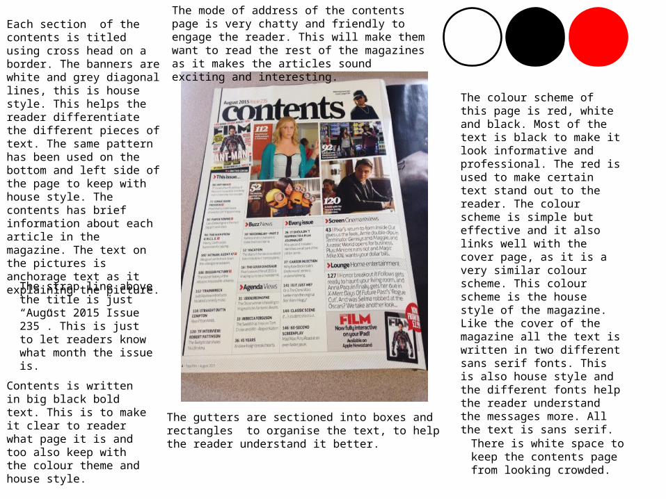
The colour scheme of this page is red, white and black. Most of the text is black to make it look informative and professional. The red is used to make certain text stand out to the reader. The colour scheme is simple but effective and it also links well with the cover page, as it is a very similar colour scheme. This colour scheme is the house style of the magazine. Like the cover of the magazine all the text is written in two different sans serif fonts. This is also house style and the different fonts help the reader understand the messages more. All the text is sans serif.
Each section of the contents is titled using cross head on a border. The banners are white and grey diagonal lines, this is house style. This helps the reader differentiate the different pieces of text. The same pattern has been used on the bottom and left side of the page to keep with house style. The contents has brief information about each article in the magazine. The text on the pictures is anchorage text as it explaining the picture.
The strap line above the title is just “August 2015 Issue 235”. This is just to let readers know what month the issue is.
Contents is written in big black bold text. This is to make it clear to reader what page it is and too also keep with the colour theme and house style. There is white space to
keep the contents page from looking crowded.
The mode of address of the contents page is very chatty and friendly to engage the reader. This will make them want to read the rest of the magazines as it makes the articles sound exciting and interesting.
The gutters are sectioned into boxes and rectangles to organise the text, to help the reader understand it better.
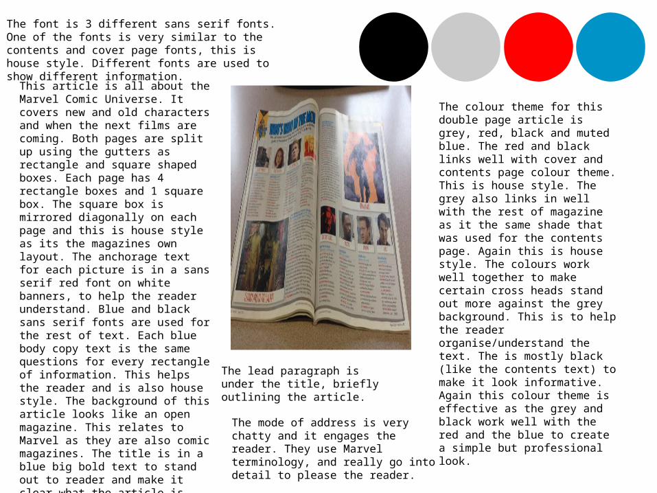
The colour theme for this double page article is grey, red, black and muted blue. The red and black links well with cover and contents page colour theme. This is house style. The grey also links in well with the rest of magazine as it the same shade that was used for the contents page. Again this is house style. The colours work well together to make certain cross heads stand out more against the grey background. This is to help the reader organise/understand the text. The is mostly black (like the contents text) to make it look informative. Again this colour theme is effective as the grey and black work well with the red and the blue to create a simple but professional look.
The font is 3 different sans serif fonts. One of the fonts is very similar to the contents and cover page fonts, this is house style. Different fonts are used to show different information.
This article is all about the Marvel Comic Universe. It covers new and old characters and when the next films are coming. Both pages are split up using the gutters as rectangle and square shaped boxes. Each page has 4 rectangle boxes and 1 square box. The square box is mirrored diagonally on each page and this is house style as its the magazines own layout. The anchorage text for each picture is in a sans serif red font on white banners, to help the reader understand. Blue and black sans serif fonts are used for the rest of text. Each blue body copy text is the same questions for every rectangle of information. This helps the reader and is also house style. The background of this article looks like an open magazine. This relates to Marvel as they are also comic magazines. The title is in a blue big bold text to stand out to reader and make it clear what the article is about.
The lead paragraph is under the title, briefly outlining the article.
The mode of address is very chatty and it engages the reader. They use Marvel terminology, and really go into detail to please the reader.

Aspirant • Aspirants are people who like to keep
bang up to date with new trends, but don’t create it themselves. They follow trends created by Leading Edge. Aspirants are very social, they will mix in with everyone. They will go along to anything from music festivals to art exhibitions, and like to see the trends first so they can be the first to post about it on social media. Aspirants are up for anything, to get it on their media platforms.
• Aspirants are: Trendies, Vloggers, New Casuals, Hype Beasts and Hipsters.
Questionnaire
• https://www.surveymonkey.com/create/?sm=V6HvsdQXEdqTFsmNAdSOXbMbYF7ps_2B50jnmRqVt5Gdg_3D

Questionnaire Results The majority of the people who answered my questionnaire were female. This was only just though, by 55%. I find this helpful as my magazine targets both genders but mainly females, so I have a range of results to use.
The majority of the people who answered my magazine were 0-18. This is great, as my target audience is 14-18’s. I also know (because of who I sent it too) that the exact ages were mainly 14 and 15 which is my target audience.
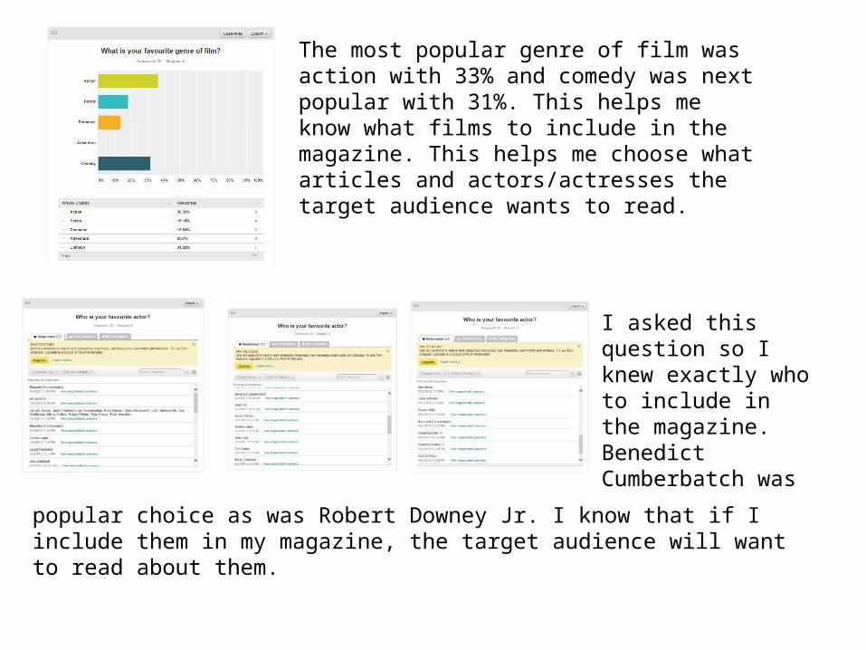
The most popular genre of film was action with 33% and comedy was next popular with 31%. This helps me know what films to include in the magazine. This helps me choose what articles and actors/actresses the target audience wants to read.
I asked this question so I knew exactly who to include in the magazine. Benedict Cumberbatch was
popular choice as was Robert Downey Jr. I know that if I include them in my magazine, the target audience will want to read about them.
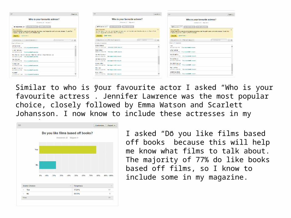
Similar to who is your favourite actor I asked “Who is your favourite actress”. Jennifer Lawrence was the most popular choice, closely followed by Emma Watson and Scarlett Johansson. I now know to include these actresses in my magazine.
I asked “Do you like films based off books” because this will help me know what films to talk about. The majority of 77% do like books based off films, so I know to include some in my magazine.
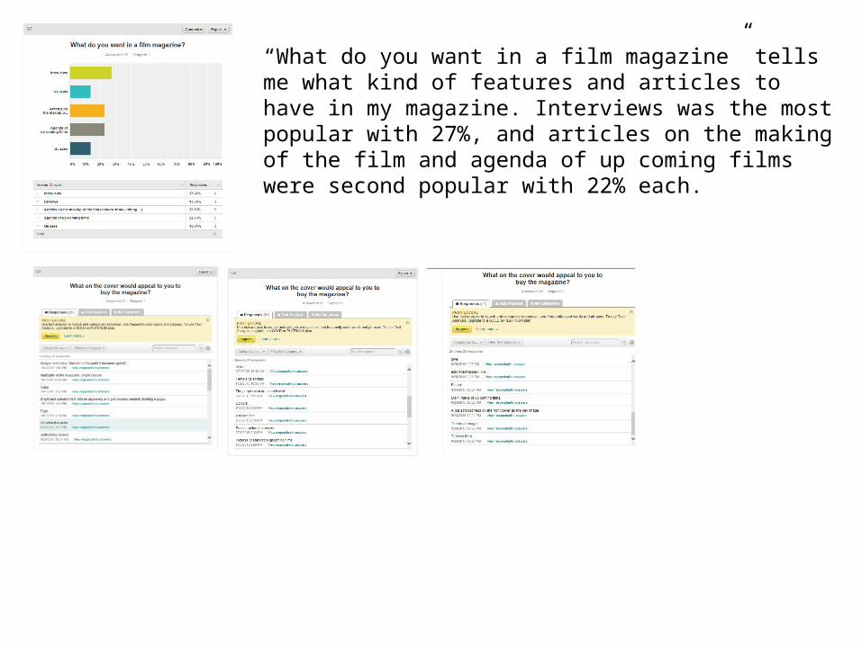
“What do you want in a film magazine” tells me what kind of features and articles to have in my magazine. Interviews was the most popular with 27%, and articles on the making of the film and agenda of up coming films were second popular with 22% each.