
Magazine research
15
Magazine research
Transcript of Magazine research

Magazine research
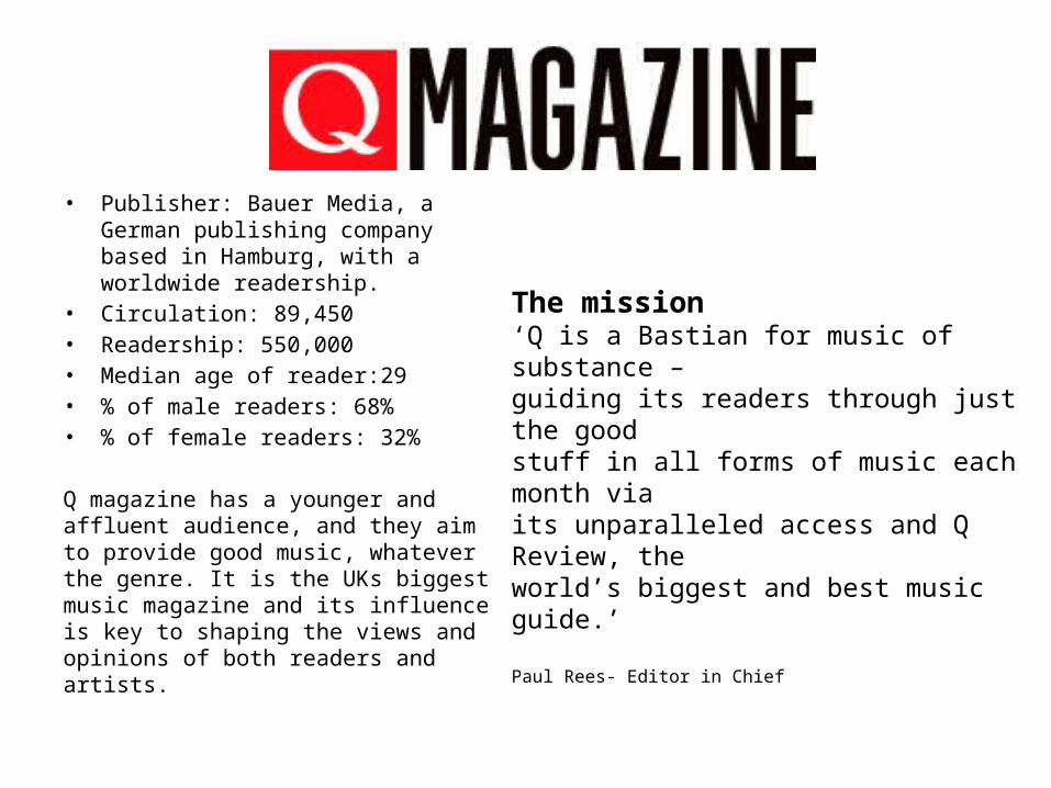
• Publisher: Bauer Media, a German publishing company based in Hamburg, with a worldwide readership.
• Circulation: 89,450• Readership: 550,000• Median age of reader:29• % of male readers: 68%• % of female readers: 32%
Q magazine has a younger and affluent audience, and they aim to provide good music, whatever the genre. It is the UKs biggest music magazine and its influence is key to shaping the views and opinions of both readers and artists.
The mission‘Q is a Bastian for music of substance – guiding its readers through just the good stuff in all forms of music each month via its unparalleled access and Q Review, the world’s biggest and best music guide.’
Paul Rees- Editor in Chief
Masthead
Selling line
Secondary lead/ sub image
Feature article photo
Kicker
Cover line
Headline
Anchorage
Barcode
Date line
banner
Menu strip
Kicker
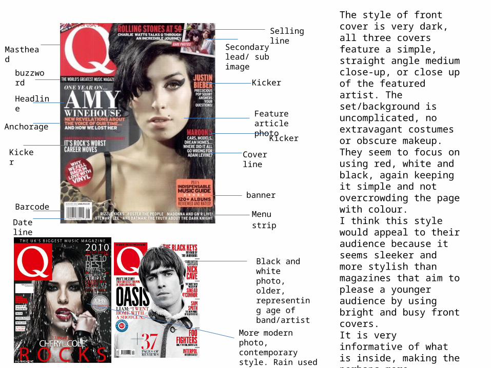
The style of front cover is very dark, all three covers feature a simple, straight angle medium close-up, or close up of the featured artist. The set/background is uncomplicated, no extravagant costumes or obscure makeup. They seem to focus on using red, white and black, again keeping it simple and not overcrowding the page with colour. I think this style would appeal to their audience because it seems sleeker and more stylish than magazines that aim to please a younger audience by using bright and busy front covers.It is very informative of what is inside, making the perhaps more important stories stand out more by making them larger.
Black and white photo, older, representing age of band/artist.
More modern photo, contemporary style. Rain used and more dramatic lighting
buzzwordKicker

Masthead
Selling line
Feature article photo
Headline
Anchorage Kicker
Barcode
Dateline
This special edition front cover differs from their regular edition front covers. They break their pattern of featuring only one artist in the photo, and instead have a collection of artists. They stick to their usual colour scheme, red and black, they also use grey, and they have coordinated the artists outfits to centre around dark colours, but different styles and patters are used to suit the artists individuality. Hints of pink are thrown in through the women’s dress and lipstick.
The pink of the woman's dress and the woman’s lipstick highlights the fact that they are women among men. Emphasises the importance of recognition of women in music.
The selling line is very bold in itself, “The UK's Biggest Music Magazine is a very bold statement and one the feel worthy to make.
Nothing much else on the cover, all the main focus is on the headline, and the photograph. Nothing else to distract the readers eye from them.
Masthead, black, white and red. In keeping with the colours of the front cover. Keeps it looking professional and stylish.
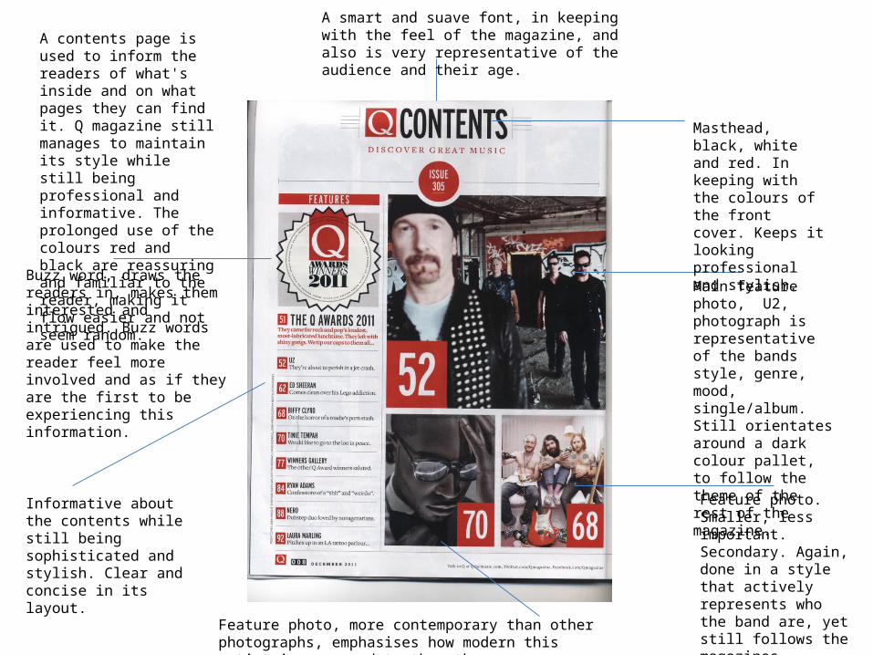
A smart and suave font, in keeping with the feel of the magazine, and also is very representative of the audience and their age.
Main feature photo, U2, photograph is representative of the bands style, genre, mood, single/album. Still orientates around a dark colour pallet, to follow the theme of the rest of the magazine.
Feature photo. Smaller, less important. Secondary. Again, done in a style that actively represents who the band are, yet still follows the magazines original themes.Feature photo, more contemporary than other photographs,
emphasises how modern this artist is compared to the others.
Buzz word, draws the readers in, makes them interested and intrigued. Buzz words are used to make the reader feel more involved and as if they are the first to be experiencing this information.
Informative about the contents while still being sophisticated and stylish. Clear and concise in its layout.
A contents page is used to inform the readers of what's inside and on what pages they can find it. Q magazine still manages to maintain its style while still being professional and informative. The prolonged use of the colours red and black are reassuring and familiar to the reader, making it flow easier and not seem random.
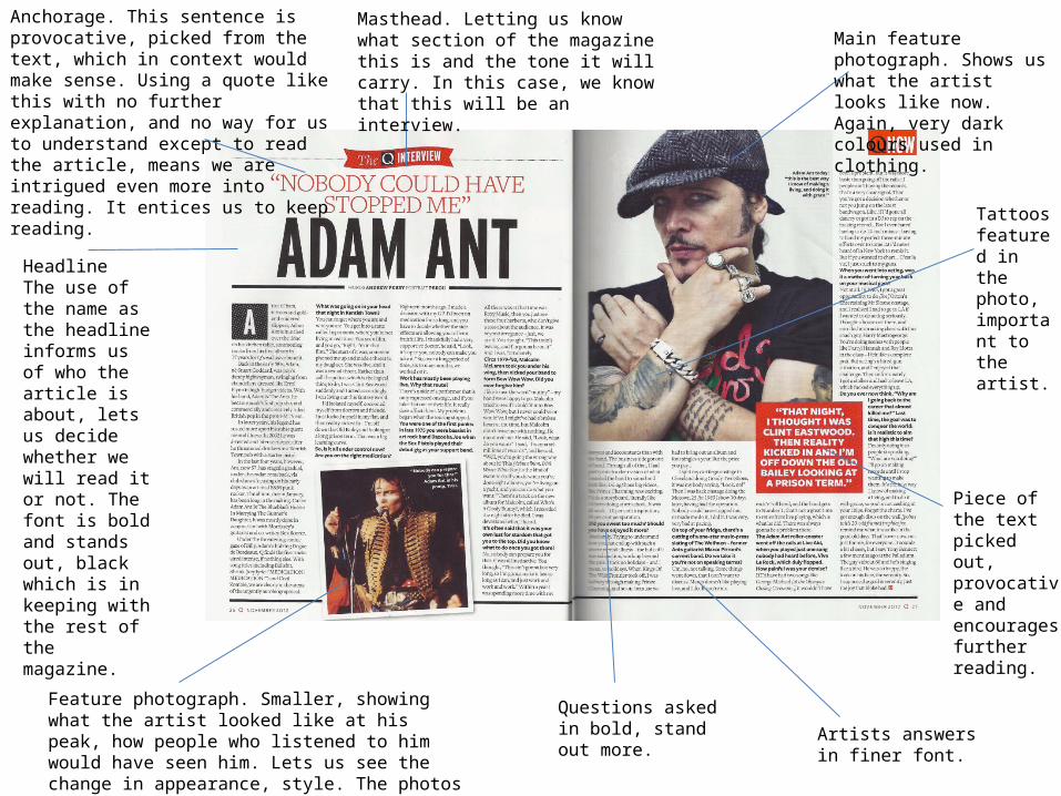
HeadlineThe use of the name as the headline informs us of who the article is about, lets us decide whether we will read it or not. The font is bold and stands out, black which is in keeping with the rest of the magazine.
Anchorage. This sentence is provocative, picked from the text, which in context would make sense. Using a quote like this with no further explanation, and no way for us to understand except to read the article, means we are intrigued even more into reading. It entices us to keep reading.
Masthead. Letting us know what section of the magazine this is and the tone it will carry. In this case, we know that this will be an interview.
Main feature photograph. Shows us what the artist looks like now. Again, very dark colours used in clothing.
Tattoos featured in the photo, important to the artist.
Piece of the text picked out, provocative and encourages further reading.
Feature photograph. Smaller, showing what the artist looked like at his peak, how people who listened to him would have seen him. Lets us see the change in appearance, style. The photos are however similar, with the same lighting and similar pose used.
Questions asked in bold, stand out more. Artists answers in finer
font.
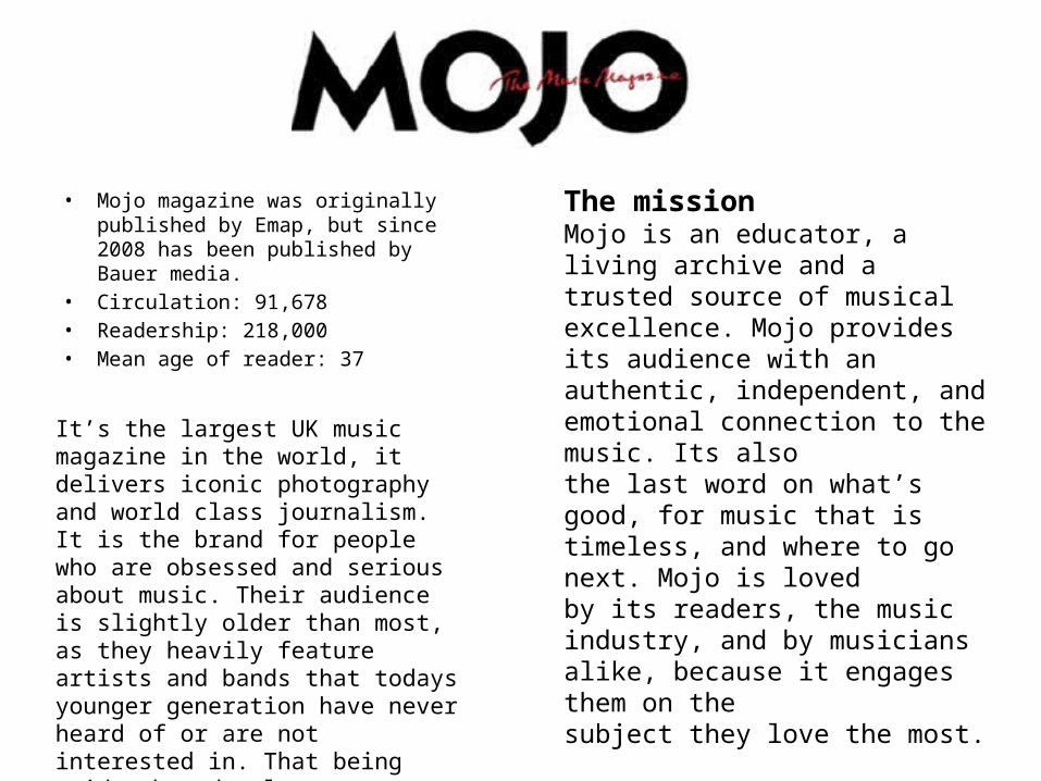
• Mojo magazine was originally published by Emap, but since 2008 has been published by Bauer media.
• Circulation: 91,678• Readership: 218,000• Mean age of reader: 37
It’s the largest UK music magazine in the world, it delivers iconic photography and world class journalism. It is the brand for people who are obsessed and serious about music. Their audience is slightly older than most, as they heavily feature artists and bands that todays younger generation have never heard of or are not interested in. That being said, they do also cover contemporary and modern artists as well. They feature both mainstream and alternative music, covering all bases to please a wider audience.
The missionMojo is an educator, a living archive and a trusted source of musical excellence. Mojo providesits audience with an authentic, independent, and emotional connection to the music. Its alsothe last word on what’s good, for music that is timeless, and where to go next. Mojo is lovedby its readers, the music industry, and by musicians alike, because it engages them on thesubject they love the most.
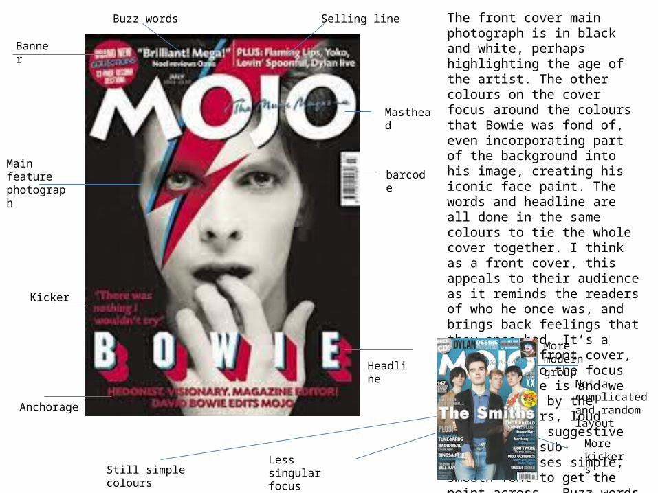
Masthead
Selling lineBuzz words
barcodeMain feature photograph
Banner
Headline
Anchorage
Kicker
The front cover main photograph is in black and white, perhaps highlighting the age of the artist. The other colours on the cover focus around the colours that Bowie was fond of, even incorporating part of the background into his image, creating his iconic face paint. The words and headline are all done in the same colours to tie the whole cover together. I think as a front cover, this appeals to their audience as it reminds the readers of who he once was, and brings back feelings that they once had. It’s a very simple front cover, its clear who the focus of this issue is and we are drawn in by the bright colours, loud headline and suggestive kickers and sub-headlines. Uses simple, smooth font to get the point across. Buzz words are used to draw the reader in.
More modern group
More kickersLess singular focus
Still simple colours
Not a complicated and random layout
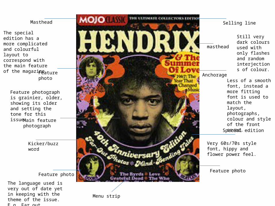
Special edition
Selling lineMasthead
masthead
Anchorage
Main feature photograph
Kicker/buzz word
Menu strip
Feature photo
Feature photo
Feature photo
The special edition has a more complicated and colourful layout to correspond with the main feature of the magazine.
Less of a smooth font, instead a more fitting font is used to match the layout, photographs, colour and style of the front cover.
Feature photograph is grainier, older, showing its older and setting the tone for this issue.
Very 60s/70s style font, hippy and flower power feel.
The language used is very out of date yet in keeping with the theme of the issue. E.g. Far out.
Still very dark colours used with only flashes and random interjections of colour.
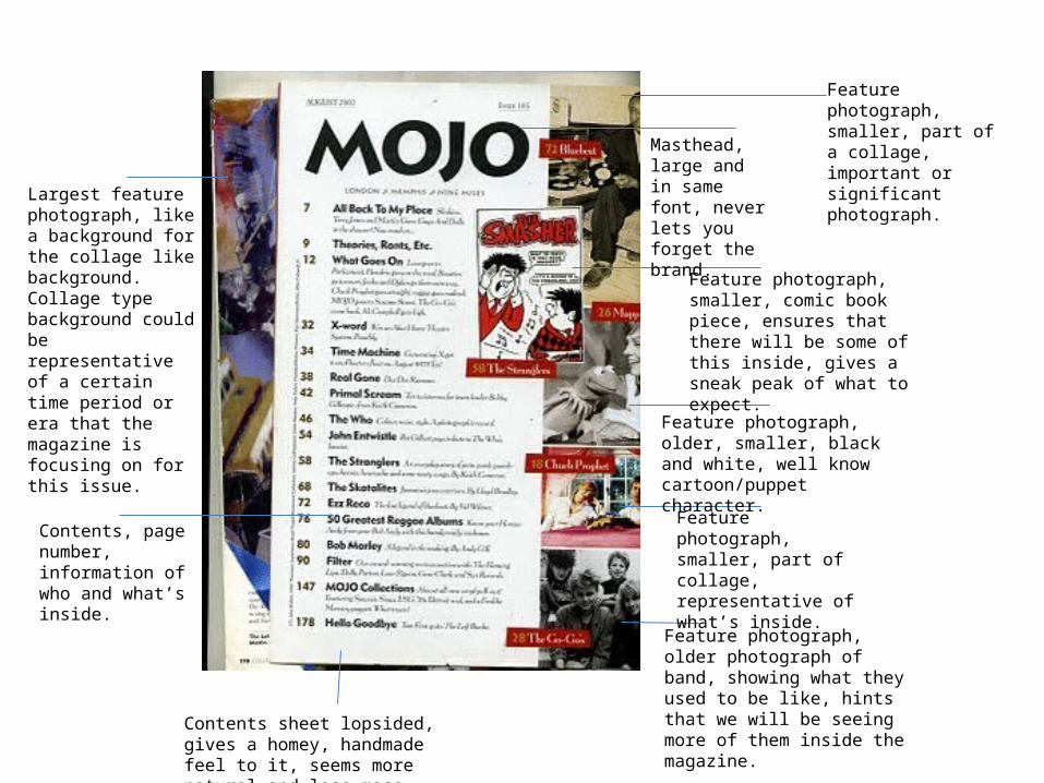
Feature photograph, smaller, part of a collage, important or significant photograph.Masthead, large
and in same font, never lets you forget the brand.
Feature photograph, smaller, comic book piece, ensures that there will be some of this inside, gives a sneak peak of what to expect.
Feature photograph, older, smaller, black and white, well know cartoon/puppet character.
Feature photograph, smaller, part of collage, representative of what’s inside.
Feature photograph, older photograph of band, showing what they used to be like, hints that we will be seeing more of them inside the magazine.
Largest feature photograph, like a background for the collage like background. Collage type background could be representative of a certain time period or era that the magazine is focusing on for this issue.
Contents, page number, information of who and what’s inside.
Contents sheet lopsided, gives a homey, handmade feel to it, seems more natural and less mass produced
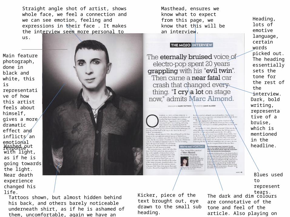
Main feature photograph, done in black and white, this is representative of how this artist feels about himself, gives a more dramatic effect and inflicts an emotional response.
Straight angle shot of artist, shows whole face, we feel a connection and we can see emotion, feeling and expressions in their face . It makes the interview seem more personal to us.
Masthead, ensures we know what to expect from this page, we know that this will be an interview.
Tattoos shown, but almost hidden behind his back, and others barely noticeable underneath shirt, as if he is ashamed of them, uncomfortable, again we have an emotional response to the way he is holding himself.
Heading, lots of emotive language, certain words picked out. The heading essentially sets the tone for the rest of the interview.
Dark, bold writing, representative of a bruise, which is mentioned in the headline.
Blues used to represent tears.
Washed out with light, as if he is going towards the light. Near death experience changed his life.
Kicker, piece of the text brought out, eye drawn to the small sub heading.
The dark and dim colours are connotative of the tone and feel of the article. Also playing on the word bruise by using bruise like colours.

• Published by IPC media, a British based publication company that sells over 350 million copies of various magazines a year.
• NME, standing for New Musical Express.• Circulation: 33.875• Readership: 325,000• Median age: 23• Female: 26%• Male:74%
Readers of NME are obsessed with music and use the magazine as a way of experiencing and discovering new artists and groups. Readers have a very strong relationship with the magazine and completely trust the brand.
“I can trust it”- “Its full of facts that we should all know but don’t BUT we do nowthanks to NME”- “Honest no-holds barred reviews”.

Masthead
Kicker
Selling line
Feature photo
Kicker
Buzz words
Bar code
Headline
Anchorage
Main feature photo
Secondary lead
The front cover uses a straight angles of the featured artist, ensuring that we know they are the main focus of this particular issue. The colours in this particular front cover contrast beautifully. The use of the white masthead over the red hair makes it stand out even more, and also having a light baby blue background makes the red of his hair stand out more too. Everything is enhanced and brought out more with the use of colour.No complicates set or scenery is used, again making the artist the main focus.
The headline and anchorage is very important to the audience, as it exposes what they can expect from the magazine. The use of a provocative and unexplained quote intrigues us and we want to find out where this quote has come from. Also, the use of the phrase “Gerard sees red” is cleverly used to correspond with his hair, making both the sentence and his hair colour stand out and seem more important.
Kickers, buzz words and secondary leads are all used on this front cover to advertise what is inside the magazine, but also to attract the eye and entice the audience. If the reader sees that inside there are interviews, tour line-ups and poster inside, they will be more inclined to buy it.

Masthead, ensuring we know the brand we are reading. Bright red, in keeping with the rest of the page.
Headline, bold, large writing, informative and clear as to what this page is about. Set to the side of the page making it seem slightly more abstract than those that place it in the middle
Colour scheme contrasts with masthead, so the page all flows together nicely. The word ‘regulars’ implies these things appear in every issue, seems very informal, addressing the fact the audience knows they appear every issue. Smaller than main lead, implying it is less important
Black, colour in keeping with the rest of the page. Larger than secondary lead, more important. The word ‘features’ shows that this is something that changes every week, so in effect it is more important than the regulars.
Buzz word. Posters make people interested, make them buy the magazine because of promise of freebies.
Red, contrasts with the rest of the page. Smaller out of the way, suggesting that it is not the main focus of the page.
Very small text, relevant but not overly important, informative of what’s inside the magazine.
Feature photograph, representative of what’s inside. Small, not drawing attention away from all the information but still eye catching.
Kickers, informative of what’s inside, provocative headline, let people decide which stories/pages they are interested in.

Main feature photograph. Very dim and dark, a lot of brown used, very drab colour. Implies that we may be about to read a intense interview. Straight angle shot meaning we are forced to have a connection.
Headline, contrasts with the image of him holding a beer as it would suggest he is not in good health, yet it also relates to the phrase when drinking, suggesting he spent a lot of time drinking
Beer can mean we instantly judge him, assume he is an alcoholic. Or it could be a way of introducing us to the type of person he actually is, and lets us know what the interview may be based around, or the kinds of themes and routes it will take.
Anchorage, we gain a little information about who he was and who he is now. We understand what the interview will be about.
Large font letter, bright and attention grabbing. Based in the same colour area as the photograph
Piece of text picked out, bigger and bolder. Provocative quote, makes us interested to keep reading, it lets us know that this interview will be personal and deep. A quote like this sets the tone for the rest of the interview.
Feature photo, smaller, representative of who he used to be, how he used to act/behave. Allows us to see difference, how he has changed
The colour of the word can be compared to that of the beer. Brings the image together, and also implies that the beer is or once was a good thing to him
Ironic lighting, almost angelic despite the fact he is holding a pint. Saying he’s good now, reformed, tried to change his ways.
Dim and dingy setting, perhaps representative of the place he was/is in mentally and physically.
