Magazine advert
3
GENERIC CONVENTIONS- MAGAZINE ADVERT
-
Upload
melissapreston100 -
Category
Education
-
view
78 -
download
0
Transcript of Magazine advert

GENERIC CONVENTIONS-
MAGAZINE ADVERT

Titles and text:Similar to other magazine adverts, the titles of the song name and the artist ‘Arkitect’ is in bold with a large font size. This is to attract the audiences attention and to promote the album. The colour of the text stands out so it is easy to see which is a positive for promoting our music video. The text featured on the advert is promoting the hit single ‘Don’t worry about me’ and the artist and when it is out, which is now.
Social media/apps:We live in a generation where social media and the internet has taken over our lives and is used on a daily basis. So by promoting the album on social media (Twitter, Instagram, snapchat, but also the album is available on Amazon music and iTunes) it will been seen by a wide range of people, but also will reach the audience we are aiming to which is teenagers. So therefore, by promoting on social media/apps it is a popular way of reaching out to our target audience.
Back ground and centre picture:The background picture was taken at the top of a carpark, and we used this picture because we thought the text would work well being theoretically in the sky as it wouldn’t look all piled up. I think the advert looks and worked well. The centre picture is the main artist in the music video. We didn’t put all three in as the album is by the main artist ‘Arkitect’.
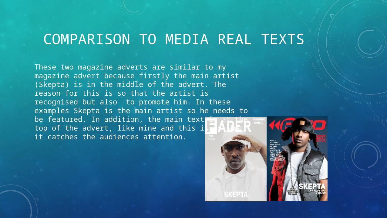
COMPARISON TO MEDIA REAL TEXTSThese two magazine adverts are similar to my magazine advert because firstly the main artist (Skepta) is in the middle of the advert. The reason for this is so that the artist is recognised but also to promote him. In these examples Skepta is the main artist so he needs to be featured. In addition, the main text is at the top of the advert, like mine and this is so that it catches the audiences attention.