Logos for VisRhet
45
-
Upload
phill-alexander -
Category
Education
-
view
120 -
download
0
Transcript of Logos for VisRhet


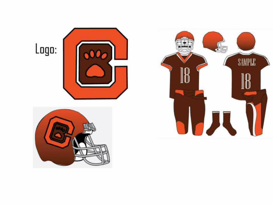
Logos
• On the following several slides you will find your logo submissions.
• Per usual, I haven’t listed names. If you want to claim yours, feel free to, but if you wish to remain anonymous, you have that option.
• After showing them all, I will offer a few comments as well.


Thoughts
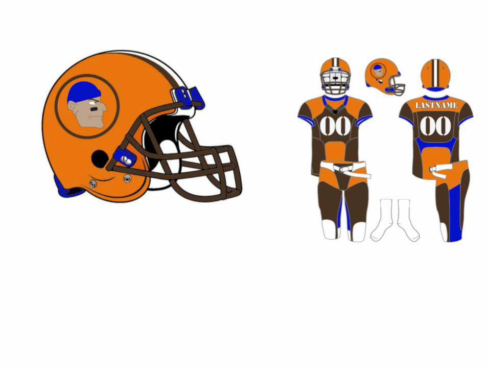
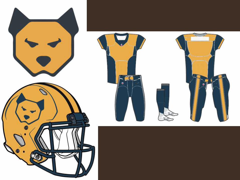
• All in all, you all did pretty well here.
• There were some common mistakes:– Forgetting one of the major colors (brown,
orange)
– Forgetting NFL style on letters/numbers (always an outline– always!)
– Too “cute” to fit with the league’s image
– Not enough of a change, or a strong enough change, to combine with your rhetoric to convince the team to spend the money to make it happen.

The good, though:
• Lots of vibrant color, in spite of the brown tying you down
• Some amazing contrast choices
• Almost all the logos and uniforms look clean–that’s very much on-the-mark for the NFL
• Lots of appeal to Cleveland nostalgia.

WELL DONE!