LOGO. FONT St LETTERING BIBL17E
22
Above, the Fisk Tire boy used a clever pun to induce sales. Below, Psyche, the goddess of purity, watches over White Rock Beverages just as she has done since this painting was first presented at the World's Fair of 1893. LOGOTYPE ntil about the 1930s, the majority of logos in America tended to be of the pictorial or literal kinds. Trademark characters such as the Dutch Boy, the White Rock girl and the Fisk Tire boy, often repro- duced from large oil paintings, were common in more innocent days. Nowadays, the friendly company trademark has matured into the hard-edged icon, a "shorthand" version of the "formal script" that was the complex, old-fashioned logo. Logo design of today includes a limitless variety of styles. As in fashion, a broader range of styles is acceptable than was ever the case historically. That's because today's logos are more often concept-driven, which means that the idea we wish to con- vey often dictates the style we choose to express it in. In this section I've attempted to show examples of various logo categories. The "literal" logo is often just a nameplate (pages 18-21). Monogrammatic logos are an ancient tradition, reaching back to the first time Glug scratched his initial on his club (pages 22-23). Abstract logos, when well designed, succeed just like modern art (pages 24-25). Retro logos are taken seri- ously by some who emulate the best aspects of the Victorian or Art Deco styles in their logos, while others delight in purposely aping the naivete found in much period work (pages 26-31). Of all the styles of logo design, I am most in- trigued—and sometimes amazed—by logos that pull double and triple duty. These kind not only present the company name or its initials, but convert them into graphics that identify the company's product. The view- er of such a logo becomes a participant in an interactive project to decipher the riddle of the image. Of course, if the design is too clever or difficult to decipher, the logo would have to be considered a failure. Ending this section is a showcase of German design- ers who pioneered this conceptual form and influenced the style of today's logo design (pages 32-35). : Design a logo (find someone—even if it's yourself-—for whom to make a real logo, rather than wasting time on a useless, hypothetical project) and produce rough comps based on the various categories demonstrated in this section.
Transcript of LOGO. FONT St LETTERING BIBL17E

Above, the Fisk Tire boyused a clever pun to induce
sales. Below, Psyche, thegoddess of purity, watches
over White Rock Beveragesjust as she has done since
this painting was firstpresented at the World's
Fair of 1893.
LOGOTYPEntil about the 1930s, the majority of logos in America tended tobe of the pictorial or literal kinds. Trademark characters such as
the Dutch Boy, the White Rock girl and the Fisk Tire boy, often repro-duced from large oil paintings, were common in more innocent days.Nowadays, the friendly company trademark has matured into thehard-edged icon, a "shorthand" version of the "formal script" that wasthe complex, old-fashioned logo.
Logo design of today includes a limitless variety of styles. As in fashion, abroader range of styles is acceptable than was ever the case historically. That's becausetoday's logos are more often concept-driven, which means that the idea we wish to con-vey often dictates the style we choose to express it in. In this section I've attempted toshow examples of various logo categories. The "literal" logo is often just a nameplate(pages 18-21). Monogrammatic logos are an ancient tradition, reaching back to thefirst time Glug scratched his initial on his club (pages 22-23). Abstract logos, whenwell designed, succeed just like modern art (pages 24-25). Retro logos are taken seri-ously by some who emulate the best aspects of the Victorian or Art Deco styles in their
logos, while others delight in purposely aping thenaivete found in much period work (pages 26-31).
Of all the styles of logo design, I am most in-trigued—and sometimes amazed—by logos that pulldouble and triple duty. These kind not only present thecompany name or its initials, but convert them intographics that identify the company's product. The view-er of such a logo becomes a participant in an interactiveproject to decipher the riddle of the image. Of course, ifthe design is too clever or difficult to decipher, the logowould have to be considered a failure.
Ending this section is a showcase of German design-ers who pioneered this conceptual form and influencedthe style of today's logo design (pages 32-35).
: Design a logo (find someone—even if it's yourself-—for whom tomake a real logo, rather than wasting time on a useless, hypothetical project) andproduce rough comps based on the various categories demonstrated in this section.

LOGO. FONT St LETTERING BIBLE 17
Dutch Boy paint has beenused in American homessince 1907, The image hasbeen kept alive, below, withupdated type and design tokeep it fresh.

L. 1 ! LI IA r\-
OASH MUST BE SENT WITH ALL ORDERS. NO GOODS SHIPPED C.• ." " '" .* -10.7.-J
O. D.
OUR PATALOGUE-
56-96 FULTON. ST.73-67 N. DESPLA! NES.ST1-3 t WAYMAN.ST/4--S8 N J EFFETRSON, ST
CABLS ADUHESSi "SUPPLY."iBFi-rwiHf-' WUH ' W^STLRN UN ION AND'F. . BRB WITH j POSTA|_ T£LEGRAPH cos
1QNC DISTANCE "HONE I1ONFiO£24
\OVER 100.COO ILLUSTRATIONS
£, AKD QUOTATIONS, MAILED TO
ANY ADDRESS OH RECEIPT OF
50 CENTS.
WE SELl EVERYTHING
JET MAILORDER ONLY, TO OUR
TWO MILLION CUSTOMERS ALL
,/OVER THE WORLD,
~*fc
CHICAGO,
The Sears company has come a long way since the 1902 letterhead,above, and so has its logo. The current version, right, is a goodexample of the current trend in corporate identity, Basic and legi-ble as its letterforms are, the unusual inline treatment, suggestingstrokes overlapping one another, brings a unique dimension thatmakes this logo unlike any other currently in use.
Once upon a time, as this
letterhead reminds us, a
logo was only as good as
the local printer's supply
of fancy wood and metal
fonts. Surprisingly, design
has lately come hill circle,
with many designers
offering little more than"font selection" as their
creative contribution
to logo design.
The logo below, designed
byjHIwithLiietteGicel,
utilizes the font
Copperplate as its basis.
Yet the simple design for a
real estate company rises
above the commonplace
by the elegant and
ingenious device of the
overlapping double Ds
that draw the eyes to this
fulcrum of interest.
485
Of CORNELLS & "WILLISSAMUEl: M. CORNELL,)SIDNEY CORNELL, \N R. WILLIS. ) - » ...
36 Courfbmdf-Sf., near Grtenwlch-Strert,TERMS Oppo»it« Meietiir.ii;' I'...'
ty Gi»o Notice, when Oo*l« irr d*Uy«4beyond th» uitul lim* ol tnmilt, »nd immediately «ft« 'heir rewipt, of »ny •rron.
UNITED)OMINION

L. DOUGLASFORGENTLEMEN.
, thf owner of the W. L Douglas Shoe Company was his own
. Hiike became a "media" fixture at the turn of the nineteenth
). Although it lacked any decent sense of typography, no one
tirgue with this logo's attention-grabbing appeal.
LOGO, FONT a LETTERING BIBLE 19
Below is the American eagle in a design of classic symmetry and
elegance. Though it was originally used as a self-stamped envelope
design (unfortunately the envelope of choice in the recent Fort
Detrick anthrax mail scare), this piece by Michael Doret for tbe U.S.
Postal Service has all the dynamic qualities of a good logo.
f»
mmm
rU i A
3 4
0t attb CourierIje flost ant* (Eouror
son specializes in the design and redesign of publication
, like that above for Charleston's Post and Courier, seen
pre- and post-Parkinson incarnations. This is as literal a
m one can get—in just a nameplate—with a concept havingTo do with the "Old English" lettering suggesting decorum
Itfengihy heritage. Parkinson's revision exemplifies those quali-
considers in improving lettering designs. Most noticeably,
letter weights have been evened up by eliminating too-light and too-
heavy strokes, creating consistent angles and stem weights, and mak-
ing all letters appear to be of the same family. Such details may go
unnoticed by 95 percent of readers, yet I believe such improvements
elevate a publication's overall status and credibility for that discern-
ing 5 percent (which may include advertisers). And I do think, on
some subconscious levels, the masses generally recognize quality.

20 LITERAL LOGOS—WITH A TWIST
The logo for TreePeople,designed by Ray Wood,
functions on two levels: Itis both literal and inferen-tial. We recognize the leaf
motif at once, but thedesign also cleverly sug-
gests an earth where thegift of greenery is
universally celebrated.
•MMMMMHI "•"••TREEPEOPLEAt first glance, we view the name KatzRadio Group and see the rules merelyas decorative architecture. Only thendo we recognize the radio dial in Jona-than Macagba's literal concept.
KATZi i
R A D I O G R O U P
Use of the American eagleas a trademark image for
the American NationalBank might be considered
literally obvious. Butdesigner Chris Costello's
excellent and powerfulrendering picks up in the
decorative departmentwhere any small lack of
concept left off.
Punchstock's punchy fontis totally unique. That's
because it's actually customlettering by Jennifer Katcha
with Kevin Wade forPlanet Propaganda.
AmericanNATIONAL BANK
The name of the comp-any is Liberty and if theviewer is still unsure, theconcept is spelled out ina monogram of stars.
*******^ ^% ^%
******************************
Liberty
******************************
punchA i r p o r t M e d i a
Left, so obvious yet long overlooked was this concept behind Nate Lambdin's logo for JHI. I'venever before seen the simple, ubiquitous market sandwich sign being used as a logo. Above, theclever hole and tag string added to this otherwise simple logo by Keith Campbell is just enoughgraphic context to indicate the company's purpose—it sells advertising on airline luggagename/address tags—and to capture the viewer's curiosity.
LOGO, FONT & LETTERING BIBLE
CHISWICK
CAT SPAW
..
t > rBBER HEELS
21
Far left, a simple logo forBell, a butcher. I'm not sure
if the image is supposed to
be some handheld bell or
just a fortuitous arrange-
ment of black lettering, but
it's so damned beautiful.Left, another simple, literal
logo so nicely arranged, we
don't mind the lack of any
tricky design.
Far left, this logo by Mark
Fox literally portrays the
red herring but then throws
us one in the nifty treat-
ment of /?-/?, which becomes
the concept of the piece.
Left, this logo by the author
for Kitchen Sink Press,
lacking any real concept,
derives its charm from the
literal image of the
antique kitchen faucet.
Cat's Paw, a logo designedfay Lucian Bernhard, is sucha classic, it had to beincluded here. The conceptis, again, literal: There's thecat, and there's his paw. Butthrough sheer strength ofthe stark composition, thelogo grips us like a pair ofrubber heels.
IB felden Barrel, and here we have a. . . golden oak barrel, appropriatelylimitation woodcut style by Russ Cox of Smiling Otis Studio. Originally inked
pe logo was meticulously redrawn in Adobe Illustrator and quite grace-Midi is not an easy task! As with many of the examples on this page, the lit-
I lacking cleverness or concept, has been justified by virtue of a really

22
Right, iconoclast literallymeans the smashing of
images, and that's why Imade this frame-breaking
logo for IconodassicsPublishing Co.
Middle right, Jonathan
Hacagba's chemical tablelogo is a great solution
for Future Beta, Inc. Farright, another Macagba
logo. The M is forMercury.
Large in center, pd stands
for Paper Doll, a very hap-
pening clothing companywith a happening logo to
match. Below right, theW is for Vinyl Avenger, a/ o
DJ in Dirk Uhlenbrock'sneck of the woods.
Below, I love the simple
logo for J HI, theRichmond, Virginia-
based design firm. Thedotted/reads "lightbulb"
as if to illustrate
the firm's web site name:www.jhigoodidea.com.
MONOGRAMMATiC LOGOS
GIFTS AGARDENS
Above, find the monogram in this logo by theauthor for Very important Planet, a gift shoplocated in the Virgin Islands.

LOGO, FONT a LETTERING BIBLE
Left, variations on a themefor Seth Bernstein's Form,Function & Finesse studio. Ialways like to introducealternate versions of 3single logo, and I trust thepublic at least to the degreethat they'll still recognizethe basic image. Apparently,Bernstein feels the same.
Find the monograms: Above left, an amaiing double monogram in the logo for MelWhitson Stationers, designed by Robert Overby (1962). Above center, logo forWestcoast Landscape by Conrad Angone (1962). Above right, Mike Samuel'sdesign for Small Craft manages to included both initial letters into the logo.
SMALL CRAFT
Enbus mark by Dirk Uhlenbrock for a design firm. In his words, "Thisi is utlid tovier. The first syllable sounds similar to Reh, the German word
&jnd the second syllable, vier, could also be the number vier, which is•ttycool, Dirk! (de is the suffix for Deutscherwb sites.)
Left, the Mf stands forKonrad Mathieu, anIT-solutions company inKb'ln. Logo by DirkUhlenbrock. The backwardsK also functions as anarrow.

24 ABSTRACTION IN LOGO DESIGN
NT£RNATIONALS-€RVIC€ Of A R T TO INDUSTRY
BRUNO PAUL- ROCKWELL K€NT • PAULPOIR€T • LUCIAN'
Top, with the emergence of the field of industrial design,
which came about in the 1930s, four artists, hoping to
capitalize on their combined international appeal,
formed Contempora, Inc. The logo is abstract, but cer-
tainly evokes contemporaneousness to me.
Above, another set of three artists formed Pronova.
Their abstract logo at least implies a triumvirate—of
something. Their stamp, right, reverses the logo's color
sequence, which today's clients are often afraid to do.
Above left, this delicate abstraction may have been
meant to suggest the three stars of the Von Der Lancken,tundquist and Sorenson Agency (1955).
.
. H . ..• : •
PRONOVAI] 17TW SI N '•
RSHAM 7

LOGO, FONT a LETTERING BIBLE 25
Museum Books ire
books anil tin-. -'' and fine art
48 East 43rd Street New York (7, N. Y. Murray Hilt 2-0430
wiper-engraved logo from 1802 with a literal depiction
[fer this fancy cloth goods merchant. Many years later, the
&) fabric bolt in the Chase Manhattan Bank logo takes on
|tf abstraction through its stylization.
Left, the Museum Books
logo by John Ciampi
is a beauty. It evokes
Picasso's Guernica with
an added initial M in a
skewed warm gray rec-
tangle that just reeks
(in a positive way) of
the 1950s.
Guerilla 3ne.comTop, Tom Geismar's famous abstract Chase Manhattan Bank logo suggests
continuity, stability, possibly an ancient coin design. And maybe art indica-
tion of a f can be found in the folds of such a classic commodity as dry
goods, or perhaps ticker tape? Above, designer Stan Endo swears his Guer-
illaOne.com logo is no guerrilla parody of Chase. Any resemblance between
Chase and this logo for a dance party organizer is purely coincidental.

REFERENTIAL NOT RETRO—LOGOS
Gerard Huerta tacklesany style of logo or
lettering with the sameconsummate skill. Design
is design, only styleschange while the under-lying principles remain.
Maybe that's whyHuerta's Caroline St.
Railroad, DeRosa's andCigar logos are all so
different in style, yet allso finely rendered.
For this tractor logo,right, Deutscber designerDirk Uhlenbrock retained
the symmetrical layout,the bunted seal and
Siitterl in-style antiquatedGerman handscript as his
links to tradition.But his simplified treat-ment of these elements
is strictly mw—andtotally Uhlenbrock.
Above, Gerard Huerta must have been born out of time. His intricatelettering for the Hand Made Cigar Collector's Guide & Journal wouldhave landed him a job at any nineteenth century print shop.
FIRST COLONYC O F F E E & TEA C9
FIRST COLONYRight, and above right, if intended as examples of classic labeldesign, these First Colony Coffee & Tea logos by Nate Lambdin forJHI could be said to have missed the mark. But as examples ofmodem design that add some new verbiage to the classic label lex-icon, they work smashingly well.

LOGO. FONT & LETTERING BIBLE 27
*
II
F E R R YB U I L D I N G
M M A
Louise Fill's logos for thePink Door, Malama andDelamar reveal her penchantfor retro styling. Yet Fillmanages to imbue her workwith ail the elegance andromantic flavor of classicEuropean Deco design with-out ever letting it becomecloymglv "nostalgic."
D E IA VM A RC R E E N"W 1 C H - H A R B O R
E L M A
G A R C I A
P I L M S
T H E M O T H E R S H I P
Michael Schwab is one of those designers whose every piececarries his unmistakable stylistic signature. Although Schwab'swork takes its cues from retro reference, his dynamic andspartan compositions have a timeless appeal.

28
Right, Mercury must have
had better things to do than
to flit around Manhattan
delivering photostats, but
this naive period image,
accompanied by really nice
lettering, would barely have
raised a snicker in 1945.
IRREVERENTLY RETRO LOGOS
Right, some logos try to
seriously achieve a retro
look. This design by the
author for a silk-screen T-
shirt printer mocks the
gravity of much Art Deco
imagery that some 1930s
companies used
in all seriousness.
Above, this gorgeously designed, inked and colored logo by Mark Fisher conjures
up all the alluring nostalgia of an old matchbook cover. Above right, Fisher brings
the naivete of the 1950s to this logo for Cosmo Icecreamo. But it's too over the
top to be truly of the period and becomes instead a delicious parody. Bless the
client that lets us get away with designing something this much fun.

LOGO, FONT & LETTERING BIBLE
'logos of Seymour Chwast and his current Pushpin Group associates are
HJ for their strong design and gentle humor. In pointing out the references
fe JWffjflH/ 1930s in firs work, it should be noted that in the 1960s,
ist became one of the first retro revivalists and gets a iot of the credit (or
K?} for pointing the rest of us in this direction. Above, Solo, designed with
[Simpson, for a publishing group; right, Lo'rke, a German clothing concern;
iw, for the Museum of Comic and Cartoon Art.
Right Brave World is a film production company whose
logo giddily parodies old self-important RKO Pictures
movie titles. The brave design—nicely executed!—is by
Dan Ibarra and Jamie Karlin of Planet Propaganda.
Above, the original logo
for Seymour Chwast and
Milton Glaser's Push Pin
Studios, c. 1959. The
name itself is gently
seif-parodying and cer-
tainly indicative of the
style and attitude that
put this highly influen-
tial, and trend-setting
studio on the map.
P R O D U C T I O N S

30 AMUSING RETRO LOGOS / CALLIGRAPHIC AND HANDMADE LOGOS
Michael Doret has made
his fame by illustrating
with letters. His logos, like
U Mogul, Coolsville and
Bedlam Ballroom, above
and right, reveal his total
unreliance upon stock
fonts. Instead, each letter
is drawn from scratch,
according to the design
concept. Doret revels in
retro and has long been a
trendsetter in the style.
Right, a double-take Mark
Fox logo for a proposed
production of the rock
opera Jesus Christ
Superstar. The cross on
Golgotha can be seenin the face of Jesus.
Far right, logo for a
textile manufacturer by
Ross, Culbert and Lavery,
Inc. in the old German
style. The letterforms are
unusual, especially the X.
Planet Propaganda's Jamie Karlin and Dana Lytle created
the logo above for an E-business consulting company. Dog
collar and sunrays are cleverly combined into one image.
* * **
LOGO, FONT & LETTERING BIBLE 31
wntft/uinffc^^—^
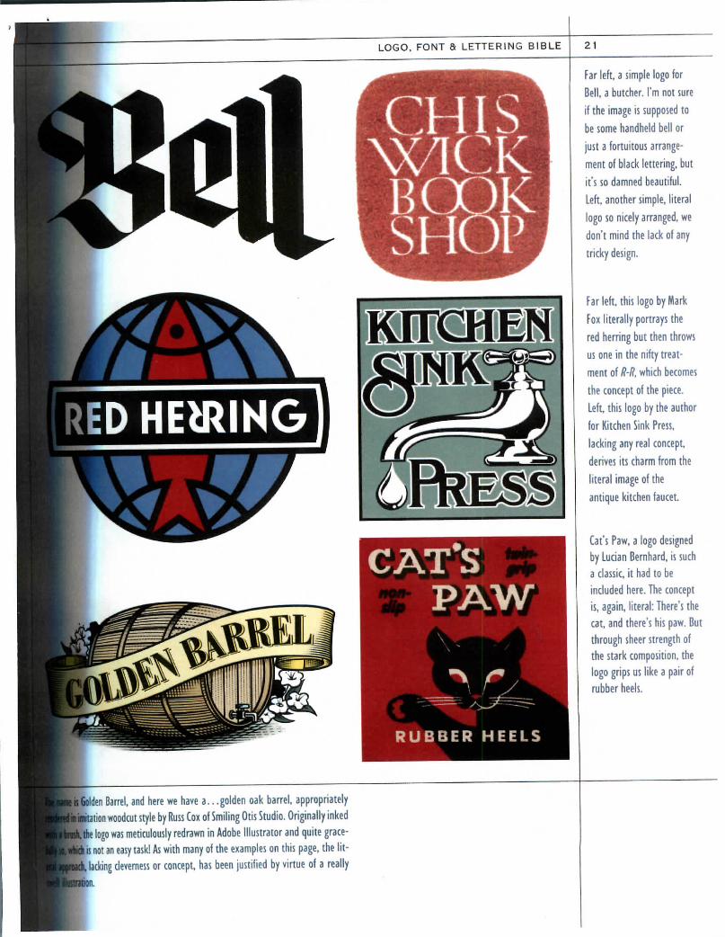
Left, there can be no better expression of the
word Triumphant! than in Jill Bell's exuberant
logo for a point-of-purchase display. Below,
Bell's treatment of the Seahorses is an inter-
esting brush treatment that breaks step with
traditional calligraphy style.
HOZEN CUSTARD
* delightful calligraphic logo by Chris
urklish." Adding to the intrigue is
blended watercolor treatment.
Left, this logo by Russ Cox maintains a
consistent feeling from the casual, car-
toony lettering to the cartoony kid. Right,
Carol Chu created this logo for a group
working with children who lost a parent
in the 9-11 disaster. This design, with its
unassuming type and optimistic graphic,
reminds us of how a logo can be used to
convey the most subtle concepts.alii a limehoDe:tle
^
"*» Above left, a proposed logo by the author for arestaurant. The name alone put me in aMediterranean mood, which inspired the mosaictiles. Drawn in Illustrator, in strokes, outlineswere created, then the whole was united.Releasing Compound Paths allowed me to filleach tile differently from a pallet of alike tones.
Above, Mark Simonson saysof his logo for the LakeWobegon baseball team,"The Whippets were perenniallosers, so I did the manda-tory baseball script runningdownhill rather than up."

32
**»"
*
LOU m
1924
KLINGSPORKALENDER
The Germans are responsible for inventing the modem iconic trademark as an out-
growth of the heavy gothic, black-letter schrift, or script, that evolved as their
unique adaptation of the roman alphabetic forms. They started playing with sim-
plified design as far back as 1905 when America had just renounced the excesses of
Victoriana for an only slightly less fussy Colonial Revival. I always say that if itweren't for African Americans' influence upon music the rest of us might still bewaltzing in powdered wigs. To that I might add, but for the Germans, all our logosmight still be kitschy oil paintings of cows, kids and mythical figures. But they didmore, the Germans: They added the concept of concept to their stripped-down
trademark symbols, many of which were no longer arcane abstractions as oldtradesmen's marks had been, but became endowed with wit and meaning.

LOGO, FONT & LETTERING BIBLE 33
MALERebGRAPHIKERB E R L I N SW68 R TTERSTR.55
'ii*-C?1*'*
^rance)

34
H A N D E L S Z E I C H E N
mEISTERVery little is known about Karl Schulpig (1864-1948), who has emerged as the quintessentialGerman logo designer. Schulpig's bold style and clever visual puns, widely emulated after the pub-lication of the author's d Treasury of German Trademarks (1982), might even qualify him as thefather of the modern icon. German designers appear to have been so well respected, and printingso accessible, that Schulpig could issue 3 yearly booklet displaying his accomplishments, somethingunheard of in America at the time. The marks on these pages were created from 1922 to 1928.
3 E L S Z E I C H E N
'gm:

LOGO, FONT & LETTERING BIBLE 35;
auANTO
LOGO, FONT & LETTERING BIBLE 43
m umenniL compfccoiite page, the restless mind at work; Fred:>-;er (1883-1961) emblazoned this letter from. -aiional magazine with rough monogram designsy the editor and art director. Watch as Cooper's3«s take flight, sequencing from one concept tobe next. (This page was reprinted from theur.:n book The Lettering and Graphic Design of;-J- Cooper, 1996, Art Direction Book Co.)
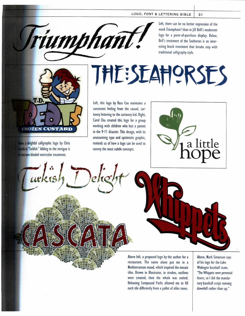
>; -n ingenious is Daniel Pelavin, who creates hisbmbnails in marker, below, scans, then auto-race: them to e-mail to clients. This method has itsaer>j. The client understands that these are roughs•: ::ein't take anything too literally at this point,u i-g the artist lots of leeway to embellish later,*i despite the sketchiness of these roughs, little<x:: is left 35 to the direction the artist is heading.i::* :hat while color is not yet indicated at this:-!•-., the all-important interplay of light and darkart-asis is already hilly developed in Pelavin'sw-:. He adds letters beside each sketch so thektt can say, "I like F, it's perfect! But could youc: ~3*E one little change..." Bear in mind that aB: accomplished designer than Pelavin might not*t 3*ay with such sketchy comps. The finished art-•wt, right, was done in Adobe Illustrator.
After the research and reference phases, the next stepis thumbnail sketches, so called because they are
done about the size and shape of those 1950s-stylespatulate-type thumbnails that Jack Kirby alwaysdrew on Sergeant Fury. Thumbnails, leading to largerroughs and "comps" (the almost-finished sketches theclient will see), are an important step in logo designbecause concepts can magically emerge as we sketch.
D)

HOW TO DESIGN A LOGO IN 3 QUASI-EASY STEPS
/&***. /, «i* '
RLG &Here are more Cooper monogram sketches. Designingmonograms became one of his hobbies, something he
;e to friends like Marione R. Derrickson, above.
The very name "Rube Goldberg" has become synonymouswith any contrivance that brings about by complicatedmeans what could have been accomplished simply. Leftthe "Goldberg Variations," as I like to call Cooper's pageof roughs for the legendary cartoonist, may seemGoldbergian as they inexorably wend their way to a fin-ished design that is a caricature and monogram in one.


