Logo Book
12
LIPSTICK logo samples AUTUMN BUEHLER
-
Upload
autumn-buehler -
Category
Documents
-
view
213 -
download
0
description
Logo Book. Multimedia Systems 1. December 2011.
Transcript of Logo Book

LIPSTICK
logo samples
AUTUMN BUEHLER


Effectively incorporating a constrained object to
visually represent 6 companies that vary greatly
in product or service provided.

This logo concept embodies the feeling of a retro diner. “Lipstick's Diner” is a modern take on an old fashioned concept. The checker pattern, script font, and color choice are all visual elements associated with the original diners in America during the 1950’s. The slogan ads to the authentic feeling of the brand as it utilizes the term “cat’s pajamas,” which was a slang term in the 50’s for describing something exceptional.
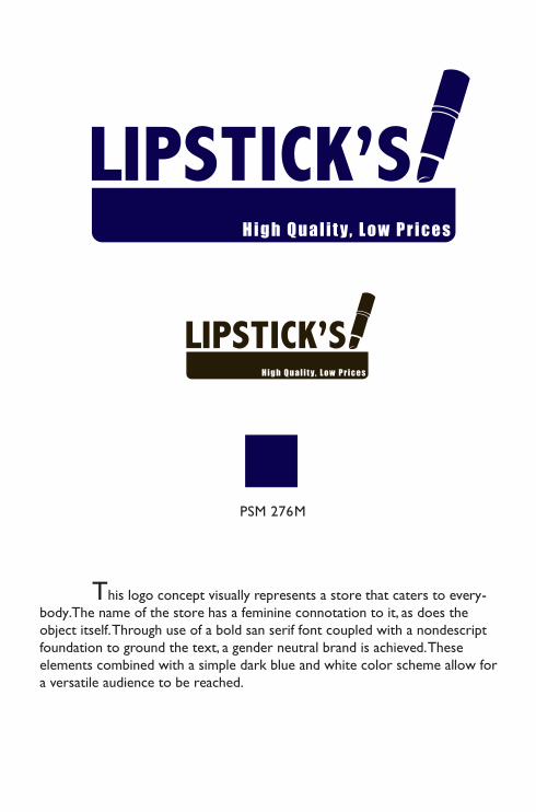
This logo concept visually represents a store that caters to every-body. The name of the store has a feminine connotation to it, as does the object itself. Through use of a bold san serif font coupled with a nondescript foundation to ground the text, a gender neutral brand is achieved. These elements combined with a simple dark blue and white color scheme allow for a versatile audience to be reached.

This logo cues the viewer on the quality of product sold in “Lipstick’s Organics.” The light brown used is connotative of rich soil, and the vibrant green is reminiscent of healthy vegetation. Those colors paired with the image of the tree ground those connotations further. The text is laid out in a circle holding the tree, which is a subtle hint to the earth. The trunk of the tree is comprised of outlines of lipstick tubes to create a visual play on the name of the store.
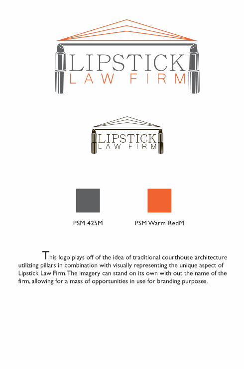
This logo plays off of the idea of traditional courthouse architecture utilizing pillars in combination with visually representing the unique aspect of Lipstick Law Firm. The imagery can stand on its own with out the name of the firm, allowing for a mass of opportunities in use for branding purposes.
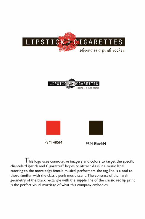
This logo uses connotative imagery and colors to target the specific clientele “Lipstick and Cigarettes” hopes to attract. As is it a music label catering to the more edgy female musical performers, the tag line is a nod to those familiar with the classic punk music scene. The contrast of the harsh geometry of the black rectangle with the supple line of the classic red lip print is the perfect visual marriage of what this company embodies.

This logo fuses the masculine with the feminine. Roller Derby is a female sport, but one that requires ferocity. The tubes of lipstick represent the female aspect of the sport, while the way they are crossed is reminiscent of a skull and cross bones. The contrast on the font used for the team name is also a play on hard versus soft, masculine versus feminine.