
Locly Native Theme Examples
12
Locly Native Theme Examples mobile app platform Anyone can create beautiful, professional quality apps using Locly Native.
-
Upload
locly -
Category
Technology
-
view
174 -
download
0
Transcript of Locly Native Theme Examples
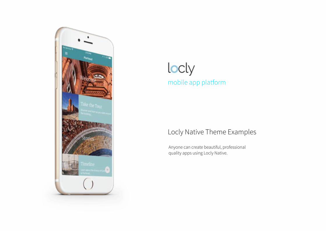
Locly Native Theme Examples
mobile app platform
Anyone can create beautiful, professional quality apps using Locly Native.
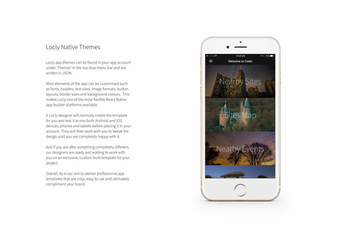
Locly Native Themes
Locly app themes can be found in your app account under ‘Themes’ in the top blue menu bar and are written in JSON.Most elements of the app can be customised such as fonts, headers, text sizes, image formats, button layouts, border sizes and background colours. This makes Locly one of the most flexible React Native app builder platforms available.
A Locly designer will normally create the template for you and test it across both Android and iOS devices, phones and tablets before placing it in your account. They will then work with you to tweak the design until you are completely happy with it.
And if you are after something completely different, our designers are ready and waiting to work with you on an exclusive, custom-built template for your project.
Overall, its is our aim to deliver professional app templates that are crisp, easy to use and ultimately compliment your brand.
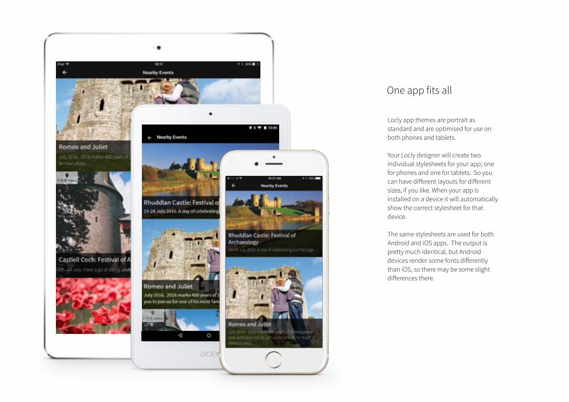
One app fits all
Locly app themes are portrait as standard and are optimised for use on both phones and tablets.
Your Locly designer will create two individual stylesheets for your app; one for phones and one for tablets. So you can have different layouts for different sizes, if you like. When your app is installed on a device it will automatically show the correct stylesheet for that device.
The same stylesheets are used for both Android and iOS apps. The output is pretty much identical, but Android devices render some fonts differently than iOS, so there may be some slight differences there.
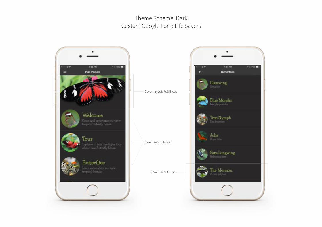
Theme Scheme: Dark Custom Google Font: Life Savers
Cover layout: Full Bleed
Cover layout: Avatar
Cover layout: List
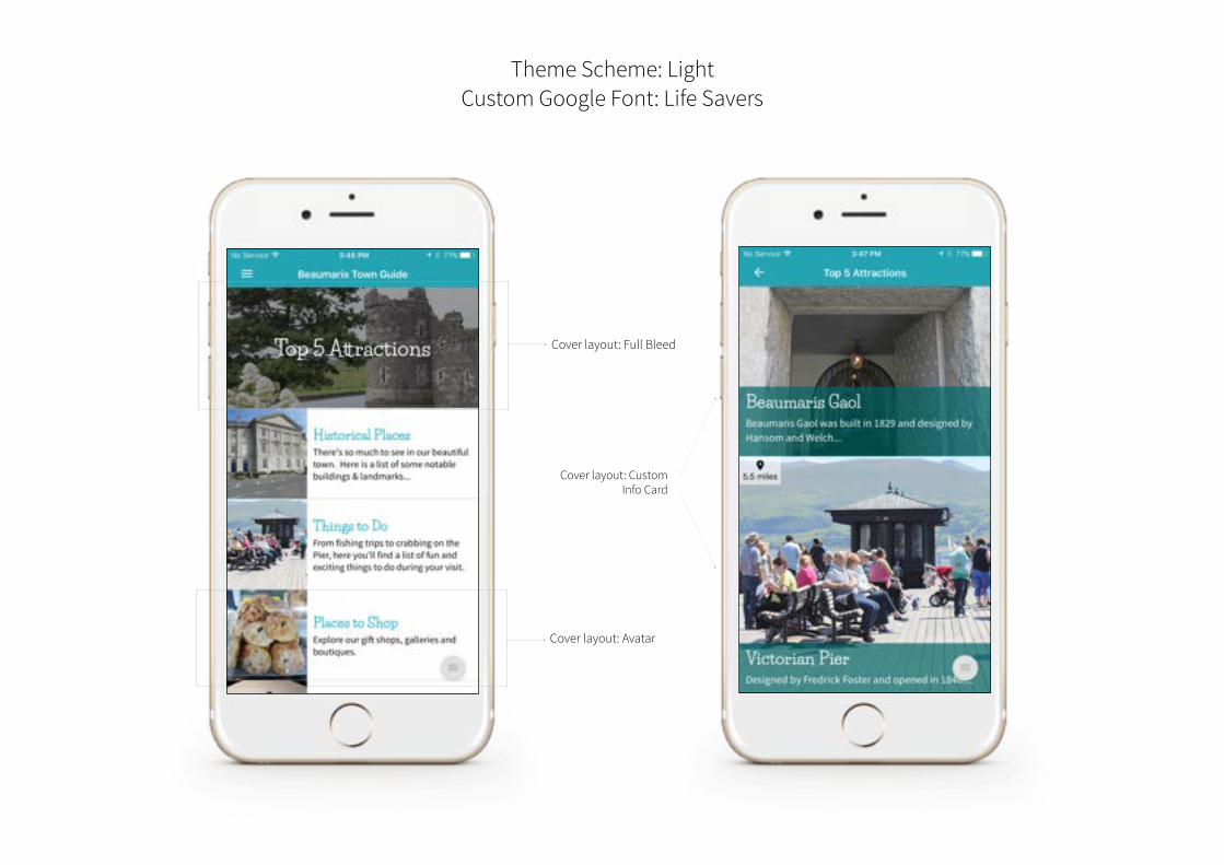
Theme Scheme: Light Custom Google Font: Life Savers
Cover layout: Full Bleed
Cover layout: Avatar
Cover layout: Custom Info Card
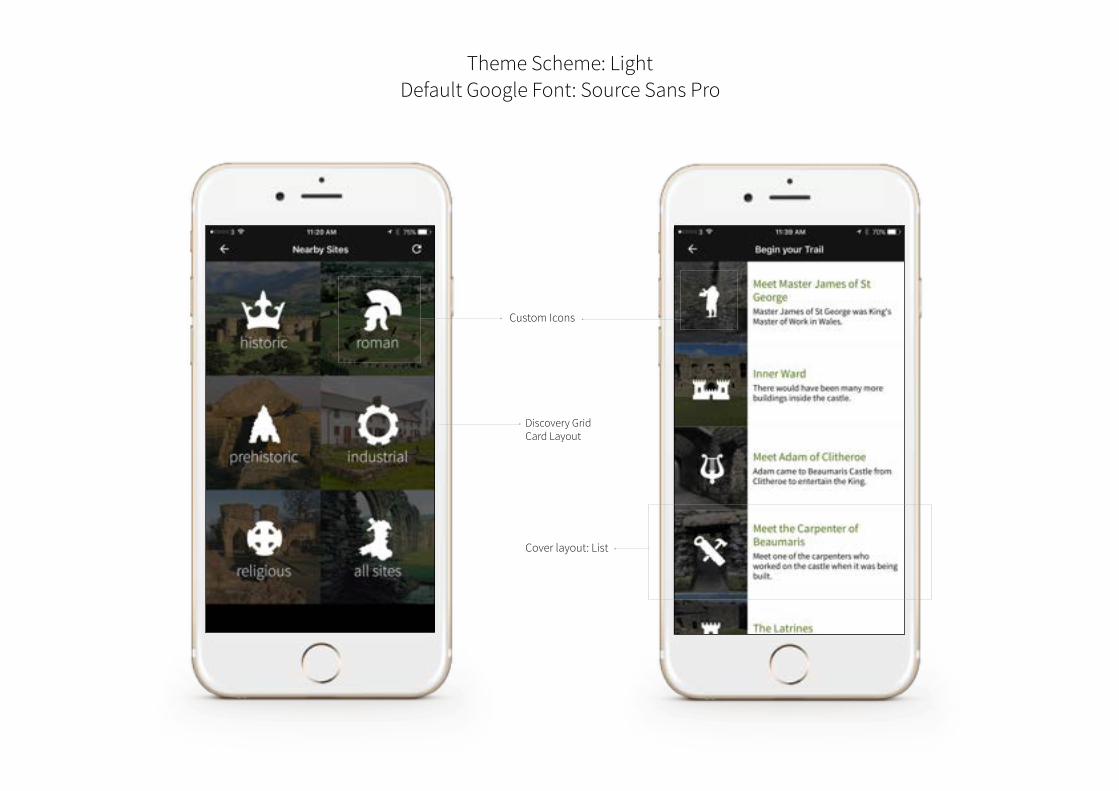
Theme Scheme: Light Default Google Font: Source Sans Pro
Custom Icons
Cover layout: List
Discovery Grid Card Layout
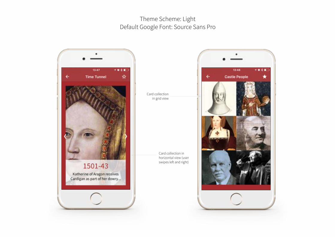
Theme Scheme: Light Default Google Font: Source Sans Pro
Card collection in grid view
Card collection in horizontal view (user swipes left and right)
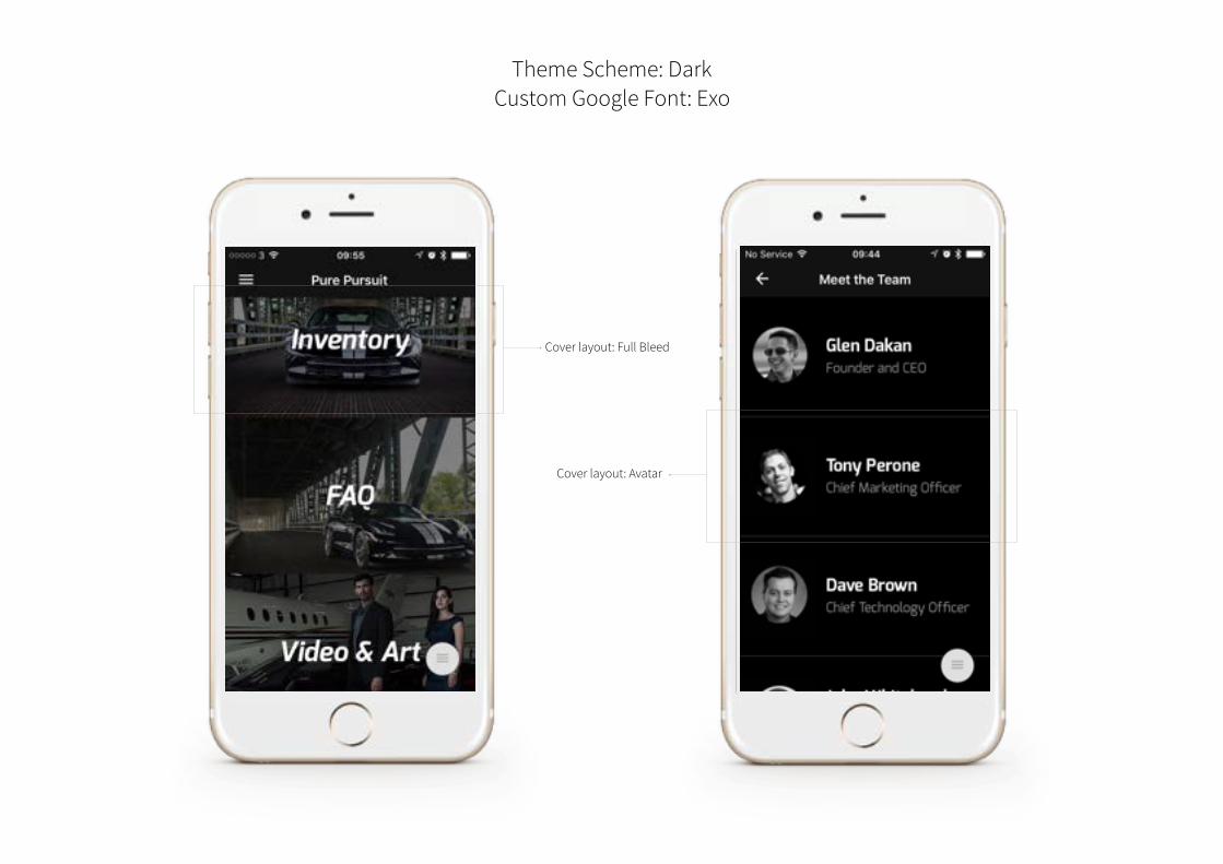
Theme Scheme: Dark Custom Google Font: Exo
Cover layout: Full Bleed
Cover layout: Avatar
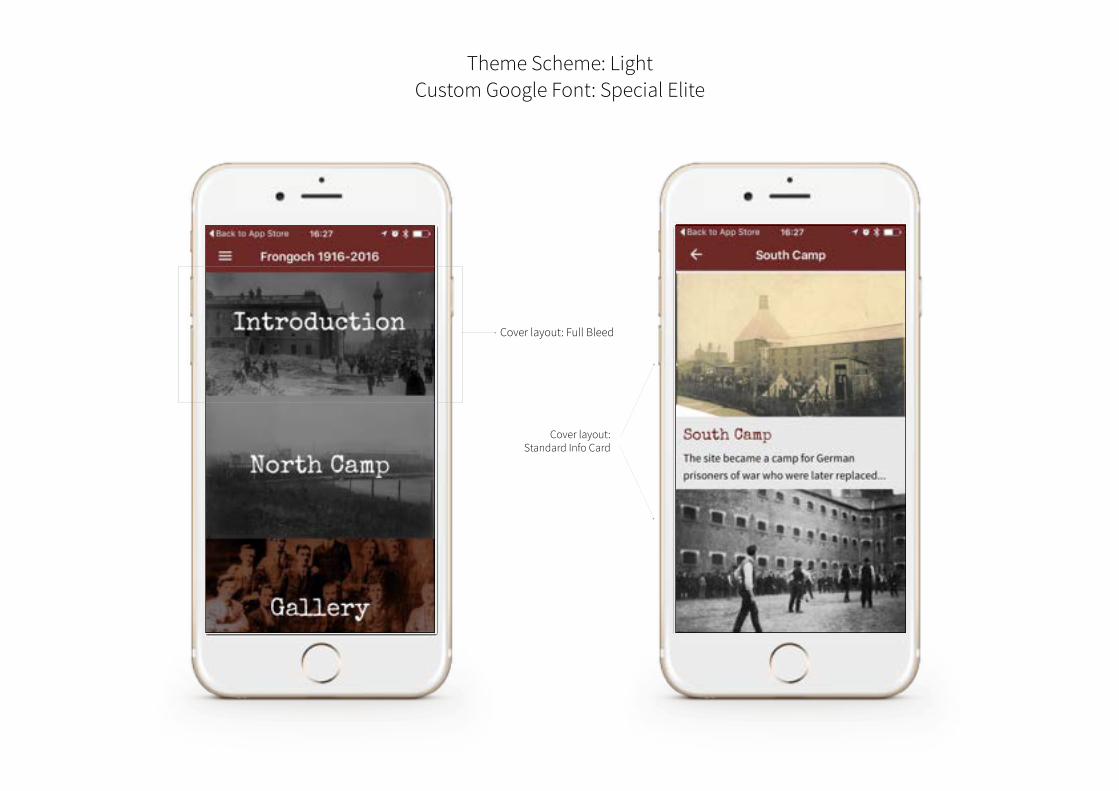
Theme Scheme: Light Custom Google Font: Special Elite
Cover layout: Full Bleed
Cover layout: Standard Info Card
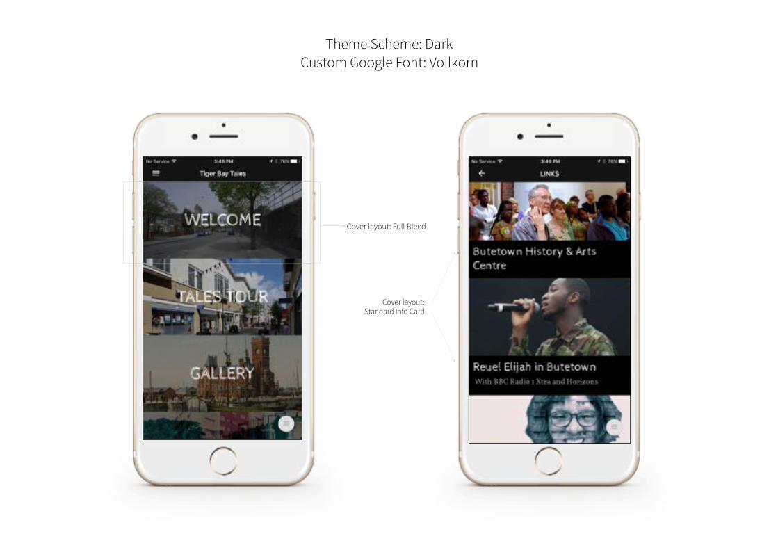
Theme Scheme: Dark Custom Google Font: Vollkorn
Cover layout: Full Bleed
Cover layout: Standard Info Card
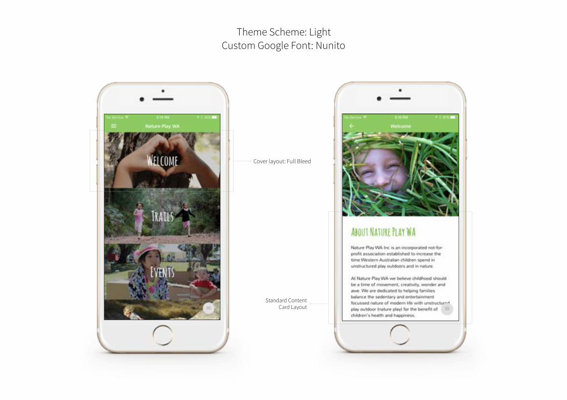
Theme Scheme: Light Custom Google Font: Nunito
Cover layout: Full Bleed
Standard Content Card Layout
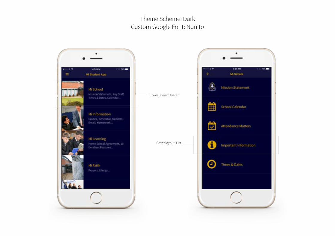
Theme Scheme: Dark Custom Google Font: Nunito
Cover layout: Avatar
Cover layout: List


