Lo2
50
-
Upload
harrison-cole -
Category
Education
-
view
52 -
download
0
Transcript of Lo2


Contents LO2• LO2• • Advertisement of inspiration • • Mood board poster• • Conclusion for mood board • • Mood board adverts• • Conclusion for mood board• • Colour slide• • Hand Drawn Drafts poster and
advert• • Conclusion hand drawn drafts•
• Mind map poster and advert• • Draft logo• • Font styles• • Graphic layouts • • Draft poster information • • Location Recce• • Risk assessment • • Proposals • • Target audience theories • • Production plans
• • Launch dates• • Location for Advertisement • • Equipment• • Budget summary • • Costs • • Legal and Ethical ASA and Ofcom• • Codes and Conduct• • Conclusion
Advertisement of Inspiration Bands name is placed above the images to connote the importance of the name. The verbal code “COASTS” connotes they are open to all types of audiences and are free to do what they love which is to perform live as it has links with the seaside which is somewhere people go to get away from stresses in their life.
The graphic connotations behind the image is the style the band want to present. The image shows them in front of a warm looking coast. The sun is shinning with a bright blue sky. The band are connoting that the genre of music is warm and free.
The color scheme is a bright blue background with white font text which helps it stand out – these are all very low key colours which is nice to read reflecting the bands personalities.
The target audience for this theory focuses on the age and gender. The age would be 16+ as most of their lyrics are about love. Appropriateness of the lyrics and music videos that they produce. The gender of the target audience are aimed at both genders. This is because the music that they play on tour is about love. Both genders can relate to love as this is a stereotypical couple for love. Both genders can like and enjoy the music about love. The target audience would have to be in middle class to be able to afford the tickets and transport to the gigs.
Social media synergy is used to help promote the tour. The synergy also allows people to book the tickets through the social media sites.
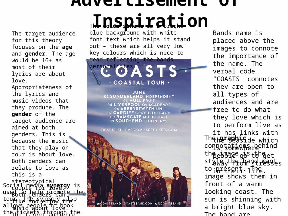
Mood board poster

Conclusion for the mood board • From this mood board I have gathered some ideas that have inspired me.
The posters give me some inspiration for the colour and font style. The font styles are bold and big. The main images are the majority of the size of the poster to catch the audiences eye. The background colour for the posters make the main image and the text stand out. Most of the posters have taken the main image shot outside in the open. This creates a creative effect for the poster.

Mood board advert

Conclusion for the mood board • From this mood board I have gathered some ideas that have inspired me.
The adverts give me some inspiration for the colour and font style. The font styles are bold and big. It has highlighted to me that adverts have more information than posters – this is because they are in magazines and more people are likely to read rather than walk by a poster.

Colours for my ideas• When deciding what colours I wanted to use for my poster and advert I decided
to use my tour of inspiration for guidance. The colour blue conveys to the audience what kind of music that’s being advertised and the personalities of the bands. The blue connotes happiness on a sunny day, the blue also connotes freedom as the sky is wide and bright. These are great colours that will reflect the band and will stand out to the audience.
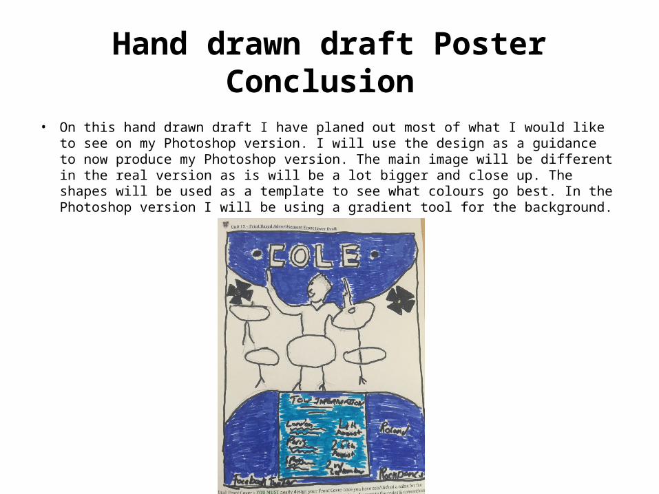
Hand drawn draft Poster
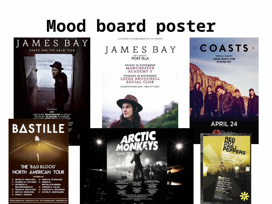
Main image has been placed in the middle of the poster to catch the audiences attention.
I have created some shapes on the bottom and top of the poster to create a unique design.
The artists name has been placed in cold capitals letters to make the name stand out. I have used two colours for the background and for the font. This is to make the font stand out to the audience.
This is where the dates for the tour go. I have placed them inside a box to easily identify and read.
Here I have included the social media synergy for the tour. I have used Facebook and Twitter.
Hand drawn draft Poster Conclusion
• On this hand drawn draft I have planed out most of what I would like to see on my Photoshop version. I will use the design as a guidance to now produce my Photoshop version. The main image will be different in the real version as is will be a lot bigger and close up. The shapes will be used as a template to see what colours go best. In the Photoshop version I will be using a gradient tool for the background.

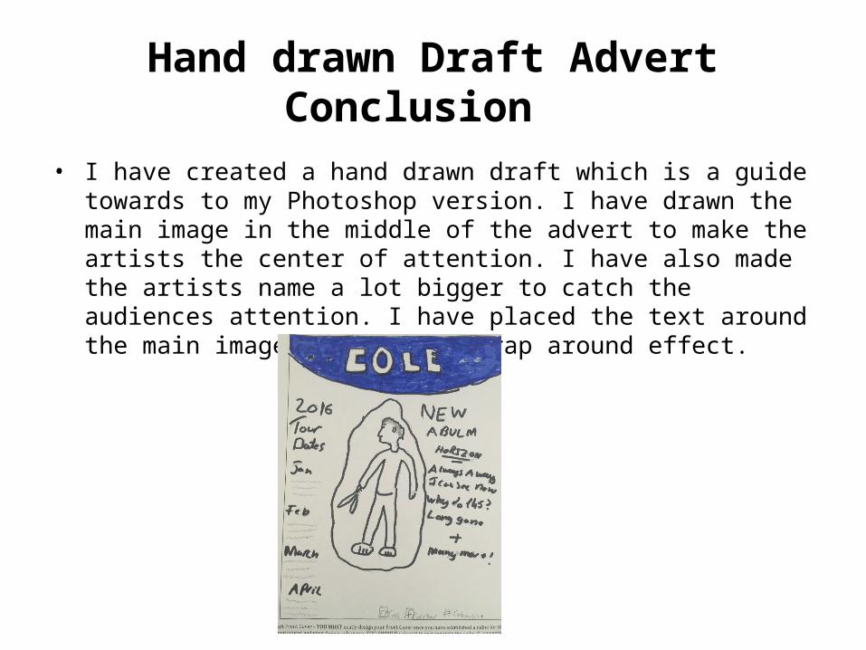
Hand drawn Draft Advert The artists name has been enlarged to make it more eye catching in the magazine. The font has been made bold and bright with the background and font colours.
Details for the tour are placed on the right hand side of the poster. This incudes the special guests that are featured in the tour.
The main image has been placed in the center of the advert to make the artist look important.
The dates for the tour have been placed down the left hand side of the advert. These dates indicate when and where the tour will be.
Social media synergy has been placed at the bottom to promote the tour. I have used Facebook and Twitter
Hand drawn Draft Advert Conclusion
• I have created a hand drawn draft which is a guide towards to my Photoshop version. I have drawn the main image in the middle of the advert to make the artists the center of attention. I have also made the artists name a lot bigger to catch the audiences attention. I have placed the text around the main image to create a wrap around effect.

Mind map Poster
COLE- Tour Poster
Colour of the poster will be based on a blue sky as the background. The text will be white to stand out in front of the blue. The image will be fairly dark. The blue will merge with the dark image.
The target audience for this poster will be the fans of the artist. The audience will be in working class to be able to afford the tickets to the tour. The majority of the audience will be young teenagers. This is due to the stereotypical enjoying going out and socializing.
The logo name I have given the artist on tour, is COLE. I have decided to feature myself in the tour poster. The name is short and relent to the artists name. The name is easy for the audience to remember.
For my logo designs I have used the logo name with two dots before and after the name. I have been inspired to use this design from my poster of inspiration by COASTS.
The frequency of my poster being produced will be 4 months before the tour starts. This then gives people the chance to book their tickets in advance.
I will be putting up these posters all over London. This is because the tour will be in London.
The slogan for this poster will be “Don't miss a beat” other ideas such as “this is the one” will also be used as an idea.
Mind map Advert
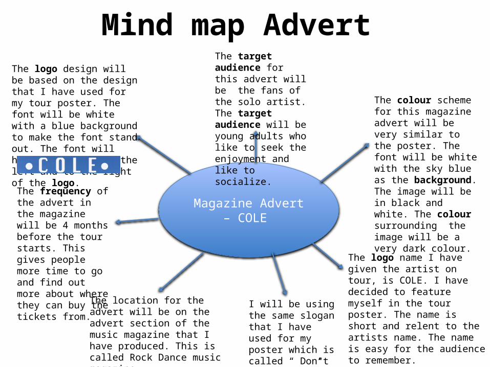
Magazine Advert – COLE
The colour scheme for this magazine advert will be very similar to the poster. The font will be white with the sky blue as the background. The image will be in black and white. The colour surrounding the image will be a very dark colour.
The target audience for this advert will be the fans of the solo artist. The target audience will be young adults who like to seek the enjoyment and like to socialize.
The logo design will be based on the design that I have used for my tour poster. The font will be white with a blue background to make the font stand out. The font will have white dots to the left and to the right of the logo.
The frequency of the advert in the magazine will be 4 months before the tour starts. This gives people more time to go and find out more about where they can buy the tickets from.
The location for the advert will be on the advert section of the music magazine that I have produced. This is called Rock Dance music magazine.
I will be using the same slogan that I have used for my poster which is called “ Don’t miss a beat”.
The logo name I have given the artist on tour, is COLE. I have decided to feature myself in the tour poster. The name is short and relent to the artists name. The name is easy for the audience to remember.

Font styles • I have chosen a range of fonts that I think will suit the poster and the advert. I
didn’t like the fonts with the bold text that is shown below. The font style has to be simple with spacing between the letters. The font style in the bottom left hand corner had the simple font style that I liked. But the spacing in between wasn’t big enough. I therefore used the font style with the white text. This is because the spacing is big enough. I then decided to add the dots to both sides of the font. This gives the font style more of an interesting design. The font designs came from a website called http://www.dafont.com .

Draft Logo Design
This is the logo that I have created for my tour poster. This is for the solo artist that is in tour. I therefore used the font style with the white text. This is because the spacing is big enough between the letters. I then decided to add the dots to both sides of the font. This gives the font style more of an interesting design. I have decided to “repeat” (Steve Neale 1980) a logo design from my inspiration.

Graphic Layouts
Name of the artist
Artists image
Synergy social media
Dates Dates
Locations
Poster
Name of the artist
Slogan
Image of artist
Dates
Loca
tions
Locations
Synergy social media
Advert
The social media synergy has been placed at the bottom of the poster and advert.
The main image has been placed in the middle of both layouts
Locations are both to the sides on the poster and advert
Name of the artist is made clear on the top of poster and advert.

Draft Poster information This is the draft article that I have created presenting who else in terms of artists will be in the tour. I have said on the advert that the special guests for the tour will be COASTS, BAD SUNS and COLDPLAY. I have chosen these bands because they have a similar genre of music to COLE. This will become appealing to the target audience. Because they are all ready attracted to the genre of the COLE tour they will then enjoy the other featured bands.
Social media synergy is used to help promote the tour. The synergy also allows people to book the tickets through the social media sites.
The slogan is placed at the top of the advert to make it more visible to the audience. The slogan is “don’t miss a beat”. I have also placed the sponsorship at the bottom of the advert. The sponsorship is by a music magazine

Location Recce

Location Recce
I produced a Location Recce before taking my pictures as it allowed me to be completely organised and know exactly what I was doing for example, what day I would take the pictures on and any potential risks or hazards.

Risk Assessment This is the risk assessment that I had to do for the photo shoot plan. I had to make sure that all the hazards while taking the photos. I have taken photos of what I think will cause an accident while taking the photos. I have then written a short description explaining how they are classed as hazards and what to be aware of when taking the pictures.

Proposal for Poster

Proposal for Poster continued
Proposal for Poster continued

Proposal for Poster continued

Proposal for Poster continued

Proposal for Advert

Proposal for Advert Continued
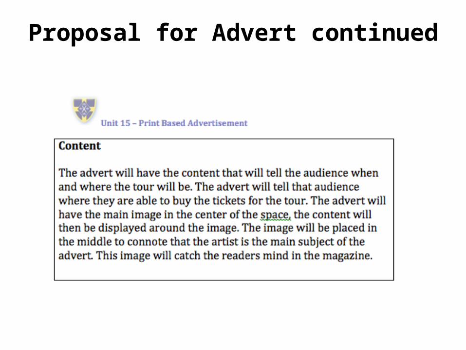
Proposal for Advert continued

Proposal for Advert continued

Target Audience- Katz • The music genre of this artist is Indie rock pop therefore the target
audience would fall into the category of diversion. This is where they are able to escape from their reality and immerse themselves in text. People tend to get more work and other responsibilities when they get older. This band provides the audience with a sense of escape listening to their music. This can be at one of their gigs or even listening to them on your phone. People are able to escape and listen to something that reliefs the stress in life. The target audience also falls into the personal relationship category. This is due to the tour being advertised as they are then able to get closer to the artist at the concerts.

Target Audience- Maslow • The target audience for this theory would be the survivors. This is because
they want the security and routine of knowing the band will be performing around the UK and knowing the dates they are touring. The target audience also relate to the social climbers. They want to improve their status in society by going to these gigs that are around the UK as they are a famous artist.

Target Audience- Hartley's 7th Subjectivities
• The target audience for this theory focuses on the age and gender. The age would be 16+ as most of their lyrics are about love which stereotypically teenagers tend to start to date at this age. The gender of the target audience are aimed at both male and female because the artist is male which stereotypical 16+ females will like and be ‘attracted’ to and also most of their music is about love which can be seen as quite feminine therefore females will like this. They appeal to the male gender because they are a group of boys they can admirer to and relate to.
• The target audience would have to be in middle class to be able to afford the tickets and transport to the gigs.
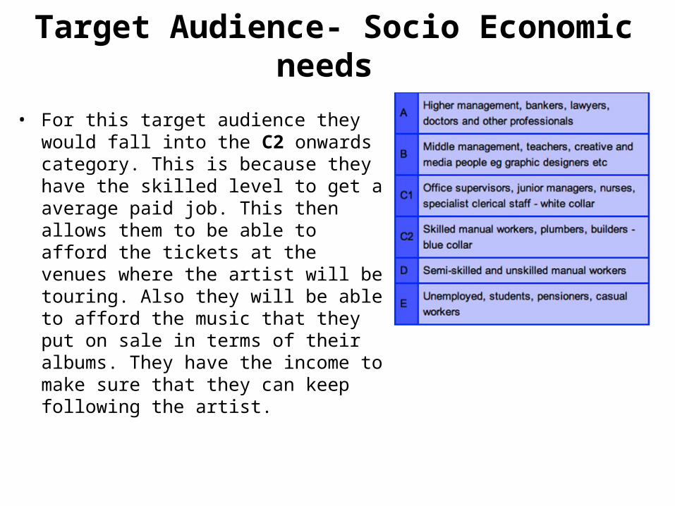
Target Audience- Socio Economic needs
• For this target audience they would fall into the C2 onwards category. This is because they have the skilled level to get a average paid job. This then allows them to be able to afford the tickets at the venues where the artist will be touring. Also they will be able to afford the music that they put on sale in terms of their albums. They have the income to make sure that they can keep following the artist.

Target Audience- Psychographic• For this target audience for the band
that are touring would be classed as Explores. This is because they want to seek the energy and excitement, this can be found at the gigs that they perform at. They want to dance and enjoy the music that they perform. The audience will have that instant effect when they are listening to their music. This would be for the younger audience that enjoy the bands music.

Production Plan for advert/poster and Audio Visual
Week 1
Week 2

Production Plan for advert/poster and Audio visual
Week 3
Week 4
Launch date for poster, advert and planned audio-visual advertisement.
Launch date/ Seasonal Calendar events
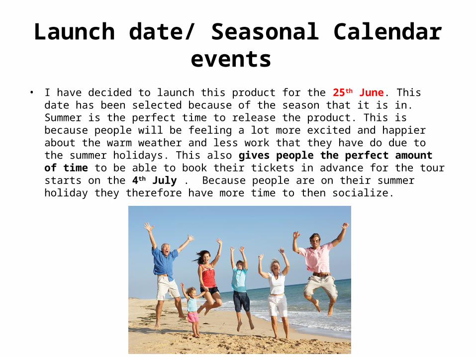
• I have decided to launch this product for the 25th June. This date has been selected because of the season that it is in. Summer is the perfect time to release the product. This is because people will be feeling a lot more excited and happier about the warm weather and less work that they have do due to the summer holidays. This also gives people the perfect amount of time to be able to book their tickets in advance for the tour starts on the 4th July . Because people are on their summer holiday they therefore have more time to then socialize.
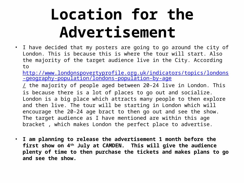
Location for the Advertisement • I have decided that my posters are going to go around the city of London. This is
because this is where the tour will start. Also the majority of the target audience live in the City. According to http://www.londonspovertyprofile.org.uk/indicators/topics/londons-geography-population/londons-population-by-age/ the majority of people aged between 20-24 live in London. This is because there is a lot of places to go out and socialize. London is a big place which attracts many people to then explore and then live. The tour will be starting in London which will encourage the 20-24 age bract to then go out and see the show. The target audience as I have mentioned are within this age bracket , which makes London the perfect place to advertise.
• I am planning to release the advertisement 1 month before the first show on 4th July at CAMDEN. This will give the audience plenty of time to then purchase the tickets and makes plans to go and see the show.
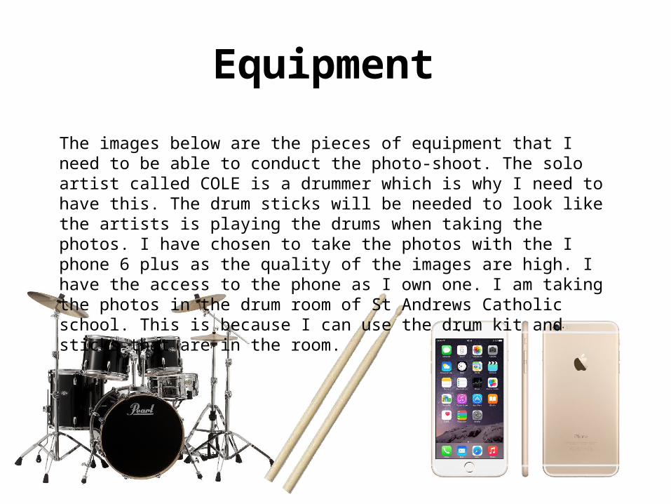
Equipment
The images below are the pieces of equipment that I need to be able to conduct the photo-shoot. The solo artist called COLE is a drummer which is why I need to have this. The drum sticks will be needed to look like the artists is playing the drums when taking the photos. I have chosen to take the photos with the I phone 6 plus as the quality of the images are high. I have the access to the phone as I own one. I am taking the photos in the drum room of St Andrews Catholic school. This is because I can use the drum kit and sticks that are in the room.

Budget/summary/resources • Magazine advertising rates- to have my advert that I have created in my
magazine. I will be looking at paying for a half page at around £1,512. This will get my advert into one of the top selling magazines. For the full page I would have to be paying around £2,750. My advert is fairly small so will be able to fit into the half page space.
• I will be needing staff for the campaign to create the advert and poster. I need a photographer which will be costing me £35 an hour. I will be needing a editor which will be costing me £50 an hour.
• The equipment wont cost me very little as I already own a camera. The cost of the computers that I need to produce the poster will be £875.
• Source: http://www.sheengate.co.uk/advertising/advertising-rates/

Costs of producing the poster • I will be looking at how much it is going to cost me to be able to produce
the poster through the printing. The posters will be a size of A4 which is small for a poster. I have chosen this because then I can the afford to have a larger quantity of of the posters to print. I am looking to produce 75 A4 posters. According to http://www.alocalprinter.co.uk/uk/posters/ this should cost me £30. This will include a free delivery which will also save me money.


Legal and ethical issues • There are many different issues that you need to consider when you are advertising.
When making the advertisement for the solo artist’s tour they need to make sure that they have no copyright problems. The tour logo cant be used in any other form of product without the owners consent. The logo has been registered so the design cant be copied.
• This can also be known as IP, this stands for intellectual property. This means that you own the rights to the name or logo you have created. This can create a good income when you own the rights. COLE can charge the people who want to use their name In their adverting. The best way to protect it is to get a patent so no one can use any of my information but this can take a long time as many steps are involved.
• Source: http://faculty.buffalostate.edu/smithrd/PR/adethics.htm
Legal and ethical issues • When COLE is on tour he will be producing the printed copies, I need to make sure there is no libel
which can then be classed as defamation . This is when something incorrect has been made in print which people can make claims on. Things that people may find offensive such as ethical backgrounds. Nothing can be printed with incorrect information. Such as the price of the tickets.
• The tour also need to consider the royalties. People may want to make some revenue of the tour with merchandises such as t shirts. Royalties is a form of payment that needs to be paid to the legal owner. If people want to use the registered font style and name of the band they need to pay the royalties. Further more public interest is important as this is when you have the welfare of the general public in mind. Therefore I need to make sure that the imagery is relevant and suitable for the audience and the target audience in mind. Furthermore, representation is important when producing the poster and advert and planning for the audio-visual because if there are images of artists on the front like there will be mine ‘COLE’ I have to make sure he is represented in the right way to appeal to the target audience, which he will be as he will be presented with a drum kit appealing to music lovers. Furthermore, I need to make sure there isn't any offensive material on the poster, advert or plan for audio-visual as the artist appeals to a young audience and if a poster is put up around London children would be able to read and see it therefore offensive material cannot be used.

ASA• To make sure that the adverts that are being produced over
the media, there is an organization called the The Advertising Standards Authority. They have the responsibility to respond to the complaints that get made about certain adverts. People complain if they get offended by the use of language, imagery and ethnicity. The ASA will be contacted if any adverts have breached the codes. This is why when creating the adverts for the band COASTS they need to make sure that its kept appropriate. The advert will have to be questioned if they have breached more than one of the codes. This is why the advert for the band has been kept relevant to the bands style in terms of music genre. Calm , friendly and very warm. This then gives of a good impression towards the audience. This then reduces the chances of the ASA getting in contact due to potential complaints.
• Source: https://www.asa.org.uk/?gclid=CjwKEAjwq6m3BRCP7IfMq6Oo9gESJACRc0bNLUJDVS57j61Vc43o-XKV5v39gCoyr07u9ni53HJYwRoCX0Lw_wcB

Ofcom- The office communications • Ofcom are a service that make sure that people are not being scammed by
online adverts and other media products. They make sure that people in the UK get the best from their communication services. If there is a potential scam that has been found on the TV, Radio or videos then Ofcom are the first to investigate. This service that Ofcom have are running under the Acts of parliament. Because the band COASTS are being advertised in the magazine that I have produced. Ofcom are very unlikely to be investigating the advert.
• • Source: http://www.legislation.gov.uk/ukpga/2003/21/contents


(M2) Regulatory codes of Conducts and regulations effecting plan campaign
The codes below I need to consider so the tour runs smoothly . For example I need to consider code 3 misleading advertising. The dates need to be correct otherwise it will be classed as misleading advertising. Furthermore I need to consider code 4 harm and offensive for example make sure there is no offensive language on the poster. Code 5 is about the children for example make sure that there is no imagery of children within the photos that are taken for the poster.

Conclusion • Within this LO I have planed for my solo artist advertisement print based
product. Using a location recce and other pre production materials such as the mind maps. I have outlined the legal and ethical issues that I need to consider when producing the advert. A budget summery has also been drawn up to give me an idea of how much it will cost.

![U2.2 lesson3[lo2]](https://static.fdocuments.us/doc/165x107/58731caf1a28ab673e8b67f1/u22-lesson3lo2-591d13e75c6d0.jpg)

![U1.1 lesson2[lo2]](https://static.fdocuments.us/doc/165x107/5879f4101a28ab70298b533b/u11-lesson2lo2.jpg)


![U1.4 lesson2[lo2]](https://static.fdocuments.us/doc/165x107/587f99ea1a28ab825e8b4ab9/u14-lesson2lo2.jpg)


![U1.6 lesson2[lo2]](https://static.fdocuments.us/doc/165x107/58f099a31a28ab47428b45ff/u16-lesson2lo2.jpg)