Level: Intermediate Drawspace Curriculum 3.3.R5 - 6 Pages ... · In high-key drawings, images can...
6
This resource has three sections: • Understanding High-Key and Low-Key • Investigating Contrast in Drawings • Using Photographic References Understanding High-Key and Low-Key Do you sometimes wonder why one drawing might look flat and uninteresting, while another intrigues you to look deeper into it? That’s usually due to the degree of contrast. One of the most expressive and important elements in a drawing is the contrast between light and dark values. The combination and breadth of values in your work is what creates interest and sets the mood. Of course, an experienced artist could limit contrast to an understated range of light tonal values (known as “high-key”) and still create a successful and delicate drawing. Without experience, however, the outcome is more likely to be a disastrously flat and dull drawing. The Key to Expressive Drawing Using key and contrast to create powerful, emotionally-evocative drawings Level: Intermediate Flesch-Kincaid Grade Level: 10.4 Flesch-Kincaid Reading Ease: 54.8 Drawspace Curriculum 3.3.R5 - 6 Pages and 9 Illustrations ISBN: 978-1-77193-271-4 Copyright © 2016 Mike Sibley (http://www.sibleyfineart.com) and Drawspace Publishing (http://www.drawspace.com). All rights reserved. No part of this publication may be reproduced, stored in a retrieval system, transferred, or transmitted in any form or by any means, including electronic, digital, mechanical, recording, photographing, photocopying, or otherwise, without the purchase of an educators’ license from drawspace.com or the prior written consent of Mike Sibley and Drawspace Publishing. As an Aside High- and low-key lighting are photographer’s terms. Low-key involves multiple lights from many directions so shadows are diluted. High-key uses a single “key light” that creates strong shadows. As an Aside Key is the range of values in a drawing and manipulating those values is a little like playing music. If you play the same song in a higher or lower octave, it’s still the same song even though it sounds different. With a drawing, changing the key lightens or darkens its values, but underneath it’s still structurally the same scene. - Carol Rosinski http://www.toadhollowstudio.com
Transcript of Level: Intermediate Drawspace Curriculum 3.3.R5 - 6 Pages ... · In high-key drawings, images can...

Resource
This resource has three sections:• Understanding High-Key and Low-Key• Investigating Contrast in Drawings• Using Photographic References
Understanding High-Key and Low-KeyDo you sometimes wonder why one drawing might look flat and uninteresting, while another intrigues you to look deeper into it? That’s usually due to the degree of contrast.
One of the most expressive and important elements in a drawing is the contrast between light and dark values. The combination and breadth of values in your work is what creates interest and sets the mood.
Of course, an experienced artist could limit contrast to an understated range of light tonal values (known as “high-key”) and still create a successful and delicate drawing. Without experience, however, the outcome is more likely to be a disastrously flat and dull drawing.
The Key to Expressive Drawing
Using key and contrast to create powerful, emotionally-evocative drawings
Level: IntermediateFlesch-Kincaid Grade Level: 10.4Flesch-Kincaid Reading Ease: 54.8Drawspace Curriculum 3.3.R5 - 6 Pages and 9 Illustrations
ISBN: 978-1-77193-271-4Copyright © 2016 Mike Sibley (http://www.sibleyfineart.com) and Drawspace Publishing (http://www.drawspace.com). All rights reserved. No part of this publication may be reproduced, stored in a retrieval system, transferred, or transmitted in any form or by
any means, including electronic, digital, mechanical, recording, photographing, photocopying, or otherwise, without the purchase of an educators’ license from drawspace.com or the prior written consent of Mike Sibley and Drawspace Publishing.
As an Aside
High- and low-key lighting are photographer’s terms. Low-key involves multiple lights from many directions so shadows are diluted. High-key uses a single “key light” that creates strong shadows.
As an Aside
Key is the range of values in a drawing and manipulating those values is a little like playing music. If you play the same song in a higher or lower octave, it’s still the same song even though it sounds different. With a drawing, changing the key lightens or darkens its values, but underneath it’s still structurally the same scene.- Carol Rosinski http://www.toadhollowstudio.com

Figure 2
A high-key drawing (think low contrast) is one that uses a value scheme of light tones (Figure 1). It can make a landscape seem strangely ethereal and magical due to the high levels of white or light tone in spots where you would usually expect a stronger tone.
2 3.3.R5: The Key to Expressive Drawing
Figure 1
ISBN: 978-1-77193-271-4Copyright © 2016 Mike Sibley (http://www.sibleyfineart.com) and Drawspace Publishing (http://www.drawspace.com). All rights reserved. No part of this publication may be reproduced, stored in a retrieval system, transferred, or transmitted in any form or by
any means, including electronic, digital, mechanical, recording, photographing, photocopying, or otherwise, without the purchase of an educators’ license from drawspace.com or the prior written consent of Mike Sibley and Drawspace Publishing.
A “low-key” drawing (think high contrast) is one that is based on an overall scheme of dark values with high contrast highlights (Figure 2).
In high-key drawings, images can evoke feelings of contentment – contrast levels are low, and shadows are suppressed.
On the other hand, low-key images are full of shadows and dark values, which can create drama in a drawing. Low-key images can also accentuate lines and shapes, as light can reflect off them to add emphasis in the darkness.
As an Aside
My own preference is usually for low-key drawing, but with a strengthened sense of reality suggested by the injection of high-key components (effectively, low-key with soothing high-key accents).
Investigating Contrast in DrawingsContrast can extend to aspects such as warmth and coolness, and is not solely concerned with tonal variations.
In Spinney Lane End (Figure 3 on the next page), darker tones are used to contrast the shady end of the lane with the bright, sunny fields beyond – each reinforces the mood of the other. As the viewer, you are in the shade and yet you can feel the warmth of the scene in front of you. This is essentially a low-key drawing with high-key midground elements to increase the overall perceived contrast.

3
Figure 3
Figure 4
3.3.R5: The Key to Expressive Drawing
Contrast can be used to:• shift the focus within a drawing while still
maintaining its separate, independent elements. For example, the values of the midground trees (Figure 3) serve to connect foreground to background.
• increase the sense of depth and three-dimensional form. Low contrast tends to flatten form – you may have seen this in your photography if you used a flash, which bleaches the shadows.
ISBN: 978-1-77193-271-4Copyright © 2016 Mike Sibley (http://www.sibleyfineart.com) and Drawspace Publishing (http://www.drawspace.com). All rights reserved. No part of this publication may be reproduced, stored in a retrieval system, transferred, or transmitted in any form or by
any means, including electronic, digital, mechanical, recording, photographing, photocopying, or otherwise, without the purchase of an educators’ license from drawspace.com or the prior written consent of Mike Sibley and Drawspace Publishing.
• balance a composition. For example: notice how the intruding bush at the right balances the darker left-hand tones.
• set the mood. For example: imagine the contrasting shading of bright sunlight shining through the window of a dark room.
• correct a colour balance that fails in monochrome. For example: a dark red label on a dark green tin might exactly equal each other in value. Lightening or darkening either will restore a more realistic balance and increase their visibility (Figure 4).
Challenge!
Compare the drawing in Figure 3 (above) to a digitally-modified version in Figure 5 (on the next page). With all the darks reduced in intensity, the drawing becomes high-key with low contrast; and loses depth, mood and impact.

ISBN: 978-1-77193-271-4Copyright © 2016 Mike Sibley (http://www.sibleyfineart.com) and Drawspace Publishing (http://www.drawspace.com). All rights reserved. No part of this publication may be reproduced, stored in a retrieval system, transferred, or transmitted in any form or by
any means, including electronic, digital, mechanical, recording, photographing, photocopying, or otherwise, without the purchase of an educators’ license from drawspace.com or the prior written consent of Mike Sibley and Drawspace Publishing.
Using Photographic ReferencesA camera doesn’t see the world like we do. Our eyes can accommodate differences in light and shade as we scan a scene; but a camera can only adjust to an overall average strength of light. As a result, photos often exhibit burnt-out highlights and shadows that are too dark – which obliterates the detail we see with our eyes.
4 3.3.R5: The Key to Expressive Drawing
Figure 5
Figure 6Consider printing extra copies of your reference photos. Compare the original (Figure 7) to Figure 6, where the shadows have been lightened to expose detail. A darkened copy usually reveals additional details in the highlights.
As with the bear’s ear, legs and coat detail, you now have all the information available. You can confidently begin drawing as if you were seeing the subject with your own eyes.
Notice how bleaching the shadows has partially flattened the bear’s three-dimensional form (Figure 6).
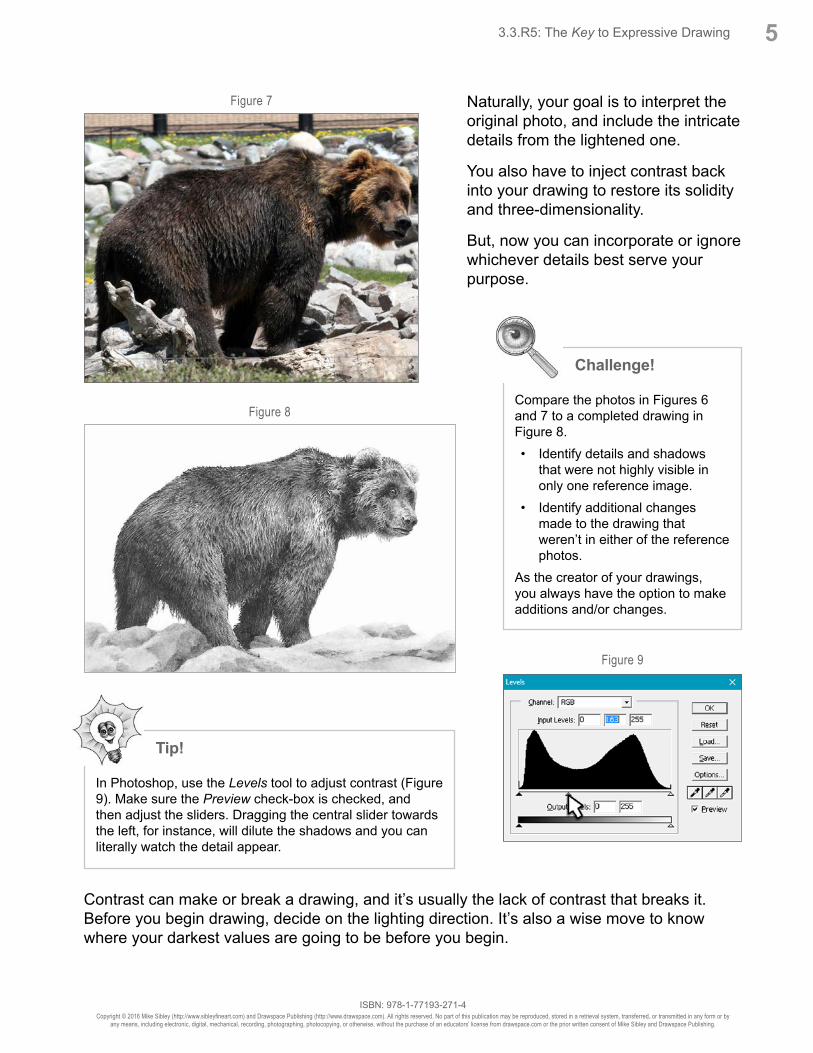
Figure 7
Figure 8
Figure 9
ISBN: 978-1-77193-271-4Copyright © 2016 Mike Sibley (http://www.sibleyfineart.com) and Drawspace Publishing (http://www.drawspace.com). All rights reserved. No part of this publication may be reproduced, stored in a retrieval system, transferred, or transmitted in any form or by
any means, including electronic, digital, mechanical, recording, photographing, photocopying, or otherwise, without the purchase of an educators’ license from drawspace.com or the prior written consent of Mike Sibley and Drawspace Publishing.
Naturally, your goal is to interpret the original photo, and include the intricate details from the lightened one.
You also have to inject contrast back into your drawing to restore its solidity and three-dimensionality.
But, now you can incorporate or ignore whichever details best serve your purpose.
53.3.R5: The Key to Expressive Drawing
Contrast can make or break a drawing, and it’s usually the lack of contrast that breaks it. Before you begin drawing, decide on the lighting direction. It’s also a wise move to know where your darkest values are going to be before you begin.
Challenge!
Compare the photos in Figures 6 and 7 to a completed drawing in Figure 8. • Identify details and shadows
that were not highly visible in only one reference image.
• Identify additional changes made to the drawing that weren’t in either of the reference photos.
As the creator of your drawings, you always have the option to make additions and/or changes.
Tip!
In Photoshop, use the Levels tool to adjust contrast (Figure 9). Make sure the Preview check-box is checked, and then adjust the sliders. Dragging the central slider towards the left, for instance, will dilute the shadows and you can literally watch the detail appear.

ISBN: 978-1-77193-271-4Copyright © 2016 Mike Sibley (http://www.sibleyfineart.com) and Drawspace Publishing (http://www.drawspace.com). All rights reserved. No part of this publication may be reproduced, stored in a retrieval system, transferred, or transmitted in any form or by
any means, including electronic, digital, mechanical, recording, photographing, photocopying, or otherwise, without the purchase of an educators’ license from drawspace.com or the prior written consent of Mike Sibley and Drawspace Publishing.
And if your reference doesn’t possess strong shadows, invent some.
Figure out where shadows would enhance the scene, and then engineer your drawing to accommodate them – as I did with the shadow cast by this Doberman’s ear (Figure 10).
This shadow serves to throw his ear away from his face, contrasts with the sharp, highlighted edge, and describes the form of his cheek.
Happy Drawing....
Drawing from Line to Lifeby Mike Sibley
• Foreword by renowned Artist David Shepherd
• Over 280 pages of pencil drawing tips, tutorials, demonstrations and much more...
• More than 625 illustrations
• Tools, techniques, methods
• Step-by-step instructions
• For the Novice and Advanced student
• From pure line drawing through to near-reality
Based on Mike’s experience of over 30 years as a professional artist and graphite pencil specialist.
www.SibleyFineArt.com/pencil-drawing-book.htm
6 3.3.R5: The Key to Expressive Drawing
Figure 10