Lesson 3 - IA for web
87
Informa(on architecture for web IFI7046 lecture slides April 12, 2015
-
Upload
hanna-liisa-pender -
Category
Education
-
view
134 -
download
0
Transcript of Lesson 3 - IA for web

Informa(on architecture for web
IFI7046 lecture slides April 12, 2015

They are here to stay…
2
243 million The number of websites as of December 2010. 486 million September 2011.
http://gs.statcounter.com

NOW
A billion…

4
• That many op(ons means heavy compe((on. • Reduced (me, aIen(on and pa(ence
Users will leave the site if: • They are having trouble using it • Do not know what the site is about • Do not know what capabili(es the site gives • They become disoriented • Informa(on is hard to read • Website it ‘heavy to digest’ and boring
Why good IA?

5
“Simply stated, if the customer can’t find a product, then he or she will not buy it” J.Nielsen, 2000
Remember…

6
We need to sa(sfy not just the client, but also the cat… Usability and Informa(on Architecture go hand in hand…
http://youtu.be/dln9xDsmCoY
The Ini(al Page. Think:
• Logo • Branding, Iden(ty • Structure and Priori(es • Naviga(on • A note on Splash Screens

Logos…

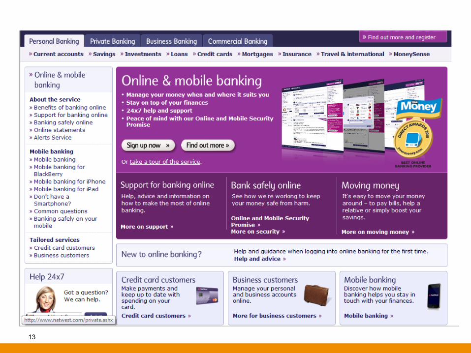
Logo • Clear, eligible, good location,
size Stands out. A usual place to put the logo is on the top left.
• A common practice is that the logo links to the main page for ease of access.
• Portrays reliability and safety


11

Iden6ty • First impressions on entry – question: do we
communicate the purpose and what the site represents to the user?
• If the site belongs to a company / organisation, then what is about?
• What can the user do on the site? (beyond navigate, meaning what does the website let them do? Get information? Sign an appeal? Create a CV account?)
• Clear taglines, slogans, messages and key words.
13

14

15

16

Corporate iden6ty A corporate iden6ty is the overall image of an ins(tu(on, firm or business in the minds of diverse publics, such as customers, investors and employees. Do the elements on the website: a) Match? b) Help you to focus? c) Contribute to the iden(ty of the ins(u(on?


Structure and Priori6es • Separations and hierarchy which needs to be decided based on the goals and functionality of the website.
• Follow Standard Conventions for structure according to the website purpose and style. If you will break this rule, and of course there are times that you can, make sure there is a concrete reason first. Remember that your users expect these and can be very unforgiving.
• Main / Critical Information – There should not be visual competition between elements. (be careful of ads)
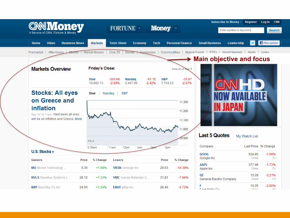
Main objective and focus

Placing ads somewhere where they are visible but do not obstruct

23
Placing ads somewhere where they are visible but do not obstruct

Standard news site layout


Some measures…

Naviga6on and Affordances • Clear access from the main page (menu?) to all the subpages
– Make sure there are no broken links – Use a sitemap (a site map (or sitemap) is a list of pages of a web site
accessible to crawlers or users. It can be either a document in any form used as a planning tool for Web design, or a Web page that lists the pages on a Web site, typically organized in hierarchical fashion)
– Product-oriented
– Visual clues as to the type of information that you will find at the lower levels (see also information scent)


Splash Screens
Does anyone watch these?

Splash Screens • Delay the user from reaching his target, the
information.
• Causes users to leave, especially if there is no skip button.
• Requires extra work and increases cognitive load for the users.
• Require plugins to run, install, authorise!
• Anti-compatible with Search Engine Compatibility
Skip intro

Screen real estate

Above the fold • The loca(on on the screen
before scrolling takes place • Differs depending on resolu(on
and se`ngs
• Important informa(on should be located above the fold for effec(ve and faster user assimila(on.

Above the fold • 640 x 480 fold is around
310 pixels down • 800 x 600 fold is around
430 pixels down • 1024 x 768 fold is around
600 pixels down • 1200 x 1024 fold is around
850 pixels down • 1600 x 1200 fold is around
1030 pixels down


The Grid • The Grid is a way of ordering content in order to structure it into horizontal and vertical arrangements.
• It assists us with designing information in a consistent and beneficial layout.
• In Chrome apps check out the UX Check Plugin


“If a website is designed with a structured layout, then that feeling of structure comes through to the user in their first impression. It implies that thought has been given to how the website is to deliver its informa(on to the user and therefore gives the user confidence in the website.”
http://www.designer-daily.com/the-use-of-grids-in-website-design-6639

Nega6ve Space • Breathing space – negative
space
• Encapsulates and makes distinction between important elements of your website
• You can use negative space to structure the web page


Graphical User Interfaces (GUIs)

Graphical User Interface
1. Look and Feel • Identity and Cohesion • Font • Background and Colours • Alignment
2. Graphics (icons and images) • Type of images, are they all useful and
needed? • Metaphors • What size are they (x,y and also in MB)? Can
we use a thumbnail? • Type of images (abstract specific realistic?)
3. Consistency and Harmonising with Cascading Style Sheets (CSS)

Metaphors • Used to represent an abstract concept such as shopping. • Needs to be close to the actual ac(vity or meaning
• Different cultures may have different understandings • Can be dangerous (not the will shoot you kind), but can be business cri(cal

Navigation Metaphors (flowers)


Fonts • The font style can portray the ‘tone’ and ‘nature’ of the website. • Ascenders and descenders are not as suited for online text unless set larger than normal • Sans serif fonts are usually more effective for reading and scanning on a screen

http://www.ampsoft.net/webdesign-l/WindowsMacFonts.html

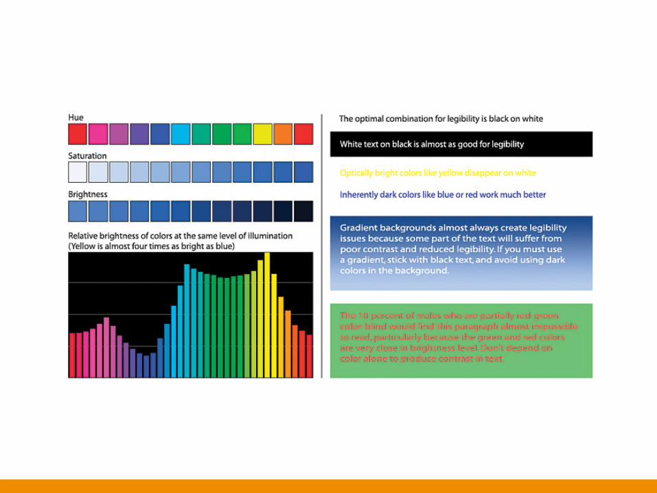
Background and Colours • There must be enough contrast between the background and the foreground (text images etc) • Standard practise is to choose colours which match the logo an the identity • Be careful in selecting colour combinations such as red on blue • Red, Green, Brown, Grey and Purple are difficult to read when next to each other. • Think of your target audience
– Bright colours for Children and Teens – Dark Font and Intense Colours for 0-30 – While / light background with bright colours and exciting images for everyone. – While / light background with big black letters for older individuals.

“Use colors with high contrast between the text and the background. Op(mal legibility requires black text on white background (so-‐called posi(ve text). White text on a black background (nega(ve text) is almost as good. Although the contrast ra(o is the same as for posi(ve text, the inverted color scheme throws people off a liIle and slows their reading slightly...”
Jakob Nielsen


Alignment • Centre or Right– Difficult (The eyes look for the beginning of the next line)
• Justified – This can confuse the browser
and create some funky (not in a good way) effects. Harder also to read than left.
• Left – Easiest to scan and read
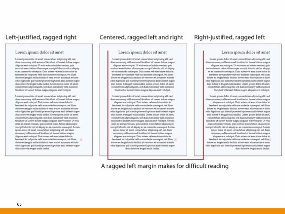
65

Images – Always consider bandwidth allowance
– We avoid using graphics for links (usually). For example, avoid using buttons on pages.
– The most successful websites are those who are fast in operation for the user.
– We do not sacrifice speed for beauty

Using Pictures...
“A picture is worth a thousand words” “A picture takes 2,000 words worth of download (me”

Use
Use specific images instead of generic image library images. Do not just use images for decora(on of page; make them have a point.


Image Size – We can advise to
• Chunking – SLICES – PLT: Perceived load 6me – Does everything appear aier loading or all at once? – Try to reduce perceived loading (me
• Make sure the user understands images with links. Thumbnails and larger images.

“On the average Web page, users have (me to read at most 28% of the words during an average visit; 20% is more likely.” Jakob Nielsen
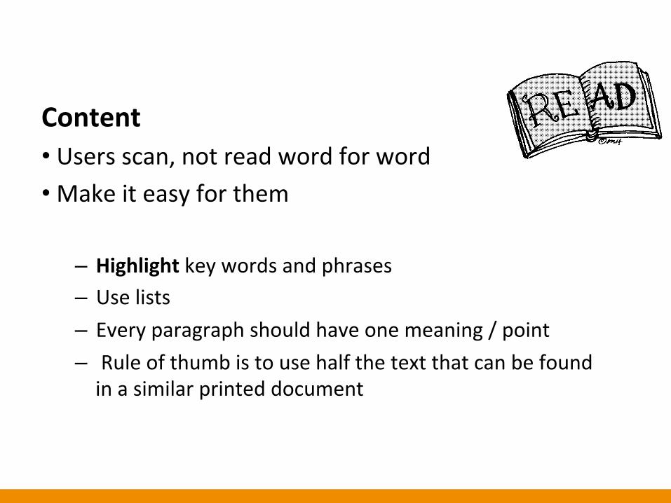
Content • Users scan, not read word for word • Make it easy for them
– Highlight key words and phrases – Use lists – Every paragraph should have one meaning / point – Rule of thumb is to use half the text that can be found in a similar printed document


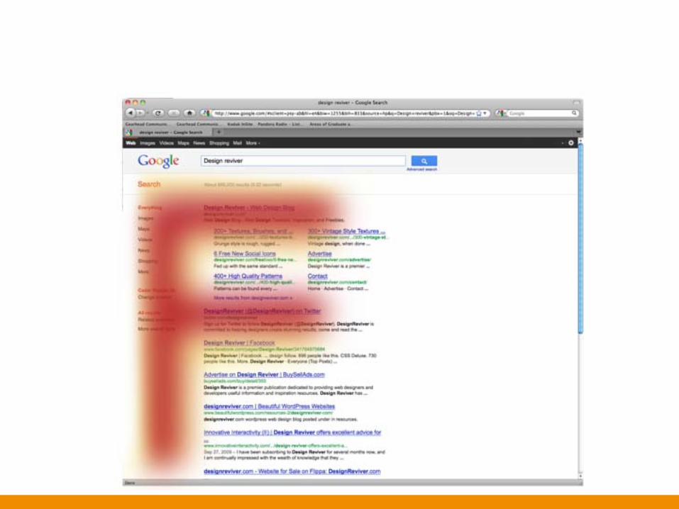
Content: the F paOern • The first two paragraphs should have the most important info. • Inverted pyramid • Remember Rich in informa(on scent

Naviga6on – Main Menu • Universal and consistent loca(on and use • Lei-‐aligned or centered • Make sure the blocks that divide the menu are of equal distance • Not more than 2-‐3 levels depth • Keep the (tles simple and short • Do not use images for these • You can also choose to repeat them at the footer


Hyperlinks Visiblity -‐ Varia(ons:
– Colour -‐ Blue links
– Underline – especially when using another colour
– visited links – users tend to move around in circles. Help them not to.
• They can see where they have been • Less overload on short-‐term memory

Hyperlinks • Descrip(ve (Summarised explana(on)
– E.G “download the pdf file for the brochure” instead of: to download the brochure “click here”
• Remember Alt labels – accessibility – <a href=“about.htm” alt=“link to the about us page”>profile</a>
• Broken links -‐ They lead no where (even worse they lead to the wrong place)

Sitemap • Helps Orienta(on
Where am I? Where did I navigate? Where can I navigate to?
• Can display pages that are not on menus directly.

Navitga6on – breadcrumb • Leaves a trail and shows you where you are
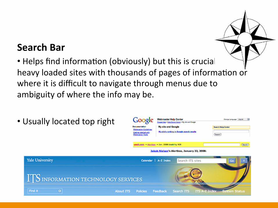
Search Bar • Helps find informa(on (obviously) but this is crucial on heavy loaded sites with thousands of pages of informa(on or where it is difficult to navigate through menus due to ambiguity of where the info may be.
• Usually located top right

Back buOon • Vital – some(mes webpages interfere with this to not let you go back… DON’T DO THIS… HOW ANNOYING…