
LAB MANUAL SOFA: Statistics Open For All
145
LAB MANUAL SOFA: Statistics Open For All george self June 2017 – Edition 2.0
Transcript of LAB MANUAL SOFA: Statistics Open For All

L A B M A N U A L
SOFA: Statistics Open For All
george self
June 2017 – Edition 2.0

George Self: Lab Manual, SOFA: Statistics Open For All, June 2017
This work is licensed under a CreativeCommons “Attribution-ShareAlike 4.0 In-ternational” license.

F O RWA R D
I have taught BASV 316, Introductory Methods of Analysis, online forthe University of Arizona in Sierra Vista since 2010 and enjoy work-ing with students on research methodology. From the start, I wantedstudents to work with statistics as part of our studies and carry outthe types of calculations that are discussed in the text. As I evaluatedstatistical software I had three criteria:
• Open Educational Resource (OER). It is important to me thatstudents use software that is available free of charge and is sup-ported by the entire web community.
• Platform. While most of my students use a Windows-based sys-tem, some use Macintosh and it was important to me to use soft-ware that is available for all of those platforms. As a bonus, mostOER software is also available for the Linux system, though I’mnot aware of any of my students who are using Linux.
• Longevity. I wanted a system that could be used in other collegeclasses or in a business setting after graduation. That way, anytime a student spends learning the software in my class will bean investment that can yield results for many years.
I originally wrote a series of six lab exercises (later expanded tonine) using R-Project since that software met these three criteria. More-over, R-Project is a recognized standard for statistical analysis andcould be easily used for even peer-reviewed published papers. Un-fortunately, I found R-Project to be confusing to students since it istext-based with rather complex commands. I found that I spent alot of time just teaching students how to set up a single test with R-Project instead of analyzing the result. In the spring of 2017 I changedto SOFA (Statistics Open For All) because it is much easier to use andstill met my criteria.
This lab manual explores every aspect of SOFA in a series of ten labexercises plus a final. It is my hope that students will find the labsinstructive and will then be able to use SOFA for other classes. Thislab manual is published under a Creative Commons license with agoal that other instructors will modify it to meet their own needs. Ialways welcome comments and will improve this manual as I receivefeedback.
—George Self
iii


C O N T E N T S
i lab exercises 1
1 introduction 3
1.1 Introduction 3
1.2 Hypothesis 3
1.3 Data 5
1.3.1 Types of Data 5
1.3.2 Shape of Data 6
1.4 Installing and Starting SOFA 9
1.5 Importing Data 9
1.5.1 Activity 1 13
1.6 Deliverable 14
2 central measures 15
2.1 Introduction 15
2.2 Central Measures 15
2.2.1 N 15
2.2.2 Mean 15
2.2.3 Median 16
2.2.4 Mode 17
2.2.5 Sum 18
2.3 Procedure 18
2.3.1 Calculating Mean, Median, and N 18
2.3.2 Activity 1: Central Measures 20
2.3.3 Grouping 20
2.3.4 Activity 2: Grouping 22
2.3.5 Mode 22
2.3.6 Activity 3: Mode for Numeric Data 24
2.3.7 Activity 4: Mode for Text Data 24
2.4 Examples 24
2.5 Deliverable 25
3 data dispersion 27
3.1 Introduction 27
3.2 Measures of Data Dispersion 27
3.2.1 Range 27
3.2.2 Quartiles 27
3.2.3 Standard Deviation 28
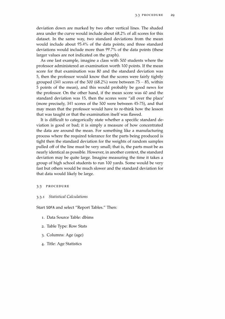
3.3 Procedure 29
3.3.1 Statistical Calculations 29
3.3.2 Activity 1: Simple Statistics 31
3.3.3 Grouping Variables 31
3.3.4 Activity 2: Grouped Statistics 32
3.3.5 Filtering 32
v

vi contents
3.3.6 Activity 3: Filtering 33
3.4 Deliverable 34
4 visualizing dispersion 35
4.1 Introduction 35
4.2 Procedure 39
4.2.1 Boxplots 39
4.2.2 Activity 1: Simple Boxplot 40
4.2.3 Grouped Boxplot 40
4.2.4 Activity 2: Grouped Boxplots 42
4.2.5 Grouped Boxplots By Series 42
4.2.6 Activity 3: Grouped Boxplots by Series 44
4.3 Deliverable 45
5 frequency tables 47
5.1 Introduction 47
5.2 Frequency Tables 47
5.3 Crosstabs 48
5.3.1 Complex Crosstabs 49
5.4 Procedure 50
5.4.1 Frequency Table 50
5.4.2 Activity 1: Frequency Table 51
5.4.3 Crosstabs 51
5.4.4 Activity 2: Crosstabs 53
5.4.5 Activity 3: Complex Crosstabs 53
5.5 Deliverable 53
6 visualizing frequency 55
6.1 Introduction 55
6.2 Visualizing Data 55
6.2.1 Histogram 55
6.2.2 Bar Chart 56
6.2.3 Clustered Bar Chart 57
6.2.4 Pie Chart 59
6.2.5 Line Charts 60
6.3 Procedure 60
6.3.1 Histogram 61
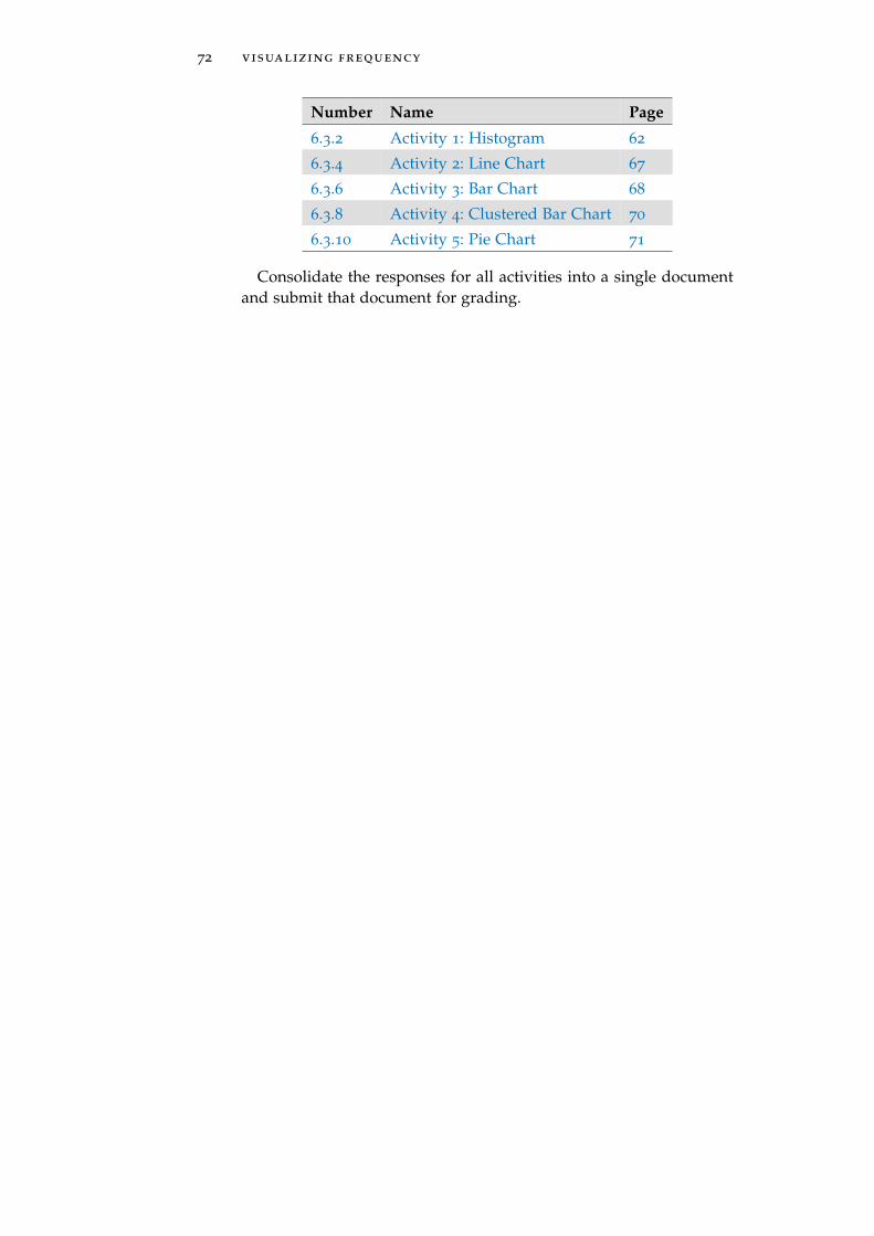
6.3.2 Activity 1: Histogram 62
6.3.3 Line Charts 62
6.3.4 Activity 2: Line Chart 67
6.3.5 Bar Chart 67
6.3.6 Activity 3: Bar Chart 68
6.3.7 Clustered Bar Chart 69
6.3.8 Activity 4: Clustered Bar Chart 70
6.3.9 Pie Chart 70
6.3.10 Activity 5: Pie Chart 71
6.4 Deliverable 71
7 correlation 73
7.1 Introduction 73

contents vii
7.2 Correlation and Causation 73
7.2.1 Pearson’s R 73
7.2.2 Spearman’s Rho 74
7.3 Significance 75
7.3.1 Chi-Square 76
7.3.2 Degrees of Freedom 77
7.4 Scatter Plots 78
7.5 Procedure 80
7.5.1 Pearson’s R 80
7.5.2 Activity 1: Pearson’s R 81
7.5.3 Spearman’s Rho 81
7.5.4 Activity 2: Spearman’s Rho 83
7.5.5 Chi Square 83
7.5.6 Activity 3: Chi Square 84
7.6 Deliverable 84
8 regression 87
8.1 Introduction 87
8.2 Regression 87
8.3 Procedure 89
8.3.1 Activity 1: Predictive Regression 1 91
8.3.2 Activity 2: Predictive Regression 2 91
8.4 Deliverable 91
9 hypothesis testing : nonparametric tests 93
9.1 Introduction 93
9.2 Kruskal-Wallis H 93
9.3 Wilcoxon Signed Ranks 93
9.4 Mann-Whitney U 94
9.5 Procedure 94
9.5.1 Statistics Wizard 94
9.5.2 Activity 1: Wizard 98
9.5.3 Chi Square 98
9.5.4 Correlation - Spearman’s 98
9.5.5 Kruskal-Wallis H 98
9.5.6 Activity 2: Kruskal-Wallis H 100
9.5.7 Mann-Whitney U 101
9.5.8 Activity 3: Mann-Whitney U 102
9.5.9 Wilcoxon Signed Ranks 103
9.5.10 Activity 4: Wilcoxon Signed Ranks 104
9.6 Deliverable 104
10 hypothesis testing : parametric tests 107
10.1 Introduction 107
10.2 ANOVA 107
10.3 t-test - Independent 107
10.4 t-test - Paired 108
10.5 Procedure 108
10.5.1 ANOVA 108

viii contents
10.5.2 Activity 1: ANOVA 113
10.5.3 Correlation - Pearson’s 114
10.5.4 t-test - Independent 114
10.5.5 Activity 2: t-test - Independent 116
10.5.6 t-test - Paired 116
10.6 Deliverable 118
11 final 119
11.1 Introduction 119
ii appendix 121
12 appendix 123
12.1 Appendix A: Datasets 123
12.1.1 bdims 123
12.1.2 births 125
12.1.3 cars 126
12.1.4 doorsurvey 126
12.1.5 email 127
12.1.6 gifted 128
12.1.7 maincafe 129
12.1.8 rivers 130
12.1.9 tutoring 130
12.2 Appendix B: Recoding Variables 131
12.2.1 Background 131
12.2.2 Recoding Variables With SOFA 131
12.3 Appendix C: SOFA Exports 132
12.3.1 Styles 132
12.3.2 Exporting a File 133
12.3.3 Copy/Paste Output 134
12.3.4 Reports 134

Part I
L A B E X E R C I S E S

1I N T R O D U C T I O N
1.1 introduction
Statistical analysis is the core of nearly all research projects and re-searchers have a wide variety of statistical tools that they can use, likeSPSS, SAS, and R. Unfortunately, these analysis tools are expensiveor difficult to master so this lab manual introduces Stastics Open ForAll (SOFA), an open source statistical analysis program that is free ofcharge and easy to use. Before downloading and diving into a statis-tics package there are two important background fundamentals thatmust be covered: hypothesis and data.
1.2 hypothesis
A hypothesis is an attempted explanation for some observation andis often used as a starting point for further investigation. For exam-ple, imagine that a physician notices that babies born of women whosmoke seem to be lighter in weight than for women who do notsmoke. That could lead to a hypothesis like “smoking during preg-nancy is linked to light birth-weights.” As another example, imaginethat a restaurant owner notices that tipping seems to be higher onweekends than through the week. That might lead to a hypothesisthat “the size of tips is higher on weekends than weekdays.” Aftercreating a hypothesis a researcher would gather data and then sta-tistically analyze that data to determine if the hypothesis is accurate.Additional investigation may be needed to explain why that observa-tion is true.
In a research project there are usually two related competing hy-potheses: the Null Hypothesis and the Alternate Hypothesis.
• Null Hypothesis (abbreviated H0). This is sometimes describedas the “skeptical” view; that is, the explanation that was prof-fered for some observed phenomena was mistaken. For exam-ple, the null hypothesis for the smoking mother observationmentioned above would be “smoking has no effect on a baby’sweight” and for the tipping observation would be “there is nodifference in tipping on the weekend.”
• Alternate Hypothesis (abbreviated Ha). This is the hypothesisthat is being suggested as an explanation for the observed phe-nomenon. In the case of the smoking mother mentioned abovethe alternative hypothesis would be that smoking causes a de-
3

4 introduction
crease in birth weight. This is called the “alternate” because it isdifferent from the status quo which is encapsulated in the nullhypothesis.
One commonly used example of the difference between the nulland alternate hypothesis comes from the trial court system. Whena jury deliberates about the guilt of a defendant they start from aposition of “innocent until proven guilty,” which would be the nullhypothesis. The prosecutor is asking the jury to accept the alternatehypothesis, or “the defendant committed the crime.”
For the most part, researchers will never conclude that the alter-nate hypothesis is true. There are always confounding variables thatare not considered but could be the cause of some observation. For ex-ample, in the smoking mothers example mentioned above, even if theevidence indicates that babies born to smokers are lighter in weightthe researcher could not state conclusively that smoking caused thatobservation. Perhaps non-smoking mothers had better health care,perhaps they had better diets, perhaps they exercised more, or any ofa number of other reasonable explanations not related to smoking.
For that reason, the result of a research project is normally reportedwith one of two phrases:
• The null hypothesis is rejected. If the evidence indicates that thereis a significant difference between the status quo and whateverwas observed then the null hypothesis would be rejected. Forthe “tipping” example above, if the researcher found a signif-icant difference in the amount of money tipped on weekendscompared to weekdays then the null hypothesis (that is, tippingis the same on weekdays and weekends) would be rejected.
• The null hypothesis cannot be rejected. If the evidence indicatesthat there is no significant difference between the status quoand whatever was observed then the researcher would reportthat the null hypothesis could not be rejected. For example, ifthere was no significant difference in the birth weights of babiesborn to smokers and non-smokers then the researcher failed toreject the null hypothesis.
Often a research hypothesis is based on a prediction rather than anobservation and that hypothesis can be tested to see if there is anysignificant difference between it and the null hypothesis. Imagine ahypothesis like “walking one mile a day for one month decreasesblood pressure.” A researcher could easily test this by measuring theblood pressure of a group of volunteers, have them walk a mile everyday for a month, and then measure their blood pressure at the end ofthe experiment to see if there was any significant difference.

1.3 data 5
1.3 data
1.3.1 Types of Data
There are four types of data, divided into two main groups, and itis important to understand the difference between them since thatdetermines appropriate statistical tests to be used in data analysis.1
• Qualitative. Qualitative data groups observations into a limitednumber of categories; for example, type of pet (cat, dog, bird,etc.) or place of residence (Arizona, California, etc.). Becausequalitative data do not have characteristics like means or stan-dard deviations, they are analyzed using non-parametric tests,as described in Lab 9 on page 93. Qualitative data can be furtherdivided into two sub-types, nominal and ordinal.
– Nominal. Nominal data are categories that do not overlapand have no meaningful order, they are merely labels forattributes. Examples of nominal data include occupations(custodial, accounting, sales, etc.) and blood type (A, B, AB,O). A special subcategory of nominal data is binary, or di-chotomous, where there are only two possible responses,like “yes” and “no”. Nominal data are sometimes storedin a database using numbers but they cannot be treatedlike numeric data. For example, binary data, like “Do yourent or own your home?” can be stored as “1 = rent, 2 =own” but the numbers in this case have no numeric sig-nificance and could be replaced by words like “Rent” and“Own.”
– Ordinal. Ordinal data, like nominal, are categorical databut, unlike nominal, the categories imply some sort of or-der (which is why it is called “ordinal” data). One exampleof ordinal data is the “star” rating system for movies. It isclear that a five-star movie is somehow better than a four-star movie but there is no way to quantify the differencebetween those two categories. As another example, it iscommon for hospital staff members to ask patients to ratetheir pain level on a scale of one to ten. If a patient reportsa pain level of “seven” but after some sort of treatmentlater reports a pain level of “five” then the pain has clearlydecreased but it would be impossible to somehow quan-tify the exact difference in those two levels. Ordinal scalesare most commonly used for Likert-type survey questionswhere the responses are selections like “Strongly Agree”,
1 Appendix A: Datasets, on page 123, lists all of the datasets used in this lab manualand specifies the type of data each contains.

6 introduction
“Agree”, “Neutral”, “Disagree”, “Strongly Disagree”. Ordi-nal data are also used when numeric data are grouped. Forexample, if a dataset included respondents’ ages then thosenumbers could be grouped into categories like “20 − 29”and “30− 39.” Those groups would typically be stored inthe dataset as a single number so maybe “2” would repre-sent the ages “20− 29,” which would be ordinal data.
• Quantitative. Quantitative data are numbers, typically countsor measures, like a person’s age, a tree’s height, or a truck’sweight. Quantitative data are measured with scales that haveequal divisions so the difference between any two values canbe calculated. Quantitative data are discrete if they are repre-sented by integers, like the count of words in a document, orcontinuous if they are represented by fractional numbers, likea person’s height. Because quantative data includes characteris-tics like means and standard deviations, they are analyzed us-ing parametric tests, as described in Lab 10 on page 107. Quan-titative data can be further divided into two sub-types, intervaland ratio.
– Interval. Interval data use numbers to represent quantitieswhere the distance between any two quantities can be cal-culated but there is no true zero point on the scale. One ex-ample is a temperature scale where the difference between80°and 90°is calculated to be the same as the difference be-tween 60°and 70°. It is important to note that interval datado not include any sort of true zero point, thus zero de-grees Celsius does not mean “no temperature,” and with-out a zero point it is not reasonable to make a statementlike 20°is twice as hot as 10°.
– Ratio. Ratio data, like interval data, use numbers to de-scribe a specific measurable distance between two quanti-ties; however, unlike interval data, ratio data have a truezero point. A good example of ratio data is the sales reportfor an automobile dealership. Because the data are a sim-ple count of the number of automobiles sold it is possibleto compare on month with another. Also, since the scalehas a true zero point (it is possible to have zero sales) itis possible to state that one month had twice the sales ofanother.
1.3.2 Shape of Data
1.3.2.1 About The Normal Distribution (Bell Curve)
When the quantitative data gathered from some statistical project areplotted on a graph they often form a “normal distribution” (some-

1.3 data 7
times called a “bell curve” due to its shape). As an example, considerthe Scholastic Aptitude Test (SAT) which is administered to morethan 1.5 million high school students every year. Figure 1 was createdwith fake data but illustrates the results expected of a typical SATadministration.
Figure 1: Normal Distribution
SAT scores lie between 400 and 1600 as listed across the X-Axisand the number of students who earn each score is plotted. Sincethe most common score is 1000 that score is at the peak of the curve.Very few students scored above 1300 or below 650 and the curve isnear the lower bound beyond those points. This illustrates a normaldistribution where most scores are bunched near the center of thegraph with only a few at either extreme.
The normal distribution is important because it permits researchersto test hypothesis about the sample. For example, perhaps a researcherhypothesized that the students in university “A” had a higher gradu-ation rate than at university “B” because their SAT scores were higher.Because SAT scores have a normal distribution the researcher coulduse specific tests, like a t-test, to try to support the hypothesis. How-ever, if the data were not normally distributed then the researcherwould need to use a different group of tests.
1.3.2.2 Excess Kurtosis
One way to mathematically describe a normal distribution is to cal-culate the length of the tails of a bell curve, and that is called itsexcess kurtosis. For a normal distribution the excess kurtosis is 0.00, apositive excess kurtosis would indicate longer tails while a negativeexcess kurtosis would indicate shorter tails. Intuitively, many people

8 introduction
believe the excess kurtosis represents the “peaked-ness” of the curvesince longer tails would tend to lead to a more peaked graph; how-ever, excess kurtosis is a measure of the data outliers, which wouldbe only present in the tails of the graph; so excess kurtosis is not di-rectly indicative of the the “sharpness” of the peak. It is difficult tocategorically state that some level of excess kurtosis is good or bad.In some cases, data that form a graph with longer tails are desiredbut in other cases they would be a problem.
Following are three examples of excess kurtosis. Notice that as theexcess kurtosis increases the tails become longer.
Figure 2: Kurtosis in a Normal Distribution
1.3.2.3 Skew
The second numerical measure of a normal distribution that is fre-quently reported is its skew, which is a measure of the symmetry ofthe curve about the mean of the data. The normal distribution in Fig-ure 1 has a skew of 0.00. A positive skew indicates that the tail on theright side is longer, which means that there are several data points onthe far right side of the graph “pulling” the tail out that direction. Anegative skew indicates that the tail on the left side of the graph islonger. Following are three examples of skew:

1.4 installing and starting sofa 9
Figure 3: Skew in a Normal Distribution
1.4 installing and starting sofa
There are versions of SOFA available for Windows, MacOS, and Linux;so whatever operating system is being used there is a version thatwill work. The SOFA downloads can be found at:
http://www.sofastatistics.com/downloads.php.The installation process is fairly simple so there is no additional
information about that here. Students should contact their instructorif they have trouble downloading or installing SOFA.
1.5 importing data
In order to work with the statistical analysis in SOFA the data mustfirst be imported. SOFA makes it easy to import data, then those dataare always available in SOFA’s internal database until they are inten-tionally deleted. The datasets2 for all of the activities in this manualare available in a ZIP file located at:https://goo.gl/hA04Gg
Download the latest version of the Zipped “Data Files” and extractall of the .CSV files to a folder and then import each dataset into SOFA.As a start, to import the bdims dataset:
1. Open SOFA and click the “Import Data” button.
2 Appendix A: Datasets, on page 123, details the structure and contents of all datasetsused in this manual.

10 introduction
2. On the “Select File” screen, find the bdims.csv file that was ex-tracted from the dataset ZIP archive. The SOFA Table Name willbe automatically filled in based upon the name of the .CSV file.While the table name can be changed, it is best to leave it at thedefault value so it matches the activities in this manual.
Figure 4: Finding CSV File To Import
3. Click the “Import” button.
4. A window with the first few lines of data from the CSV file willopen. Be certain that the data looks correct. If it looks like thereare run-on lines (that is, a long string of random characters) orthe header line was not found, then adjust the various settingsat the top of the check window.

1.5 importing data 11
Figure 5: Checking Import Data
5. Notice in Figure 5 that the column labeled “elb.di” has someblanks at the top. It is common for datasets to have missingdata, but SOFA can easily work around that problem.
6. Click “OK.”
7. Next, SOFA warns that there was a problem with Row 7.
12 introduction
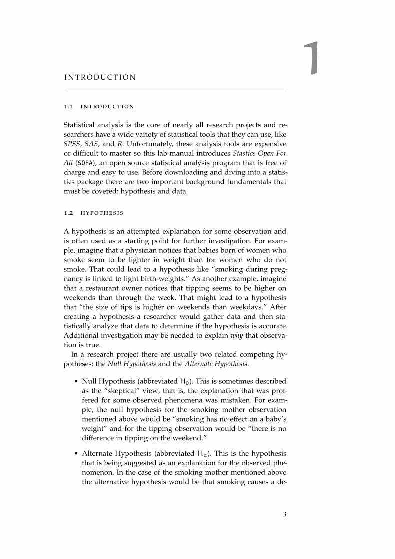
Figure 6: Mixed Data Warning
8. The column for “elb.di” had some missing values in its first fewlines so SOFA assumed that the column contained text. Then,when SOFA found a number in row seven it was not sure if thecolumn contained text or numbers.
9. Click “Numeric” to let SOFA know that the column containsnumbers rather than text.
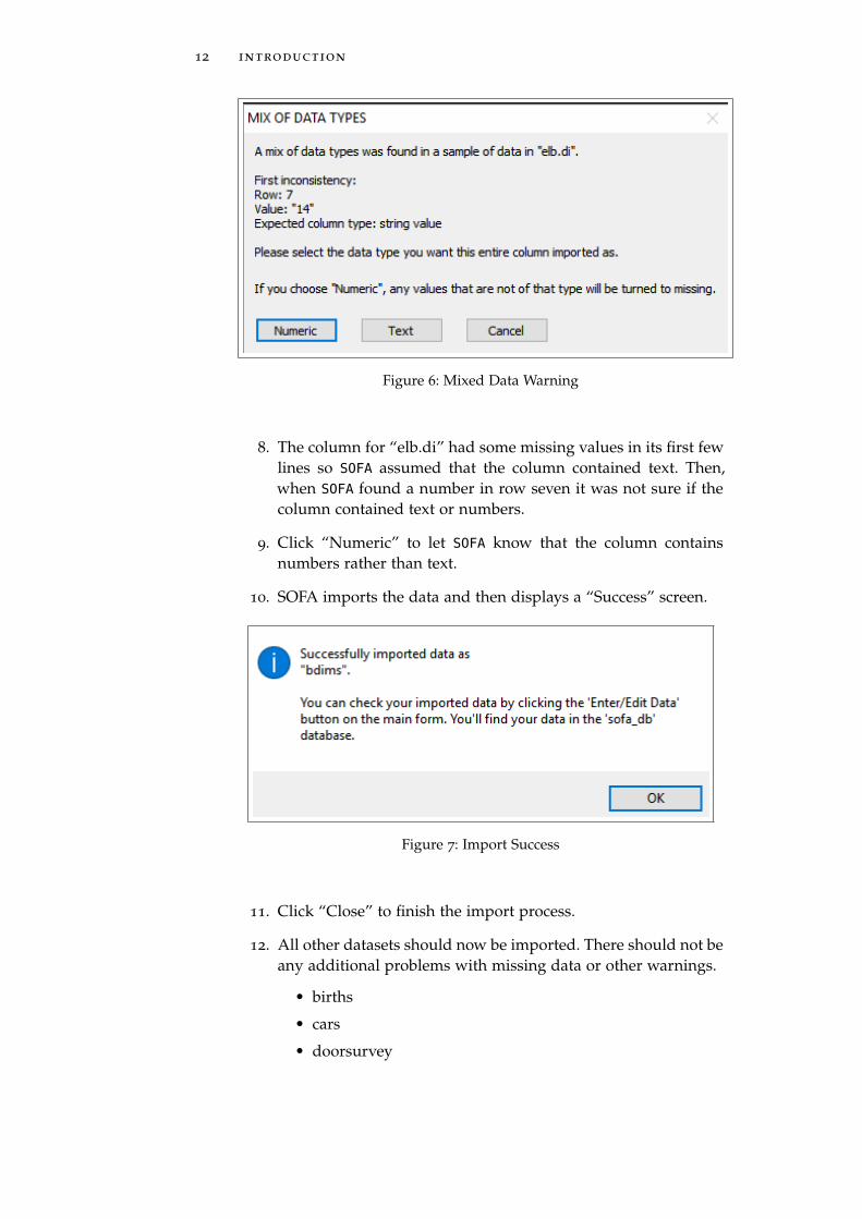
10. SOFA imports the data and then displays a “Success” screen.
Figure 7: Import Success
11. Click “Close” to finish the import process.
12. All other datasets should now be imported. There should not beany additional problems with missing data or other warnings.
• births
• cars
• doorsurvey
1.5 importing data 13
• gifted
• maincafe
• rivers (Note: this dataset has only a single column of num-bers.)
• tutoring
13. To check and be certain that all datasets were successfully loaded,go to the main SOFA screen and click the “Enter/Edit Data” but-ton.
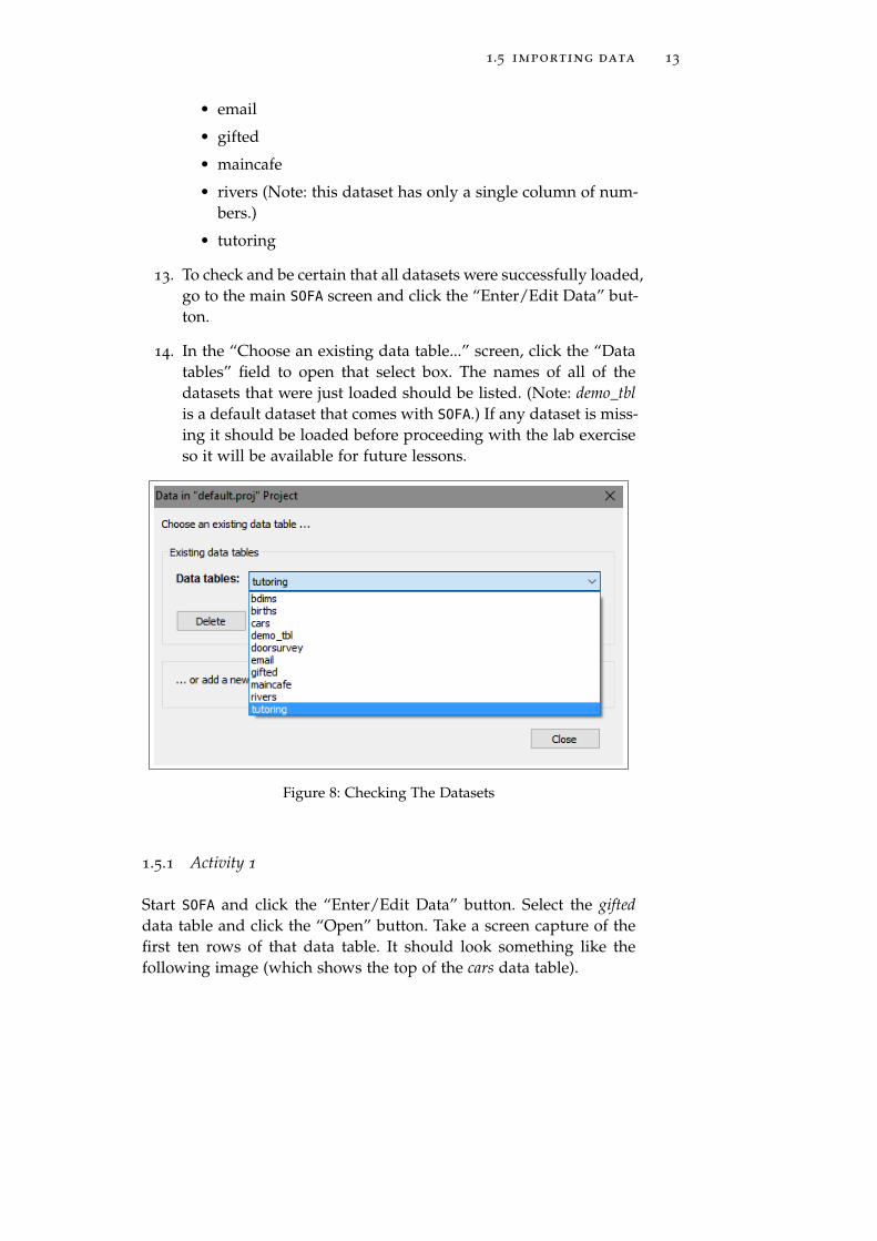
14. In the “Choose an existing data table...” screen, click the “Datatables” field to open that select box. The names of all of thedatasets that were just loaded should be listed. (Note: demo_tblis a default dataset that comes with SOFA.) If any dataset is miss-ing it should be loaded before proceeding with the lab exerciseso it will be available for future lessons.
Figure 8: Checking The Datasets
1.5.1 Activity 1
Start SOFA and click the “Enter/Edit Data” button. Select the gifteddata table and click the “Open” button. Take a screen capture of thefirst ten rows of that data table. It should look something like thefollowing image (which shows the top of the cars data table).

14 introduction
Figure 9: The Top Of The Cars Data Table
1.6 deliverable
Complete the following activity in this lab:
Number Name Page
1.5.1 Activity 1 13
Save the screen capture in a Word document and submit that doc-ument for grading.

2C E N T R A L M E A S U R E S
2.1 introduction
It is often desirable to characterize an entire dataset with a singlenumber, and the number that is “in the middle” of the dataset wouldseem most logical to use. Students in elementary school are taughthow to find the average of a group of numbers and they learn that theaverage is the best representation for that entire group. In statistics,though, there are several different numbers that are often used to rep-resent an entire dataset, and these numbers are collectively known asthe Central Measure, or numbers that are the “middle” of the dataset.
2.2 central measures
2.2.1 N
One of the simplest of measures is nothing more than the number ofitems in a dataset. For example, for the dataset 5, 7, 13, 22 the numberof items is 4. In statistics, the number of items in a dataset is usuallyrepresented by the letter N, therefore, in the simple dataset in thisparagraph, N = 4. Technically, N does not identify the middle of adataset but it is an important measure that is often reported and isincluded here for completeness.
2.2.2 Mean
The mean is calculated by adding all of the data items together andthen dividing that sum by the number of items, which is taught in el-ementary school as the average. For example, given the dataset: 6, 8, 9,the total is 23 and that divided by 3 (the number of items) is 7.66; sothe mean of 6, 8, 9 is 7.66.
If a dataset has outliers, or values that are unusually large or small,then the mean is often skewed such that it no longer represents the“average” value. As an example, the length (in miles) of the 141
longest rivers in North America ranges from 135 to 3710 and themean of these values is 591 miles1. Unfortunately, because the lengthsof the top few rivers are disproportionately higher than the rest of thevalues in the dataset (their lengths are outliers), the mean is skewedupward. One way compensate for outliers is to use a trimmed mean
1 These data are found in the rivers dataset.
15

16 central measures
(sometimes called a truncated mean). A trimmed mean is calculatedby removing a specified number of values from both the top and bot-tom of the dataset and then finding the mean of the remaining values.In the case of the rivers dataset, if 5% of the values are removed fromboth the top and bottom (7 values from each end of the dataset, for10% total) then 127 values remain with a range from 230 to 1450 andthe trimmed mean for that dataset is 519. Trimming the dataset effec-tively removes both upper and lower outliers and produces a muchmore reasonable central value for this dataset. In actual practice, atrimmed mean is not commonly used since it is difficult to knowhow much to trim from the dataset and the resulting mean may bejust as skewed as if no values were trimmed; thus, when outliers aresuspected, the best “middle” term to report is the median.
2.2.3 Median
The median is found by listing all of the data items in numeric orderand then mechanically finding the middle item. For example, usingthe dataset 6, 8, 9, the middle item (or median) is 8. If the dataset hasan even number of items, then the median is calculated as the meanbetween the two middle items. For example, in the dataset 6, 8, 9, 13the median is 8.5, which is the mean of 8 and 9, the two middle terms.
The median is very useful in cases where the dataset has outliers.As an example of using a median rather than a mean, consider thedataset 5, 6, 7, 8, 30. The mean is (5+ 6+ 7+ 8+ 30)/5 = 56/5 = 11.2.However, 11.2 is clearly much higher than most of the other num-bers in that dataset since one outlier, 30, is significantly driving upthe mean. A much better representation of the central term for thisdataset would be 7, which is the median. To re-visit the river lengthsintroduced above, the median of the dataset is 425, which is muchmore representative of the “middle” length than using either themean or the trimmed mean.
As another example where the median is the best central measure,suppose a newspaper reporter wanted to find the “average” wage fora group of factory workers. The ten workers in that factory all havean annual salary of $25, 000; however, the supervisor has a salary of$125, 000. In the newspaper article, the supervisor is quoted as sayingthat his workers have an average salary of $34, 090. That is correct ifthe mean of all those salaries is reported, but that number is clearlyhigher than any sort of reasonable “average” salary for workers inthe factory due to the one outlier (the supervisor’s salary). In thiscase, the median of $25, 000 would be much more representative ofthe “average” salary. The median is typically reported for salaries,home values, and other datasets where one or two outliers wouldsignificantly distort the reported “middle” value.
2.2 central measures 17
If the dataset contains no outliers, then the mean and median arethe same; but if there are outliers then these two measures becomeseparated, often by a large amount. Consider the rivers dataset men-tioned in the Mean section above. That dataset has a mean of 591 anda median of 425. This difference, 166, is about 28% of the mean andis significant. The size of this difference would tell a researcher thatthere are outliers in the dataset that may be skewing the mean.
2.2.4 Mode
The mode is used to describe the center of nominal or ordinal dataand is nothing more than the item that was most commonly foundin the dataset. For example, if a question asked respondents to selecttheir zip code from a list of five local codes and “12345” was selectedmore often than any other then that would be the mode for that item.Calculating the mode is no more difficult than counting the numberof times the various values are found in the dataset and reporting thevalue found most frequently.
As an example, the cars dataset includes the following types ofdrive trains:
Type Frequency
4WD 2
Front 43
Rear 9
Since the most common type of drive train is “Front” that wouldbe the mode for this data item.
It does not make much sense to calculate the mean or median fornominal or ordinal data since those are categories; however, reportsfrequently contain the mean for Likert-style questions (ordinal data)by equating each level of response to a number and then calculat-ing the mean of those numbers. For example, imagine that a studenthousing survey asked respondents to select among “Strongly Dis-agree, Disagree, Neutral, Agree, Strongly Agree” for a statement like“I like the food in the cafeteria.” That is clearly ordinal data and while“Agree” is somehow better than “Disagree” it would be wrong to tryto quantify that difference as “one point better” or something. Some-times, though, researchers will assign a point value to those responseslike “Strongly Disagree” is one point, “Disagree” is two points, andso forth. Then they will calculate the mean for the responses on asurvey item and report something like “The question about the foodin the cafeteria had a mean of 3.24.” It would be impossible to knowwhat that means. Are students 0.24 units above “Neutral” on likingthe cafeteria food?

18 central measures
2.2.5 Sum
One last measure of a dataset that is occasionally reported is the sum,which is nothing more than the values of all of the items added to-gether. As an example, the dataset 6, 7, 8 has a sum of 21. The riversdataset has a sum of 83357. It should be rather obvious that the sumby itself does not offer much information without knowing the num-ber of items in the dataset and the range of the values.
2.3 procedure
Start SOFA and select “Report Tables.” Then:
2.3.1 Calculating Mean, Median, and N
1. Data Source Table:: rivers
2. Table Type: Row Stats
Figure 10: Central Measures for Rivers: Steps 1-2
3. Columns: Add -> Length (Length)
Figure 11: Central Measures for Rivers: Step 3
4. Just above the “Columns” window, click the “Config” buttonand select: Mean, Median, and N.

2.3 procedure 19
Figure 12: Central Measures for Rivers: Step 4
5. Read those values in the lower left corner of the “Make ReportTable” window.
Figure 13: Central Measures for Rivers: Step 5
6. Thus, there are 141 river lengths in the dataset, the mean lengthof those rivers is 591.18 miles and the median length is 425.00miles.

20 central measures
7. To create a version of the output that can be saved and pastedinto Word or some other program refer to the instructions inAppendix B: Recoding Variables (page 131).
2.3.2 Activity 1: Central Measures
Using the maincafe dataset in SOFA produce a table that contains themean and median for Age, Bill, Length, and Miles data elements.The table should have a title of “Central Measure, Activity 1” anda subtitle of “Main Street Cafe Central Measures”.
2.3.3 Grouping
It is frequently desirable to group data so means can be compared.For example, it may be useful to group the mean of some variable bygender or some other category. To create groups in SOFA:
Start SOFA and select “Report Tables.” Then:
1. Data Source Table: births
2. Table Type: Row Stats
3. Select “Habit” for the row
4. Select “Weeks,” and “Weight” for Columns
5. Click “Config” for each variable in Columns and select “mean”and “median” for those variables.
Figure 14: Setting Up Groups of Central Measures
Now, read the mean and median for weeks and weight grouped bysmoking habit.

2.3 procedure 21
Figure 15: Central Measures for Weeks and Weight by Smoking Habit
In Figure 15 the mean length of pregnancy, in weeks, for non-smokers is 38.32 and for smokers is 38.44. The mean and medianfor weight can also be easily read from the chart.
Sub-groups can also be created with SOFA. As an example, startSOFA and select “Report Tables.” Then:
1. Data Source: births
2. Table Type: Row Stats
3. Click Add and then select “Habit” for the row
4. For Rows, click “Add Under” and then select “Gender”
5. Select “Weight” for Columns
6. Click “Config” for the columns and select “mean” and “me-dian”
Figure 16: Setting Up Subgroups

22 central measures
Figure 17: Mean and Median for Subgroups
In Figure 17 female babies born to non-smokers have a mean weightof 6.94 pounds and females born to smokers have a mean weight of6.68 pounds.
To create meaningful statistics, the “Row” variables, which are usedfor grouping, should be either nominal or ordinal and the “Column”variables should be interval or ratio.
2.3.4 Activity 2: Grouping
Using the maincafe dataset in SOFA produce a table that contains themean and median for Bill when grouped by Meal. The table shouldhave a title of “Central Measure, Activity 2” and a subtitle of “MainStreet Cafe Grouped Central Measures”.
2.3.5 Mode
The mode is useful for dataset items that are nominal or ordinal innature rather than interval or ratio. To find the mode for numeric datawith SOFA:
Start SOFA and select “Report Tables.” Then:
1. Data Source: births
2. Table Type: Row Stats
3. Columns: Add -> Visits
4. Just above the “Columns” window, click the “Config” buttonand select: Mode.
5. Read those values in the lower left corner of the “Make ReportTable” window.

2.3 procedure 23
Figure 18: Mode for Visits
143 mothers visited the hospital 12 times, which is the mode for thisdata item and would be the best “average” to describe the number ofhospital visits made by mothers.
If the data being analyzed is text rather than numeric then themode must be found in a slightly different way. For example, thegender of the baby is listed in the dataset as “male” and “female”and SOFA will not calculate this mode since these are not numericvalues. To find the mode for this type of data:
Start SOFA and select “Report Tables.” Then:
1. Data Source: births
2. Table Type: Row Stats
3. Rows: Add -> Gender
4. Columns: Add -> Sofa_Id (Note: this is just a one-up numberadded by SOFA to each row of data as it is imported.)
5. Just above the “Columns” window, click the “Config” buttonand select: N.
6. The output table shows the frequency that each value appearsin the dataset and the mode would be the largest of those fre-quencies.
Figure 19: Mode for Baby Gender
For example, the information in Figure 19 shows that there weremore females than males in the dataset so that is the mode for Gender.

24 central measures
2.3.6 Activity 3: Mode for Numeric Data
Using the maincafe dataset in SOFA produce a table that contains themode for both Food and Svc (these are ordinal data). The table shouldhave a title of “Central Measure, Activity 3” and a subtitle of “MainStreet Cafe Food and Service Modes”.
2.3.7 Activity 4: Mode for Text Data
Using the maincafe dataset in SOFA produce a table that contains themode for Day. The table should have a title of “Central Measure, Ac-tivity 4” and a subtitle of “Main Street Cafe Day Mode”.
2.4 examples
The following examples were created from the births data and areprovided for practice.
Figure 20: Various Means and Medians from the Births Data
Figure 21: Various Modes from the Births Data

2.5 deliverable 25
Figure 22: Length of Term and Baby’s Weight Grouped by Smoker
2.5 deliverable
Complete the following activities in this lab:
Number Name Page
2.3.2 Activity 1: Central Measures 20
2.3.4 Activity 2: Grouping 22
2.3.6 Activity 3: Mode for Numeric Data 24
2.3.7 Activity 4: Mode for Text Data 24
Screen capture the tables generated by each of these activities, addall of them into a single document, and submit that document forgrading.


3D ATA D I S P E R S I O N
3.1 introduction
One way to describe a dataset is to report its dispersion, or spread.For example, if a professor administered a test to 100 students andthe scores were between 90− 100 that would be a fairly tight groupbut if another class had scores between 60− 100 that would indicatesomething completely different. This lab explores the concept of datadispersion and the methods used to describe that value.
3.2 measures of data dispersion
3.2.1 Range
The maximum and minimum values are those at the extreme ends ofthe dataset and the range is nothing more than the maximum minusthe minimum values. For the 2016 version of the Scholastic AptitudeTest (SAT) the maximum score is 1600 and the minimum score is 400,so the range is 1600− 400, or 1200.
3.2.2 Quartiles
A measure that is closely related to the median1 is the first and thirdquartile. The first quartile (Q1) is the score that splits the lowest 25%of the values from the rest and the third quartile (Q3) splits the high-est 25% of the values from the rest. The second quartile (Q2) is thesame as the median and, normally, the term “median” is used ratherthan Q2. For example, consider this dataset:
5, 7, 10, 13, 17, 19, 23
The median of this dataset is 13 because three values are smallerand three are larger. The first quartile is 7, which is the median for thelower half of the values (not including 13, the median of the dataset);or the score that splits the lowest 25% from the rest of the data. Thethird quartile is 19, which is the median for the upper half of thescores; or the score that splits the highest 25% from the rest of thedata.
Occasionally, the word “hinges” appears in statistical literature. Thetwo hinges for a dataset are the medians for the lower half and the
1 The median was described in Lab 2.2.3, page 16.
27

28 data dispersion
upper half of the data, but those halves also include the dataset me-dian. For the simple dataset above, the lower hinge is the median of 5,7, 10, and 13, or 8.5. The upper hinge is the median of 13, 17, 19, and23, or 18. Quartiles and hinges usually have about the same accuracybut quartiles are more commonly used.
Another measure of dispersion that is occasionally used is the Inter-Quartile Range (IQR); that is, the difference between Q1 and Q3. Thisis used to counter the skew introduced by a dataset with extremeoutliers.
3.2.3 Standard Deviation
The standard deviation of a dataset is a number that indicates howmuch variation there is in the data; or how “scattered” the data arefrom the mean. In general, the larger the standard deviation then themore variation there is in the data. A dataset with a small standarddeviation would create a sharply peaked normal distribution curvewhile a large standard deviation would create a flatter curve.2
Once a standard deviation is calculated, then about 68.2% of thesamples will lie closer to the mean than that number. To put it an-other way, one standard deviation explains about 68.2% of the vari-ance from the mean. To show this concept graphically, consider thefollowing graph of the scores on an examination:
Figure 23: Illustration Of Standard Deviation
The mean of this distribution is marked with a vertical line in thecenter of the bell curve. One standard deviation up and one standard
2 The concept of the normal distribution curve was presented in Lab 1.3.2.1 on page6.
3.3 procedure 29
deviation down are marked by two other vertical lines. The shadedarea under the curve would include about 68.2% of all scores for thisdataset. In the same way, two standard deviations from the meanwould include about 95.4% of the data points; and three standarddeviations would include more than 99.7% of the data points (theselarger values are not indicated on the graph).
As one last example, imagine a class with 500 students where theprofessor administered an examination worth 100 points. If the meanscore for that examination was 80 and the standard deviation was5, then the professor would know that the scores were fairly tightlygrouped (341 scores of the 500 (68.2%) were between 75− 85, within5 points of the mean), and this would probably be good news forthe professor. On the other hand, if the mean score was 60 and thestandard deviation was 15, then the scores were “all over the place’(more precisely, 341 scores of the 500 were between 45-75), and thatmay mean that the professor would have to re-think how the lessonthat was taught or that the examination itself was flawed.
It is difficult to categorically state whether a specific standard de-viation is good or bad; it is simply a measure of how concentratedthe data are around the mean. For something like a manufacturingprocess where the required tolerance for the parts being produced istight then the standard deviation for the weights of random samplespulled off of the line must be very small; that is, the parts must be asnearly identical as possible. However, in another context, the standarddeviation may be quite large. Imagine measuring the time it takes agroup of high school students to run 100 yards. Some would be veryfast but others would be much slower and the standard deviation forthat data would likely be large.
3.3 procedure
3.3.1 Statistical Calculations
Start SOFA and select “Report Tables.” Then:
1. Data Source Table: dbims
2. Table Type: Row Stats
3. Columns: Age (age)
4. Title: Age Statistics

30 data dispersion
Figure 24: Setting Up Age
5. Just above the “Columns” window, click the “Config” buttonand select: Mean, Standard Deviation, Median, Minimum, andMaximum. Of course, any of the available measures, such asrange or quartiles, can be selected depending upon what needsto be reported.
Figure 25: Configure Options for Age
6. Read those values in the lower left corner of the “Make ReportTable” window.

3.3 procedure 31
Figure 26: Statistics for Age
3.3.2 Activity 1: Simple Statistics
Using the maincafe dataset in SOFA, produce a table that contains thestandard deviation, minimum, maximum, range, lower quartile, up-per quartile, and inter-quartile range for Age. The table should havea title of “Data Dispersion, Activity 1” and a subtitle of “Measures ofDispersion”.
3.3.3 Grouping Variables
To produce the statistics for grouped variables, like “the age statisticsby sex,” add the “sex” variable to the “Rows:” window and modifythe title of the chart.
Figure 27: Grouping Age Statistics by Sex
Then, the output will display the selected Age statistics by sex.

32 data dispersion
Figure 28: Age Statistics by Sex
3.3.4 Activity 2: Grouped Statistics
Using the maincafe dataset in SOFA, produce a table that contains themean, standard deviation, and N for Age when grouped by Sex. Thetable should have a title of “Data Dispersion, Activity 2” and a subti-tle of “Grouped Measures of Dispersion”.
3.3.5 Filtering
SOFA provides researchers a way to filter the data such that only aspecified subset is used in calculations. As an example, to analyzeonly the males in the dataset:
Start SOFA and select “Report Tables.” Then:
1. Data Source Table: dbims
2. Table Type: Row Stats
3. Columns: Age (age)
4. Configure the Age column to display the Mean, Median, and N
5. Title: Age Statistics For Males
6. Click the “Filter” button near the top of the window
7. Select “Sex” in the dropdown list for the “Quick” button
8. Select the “=” comparator
9. Enter “male” as the match term (Note: do not use quote marks)
10. Add the optional label: “Analyze Age For Males Only”

3.3 procedure 33
Figure 29: Setting Up a Filter
Then, the output will display the selected Age statistics for malesonly.
Figure 30: Age Statistics for Males
Important Note: Once a filter is applied it will remain until itis either manually removed or the SOFA session ends. To remove afilter, open the filter dialog box and click the “remove” button.
3.3.6 Activity 3: Filtering
Using the maincafe dataset in SOFA, produce a table that contains themean, standard deviation, and N for Age for only males. The tableshould have a title of “Data Dispersion, Activity 3” and a subtitle of“Filtered Statistics”.

34 data dispersion
3.4 deliverable
Complete the following activities in this lab:
Number Name Page
3.3.2 Activity 1: Simple Statistics 31
3.3.4 Activity 2: Grouped Statistics 32
3.3.6 Activity 3: Filtering 33
Consolidate the responses for all activities into a single documentand submit that document for grading.

4V I S U A L I Z I N G D I S P E R S I O N
4.1 introduction
SOFA makes it easy to calculate various measures of dispersion, ascovered in Lab 3; however, most people find it easier to understandthe dispersion of data when that is presented graphically. Fortunately,SOFA has a great graphic tool for visualizing data dispersion: Box Plot(sometimes called “Box and Whisker” plot). A Box Plot graphicallyillustrates Q1, the median, Q3, and outliers (if any are present).
The bdims dataset is used to illustrate a Box Plot. Following is thestatistical data for Age from the bdims dataset along with the box plotfor that same data.
Age (years)
Min Q1 Median Q3 Max Range IQR
18 23 27 36 67 49 13
Following is the box plot that illustrates the above statistics.
Figure 31: Box Plot for Bdims Age
In the above Box Plot, the median is indicated by a dark line at 27,Q1 is 23 (the lower edge of the box) and Q3 is 36 (the upper edge of
35
36 visualizing dispersion
the box). That makes the Inter-Quartile Range (IQR) equal to 13 (thesize of the box).
The “whiskers” are placed at 1.5XIQR above and below each quad-rant. Thus:
1. Upper. Q3+ (1.5XIQR), or 36 + (1.5X13) = 55.5
2. Lower. Q1–(1.5XIQR), or 23 – (1.5X13) = 19.5
Note: SOFA makes it possible to set the whiskers at the maximumand minimum values, but that hides the outliers and is rarely done.
The circles above the box plot represent outliers. In this case thereare nine outliers. If the data are a normal distribution, then the whiskerswill enclose most of the values in the dataset and outliers will be rare.
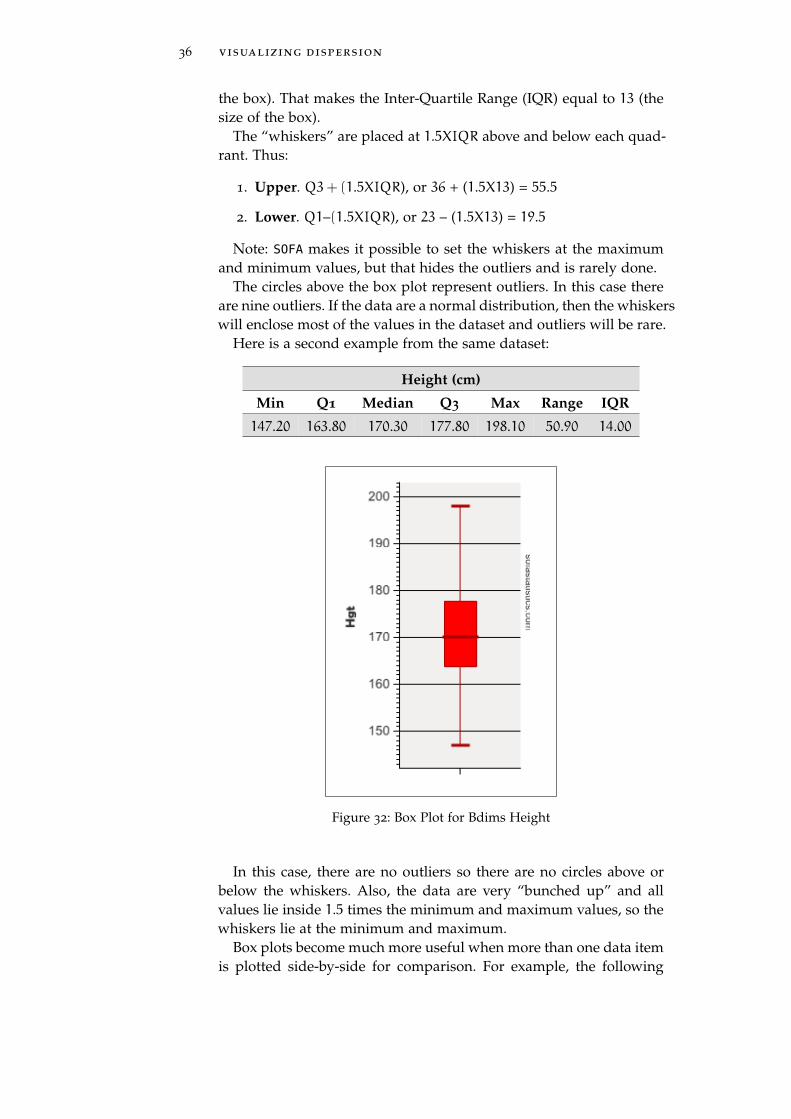
Here is a second example from the same dataset:
Height (cm)
Min Q1 Median Q3 Max Range IQR
147.20 163.80 170.30 177.80 198.10 50.90 14.00
Figure 32: Box Plot for Bdims Height
In this case, there are no outliers so there are no circles above orbelow the whiskers. Also, the data are very “bunched up” and allvalues lie inside 1.5 times the minimum and maximum values, so thewhiskers lie at the minimum and maximum.
Box plots become much more useful when more than one data itemis plotted side-by-side for comparison. For example, the following

4.1 introduction 37
box plot is helpful in determining if there is a difference in height bysex.
Figure 33: Comparing Height By Sex
By comparing the two box plots it is very easy to see that malesare generally taller than females since that box is higher on the graph.Also notice that the “males” plot includes outliers at both the min-imum and maximum values which indicates a greater variation inmale heights than female.
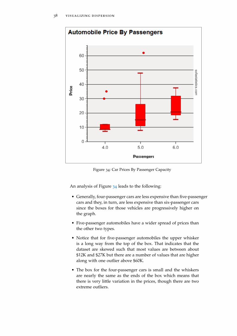
As a final example of box plots, consider the cars dataset. The fol-lowing box plot shows the price of a new automobile by the numberof passengers it can carry.
38 visualizing dispersion
Figure 34: Car Prices By Passenger Capacity
An analysis of Figure 34 leads to the following:
• Generally, four-passenger cars are less expensive than five-passengercars and they, in turn, are less expensive than six-passenger carssince the boxes for those vehicles are progressively higher onthe graph.
• Five-passenger automobiles have a wider spread of prices thanthe other two types.
• Notice that for five-passenger automobiles the upper whiskeris a long way from the top of the box. That indicates that thedataset are skewed such that most values are between about$12K and $27K but there are a number of values that are higheralong with one outlier above $60K.
• The box for the four-passenger cars is small and the whiskersare nearly the same as the ends of the box which means thatthere is very little variation in the prices, though there are twoextreme outliers.

4.2 procedure 39
4.2 procedure
4.2.1 Boxplots
Start SOFA and select “Charts.” Then:
1. Data Source Table: births
2. Chart Types: Make Box and Whisker Plot (the last button on theright)
3. Variables Described: Gained (gained)
4. Title: Weight Gained
Figure 35: Set Up Boxplot for Weight Gained
Following is the plot generated by the above.

40 visualizing dispersion
Figure 36: Box Plot of Weight Gained
4.2.2 Activity 1: Simple Boxplot
Using the maincafe dataset in SOFA, produce a boxplot for Age. Theboxplot should have a title of “Visualizing Dispersion, Activity 1”and a subtitle of “Boxplot For Age”.
4.2.3 Grouped Boxplot
To group two or more boxplots, select a grouping variable to creategrouped plots. For example, to group the weight gain box plots bywhether the mother was a smoker, select:
1. Data Source Table: births
2. Chart Types: Make Box and Whisker Plot (the last button on theright)
3. Variables Described: Gained
4. By: Habit
5. Title: Weight Gained by Smoking Habit

4.2 procedure 41
Figure 37: Set Up Boxplot for Weight Gained by Habit
Figure 38: Box Plot of Weight Gained by Habit

42 visualizing dispersion
4.2.4 Activity 2: Grouped Boxplots
Using the maincafe dataset in SOFA, produce a boxplot for Age groupedby Meal. The boxplot should have a title of “Visualizing Dispersion,Activity 2” and a subtitle of “Boxplot of Age Grouped By Meal”.
4.2.5 Grouped Boxplots By Series
Finally, the data can be grouped by series. For example, to group theabove box plots by the sex of the baby, select “Gender” as the “SeriesBy” variable and then change the title and subtitle of the box plot.
Figure 39: Set Up Boxplot for Weight Gained by Habit and Baby’s Sex

4.2 procedure 43
Figure 40: Box Plot of Weight Gained by Habit and Baby’s Sex
In box plot 40 it is clear that for non-smokers, male baby’s weightsare more variable than females since that box is larger. Interestingly,the weight of female babies born to smokers has a much larger vari-ability (the box is larger) and the mean of the weights for femalebabies is somewhat lower than for males.
As a second example of a box plot, the email dataset was selectedand the size of the email message (number of characters) was plottedas a function of whether it was spam and contains large numbers.
Figure 41: Set Up Boxplot for Email Data Set

44 visualizing dispersion
Figure 42: Example Box Plot for Email Data Set
To interpret box plot 42, notice that, generally, the spam messagescontain fewer characters than non-spam messages (those plots arelower), indicating that spam messages are generally shorter than non-spam messages. Then, looking at only the non-spam plots (the threeon the left), notice that if the message contains large numbers (thefirst plot from the left) it will generally contain more characters thanmessages with only small numbers (the third plot). Finally, notice thatnon-spam messages with no numbers (the second plot) are generallyshort (fewer characters, indicated by a box that is lower on the scale).There are a number of other characteristics that could be drawn fromthis one chart, such as a discussion about the outliers or the meansfor each type of message.
The last example (the email box plots) illustrates that a box plotcontains a lot of information and is a valuable tool for research re-ports.
4.2.6 Activity 3: Grouped Boxplots by Series
Using the maincafe dataset in SOFA, produce a boxplot for Age groupedby Sex and using Meal as a series. The boxplot should have a title of

4.3 deliverable 45
“Visualizing Dispersion, Activity 3” and a subtitle of “Boxplot of Ageby Sex and Meal”.
4.3 deliverable
Complete the following activities in this lab:
Number Name Page
4.2.2 Activity 1: Simple Boxplot 40
4.2.4 Activity 2: Grouped Boxplots 42
4.2.6 Activity 3: Grouped Boxplots by Series 44
Consolidate the responses for all activities into a single documentand submit that document for grading.


5F R E Q U E N C Y TA B L E S
5.1 introduction
Nominal and Ordinal data items are normally reported in frequencytables where the counts for a particular item are displayed. Crosstabsare a type of frequency table used to compare the counts of items thathave been grouped in some way. This lab explores both frequencytables and crosstabs.
5.2 frequency tables
A frequency table simply lists a count of the number of times thatsome nominal or ordinal data item appears in a dataset. These typesof tables are common around election time when polls report thenumber of people who voted for or against some proposition. As anexample, here is a frequency table for the passenger rating in the carsdataset.
Figure 43: Passenger Ratings Per Car
The above table shows that 10 cars in the dataset were rated forfour passengers, 28 for five passengers, and 16 for six passengers,for a total of 54 rated cars. The table also shows the various rowpercentages so the researcher could report that 18.5% of the cars wererated for four passengers.
A second example of a frequency table was created from the emaildataset. This frequency table shows the number of images that wereattached to messages.
47

48 frequency tables
Figure 44: Images Per Message
Figure 44 shows that 97.5% of 3154 email messages contained noimages while a small number of messages contained one or moreimages.
Frequency tables are only useful for nominal or ordinal data-typeitems. To illustrate why this is true, imagine creating a survey forall of the students at the University of Arizona and including “age”(interval-type data) as one of the survey questions. Attempting tocreate a frequency table for the ages of the respondents would have,potentially, more than 65 rows since student ages would range fromabout 15 to more than 80 and each row would report the numberof students for that age. While a frequency table that large couldbe created it would have so many rows that it would be virtuallyunusable.
5.3 crosstabs
A crosstab (sometimes called a contingency table or pivot table), isa table of frequencies used to display the relationship between twonominal or ordinal variables. These are commonly used around elec-tion time when pollsters create tables that show things like the num-ber of people who voted for or against some proposition countedby gender, race, or some other factor. As an example of a crosstab,consider the following from the email dataset.

5.3 crosstabs 49
Figure 45: Addressees As A Function of Spam
In Figure 45 notice that 2288 messages were sent to a single ad-dressee and were identified as not spam while 521 messages weresent to multiple addressees and identified as not spam. By usinga crosstab, a researcher can determine the frequency of some inci-dent (email messages) by two different criteria (spam and multipleaddressees).
Here is a second example from the email dataset:
Figure 46: Images As A Function of Spam
In Figure 46 notice that spam in general has no images. In fact, onlytwo email messages out of 345 had one image, and no messages hadmore than one.
5.3.1 Complex Crosstabs
It is possible to create crosstabs that are quite complex, with multiplesubcategories for both rows and columns. However, these tables areoften too complex to be easy to interpret. Consider the table in Figure47.

50 frequency tables
Figure 47: Images and Addressees As A Function of Spam
In the crosstab presented, 2249 email messages were identified asnot spam, had zero images, and went to a single addressee. Whilethis crosstab presents a lot of data in a compact form it is difficult toread and make sense of any one data cell. In general, it is preferableto have only one variable for both the rows and columns in a crosstab.
5.4 procedure
5.4.1 Frequency Table
Start SOFA and select “Report Tables.” Then:
1. Data Source Table: email
2. Table Type: Frequencies
3. Rows: Format
4. Title: Types Of Email Messages
5. Row Config: Check “Total”
6. Column Config: Check “Frequency” and “Column %”
5.4 procedure 51
Figure 48: Setting Up Email Frequency Table
Figure 49: Email Frequency Table
5.4.2 Activity 1: Frequency Table
Using the maincafe dataset in SOFA, produce a frequency table for Meal.The table should include both frequency and percentage for each ofthe four types of meals. The table should have a title of “FrequencyTables, Activity 1” and a subtitle of “Frequency Table for Types ofMeals”.
5.4.3 Crosstabs
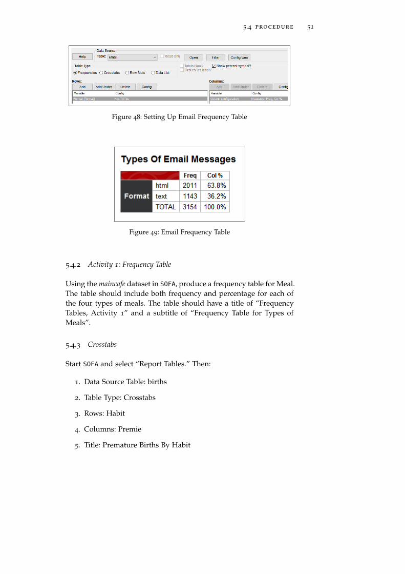
Start SOFA and select “Report Tables.” Then:
1. Data Source Table: births
2. Table Type: Crosstabs
3. Rows: Habit
4. Columns: Premie
5. Title: Premature Births By Habit

52 frequency tables
Figure 50: Setting Up Premature Births By Habit
Figure 51: Premature Births By Habit
To create a more complex crosstab, follow the instructions abovefor a simple crosstab but then click “Add Under” for Rows and select“Mature.”
Figure 52: Setting Up Premature Births By Habit and Maturity

5.5 deliverable 53
Figure 53: Premature Births By Habit and Maturity
5.4.4 Activity 2: Crosstabs
Using the maincafe dataset in SOFA, produce a crosstab with the rowsbeing Food and the columns being Svc. The crosstab should includeonly frequency and have a title of “Frequency Tables, Activity 2” anda subtitle of “Crosstab for Food and Service”.
5.4.5 Activity 3: Complex Crosstabs
Using the maincafe dataset in SOFA, produce a crosstab with the rowsbeing Pref with a sub-group of Sex and the columns being Meal. Thecrosstab should include only frequency and should have a title of“Frequency Tables, Activity 3” and a subtitle of “Crosstab of Prefer-ence by Sex and Meal”.
5.5 deliverable
Complete the following activities in this lab:
Number Name Page
5.4.2 Activity 1: Frequency Table 51
5.4.4 Activity 2: Crosstabs 53
5.4.5 Activity 3: Complex Crosstabs 53
Consolidate the responses for all activities into a single documentand submit that document for grading.


6V I S U A L I Z I N G F R E Q U E N C Y
6.1 introduction
Nominal and Ordinal data items are normally reported in frequencytables where the number of times a particular survey item was se-lected by respondents is displayed. However, there are many waysto visualize frequency data and many people find various charts andgraphs to be useful. This lab introduces the visualization tools avail-able in SOFA.
6.2 visualizing data
6.2.1 Histogram
A histogram is a graph that shows how often various responses wereselected on a survey. These are often presented as a graphic represen-tation of the statistical data found in a frequency table in order to aidin understanding. Histograms are only used for data that are intervalor ratio in nature, for example, age or height. Histograms are espe-cially useful for interval or ratio data since SOFA will automaticallycluster the data into “bins.”
As an example of a histogram, Figure 54 shows the mother’s agefrom the births dataset.
Figure 54: Histogram of Mother’s Age
Notice that there is not a separate bar for each age; rather, SOFAhas clustered two years into the same bar. Thus, there is a bar thatcombines 20-21 and not separate bars for 20 and 21.
55
56 visualizing frequency
As another example, Figure 55 shows a histogram for baby’s weightfrom the births dataset.1
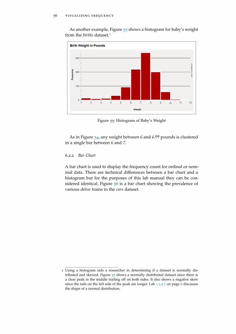
Figure 55: Histogram of Baby’s Weight
As in Figure 54, any weight between 6 and 6.99 pounds is clusteredin a single bar between 6 and 7.
6.2.2 Bar Chart
A bar chart is used to display the frequency count for ordinal or nom-inal data. There are technical differences between a bar chart and ahistogram but for the purposes of this lab manual they can be con-sidered identical. Figure 56 is a bar chart showing the prevalence ofvarious drive trains in the cars dataset.
1 Using a histogram aids a researcher in determining if a dataset is normally dis-tributed and skewed. Figure 55 shows a normally distributed dataset since there isa clear peak in the middle trailing off on both sides. It also shows a negative skewsince the tails on the left side of the peak are longer. Lab 1.3.2.1 on page 6 discussesthe shape of a normal distribution.

6.2 visualizing data 57
Figure 56: Prevelance of Types of Drive Trains
Figure 57 shows the maturity level of the mothers in the birthsdataset and unsurprisingly indicates that most mothers are younger.
Figure 57: Maturity of Mothers
6.2.3 Clustered Bar Chart
A clustered bar chart displays two or more variables and is used todisplay ordinal or nominal data. In general, clustered bar charts canbe difficult to interpret and should be avoided. Figure 58 is a clus-tered bar chart that shows the incidence of premature births by themother’s smoking habit in the births dataset.

58 visualizing frequency
Figure 58: Permature Births By Smoking Habit
Figure 59 illustrates the problem with a clustered bar chart. This isa chart that shows the number of passengers for each type of car inthe cars dataset. Notice that no large cars have four or five passengersand no small cars have six passengers so those bars are missing andthat can make the chart difficult to interpret.
Figure 59: Number of Passengers By Car Type

6.2 visualizing data 59
6.2.4 Pie Chart
A pie chart is commonly used to display nominal or ordinal data;however, pie charts are notoriously difficult to understand, especiallyif the writer uses some sort of 3-D effect or “exploded” slices. Thehuman brain seems able to easily compare the heights of two or morebars, as in histograms and bar charts, but the areas of two or moreslices of a pie chart are difficult to compare. For this reason, piecharts should be avoided in research reports. If they are used at all,they should only illustrate one slice’s relationship to the whole, notcomparing one slice to another; and no more than four or five slicesshould be presented on one chart.
Figure 60 shows the types of numbers found in messages in theemail dataset. This pie chart is easy to interpret since there are onlythree slices and each slice is easy to compare to the whole.
Figure 60: Types of Numbers in Email Messages
As an extreme example of a poorly used pie chart, consider Figure61. Even ignoring the problem of the numbers overlapping, makingthem impossible to read, the slices are so numerous and small thatit is impossible to differentiate between them. For example, the “one”and “two” slices are impossible to compare. For this pie chart, aboutall that can be stated is that most email messages have zero dollarsigns.

60 visualizing frequency
Figure 61: Number of Times a Dollar Sign Used in Email Messages
6.2.5 Line Charts
Line charts display the frequency of some value in a linear form thatmakes trend detection easier. As an example, consider the followingfrom the gifted dataset which charts the number of hours that parentsspent reading to their children.
Figure 62: Hours Spent Reading
This chart makes it easy to see that most parents in this survey readto their children about 2.2− 2.3 hours per week.
6.3 procedure
Start SOFA and select “Charts.” Then:

6.3 procedure 61
6.3.1 Histogram
1. Data Source Table: bdims
2. Table Type: Histogram (sixth button)
3. Values: Age
4. Title: Age Statistics
Figure 63: Setting Up Age Statistics
Figure 64: Age Statistics

62 visualizing frequency
6.3.2 Activity 1: Histogram
Using the maincafe dataset in SOFA, produce an histogram of Age. Thehistogram should have a title of “Visualizing Frequency, Activity 1”and a subtitle of “Histogram of Age”.
6.3.3 Line Charts
To create a line chart:Start SOFA and select “Charts” then:
1. Data Source Table: gifted
2. Table Type: Line Chart (fourth button)
3. Values: Read
4. Title: Hours Parents Read To Child
Figure 65: Setting Up Line Chart

6.3 procedure 63
Figure 66: Line Chart For Time Parents Spend Reading To Children
If a “By” value is selected then a new line will be generated foreach of the levels in the “By” variable. For example:
1. Data Source Table: births
2. Table Type: Line Chart (fourth button)
3. Values: Mage
4. By: Gender
5. Title: Mother’s Age and Baby Gender
Figure 67: Setting Up Line Chart

64 visualizing frequency
Figure 68: Line Chart For Mother’s Age and Baby Gender
An “Area Chart” (button five) is the same as a line chart but thearea under the line is colored which may make it easier to see trends.
1. Data Source Table: births
2. Table Type: Area Chart (fifth button)
3. Values: Mage
4. Title: Mother’s Age
Figure 69: Setting Up Area Chart
Figure 70: Area Chart For Mother’s Age
6.3 procedure 65
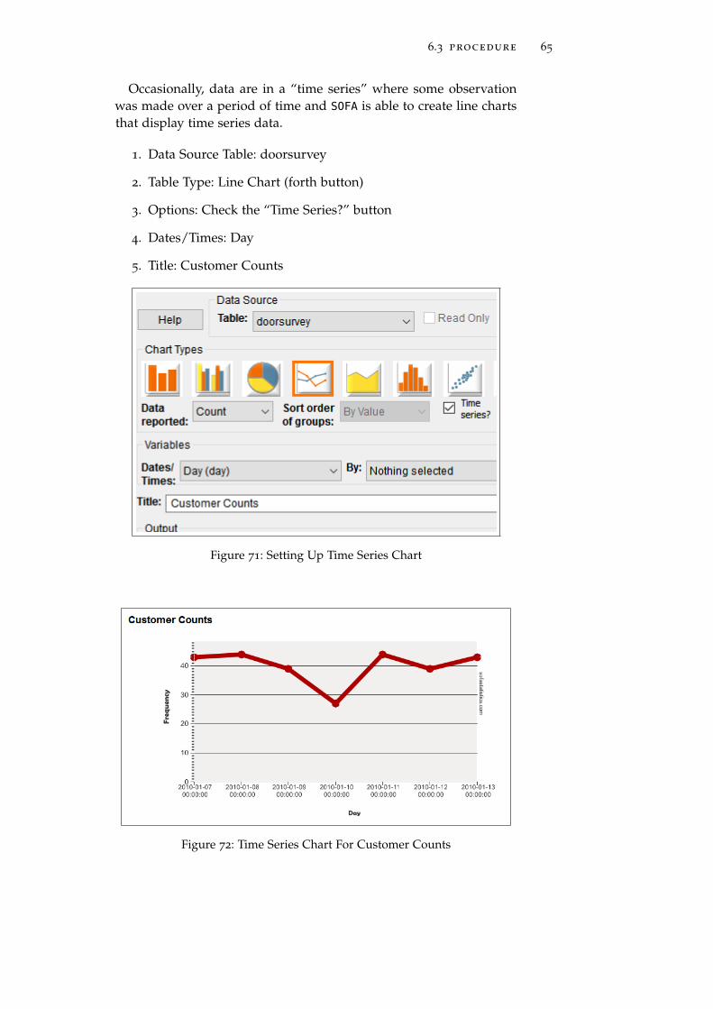
Occasionally, data are in a “time series” where some observationwas made over a period of time and SOFA is able to create line chartsthat display time series data.
1. Data Source Table: doorsurvey
2. Table Type: Line Chart (forth button)
3. Options: Check the “Time Series?” button
4. Dates/Times: Day
5. Title: Customer Counts
Figure 71: Setting Up Time Series Chart
Figure 72: Time Series Chart For Customer Counts

66 visualizing frequency
SOFA is also able to display more than one time series on the samechart. For example, to display the number of customers by sex:
1. Data Source Table: doorsurvey
2. Table Type: Line Chart (forth button)
3. Options: Check the “Time Series?” button
4. Dates/Times: Day
5. By: Gender
6. Title: Customer Counts By Gender
Figure 73: Setting Up Time Series Chart By Sex

6.3 procedure 67
Figure 74: Time Series Chart For Customer Counts By Gender
SOFA includes a number of options for line charts that can be se-lected with the check boxes under the Chart Types buttons:
• Trend Line? is a straight line added to a time series chart tohelp visualize a variable’s trend over time.
• Smooth Line? produces a smoothed-out line rather than jagged.
• Rotate Labels? makes longer labels fit the chart space better.
• Hide Markers? removes the “dots” from the line.
• Major Labels Only? condenses the chart by only showing themajor time divisions.
6.3.4 Activity 2: Line Chart
Using the maincafe dataset in SOFA, produce a line chart of Ptysizeby Sex. The line chart should have a title of “Visualizing Frequency,Activity 2” and a subtitle of “Line Chart of Party Size by Sex”.
6.3.5 Bar Chart
1. Data Source Table: cars
2. Table Type: Bar Chart (first button)
3. Values: Passengers
4. Title: Passengers
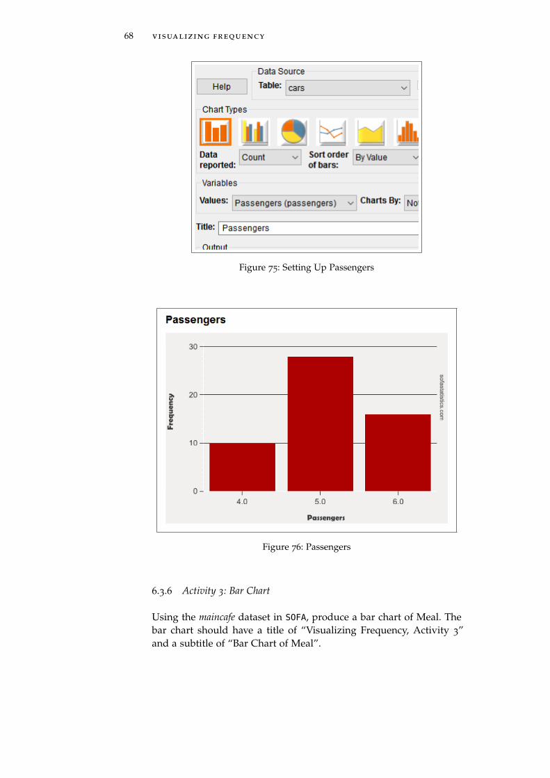
68 visualizing frequency
Figure 75: Setting Up Passengers
Figure 76: Passengers
6.3.6 Activity 3: Bar Chart
Using the maincafe dataset in SOFA, produce a bar chart of Meal. Thebar chart should have a title of “Visualizing Frequency, Activity 3”and a subtitle of “Bar Chart of Meal”.

6.3 procedure 69
6.3.7 Clustered Bar Chart
1. Data Source Table: cars
2. Table Type: Clustered Bar Chart (second button)
3. Values: Passengers
4. By: Drivetrain
5. Title: Passengers By Drive Train
Figure 77: Setting Up Passengers By Drivetrain

70 visualizing frequency
Figure 78: Passengers By Drivetrain
6.3.8 Activity 4: Clustered Bar Chart
Using the maincafe dataset in SOFA, produce a clustered bar chart ofMeal by Sex. The bar chart should have a title of “Visualizing Fre-quency, Activity 4” and a subtitle of “Bar Chart of Meal by Sex”.
6.3.9 Pie Chart
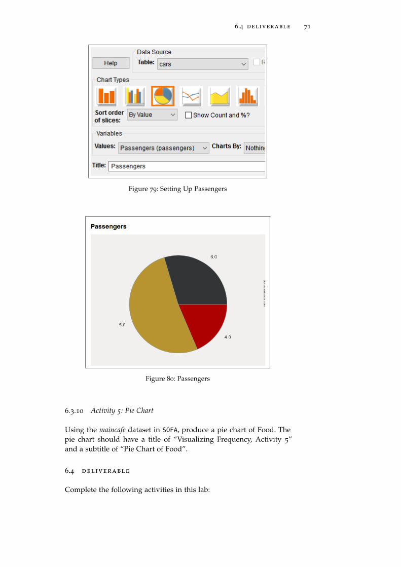
1. Data Source Table: cars
2. Table Type: Pie Chart (third button)
3. Values: Passengers
4. Title: Passengers
6.4 deliverable 71
Figure 79: Setting Up Passengers
Figure 80: Passengers
6.3.10 Activity 5: Pie Chart
Using the maincafe dataset in SOFA, produce a pie chart of Food. Thepie chart should have a title of “Visualizing Frequency, Activity 5”and a subtitle of “Pie Chart of Food”.
6.4 deliverable
Complete the following activities in this lab:
72 visualizing frequency
Number Name Page
6.3.2 Activity 1: Histogram 62
6.3.4 Activity 2: Line Chart 67
6.3.6 Activity 3: Bar Chart 68
6.3.8 Activity 4: Clustered Bar Chart 70
6.3.10 Activity 5: Pie Chart 71
Consolidate the responses for all activities into a single documentand submit that document for grading.

7C O R R E L AT I O N
7.1 introduction
Correlation is a method used to describe relationships between twovariables. For example, if some research project plotted the ages ofpeople who started smoking and the family income of those peoplethen a correlation would attempt to determine if there is some rela-tionship between those two factors.
This lab explores both correlation and scatter plots, which are graphictools designed to make correlations easier to understand.
7.2 correlation and causation
From the outset of this lab, it is important to remember that thereis a huge difference between correlation and causation. Just becausetwo factors are correlated in some way does not lead to a conclusionthat one is causing the other. As an example, if a research projectfound that students who spend more hours studying tend to gethigher grades this would be an interesting correlation. However, thatresearch, by itself, could not prove that longer studying hours causeshigher grades. There could be other intervening factors that are notaccounted for in this simple correlation (like the type of final exami-nation used). As an egregious example to prove this point, considerthat the mean age in the United States is rising (that is, people are liv-ing longer; thus, there are more elderly people in the population) andthat human trafficking crime is increasing. While these two facts maybe correlated, it would not follow that old people are responsible forhuman trafficking! Instead, there are numerous social forces in playthat are not accounted for in this simple correlation. It is importantto keep in mind that correlation does not equal causation as you readresearch.
7.2.1 Pearson’s R
Pearson’s Product-Moment Correlation Coefficient (normally calledPearson’s r) is a measure of the strength of the relationship betweentwo variables. Pearson’s r is a number between −1.0 and +1.0, where0.0 means there is no correlation between the two variables and either+1.0 or −1.0 means there is a perfect correlation. A positive correla-tion means that as one variable increases the other also increases. Forexample, as people age they tend to weigh more so a positive corre-
73

74 correlation
lation would be expected between age and weight. A negative corre-lation, on the other hand, means that as one variable increases theother decreases. For example, as people age they tend to run slowerso a negative correlation would be expected between age and runningspeed. In general, both the strength and direction of a correlation isindicated by the value of “r”:
Correlation Description
+.70 or higher Very strong positive
+.40 to +.69 Stong positive
+.30 to +.39 Moderate positive
+.20 to +.29 Weak positive
+.19 to −.19 No or negligible
−.20 to −.29 Weak negative
−.30 to −.39 Moderate negative
−.40 to −.69 Strong negative
−.70 or less Very strong negative
As an example from the bdims dataset, the correlation betweenweight and waist girth (Wgt - Wai.Gi) is +0.904 so there is a verystrong positive correlation between these two factors. This would beexpected since people who weigh more would be expected to havelarger waists. Here are a few other correlations from the dbims dataset:
Variables Correlation Description
Weight—Waist Girth 0.904 Very Strong Positive
Weight—Ankle Diameter 0.726 Very Strong Positive
Height—Chest Depth 0.553 Strong Positive
Height—Hip Girth 0.339 Moderate Positive
Height—Thigh Girth 0.116 No Correlation
7.2.2 Spearman’s Rho
Pearson’s r is only useful if both data elements being correlated areinterval or ratio in nature. When the one or both data elements areordinal or nominal then a statistically different process must be usedto calculate a correlation, and that process is Spearman’s Rho. Otherthan the process used to calculate Spearman’s Rho, the concept isexactly the same as for Pearson’s r and the result is a correlation be-tween −1 and +1 where the strength and direction of the correlationis determined by its value.
For example, imagine that a dataset included information about theage of people who purchased various makes of automobiles. Sincethe “makes” would be selected from a list (Ford, Chevrolet, Honda,

7.3 significance 75
etc.), Spearman’s Rho would be used to calculate the correlation be-tween the customers’ preference for the make of an automobile andtheir age. Perhaps the correlation would come out to +0.534 (this isjust a made-up number). This would indicate that there was a strongpositive correlation between these two variables; that is, people tendto prefer a specific make based upon their age; or, to put it anotherway, as people age their preference for automobile make changes ina predictable way.
Pearson’s r and Spearman’s Rho both calculate correlation and itis reasonable to wonder which method should be used in any givensituation. A good rule of thumb is to use Pearson’s r if both dataitems being correlated are interval or ratio and use Spearman’s rho ifone or both are ordinal or nominal. Imagine a series of survey ques-tions that permitted people to select from only a small group of possi-ble answers. As an example, perhaps respondents are asked to selectone of five responses ranging from “Strongly Agree” to “StronglyDisagree” for statements like “I enjoyed the movie.” Restricting re-sponses to only one of five options creates ordinal data and to deter-mine how well the responses to these questions correlate with some-thing like the respondents’ ages, Spearman’s Rho would be an appro-priate choice.
As an example from the email dataset, the correlation between Im-age and CC is +0.808 so there is a very strong positive correlationbetween these two factors. Here are a few other correlations from theemail dataset, all using Spearman’s Rho:
Variables Correlation Description
Image—Exclaim_Mess 0.522 Strong Positive
Image—Line_Breaks 0.491 Strong Positive
Image—Attach 0.927 Very Strong Positive
Line_Breaks—Dollar 0.453 Strong Positive
Exclaim_Mess—CC 0.408 Strong Positive
7.3 significance
Most people use the word “significant” to mean “important” but re-searchers and statisticians have a much different meaning for “signif-icant” and it is vital to keep that difference in mind.
In statistics and research, “significance” means that the experimen-tal results were such that they would not likely have been producedby mere chance. For example, if a coin is flipped 100 times, headsshould come up 50 times. Of course, by pure chance, it would be pos-sible for heads to come up 55 or even 60 times. However, if headscame up 100 times, researchers would suspect that something un-usual was happening (and they would be right!). To a researcher, the

76 correlation
central question of significance is “How many times can heads comeup and still be considered just pure chance?” That number is the sta-tistical significance level.
In general, researchers use one of three significance levels: 1%, 5%,or 10%. A researcher conducting The Great Coin-Tossing Experimentmay start by simply stating “This result will be significant at the 5%level.” That would mean that if the coin were tossed 100 times, thenanything between 47.5− 52.5 (a 5% spread) “heads” tosses would bemerely chance. However, 47 or 53 “heads” would be outside that 5%spread and would be significant.
It must seem somewhat subjective for a researcher to simply se-lect the desired significance level, but most researchers in businessand the social and behavioral sciences (like education, sociology, andpsychology) tend to choose a significance level of 5%.1 There is noreal reason for choosing that level today other than it is just the waythings have traditionally been done for many years. Therefore, if aresearcher selected something other than 5%, peer researchers wouldwant some explanation concerning the “weird” significance level.
Keep in mind, though, that statistical significance is not the sameas practical significance. Wikipedia, that great repository of knowledge,includes this interesting example2:
As used in statistics, significant does not mean important ormeaningful, as it does in everyday speech. For example, a studythat included tens of thousands of participants might be able tosay with great confidence that residents of one city were moreintelligent than people of another city by 1/20 of an IQ point.This result would be statistically significant, but the differenceis small enough to be utterly unimportant.
7.3.1 Chi-Square
One of the most common measurements of statistical significance isthe chi-square test, but this test should only be used if both variablesare nominal. The basic idea behind this test is to determine whatvalues would be expected by chance and compare that to the valuesactually obtained by experiment. The formula for a chi-square test issomewhat complex but SOFA handles chi-square calculations withoutany problem at all. The following chi-square values were obtainedfrom the email dataset:
1 The reason that 5% is usually selected as a significance level can be traced backto R.A. Fisher who published a book in 1925 that included statistical tables for re-searchers. His work was profoundly influential and values in the 5% table becamethe most commonly cited levels in published research for many decades.
2 http://en.wikipedia.org/wiki/Statistical_significance

7.3 significance 77
Variables Chi-Square
Spam—Exclaim_Subj 0.256
Spam—Image 5.927
Spam—Urgent_Subj 15.374
Spam—Attach 104.825
While it is difficult to decide if any give chi-square statistic is “good”or “bad,” in general the larger that number then the stronger the re-lationship between the two variables. In the above table, for example,there would seem to be virtually no relationship between Spam andExclaim_Subj but there is a strong relationship between Spam andAttach.
As an aid to determining whether a calculated chi-square is sig-nificant, a p-value (that stands for “probability value”) is usually alsocalculated. A p-value answers the question, “what is the probabilitythat an observed phenomenon is due to chance?” For example, thep-value for each of the above chi-square statistics is:
Variables Chi-Square P-Value
Spam—Exclaim_Subj 0.256 0.6129
Spam—Image 5.927 0.2047
Spam—Urgent_Subj 15.374 8.820× 10⁻⁵
Spam—Attach 104.825 0.00
Notice that as the chi-square statistic gets larger the p-value getssmaller since there is an inverse relationship between those values.In the Significance section above, page 75, the concept of a 5% sig-nificance level was developed so any p-value smaller than 0.05 isconsidered significant; that is, it is not likely due to chance. If theresearcher for the “email” project was using a 5% (0.05) significancelevel then there is no significance in the correlation between spamand exclaim_subj or spam and image since the p-level for those twocorrelations is greater than 0.05. However, the relationship betweenspam and urgent_subj and spam and attach is significant since thep-level for those two correlations is smaller than 0.05.
In short, a significant correlation would have a large chi-squarestatistic and a small p-level value (less than 0.05, normally).
7.3.2 Degrees of Freedom
One other statistic is often evoked when discussing significance: De-grees of Freedom. While this statistic can be confusing to understand3,
3 There is an excellent discussion about Degrees of Freedom at http:
//blog.minitab.com/blog/statistics-and-quality-data-analysis/
what-are-degrees-of-freedom-in-statistics

78 correlation
it is fairly easy to calculate. Keep in mind that degrees of freedomare only meaningful for nominal or ordinal data and is calculatedby determining the number of levels for each of the variables underconsideration, subtract one from each of those levels, and multiplythe result. As an example, when calculating the “spam—Attach” chi-square, there were two levels for “spam” (no/yes) and eight levels for“attach” (0, 1, 2, 3, 4, 5, 6, 7). Subtracting one from each of those leavesone and seven and then multiplying those two numbers ends withseven degrees of freedom. SOFA displays the degrees of freedom withthe chi-square calculation.
Here are a few degrees of freedom from the email dataset to help ex-plain this concept. In each case, the number of levels for each variableare in parenthesis following the variable name.
Variables Degrees of Freedom
Spam (2)—Exclaim_Subj (2) (2− 1)(2− 1) = 1
Spam (2)—Image (5) (2− 1)(5− 1) = 4
Number (3)—Image (5) (3− 1)(5− 1) = 8
Number (3)—Attach (8) (3− 1)(8− 1) = 14
7.4 scatter plots
A scatter plot is a two-dimensional graph of ordered pairs that in-dicates the relationship between two variables. While a scatter plotcould be created from nominal or ordinal data, it is normally onlyused for interval and ratio data. For example, the correlation betweenweight and waist girth in the dbims dataset was calculated at 0.904(see the table on page 74). Figure 81 is the scatter plot for that corre-lation:
Figure 81: Weight-Waist Girth

7.4 scatter plots 79
Each of the red dots is a single point in the dataset. For example,the farthest dot to the right is for a weight of 116.4 and a waist girth of105.2 Notice that, generally, as the weight increases (X-Axis) the waistgirth also increases (Y-Axis), which indicates a positive correlation.Also notice that the dots are very close together which indicates astrong correlation. Compare this to the next illustration:
Figure 82: Height-Chest Depth
Figure 82 is the scatter plot for the correlation between height andchest depth, which was calculated at 0.553 (see the table on page74). While there is still a clear upward trend to these dots (a positivecorrelation), they are more scattered out (a weak correlation). As onefinal example, consider the scatter plot for height and thigh girth.
Figure 83: Height-Thigh Girth
The correlation 0.116 so there is no clear direction for the plot andthe dots are very scattered.

80 correlation
7.5 procedure
7.5.1 Pearson’s R
Start SOFA and select “Statistics” then:
1. Select “Select a Statistical Test Here”
2. Select “Correlation - Pearson’s”
3. Click “Configure Test”
Figure 84: Starting Pearson’s R
4. Data Source Table: gifted (It is desired to see if there is a correla-tion between the age when children first learn to count and thetime spent watching cartoons.)
5. Group A: Count (this is the “X-Axis” or independent variable)
6. Group B: Cartoons (this is the “Y-Axis” or dependent variable)
Figure 85: Calculating Pearson’s R for Cartoons-Count
7. Click “Show Results” and read the results at the bottom of thewindow. SOFA reports the “Two-tailed p value” (described assimply “p-value” earlier in this lab document) of 0.3670, Pear-son’s R of 0.155, with 34 degrees of freedom.
Figure 86: Pearson’s R for Cartoons-Count

7.5 procedure 81
8. SOFA also displays a scatter plot with a regression line and re-ports its slope (0.023) and Y-Intercept (2.371)4.
Figure 87: Scatterplot and Regression Line for Cartoons-Count
The following table lists the calculated statistics for several Pear-son’s R correlations from the gifted dataset. This could be used forpractice in obtaining Pearson’s R.
Variables P R DF
Count-Edutv 0.2065 −0.216 34
Read-Score 1.006× 10⁻³ 0.525 34
Motheriq-Read 0.8032 −0.043 34
7.5.2 Activity 1: Pearson’s R
Using the maincafe dataset in SOFA, determine Pearson’s R for Length(Group A) and Bill (Group B). Submit a screen capture from SOFA
that shows the Two-tailed p value, Pearson’s R statistic, Degrees ofFreedom, and Linear Regression Details (Slope and Intercept).
7.5.3 Spearman’s Rho
Start SOFA and select “Statistics” then:
4 Regression and the use of the slope/intercept information is covered in Lab 8, page87

82 correlation
1. Select “Select a Statistical Test Here”
2. Select “Correlation - Spearmans’s”
3. Click “Configure Test”
Figure 88: Starting Spearman’s Rho
4. Data Source Table: email (It is desired to see if there is a corre-lation between the number of attachments to a message and itsbeing identified as spam.)
5. Group A: Attach (this is the “X-Axis” or independent variable)
6. Group B: Spamnum (this is the “Y-Axis” or dependent variable)
Figure 89: Setting Up Spearman’s Rho
7. Read the results of calculating Spearman’s Rho at the bottom ofthe window.
Figure 90: Spearman’s Rho Results
8. SOFA also creates a scatter plot for Spearman’s Rho but that isof limited value. Since the “spam” variable can only be 0 or 1
the scatter plot is basically two rows of dots and does not offermuch information.

7.5 procedure 83
The following table lists the calculated statistics for several Spear-man’s Rho correlations from the births dataset. This could be used forpractice in obtaining Spearman’s Rho.
Variables P Rho DF
Fage-Mage 1.716× 10−181 0.795 827
Mage-Weight 0.01443 0.077 998
Weeks-Weight 2.359× 10−53 0.46 996
7.5.4 Activity 2: Spearman’s Rho
Using the maincafe dataset in SOFA, determine Spearman’s Rho usingLength for Group A and Ptysize for Group B. Submit a screen capturefrom SOFA that shows the p value, Spearman’s R statistic, Degrees ofFreedom, and Linear Regression Details (Slope and Intercept).
7.5.5 Chi Square
Start SOFA and select “Statistics” then:
1. Select “Select a Statistical Test Here”
2. Select “Chi Square”
3. Click “Configure Test”
Figure 91: Starting Chi Square
4. Data Source Table: email (It is desired to see if the correlationbetween the types of numbers in a message and the number ofattachments is significant.)
5. Group A: Number
6. Group B: Image
7. SOFA calculates the p-value of 0.01199, chi square of 19.593 andthe degrees of freedom of 8.

84 correlation
Figure 92: Chi Square Results
8. Chi square results are normally printed in a matrix where theexpected and actual values for each of the correlated variablesare compared.
Figure 93: Chi Square Matrix
9. In the chi square matrix each level for both variables is calcu-lated and compared. For example, in the matrix in Figure 93,“Large” numbers were observed 373 times and were expected380.4 times. As long as the two values are close to each otherthen there is not much statistical significance in the values, inother words, the observed values are about what was expected.Under the matrix SOFA notes that the minimum expected cellcount for the entire matrix is 0.124 and 53.3% of the expectedvalues are less than 5.
7.5.6 Activity 3: Chi Square
Using the maincafe dataset in SOFA, determine Chi Square where GroupA is Meal and Group B is Ptysize. Submit a screen capture from SOFA
that shows the p value, Pearson’s Chi Square statistic, Degrees ofFreedom, the Ptysize Matrix, the Minimum expected cell count, andthe percentage of cells with the expected count.
7.6 deliverable
Complete the following activities in this lab:

7.6 deliverable 85
Number Name Page
7.5.2 Activity 1: Pearson’s R 81
7.5.4 Activity 2: Spearman’s Rho 83
7.5.6 Activity 3: Chi Square 84
Consolidate the responses for all activities into a single documentand submit that document for grading.


8R E G R E S S I O N
8.1 introduction
Regression is a method used to describe relationships between twovariables. Regression is similar to correlation, but it is a measure ofthe relationship between the mean of one variable and the correspond-ing values of another variable. Regression analysis is used to predictan unknown value for one variable when the mean of the related vari-able is known. For example, if some research project plotted the agesof people who started smoking and the family income of those peoplethen a correlation would attempt to determine if there is some rela-tionship between those two factors while a regression would attemptto predict the age someone would start smoking given that person’sfamily income.
This lab explores the statistics of regression and demonstrates howto use regression to make predictions.
8.2 regression
A regression line can be drawn on a scatter plot to graphically showthe relationship between two variables (this is sometimes called a“trend line” and a “line of best fit”). Moreover, if the data points inthe scatter plot are all close to the regression line, then it is a strongcorrelation.
As an example, in the bdims dataset the calculated Pearson’s r forweight and ankle diameter was 0.726. The regression line in Figure 94
makes it clear that the correlation is positive (the line slopes up andright) and since the dots are all fairly close to the regression line thecorrelation is strong.
87

88 regression
Figure 94: Weight-Ankle Diameter
As another scatter plot example, here is one for height and hipgirth.
Figure 95: Height-Hip Girth
The correlation for height and hip girth is 0.339. While this is apositive number, it is weakly positive so the slope of the regressionline is small and the dots are fairly scattered.

8.3 procedure 89
SOFA includes the slope and Y-Intercept data at the top left corner ofa regression plot. That information can be used to predict the Y-Valuefor a given X-Value by using a simple “Slope-Intercept” equation:
y = mx+ b
Where m is the slope of the regression line and b is the y-intercept.By plugging in a value for x a simple calculation will determine thecorresponding value for y. For example, in Figure 95 the slope is0.241 and the y-intercept is 55.427. To calculate the Hip Girth (the “y”value) for a height of 165 centimeters:
y = (0.241)(165) + 55.427
y = 95.192
It is important to keep in mind that Pearson’s r and the slope of theregression line measure different aspects of a correlation, and eventhough they could coincidentally be nearly the same they should notbe confused. It is possible to have a slope, for example, of −2.0, butnever a correlation that size. In the case of Figure 95, the slope is 0.241while the correlation is 0.339.
Regression analysis becomes less certain if the selected X-Value isat the edge or outside the main body of the scatter plot. For example,in Figure 95 it is mathematically possible to predict the value of hipgirth (Y-Value) for a height of 140 centimeters (X-Value):
y = (0.241)(140) + 55.427
y = 89.167
However, since the selected X-Value is outside the main body of thescatter plot then the calculated Y-Value is suspect.
8.3 procedure
Start SOFA and select “Statistics” then:
1. Select “Select a Statistical Test Here”
2. Select “Correlation - Pearson’s”
3. Click “Configure Test”
4. Data Source Table: gifted (It is desired to predict a child’s scoreon a test of analytical skills when given the mother’s IQ.)
5. Group A: Motheriq (this is the “X-Axis” or independent vari-able)

90 regression
6. Group B: Score (this is the “Y-Axis” or dependent variable)
Figure 96: Calculating Pearson’s R for Motheriq-Score
7. Click “Show Results” and scroll down to the scatter plot.
Figure 97: Scatter Plot for Motheriq-Score
8. Using the slope and y-intercept, calculate the expected test scorefor a mother’s IQ of 118.
y = (0.407)(118) + 111.093
y = 159.119
9. Using the slope and y-intercept, calculate the expected test scorefor a mother’s IQ of 122.

8.4 deliverable 91
y = (0.407)(122) + 111.093
y = 160.747
The following table lists the predicted student’s test score for sev-eral different variables in the gifted dataset. This could be used forpractice in calculating regression predictions. In each case, Pearsonsr was calculated and the “Group B” used is “Score.”
Group A Slope Intercept X-Value Predicted Score
Fatheriq 0.25 130.429 117 159.679
Read 11.813 133.905 2.35 161.67
Speak 0.385 152.216 17 158.761
8.3.1 Activity 1: Predictive Regression 1
Using the maincafe dataset in SOFA, determine the slope and interceptfor Length (Group A) and Bill (Group B). Use those numbers to pre-dict the bill for a meal lasting 42 minutes. Round the bill to the nearestpenny.
8.3.2 Activity 2: Predictive Regression 2
Using the maincafe dataset in SOFA, determine the slope and interceptfor Age (Group A) and Tip (Group B). Use those numbers to predictthe tip left by a customer who is 48 years old. Round the tip to thenearest penny.
8.4 deliverable
Complete the following activities in this lab:
Number Name Page
8.3.1 Activity 1: Predictive Regression 1 91
8.3.2 Activity 2: Predictive Regression 2 91
Consolidate the responses for all activities into a single documentand submit that document for grading.


9H Y P O T H E S I S T E S T I N G : N O N PA R A M E T R I C T E S T S
9.1 introduction
An important function for statistical analysis is to test a hypothesis tosee if it adequately explains some observed phenomenon. The statis-tical processes for qualitative data are introduced in this lab and theprocesses for quantitative data are in hypothesis testing : para-metric tests on 107.1
9.2 kruskal-wallis h
More Than 2 Groups : Ordinal/Nominal Data : Not PairedThis test is used to determine if there are any significant differ-
ences in three or more groups of ordinal or nominal data. Imaginethat a researcher wanted to determine if there was a significant dif-ference in the birth weight for babies born to women who were di-vided into three groups: “Heavy Smokers” (more than one pack perday), “Light Smokers” (one pack or less per day), and “Nonsmokers.”The researcher would record the birth weights and mothers’ smokinghabits for all babies born in a single hospital for six months and thenuse a Kruskal-Wallis H test to see if there was a significant differencein those three groups.
9.3 wilcoxon signed ranks
2 Groups : Ordinal/Nominal Data : PairedThis test is used to determine if there are any significant differences
in two groups of paired ordinal or nominal data. “Paired” data meansthat a single data point is observed two different times and thosetwo observations are compared. Imagine that a researcher wanted toknow if a speech from the company president could change work-ers’ opinions. The researcher would ask a group of volunteers theiropinion about a controversial policy both before and after that speech.The researcher would use a 1-to-5 point scale with questions like “Iwould vote for this policy.” Later, the researcher would compare eachperson’s before/after rating with a Wilcoxon Signed Ranks test to seeif there was a significant change in opinion. In this case, the data arepaired such that the before/after opinion for each volunteer is com-pared.
1 The definitions of “hypothesis” and the various data types are found in the intro-duction, beginning on page 3.
93

94 hypothesis testing : nonparametric tests
9.4 mann-whitney u
2 Groups : Ordinal/Nominal Data : Not PairedThis test is used to determine if there are any significant differences
in two groups of unpaired ordinal or nominal data. Imagine that amovie producer wanted to know if there was a difference in the waythe audience in two different cities responded to a movie. As the audi-ence members left the theater they would be asked to rate the movieon a scale of one to five stars. The ratings for the two cities would becollected and then a Mann-Whitney test would be used to determineif the difference in ratings between the cities was significant.
9.5 procedure
SOFA makes it easy to complete any of the statistical tests listed in thislab exercise. A Wizard provides help in selecting an appropriate testbut users can also manually select and configure whatever test theyneed.
9.5.1 Statistics Wizard
If the type of data and the question being asked is known then SOFA
includes a Wizard to help select an appropriate statistics test. To ac-cess the wizard, open SOFA and select “Statistics.” Then click “Or GetHelp Choosing Below.”
• Tests that show if there is a difference.
– Groups. Select the number of groups that are being ana-lyzed: 2 or 3 or more. For help in determining how manygroups are in the data click the “Groups” button near thebottom of the window to open the frequency table func-tion2 Also, the “Help” button to the right of the Groupsselection provides good information.
– Normal. Select whether the data are in a normal distribu-tion3. For help in determining if the data are normal, clickthe “Normality” button near the bottom of the window.Also, the “Help” button to the right of the Normal selec-tion provides good information.
– Independence. Select whether the data are independentobservations or paired.
• Tests that show if there is a relationship.
2 See Lab 5 on page 47 for more information about frequency tables.3 See Section 1.3.2.1 on page 6 for more information about the normal distribution.

9.5 procedure 95
– Data Type. Select “Names” if the data are nominal and“Ordered” if Ordinal. For help in determing the data type,click the “Data Type” button near the bottom of the win-dow. Also, the “Help” button to the right of the Data Typeselection provides good information.
– Normal. (Note: this selection is only active for “Ordered”data) Select whether the data are in a normal distribution4.For help in determining if the data are normal, click the“Normality” button near the bottom of the window. Also,the “Help” button to the right of the Normal selection pro-vides good information.
As an example, the births dataset contains information about 1000births in North Carolina in 2004. Imagine that a researcher proposedthis hypothesis: “The weight of babies born to smokers is less thanthe weight of babies born to nonsmokers.” The null hypothesis wouldbe “Smoking makes no difference in the birth weight of babies.” Totest that hypothesis, the researcher would:
Start SOFA and select “Statistics.” Then:
1. Click “Or Get Help Choosing Below”
2. Click “Tests that show if there is a difference” since the hypoth-esis states that smoking causes a difference in birth weight.
3. The researcher proposes comparing two groups: smokers andnonsmokers. However, to be certain that the dataset does notinclude any other types of groups (like “former smokers”), theresearcher clicks the “Groups” button and the “Make ReportTable” window opens.5 The researcher creates a frequency ta-ble for “Habit” and finds that there are only two groups: non-smoker and smoker.
4 See Section 1.3.2.1 on page 6 for more information about the normal distribution.5 The creation and use of Frequency Tables are covered in frequency tables on
page 47.

96 hypothesis testing : nonparametric tests
Figure 98: Verifying Groups
4. Having verified that there are two groups, the researcher mustnext determine if the birth weight is normally distributed. Todo that, the researcher clicks then “Normality” button at thebottom of the window. In the “Normal Data?” window thatpops up, the variable “weight” is selected and the following isreturned by SOFA:

9.5 procedure 97
Figure 99: Verifying Normality
5. The text above the histogram reports “Rely on visual inspec-tion of graph. Although the data failed the ideal normality test,most real-world data-sets with as many results (1000) wouldfail for even slight differences from the perfect normal curve.Skew (lopsidedness) is −1.145 which is probably a good sign.Kurtosis (peakedness or flatness) is 2.7 which is probably not agood sign.” In this case, there are 1000 birth weights recordedso the skew and kurtosis numbers need to tempered by the vi-sual appearance of the histogram. Since the histogram shows alarge center peak with “shoulders” on both sides this data canbe treated as normally distributed.
6. Next, the researcher must determine if the data are independentobservations or paired. In this case there is no pairing indicatedso the researcher chooses “Independent.”
Figure 100: Choosing The Correct Statistical Test

98 hypothesis testing : nonparametric tests
7. SOFA indicates that “t-test - independent” is the correct test forthe data being analyzed, so the researcher clicks the “ConfigureTest” button at the top right corner of the window and proceedsto execute that test. All of the various statistical tests in SOFAare described on the following pages of this lab.
9.5.2 Activity 1: Wizard
Using the various settings for the Wizard, what type of test is recom-mended for the following types of data? Note: in the Word documentsubmitted for this lab, Activity 1 should have a simple listing, some-thing like this (Note: these are not the correct answers to the listedtests):
1 Mann-Whitney U
2 t-test - paired
3 Kruskal-Wallis H
Here are the three types of data being analyzed:
No. Test Type Groups Distribution Indep Cat
1 Difference 4 Normal N/A N/A
2 Difference 2 Not Normal Paired N/A
3 Relationship N/A Normal N/A Ordered
9.5.3 Chi Square
The Chi Square statistic is covered in Lab 7.3.1, Chi-Square, page 76.The SOFA activity related to Chi Square is on page 83.
9.5.4 Correlation - Spearman’s
The Spearman’s Rho statistic is covered in Lab 7.2.2, Spearman’s Rho,page 74. The SOFA activity related to Spearman’s Rho is on page 81.
9.5.5 Kruskal-Wallis H
1. Start SOFA and click the "Statistics" button.
2. Select "Kruskal-Wallis H" from the Statistical Test list at the topof the window and then click the "Configure Test" button.
3. Data Source Table: email
4. Averaged Variable: Dollar. This is the key difference betweena Kruskal-Wallis H test and an ANOVA. The Kruskal-Wallis H

9.5 procedure 99
test expects the “averaged” variable to be a non-normal distri-bution, like ordinal or nominal data, while the ANOVA test ex-pects the “averaged” variable to be a normal distribution, likeratio or interval.
5. Group By Variable: “Spam”.
6. From Group: No
7. To: Yes
Figure 101: Setting Up a Kruskal-Wallis H Test
8. The results of that test are found in the results window:
Figure 102: Results of a Kruskal-Wallis H Test
9. p Value. The most important statistic in the results window isthe p-value. As always, when this number is encountered it isdesired for it to have a value less than 0.05 (5%). In the exam-ple calculated for this exercise, the p-value is 0.1849, which isgreater than 0.05, so there is no significant relationship betweenDollar and Spam in this dataset.
10. Kruskal-Wallis H statistic. If the Kruskal-Wallis H statistic isgreater than the Chi Square calculated value for the same inputvariables then the null hypothesis can be rejected. In a separateoperation, the Chi Square statistic was calculated as 112.033 forDollar and Spam. Since the Kruskal-Wallis H statistic was less

100 hypothesis testing : nonparametric tests
than the Chi Square then the null hypothesis could not be re-jected. This agrees with the p-value calculated and, in general,if a p-value is available it should be used rather than rely oncalculating and comparing to the Chi Square statistic.
11. Others. All other statistics displayed in the Kruskal-Wallis Hresults window have been explained elsewhere and will not befurther detailed here.
12. Another Example. As another example, following is a Kruskal-Wallis H test for “Attach” and “Spam.” Notice that the p-valueis 4.587× 10⁻⁵, which is much less than the threshold of 0.05,so there is a significant relationship between the number of at-tachments to an email message and whether that message isspam.
Figure 103: Setting Up a Kruskal-Wallis H Test
Figure 104: Results of a Kruskal-Wallis H Test
9.5.6 Activity 2: Kruskal-Wallis H
Using the maincafe dataset in SOFA conduct a Kruskal-Wallis H testand report the p-value for the following variables. Note: in the Worddocument submitted for this lab, Activity 2 should have a simplelisting, something like this. (Notes: these are not the correct answersto the listed tests. To indicate tiny values use scientific notation in aform like 1.6e− 5 since that is easier to type.)

9.5 procedure 101
1 0.35
2 1.27e− 8
3 237.4
4 0.73
Here are the variables to test:
Num Averaged Group By From To
1 Ptysize Recmd No Yes
2 Food Meal Breakfast Other
3 Bill Day Friday Wednesday
4 Tip Sex Female Other
9.5.7 Mann-Whitney U
1. Start SOFA and click the "Statistics" button.
2. Select "Mann-Whitney U" from the Statistical Test list at the topof the window and then click the "Configure Test" button.
3. Data Source Table: email
4. Ranked Variable: Attach
5. Group By Variable: Spam
6. Group A: No
7. Group B: Yes
Figure 105: Setting Up a Mann-Whitney U Test
8. The results are shown in the figure below.
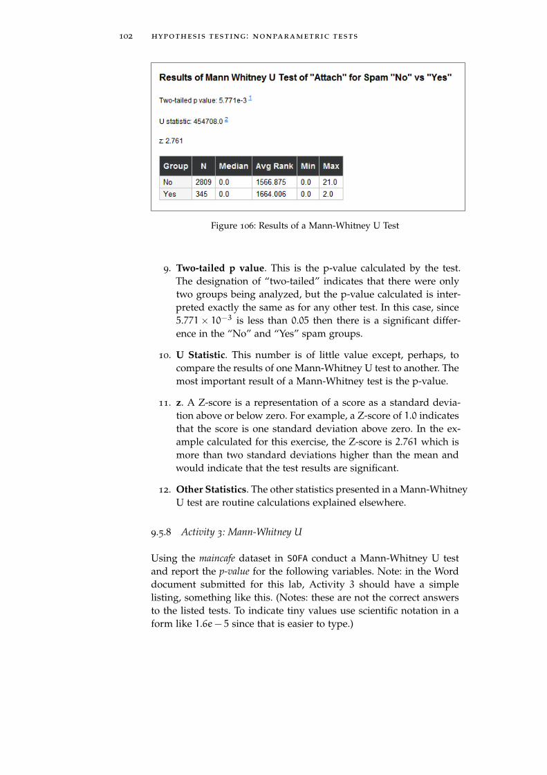
102 hypothesis testing : nonparametric tests
Figure 106: Results of a Mann-Whitney U Test
9. Two-tailed p value. This is the p-value calculated by the test.The designation of “two-tailed” indicates that there were onlytwo groups being analyzed, but the p-value calculated is inter-preted exactly the same as for any other test. In this case, since5.771× 10−3 is less than 0.05 then there is a significant differ-ence in the “No” and “Yes” spam groups.
10. U Statistic. This number is of little value except, perhaps, tocompare the results of one Mann-Whitney U test to another. Themost important result of a Mann-Whitney test is the p-value.
11. z. A Z-score is a representation of a score as a standard devia-tion above or below zero. For example, a Z-score of 1.0 indicatesthat the score is one standard deviation above zero. In the ex-ample calculated for this exercise, the Z-score is 2.761 which ismore than two standard deviations higher than the mean andwould indicate that the test results are significant.
12. Other Statistics. The other statistics presented in a Mann-WhitneyU test are routine calculations explained elsewhere.
9.5.8 Activity 3: Mann-Whitney U
Using the maincafe dataset in SOFA conduct a Mann-Whitney U testand report the p-value for the following variables. Note: in the Worddocument submitted for this lab, Activity 3 should have a simplelisting, something like this. (Notes: these are not the correct answersto the listed tests. To indicate tiny values use scientific notation in aform like 1.6e− 5 since that is easier to type.)

9.5 procedure 103
1 0.35
2 1.27e− 8
3 237.4
4 0.73
Here are the variables to test:
Num Ranked Group By From To
1 Ptysize Meal Breakfast Other
2 Ptysize Pref Booth Table
3 Svc Sex Female Other
4 Food Day Friday Wednesday
9.5.9 Wilcoxon Signed Ranks
1. Start SOFA and click the "Statistics" button.
2. Select "Wilcoxon Signed Ranks" from the Statistical Test list atthe top of the window and then click the "Configure Test" but-ton.
3. Data Source Table: tutoring
4. Group A Variable: Expgrapre
5. Group B Variable: Expgra01
Figure 107: Setting Up a Wilcoxon Signed Ranks Test
6. SOFA calculates the following result.
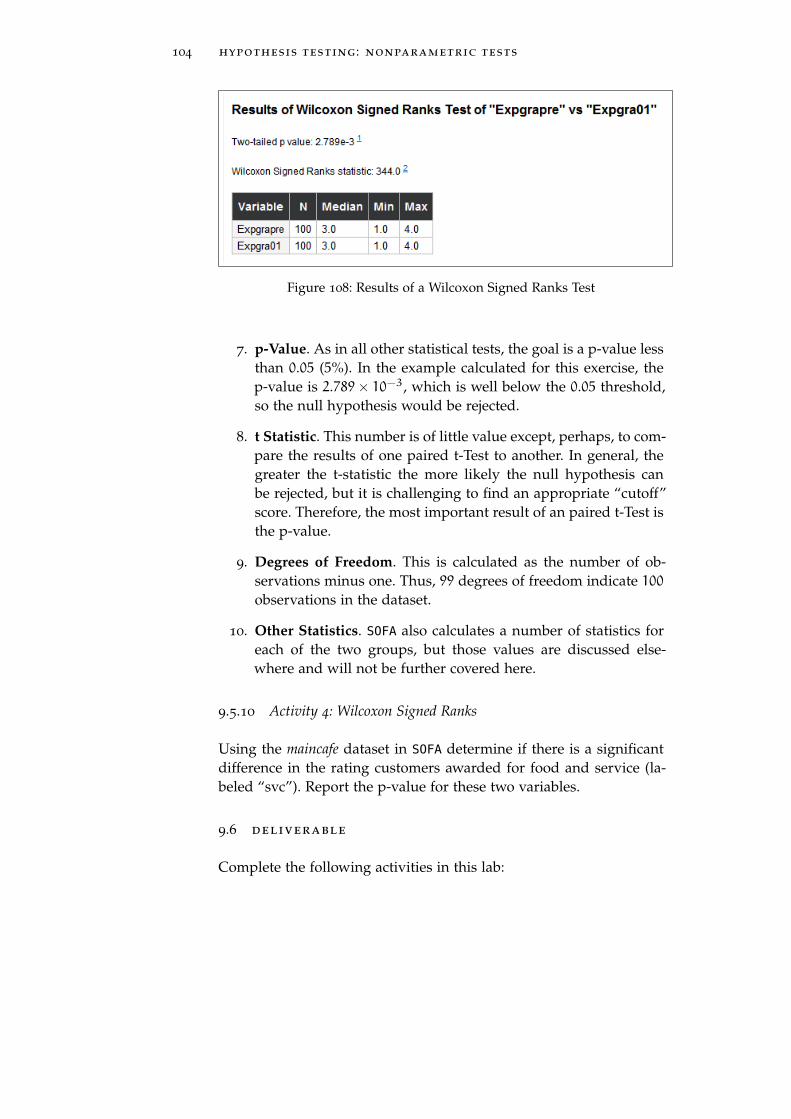
104 hypothesis testing : nonparametric tests
Figure 108: Results of a Wilcoxon Signed Ranks Test
7. p-Value. As in all other statistical tests, the goal is a p-value lessthan 0.05 (5%). In the example calculated for this exercise, thep-value is 2.789× 10⁻³, which is well below the 0.05 threshold,so the null hypothesis would be rejected.
8. t Statistic. This number is of little value except, perhaps, to com-pare the results of one paired t-Test to another. In general, thegreater the t-statistic the more likely the null hypothesis canbe rejected, but it is challenging to find an appropriate “cutoff”score. Therefore, the most important result of an paired t-Test isthe p-value.
9. Degrees of Freedom. This is calculated as the number of ob-servations minus one. Thus, 99 degrees of freedom indicate 100
observations in the dataset.
10. Other Statistics. SOFA also calculates a number of statistics foreach of the two groups, but those values are discussed else-where and will not be further covered here.
9.5.10 Activity 4: Wilcoxon Signed Ranks
Using the maincafe dataset in SOFA determine if there is a significantdifference in the rating customers awarded for food and service (la-beled “svc”). Report the p-value for these two variables.
9.6 deliverable
Complete the following activities in this lab:
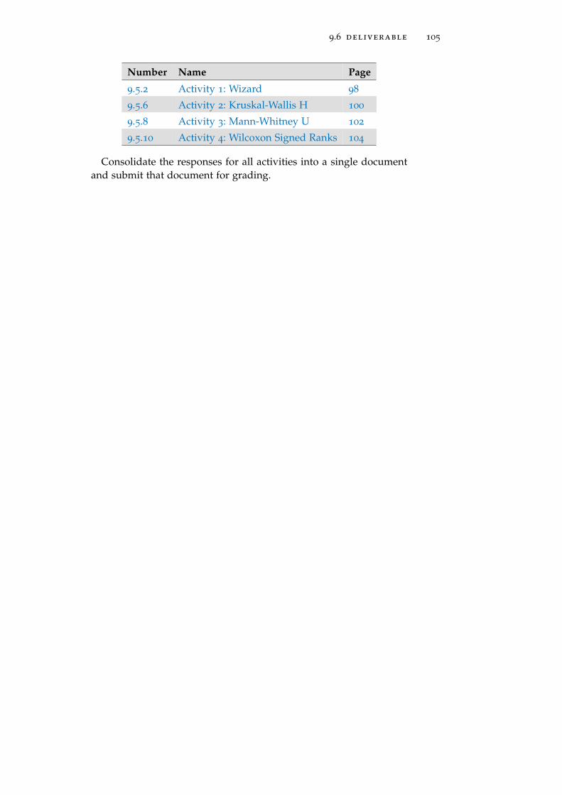
9.6 deliverable 105
Number Name Page
9.5.2 Activity 1: Wizard 98
9.5.6 Activity 2: Kruskal-Wallis H 100
9.5.8 Activity 3: Mann-Whitney U 102
9.5.10 Activity 4: Wilcoxon Signed Ranks 104
Consolidate the responses for all activities into a single documentand submit that document for grading.


10H Y P O T H E S I S T E S T I N G : PA R A M E T R I C T E S T S
10.1 introduction
An important function for statistical analysis is to test a hypothesisto see if it adequately explains some observed phenomenon. The sta-tistical processes for quantitative data are introduced in this lab andthe processes for qualitative data are in hypothesis testing : non-parametric tests on 93.1
10.2 anova
More Than 2 Groups : Ratio/Interval DataAn Analysis of Variance (ANOVA) is used to analyze the differ-
ence in three or more groups of observations. For example, imaginethree groups of students were in the same class and one group was re-quired to attend tutoring once a week, a second group twice a week,and a third group never. The null hypothesis (H0) is “The amountof tutoring does not significantly change a student’s score on the fi-nal exam.” The alternate hypothesis (Ha) is “More frequent tutoringsignificantly changes a student’s score on the final test.” After the fi-nal exam was graded, an ANOVA could be administered and if thatshowed the test scores for those three groups of students had a signif-icant difference then the null hypothesis would be rejected in favor ofthe alternate hypothesis.
10.3 t-test - independent
2 Groups : Ratio/Interval Data : Not PairedAn independent t-test is one of the most commonly used mea-
sures of the difference between two groups. One example of an in-dependent t-test is to compare the spending habits of two similargroups of people. For example, do the residents of Tucson spendmore on dining out than the residents of Phoenix? The null hypothe-sis (H0) is “People in Phoenix and Tucson spend the same amount ofmoney when dining out.” The alternate hypothesis (Ha) is “Peoplein Phoenix and Tucson spend different amounts of money when din-ing out.” Imagine that the dining bills of 100 people from both citieswere recorded and it was discovered that the mean bill in Phoenixis $15.13 and in Tucson is $12.47. A t-test would determine if there
1 The definitions of “hypothesis” and the various data types are found in the intro-duction, beginning on page 3.
107
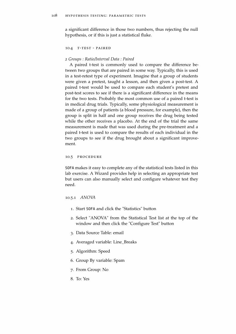
108 hypothesis testing : parametric tests
a significant difference in those two numbers, thus rejecting the nullhypothesis, or if this is just a statistical fluke.
10.4 t-test - paired
2 Groups : Ratio/Interval Data : PairedA paired t-test is commonly used to compare the difference be-
tween two groups that are paired in some way. Typically, this is usedin a test-retest type of experiment. Imagine that a group of studentswere given a pretest, taught a lesson, and then given a post-test. Apaired t-test would be used to compare each student’s pretest andpost-test scores to see if there is a significant difference in the meansfor the two tests. Probably the most common use of a paired t-test isin medical drug trials. Typically, some physiological measurement ismade of a group of patients (a blood pressure, for example), then thegroup is split in half and one group receives the drug being testedwhile the other receives a placebo. At the end of the trial the samemeasurement is made that was used during the pre-treatment and apaired t-test is used to compare the results of each individual in thetwo groups to see if the drug brought about a significant improve-ment.
10.5 procedure
SOFA makes it easy to complete any of the statistical tests listed in thislab exercise. A Wizard provides help in selecting an appropriate testbut users can also manually select and configure whatever test theyneed.
10.5.1 ANOVA
1. Start SOFA and click the "Statistics" button
2. Select "ANOVA" from the Statistical Test list at the top of thewindow and then click the "Configure Test" button
3. Data Source Table: email
4. Averaged variable: Line_Breaks
5. Algorithm: Speed
6. Group By variable: Spam
7. From Group: No
8. To: Yes

10.5 procedure 109
9. Click “Show Results”
Figure 109: Setting Up the ANOVA Test
10. The ANOVA test generates a lot of information.
a) ANOVA Table. This displays information about two broadpartitions of the calculated data. The “Between” Source arevalues calculated when comparing two (or more) groupsand the “Within” Source are values calculated within a sin-gle group.
Figure 110: ANOVA Table
• Sum of Squares. Each value in both groups is sub-tracted from the mean of that group, then that numberis squared (to eliminate negative values), and, finally,all of the squared are summed. For the purposes ofthis exercise the Sum of Squares is of little value.
• df. The degrees of freedom is calculated for the groupsbeing analyzed. The degrees of freedom is one lessthan the number of groups.2
• Mean Sum of Squares. This is the mean of the sum ofthe squares. This is calculated as the sum of squares di-vided by the degrees of freedom. (Note: the Mean Sumof Squares for the Within Source is frequently referredto as the “residuals”).
• F. This is the value of the “F-Test” for this ANOVA.An F-Test is the ratio between two mean square values
2 The concept of Degrees of Freedom is explained in Lab 7.3.2, page 77.
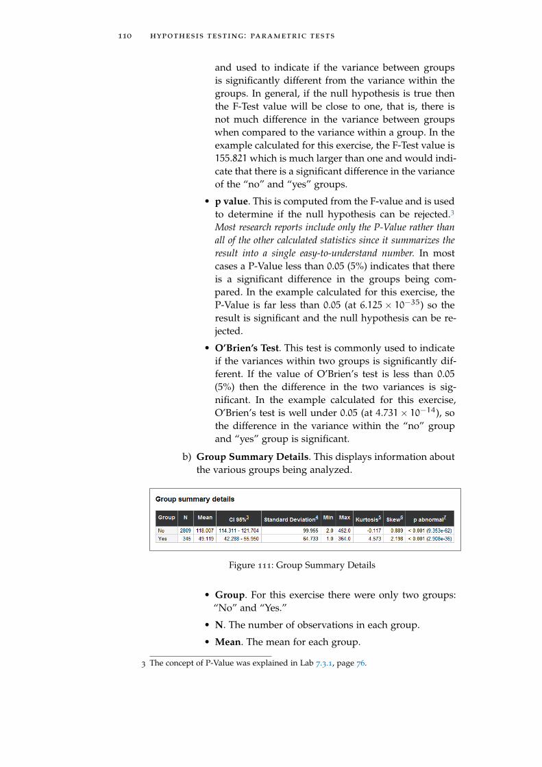
110 hypothesis testing : parametric tests
and used to indicate if the variance between groupsis significantly different from the variance within thegroups. In general, if the null hypothesis is true thenthe F-Test value will be close to one, that is, there isnot much difference in the variance between groupswhen compared to the variance within a group. In theexample calculated for this exercise, the F-Test value is155.821 which is much larger than one and would indi-cate that there is a significant difference in the varianceof the “no” and “yes” groups.
• p value. This is computed from the F-value and is usedto determine if the null hypothesis can be rejected.3
Most research reports include only the P-Value rather thanall of the other calculated statistics since it summarizes theresult into a single easy-to-understand number. In mostcases a P-Value less than 0.05 (5%) indicates that thereis a significant difference in the groups being com-pared. In the example calculated for this exercise, theP-Value is far less than 0.05 (at 6.125× 10⁻³⁵) so theresult is significant and the null hypothesis can be re-jected.
• O’Brien’s Test. This test is commonly used to indicateif the variances within two groups is significantly dif-ferent. If the value of O’Brien’s test is less than 0.05(5%) then the difference in the two variances is sig-nificant. In the example calculated for this exercise,O’Brien’s test is well under 0.05 (at 4.731× 10⁻¹⁴), sothe difference in the variance within the “no” groupand “yes” group is significant.
b) Group Summary Details. This displays information aboutthe various groups being analyzed.
Figure 111: Group Summary Details
• Group. For this exercise there were only two groups:“No” and “Yes.”
• N. The number of observations in each group.
• Mean. The mean for each group.
3 The concept of P-Value was explained in Lab 7.3.1, page 76.

10.5 procedure 111
• CI 95%. The 95% confidence interval. For example, thereis 95% confidence that the actual mean for the “No”group lies between 114.311 and 121.704.
• Standard Deviation. The standard deviation for eachgroup.
• Min. The minimum value for each group.
• Max. The maximum value for each group.
• Kurtosis. The Kurtosis4 for each group.
• Skew. This is a measure of the symmetry of the data.While it is problematic to categorically state that somevalue of skewness is “bad,” generally values lower than−1 or higher than +1 would be considered non-symmetrical.In the example calculated for this exercise, the “No”skew is +0.889 and would be considered reasonablysymmetrical while the “Yes” skew is +2.198 and wouldbe considered non-symmetrical.
• p Abnormal. This is a measure of the normality ofthe distribution. If the value is less than 0.05 then thedata are not normally distributed. In the example cal-culated for this exercise, both groups have a value wellbelow 0.05 and would be considered non-normally dis-tributed. A histogram of each group’s distribution isincluded in the ANOVA results and shown in the nexttwo figures. It is easy to see that these data are notnormally distributed.
4 Kurtosis and skew were described in Lab 1.3.2.1, page 6.
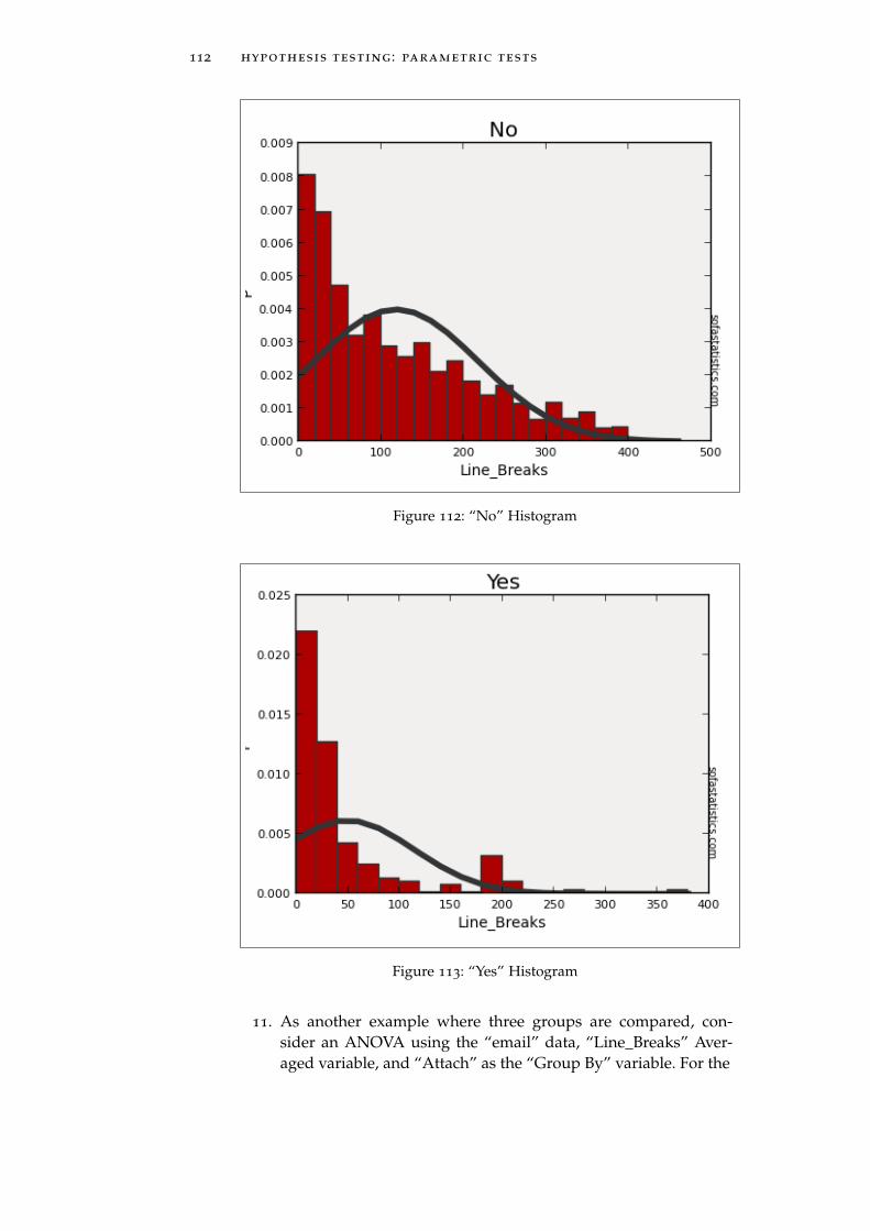
112 hypothesis testing : parametric tests
Figure 112: “No” Histogram
Figure 113: “Yes” Histogram
11. As another example where three groups are compared, con-sider an ANOVA using the “email” data, “Line_Breaks” Aver-aged variable, and “Attach” as the “Group By” variable. For the

10.5 procedure 113
grouped variable, choose to group from 0.0 to 2.0 only. Here arethe results:
Figure 114: Setting Up ANOVA for Attach
Figure 115: ANOVA Table
Figure 116: ANOVA Group Summary
10.5.2 Activity 1: ANOVA
Using the maincafe dataset in SOFA conduct an ANOVA and report theBetween Source p-value for the following variables. Note: in the Worddocument submitted for this lab, Activity 1 should have a simplelisting, something like this. (Notes: these are not the correct answersto the listed tests. To indicate tiny values use scientific notation in aform like 1.6e− 5 since that is easier to type.)

114 hypothesis testing : parametric tests
1 0.35
2 1.27e− 8
3 237.4
4 0.73
Here are the variables to test:
Num Averaged Group By From To
1 Age Food 1.0 5.0
2 Age Svc 1.0 5.0
3 Age Day Friday Wednesday
4 Food Day Friday Wednesday
10.5.3 Correlation - Pearson’s
The Pearson’s R statistic is covered in Lab 7.2.1, Pearson’s R, page 73.The SOFA activity related to Pearson’s R is on page 80.
10.5.4 t-test - Independent
1. Start SOFA and click the "Statistics" button.
2. Select "t-test - independent" from the Statistical Test list at thetop of the window and then click the "Configure Test" button.
3. Data Source Table: births
4. Averaged Variable: Weight
5. Group By Variable: Habit
6. Group A: Nonsmoker
7. Group B: Smoker
Figure 117: Setting Up Independent t-Test
8. Following is the result of that test.

10.5 procedure 115
Figure 118: Results of an Independent t-Test
9. p Value. The most important statistic in the results window isthe p-value. As always, when this number is encountered it isdesired for it to have a value less than 0.05 (5%). In the examplecalculated for this exercise, the p-value is 0.02779, which is lessthan 0.05, so there is a significant relationship between BirthWeight and Smoking Habit in this dataset.
10. t Statistic. This number is of little value except, perhaps, to com-pare the results of one independent t-Test to another. In general,the greater the t-statistic the more likely the null hypothesis canbe rejected, but it is challenging to find an appropriate “cutoff”score. Therefore, the most important result of an independentt-Test is the p-value.
11. Degrees of Freedom (df). The degrees of freedom is calculatedas the number of different birth weights times one less than thenumber of groups.5
12. O’Brien’s Test. This test is commonly used to indicate if the vari-ances within two groups is significantly different. If the valueof O’Brien’s test is less than 0.05 (5%) then the difference in thetwo variances is significant. In the example calculated for thisexercise, O’Brien’s test greater than 0.05 (at 0.4154), so the differ-ence in the variance between the “Nonsmoker” and “Smoker”groups is not significant.
13. Other Statistics. The table shows a number of statistical valuesfor the two groups and each of the types of values have beendescribed elsewhere.
14. Histograms. The results window includes a histogram for eachof the groups in the calculation, similar that that found for anANOVA (see page 112). Those histograms are not reproducedhere.
5 The concept of Degrees of Freedom is explained in Lab 7.3.2, page 77.
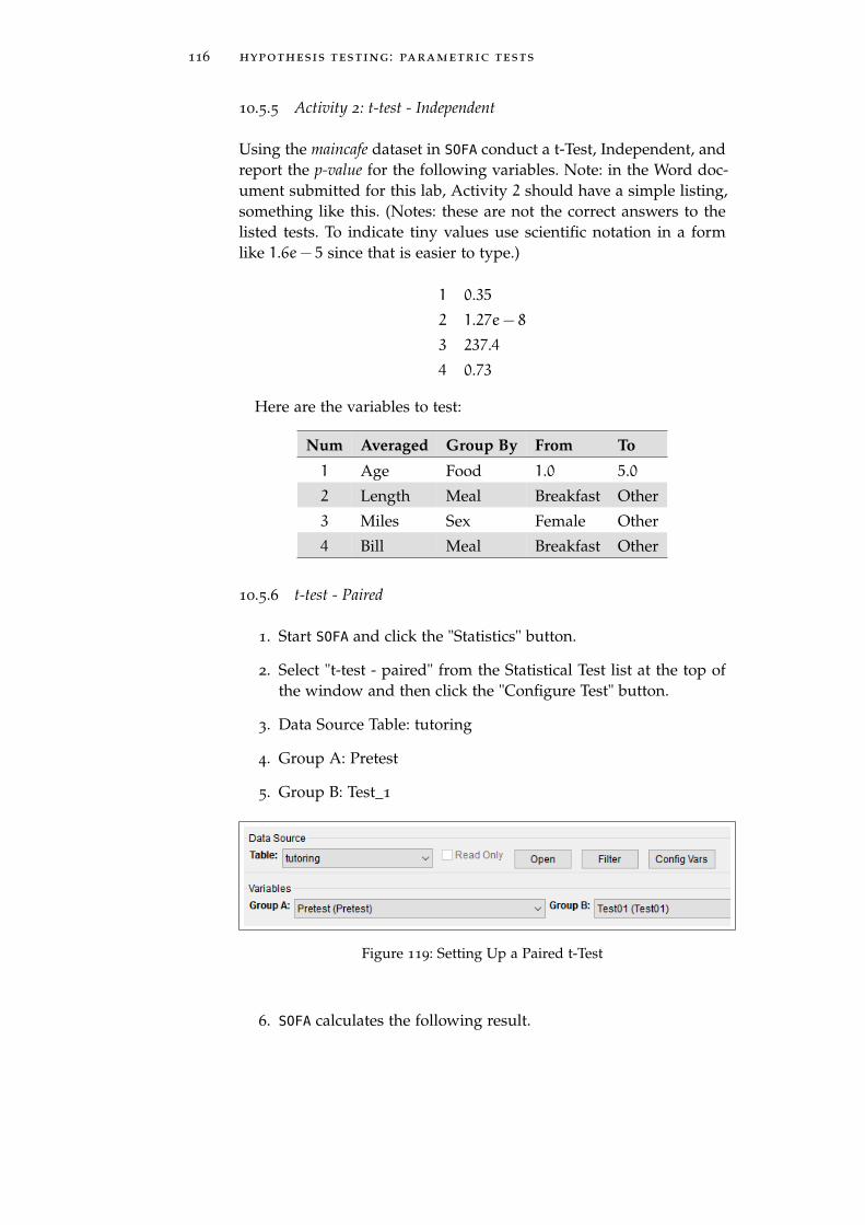
116 hypothesis testing : parametric tests
10.5.5 Activity 2: t-test - Independent
Using the maincafe dataset in SOFA conduct a t-Test, Independent, andreport the p-value for the following variables. Note: in the Word doc-ument submitted for this lab, Activity 2 should have a simple listing,something like this. (Notes: these are not the correct answers to thelisted tests. To indicate tiny values use scientific notation in a formlike 1.6e− 5 since that is easier to type.)
1 0.35
2 1.27e− 8
3 237.4
4 0.73
Here are the variables to test:
Num Averaged Group By From To
1 Age Food 1.0 5.0
2 Length Meal Breakfast Other
3 Miles Sex Female Other
4 Bill Meal Breakfast Other
10.5.6 t-test - Paired
1. Start SOFA and click the "Statistics" button.
2. Select "t-test - paired" from the Statistical Test list at the top ofthe window and then click the "Configure Test" button.
3. Data Source Table: tutoring
4. Group A: Pretest
5. Group B: Test_1
Figure 119: Setting Up a Paired t-Test
6. SOFA calculates the following result.

10.5 procedure 117
Figure 120: Results of a Paired t-Test
7. p-Value. As in all other statistical tests, the goal is a p-value lessthan 0.05 (5%). In the example calculated for this exercise, thep-value is 0.01870, which is well below the 0.05 threshold, so thenull hypothesis would be rejected.
8. t Statistic. This number is of little value except, perhaps, to com-pare the results of one paired t-Test to another. In general, thegreater the t-statistic the more likely the null hypothesis canbe rejected, but it is challenging to find an appropriate “cutoff”score. Therefore, the most important result of an paired t-Test isthe p-value.
9. Degrees of Freedom. This is calculated as the number of ob-servations minus one. Thus, 99 degrees of freedom indicate 100
observations in the dataset.
10. Other Statistics. SOFA also calculates a number of statistics foreach of the two groups, but those values are discussed else-where and will not be further covered here.
11. Graph. SOFA also generates a graph of the results. In the fol-lowing figure, the differences between pairs is graphed on theX-Axis. Ideally, the result would be a normal distribution, as in-dicated by the dark line. In this particular example, though, theresults are rather flat which would indicate a possible problemwith the experiment that the researcher would want to consider.

118 hypothesis testing : parametric tests
Figure 121: Graphic Results of a Paired t-Test
10.6 deliverable
Complete the following activities in this lab:
Number Name Page
10.5.2 Activity 1: ANOVA 113
10.5.5 Activity 2: t-test - Independent 116
Consolidate the responses for all activities into a single documentand submit that document for grading.

11F I N A L
11.1 introduction
The final lab requires the review and completion of several SOFA pro-cedures. The specific activities will be provided by the instructor. Fol-lowing are examples of the types of activities that may be required:
1. Using the maincafe dataset, create a frequency table of “Svc.”
2. Using the maincafe dataset, create a histogram of “Age.”
3. Using the maincafe dataset, calculate the mean, median, andstandard deviation of “Age.”
Consolidate the responses for all activities into a single documentand submit that document for grading.
119


Part II
A P P E N D I X


12A P P E N D I X
12.1 appendix a : datasets
There are a number of datasets used in the lab exercises and thisappendix lists the following information about those datasets:
1. Type of data (Nominal, Ordinal, Interval, Ratio)
2. Whether the data are normally distributed
3. Skew
4. Kurtosis
12.1.1 bdims
This is a dataset of the body girth measurements and skeletal diame-ter measurements, as well as age, weight, height and gender, for 507
physically active individuals, 247 men and 260 women.
• age. (Ratio : Normal : 1.131 : 0.96) The patient’s age in years.
• ank.di. (Ratio : Normal : 0.07 : −0.372) The patient’s ankle di-ameter in centimeters, measured as sum of two ankles.
• ank.gi. (Ratio : Normal : 1.131 : 0.96) The patient’s ankle mini-mum girth in centimeters, measured as average of right and leftgirths.
• bia.di. (Ratio : Normal : 1.156 : −0.83) The patient’s biacromial(shoulder width) in centimeters.
• bic.gi. (Ratio : Normal : 0.221 : −0.821) The patient’s bicep girthin centimeters, measured when flexed as the average of rightand left girths.
• bii.di. (Ratio : Normal : −0.417 : 1.09) The patient’s biiliac (pelvicwidth) in centimeters.
• bit.di. (Ratio : Normal : −0.087 : 0.036) The patient’s bitrochanteric(femur width) in centimeters.
• cal.gi. (Ratio : Normal : 0.278 : 0.301) The patient’s calf maxi-mum girth in centimeters, measured as average of right and leftgirths.
123
124 appendix
• che.de. (Ratio : Normal : 0.495 : −0.128) The patient’s chestdepth in centimeters, measured between spine and sternum atnipple level, mid-expiration.
• che.di. (Ratio : Normal : 0.259 : −0.727) The patient’s chest di-ameter in centimeters, measured at nipple level, mid-expiration.
• che.gi. (Ratio : Normal : 0.239 : −0.879) The patient’s chest girthin centimeters, measured at nipple line in males and just abovebreast tissue in females, mid-expiration.
• elb.di. (Ratio : Normal : 0.053 : −0.731) The patient’s elbow di-ameter in centimeters, measured as sum of two elbows.
• for.gi. (Ratio : Normal : 0.153 : −0.972) The patient’s forearmgirth in centimeters, measured when extended, palm up as theaverage of right and left girths.
• hgt. (Ratio : Normal : 0.152 : −0.45) The patient’s height in cen-timeters.
• hip.gi. (Ratio : Normal : 0.498 : 0.774) The patient’s hip girth incentimeters, measured at at level of bitrochanteric (femur width)diameter.
• kne.di. (Ratio : Normal : 0.341 : 0.081) The patient’s knee diam-eter in centimeters, measured as sum of two knees.
• kne.gi. (Ratio : Normal : 0.469 : 1.019) The patient’s knee diam-eter in centimeters, measured as sum of two knees.
• nav.gi. (Ratio : Normal : 0.45 : 0.14) The patient’s navel (abdom-inal) girth in centimeters, measured at umbilicus and iliac crestusing iliac crest as a landmark.
• sex. (Nominal : Not Normal : N/A : N/A) The patient’s sex.
• sho.gi. (Ratio : Normal : 0.14 : −0.896) The patient’s shouldergirth in centimeters, measured over deltoid muscles.
• thi.gi. (Ratio : Normal : 0.691 : 0.731) The patient’s thigh girthin centimeters, measured below gluteal fold as the average ofright and left girths.
• wai.gi. (Ratio : Normal : 0.541 : −0.218) The patient’s waist girthin centimeters, measured at the narrowest part of torso belowthe rib cage as average of contracted and relaxed position.
• wgt. (Ratio : Normal : 0.402 : −0.348) The patient’s weight inkilograms.
• wri.di. (Ratio : Normal : 0.048 : −0.483) The patient’s wrist di-ameter in centimeters, measured as sum of two wrists.

12.1 appendix a : datasets 125
• wri.gi. (Ratio : Normal : 0.152 : −0.719) The patient’s wrist mini-mum girth in centimeters, measured as average of right and leftgirths.
12.1.2 births
This is a random sample of 1000 births in North Carolina in 2004.
• Fage. (Ratio : Normal : 0.292 : −0.246) The father’s age.
• Fageord. (Ordinal : Not Normal : N/A : N/A) Father’s agegroups. This is not in the original dataset and was added viarecoding.
• Gained. (Ratio : Normal : 0.461 : 0.752) The mother’s weightgain, in pounds.
• Gainedord. (Ordinal : Not Normal : N/A : N/A) Weight gainedgroups. This is not in the original dataset and was added viarecoding.
• Gender. (Nominal : Not Normal : N/A : N/A) The gender ofthe baby.
• Habit. (Nominal : Not Normal : N/A : N/A) Whether the motherwas a smoker.
• Lowbirthweight. (Nominal : Not Normal : N/A : N/A) Whetherthe baby had a low birth weight.
• Mage. (Ratio : Normal : 0.263 : −0.636) The mother’s age.
• Mageord. (Ordinal : Not Normal : N/A : N/A) Mother’s agegroups. This is not in the original dataset and was added viarecoding.
• Marital. (Nominal : Not Normal : N/A : N/A) Whether themother was married.
• Mature. (Nominal : Not Normal : N/A : N/A) The mother’smaturity status.
• Premie. (Nominal : Not Normal : N/A : N/A) Whether thebaby was premature.
• Visits. (Interval : Normal : 0.263 : −0.636) The number of hospi-tal visits made by the mother.
• Weeks. (Interval : Normal : −2.016 : 7.681) Length of pregnancy,in weeks. This data are normally distributed, but the skew andkurtosis are very poor so the data may be better treated as notnormal.

126 appendix
• Weight. (Interval : Normal : −1.145 : 2.7) Birth weight of thebaby, in pounds.
• Whitemom. (Nominal : Not Normal : N/A : N/A) Whether themother was white.
12.1.3 cars
This is a random sample for 1993 model cars that were in both Con-sumer Reports and PACE Buying Guide. Only vehicles of type “small,”“midsize,” and “large” were included. The dataset has 54 rows andthese data elements for each row:
• driveTrain. (Nominal : Not Normal : N/A : N/A) Vehicle drivetrain with levels 4WD, front, and rear.
• mpgCity. (Ratio : Normal : 1.45 : 1.968) City mileage (miles pergallon).
• passengers. (Ordinal : Not Normal : N/A : N/A) The vehiclepassenger capacity.
• price. (Ratio : Normal : 1.327 : 1.897) Vehicle price in U.S. dol-lars.
• type. (Ordinal : Not Normal : N/A : N/A) The vehicle typewith levels large, midsize, and small.
• weight. (Ratio : Normal : −0.233 : −1.168) Vehicle weight inpounds. The skew and kurtosis for this data are good, but thehistogram is rather flat. This may be better considered a notnormal distribution.
12.1.4 doorsurvey
This is simulated data. Students recorded observations about the cus-tomers entering a store between 9 AM and 11 AM for a one weekperiod.
• agecat. (Ordinal : Not Normal : N/A : N/A) An estimate of theage category for the customer where 1 is less than 30 years old,2 is between 30 and 50 years old, and 3 is more than 50 years old.If a group entered then the age of the first adult in the groupwas estimated.
• day. (Ordinal : Not Normal : N/A : N/A) The date the cus-tomers were observed.
• grpnum. (Ordinal : Not Normal : N/A : N/A) The number ofpeople in the group.

12.1 appendix a : datasets 127
• gender. (Nominal : Not Normal : N/A : N/A) The sex of thecustomer: m or f. If a group entered then the sex of the firstadult in the group was recorded.
12.1.5 email
This dataset contains 3154 observations from the email received byone person over a period of several months in 2012.
• attach. (Ratio : Not Normal : 16.278 : 502.528) The number ofattached files.
• cc. (Ratio : Not Normal : 13.51 : 225.074) How many people wereCCed on the message.
• dollar. (Ratio : Not Normal : 4.456 : 22.826) The number of timesa dollar sign or the word “dollar” appeared in the email.
• exclaim_mess. (Ratio : Not Normal : 4.107 : 23.946) The numberof exclamation points in the email message.
• exclaim_subj. (Nominal : Not Normal : N/A : N/A) No if theemail subject did not have an exclamation point, otherwise yes.
• format. (Nominal : Not Normal : N/A : N/A) Text if the mes-sage was sent in text format and html if it used HTML format.
• image. (Ratio : Not Normal : 9.621 : 121.313) The number ofimages attached.
• inherit. (Ratio : Not Normal : 18.188 : 478.488) The numberof times “inherit” (or an extension, such as “inheritance”) ap-peared in the email.
• line_breaks. (Ratio : Normal : 0.974 : 0.046) The number of linebreaks in the email (does not count text wrapping).
• num_char. (Ratio : Normal : 0.944 : −0.017) The number of char-acters in the email, in thousands.
• number (Ordinal : Not Normal : N/A : N/A) None if the mes-sage included no numbers, small if it included only numbersless than one million, or large if it included one or more bignumbers.
• password. (Ratio : Not Normal : 16.173 : 333.185) The numberof times “password” appeared in the email.
• re_subj. (Nominal : Not Normal : N/A : N/A) No if the sub-ject did not include any of these: “Re:”, “RE:”, “re:”, or “rE:”,otherwise yes.

128 appendix
• sent_email. (Nominal : Not Normal : N/A : N/A) No if noemail was sent to the sender in the last 30 days, otherwise yes.
• spam. (Nominal : Not Normal : N/A : N/A) Yes if the messageis spam, otherwise no.
• spamnum. (Ordinal : Not Normal : N/A : N/A) Numeric rep-resentation of the “spam” data item. This is not in the originaldataset and was added via recoding.
• to_multiple. (Nominal : Not Normal : N/A : N/A) No for mailthat was sent to only one person, otherwise yes.
• urgent_subj. (Nominal : Not Normal : N/A : N/A) Yes if thesubject included the word “urgent,” otherwise no.
• viagra. (Ratio : Not Normal : 56.134 : 3149.0) The number oftimes “viagra” appeared in the email.
• winner. (Nominal : Not Normal : N/A : N/A) Yes if the word“winner” appeared in the email, otherwise no.
12.1.6 gifted
An investigator is interested in understanding the relationship, if any,between the analytical skills of young gifted children and the vari-ables listed below. The analytical skills are evaluated using a standardtesting procedure and the score on that test is included in the dataset.Data were collected from schools in a large city on a set of 36 childrenwho were identified as gifted children soon after they reached the ageof four.
• Cartoons. (Ratio : Normal : 0.053 : −0.551) Average number ofhours per week the child watched cartoons on TV during thepast three months.
• Count. (Interval : Normal : −0.197 : −0.653) Age in monthswhen the child first counted to ten successfully.
• Edutv. (Ratio : Normal : −0.053 : −0.375) Average number ofhours per week the child watched an educational program onTV during the past three months.
• Fatheriq. (Interval : Normal : 1.091 : 1.459) Father’s IQ.
• Motheriq. (Interval : Normal : 0.247 : 0.035) Mother’s IQ.
• Read. (Ratio : Normal : −0.576 : −0.449) Average number ofhours per week the child’s mother or father reads to the child.
• Score. (Ratio : Normal : −0.016 : −0.528) The score in test ofanalytical skills.

12.1 appendix a : datasets 129
• Speak. (Interval : Normal : −0.627 : −0.153) Age in monthswhen the child first said “mummy” or “daddy.”
12.1.7 maincafe
This is simulated data. Customers of the Main Street Café completedsurveys over a one week period. Note: this dataset is occasionallyre-created so the values for skew and kurtosis are only estimates.
• age. (Ratio : Normal : ≈ 0.2 : ≈ −0.6) The age in years of theperson completing the survey.
• bill. (Interval : Normal : ≈ 1.0 : ≈ 0.5) The bill for the meal.
• day. (Nominal : Not Normal : N/A : N/A) The day of the weekthe person visited the cafe. The levels are written names of days,like “Sunday” and “Monday.”
• food. (Ordinal : Not Normal : N/A : N/A) A rating for the food,from one to five “stars.”
• length. (Interval : Normal : ≈ −0.5 : ≈ −0.2) The length of thevisit in minutes.
• meal. (Nominal : Not Normal : N/A : N/A) The meal eatenstored as Breakfast, Lunch, Dinner, and Other.
• miles. (Interval : Not Normal : ≈ 8.2 : ≈ 71.0) The number ofmiles from the visitor’s home and the cafe.
• pref. (Nominal : Not Normal : N/A : N/A) A binary item forthe preference in tables of the diner. The levels are “table” and“booth.”
• ptysize. (Interval : Normal : ≈ 0.7 : ≈ 0.1) The size of the diningparty.
• recmd. (Nominal : Not Normal : N/A : N/A) A binary itemfor whether the customer would recommend the café to otherpeople, stored as “no” and “yes.”
• sex. (Nominal : Not Normal : N/A : N/A) The gender of theperson completing the survey. The levels are: male, female, andother.
• svc. (Ordinal : Not Normal : N/A : N/A) A rating for the ser-vice, from one to five “stars.”
• tip. (Ratio : Normal : ≈ 1.4 : ≈ 1.2) The amount of tip left.

130 appendix
12.1.8 rivers
The Rivers dataset is a list of the lengths of the longest 141 rivers inthe United States. These data are not normally distributed.
135, 202, 210, 210, 215, 217, 230, 230, 233, 237, 246, 250,250, 250, 255, 259, 260, 260, 265, 268, 270, 276, 280, 280, 280,281, 286, 290, 291, 300, 300, 300, 301, 306, 310, 310, 314, 315,320, 325, 327, 329, 330, 332, 336, 338, 340, 350, 350, 350, 350,352, 360, 360, 360, 360, 375, 377, 380, 380, 383, 390, 390, 392,407, 410, 411, 420, 420, 424, 425, 430, 431, 435, 444, 445, 450,460, 460, 465, 470, 490, 500, 500, 505, 524, 525, 525, 529, 538,540, 545, 560, 570, 600, 600, 600, 605, 610, 618, 620, 625, 630,652, 671, 680, 696, 710, 720, 720, 730, 735, 735, 760, 780, 800,840, 850, 870, 890, 900, 900, 906, 981, 1000, 1038, 1054, 1100,1171, 1205, 1243, 1270, 1306, 1450, 1459, 1770, 1885, 2315,2348, 2533
12.1.9 tutoring
This is simulated data. A professor designed an experiment where shefirst administered a pretest to all students. She then required all stu-dents to work with an online tutoring service every week. At the endof four weeks she administered a post-test and labeled the scores onthat test as “Test01.” She then required students to attend weeklyface-to-face tutoring sessions. After four weeks she administered adifferent, but similar, post-test and labeled the scores on that test as“Test02.” After each of the three tests she asked the students whatgrade they expected to earn. This dataset includes the test scores andgrade predictions for each of the students.
• ExpGra01. (Ordinal : Not Normal : N/A : N/A) This is theexpected grade the student reported after Test01. The levels areA=4, B=3, C=2, and D=1.
• ExpGra02. (Ordinal : Not Normal : N/A : N/A) This is theexpected grade the student reported after Test02. The levels areA=4, B=3, C=2, and D=1.
• ExpGraPre. (Ordinal : Not Normal : N/A : N/A) This is the ex-pected grade the student reported during the pretest. The levelsare A=4, B=3, C=2, and D=1.
• Pretest. (Ratio : Normal : 0.199 : −0.591) This is the student’spretest score.
• StuID. (Interval : Not Normal : N/A : N/A) This is just a one-up number assigned to identify each student in the study.

12.2 appendix b : recoding variables 131
• Test01. (Ratio : Normal : 0.063 : −0.205) This is the score forstudents on the first post-test.
• Test02. (Ratio : Normal : −0.05 : −0.109) This is the score forstudents on the second post-test.
12.2 appendix b : recoding variables
12.2.1 Background
For efficiency, data are often stored in a database in a format that doesnot lend itself to easy analysis. For example, nominative values, like“no” and “yes” are frequently stored as 0 and 1. While that is efficientfor storage it makes using a table or chart more difficult because thevarious data elements will be presented as something like 0 instead of“no” and it is incumbent upon the researcher to remember what thevarious codes mean; however, values in a dataset can be recoded tomake them easier to use. As examples, “0/1” values can be recodedto “no/yes” or a variable containing ages can be recoded so the agesare grouped, like ages 20− 29 can be recoded to 2.
12.2.2 Recoding Variables With SOFA
In SOFA, a data field is recoded into a new field so the dataset endsup with two fields that contain the same data but in different formats.As an example, imagine that a researcher is using the “spam” field ofthe email dataset and desires to use 0 instead of “no” and 1 instead of“yes,” then that field would need to be recoded.
1. Start SOFA and select “Enter/Edit Data.”
2. Data Tables: email
3. Click “Design”
4. Click the “Recode” button on the Data Table screen
5. Fill in the “Recode” screen as illustrated below. (Note: sinceeach row is saved as it is entered, the cursor must be movedinto Row 3, as illustrated, in order to save the changes made onRow 2).

132 appendix
Figure 122: Recoding Spam Field
6. Click “Recode”
7. The following message will be displayed
Figure 123: Recode Warning on Save
8. Click OK to dismiss the warning, click OK to complete the re-code, and then click “Update” to file the results of the recodeprocess.
When this process is completed the email dataset will contain a newfield named “spamnum” that contains a 0 where “spam” is equal to“no” and a 1 where “spam” is “yes.”
12.3 appendix c : sofa exports
SOFA creates several different types of exports and each are easy togenerate and use. Export specifications are set in the area across thecenter of the various pop-up windows (Report Tables, Charts, andStatistics) and generating reports is the same for all of the windows.
12.3.1 Styles
SOFA comes with seven built-in styles that can be selected from thebox on the bottom-right of the window:

12.3 appendix c : sofa exports 133
Figure 124: SOFA Styles
As each style is selected the display in the lower-left corner of thewindow is immediately updated to reflect the selected style.
12.3.2 Exporting a File
The output in the lower-left corner of the window can be exported ina file that can be opened by a program like Excel. In the Export drop-down box at the right-center of the window select “Current Output”and then click the “Export” button.
Figure 125: Selecting Export Type
Select the specific type of output desired in the pop-up window.

134 appendix
Figure 126: Specifying Desired Export
• Export as PDF. This option will generate a PDF file containingthe current output. Note that a number of different outputs canbe combined into a single PDF file by using the “Report” fea-ture, described below.
• Export to spreadsheet (report tables only). This generates anExcel spreadsheet without any formatting. This is an excellentoption if the data produced by SOFA needs further manipulation.
• Export as Images. SOFA will export the output as .PNG imagesthat can be used in other programs or emailed. The quality ofthe image can be selected using the drop-down box. (NOTE: formost work the “Print Quality (300 dpi)” setting is adequate.)
Click the “Export” button to generate the desired export file.
12.3.3 Copy/Paste Output
In the dropdown “Export” box, select “Copy current output readyto paste” to copy the output displayed in the lower left corner of thewindow so it can be pasted directly into Word or some other program.
12.3.4 Reports
SOFA can combine the outputs for several operations into a singlePDF report or series of .PNG files. This is a two-step process, first thevarious outputs are saved into a report and, second, the final reportis exported.
To save the outputs into a single report, start by specifying thelocation and name for the report. By default, SOFA saves reports in thesofastats/reports folder and that is appropriate since SOFA can generate

12.3 appendix c : sofa exports 135
a number of files when producing a report. To specify the name fora new report, click the “Browse” button and enter the report’s name(it is the file name). SOFA saves reports in .HTM format but a differentformat can be specified when the report is later exported.
Then, as outputs are produced, click the “Also add to report” but-ton to add the current output, displayed in the lower-left corner ofthe window, to the report. Note: every time the “Also add to report”button is clicked the current output is added to the report so avoidclicking that button multiple times unless multiple copies of the cur-rent output are desired.
To export the report, select “Entire Report” in the export drop-down box. Select the format for the report (PDF, images, or ExcelSpreadsheet) and click “Export.”
Note: SOFA exports PDF files such that each saved output screen ison a different PDF page, which makes the PDF file rather long with alot of blank space between pages. As an alternative, it may be possibleto click the “View Report” button to open the report in a browser andthen use the browser’s print feature.