Lab 1 B Objectives 1.Calibrate a thermometer 2.Dimension analysis 3.Generate a graph on excel.
22
Lab 1 B Objectives 1. Calibrate a thermometer 2. Dimension analysis 3. Generate a graph on excel
-
Upload
gregory-jones -
Category
Documents
-
view
219 -
download
0
Transcript of Lab 1 B Objectives 1.Calibrate a thermometer 2.Dimension analysis 3.Generate a graph on excel.

Lab 1 B
Objectives
1. Calibrate a thermometer
2. Dimension analysis
3. Generate a graph on excel
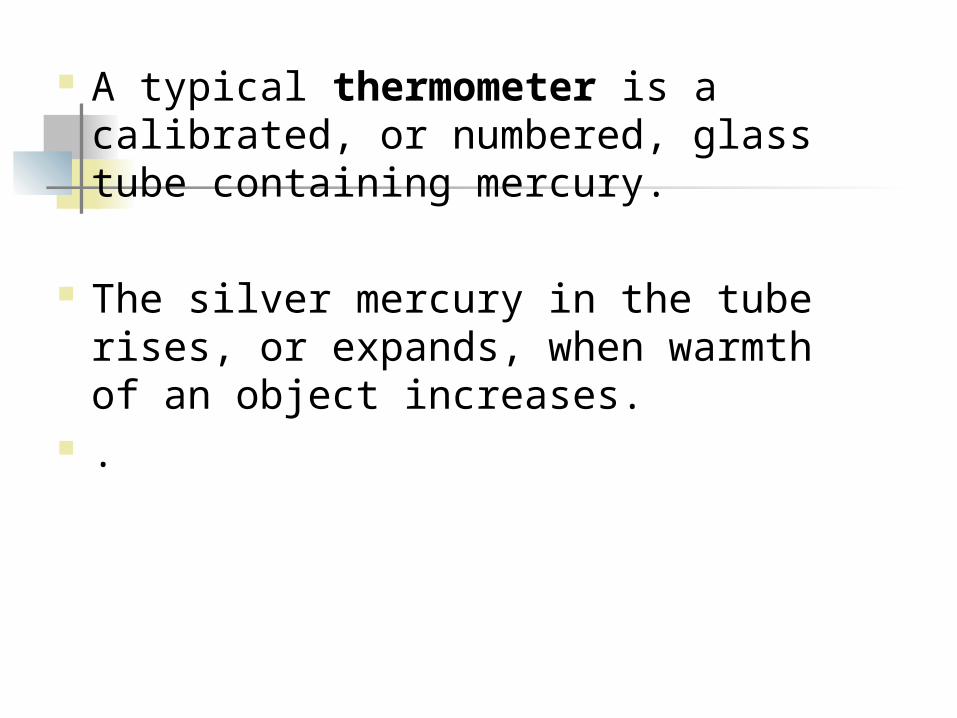
A typical thermometer is a calibrated, or numbered, glass tube containing mercury.
The silver mercury in the tube rises, or expands, when warmth of an object increases.
.
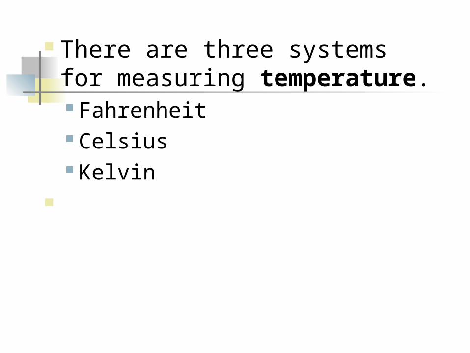
There are three systems for measuring temperature. Fahrenheit Celsius Kelvin

Fahrenheit.
The first scale is measured in degrees Fahrenheit.
The range from freezing point to boiling point on this scale is 32 to 212 degrees.

Celsius
The other scale is measured in degrees Celsius.
. The range from freezing point to boiling point on this scale is 0 to 100 degrees.

Temperature Conversion Table
From
Fahrenheit (F o to C o) (F - 32) * 5/9
Celsius (C o to F o) (C * 9/5) + 32
Kelvin (C o to Ko) C + 273
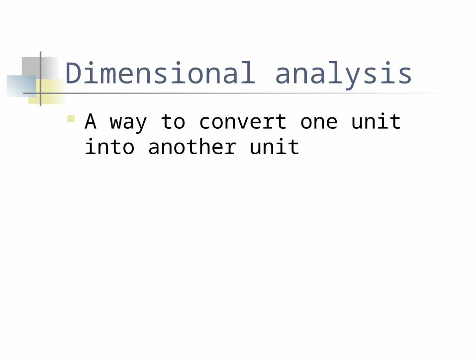
Dimensional analysis A way to convert one unit into another unit

Math Start with what is given. If the problem is in the form of a math
equation (ex. 36 eggs = ______________ dozen, it’s the number written first.

36 eggs
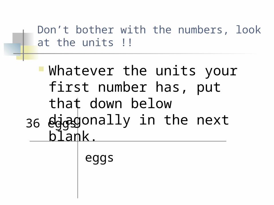
Don’t bother with the numbers, look at the units !!
Whatever the units your first number has, put that down below diagonally in the next blank.
36 eggs
eggs

Conversions
Decide what you have to convert the unit you just wrote into.
Put the conversion unit above
A conversion is a unit that has an equivalent value to another unit

Important conversions 1 cm3 = 1 ml
1 inch = 2.54 cm 1meter = 1000mm
1km = 1000m 1m= 100 cm

36 eggs
eggs
Dozen

For each conversion, ask which unit is larger put a 1 next to it
36 eggs
eggs
Dozen1

Ask yourself how many of the other units are in the larger unit. Fill in the other number
36 eggs
eggs
Dozen1
12

Cancel units that divide out
36 eggs
eggs
Dozen1
12

Do the math. Multiply across the top write the number
down. Multiply across the bottom write the number
down, Divide the two numbers. That is your answer.
36x 1 = 36 1 x12 = 12 36 / 12= 3 dozen
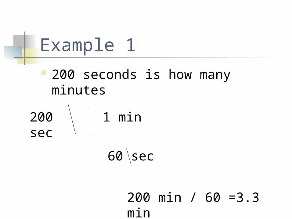
Example 1 200 seconds is how many minutes
200 sec
60 sec
1 min
200 min / 60 =3.3 min

Example 2 2000 seconds is how many days
2000 sec
60 sec
1 min
2000 Hours / 3600 =0.55 hours
60 min
1 Hour

Example 3 200 mg/ml is how many grams / L
200 mg
1000 mg
1 gram
ml
1000 ml
1 L
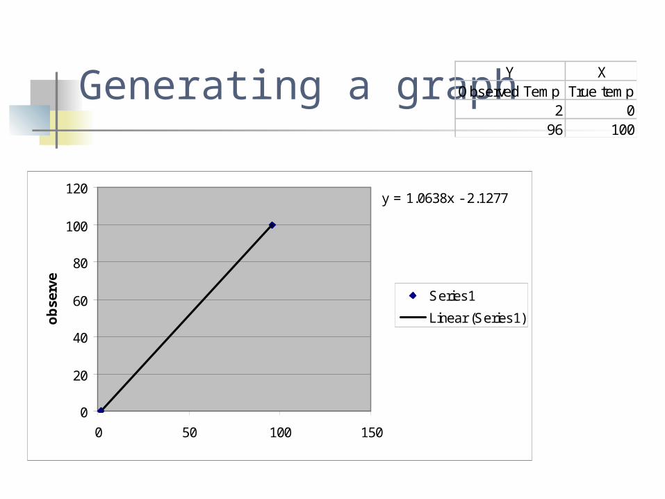
Generating a graph
y = 1.0638x - 2.1277
0
20
40
60
80
100
120
0 50 100 150
ob
serv
e
Series1
Linear (Series1)
Y XObserved Temp True temp
2 096 100

Directions for creating a trendline 1. Determine and label X and Y axis 2. Highlight numerical data 3. Click graph icon 4. Choose scatter graph 5. Determine if your data is in colums or rows 6. Label graph and x and y axis 7. Generate graph 8. Click on data points in graph 9. Click on chart tab 10. Click on add trendline and Choose linear 11. Click on options and click on display equation on chart