Kendall venturelabstores
5
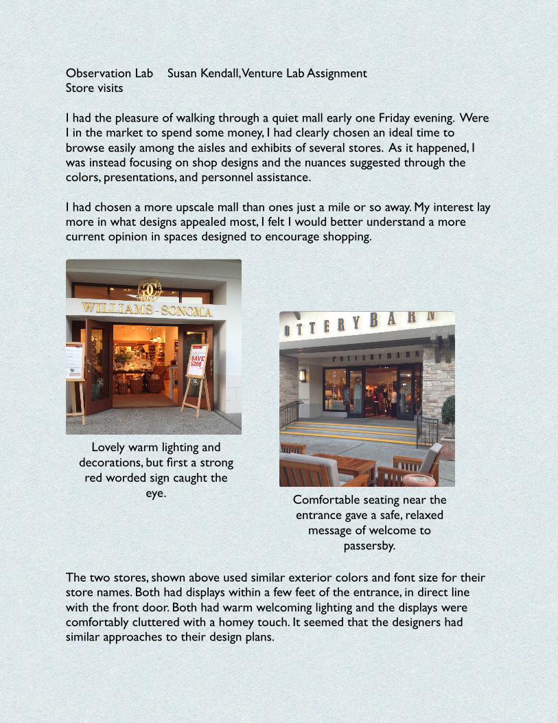
Observation Lab Susan Kendall,Venture Lab Assignment Store visits I had the pleasure of walking through a quiet mall early one Friday evening. Were I in the market to spend some money, I had clearly chosen an ideal time to browse easily among the aisles and exhibits of several stores. As it happened, I was instead focusing on shop designs and the nuances suggested through the colors, presentations, and personnel assistance. I had chosen a more upscale mall than ones just a mile or so away. My interest lay more in what designs appealed most, I felt I would better understand a more current opinion in spaces designed to encourage shopping. The two stores, shown above used similar exterior colors and font size for their store names. Both had displays within a few feet of the entrance, in direct line with the front door. Both had warm welcoming lighting and the displays were comfortably cluttered with a homey touch. It seemed that the designers had similar approaches to their design plans. Comfortable seating near the entrance gave a safe, relaxed message of welcome to passersby. Lovely warm lighting and decorations, but first a strong red worded sign caught the eye.
-
Upload
skendall888 -
Category
Documents
-
view
60 -
download
0
Transcript of Kendall venturelabstores
Observation Lab Susan Kendall, Venture Lab Assignment Store visits I had the pleasure of walking through a quiet mall early one Friday evening. Were I in the market to spend some money, I had clearly chosen an ideal time to browse easily among the aisles and exhibits of several stores. As it happened, I was instead focusing on shop designs and the nuances suggested through the colors, presentations, and personnel assistance. I had chosen a more upscale mall than ones just a mile or so away. My interest lay more in what designs appealed most, I felt I would better understand a more current opinion in spaces designed to encourage shopping.
The two stores, shown above used similar exterior colors and font size for their store names. Both had displays within a few feet of the entrance, in direct line with the front door. Both had warm welcoming lighting and the displays were comfortably cluttered with a homey touch. It seemed that the designers had similar approaches to their design plans.
Comfortable seating near the entrance gave a safe, relaxed
message of welcome to passersby.
Lovely warm lighting and decorations, but first a strong red worded sign caught the
eye.
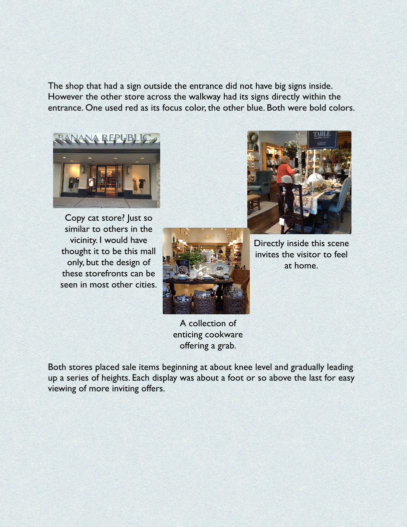
The shop that had a sign outside the entrance did not have big signs inside. However the other store across the walkway had its signs directly within the entrance. One used red as its focus color, the other blue. Both were bold colors.
Both stores placed sale items beginning at about knee level and gradually leading up a series of heights. Each display was about a foot or so above the last for easy viewing of more inviting offers.
Directly inside this scene invites the visitor to feel
at home.
Copy cat store? Just so similar to others in the
vicinity. I would have thought it to be this mall
only, but the design of these storefronts can be seen in most other cities.
A collection of enticing cookware
offering a grab.
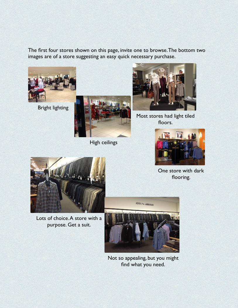
The first four stores shown on this page, invite one to browse. The bottom two images are of a store suggesting an easy quick necessary purchase.
One store with dark flooring.
Lots of choice. A store with a purpose. Get a suit.
Not so appealing, but you might find what you need.
Most stores had light tiled floors.
High ceilings
Bright lighting
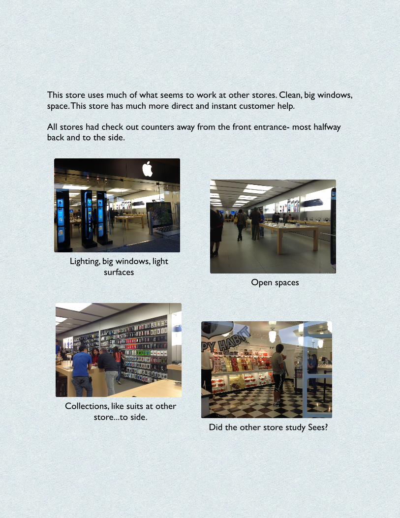
This store uses much of what seems to work at other stores. Clean, big windows, space. This store has much more direct and instant customer help. All stores had check out counters away from the front entrance- most halfway back and to the side.
Open spaces
Did the other store study Sees?
Collections, like suits at other store...to side.
Lighting, big windows, light surfaces
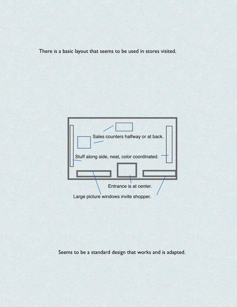
There is a basic layout that seems to be used in stores visited.
Entrance is at center.
Large picture windows invite shopper.
Sales counters halfway or at back.
Stuff along side, neat, color coordinated.
Seems to be a standard design that works and is adapted.