“K ping It Simple” - s3.amazonaws.com · “vocabulary”. In ... He spoke about how the wall...
19
“K!ping It Simple” 7th & 8th April 2018 Esk, QLD Workshop Notes Day 1. This workshop is all about understanding colour by using less colours! We’re using quite cool colours (Pthalo Blue, Cadmium Yellow Light, Permanent Alizarine), but they are very versatile. We’re going to paint the same image, at two different times of the day, using the same colours. Mark went into how the times of the day move through the colour spectrum, for example at midday, the highlights on leaves tend to be quite “white”. At around 3-4pm the colour stas to change through more yellows. At 6 pm you can sta to add redder colours. Around dusk and dawn are when the “warmer” colours sta to creep in. Dusk can appear warmer due to the air pollution build up during the day. Dusk transitions through purples, blues and then the darkest darks. As the sun drops fuher, the shadow of the eah is more apparent, and the blues pervade. With these 3 colours and White, it seems quite simple, but is is actually very sophisticated and pervasive. So what? What does this mean? As aists, we are communicators. We tell stories through our paintings. We use colour, canvas and a hairy stick to do so. To tell the story you want to tell, you need to have skills and technique - this is like your “vocabulary”. In order to expand your vocabulary you really need to immerse yourself in what you want to learn about and practise techniques that facilitate that. For example if you want to paint skies well, you need to really observe skies, a lot (and paint a lot of gradations)! Once you have an expanded vocabulary you know which information to put in, or leave out, to tell a compelling story. The more information you can communicate, the more compelling the story. On the other side of that, when Mark said “the cat sat on the….” the rest of us thought, “mat”. You can save yourself some work by knowing the rules - then let the viewer make up the rest. Knowing and applying the information allows you to communicate a very poweul story. We’re inviting you to go on a slightly bigger journey than maybe you’re used to with your painting. It has taken 13.8 billion years for you to be right here, right now. Enjoy the fact that you can stand here making pictures out of coloured goo. Remember this when you’re being challenged throughout this process :) We are surrounded by miracles - remember to dance and play - this is the most impoant thing!
Transcript of “K ping It Simple” - s3.amazonaws.com · “vocabulary”. In ... He spoke about how the wall...

“K!ping It Simple” 7th & 8th April 2018
Esk, QLD
Workshop Notes
Day 1.
This workshop is all about understanding colour by using less colours! We’re using quite cool colours (Pthalo Blue, Cadmium Yellow Light, Permanent Alizarine), but they are very versatile. We’re going to paint the same image, at two different times of the day, using the same colours.
Mark went into how the times of the day move through the colour spectrum, for example at midday, the highlights on leaves tend to be quite “white”. At around 3-4pm the colour sta"s to change through more yellows. At 6 pm you can sta" to add redder colours.
Around dusk and dawn are when the “warmer” colours sta" to creep in. Dusk can appear warmer due to the air pollution build up during the day. Dusk transitions through purples, blues and then the darkest darks. As the sun drops fu"her, the shadow of the ea"h is more apparent, and the blues pervade.
With these 3 colours and White, it seems quite simple, but is is actually very sophisticated and pervasive.
So what? What does this mean? As a"ists, we are communicators. We tell stories through our paintings. We use colour, canvas and a hairy stick to do so. To tell the story you want to tell, you need to have skills and technique - this is like your “vocabulary”. In order to expand your vocabulary you really need to immerse yourself in what you want to learn about and practise techniques that facilitate that. For example if you want to paint skies well, you need to really observe skies, a lot (and paint a lot of gradations)! Once you have an expanded vocabulary you know which information to put in, or leave out, to tell a compelling story. The more information you can communicate, the more compelling the story. On the other side of that, when Mark said “the cat sat on the….” the rest of us thought, “mat”. You can save yourself some work by knowing the rules - then let the viewer make up the rest. Knowing and applying the information allows you to communicate a very powe#ul story.
We’re inviting you to go on a slightly bigger journey than maybe you’re used to with your painting. It has taken 13.8 billion years for you to be right here, right now. Enjoy the fact that you can stand here making pictures out of coloured goo. Remember this when you’re being challenged throughout this process :) We are surrounded by miracles - remember to dance and play - this is the most impo"ant thing!

Mark took a moment here to talk about Atelier Interactive - how great it is to be able to control the drying time, and extend and open the drying time with Unlocking Formula (see the links at the end of the notes for a demonstration on how to use Unlocking Formula and Universal Medium to get the most out of Atelier Interactive paints).
Mark uses Atelier Interactive as it is a superior quality paint, which blends superbly. It also has unique prope"ies which enable it to dry differently to “normal” acrylics, that is it doesn’t form a “skin” but dries evenly all over. The bonus is if you dish up a lot of paint it is actually more economically efficient than dishing out a tiny pea-sized amount.
Adding Universal Medium to your Atelier Interactive is like using a LOCK. It makes the paint behave similarly to other acrylic paint, which cannot be re-opened. If you add Unlocking Formula to your paint this is the KEY. This is how you re-open the paint.
Set Up Your Workspace:
Set yourself up properly to remove “obstacles”. Your pale$e is for working stuff out on! Not your “real” canvas! It is your workspace. Dish up more paint than you think you’ll need. There is nothing worse than trying to match colours halfway through a painting because not enough paint was dished up at the beginning. These strategies will free your brain for painting.
Your small canvas is there for you to work your stuff out on. Use it as a practise space. Test the marks you make BEFORE you make them.
We need to be very methodical in managing our pale$e with this workshop, as we are using a lot of gradations. Your pale$e should suppo" your practise.
Mark talked about the concept of considering that a lot of paintings can be built in the early stages, around gradations of colour or tone, and adding final detail over the top of this.
He spoke about how the wall is a gradation - pa" of the wall higher up is a different colour to the wall closer to the ground. Anywhere there is a transition, THAT is a gradation. We’re going to investigate the concept that gradation is a foundation for your painting.
Mark’s process is thus - he breaks down a painting into a series of gradations. He does the initial blocking in gradation, and then does the gradation again. The first time around the colour may not be quite right. The second time you do your gradation is where you can make any changes.
For Mark’s “proper” paintings, he o%en puts layers of Heavy Gel Gloss or Impasto Gel in between the layers of paint. He tends to use Free Flow for roughing in, it’s fast and covers beautifully, and the colours match the Atelier Interactive.
We are following a process here. You are strapped in, so don’t worry!

Set Up Your Pale!e:
Set up your pale$e with a lot of paint dished up at the top of the pale$e, from le% to right Pthalo Blue, Cadmium Yellow Light, Permanent Alizarine and White. Draw some lines between your paint to create columns down your pale$e. Doing it this way is beneficial because a) The gradation is mapped out - you’ll be able to see if there’s too much of one colour or another. Any mistakes in your colour mixing are made on the pale$e rather than your canvas. And b) You have an historical record of each colour mix, you have a point of reference right there.
So, Let’s Get Sta"ed!
We’re going to practise a couple of gradations as a warm up, and a loosening up exercise. With your pencil, make an horizon line on your canvas roughly halfway.
Using White and Pthalo Blue, with a teensy big of Permanent Alizarine, add a li$le water and paint in a band under and up to (along) the horizon. (Use your White column to mix these colours).
Add a teensy bit of Pthalo Blue to this colour and paint it in a band underneath, pushing the 2 colours together and blend.
Add more Pthalo Blue to this mix, (come down your pale$e with each colour mix in the column) paint in a band and pull the colours together using a cross hatch technique.
Add more Pthalo Blue to this colour (add water to get the paint to travel), and come right down to the edge. Then turn it upside down (or rightside up!) as this is your sky.
TIP: People tend to try and paint a gradation all in one go with acrylics. It’s easier to mix your colours and paint bands across the canvas, and then pull the
bands together using the tip of the brush to blend.
TIP: Paint with confidence by painting with confidence!
TIP: Clean and dry your brush - A LOT!
So what did we learn from this gradation exercise? Some people suggested they needed to put out more paint, take the time to get the consistency right (with water) and perhaps buy be$er quality canvas! (Or put another coat of gesso onto a cheap canvas. You can also spray the back of the canvas so the paint doesn’t get sucked all into the weave).

There are some traps with gradation which we can talk about here.
Some people have discovered their gradations are patchy or streaky. The trick is to get plenty of paint down, blend it, and then if you like, using a large, damp house painting brush, come back and just using the tip of the brush blend the gradations so that the transitions become smoother. Clean and dry the brush regularly throughout so you don’t accidentally pull the paler colour right up into the darker colour.
Trick yourself into thinking that each step is a practise. If you do this, you o%en can get out of your own way, allowing the process of “effo"less effo"” to make your painting sing; to stop “trying” and sta" “doing”.
At this point Mark went into the three functions of your paintbrush - the theory that there are basically 3 things that will affect the mark that you make. That is, the amount of paint on your brush, the amount of pressure you use, and the amount of medium (or the prope"ies of the paint) in the paint. The paintbrush also has three sections. The pa" closest to the ferrule is the bit where you use a lot of pressure to really scrub in, and push the paint right into the canvas. (A bit like a shovel). The next pa" of the paintbrush (see the web link at the end of the notes about paintbrushes), the middle area is like the rake, it’s for spreading the paint around. The tip of the brush is for so%ening the transition. A%er a time, the action with your paintbrush will become unconscious. The more practise you do with this, the easier this will be. There will always be nuance and subtlety that will challenge you.
With your painting there are a lot of “get out of jail free” cards. For example, creating wispy clouds or a cloud bank along your horizon if you have some impe#ections in your sky gradation. To do this mix a teensy bit of Cadmium Yellow Light and a teensy bit of Permanent Alizarine, and a pile of White, use a brush and paint close to the horizon to create a cloud bank and wispy clouds. Bye bye impe#ections! Painting is all about subte#uge and using smoke and mirrors to fix or hide mistakes. This is one of the differences between a good painter and a great painter. The great painter has a lot of strategies to hide or fix mistakes :)
We’re now going to paint the water gradation under the horizon. We’ll go back over a li$le bit of theory about water first.
The Four Elements:
• Substrate - can be lots of different colours ie pebbles, sand, rocks, kelp etc.
• Colour of water - can also be lots of different colours. • Su#ace - probably the most impo"ant element - from underneath and
above. • Light
Observe. Think of painting water and waves as a series of mirrors and windows. The fla$er to your eye the water is - the more will be reflected on its su#ace. When you are looking at water at a flat angle, the water becomes very reflective like a mirror.

When you want to paint a water scene, ask yourself a series of questions so you can work it out:
• What is the substrate? • What is the colour of the water? • How much of the light is reflected on the su#ace?
Then paint it in that order, first the substrate, then the colour of the water, then the su#ace (and the light).
The wind will affect the appearance of the su#ace of the water, and if water is si$ing above sand (really shallow water), the water is also affected by the shape of the substrate.
ANATOMY OF A WAVE
What is a wave? A wave is a lump of water = “deeper water colour” if you are looking through the face of a wave in deeper water. It helps to think of waves as windows and mirrors. The back of waves reflect sky (mirrors) and you can see through the front of the wave (windows). Water isn’t “pe#ect”, you can get away with a lot in your painting because of this.
In this case, we’re going to mix the colour closest to the horizon, which is Pthalo Blue, White plus a tiny bit of Permanent Alizarine (the water closest to the horizon reflects the pa" of the sky closest to the horizon, which is o%en a li$le “warmer” due to the pollution, pa"iculate ma$er in the air etc). Paint this in a band.
Add Pthalo Blue to that colour, paint in a band underneath the other one and pull it together.
Add almost pure Pthalo Blue (add a li$le white to this to eliminate the transparency and allow it to cover much be$er), and then pull this together.
For the shallower water (you’ll sta" to see the substrate), add Cadmium Yellow Light, Pthalo Blue and White and paint this in a band.
Add more White to this colour and a teensy bit of Cadmium Yellow light and paint down on an angle, pulling these colours together.
To add a band of wet sand, use White, Pthalo blue and a teensy bit of Permanent Alizarine and add a band of the sky colour to create the wet sand here (the sky is reflected on it).

We stopped at this point to notice that with a series of gradations, we’ve told a huge pa" of the story here.
To create the transition from the wet sand to the drier sand, use a mix of White, Cadmium Yellow Light and Permanent Alizarine, with a teensy bit of Pthalo Blue (if it goes green, you have too much Pthalo Blue in your mix!). Paint this in a band underneath the wet sand and pull together.
Add white to this colour mix and paint the sand closest to the edge of the canvas, pull the colours together and so%en the transition.
And now for the details (making a wave).
Using a mix of White, Pthalo Blue, Permanent Alizarine and a teensy bit of Cadmium Yellow Light, Mark demonstrated making a brown to create the shadow under the wave.
Mark then took a li$le of the previous “sand” colour and painted some sections in at the bo$om of the wave to represent the sand being sucked up the face of the wave.
He then painted a “shallow water colour” using a mix of Pthalo Blue, Cadmium Yellow Light and White across the face of that wave (to represent the shallow pa" of the wave you’re looking through). He used a deeper water colour using the same mix as above but less Cadmium Yellow Light to create the top of the wave (you will see through this pa" of the wave to the deeper water behind).
He came back with pure White to sta" creating the whitewash foam and the lip of the wave. This mixed with the still wet blue paint on the canvas creates a shadow layer of whitewash. This was painted over when dry with pure White to create highlights there.
He came back with the sky colour (White, Pthalo Blue and a teensy bit of Permanent Alizarine) to create reflections on the su#ace of the water, to shape the back of the wave and create distance in the painting. He added reflections from the whitewash in the foreground on the wet sand.
TIP: To create reflections in the wet sand or on the su#ace of the water, remember “Dry brush down, wet brush across”. Eg for your
horizontal strokes use thinned paint with most of it taken off the brush, and for your ve"ical strokes use a dry brush, with most
of the paint taken off the brush.
The most impo"ant thing from this weekend is not to come away with a “finished”, “polished” painting - rather to come away with the information to have every painting you do in the future improve, due to how you can now see
the world.

Warm to Cool Concept
Mark mentioned at this point, that there was one concept which totally changed the way he painted, and that is - generally speaking, objects closer to the light source appear warmer, and as you get fu"her away from the light source, these colours appear cooler. When you really sta" looking, you will see this concept everywhere, even in different pa"s of the same shadow. When you can apply this knowledge to your paintings, you will add a layer of realism which looks incredible.
PM:
A%er lunch we ripped in with our sunset colours and sta"ed with the sky gradation, closest to the horizon. Working upside down, we mixed a lovely purple using White, Permanent Alizarine and Pthalo Blue.
Add White to this mix and paint down and blend back towards the horizon.
CLEAN YOUR BRUSH!
Mix White, Cadmium Yellow Light and a teensy bit of Permanent Alizarine and paint a band down from the last one.
CLEAN YOUR BRUSH!
Mix the same colour again but diminish the Permanent Alizarine even fu"her, and paint in a band and blend back into the last one.
CLEAN YOUR BRUSH!
Mix White and Cadmium Yellow Light and paint in a band.
CLEAN YOUR BRUSH!
Mix White, Pthalo Blue and a teensy, teensy bit of Permanent Alizarine (so as to not go “lolly”).
TIP: You can paint a white band in between the blue and yellow area to pull these areas together to keep the blue and yellow apa".
Add Pthalo Blue, White and a TEENSY TOUCH of Permanent Alizarine, and paint another band.
Add Pthalo Blue (no Permanent Alizarine this time) and paint this to the bo$om of the canvas.
CLEAN YOUR BRUSH!!
Flip your painting as this is your sky.
Then, take your pencil and mark in a band on an angle at the bo$om of the canvas.
Then, paint exactly the same gradation as the sky you’ve just done, but add more Pthalo Blue, as we’re now painting the water, and the water is predominantly Pthalo Blue.
This is fundamentally a mirror image of the sky (as water is HIGHLY reflective).
Paint the damp sand strip using mainly White, Permanent Alizarine, Pthalo Blue, the adding more White to make the sand appear drier.
TIP: Colour matching tip. If you want to match colour remember that acrylics dry darker. To match correctly you can wet the canvas where the colour is you want to match (it will immediately appear lighter) and then mix the colour to
THAT instead of the DRY colour. Day 2:
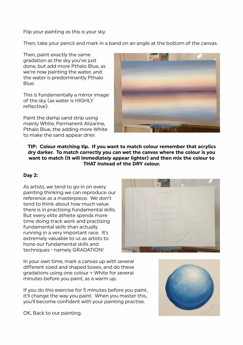
As a"ists, we tend to go in on every painting thinking we can reproduce our reference as a masterpiece. We don’t tend to think about how much value there is in practising fundamental skills. But every elite athlete spends more time doing track work and practising fundamental skills than actually running in a very impo"ant race. It’s extremely valuable to us as a"ists to hone our fundamental skills and techniques - namely GRADATION!
In your own time, mark a canvas up with several different sized and shaped boxes, and do these gradations using one colour + White for several minutes before you paint, as a warm up.
If you do this exercise for 5 minutes before you paint, it’ll change the way you paint. When you master this, you’ll become confident with your painting practise.
OK, Back to our painting.

TIP: Chalk is your friend! Chalk is great to use on your painting to map out elements and move things around. Simply wipe it off or paint over it :)
We used chalk to draw in a line for a wave. We’re going to pretend the vanishing point is well to the le% of the canvas; and that the swell is running roughly parallel to the horizon. The su#ace of the water is relatively flat.
Mark mentioned that most of the painting is now actually complete! We have represented the water as a reflection of the sky (adding more Pthalo Blue to this due to the “water” element). The water is fundamentally a reflection of the sky with some detail on top.
So, yesterday’s painting of the wave (tropical midday colours) was mostly Pthalo Blue, Cadmium Yellow Light and White - so we’ll use the same colours for the water as yesterday, plus Permanent Alizarine. We established that these sunset colours were the “Alizarine time of day”.
NB: All these theories are just a broad framework. It is up to you to add the nuance and
subtlety. Sta" with this colour and paint in the deepest pa" of the wave. This is where you can change the angle if you’re not happy with it etc.
To create the shallower pa" of the wave, add Cadmium Yellow Light + White to this colour (there is still some Permanent Alizarine in this mix) and paint the middle section pa" of the wave.
Add a bigger wave out the back - use more Pthalo Blue (less Cadmium Yellow Light) - poke the colour around until it looks right.
Mark wasn’t happy with the angle of his wave, and used a mix of Pthalo Blue, Permanent Alizarine and White to create some whitewash shadows on either end of the wave in order to “fix” the angle of it.
At this point Mark reiterated the “warm to cool” principle. There is warm to cool everywhere - this is why you add Pthalo Blue to the whitewash shadows, as the shadows will be cooler. Mark then added some more realism using that shadow colour, thinned and with a “wet, dry brush” (use thinned paint but then take most of the paint off the brush). He used this colour to create the plane of the whitewash reflections and painted this shadow colour in the direction of the other vanishing point (imagining that

there is another vanishing point to the right off the edge of the painting).
Mark spent a li$le bit of time talking about perspective here. (see the link “painting in perspective” at the end of these notes).
And it was at this point Mark introduced the three fundamental skills required to make a painting:
• Conceptual Skills • Physical Ability • Perception Skills
This weekend is about developing your perception skills and conceptual skills.
Conceptual Skills:
This is your spin on the image. Is the concept (of the image you want to paint) compelling to you? If it is, that’s great! You’re not painting for anyone else! Having said that we want to make a piece that is compelling in some way. Your conceptual skills can modify an image (perhaps something as simple as cropping) and make it somehow “something else”. And yours.
Physical Ability:
This is the ability to move your paint around. If you practise your physical skills this will eventually also enhance your perception and conceptual skill areas.
Perception Skills:
As a"ists and humans, we notice when things don’t look right. (For example the sunlight shining through a bushfire, instantly looks strange). As a"ists we should take this fu"her and go beyond this, to see what is wrong, or find the nuance, and investigate.
Our brains don’t tend to see everything - we stop noticing the minutiae in the world. As a"ists we need to look at everything like it’s the first time we’ve noticed it. These nuances are the things you can exaggerate and share with the world.
Painting is a lot about creating illusion - knowing some tricks to help create these illusions is very useful!!
These three concepts (Physical Ability, Conceptual Skills and Perception Skills) can be used as a problem solving tool when you are making paintings. Use this tool to refine your own a"s practise.
Next time you’re at an a"s show, look at the paintings - holding these three concepts in your mind - and really evaluate the paintings. For example you might love a pa"icular concept, but notice that the a"ist lacked the painting technique. You can learn a lot about your own painting practise by looking at others’ paintings in this way.

OK, back to perspective and planes. The wet sand area is slightly tilted (so that the sea doesn’t ove"ake the ea"h :) Therefore this area will reflect slightly differently than an area that is flat. It will reflect the wave behind, and possibly objects in the distance as well (for example a red boat).
Mark mixed a blue-grey colour to illustrate the whitewash and the reflections that would appear in these areas. The whitewash area for example (this area is flat relative to your eye) will reflect higher pa"s of the sky (the pa" still lit by the sun) for example the yellow area.
TIP: Your painting is a dance. There is a lot of to-ing and fro-ing with this. Go with the process as much as possible.
We’ve got 3 areas here that are separate but relating to your sky. You can work on each of these areas separately which (in theory) should take the pressure off a li$le!
We also have 3 sources of light - the sun which is behind you and below the horizon, the sky is the secondary source of light, and the third source of light is the reflection of the sky on the su#ace of the water. The secondary light source will affect the highlights on the backs of the waves, for example.
So, water is lumpy, especially when there’s waves breaking. Anywhere there is a lump of water we’ll see a reflection. Where there is a wave, we’ll see different pa"s of the sky reflected. We can use these reflections to a) fix our mistakes and b) create realism. To create the illusion of flatness - reflect the sky! Even within the wave there are different pa"s of the sky reflected.
Mark mixed a mid-sky colour (yellow) and added LOTS of water to this in order to be able to draw out thin long lines, and painted these on the backs of the waves, and anywhere that this pa" of the sky would be reflected.
TIP: Create waves out the back by NOT reflecting the sky.
He then mixed the pink pa" of the sky and repeated this process. Layering these reflections in this way creates realism within the water, and also hides any mistakes you’ve previously made.. You’re looking to create a rough mirror image from the sky in the water.
TIP: So%en the waves by feathering the sky reflections across the tops of the wave.
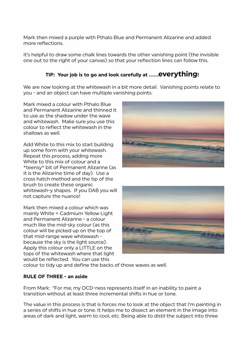
Mark then mixed a purple with Pthalo Blue and Permanent Alizarine and added more reflections.
It’s helpful to draw some chalk lines towards the other vanishing point (the invisible one out to the right of your canvas) so that your reflection lines can follow this.
TIP: Your job is to go and look carefully at ……everything!
We are now looking at the whitewash in a bit more detail. Vanishing points relate to you - and an object can have multiple vanishing points.
Mark mixed a colour with Pthalo Blue and Permanent Alizarine and thinned it to use as the shadow under the wave and whitewash. Make sure you use this colour to reflect the whitewash in the shallows as well.
Add White to this mix to sta" building up some form with your whitewash. Repeat this process, adding more White to this mix of colour and a *teensy* bit of Permanent Alizarine (as it is the Alizarine time of day). Use a cross hatch method and the tip of the brush to create these organic whitewash-y shapes. If you DAB you will not capture the nuance!
Mark then mixed a colour which was mainly White + Cadmium Yellow Light and Permanent Alizarine - a colour much like the mid-sky colour (as this colour will be picked up on the top of that mid-range wave whitewash - because the sky is the light source). Apply this colour only a LITTLE on the tops of the whitewash where that light would be reflected. You can use this colour to tidy up and define the backs of those waves as well.
RULE OF THREE - an aside
From Mark: “For me, my OCD-ness represents itself in an inability to paint a transition without at least three incremental shi%s in hue or tone.
The value in this process is that is forces me to look at the object that I’m painting in a series of shi%s in hue or tone. It helps me to dissect an element in the image into areas of dark and light, warm to cool, etc. Being able to distil the subject into three

areas in this way, allows a complicated subject to be more easily managed mentally. And allows a process to be formed. That rule of three when applied practically, and the colours pushed and pulled together, delivers a surprisingly effective result.
This rule of three, while very effective and efficient (and of course nice and simple) is obviously not the whole answer. There are always additions and subtle nuance that needs to be taken into account. The beautiful thing about the rule of three, is that if you use it as a sta"ing place, a much more complicated image can be more easily broken down. Subtle nuance can be added once the “bones” of the rule of three have been established. These examples are just the tip of the iceberg :)
Something major to take into account with the rule of three is that there are usually three sources of light to consider too - direct light, and at least two sources of reflections. (There will usually be light coming in from somewhere else).
Back to our wave - to create the illusion of the wave curving over, use a mix of Pthalo Blue and Permanent Alizarine painted across the lip of the wave where it’s rolling over, and all along the top of the wave where you can see through to the deeper water. Add this colour as well as the shadow under the wave colour.
Add the “tropical water” colour to that mix (Pthalo Blue, Cadmium Yellow Light and White) and paint through the middle of the wave where you would see more of the substrate beneath (the wave is shallower in this pa"). Then paint the reflections in front of the wave in the same colour.
Add a li$le White to this colour and bump up the shallow middle area on the wave - but be careful here - you don’t want the wave to appear too transparent as that will look like the sun is much higher in the sky than it would be at that time of the day. Come back with your pale yellow sky colour to feather the top edge of the wave as it curls over, to reflect that “mid-sky” area, and create a cylindrical impression.
As the wave curls over, there is a cylinder WITHIN the wave, and light bounces off it. To represent this “tube”, mix up a sky blue colour using Pthalo Blue, White, (and of course a tiny bit of Permanent Alizarine). Paint this colour a li$le up

the face of the wave to suggest the sky light is shining through the curved pa" of the wave, just under the lip.
Add a li$le more White to this colour to bump up that reflection under the lip of the wave. Paint this blue here and there into the whitewash as well, as it would be facing many different directions and would therefore be reflecting various different pa"s of the sky.
Now mix a light grey colour using mainly White, Cadmium Yellow Light, Permanent Alizarine and Pthalo Blue and paint along the edge of the wave lip and along the top of the wave. Holding your brush a li$le sideways, you can create some offshore “chop” with this colour along the edge of the wave. Also add some of this higher colour to the whitewash, and use it to reflect the wave also.
TIP: Dry brush down, damp brush across to create realistic reflections.
TIP: Using more White in the foreground gives the illusion of
closeness.
TIP: Add whitewash “loops” to cover any issues in that really shallow water area. These whitewash trails roughly follow
the Vanishing Point lines going out off the the right hand side of the canvas.
TIP: Get yourself a bo!le of Atelier Free Flow White if you can - it is so opaque, but thin, it is truly awesome for anywhere you need a fine line!
The li$le wave in the foreground will also be reflected in the patch of wet sand in front of it. Remember dry brush down, wet brush across.
You can come back and define the whitewash “line” in the shallows, by painting it’s shadow. Mix up a bluey-grey using White, Pthalo Blue, teensy bit of Cadmium Yellow Light and of course a touch of Permanent Alizarine for this shadow colour.

Thanks so much to a" of you lovely participants at Esk!!!!
Overheard in Class:
“Sorry, were you signalling or scratching?” “What the hell is a wet dry brush!?”
“No dabbing! If you dab I’m going to make you write lines.” “Simple maybe - but not easy!”
“I have a pen of sheep rather than rolling waves”
For suppo" material about what you learnt over the weekend, check out these pages from our website:
Have a look at this page first to do some of your own exploring!
http://www.explore-acrylic-painting.com/sitemap.html
www.explore-acrylic-painting.com/ocean-landscapes.html www.explore-acrylic-painting.com/color-mixing-guide.html www.explore-acrylic-painting.com/perspective-in-painting.html www.explore-acrylic-painting.com/how-to-paint-water.html www.explore-acrylic-painting.com/painting-waves.html

www.explore-acrylic-painting.com/gradation.html www.explore-acrylic-painting.com/brush-technique.html www.explore-acrylic-painting.com/paintbrushes.html www.explore-acrylic-painting.com/how-to-paint-clouds.html www.explore-acrylic-painting.com/shadow-painting.html www.explore-acrylic-painting.com/sunset-painting.html www.explore-acrylic-painting.com/skyscapes.html www.explore-acrylic-painting.com/atelier-interactive.html www.explore-acrylic-painting.com/acrylic-sealer.html www.explore-acrylic-painting.com/atelier-unlocking-formula.html www.explore-acrylic-painting.com/create-unique-paintings.html www.explore-acrylic-painting.com/workshops-past.html (to access previous workshop notes)
and these video clips! (make sure you subscribe to our Youtube channel for all the latest clips):
Painting The Right Light | Acrylic Painting Tip: https://www.youtube.com/watch?v=XdaWQW3lD4Q
How to Paint a Sunset: https://www.youtube.com/watch?v=ppP8tqkZJSw&t=7s
Sunset Painting - Gradation: https://www.youtube.com/watch?v=dNJkgJROfpQ&t=31s
Painting Your Horizon: https://youtu.be/XsVGv9eH6U0
Creating Distance In Your Paintings | Atmospheric Perspective: https://www.youtube.com/watch?v=0ecBhJUiFXU
Brush Technique: http://www.youtube.com/watch?v=icWYYJHJFVc
Painting Waves - Dry Brush Technique: http://www.youtube.com/watch?v=bgNhoede9AI
Learn How To Paint - Gradation: http://www.youtube.com/watch?v=vy-Z0FQ2kpg
Acrylic Painting Techniques - Shadows in Waves: http://www.youtube.com/watch?v=OfIAtF-0UoM
Acrylic Painting Techniques - Reflections in Whitewash: http://www.youtube.com/watch?v=IUDJHY9h9fA
Acrylic Painting Tips - Colour Matching: https://www.youtube.com/watch?v=A5gzJuX8EEU
How to Paint Water - Refraction: http://www.youtube.com/watch?v=xzCGPAUXJOg
How To Paint Shadows: http://www.youtube.com/watch?v=lDut2Tma1QU
Painting Waves - Perspective in Whitewash: https://www.youtube.com/watch?v=TDvlwo_e9JI
Blocking in - Painting Waves: https://www.youtube.com/watch?v=0Gm5EbU8oB4&t=37s
Painting Waves & Whitewash: https://www.youtube.com/watch?v=5NiBE3sq_VQ&t=32s
Waves & Whitewash - paint recipes: https://www.youtube.com/watch?v=wRl8CVBZsjg
Wave Fundamentals - DVD Trailer: https://www.youtube.com/watch?v=8BDo2asc8Os
How To Paint Tropical Water - Paint Recipes: https://www.youtube.com/watch?v=vH8xAeu6njY&list=UUIzzJZa8_Obui-WGHgdUnng
Creating Planes - Studio Tips: https://www.youtube.com/watch?v=4MsJwKRtD_E
Atelier Interactive demonstration: h$p://www.atelieracrylic.com/atelier-interactive-acrylic
Unlocking Formula demonstration: h$p://www.atelieracrylic.com/atelier-unlocking-formula

gingerbread barsIngredients:1/2 cup butter, melted1/3 cup brown sugar1tspn vanilla1/3 cup molasses1 egg2 cups plain flour2 tspn baking soda3 tspn cinnamon1 tspn ginger1/2 tspn nutmeg1/2 tspn saltIcing sugar, for dusting (about 2 tblspn)
Method:Preheat oven to 180˚C
Spray a 9x 13” baking pan with oil and line with baking paper, overhanging the sides of the pan for easy removal later on.
With an electric mixer, combine butter and sugar, beating well until mixed. Add in vanilla and molasses and beat until well combined. Mix in egg until combined. Combine flour, baking soda and spices. Mix sifted dry ingredients with wet ingredients until well combined, (but do not overmix). Batter will be thick. Press batter evenly into pan.
Bake for 15-20 minutes. They may seem undercooked, but will firm up as they cool. Once cooled completely, dust with icing sugar. Can be frozen :)
enjoy

little boobs :)Ingredients:1 x packet Arnott’s Butternut Biscuits1 x Philadelphia Cream cheese tub - room temperature2-3 tblspn condensed milk 1 lemon, juiced1 punnet raspberries1 patty pan (shallow half-moon shapes)
Method:Preheat oven to 180˚CLay your butternut biscuits over the patty pan holes, pop into oven for 2-4 minutes to soften. Take out of oven and push into the patty pan holes with the back of a spoon to create the hollowed patty shape. Leave to cool for 2 minutes and then transfer to a wire rack to cool. Repeat this process until biscuits are finished :)
Mix together the cream cheese, half the lemon juice and the condensed milk. Mix well with a whisk until all lumps disappear. Test taste and add more lemon juice or condensed milk according to taste.
If you’re a bit fancy like me, put this mix in a piping bag and use a start nozzle to pipe the mixture into the shells.
Top them with a sweet little raspberry and you’re good to go!enjoy!