Just forkids
33
Just for Kids Echipa: Victor-Andrei Filimon Ionut-Codrin Cojocaru
-
Upload
codrin-cojocaru -
Category
Technology
-
view
53 -
download
1
Transcript of Just forkids
Just for Kids
Echipa:
Victor-Andrei Filimon
Ionut-Codrin Cojocaru
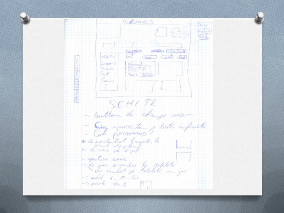
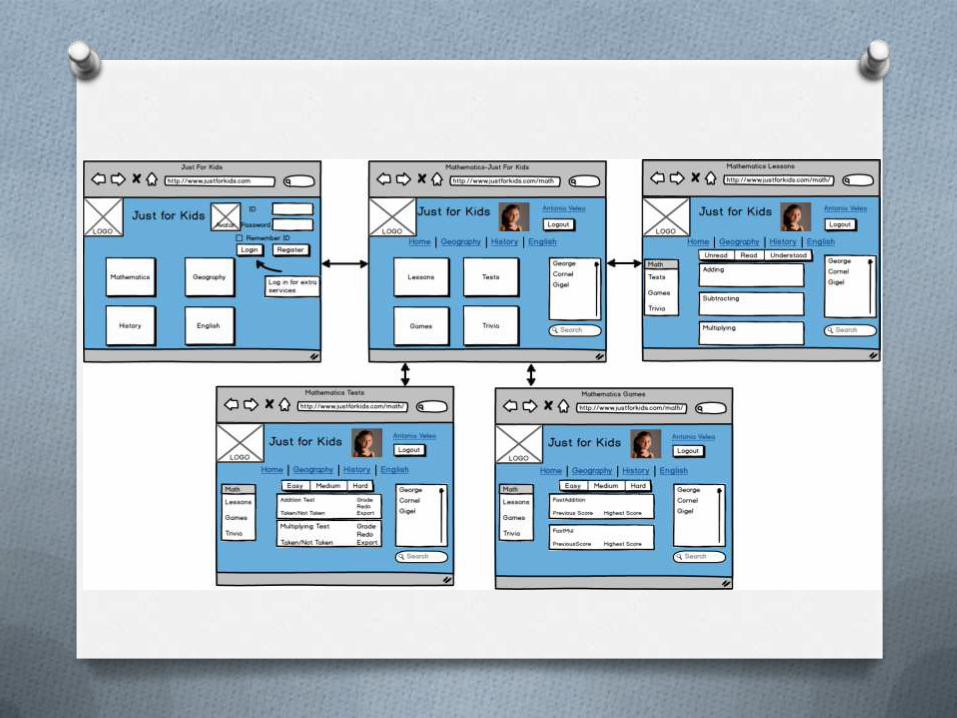
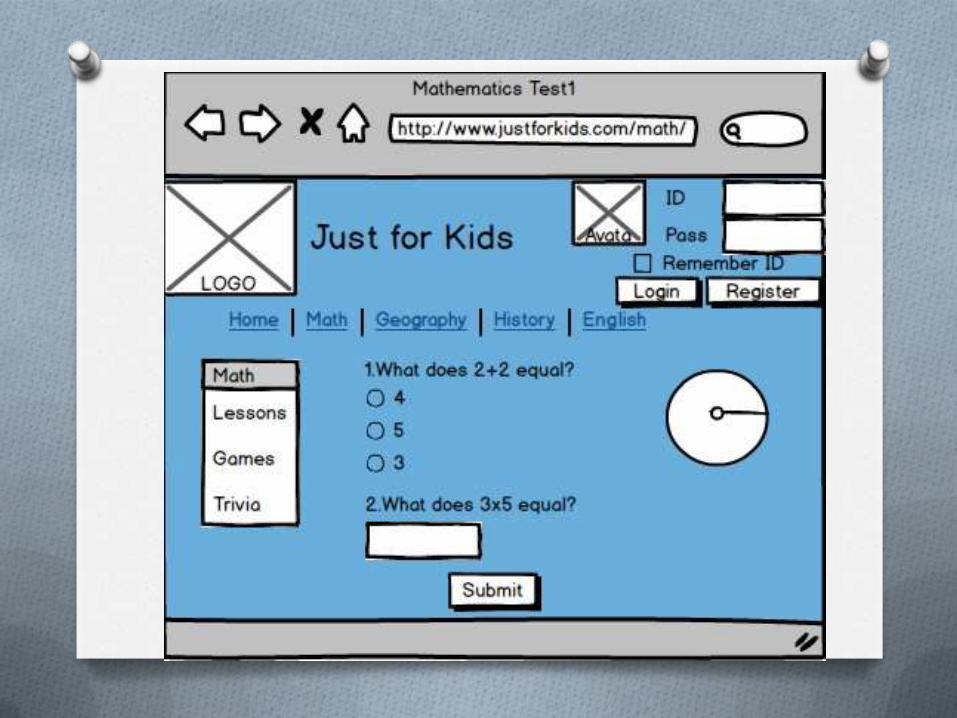
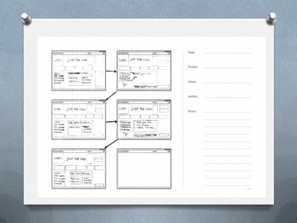
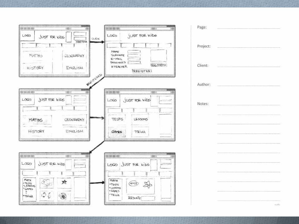
Schițe
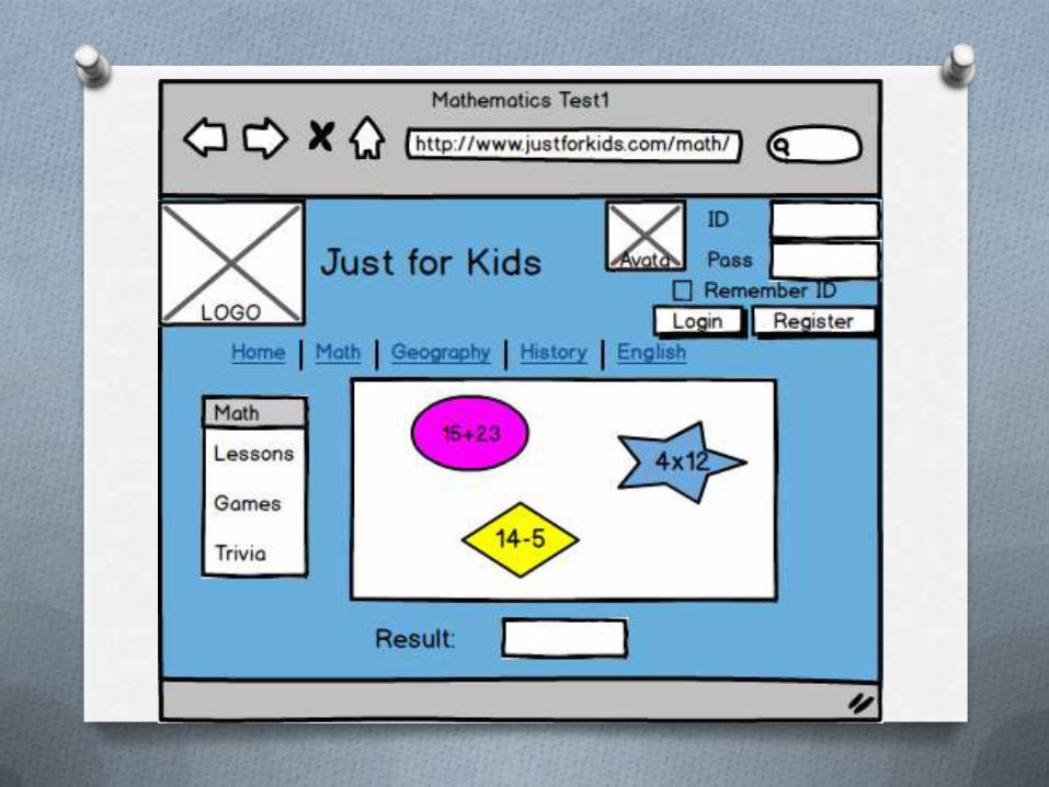
Questions,Options & Criteria
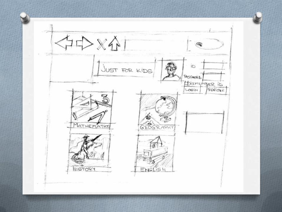
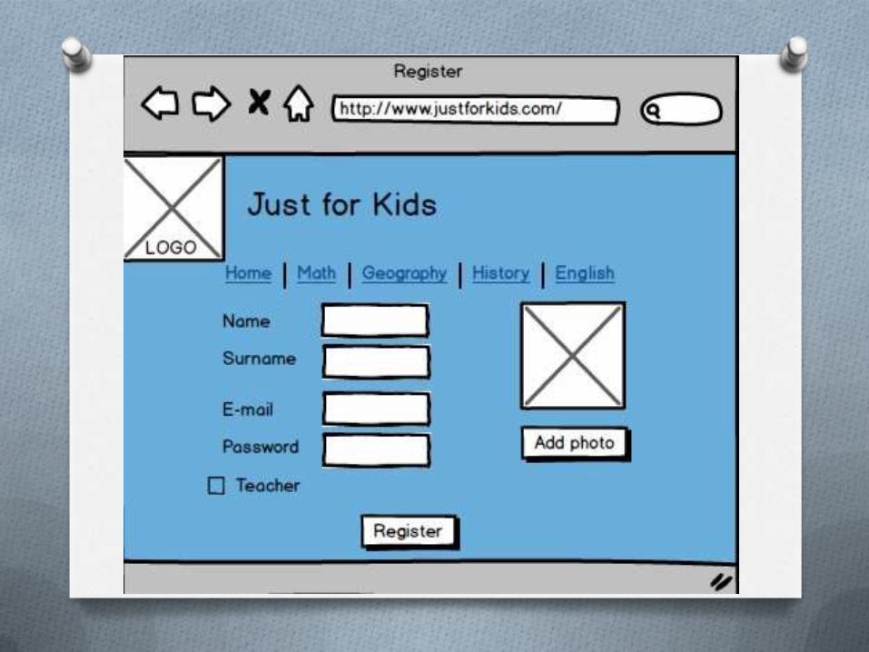
O We chose a simplist design, considering
the age of our main users. The site’s
chromatic is especially chosen for kids, so
they’ll not lose interest.
O Why our users are not pushed to be
logged in ?
O There are not many possibilities in
which a web page can reject it’s users.
One of that is a user being forced to
register and log in before he knows what
that web page does or can do.
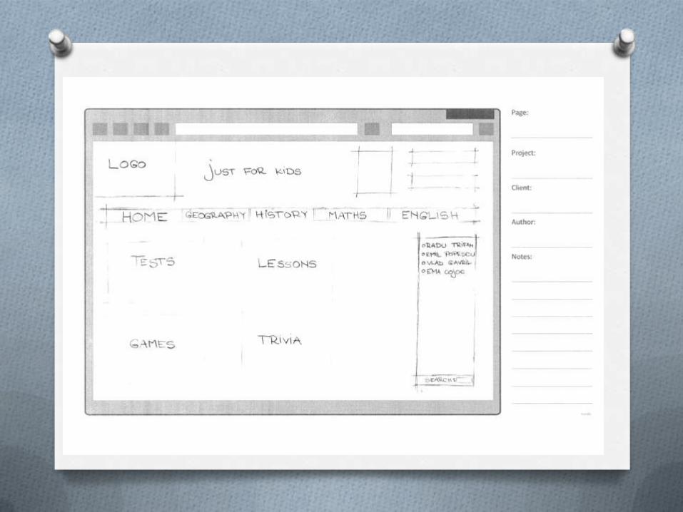
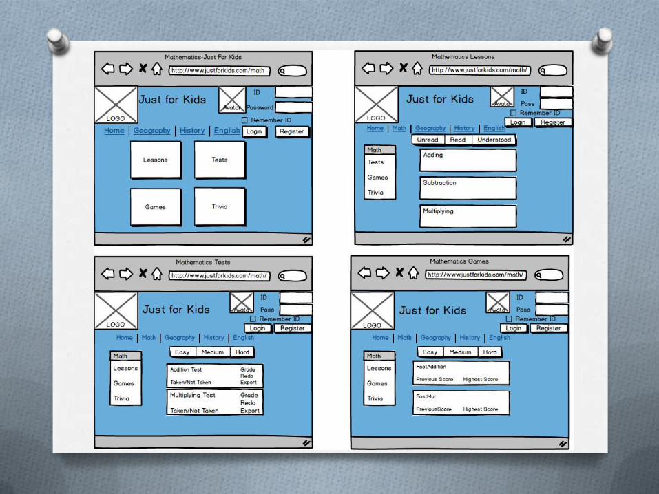
The “4 on a page” concept
O We chose this way of presenting our
application in order for it to be more
appealable on a desktop view. Also it is
very intuitive for the user and ,usually, the
screens are big enough for the application
to fit without using any horizontal scroll.
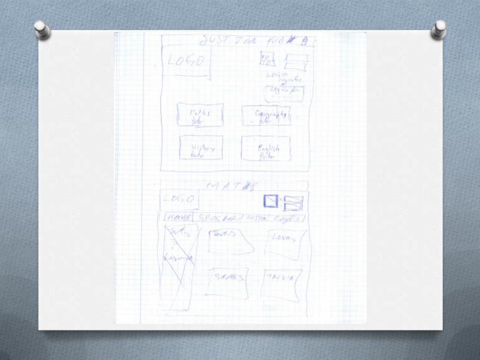
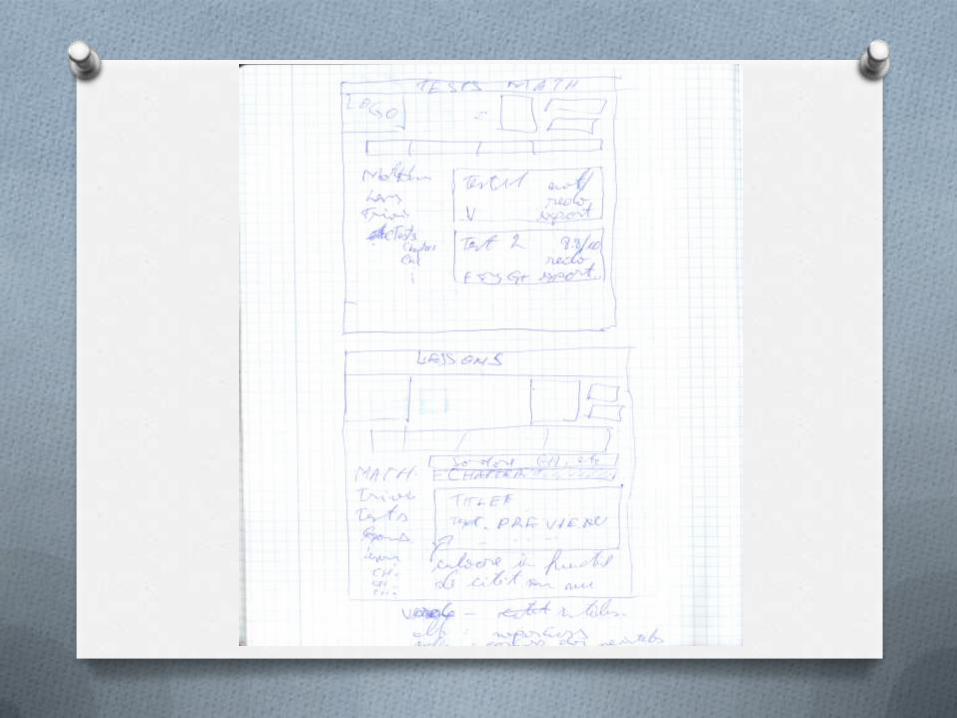
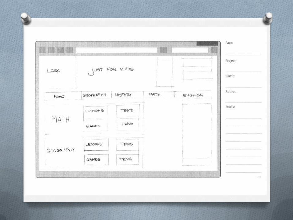
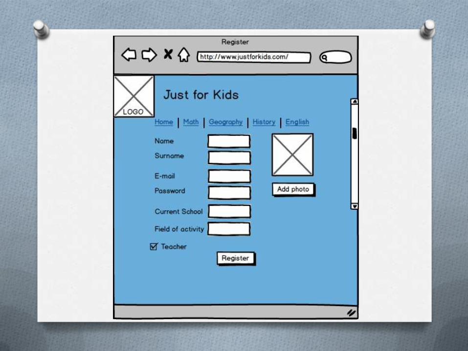
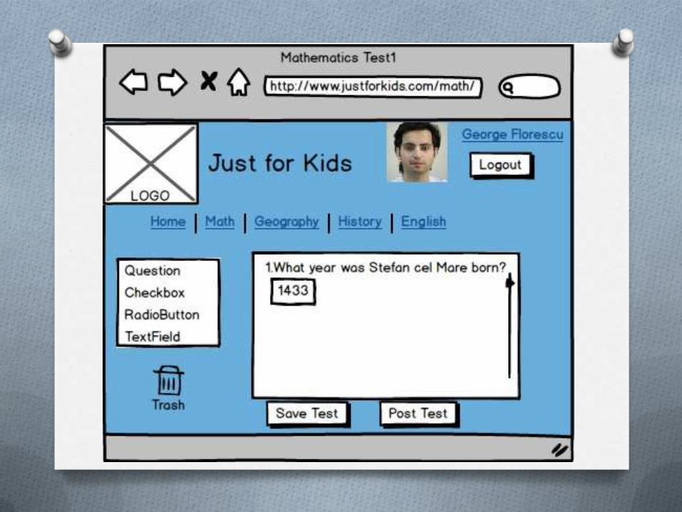
The list concept
O When we thought at this concept, we were
axing on our teacher persona and it’s
needs. It is a more detailed design for a
quicker navigation. Using this concept the
user can edit immediately , without the
need of two many clicks. Just select the
edit button on the lesson or test he wants
to edit. The same thing can be done for
adding a new test or deleting one.
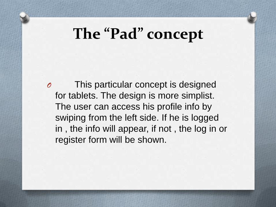
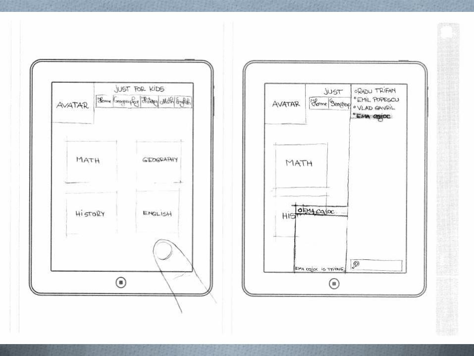
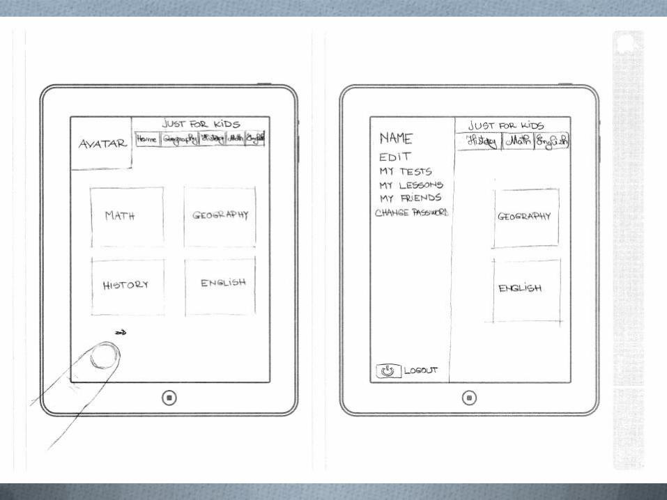
The “Pad” concept
O This particular concept is designed
for tablets. The design is more simplist.
The user can access his profile info by
swiping from the left side. If he is logged
in , the info will appear, if not , the log in or
register form will be shown.
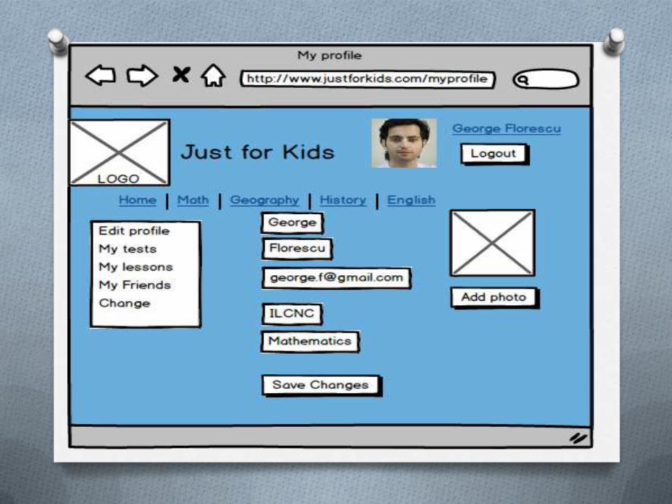
Personas
Antonia Velea
George Florescu
Rodica Popescu
Wireframes
Storyboards
Axure Mockupdemo