JOURNATA DESIGNING THE INTERACTION OF A MOBILE … · designed interface and interaction),...
112
JOURNATA – DESIGNING THE INTERACTION OF A MOBILE APPLICATION FOR EXCHANGING PUBLIC TRANSPORT INFORMATION BETWEEN TRAVELLERS MARCO ANDRÉ MOREIRA AMADOR DISSERTAÇÃO DE MESTRADO APRESENTADA À FACULDADE DE ENGENHARIA DA UNIVERSIDADE DO PORTO EM ENGENHARIA INFORMÁTICA E COMPUTAÇÃO M 2014
Transcript of JOURNATA DESIGNING THE INTERACTION OF A MOBILE … · designed interface and interaction),...
JOURNATA – DESIGNING THE INTERACTION OF A MOBILE APPLICATION FOR EXCHANGING PUBLIC TRANSPORT INFORMATION BETWEEN TRAVELLERS
MARCO ANDRÉ MOREIRA AMADOR DISSERTAÇÃO DE MESTRADO APRESENTADA À FACULDADE DE ENGENHARIA DA UNIVERSIDADE DO PORTO EM ENGENHARIA INFORMÁTICA E COMPUTAÇÃO
M 2014
FACULDADE DE ENGENHARIA DA UNIVERSIDADE DO PORTO
Journata - Designing the interaction ofa mobile application for exchangingpublic transport information among
travellers
Marco André Moreira Amador
Mestrado Integrado em Engenharia Informática e Computação
Advisor: Teresa Galvão Dias (Prof.)
Co-Advisor: António Nunes (MSc.)
June 23, 2014

Journata - Designing the interaction of a mobileapplication for exchanging public transport information
among travellers
Marco André Moreira Amador
Mestrado Integrado em Engenharia Informática e Computação
Approved in oral examination by the committee:
Chair: Doctor Alexandre Miguel Barbosa Valle de Carvalho
External Examiner: Doctor Hugo Alexandre Paredes Guedes da Silva
Supervisor: Doctor Maria Teresa Galvão DiasJune 23, 2014

Abstract
The advent of smartphones and the massification of Internet connections allowed easy accessand sharing of real-time information between people. This fact has contributed to the success ofseveral social networks and location-based services developed for mobile devices. The changeof paradigm to accessing and sharing information may be explored in order to solve mobilityproblems, through improvements on public transport services and their use experience, promotingthe use of public transport in urban areas.
Relating to this, a previous proposal was made in order to create a mobile application, withsocial network features, allowing real time sharing of public transport information between trav-ellers, related to several aspects of the service. Such shared information can be useful to a betterinformed decision making by the users about their own journeys, and form a way that publictransport operators can use in order to gather information about their service quality and, there-fore, to improve it. Simultaneously, a good structure and organization of the shared informationmaximizes its utility to the users of the platform. That previous work resulted in a functional pro-totype with several limitations concerning the usability and user interaction with the application,conditioning the application’s engagement and mass adherence by potential users.
This dissertation aims to develop a functional prototype of that application, applying user-centred design processes in order to produce a new iteration that overcomes the referred limita-tions, improving user experience and focusing in the interaction between the final user and theapplication. Initially, limitations of the previous iteration of the application were identified, alongwith some research in order to understand the usability requirements among potential users. Af-ter the prototype development (through an iterative process with evolution and validation of thedesigned interface and interaction), usability tests were performed among experts in the field ofmobile applications development to public transport systems, which allowed to gather feedbackabout the work carried out and the potential range of an application with these characteristics.
This work can be seen as an evolution of the base concept behind this application, based uponuser engagement in the development process phases, serving as a starting point to the integrationof the addressed concepts in larger scale projects related to mobility.
i

ii
Resumo
O advento dos smartphones e a massificação das conexões à Internet possibilitou às pessoas oacesso e partilha de informação em tempo real com facilidade. Tal contribuiu para o sucesso devárias redes sociais e outros serviços baseados na localização do utilizador de dispositivos móveis.A alteração desse paradigma de acesso e partilha de informação poderá ser explorada no intuitode resolver problemas associados à mobilidade, através da melhoria dos serviços de transportepúblico e da sua experiência de utilização, promovendo a utilização desse tipo de transporte.
Nesse sentido, foi proposta anteriormente a criação de uma aplicação móvel com caracterís-ticas de rede social com vista à troca de informações de transportes públicos entre os seus pas-sageiros, em tempo real, sendo essas informações referentes a vários aspectos do serviço. A par-tilha desse tipo de informações poderá ser útil para uma tomada de decisão mais informada acercadas suas viagens, por parte dos utilizadores, e constituir uma forma através da qual os operadoresde transporte público poderão recolher informação sobre o seu serviço com vista a melhorar aqualidade do mesmo. Simultaneamente, a estruturação e organização da informação partilhadamaximiza a utilidade da mesma para os utilizadores da plataforma. Esse trabalho anterior resultounum protótipo funcional com limitações na óptica de usabilidade e interacção com o utilizador, oque condiciona uma adesão da mesma em larga escala por parte de potenciais utilizadores.
Esta dissertação tem como objectivo o desenvolvimento de um protótipo funcional para a ditaaplicação, aplicando os processos de design centrado no utilizador de modo a produzir uma novaiteração dessa aplicação que ultrapasse essas limitações, melhorando a experiência de utilizaçãoe dando foco à interacção entre a aplicação e o utilizador final. Inicialmente, foi feito o levanta-mento das limitações da iteração anterior da aplicação móvel, tendo sido igualmente feita algumapesquisa no sentido de perceber quais os requisitos de usabilidade de potenciais utilizadores. Apóso desenvolvimento do referido protótipo (através de um processo iterativo com evolução e vali-dação da interface e interacção concebidas), foram realizados testes de usabilidade, junto de ex-perts na área do desenvolvimento de aplicações móveis para transportes públicos, o que permitiurecolher feedback acerca do trabalho realizado e do possível alcance de uma aplicação deste tipo.
Este trabalho pode ser visto como uma evolução do conceito base desta aplicação, tendo porbase o envolvimento dos utilizadores nas fases do processo de desenvolvimento, servindo de pontode partida para a integração dos conceitos aqui abordados em projectos de maior escala ligados àmobilidade.
iii

iv
Acknowledgements
I would not be able to accomplish this work without the priceless contribute from a lot of peopleto whom I am grateful.
First of all, I would like to thank my family, specially my parents and my grandfather, for all theconstant support and the help to find motivation when I needed the most, and, most importantly, forthe opportunity that was given to me in order to choose this field of study in this faculty. Withoutthem and their sacrifice, it would not be possible, and I’ll never forget that. I sure hope to haveseized that opportunity in the right way.
To my friends and colleagues, the most amazing group of people I have met, I cannot thankyou enough for being there for me, even in the worst moments. It was an immense privilege tobe at your side during this course. Thanks for giving me strength to always carry on during thecourse, and for all the countless help and endless inspiration. Without you, I probably wouldn’t bewriting this now. Eduardo, you’ll never be forgotten!
To my supervisor, Prof. Teresa Galvão, for all the support and precious advice, for all thevaluable suggestions and the availability in the difficult times, to putting and end to my doubts andfor showing me the better path to follow.
To Eng. António Nunes, my co-supervisor, for always being there to help and contributewith his valuable input, giving great advice and ideas for this work’s development. His curiosityinspired me to explore new types of possible solutions to overcome the challenged presented inthis work. I surely hope to have meet his expectations, because this project is born from his ideaand because I recognise the great potential of this project.
To all the people at CAS, for making me comfortable and providing a great place to work.To OPT, thanks for all the expertise and valuable feedback given in the final testing phase, and
all the demonstrated interest in the project.To the users of Stack Overflow, who ’saved my life’ several times during the implementation
phase of this work. Without that platform as a valuable help tool, the amount of work accomplishedwould surely be less.
Finally, I would like to thank all the people that took some of their own time to participate inthe focus group and the usability testing. Without them, this work would not be possible for sure.
Marco Amador
v

vi
“The brick walls are there for a reason. The brick walls are not there to keep us out. The brickwalls are there to give us a chance to show how badly we want something. The brick walls are
there to stop the people who don’t want it badly enough.”
Randy Pausch
vii

viii
Contents
1 Introduction 11.1 Context . . . . . . . . . . . . . . . . . . . . . . . . . . . . . . . . . . . . . . . 11.2 Motivation . . . . . . . . . . . . . . . . . . . . . . . . . . . . . . . . . . . . . . 21.3 Goals . . . . . . . . . . . . . . . . . . . . . . . . . . . . . . . . . . . . . . . . 31.4 Structure of the Report . . . . . . . . . . . . . . . . . . . . . . . . . . . . . . . 4
2 State-of-the-Art 52.1 Online Collaboration Tools . . . . . . . . . . . . . . . . . . . . . . . . . . . . . 52.2 Mobile Environment Overview . . . . . . . . . . . . . . . . . . . . . . . . . . . 62.3 Location-Based Services . . . . . . . . . . . . . . . . . . . . . . . . . . . . . . 72.4 Social Networks . . . . . . . . . . . . . . . . . . . . . . . . . . . . . . . . . . . 82.5 Gamification . . . . . . . . . . . . . . . . . . . . . . . . . . . . . . . . . . . . 102.6 Existing work . . . . . . . . . . . . . . . . . . . . . . . . . . . . . . . . . . . . 10
2.6.1 Social Networks for travellers . . . . . . . . . . . . . . . . . . . . . . . 112.6.2 Mobile Applications using Location-Based Services . . . . . . . . . . . 122.6.3 Route Planners . . . . . . . . . . . . . . . . . . . . . . . . . . . . . . . 142.6.4 Mobile Applications for Public Transport . . . . . . . . . . . . . . . . . 152.6.5 Mobile Applications with Crowdsourcing . . . . . . . . . . . . . . . . . 16
2.7 Summary . . . . . . . . . . . . . . . . . . . . . . . . . . . . . . . . . . . . . . 19
3 Problem Description and Approach 213.1 Usability . . . . . . . . . . . . . . . . . . . . . . . . . . . . . . . . . . . . . . . 223.2 User-Centered Design . . . . . . . . . . . . . . . . . . . . . . . . . . . . . . . . 23
3.2.1 Usability Evaluation . . . . . . . . . . . . . . . . . . . . . . . . . . . . 253.2.2 Usability Tests . . . . . . . . . . . . . . . . . . . . . . . . . . . . . . . 25
4 Requirements Elicitation 274.1 Previous work . . . . . . . . . . . . . . . . . . . . . . . . . . . . . . . . . . . . 274.2 Initial Proposals . . . . . . . . . . . . . . . . . . . . . . . . . . . . . . . . . . . 30
4.2.1 Technology . . . . . . . . . . . . . . . . . . . . . . . . . . . . . . . . . 314.2.2 Main Navigation . . . . . . . . . . . . . . . . . . . . . . . . . . . . . . 324.2.3 User Profile . . . . . . . . . . . . . . . . . . . . . . . . . . . . . . . . . 344.2.4 Comment, Rate and News Feed . . . . . . . . . . . . . . . . . . . . . . 354.2.5 Journey Planner . . . . . . . . . . . . . . . . . . . . . . . . . . . . . . . 38
4.3 Focus Group . . . . . . . . . . . . . . . . . . . . . . . . . . . . . . . . . . . . . 39
ix
CONTENTS
5 Application Development 435.1 Architecture . . . . . . . . . . . . . . . . . . . . . . . . . . . . . . . . . . . . . 43
5.1.1 Data Model . . . . . . . . . . . . . . . . . . . . . . . . . . . . . . . . . 435.1.2 Android Application . . . . . . . . . . . . . . . . . . . . . . . . . . . . 445.1.3 Webservice . . . . . . . . . . . . . . . . . . . . . . . . . . . . . . . . . 44
5.2 Interface Elements and Concepts . . . . . . . . . . . . . . . . . . . . . . . . . . 455.2.1 Branding . . . . . . . . . . . . . . . . . . . . . . . . . . . . . . . . . . 455.2.2 Main Navigation . . . . . . . . . . . . . . . . . . . . . . . . . . . . . . 455.2.3 News Feed . . . . . . . . . . . . . . . . . . . . . . . . . . . . . . . . . 485.2.4 Authentication . . . . . . . . . . . . . . . . . . . . . . . . . . . . . . . 565.2.5 Comment Submission . . . . . . . . . . . . . . . . . . . . . . . . . . . 595.2.6 Journey Planner Features . . . . . . . . . . . . . . . . . . . . . . . . . . 625.2.7 User Profile . . . . . . . . . . . . . . . . . . . . . . . . . . . . . . . . . 65
6 Tests and Results 696.1 Usability Test . . . . . . . . . . . . . . . . . . . . . . . . . . . . . . . . . . . . 696.2 Evaluation by Experts . . . . . . . . . . . . . . . . . . . . . . . . . . . . . . . . 71
6.2.1 General Evaluation . . . . . . . . . . . . . . . . . . . . . . . . . . . . . 726.2.2 Suggestions and Observations . . . . . . . . . . . . . . . . . . . . . . . 74
7 Conclusions and Future Work 777.1 Conclusions . . . . . . . . . . . . . . . . . . . . . . . . . . . . . . . . . . . . . 777.2 Future Work . . . . . . . . . . . . . . . . . . . . . . . . . . . . . . . . . . . . . 78
7.2.1 Usability and Interaction . . . . . . . . . . . . . . . . . . . . . . . . . . 787.2.2 Data Structure . . . . . . . . . . . . . . . . . . . . . . . . . . . . . . . 787.2.3 Integration with existing social networks . . . . . . . . . . . . . . . . . 797.2.4 Integration with existing public transport applications . . . . . . . . . . . 79
References 81
A Focus Group Script 85A.1 Goals . . . . . . . . . . . . . . . . . . . . . . . . . . . . . . . . . . . . . . . . 85A.2 Briefing to the participants . . . . . . . . . . . . . . . . . . . . . . . . . . . . . 85A.3 Use Cases to Discuss . . . . . . . . . . . . . . . . . . . . . . . . . . . . . . . . 86
A.3.1 Journey Planner and Check-In . . . . . . . . . . . . . . . . . . . . . . . 86A.3.2 User Profile . . . . . . . . . . . . . . . . . . . . . . . . . . . . . . . . . 86A.3.3 Trip information . . . . . . . . . . . . . . . . . . . . . . . . . . . . . . 86
A.4 Other questions to discuss regarding other features or interactions . . . . . . . . 87
B Usability Test Script 89B.1 Introduction . . . . . . . . . . . . . . . . . . . . . . . . . . . . . . . . . . . . . 89B.2 Socio-demographic questions . . . . . . . . . . . . . . . . . . . . . . . . . . . . 89
B.2.1 Age . . . . . . . . . . . . . . . . . . . . . . . . . . . . . . . . . . . . . 89B.2.2 Gender . . . . . . . . . . . . . . . . . . . . . . . . . . . . . . . . . . . 89B.2.3 How frequently do you use public transports? . . . . . . . . . . . . . . . 90B.2.4 Are you a smartphone owner and user? . . . . . . . . . . . . . . . . . . 90B.2.5 Please state your city of residence. . . . . . . . . . . . . . . . . . . . . . 90
B.3 List of Tasks to Accomplish . . . . . . . . . . . . . . . . . . . . . . . . . . . . 90B.4 Post-task questionnaire . . . . . . . . . . . . . . . . . . . . . . . . . . . . . . . 91
x
List of Figures
2.1 Gartner Hype Cycle 2011 graphic . . . . . . . . . . . . . . . . . . . . . . . . . 112.2 Screenshot of WAYN desktop interface . . . . . . . . . . . . . . . . . . . . . . . 122.3 Screenshot of Foursquare Android mobile application interface . . . . . . . . . . 132.4 Screenshot of Blendr Android mobile application interface . . . . . . . . . . . . 142.5 Workflow of Tinder application interface . . . . . . . . . . . . . . . . . . . . . . 142.6 Interfaces of mobile applications for public transport information - Example 1 . . 15
(a) Catch That Bus! . . . . . . . . . . . . . . . . . . . . . . . . . . . . . . . 15(b) London Underground . . . . . . . . . . . . . . . . . . . . . . . . . . . . . 15
2.7 Interfaces of mobile applications for public transport information - Example 2 . . 16(a) National Rail Enquiries . . . . . . . . . . . . . . . . . . . . . . . . . . . 16(b) MOVE-ME . . . . . . . . . . . . . . . . . . . . . . . . . . . . . . . . . . 16
2.8 Captions of Waze mobile application interface. . . . . . . . . . . . . . . . . . . . 17(a) Route information . . . . . . . . . . . . . . . . . . . . . . . . . . . . . . 17(b) Report feature . . . . . . . . . . . . . . . . . . . . . . . . . . . . . . . . 17
2.9 Captions of Moovit mobile application interface. . . . . . . . . . . . . . . . . . . 18(a) Trip information feature. . . . . . . . . . . . . . . . . . . . . . . . . . . . 18(b) Report information feature. . . . . . . . . . . . . . . . . . . . . . . . . . 18
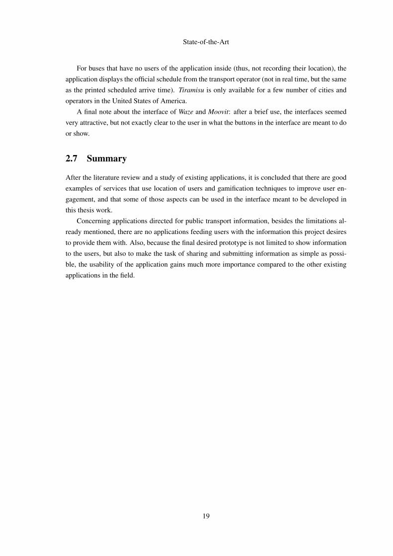
3.1 Screenshots of the previously implemented interface. . . . . . . . . . . . . . . . 22(a) Trip information feature. . . . . . . . . . . . . . . . . . . . . . . . . . . . 22(b) Report information feature. . . . . . . . . . . . . . . . . . . . . . . . . . 22(c) Trip information feature. . . . . . . . . . . . . . . . . . . . . . . . . . . . 22
3.2 Workflow of the process described in ISO 13407. . . . . . . . . . . . . . . . . . 24
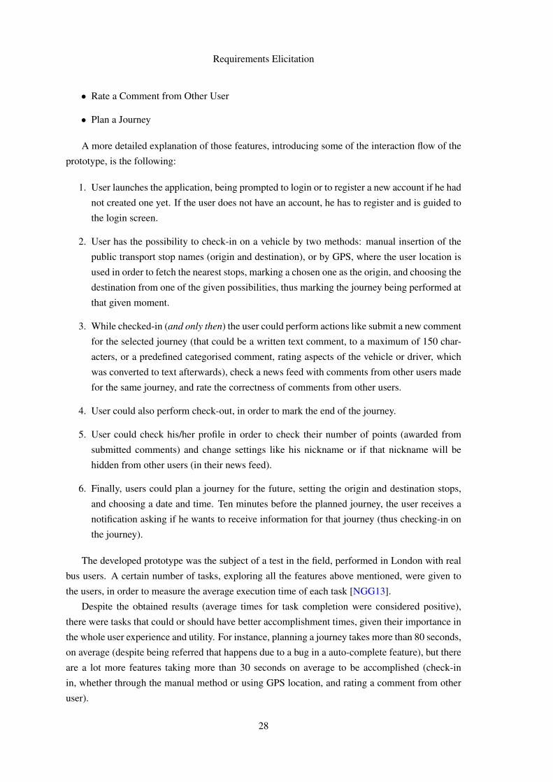
4.1 Screenshot of the tab where we could find the rate comment feature. . . . . . . . 304.2 Example of an Action Bar from an Android application, displaying the application
icon (1), action items (2) and a menu option (3). . . . . . . . . . . . . . . . . . . 324.3 Example of an application with splitted Action Bar - Evernote. Note also the
bottom bar, present in recent devices. . . . . . . . . . . . . . . . . . . . . . . . . 334.4 Initial draft of the tab component - three visible tabs, only text labels. . . . . . . 344.5 Initial draft of the tab component - four tabs, icons and text labels. . . . . . . . . 344.6 Initial draft of the tab component - four tabs, icons and text labels, and coloured
indicator. . . . . . . . . . . . . . . . . . . . . . . . . . . . . . . . . . . . . . . 344.7 Initial draft of the user profile screen - with network user map. . . . . . . . . . . 354.8 Initial draft of the user profile screen - without network user map. . . . . . . . . 364.9 Initial draft of the comment, rate and news feed features - all-in-one. . . . . . . . 374.10 Initial draft of the comment, rate and news feed features - news feed/rating aggre-
gated, with comment in other tab. . . . . . . . . . . . . . . . . . . . . . . . . . . 37
xi
LIST OF FIGURES
4.11 Initial draft of the journey planner features - with tabs on the left, with spinners onthe right. . . . . . . . . . . . . . . . . . . . . . . . . . . . . . . . . . . . . . . . 38
5.1 Application first logo alternative designs. . . . . . . . . . . . . . . . . . . . . . 455.2 Screenshot of Facebook application navigation component for Android. . . . . . 465.3 Screenshot of Swarm application navigation component for Android. . . . . . . . 475.4 Example of a tab navigation in an iOS mobile application. . . . . . . . . . . . . 475.5 Second iteration of the tab navigation interface. . . . . . . . . . . . . . . . . . . 485.6 Screenshot of the implemented application’s main navigation. . . . . . . . . . . 485.7 News Feed features and screens - Add Feed, First Iteration. . . . . . . . . . . . . 495.8 News Feed features and screens - Filter and Remove Feeds, First Iteration. . . . . 505.9 News Feed features and screens - View Feed, First Iteration. . . . . . . . . . . . 515.10 News Feed features and screens - Add Feed (alternative designs) and Search Re-
sults, Second Iteration . . . . . . . . . . . . . . . . . . . . . . . . . . . . . . . . 525.11 News Feed features and screens - Filter and Remove Feed, Second Iteration. . . . 535.12 Screenshots of the add and filter feed features. . . . . . . . . . . . . . . . . . . . 545.13 Screenshots of the view feed feature (with refresh). . . . . . . . . . . . . . . . . 555.14 User profile screen - an example where authentication is required in order to access
the information. . . . . . . . . . . . . . . . . . . . . . . . . . . . . . . . . . . . 575.15 Screenshots of the login and register screens. . . . . . . . . . . . . . . . . . . . 585.16 Login and logout buttons in the Action Bar. . . . . . . . . . . . . . . . . . . . . 595.17 Comment menu - First Iteration. . . . . . . . . . . . . . . . . . . . . . . . . . . 605.18 Check-in and definition of route - Second Iteration. . . . . . . . . . . . . . . . . 615.19 Comment menu and classification dialog - Second Iteration. . . . . . . . . . . . 615.20 Screenshots of the implementation of check-in and comment submission features. 625.21 Favourites and Schedule features - First Iteration. . . . . . . . . . . . . . . . . . 635.22 Favourites and Schedule features - Second Iteration. . . . . . . . . . . . . . . . . 645.23 Screenshot of the implementation of the favourites and schedule lists. . . . . . . 655.24 User Profile screen - Design phase. . . . . . . . . . . . . . . . . . . . . . . . . . 665.25 Screenshots of the implementation of user profile screen. . . . . . . . . . . . . . 67
6.1 Average quantitative appraisal by task. . . . . . . . . . . . . . . . . . . . . . . . 71
xii
List of Tables
4.1 Focus group participants characteristics. . . . . . . . . . . . . . . . . . . . . . . 39
xiii

LIST OF TABLES
xiv
Abbreviations
API Application Programming InterfaceIBM-CAS IBM Center for Advanced StudiesC2DM Google Cloud to Device Messaging FrameworkGCM Google Cloud Messaging FrameworkGPS Global Positioning SystemGSM Global System for Mobile CommunicationsISO International Organization for StandardizationNFC Near Field CommunicationOS Operative SystemQRCode Quick Response CodeSTCP Sociedade de Transportes Colectivos do PortoTFL Transport for LondonUI User InterfaceUX User ExperienceXML Extensible Markup Language
xv

Chapter 1
Introduction
This initial chapter aims to give a general overview about this thesis and the themes it addresses.
It will start by explaining the context in which it is inserted, as well as the motivation beneath the
proposal.
The main objectives of this thesis, as well as the methods that will be employed in order to
achieve them, will also be described.
1.1 Context
In the last few years, we have seen the speed of evolution and innovation regarding technology to
reach levels we never thought before, applied to several fields. One of these fields, and probably
the one where we, as human beings, felt more that evolution was communication. Some of the
big changes we perceived was for instance, the massification of the e-mail usage to communicate,
the rise of instant messaging applications, the boost of the number of mobile phones and Internet
connections worldwide [Int13].
Some studies [DMW03] related to the "Six Degrees of Separation theory", which defends that
every person in the Earth is only separated, through an introduction process, by six steps to any
other person, have shown that the value for average number of steps between any given people has
been decreasing in the last few years. Microsoft itself performed a study with data from Messenger
application, that revealed, only using that application, that the mean path between Messenger users
is 6.6 [LH07].
The advent of social networks, platforms that allow information sharing and interaction be-
tween people in several ways, had (and still has) a great contribute in approximating people and,
along with the growth of Internet connections worldwide and the easiness of internet access, al-
lows people to be constantly connected and communicating.
1
Introduction
Mobile devices, in the last few years, have evolved as well, along with technology, developing
capabilities of internet access and allowing that connection and communication to be done even
when people are not at home or at work.
As this evolution happens, we witness as well an increasing migration from people to larger
cities, promoting an increment on the worldwide population living in urban areas. Recent data
shows that this migration is happening in both well developed and less developed regions around
the globe [Nat11].
This is contributing to generate some chaos in our cities, making the task of quickly reaching
our destinations increasingly harder, due to the increasing number of vehicles and people.
In this context, public transportation has a vital role on promoting urban mobility and helping
us to avoid those problems. Encouraging its use reduces the number of cars, thus reducing traffic
levels and the likelihood of traffic jams, increasing the efficiency of mobility inside the cities and
the efficiency of public transport system itself [CSV11].
As an attempt to promote public transport usage, some companies publicize their services and
try to reach their costumers through social networks, particularly the most widely used, such as
Facebook1 or Twitter2, taking advantage of their popularity.
The concept that supports this thesis is based upon this phenomenon, and tries to explore social
network’s abilities to act as information vehicle between people, and the willingness of people to
share information in the first place. However, the kind of information we intend to see shared
between people with this project is information concerning public transport, in such way that both
users and operators can benefit from that information.
This concept has been proposed in the article Using social networks for exchanging valuable
real time public transport information between travellers [NGeCP11], and its implementation is
in course at the IBM Center for Advanced Studies at FEUP. That implementation has been the
subject of previous master thesis works from MIEIC, and resulted on a prototype for an Android
mobile application [eSG12].
This thesis aims to provide a redesigned and intuitive interface to the project, in order to make
the new iteration a more efficient way for travellers to help each other and contribute to a better
public transport service, ultimately leading to an increasing use of public transport (and possibly
more efficient public transport and cities).
1.2 Motivation
Time is a very important resource nowadays, specially for those who live in a city. We waste
some of that time on our daily travels, such as performing home-to-work journeys and the reverse.
Often, journeys that should last 10 minuted end up lasting much more than that, due to delays,
traffic jams and so on.
1http://www.facebook.com2http://www.twitter.com
2
Introduction
Those factors generate some unpredictability on public transport behaviour that, allied with
the lack of information about the routes, delays and unexpected problems, frequently lead people
to try to avoid them when possible, in order to keep up to their schedule [BC07].
Providing travellers with real-time status information about public transport is something that
can lead people to use them. This way, we can help people making informed travel decisions, while
possibly reducing the number of private vehicles circulating in our cities, thus reducing traffic and
saving time. It can also lead to improvements in the usage experience of public transportation by
the travellers, resulting in more bearable waits and journeys.
Social networks have been used in the recent times by some public transport companies in
order to get closer to their customers and to provide them some real-time information about their
services. Using social networks, those companies are establishing a two-way communication
street with their customers, generating feedback that can be used to improve the quality of the
offered services.
However, recent studies have shown that, despite the notorious advantages that arise from
this kind of approach, the information provided is not fully exploited sometimes, leading users to
perceive it as useless and to underestimate it [NGeCP11].
The existence of a social network designed to provide structured information in real-time to
the right people (people that would perceive that information as highly useful), through a mobile
application, could help improving public transports’ perceived experience. Moreover, if the infor-
mation shared inside this social network had origin in the users themselves, the transport operators
wouldn’t have charges related to the maintenance of those services, while receiving a constant
source of feedback they can use to improve the quality and efficiency of their services.
This social network could also contribute to other kinds of benefits (apart from the economical
ones to the transport operators[NGeC14]). For instance, it could lead to decreasing levels of
stress suffered by passengers of public transport, by increasing their well-being, and also, as an
ultimate consequence, to the reduction of the ecological footprint generated by the widespread use
of private vehicles on home-to-work travels.
However, providing structured information to the right people in real-time is not enough. Be-
ing this social network fed by information generated by and shared between its users, it must have
as many users as possible, in order to generate a large volume of information, so that users can
receive information useful for them.
That said, the user interface (UI) of the social network, in this case, a mobile application, must
be intuitive and attractive to the passengers, captivating them to use it daily and to contribute to
the information flow inside the social network.
1.3 Goals
One of the most innovative aspects of the concept referred in the last section is the creation of dy-
namic community networks, in time and space. For instance, in a social network such as Facebook,
we have a list of friends and acquaintances that does not change a lot over time (thus, forming static
3
Introduction
networks). In the proposed concept [NGeCP11], it is discussed the creation of dynamic networks,
representative of travellers on a specific line, vehicle, or inside vehicles from different lines that
share part of its trip between them. That way, a traveller would only receive information from
other travellers in the same networks, maximizing the utility of the received information. The
main goal of this thesis is to develop a user interface for the mentioned system, while achieving
the following objectives:
• Create and analyse appropriate metaphors for the interaction with dynamic social networks.
• Design and test innovative visual affordances for the concept of dynamic social networks.
• Apply state-of-the-art concepts related with Human-Computer Interaction in order to max-
imize the usability of the application by its final users, while addressing usability problems
identified on the previous existing prototype.
• Develop a functional prototype for an Android mobile application based on the obtained
from the goals already mentioned.
• Test the system and evaluate the results obtained.
1.4 Structure of the Report
Besides the Introduction chapter, this document contains six additional chapters, with the follow-
ing structure: Chapter 2, State-of-the-Art, presents the definition, explanation and related works
in the fields of the concepts in which the project is based upon. It will also present examples of
several mobile applications with social network features and/or related to public transport infor-
mation.
Chapter 3, Problem Description and Approach, explains more in detail what is meant to
achieve with this work and the problem that is discussed in it, as well as the chosen approach
to reach the proposed goals.
Chapter 4, Requirements Elicitation, describes the work performed in the initial phase of the
process, having the previous state of the project as a starting point to some new design proposals,
and the realization of a focus group to perceive user needs and usability requirements.
Chapter 5, Application, presents the architecture of the application, and describes the evolution
of each main design concept of it, from the first sketches to the implementation phase.
All the performed tests and subsequent results are presented in Chapter 6, Tests and Results.
Finally, Chapter 7 presents the conclusions taken from this thesis, as well as suggestions about
future work to be done in the project and ways it can evolve in order to maximize its reach, and be
integrated with bigger scale solutions.
4
Chapter 2
State-of-the-Art
Social networks are changing the paradigm of communication between people. We have seen an
increasing growth of the number of people using them in the past few years, and the same applies
for the amount of time spent by people in these communities. This popularity brings a huge
potential to these platforms, for instance, for promoting or marketing of products, sharing various
kinds of information, and stimulating the collaboration among its users. Using this strong sharing
component, and with the help of some other features for communication between people, such
as chat, instant messaging, video-conferencing and so on, these platforms develop some features
of collaborative environments, making them attractive to implement the concept of Collective
Intelligence [Fle08].
The fact that we can use a communication network everywhere these days had an impact on
the social networks growth, popularity, and volume of information shared. To be online anywhere
and at any moment, has become an habit for millions of human beings, and the smartphones’
expansion had a great contribution to that. However, their increasing popularity does not exactly
mean that people are easily driven or compelled to use new ones. Instead, they usually get bored
faster and their acceptance of different networks and environments diminishes.
So, in order to succeed, a new player, in this case, a new social network or platform, has to
find new ways in order to keep people interested in their services, and attract even more people.
We will start by clarifying some concepts that are in some way related with the project.
2.1 Online Collaboration Tools
Nowadays, we have a wide range of tools we can use to perform some kind of online collabora-
tion, such as real-time collaborative text editors (Google Drive, for instance), wikis, Q&A websites
(StackOverflow and SuperUser have an enormous success inside the IT community, allowing peo-
ple to ask questions and to say problems they’re facing and see them answered by someone with
expertise on the field), and so on.
5
State-of-the-Art
Most of these platforms, and their success, rely heavily on their number of users, on their
features, and on the information flow generated and shared by them. In cases where the shared
information is made public (Q&A websites, for instance), the "community sense" perceived by
the user, along with the value of the existing information, is fundamental to the acceptance of the
platform.
That kind of collaboration lies deeply within the concept of Collective Intelligence, emerged
from the debates held by Pierre Lévi [Lé98], where it is assumed that the intelligences of each
individual are added and shared by the society.
"What is collective intelligence? It is a form of universally distributed intelligence,
constantly enhanced, coordinated in real-time, and resulting in the effective mobiliza-
tion of skills... My initial premise is based on the notion of a universally distributed
intelligence. No one knows everything, everyone knows something, all knowledge
resides in humanity."
This is something meant to be explored deeply in this thesis and the concept behind it, due to
the functionality and usability the application aims to give to the passengers, in order to keep them
generating useful information for other users.
The growth of online collaboration lead also to the growth of a new business model, called
crowdsourcing, where people submit problems to a community, instead of solving them on their
own, hoping for the community to reply with better and/or more creative solutions.
That business model has also evolved into several sub-types, such as crowdfunding, where
someone prompts the community with a solution for a problem and asks the members of the
community for funding, in order to develop and launch said solution, if the said members think
the solution is viable, creative and/or necessary.
2.2 Mobile Environment Overview
As said before, we live in an era where smartphones allowed us to take advantages of the massifi-
cation of wireless networks in order to be online, anywhere and at any given time.
They also allowed us to perform tasks we did not imagine ourselves performing from a mobile
phone ten years ago, such as:
• Reading our e-mail account and send new e-mails.
• Navigating on websites.
• Share photos with friends via messages or social networks.
• ’Check-in’ at restaurants, clubs, museums, etc.
• Use native applications to fetch several types of information: news, weather information,
football scores, and even public transport information, such as schedules.
6
State-of-the-Art
The appearance of mobile operating systems with high number of default functionalities, such
as Android 1 (maintained by Google) or iOS 2 (from Apple Company), allied to the easy devel-
opment of native applications for those OS’s, lead to an exponential growth in the number of that
type of devices worldwide and thus, their native applications.
Android is, by far, the mobile operating system with most devices sold [McC13][McG13] and
has a steep growing trend. It is known for being an open source Linux-based system, suitable for
both smartphones and tablets and very flexible concerning to hardware configurations.
It has been well received by third-party phone manufacturers, and it has a large community of
developers, as well as millions of native applications available for download. Users can find these
application in their official store, Google Play Store, the largest app store worldwide [Are13], or
through third-party websites.
Apple’s iOS, however, is a closed-source system, for installation on Apple’s devices only. It
was originally developed for Apple’s smartphones, iPhone, but it has since then been extended to
other devices from the company, such as tablets (iPad) or portable music players (iPod Touch). Its
application store is the most profitable worldwide.
Both Android and iOS have evolved since their first versions, not only adding functionality and
features, but also providing developers with new methods to make their applications more usable,
efficient and aesthetically attractive.
Mobile devices who have these operative systems are also equipped with a lot of embedded
sensors, that provide help and data to some features of applications. Some of these sensors are:
• Motion Sensors (accelerometers, gyroscopes, gravity sensors);
• Environmental Sensors (barometers, thermometers);
• Position Sensors (orientation sensors, magnetometer);
• Location Sensors (GPS sensors).
The last type of referred sensors, that allow the device and therefore its applications to detect
and use information related to the users location, using GPS (Global Positioning System), resulted
in the creation of new types of services, that can be inserted in the Location-based Services cate-
gory.
2.3 Location-Based Services
Schiller and Voisar [SV04] define location-based services as "services that integrate a mobile
device’s location or position with other information so as to provide added value to a user".
GSM Association’s definition is a little bit more abstract, and defines those services as "ser-
vices that use the location of a client for adding value to the service".
1http://www.android.com/meet-android/2https://www.apple.com/ios/
7
State-of-the-Art
In this context, the referred client is understood as any entity whose location is relevant, and
not necessarily a mobile device or the user of the service.
This concept of location-based services, as it is known today, was first studied by Timo Ranta-
lainen, in his master thesis in Electronical Engineering for Helsinki University of Technology, in
1994. In a posterior article [SR95], he wrote about possible methods to determine users’ location.
These services were created due to a set of particular questions that web developers faced with
the growth of the Internet. For instance, how to adapt the contents of a website to a particular
reader? Knowing their location (the country they were visiting the page from), it was made pos-
sible to display the website information in that country’s language. In similar ways, results from
a search engine could be customized to the user’s country, as well as the advertisement shown
[BWD11].
The appearance of mobile computation brought new challenges to this area, and new strengths
to these services - it is far more interesting to use the location of a mobile device than the location
of a desktop computer, for instance.
Some of the biggest challenges were related to the way the location data was stored and han-
dled (due to being from a mobile device and the data being dynamic, because the location is
changing and the gathered data is continuous).
2.4 Social Networks
In the definition provided by James Clyde Mitchell [Mit69], a social network is a set of specific
links between a group of people, with the additional property that the characteristics of these
connections as a whole can be used to interpret the social behaviour of the involved individuals.
Of course, this is the general definition of a social network, but nowadays we associate it to the
phenomenon of online social networks, that according to the definition given by Nicole B. Ellison
[BE08], consist in Web services that allow an individual to:
• Create a public or semi-public profile within a bounded system;
• Articulate a list of other users with whom they share a connection;
• View and go through their list of connections and those made by others within the system.
However, most of these online platforms evolved beyond that definition, providing features to
their users allowing them to upload content (for instance, photos, music or videos), send instant
messages to other users and use small applications or play games [Joi08].
Online social networks have grown in such a way that has provided them a tremendous power
(especially the most used platforms, such as Facebook or Twitter, that have a huge popularity).
Some proofs of this power are the recent developments in the political world, where cases like the
revolt in Tunisia [Del11], Egypt [Sut11], and most recently, Syria [OPG+14], were made possible
in part due to the massive mobilization of people that occured through these networks, showing
their influence on the world.
8
State-of-the-Art
This phenomenon lead also to some academic work that aimed to analyse the content shared
on those social networks during the conflicts, in order do provide knowledge about the forces and
the supporters from different factions [OPG+14]. Political and religious leaders all around the
world have also realized the importance of online social networks, and have themselves created
profiles in those networks, that allow them to disseminate messages, that are then replicated by the
media. Catholic Church, for instance, created a Twitter account to be used by their religious leader,
the Pope (first used by Pope Benedict XVI and now by Pope Francis) 3. That account has more
than 3.6 million followers, apart from more than 400 000 followers in other related accounts (that
translate the messages from the original account to other languages, such as Spanish, Portuguese,
German and Latin.
Google+4, for instance, has provided several live forums with the President of the United
States of America, Barack Obama. Using the Hangouts functionality, the President can answer
to questions from some of the users of the platform. The last debate, held at 31st January 2014,
intended to be a discussion about the new US national health system program, commonly known as
Obamacare, where users could see some of their doubts or questions about the program answered
by Barack Obama. Those live forums can often be reviewed on Youtube5.
Another example of the power of social networks is all the content generated in those networks
by athletes and journalists about the 2014 Winter Olympics, hosted in Sochi, Russia. Some photos
shared by those people questioned the preparation of the country to host the event, and revealed
negative aspects that were conveniently ignored by the Russian media, such as lack of potable
water, bad commodities to accommodate athletes, planned infra-structures that were not built, etc.
That has lead to an imposition by the International Olympic Committee to the athletes, forbidding
them to use professional recording material to take photos and videos and put them on social
networks such as Instagram [Sop14].
On the 18th of May of 2012, Facebook became the first online social network to get into the
stock market [Del11], and was followed by Twitter on the 7th of November 2013 [Pos13], which
is another example of the popularity, success and potential of this type of platforms.
Some of this platforms are meant for general use (Facebook, Twitter, for instance), but there
are also ’themed’ online social networks, designed to target part of the population making the plat-
form focused on sharing particular types of information, related to the users’ interests or hobbies.
LinkedIn6 is an example of a network of that kind, having a focus on professional informations
that can help people by sharing their curriculum information, recommending people they work or
used to work with, share their set of skills or recommending a certain skill of an acquaintance.
3https://twitter.com/Pontifex4http://plus.google.com5http://www.youtube.com6http://www.linkedin.com
9
State-of-the-Art
2.5 Gamification
Gamification can be defined as the use of game play mechanics for non-game applications, partic-
ularly consumer-oriented web and mobile sites, in order to encourage people to adopt the appli-
cations, or, in the words of Gabe Zichermann and Christopher Cunningham, authors of the book
"Gamification by Design", "the process of game-thinking and game mechanics to engage users
and solve problems".
The term gamification only came into widespread use in February 2010, when Jesse Schell, a
game designer and professor from Carnegie Mellon University, gave a presentation on the DICE
2010 conference, where he claimed that elements of games will invade every part of our daily lives
[Sch10].
The term gained more importance through several recent published books, such as "Game
Based Marketing", by Gabe Zichermann, who advocated the use of game mechanics in marketing,
and Baron Reeves’s "Total Engagement", where it is said that games and virtual worlds will change
the way people work. At the South by Southwest annual conference of 2011 (in short, SXSW
2011), entrepreneur Seth Priebatsch talked about games as the new layer that, similarly to the
social layer, "will change the world" [Xu12].
Gartner, an IT research company, predicts that by 2015, more than half of companies managing
innovation processes will employ gamification of some sort in their products [Xu12]. Another
company, M2 Research, predicts that, also by 2015, game mechanics production will generate 1.6
billion dollars in revenues and will account for 23% of social media marketing budgets.
As of today, gamification is employed in applications across many areas, including productiv-
ity, finance, news, health, user-generated content and e-learning. Several companies offer gami-
fication in their products as a layer of reward and reputation systems to their users, using points,
badges, levels and leader boards as some examples of that use.
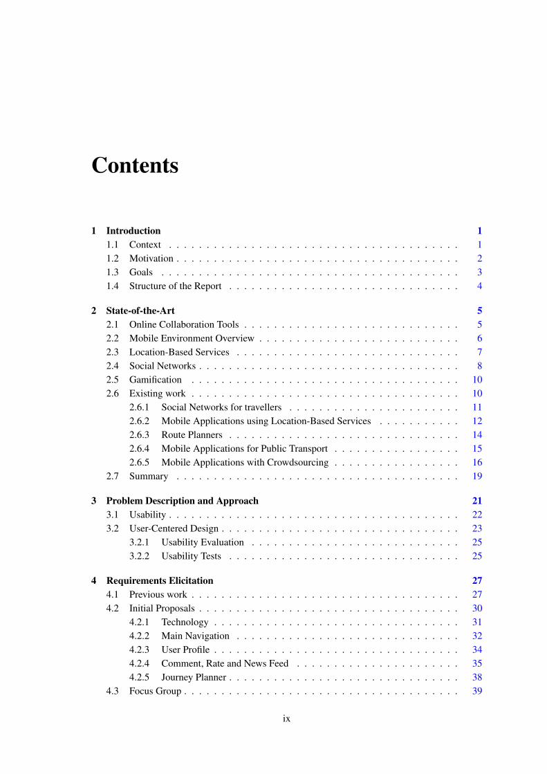
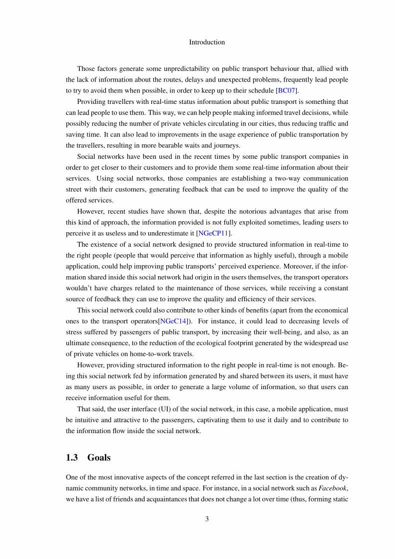
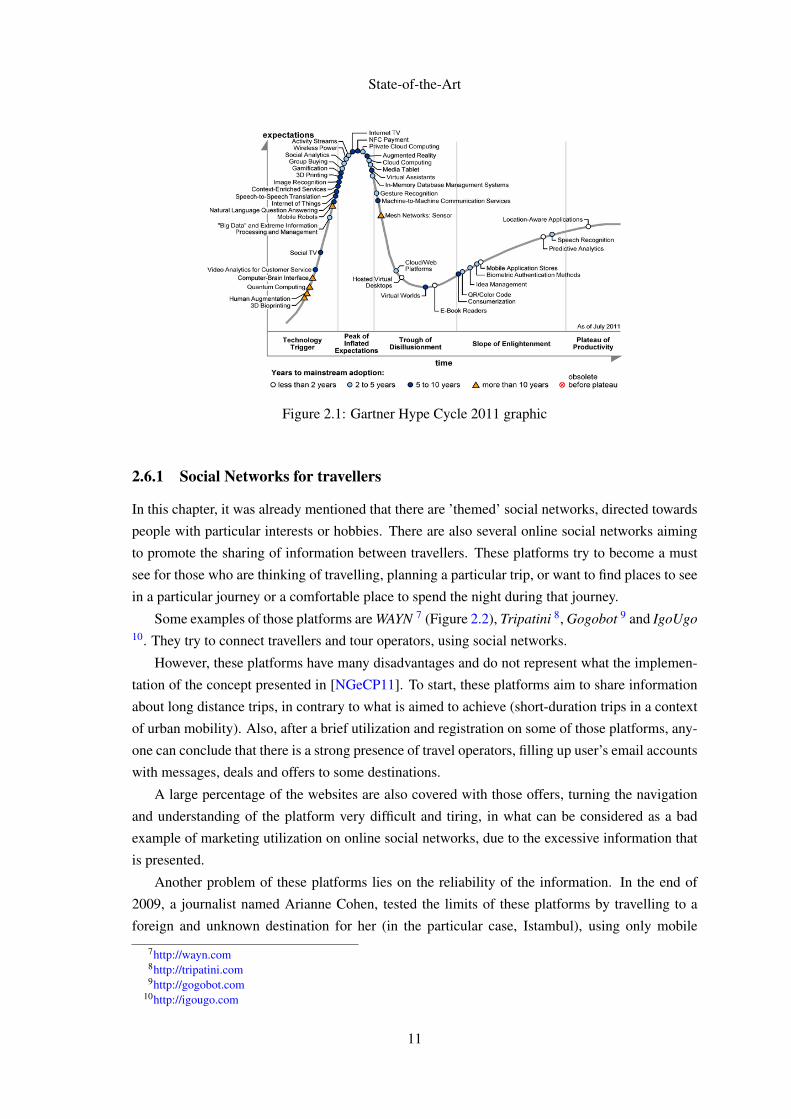
In the 2011 Gartner Hype Cycle report, gamification is listed as rising onto the stage of "peak
of inflated expectation" (Figure 2.1). After reaching that peak, it is said that one technology
reaches the hype and the mainstream adoption. Gamification was then said to have between 2 and
5 years until reaching that peak.
Despite being a term commonly referred, there is already criticism of gamification in the
media. Some say that the term is a mere buzzword, applied as a simple "pointification", and
often missing game elements such as storytelling and experiences, that are fundamental to the
effectiveness of games.
2.6 Existing work
This section aims to introduce and analyse some existing services and applications related in some
way to the concepts defined and explained in the previous sections of this chapter. This is partic-
ularly relevant because those concepts are behind the work meant to be developed in this thesis
work and the project in which it is inserted.
10
State-of-the-Art
Figure 2.1: Gartner Hype Cycle 2011 graphic
2.6.1 Social Networks for travellers
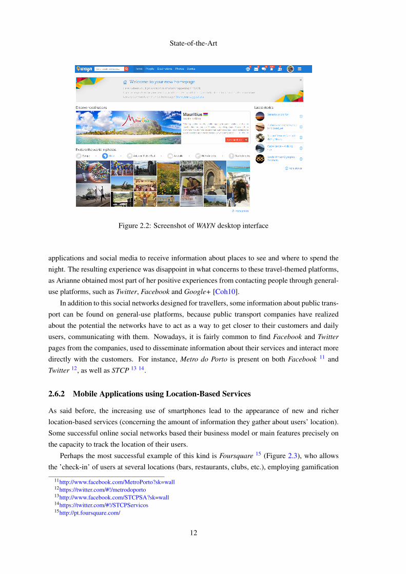
In this chapter, it was already mentioned that there are ’themed’ social networks, directed towards
people with particular interests or hobbies. There are also several online social networks aiming
to promote the sharing of information between travellers. These platforms try to become a must
see for those who are thinking of travelling, planning a particular trip, or want to find places to see
in a particular journey or a comfortable place to spend the night during that journey.
Some examples of those platforms are WAYN 7 (Figure 2.2), Tripatini 8, Gogobot 9 and IgoUgo10. They try to connect travellers and tour operators, using social networks.
However, these platforms have many disadvantages and do not represent what the implemen-
tation of the concept presented in [NGeCP11]. To start, these platforms aim to share information
about long distance trips, in contrary to what is aimed to achieve (short-duration trips in a context
of urban mobility). Also, after a brief utilization and registration on some of those platforms, any-
one can conclude that there is a strong presence of travel operators, filling up user’s email accounts
with messages, deals and offers to some destinations.
A large percentage of the websites are also covered with those offers, turning the navigation
and understanding of the platform very difficult and tiring, in what can be considered as a bad
example of marketing utilization on online social networks, due to the excessive information that
is presented.
Another problem of these platforms lies on the reliability of the information. In the end of
2009, a journalist named Arianne Cohen, tested the limits of these platforms by travelling to a
foreign and unknown destination for her (in the particular case, Istambul), using only mobile
7http://wayn.com8http://tripatini.com9http://gogobot.com
10http://igougo.com
11
State-of-the-Art
Figure 2.2: Screenshot of WAYN desktop interface
applications and social media to receive information about places to see and where to spend the
night. The resulting experience was disappoint in what concerns to these travel-themed platforms,
as Arianne obtained most part of her positive experiences from contacting people through general-
use platforms, such as Twitter, Facebook and Google+ [Coh10].
In addition to this social networks designed for travellers, some information about public trans-
port can be found on general-use platforms, because public transport companies have realized
about the potential the networks have to act as a way to get closer to their customers and daily
users, communicating with them. Nowadays, it is fairly common to find Facebook and Twitter
pages from the companies, used to disseminate information about their services and interact more
directly with the customers. For instance, Metro do Porto is present on both Facebook 11 and
Twitter 12, as well as STCP 13 14.
2.6.2 Mobile Applications using Location-Based Services
As said before, the increasing use of smartphones lead to the appearance of new and richer
location-based services (concerning the amount of information they gather about users’ location).
Some successful online social networks based their business model or main features precisely on
the capacity to track the location of their users.
Perhaps the most successful example of this kind is Foursquare 15 (Figure 2.3), who allows
the ’check-in’ of users at several locations (bars, restaurants, clubs, etc.), employing gamification
11http://www.facebook.com/MetroPorto?sk=wall12https://twitter.com/#!/metrodoporto13http://www.facebook.com/STCPSA?sk=wall14https://twitter.com/#!/STCPServicos15http://pt.foursquare.com/
12
State-of-the-Art
techniques (badges) to improve user engagement with the network. The mobile application of
the platform gathers the user location, giving him information about the nearest interest points,
and allowing him to perform manual check-in at one of these locations. A user earns a badge
for completing tasks, such as checking-in for the first time at a new place, checking-in at a wide
number of places in the same area, or several times in the same place. The platform also allows
searching for particular categories of points of interest, and check the places visited by an user
acquaintance.
Figure 2.3: Screenshot of Foursquare Android mobile application interface
Foursquare had, as of February 2013, more than 40 million registered users, with several
millions of check-ins registered in a daily basis.
Some other examples of successful online social networks that take advantage of the location
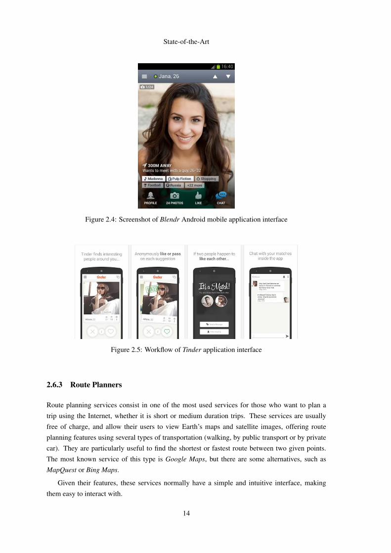
of their users are Blendr 16 (Figure 2.4) and Tinder 17. Their main goal is to, using that location,
search for people nearby in order to arrange online dates between users.
Tinder, for instance, provides users with a sort of catalog from other users nearby, prompting
them with a choice: marking them as a possible interest or not. Then, if the other person does the
same thing, communication between the two users is enabled (see Figure 2.5).
These two social networks, along with similar applications, demonstrate how a location-based
service can be used in a context where the location of nearby users is deeply explored, and the
number of existing users a critical factor for their success.
16http://blendr.com/17http://www.gotinder.com/
13
State-of-the-Art
Figure 2.4: Screenshot of Blendr Android mobile application interface
Figure 2.5: Workflow of Tinder application interface
2.6.3 Route Planners
Route planning services consist in one of the most used services for those who want to plan a
trip using the Internet, whether it is short or medium duration trips. These services are usually
free of charge, and allow their users to view Earth’s maps and satellite images, offering route
planning features using several types of transportation (walking, by public transport or by private
car). They are particularly useful to find the shortest or fastest route between two given points.
The most known service of this type is Google Maps, but there are some alternatives, such as
MapQuest or Bing Maps.
Given their features, these services normally have a simple and intuitive interface, making
them easy to interact with.
14
State-of-the-Art
2.6.4 Mobile Applications for Public Transport
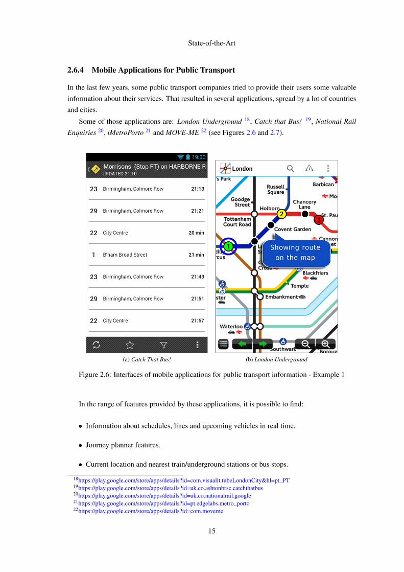
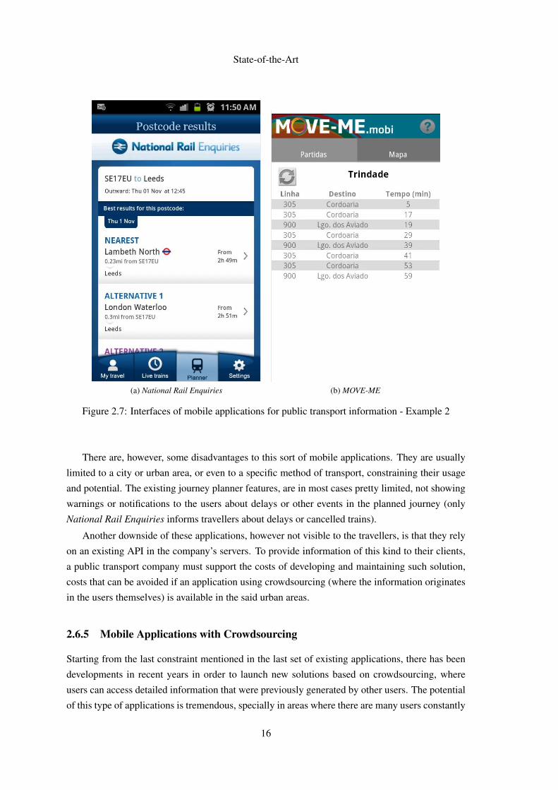
In the last few years, some public transport companies tried to provide their users some valuable
information about their services. That resulted in several applications, spread by a lot of countries
and cities.
Some of those applications are: London Underground 18, Catch that Bus! 19, National Rail
Enquiries 20, iMetroPorto 21 and MOVE-ME 22 (see Figures 2.6 and 2.7).
(a) Catch That Bus! (b) London Underground
Figure 2.6: Interfaces of mobile applications for public transport information - Example 1
In the range of features provided by these applications, it is possible to find:
• Information about schedules, lines and upcoming vehicles in real time.
• Journey planner features.
• Current location and nearest train/underground stations or bus stops.
18https://play.google.com/store/apps/details?id=com.visualit.tubeLondonCity&hl=pt_PT19https://play.google.com/store/apps/details?id=uk.co.ashtonbrsc.catchthatbus20https://play.google.com/store/apps/details?id=uk.co.nationalrail.google21https://play.google.com/store/apps/details?id=pt.edgelabs.metro_porto22https://play.google.com/store/apps/details?id=com.moveme
15
State-of-the-Art
(a) National Rail Enquiries (b) MOVE-ME
Figure 2.7: Interfaces of mobile applications for public transport information - Example 2
There are, however, some disadvantages to this sort of mobile applications. They are usually
limited to a city or urban area, or even to a specific method of transport, constraining their usage
and potential. The existing journey planner features, are in most cases pretty limited, not showing
warnings or notifications to the users about delays or other events in the planned journey (only
National Rail Enquiries informs travellers about delays or cancelled trains).
Another downside of these applications, however not visible to the travellers, is that they rely
on an existing API in the company’s servers. To provide information of this kind to their clients,
a public transport company must support the costs of developing and maintaining such solution,
costs that can be avoided if an application using crowdsourcing (where the information originates
in the users themselves) is available in the said urban areas.
2.6.5 Mobile Applications with Crowdsourcing
Starting from the last constraint mentioned in the last set of existing applications, there has been
developments in recent years in order to launch new solutions based on crowdsourcing, where
users can access detailed information that were previously generated by other users. The potential
of this type of applications is tremendous, specially in areas where there are many users constantly
16
State-of-the-Art
using the application, receiving and submitting information possibly useful to other people with
the same intentions. Obviously, transportation in urban areas is a field where this potential can be
explored, giving the amount of people using private or public transport in a daily basis and sharing
travel intentions.
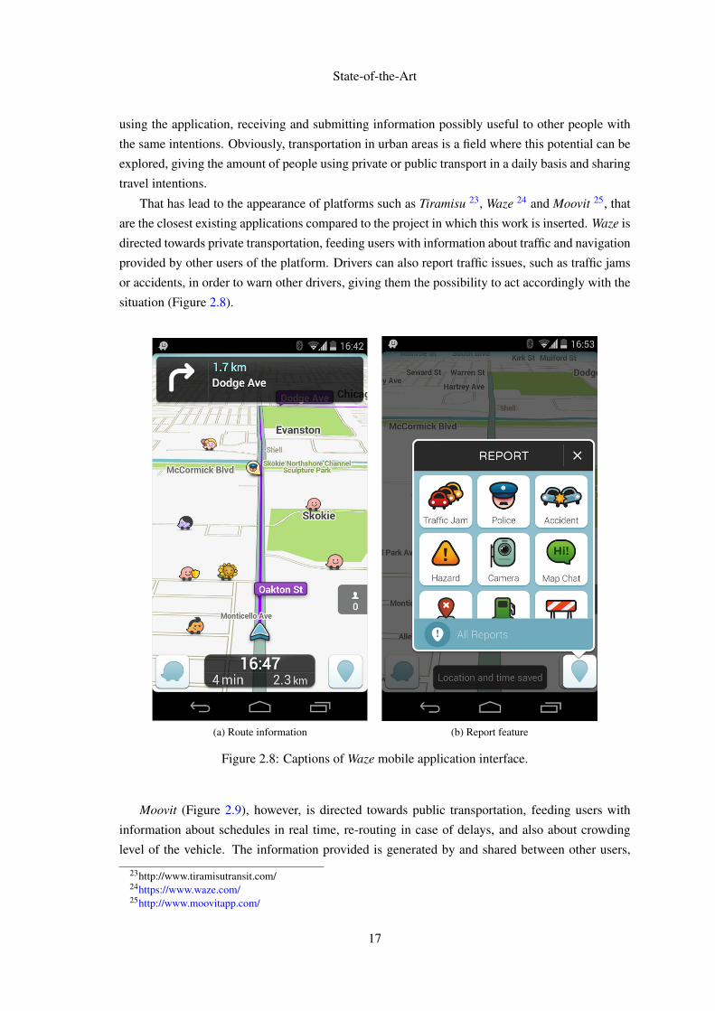
That has lead to the appearance of platforms such as Tiramisu 23, Waze 24 and Moovit 25, that
are the closest existing applications compared to the project in which this work is inserted. Waze is
directed towards private transportation, feeding users with information about traffic and navigation
provided by other users of the platform. Drivers can also report traffic issues, such as traffic jams
or accidents, in order to warn other drivers, giving them the possibility to act accordingly with the
situation (Figure 2.8).
(a) Route information (b) Report feature
Figure 2.8: Captions of Waze mobile application interface.
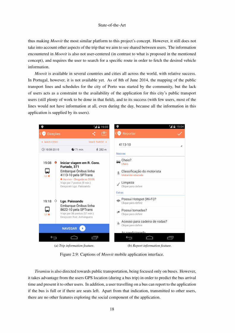
Moovit (Figure 2.9), however, is directed towards public transportation, feeding users with
information about schedules in real time, re-routing in case of delays, and also about crowding
level of the vehicle. The information provided is generated by and shared between other users,
23http://www.tiramisutransit.com/24https://www.waze.com/25http://www.moovitapp.com/
17
State-of-the-Art
thus making Moovit the most similar platform to this project’s concept. However, it still does not
take into account other aspects of the trip that we aim to see shared between users. The information
encountered in Moovit is also not user-centered (in contrast to what is proposed in the mentioned
concept), and requires the user to search for a specific route in order to fetch the desired vehicle
information.
Moovit is available in several countries and cities all across the world, with relative success.
In Portugal, however, it is not available yet. As of 8th of June 2014, the mapping of the public
transport lines and schedules for the city of Porto was started by the community, but the lack
of users acts as a constraint to the availability of the application for this city’s public transport
users (still plenty of work to be done in that field), and to its success (with few users, most of the
lines would not have information at all, even during the day, because all the information in this
application is supplied by its users).
(a) Trip information feature. (b) Report information feature.
Figure 2.9: Captions of Moovit mobile application interface.
Tiramisu is also directed towards public transportation, being focused only on buses. However,
it takes advantage from the users GPS location (during a bus trip) in order to predict the bus arrival
time and present it to other users. In addition, a user travelling on a bus can report to the application
if the bus is full or if there are seats left. Apart from that indication, transmitted to other users,
there are no other features exploring the social component of the application.
18
State-of-the-Art
For buses that have no users of the application inside (thus, not recording their location), the
application displays the official schedule from the transport operator (not in real time, but the same
as the printed scheduled arrive time). Tiramisu is only available for a few number of cities and
operators in the United States of America.
A final note about the interface of Waze and Moovit: after a brief use, the interfaces seemed
very attractive, but not exactly clear to the user in what the buttons in the interface are meant to do
or show.
2.7 Summary
After the literature review and a study of existing applications, it is concluded that there are good
examples of services that use location of users and gamification techniques to improve user en-
gagement, and that some of those aspects can be used in the interface meant to be developed in
this thesis work.
Concerning applications directed for public transport information, besides the limitations al-
ready mentioned, there are no applications feeding users with the information this project desires
to provide them with. Also, because the final desired prototype is not limited to show information
to the users, but also to make the task of sharing and submitting information as simple as possi-
ble, the usability of the application gains much more importance compared to the other existing
applications in the field.
19

State-of-the-Art
20
Chapter 3
Problem Description and Approach
As described in the section 1.3 of the introduction, the project encompasses the creation of a
functional prototype for an Android mobile application for a platform that uses dynamic social
networks and intends to use gamification techniques to improve user engagement. The platform
is designed to share information about public transport between travellers. Before the implemen-
tation of the functional prototype, the creation and testing of interface designs is required. The
usability and interaction of that interface is fundamental to the platform, because it might make
the difference between its success or failure, given that it might attract or repel several users and
facilitate or make more difficult the submission of information through the platform.
According to a study performed by Robert Pessagno [Pes10], "[social networks] acceptance
is determined by how easy it is to use them", and that has even more importance in the scope of
this project, given the necessity of having a large base of users feeding the platform with a huge
volume of information in real time at any given moment. If that does not happen, there is a risk
of having lines with no information. For instance, low transport frequency time periods or low
frequency lines may lead to inexistent information in those lines or during those periods. Having
a greater user base mitigates that risk, though it can still happen.
Given the innovation introduced by the main feature of the project, the dynamic social net-
works, it is necessary to develop suitable metaphors and create user visual affordance to enable
the understanding of that feature by travellers, in a familiar or intuitive way for them. In the first
iteration of the project [eSG12], usability tests were performed in order to capture possible usabil-
ity problems with the previously developed interface (Figure 3.1). Those tests resulted in a set of
conclusions that encompassed usability issues to be addressed and aspects to improve in this new
iteration, and it is aimed to use those conclusions as a starting point to this work (see 4.2).
21
Problem Description and Approach
(a) Trip information feature. (b) Report information feature. (c) Trip information feature.
Figure 3.1: Screenshots of the previously implemented interface.
3.1 Usability
Usability can be defined as a measurement for how easy it is to use an interface. Typically, the
evaluation or measurement of usability is kept separate from discussions of utility, a characteristic
often more influenced by what the interface is connected to (if we’re talking about a mobile appli-
cation, that can be for instance an existing API retrieving data existing in an external server) than
the interface itself. Jakob Nielsen, one of the most prominent authors and experts on usability,
defines usability as having the following components [Nie12]
• Learnability - How easy it is to users to accomplish basic tasks in the first time they are
introduced to the design?
• Efficiency - Once the users have passed the learning phase, how quickly can they perform
tasks?
• Memorability - After a period of not using the interface, how quickly can users remember
it and be proficient in the accomplishment of tasks?
• Errors - How many errors do the users make while using the interface? What is the severity
of those errors and can they recover from them?
• Satisfaction - How pleasant is it to use the design?
Following Nielsen’s approach, only actual performance by users is worth measuring. How-
ever, there are other approaches, for instance the one defined by Patrick Jordan, that include the
22
Problem Description and Approach
theoretical performance level achieved when the system being measured is used to its full potential
[Jor94].
Despite the several definitions and approaches, the goal of (improving) usability, that aims
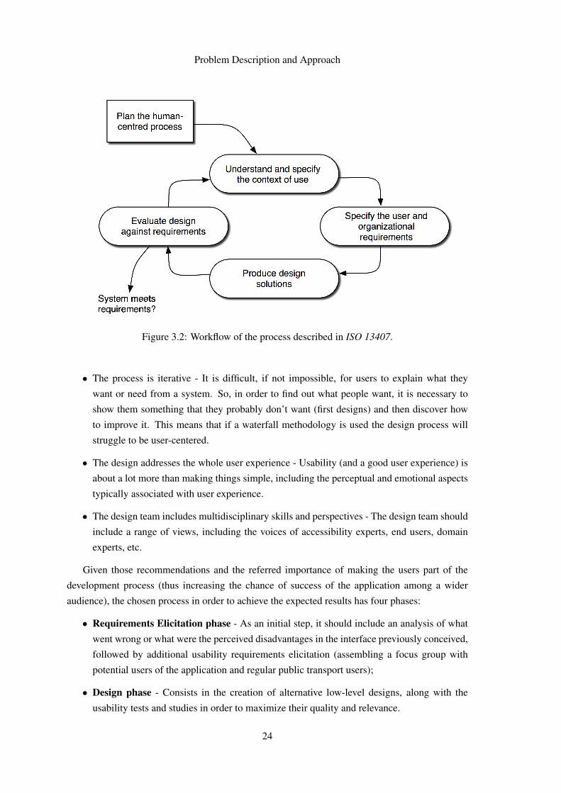
to be accomplished in this thesis work, is to make it faster and easier to users of an interface to
achieve their goals and accomplish the desired tasks.
3.2 User-Centered Design
In the recent years, the attempt of several institutions to integrate design with technology has
become a regular behaviour in the development of their products. In 1999, it was established an
international standard, ISO 13407, that aimed to provide "guidance on achieving quality in use
by incorporating user-centered design activities throughout the life cycle of interactive computer-
based systems."
That standard established four activities that had to be started at the earlier stages of a project:
• Understand and specify the context of use for the product - Collect relevant contextual in-
formation from the environment where the system is going to be used;
• Specify the user and organisational requirements - Formulate and build the user-centered
requirements for the new software.
• Produce design solutions - Simulate design solutions using paper or computer-based mock-
ups and get feedback of real users;
• Evaluate designs against requirements. Last but not least,is indispensable to evaluate the de-
sign work performed previously. In this phase anomalies, defects, bugs, failures are detected
in order to select the best solution for the system.
These activities were meant to be performed according to the workflow presented in Figure
3.2. This standard has since then been revised and re-issued as ISO 9241-210, which describes six
key principles to apply in a user-centered design process [Tra11]:
• The design is based upon an explicit understanding of users, tasks and environments. This
means that is necessary to understand your users, understand what they want to do with the
system and understand the environment in which the system is used.
• Users are involved throughout design and development - Users must be involved in all design
phases, not just at the start and at the end of the design.
• The design is driven and refined by user-centered evaluation - Usability testing should be
carried out throughout the design process. Initially, to test preliminary designs such as paper
prototypes, and after that, not just at the end of the process.
23
Problem Description and Approach
Figure 3.2: Workflow of the process described in ISO 13407.
• The process is iterative - It is difficult, if not impossible, for users to explain what they
want or need from a system. So, in order to find out what people want, it is necessary to
show them something that they probably don’t want (first designs) and then discover how
to improve it. This means that if a waterfall methodology is used the design process will
struggle to be user-centered.
• The design addresses the whole user experience - Usability (and a good user experience) is
about a lot more than making things simple, including the perceptual and emotional aspects
typically associated with user experience.
• The design team includes multidisciplinary skills and perspectives - The design team should
include a range of views, including the voices of accessibility experts, end users, domain
experts, etc.
Given those recommendations and the referred importance of making the users part of the
development process (thus increasing the chance of success of the application among a wider
audience), the chosen process in order to achieve the expected results has four phases:
• Requirements Elicitation phase - As an initial step, it should include an analysis of what
went wrong or what were the perceived disadvantages in the interface previously conceived,
followed by additional usability requirements elicitation (assembling a focus group with
potential users of the application and regular public transport users);
• Design phase - Consists in the creation of alternative low-level designs, along with the
usability tests and studies in order to maximize their quality and relevance.
24
Problem Description and Approach
• Prototyping phase - Implementation of a chosen design, previously done, as an Android
mobile application.
• Evaluation phase - Realization of usability evaluation and analysis of the evaluation results,
as the name suggests.
It is worth referring that this process is an adaptation encompassing the iterative process de-
scribed in ISO 13407, where the mentioned Requirements Elicitation phase serves as the first
iteration that allows the gathering of a vast amount of information regarding usability require-
ments, that will result in the production of an initial design, that will be checked against additional
requirements.
The following design phase will act as several iterations of the process, constantly evolving
the interface and trying to improve the quality of the solution. That phase will end with a usability
test with potential users, that will serve as validation of the evolved design in order to pass to the
implementation phase.
Finally, the implementation and evaluation phases will act as a final (and long duration, due to
the duration of the implementation) iteration of the process.
3.2.1 Usability Evaluation
The usual approaches to perform usability evaluation are the following:
1. Usability testing - Involves measuring typical user’s performance on task accomplishment.
2. Field studies - Performed in a natural environment (real case scenario)
3. Analytical evaluation - Does not involve end-users. Two main methods are usually used,
heuristic evaluation and/or predictive evaluation. While heuristic evaluation involves the
use heuristics (sets of guidelines and standards) and walkthroughs with experts through
scenarios of the application prototypes, predictive evaluation is based on theoretical models,
in order to predict user performance.
Heuristic evaluation with experts will be employed in a final phase, to evaluate the functional
prototype and to validate the implemented interface, serving as a base to possible future improve-
ments.
3.2.2 Usability Tests
In order to measure and improve usability of a given project, usability tests are often performed.
An usability test serves as an important tool for the usability evaluation of an User Interface,
in which the effectiveness of the User Interface itself is analysed. Based on the results of that
evaluation, changes can be made to improve the interface and the interaction of the said project.
These tests often consist in observing users accomplishing a given set of tasks in the ap-
plication, or even looking at a User Interface and checking it against common design rules and
25
Problem Description and Approach
guidelines [Joh14] and identifying the origin of possible unexpected/unwanted behaviours in its
utilization.
The process of performing the usability test includes the definition of what is meant to be
evaluated, the choice of participants for the test, the creation of test tasks and scenarios, and the
selection of evaluation metrics aligned with the goals defined for the test.
In the scope of this project, usability tests are necessary to include users in the evolution
process of the designed interface, and also to present a validation method to that interface before
an implementation phase. These tests will be performed through the design phase, promoting the
correction and improvement of the designed interface, recurring to potential user observation and
questioning.
26
Chapter 4
Requirements Elicitation
This chapter will present in detail the first stage on the development process of this thesis, covering
the initial usability requirements elicitation.
The following sections provide an analysis of the previously existing work on the project and
conclusions drawn from that work, as well as the process that lead to a first redesign, based on
those conclusions.
In the last section, the referred redesign, consisting in several alternative solutions, will act as
a discussion material in a focus group performed with potential users of the application, in order
to elicit usability requirements. All the process of the focus group, as well as all the data gathered
from it, is detailed there.
4.1 Previous work
As said before, the initial work on this project encompassed the initial implementation of the
concept referred on [NGeCP11], including a first prototype of an Android mobile application. This
prototype was made using Android API level 8, being compatible with mobile devices running at
least version 2.2 of the operative system.
This prototype had the following set of features [eSG12]
• Login
• Register Account
• Check-in
• Check-out
• See News Feed
• Submit a Comment
27
Requirements Elicitation
• Rate a Comment from Other User
• Plan a Journey
A more detailed explanation of those features, introducing some of the interaction flow of the
prototype, is the following:
1. User launches the application, being prompted to login or to register a new account if he had
not created one yet. If the user does not have an account, he has to register and is guided to
the login screen.
2. User has the possibility to check-in on a vehicle by two methods: manual insertion of the
public transport stop names (origin and destination), or by GPS, where the user location is
used in order to fetch the nearest stops, marking a chosen one as the origin, and choosing the
destination from one of the given possibilities, thus marking the journey being performed at
that given moment.
3. While checked-in (and only then) the user could perform actions like submit a new comment
for the selected journey (that could be a written text comment, to a maximum of 150 char-
acters, or a predefined categorised comment, rating aspects of the vehicle or driver, which
was converted to text afterwards), check a news feed with comments from other users made
for the same journey, and rate the correctness of comments from other users.
4. User could also perform check-out, in order to mark the end of the journey.
5. User could check his/her profile in order to check their number of points (awarded from
submitted comments) and change settings like his nickname or if that nickname will be
hidden from other users (in their news feed).
6. Finally, users could plan a journey for the future, setting the origin and destination stops,
and choosing a date and time. Ten minutes before the planned journey, the user receives a
notification asking if he wants to receive information for that journey (thus checking-in on
the journey).
The developed prototype was the subject of a test in the field, performed in London with real
bus users. A certain number of tasks, exploring all the features above mentioned, were given to
the users, in order to measure the average execution time of each task [NGG13].
Despite the obtained results (average times for task completion were considered positive),
there were tasks that could or should have better accomplishment times, given their importance in
the whole user experience and utility. For instance, planning a journey takes more than 80 seconds,
on average (despite being referred that happens due to a bug in a auto-complete feature), but there
are a lot more features taking more than 30 seconds on average to be accomplished (check-in
in, whether through the manual method or using GPS location, and rating a comment from other
user).
28
Requirements Elicitation
Regarding the check-in functionalities, this can be a problem since it is a feature used on
a critical part of the application - check-in is required to access several other main use cases.
Making this process too extensive or making those features only accessible to checked-in users
may lead to loss of interest by potential users.
One of the possible causes to this unwanted results is the fact that the check-in options are not
accessible at a user’s view level after logging in with his account - in order to perform check-in,
users had to press the Android Menu button (which prompts up the context menu to the user, where
they would find those options).
The same principle is valid for the check-out feature, as the button who triggers it is also found
in the context menu.
Despite the results obtained for this task were much better, that is probably due to the fact that,
in order to perform check-out, an user has to check-in in the first place, learning the place where
the check-out button is when he’s faced with the check-in task.
Still, no visual element whatsoever gives the user the information that the context menu is
available to be shown. We should not rely on previous experience that the final user may have with
the platform/operative system for which we are designing an interface, specially if that possible
experience includes gestures, buttons or other interaction triggers that may be unfamiliar for the
user in similar contexts or not visible.
There was another task with average accomplishment time exceeding 30 seconds - submitting
a written comment - though it’s fair to assume that most of that time consists in writing the desired
comment, and it is not necessarily tied to a disadvantage of the interface.
Another measurement taken was a quantitative value (from one to five) representing the ap-
praisal of a given task, concerning its difficulty, so that one represents a very difficult task to
execute, and five represents an easy task. Here, the tasks that could have had better results were
related to the notification system (informing a user that he has a planned journey soon, asking if he
wants to receive information from it and check-in), as well as rating other users comments (Figure
4.1).
This last concept was perceived as difficult to grasp, suggesting that improvement on this
feature or the whole comment validation system, in order to provide more reliable feedback to
public transport operators, can and should be made. The less positive appraisal from the rating
comment task could also be associated with the fact that this feature has his own tab (the main
navigation is composed by tabs), thus getting less visibility when comparing to other tabs (news
feed or comment tab, for instance).
A possible solution to this problem could consist in aggregating both the news feed and rate
separators, giving this feature more visibility, because one of the goals of the application is to
maximize the reliability of the generated information. Thus, having as much users as possible
performing ratings (by simplifying that task or the interaction behind it, or by augmenting its
visibility) is crucial.
29
Requirements Elicitation
Figure 4.1: Screenshot of the tab where we could find the rate comment feature.
All these questions and conclusions led to the development of a initial interface redesign,
presented in the following section.
4.2 Initial Proposals
After the initial process of perceiving what was done before, as well as understanding what were
the advantages and disadvantages of the previous design decisions, and what went well and could
go better, there were five groups of research questions to be answered in order to proceed with the
next steps. Those questions were:
• Technology - Despite being still on a premature phase, what technology would be used in
order to develop the functional prototype? In this case, since that prototype is expected to
be an Android application, what would be the versions targeted for the prototype?
• Main Navigation - How to design the main navigation for the application? Stick by the use
of the tabs? Explore other solutions used in similar contexts?
• Information shown on User Profile - What is relevant to be shown to the user? Does the
user wants to see nearby users? Is he willing to allow his location to be shared and to see
where are the users generating useful information to them? Or does he want to focus on
more personal information, such as possible rewards, points, statistics and so on?
30
Requirements Elicitation
• Comment, Rate and News Feed features - Can these be aggregated in a way user understands
or is familiar with, or it represents an excessive amount of information to be shown in one
screen?
• Journey Planner features - Could other features with perceived utility to the user be added
in order to allow a better comprehension of the concept behind the application, and conse-
quently, a more efficient use (for instance, saving time and avoiding repetitive tasks)?
4.2.1 Technology
Some thought should be put on the first mentioned topic from the beginning, since the target
version of the future application, apart from the possible conditioning of target users (who have
outdated Android versions on their devices), can influence the implemented interaction, since the
newer versions of the operative system have several features related to animations, UI styling and
interaction patterns.
The main decision was between sticking with a target version of Android 2.x (however, using
the API for version 2.3.3 instead of 2.2, because as of February 2014, Android 2.2 users repre-
sented about only 1% of all the Android devices worldwide) or developing the prototype only for
versions equal or superior to 4.0.3 (Ice Cream Sandwich) [Goo14].
Despite the fact that the users of Android versions inferior to 4.0.3 represent about 15% of total
Android users, that number will surely reduce with the emergence of newer versions and devices.
The ’time to market’ of the application is expected to be wide, though, so it is expected that, when
a fully implemented and improved version of the project is ready to be launched, those 15% don’t
pose a limitation anymore. Apart from that fact, the advantage of developing the application for
versions equal or superior to 4.0.3 is huge, because the API versions between Android 3.0 and
4.0.3 introduced major improvements to the UI, text input and so on.
Another important feature of this version is the Action Bar, used in the majority of Android
applications in order to serve as the main navigation menu of those applications, and that could be
used as well in this project. The Action Bar menu came as a replacement for the Context Menu in
older versions of Android (see Figure 4.2).
31
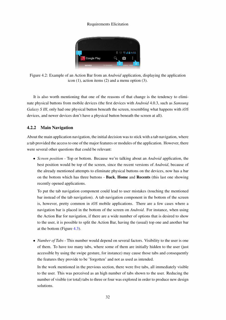
Requirements Elicitation
Figure 4.2: Example of an Action Bar from an Android application, displaying the applicationicon (1), action items (2) and a menu option (3).
It is also worth mentioning that one of the reasons of that change is the tendency to elimi-
nate physical buttons from mobile devices (the first devices with Android 4.0.3, such as Samsung
Galaxy S III, only had one physical button beneath the screen, resembling what happens with iOS
devices, and newer devices don’t have a physical button beneath the screen at all).
4.2.2 Main Navigation
About the main application navigation, the initial decision was to stick with a tab navigation, where
a tab provided the access to one of the major features or modules of the application. However, there
were several other questions that could be relevant:
• Screen position - Top or bottom. Because we’re talking about an Android application, the
best position would be top of the screen, since the recent versions of Android, because of
the already mentioned attempts to eliminate physical buttons on the devices, now has a bar
on the bottom which has three buttons - Back, Home and Recents (this last one showing
recently opened applications.
To put the tab navigation component could lead to user mistakes (touching the mentioned
bar instead of the tab navigation). A tab navigation component in the bottom of the screen
is, however, pretty common in iOS mobile applications. There are a few cases where a
navigation bar is placed in the bottom of the screen on Android. For instance, when using
the Action Bar for navigation, if there are a wide number of options that is desired to show
to the user, it is possible to split the Action Bar, having the (usual) top one and another bar
at the bottom (Figure 4.3).
• Number of Tabs - This number would depend on several factors. Visibility to the user is one
of them. To have too many tabs, where some of them are initially hidden to the user (just
accessible by using the swipe gesture, for instance) may cause those tabs and consequently
the features they provide to be ’forgotten’ and not as used as intended.
In the work mentioned in the previous section, there were five tabs, all immediately visible
to the user. This was perceived as an high number of tabs shown to the user. Reducing the
number of visible (or total) tabs to three or four was explored in order to produce new design
solutions.
32
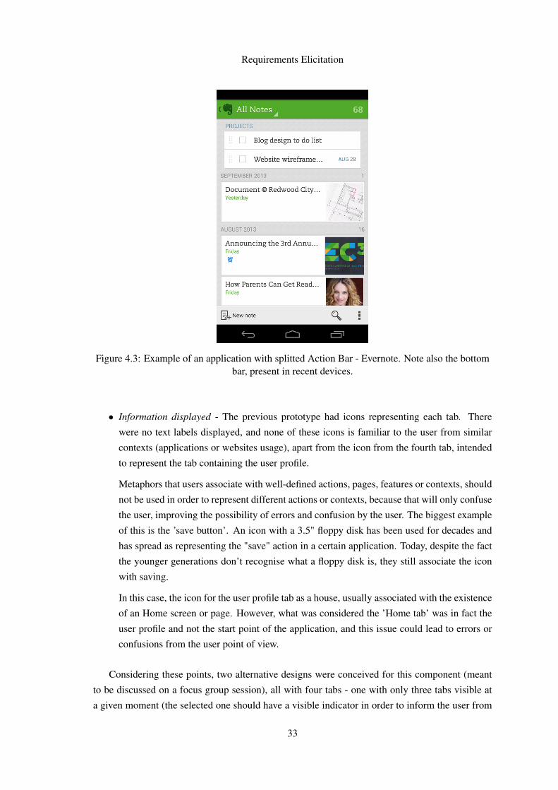
Requirements Elicitation
Figure 4.3: Example of an application with splitted Action Bar - Evernote. Note also the bottombar, present in recent devices.
• Information displayed - The previous prototype had icons representing each tab. There
were no text labels displayed, and none of these icons is familiar to the user from similar
contexts (applications or websites usage), apart from the icon from the fourth tab, intended
to represent the tab containing the user profile.
Metaphors that users associate with well-defined actions, pages, features or contexts, should
not be used in order to represent different actions or contexts, because that will only confuse
the user, improving the possibility of errors and confusion by the user. The biggest example
of this is the ’save button’. An icon with a 3.5" floppy disk has been used for decades and
has spread as representing the "save" action in a certain application. Today, despite the fact
the younger generations don’t recognise what a floppy disk is, they still associate the icon
with saving.
In this case, the icon for the user profile tab as a house, usually associated with the existence
of an Home screen or page. However, what was considered the ’Home tab’ was in fact the
user profile and not the start point of the application, and this issue could lead to errors or
confusions from the user point of view.
Considering these points, two alternative designs were conceived for this component (meant
to be discussed on a focus group session), all with four tabs - one with only three tabs visible at
a given moment (the selected one should have a visible indicator in order to inform the user from
33
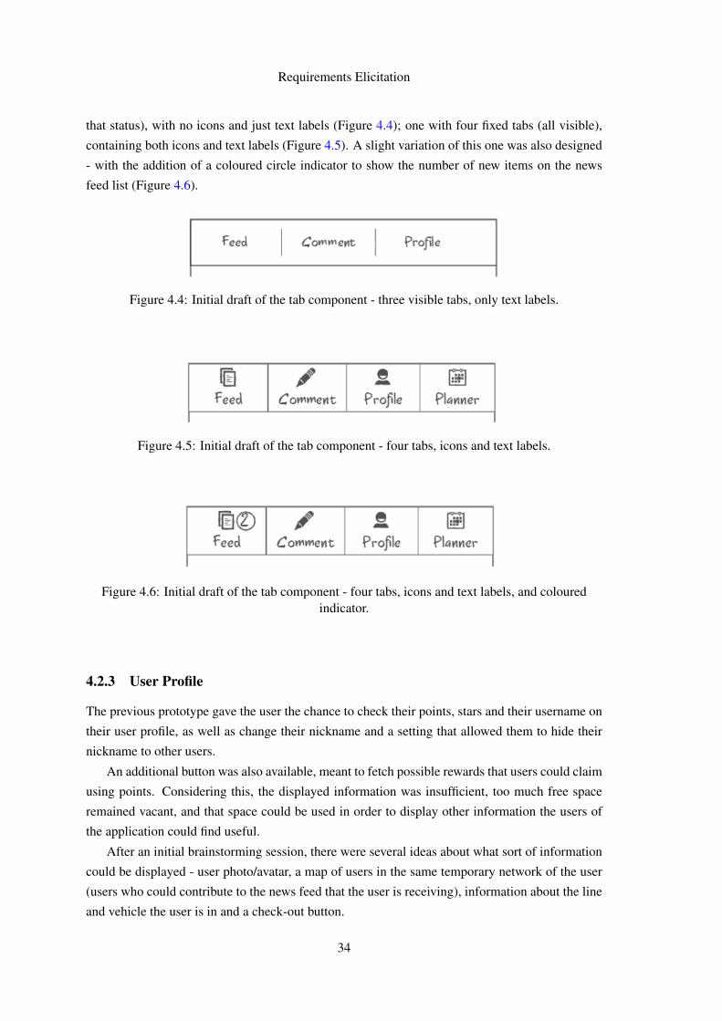
Requirements Elicitation
that status), with no icons and just text labels (Figure 4.4); one with four fixed tabs (all visible),
containing both icons and text labels (Figure 4.5). A slight variation of this one was also designed
- with the addition of a coloured circle indicator to show the number of new items on the news
feed list (Figure 4.6).
Figure 4.4: Initial draft of the tab component - three visible tabs, only text labels.
Figure 4.5: Initial draft of the tab component - four tabs, icons and text labels.
Figure 4.6: Initial draft of the tab component - four tabs, icons and text labels, and colouredindicator.
4.2.3 User Profile
The previous prototype gave the user the chance to check their points, stars and their username on
their user profile, as well as change their nickname and a setting that allowed them to hide their
nickname to other users.
An additional button was also available, meant to fetch possible rewards that users could claim
using points. Considering this, the displayed information was insufficient, too much free space
remained vacant, and that space could be used in order to display other information the users of
the application could find useful.
After an initial brainstorming session, there were several ideas about what sort of information
could be displayed - user photo/avatar, a map of users in the same temporary network of the user
(users who could contribute to the news feed that the user is receiving), information about the line
and vehicle the user is in and a check-out button.
34
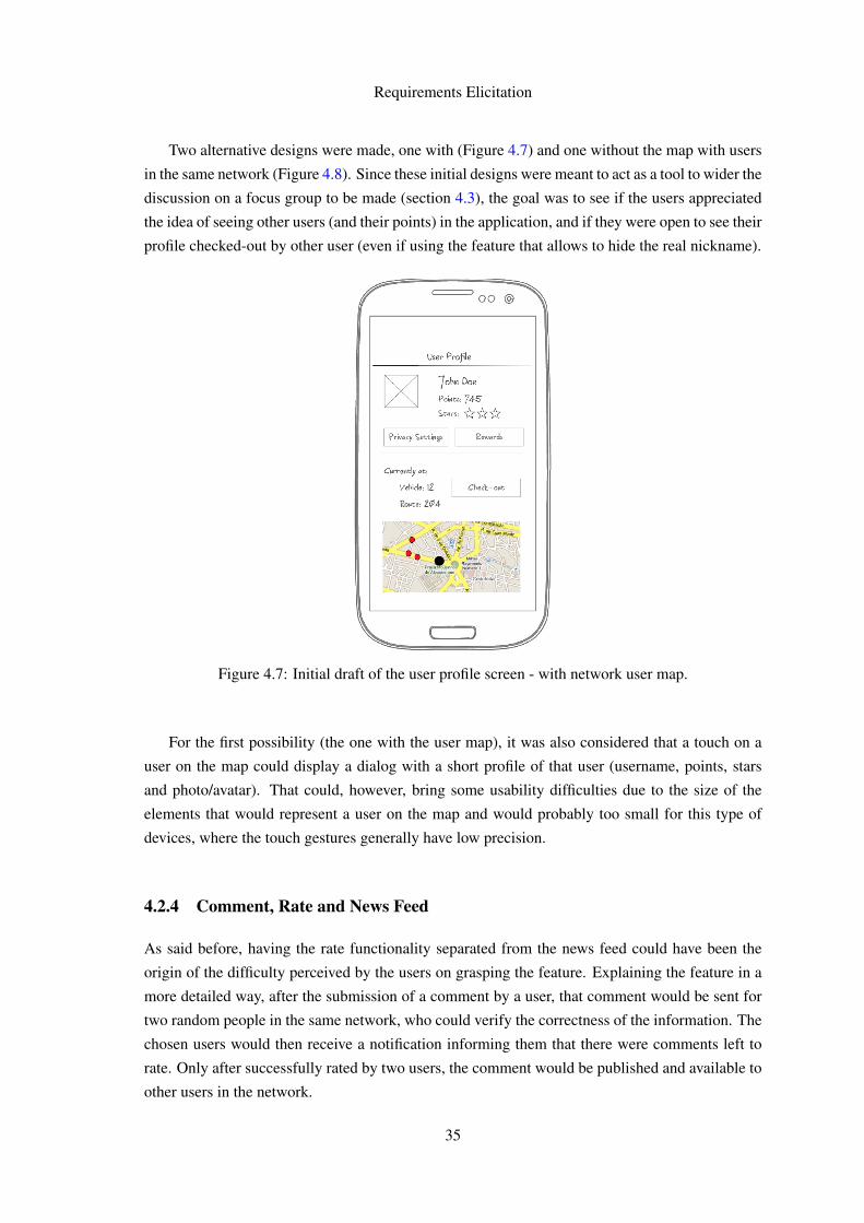
Requirements Elicitation
Two alternative designs were made, one with (Figure 4.7) and one without the map with users
in the same network (Figure 4.8). Since these initial designs were meant to act as a tool to wider the
discussion on a focus group to be made (section 4.3), the goal was to see if the users appreciated
the idea of seeing other users (and their points) in the application, and if they were open to see their
profile checked-out by other user (even if using the feature that allows to hide the real nickname).
Figure 4.7: Initial draft of the user profile screen - with network user map.
For the first possibility (the one with the user map), it was also considered that a touch on a
user on the map could display a dialog with a short profile of that user (username, points, stars
and photo/avatar). That could, however, bring some usability difficulties due to the size of the
elements that would represent a user on the map and would probably too small for this type of
devices, where the touch gestures generally have low precision.
4.2.4 Comment, Rate and News Feed
As said before, having the rate functionality separated from the news feed could have been the
origin of the difficulty perceived by the users on grasping the feature. Explaining the feature in a
more detailed way, after the submission of a comment by a user, that comment would be sent for
two random people in the same network, who could verify the correctness of the information. The
chosen users would then receive a notification informing them that there were comments left to
rate. Only after successfully rated by two users, the comment would be published and available to
other users in the network.
35
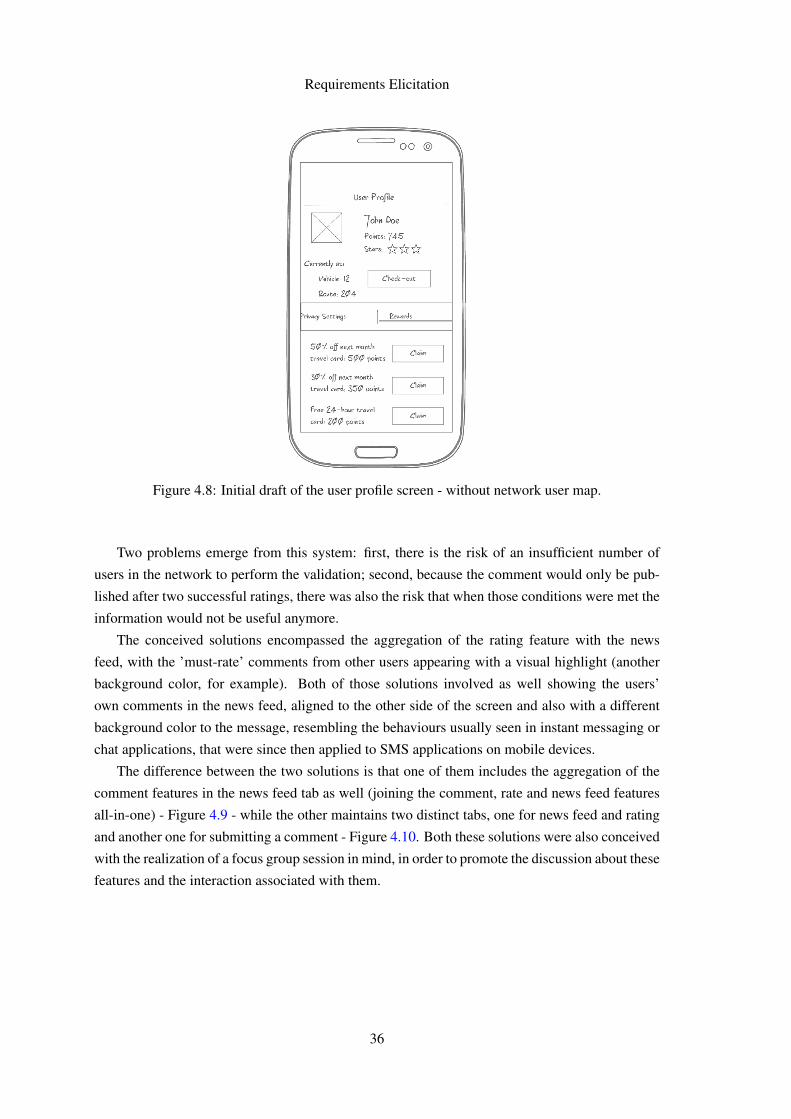
Requirements Elicitation
Figure 4.8: Initial draft of the user profile screen - without network user map.
Two problems emerge from this system: first, there is the risk of an insufficient number of
users in the network to perform the validation; second, because the comment would only be pub-
lished after two successful ratings, there was also the risk that when those conditions were met the
information would not be useful anymore.
The conceived solutions encompassed the aggregation of the rating feature with the news
feed, with the ’must-rate’ comments from other users appearing with a visual highlight (another
background color, for example). Both of those solutions involved as well showing the users’
own comments in the news feed, aligned to the other side of the screen and also with a different
background color to the message, resembling the behaviours usually seen in instant messaging or
chat applications, that were since then applied to SMS applications on mobile devices.
The difference between the two solutions is that one of them includes the aggregation of the
comment features in the news feed tab as well (joining the comment, rate and news feed features
all-in-one) - Figure 4.9 - while the other maintains two distinct tabs, one for news feed and rating
and another one for submitting a comment - Figure 4.10. Both these solutions were also conceived
with the realization of a focus group session in mind, in order to promote the discussion about these
features and the interaction associated with them.
36
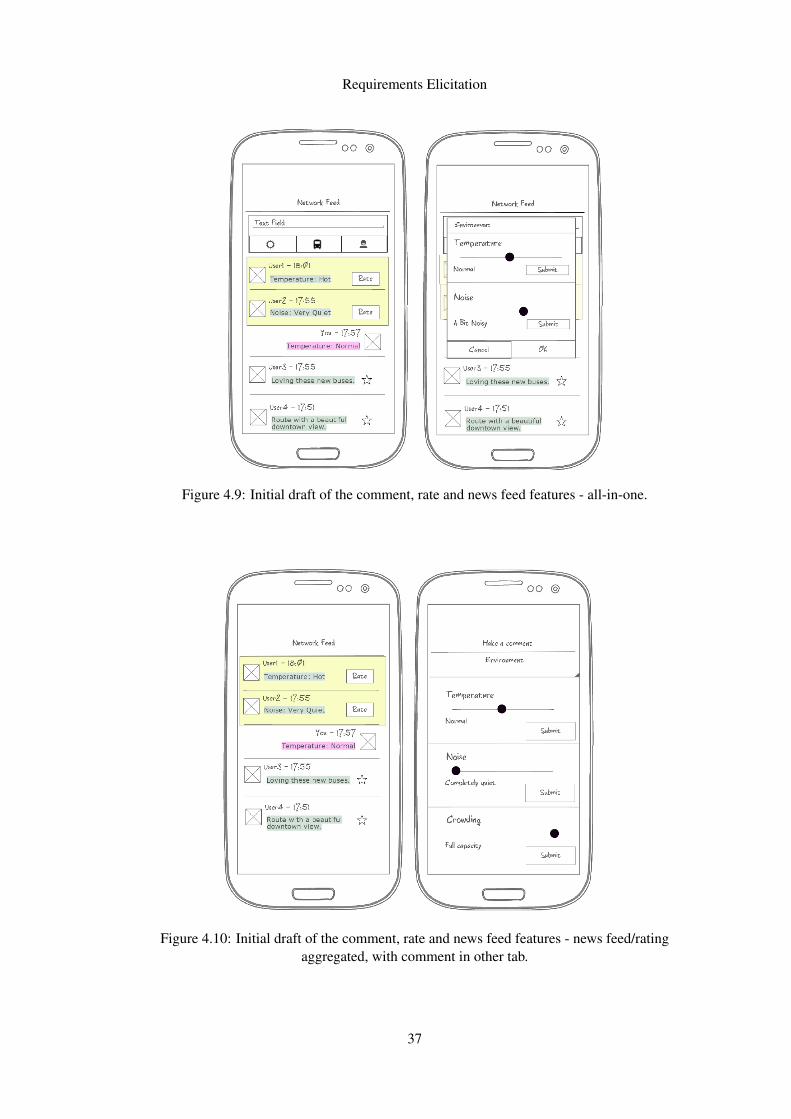
Requirements Elicitation
Figure 4.9: Initial draft of the comment, rate and news feed features - all-in-one.
Figure 4.10: Initial draft of the comment, rate and news feed features - news feed/ratingaggregated, with comment in other tab.
37
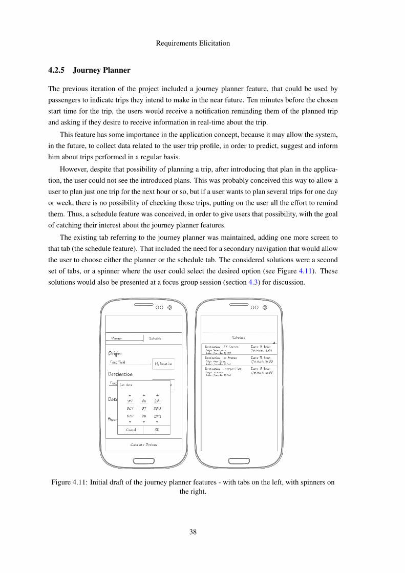
Requirements Elicitation
4.2.5 Journey Planner
The previous iteration of the project included a journey planner feature, that could be used by
passengers to indicate trips they intend to make in the near future. Ten minutes before the chosen
start time for the trip, the users would receive a notification reminding them of the planned trip
and asking if they desire to receive information in real-time about the trip.
This feature has some importance in the application concept, because it may allow the system,
in the future, to collect data related to the user trip profile, in order to predict, suggest and inform
him about trips performed in a regular basis.
However, despite that possibility of planning a trip, after introducing that plan in the applica-
tion, the user could not see the introduced plans. This was probably conceived this way to allow a
user to plan just one trip for the next hour or so, but if a user wants to plan several trips for one day
or week, there is no possibility of checking those trips, putting on the user all the effort to remind
them. Thus, a schedule feature was conceived, in order to give users that possibility, with the goal
of catching their interest about the journey planner features.
The existing tab referring to the journey planner was maintained, adding one more screen to
that tab (the schedule feature). That included the need for a secondary navigation that would allow
the user to choose either the planner or the schedule tab. The considered solutions were a second
set of tabs, or a spinner where the user could select the desired option (see Figure 4.11). These
solutions would also be presented at a focus group session (section 4.3) for discussion.
Figure 4.11: Initial draft of the journey planner features - with tabs on the left, with spinners onthe right.
38
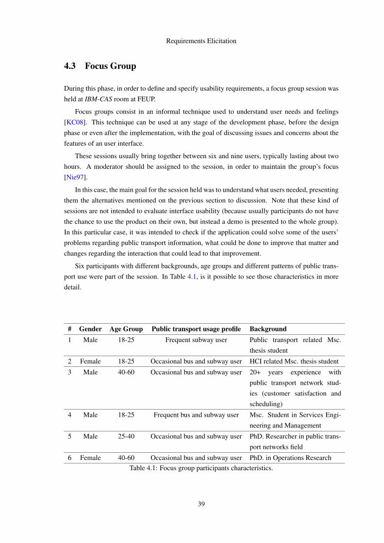
Requirements Elicitation
4.3 Focus Group
During this phase, in order to define and specify usability requirements, a focus group session was
held at IBM-CAS room at FEUP.
Focus groups consist in an informal technique used to understand user needs and feelings
[KC08]. This technique can be used at any stage of the development phase, before the design
phase or even after the implementation, with the goal of discussing issues and concerns about the
features of an user interface.
These sessions usually bring together between six and nine users, typically lasting about two
hours. A moderator should be assigned to the session, in order to maintain the group’s focus
[Nie97].
In this case, the main goal for the session held was to understand what users needed, presenting
them the alternatives mentioned on the previous section to discussion. Note that these kind of
sessions are not intended to evaluate interface usability (because usually participants do not have
the chance to use the product on their own, but instead a demo is presented to the whole group).
In this particular case, it was intended to check if the application could solve some of the users’
problems regarding public transport information, what could be done to improve that matter and
changes regarding the interaction that could lead to that improvement.
Six participants with different backgrounds, age groups and different patterns of public trans-
port use were part of the session. In Table 4.1, is it possible to see those characteristics in more
detail.
# Gender Age Group Public transport usage profile Background1 Male 18-25 Frequent subway user Public transport related Msc.
thesis student
2 Female 18-25 Occasional bus and subway user HCI related Msc. thesis student
3 Male 40-60 Occasional bus and subway user 20+ years experience with
public transport network stud-
ies (customer satisfaction and
scheduling)
4 Male 18-25 Frequent bus and subway user Msc. Student in Services Engi-
neering and Management
5 Male 25-40 Occasional bus and subway user PhD. Researcher in public trans-
port networks field
6 Female 40-60 Occasional bus and subway user PhD. in Operations ResearchTable 4.1: Focus group participants characteristics.
39
Requirements Elicitation
As expected, a lot of ideas came up from the session. However, the ideas and discussions
pointed in a way where a major redesign or rethinking about the application concept was needed.
For instance, assume that a user wanted to perform a journey between a given point, A, and
another given point, B. To go from A to B, there are several options, transportation methods and
routes. In the way the concepts behind the application were currently designed, there was no way
that the user could use it in order to make a informed decision about his trip.
If there are three possibilities to go from A to B, two being distinct bus routes and one being
subway, it is useful to the user to check if there is some problem regarding one or two of these
routes (delay, traffic jam, accident and so on) and possibly change the option he would take, saving
him time and trouble by giving him the information to perform that informed decision.
Even if the user desires to receive information about other journeys (if they do several different
journeys between different points in one way or through the week), this was also impossible to get
with the application.
In short, the following problems were faced:
• Impossibility of checking the information before entering the vehicle - as the user had to
check-in in a route and vehicle prior to submit and, more importantly, to receive information.
• Impossibility of checking more than one route at a time - User only could receive informa-
tion from the route where he was checked-in, and could only be checked-in at one route.
If the possibility of receiving information for several trips was introduced, one of the sugges-
tions was the possibility to filter which trip (or trips) the user wanted to see information from,
in order to not get lost in the middle of a big volume of information. Taking the same example
situation above (three possible routes between A and B), a user should be capable to, despite re-
ceiving information from the three routes, to hide one or other just to make the visualization of the
information easier, showing it again whenever he wants to.
The discussed solutions referring user profile information (Figures 4.7 and 4.8) resulted in the
conclusion that the users do not feel comfortable seeing the other users in their temporary network,
because that would imply their information would be accessible to other users as well.
Instead, they valued the existence of a record with the user journeys and user statistics about
some of the aspects of their journey profile.
All users recognised value in the existence of the schedule feature (Figure 4.11), and suggested
as well the existence of favourite trips, which could easily be added to the trips the user desires to
receive information from.
About the interactions proposed, the main navigation composed by tabs with icons and labels
(Figure 4.5 and 4.6) was considered a good way to go. The feedback about the secondary naviga-
tion was mixed, but the secondary set of tabs (for journey planner) was considered easier to learn,
because the user does not have to open the spinner widget to see all the available options in the
secondary navigation.
40
Requirements Elicitation
Some others conclusions pointed to the importance of the rewards given to the users, to im-
prove user engagement with the application, and that the trip aspects that the users value the most
are related with security and service quality.
In the following chapter it is possible to see the changes that the gathered data and conclusions
introduced to the application concept and its features and interaction.
41

Requirements Elicitation
42
Chapter 5
Application Development
This chapter covers in detail the development phase for the application, starting with the sugges-
tions obtained in the performed focus group to evolve the initial drafts all along to the implemen-
tation phase. In the section 5.2, that process will be described, concept by concept.
5.1 Architecture
5.1.1 Data Model
The data model for this application was initially the same conceived and referred in [eSG12]. That
said, it carries the same assumptions and limitations then assumed, such as the simplified network
concept (where a network is not centred in the user, as desired for the future, but represents a
single line and direction). Therefore, checking-in in a network represents sharing information
with other users in the same line or direction, while it should represent sharing information with
users performing trips in a set of routes, lines or directions with relevance to the origin-destination
pair where the user checked-in.
The original data model was refined in a second iteration of the project, aiming to give addi-
tional intelligence to the application, by calculating relevant routes for a given origin and destina-
tion. The relevant routes are calculated through inference on past data from validations supplied
by STCP, and users in routes considered relevant are added to the initial user temporary network
(the same who provided the origin and destination used to perform that calculation) [Dia13].
The refined data model introduced another change: the usage of transport public data from the
city of Porto, while the older one used data from Transport for London(TFL), which were used in
the tests performed in the field among users.
In this work, some adaptations to this second version of the data model were made, in order
to allow some concept modifications. Those adaptations will be mentioned and explained in the
following sections, along with the reasons that lead to them.
43
Application Development
5.1.2 Android Application
As said before, the technology chosen for the functional prototype of the application is Android.
This choice was made due to several reasons.
The first reason is portability. Android applications are developed in Java (although, a modified
version of Java, along with XML). Java code is compiled to run in any Java virtual machine,
making it possible to develop applications in any environment, either it is Windows, Linux or Mac
OS.
The choice about target version has fallen on the Ice Cream Sandwich API, which, as men-
tioned in section 4.2.1, has several advantages regarding UI design and implementation and inter-
action patterns.
This choice was reinforced by an additional point: Android Cloud to Device Messaging
Framework, that allowed push notifications to be sent to the application. Those notifications
would allow the rating feature as it was conceived previously, prompting 2 random users from
a network to rate a submitted comment from that network. However, Cloud to Device Messaging
Framework (C2DM) has been deprecated in July 2012, being replaced by a new service, Google
Cloud Messaging (GCM).
If the maintenance and refactoring of the code that made that rating feature work in the pre-
vious application (and webservice) was a point in favour of adopting Android 2.2 for the imple-
mentation of the application, that change (allied to the already pointed limitations of the existing
rating system), were strong points against it.
5.1.3 Webservice
The webservice connecting the existing database (as well as other data concerning the route rele-
vance calculation) and the mobile application was also the same developed in [eSG12].
Similar to what was said about the data model, an effort was made to integrate, when pos-
sible, the existing webservice with the new application prototype. However, some concept and
feature modifications required changes to the webservice as well. Those modifications will also
be mentioned in the following sections.
44
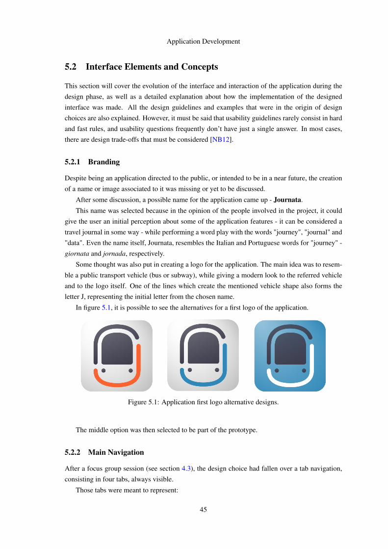
Application Development
5.2 Interface Elements and Concepts
This section will cover the evolution of the interface and interaction of the application during the
design phase, as well as a detailed explanation about how the implementation of the designed
interface was made. All the design guidelines and examples that were in the origin of design
choices are also explained. However, it must be said that usability guidelines rarely consist in hard
and fast rules, and usability questions frequently don’t have just a single answer. In most cases,
there are design trade-offs that must be considered [NB12].
5.2.1 Branding
Despite being an application directed to the public, or intended to be in a near future, the creation
of a name or image associated to it was missing or yet to be discussed.
After some discussion, a possible name for the application came up - Journata.
This name was selected because in the opinion of the people involved in the project, it could
give the user an initial perception about some of the application features - it can be considered a
travel journal in some way - while performing a word play with the words "journey", "journal" and
"data". Even the name itself, Journata, resembles the Italian and Portuguese words for "journey" -
giornata and jornada, respectively.
Some thought was also put in creating a logo for the application. The main idea was to resem-
ble a public transport vehicle (bus or subway), while giving a modern look to the referred vehicle
and to the logo itself. One of the lines which create the mentioned vehicle shape also forms the
letter J, representing the initial letter from the chosen name.
In figure 5.1, it is possible to see the alternatives for a first logo of the application.
Figure 5.1: Application first logo alternative designs.
The middle option was then selected to be part of the prototype.
5.2.2 Main Navigation
After a focus group session (see section 4.3), the design choice had fallen over a tab navigation,
consisting in four tabs, always visible.
Those tabs were meant to represent:
45
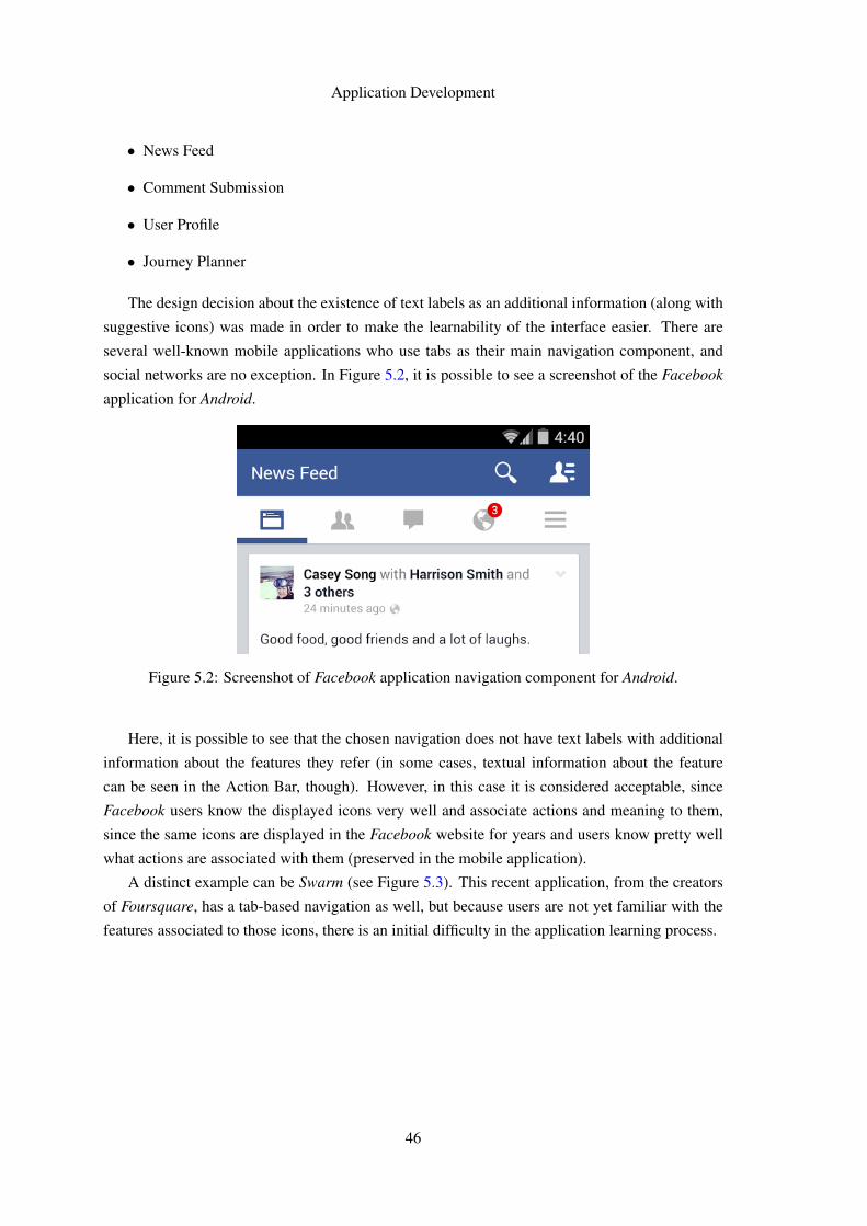
Application Development
• News Feed
• Comment Submission
• User Profile
• Journey Planner
The design decision about the existence of text labels as an additional information (along with
suggestive icons) was made in order to make the learnability of the interface easier. There are
several well-known mobile applications who use tabs as their main navigation component, and
social networks are no exception. In Figure 5.2, it is possible to see a screenshot of the Facebook
application for Android.
Figure 5.2: Screenshot of Facebook application navigation component for Android.
Here, it is possible to see that the chosen navigation does not have text labels with additional
information about the features they refer (in some cases, textual information about the feature
can be seen in the Action Bar, though). However, in this case it is considered acceptable, since
Facebook users know the displayed icons very well and associate actions and meaning to them,
since the same icons are displayed in the Facebook website for years and users know pretty well
what actions are associated with them (preserved in the mobile application).
A distinct example can be Swarm (see Figure 5.3). This recent application, from the creators
of Foursquare, has a tab-based navigation as well, but because users are not yet familiar with the
features associated to those icons, there is an initial difficulty in the application learning process.
46
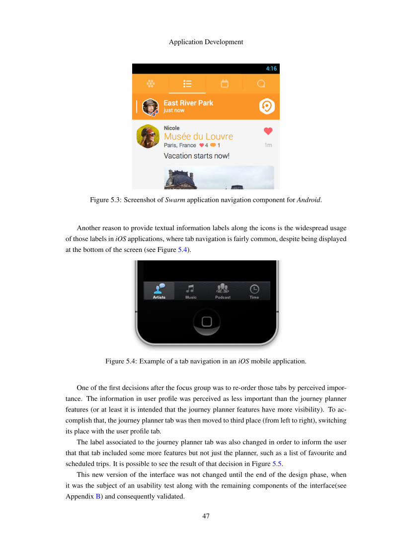
Application Development
Figure 5.3: Screenshot of Swarm application navigation component for Android.
Another reason to provide textual information labels along the icons is the widespread usage
of those labels in iOS applications, where tab navigation is fairly common, despite being displayed
at the bottom of the screen (see Figure 5.4).
Figure 5.4: Example of a tab navigation in an iOS mobile application.
One of the first decisions after the focus group was to re-order those tabs by perceived impor-
tance. The information in user profile was perceived as less important than the journey planner
features (or at least it is intended that the journey planner features have more visibility). To ac-
complish that, the journey planner tab was then moved to third place (from left to right), switching
its place with the user profile tab.
The label associated to the journey planner tab was also changed in order to inform the user
that that tab included some more features but not just the planner, such as a list of favourite and
scheduled trips. It is possible to see the result of that decision in Figure 5.5.
This new version of the interface was not changed until the end of the design phase, when
it was the subject of an usability test along with the remaining components of the interface(see
Appendix B) and consequently validated.
47
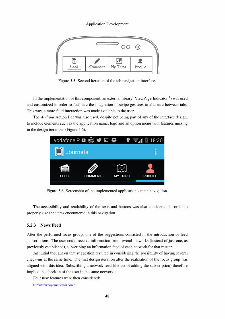
Application Development
Figure 5.5: Second iteration of the tab navigation interface.
In the implementation of this component, an external library (ViewPagerIndicator 1) was used
and customized in order to facilitate the integration of swipe gestures to alternate between tabs.
This way, a more fluid interaction was made available to the user.
The Android Action Bar was also used, despite not being part of any of the interface design,
to include elements such as the application name, logo and an option menu with features missing
in the design iterations (Figure 5.6).
Figure 5.6: Screenshot of the implemented application’s main navigation.
The accessibility and readability of the texts and buttons was also considered, in order to
properly size the items encountered in this navigation.
5.2.3 News Feed
After the performed focus group, one of the suggestions consisted in the introduction of feed
subscriptions. The user could receive information from several networks (instead of just one, as
previously established), subscribing an information feed of each network for that matter.
An initial thought on that suggestion resulted in considering the possibility of having several
check-ins at the same time. The first design iteration after the realization of the focus group was
aligned with this idea. Subscribing a network feed (the act of adding the subscription) therefore
implied the check-in of the user in the same network.
Four new features were then considered:1http://viewpagerindicator.com/
48
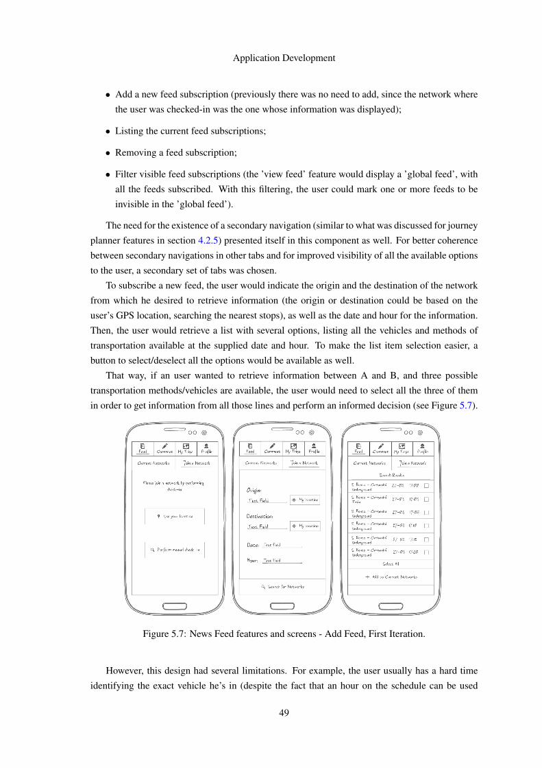
Application Development
• Add a new feed subscription (previously there was no need to add, since the network where
the user was checked-in was the one whose information was displayed);
• Listing the current feed subscriptions;
• Removing a feed subscription;
• Filter visible feed subscriptions (the ’view feed’ feature would display a ’global feed’, with
all the feeds subscribed. With this filtering, the user could mark one or more feeds to be
invisible in the ’global feed’).
The need for the existence of a secondary navigation (similar to what was discussed for journey
planner features in section 4.2.5) presented itself in this component as well. For better coherence
between secondary navigations in other tabs and for improved visibility of all the available options
to the user, a secondary set of tabs was chosen.
To subscribe a new feed, the user would indicate the origin and the destination of the network
from which he desired to retrieve information (the origin or destination could be based on the
user’s GPS location, searching the nearest stops), as well as the date and hour for the information.
Then, the user would retrieve a list with several options, listing all the vehicles and methods of
transportation available at the supplied date and hour. To make the list item selection easier, a
button to select/deselect all the options would be available as well.
That way, if an user wanted to retrieve information between A and B, and three possible
transportation methods/vehicles are available, the user would need to select all the three of them
in order to get information from all those lines and perform an informed decision (see Figure 5.7).
Figure 5.7: News Feed features and screens - Add Feed, First Iteration.
However, this design had several limitations. For example, the user usually has a hard time
identifying the exact vehicle he’s in (despite the fact that an hour on the schedule can be used
49
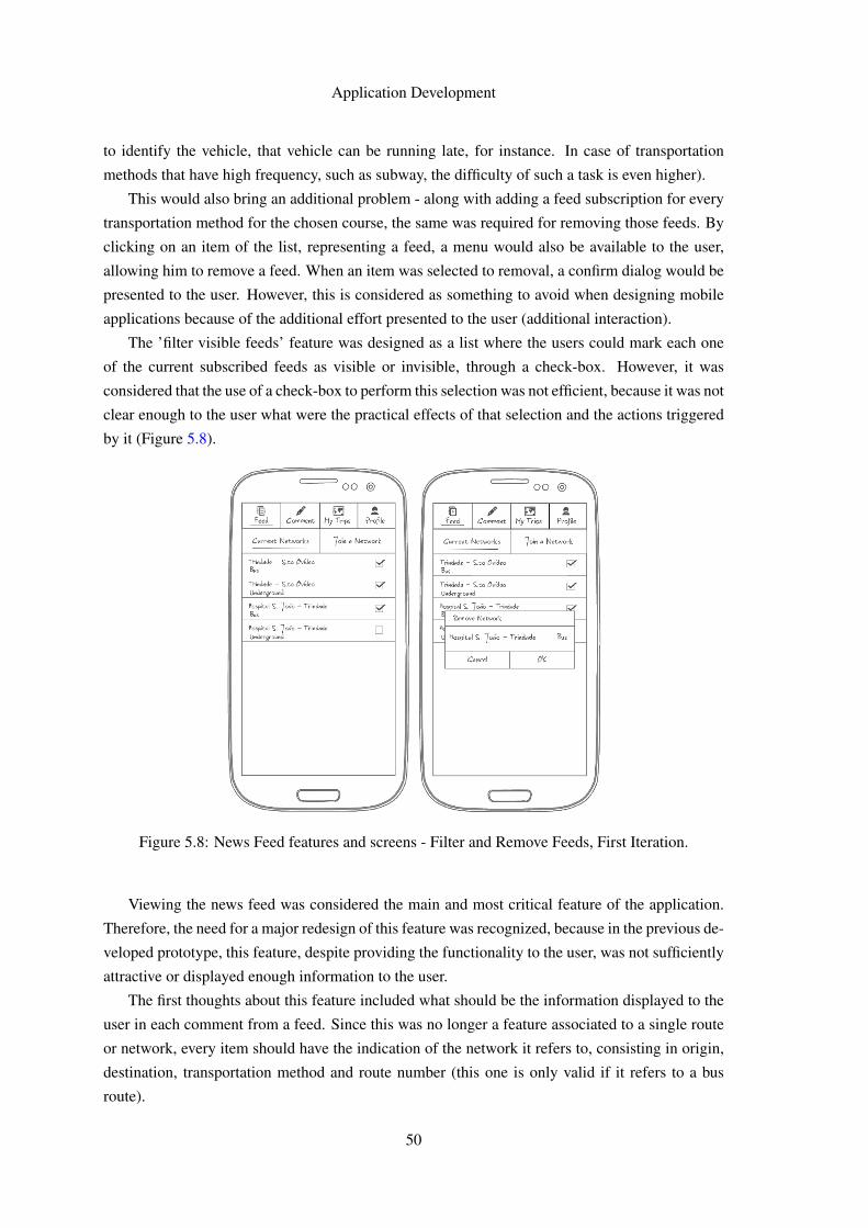
Application Development
to identify the vehicle, that vehicle can be running late, for instance. In case of transportation
methods that have high frequency, such as subway, the difficulty of such a task is even higher).
This would also bring an additional problem - along with adding a feed subscription for every
transportation method for the chosen course, the same was required for removing those feeds. By
clicking on an item of the list, representing a feed, a menu would also be available to the user,
allowing him to remove a feed. When an item was selected to removal, a confirm dialog would be
presented to the user. However, this is considered as something to avoid when designing mobile
applications because of the additional effort presented to the user (additional interaction).
The ’filter visible feeds’ feature was designed as a list where the users could mark each one
of the current subscribed feeds as visible or invisible, through a check-box. However, it was
considered that the use of a check-box to perform this selection was not efficient, because it was not
clear enough to the user what were the practical effects of that selection and the actions triggered
by it (Figure 5.8).
Figure 5.8: News Feed features and screens - Filter and Remove Feeds, First Iteration.
Viewing the news feed was considered the main and most critical feature of the application.
Therefore, the need for a major redesign of this feature was recognized, because in the previous de-
veloped prototype, this feature, despite providing the functionality to the user, was not sufficiently
attractive or displayed enough information to the user.
The first thoughts about this feature included what should be the information displayed to the
user in each comment from a feed. Since this was no longer a feature associated to a single route
or network, every item should have the indication of the network it refers to, consisting in origin,
destination, transportation method and route number (this one is only valid if it refers to a bus
route).
50
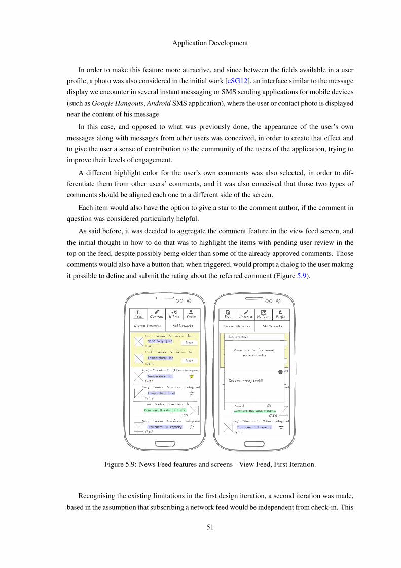
Application Development
In order to make this feature more attractive, and since between the fields available in a user
profile, a photo was also considered in the initial work [eSG12], an interface similar to the message
display we encounter in several instant messaging or SMS sending applications for mobile devices
(such as Google Hangouts, Android SMS application), where the user or contact photo is displayed
near the content of his message.
In this case, and opposed to what was previously done, the appearance of the user’s own
messages along with messages from other users was conceived, in order to create that effect and
to give the user a sense of contribution to the community of the users of the application, trying to
improve their levels of engagement.
A different highlight color for the user’s own comments was also selected, in order to dif-
ferentiate them from other users’ comments, and it was also conceived that those two types of
comments should be aligned each one to a different side of the screen.
Each item would also have the option to give a star to the comment author, if the comment in
question was considered particularly helpful.
As said before, it was decided to aggregate the comment feature in the view feed screen, and
the initial thought in how to do that was to highlight the items with pending user review in the
top on the feed, despite possibly being older than some of the already approved comments. Those
comments would also have a button that, when triggered, would prompt a dialog to the user making
it possible to define and submit the rating about the referred comment (Figure 5.9).
Figure 5.9: News Feed features and screens - View Feed, First Iteration.
Recognising the existing limitations in the first design iteration, a second iteration was made,
based in the assumption that subscribing a network feed would be independent from check-in. This
51
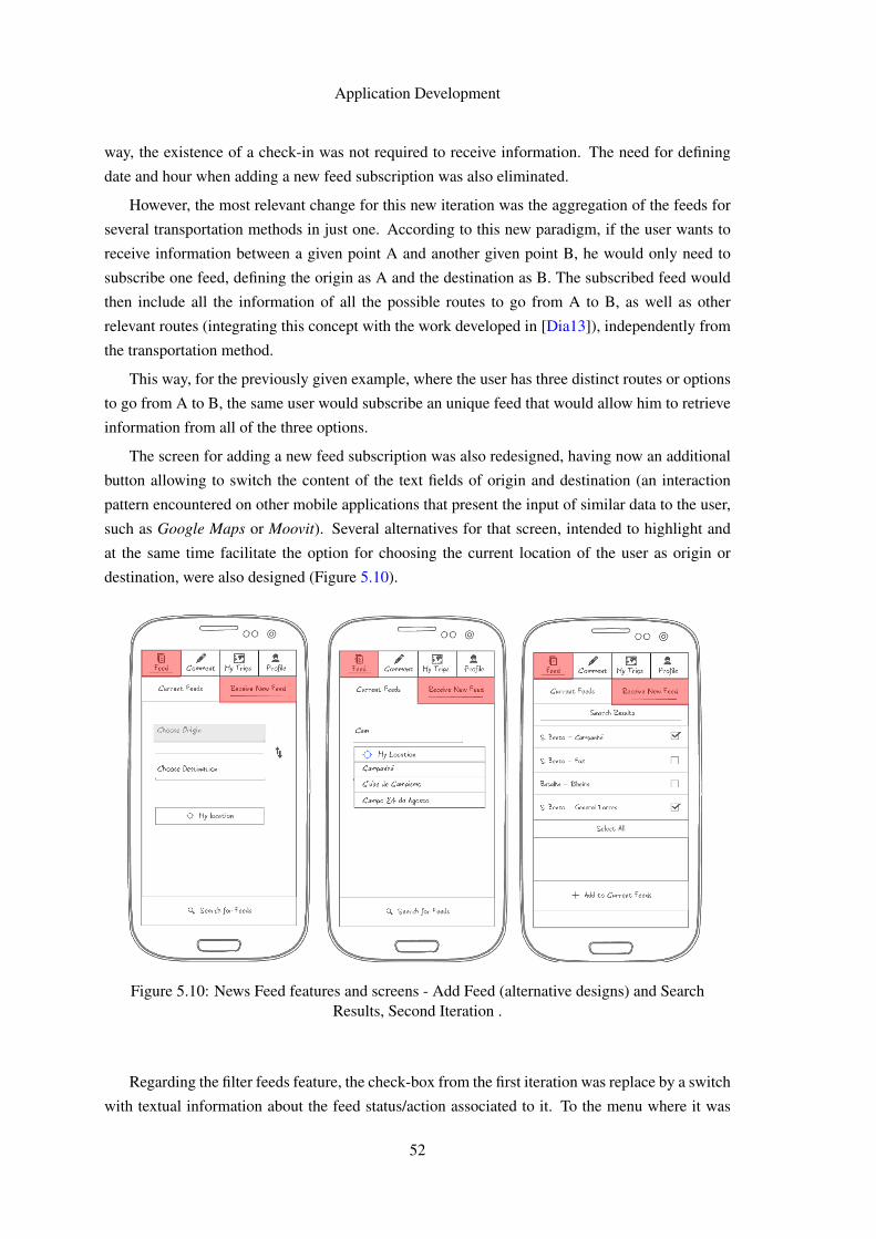
Application Development
way, the existence of a check-in was not required to receive information. The need for defining
date and hour when adding a new feed subscription was also eliminated.
However, the most relevant change for this new iteration was the aggregation of the feeds for
several transportation methods in just one. According to this new paradigm, if the user wants to
receive information between a given point A and another given point B, he would only need to
subscribe one feed, defining the origin as A and the destination as B. The subscribed feed would
then include all the information of all the possible routes to go from A to B, as well as other
relevant routes (integrating this concept with the work developed in [Dia13]), independently from
the transportation method.
This way, for the previously given example, where the user has three distinct routes or options
to go from A to B, the same user would subscribe an unique feed that would allow him to retrieve
information from all of the three options.
The screen for adding a new feed subscription was also redesigned, having now an additional
button allowing to switch the content of the text fields of origin and destination (an interaction
pattern encountered on other mobile applications that present the input of similar data to the user,
such as Google Maps or Moovit). Several alternatives for that screen, intended to highlight and
at the same time facilitate the option for choosing the current location of the user as origin or
destination, were also designed (Figure 5.10).
Figure 5.10: News Feed features and screens - Add Feed (alternative designs) and SearchResults, Second Iteration .
Regarding the filter feeds feature, the check-box from the first iteration was replace by a switch
with textual information about the feed status/action associated to it. To the menu where it was
52
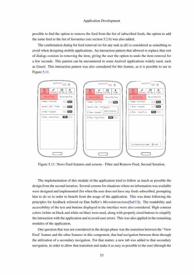
Application Development
possible to find the option to remove the feed from the list of subscribed feeds, the option to add
the same feed to the list of favourites (see section 5.2.6) was also added.
The confirmation dialog for feed removal (or for any task at all) is considered as something to
avoid when designing mobile applications. An interaction pattern that allowed to replace that sort
of dialogs consists in removing the item, giving the user the option to undo the item removal for
a few seconds. This pattern can be encountered in some Android applications widely used, such
as Gmail. This interaction pattern was also considered for this feature, as it is possible to see in
Figure 5.11.
Figure 5.11: News Feed features and screens - Filter and Remove Feed, Second Iteration.
The implementation of this module of the application tried to follow as much as possible the
design from the second iteration. Several screens for situations where no information was available
were designed and implemented (for when the user does not have any feeds subscribed, prompting
him to do so in order to benefit from the usage of the application. This was done following the
principles for feedback referred on Dan Saffer’s Microinteractions[Saf13]). The readability and
accessibility of the text and buttons displayed in the interface were also considered. High contrast
colors (white on black and white on blue) were used, along with properly sized buttons to simplify
the interaction with the application and to avoid user errors. This was also applied in the remaining
modules of the application.
One question that was not considered in the design phase was the transition between the ’View
Feed’ feature and the other features in this component, that had navigation between them through
the utilization of a secondary navigation. For that matter, a new tab was added to that secondary
navigation, in order to allow that transition and make it as easy as possible to the user (through the
53
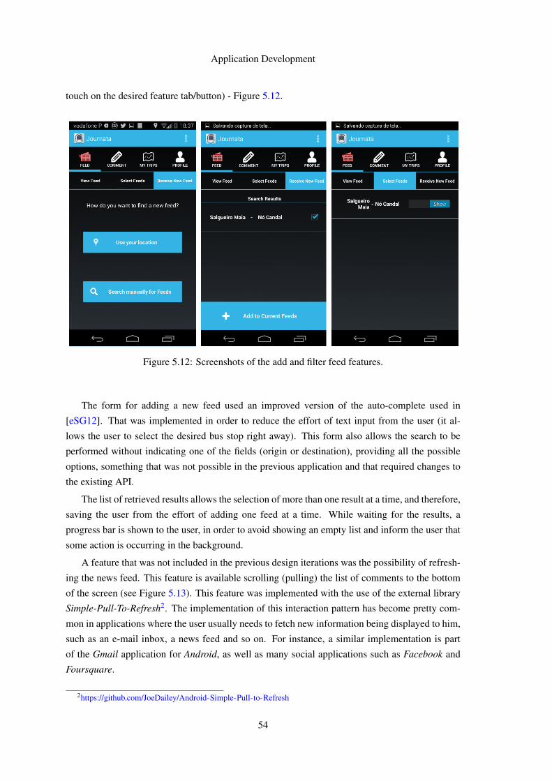
Application Development
touch on the desired feature tab/button) - Figure 5.12.
Figure 5.12: Screenshots of the add and filter feed features.
The form for adding a new feed used an improved version of the auto-complete used in
[eSG12]. That was implemented in order to reduce the effort of text input from the user (it al-
lows the user to select the desired bus stop right away). This form also allows the search to be
performed without indicating one of the fields (origin or destination), providing all the possible
options, something that was not possible in the previous application and that required changes to
the existing API.
The list of retrieved results allows the selection of more than one result at a time, and therefore,
saving the user from the effort of adding one feed at a time. While waiting for the results, a
progress bar is shown to the user, in order to avoid showing an empty list and inform the user that
some action is occurring in the background.
A feature that was not included in the previous design iterations was the possibility of refresh-
ing the news feed. This feature is available scrolling (pulling) the list of comments to the bottom
of the screen (see Figure 5.13). This feature was implemented with the use of the external library
Simple-Pull-To-Refresh2. The implementation of this interaction pattern has become pretty com-
mon in applications where the user usually needs to fetch new information being displayed to him,
such as an e-mail inbox, a news feed and so on. For instance, a similar implementation is part
of the Gmail application for Android, as well as many social applications such as Facebook and
Foursquare.
2https://github.com/JoeDailey/Android-Simple-Pull-to-Refresh
54
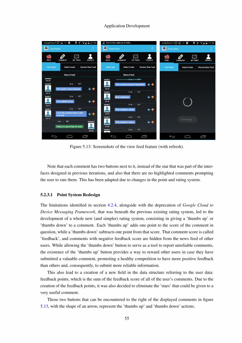
Application Development
Figure 5.13: Screenshots of the view feed feature (with refresh).
Note that each comment has two buttons next to it, instead of the star that was part of the inter-
faces designed in previous iterations, and also that there are no highlighted comments prompting
the user to rate them. This has been adapted due to changes in the point and rating system.
5.2.3.1 Point System Redesign
The limitations identified in section 4.2.4, alongside with the deprecation of Google Cloud to
Device Messaging Framework, that was beneath the previous existing rating system, led to the
development of a whole new (and simpler) rating system, consisting in giving a ’thumbs up’ or
’thumbs down’ to a comment. Each ’thumbs up’ adds one point to the score of the comment in
question, while a ’thumbs down’ subtracts one point from that score. That comment score is called
’feedback’, and comments with negative feedback score are hidden from the news feed of other
users. While allowing the ’thumbs down’ button to serve as a tool to report unreliable comments,
the existence of the ’thumbs up’ button provides a way to reward other users in case they have
submitted a valuable comment, promoting a healthy competition to have more positive feedback
than others and, consequently, to submit more reliable information.
This also lead to a creation of a new field in the data structure referring to the user data:
feedback points, which is the sum of the feedback score of all of the user’s comments. Due to the
creation of the feedback points, it was also decided to eliminate the ’stars’ that could be given to a
very useful comment.
Those two buttons that can be encountered to the right of the displayed comments in figure
5.13, with the shape of an arrow, represent the ’thumbs up’ and ’thumbs down’ actions.
55
Application Development
In order to display the network feed information, additional changes to the API were made.
The existing implementation required an existing login and check-in in order to retrieve the set of
information from a network, retrieving only the information for the network where the user was
checked-in. Changes to that ’request’ method had to be made in order to retrieve data from any
network without those limitations.
5.2.4 Authentication
Authentication is obviously present in the majority of applications, because most of them have
features that require a creation of a user account.
All the effort of doing that, however, has been reduced in many applications, through allowing
registration via an existing account for a known and widely used social network or type of ac-
count. For instance, it is fairly common to encounter an application where registering an account
can be made using our Facebook, Twitter or Google account. In theory, the implementation of
authentication via Google account will require less effort, within the mentioned options, because
Android users have a Google account associated to their mobile device and are usually already
authenticated in that account when using it.
The main concern about reducing the registration effort to the user is related with the possible
risk of abandon. Having extensive registration forms reduced the user motivation to continue that
process and create an account (and consequently, to use the application). That concern is even
bigger in mobile applications, where text input is harder and prone to user errors (small-sized
keys, allied in most cases to writing while performing other tasks, such as walking).
That said, minimizing the text input is the way to go when developing mobile applications.
However, that is not enough.
One of the most important guidelines for the development of mobile applications is to avoid
making users pass through a registration screen as a starting point to use the application. When
a user starts using an application for the first time, he has a low level of commitment. Unless the
application offers immense value to him, as quickly as possible, users won’t use it enough to make
registration worth their while.
Forcing users to register before they are sufficiently convinced of the value provided by the
application will probably cause many of them to simply back out from it and never try it again,
therefore losing the chance of causing a first impression [NB12].
This guideline is not exactly new, as it is recommended since 1999 in e-commerce sites (a
user should be able to buy items without having to register). Its importance, though, is greater in
mobile applications, because every extra step that the user must pass through causes considerable
effort, and users are less committed to an app they just downloaded than to a website where they
have spent time browsing before being prompted to create an account.
"Registration on the first screen is an example of ’take before you give’: Apps want
users to spend time and effort without any perceived benefit. Asking for permission
to send notifications of use the current location before users find out what the app is
56
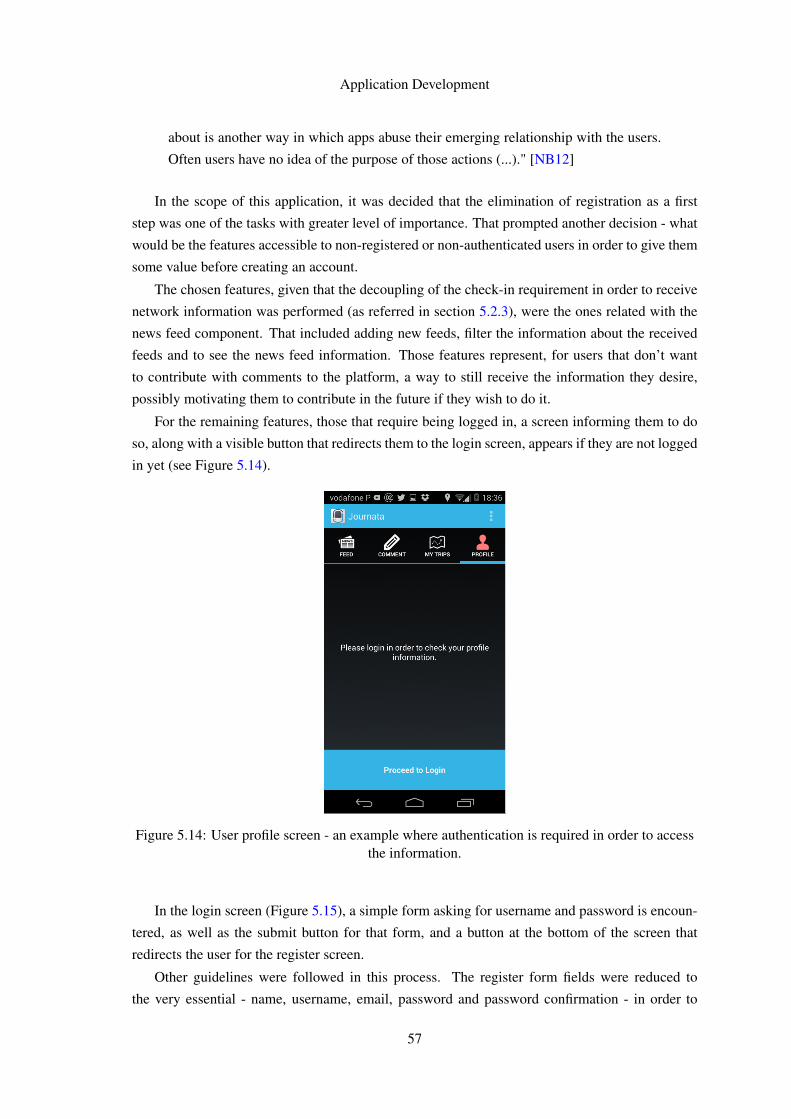
Application Development
about is another way in which apps abuse their emerging relationship with the users.
Often users have no idea of the purpose of those actions (...)." [NB12]
In the scope of this application, it was decided that the elimination of registration as a first
step was one of the tasks with greater level of importance. That prompted another decision - what
would be the features accessible to non-registered or non-authenticated users in order to give them
some value before creating an account.
The chosen features, given that the decoupling of the check-in requirement in order to receive
network information was performed (as referred in section 5.2.3), were the ones related with the
news feed component. That included adding new feeds, filter the information about the received
feeds and to see the news feed information. Those features represent, for users that don’t want
to contribute with comments to the platform, a way to still receive the information they desire,
possibly motivating them to contribute in the future if they wish to do it.
For the remaining features, those that require being logged in, a screen informing them to do
so, along with a visible button that redirects them to the login screen, appears if they are not logged
in yet (see Figure 5.14).
Figure 5.14: User profile screen - an example where authentication is required in order to accessthe information.
In the login screen (Figure 5.15), a simple form asking for username and password is encoun-
tered, as well as the submit button for that form, and a button at the bottom of the screen that
redirects the user for the register screen.
Other guidelines were followed in this process. The register form fields were reduced to
the very essential - name, username, email, password and password confirmation - in order to
57
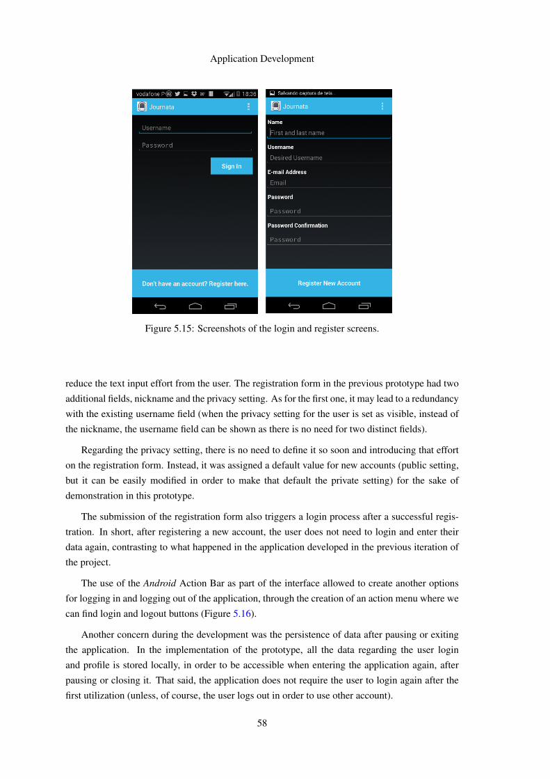
Application Development
Figure 5.15: Screenshots of the login and register screens.
reduce the text input effort from the user. The registration form in the previous prototype had two
additional fields, nickname and the privacy setting. As for the first one, it may lead to a redundancy
with the existing username field (when the privacy setting for the user is set as visible, instead of
the nickname, the username field can be shown as there is no need for two distinct fields).
Regarding the privacy setting, there is no need to define it so soon and introducing that effort
on the registration form. Instead, it was assigned a default value for new accounts (public setting,
but it can be easily modified in order to make that default the private setting) for the sake of
demonstration in this prototype.
The submission of the registration form also triggers a login process after a successful regis-
tration. In short, after registering a new account, the user does not need to login and enter their
data again, contrasting to what happened in the application developed in the previous iteration of
the project.
The use of the Android Action Bar as part of the interface allowed to create another options
for logging in and logging out of the application, through the creation of an action menu where we
can find login and logout buttons (Figure 5.16).
Another concern during the development was the persistence of data after pausing or exiting
the application. In the implementation of the prototype, all the data regarding the user login
and profile is stored locally, in order to be accessible when entering the application again, after
pausing or closing it. That said, the application does not require the user to login again after the
first utilization (unless, of course, the user logs out in order to use other account).
58
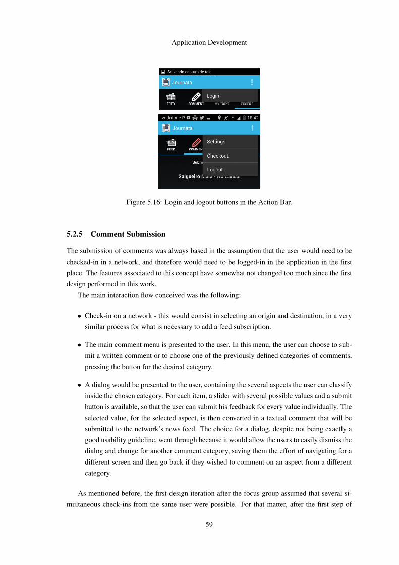
Application Development
Figure 5.16: Login and logout buttons in the Action Bar.
5.2.5 Comment Submission
The submission of comments was always based in the assumption that the user would need to be
checked-in in a network, and therefore would need to be logged-in in the application in the first
place. The features associated to this concept have somewhat not changed too much since the first
design performed in this work.
The main interaction flow conceived was the following:
• Check-in on a network - this would consist in selecting an origin and destination, in a very
similar process for what is necessary to add a feed subscription.
• The main comment menu is presented to the user. In this menu, the user can choose to sub-
mit a written comment or to choose one of the previously defined categories of comments,
pressing the button for the desired category.
• A dialog would be presented to the user, containing the several aspects the user can classify
inside the chosen category. For each item, a slider with several possible values and a submit
button is available, so that the user can submit his feedback for every value individually. The
selected value, for the selected aspect, is then converted in a textual comment that will be
submitted to the network’s news feed. The choice for a dialog, despite not being exactly a
good usability guideline, went through because it would allow the users to easily dismiss the
dialog and change for another comment category, saving them the effort of navigating for a
different screen and then go back if they wished to comment on an aspect from a different
category.
As mentioned before, the first design iteration after the focus group assumed that several si-
multaneous check-ins from the same user were possible. For that matter, after the first step of
59
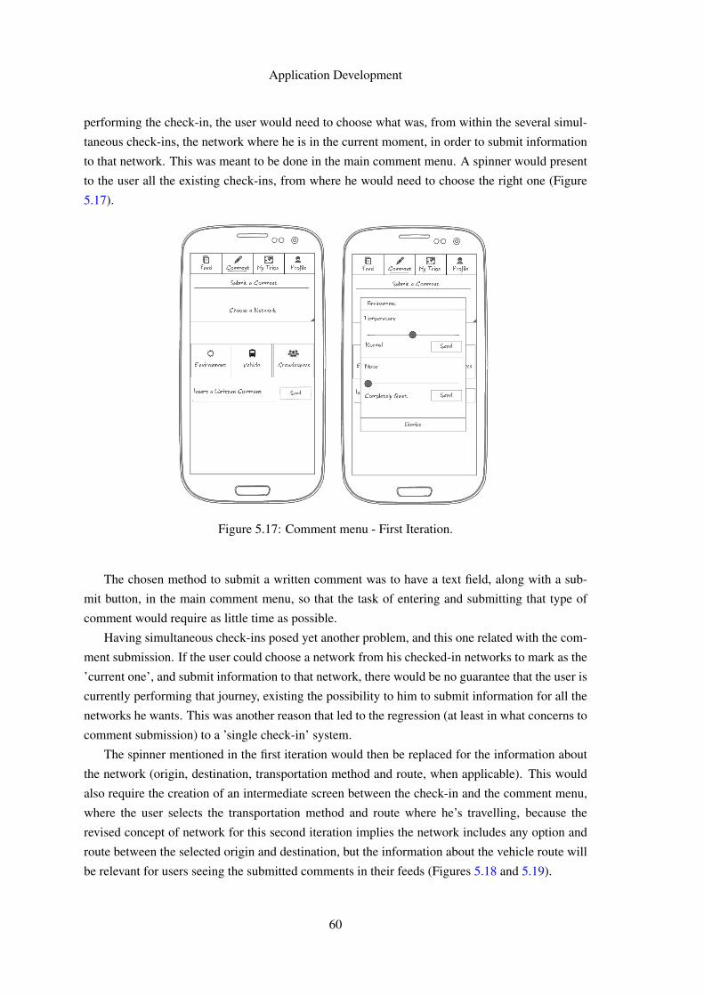
Application Development
performing the check-in, the user would need to choose what was, from within the several simul-
taneous check-ins, the network where he is in the current moment, in order to submit information
to that network. This was meant to be done in the main comment menu. A spinner would present
to the user all the existing check-ins, from where he would need to choose the right one (Figure
5.17).
Figure 5.17: Comment menu - First Iteration.
The chosen method to submit a written comment was to have a text field, along with a sub-
mit button, in the main comment menu, so that the task of entering and submitting that type of
comment would require as little time as possible.
Having simultaneous check-ins posed yet another problem, and this one related with the com-
ment submission. If the user could choose a network from his checked-in networks to mark as the
’current one’, and submit information to that network, there would be no guarantee that the user is
currently performing that journey, existing the possibility to him to submit information for all the
networks he wants. This was another reason that led to the regression (at least in what concerns to
comment submission) to a ’single check-in’ system.
The spinner mentioned in the first iteration would then be replaced for the information about
the network (origin, destination, transportation method and route, when applicable). This would
also require the creation of an intermediate screen between the check-in and the comment menu,
where the user selects the transportation method and route where he’s travelling, because the
revised concept of network for this second iteration implies the network includes any option and
route between the selected origin and destination, but the information about the vehicle route will
be relevant for users seeing the submitted comments in their feeds (Figures 5.18 and 5.19).
60
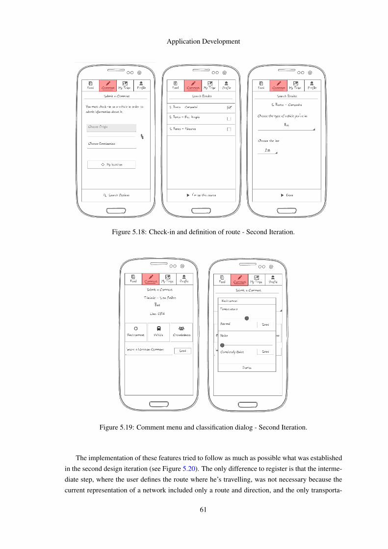
Application Development
Figure 5.18: Check-in and definition of route - Second Iteration.
Figure 5.19: Comment menu and classification dialog - Second Iteration.
The implementation of these features tried to follow as much as possible what was established
in the second design iteration (see Figure 5.20). The only difference to register is that the interme-
diate step, where the user defines the route where he’s travelling, was not necessary because the
current representation of a network included only a route and direction, and the only transporta-
61
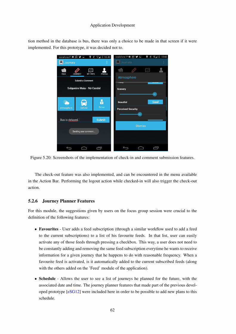
Application Development
tion method in the database is bus, there was only a choice to be made in that screen if it were
implemented. For this prototype, it was decided not to.
Figure 5.20: Screenshots of the implementation of check-in and comment submission features.
The check-out feature was also implemented, and can be encountered in the menu available
in the Action Bar. Performing the logout action while checked-in will also trigger the check-out
action.
5.2.6 Journey Planner Features
For this module, the suggestions given by users on the focus group session were crucial to the
definition of the following features:
• Favourites - User adds a feed subscription (through a similar workflow used to add a feed
to the current subscriptions) to a list of his favourite feeds. In that list, user can easily
activate any of those feeds through pressing a checkbox. This way, a user does not need to
be constantly adding and removing the same feed subscription everytime he wants to receive
information for a given journey that he happens to do with reasonable frequency. When a
favourite feed is activated, is it automatically added to the current subscribed feeds (along
with the others added on the ’Feed’ module of the application).
• Schedule - Allows the user to see a list of journeys he planned for the future, with the
associated date and time. The journey planner features that made part of the previous devel-
oped prototype [eSG12] were included here in order to be possible to add new plans to this
schedule.
62
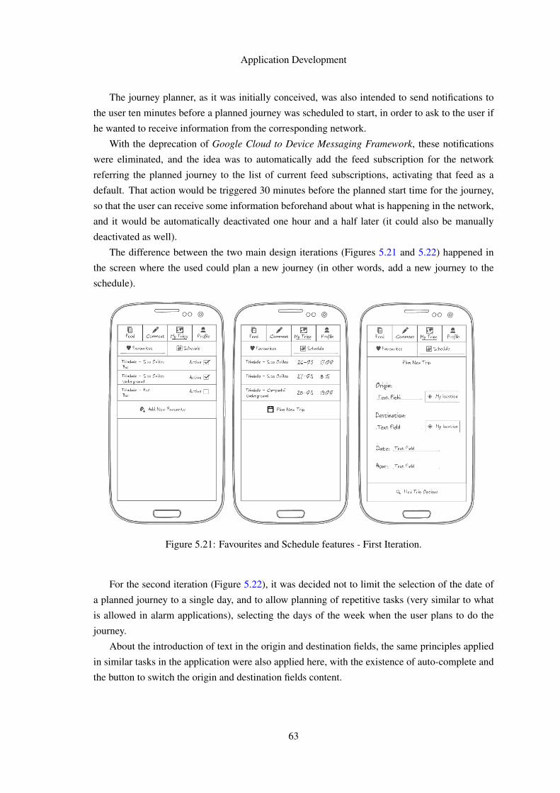
Application Development
The journey planner, as it was initially conceived, was also intended to send notifications to
the user ten minutes before a planned journey was scheduled to start, in order to ask to the user if
he wanted to receive information from the corresponding network.
With the deprecation of Google Cloud to Device Messaging Framework, these notifications
were eliminated, and the idea was to automatically add the feed subscription for the network
referring the planned journey to the list of current feed subscriptions, activating that feed as a
default. That action would be triggered 30 minutes before the planned start time for the journey,
so that the user can receive some information beforehand about what is happening in the network,
and it would be automatically deactivated one hour and a half later (it could also be manually
deactivated as well).
The difference between the two main design iterations (Figures 5.21 and 5.22) happened in
the screen where the used could plan a new journey (in other words, add a new journey to the
schedule).
Figure 5.21: Favourites and Schedule features - First Iteration.
For the second iteration (Figure 5.22), it was decided not to limit the selection of the date of
a planned journey to a single day, and to allow planning of repetitive tasks (very similar to what
is allowed in alarm applications), selecting the days of the week when the user plans to do the
journey.
About the introduction of text in the origin and destination fields, the same principles applied
in similar tasks in the application were also applied here, with the existence of auto-complete and
the button to switch the origin and destination fields content.
63
Application Development
Figure 5.22: Favourites and Schedule features - Second Iteration.
The implementation followed what was established in the design phase. However, there were
room for some changes, such as fixing the position of the buttons at the end of the lists (favourites
and schedule) in order to be coherent with the implementation of the remaining modules and
allow the user to perform the majority of the main application flow through the press of well-sized
buttons at the bottom of the screen (Figure 5.23).
An external library was also used to help with the implementation of the date (with repetitive
tasks) and time ’pickers’ for the journey planner, DateTimePicker3, that contained the attractive
widget for those type of tasks that is also possible to find in the most recent versions of Google
Calendar application.
3https://github.com/flavienlaurent/datetimepicker
64
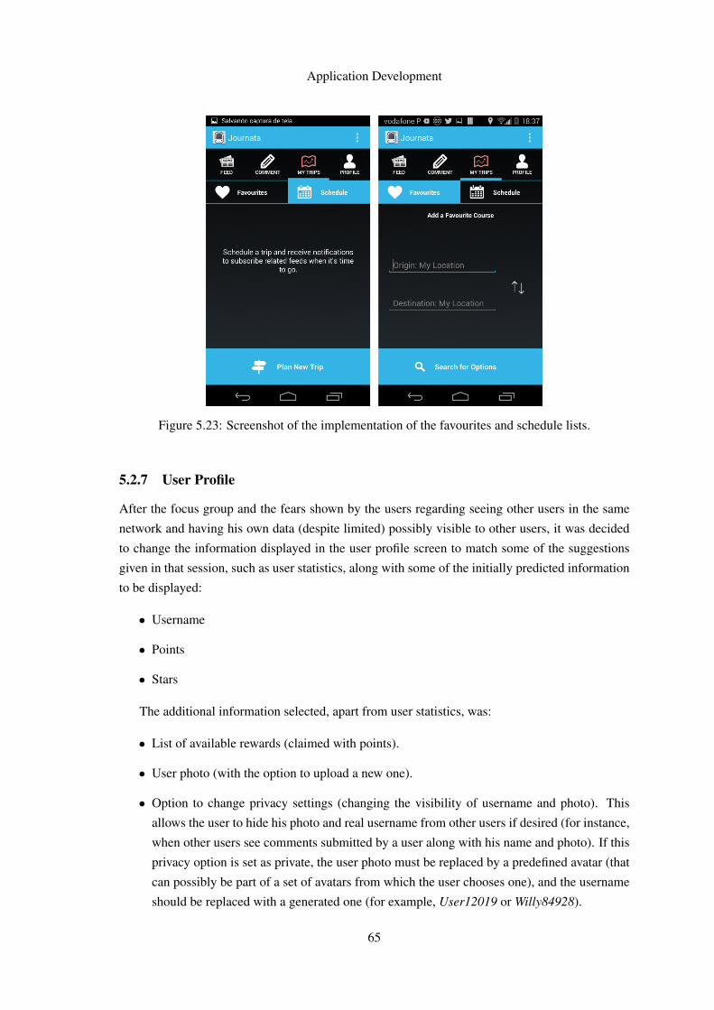
Application Development
Figure 5.23: Screenshot of the implementation of the favourites and schedule lists.
5.2.7 User Profile
After the focus group and the fears shown by the users regarding seeing other users in the same
network and having his own data (despite limited) possibly visible to other users, it was decided
to change the information displayed in the user profile screen to match some of the suggestions
given in that session, such as user statistics, along with some of the initially predicted information
to be displayed:
• Username
• Points
• Stars
The additional information selected, apart from user statistics, was:
• List of available rewards (claimed with points).
• User photo (with the option to upload a new one).
• Option to change privacy settings (changing the visibility of username and photo). This
allows the user to hide his photo and real username from other users if desired (for instance,
when other users see comments submitted by a user along with his name and photo). If this
privacy option is set as private, the user photo must be replaced by a predefined avatar (that
can possibly be part of a set of avatars from which the user chooses one), and the username
should be replaced with a generated one (for example, User12019 or Willy84928).
65
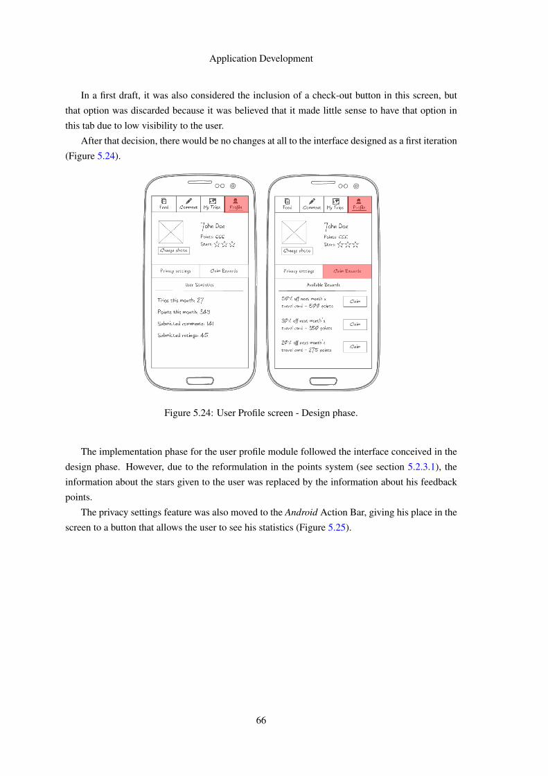
Application Development
In a first draft, it was also considered the inclusion of a check-out button in this screen, but
that option was discarded because it was believed that it made little sense to have that option in
this tab due to low visibility to the user.
After that decision, there would be no changes at all to the interface designed as a first iteration
(Figure 5.24).
Figure 5.24: User Profile screen - Design phase.
The implementation phase for the user profile module followed the interface conceived in the
design phase. However, due to the reformulation in the points system (see section 5.2.3.1), the
information about the stars given to the user was replaced by the information about his feedback
points.
The privacy settings feature was also moved to the Android Action Bar, giving his place in the
screen to a button that allows the user to see his statistics (Figure 5.25).
66
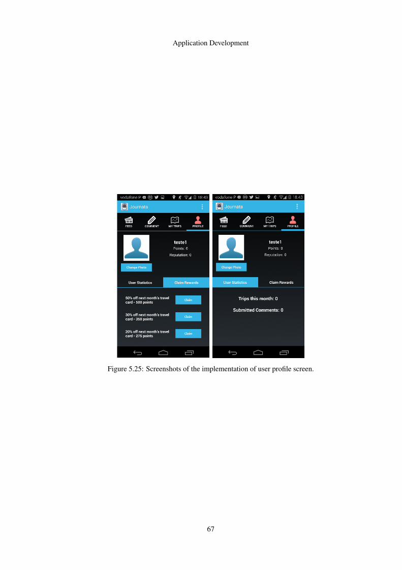
Application Development
Figure 5.25: Screenshots of the implementation of user profile screen.
67

Application Development
68
Chapter 6
Tests and Results
The tests presented in this section aimed to evaluate the quality of the interface and interaction
developed as the result of the process detailed in Chapter 5.
It also aimed to gather some conclusions on perspectives to the evolution of the application,
such as future integration with larger-scale applications or projects in the public transport applica-
tions field.
6.1 Usability Test
The work performed during the design phase, as established in Chapter 5, led to deep changes
regarding the application features, navigation and the concepts behind the application. To validate
those concepts before the implementation phase, it was decided to perform an usability test.
During the course of one week, a group of potential users were asked to spend one hour in
order to use a low-level prototype, trying to accomplish a predefined set of tasks, and give their
feedback about the application and their possible difficulties in grasping the concepts behind it, in
a controlled environment.
To guide users during this test, a script was presented to them (see Appendix B). This script
was divided in two parts, a first one presenting a set of specific tasks to be accomplished through
navigation and a second one where some questions to collect feedback about certain aspects were
asked to the testers.
Following Jakob Nielsen’s recommendation for qualitative user research [NB12], this test was
presented to 6 subjects, with the majority of them being different from those who were in the focus
group session previously made.
All of them arere frequent public transport users and reside in the Porto Metropolitan Area,
have a smartphone and have ages comprehended within 18 and 25 years old. It was attempted to
have a equal gender distributed sample, but that was not achieved in a timely manner. The sample
ended up having 67 percent male subjects and 33 percent female subjects.
69
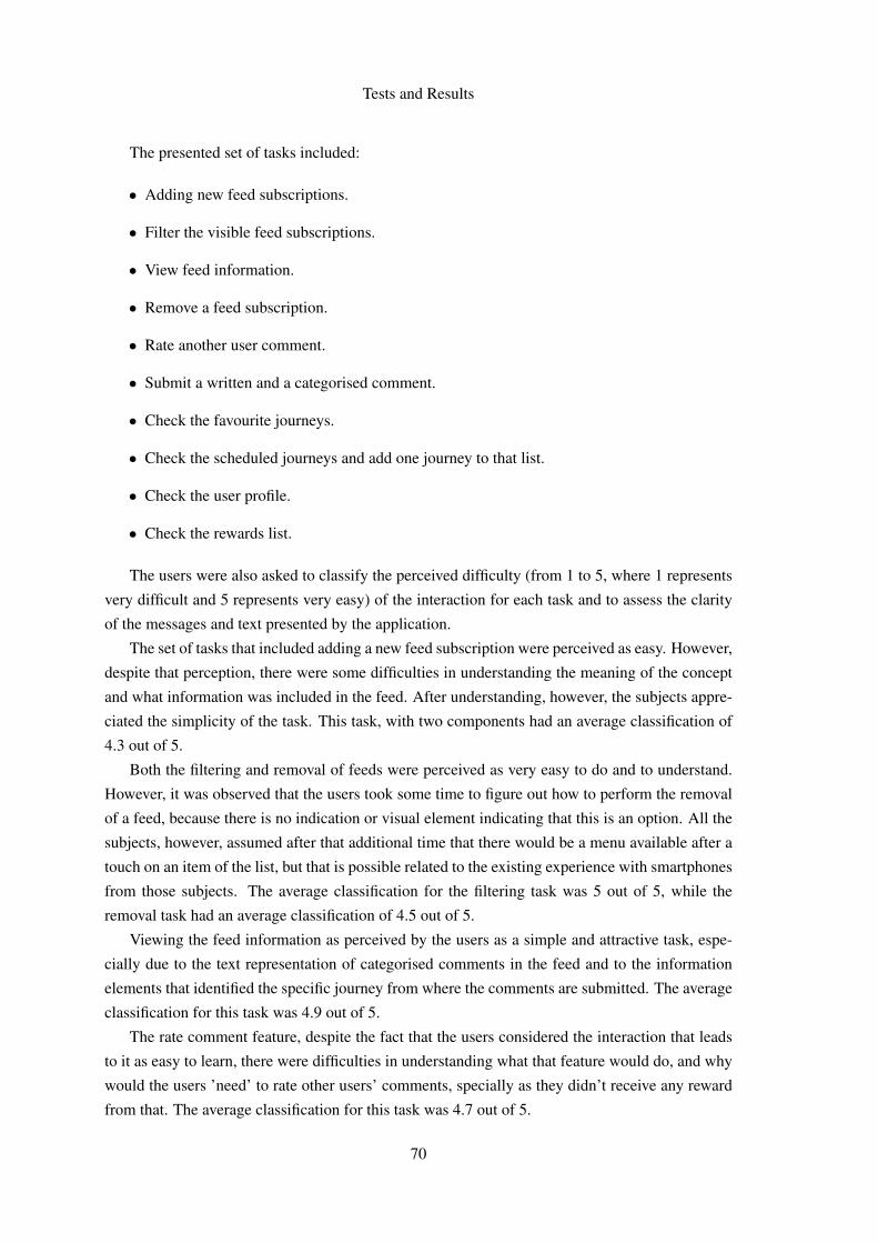
Tests and Results
The presented set of tasks included:
• Adding new feed subscriptions.
• Filter the visible feed subscriptions.
• View feed information.
• Remove a feed subscription.
• Rate another user comment.
• Submit a written and a categorised comment.
• Check the favourite journeys.
• Check the scheduled journeys and add one journey to that list.
• Check the user profile.
• Check the rewards list.
The users were also asked to classify the perceived difficulty (from 1 to 5, where 1 represents
very difficult and 5 represents very easy) of the interaction for each task and to assess the clarity
of the messages and text presented by the application.
The set of tasks that included adding a new feed subscription were perceived as easy. However,
despite that perception, there were some difficulties in understanding the meaning of the concept
and what information was included in the feed. After understanding, however, the subjects appre-
ciated the simplicity of the task. This task, with two components had an average classification of
4.3 out of 5.
Both the filtering and removal of feeds were perceived as very easy to do and to understand.
However, it was observed that the users took some time to figure out how to perform the removal
of a feed, because there is no indication or visual element indicating that this is an option. All the
subjects, however, assumed after that additional time that there would be a menu available after a
touch on an item of the list, but that is possible related to the existing experience with smartphones
from those subjects. The average classification for the filtering task was 5 out of 5, while the
removal task had an average classification of 4.5 out of 5.
Viewing the feed information as perceived by the users as a simple and attractive task, espe-
cially due to the text representation of categorised comments in the feed and to the information
elements that identified the specific journey from where the comments are submitted. The average
classification for this task was 4.9 out of 5.
The rate comment feature, despite the fact that the users considered the interaction that leads
to it as easy to learn, there were difficulties in understanding what that feature would do, and why
would the users ’need’ to rate other users’ comments, specially as they didn’t receive any reward
from that. The average classification for this task was 4.7 out of 5.
70
Tests and Results
Submitting a comment was perceived as a task of very reduced difficulty, and good feedback
about the transition between producing a categorised comment and switching back in order to
choose another category or to submit a written comment was received. The average classification
for this task was 5 out of 5.
Both the favourites journeys and schedule features were perceived as very useful and with
simple interaction, since they are as well available in other applications. The option for setting a
scheduled journey as a possible repetitive task, for certain days of a week, for example, was seen
as very useful and very easy and intuitive. The average classification for these tasks was 4.7 out
of 5.
Checking the user profile was one of the tasks perceived as more obvious, as well as checking
the list of possible rewards. This task had an average classification of 5 out of 5. All the average
classifications are available in Figure 6.1.
Figure 6.1: Average quantitative appraisal by task.
Therefore, it was concluded that it was necessary to redesign the rate and points system in
order to make it attractive to the user to understand. An easier definition of that system, perhaps
related to another feedback system widely used in other social websites or applications, would
provide that better understanding and probably captivate the user to give feedback about other
users’ comments. It would also be useful to arrange a way to allow easier understanding of the
concept of feed subscription and the amount of information associated to it. This aspects would
had to be taken under consideration in the implementation phase.
6.2 Evaluation by Experts
In the end of the implementation phase, a session for evaluate the usability and interaction of the
obtained functional prototype was held at OPT’s offices, in Porto.
71
Tests and Results
Five of the company’s experts on usability and application development for public transports
(both mobile and web applications) were present in this session, to act as experts and provide
feedback about the developed application.
To the experts, it was provided the script used in the usability test previously performed with
users, and a brief session was held before the evaluation to explain some of the concepts behind the
applications and some of the changes occurred during this process. After that brief introduction,
all of the experts were asked to freely explore the functional prototype of the application, while
observed by the author of this work, in order to register the problems encountered, the suggestions
and to discuss possible improvements.
Some test accounts were created before the session and their authentication credentials were
provided to the experts, despite the fact that they were also encouraged to create new accounts if
they wanted to.
There were also provided some routes with a vast amount of existing information in the appli-
cation database as a suggestion in order to give them full utilization experience of the application.
6.2.1 General Evaluation
The general consensus among the experts was that this was an application very easy to use, with
a ’linear’ navigation in most cases, with the flow between screens inside an use case occurring
through a button on the bottom of the screen.
The development process for the application was also validated, highlighting the importance
of the inclusion of users and experts during the design phase and the use of low-level prototypes
and usability tests before an implementation phase.
Several useful contributions were given by the experts during the tests, and should be imple-
mented and validated in a following iteration:
• When the user initially enters the application, an information that he has no feeds subscribed
is displayed. However, and in contrary to what happens in other modules of the application,
there is no button in the bottom of the screen redirecting the user to that feature, causing
some confusion on the user regarding the existence of a trigger on clicking the displayed
information text or leading him to explore other features inside the module and wasting
unnecessary time in navigation.
• Regarding the comment submission module, some messages displayed to the user had the
wrong information (due to a bug in the implementation), and others did not make the process
of user checking-in on a network before comment submission explicit enough. Despite not
having great influence in the user perception of the feature, it does not give the user the
perception of being checked-in and able to check-out. This is amplified by the fact that the
access to the checkout feature is hidden on the Action Bar. One suggestion to solve this
problem is to take advantage of the existing free space on the main comment menu and add
a button allowing the user to perform check-out.
72
Tests and Results
• The position of the text field to submit a written comment is causing the Android keyboard
to hide its content, forcing the user to write his comment ’blindly’ (it is also a bug related to
the implementation, but can also raise the question of changing the location of the text field
in the interface).
• The selection of items in lists of results (adding a feed, for example) has a problem regarding
consistency of interaction. The existence of a checkbox leads some users to click inside the
checkbox or to click the list item. Due to problems during the implementation, a decision
was made in order to associate the selection to the click of the bigger target (the list item),
since the checkbox has a reduced size. However, the users who clicked inside the check-
box had problems, and improving the consistency between the two types of interactions to
change the selection state is required.
• The auto-complete feature should return the options that do not necessarily start with the
introduced text, but those who contain it (this is easily solved in the webservice supporting
the application, but was not seen as a limitation or possible usability problem until this
point).
• The upvote (’thumbs up’) and downvote (’thumbs down’) buttons size was perceived as too
small and too close from each other. Displaying the feedback points from a comment would
be a good information to show along with the buttons.
• The text representation of categorised comments can be improved for readability. The rep-
resentation used as an example in the prototypes from the design phase were perceived as
better when comparing to the representation used in the functional prototype.
• A timeout should be implemented for the written comment submission and for each item
in the categorised comment submission, to avoid possible spamming of comments in the
platform.
• A ’send all’ button should be introduced at the end of the categorised comment categories
dialogs in order to save some clicks to the user (a timeout should also be implemented).
• More thought should be put on the location of the favourites and scheduled list. Since they
are now the centerpiece and moved the journey planner to the background (as a method
to use those features, and not as the feature itself), and since they are related with feed
subscription (it is essentially a list of favourite feeds and a feed subscription scheduler),
perhaps they would be better located if they were in the ’feed’ module, but that would also
imply having too many features concentrated in that navigation tab.
Concerning difficulties from the users in grasping the concepts behind the application, it was
recognized by the experts that one of the more important and difficult questions raised by the
application resides in the way to identify the specific vehicle where the users who comment are
travelling, in order that the user receiving information can understand what vehicle is mentioned
73
Tests and Results
in the comments (this gains even more importance in high frequency routes or services). This
difficulty, however, would not present itself if an automatic check-in on a vehicle was possible (for
instance, through interaction of the smartphone with the validator device inside a vehicle).
About the feed subscription concept, a recommendation was given in order to simplify it and
limit the feed to courses with monomodal transportation and without changing routes/lines. That
would represent the majority of the journeys and facilitate the understanding of the concept for
a big number of users. The remaining ones would need to add several feeds instead of one,
depending on their course. This would also make the user have less course alternatives and receive
less (and possibly more relevant) information when performing long multi-modal journeys.
The new rating system was appreciated by its simplicity (and the several limitations of the
previous system were also recognized and discussed). Some possible future improvements of the
new system were also suggested, such as the implementation of point rewards for ’thumbs-up’
or ’thumbs-down’, since the users are performing the comment validation for the platform, and
also that the understanding of those actions should be clarified, in order to represent more like
an agreement with the submitted comment and less like a ’like/dislike’. This way, a user would
be lead towards not submitting a comment with the same information that was already submitted
(because that would award him points) and less redundant and more reliable information would be
produced.
6.2.2 Suggestions and Observations
The following suggestions were also given by the experts (some of them were the subject of
discussion about how they could work and some of the trade-off involved):
• Aggregating more than one ’reviewed’ aspect in just one comment (making the current
comments information ’chunks’ of a bigger comment) would be a nice thing to introduce.
It would reduce the quantity of requests from the application to submit a comment, and it
could be presented as only one item in the feed.
Currently, if the user wishes to submit a comment about several aspects, submitting them
individually, other user who wants to check the network feed information would have to
scroll to see information submitted by other users because he would see several items in the
feed referring to those several submissions, when he could be seeing just one item (that he
could click to see in detail).
• Swipe gesture should not only allow the navigation between tabs from the primary naviga-
tion, but also from the secondary one. For instance, if the user is in the ’View Feed’ screen, a
swipe to the left should lead him to the ’Select Feeds’ screen, and not to the ’Comment’ tab.
Only when the user is on the ’Receive New Feed’ (the last one on the secondary navigation
for the first tab) and performs the same gesture should he be led to the ’Comment’ tab.
To conclude this section, two additional observations during the tests were registered by the
author:
74
Tests and Results
• Despite having the possibility to navigate between tabs by using swipe gestures, users almost
always used the click on the desired tab to navigate.
• All the experts expected an action by clicking on a comment item on the view feed feature.
It was unclear if this was caused by the background color on the comment text, but this
remark can be used along with the ’aggregated comment’ recommendation given above to
serve as a possible positive feedback of the implementation of that feature. It shows that the
visible metaphor seems to be there already for the users, but with no functionality.
75

Tests and Results
76
Chapter 7
Conclusions and Future Work
7.1 Conclusions
Usability does not give exactly magic formulas, rules and processes that should be followed every
time to get a good and intuitive application, product or solution. It includes a wide set of rec-
ommendations, guidelines and other methods, based on extensive research, that can lead us to a
better final result, but there also lots of trade-offs to be discussed in the process of developing such
application or product.
In the context of an ongoing project [NGeCP11], the main goal of this work was to provide
better interaction and usability to a innovative mobile application, dedicated to sharing informa-
tion on public transports [eSG12], through the definition and application of a user-centred design
process. The mentioned application introduces a change in the public transport information sys-
tem, providing travellers data that is fed to the system by other travellers. To avoid irrelevant and
unnecessary information to be shown to a traveller, this application relies on the creation of tem-
porary networks composed by the most relevant passengers at a given time, improving the time
and space relevance of said information.
In a first phase, this work aimed to elicit usability requirements for the application among po-
tential users. This stage was performed by holding a focus group session to discuss what the users
wanted and ways to improve their engagement with the application and make their understanding
of the concepts behind the application much easier.
That initial phase, however, revealed that, in order to achieve those goals for the application,
some profound changes about the said concepts were necessary, which resulted in an extended
design phase comparing to what was predicted. The result of the design phase, however, was
richer and considered a great step to the potential success of the application, as validated through
usability tests (see Chapter 6).
Those tests gave then place to an implementation phase that resulted in a functional prototype,
Journata. This functional prototype was then tested with experts (also mentioned in Chapter 6),
since a test with real users would be a time consuming task which was postponed to a forthcoming
phase.
77
Conclusions and Future Work
The results of that session were very satisfactory and assessed that this work is a big step in the
right direction, but also there is yet a lot to be done and explored (as it can be seen in the following
sections). This was seen as a big motivation to keep working in this concept and a confirmation of
the huge potential of this application and the influence it can have on solving mobility problems
and improving public transportation usage experience.
7.2 Future Work
Despite the fact that this work can be considered a big step to the fulfilment of all the recognised
potential in the application (and possibly helped to figure out solutions to make that potential even
higher), there is still a long way to go regarding that matter, and several features regarding usability
and architecture of the project can be object of future work.
It must also be said that the potential from this application and project was also recognised by
external entities, that want Journata or some of its features to be included in a bigger scale project
regarding a mobile payment solution for public transports, that intends to dematerialize the public
transport tickets. The author of this work was selected to be part of that project, where he will have
the opportunity to work on the integration of the information sharing features on such a innovative
platform for the public transports ’big picture’ in Portugal. He will also have the opportunity
to continue the work performed on this thesis and achieve some of the points mentioned in the
following sections, while trying to follow the suggestions obtained in the test phase.
7.2.1 Usability and Interaction
Apart from following the suggestions given by the experts on the evaluation session (see Chapter
6) and implementing the features referred in the designed phase that, due to time constraints, were
left aside, the following work could also be done:
• Develop an interface layout for landscape view for the entire application.
• Create alternative locations (translations) and themes for the application.
7.2.2 Data Structure
In order to fully implement the concepts of the application as they were conceived during the
design phase of this work, profound changes to the data structure behind the application are nec-
essary.
• Implement the new point system and support the reward model.
• Networks should not be entities associated to an unique route or direction. They should be,
instead, associated to one user, and to the origin and destination of the journey performed
(or intended to be performed) by that same user, containing users in relevant routes to the
user journey. Some of the limitations of the current structure formed an obstacle when
78
Conclusions and Future Work
implementing the ’view feed’ feature, leading to the impossibility of displaying the infor-
mation thought to be displayed to the user in the design phase. However, those limitations
go much further than that and a rethought implementation of networks in the system should
be subject of an in-depth discussion.
• Requests for feed information should be specified through the utilization of a range of time
for the desired information, instead of getting only the information since the last request.
• Support a way to the transport providers to send relevant information about some routes
through the application.
• Provide techniques that allow the deduction of travel patterns from the users, which could
be used to automatically add or suggest new feed subscriptions to the user based on the
gathered information.
• Improve the security of the application denying non-authorized access to data that does not
require a login state.
7.2.3 Integration with existing social networks
Despite the fact that some of the social features considered in the initial phase of this work were
left aside, due to concerns shown by the users, there is still possible room to be explored here
concerning the integration with existing social networks.
One possible way is to provide means to register in Journata through the use of an account
from a widely used social network, such as Facebook or Twitter, saving the effort to create an
account manually. Other possibility is the use of the said social networks’ friends list to provide
the initially thought social features for Journata (nearby users, checking other user profile and so
on) only for those users who are part of those lists, and also use Journata. Some work on user
statistics and exploring ways to integrate them with gamification concepts could also be used to
allow the user to share his data into his social networks’ accounts.
7.2.4 Integration with existing public transport applications
It would present an advantage to the application if it could be integrated with a system that acted
as a substitute for travel tickets. For a start, a validation at an entering and exiting stage from a
journey or vehicle (taking advantages of technologies such as NFC or QRCode) would dismiss the
necessity of a check-in or check-out features, as it would be an automatic validation process, and
it would also allow the gathering of data for deduction of travel patterns.
Journata would also have a lot to gain with the integration with services such as the API used
by MOVE-ME 1 as a source for its auto-complete and journey planner features, as it contains not
only the bus, train and subway stations, but also information and location of interest points that
1http://www.move-me.mobi/
79
Conclusions and Future Work
could also be set as origins or destinations for journeys. This specific API is obviously only for a
limited scope of Journata, concerning the data of the city of Porto.
80
References
[Are13] GSM Arena. Google play is now the largest app store withover 1 million apps. Available at http://blog.gsmarena.com/google-play-is-now-the-largest-app-store-with-1-million-apps/, July 2013.
[BC07] Gabriela Beirão and J.A. Sarsfield Cabral. Understanding attitudes towards publictransport and private car: A qualitative study. Transport Policy, page 14(6):478 –489, 2007.
[BE08] Danah M Boyd and Nicole B. Ellison. Social network sites: Definition, history, andscholarship. Journal of Computer-Mediated Communication, page 13(1):210–230,2008.
[BWD11] Richard Barnes, James Winterbottom, and Martin Dawson. Internet geolocationand location-based services. IEEE Communications Magazine, page 49(4):102–108,April 2011.
[Coh10] Arianne Cohen. The connected traveler. Available at http://www.budgettravel.com/bt-dyn/content/article/2009/11/01/AR2009110102119.html?page=1, January 2010.
[CSV11] Ana Paula Chaves, Igor Steinmacher, and Vaninha Vieira. Social networks andcollective intelligence applied to public transportation systems: A survey. VIIISimpósio Brasileiro de Sistemas Colaborativos (SBSC 2011), Available at http://projeto.unisinos.br/simtur/papers/Chaves%20et%20al.pdf, October 2011.
[Del11] Colin Delany. How social media accelerated tunisia’s revolution:An inside view. Available at http://www.epolitics.com/2011/02/10/how-social-media-accelerated-tunisias-revolution-an-inside-view/, February2011.
[Dia13] Luís Dias. Adding intelligence to a smartphone application prototype for exchangingpublic transport information among travellers. Master’s thesis, Faculdade de Engen-haria da Universidade do Porto, 2013.
[DMW03] Peter Sheridan Dodds, Roby Muhamad, and Duncan J. Watts. An experimental studyof search in global social networks. Science, 301(5634):p827–829, August 2003.
[eSG12] Tiago Miguel e Sousa Gonçalves. A smartphone application prototype for exchang-ing valuable real time public transport information among travellers. Master’s thesis,Faculdade de Engenharia da Universidade do Porto, 2012.
[Fle08] Terry Flew. New media: an introduction (3rd Edition). Oxford University Press,Melbourne, 2008.
81
REFERENCES
[Goo14] Google. Dashboards - platform versions. Available at https://developer.android.com/about/dashboards/index.html, 2014.
[Int13] ITU International Telecommunication Union. Statistics 2005-2013.http://www.itu.int/en/ITU-D/Statistics/Documents/statistics/2013/ITU_Key_2005-2013_ICT_data.xls, December 2013.
[Joh14] Jeff Johnson. Designing with the Mind in Mind, Second Edition: Simple Guide toUnderstanding User Interface Design Guidelines. Morgan Kaufmann, 2014.
[Joi08] Adam N. Joinson. Looking at, looking up or keeping up with people?: motivesand use of facebook. Proceedings of the twenty-sixth annual SIGCHI conference onHuman factors in computing systems, page 1027–1036, 2008.
[Jor94] P. W. Jordan. What is usability. In S. Robertson, editor, Contemporary Ergonomics,pages 454–458. Taylor & Francis, London, 1994.
[KC08] Richard A. Krueger and Mary Anne Casey. Focus Groups: A Practical Guide forApplied Research, 4th Edition. SAGE Publications, 2008.
[Lé98] Pierre Lévy. A inteligência coletiva: por uma antropologia do ciberespaço. EdiçõesLoyola, 1998.
[LH07] Jure Leskovec and Eric Horvitz. Planetary-scale views on an instant-messagingnetwork. Microsoft Research, Available at http://research.microsoft.com/en-us/um/people/horvitz/Leskovec_Horvitz_worldwide_buzz.pdf, June 2007.
[McC13] Harry McCracken. Who’s winning, ios or android? all the numbers, all in one place.Available at http://techland.time.com/2013/04/16/ios-vs-android/, April 2013.
[McG13] Shaun McGlaun. Gartner numbers show android holds 82market. Avail-able at http://www.dailytech.com/Gartner+Numbers+Show+Android+Holds+82+of+Worldwide+Smartphone+Market/article33748.htm, November 2013.
[Mit69] J.C. Mitchell. Social networks in urban situations: analyses of personal relationshipsin Central African towns. Manchester University Press, 1969.
[Nat11] United Nations. Department of economic and population division social affairs.world urbanization prospects. the 2011 revision. Technical report, United Nations,December 2011.
[NB12] Jakob Nielsen and Raluca Budiu. Mobile Usability. New Riders, 2012.
[NGeC14] António A. Nunes, Teresa Galvão, and João Falcão e Cunha. Urban public transportservice co-creation: Leveraging passenger’s knowledge to enhance travel experience.Procedia - Social and Behavioral Sciences, 111 - Transportation: Can we do morewith less resources? – 16th Meeting of the Euro Working Group on Transportation –Porto 2013:p577–585, February 2014.
[NGeCP11] Antonio A. Nunes, Teresa Galvao, João Falcão e Cunha, and Jeremy V. Pitt. Us-ing social networks for exchanging valuable real time public transport informationamong travellers. 2011 IEEE Conference on Commerce and Enterprise Computing,2011.
82
REFERENCES
[NGG13] António A. Nunes, Tiago Gonçalves, and Teresa Galvão. A prototype for publictransport service co-creation using social media: Results from usability testing, 2013.
[Nie97] Jakob Nielsen. The use and misuse of focus groups. Available at http://www.nngroup.com/articles/focus-groups/, 1997.
[Nie12] Jakob Nielsen. Usability 101: Introduction to usability. Available at http://www.nngroup.com/articles/usability-101-introduction-to-usability/, 2012.
[OPG+14] Derek O’Callaghan, Nico Prucha, Derek Greene, Maura Conway, Joe Carthy, andPadraig Cunningham. Online social media in the syria conflict: Encompassing theextremes and the in-betweens. 2014.
[Pes10] Robert Pessagno. Design and usability of social networking web sites. Availableat http://digitalcommons.calpoly.edu/cgi/viewcontent.cgi?article=1035&context=grcsp, 2010.
[Pos13] Washington Post. Twitter makes market debut, stock surges 73 percent atopen. Available at http://www.washingtonpost.com/business/technology/twitter-makes-market-debut-stock-surges-73-percent-at-open/2013/11/07/9345ee4a-47c6-11e3-bf0c-cebf37c6f484_gallery.html#photo=1, November 2013.
[Saf13] Dan Saffer. Microinteractions. O’Reilly, 2013.
[Sch10] J. Schell. Design outside the box. DICE Summit, 2010.
[Sop14] Taylor Sopper. Olympic athletes in sochi banned from posting video,audio to social media. Available at http://www.geekwire.com/2014/free-speech-issue-athletes-sochi-arent-allowed-post-pictures-videos-social-media/,February 2014.
[SR95] Marko Silventoinen and Timo Rantalainen. Mobile station locating in gsm. IEEEWireless Communication System Symposium, page 53–59, 1995.
[Sut11] John D. Sutter. The faces of egypt’s revolution 2.0. Available at http://edition.cnn.com/2011/TECH/innovation/02/21/egypt.internet.revolution/index.html, Febru-ary 2011.
[SV04] Jochen Schiller and Agnès Voisard. Location-Based Services. Morgan KaufmannPublishers, San Francisco, CA, USA, 2004.
[Tra11] David Travis. Iso 13407 is dead. long live iso 9241-210! Available at http://www.userfocus.co.uk/articles/iso-13407-is-dead.html, 2011.
[Xu12] Yongwen Xu. Literature review on web application gamification and analytics. April2012.
83

REFERENCES
84
Appendix A
Focus Group Script
A.1 Goals
This Focus Group intends to present some uses cases from the application, in order to elicit usabil-
ity requirements for a future functional prototype of the said application. It is intended to promote
a discussion which, recurring to suggestions of interface designs for some of the use cases, can
serve as indication to the best way to proceed regarding the interaction of the application.
A.2 Briefing to the participants
A number increasingly higher of public transport passengers is connected everyday to social net-
work platforms through the utilization of their personal mobile devices. This allows sharing of
information between passengers in real time, regarding several aspects of the public transport ser-
vice at a given moment. This kind of information can be useful both to the users, in order to help
them take more informed decisions regarding their journeys, and the transport network managers,
helping them to introduce improvements to the service. Regarding this last point, there can also
be benefits to the public transport operators through the acquisition of operational information in
a more timely manner and with less use of resources.
However, the most used social networks are incapable of aggregating and distributing custom
information to passengers and managers of public transport networks, leading to the existence of
spread information with much less utility. Therefore, it is intended to develop a prototype of a
mobile service based on the structure of a social network, but innovative in the way how users are
connected between each other, temporarily, based on their location and travel patterns.
The developed prototype will be a new and more advanced version of other prototype previ-
ously developed, but with significant improvements in several aspects, such as usability and the
capacity to establish temporary connections between passengers in an intelligent and real time
manner.
85
Focus Group Script
A.3 Use Cases to Discuss
A.3.1 Journey Planner and Check-In
• Check-in must have better visibility than in the previous prototype. In that prototype, the
journey planner, despite referring to a probable check-in in a future journey, had more visi-
bility than a journey intended to perform in the immediate present.
• It is impossible to verify is the user has several trips planned (it is not possible to list all the
previously planned journeys), which brings up a difficulty if the user had planned more than
one trip to perform in the future. The implementation of such feature has benefit?
A.3.2 User Profile
Displays information about the user profile in the application. Suggestions for data to display in
this screen are:
• User Name
• Photo/Avatar of the user.
• Map with user location (and possibly users in the same network).
• Information about vehicle or route where the user currently is.
• Menu to access other features.
• Access button to visibility/privacy options.
Regarding this use case, other questions that may be relevant of discussion:
• Is the user profile screen the best to display to the user when entering the application (instead
of, for instance, travel information)?
• Access to other features should be made from this screen or should the other feature be
accessible on other ’tabs’ from the application or through a swipe gesture?
• Is this the right screen to display points and stars from the user?
A.3.3 Trip information
Regarding this use case, the following points must be considered:
• Information displaying mode - Should be implemented, for instance, under the form of a
’newsfeed’ or there is a better way to do it? The task of ’rating’ the information should be
in another ’tab’, to give visibility to that feature, or done recurring to buttons appearing in
the news feed along with the information?
86
Focus Group Script
• Easiness of information submission - The user must have minimum effort to submit new
information. This means that the interface for quantitative rating of information should
be as clear as possible (with properly sized buttons or through sliders). The qualitative
information submission (written comments) should also minimize text input effort from the
user.
• Presentation of the types of information to submit - Previous division by category (such
as the previous prototype)? All types of information in the same page/screen (scrolling
requires less effort than going back and choosing other category, despite the fact that the
items in the end of the list become less visible)?
A.4 Other questions to discuss regarding other features or interac-tions
• Early Registration - Eliminating early registration in the application, giving the user fea-
tures that do not allow login or check-in in a network to access information could lead to
less ’abandon rate’ when first using the application. However, it could lead to a vast number
of users not creating an account to share information.
• How relevant to the users is the possibility to see other users in their temporary network?
• It would be interesting to provide users with the history of their trips and submitted com-
ments?
• Notifications - Sending a notification to the user when he enters a network or has a planned
journey in the next 10 minutes is excessive?
87

Focus Group Script
88
Appendix B
Usability Test Script
B.1 Introduction
This document intends to serve as a script to the realization of an usability test of an interface for a
mobile application to be implemented for the Android mobile operating system. This application
has features of a social network, and aims at sharing information about public transport networks,
with that sharing component being performed by the users of the platform.
This test aims to perform the validation of low-level prototypes developed in order to provide
an interface and an interaction flow to the mentioned application.
To the realization of this test, a sequential set of tasks should be performed by the users. It is
intended to evaluate the easiness of interaction between the user and the proposed interface, with
the purpose of detecting and solving possible problems before an implementation phase.
B.2 Socio-demographic questions
B.2.1 Age
• 18-25
• 25-40
• 40-60
• 60+
B.2.2 Gender
• Male
• Female
89
Usability Test Script
B.2.3 How frequently do you use public transports?
• Frequently (1-5 times per week).
• Often (1-5 times per month).
• Rarely (1-10 times per year).
• Never.
B.2.4 Are you a smartphone owner and user?
• Yes.
• No.
B.2.5 Please state your city of residence.
B.3 List of Tasks to Accomplish
• Task 1 - Add a New Feed Subscription
– Add a new feed, entering manually the origin and destination you desire. For the sake
of this test, enter ’S. Bento’ as the desired origin.
– Add two of the displayed results to your current feeds (for instance, S.Bento - Cam-panhã and S.Bento - General Torres).
• Task 2 - Filter Visible Feeds
– Check the list of current subscribed feeds. Verify that those you added make part of
that list.
– Hide the information from the feed referring to ’S.Bento - General Torres’.
• Task 3 - Remove Feed Subscription
– Remove one of the feeds (Hospital S. João - Trindade). Verify that it’s no longer part
of the list.
• Task 4 - View Feed Subscriptions Information
– Read the information coming from the feeds subscribed.
• Task 5 - Rate a Comment
– Rate another users’ comment.
90
Usability Test Script
• Task 6 - Submit a Comment
– Assume that you’ve just entered a bus from the route 604, with destination Sto. Oví-dio. Submit a written comment about that trip.
– Submit another comment about the trip, this time regarding the noise on the vehicle.
• Task 7 - Check Favourites List
– Access your favourite journeys list. Assume that there are already two there (Trindade- Sto. Ovídio e Trindade - Foz). Deactivate the one that is currently active.
• Task 8 - Check Scheduled Journeys
– Check your scheduled journeys. Add another journey to the same list.
• Task 9 - User Profile
– Consult your user profile. Enter the list of reward to check the discounts you can claim
with your current amount of points.
B.4 Post-task questionnaire
In a scale from 1 to 5, with 1 representing ’very hard’ and 5 considered ’very easy’, classify your
perception of the difficulty of the task, based on the simplicity of the interaction and the clarity of
messages displayed in the interface.
Finally (and optionally) give an answer to these questions:
• Would you use an application such as this in your daily routine?
• What captivates you more about the application (one specific feature, the possible rewards,
etc.?
91