
JavaFX CSS Reference Guide - Home pagepoincare.matf.bg.ac.rs/~biljana/oop/cas12/JavaFX CSS...
42
JavaFX CSS Reference Guide Contents Introduction CSS and the JavaFX Scene Graph Limitations Inheritance Examples Understanding Parser Warnings Types inherit <boolean> <string> <number> & <integer> <size> <length> <percentage> <angle> <point> <color-stop> <uri> <effect> <font> <paint> <color> Nodes javafx.scene Group Node Parent Scene javafx.scene.image ImageView javafx.scene.layout AnchorPane BorderPane FlowPane GridPane HBox Pane Region StackPane TilePane VBox javafx.scene.shape Shape Release: JavaFX 2.2 JavaFX CSS Reference Guide http://docs.oracle.com/javafx/2/api/javafx/scene/doc-files/cssref.html 1 of 42 12.5.2013 18:33
Transcript of JavaFX CSS Reference Guide - Home pagepoincare.matf.bg.ac.rs/~biljana/oop/cas12/JavaFX CSS...

JavaFX CSS Reference Guide
Contents
Introduction
CSS and the JavaFX Scene Graph
Limitations
Inheritance
Examples
Understanding Parser Warnings
Types
inherit
<boolean>
<string>
<number> & <integer>
<size>
<length>
<percentage>
<angle>
<point>
<color-stop>
<uri>
<effect>
<font>
<paint>
<color>
Nodes
javafx.scene
Group
Node
Parent
Scene
javafx.scene.image
ImageView
javafx.scene.layout
AnchorPane
BorderPane
FlowPane
GridPane
HBox
Pane
Region
StackPane
TilePane
VBox
javafx.scene.shape
Shape
Release: JavaFX 2.2
JavaFX CSS Reference Guide http://docs.oracle.com/javafx/2/api/javafx/scene/doc-files/cssref.html
1 of 42 12.5.2013 18:33

Arc
Circle
CubicCurve
Ellipse
Line
Path
Polygon
QuadCurve
Rectangle
SVGPath
javafx.scene.text
Text
javafx.scene.web
WebView
Controls
javafx.scene.control
Accordion
Button
ButtonBase
Cell
CheckBox
CheckMenuItem
ChoiceBox
ColorPicker
ComboBox
Control
Hyperlink
IndexedCell
Label
Labeled
ListCell
ListView
Menu
MenuBar
MenuButton
MenuItem
MenuItemBase
Pagination
PasswordField
ProgressBar
ProgressIndicator
RadioButton
RadioMenuItem
ScrollBar
ScrollPane
Separator
Slider
SplitMenuButton
SplitPane
TabPane
TableView
TextArea
TextInputControl
TextField
JavaFX CSS Reference Guide http://docs.oracle.com/javafx/2/api/javafx/scene/doc-files/cssref.html
2 of 42 12.5.2013 18:33

TitledPane
ToggleButton
ToolBar
Tooltip
TreeCell
TreeView
Charts
javafx.scene.chart
AreaChart
BarChart
BubbleChart
Chart
LineChart
ScatterChart
PieChart
XYChart
Axis
ValueAxis
NumberAxis
CategoryAxis
Legend
References
Introduction
JavaFX Cascading Style Sheets (CSS) is based on the W3C CSS version 2.1 [1] with some additions from
current work on version 3 [2]. JavaFX CSS also has some extensions to CSS in support of specific JavaFX
features. The goal for JavaFX CSS is to allow web developers already familiar with CSS for HTML to use CSS to
customize and develop themes for JavaFX controls and scene graph objects in a natural way. The JavaFX CSS
support and extensions have been designed to allow JavaFX CSS style sheets to be parsed cleanly by any
compliant CSS parser, even though it might not support JavaFX extensions. This enables the mixing of CSS
styles for JavaFX and for other purposes (such as for HTML pages) into a single style sheet. To this end, all
JavaFX property names have been prefixed with a vendor extension of "-fx-". Even properties that might seem to
be compatible with standard HTML CSS have been prefixed, because JavaFX has somewhat different semantics
for their values.
JavaFX CSS does not support CSS layout properties such as float, position, overflow, and width. However, the
CSS padding and margins properties are supported on some JavaFX scene graph objects. All other aspects of
layout are handled programmatically in JavaFX code. In addition, CSS support for HTML-specific elements such
as Tables are not supported since there is no equivalent construct in JavaFX.
JavaFX has a rich set of extensions to CSS in support of features such as color derivation, property lookup, and
multiple background colors and borders for a single node. These features add significant new power for
developers and designers and are described in detail in this document.
The structure of this document is as follows. First, there is a description of all value types for JavaFX CSS
properties.Where appropriate, this includes a grammar for the syntax of values of that type. Then, for each scene
graph node that supports CSS styles, a table is given that lists the properties that are supported, along with type
and semantic information. The pseudo-classes for each class are also given. The description of CSS properties
continues for the controls. For each control, the substructure of that control's skin is given, along with the style
class names for the Region objects that implement that substructure.
JavaFX CSS Reference Guide http://docs.oracle.com/javafx/2/api/javafx/scene/doc-files/cssref.html
3 of 42 12.5.2013 18:33

CSS and the JavaFX Scene Graph
CSS styles are applied to nodes in the JavaFX scene graph in a way similar to the way CSS styles are applied to
elements in the HTML DOM. Styles are first applied to the parent, then to its children. The code is written such
that only those branches of the scene graph that might need CSS reapplied are visited. A node is styled after it is
added to the scene graph. Styles are reapplied when there is a change to the node's pseudo-class state, style
class, id, inline style, or parent.
CSS styles are applied asynchronously. That is, CSS styles are loaded and values are converted and assigned
some time after a scene graph object has been created and added to the scene graph, but before the scene
graph is first laid out and painted. In addition, if the styles that apply to an object have changed (for example,
because its pseudo-class has changed), values from the newly applied styles will not be applied immediately.
Instead, they will be applied sometime after the object's state has changed but before the scene is next painted. It
is possible that a style might apply to a variable in a JavaFX object that had been assigned a value by a JavaFX
program. Since CSS styles are applied asynchronously, it's possible that values might be assigned by a program
and used for some time before being overwritten by CSS at an arbitrary time later.
Each node in the scene graph has a styleClass variable, a List<String>. This is analogous to the class="..."
attribute that can appear on HTML elements. Supplying a string for a node's styleClass variable causes style
properties for that style class to applied to this node. Styles for style classes can be specified using the
".styleclass" selector syntax in a style sheet. Note that a node may have more than one style class.
Each node in the scene graph has an id variable, a string. This is analogous to the id="..." attribute that can
appear HTML elements. Supplying a string for a node's id variable causes style properties for this node to be
looked up using that id. Styles for specific ids can be specified using the "#nodeid" selector syntax in a style
sheet.
Each node honors a set of properties that depends on the node's JavaFX class (as distinct from its styleClass).
The properties honored by each node class are shown in detail in tables later in this document. The property
value that is actually applied depends on the precedence of the origin of the rule, as described above, as well as
the specificity of the rule's selector as described in CSS 2 [1] . Ultimately, a property value string is converted into
a JavaFX value of the appropriate type and is then assigned to an instance variable of the JavaFX object.
CSS styles can come from style sheets or inline styles. Style sheets are loaded from the URLs specified in the
stylesheets variable of the Scene object. If the scene graph contains a Control, a default user agent style sheet
is loaded. Inline styles are specified via the Node setStyle API. Inline styles are analogous to the style="..."
attribute of an HTML element. Styles loaded from a Scene's style sheets take precedence over rules from the
user agent style sheet. Inline styles take precedence over styles originating elsewhere. The precedence order of
style rules can be modified using "!important" in a style declaration.
Beginning with JavaFX 2.1, the Parent class has a stylesheets property, allowing style sheets to be set on a
container. This allows for one branch of of the scene graph to have a distinct set of styles. Any instance of Parent
can have a style sheets. A child will take its styles from its own inline styles, the style sheets of all its ancestors,
and any style sheets from the Scene.
A style sheet URL may be an absolute URL or a relative URL. If a relative URL is given, it is resolved against the
base URL of the ClassLoader of the concrete Application class. If, for example, there is a main class
com.wicked.cool.ui.Main that extends Application, the relative URL "com/wicked/cool/resources/styles.css"
would resolve correctly. The relative URL "../resources/styles.css" would not since the path ".." relative to the root
is not a valid path. It is often easier to use the ClassLoader of some class to find the resource. For example, if the
"styles.css" file resides in the same package as Main, the following code will give the correct URL:com.wicked.cool.ui.Main.class.getResource("styles.css").toExternalForm()
Note that, beginning with JavaFX 2.1, a URL consisting of only an absolute path (having no scheme or authority)
is resolved relative to the base URL of ClassLoader of the class that extends Application. In other words,
"/com/wicked/cool/resources/styles.css" is treated as "com/wicked/cool/resources/styles.css". This is consistent
JavaFX CSS Reference Guide http://docs.oracle.com/javafx/2/api/javafx/scene/doc-files/cssref.html
4 of 42 12.5.2013 18:33

with FXML.
The implementation allows designers to style an application by using style sheets to override property values set
from code. This has implications for the cascade; particularly, when does a style from a style sheet override a
value set from code? The JavaFX CSS implementation applies the following order of precedence; a style from a
user agent style sheet has lower priority than a value set from code, which has lower priority than a Scene or
Parent style sheet. Inline styles have highest precedence. Style sheets from a Parent instance are considered to
be more specific than those styles from Scene style sheets.
Naming conventions have been established for deriving CSS style class names from JavaFX class names, and
for deriving CSS property names from JavaFX variable names. Note that this is only a naming convention; there
is no automatic name conversion. Most JavaFX names use "camel case," that is, mixed case names formed from
compound words, where the initial letter of each sub-word is capitalized. Most CSS names in the HTML world are
all lower case, with compound words separated by hyphens. The convention is therefore to take JavaFX class
names and form their corresponding CSS style class name by separating the compound words with hyphens and
convering the letters to all lower case. For example, the JavaFX ToggleButton class would have a style class of
"toggle-button". The convention for mapping JavaFX variable names to CSS property names is similar, with the
addition of the "-fx-" prefix. For example, the blendMode variable would have a corresponding CSS property
name of "-fx-blend-mode".
Limitations
While the JavaFX CSS parser will parse valid CSS syntax, it is not a fully compliant CSS parser. One should not
expect the parser to handle syntax not specified in this document.
@-keyword statements are ignored.
The ":first-child" and ":lang" pseudo-classes are not supported. The ":first-line", ":first-letter", ":after", and ":before"
pseudo-elements are not supported.
The ":active" and ":focus" dynamic pseudo-classes are not supported. However, Nodes do support the ":pressed"
and ":focused" pseudo-classes, which are similar.
The ":link" and ":visited" pseudo-classes are not supported in general. However, Hyperlink objects can be styled,
and they support the ":visited" pseudo-class.
JavaFX CSS does not support comma-separated series of font family names in the -fx-font-family property. The
optional line height parameter when specifying fonts is not supported. There is no equivalent for the font-variant
property.
JavaFX CSS uses the HSB color model instead of the HSL color model.
It is possible to use the JavaFX class name as a type selector, however, such use is not recommended. For
example, it is possible to specify styles for a ToggleButton using the syntax "ToggleButton { ... }". Such usage is
not recommended because the name used to match the type selector is the actual concrete class name used in
the JavaFX program. This class name can change in the case of subclassing. If the application were to subclass
the ToggleButton class, these styles would no longer apply.
At this time, the programming interfaces necessary for a class to declare support for CSS properties, to convert
and load these values from CSS style sheets into object variables, and to declare and notify changes to an
object's pseudo-classes, are considered internal interfaces and are not accessible directly to applications.
If a property of a node is initialized by calling the set method of the property, the CSS implementation will see this
as a user set value and the value will not be overwritten by a style from a user agent style sheet.
Inheritance
JavaFX CSS Reference Guide http://docs.oracle.com/javafx/2/api/javafx/scene/doc-files/cssref.html
5 of 42 12.5.2013 18:33
CSS also provides for certain properties to be inherited by default, or to be inherited if the property value is
'inherit'. If a value is inherited, it is inherited from the computed value of the element's parent in the document
tree. In JavaFX, inheritance is similar, except that instead of elements in the document tree, inheritance occurs
from parent nodes in the scene graph.
The following properties inherit by default. Any property can be made to inherit by giving it the value "inherit".
Class Property CSS Property Initial Value
javafx.scene.Node cursor -fx-cursor javafx.scene.Cursor.DEFAULT
javafx.scene.text.Text textAlignment -fx-text-alignment javafx.scene.text.TextAlignment.LEFT
javafx.scene.text.Font font -fx-font Font.DEFAULT (12px system)
Within the hierarchy of JavaFX classes (for example, Rectangle is a subclass of Shape, which in turn is a
subclass of Node), the CSS properties of an ancestor are also CSS properties of the descendant. This means
that a subclass will respond to the same set of properties as its ancestor classes, and to additional properties it
defines itself. So, a Shape supports all the properties of Node plus several more, and Rectangle supports all the
properties of Shape plus a couple more. However, because using a JavaFX class name as a type selector is an
exact match, providing style declarations for a Shape will not cause a Rectangle to use those values (unless the
.css value for the Rectangle's property is "inherit").
Examples
Consider the following simple JavaFX application:
Scene scene = new Scene(new Group());scene.getStylesheets().add(“test.css”);Rectangle rect = new Rectangle(100,100);rect.setLayoutX(50);rect.setLayoutY(50);rect.getStyleClass().add("my-rect");((Group)scene.getRoot()).getChildren().add(rect);
Without any styles, this will display a plain black rectangle. If test.css contains the following:
.my-rect { -fx-fill: red; }
the rectangle will be red instead of black:
If test.css contains the following:
.my-rect { -fx-fill: yellow; -fx-stroke: green; -fx-stroke-width: 5; -fx-stroke-dash-array: 12 2 4 2; -fx-stroke-dash-offset: 6;
JavaFX CSS Reference Guide http://docs.oracle.com/javafx/2/api/javafx/scene/doc-files/cssref.html
6 of 42 12.5.2013 18:33

-fx-stroke-line-cap: butt;}
the result will be a yellow rectangle with a nicely dashed green border:
Understanding Parser Warnings
When the JavaFX CSS parser encounters a syntax error, a warning message is emitted which conveys as much
information as is available to help resolve the error. For example
WARNING: com.sun.javafx.css.parser.CSSParser declaration Expected '<percent>'while parsing '-fx-background-color' at ?[1,49]
The cryptic '?[1,49]' pertains to the location of the error. The format of the location string is
<url>[line, position]
If the error is found while parsing a file, the file URL will be given. If the error is from an inline style (as in the
example above), the URL is given as a question mark. The line and position give an offset into the file or string
where the token begins. Please note that the line and position may not be accurate in releases prior to JavaFX
2.2.
Applications needing to detect errors from the parser can add a listener to the errors property of
com.sun.javafx.css.StyleManager. This is not public API and is subject to change.
Types
inherit
Each property has a type, which determines what kind of value and the syntax for specifying those values. In
addition, each property may have a specified value of 'inherit', which means that, for a given node, the property
takes the same computed value as the property for the node's parent. The 'inherit' value can be used on
properties that are not normally inherited.
If the 'inherit' value is set on the root element, the property is assigned its initial value.
<boolean>
Boolean values can either have the string value of "true" or "false", the values are case insensitive as all CSS is
case insensitive.
<string>
JavaFX CSS Reference Guide http://docs.oracle.com/javafx/2/api/javafx/scene/doc-files/cssref.html
7 of 42 12.5.2013 18:33

Strings can either be written with double quotes or with single quotes. Double quotes cannot occur inside double
quotes, unless escaped (e.g., as '\"' or as '\22'). Analogously for single quotes (e.g., "\'" or "\27").
"this is a 'string'""this is a \"string\""'this is a "string"''this is a \'string\''
A string cannot directly contain a newline. To include a newline in a string, use an escape representing the line
feed character in ISO-10646 (U+000A), such as "\A" or "\00000a". This character represents the generic notion of
"newline" in CSS. See the 'content' property for an example.
<number> & <integer>
Some value types may have integer values (denoted by <integer>) or real number values (denoted by
<number>). Real numbers and integers are specified in decimal notation only. An <integer> consists of one or
more digits "0" to "9". A <number> can either be an <integer>, or it can be zero or more digits followed by a dot (.)
followed by one or more digits. Both integers and real numbers may be preceded by a "-" or "+" to indicate the
sign. -0 is equivalent to 0 and is not a negative number.
[+|-]? [[0-9]+|[0-9]*"."[0-9]+]
Note that many properties that allow an integer or real number as a value actually restrict the value to some
range, often to a non-negative value.
<size>
A size is a <number> with units of <length> or <percentage>If units are not specified then specified the 'px' is
assumed.
<length>
<number>[ px | mm | cm | in | pt | pc | em | ex ]?
No whitespace is allowed between the number and units if provided. Some units are relative and others absolute.
Relative
px: pixels, relative to the viewing device
em: the 'font-size' of the relevant font
ex: the 'x-height' of the relevant font
Absolute
in: inches — 1 inch is equal to 2.54 centimeters.
cm: centimeters
mm: millimeters
pt: points — the points used by CSS 2.1 are equal to 1/72nd of an inch.
pc: picas — 1 pica is equal to 12 points.
<percentage>
These are a percentage of some length, typically to the width or height of a node.
<number>[ % ]
JavaFX CSS Reference Guide http://docs.oracle.com/javafx/2/api/javafx/scene/doc-files/cssref.html
8 of 42 12.5.2013 18:33

<angle>
An angle is a <number> with one of the following units.
<number>[ deg | rad | grad | turn ]
deg: angle in degrees - all other angle units are converted to degrees.
rad: angle in radians
grad: angle in gradians
turn: angle in turns
<point>
A point is an {x,y} coordinate.
[ [ <length> <length> ] | [ <percentage> | <percentage> ] ]
<color-stop>
Stops are per W3C color-stop syntax.
[ <color> [ <percentage> | <length>]? ]
In a series of <color-stop>, stop distance values must all be <percentage> or <length>. Furthermore, if <length>
values are used, then the distance value for first and last stop in the series must be specified. This restriction may
be removed in a future release.
"red, white 70%, blue" is valid since the distance for red and blue is assumed to be 0% and 100%, respectively.
"red 10, white, blue 90" is valid. Because distance for red and blue is 10 and 90, respectively, the distance for
white can be calculated.
"red, white 70, blue" is not valid since distance units do not agree.
"red, white, blue" is valid. The stops are distributed evenly between 0% and 100%.
<uri>
url ( [\"\']? <address> [\"\']? )
<address> can be an absolute URI, for example:
url(http://example.com)url('http://example.com')url("http://example.com")
or it can be relative to the location of the CSS file.
<effect>
JavaFX CSS currently supports the DropShadow and InnerShadow effects from the JavaFX platform. See the
class documentation in javafx.scene.effect for further details about the semantics of the various effect
parameters.
Drop Shadow
JavaFX CSS Reference Guide http://docs.oracle.com/javafx/2/api/javafx/scene/doc-files/cssref.html
9 of 42 12.5.2013 18:33

A high-level effect that renders a shadow of the given content behind the content.
dropshadow( <blur-type> , <color> , <number> , <number> , <number> , <number> )
<blur-type> = [ gaussian | one-pass-box | three-pass-box | two-pass-box ]<color> The shadow Color.
<number> The radius of the shadow blur kernel. In the range [0.0 ... 127.0], typical value 10.
<number> The spread of the shadow. The spread is the portion of the radius where the contribution of the
source material will be 100%. The remaining portion of the radius will have a contribution controlled by the
blur kernel. A spread of 0.0 will result in a distribution of the shadow determined entirely by the blur
algorithm. A spread of 1.0 will result in a solid growth outward of the source material opacity to the limit of
the radius with a very sharp cutoff to transparency at the radius. Values should be in the range [0.0 ... 1.0].
<number> The shadow offset in the x direction, in pixels.
<number> The shadow offset in the y direction, in pixels.
Inner Shadow
A high-level effect that renders a shadow inside the edges of the given content.
innershadow( <blur-type> , <color> , <number> , <number> , <number> , <number> )
<blur-type> = [ gaussian | one-pass-box | three-pass-box | two-pass-box ]<color> The shadow Color.
<number> The radius of the shadow blur kernel. In the range [0.0 ... 127.0], typical value 10.
<number> The choke of the shadow. The choke is the portion of the radius where the contribution of the
source material will be 100%. The remaining portion of the radius will have a contribution controlled by the
blur kernel. A choke of 0.0 will result in a distribution of the shadow determined entirely by the blur
algorithm. A choke of 1.0 will result in a solid growth inward of the shadow from the edges to the limit of the
radius with a very sharp cutoff to transparency inside the radius. Values should be in the range [0.0 ... 1.0].
<number> The shadow offset in the x direction, in pixels.
<number> The shadow offset in the y direction, in pixels.
<font>
JavaFX CSS supports the ability to specify fonts using separate family, size, style, and weight properties, as well
as the ability to specify a font using a single shorthand property. There are four value types related to fonts plus a
shorthand property that encompasses all four properties. The font-related types are as follows.
<font-family>The string name of the font family. An actual font family name available on the system can be
used, or one of the following generic family names can be used:
'serif' (e.g., Times)
'sans-serif' (e.g., Helvetica)
'cursive' (e.g., Zapf-Chancery)
'fantasy' (e.g., Western)
'monospace' (e.g., Courier)
<font-size> The size of the font, using the <size> syntax.
<font-style> The font's style, using the following syntax:[ normal | italic | oblique ]
<font-weight> The font's weight, using the following syntax:[ normal | bold | bolder | lighter | 100 | 200 | 300 | 400 | 500 | 600 | 700 | 800| 900 ]
<font> This font shorthand property can be used in place of the above properties. It uses the following syntax:
JavaFX CSS Reference Guide http://docs.oracle.com/javafx/2/api/javafx/scene/doc-files/cssref.html
10 of 42 12.5.2013 18:33

[[ <font-style> || <font-weight> ]? <font-size> <font-family> ]
Font Properties
Most classes that use text will support the following font properties. In some cases a similar set of properties will
be supported but with a different prefix instead of "-fx-font".
CSS Property Values Default Comments
-fx-font <font> inherit shorthand property for font-size, font-family, font-weight and font-style
-fx-font-family <font-family> inherit
-fx-font-size <font-size> inherit
-fx-font-style <font-style> inherit
-fx-font-weight <font-weight> inherit
<paint>
Paint values can either be a solid color specified in one of the color syntaxes or they can be a linear or radial
gradient.
<color> | <linear-gradient> | <radial-gradient>
Linear Gradients <linear-gradient><linear-gradient><linear-gradient><linear-gradient>
linear-gradient( [ [from <point> to <point>] | [ to <side-or-corner>], ]? [ [repeat | reflect ], ]? <color-stop>[, <color-stop>]+)
where <side-or-corner> = [left | right] || [top | bottom]
Linear gradient creates a gradient going though all the stop colors along the line between the "from" <point>
and the "to" <point>. If the points are percentages, then they are relative to the size of the area being filled.
Percentage and length sizes can not be mixed in a single gradient function.
If neither repeat nor reflect are given, then the CycleMethod defaults "NO_CYCLE".
If neither [from <point> to <point>] nor [ to <side-or-corner> ] are given, then the gradient direction defaults to 'to
bottom'.
Stops are per W3C color-stop syntax and are normalized accordingly.
This example will create a gradient from top left to bottom right of the filled area with red at the top left corner and
black at the bottom right.
linear-gradient(to bottom right, red, black)
This is equivalent to:
linear-gradient(from 0% 0% to 100% 100%, red 0%, black 100%)
This more complex example will create a 50px high bar at the top with a 3 color gradient with white underneath
for the rest of the filled area.
linear-gradient(from 0px 0px to 0px 50px, gray, darkgray 50%, dimgray 99%,white)
The following syntax for linear gradient does not conform to the CSS grammar and is deprecated in JavaFX 2.0.
The JavaFX 2.0 CSS parser supports the syntax but this support may be removed in later releases.
linear (<size>, <size>) to (<size>, <size>) stops [ (<number>,<color>) ]+ [ repeat| reflect ]?
JavaFX CSS Reference Guide http://docs.oracle.com/javafx/2/api/javafx/scene/doc-files/cssref.html
11 of 42 12.5.2013 18:33

Radial Gradients <radial-gradient><radial-gradient><radial-gradient><radial-gradient>
radial-gradient([ focus-angle <angle>, ]? [ focus-distance <percentage>, ]? [center <point>, ]? radius [ <length> | <percentage> ] [ [ repeat | reflect ], ]?<color-stop>[, <color-stop>]+)
If neither repeat nor reflect are given, then the CycleMethod defaults "NO_CYCLE".
Stops are per W3C color-stop syntax and are normalized accordingly.
Following are examples of the use of radial-gradient:
radial-gradient(radius 100%, red, darkgray, black)radial-gradient(focus-angle 45deg, focus-distance 20%, center 25% 25%, radius50%, reflect, gray, darkgray 75%, dimgray)
The following syntax for radial gradient does not conform to the CSS grammar and is deprecated in JavaFX 2.0.
The JavaFX 2.0 CSS parser supports the syntax but this support may be removed in later releases.
radial [focus-angle <number> | <number> ] ]? [ focus-distance <size> ]? [ center<size,size> ]? <size> stops [ ( <number>, <color> ) ]+ [ repeat | reflect ]?
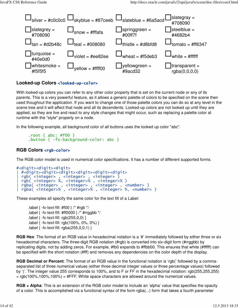
<color>
<named-color> | <looked-up-color> | <rgb-color> | <hsb-color> | <color-function>
Named Colors <named-color><named-color><named-color><named-color>
CSS supports a bunch of named constant colors. Named colors can be specified with just their unquoted name
for example:
.button { -fx-background-color: red;}
The named colors that are available in CSS are:
aliceblue =
#f0f8ff
antiquewhite =
#faebd7aqua = #00ffff
aquamarine =
#7fffd4
azure = #f0ffff beige = #f5f5dc bisque = #ffe4c4 black = #000000
blanchedalmond
= #ffebcdblue = #0000ff
blueviolet =
#8a2be2brown = #a52a2a
burlywood =
#deb887
cadetblue =
#5f9ea0chartreuse = #7fff00
chocolate =
#d2691e
coral = #ff7f50cornflowerblue =
#6495edcornsilk = #fff8dc crimson = #dc143c
cyan = #00ffffdarkblue =
#00008b
darkcyan =
#008b8b
darkgoldenrod =
#b8860b
darkgray =
#a9a9a9
darkgreen =
#006400darkgrey = #a9a9a9
darkkhaki =
#bdb76b
darkmagenta =
#8b008b
darkolivegreen =
#556b2f
darkorange =
#ff8c00
darkorchid =
#9932cc
darkred =
#8b0000
darksalmon =
#e9967a
darkseagreen =
#8fbc8f
darkslateblue =
#483d8b
JavaFX CSS Reference Guide http://docs.oracle.com/javafx/2/api/javafx/scene/doc-files/cssref.html
12 of 42 12.5.2013 18:33

darkslategray =
#2f4f4f
darkslategrey =
#2f4f4f
darkturquoise =
#00ced1
darkviolet =
#9400d3
deeppink =
#ff1493
deepskyblue =
#00bfffdimgray = #696969 dimgrey = #696969
dodgerblue =
#1e90fffirebrick = #b22222 floralwhite = #fffaf0
forestgreen =
#228b22
fuchsia = #ff00ffgainsboro =
#dcdcdcghostwhite = #f8f8ff gold = #ffd700
goldenrod =
#daa520gray = #808080 green = #008000
greenyellow =
#adff2f
grey = #808080 honeydew = #f0fff0 hotpink = #ff69b4indianred =
#cd5c5c
indigo =
#4b0082ivory = #fffff0 khaki = #f0e68c lavender = #e6e6fa
lavenderblush =
#fff0f5
lawngreen =
#7cfc00
lemonchiffon =
#fffacdlightblue = #add8e6
lightcoral =
#f08080lightcyan = #e0ffff
lightgoldenrodyellow
= #fafad2lightgray = #d3d3d3
lightgreen =
#90ee90lightgrey = #d3d3d3 lightpink = #ffb6c1
lightsalmon =
#ffa07a
lightseagreen =
#20b2aa
lightskyblue =
#87cefa
lightslategray =
#778899
lightslategrey =
#778899
lightsteelblue =
#b0c4delightyellow = #ffffe0 lime = #00ff00
limegreen =
#32cd32
linen = #faf0e6 magenta = #ff00ff maroon = #800000mediumaquamarine
= #66cdaa
mediumblue =
#0000cd
mediumorchid =
#ba55d3
mediumpurple =
#9370db
mediumseagreen =
#3cb371
mediumslateblue
= #7b68ee
mediumspringgreen
= #00fa9a
mediumturquoise =
#48d1cc
mediumvioletred =
#c71585
midnightblue =
#191970mintcream = #f5fffa mistyrose = #ffe4e1 moccasin = #ffe4b5
navajowhite =
#ffdeadnavy = #000080 oldlace = #fdf5e6 olive = #808000
olivedrab =
#6b8e23orange = #ffa500 orangered = #ff4500 orchid = #da70d6
palegoldenrod =
#eee8aa
palegreen =
#98fb98
paleturquoise =
#afeeee
palevioletred =
#db7093
papayawhip =
#ffefd5peachpuff = #ffdab9 peru = #cd853f pink = #ffc0cb
plum = #dda0ddpowderblue =
#b0e0e6purple = #800080 red = #ff0000
rosybrown =
#bc8f8f
royalblue =
#4169e1
saddlebrown =
#8b4513salmon = #fa8072
sandybrown =
#f4a460
seagreen =
#2e8b57seashell = #fff5ee sienna = #a0522d
JavaFX CSS Reference Guide http://docs.oracle.com/javafx/2/api/javafx/scene/doc-files/cssref.html
13 of 42 12.5.2013 18:33
silver = #c0c0c0 skyblue = #87ceeb slateblue = #6a5acdslategray =
#708090
slategrey =
#708090snow = #fffafa
springgreen =
#00ff7f
steelblue =
#4682b4
tan = #d2b48c teal = #008080 thistle = #d8bfd8 tomato = #ff6347
turquoise =
#40e0d0violet = #ee82ee wheat = #f5deb3 white = #ffffff
whitesmoke =
#f5f5f5yellow = #ffff00
yellowgreen =
#9acd32
transparent =
rgba(0,0,0,0)
Looked-up Colors <looked-up-color><looked-up-color><looked-up-color><looked-up-color>
With looked-up colors you can refer to any other color property that is set on the current node or any of its
parents. This is a very powerful feature, as it allows a generic palette of colors to be specified on the scene then
used thoughout the application. If you want to change one of those palette colors you can do so at any level in the
scene tree and it will affect that node and all its decendents. Looked-up colors are not looked up until they are
applied, so they are live and react to any style changes that might occur, such as replacing a palette color at
runtime with the "style" property on a node.
In the following example, all background color of all buttons uses the looked up color "abc".
.root { abc: #f00 }
.button { -fx-background-color: abc }
RGB Colors <rgb-color><rgb-color><rgb-color><rgb-color>
The RGB color model is used in numerical color specifications. It has a number of different supported forms.
#<digit><digit><digit>| #<digit><digit><digit><digit><digit><digit>| rgb( <integer> , <integer> , <integer> )| rgb( <integer> %, <integer>% , <integer>% )| rgba( <integer> , <integer> , <integer> , <number> )| rgba( <integer>% , <integer>% , <integer> %, <number> )
These examples all specify the same color for the text fill of a Label:
.label { -fx-text-fill: #f00 } /* #rgb */
.label { -fx-text-fill: #ff0000 } /* #rrggbb */
.label { -fx-text-fill: rgb(255,0,0) }
.label { -fx-text-fill: rgb(100%, 0%, 0%) }
.label { -fx-text-fill: rgba(255,0,0,1) }
RGB Hex: The format of an RGB value in hexadecimal notation is a ‘#’ immediately followed by either three or six
hexadecimal characters. The three-digit RGB notation (#rgb) is converted into six-digit form (#rrggbb) by
replicating digits, not by adding zeros. For example, #fb0 expands to #ffbb00. This ensures that white (#ffffff) can
be specified with the short notation (#fff) and removes any dependencies on the color depth of the display.
RGB Decimal or Percent: The format of an RGB value in the functional notation is ‘rgb(’ followed by a comma-
separated list of three numerical values (either three decimal integer values or three percentage values) followed
by ‘)’. The integer value 255 corresponds to 100%, and to F or FF in the hexadecimal notation: rgb(255,255,255)
= rgb(100%,100%,100%) = #FFF. White space characters are allowed around the numerical values.
RGB + Alpha: This is an extension of the RGB color model to include an ‘alpha’ value that specifies the opacity
of a color. This is accomplished via a functional syntax of the form rgba(...) form that takes a fourth parameter
JavaFX CSS Reference Guide http://docs.oracle.com/javafx/2/api/javafx/scene/doc-files/cssref.html
14 of 42 12.5.2013 18:33

which is the alpha value. The alpha value must be a number in the range 0.0 (representing completely
transparent) and 1.0 (completely opaque). As with the rgb() function, the red, green, and blue values may be
decimal integers or percentages. The following examples all specify the same color:
.label { -fx-text-fill: rgb(255,0,0) } /* integer range 0 - 255*/
.label { -fx-text-fill: rgba(255,0,0,1) /* the same, with explicit opacity of 1 */
.label { -fx-text-fill: rgb(100%,0%,0%) } /* float range 0.0% - 100.0% */
.label { -fx-text-fill: rgba(100%,0%,0%,1) } /* the same, with explicit opacity of 1 */
HSB Colors <hsb-color><hsb-color><hsb-color><hsb-color>
Colors can be specified using the HSB (sometimes called HSV) color model, as follows:
hsb( <number> , <number>% , <number>% ) | hsba( <number> , <number>% , <number>% ,<number> )
The first number is hue, a number in the range 0 to 360 degrees. The second number is saturation, a percentage
in the range 0% to 100%. The third number is brightness, also a percentage in the range 0% to 100%. The
hsba(...) form takes a fourth parameter at the end which is a alpha value in the range 0.0 to 1.0, specifying
completely transparent and completely opaque, respectively.
Color Functions <color-function><color-function><color-function><color-function>
JavaFX supports some color computation functions. These compute new colors from input colors at the time the
color style is applied. This enables a color theme to be specified using a single base color and to have variant
colors computed from that base color. There are two color functions: derive() and ladder().
<derive> | <ladder>
Derive <derive>
derive( <color> , <number>% )
The derive function takes a color and computes a brighter or darker version of that color. The second parameter
is the brightness offset, ranging from -100% to 100%. Positive percentages indicate brighter colors and negative
percentages indicate darker colors. A value of -100% means completely black, 0% means no change in
brightness, and 100% means completely white.
Ladder<ladder>
ladder(<color> , <color-stop> [, <color-stop>]+)
The ladder function interpolates between colors. The effect is as if a gradient is created using the stops provided,
and then the brightness of the provided <color> is used to index a color value within that gradient. At 0%
brightness, the color at the 0.0 end of the gradient is used; at 100% brightness, the color at the 1.0 end of the
gradient is used; and at 50% brightness, the color at 0.5, the midway point of the gradient, is used. Note that no
gradient is actually rendered. This is merely an interpolation function that results in a single color.
Stops are per W3C color-stop syntax and are normalized accordingly.
For example, you could use the following if you want the text color to be black or white depending upon the
brightness of the background.
background: white;-fx-text-fill: ladder(background, white 49%, black 50%);
The resulting -fx-text-fill value will be black, because the background (white) has a brightness of 100%, and the
color at 1.0 on the gradient is black. If we were to change the background color to black or dark grey, the
brightness would be less than 50%, giving an -fx-text-fill value of white.
JavaFX CSS Reference Guide http://docs.oracle.com/javafx/2/api/javafx/scene/doc-files/cssref.html
15 of 42 12.5.2013 18:33
The following syntax for radial gradient does not conform to the CSS grammar and is deprecated in JavaFX 2.0.
The JavaFX 2.0 CSS parser supports the syntax but this support may be removed in later releases.
ladder(<color>) stops [ ( <number> , <color> ) ]+
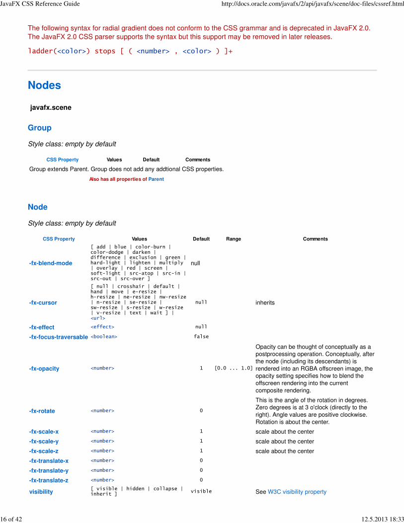
Nodes
javafx.scene
Group
Style class: empty by default
CSS Property Values Default Comments
Group extends Parent. Group does not add any addtional CSS properties.
Also has all properties of Parent
Node
Style class: empty by default
CSS Property Values Default Range Comments
-fx-blend-mode
[ add | blue | color-burn |color-dodge | darken |difference | exclusion | green |hard-light | lighten | multiply| overlay | red | screen |soft-light | src-atop | src-in |src-out | src-over ]
null
-fx-cursor
[ null | crosshair | default |hand | move | e-resize |h-resize | ne-resize | nw-resize| n-resize | se-resize |sw-resize | s-resize | w-resize| v-resize | text | wait ] |<url>
null inherits
-fx-effect <effect> null
-fx-focus-traversable <boolean> false
-fx-opacity <number> 1 [0.0 ... 1.0]
Opacity can be thought of conceptually as a
postprocessing operation. Conceptually, after
the node (including its descendants) is
rendered into an RGBA offscreen image, the
opacity setting specifies how to blend the
offscreen rendering into the current
composite rendering.
-fx-rotate <number> 0
This is the angle of the rotation in degrees.
Zero degrees is at 3 o'clock (directly to the
right). Angle values are positive clockwise.
Rotation is about the center.
-fx-scale-x <number> 1 scale about the center
-fx-scale-y <number> 1 scale about the center
-fx-scale-z <number> 1 scale about the center
-fx-translate-x <number> 0
-fx-translate-y <number> 0
-fx-translate-z <number> 0
visibility[ visible | hidden | collapse |inherit ]
visible See W3C visibility property
JavaFX CSS Reference Guide http://docs.oracle.com/javafx/2/api/javafx/scene/doc-files/cssref.html
16 of 42 12.5.2013 18:33

Pseudo-classes
CSS Pseudo-class Comments
disabled applies when the disabled variable is true
focused applies when the focused variable is true
hover applies when the hover variable is true
pressed applies when the pressed variable is true
show-mnemonic apples when the mnemonic affordance (typically an underscore) should be shown.
Parent
Style class: empty by default
CSS Property Values Default Comments
Parent extends Node. Parent does not add any addtional CSS properties.
Also has all properties of Node
Scene
Style class: not applicable
The Scene object has no settable CSS properties, nor does it have any pseudo-classes. However, the root node
of the scene is assigned the style class "root" (in addition to style classes already assigned to the node). This is
useful because the root node of Scene is the root container for all active scene graph nodes. Thus, it can serve
as a container for properties that are inherited or looked up.
javafx.scene.image
ImageView
Style class: empty by default
CSS Property Values Default Comments
-fx-image <uri> null Relative URLs are resolved against the URL of the stylesheet.
Also has all properties of Node
javafx.scene.layout
AnchorPane
Style class: empty by default
CSS Property Values Default Comments
AnchorPane extends Pane and does not add any additional CSS properties.
Also has all properties of Pane
BorderPane
Style class: empty by default
CSS Property Values Default Comments
JavaFX CSS Reference Guide http://docs.oracle.com/javafx/2/api/javafx/scene/doc-files/cssref.html
17 of 42 12.5.2013 18:33
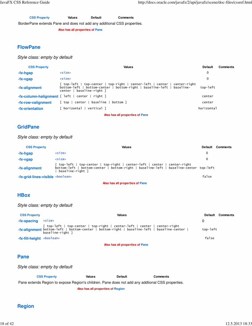
CSS Property Values Default Comments
BorderPane extends Pane and does not add any additional CSS properties.
Also has all properties of Pane
FlowPane
Style class: empty by default
CSS Property Values Default Comments
-fx-hgap <size> 0
-fx-vgap <size> 0
-fx-alignment[ top-left | top-center | top-right | center-left | center | center-rightbottom-left | bottom-center | bottom-right | baseline-left | baseline-center | baseline-right ]
top-left
-fx-column-halignment [ left | center | right ] center
-fx-row-valignment [ top | center | baseline | bottom ] center
-fx-orientation [ horizontal | vertical ] horizontal
Also has all properties of Pane
GridPane
Style class: empty by default
CSS Property Values Default Comments
-fx-hgap <size> 0
-fx-vgap <size> 0
-fx-alignment[ top-left | top-center | top-right | center-left | center | center-rightbottom-left | bottom-center | bottom-right | baseline-left | baseline-center| baseline-right ]
top-left
-fx-grid-lines-visible <boolean> false
Also has all properties of Pane
HBox
Style class: empty by default
CSS Property Values Default Comments
-fx-spacing <size> 0
-fx-alignment[ top-left | top-center | top-right | center-left | center | center-rightbottom-left | bottom-center | bottom-right | baseline-left | baseline-center |baseline-right ]
top-left
-fx-fill-height <boolean> false
Also has all properties of Pane
Pane
Style class: empty by default
CSS Property Values Default Comments
Pane extends Region to expose Region's children. Pane does not add any addtional CSS properties.
Also has all properties of Region
Region
JavaFX CSS Reference Guide http://docs.oracle.com/javafx/2/api/javafx/scene/doc-files/cssref.html
18 of 42 12.5.2013 18:33
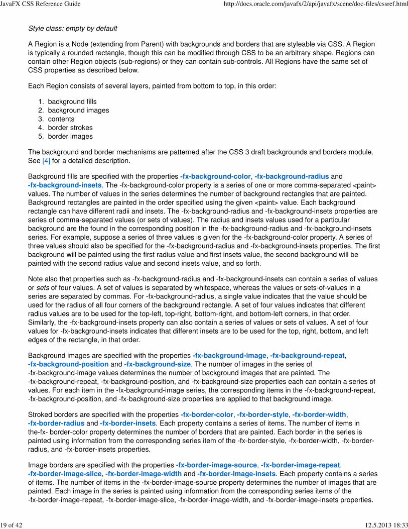
Style class: empty by default
A Region is a Node (extending from Parent) with backgrounds and borders that are styleable via CSS. A Region
is typically a rounded rectangle, though this can be modified through CSS to be an arbitrary shape. Regions can
contain other Region objects (sub-regions) or they can contain sub-controls. All Regions have the same set of
CSS properties as described below.
Each Region consists of several layers, painted from bottom to top, in this order:
background fills1.
background images2.
contents3.
border strokes4.
border images5.
The background and border mechanisms are patterned after the CSS 3 draft backgrounds and borders module.
See [4] for a detailed description.
Background fills are specified with the properties -fx-background-color, -fx-background-radius and
-fx-background-insets. The -fx-background-color property is a series of one or more comma-separated <paint>
values. The number of values in the series determines the number of background rectangles that are painted.
Background rectangles are painted in the order specified using the given <paint> value. Each background
rectangle can have different radii and insets. The -fx-background-radius and -fx-background-insets properties are
series of comma-separated values (or sets of values). The radius and insets values used for a particular
background are the found in the corresponding position in the -fx-background-radius and -fx-background-insets
series. For example, suppose a series of three values is given for the -fx-background-color property. A series of
three values should also be specified for the -fx-background-radius and -fx-background-insets properties. The first
background will be painted using the first radius value and first insets value, the second background will be
painted with the second radius value and second insets value, and so forth.
Note also that properties such as -fx-background-radius and -fx-background-insets can contain a series of values
or sets of four values. A set of values is separated by whitespace, whereas the values or sets-of-values in a
series are separated by commas. For -fx-background-radius, a single value indicates that the value should be
used for the radius of all four corners of the background rectangle. A set of four values indicates that different
radius values are to be used for the top-left, top-right, bottom-right, and bottom-left corners, in that order.
Similarly, the -fx-background-insets property can also contain a series of values or sets of values. A set of four
values for -fx-background-insets indicates that different insets are to be used for the top, right, bottom, and left
edges of the rectangle, in that order.
Background images are specified with the properties -fx-background-image, -fx-background-repeat,
-fx-background-position and -fx-background-size. The number of images in the series of
-fx-background-image values determines the number of background images that are painted. The
-fx-background-repeat, -fx-background-position, and -fx-background-size properties each can contain a series of
values. For each item in the -fx-background-image series, the corresponding items in the -fx-background-repeat,
-fx-background-position, and -fx-background-size properties are applied to that background image.
Stroked borders are specified with the properties -fx-border-color, -fx-border-style, -fx-border-width,
-fx-border-radius and -fx-border-insets. Each property contains a series of items. The number of items in
the-fx- border-color property determines the number of borders that are painted. Each border in the series is
painted using information from the corresponding series item of the -fx-border-style, -fx-border-width, -fx-border-
radius, and -fx-border-insets properties.
Image borders are specified with the properties -fx-border-image-source, -fx-border-image-repeat,
-fx-border-image-slice, -fx-border-image-width and -fx-border-image-insets. Each property contains a series
of items. The number of items in the -fx-border-image-source property determines the number of images that are
painted. Each image in the series is painted using information from the corresponding series items of the
-fx-border-image-repeat, -fx-border-image-slice, -fx-border-image-width, and -fx-border-image-insets properties.
JavaFX CSS Reference Guide http://docs.oracle.com/javafx/2/api/javafx/scene/doc-files/cssref.html
19 of 42 12.5.2013 18:33
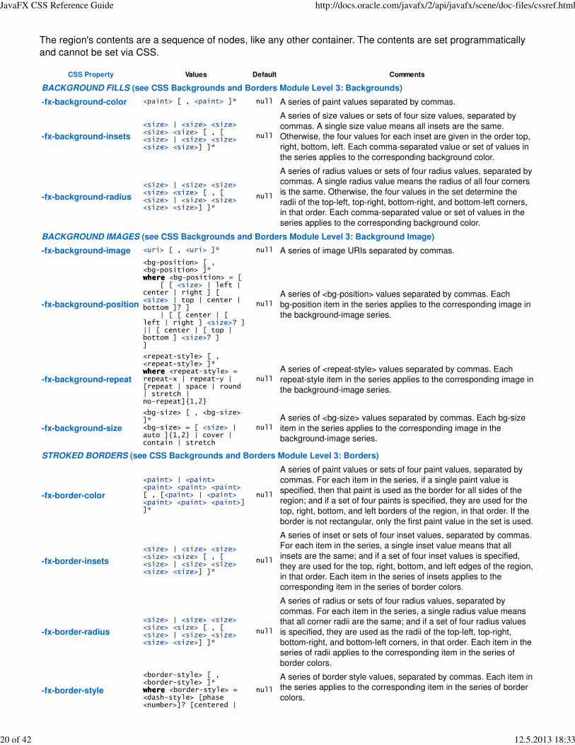
The region's contents are a sequence of nodes, like any other container. The contents are set programmatically
and cannot be set via CSS.
CSS Property Values Default Comments
BACKGROUND FILLS (see CSS Backgrounds and Borders Module Level 3: Backgrounds)
-fx-background-color <paint> [ , <paint> ]* null A series of paint values separated by commas.
-fx-background-insets
<size> | <size> <size><size> <size> [ , [<size> | <size> <size><size> <size>] ]*
null
A series of size values or sets of four size values, separated by
commas. A single size value means all insets are the same.
Otherwise, the four values for each inset are given in the order top,
right, bottom, left. Each comma-separated value or set of values in
the series applies to the corresponding background color.
-fx-background-radius
<size> | <size> <size><size> <size> [ , [<size> | <size> <size><size> <size>] ]*
null
A series of radius values or sets of four radius values, separated by
commas. A single radius value means the radius of all four corners
is the same. Otherwise, the four values in the set determine the
radii of the top-left, top-right, bottom-right, and bottom-left corners,
in that order. Each comma-separated value or set of values in the
series applies to the corresponding background color.
BACKGROUND IMAGES (see CSS Backgrounds and Borders Module Level 3: Background Image)
-fx-background-image <uri> [ , <uri> ]* null A series of image URIs separated by commas.
-fx-background-position
<bg-position> [ ,<bg-position> ]*wherewherewherewhere <bg-position> = [ [ [ <size> | left |center | right ] [<size> | top | center |bottom ]? ] | [ [ center | [left | right ] <size>? ]|| [ center | [ top |bottom ] <size>? ]]
null
A series of <bg-position> values separated by commas. Each
bg-position item in the series applies to the corresponding image in
the background-image series.
-fx-background-repeat
<repeat-style> [ ,<repeat-style> ]*wherewherewherewhere <repeat-style> =repeat-x | repeat-y |[repeat | space | round| stretch |no-repeat]{1,2}
null
A series of <repeat-style> values separated by commas. Each
repeat-style item in the series applies to the corresponding image in
the background-image series.
-fx-background-size
<bg-size> [ , <bg-size>]*<bg-size> = [ <size> |auto ]{1,2} | cover |contain | stretch
null
A series of <bg-size> values separated by commas. Each bg-size
item in the series applies to the corresponding image in the
background-image series.
STROKED BORDERS (see CSS Backgrounds and Borders Module Level 3: Borders)
-fx-border-color
<paint> | <paint><paint> <paint> <paint>[ , [<paint> | <paint><paint> <paint> <paint>]]*
null
A series of paint values or sets of four paint values, separated by
commas. For each item in the series, if a single paint value is
specified, then that paint is used as the border for all sides of the
region; and if a set of four paints is specified, they are used for the
top, right, bottom, and left borders of the region, in that order. If the
border is not rectangular, only the first paint value in the set is used.
-fx-border-insets
<size> | <size> <size><size> <size> [ , [<size> | <size> <size><size> <size>] ]*
null
A series of inset or sets of four inset values, separated by commas.
For each item in the series, a single inset value means that all
insets are the same; and if a set of four inset values is specified,
they are used for the top, right, bottom, and left edges of the region,
in that order. Each item in the series of insets applies to the
corresponding item in the series of border colors.
-fx-border-radius
<size> | <size> <size><size> <size> [ , [<size> | <size> <size><size> <size>] ]*
null
A series of radius or sets of four radius values, separated by
commas. For each item in the series, a single radius value means
that all corner radii are the same; and if a set of four radius values
is specified, they are used as the radii of the top-left, top-right,
bottom-right, and bottom-left corners, in that order. Each item in the
series of radii applies to the corresponding item in the series of
border colors.
-fx-border-style
<border-style> [ ,<border-style> ]*wherewherewherewhere <border-style> =<dash-style> [phase<number>]? [centered |
null
A series of border style values, separated by commas. Each item in
the series applies to the corresponding item in the series of border
colors.
JavaFX CSS Reference Guide http://docs.oracle.com/javafx/2/api/javafx/scene/doc-files/cssref.html
20 of 42 12.5.2013 18:33

CSS Property Values Default Comments
inside | outside]?[line-join [miter<number> | bevel |round]]? [line-cap[square | butt |round]]?wherewherewherewhere <dash-style> = [none | solid | dotted |dashed | segments(<number>, <number> [,<number>]*) ]
The segments dash-style defines a sequence representing the
lengths of the dash segments. Alternate entries in the sequence
represent the lengths of the opaque and transparent segments of
the dashes. This corresponds to the strokeDashArray variable of
Shape.
The optional phase parameter defines the point in the dashing
pattern that will correspond to the beginning of the stroke. This
corresponds to the strokeDashOffset variable of Shape.
-fx-border-width
<size> | <size> <size><size> <size> [ , [<size> | <size> <size><size> <size>] ]*
null
A series of width or sets of four width values, separated by
commas. For each item in the series, a single width value means
that all border widths are the same; and if a set of four width values
is specified, they are used for the top, right, bottom, and left border
widths, in that order. If the border is not rectangular, only the first
width value is used. Each item in the series of widths applies to the
corresponding item in the series of border colors.
BORDER IMAGES (see CSS Backgrounds and Borders Module Level 3: Border Images)
-fx-border-image-source <uri> [ , <uri> ]* null A series of image URIs, separated by commas.
-fx-border-image-insets
<size> | <size> <size><size> <size> [ , [<size> | <size> <size><size> <size>] ]*
null
A series of inset or sets of four inset values, separated by commas.
For each item in the series, a single inset value means that all
insets are the same; and if a set of four inset values is specified,
they are used for the top, right, bottom, and left edges of the region,
in that order. Each item in the series of insets applies to the
corresponding image in the series of border images.
-fx-border-image-repeat
<repeat-style> [ ,<repeat-style> ]*wherewherewherewhere <repeat-style> =repeat-x | repeat-y |[repeat | space | round| no-repeat]{1,2}
null
A series of repeat-style values, separated by commas. Each item in
the series applies to the corresponding image in the series of
border images.
-fx-border-image-slice
[<size> | <size> <size><size> <size> ] fill? [, [ <size> | <size><size> <size> <size><size> ] fill? ]*
null
A series of image slice values or sets of four values, separated by
commas. Each item in the series applies to the corresponding
image in the series of border images. For each item in the series, if
four values are given, they specify the size of the top, right, bottom,
and left slices. This effectively divides the image into nine regions:
an upper left corner, a top edge, an upper right corner, a right edge,
a lower right corner, a bottom edge, a lower left corner, a left edge
and a middle. If one value is specified, this value is used for the
slice values for all four edges. If 'fill' is present, the middle slice is
preserved, otherwise it is discarded. Percentage values may be
used here, in which case the values are considered proportional to
the source image.
-fx-border-image-width
<size> | <size> <size><size> <size> [ , [<size> | <size> <size><size> <size>] ]*
null
A series of width or sets of four width values, separated by
commas. For each item in the series, a single width value means
that all border widths are the same; and if a set of four width values
is specified, they are used for the top, right, bottom, and left border
widths, in that order. If the border is not rectangular, only the first
width value is used. Each item in the series of widths applies to the
corresponding item in the series of border images. Percentage
values may be used here, in which case the values are considered
proportional to the border image area.
OTHER
-fx-padding<size> | <size> <size><size> <size>
null
A sets of four padding values, separated by commas. For each item
in the series, a single padding value means that all padding are the
same; and if a set of four padding values is specified, they are used
for the top, right, bottom, and left edges of the region, in that order.
-fx-position-shape <boolean> true
If true means the shape centered within the region's width and
height, otherwise the shape is positioned at its source position. Has
no effect if a shape string is not specified.
JavaFX CSS Reference Guide http://docs.oracle.com/javafx/2/api/javafx/scene/doc-files/cssref.html
21 of 42 12.5.2013 18:33

CSS Property Values Default Comments
-fx-scale-shape <boolean> true
If true means the shape is scaled to fit the size of the region,
otherwise the shape is at its source size, and its position depends
on the value of the position-shape property. Has no effect if a shape
string is not specified.
-fx-shape "<string>" null
An SVG path string. By specifying a shape here the region takes on
that shape instead of a rectangle or rounded rectangle. The syntax
of this path string is specified in [3].
-fx-snap-to-pixel <boolean> trueDefines whether this region rounds position/spacing and ceils size
values to pixel boundaries when laying out its children.
-fx-background-fills null
This property is set by specifying -fx-background-color, optionally
-fx-background-insets, and optionally -fx-background-radius. In
order to set the background fill to null, specify the style
"-fx-background-color: null;". There is no shorthand notation for
-fx-background-fills at this time.
-fx-background-images null
This property is set by specifying -fx-background-image, optionally
-fx-background-position, optionally -fx-background-repeat, and
optionally -fx-background-size. There is no shorthand notation for
-fx-background-images at this time.
-fx-stroke-borders null
This property is set by specifying -fx-border-color with the optional
-fx-border-insets, -fx-border-radius, -fx-border-style and -fx-border-
width. There is no shorthand notation for -fx-stroke-borders at this
time.
-fx-image-borders null
This property set by specifying -fx-border-image-source with the
optional -fx-border-image-insets, -fx-border-image-repeat,
-fx-border-image-slice and -fx-border-image-width. There is no
shorthand notation for -fx-image-borders at this time.
Also has all properties of Parent
StackPane
Style class: empty by default
CSS Property Values Default Comments
-fx-alignment[ top-left | top-center | top-right | center-left | center | center-rightbottom-left | bottom-center | bottom-right | baseline-left | baseline-center |baseline-right ]
top-left
Also has all properties of Pane
TilePane
Style class: empty by default
CSS Property Values Default Comments
-fx-orientation [ horizontal | vertical ] horizontal
-fx-pref-rows <integer> 5
-fx-pref-columns <integer> 5
-fx-pref-tile-width <size> -1
-fx-pref-tile-height <size> -1
-fx-hgap <size> 0
-fx-vgap <size> 0
-fx-alignment[ top-left | top-center | top-right | center-left | center | center-rightbottom-left | bottom-center | bottom-right | baseline-left | baseline-center| baseline-right ]
top-left
-fx-tile-alignment[ top-left | top-center | top-right | center-left | center | center-rightbottom-left | bottom-center | bottom-right | baseline-left | baseline-center| baseline-right ]
center
JavaFX CSS Reference Guide http://docs.oracle.com/javafx/2/api/javafx/scene/doc-files/cssref.html
22 of 42 12.5.2013 18:33

CSS Property Values Default Comments
Also has all properties of Pane
VBox
Style class: empty by default
CSS Property Values Default Comments
-fx-spacing <size> 0
-fx-alignment[ top-left | top-center | top-right | center-left | center | center-rightbottom-left | bottom-center | bottom-right | baseline-left | baseline-center |baseline-right ]
top-left
-fx-fill-width <boolean> true
Also has all properties of Pane
javafx.scene.shape
Shape
Style class: empty by default
CSS Property Values Default Comments
-fx-fill <paint> BLACK
-fx-smooth <boolean> true
-fx-stroke <paint> null
-fx-stroke-type [ inside | outside | centered ] centered
-fx-stroke-dash-array <size>[ <size>]+ null
-fx-stroke-dash-offset <number> 0
-fx-stroke-line-cap [ square | butt | round ] square
-fx-stroke-line-join [ miter | bevel | round ] miter
-fx-stroke-miter-limit <number> 10
-fx-stroke-width <size> 1
Also has all properties of Node
Arc
Style class: empty by default
The Arc node has all the properties of Shape and Node.
Circle
Style class: empty by default
The Circle node has all the properties of Shape and Node.
CubicCurve
Style class: empty by default
The CubicCurve node has all the properties of Shape and Node.
Ellipse
JavaFX CSS Reference Guide http://docs.oracle.com/javafx/2/api/javafx/scene/doc-files/cssref.html
23 of 42 12.5.2013 18:33

Style class: empty by default
The Ellipse node has all the properties of Shape and Node.
Line
Style class: empty by default
The Line node has all the properties of Shape and Node.
Path
Style class: empty by default
The Path node has all the properties of Shape and Node.
Polygon
Style class: empty by default
The Polygon node has all the properties of Shape and Node.
QuadCurve
Style class: empty by default
The QuadCurve node has all the properties of Shape and Node.
Rectangle
Style class: empty by default
CSS Property Values Default Comments
-fx-arc-height <size> 0
-fx-arc-width <size> 0
Also has all properties of Shape
SVGPath
Style class: empty by default
The SVGPath node has all the properties of Shape and Node.
javafx.scene.text
Text
Style class: empty by default
CSS Property Values Default Comments
-fx-font <font> Font.DEFAULT inherits
-fx-font-smoothing-type [ gray | lcd ] gray
-fx-strikethrough <boolean> false
-fx-text-alignment [ left | center | right | justify ] left inherits
-fx-text-origin [ baseline | top | bottom ] baseline
JavaFX CSS Reference Guide http://docs.oracle.com/javafx/2/api/javafx/scene/doc-files/cssref.html
24 of 42 12.5.2013 18:33

CSS Property Values Default Comments
-fx-underline <boolean> false
Also has font properties and all properties of Shape
javafx.scene.web
WebView
Style class: web-view
CSS Property Values Default Comments
-fx-context-menu-enabled <boolean> true
-fx-font-smoothing-type [ gray | lcd ] lcd
-fx-font-scale <number> 1
-fx-min-width <size> 0
-fx-min-height <size> 0
-fx-pref-width <size> 800
-fx-pref-height <size> 600
-fx-max-width <size> Double.MAX_VALUE
-fx-max-height <size> Double.MAX_VALUE
Also has all properties of Parent
javafx.scene.control
In JavaFX 2.0 the default skins for all controls support styling from CSS. This is accomplished by building the
skins from layout objects called Regions. Most of the style properties for a control are provided by the Region
objects that comprise the control's skin. Each Region object of the skin's substructure has its own style class so
that it can be styled specifically. The control itself will sometimes provide CSS properties in addition to those
provided by its Regions. Finally, controls may also define pseudo-classes such as "vertical" and "horizontal" in
addition to those defined by Node.
Accordion
Style class: accordion
The Accordion control has all the properties and pseudo-classes of Control
Substructure
first-titled-pane - the first TitledPane
Button
Style class: button
The Button control has all the properties of ButtonBase
Pseudo-classes
CSS Pseudo-class Comments
cancel applies if this Button receives VK_ESC if the event is not otherwise consumed
default applies if this Button receives VK_ENTER if the event is not otherwise consumed
Also has all pseudo-classes of ButtonBase
JavaFX CSS Reference Guide http://docs.oracle.com/javafx/2/api/javafx/scene/doc-files/cssref.html
25 of 42 12.5.2013 18:33

ButtonBase
The ButtonBase control has all the properties of Labeled
Pseudo-classes
CSS Pseudo-class Comments
armed applies when the armed variable is true
Also has all pseudo-classes of Labeled
Cell
Style class: cell
CSS Property Values Default Comments
-fx-cell-size <size> 15The cell size. For vertical ListView or a TreeView or TableView this is the height, for a horizontal
ListView this is the width.
The Cell control has all the properties of Labeled
Pseudo-classes
CSS Pseudo-class Comments
empty applies when the empty variable is true
filled applies when the empty variable is false
selected applies when the selected variable is true
Also has all pseudo-classes of Labeled
Substructure
text - a Labeled
CheckBox
Style class: check-box
The CheckBox control has all the properties of ButtonBase
Pseudo-classes
CSS Pseudo-class Comments
selected applies when the selected variable is true
determinate applies when the indeterminate variable is false
indeterminate applies when the indeterminate variable is true
Also has all pseudo-classes of ButtonBase
Substructure
box — a StackPane
mark — a StackPane
CheckMenuItem
Pseudo-classes
JavaFX CSS Reference Guide http://docs.oracle.com/javafx/2/api/javafx/scene/doc-files/cssref.html
26 of 42 12.5.2013 18:33
CSS Pseudo-class Comments
selected applies if this item is selected
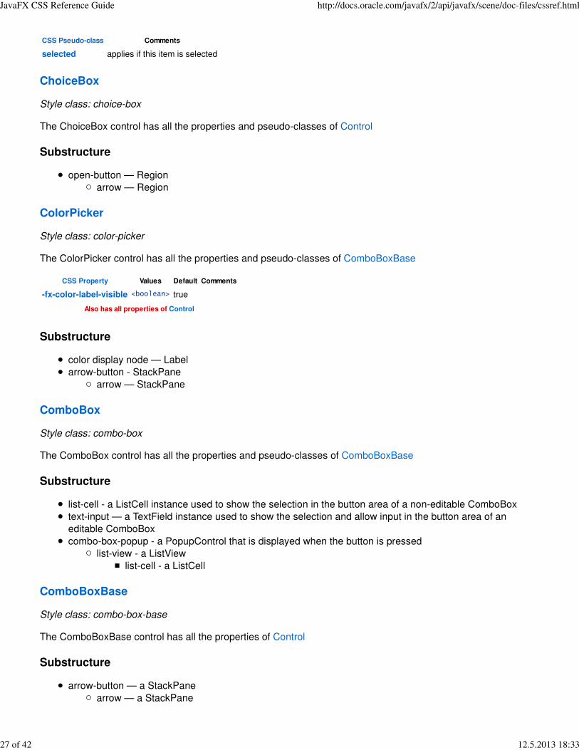
ChoiceBox
Style class: choice-box
The ChoiceBox control has all the properties and pseudo-classes of Control
Substructure
open-button — Region
arrow — Region
ColorPicker
Style class: color-picker
The ColorPicker control has all the properties and pseudo-classes of ComboBoxBase
CSS Property Values Default Comments
-fx-color-label-visible <boolean> true
Also has all properties of Control
Substructure
color display node — Label
arrow-button - StackPane
arrow — StackPane
ComboBox
Style class: combo-box
The ComboBox control has all the properties and pseudo-classes of ComboBoxBase
Substructure
list-cell - a ListCell instance used to show the selection in the button area of a non-editable ComboBox
text-input — a TextField instance used to show the selection and allow input in the button area of an
editable ComboBox
combo-box-popup - a PopupControl that is displayed when the button is pressed
list-view - a ListView
list-cell - a ListCell
ComboBoxBase
Style class: combo-box-base
The ComboBoxBase control has all the properties of Control
Substructure
arrow-button — a StackPane
arrow — a StackPane
JavaFX CSS Reference Guide http://docs.oracle.com/javafx/2/api/javafx/scene/doc-files/cssref.html
27 of 42 12.5.2013 18:33

CSS Pseudo-class Comments
editable applies when the editable variable is true
showing applies when the showing variable is true
armed applies when the armed variable is true
Control
The Control class has all the properties of Parent
CSS Property Values Default Comments
-fx-skin <string> null The class name of the Control's Skin.
Hyperlink
Style class: hyperlink
The Hyperlink control has all the properties of ButtonBase.
Pseudo-classes
CSS Pseudo-class Comments
visited applies when the visited variable is true
Also has all pseudo-classes of ButtonBase
Substructure
label — Label
IndexedCell
Style class: indexed-cell
The IndexedCell control has all the properties of Cell.
Pseudo-classes
CSS Pseudo-class Comments
even applies if this cell's index is even
odd applies if this cell's index is odd
Also has all pseudo-classes of Cell
Label
Style class: label
Label has all the properties and pseudo-class state of Labeled
Labeled
CSS Property Values Default Comments
-fx-alignment[ top-left | top-center | top-right | center-left | center |center-right bottom-left | bottom-center | bottom-right |baseline-left | baseline-center | baseline-right ]
top-left
-fx-text-alignment [ left | center | right | justify ] left
text-align from CSS spec
maps to textAlignment in
JavaFX
JavaFX CSS Reference Guide http://docs.oracle.com/javafx/2/api/javafx/scene/doc-files/cssref.html
28 of 42 12.5.2013 18:33
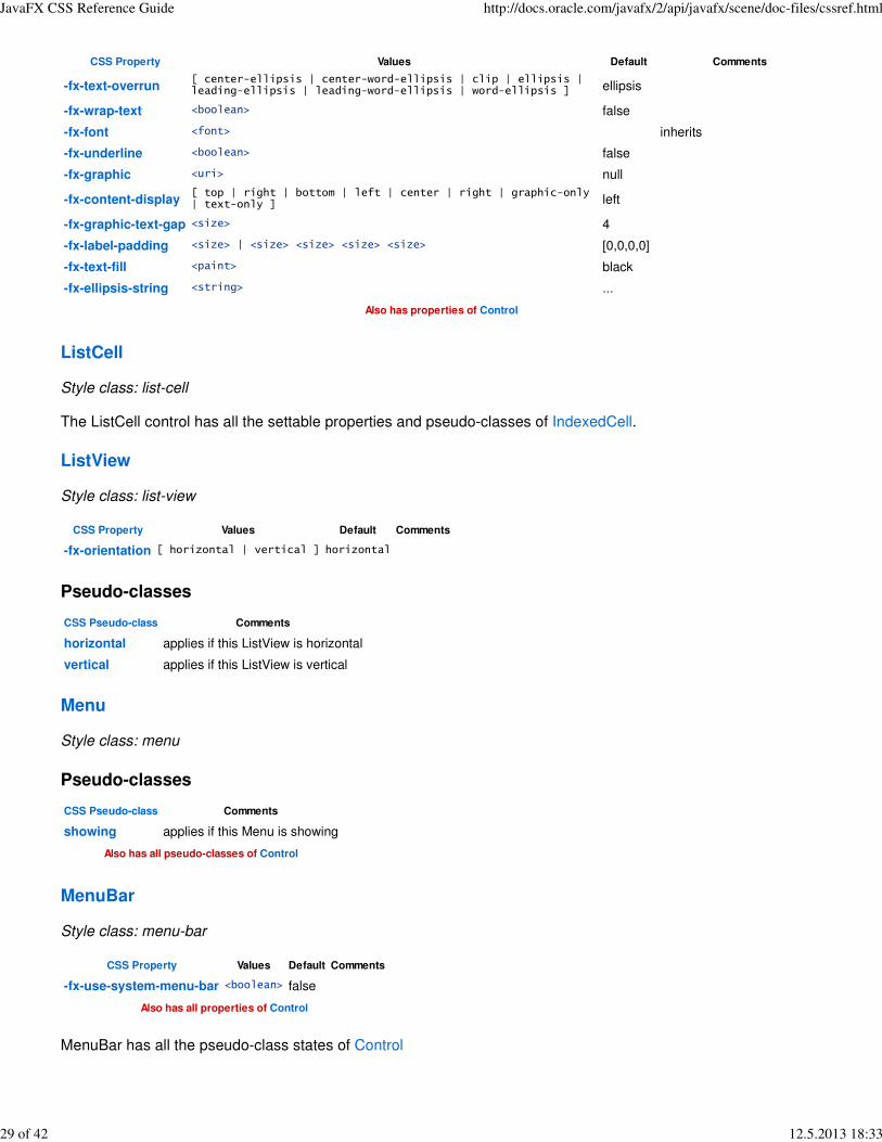
CSS Property Values Default Comments
-fx-text-overrun[ center-ellipsis | center-word-ellipsis | clip | ellipsis |leading-ellipsis | leading-word-ellipsis | word-ellipsis ] ellipsis
-fx-wrap-text <boolean> false
-fx-font <font> inherits
-fx-underline <boolean> false
-fx-graphic <uri> null
-fx-content-display[ top | right | bottom | left | center | right | graphic-only| text-only ] left
-fx-graphic-text-gap <size> 4
-fx-label-padding <size> | <size> <size> <size> <size> [0,0,0,0]
-fx-text-fill <paint> black
-fx-ellipsis-string <string> ...
Also has properties of Control
ListCell
Style class: list-cell
The ListCell control has all the settable properties and pseudo-classes of IndexedCell.
ListView
Style class: list-view
CSS Property Values Default Comments
-fx-orientation [ horizontal | vertical ] horizontal
Pseudo-classes
CSS Pseudo-class Comments
horizontal applies if this ListView is horizontal
vertical applies if this ListView is vertical
Menu
Style class: menu
Pseudo-classes
CSS Pseudo-class Comments
showing applies if this Menu is showing
Also has all pseudo-classes of Control
MenuBar
Style class: menu-bar
CSS Property Values Default Comments
-fx-use-system-menu-bar <boolean> false
Also has all properties of Control
MenuBar has all the pseudo-class states of Control
JavaFX CSS Reference Guide http://docs.oracle.com/javafx/2/api/javafx/scene/doc-files/cssref.html
29 of 42 12.5.2013 18:33
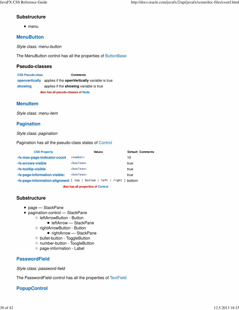
Substructure
menu
MenuButton
Style class: menu-button
The MenuButton control has all the properties of ButtonBase
Pseudo-classes
CSS Pseudo-class Comments
openvertically applies if the openVertically variable is true
showing applies if the showing variable is true
Also has all pseudo-classes of Node
MenuItem
Style class: menu-item
Pagination
Style class: pagination
Pagination has all the pseudo-class states of Control
CSS Property Values Default Comments
-fx-max-page-indicator-count <number> 10
-fx-arrows-visible <boolean> true
-fx-tooltip-visible <boolean> true
-fx-page-information-visible: <boolean> true
-fx-page-information-alignment [ top | bottom | left | right ] bottom
Also has all properties of Control
Substructure
page — StackPane
pagination-control — StackPane
leftArrowButton - Button
leftArrow — StackPane
rightArrowButton - Button
rightArrow — StackPane
bullet-button - ToggleButton
number-button - ToogleButton
page-information - Label
PasswordField
Style class: password-field
The PasswordField control has all the properties of TextField
PopupControl
JavaFX CSS Reference Guide http://docs.oracle.com/javafx/2/api/javafx/scene/doc-files/cssref.html
30 of 42 12.5.2013 18:33

ProgressBar
Style class: progress-bar
CSS Property Values Default Comments
-fx-indeterminate-bar-length <number> 60
-fx-indeterminate-bar-escape <boolean> true
-fx-indeterminate-bar-flip <boolean> true
-fx-indeterminate-bar-animation-time <number> 2.0
The ProgressBar control has all the properties of and pseudo-class state of ProgressIndicator
Substructure
track - StackPane
bar — Region
ProgressIndicator
Style class: progress-indicator
CSS Property Values Default Comments
-fx-skin<the fully qualified class name ofthe Skin> null
The PopupControl is a PopupWindow and does not have any other
CSS properties
CSS Property Values Default Comments
-fx-progress-color <paint> dodgerblue
The ProgressIndicator control has all the properties of Control
Pseudo-classes
CSS Pseudo-class Comments
determinate applies if the indeterminate variable is false
indetermindate applies if the indeterminate variable is true
Also has all pseudo-classes of Control
Substructure
indicator — StackPane
progress - StackPane
percentage - Text
tick - StackPane
RadioButton
Style class: radio-button
The RadioButton control has all the properties of ToggleButton
Substructure
radio — Region
dot — Region
label — Label
JavaFX CSS Reference Guide http://docs.oracle.com/javafx/2/api/javafx/scene/doc-files/cssref.html
31 of 42 12.5.2013 18:33

RadioMenuItem
Pseudo-classes
CSS Pseudo-class Comments
selected applies if this item is selected
ScrollBar
Style class: scroll-bar
CSS Property Values Default Comments
-fx-orientation [ horizontal | vertical ] horizontal
-fx-block-increment <number> 10
-fx-unit-increment <number> 1
Pseudo-classes
CSS Pseudo-class Comments
vertical applies if this ScrollBar is vertical
horizontal applies if this ScrollBar is horizontal
Also has all pseudo-classes of Control
Substructure
decrement-button — StackPane
decrement-arrow — StackPane
track — StackPane
thumb — StackPane
increment-button — StackPane
increment-arrow — StackPane
ScrollPane
Style class: scroll-pane
CSS Property Values Default Comments
-fx-fit-to-width <boolean> false
-fx-fit-to-height <boolean> false
-fx-pannable <boolean> false
-fx-hbar-policy [ never | always | as-needed ] 1
-fx-vbar-policy [ never | always | as-needed ] 1
Also has all properties of Control
Pseudo-classes
CSS Pseudo-class Comments
pannable applies if this ScrollPane is pannable
fitToWidth applies if this ScrollPane is fitToWidth
fitToHeight applies if this ScrollPane is fitToHeight
Also has all pseudo-classes of Control
Substructure
JavaFX CSS Reference Guide http://docs.oracle.com/javafx/2/api/javafx/scene/doc-files/cssref.html
32 of 42 12.5.2013 18:33

scroll-bar:vertical — ScrollBar
scroll-bar:horizontall — ScrollBar
corner - StackPane
Separator
Style class: separator
CSS Property Values Default Comments
-fx-orientation [ horizontal | vertical ] horizontal
-fx-halignment [ left | center | right ] center
-fx-valignment [ top | center | baseline | bottom ] center
Also has all properties of Control
Pseudo-classes
CSS Pseudo-class Comments
horizontal applies if this Separator is horizontal
vertical applies if this Separator is vertical
Also has all pseudo-classes of Control
Substructure
line — Region
Slider
Style class: slider
CSS Property Values Default Comments
-fx-orientation [ horizontal | vertical ] horizontal
-fx-show-tick-labels <boolean> false
-fx-show-tick-marks <boolean> false
-fx-major-tick-unit <number> 25
-fx-minor-tick-count <integer> 3
-fx-show-tick-labels <boolean> false
-fx-snap-to-ticks <boolean> false
-fx-block-increment <integer> 10
Also has all properties of Control
Pseudo-classes
CSS Pseudo-class Comments
horizontal applies if this Slider is horizontal
vertical applies if this Slider is vertical
Also has all pseudo-classes of Control
Substructure
axis — NumberAxis
track — Region
thumb — Region
JavaFX CSS Reference Guide http://docs.oracle.com/javafx/2/api/javafx/scene/doc-files/cssref.html
33 of 42 12.5.2013 18:33

SplitMenuButton
Style class: split-menu-button
SplitPane
Style class: split-pane
CSS Property Values Default Comments
-fx-orientation [ horizontal | vertical ] horizontal
Also has all properties of Control
Pseudo-classes
CSS Pseudo-class Comments
horizontal applies if this Slider is horizontal
vertical applies if this Slider is vertical
Also has all pseudo-classes of Control
Substructure
split-pane-divider — StackPane
vertical-grabber — StackPane
horizontal-grabber — StackPane
TabPane
Style class: tab-pane
Note: The styleclass is "tab-pane floating" if the TabPane is floating.
CSS Property Values Default Comments
-fx-tab-min-width <integer> 0
-fx-tab-max-width <integer> Double.MAX_VALUE
-fx-tab-min-height <integer> 0
-fx-tab-max-height <integer> Double.MAX_VALUE
Also has all properties of Control
Pseudo-classes
CSS Pseudo-class Comments
top applies if the side is top
right applies if the side is rght
bottom applies if the side is bottom
left applies if the side is left
Also has all pseudo-classes of Control
Substructure
tab-header-area — StackPane
headers-region - StackPane
tab-header-background - StackPane
control-buttons-tab - StackPane
JavaFX CSS Reference Guide http://docs.oracle.com/javafx/2/api/javafx/scene/doc-files/cssref.html
34 of 42 12.5.2013 18:33

tab-down-button - Pane
arrow - StackPane
tab - Tab
tab-label - Label
tab-close-button - StackPane
tab-content-area — StackPane
TableView
Style class: table-view
CSS Property Values Default Comments
-fx-size <size> 20 The table column header size.
Also has all properties of Control
Pseudo-classes
CSS Pseudo-class Comments
cell-selection applies if this TableView's selection model is cell selection
row-selection applies if this TableView's selection model is row selection
Also has all pseudo-classes of Node
Substructure
column-resize-line - Region
column-overlay - Region
placeholder - StackPane
column-header-background - StackPane
nested-column-header
column-header
filler - Region
show-hide-columns-button - StackPane
show-hide-column-image - StackPane
column-drag-header - StackPane
label - Label
TextArea
Style class: text-area
TextArea has all the properties and pseudo-class state of TextInputControl
Substructure
scroll-pane - ScrollPane
content - Region
TextInputControl
CSS Property Values Default Comments
-fx-font <font> null inherits
-fx-text-fill <paint> black
-fx-prompt-text-fill <paint> gray
-fx-highlight-fill <paint> dodgerblue
JavaFX CSS Reference Guide http://docs.oracle.com/javafx/2/api/javafx/scene/doc-files/cssref.html
35 of 42 12.5.2013 18:33

CSS Property Values Default Comments
-fx-highlight-text-fill <paint> white
-fx-display-caret <boolean> true
Also has Font Properties and all properties of Control
Pseudo-classes
CSS Pseudo-class Comments
readonly applies if this TextInputControl is not editable
Also has all pseudo-classes of Control
TextField
Style class: text-field
CSS Property Values Default Comments
-fx-alignment[ top-left | top-center | top-right | center-left | center | center-rightbottom-left | bottom-center | bottom-right | baseline-left | baseline-center |baseline-right ]
center-left
Also has all properties of TextInputControl
TextField has all the pseudo-class states of TextInputControl
TitledPane
CSS Property Values Default Comments
-fx-animated <boolean> true
-fx-collapsible <boolean> true
Also has Font Properties and all properties of Labeled
Pseudo-classes
CSS Pseudo-class Comments
expanded applies if this TitledPane is expanded
collapsed applies if this TitledPane is collapsed
Also has all pseudo-classes of Labeled
Substructure
title — HBox
text — Label/li>
arrow-button — StackPane/li>
arrow — StackPane
content — StackPane/li>
ToggleButton
Style class: toggle-button
The ToggleButton control has all the properties of ButtonBase.
Pseudo-classes
CSS Pseudo-class Comments
selected applies if this ToggleButton is selected
JavaFX CSS Reference Guide http://docs.oracle.com/javafx/2/api/javafx/scene/doc-files/cssref.html
36 of 42 12.5.2013 18:33

CSS Pseudo-class Comments
Also has all pseudo-classes of ButtonBase
ToolBar
Style class: tool-bar
CSS Property Values Default Comments
-fx-orientation [ horizontal | vertical ] horizontal
Also has all properties of Control
Pseudo-classes
CSS Pseudo-class Comments
horizontal applies if this ToolBar is horizontal
vertical applies if this ToolBar is vertical
Also has all pseudo-classes of Control
Substructure
tool-bar-overflow-button - StackPane
arrow - StackPane
Tooltip
Style class: tooltip
CSS Property Values Default Comments
-fx-text-alignment [ left | center | right | justify ] left
-fx-text-overrun[ center-ellipsis | center-word-ellipsis | clip | ellipsis | leading-ellipsis | leading-word-ellipsis | word-ellipsis ] ellipsis
-fx-wrap-text <boolean> false
-fx-graphic <uri> null
-fx-content-display[ top | right | bottom | left | center | right | graphic-only |text-only ] left
-fx-graphic-text-gap <size> 4
-fx-font <font> Font.DEFAULT inherits
Substructure
label — Label
page-corner — StackPane
TreeCell
Style class: tree-cell
CSS Property Values Default Comments
-fx-indent <size> 10 The amout of space to multiply by the treeItem.level to get the left margin
Also has all properties of IndexedCell
Pseudo-classes
CSS Pseudo-class Comments
JavaFX CSS Reference Guide http://docs.oracle.com/javafx/2/api/javafx/scene/doc-files/cssref.html
37 of 42 12.5.2013 18:33
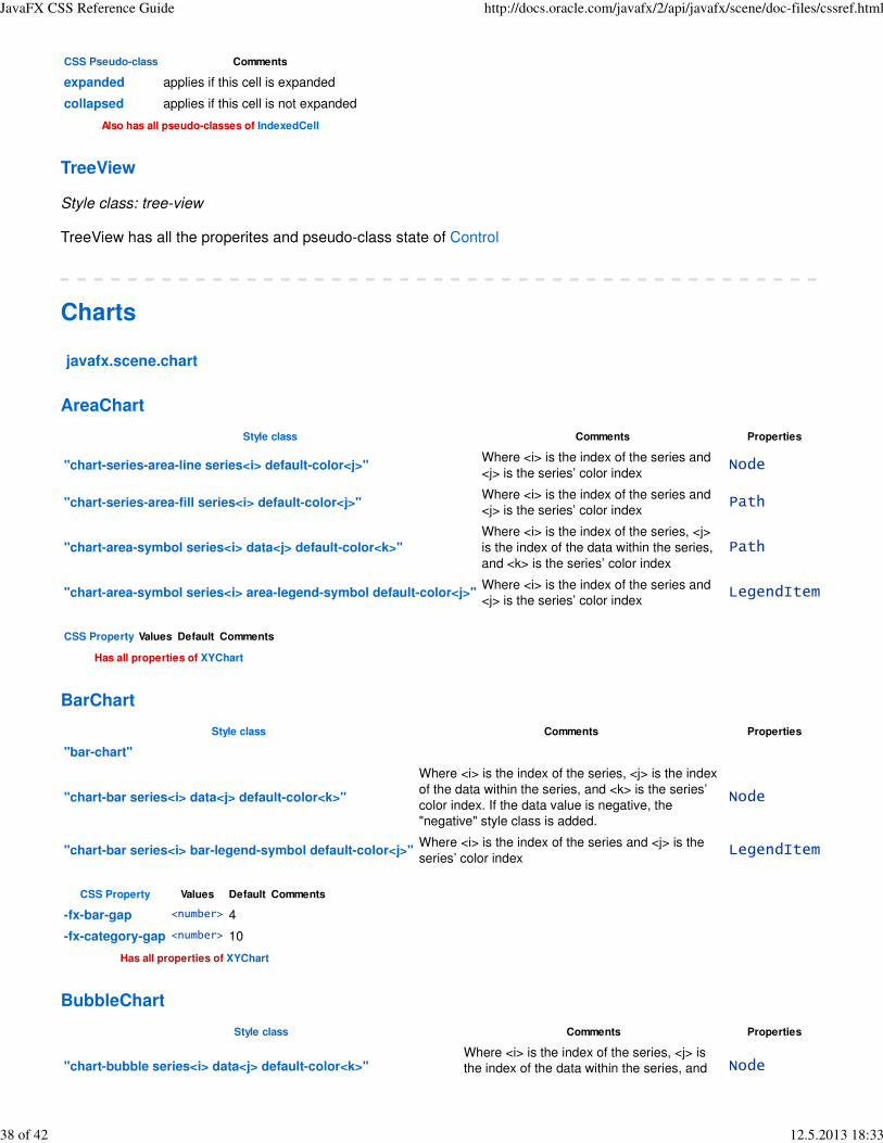
CSS Pseudo-class Comments
expanded applies if this cell is expanded
collapsed applies if this cell is not expanded
Also has all pseudo-classes of IndexedCell
TreeView
Style class: tree-view
TreeView has all the properites and pseudo-class state of Control
Charts
javafx.scene.chart
AreaChart
Style class Comments Properties
"chart-series-area-line series<i> default-color<j>"Where <i> is the index of the series and
<j> is the series’ color indexNode
"chart-series-area-fill series<i> default-color<j>"Where <i> is the index of the series and
<j> is the series’ color indexPath
"chart-area-symbol series<i> data<j> default-color<k>"
Where <i> is the index of the series, <j>
is the index of the data within the series,
and <k> is the series’ color index
Path
"chart-area-symbol series<i> area-legend-symbol default-color<j>"Where <i> is the index of the series and
<j> is the series’ color indexLegendItem
CSS Property Values Default Comments
Has all properties of XYChart
BarChart
Style class Comments Properties
"bar-chart"
"chart-bar series<i> data<j> default-color<k>"
Where <i> is the index of the series, <j> is the index
of the data within the series, and <k> is the series’
color index. If the data value is negative, the
"negative" style class is added.
Node
"chart-bar series<i> bar-legend-symbol default-color<j>"Where <i> is the index of the series and <j> is the
series’ color indexLegendItem
CSS Property Values Default Comments
-fx-bar-gap <number> 4
-fx-category-gap <number> 10
Has all properties of XYChart
BubbleChart
Style class Comments Properties
"chart-bubble series<i> data<j> default-color<k>"Where <i> is the index of the series, <j> is
the index of the data within the series, and Node
JavaFX CSS Reference Guide http://docs.oracle.com/javafx/2/api/javafx/scene/doc-files/cssref.html
38 of 42 12.5.2013 18:33
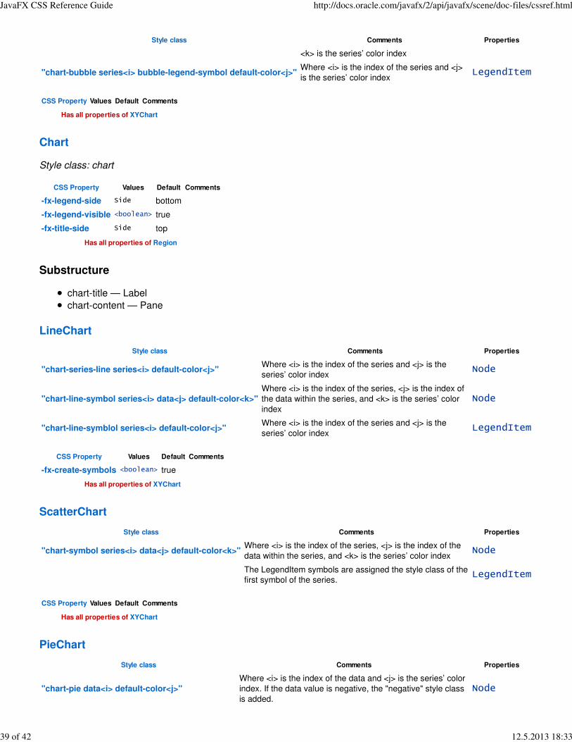
Style class Comments Properties
<k> is the series’ color index
"chart-bubble series<i> bubble-legend-symbol default-color<j>"Where <i> is the index of the series and <j>
is the series’ color indexLegendItem
CSS Property Values Default Comments
Has all properties of XYChart
Chart
Style class: chart
CSS Property Values Default Comments
-fx-legend-side Side bottom
-fx-legend-visible <boolean> true
-fx-title-side Side top
Has all properties of Region
Substructure
chart-title — Label
chart-content — Pane
LineChart
Style class Comments Properties
"chart-series-line series<i> default-color<j>"Where <i> is the index of the series and <j> is the
series’ color indexNode
"chart-line-symbol series<i> data<j> default-color<k>"
Where <i> is the index of the series, <j> is the index of
the data within the series, and <k> is the series’ color
index
Node
"chart-line-symblol series<i> default-color<j>"Where <i> is the index of the series and <j> is the
series’ color indexLegendItem
CSS Property Values Default Comments
-fx-create-symbols <boolean> true
Has all properties of XYChart
ScatterChart
Style class Comments Properties
"chart-symbol series<i> data<j> default-color<k>"Where <i> is the index of the series, <j> is the index of the
data within the series, and <k> is the series’ color indexNode
The LegendItem symbols are assigned the style class of the
first symbol of the series.LegendItem
CSS Property Values Default Comments
Has all properties of XYChart
PieChart
Style class Comments Properties
"chart-pie data<i> default-color<j>"
Where <i> is the index of the data and <j> is the series’ color
index. If the data value is negative, the "negative" style class
is added.
Node
JavaFX CSS Reference Guide http://docs.oracle.com/javafx/2/api/javafx/scene/doc-files/cssref.html
39 of 42 12.5.2013 18:33

Style class Comments Properties
"chart-pie-label-line;" Path
"chart-pie-label;" Text
"pie-legend-symbol <ith
data item’s style class>"Each item in the legend has the style class "pie-legend-
symbol" plus the style class of the corresponding data itemLegendItem
CSS Property Values Default Comments
-fx-clockwise <boolean> true
-fx-pie-label-visible <boolean> true
-fx-label-line-length <size> 20
-fx-start-angle <number> 0
Has all properties of Chart
XYChart
Style class: set by sub-type
CSS Property Values Default Comments
-fx-alternative-column-fill-visible <boolean> true
-fx-alternative-row-fill-visible <boolean> true
-fx-horizontal-grid-lines-visible <boolean> true
-fx-horizontal-zero-line-visible <boolean> true
-fx-vertical-grid-lines-visible <boolean> true
-fx-vertical-zero-line-visible <boolean> true
Has all properties of chart
Substructure
plot-content — Group
chart-plot-background — Region
chart-alternative-column-fill — Path
chart-alternative-row-fill — Path
chart-vertical-grid-lines — Path
chart-horizontal-grid-lines — Path
chart-vertical-zero-line — Line
chart-horizontal-zero-line — Line
Axis
Style class: axis
CSS Property Values Default Comments
-fx-side Side null
-fx-tick-length <size> 8
-fx-tick-label-font <font> 8 system
-fx-tick-label-fill <paint> 8 system
-fx-tick-label-gap <size> 8 system
-fx-tick-mark-visible <boolean> true
-fx-tick-labels-visible <boolean> true
Has all properties of Region
Substructure
JavaFX CSS Reference Guide http://docs.oracle.com/javafx/2/api/javafx/scene/doc-files/cssref.html
40 of 42 12.5.2013 18:33

axis-label — Text
axis-tick-mark — Path
ValueAxis
Style class: axis
CSS Property Values Default Comments
-fx-minor-tick-length <size> 5
-fx-minor-tick-count <size> 5
-fx-minor-tick-visible <boolean> true
Has all properties of Axis
Substructure
axis-minor-tick-mark — Path
NumberAxis
Style class: axis
CSS Property Values Default Comments
-fx-tick-unit <number> 5 The value between each major tick mark in data units.
Has all properties of ValueAxis
CategoryAxis
Style class: axis
CSS Property Values Default Comments
-fx-start-margin <number> 5 The margin between the axis start and the first tick-mark
-fx-end-margin <number> 5 The margin between the axis start and the first tick-mark
-fx-gap-start-and-end <boolean> true If this is true then half the space between ticks is left at the start and end
Has all properties of Axis
Legend
Style class: chart-legend
CSS Property Values Default Comments
Has all properties of Region
Substructure
chart-legend-item - Label
chart-legend-item-symbol - Node
References
[1] CSS 2.1: http://www.w3.org/TR/CSS21/
[2] CSS 3 work in progress http://www.w3.org/Style/CSS/current-work (May 2010).
JavaFX CSS Reference Guide http://docs.oracle.com/javafx/2/api/javafx/scene/doc-files/cssref.html
41 of 42 12.5.2013 18:33

[3] SVG Paths: http://www.w3.org/TR/SVG/paths.html
[4] CSS Backgrounds and Borders Module Level 3: http://www.w3.org/TR/css3-background/
Copyright (c) 2008, 2013 Oracle and/or its affiliates. All rights reserved. Use is subject to license terms.
JavaFX CSS Reference Guide http://docs.oracle.com/javafx/2/api/javafx/scene/doc-files/cssref.html
42 of 42 12.5.2013 18:33