ISSUE 2 -MAR 2020 - arkt.space · ISSUE 2 -MAR 2020 SPACE TO ARCHITECTURE. 2 Trimestrale di...
36
CASA T HOME T SAN NICOLA ARCELLA E IL FASCINO DEL CORTEN ALL’ARCOMAGNO SAN NICOLA ARCELLA AND THE CHARM OF CORTEN IN ARCOMAGNO O-HOUSE LA CASA MUSEO O-HOUSE THE HOUSE MUSEUM A TEMPLE OF SPIRIT A TEMPLE OF SPIRIT INTERVISTA CON SIMONE MICHELI INTERVIEW WITH SIMONE MICHELI - UNIVERSITY OF VENICE IUAV - UNIVERSITY OF VENICE FB: arkt space to architecture www.arkt.space ISSUE 2 -MAR 2020 SPACE TO ARCHITECTURE CASA T HOME T SAN NICOLA ARCELLA E IL FASCINO DEL CORTEN ALL’ARCOMAGNO SAN NICOLA ARCELLA AND THE CHARM OF CORTEN IN ARCOMAGNO O-HOUSE LA CASA MUSEO O-HOUSE THE HOUSE MUSEUM A TEMPLE OF SPIRIT A TEMPLE OF SPIRIT INTERVISTA CON SIMONE MICHELI INTERVIEW WITH SIMONE MICHELI - UNIVERSITY OF VENICE IUAV - UNIVERSITY OF VENICE FB: arkt space to architecture www.arkt.space ISSUE 2 -MAR 2020 SPACE TO ARCHITECTURE
Transcript of ISSUE 2 -MAR 2020 - arkt.space · ISSUE 2 -MAR 2020 SPACE TO ARCHITECTURE. 2 Trimestrale di...

CASA T HOME T SAN NICOLA ARCELLA E IL FASCINO DEL CORTEN ALL’ARCOMAGNO SAN NICOLA ARCELLA AND THE CHARM OF CORTEN IN ARCOMAGNO O-HOUSE LA CASA MUSEO O-HOUSE THE HOUSE MUSEUM A TEMPLE OF SPIRIT A TEMPLE OF SPIRIT INTERVISTA CON SIMONE MICHELI INTERVIEW WITH SIMONE MICHELI - UNIVERSITY OF VENICE IUAV - UNIVERSITY OF VENICE
FB
: a
rkt
sp
ac
e t
o a
rch
ite
ctu
re
ww
w.a
rkt.
sp
ac
e
I S S U E 2 - M A R 2 0 2 0
S P A C E T O A R C H I T E C T U R E

2
Trimestrale di proprietà e redatto da ETERNO IVICA
Via Austria, 25/E35127 PADOVA - ITALYT. ITALY +39 049 8530101 T. EXP. +39 049 8530102
Redattore e coordinamento organizzativo: Elisabetta Balzani
Hanno collaborato a questonumero: Elisabetta Balzani; Linda Pivesso; Silvia Menapace; Davide Moroni; Domenico De Rito; Gabriele La Rosa; Giuseppina Arena; Simone Micheli.
Stampa: Tipografia Toffanin
Grafica: Ey Studio
Per info e contatti: [email protected]
FB: ARKT - Space to Architecture
Immagine di copertina:Inside Weather
Una realizzazione di:www.eternoivica.com
COLLABORA CON NOIScrivi per ARKT
Vuoi informazioni, hai un tema di cui vuoi parlare o vuoi pubblicare un articolo?
CONTATTACI!www.arkt.spacearkt space to architecture
Quarterly owned and written by ETERNO IVICA
Via Austria, 25/E - Z.I. SUD 35127 PADOVA - ITALYT. ITALY +39 049 8530101 T. EXP. +39 049 8530102
Editor and organizational coordination: Elisabetta Balzani
Contributors: Elisabetta Balzani; Linda Pivesso; Silvia Menapa-ce; Davide Moroni; Domenico De Rito; Gabriele La Rosa; Giuseppina Arena; Simone Micheli.
Printing: Toffanin Typography
Graphics: Ey Studio
For info and contacts: [email protected]
FB: ARKT - Space to Architecture
Cover picture:Inside Weather
A realization of:www.eternoivica.com
WORK WITH USWrite for ARKT
Do you want to know more,do you have an idea you want to talk about or do you want to publish an article?
CONTACT USwww.arkt.spacearkt space to architecture

3
I N D I C E
C A S A TH O M E T
O - H O U S E , L A C A S A M U S E OO - H O U S E , T H E H O U S E M U S E U M
S A N N I C O L A A R C E L L A E I L F A S C I N O D E L C O R T E N A L L’A R C O M A G N OS A N N I C O L A A R C E L L A A N D T H E C H A R M O F C O R T E N I N A R C O M A G N O
A T E M P L E O F S P I R I TA T E M P L E O F S P I R I T
I N T E R V I S T A C O N S I M O N E M I C H E L I I N T E R V I E W W I T H S I M O N E M I C H E L I
I U A V - U N I V E R S I T Y O F V E N I C EI U A V - U N I V E R S I T Y O F V E N I C E
4
1 6
PR
OJE
CT
SS
TO
RIE
SC
OL
LA
BO
RA
TIO
NS
2 4
2 8
1 2

4
P R O J E C T S B Y D A V I D E M O R O N I
C A S A T
H O M E T
5
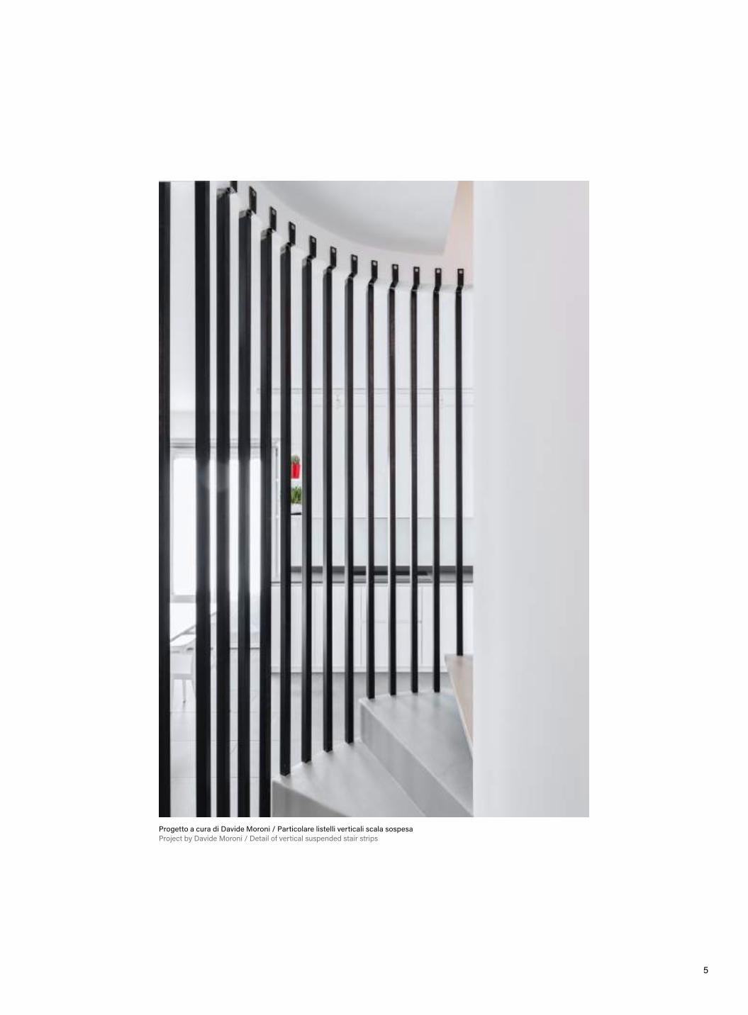
Progetto a cura di Davide Moroni / Particolare listelli verticali scala sospesaProject by Davide Moroni / Detail of vertical suspended stair strips

6
La sfidaUna giovane coppia con figli ancora in tenera età, trovandosi di fronte all’esigenza di poter usufruire di maggiore spazio domestico per il proprio nucleo familiare, aveva dunque provveduto all’acquisto di una nuova unità immobiliare disposta su due livelli, di cui il secondo da adibirsi a zona notte con co-pertura lignea a vista, collegati da un’angusta scala prefabbricata posta in posizione centrale tra la cucina ed il locale igienico di servizio.La distribuzione degli ambienti, seppur al rusti-co, risultava già in essere su entrambi i piani, così come la presenza dell’impianto di riscaldamento a pavimento già posato che giocava decisamente a sfavore in vista di una rivisitazione dell’intero ap-partamento sulla base delle nuove richieste della committenza.
Vista interna della cucinaKitchen view
The challengeA young couple with small children, finding them-selves faced with the need of more domestic space for their family, had purchased a new real estate unit on two levels, the second to be used as a sleeping area with exposed wooden roof, connected by a narrow prefabricated staircase centrally locat-ed between the kitchen and the service toilet.The distribution of the rooms, albeit rustic, was already in place on both floors, as well as the pres-ence of the already installed underfloor heating sys-tem which created some difficulties in renovating the entire apartment on the basis of new requests of the client. The approachThe design approach has thus evolved in the tai-loring methods of the “cut and sew”, enhancing the pre-existing non-changeable ones and providing targeted demolition, reconstruction and integration works that could give a new distribution structure and new life to what already existed, in an attempt to create a young, sparkling and human-sized context.
7
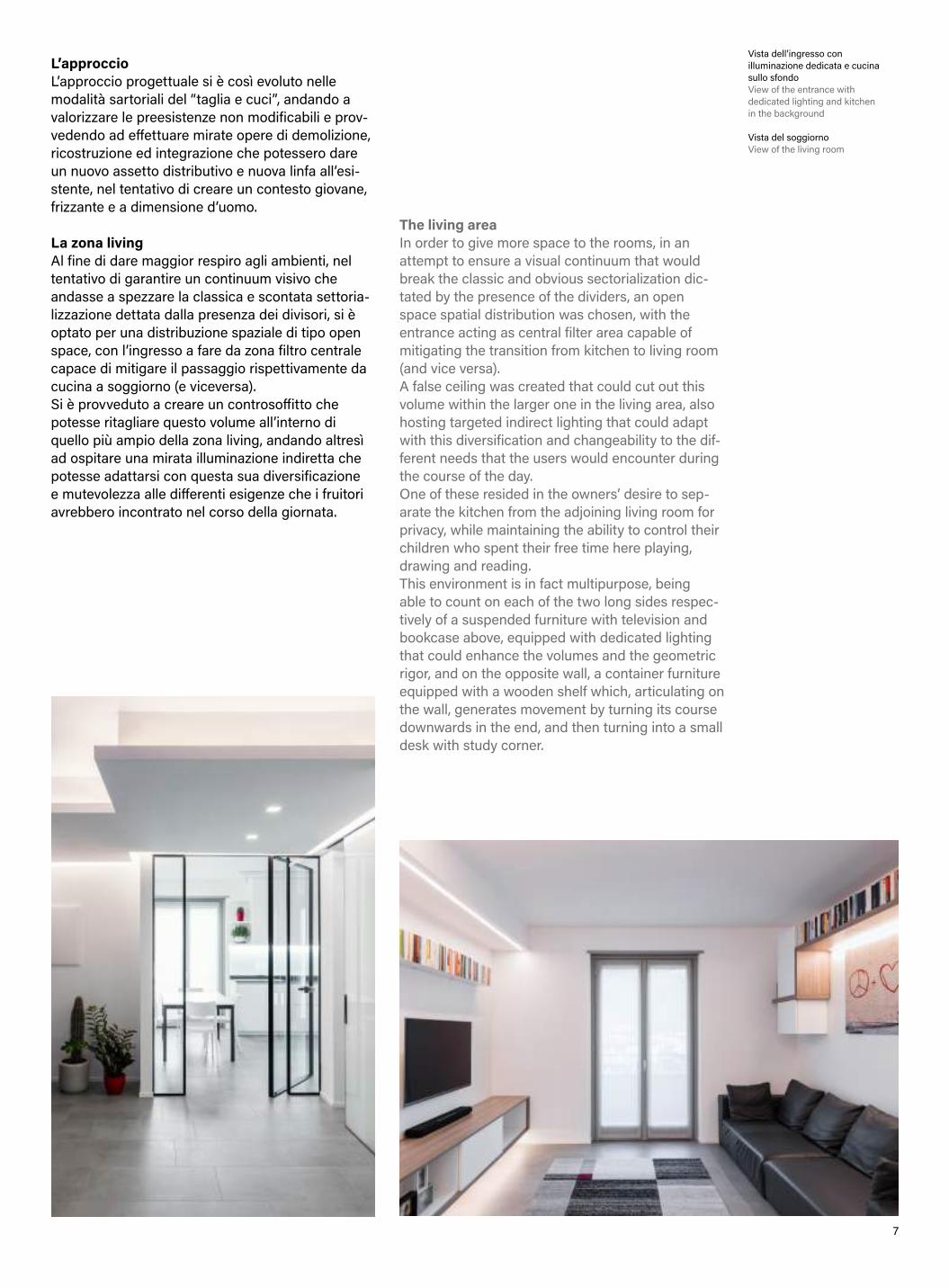
Vista dell’ingresso con illuminazione dedicata e cucina sullo sfondoView of the entrance with dedicated lighting and kitchen in the background
Vista del soggiorno View of the living room
L’approccioL’approccio progettuale si è così evoluto nelle modalità sartoriali del “taglia e cuci”, andando a valorizzare le preesistenze non modificabili e prov-vedendo ad effettuare mirate opere di demolizione, ricostruzione ed integrazione che potessero dare un nuovo assetto distributivo e nuova linfa all’esi-stente, nel tentativo di creare un contesto giovane, frizzante e a dimensione d’uomo.
La zona livingAl fine di dare maggior respiro agli ambienti, nel tentativo di garantire un continuum visivo che andasse a spezzare la classica e scontata settoria-lizzazione dettata dalla presenza dei divisori, si è optato per una distribuzione spaziale di tipo open space, con l’ingresso a fare da zona filtro centrale capace di mitigare il passaggio rispettivamente da cucina a soggiorno (e viceversa).Si è provveduto a creare un controsoffitto che potesse ritagliare questo volume all’interno di quello più ampio della zona living, andando altresì ad ospitare una mirata illuminazione indiretta che potesse adattarsi con questa sua diversificazione e mutevolezza alle differenti esigenze che i fruitori avrebbero incontrato nel corso della giornata.
The living areaIn order to give more space to the rooms, in an attempt to ensure a visual continuum that would break the classic and obvious sectorialization dic-tated by the presence of the dividers, an open space spatial distribution was chosen, with the entrance acting as central filter area capable of mitigating the transition from kitchen to living room (and vice versa).A false ceiling was created that could cut out this volume within the larger one in the living area, also hosting targeted indirect lighting that could adapt with this diversification and changeability to the dif-ferent needs that the users would encounter during the course of the day.One of these resided in the owners’ desire to sep-arate the kitchen from the adjoining living room for privacy, while maintaining the ability to control their children who spent their free time here playing, drawing and reading.This environment is in fact multipurpose, being able to count on each of the two long sides respec-tively of a suspended furniture with television and bookcase above, equipped with dedicated lighting that could enhance the volumes and the geometric rigor, and on the opposite wall, a container furniture equipped with a wooden shelf which, articulating on the wall, generates movement by turning its course downwards in the end, and then turning into a small desk with study corner.

8
Una di queste risiedeva nella volontà da parte dei proprietari di separare per privacy la cucina dall’at-tiguo soggiorno, mantenendo però la possibilità di controllare i propri bambini che qui trascorrevano il tempo libero giocando, disegnando e leggendo.Questo ambiente risulta infatti polivalente, potendo contare su ciascuno dei due lati lunghi rispettiva-mente di un mobile sospeso con soprastante tele-visione e libreria, dotati di un’illuminazione dedicata che ne potesse valorizzare i volumi ed il rigore geometrico e di un arredo contenitore sull’opposta parete dotato di una mensola in legno che artico-landosi sulla parete genera movimento volgendo sul finire il suo andamento verso terra, tramutando-si in una piccola scrivania con angolo studio.La scelta è dunque ricaduta su questa parete ve-trata dotata di un minimale telaio nero che oltre a fare da cornice, potesse far emergere il vetro, qui inteso come elemento di divisione e nel contempo di trasparenza e permeabilità. Al suo centro trova collocazione una porta a bilico a tutta altezza, priva di cardini, ben riconoscibile una volta aperta nella sua interezza, ma perfettamente celata quando ri-chiusa, merito della minimale maniglia in dotazione.La cucina, disposta a Sud, è qui volutamente orga-nizzata sui suoi lati perimetrali, così da poter lascia-re il maggior spazio fruibile al centro dell’ambiente ove l’unico elemento di arredo è rappresentato dal tavolo da pranzo, isolato, da intendersi concet-tualmente come elemento di riunione del nucleo familiare. È stata inoltre pensata come compositi-vamente e cromaticamente neutrale, giocando su di un rivestimento di colore bianco lucido con top scuro, perfetta cornice dell’elemento da intendersi come fulcro dell’intero progetto intorno al quale si articolano i vari ambienti in una sincronizzata coe-sistenza, la scala sospesa.
The choice therefore fell on this glass wall equipped with a minimal black frame which in addition to being a frame, could bring out the glass, here con-sidered as an element of division and at the same time of transparency and permeability. At its center there is a full-height pivot door, without hinges, well-recognizable once opened in its entirety, but perfectly concealed when closed, thanks to the minimal handle provided.The kitchen, located to the south, is deliberately organized here on its perimeter sides, so as to be able to leave the largest usable space in the center of the environment where the only piece of furniture is represented by the isolated dining table, to be understood conceptually as an element for family meeting and reunion.It was also conceived as compositionally and chro-matically neutral, playing on a glossy white coating with dark top, the perfect frame of the element to be understood as the fulcrum of the entire project around which the various environments are artic-ulated in a synchronized coexistence, that is the suspended staircase. The stairsThis design element created according to the archi-tect’s design, appears here as a reinterpretation of the original, prefabricated staircase, closed inside the compartment dedicated to it, embedded in a narrow and light-free environment, from which it takes only the same position and trend, now show-ing its truest guise, that is as the fulcrum element of the project, totally involved in the environment that surrounds it.

9
La scalaQuesto elemento di design realizzato su disegno dell’architetto, appare qui come una rivisitazione della scala originaria, prefabbricata, chiusa all’inter-no del vano ad essa dedicato incastrata in un am-biente angusto e privo di luce, dal quale ne riprende solamente la medesima collocazione e andamento, mostrando ora la sua veste più vera, ossia quella di elemento fulcro del progetto, totalmente partecipe dell’ambiente che lo circonda.Particolare attenzione è stata risposta durante la fase progettuale nella cernita dei materiali, al loro posizionamento e a come questi potessero coesi-stere senza che uno prevalesse sull’altro, garanten-do un corretto equilibrio tra le parti: il ferro che qui rappresenta l’anima portante, lasciato al grezzo e protetto solo con uno strato di trasparente, il legno che caratterizza le pedate e gli elementi verticali di collegamento e sospensione, il basamento in resina che prosegue al di sotto di essa creando una men-sola, mettendo conseguentemente in mostra le sue poliedriche caratteristiche.
Particular attention was paid during the design phase in the sorting of the materials, their position-ing and how they could coexist without one pre-vailing over the other, ensuring a correct balance between the parts: the iron that represents the supporting soul here, left to the raw and protected only with a layer of transparent, the wood that char-acterizes the treads and the vertical connection and suspension elements, the resin base that continues below it creating a shelf, consequently showing its multifaceted characteristics.It should be noted that the first rise of the iron structure was deliberately not carried out, in an attempt to confer lightness and suspension, in total contrast with the heaviness and grounding of the underlying part where the further steps are ob-tained. In order for the staircase not to appear to
Vista scala sospesa Suspended staircase view
Vista scala sospesa dalla zona notteView of suspended staircase from the sleeping area

1 0
Si noti come volutamente non si sia realizzata la prima alzata della struttura in ferro, nel tentativo di conferire leggerezza e sospensione, in totale antite-si con la pesantezza ed il radicamento al suolo del-la parte sottostante dove sono ricavati gli ulteriori gradini. Affinchè la scala non apparisse all’occhio del fruitore come costituita da due elementi tra loro avulsi, ci si è avvalsi di montanti verticali con lo scopo di creare un collegamento tra le parti, dando conseguentemente l’idea di coesione ed unicità.A testimonianza del fatto che la scala sia ora un elemento perfettamente inserito nel contesto, si osservi come nel bagno di servizio della zona living il suo andamento circolare di risalita, qui enfatiz-zato dall’utilizzo del colore bianco su sfondo scuro, sia perfettamente enunciato, riuscendo a convivere armoniosamente con le mattonelle a mezza altezza che rivestono le pareti perimetrali.Fondamentale appare altresì la scelta e la colloca-zione della luce a servizio dell’architettura e delle forme, qui proposta sotto forma di strisce led ver-ticali volte a richiamare i montanti in ferro e legno, accompagnando il fruitore nella sua salita alla zona notte. La zona notteQuesta è la parte più intima e raccolta dell’abitazio-ne, caratterizzata da un clima caldo e a dimensione d’uomo, grazie anche alla presenza della copertura lignea a vista, qui opportunamente pitturata con un leggero strato di bianco senza che questo la ricopra totalmente, facendo così emergere nodi e venature, enfatizzando conseguentemente il suo effetto materico.
the user as constituted by two elements detached from one another, vertical uprights were used with the aim of creating a connection between the parts, thus giving the idea of cohesion and uniqueness.The choice and location of the light at the service of architecture and shapes also appears to be funda-mental, proposed here in the form of vertical LED strips aimed at recalling the iron and wooden up-rights, accompanying the user on his ascent to the sleeping area. The sleeping areaThis is the most private and intimate part of the house, characterized by a warm and human-sized climate, also thanks to the presence of the exposed wooden roof, here suitably painted with a light layer of white without this covering it completely, making thus emerge knots and veins, consequently empha-sizing its material effect.It consists of a central corridor that guarantees access to each individual room, with the presence of a small balcony protected by a full-height glass window that provides a privileged view of the sus-pended staircase below to the home owners, also allowing the light from the living area may rise, also giving a consequent sense of breadth.
Vista bagno di servizio zona living View of the bathroom in the living area
Vista camera padronale con la retrostante cabina armadioView of the master bedroom with the walk-in closet behind
1 1
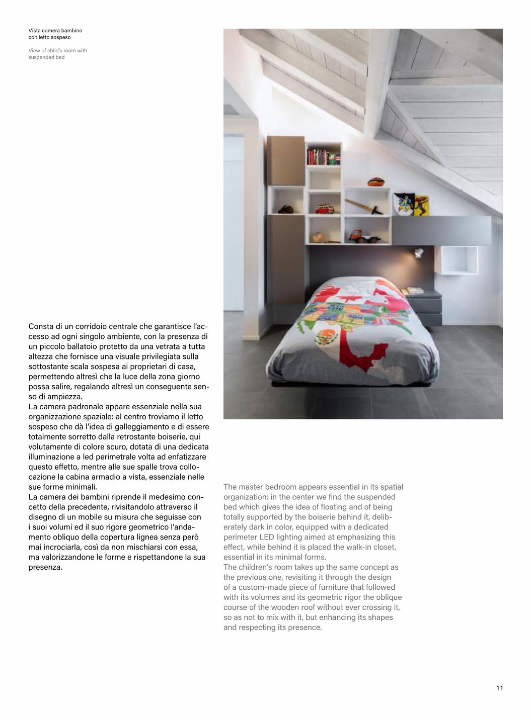
Consta di un corridoio centrale che garantisce l’ac-cesso ad ogni singolo ambiente, con la presenza di un piccolo ballatoio protetto da una vetrata a tutta altezza che fornisce una visuale privilegiata sulla sottostante scala sospesa ai proprietari di casa, permettendo altresì che la luce della zona giorno possa salire, regalando altresì un conseguente sen-so di ampiezza.La camera padronale appare essenziale nella sua organizzazione spaziale: al centro troviamo il letto sospeso che dà l’idea di galleggiamento e di essere totalmente sorretto dalla retrostante boiserie, qui volutamente di colore scuro, dotata di una dedicata illuminazione a led perimetrale volta ad enfatizzare questo effetto, mentre alle sue spalle trova collo-cazione la cabina armadio a vista, essenziale nelle sue forme minimali.La camera dei bambini riprende il medesimo con-cetto della precedente, rivisitandolo attraverso il disegno di un mobile su misura che seguisse con i suoi volumi ed il suo rigore geometrico l’anda-mento obliquo della copertura lignea senza però mai incrociarla, così da non mischiarsi con essa, ma valorizzandone le forme e rispettandone la sua presenza.
The master bedroom appears essential in its spatial organization: in the center we find the suspended bed which gives the idea of floating and of being totally supported by the boiserie behind it, delib-erately dark in color, equipped with a dedicated perimeter LED lighting aimed at emphasizing this effect, while behind it is placed the walk-in closet, essential in its minimal forms.The children’s room takes up the same concept as the previous one, revisiting it through the design of a custom-made piece of furniture that followed with its volumes and its geometric rigor the oblique course of the wooden roof without ever crossing it, so as not to mix with it, but enhancing its shapes and respecting its presence.
Vista camera bambino con letto sospeso
View of child’s room with suspended bed

1 2
P R O J E C T S B Y D O M E N I C O D E R I T O
S A N N I C O L A
A R C E L L A
S A N N I C O L A
A R C E L L A

1 3
Scala in acciaio corten - San Nicola spiaggia Arcomagno Corten steel staircase - San Nicola Arcomagno beach

1 4
La riqualificazione paesaggistica/ambientale, nel-la sua accezione più ampia, permette di elevare la qualità e l’attrattività nel territorio. Il paesaggio è uno spazio libero e pubblico e quand’anche privato la sua percezione, la sua ricaduta è sempre di carat-tere collettivo. San Nicola Arcella (insignita del riconoscimento internazionale di Bandiera Blu 2019), è un comune di 2.000 abitanti circa, nella provincia di Cosenza in Calabria. Nota località balneare dalla sorprendente bellezza, situata su di uno strapiombo di 110 metri sul livello del mare, ai piedi del quale si trova una baia racchiusa da un braccio roccioso che le conferisce la forma di un porto naturale.
Il progettoIl progetto in fase di realizzazione in località Ar-comagno, si inserisce in un contesto paesaggisti-co-ambientale incontaminato, dall’area parcheggio, una scala in acciaio corten, materiale sostenibile e riciclabile con valori vicino al 100% armonizza perfettamente con i colori del paesaggio, sale sul sentiero e con un percorso in terra battuta con tre gazebo per la sosta, raggiunge la spiaggia, con una seconda scala in acciaio corten.L’architetto De Rito sostiene: la luce in tutta l’area di intervento è pensata per non disturbare il passaggio dei volatili e per poter apprezzare il cielo stellato, nelle notti d’estate.
The landscape/environmental redevelopment, in its broadest sense, allows to increase the quality and attractiveness in the territory.The landscape is a free and public space and even if its perception is deprived, its fallout is always a collective one.San Nicola Arcella (awarded the international Blue Flag award 2019), is a town of about 2,000 inhabit-ants, in the province of Cosenza in Calabria. Famous seaside resort of surprising beauty, it is located on a precipice of 110 meters above the sea level, at the foot of which there is a bay en-closed by a rocky arm that gives it the shape of a natural harbor.
The ProjectThe project under construction in Arcomagno, is part of a pristine landscape and environmental con-text developed from the parking area, a corten steel staircase, a sustainable and recyclable material with values close to 100%, perfectly harmonizing with the colors of the landscape, goes upwards on the path in beaten earth with three gazebos for the rest, reaching then the beach, with a second staircase in corten steel.
Scala in acciaio corten con luce asimmetrica – lato parcheggio (n.1 sulla planimetria generale)
Corten steel staircase with asymmetrical light – parking side (n.1 on the general plan)
1 5
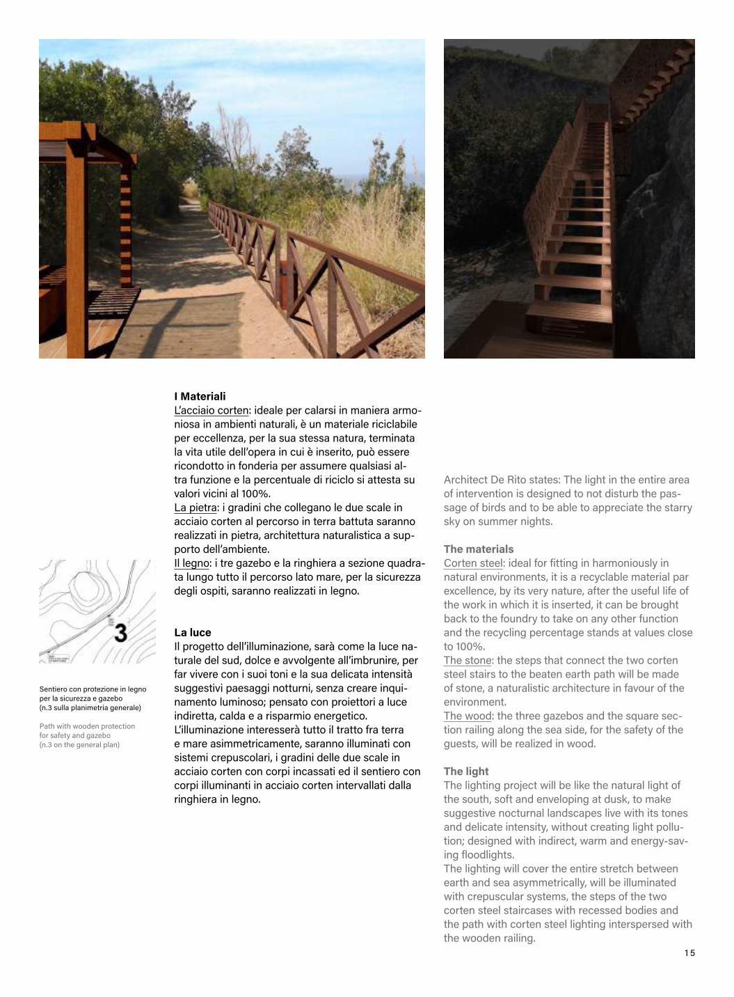
Sentiero con protezione in legno per la sicurezza e gazebo (n.3 sulla planimetria generale)
Path with wooden protection for safety and gazebo (n.3 on the general plan)
I MaterialiL’acciaio corten: ideale per calarsi in maniera armo-niosa in ambienti naturali, è un materiale riciclabile per eccellenza, per la sua stessa natura, terminata la vita utile dell’opera in cui è inserito, può essere ricondotto in fonderia per assumere qualsiasi al-tra funzione e la percentuale di riciclo si attesta su valori vicini al 100%.La pietra: i gradini che collegano le due scale in acciaio corten al percorso in terra battuta saranno realizzati in pietra, architettura naturalistica a sup-porto dell’ambiente.Il legno: i tre gazebo e la ringhiera a sezione quadra-ta lungo tutto il percorso lato mare, per la sicurezza degli ospiti, saranno realizzati in legno.
La luceIl progetto dell’illuminazione, sarà come la luce na-turale del sud, dolce e avvolgente all’imbrunire, per far vivere con i suoi toni e la sua delicata intensità suggestivi paesaggi notturni, senza creare inqui-namento luminoso; pensato con proiettori a luce indiretta, calda e a risparmio energetico.L’illuminazione interesserà tutto il tratto fra terra e mare asimmetricamente, saranno illuminati con sistemi crepuscolari, i gradini delle due scale in acciaio corten con corpi incassati ed il sentiero con corpi illuminanti in acciaio corten intervallati dalla ringhiera in legno.
Architect De Rito states: The light in the entire area of intervention is designed to not disturb the pas-sage of birds and to be able to appreciate the starry sky on summer nights.
The materialsCorten steel: ideal for fitting in harmoniously in natural environments, it is a recyclable material par excellence, by its very nature, after the useful life of the work in which it is inserted, it can be brought back to the foundry to take on any other function and the recycling percentage stands at values close to 100%.The stone: the steps that connect the two corten steel stairs to the beaten earth path will be made of stone, a naturalistic architecture in favour of the environment.The wood: the three gazebos and the square sec-tion railing along the sea side, for the safety of the guests, will be realized in wood.
The lightThe lighting project will be like the natural light of the south, soft and enveloping at dusk, to make suggestive nocturnal landscapes live with its tones and delicate intensity, without creating light pollu-tion; designed with indirect, warm and energy-sav-ing floodlights.The lighting will cover the entire stretch between earth and sea asymmetrically, will be illuminated with crepuscular systems, the steps of the two corten steel staircases with recessed bodies and the path with corten steel lighting interspersed with the wooden railing.
1 6
O - H O U S E
O - H O U S E
P R O J E C T S B Y G A B R I E L E L A R O S A
1 7
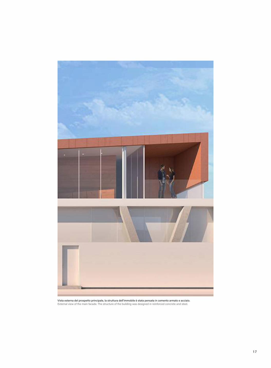
Vista esterna del prospetto principale, la struttura dell’immobile è stata pensata in cemento armato e acciaio. External view of the main facade. The structure of the building was designed in reinforced concrete and steel.
1 8
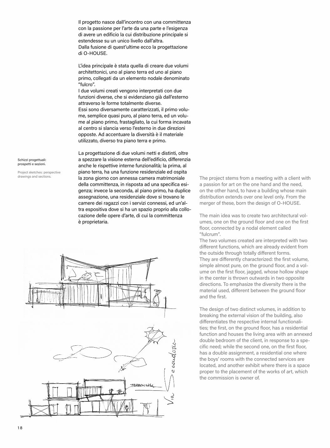
Il progetto nasce dall’incontro con una committenza con la passione per l’arte da una parte e l’esigenza di avere un edificio la cui distribuzione principale si estendesse su un unico livello dall’altra. Dalla fusione di quest’ultime ecco la progettazione di O-HOUSE. L’idea principale è stata quella di creare due volumi architettonici, uno al piano terra ed uno al piano primo, collegati da un elemento nodale denominato “fulcro”.I due volumi creati vengono interpretati con due funzioni diverse, che si evidenziano già dall’esterno attraverso le forme totalmente diverse.Essi sono diversamente caratterizzati, il primo volu-me, semplice quasi puro, al piano terra, ed un volu-me al piano primo, frastagliato, la cui forma incavata al centro si slancia verso l’esterno in due direzioni opposte. Ad accentuare la diversità è il materiale utilizzato, diverso tra piano terra e primo. La progettazione di due volumi netti e distinti, oltre a spezzare la visione esterna dell’edificio, differenzia anche le rispettive interne funzionalità; la prima, al piano terra, ha una funzione residenziale ed ospita la zona giorno con annessa camera matrimoniale della committenza, in risposta ad una specifica esi-genza; invece la seconda, al piano primo, ha duplice assegnazione, una residenziale dove si trovano le camere dei ragazzi con i servizi connessi, ed un’al-tra espositiva dove si ha un spazio proprio alla collo-cazione delle opere d’arte, di cui la committenza è proprietaria.
The project stems from a meeting with a client with a passion for art on the one hand and the need, on the other hand, to have a building whose main distribution extends over one level only. From the merger of these, born the design of O-HOUSE.
The main idea was to create two architectural vol-umes, one on the ground floor and one on the first floor, connected by a nodal element called “fulcrum”.The two volumes created are interpreted with two different functions, which are already evident from the outside through totally different forms.They are differently characterized: the first volume, simple almost pure, on the ground floor, and a vol-ume on the first floor, jagged, whose hollow shape in the center is thrown outwards in two opposite directions. To emphasize the diversity there is the material used, different between the ground floor and the first. The design of two distinct volumes, in addition to breaking the external vision of the building, also differentiates the respective internal functionali-ties; the first, on the ground floor, has a residential function and houses the living area with an annexed double bedroom of the client, in response to a spe-cific need; while the second one, on the first floor, has a double assignment, a residential one where the boys’ rooms with the connected services are located, and another exhibit where there is a space proper to the placement of the works of art, which the commission is owner of.
Schizzi progettuali: prospetti e sezioni.
Project sketches: perspective drawings and sections.

1 9
Render-viste prospetticheRender-perspective views

2 0
2 1
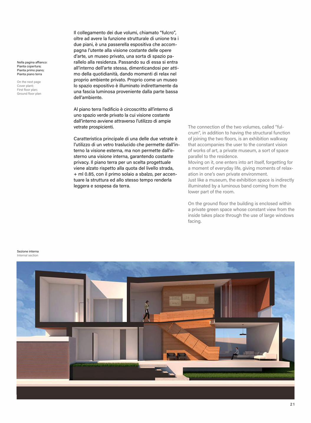
Il collegamento dei due volumi, chiamato “fulcro”, oltre ad avere la funzione strutturale di unione tra i due piani, è una passerella espositiva che accom-pagna l’utente alla visione costante delle opere d’arte, un museo privato, una sorta di spazio pa-rallelo alla residenza. Passando su di essa si entra all’interno dell’arte stessa, dimenticandosi per atti-mo della quotidianità, dando momenti di relax nel proprio ambiente privato. Proprio come un museo lo spazio espositivo è illuminato indirettamente da una fascia luminosa proveniente dalla parte bassa dell’ambiente. Al piano terra l’edificio è circoscritto all’interno di uno spazio verde privato la cui visione costante dall’interno avviene attraverso l’utilizzo di ampie vetrate prospicienti. Caratteristica principale di una delle due vetrate è l’utilizzo di un vetro traslucido che permette dall’in-terno la visione esterna, ma non permette dall’e-sterno una visione interna, garantendo costante privacy. Il piano terra per un scelta progettuale viene alzato rispetto alla quota del livello strada, + ml 0.85, con il primo solaio a sbalzo, per accen-tuare la struttura ed allo stesso tempo renderla leggera e sospesa da terra.
The connection of the two volumes, called “ful-crum“, in addition to having the structural function of joining the two floors, is an exhibition walkway that accompanies the user to the constant vision of works of art, a private museum, a sort of space parallel to the residence.Moving on it, one enters into art itself, forgetting for a moment of everyday life, giving moments of relax-ation in one’s own private environment.Just like a museum, the exhibition space is indirectly illuminated by a luminous band coming from the lower part of the room. On the ground floor the building is enclosed within a private green space whose constant view from the inside takes place through the use of large windows facing.
Nella pagina affianco:Pianta copertura;Pianta primo piano;Pianta piano terra
On the next pageCover plant;First floor plan;Ground floor plan
Sezione interna Internal section

2 2
Prospetti frontali e laterali Front and side perspective drawings
Vista assonometrica;Disegno architettonico della struttura
Axonometric view;Architectural drawing of the structure

2 3
Al piano primo le altezza standard di un edificio re-sidenziali vengono sostituite da altezze più notevoli per dare snellezza alla struttura.La parte esterna del piano primo dell’edificio sarà rivestita da lastre Equitone di colore terra cruda, in netto contrasto con la parte esterna del piano infe-riore per il cui verrà utilizzato il colore bianco. La struttura dell’immobile è stata pensata in ce-mento armato, e acciaio.La parte in acciaio, per la presenza di grandi luci a sbalzo, è definita da struttura reticolare spaziale. Si evince dalle immagini, inoltre, come la struttura in acciaio nella sua leggerezza viene agganciata da un lato alla struttura in cemento armato e dall’altra viene appoggiata ai due pilastri in acciaio.
The main feature of one of the two windows is the use of a translucent glass that allows the external vision from the inside, but does not allow an inter-nal vision from the outside, guaranteeing constant privacy.The ground floor for a design choice is raised above the street level, + 0.85 ml, with the first cantilevered floor, to accentuate the structure and at the same time make it light and suspended from the ground. On the first floor, the standard height of a residential building is replaced by more noteworthy heights to give slimness to the structure.The outer part of the first floor of the building will be covered with raw earth colored Equitone slabs, in stark contrast to the outer part of the lower floor for which the white color will be used. The structure of the building was designed in rein-forced concrete and steel.The steel part, due to the presence of large over-hanging lights, is defined by a spatial reticular structure. Moreover, it is clear from the images, how the steel structure in its lightness is hooked on one side to the reinforced concrete structure and on the other is supported by the two steel pillars.
Viste interne Internal views

2 4
The Solomon R. Guggenheim Museum was de-signed by one of the most important architects of the 20th century: Frank Lloyd Wright. It is interest-ing to go there and discover this spectacular archi-tecture while walking in Central Park, and suddenly see it through the leaves and tree branches.While you are walking to get there, you notice it, you look at it, and you don’t realize right away that a city road runs between the park and the museum. This makes the discovery even more incredible and it makes me immediately think of organic architecture, even though we are right in the center of Manhattan.Once you leave Central Park, you find this huge upside-down spiral in front of your eyes, like a beautiful white cloud in the middle of a storm (of skyscrapers). Only later you notice the infernal New York traffic, with yellow taxis speeding along Fifth Avenue, in its Museum Mile portion.
Il Solomon R. Guggenheim Museum fu progettato da uno degli architetti più importanti del XX seco-lo: Frank Lloyd Wright. È interessante andare alla scoperta di questa spettacolare architettura pas-seggiando immersi nel Central Park, scorgendolo all’improvviso in mezzo alle foglie e i rami degli alberi. Mentre stai camminando per raggiungerlo, lo noti, lo intravedi e non ti accorgi che a dividere il parco dal museo in realtà c’è una strada urbana. Questo rende la sua scoperta ancora più incredibi-le e mi fa pensare immediatamente all’architettura organica, nonostante ci troviamo in pieno centro a Manhattan.Una volta usciti dal Central Park, ci si ritrova que-sta immensa spirale capovolta di fronte agli occhi, come una bellissima nuvola bianca in mezzo a un temporale (di grattacieli). Solo in un secondo mo-mento ti accorgi del traffico infernale di New York, con quei taxi gialli che sfrecciano lungo la Fifth Avenue, indicata nella mappa come Museum Mile.
A T E M P L E O F S P I R I T
S T O R I E S B Y G I U S E P P I N A A R E N A
L’ingresso vetrato principale del museo, sormontato dalla scritta “The Solomon R. Guggenheim Museum” e la vista sullo store ufficiale al piano terra.
The main glass entrance to the museum, surmounted by he inscription “The Solomon R. Guggenheim Museum” and the view on the official store on the ground floor.

2 5
La bianca spirale capovolta del Guggenheim intravista tra le foglie degli alberi del Central Park, in netto contrasto con le architetture e i colori degli edifici confinanti.
The white inverted spiral of the Guggenheim glimpsed among the leaves of the trees in Central Park, in clear contrast with the architecture and colors of nearby buildings.
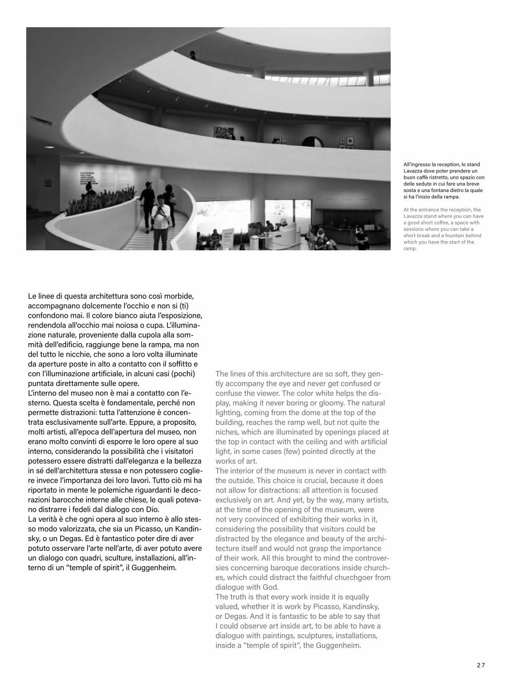
Entering the museum, you initially find yourself inside a small space with a low ceiling, typical of Wright’s architecture, but this lasts only a moment, because a few steps further on, you suddenly plunge into an open space, illuminated from above and surrounded by a single large ramp that rises all around, welcoming visitors. Wright thinks of this museum as an open space, with the main ramp as a served space and serving space together: It is, with the elevators, the vertical connection that allows the use of the museum, and also some works of art are already exhibited in it. The boldest visitor will walk up this ramp to visit the museum, but with common sense, one goes up the last level in an elevator, and then begins the descent in an immersion with the works of art.
The ramp presents open exhibition “niches”, alter-nated with supporting walls, but not just that. In-deed, it is possible to access some more reserved spaces, galleries, to visit particular exhibitions. This is where one can focus the most, staying face to face with paintings, statues or photographs.
Entrando nel museo, inizialmente ci si trova all’in-terno di uno spazio piccolo con un soffitto basso, tipico delle architetture di Wright, ma tutto questo dura solo un attimo, perché pochi passi più avanti ci si immerge all’improvviso in uno spazio aperto, illuminato dall’alto e circondato da un’unica grande rampa che sale tutto intorno, avvolgendo il visita-tore. Wright pensa questo museo come uno spazio aperto, con la rampa protagonista in quanto spazio servito e spazio servente insieme. Oltre ad essere, infatti, insieme agli ascensori, il collegamento ver-ticale che permette la fruizione del museo, sono esposte già in essa alcune opere d’arte. I più spaval-di percorreranno in salita questa rampa per visitare il museo, ma nella logica più comune si sale all’ulti-mo livello in ascensore, per poi iniziare la discesa in immersione nelle opere d’arte.
La rampa serve delle “nicchie” espositive aper-te, scandite dai setti portanti, ma non solo. Si può accedere, infatti, ad alcuni spazi più riservati, delle gallerie, per visitare particolari mostre. È qui che ci si può raccogliere maggiormente, restando a tu per tu con quadri, statue o fotografie.

2 6
Guardando verso l’alto si può scorgere questo bianco nastro che si allarga sempre di più e la cupola vetrata dalla quale proviene la maggior parte della luce naturale.
Looking upwards you can see this white ribbon that widens more and more and the glass dome through which most of the natural light comes in.
2 7
The lines of this architecture are so soft, they gen-tly accompany the eye and never get confused or confuse the viewer. The color white helps the dis-play, making it never boring or gloomy. The natural lighting, coming from the dome at the top of the building, reaches the ramp well, but not quite the niches, which are illuminated by openings placed at the top in contact with the ceiling and with artificial light, in some cases (few) pointed directly at the works of art.The interior of the museum is never in contact with the outside. This choice is crucial, because it does not allow for distractions: all attention is focused exclusively on art. And yet, by the way, many artists, at the time of the opening of the museum, were not very convinced of exhibiting their works in it, considering the possibility that visitors could be distracted by the elegance and beauty of the archi-tecture itself and would not grasp the importance of their work. All this brought to mind the controver-sies concerning baroque decorations inside church-es, which could distract the faithful churchgoer from dialogue with God.The truth is that every work inside it is equally valued, whether it is work by Picasso, Kandinsky, or Degas. And it is fantastic to be able to say that I could observe art inside art, to be able to have a dialogue with paintings, sculptures, installations, inside a “temple of spirit”, the Guggenheim.
Le linee di questa architettura sono così morbide, accompagnano dolcemente l’occhio e non si (ti) confondono mai. Il colore bianco aiuta l’esposizione, rendendola all’occhio mai noiosa o cupa. L’illumina-zione naturale, proveniente dalla cupola alla som-mità dell’edificio, raggiunge bene la rampa, ma non del tutto le nicchie, che sono a loro volta illuminate da aperture poste in alto a contatto con il soffitto e con l’illuminazione artificiale, in alcuni casi (pochi) puntata direttamente sulle opere.L’interno del museo non è mai a contatto con l’e-sterno. Questa scelta è fondamentale, perché non permette distrazioni: tutta l’attenzione è concen-trata esclusivamente sull’arte. Eppure, a proposito, molti artisti, all’epoca dell’apertura del museo, non erano molto convinti di esporre le loro opere al suo interno, considerando la possibilità che i visitatori potessero essere distratti dall’eleganza e la bellezza in sé dell’architettura stessa e non potessero coglie-re invece l’importanza dei loro lavori. Tutto ciò mi ha riportato in mente le polemiche riguardanti le deco-razioni barocche interne alle chiese, le quali poteva-no distrarre i fedeli dal dialogo con Dio.La verità è che ogni opera al suo interno è allo stes-so modo valorizzata, che sia un Picasso, un Kandin-sky, o un Degas. Ed è fantastico poter dire di aver potuto osservare l’arte nell’arte, di aver potuto avere un dialogo con quadri, sculture, installazioni, all’in-terno di un “temple of spirit”, il Guggenheim.
All’ingresso la reception, lo stand Lavazza dove poter prendere un buon caffè ristretto, uno spazio con delle sedute in cui fare una breve sosta e una fontana dietro la quale si ha l’inizio della rampa.
At the entrance the reception, the Lavazza stand where you can have a good short coffee, a space with sessions where you can take a short break and a fountain behind which you have the start of the ramp.

2 8
E: Quale la sua filosofia progettuale?S: Ogni nuovo progetto rappresenta per me una
straordinaria sfida, il mio obbiettivo è quello di superare i confini del reale conosciuto, distanziarmi dagli stereotipi per creare nuovi spazi: luoghi es-senziali, funzionali, in grado di risvegliare una nuova sensorialità. La mia architettura è figlia del presente e rivolta verso il futuribile.
E: Integrazione tra architettura e design.S: Negli ultimi anni la relazione duale che lega
architettura e design ha subito forti cambiamenti, portando all’emersione del ruolo del design nella contemporaneità ed all’estensione del suo senso primario. Architettura e design divengono quindi elementi sinonimi e complementari, poichè entram-bi sono connessi profondamente all’essenza stessa dell’uomo ed ai processi che questi è in grado di mettere in atto.
E: What is your design philosophy?S: Each new project represents an extraordinary
challenge for me, my goal is to overcome the boun-daries of the known real, to distance myself from stereotypes to create new spaces: essential, fun-ctional places, able to awaken a new sensoriality. My architecture is the daughter of the present and turned towards the future.
E: Integration between architecture and design.S: In recent years, the dual relationship between
architecture and design has been subject to strong changes, leading to the emergence of the role of design in the contemporary world and the exten-sion of its primary sense. Architecture and design therefore become synonymous and complementary elements, as both are deeply connected to the very essence of man and to the processes that he is able to implement.
I N T E R V I S T A C O N S I M O N E M I C H E L I
I N T E R V I E W W I T H S I M O N E M I C H E L I
S T O R I E S B Y E T E R N O I V I C A
Loft in Sardegna (Italia) - 2018
Loft in Sardinia (Italy) - 2018

2 9
Aquatio Cave Luxury Hotel & SPA, Matera (Italia) - 2018
Aquatio Cave Luxury Hotel & SPA, Matera (Italy) - 2018
E: Quando si approccia a un nuovo progetto quali sono i suoi obiettivi finali?
S: La mia è una ricerca costante, il cui fine ultimo e definire campi spaziali super stimolanti, dinamici, emozionanti, per poter qualificare la vita dell’uomo.
E: Il suo rapporto con il lusso e la sua tecnica di progettazione.
S: Il nuovo lusso per me è rappresentato dalla basica volontà di riappropiarsi delle piccole bellezze e delle verità del quotidiano. Un lusso legato a spazi vuoti più che a pieni, che abbandona l’opulenza per andare alla ricerca della trasparenza.Viviamo in un contesto mediale super stimolante, iper-connesso, ma paradossalmente all’aumenta-re delle relazioni digitali, cresce il nostro distacco emotivo. Ecco perché con i miei progetti parlo di possibili luoghi in cui echeggia la storia della nostra vita riproposta sotto forma di essenza visiva, tat-tile e uditiva. Luoghi armonici in grado con la loro essenza di risvegliarci dal torpore contemporaneo in cui la tecnologia e le molteplicità del presente ci sprofondano; semplicità al posto di complessità è questa la via che indico.
E: Come nasce la collaborazione con l’azienda Eterno Ivica di Padova? Quale l’idea di prodotto di fondo?
S: Nasce da una condivisione di visioni, dall’idea progettuale di realizzare degli elementi fonoas-sorbenti che attraverso la loro semplicità e la loro funzionalità si adattino a mille spazi possibili.
E: Qualche considerazione sugli eventi che organizza.
S: Essi rappresentano dei momenti per estendere condivisione, fare rete e costruire un nuovo futuro.
E: When you approach a new project what are its final objectives?
S: Mine is a constant search whose ultimate goal is to define super stimulating, dynamic, exciting spatial fields in order to qualify human life.
E: Your relationship with luxury and your design technique.
S: The new luxury for me is represented by the basic desire to reappropriate the small beau-
ties and truths of everyday life. A luxury linked to empty rather than full spaces, which leaves opulen-ce in favour of searching of transparency.We live in a super stimulating, hyper-connected media context, but paradoxically as digital relation-ships increase, as our emotional detachment grows. That’s why through my projects I talk about possible places where the story of our life echoes in the form of visual, tactile and auditory essence. Harmonious places able, with their essence, to awa-ke us from the contemporary torpor in which the technology and the multiplicity of the present make us sink; simplicity instead of complexity is the way I am pointing out.
E: How did the collaboration with the Eterno Ivica company in Padua come about? What is the idea of the underlying product?
S: It comes from a sharing of visions, from the design idea of creating sound-absorbing elements that through their simplicity and functionality adapt to a thousand possible spaces.
E: Some considerations on the events it organizes.
S: They represent moments to extend sharing, network and build a new future.

3 0
3dddì - Eat Well - Feel GoodFirenze (Italia) - 2015 Foto di Juergen Eheim
3dddì - Eat Well - Feel GoodFlorence (Italy) - 2015 Photos by Juergen Eheim

3 1
Sono 32 i luxury apartment racchiusi nella splendida cornice della Casa della Pietà e la sua Torre Medievale in Piazza dei Signori, nel cuore della cittàdi Verona.
The 32 luxury apartments surrounded by the wonderful frame, made of Casa della Pietà and its Medieval Tower at Piazza dei Signori, right in the Verona city centre.
Client - Innovazioni, Verona - ItaliaArea 3.000 mqAnno 2018Foto di Jürgen Eheim
Client - Innovazioni, Verona - ItalyArea 3.000 mqYear 2018Photos by Jürgen Eheim

3 2
Altre viste interne di uno degli appartamenti del complesso lussuoso che sorge nel centrodi Verona (Italia)
Other internal views of one of the apartments of the luxury complex located in the center of Verona (Italy)

3 3
BIOGRAFIA SIMONE MICHELI ARCHITETTO
Simone Micheli fonda lo Studio d’Archi-tettura nel 1990 e nel 2003, con Roberta Colla, la società di progettazione Simone Micheli Architectural Hero con sede a Firenze, Milano, Puntaldìa, Dubai, Rabat e Busan.La sua attività professionale si articola in plurime direzioni: dall’architettura all’in-terior, dal design al visual, passando per grafica, comunicazione ed organizzazio-ne di eventi; le sue creazioni, sostenibili e sempre attente all’ambiente, sono con-notate da forte identità e unicità. Nume-rose sono le sue realizzazioni per pub-bliche amministrazioni e per importanti committenze private connesse al mondo residenziale e della collettività.È curatore di mostre tematiche - con-tract e non solo - nell’ambito delle più importanti fiere internazionali di settore.È docente presso il Poli.Design e presso la Scuola Politecnica di Design di Mila-no. In collaborazione con Roberta Colla ed il suo team di professionisti, tiene conferenze, workshop e lecture presso università, istituti di cultura, enti ed isti-tuzioni di molte città del mondo.I suoi lavori sono stati presentati nell’am-bito delle più importanti rassegne espo-sitive internazionali. Molte sono le pub-blicazioni su riviste, magazine, quotidiani italiani ed internazionali.
SIMONE MICHELI ARCHITECTBIOGRAPHY
simonemicheli.com
Simone Micheli founded the Architecture Studio in 1990 and in 2003, together with Roberta Colla, he created the design company Simone Micheli Architectural Hero, based in Florence, Milan, Puntal-dìa, Dubai, Rabat and Busan.His professional activity ranges from architecture to interior, from design to visual, through graphics, communication and event organization; his creations, always sustainable and environmentally conscious, are characterized by a strong identity and uniqueness. Many are his creations for public admi-nistrations and important private clients connected to the community and to the residential world.He is the curator of thematic exhibitions - contract, but not only - at the main international architecture, design and hospitality fairs.He is professor at the Poli.Design and at the Scuola Politecnica di Design in Milan.In collaboration with Roberta Colla and his team of professionals, he holds conferences, workshops and lectures at universities, cultural institutes and insti-tutions in many cities around the world.His works have been featured in the most important international exhibitions as well as in Italian and international newspapers, magazines and periodicals.
AWARDS
Premio Regula/100 progetti italiani 2019 - Rome, Italy “Interior Design” Category with Lords of Verona project for Innovazioni; Hotel Property Award 2018 Finalist Nomination, HotelForum, Monaco, Germany with the project Aquatio, Cave Luxury Hotel & Spa; Excellence Award 2017 - Korea Institute of Interior Design with the project Atomic Spa for Palazzo Mat-teotti, The Dedica Anthology Milan; Codega 2016 #lighting-design Award, Venice and AAP- American Architectural Prize 2016 #interior, Los Angeles with the project Sarajevo Dreamy Spa; Best of Houzz Award 2016 | design, for the popularity of the projects selected by more than 35 millions Houzz Commu-nity users; 100 Eccellenze Italiane 2015 Award - Montecitorio, Roma. Simone Micheli is among the 100 eminent personalities who represent Italian excellence; International Hotel and Pro-perty Awards 2015 European categories – Hotel over 200 ro-oms, with the interior and lighting project Barcelò Hotel Milan;Iconic Award 2014 - Frankfurt, “Interior” category, organized by the German Design Council, with the project RubensLuciano New Offices & Showroom, Strà, Venice; Best of Year Honoree 2012 for the “Hospitality” category, organized by Interior Design Magazine, New York, with the project Barceló Milan Hotel;Tre Number One Award 2011 – Venezia for the interior design and the Contemporary Spa Award 2011 in the category “Best Future Spa” – Bologna with the project Marina Verde Wellness Resort, Caorle, Venice; Best of Year 2010 for the category “Beauty, Spa e Fitness”, award given by Interior Design Ma-gazine – New York, Usa and International Media Prize 2010 in the category Annual Club Space Award, organized by Modern Decoration Magazine in Shenzen, China with the project Atomic Spa of Boscolo Hotels; Interior Designer of the Year agli International Design Award 2008 – Los Angeles with the project Atomic Spa; International Media Prize 2008 – Shenzhen in the category “Annual Public Spaces Grand Award”; Internatio-nal Design Award 2008 – Los Angeles in the category “Interior Design” with the project New Urban Face for the province and municipality of Milan; Best Interior Design and the Best Apartment Italy with the project Golfo Gabella Lake Resort for the competition “Homes Overseas Award 2007”, London.
PREMI
Premio Regula /100 progetti italiani 2019 - Roma nella Categoria “Interior Design” con il progetto Lords Of Verona per Innovazioni; Hotel Property Award 2018 Finalist Nomination, HotelForum, Monaco, Germania con il progetto Aquatio, Cave Luxury Hotel & Spa; Excellence Award 2017 - Korea Institu-te of Interior Design con il progetto Atomic Spa per Palazzo Matteotti, The Dedica Anthology Milano; Premio Codega 2016 #lightingdesign , Venezia e AAP- American Architectural Prize 2016 #interior, Los Angeles con il progetto Sarajevo Dreamy Spa; Best of Houzz Award 2016/design per la popolarità dei progetti selezionati dagli oltre 35 milioni di utenti delle community di Houzz; Premio 100 Eccellenze Italiane 2015 - Montecitorio, Roma. Simone Micheli annoverato tra i 100 illustri personaggi rappresentativi dell’eccellenza del nostro Paese; International Hotel e Property Awards 2015 European cate-gories, Hotel over 200 rooms, con progetto di interior design ed illuminotecnico del Barcelò Hotel Milan; Iconic Award 2014 - Francoforte, categoria “Interior”, organizzato dal German Design Council, con il progetto RubensLuciano New Offices & Showroom, Strà, Venezia; Best of Year Honoree 2012 nella categoria “Hospitality” organizzato da Interior Design Magazi-ne, New York, con il progetto Barceló Milan Hotel; Tre Number One Award 2011 - Venezia per l’interior design e il “Contemporary Spa Award 2011 nella categoria “Best Future Spa”, Bologna con il progetto Marina Verde Wellness Resort, Caorle, Venezia; Best of Year 2010 nella categoria “Beauty, Spa e Fitness”, premio organizzato da Interior Design Maga-zine - New York, Usa e l’ International Media Prize 2010 nella categoria Annual Club Space Award, organizzato da Modern Decoration Magazine a Shenzen, China con il progetto Atomic Spa della Boscolo Hotels; Interior Designer of the Year agli International Design Award 2008 - Los Angeles con il progetto Atomic Spa; International Media Prize 2008 - Shenzhen nella categoria “Annual Public Spaces Grand Award”; International Design Award 2008 - Los Angeles nella categoria “Interior Design” con il progetto New Urban Face per la Provincia e il Comune di Milano; Best Interior Design e Best Apartment Italy con il progetto Golfo Gabella Lake Resort nella competi-zione “Homes Overseas Award 2007”, Londra.

3 4
L’architettura è lo spazio, e in un cer to senso anche c iò che lo r iempie . Usiamo lo spazio come conf ine di c iò che del imita un’area in cui desideriamo creare un’esperienza. Se questo v iene poi r iempito, creiamo come del le masse che lo def iniscono, e tutto prende forma, esprime un messaggio, diventandocomunicazione.
ARK T – space to architecture , è un magazine web e car taceo redatto da Eterno Iv ica, azienda i tal iana di prodott i e soluzioni per l ’architettura e l ’edi l iz ia con sede a Padova.Questo progetto sperimentale nasce con l ’obiett ivo di creare uno spazio in cui poter parlare di architettura,in tutte le sue forme e sfaccettature , creando un ponte comunicativo tra le aziende produttr ic i di soluzioni per l ’architettura e l ’edi l iz ia e i l mondo del la progettazione.
3 5
Archi tecture is space , and in a cer ta in sense i t ’s a lso what f i l ls i t . We use space as the boundar y o f what c lear ly del imi ts where we want to create an experience .Then, i f th is is f i l led , we create as the masses that de f ine i t , and ever y thing takes shape , express a message , becoming communicat ion.
ARK T – space to archi tecture is a magazine edi ted by Eterno Iv ica, an I ta l ian company of products and solut ions for archi tecture and based in Padua, an experimental pro ject born wi th the aim of creat ing a space in which to speak about archi tecture , in a l l i t s shapes and facets , creat ing a communicat ion bridge between companies produc ing solut ions for archi tecture and construct ion and the design world.
3 6 è una real izzazione di E TERNOIVICA www.eternoivica .com


![90012008 EN.pdf · Certificate N. IT09/0663 The quality management system of ITW Construction Products Italy S r I Registered Office and Operation Unit: Viale Veneto, 5 Z]. - 35127](https://static.fdocuments.us/doc/165x107/5c62b90b09d3f291208b5ee0/90012008-enpdf-certificate-n-it090663-the-quality-management-system-of-itw.jpg)