
Irissprague bookdesign
37
How Posters Work Ellen Lupton Cooper Hewitt Smithsonian Design Museum
-
Upload
iris-josephine-sprague -
Category
Documents
-
view
214 -
download
0
description
Â
Transcript of Irissprague bookdesign

How
Posters Work
1
How Posters Work Ellen Lupton Cooper Hewitt Smithsonian Design Museum

How
Pos
ters
Wor
k
2

How
Posters Work
3

How
Pos
ters
Wor
k
4
ESSAYS
7 Ellen Lupton, How Posters Work
13 Caitlin Condell, How Posters Are Made
19 E. McKnight Kauffer, A Note on Technique, 1937
20 Bruno Munari, Poster with a Central Image, 1966
24 Karrie Jacobs and Steven Heller, Angry Graphics, 1991
30 Rianne Petter and René Put, Focal Point, 2012
40 Gail Davidson, Collecting Posters
Table of Contents

How
Posters Work
5
POSTERS
44 Focus the Eye
58 Overwhelm the Eye
68 Simplify
88 Overlap
98 Cut and Paste
108 Assault the Surface
118 Use Text as Image
132 Make Noise
152 Double the Meaning
162 Make Eye Contact
176 Communicate with Scale
186 Exploit the Diagonal
196 Make a Grid
206 Make a Series
222 INDEX

How
Pos
ters
Wor
k
6
Essays

How
Posters Work
7
Edward McKnight KaufferPoster: Tea Drives Aways the Droops, 1936 Offset lithograph on paper, lined75.7 x 50.3 cm (29 13/16 x 19 13/16 in.)Gift of Mrs. E. McKnight Kauffer, 1963-39-84
Edward McKnight KaufferPoster: Step on the India Noskid Types and Feel the Difference, 1935Offset lithograph on paper71.5 x 47.7 cm (28 1/8 x 18 3/4 in.)Gift of Mrs. E. McKnight Kauffer, 1963-39-79
Focus the eye 7

How
Pos
ters
Wor
k
8
The American-born designer E. McKnight Kauffer (1890–1954) studied art in Germany and then went to work in London. There, he designed numerous posters for the London Underground and other clients. Although Kauffer was never
Edward McKnight KaufferDrawing: Hand, 1935–38 Air brush and white gouache on blue paper22.9 x 19.1 cm (9 in. x 7 1/2 in.)Gift of Mrs. E. McKnight Kauffer, 1963-39-960
Edward McKnight KaufferDrawing: Abstraction with a Hand, 1935–38 Brush and gouache, graphite on thick paper31.1 x 21.6 cm (12 1/4 x 8 1/2 in.)Gift of Mrs. E. McKnight Kauffer, 1963-39-963
well-known in the U.S. during his lifetime, the Museum of Modern Art exhibited his work in 1937. The essay reprinted here is from that catalog. He describes the diverse tools he used as well as his interest in applying abstract art to advertising.

How
Posters Work
9
‘…I have used all kinds of instruments common to most
contemporary painters, such as tooth brushes, cheese cloth,
wire netting, etc.—in fact anything that suggests interesting
textures. The air-brush I seldom use now, but when I did use
it a few years ago I realized that it was a tricky instrument and
that its use required an exceedingly disciplined technique.
At the moment I prefer methods less exacting and with more
direct contact between my idea and the medium.
Lithography still tends to be commercially practical for
reproduction and most of my posters are done by an old �rm
still using in many cases actual lithograph stones.
When I began advertising design in England in 1916, the
outstanding work then was of the Munich realistic school,
more pictorial than poster. My enthusiasm, to counteract that
influence, was at first by violent methods, but such designs
as I did were confined to exhibition posters for the then. Modern
group of painters known as the London group, of which
I was secretary.
In 1919 I produced the first and only Cubist poster design
in England—a flight of birds, which was sold to an advertising
agent for �fty dollars. It eventually appeared without my layout
or lettering and for the Labour Paper, the Daily Herald. This
design was so much noticed that Mr. Winston Churchill, then at
A Note on TechniqueE. McKnight Kauffer, 1937 (Excerpt from a letter)
the War Office, asked to see me with the idea of designing
a new flag for the Royal Air Force. Mr. Churchill's appreciation
of this ‘modernistic’ design was flattering, but nothing further
happened. I think at this moment a new direction in poster
designing was created, but I realized that more persuasive
methods would have to be employed. Rightly or wrongly, the
progress of poster designing as done by myself has been
slowly won, mostly by discussion, argument and a good deal
of fighting. But English clients, once they are convinced, are
prepared to go full steam ahead.
The cover design for the catalog is the most recent
experiment I have made and it is an endeavour to dramatize
shapes in space, to give an excitement to the mind with the
use of non-naturalistic symbols and to suggest to the person
who sees it a conflict of which he is a solitary witness. I am
working more on these experiments, about which I shall write
you later....
Focus the Eye 9

How
Pos
ters
Wor
k
10
The Italian designer Bruno Munari (1907–1998) wrote extensively about art and design. During the 1920s, he joined the second phase of the Futurist movement, led by F. T. Marinetti. Well-known as a children's book author, he also contributed to the discourse of design theory
and education. This essay from his book Design as Art describes the optical effects of different geometric structures and makes fun of recurring ideas in poster design.
Basic pattern of a poster in the form of the Japanese flag. The eye is attracted by the dark disc and has no way of escaping. It has to tear itself away. The space around the disc isolates the image from any other near-by forms
Basic pattern of a poster cut up into separate sections. The eye wanders over the surface and is continually forced to follow the dividing lines between the light and dark sections. These lead it out and away from the poster. Besides this, the sections themselves may easily seem to belong to the posters next door.

How
Posters Work
11
The old idea in advertising was that a poster should hit you in
the eye, and even today many people would agree. It is a way of
getting information across to the average passer-by, who might
well be thinking about the transformation of a caterpillar into
a butterfly: a violent transformation, and everyone knows that
violence has to be opposed with equal violence.
But joking apart, what did these old-fashioned advertising
men mean by hitting you in the eye’? They probably meant
that a poster must stand out a mile from the other posters
displayed around it in the street. It must jump out at you,
surprise you, capture your attention by an act of banditry. The
same thing goes for all the other posters nearby.
A poster for soap, for example, or for some detergent,
must be quite different from any other poster for soap.
We already know that a certain detergent washes white, that
another washes whiter, that·a third washes whiter still, that
a fourth washes whiter than the first and second put together,
that a fifth washes easily twice as white, and that a sixth (which
is in fact the same powder as the one which started the whole
idea) washes so white that it makes things look black.
It usually happens that when someone cannot keep his
end up in an argument he begins to shout. In this way he does
not add anything new to his argument, but at least he makes
himself heard. Many posters want to make themselves heard
at all costs, and so they shout with their colours, yell at you
Poster with a Central ImageBruno Munari, 1966
with strident shapes. And the worst thing of all is that there are
thousands of them all bellowing at you in satanic discord. Not
having studied the exact techniques of visual communication,
advertisers fall back on commonplace images which they
multiply ad nauseam and without thinking whether the forms
and colours they are using could not equally well be applied to
tyres, soap or aperitifs. But the designer’s experiments have
taught us that it would be enough to employ an unusual colour,
a different form, and to give the passer-by exact and immediate
information instead of assaulting him time and time again until
he is battered senseless.
On the other hand one sometimes sees posters so jaded
they seem to have been deliberately camouflaged, and it is
incredible that they could have been accepted and printed. It
probably happens like this. The painter (not a graphic designer)
makes a rough sketch of the poster and takes it along to the
advertising manager’s office. This sketch is full size, say three
feet by five, and done on canvas or stiff paper. It is propped
up opposite the advertising manager’s desk for his approval.
Now his office is furnished with exquisite taste, as befits the
head of a department: for one must not only be the head of
a department, but must be seen to be such. The colours are
muted, the furniture of a classical restraint. There is nothing
in the least gaudy about it. In these surroundings the poster,
even if it is ugly, has an explosive force. The picture hanging on
Focus the Eye 11

How
Pos
ters
Wor
k
12
the wall beside it looks like a washed out photograph. The
poster is accepted and printed, and only then is it realized that
surrounded by a mass of other posters it is barely noticeable.
But what’s done is done, and all we canhope is to do better
next time.
There is one basic kind of poster that graphic designers
often use, because it is so visually compelling. This is the
Japanese flag, a red disc on a white background. Why is such
a simple design so effective? Because the white background
isolates the disc from everything around it, from the other
posters, and because the disc itself is a form that the eye finds
it hard to escape from. The eye is in fact accustomed to making
its escape at the points or corners of things, at the head of an
arrow for example. A triangle offers three escape routes,
a square offers four. A circle has no corners, and the eye is
forced to go round and round in it until it tears itself away with
an effort.
How is this basic pattern used in a poster? The disc
may represent or become a tomato, a plate of soup, a clock,
a football, a shell, a steering-wheel, a cooking pot, a round
cheese, a button, a champagne cork, a gramophone record,
a flower, a roadsign, a wheel, a tyre, a target, a ball-bearing, a
Gothic rose-window, an open umbrella, a cogwheel ... and last
but not least the globe. A photo of a globe, the globe painted
with bold strokes of the brush, a globe made of strips of paper
or torn paper scraps, in black and white, in colour ....
Even today you will find this basic design used for countless
posters. On the other hand it is a mistake to divide the surface
of a poster into different blocks of colour or print. Such a poster
fades too easily into its surroundings, and each part of the
composition flows off into the poster next door, confusing the
public and absolutely nullifying the effect of the message.

How
Posters Work
13Focus the Eye 13
Posters

How
Pos
ters
Wor
k
14
Gottlieb SolandPoster: Exhibition Grammo-Grafik, (Recorded Music Graphics) Kunstgewerbemuseum, Zurich, 1957Lithograph on wove paper100 x 69.9 cm (39 3/8 x 27 1/2 in.)Gift of Sara and Marc Benda, 2009-12-19
Munari may have had this poster in mind when he mentioned “phonograph records” in his list of round objects. Swiss graphic designers in the 1950s and 60s sought to create a universal language of visual communication with gridded layouts, sans serif typefaces, and stark, iconic representations.

How
Posters Work
15
In the early twentieth century, designers in the German Plakatsil
or “poster style” movement created arresting advertisements
that highlighted a single object. They employed heavy lines and
flat colors to depict the industrial goods of the day—from hats,
shoes, and pens to matches and cigarettes. In the poster above
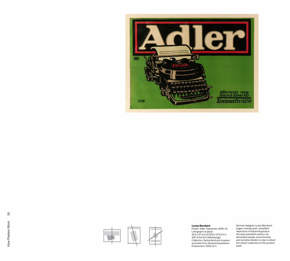
by Lucian Bernhard, sturdy letterforms match the forthright
heft of the illustration.
Bernhard’s poster is not as simple as it might seem,
however. He created a sense of depth by making the typewriter
overlap the product name. The black and red frame around
the text directs our attention to it, and the outline around the
letters gives them dimension and brings them further into focus.
The main lettering and the sheet of paper in the typewriter are
the composition’s brightest elments, giving the design a clear
and uncontested anchor.
Bernhard’s famous poster employs design techniques
that remain commonly used today. Book covers, advertisments,
websites, and packages often establish a clear point of focus.
Designers use line, color, contrast, and placement to show
viewers where to look first.
The easiest way to get someone to look at an image on a
page, screen, or poster is to make it big and put it right in the
middle. Symmetry is one of design’s oldest and most reliable
conventions. The human body is symmetrical from side to side,
while flowers are symmetrical in multiple directions. Symmetrical
designs feel balanced because they evenly distribute elements
around one or more axes. Although humans have a deep-seated
Focus the Eyethe balanced stability of symmetrical arrangments, purely
symmetrical designs can yield dull results. A centered picture
or a centered line of text can feel static, like words carved on
a tombstone. Bernhard chose to push his typewriter off to
one side, but he centered the product name at the top. Many
Plakatstil posters employ a similar mix of centered and
off-centered elements to create compositions that have a clear
focus while also conveying a sense of movement and surprise.
The poster Food is a Weapon centers our gaze on an
ordinary object. The emphatic headlines are also centered.
Sitting above and below the image, the headlines establish an
order of reading and thus allow a story to unfold as we read
the poster from top to bottom. Dramatic lighting heightens
attention on the central object. The symmetry is broken,
however, by the napkin and water glass, wihch make a strong
diagonal movement across the surface. Without that break,
the poster would feel still and stagnant.
Bardasano’s Spanish Civil War poster also centers on an
everyday object. An ordinary glass of water glass looms above
the tiny fighters on the ground, acquiring monumental stature
from the contrast in scale. Light and shadow intensify the
drama, while the angle of the glass pushes against the poster’s
dominant symmetry. The hand-drawn text conveys movement
through both its forms and placement.
Leading the eye to a main point of focus is an effective
design strategy than can support dynamic tension as well as
clear communication.
Focus the Eye 15
How
Pos
ters
Wor
k
16
Lucian BernhardPoster: Adler Typewriter, 1909–10Lithograph on paper34.5 x 47 cm (13 9/16 x 18 1/2 in.)Gift of the Eric Kellenberger Collection, Switzerland and museum purchase from General Acquisitions Endowment, 2005-12-2
German designer Lucian Bernhard began creating stark, simplified depictions of industrial goods in the early twentieth century. He eliminated people, environments, and narrative details in order to direct the viewer’s attention to the product itself.

How
Posters Work
17
Office of War InformationPoster: Food Is a Weapon, 1943Lithograph on paper57.5 x 41 cm (22 5/8 x 16 1/8 in.), 1987-24-23
BardasanoPoster: El agua en malas condiciones/produce mas bajas que la metrallaLithograph on paperGift of William P. Mangold, 1997-21-15
There’s no intrinsic drama in a plate of chicken bones. This poster creates dramatic tension by shining a spotlight on these ordinary objects. The arresting headline heightens the emotional intensity.
Grids function throughout society. The street grids used in many modern cities around the globe promote circulation among neighborhoods and the flow of traffic, in contrast with the suburban cul de sac, a dead-end road that keeps neighborhoods closed offand private.
Focus the Eye 17

How
Pos
ters
Wor
k
18
James MihoPoster: Friend? Or Foe?, 1976Screenprint on metallic coated paper91.7 x 61.2 cm (36 1/8 x 24 1/8 in.)Gift of Various Donors, 1981-29-153
BardasanoPoster: El agua en malas condiciones/produce mas bajas que la metrallaLithograph on paperGift of William P. Mangold, 1997-21-15
During World War II, civilian and military spotters learned to distinguish enemy aircraft from allied planes. This poster for the National Air and Space Museum shows the alphabet of silhouettes that spotters learned to recognize. A military emblem dominates the center.
Grids function throughout society. The street grids used in many modern cities around the globe promote circulation among neighborhoods and the flow of traffic, in contrast with the suburban cul de sac, a dead-end road that keeps neighborhoods closed offand private.

How
Posters Work
19
Tai TsugePoster: Nippon Good Design Show, 1963 Lithograph on wove paper102.5 x 68.8 cm (40 3/8 x 27 1/16 in.)Gift of Sara and Marc Benda,2009-12-20
Dan FriedmanPoster, 20th centuryOffset lithograph on paper63.5 x 48.4 cm (25 in. x 19 1/16 in.)Gift of Ken Friedman, 1997-19-198
This poster emphasizes the moon and makes the sun a small and distant object.
The large ball shape is centered towards the bottom of the poster, but the typography is set flush left. This is a common layout for modern posters.
Focus the Eye 19

How
Pos
ters
Wor
k
20
The Klein bottle is a self-penetrating object; it has no inside or outside and could only be physically constructed in four dimensions, since it must pass through itself without a hole. Jacques Lacan saw this mathematical object as an analogue for interwoven and
The Möbius strip and the Möbius short are one-sided structures whose surfaces flow from inside to outside.
contradictory planes of human thought. See Steven M. Rosen, Topologies of the Flesh: A Multidimensional Exploration of the Lifeworld (Ohio University Press, 2006) and http://mathworld.wolfram.com/KleinBottle.html.
Henry van de VeldePoster: Tropon est L’Aliment le Plus Concentré (Tropon, the Most Concentrated Food Supplement), 1898 Lithograph on wove paper, lined111.8 x 77.5 cm (44 x 30 1/2 in.)Museum purchase through gift of Mr. and Mrs. Lee S. Ainslie III, Marilyn
Friedman, and Nancy Marks; General Acquisitions Endowment; Drawings & Prints Council Fund, 2007-2-1

How
Posters Work
21
Tropon was a German food product made from processed
egg whites. Perhaps such an abstract product warranted a
highly abstract representation. In Henry van de Velde’s 1898
advertisment for Tropon, extravagant curves overwhelm
the poster’s surface, and an intricate maze surrounds the
product name. No space is left untouched by line, shape, and
ornament. Van de Velde, a proponent of the international
Jugenstil or Art Nouveau movement, engaged the viewer in an
optical experience rather than depicting a product or telling a
concrete story. He and other designers of the era led the eye in
a restless journey across the surface.
The psychedelic posters of the 1960s revived the sensual
organicism of Jugendstil. Bonnie MacLean, Victor Moscoso, Wes
Wilson and other designers of the era employed waves of
swirling lines and repeated forms to overtake the surface and
keep the viewer’s eye in continuous motion. Hand-lettered text
ignored traditional typographic values of legibility
and uniformity.
Inspired by modern color theory, these designers of
psychedelia often juxtaposed colors that compete for attention,
challenging the eye’s desire to find a place to focus. Colors that
have different hues (such as red and green) yet are close in
value (having a similar level of lightness or darkness) are said to
“vibrate”—a shimmering effect occurs where the edges meet.
Vibrating colors are visually unstable, appearing to move and
flicker when we try to fix our gaze on them. Intensely colored
silkscreen inks amplify the effect, distracting and exciting
Overwhelm the Eyethe eye with visual noise. In psychedelic graphics, modernist
ideals of flush-left type, open “white space,” and sophisticated
intellectual concepts give way to an unquenchable hunger for
immediate sensation. These posters, produced as souvenirs for
concerts, were graphic analogues for the orgiastic experience
of music, sex, and drugs.
Designers in the twenty-first century have used new tools
and reference points to address the thirst for visual sensation.
Inspired by doodles, grafitti, and randomized and automated
processes, designers have created warped and layered spaces
where lines and forms overlap, confounding a viewer’s attempt
to pin down a stable structure or compact message.
Ralph Schraivogel, Michiel Schuurman, Felix Pfaffli, and
Sulki and Min have pictured interpenetrating surfaces similar
to the Möbius strip or the Klein bottle; in these mathematical
structures, surfaces flow from inside to outside, confounding
clear distinctions between front and back, flatness and depth,
2D and 3D. Psychoanylitic thinker Jacques Lacan used the
Möbius strip and the Klein bottle to picture the complexity of
human subjectivity. Such models of design and mind reject
the search for clear, unambiguous representations of ideas,
messages, or human identities—no representation exists on a
single plane. Reaching beyond the visual “high” of psychedelia,
this late-breaking wave of experimental design generates
strange graphical landscapes whose fractal-like depth operates
across multiples scales, from macro to micro.
Overw
helm the Eye 21

How
Pos
ters
Wor
k
22
Vibrating colors create visual noise where the two edges meet. The colors have sharply different hues but the are similar in value (light and dark).

How
Posters Work
23
Jan (Johan) Thorn-PrikkerPoster: Holländische Kunstausstellung (Dutch Art Exhibition in Krefeld), 1903Lithograph on white wove paper85.4 x 121.8 cm (33 5/8 x 47 15/16 in.)Museum purchase from the Members’ Acquisitions Fund of Cooper-Hewitt, National Design Museum, 2008-4-1
Bonnie MacLeanPoster: Jim Kweskin / Jug Band, 1967 Offset lithograph on white wove paper58.2 x 36 cm (22 15/16 x 14 3/16 in.)Gift of Mr. and Mrs. Leslie J. Schreyer, 1979-34-9
Victor MoscosoPoster: Junior Wells, 1966Offset lithograph on white wove paper50.3 x 36 cm (19 13/16 x 14 3/16 in.)Gift of Mr. and Mrs. Leslie J. Schreyer, 1979-34-37
Victor MoscosoPoster: Chambers Brothers Band, Neon Rose #12, 1967 Lithograph on wove paper50.2 x 35.7 cm (19 3/4 x 14 1/16 in.)Gift of Sara and Marc Benda, 2009-12-23
Wes WilsonPoster: The Association, 1966 Offset lithograph on white wove paper50.6 x 35.1 cm (19 15/16 x 13 13/16 in.)Gift of Mr. and Mrs. Leslie J. Schreyer, 1979-34-25
Overw
helm the Eye 23

How
Pos
ters
Wor
k
24

How
Posters Work
25
Sulki & MinPoster: Three Questions for Death, 2014 Offset lithograph on paperH x W: 59.4 × 84 cm (23 3/8 × 33 1/16 in.)Gift of the designers, 6829.4.2014
Sulki & MinPoster: Works in the Open Air, 2010 Offset lithograph on paper59.4 × 84 cm (23 3/8 × 33 1/16 in.)Gift of the designers, 6829.3.2014
Shiro Shita SaoriPoster: Solo Exhibition, 2014Digital print on paper103 × 72.8 cm (40 9/16 × 28 11/16 in.)Gift of the designer, 6827.2.2014
The designers have broken the texts and images into simple shapes filled with vibrating colors (opposing hue, similar value). The thin white lines help the viewer pull sense out of this jittery surface. Posters like this one engage the viewer in an active process of looking.
Bodies and objects melt into the landscape in this grafitti-like exploration of figure and ground. The imagery suggests impossible topologies and a dreamlike stream of consciousness. The disembodied eyeball recalls surrealism and psychedelia.
Overw
helm the Eye 25

How
Pos
ters
Wor
k
26
Edward McKnight KaufferDrawing: Oak Tree Trunk, Leaf, Star, 1936 Brush and black wash, graphite on cream paper. 7.2 x 4.3 cm (2 13/16 x 1 11/16 in.)Gift of Mrs. E. McKnight Kauffer, 1963-39-873 875
The tangram is a geometric puzzle invented in China. Children use the pieces to create simple drawings.
Edward McKnight Kauffer Poster: Spring in the Village Lithograph mounted on linen (linen lining):109.5 x 72.2 cm (43 1/8 x 28 7/16 in.)100.1 x 62.6 cm (39 7/16 x 24 5/8 in.)1963-39-82-2

How
Posters Work
27
SimplifyInspired by Cubism as well as by German poster art, E.McKnight
Kauffer designed posters and drawings in the 1920s and 30s
that explored fluid relationships between figure and ground,
form and void. Studies in ink and pencile became the basis of
finished posters featuring graphic interpretations of natural or
manufactured things.
Schematic icons long predate the modern poster. The
tangram is a traditional Chinese puzzle made of seven shapes
cut from a single square. The shapes fit together in countless
ways to build angular pictures. Japanese designer Ikko Tanaka
used a tangram to construct a portrait of a geisha in his famous
poster Nihon Boyu, which produces an elegant fit between the
figure and its parts.
Designers often simplify an image in order to focus
attention on a strong message or idea. Stark silhouettes of
objects became a hallmark of modern poster design in the 1950s
and 60s. John Massey’s poster for the furniture company
Herman Miller offered a mid-century update on the Plakatstil
tradition, presenting a painterly, high-contrast interpretation of
Charles and Ray Eames’s famous Soft Pad chair.
Swiss designer and educator Armin Hoffmann called such
images “graphic translations.” Although the end result may
look simple, creating these translations required painstaking
hand skills as well as close observation and analysis; learning to
do this became a rite of passage within modernist design
training in the 1950s and 60s, and the exercise is still used in
many curricula today, albeit with digital tools.
These remarkable film posters were produced in Poland
in the 1960s and 70s. The posters advertise popular American
films, but they perform outside the conventional language
of Hollywood film promotion, exemplifying the creativity and
artistic sensibility of Polish poster art. Designers working
behind the Iron Curtain often didn’t have access to photographs
or illustrations sharp enough to reproduce at large scale.
Working with available materials, Polish designers drew on
personal experience to tell the story of the films and
their characters.
Poignant details bring these minimal illustrations to life.
When King Kong makes eye contact with the viewer, his gaze
is both ominous and endearing. The red lips of the Midnight
Cowboy capture the sensuality of Jon Voight’s character, a
male prostitute living at the raw edges of society. The designer
for Point Blank probably enlarged a photograph or photocopy
to create a high-contrast image and then printed it in two
colors, flattening out the interior details to create a more
universal figure.
Sim
plify 27

How
Pos
ters
Wor
k
28

How
Posters Work
29
Ikko TanakaNihon Buyo, 1981 Screenprint103 x 72.8 cm (40 9/16x 28 11/16 in.)1993-55-6
Yusaku KamekuraPoster: Black Lightbulb with Colored Outline, late 20th centuryPhoto-offset lithograph on paper102.7 x 72.4 cm (40 7/16 x 28 1/2 in.)Gift of Sara and Marc Benda, 2009-20-17
John MasseyPoster: Eames Soft Pad Group, Herman miller, 1970 Screenprint on coated metallic paper122.8 x 81.2 cm (48 3/8 x 31 15/16 in.)Gift of Various Donors, 1981-29-124
Sim
plify 29

How
Pos
ters
Wor
k
30

How
Posters Work
31
Waldemar SwierzyPoster: Nocny Kowboj [Midnight Cowboy], 1973 Offset lithograph on wove paper82.3 x 58.5 cm (32 3/8 x 23 1/16 in.)Gift of Sara and Marc Benda, 2010-21-103
Bronislaw ZelekPoster: Zbieg z Alcatraz [Point Blank], 1970 Offset lithograph on wove paper83.4 x 59.4 cm (32 13/16 x 23 3/8 in.)Gift of Sara and Marc Benda, 2010-21-101
Marek MosinskiUcieczka King Konga [King Kong Escapes], 1968 Offset lithograph on wove paperGift of Sara and Marc Benda. 2010-21-104
Sim
plify 31

How
Pos
ters
Wor
k
32
Francisco DosamantesExposision Litografia, 1939 Lithograph on paper45.1 x 59.7 cm (17 3/4 x 23 1/2 in. )2004-34-1
Eye-tracking software shows that when given a picture of a face, the eye repeatedly returns to primary facial features, especially the eyes. From A. Yarbus, Eye Movements and Vision (New York: Plenum, 1967).

How
Posters Work
33
Make Eye ContactIn this 1939 poster for an exhibition devoted to lithography
presents, a wide-open eye symbolizes visual creativity. Modern
designers commonly used the eye (as well as the hand) as
an emblem and marker for visual art and for the powerful
new tools unleashed by modern design and technology, from
photographic reproduction to lithographic presses.
But the eye is more than a symbol. The eye in this poster
is looking at you. It is initiating an intimate form of contact and
communication. The human vision system is specially attuned
to recognizing faces. Human beings see eyes, noses, and
mouths not only on the visages of living things but on nearly
anything configured in the general pattern of a face,
from a simple smiley face to the grille and headlights of a car.
Intuitively understanding the power of eye contact,
graphic designers often include faces that are looking directly
at a viewer, challenging the viewer to look back. Paula Scher’s
posters... Indeed, eyes play an important role in theater.
Guidelines help the designer align elements in relation to each
other. Consistent margins and columns create an underlying
structure that unifies the pages of a document and makes the
layout process more efficient. In addition to organizing the
active content of the page (text and images), the grid lends
structure to the white spaces, which cease to be merely
blank and passive voids but participate in the rhythm of the
overall system.
A well-made grid encourages the designer to vary the
scale and placement of elements without relying wholly on
arbitrary or whimsical judgments. The grid offers a rationale
and a starting point for each composition, converting a blank
area into a structured field.
Many artists have embraced the grid as a rational, universal
form that exists outside of the individual producer. At the same
time, the grid is culturally associated with modern urbanism,
architecture, and technology. The facades of many glass high
rises and other modern buildings consist of uniform ribbons
of metal and glass that wrap the building’s volume in a continuous
skin. In contrast with the symmetrical hierarchy of a classical
building, with its strong entranceway and tiered pattern of
windows, a gridded facade expresses a democracy of elements.
Grids function throughout society. The street grids used
in many modern cities around the globe promote circulation
among neighborhoods and the flow of traffic, in contrastwith the
suburban cul de sac, a dead-end road that keeps neighborhoods
closed offand private.
By breaking down space into units, grids encourage
designers to leave some areas open rather than filling up the page.
Software interfaces encourage the use of grids by making it easy
to establish margins, columns, and page templates. Guidelines
can be quickly dragged, dropped, and deleted and made visible
or invisible at will. (Indeed, it is a good idea when working on screen
to switch off the guidelines from time to time, as they can create
a false sense of fullness and structure as well as clutter one’s
view.) This chapter looks at the grid as a means of generating form,
arranging images, and organizing information.
Make Eye C
ontact 33

How
Pos
ters
Wor
k
34

How
Posters Work
35
Paula ScherPoster: New York Public Theater/Nude Nude Totally Nude, 1996Offset lithograph on paper116.8 x 76 cm (46 in. x 29 15/16 in.)Gift of Pentagram, 1997-99-3
Paula ScherPoster: Him, The Public Theater, 1994Screenprint on paper116.8 x 76.2 cm (46 x 30 in.)Gift of Paula Scher, 2013-25-1
Grids function throughout society. The street grids used in many modern cities around the globe promote circulation among neighborhoods and the flow of traffic, in contrast with the suburban cul de sac, a dead-end road that keeps neighborhoods closed offand private.
Make Eye C
ontact 35

How
Pos
ters
Wor
k
36

How
Posters Work
37
Marlene McCartyPoster: WAC Is Watching, 1992Offset color lithograph on paper56.9 x 56.9 cm (22 3/8 x 22 3/8 in.)Gift of Marlene McCarty and Donald Moffett, Bureau, 1996-44-1
Edward McKnight KaufferPrint: Subway Posters Perform, 1948Lithograph on paper21.6 x 14 cm (8 1/2 x 5 1/2 in.)Gift of Mrs. E. McKnight Kauffer, 1963-39-166-c
Grids function throughout society. The street grids used in many modern cities around the globe promote circulation among neighborhoods and the flow of traffic, in contrast with the suburban cul de sac, a dead-end road that keeps neighborhoods closed offand private.
Paul RandPoster: The Prepared Professional, International Design Conference, Aspen, 1982Screenprint on paper96.5 x 53.7 cm (38 x 21 1/8 in. )Gift of Marion S. Rand, 2002-11-11
Make Eye C
ontact 37


