
Introduction to Wpf
67
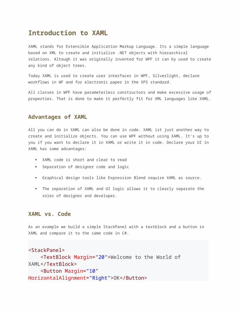
Introduction to XAML XAML stands for Extensible Application Markup Language. Its a simple language based on XML to create and initialize .NET objects with hierarchical relations. Altough it was originally invented for WPF it can by used to create any kind of object trees. Today XAML is used to create user interfaces in WPF, Silverlight, declare workflows in WF and for electronic paper in the XPS standard. All classes in WPF have parameterless constructors and make excessive usage of properties. That is done to make it perfectly fit for XML languages like XAML. Advantages of XAML All you can do in XAML can also be done in code. XAML ist just another way to create and initialize objects. You can use WPF without using XAML. It's up to you if you want to declare it in XAML or write it in code. Declare your UI in XAML has some advantages: XAML code is short and clear to read Separation of designer code and logic Graphical design tools like Expression Blend require XAML as source. The separation of XAML and UI logic allows it to clearly separate the roles of designer and developer. XAML vs. Code As an example we build a simple StackPanel with a textblock and a button in XAML and compare it to the same code in C#. <StackPanel> <TextBlock Margin="20">Welcome to the World of XAML</TextBlock> <Button Margin="10" HorizontalAlignment="Right">OK</Button>
-
Upload
aleksandar-braca-miljkovic -
Category
Documents
-
view
21 -
download
5
description
Introduction to Wpf
Transcript of Introduction to Wpf
Introduction to XAML
XAML stands for Extensible Application Markup Language. Its a simple language based on
XML to create and initialize .NET objects with hierarchical relations. Altough it was originally
invented for WPF it can by used to create any kind of object trees.
Today XAML is used to create user interfaces in WPF, Silverlight, declare workflows in WF
and for electronic paper in the XPS standard.
All classes in WPF have parameterless constructors and make excessive usage of properties.
That is done to make it perfectly fit for XML languages like XAML.
Advantages of XAML
All you can do in XAML can also be done in code. XAML ist just another way to create and
initialize objects. You can use WPF without using XAML. It's up to you if you want to declare
it in XAML or write it in code. Declare your UI in XAML has some advantages:
XAML code is short and clear to read
Separation of designer code and logic
Graphical design tools like Expression Blend require XAML as source.
The separation of XAML and UI logic allows it to clearly separate the roles of designer
and developer.
XAML vs. Code
As an example we build a simple StackPanel with a textblock and a button in XAML and
compare it to the same code in C#.
<StackPanel> <TextBlock Margin="20">Welcome to the World of XAML</TextBlock> <Button Margin="10" HorizontalAlignment="Right">OK</Button></StackPanel>
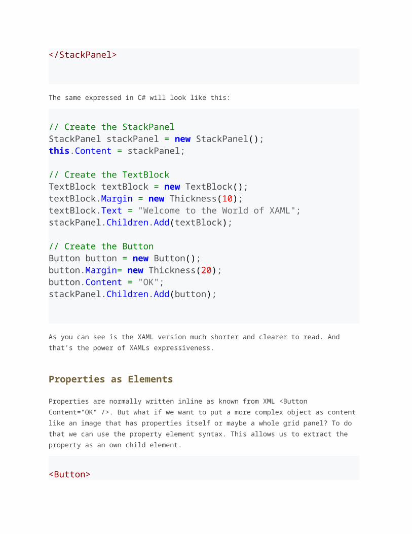
The same expressed in C# will look like this:
// Create the StackPanelStackPanel stackPanel = new StackPanel();this.Content = stackPanel; // Create the TextBlockTextBlock textBlock = new TextBlock();textBlock.Margin = new Thickness(10);textBlock.Text = "Welcome to the World of XAML";stackPanel.Children.Add(textBlock); // Create the ButtonButton button = new Button();button.Margin= new Thickness(20);button.Content = "OK";stackPanel.Children.Add(button);
As you can see is the XAML version much shorter and clearer to read. And that's the power
of XAMLs expressiveness.
Properties as Elements
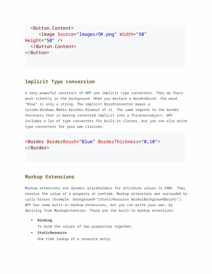
Properties are normally written inline as known from XML <Button Content="OK" />. But
what if we want to put a more complex object as content like an image that has properties
itself or maybe a whole grid panel? To do that we can use the property element syntax. This
allows us to extract the property as an own child element.
<Button> <Button.Content> <Image Source="Images/OK.png" Width="50" Height="50" /> </Button.Content></Button>
Implicit Type conversion
A very powerful construct of WPF are implicit type converters. They do their work silently in
the background. When you declare a BorderBrush, the word "Blue" is only a string. The
implicit BrushConverter makes a System.Windows.Media.Brushes.Blueout of it. The same
regards to the border thickness that is beeing converted implicit into a Thicknessobject.
WPF includes a lot of type converters for built-in classes, but you can also write type
converters for your own classses.
<Border BorderBrush="Blue" BorderThickness="0,10"></Border>
Markup Extensions
Markup extensions are dynamic placeholders for attribute values in XAML. They resolve the
value of a property at runtime. Markup extensions are surrouded by curly braces (Example:
Background="{StaticResource NormalBackgroundBrush}"). WPF has some built-in
markup extensions, but you can write your own, by deriving from MarkupExtension. These
are the built-in markup extensions:
Binding
To bind the values of two properties together.
StaticResource
One time lookup of a resource entry
DynamicResource
Auto updating lookup of a resource entry
TemplateBinding
To bind a property of a control template to a dependency property of the control
x:Static
Resolve the value of a static property.
x:Null
Return null
The first identifier within a pair of curly braces is the name of the extension. All preciding
identifiers are named parameters in the form of Property=Value. The following example
shows a label whose Content is bound to the Textof the textbox. When you type a text into
the text box, the text property changes and the binding markup extension automatically
updates the content of the label.
<TextBox x:Name="textBox"/><Label Content="{Binding Text, ElementName=textBox}"/>
Namespaces
At the beginning of every XAML file you need to include two namespaces.
The first is http://schemas.microsoft.com/winfx/2006/xaml/presentation. It is mapped
to all wpf controls in System.Windows.Controls.
The second is http://schemas.microsoft.com/winfx/2006/xaml it is mapped to
System.Windows.Markupthat defines the XAML keywords.
The mapping between an XML namespace and a CLR namespace is done by the
XmlnsDefinitionattribute at assembly level. You can also directly include a CLR namespace
in XAML by using the clr-namespace: prefix.
indow xmlns=”http://schemas.microsoft.com/winfx/2006/xaml/presentation” xmlns:x=”http://schemas.microsoft.com/winfx/2006/xaml”>indow>
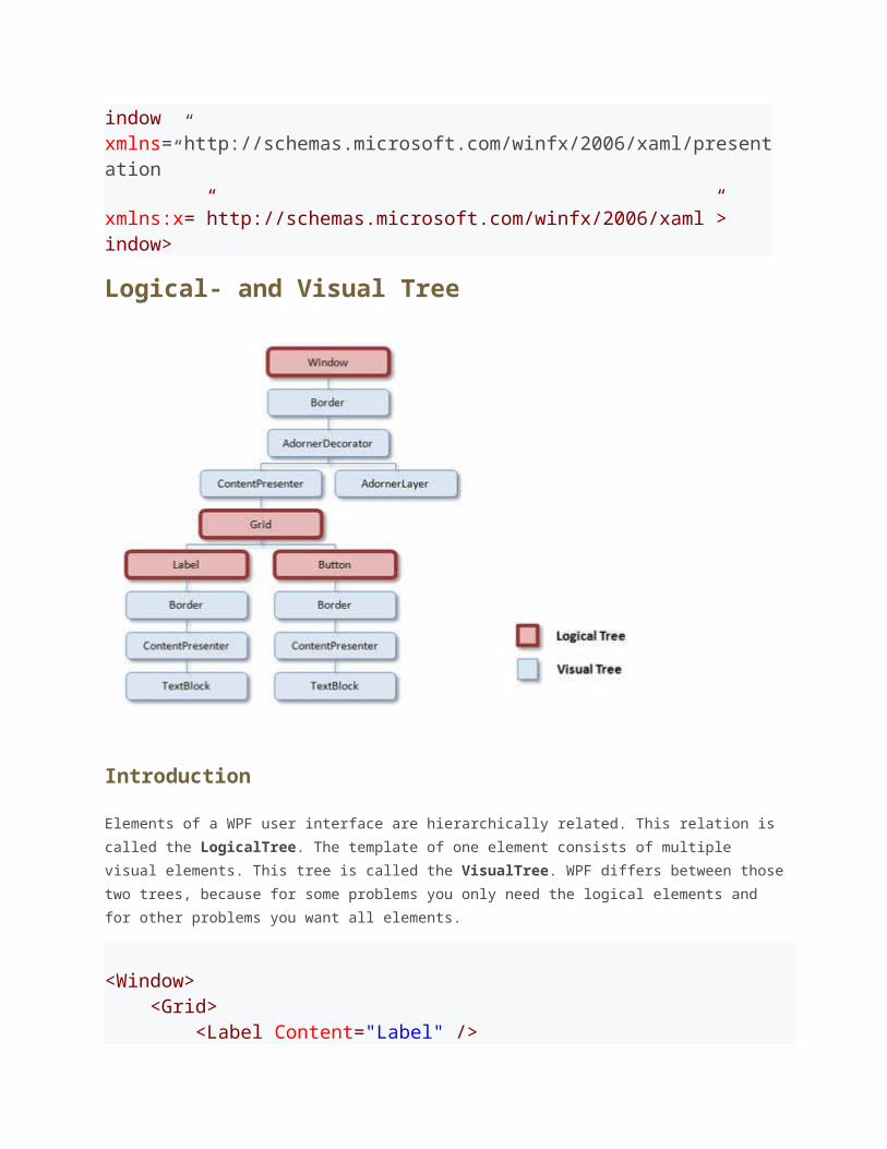
Logical- and Visual Tree
Introduction
Elements of a WPF user interface are hierarchically related. This relation is called the
LogicalTree. The template of one element consists of multiple visual elements. This tree is
called the VisualTree. WPF differs between those two trees, because for some problems
you only need the logical elements and for other problems you want all elements.
<Window> <Grid> <Label Content="Label" /> ton Content="Button" /> </Grid></Window>
Why do we need two different kind of trees?
A WPF control consists of multiple, more primitive controls. A button - for example - consists
of a border, a rectangle and a content presenter. These controls are visual children of the
button.
When WPF renders the button, the element itself has no appearance, but it iterates through
the visual tree and renders the visual children of it. This hierarchical relation can also be
used to do hit-testing, layout etc.
But sometimes you are not interested in the borders and rectangles of a controls' template.
Particulary because the template can be replaced, and so you should not relate on the visual
tree structure! Because of that you want a more robust tree that only contains the "real"
controls - and not all the template parts. And that is the eligibility for the logical tree.
The Logical Tree
The logical treedescribes the relations between elements of the user interface. The logical
tree is responsible for:
Inherit DependencyProperty values
Resolving DynamicResources references
Looking up element names for bindings
Forwaring RoutedEvents
The Visual Tree
The visual tree contains all logical elements including all visual elements of the template of
each element.<BR
The visual tree is responsible for:
Rendering visual elements
Propagate element opacity
Propagate Layout- and RenderTransforms
Propagate the IsEnabled property.
Do Hit-Testing
RelativeSource (FindAncestor)
Programmatically Find an Ancestor in the Visual Tree
If you are a child element of a user interface and you want to access data from a parent
element, but you don't know how many levels up that elemens is, it's the best solution to
navigate up the tree until it finds an element of the requested type.
This helper does excactly this. You can use almost the same code to navigate through the
logical tree.
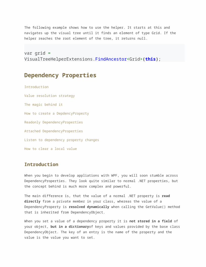
public static class VisualTreeHelperExtensions{ public staticT FindAncestor<T>(DependencyObject dependencyObject) where T : class { DependencyObject target = dependencyObject; do { target = VisualTreeHelper.GetParent(target); } while (target != null && !(target is T)); return target as T; }} The following example shows how to use the helper. It starts at this and navigates up the
visual tree until it finds an element of type Grid. If the helper reaches the root element of
the tree, it returns null.
var grid = VisualTreeHelperExtensions.FindAncestor<Grid>(this);
Dependency Properties
Introduction
Value resolution strategy
The magic behind it
How to create a DepdencyProperty
Readonly DependencyProperties
Attached DependencyProperties
Listen to dependency property changes
How to clear a local value
Introduction
When you begin to develop appliations with WPF, you will soon stumble across
DependencyProperties. They look quite similar to normal .NET properties, but the concept
behind is much more complex and powerful.
The main difference is, that the value of a normal .NET property is read directly from a
private member in your class, whereas the value of a DependencyProperty is resolved
dynamically when calling the GetValue() method that is inherited from
DependencyObject.
When you set a value of a dependency property it is not stored in a field of your object,
but in a dictionaryof keys and values provided by the base class DependencyObject. The
key of an entry is the name of the property and the value is the value you want to set.
The advantages of dependency properties are
Reduced memory footprint
It's a huge dissipation to store a field for each property when you think that over 90%
of the properties of a UI control typically stay at its initial values. Dependency
properties solve these problems by only store modified properties in the instance.
The default values are stored once within the dependency property.
Value inheritance
When you access a dependency property the value is resolved by using a value
resolution strategy. If no local value is set, the dependency property navigates up the
logical tree until it finds a value. When you set the FontSize on the root element it
applies to all textblocks below except you override the value.
Change notification
Dependency properties have a built-in change notification mechanism. By registering
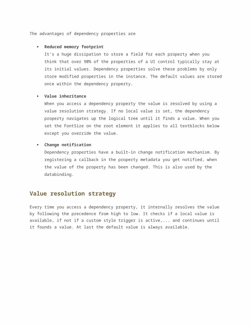
a callback in the property metadata you get notified, when the value of the property
has been changed. This is also used by the databinding.
Value resolution strategy
Every time you access a dependency property, it internally resolves the value by following
the precedence from high to low. It checks if a local value is available, if not if a custom style
trigger is active,... and continues until it founds a value. At last the default value is always
available.
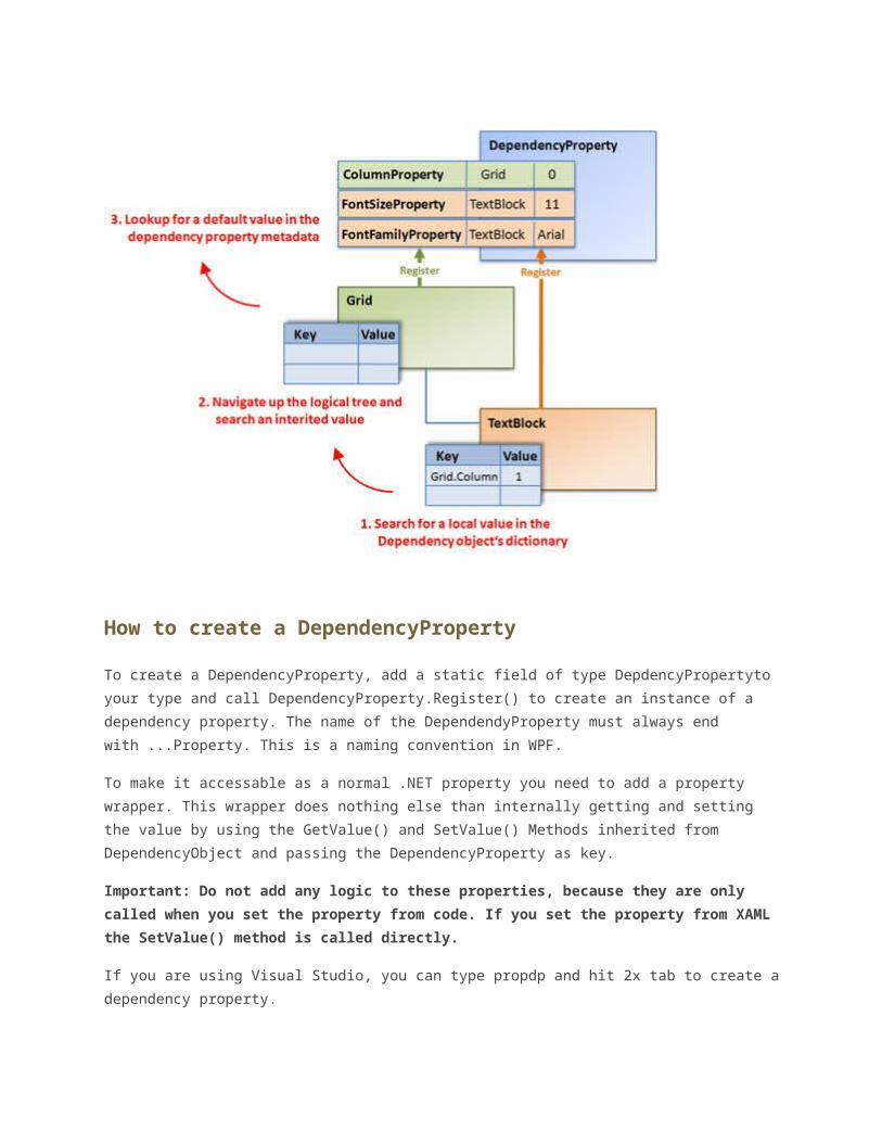
The magic behind it
Each WPF control registers a set of DependencyProperties to the static
DependencyPropertyclass. Each of them consists of a key - that must be unique per type -
and a metadata that contain callbacks and a default value.
All types that want to use DependencyProperties must derive from DependencyObject. This
baseclass defines a key, value dictionary that contains local values of dependency

properties. The key of an entry is the key defined with the dependency property.
When you access a dependency property over its .NET property wrapper, it internally calls
GetValue(DependencyProperty)to access the value. This method resolves the value by
using a value resolution strategy that is explained in detail below. If a local value is
available, it reads it directly from the dictionary. If no value is set if goes up the logical tree
and searches for an inherited value. If no value is found it takes the default value defined in
the property metadata. This sequence is a bit simplified, but it shows the main concept.
How to create a DependencyProperty
To create a DependencyProperty, add a static field of type DepdencyPropertyto your type
and call DependencyProperty.Register() to create an instance of a dependency property.
The name of the DependendyProperty must always end with ...Property. This is a naming
convention in WPF.
To make it accessable as a normal .NET property you need to add a property wrapper. This
wrapper does nothing else than internally getting and setting the value by using the
GetValue() and SetValue() Methods inherited from DependencyObject and passing the
DependencyProperty as key.
Important: Do not add any logic to these properties, because they are only called
when you set the property from code. If you set the property from XAML the
SetValue() method is called directly.
If you are using Visual Studio, you can type propdp and hit 2x tab to create a dependency
property.
// Dependency Propertypublic static readonly DependencyProperty CurrentTimeProperty = DependencyProperty.Register( "CurrentTime", typeof(DateTime), typeof(MyClockControl), new FrameworkPropertyMetadata(DateTime.Now)); // .NET Property wrapperpublic DateTime CurrentTime{ get { return (DateTime)GetValue(CurrentTimeProperty); } set { SetValue(CurrentTimeProperty, value); }} Each DependencyProperty provides callbacks for change notification, value coercion and
validation. These callbacks are registered on the dependency property.
new FrameworkPropertyMetadata( DateTime.Now, OnCurrentTimePropertyChanged, OnCoerceCurrentTimeProperty ), OnValidateCurrentTimeProperty );
Value Changed Callback
The change notification callback is a static method, that is called everytime when the value
of the TimeProperty changes. The new value is passed in the EventArgs, the object on which
the value changed is passed as the source.
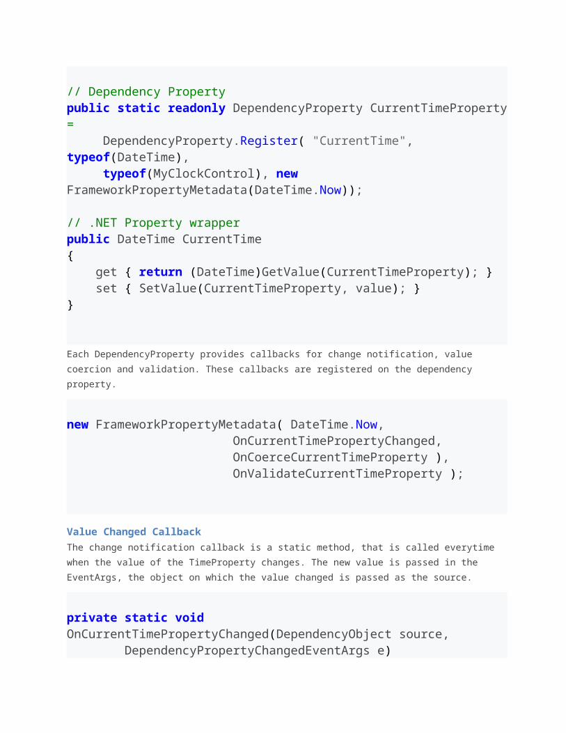
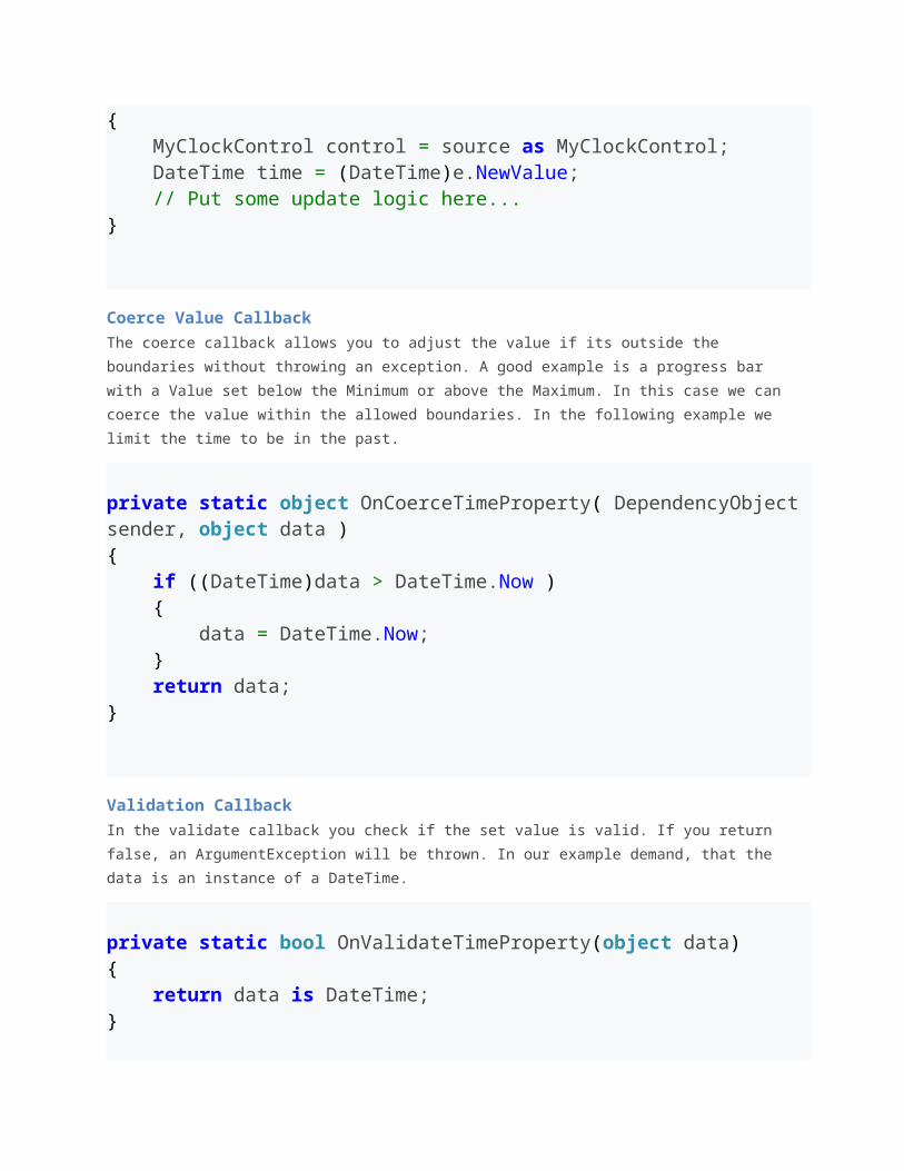
private static void OnCurrentTimePropertyChanged(DependencyObject source, DependencyPropertyChangedEventArgs e){ MyClockControl control = source as MyClockControl; DateTime time = (DateTime)e.NewValue; // Put some update logic here...}
Coerce Value Callback
The coerce callback allows you to adjust the value if its outside the boundaries without
throwing an exception. A good example is a progress bar with a Value set below the
Minimum or above the Maximum. In this case we can coerce the value within the allowed
boundaries. In the following example we limit the time to be in the past.
private static object OnCoerceTimeProperty( DependencyObject sender, object data ){ if ((DateTime)data > DateTime.Now ) { data = DateTime.Now; } return data;}
Validation Callback
In the validate callback you check if the set value is valid. If you return false, an
ArgumentException will be thrown. In our example demand, that the data is an instance of a
DateTime.
private static bool OnValidateTimeProperty(object data){ return data is DateTime;}
Readonly DependencyProperties
Some dependency property of WPF controls are readonly. They are often used to report the
state of a control, like the IsMouseOver property. Is does not make sense to provide a setter
for this value.
Maybe you ask yourself, why not just use a normal .NET property? One important reason is
that you cannot set triggers on normal .NET propeties.
Creating a read only property is similar to creating a regular DependencyProperty. Instead of
calling DependencyProperty.Register() you call
DependencyProperty.RegisterReadonly(). This returns you a DependencyPropertyKey.
This key should be stored in a private or protected static readonly field of your class. The
key gives you access to set the value from within your class and use it like a normal
dependency property.
Second thing to do is registering a public dependency property that is assigned to
DependencyPropertyKey.DependencyProperty. This property is the readonly property that
can be accessed from external.
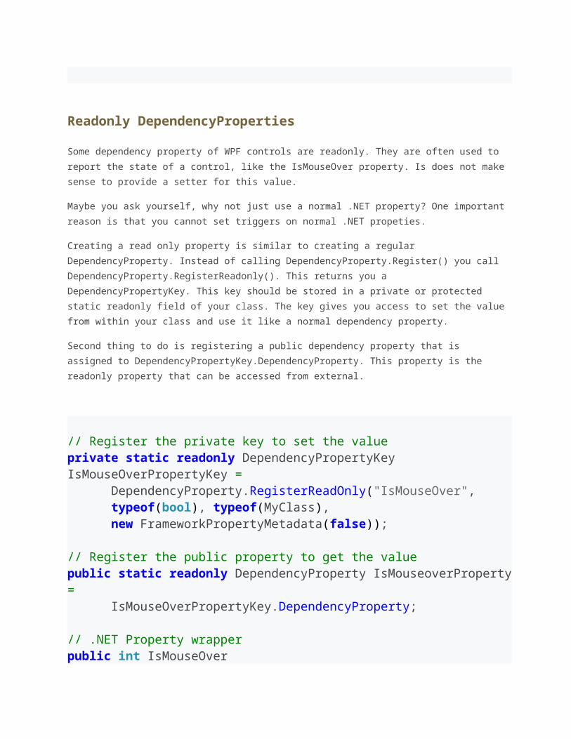
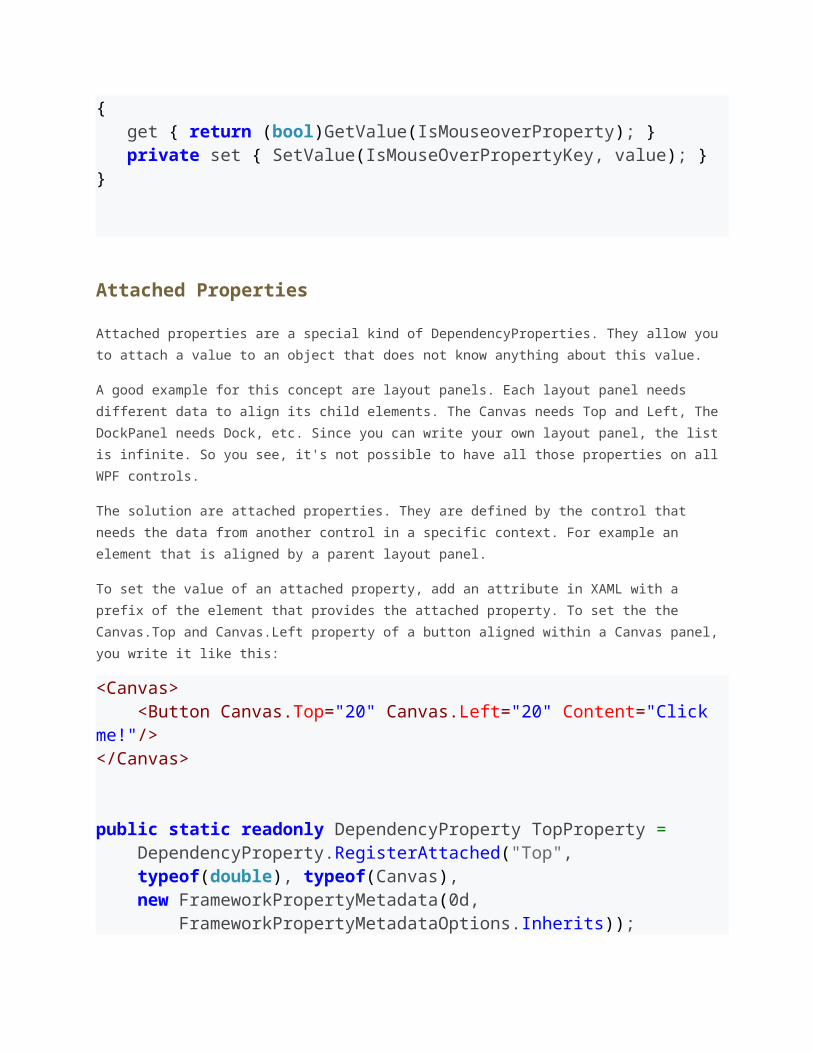
// Register the private key to set the valueprivate static readonly DependencyPropertyKey IsMouseOverPropertyKey = DependencyProperty.RegisterReadOnly("IsMouseOver", typeof(bool), typeof(MyClass), new FrameworkPropertyMetadata(false)); // Register the public property to get the valuepublic static readonly DependencyProperty IsMouseoverProperty = IsMouseOverPropertyKey.DependencyProperty; // .NET Property wrapperpublic int IsMouseOver{ get { return (bool)GetValue(IsMouseoverProperty); }
private set { SetValue(IsMouseOverPropertyKey, value); }}
Attached Properties
Attached properties are a special kind of DependencyProperties. They allow you to attach a
value to an object that does not know anything about this value.
A good example for this concept are layout panels. Each layout panel needs different data to
align its child elements. The Canvas needs Top and Left, The DockPanel needs Dock, etc.
Since you can write your own layout panel, the list is infinite. So you see, it's not possible to
have all those properties on all WPF controls.
The solution are attached properties. They are defined by the control that needs the data
from another control in a specific context. For example an element that is aligned by a
parent layout panel.
To set the value of an attached property, add an attribute in XAML with a prefix of the
element that provides the attached property. To set the the Canvas.Top and Canvas.Left
property of a button aligned within a Canvas panel, you write it like this:
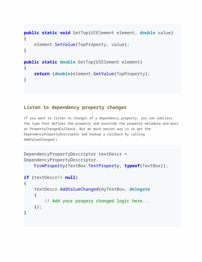
<Canvas> <Button Canvas.Top="20" Canvas.Left="20" Content="Click me!"/></Canvas> public static readonly DependencyProperty TopProperty = DependencyProperty.RegisterAttached("Top", typeof(double), typeof(Canvas), new FrameworkPropertyMetadata(0d, FrameworkPropertyMetadataOptions.Inherits)); public static void SetTop(UIElement element, double value){ element.SetValue(TopProperty, value);}
public static double GetTop(UIElement element){ return (double)element.GetValue(TopProperty);}
Listen to dependency property changes
If you want to listen to changes of a dependency property, you can subclass the type that
defines the property and override the property metadata and pass an
PropertyChangedCallback. But an much easier way is to get the
DependencyPropertyDescriptor and hookup a callback by calling AddValueChanged()
DependencyPropertyDescriptor textDescr = DependencyPropertyDescriptor. FromProperty(TextBox.TextProperty, typeof(TextBox)); if (textDescr!= null){ textDescr.AddValueChanged(myTextBox, delegate { // Add your propery changed logic here... });}
How to clear a local value
Because null is also a valid local value, there is the constant
DependencyProperty.UnsetValue that describes an unset value.
button1.ClearValue( Button.ContentProperty );
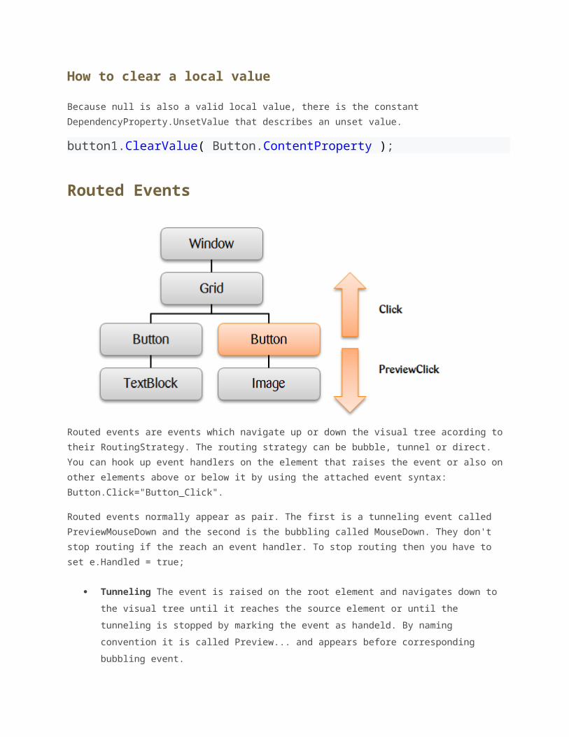
Routed Events
Routed events are events which navigate up or down the visual tree acording to their
RoutingStrategy. The routing strategy can be bubble, tunnel or direct. You can hook up
event handlers on the element that raises the event or also on other elements above or
below it by using the attached event syntax: Button.Click="Button_Click".
Routed events normally appear as pair. The first is a tunneling event called
PreviewMouseDown and the second is the bubbling called MouseDown. They don't stop routing
if the reach an event handler. To stop routing then you have to set e.Handled = true;
Tunneling The event is raised on the root element and navigates down to the visual
tree until it reaches the source element or until the tunneling is stopped by marking
the event as handeld. By naming convention it is called Preview... and appears
before corresponding bubbling event.
Bubbling The event is raised on the source element and navigates up to the visual
tree until it reaches the root element or until the bubbling is stopped by marking the
event as handled. The bubbling event is raised after the tunneling event.
Direct The event is raised on the source element and must be handled on the source
element itself. This behavior is the same as normal .NET events.
How to Create a Custom Routed Event
// Register the routed eventpublic static readonly RoutedEvent SelectedEvent = EventManager.RegisterRoutedEvent( "Selected", RoutingStrategy.Bubble, typeof(RoutedEventHandler), typeof(MyCustomControl)); // .NET wrapperpublic event RoutedEventHandler Selected{ add { AddHandler(SelectedEvent, value); } remove { RemoveHandler(SelectedEvent, value); }} // Raise the routed event "selected"RaiseEvent(new RoutedEventArgs(MyCustomControl.SelectedEvent));
Introduction to WPF Layout
Why layout is so important
Best Practices
Vertical and Horizontal Alignment
Margin and Padding
Width and Height
Content Overflow Handling
Why layout is so important
Layout of controls is critical to an applications usability. Arranging controls based on fixed
pixel coordinates may work for an limited enviroment, but as soon as you want to use it on
different screen resolutions or with different font sizes it will fail. WPF provides a rich set
built-in layout panels that help you to avoid the common pitfalls.
These are the five most popular layout panels of WPF:
Grid Panel
Stack Panel
Dock Panel
Wrap Panel
Canvas Panel
Best Practices
Avoid fixed positions - use the Alignment properties in combination with Margin to
position elements in a panel
Avoid fixed sizes - set the Width and Height of elements to Auto whenever possible.
Don't abuse the canvas panel to layout elements. Use it only for vector graphics.
Use a StackPanel to layout buttons of a dialog
Use a GridPanel to layout a static data entry form. Create a Auto sized column for the
labels and a Star sized column for the TextBoxes.
Use an ItemControl with a grid panel in a DataTemplate to layout dynamic key value
lists. Use the SharedSize feature to synchronize the label widths.
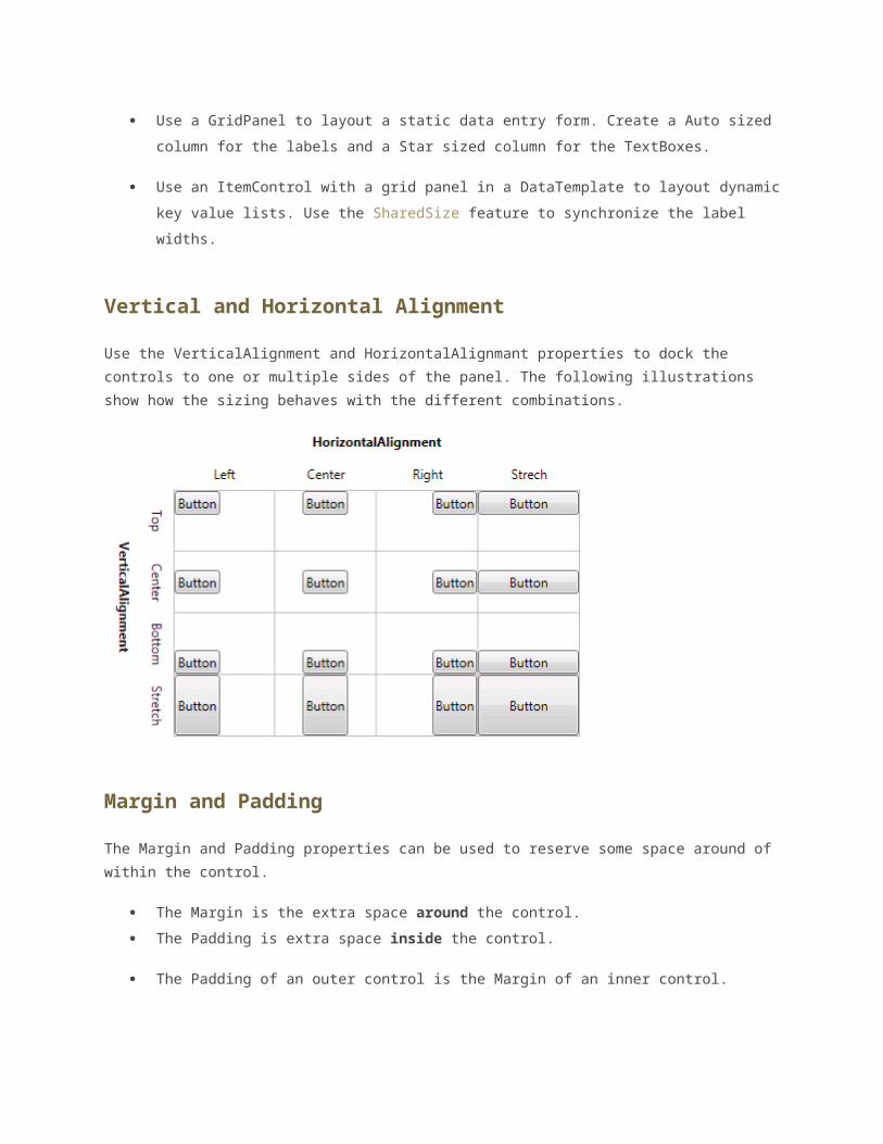
Vertical and Horizontal Alignment
Use the VerticalAlignment and HorizontalAlignmant properties to dock the controls to
one or multiple sides of the panel. The following illustrations show how the sizing behaves
with the different combinations.
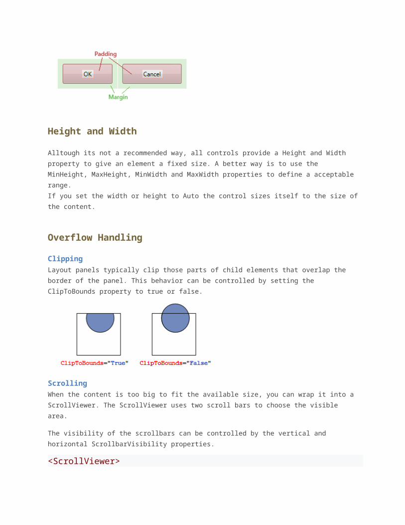
Margin and Padding
The Margin and Padding properties can be used to reserve some space around of within the
control.
The Margin is the extra space around the control.
The Padding is extra space inside the control.
The Padding of an outer control is the Margin of an inner control.
Height and Width
Alltough its not a recommended way, all controls provide a Height and Width property to
give an element a fixed size. A better way is to use the MinHeight, MaxHeight, MinWidth
and MaxWidth properties to define a acceptable range.
If you set the width or height to Auto the control sizes itself to the size of the content.
Overflow Handling
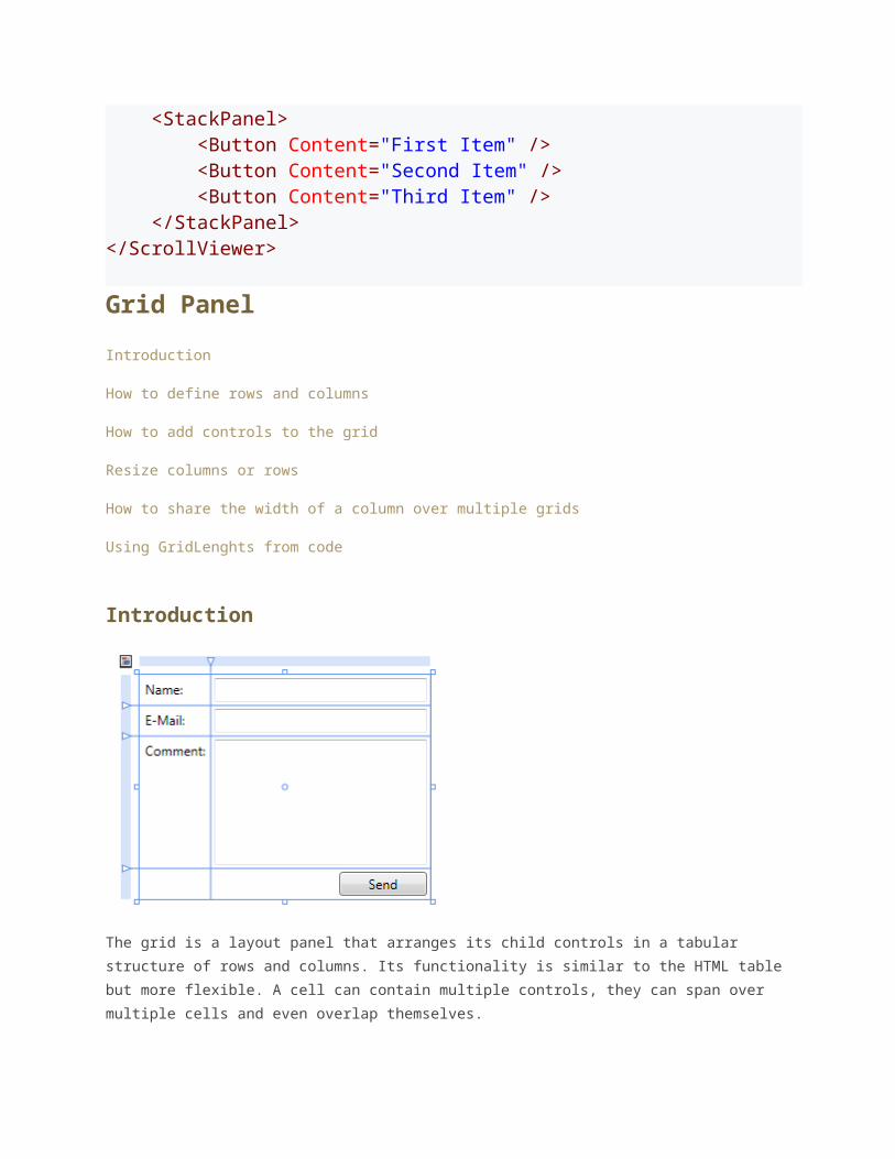
Clipping
Layout panels typically clip those parts of child elements that overlap the border of the
panel. This behavior can be controlled by setting the ClipToBounds property to true or false.
ScrollingWhen the content is too big to fit the available size, you can wrap it into a ScrollViewer.
The ScrollViewer uses two scroll bars to choose the visible area.
The visibility of the scrollbars can be controlled by the vertical and horizontal
ScrollbarVisibility properties.
<ScrollViewer> <StackPanel> <Button Content="First Item" /> <Button Content="Second Item" /> <Button Content="Third Item" /> </StackPanel></ScrollViewer>
Grid Panel
Introduction
How to define rows and columns
How to add controls to the grid
Resize columns or rows
How to share the width of a column over multiple grids
Using GridLenghts from code
Introduction
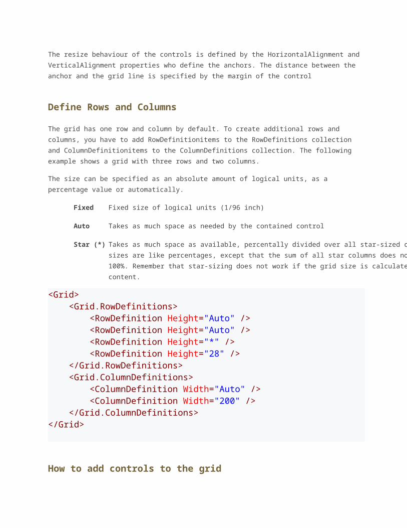
The grid is a layout panel that arranges its child controls in a tabular structure of rows and
columns. Its functionality is similar to the HTML table but more flexible. A cell can contain
multiple controls, they can span over multiple cells and even overlap themselves.
The resize behaviour of the controls is defined by the HorizontalAlignment and
VerticalAlignment properties who define the anchors. The distance between the anchor
and the grid line is specified by the margin of the control
Define Rows and Columns
The grid has one row and column by default. To create additional rows and columns, you
have to add RowDefinitionitems to the RowDefinitions collection and
ColumnDefinitionitems to the ColumnDefinitions collection. The following example shows
a grid with three rows and two columns.
The size can be specified as an absolute amount of logical units, as a percentage value or
automatically.
Fixed Fixed size of logical units (1/96 inch)
Auto Takes as much space as needed by the contained control
Star (*) Takes as much space as available, percentally divided over all star-sized columns. Star-sizes are like
percentages, except that the sum of all star columns does not have to be 100%. Remember that star-sizing
does not work if the grid size is calculated based on its content.
<Grid>
<Grid.RowDefinitions> <RowDefinition Height="Auto" /> <RowDefinition Height="Auto" /> <RowDefinition Height="*" /> <RowDefinition Height="28" /> </Grid.RowDefinitions> <Grid.ColumnDefinitions> <ColumnDefinition Width="Auto" /> <ColumnDefinition Width="200" /> </Grid.ColumnDefinitions></Grid>
How to add controls to the grid
To add controls to the grid layout panel just put the declaration between the opening and
closing tags of the Grid. Keep in mind that the row- and columndefinitions must precced any
definition of child controls.
The grid layout panel provides the two attached properties Grid.Column and Grid.Row to
define the location of the control.
<Grid> <Grid.RowDefinitions> <RowDefinition Height="Auto" /> <RowDefinition Height="Auto" /> <RowDefinition Height="*" /> <RowDefinition Height="28" /> </Grid.RowDefinitions> <Grid.ColumnDefinitions> <ColumnDefinition Width="Auto" /> <ColumnDefinition Width="200" /> </Grid.ColumnDefinitions> <Label Grid.Row="0" Grid.Column="0" Content="Name:"/> <Label Grid.Row="1" Grid.Column="0" Content="E-Mail:"/> <Label Grid.Row="2" Grid.Column="0" Content="Comment:"/> <TextBox Grid.Column="1" Grid.Row="0" Margin="3" /> <TextBox Grid.Column="1" Grid.Row="1" Margin="3" /> <TextBox Grid.Column="1" Grid.Row="2" Margin="3" />
ton Grid.Column="1" Grid.Row="3" HorizontalAlignment="Right" MinWidth="80" Margin="3" Content="Send" /></Grid>
Resizable columns or rows
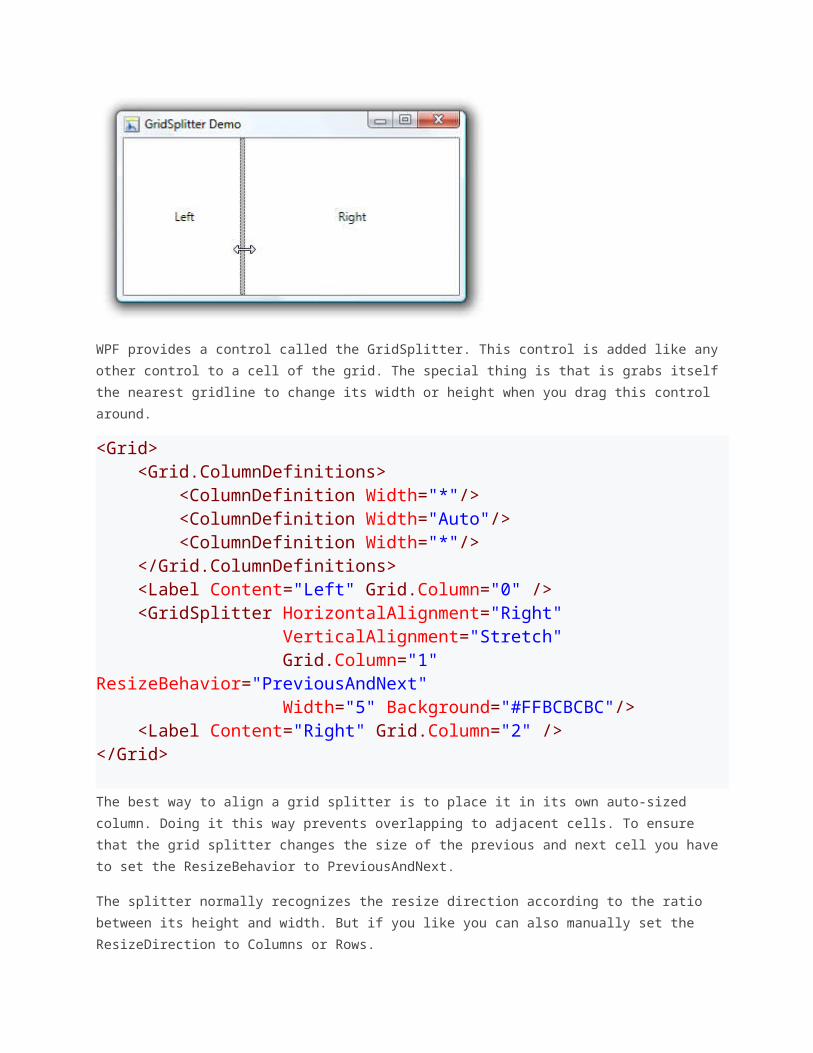
WPF provides a control called the GridSplitter. This control is added like any other control
to a cell of the grid. The special thing is that is grabs itself the nearest gridline to change its
width or height when you drag this control around.
<Grid> <Grid.ColumnDefinitions> <ColumnDefinition Width="*"/> <ColumnDefinition Width="Auto"/> <ColumnDefinition Width="*"/> </Grid.ColumnDefinitions> <Label Content="Left" Grid.Column="0" /> <GridSplitter HorizontalAlignment="Right" VerticalAlignment="Stretch" Grid.Column="1" ResizeBehavior="PreviousAndNext" Width="5" Background="#FFBCBCBC"/> <Label Content="Right" Grid.Column="2" /></Grid>
The best way to align a grid splitter is to place it in its own auto-sized column. Doing it this
way prevents overlapping to adjacent cells. To ensure that the grid splitter changes the size
of the previous and next cell you have to set the ResizeBehavior to PreviousAndNext.
The splitter normally recognizes the resize direction according to the ratio between its
height and width. But if you like you can also manually set the ResizeDirection to Columns
or Rows.
<GridSplitter ResizeDirection="Columns"/>
How to share the width of a column over multiple grids
The shared size feature of the grid layout allows it to synchronize the width of columns over
multiple grids. The feature is very useful if you want to realize a multi-column listview by
using a grid as layout panel within the data template. Because each item contains its own
grid, the columns will not have the same width.
By setting the attached property Grid.IsSharedSizeScope to true on a parent element you
define a scope within the column-widths are shared.
To synchronize the width of two columndefinitions, set the SharedSizeGroup to the same
name.
<ItemsControl Grid.IsSharedSizeScope="True" > <ItemsControl.ItemTemplate> <DataTemplate> <Grid> <Grid.ColumnDefinitions> <ColumnDefinition SharedSizeGroup="FirstColumn" Width="Auto"/> <ColumnDefinition Width="*"/> </Grid.ColumnDefinitions> <TextBlock Text="{Binding Path=Key}" TextWrapping="Wrap"/> <TextBlock Text="{Binding Path=Value}" Grid.Column="1" TextWrapping="Wrap"/> </Grid> </DataTemplate> </ItemsControl.ItemTemplate>
</ItemsControl>
Useful Hints
Columns and rows that participate in size-sharing do not respect Star sizing. In the size-
sharing scenario, Star sizing is treated as Auto. Since TextWrapping on TextBlocks within an
SharedSize column does not work you can exclude your last column from the shared size.
This often helps to resolve the problem.
Using GridLenghts from code
If you want to add columns or rows by code, you can use the GridLengthclass to define the
differenz types of sizes.
Auto sized GridLength.Auto
Star sized new GridLength(1,GridUnitType.Star)
Fixed size new GridLength(100,GridUnitType.Pixel)
Grid grid = new Grid(); ColumnDefinition col1 = new ColumnDefinition();col1.Width = GridLength.Auto;ColumnDefinition col2 = new ColumnDefinition();col2.Width = new GridLength(1,GridUnitType.Star); grid.ColumnDefinitions.Add(col1);grid.ColumnDefinitions.Add(col2);
WPF StackPanel
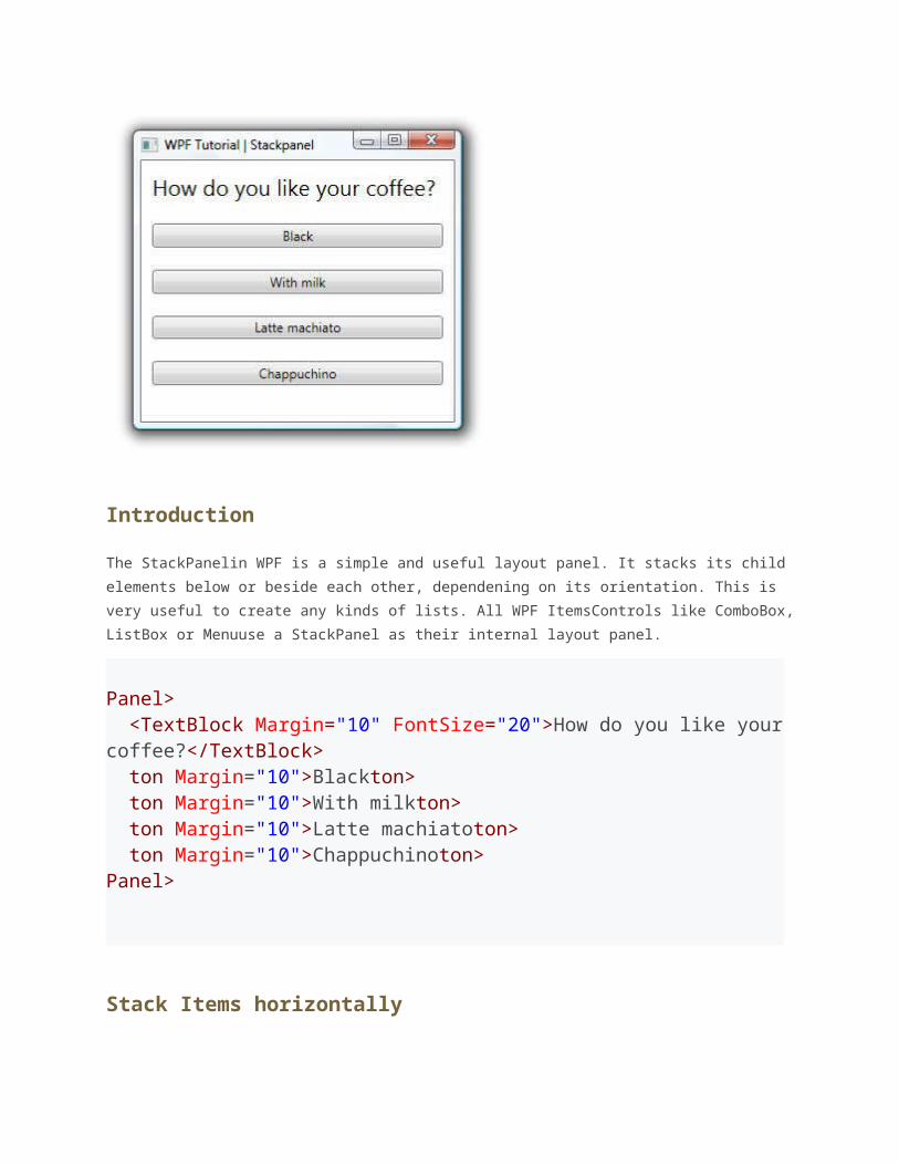
Introduction
The StackPanelin WPF is a simple and useful layout panel. It stacks its child elements below
or beside each other, dependening on its orientation. This is very useful to create any kinds
of lists. All WPF ItemsControls like ComboBox, ListBox or Menuuse a StackPanel as their
internal layout panel.
Panel> <TextBlock Margin="10" FontSize="20">How do you like your coffee?</TextBlock> ton Margin="10">Blackton> ton Margin="10">With milkton> ton Margin="10">Latte machiatoton> ton Margin="10">Chappuchinoton>Panel>
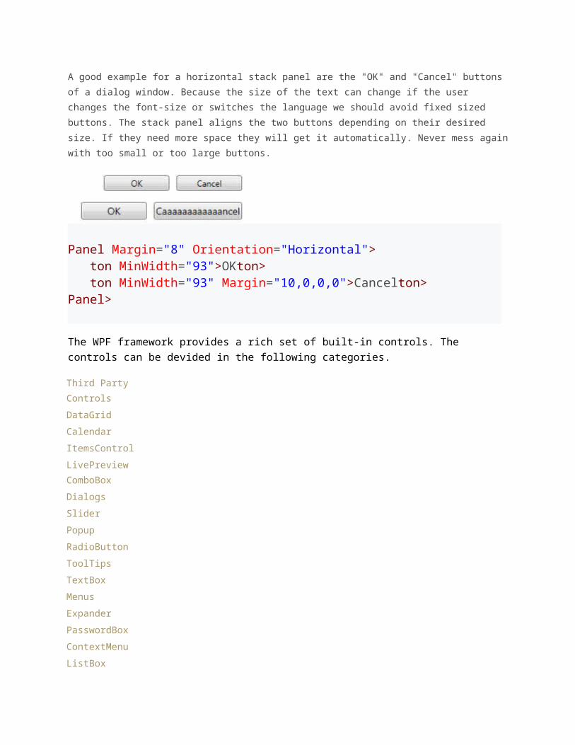
Stack Items horizontally
A good example for a horizontal stack panel are the "OK" and "Cancel" buttons of a dialog
window. Because the size of the text can change if the user changes the font-size or
switches the language we should avoid fixed sized buttons. The stack panel aligns the two
buttons depending on their desired size. If they need more space they will get it
automatically. Never mess again with too small or too large buttons.
Panel Margin="8" Orientation="Horizontal"> ton MinWidth="93">OKton> ton MinWidth="93" Margin="10,0,0,0">Cancelton>Panel>
The WPF framework provides a rich set of built-in controls. The controls can be devided in the following categories.
Third Party Controls
DataGrid
Calendar
ItemsControl
LivePreview
ComboBox
Dialogs
Slider
Popup
RadioButton
ToolTips
TextBox
Menus
Expander
PasswordBox
ContextMenu
ListBox
ListView
TextBlock
Window
DataBinding in WPF
Introduction
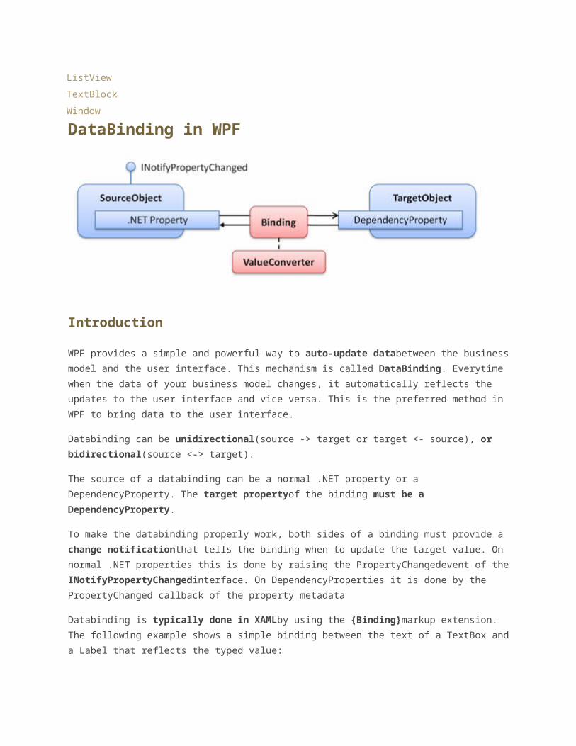
WPF provides a simple and powerful way to auto-update databetween the business model
and the user interface. This mechanism is called DataBinding. Everytime when the data of
your business model changes, it automatically reflects the updates to the user interface and
vice versa. This is the preferred method in WPF to bring data to the user interface.
Databinding can be unidirectional(source -> target or target <- source), or
bidirectional(source <-> target).
The source of a databinding can be a normal .NET property or a DependencyProperty. The
target propertyof the binding must be a DependencyProperty.
To make the databinding properly work, both sides of a binding must provide a change
notificationthat tells the binding when to update the target value. On normal .NET
properties this is done by raising the PropertyChangedevent of the
INotifyPropertyChangedinterface. On DependencyProperties it is done by the
PropertyChanged callback of the property metadata
Databinding is typically done in XAMLby using the {Binding}markup extension. The
following example shows a simple binding between the text of a TextBox and a Label that
reflects the typed value:
ackPanel> <TextBox x:Name="txtInput" /> abel Content="{Binding Text, ElementName=txtInput, UpdateSourceTrigger=PropertyChanged}" />ackPanel>
DataContext
Every WPF control derived from FrameworkElementhas a DataContext property. This
property is meant to be set to the data objectit visualizes. If you don't explicity define a
source of a binding, it takes the data context by default.
The DataContext property inherits its value to child elements. So you can set the
DataContexton a superior layout container and its value is inherited to all child elements.
This is very useful if you want to build a form that is bound to multiple properties of the
same data object.
ackPanel DataContext="{StaticResource myCustomer}"> <TextBox Text="{Binding FirstName}"/> <TextBox Text="{Binding LastName}"/> <TextBox Text="{Binding Street}"/> <TextBox Text="{Binding City}"/>ackPanel>
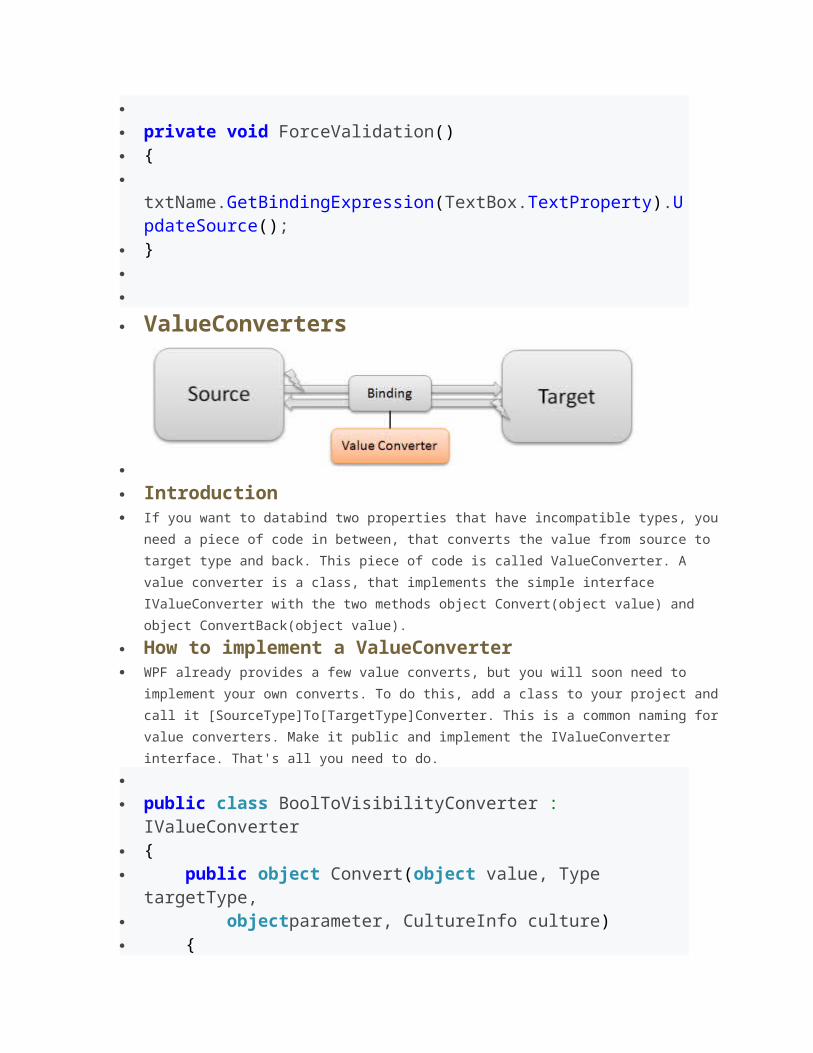
ValueConverters
If you want to bind two properties of different typestogether, you need to use a
ValueConverter. A ValueConverter converts the value from a source type to a target type
and back. WPF already includes some value converters but in most cases you will need to
write your own by implementing the IValueConverterinterface.
A typical example is to bind a boolean member to the Visibilityproperty. Since the
visibility is an enum value that can be Visible, Collapsed or Hidden, you need a value
converter.
ackPanel> ackPanel.Resources> anToVisibilityConverter x:Key="boolToVis" /> ackPanel.Resources> <CheckBox x:Name="chkShowDetails" Content="Show Details" />
ackPanel x:Name="detailsPanel" Visibility="{Binding IsChecked, ElementName=chkShowDetails, Converter={StaticResource boolToVis}}"> ackPanel>ackPanel>
The following example shows a simple converter that converts a boolen to a visibility
property. Note that such a converter is already part of the .NET framework.
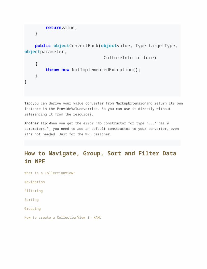
public classBooleanToVisibilityConverter :IValueConverter{ public object Convert(objectvalue, Type targetType, objectparameter, CultureInfo culture) { if (value isBoolean) { return ((bool)value) ? Visibility.Visible : Visibility.Collapsed; } returnvalue; } public objectConvertBack(objectvalue, Type targetType, objectparameter, CultureInfo culture) { throw new NotImplementedException(); }}
Tip:you can derive your value converter from MarkupExtensionand return its own instance
in the ProvideValueoverride. So you can use it directly without referencing it from the
resources.
Another Tip:When you get the error "No constructor for type '...' has 0 parameters.", you
need to add an default constructor to your converter, even it's not needed. Just for the WPF
designer.
How to Navigate, Group, Sort and Filter Data in WPF
What is a CollectionView?
Navigation
Filtering
Sorting
Grouping
How to create a CollectionView in XAML
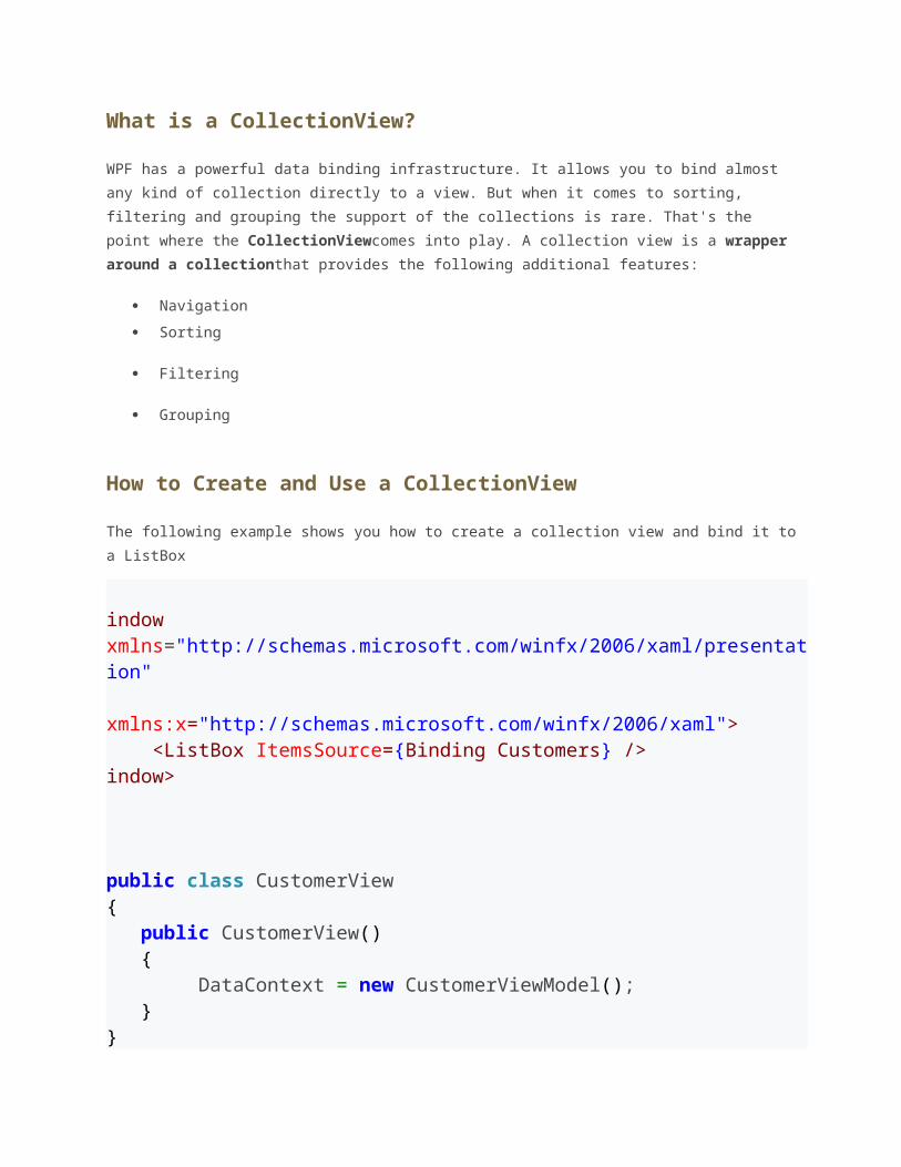
What is a CollectionView?
WPF has a powerful data binding infrastructure. It allows you to bind almost any kind of
collection directly to a view. But when it comes to sorting, filtering and grouping the support
of the collections is rare. That's the point where the CollectionViewcomes into play. A
collection view is a wrapper around a collectionthat provides the following additional
features:
Navigation
Sorting
Filtering
Grouping
How to Create and Use a CollectionView
The following example shows you how to create a collection view and bind it to a ListBox
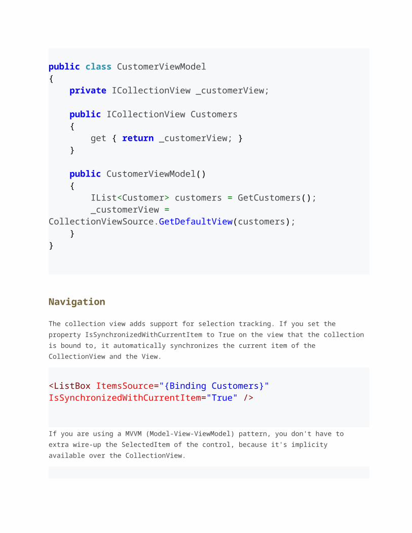
indow xmlns="http://schemas.microsoft.com/winfx/2006/xaml/presentation" xmlns:x="http://schemas.microsoft.com/winfx/2006/xaml"> <ListBox ItemsSource={Binding Customers} />indow> public class CustomerView{ public CustomerView() { DataContext = new CustomerViewModel(); }} public class CustomerViewModel{ private ICollectionView _customerView; public ICollectionView Customers { get { return _customerView; } } public CustomerViewModel() { IList<Customer> customers = GetCustomers(); _customerView = CollectionViewSource.GetDefaultView(customers); }}
Navigation
The collection view adds support for selection tracking. If you set the property
IsSynchronizedWithCurrentItem to True on the view that the collection is bound to, it
automatically synchronizes the current item of the CollectionView and the View.
<ListBox ItemsSource="{Binding Customers}" IsSynchronizedWithCurrentItem="True" /> If you are using a MVVM (Model-View-ViewModel) pattern, you don't have to extra wire-up
the SelectedItem of the control, because it's implicity available over the CollectionView.
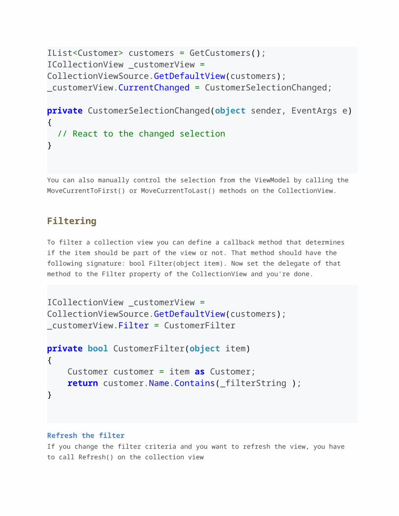
IList<Customer> customers = GetCustomers();ICollectionView _customerView = CollectionViewSource.GetDefaultView(customers);_customerView.CurrentChanged = CustomerSelectionChanged; private CustomerSelectionChanged(object sender, EventArgs e){ // React to the changed selection} You can also manually control the selection from the ViewModel by calling the
MoveCurrentToFirst() or MoveCurrentToLast() methods on the CollectionView.
Filtering
To filter a collection view you can define a callback method that determines if the item
should be part of the view or not. That method should have the following signature: bool
Filter(object item). Now set the delegate of that method to the Filter property of the
CollectionView and you're done.
ICollectionView _customerView = CollectionViewSource.GetDefaultView(customers);_customerView.Filter = CustomerFilter private bool CustomerFilter(object item)
{ Customer customer = item as Customer; return customer.Name.Contains(_filterString );}
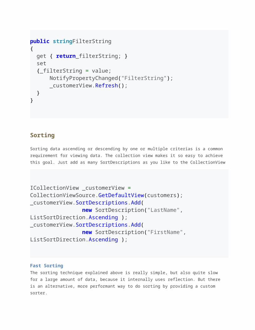
Refresh the filterIf you change the filter criteria and you want to refresh the view, you have to call Refresh()
on the collection view
public stringFilterString{ get { return_filterString; } set {_filterString = value; NotifyPropertyChanged("FilterString"); _customerView.Refresh(); }}
Sorting
Sorting data ascending or descending by one or multiple criterias is a common requirement
for viewing data. The collection view makes it so easy to achieve this goal. Just add as many
SortDescriptions as you like to the CollectionView
ICollectionView _customerView = CollectionViewSource.GetDefaultView(customers);_customerView.SortDescriptions.Add( new SortDescription("LastName", ListSortDirection.Ascending );_customerView.SortDescriptions.Add( new SortDescription("FirstName", ListSortDirection.Ascending );
Fast Sorting
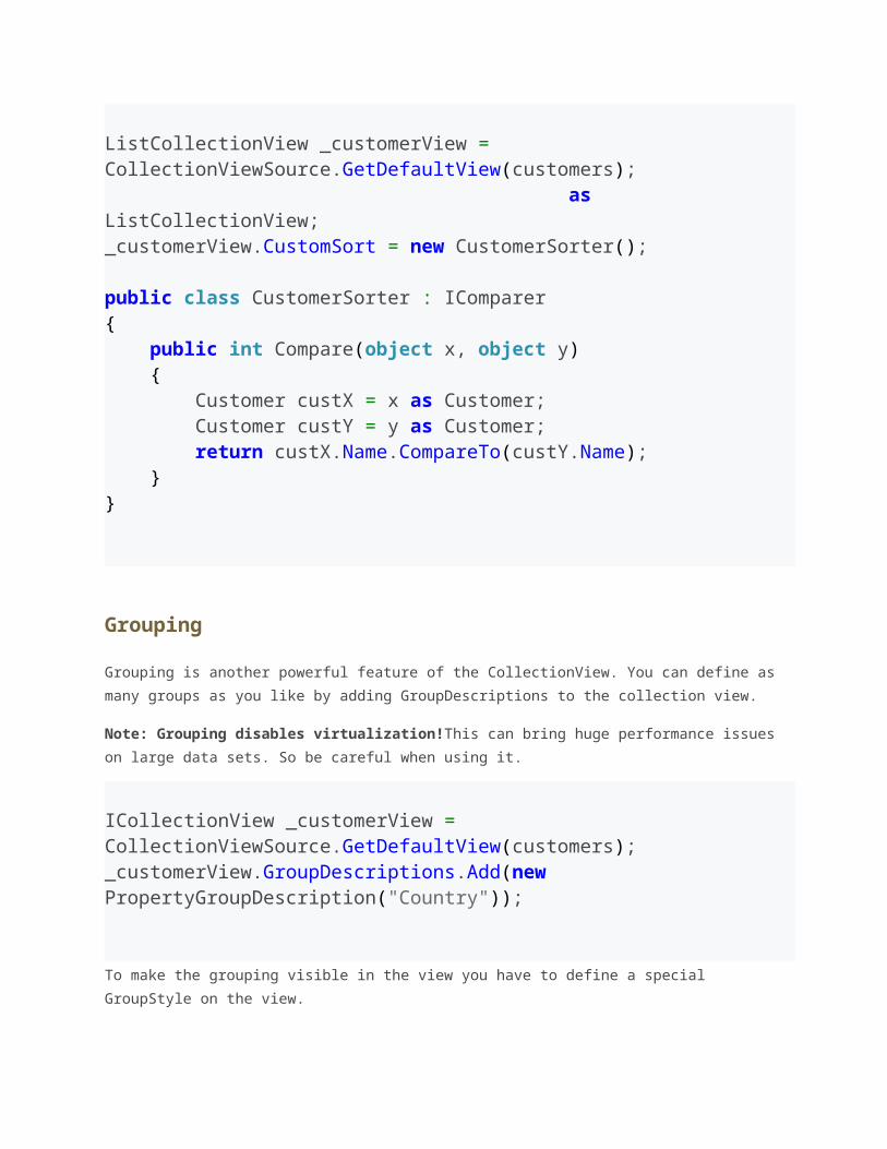
The sorting technique explained above is really simple, but also quite slow for a large
amount of data, because it internally uses reflection. But there is an alternative, more
performant way to do sorting by providing a custom sorter.
ListCollectionView _customerView = CollectionViewSource.GetDefaultView(customers); as ListCollectionView;_customerView.CustomSort = new CustomerSorter(); public class CustomerSorter : IComparer{ public int Compare(object x, object y) { Customer custX = x as Customer; Customer custY = y as Customer; return custX.Name.CompareTo(custY.Name); }}
Grouping
Grouping is another powerful feature of the CollectionView. You can define as many groups
as you like by adding GroupDescriptions to the collection view.
Note: Grouping disables virtualization!This can bring huge performance issues on large
data sets. So be careful when using it.
ICollectionView _customerView = CollectionViewSource.GetDefaultView(customers);_customerView.GroupDescriptions.Add(new PropertyGroupDescription("Country"));
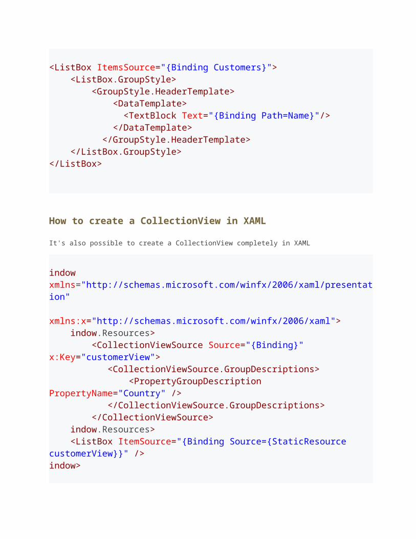
To make the grouping visible in the view you have to define a special GroupStyle on the
view.
<ListBox ItemsSource="{Binding Customers}"> <ListBox.GroupStyle> <GroupStyle.HeaderTemplate> <DataTemplate> <TextBlock Text="{Binding Path=Name}"/> </DataTemplate> </GroupStyle.HeaderTemplate> </ListBox.GroupStyle></ListBox>
How to create a CollectionView in XAML
It's also possible to create a CollectionView completely in XAML
indow xmlns="http://schemas.microsoft.com/winfx/2006/xaml/presentation" xmlns:x="http://schemas.microsoft.com/winfx/2006/xaml"> indow.Resources> <CollectionViewSource Source="{Binding}" x:Key="customerView"> <CollectionViewSource.GroupDescriptions> <PropertyGroupDescription PropertyName="Country" /> </CollectionViewSource.GroupDescriptions> </CollectionViewSource> indow.Resources> <ListBox ItemSource="{Binding Source={StaticResource customerView}}" />
indow>
The Model-View-ViewModel Pattern
How the MVVM pattern became convenient
WPF has a very powerful databinding feature, that provides an easy one-way or two-way
synchronization of properties. You can directly bind two WPF elements together, but the
common use of databinding is to bind some kind of data to the view. This is done by using
the DataContext property. Since the DataContextproperty is marked as inherited, it can be
set on the root element of a view and it's value is inherited to all subjacent elements of the
view.
One big limitation of using the DataContextproperty as data source is, that there is only one
of it. But in a real life project you usually have more than one data object per view. So what
can we do? The most obvious approach is to aggreate all data objects into one single object
that exposes the aggregated data as properties and that can be bound to the DataContext.
This object is called the view model.
Separation of logic and presentation
The MVVM pattern is so far only a convenient way to bind data to the view. But what about
user actions, how are they handeld? The classic approach, known from WinForms is to
register an event handler, that is implemented in the code-behind file of the view. Doing this
has some disadvantages:
Having event handlers in the code-behind is bad for testing, since you cannot mock
away the view.
Changing the design of the view often also requires changes in the code, since every
element has it's different event handlers.
The logic is tightly bound to the view. It's not possible to reuse the logic in an other
view
So the idea is to move the whole presentation logic to the view model by using another
feature of WPF, namely Commands. Commands can be bound like data and are supported by
many elements as buttons, togglebuttons, menuitems, checkboxes and inputbindings. The
goal here is not to have any line of logic in the code-behind of a view. This brings you the
following advantages
The view-model can easily be tested by using standard unit-tests (instead of UI-
testing)
The view can be redesigned without changing the viewmodel, because the interface
stays the same.
The view-model can even be reused, in sone special cases (this is usually not
recommended)
What's the difference between MVVM, MVP and MVC?
There is always some confusion about the differences between model-view-presenter,
model-view-controller an MVVM pattern. So I try to define and distinguish them a bit more
clearly.
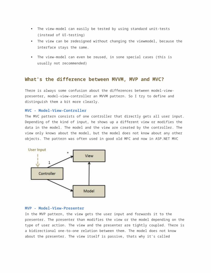
MVC - Model-View-Controller
The MVC pattern consists of one controller that directly gets all user input. Depending of the
kind of input, he shows up a different view or modifies the data in the model. The model and
the view are created by the controller. The view only knows about the model, but the model
does not know about any other objects. The pattern was often used in good old MFC and
now in ASP.NET MVC
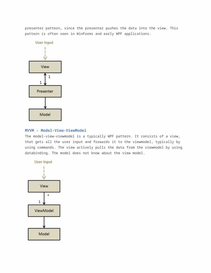
MVP - Model-View-Presenter
In the MVP pattern, the view gets the user input and forwards it to the presenter. The
presenter than modifies the view or the model depending on the type of user action. The
view and the presenter are tightly coupled. There is a bidirectional one-to-one relation
between them. The model does not know about the presenter. The view itself is passive,
thats why it's called presenter pattern, since the presenter pushes the data into the view.
This pattern is often seen in WinForms and early WPF applications.
MVVM - Model-View-ViewModel
The model-view-viewmodel is a typically WPF pattern. It consists of a view, that gets all the
user input and forwards it to the viewmodel, typically by using commands. The view actively
pulls the data from the viewmodel by using databinding. The model does not know about the
view model.
Also check out this interesting article from Costas Bakopanos, a friend of mine, a discussion
about the model, states and controllers in the MVVM environment.
Some MVVM Frameworks
Check out this handy tool to compare MVVM frameworks: MVVM Comparison Tool (Silverlight
PRISM (Microsoft)
MVVM Light (Laurent Bugnion)
WPF Application Framework
Chinch
Caliburn Micro
Core MVVM
Onyx
nRoute
MVVM Foundation
How to build your own MVVM Framework
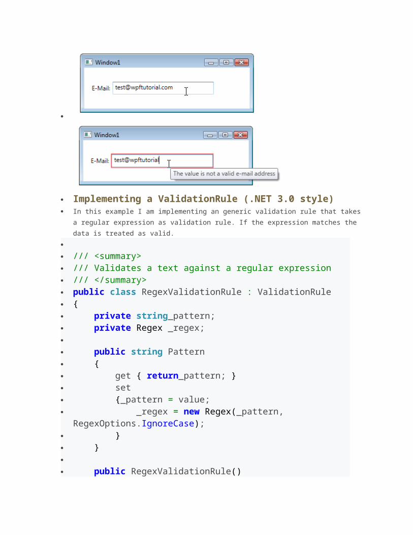
Data Validation in WPF What we want to do is a simple entry form for an e-mail address. If the user enters an
invalid e-mail address, the border of the textbox gets red and the tooltip is showing
the reason.
Implementing a ValidationRule (.NET 3.0 style) In this example I am implementing an generic validation rule that takes a regular
expression as validation rule. If the expression matches the data is treated as valid.
/// <summary> /// Validates a text against a regular expression /// </summary> public class RegexValidationRule : ValidationRule { private string_pattern; private Regex _regex; public string Pattern { get { return_pattern; } set {_pattern = value; _regex = new Regex(_pattern,
RegexOptions.IgnoreCase); } } public RegexValidationRule() { }
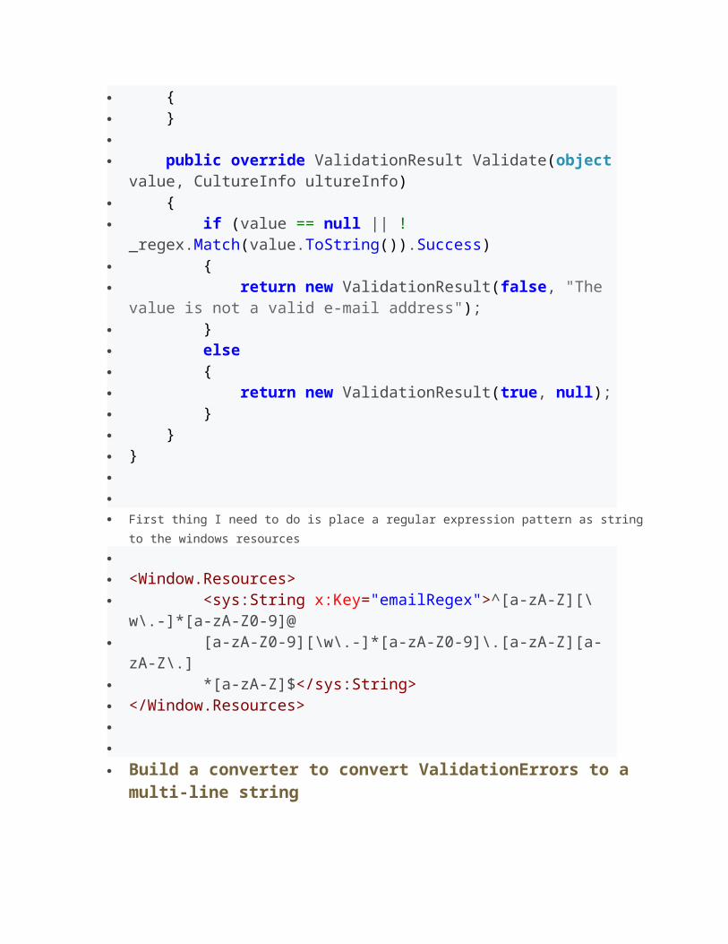
public override ValidationResult Validate(object value, CultureInfo ultureInfo)
{ if (value == null || !
_regex.Match(value.ToString()).Success) { return new ValidationResult(false, "The
value is not a valid e-mail address"); } else { return new ValidationResult(true, null); } } } First thing I need to do is place a regular expression pattern as string to the windows
resources
<Window.Resources> <sys:String x:Key="emailRegex">^[a-zA-Z][\
w\.-]*[a-zA-Z0-9]@ [a-zA-Z0-9][\w\.-]*[a-zA-Z0-9]\.[a-zA-Z][a-
zA-Z\.] *[a-zA-Z]$</sys:String> </Window.Resources> Build a converter to convert ValidationErrors to a multi-line string The following converter combines a list of ValidationErrorsinto a string. This
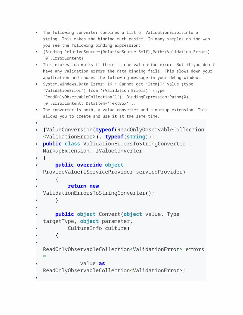
makes the binding much easier. In many samples on the web you see the following
binding expression:
{Binding RelativeSource={RelativeSource Self},Path=(Validation.Errors)
[0].ErrorContent}
This expression works if there is one validation error. But if you don't have any
validation errors the data binding fails. This slows down your application and causes
the following message in your debug window:
System.Windows.Data Error: 16 : Cannot get ‘Item[]‘ value (type
‘ValidationError’) from ‘(Validation.Errors)’ (type
‘ReadOnlyObservableCollection`1′). BindingExpression:Path=(0).
[0].ErrorContent; DataItem=’TextBox’...
The converter is both, a value converter and a markup extension. This allows you to
create and use it at the same time.
[ValueConversion(typeof(ReadOnlyObservableCollection
<ValidationError>), typeof(string))] public class ValidationErrorsToStringConverter :
MarkupExtension, IValueConverter { public override object
ProvideValue(IServiceProvider serviceProvider) { return new
ValidationErrorsToStringConverter(); } public object Convert(object value, Type
targetType, object parameter, CultureInfo culture) {
ReadOnlyObservableCollection<ValidationError> errors =
value as ReadOnlyObservableCollection<ValidationError>;
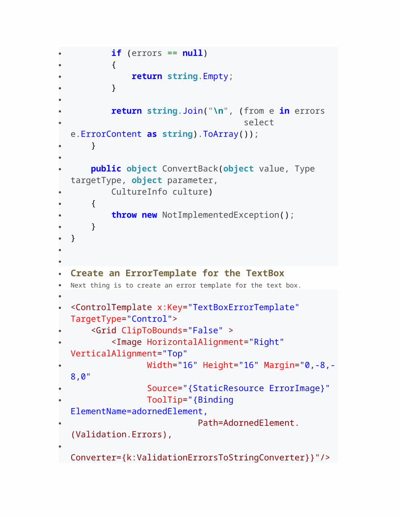
if (errors == null) { return string.Empty; } return string.Join("\n", (from e in errors select
e.ErrorContent as string).ToArray()); }
public object ConvertBack(object value, Type targetType, object parameter,
CultureInfo culture) { throw new NotImplementedException(); } } Create an ErrorTemplate for the TextBox Next thing is to create an error template for the text box.
<ControlTemplate x:Key="TextBoxErrorTemplate"
TargetType="Control"> <Grid ClipToBounds="False" > <Image HorizontalAlignment="Right"
VerticalAlignment="Top" Width="16" Height="16" Margin="0,-8,-
8,0" Source="{StaticResource ErrorImage}" ToolTip="{Binding
ElementName=adornedElement, Path=AdornedElement.
(Validation.Errors),
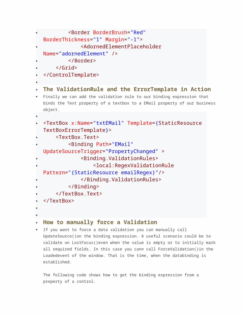
Converter={k:ValidationErrorsToStringConverter}}"/> <Border BorderBrush="Red"
BorderThickness="1" Margin="-1"> <AdornedElementPlaceholder
Name="adornedElement" /> </Border> </Grid> </ControlTemplate> The ValidationRule and the ErrorTemplate in Action Finally we can add the validation rule to our binding expression that binds the Text
property of a textbox to a EMail property of our business object.
<TextBox x:Name="txtEMail" Template={StaticResource TextBoxErrorTemplate}>
<TextBox.Text> <Binding Path="EMail"
UpdateSourceTrigger="PropertyChanged" > <Binding.ValidationRules> <local:RegexValidationRule
Pattern="{StaticResource emailRegex}"/> </Binding.ValidationRules> </Binding> </TextBox.Text> </TextBox> How to manually force a Validation If you want to force a data validation you can manually call UpdateSource()on the
binding expression. A useful scenario could be to validate on LostFocus()even when
the value is empty or to initially mark all required fields. In this case you cann call
ForceValidation()in the Loadedevent of the window. That is the time, when the
databinding is established.
The following code shows how to get the binding expression from a property of a
control.
private void ForceValidation() {
txtName.GetBindingExpression(TextBox.TextProperty).UpdateSource();
}
ValueConverters
Introduction If you want to databind two properties that have incompatible types, you need a
piece of code in between, that converts the value from source to target type and
back. This piece of code is called ValueConverter. A value converter is a class, that
implements the simple interface IValueConverter with the two methods object
Convert(object value) and object ConvertBack(object value).
How to implement a ValueConverter WPF already provides a few value converts, but you will soon need to implement your
own converts. To do this, add a class to your project and call it
[SourceType]To[TargetType]Converter. This is a common naming for value
converters. Make it public and implement the IValueConverter interface. That's all
you need to do.
public class BoolToVisibilityConverter :
IValueConverter { public object Convert(object value, Type
targetType, objectparameter, CultureInfo culture) { // Do the conversion from bool to visibility } public object ConvertBack(object value, Type
targetType, objectparameter, CultureInfo culture) { // Do the conversion from visibility to bool } } How to use a ValueConverter in XAML First thing you need to do is to map the namespace of your converter to a XAML
namespace. Then you can create an instance of a value converter in the resources of
the view and give it a name. Then you can reference it by using {StaticResource}
indow x:Class="VirtualControlDemo.Window1" ...
xmlns:l="clr-namespace:VirtualControlDemo" ...> indow.Resources> <l:BoolToVisibilityConverter
x:Key="converter" /> indow.Resources> <Grid> <Button Visibility="{Binding HasFunction, Converter={StaticResource
converter}}" /> </Grid> indow> Simplify the usage of ValueConvers If you want to use a normal ValueConverter in XAML, you have to add an instance of
it to the resources and reference it by using a key. This is cumbersome, because and
the key is typically just the name of the converter.
A simple and cool trick is to derive value converters from MarkupExtension. This way
you can create and use it in the binding like this: Text={Binding Time,
Converter={x:MyConverter}}, and that is quite cool!
public abstract class BaseConverter :
MarkupExtension { public override object
ProvideValue(IServiceProvider serviceProvider) { return this; } } StringFormat Converter The StringFormatConverter is a useful converter to control the format of an implicit
string conversion of an object (e.g. if you bind a DateTime to a TextBlock ).
[ValueConversion(typeof(object), typeof(string))]
public classStringFormatConverter : BaseConverter, IValueConverter
{ public object Convert(object value, Type
targetType, object parameter,
System.Globalization.CultureInfo culture) { string format = parameter asstring; if (!string.IsNullOrEmpty(format)) { return string.Format(culture, format,
value); } else { return value.ToString(); } public object ConvertBack(object value, Type
targetType, object parameter, System.Globalization.CultureInfo
culture) { return null; } }
Behaviors
A simple Border can be dragged by mouse - because of an attached drag behavior.
Introduction
Behaviors are a new concept, introduced with Expression Blend in Version 3, to
encapsulate pieces of functionality into a reusable component. These components
than can be attached to controls to give them an additional behavior.
The ideas behind behaviors are to give the interaction designer more flexibility to design
complex user interactions without writing any code.
Example of a behaviors are drag&drop, input validation, pan and zoom, re-position of
elements, etc... The list of possible behaviors is very long.
Imaging an application that has a list of customers and the user can add some of them to
subscriber lists. This interaction can be designed by providing an "Add" button next to each
subscriber list. But if the interaction designer wants to add drag&drop functionality, he
needs to discuss it with the developer and wait until the implementation is done. With
behaviors he just drags a drag and drop behavior on each list and we are done.
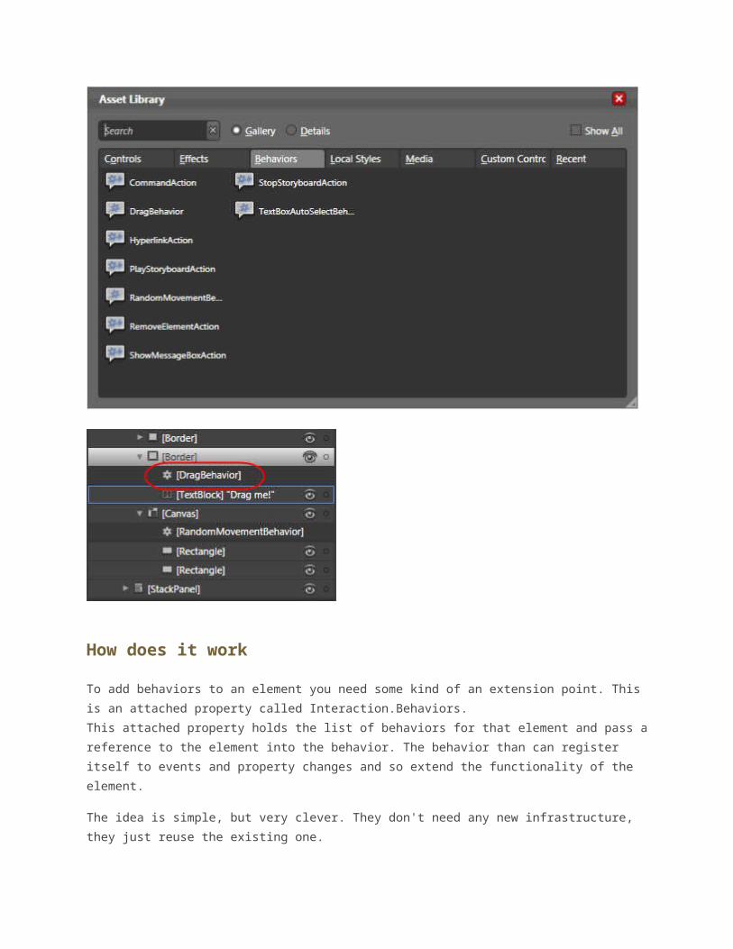
How to use behaviors in Expression Blend 3
Using behaviors in Expression Blend is as simple as adding an element to the design
surface. In the asset library you find a new secion called "Behaviors". It lists all behaviors
available within your project. Just grab one of these and drag it onto the element you want
to add this behavior and thats it.
The behavior appears as an child element in the visual tree. By clicking on it you can
configure the properties of the behavior.
How does it work
To add behaviors to an element you need some kind of an extension point. This is an
attached property called Interaction.Behaviors.
This attached property holds the list of behaviors for that element and pass a reference to
the element into the behavior. The behavior than can register itself to events and property
changes and so extend the functionality of the element.
The idea is simple, but very clever. They don't need any new infrastructure, they just reuse
the existing one.
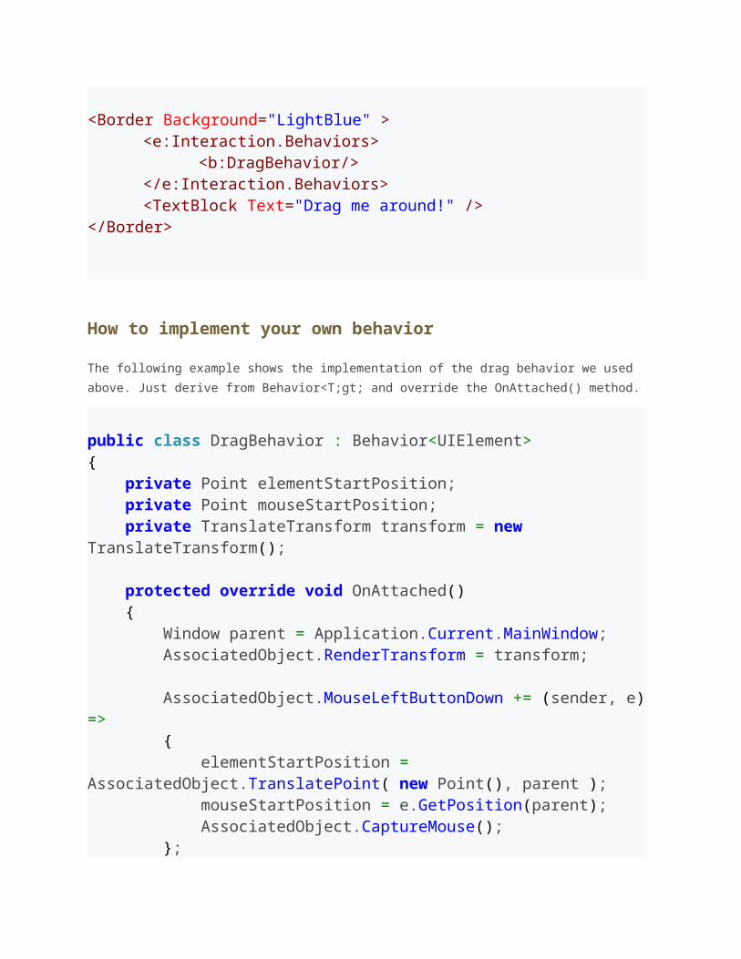
<Border Background="LightBlue" ><e:Interaction.Behaviors>
<b:DragBehavior/></e:Interaction.Behaviors><TextBlock Text="Drag me around!" />
</Border>
How to implement your own behavior
The following example shows the implementation of the drag behavior we used above. Just
derive from Behavior<T;gt; and override the OnAttached() method.
public class DragBehavior : Behavior<UIElement>{ private Point elementStartPosition; private Point mouseStartPosition; private TranslateTransform transform = new TranslateTransform(); protected override void OnAttached() { Window parent = Application.Current.MainWindow; AssociatedObject.RenderTransform = transform; AssociatedObject.MouseLeftButtonDown += (sender, e) => { elementStartPosition = AssociatedObject.TranslatePoint( new Point(), parent ); mouseStartPosition = e.GetPosition(parent); AssociatedObject.CaptureMouse(); }; AssociatedObject.MouseLeftButtonUp += (sender, e) => {

AssociatedObject.ReleaseMouseCapture(); }; AssociatedObject.MouseMove += (sender, e) => {Vector diff = e.GetPosition( parent ) - mouseStartPosition; if (AssociatedObject.IsMouseCaptured) { transform.X =diff.X; transform.Y =diff.Y; } }; }}
List of some popular behaviors
Since its so cool and easy to create your own pice of interactivity, I am sure that we will find
hunderts of behaviors available soon. I tried to make a list of some popular ones.
Zoom Behavior
Glass Behavior
Shake Behavior
Transparency Behavior
Introduction to Styles in WPF
Introduction
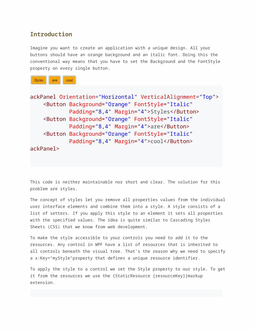
Imagine you want to create an application with a unique design. All your buttons should
have an orange background and an italic font. Doing this the conventional way means that
you have to set the Background and the FontStyle property on every single button.
ackPanel Orientation="Horizontal" VerticalAlignment="Top"> <Button Background="Orange" FontStyle="Italic" Padding="8,4" Margin="4">Styles</Button> <Button Background="Orange" FontStyle="Italic" Padding="8,4" Margin="4">are</Button> <Button Background="Orange" FontStyle="Italic" Padding="8,4" Margin="4">cool</Button>ackPanel>
This code is neither maintainable nor short and clear. The solution for this problem are
styles.
The concept of styles let you remove all properties values from the individual user interface
elements and combine them into a style. A style consists of a list of setters. If you apply this
style to an element it sets all properties with the specified values. The idea is quite similar to
Cascading Styles Sheets (CSS) that we know from web development.
To make the style accessible to your controls you need to add it to the resources. Any
control in WPF have a list of resources that is inherited to all controls beneath the visual
tree. That's the reason why we need to specify a x:Key="myStyle"property that defines a
unique resource identifier.
To apply the style to a control we set the Style property to our style. To get it from the
resources we use the {StaticResource [resourceKey]}markup extension.
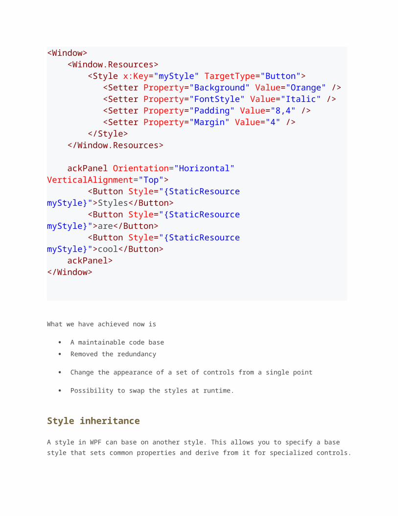
<Window> <Window.Resources> <Style x:Key="myStyle" TargetType="Button"> <Setter Property="Background" Value="Orange" /> <Setter Property="FontStyle" Value="Italic" /> <Setter Property="Padding" Value="8,4" /> <Setter Property="Margin" Value="4" /> </Style> </Window.Resources>
ackPanel Orientation="Horizontal" VerticalAlignment="Top"> <Button Style="{StaticResource myStyle}">Styles</Button> <Button Style="{StaticResource myStyle}">are</Button> <Button Style="{StaticResource myStyle}">cool</Button> ackPanel></Window>
What we have achieved now is
A maintainable code base
Removed the redundancy
Change the appearance of a set of controls from a single point
Possibility to swap the styles at runtime.
Style inheritance
A style in WPF can base on another style. This allows you to specify a base style that sets
common properties and derive from it for specialized controls.
<Style x:Key="baseStyle"> <Setter Property="FontSize" Value="12" /> <Setter Property="Background" Value="Orange" /></Style> <Style x:Key="boldStyle" BasedOn="{StaticResource baseStyle}"> <Setter Property="FontWeight" Value="Bold" /></Style>
Control Templates
Introduction
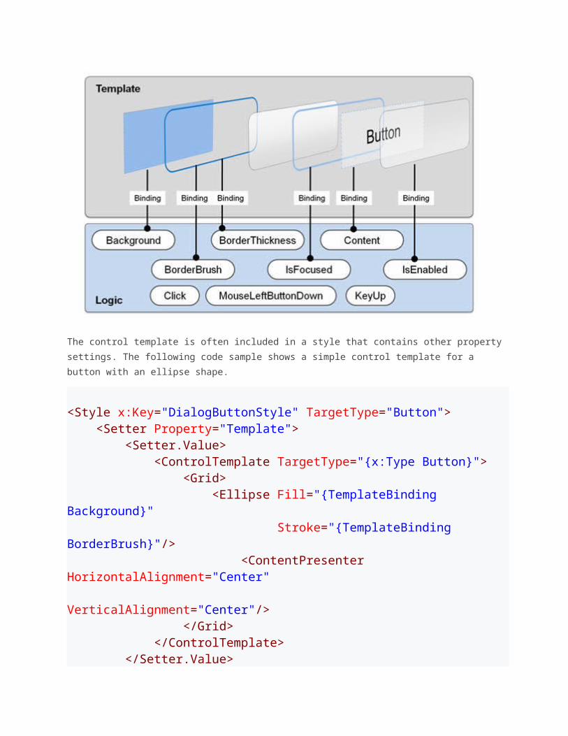
Controls in WPF are separated into logic, that defines the states, events and properties and
template, that defines the visual appearance of the control. The wireup between the logic
and the template is done by DataBinding.
Each control has a default template. This gives the control a basic appearance. The default
template is typically shipped together with the control and available for all common windows
themes. It is by convention wrapped into a style, that is identified by value of the
DefaultStyleKey property that every control has.
The template is defined by a dependency property called Template. By setting this property
to another instance of a control template, you can completely replace the appearance
(visual tree) of a control.
The control template is often included in a style that contains other property settings. The
following code sample shows a simple control template for a button with an ellipse shape.
<Style x:Key="DialogButtonStyle" TargetType="Button">

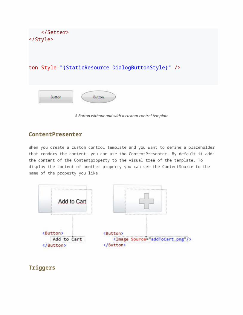
<Setter Property="Template"> <Setter.Value> <ControlTemplate TargetType="{x:Type Button}"> <Grid> <Ellipse Fill="{TemplateBinding Background}" Stroke="{TemplateBinding BorderBrush}"/> <ContentPresenter HorizontalAlignment="Center" VerticalAlignment="Center"/> </Grid> </ControlTemplate> </Setter.Value> </Setter></Style> ton Style="{StaticResource DialogButtonStyle}" />
A Button without and with a custom control template
ContentPresenter
When you create a custom control template and you want to define a placeholder that
renders the content, you can use the ContentPresenter. By default it adds the content of
the Contentproperty to the visual tree of the template. To display the content of another
property you can set the ContentSource to the name of the property you like.
Triggers
{RelativeSource TemplatedParent} not working in DataTriggers of a ControlTemplateIf you want to bind to a property of a property on your control like Data.IsLoadedyou
cannot use a normal Trigger, since it does not support this notation, you have to use a
DataTrigger.
But when you are using a DataTrigger, with {RelativeSource TemplatedParent} it will not
work. The reason is, that TemplatedParentcan only be used within the
ControlTemplate. It is not working in the Trigger section. You have to use the
{RelativeSource Self} instead.
What if a Binding working or a Setter is not applied when using a control template
There is something you need to know when setting a value of an element within a control
template: The value does have a lower precendence as the local value! So if you are setting
the local value in the constructor of the contained element, you cannot override it within the
controltemplate. But if you use the element directly in your view, it will work. So be aware of
this behavior!.
Here you can find more information about DependencyProperty value precendence:
Dependency Property Value Precedence
Data Templates
Introduction
Data Template are a similar concept as Control Templates. They give you a very flexible and
powerful solution to replace the visual appearance of a data itemin a control like
ListBox, ComboBox or ListView. In my opinion this is one of the key success factory of WPF.
If you don't specify a data template, WPF takes the default template that is just a TextBlock.
If you bind complex objects to the control, it just calls ToString()on it. Within a
DataTemplate, the DataContext is set the data object. So you can easily bind against the
data context to display various members of your data object
DataTemplates in Action: Building a simple PropertyGrid
Whereas it was really hard to display complex data in a ListBox with WinForms, its super
easy with WPF. The following example shows a ListBox with a list of DependencyPropertyInfo
instances bound to it. Without a DataTemplate you just see the result of calling ToString()
on the object. With the data template we see the name of the property and a TextBox that
even allows us to edit the value.
<!-- Without DataTemplate --><ListBox ItemsSource="{Binding}" /> <!-- With DataTemplate --><ListBox ItemsSource="{Binding}" BorderBrush="Transparent" Grid.IsSharedSizeScope="True" HorizontalContentAlignment="Stretch">
<ListBox.ItemTemplate> <DataTemplate> <Grid Margin="4"> <Grid.ColumnDefinitions> inition Width="Auto" SharedSizeGroup="Key" /> inition Width="*" /> </Grid.ColumnDefinitions> <TextBlock Text="{Binding Name}" FontWeight="Bold" /> <TextBox Grid.Column="1" Text="{Binding Value }" /> </Grid> </DataTemplate> </ListBox.ItemTemplate></ListBox>
How to use a DataTemplateSelector to switch the Template depending on the data
Our property grid looks nice so far, but it would be much more usable if we could switch the
editor depending on the type of the property.
The simplest way to do this is to use a DataTemplateSelector. The DataTemplateSelector
has a single method to override: SelectTemplate(object item, DependencyObject
container). In this method we decide on the provided item which DataTemplate to choose.
The following exmple shows an DataTemplateSelector that decides between tree data
templates:
public classPropertyDataTemplateSelector :DataTemplateSelector{ public DataTemplate DefaultnDataTemplate { get; set; } public DataTemplate BooleanDataTemplate { get; set; } public DataTemplate EnumDataTemplate { get; set; } public override DataTemplate SelectTemplate(objectitem,
DependencyObject container) {DependencyPropertyInfo dpi = item asDependencyPropertyInfo; if (dpi.PropertyType == typeof(bool)) { return BooleanDataTemplate; } if (dpi.PropertyType.IsEnum) { return EnumDataTemplate; } return DefaultnDataTemplate; }}
indow x:Class="DataTemplates.Window1" xmlns="http://schemas.microsoft.com/winfx/2006/xaml/presentation" xmlns:x="http://schemas.microsoft.com/winfx/2006/xaml" xmlns:l="clr-namespace:DataTemplates" xmlns:sys="clr-namespace:System;assembly=mscorlib"> indow.Resources> <!-- Default DataTemplate --> <DataTemplate x:Key="DefaultDataTemplate"> ... </DataTemplate> <!-- DataTemplate for Booleans --> <DataTemplate x:Key="BooleanDataTemplate"> ... </DataTemplate> <!-- DataTemplate for Enums -->
<DataTemplate x:Key="EnumDataTemplate"> ... </DataTemplate> <!-- DataTemplate Selector --> <l:PropertyDataTemplateSelector</l:PropertyData x:Key="templateSelector" DefaultnDataTemplate="{StaticResource DefaultDataTemplate}" BooleanDataTemplate="{StaticResource BooleanDataTemplate}" EnumDataTemplate="{StaticResource EnumDataTemplate}"/> indow.Resources> <Grid> <ListBox ItemsSource="{Binding}" Grid.IsSharedSizeScope="True" HorizontalContentAlignment="Stretch" ItemTemplateSelector="{StaticResource templateSelector}"/> </Grid>indow>
How to react to IsSelected in the DataTemplate
If you want to change the appearance of a ListBoxItem when it is selected, you have to bind
the IsSelected property of the ListBoxItem. But this is a bit tricky, you have to use a relative
source with FindAcestor to navigate up the visual tree until you reach the ListBoxItem.
<DataTemplate x:Key="DefaultDataTemplate"> <Border x:Name="border" Height="50"> ... </Border> <DataTemplate.Triggers> <DataTrigger Binding="{Binding RelativeSource={RelativeSource Mode=FindAncestor, AncestorType=
{x:Type ListBoxItem}},Path=IsSelected}" Value="True"> <Setter TargetName="border" Property="Height" Value="100"/> </DataTrigger> </DataTemplate.Triggers></DataTemplate>