
INTRODUCTION TO THE INTERNET AND WEB PAGE DESIGN
201
INTRODUCTION TO THE INTERNET AND WEB PAGE DESIGN A Project Presented to the Faculty of the Communication Department at Southern Utah University In Partial Fulfillment of the Requirements for the Degree Master of Arts in Professional Communication By Lance Douglas Jackson Dr. Jon Smith, Project Supervisor April 2009
Transcript of INTRODUCTION TO THE INTERNET AND WEB PAGE DESIGN

INTRODUCTION TO THE INTERNET AND WEB PAGE DESIGN
A ProjectPresented to
the Faculty of the Communication Departmentat Southern Utah University
In Partial Fulfillmentof the Requirements for the Degree
Master of Arts in Professional Communication
ByLance Douglas Jackson
Dr. Jon Smith, Project Supervisor
April 2009

APPROVAL PAGE
The undersigned, appointed by the dean of the College of Humanities and Social Science at Southern Utah University, have examined the project en-titled:
INTRODUCTION TO THE INTERNET AND WEB PAGE DESIGN
Submitted by Lance Douglas Jackson,
A candidate for the degree of Master of Art in Professional Communication,
and hereby certify that, in their opinion, it is worthy of acceptance.
_________________________________________Professor Jon Smith
_________________________________________Professor Arthur Challis
________________________________________Professor Lionel Grady
________________________________________Mr. Mark Walton
________________________________________Professor Suzanne Larson
Graduate Director

DIGITIZATION PERMISSION FORM
I, Lance D. Jackson, give permission to the Southern Utah University Library to digitize and archive my capstone project entitled Introduction to the Internet and Web Page De-sign, submitted for the Master of Arts degree in Professional Communication.
______________________________ _______________________ Lance D. Jackson Date

ACKNOWLEDGEMENTS
I wish to acknowledge the following individuals for their help, Support and
encouragement in the completion of this project and the requirements of the Master’s
Degree:
Dr. Jon Smith, chair of my committee for his guidance support and encourage-
ment and for inspiring me to think out of the box. Because of his guidance, I have begun
to aspire to greater heights than I had previously though possible.
Committee members Dr. Arthur Challis and Lionel Grady for their friendship and support. Dr. Suzanne Larson, Graduate Director, for always believing in me and being sup-
portive and for her guidance and advice.
I acknowledge the help and support of the graduate faculty of the SUU Commu-
nication Department. Dr. L. Paul Husselbee has been an great inspiration to
strive for the best technically correct workmanship. His courses have been demanding,
yet fair and have helped me to see the importance of being thorough in research design
and execution.
I especially acknowledge and thank Mr. Mark Walton, Director of Web Services
at Southern Utah University and member of my committee and my wife, Deborah K.
Jackson. Mr. Walton has provided much in the way of content editing and suggestions.
His expertise and suggestions have not only been appreciated but have also improved
the quality and usefulness of the project. Debbie has been supportive from the begin-
ning, without her support, this project would not have been possible.
ii

TABLE OF CONTENTS
TITLE PAGE . . . . . . . . . . . . . . . . . . . . . . . . . . . . . . . . . . . . . . . . . . . . . . . . . . . . . . . . . i
ACKNOWLEDGEMENTS. . . . . . . . . . . . . . . . . . . . . . . . . . . . . . . . . . . . . . . . . . . . . . ii LIST OF FIGURES . . . . . . . . . . . . . . . . . . . . . . . . . . . . . . . . . . . . . . . . . . . . . . . . . . . . iv
LIST OF TABLES. . . . . . . . . . . . . . . . . . . . . . . . . . . . . . . . . . . . . . . . . . . . . . . . . . . . . ix
EXPLANATION OF TERMINOLOGY/ABBREVIATIONS . . . . . . . . . . . . . . . . . . . . x
ABSTRACT . . . . . . . . . . . . . . . . . . . . . . . . . . . . . . . . . . . . . . . . . . . . . . . . . . . . . . . . . xi
COPYRIGHT STATEMENT . . . . . . . . . . . . . . . . . . . . . . . . . . . . . . . . . . . . . . . . . . . xii
Chapter
1. THE INTERNET AND THE WORLD-WIDE WEB . . . . . . . . . . . . . . . . . . . . 1
2. PLANNING FOR WEB DESIGN. . . . . . . . . . . . . . . . . . . . . . . . . . . . . . . . . . . 15
3. TECHNICAL CONSIDERATIONS . . . . . . . . . . . . . . . . . . . . . . . . . . . . . . . . . 35
4. IMAGE EDITING AND PREPARATION . . . . . . . . . . . . . . . . . . . . . . . . . . . . 51
5. BACKGROUNDS, TEXTURES AND ICONS . . . . . . . . . . . . . . . . . . . . . . . . 71
6. ANIMATION WITH PHOTOSHOP. . . . . . . . . . . . . . . . . . . . . . . . . . . . . . . . . 87
7. HTML, XHTML AND STYLE SHEETS . . . . . . . . . . . . . . . . . . . . . . . . . . . . . 105
8. WEB DESIGN WITH PHOTOSHOP . . . . . . . . . . . . . . . . . . . . . . . . . . . . . . . . 137
9. ADOBE DREAMWEAVER . . . . . . . . . . . . . . . . . . . . . . . . . . . . . . . . . . . . . . . 157
REFERENCES . . . . . . . . . . . . . . . . . . . . . . . . . . . . . 14, 33, 49, 69, 85, 104, 135,155, 174
VITA. . . . . . . . . . . . . . . . . . . . . . . . . . . . . . . . . . . . . . . . . . . . . . . . . . . . . . . . . . . . . . . . 176
APPENDIX . . . . . . . . . . . . . . . . . . . . . . . . . . . . . . . . . . . . . . . . . . . . . . . . . . . . . . . . . . 178
iii

iv
LIST OF FIGURES
Chapter 1 1.1 Simple Network . . . . . . . . . . . . . . . . . . . . . . . . . . . . . . . . . . . . . . . . . . . . . . . . . 2 1.2 Peer-to-Peer Network . . . . . . . . . . . . . . . . . . . . . . . . . . . . . . . . . . . . . . . . . . . . . 3 1.3 Client Server Network . . . . . . . . . . . . . . . . . . . . . . . . . . . . . . . . . . . . . . . . . . . . 4 1.4 Internet Access to a Network . . . . . . . . . . . . . . . . . . . . . . . . . . . . . . . . . . . . . . . 5 1.5 Monitor Pixels . . . . . . . . . . . . . . . . . . . . . . . . . . . . . . . . . . . . . . . . . . . . . . . . . . 11
Chapter 2 2.1 Kress & Van Leeuewen Model . . . . . . . . . . . . . . . . . . . . . . . . . . . . . . . . . . . . . 20 2.2 Open/Cluttered designs . . . . . . . . . . . . . . . . . . . . . . . . . . . . . . . . . . . . . . . . . . . 21 2.3 Icon/Index/Symbol . . . . . . . . . . . . . . . . . . . . . . . . . . . . . . . . . . . . . . . . . . . . . . 22 2.4 Layout Models . . . . . . . . . . . . . . . . . . . . . . . . . . . . . . . . . . . . . . . . . . . . . . . . . . 25 2.5 Rough Drawing . . . . . . . . . . . . . . . . . . . . . . . . . . . . . . . . . . . . . . . . . . . . . . . . . 27 2.6 Flow Chart . . . . . . . . . . . . . . . . . . . . . . . . . . . . . . . . . . . . . . . . . . . . . . . . . . . . . 28
Chapter 3 3.1 Web Server . . . . . . . . . . . . . . . . . . . . . . . . . . . . . . . . . . . . . . . . . . . . . . . . . . . . . 36 3.2 Web Server ISP . . . . . . . . . . . . . . . . . . . . . . . . . . . . . . . . . . . . . . . . . . . . . . . . . 36 3.3 SUU Computer Network . . . . . . . . . . . . . . . . . . . . . . . . . . . . . . . . . . . . . . . . . . 37 3.4 F: Drive Content . . . . . . . . . . . . . . . . . . . . . . . . . . . . . . . . . . . . . . . . . . . . . . . . 38 3.5 My Computer Icon . . . . . . . . . . . . . . . . . . . . . . . . . . . . . . . . . . . . . . . . . . . . . . 39 3.6 Content of My Computer . . . . . . . . . . . . . . . . . . . . . . . . . . . . . . . . . . . . . . . . . 39 3.7 Content of F: Drive . . . . . . . . . . . . . . . . . . . . . . . . . . . . . . . . . . . . . . . . . . . . . 39 3.8 Creating a New Folder . . . . . . . . . . . . . . . . . . . . . . . . . . . . . . . . . . . . . . . . . . . 39 3.9 Renaming a Folder . . . . . . . . . . . . . . . . . . . . . . . . . . . . . . . . . . . . . . . . . . . . . . 40 3.10 public_html Folder . . . . . . . . . . . . . . . . . . . . . . . . . . . . . . . . . . . . . . . . . . . . . 40 3.11 Example of Files Names . . . . . . . . . . . . . . . . . . . . . . . . . . . . . . . . . . . . . . . . . 41 3.12 HTML Sample . . . . . . . . . . . . . . . . . . . . . . . . . . . . . . . . . . . . . . . . . . . . . . . . 41 3.13 Web Folder Example . . . . . . . . . . . . . . . . . . . . . . . . . . . . . . . . . . . . . . . . . . . 42
Chapter 4 4.1 Minimal JPEG Compression . . . . . . . . . . . . . . . . . . . . . . . . . . . . . . . . . . . . . . . 53 4.2 Medium JPEG Compression . . . . . . . . . . . . . . . . . . . . . . . . . . . . . . . . . . . . . . . 53 4.3 Large JPEG Compression . . . . . . . . . . . . . . . . . . . . . . . . . . . . . . . . . . . . . . . . . 53 4.4 GIF Image Example . . . . . . . . . . . . . . . . . . . . . . . . . . . . . . . . . . . . . . . . . . . . . 54 4.5 Animated GIF Example . . . . . . . . . . . . . . . . . . . . . . . . . . . . . . . . . . . . . . . . . . . 54 4.6 Solid Background GIF Images . . . . . . . . . . . . . . . . . . . . . . . . . . . . . . . . . . . . . 54 4.7 After Touch-up Photo . . . . . . . . . . . . . . . . . . . . . . . . . . . . . . . . . . . . . . . . . . . . . 58 4.8 Before Touch-up Photo . . . . . . . . . . . . . . . . . . . . . . . . . . . . . . . . . . . . . . . . . . . 58 4.9 JPEG Options Menu . . . . . . . . . . . . . . . . . . . . . . . . . . . . . . . . . . . . . . . . . . . . . . 59 4.10 Image Size Menu . . . . . . . . . . . . . . . . . . . . . . . . . . . . . . . . . . . . . . . . . . . . . . . 59

List of Figures Continued
4.11 Crop Tool . . . . . . . . . . . . . . . . . . . . . . . . . . . . . . . . . . . . . . . . . . . . . . . . . . . . . 60 4.12 Crop on Photo . . . . . . . . . . . . . . . . . . . . . . . . . . . . . . . . . . . . . . . . . . . . . . . . . 60 4.13 Cropped Image . . . . . . . . . . . . . . . . . . . . . . . . . . . . . . . . . . . . . . . . . . . . . . . . . 61 4.14 Color Picker Menu . . . . . . . . . . . . . . . . . . . . . . . . . . . . . . . . . . . . . . . . . . . . . . 61 4.15 Setting Point of Origin for Clone Stamp . . . . . . . . . . . . . . . . . . . . . . . . . . . . . 62 4.16 Using the Clone Stamp Tool . . . . . . . . . . . . . . . . . . . . . . . . . . . . . . . . . . . . . . 62 4.17 Histogram Pallet . . . . . . . . . . . . . . . . . . . . . . . . . . . . . . . . . . . . . . . . . . . . . . . 63 4.18 Levels Menu . . . . . . . . . . . . . . . . . . . . . . . . . . . . . . . . . . . . . . . . . . . . . . . . . . 63 4.19 Unsharp Mask Filter . . . . . . . . . . . . . . . . . . . . . . . . . . . . . . . . . . . . . . . . . . . . 64 4.20 Save for Web and Devices Menu . . . . . . . . . . . . . . . . . . . . . . . . . . . . . . . . . . 64 4.21 Optimizing for Web Example . . . . . . . . . . . . . . . . . . . . . . . . . . . . . . . . . . . . . 66 4.22 Optimizing for Web Example 2 . . . . . . . . . . . . . . . . . . . . . . . . . . . . . . . . . . . 66 4.23 Save Optimized As menu . . . . . . . . . . . . . . . . . . . . . . . . . . . . . . . . . . . . . . . . 67 Chapter 5 5.1 High Resolution Monitor . . . . . . . . . . . . . . . . . . . . . . . . . . . . . . . . . . . . . . . . . . 73 5.2 Low Resolution Monitor . . . . . . . . . . . . . . . . . . . . . . . . . . . . . . . . . . . . . . . . . . 73 5.3 Color Picker . . . . . . . . . . . . . . . . . . . . . . . . . . . . . . . . . . . . . . . . . . . . . . . . . . . . 73 5.4 Texturizer Filter . . . . . . . . . . . . . . . . . . . . . . . . . . . . . . . . . . . . . . . . . . . . . . . . . 74 5.5 Add Noise Filter . . . . . . . . . . . . . . . . . . . . . . . . . . . . . . . . . . . . . . . . . . . . . . . . 75 5.6 Creating a New Layer . . . . . . . . . . . . . . . . . . . . . . . . . . . . . . . . . . . . . . . . . . . . 75 5.7 Motion Blur Filter . . . . . . . . . . . . . . . . . . . . . . . . . . . . . . . . . . . . . . . . . . . . . . . 76 5.8 Hue/Saturation menu . . . . . . . . . . . . . . . . . . . . . . . . . . . . . . . . . . . . . . . . . . . . 76 5.9 Completed Texture . . . . . . . . . . . . . . . . . . . . . . . . . . . . . . . . . . . . . . . . . . . . . . 77 5.10 Crop Tool Options . . . . . . . . . . . . . . . . . . . . . . . . . . . . . . . . . . . . . . . . . . . . . 77 5.11 Cropping Navigation Bar to Shape . . . . . . . . . . . . . . . . . . . . . . . . . . . . . . . . . 77 5.12 Navigation Bar Layer . . . . . . . . . . . . . . . . . . . . . . . . . . . . . . . . . . . . . . . . . . . . 78 5.13 Layer Style Menu . . . . . . . . . . . . . . . . . . . . . . . . . . . . . . . . . . . . . . . . . . . . . . . 78 5.14 Adding Text to a Button . . . . . . . . . . . . . . . . . . . . . . . . . . . . . . . . . . . . . . . . . 79 5.15 Finished Navigation Bar . . . . . . . . . . . . . . . . . . . . . . . . . . . . . . . . . . . . . . . . . 79 5.16 Renaming Layers . . . . . . . . . . . . . . . . . . . . . . . . . . . . . . . . . . . . . . . . . . . . . . . 80 5.17 Circular Selection . . . . . . . . . . . . . . . . . . . . . . . . . . . . . . . . . . . . . . . . . . . . . . . 80 5.18 Round Button . . . . . . . . . . . . . . . . . . . . . . . . . . . . . . . . . . . . . . . . . . . . . . . . . . 81 5.19 Adding Button Layers . . . . . . . . . . . . . . . . . . . . . . . . . . . . . . . . . . . . . . . . . . . 81 5.20 Finished “Up” Button . . . . . . . . . . . . . . . . . . . . . . . . . . . . . . . . . . . . . . . . . . . 81 5.21 Optimizing the Buttons . . . . . . . . . . . . . . . . . . . . . . . . . . . . . . . . . . . . . . . . . . 82 5.22 Saving the Finished Buttons . . . . . . . . . . . . . . . . . . . . . . . . . . . . . . . . . . . . . . . 82
Chapter 6 6.1 Animation Frames. . . . . . . . . . . . . . . . . . . . . . . . . . . . . . . . . . . . . . . . . . . . . . . . 88 6.2 Animated “WOW” Example . . . . . . . . . . . . . . . . . . . . . . . . . . . . . . . . . . . . . . . 89 6.3 Convert to Frames Mode . . . . . . . . . . . . . . . . . . . . . . . . . . . . . . . . . . . . . . . . . . 89
v

List of Figures Continued
6.4 Playing an Animation . . . . . . . . . . . . . . . . . . . . . . . . . . . . . . . . . . . . . . . . . . . . 89 6.5 Entering a Word to Animate . . . . . . . . . . . . . . . . . . . . . . . . . . . . . . . . . . . . . . . 90 6.6 Changing the Display Time . . . . . . . . . . . . . . . . . . . . . . . . . . . . . . . . . . . . . . . . 90 6.7 Looping Options. . . . . . . . . . . . . . . . . . . . . . . . . . . . . . . . . . . . . . . . . . . . . . . . . 90 6.8 Duplicating a Frame . . . . . . . . . . . . . . . . . . . . . . . . . . . . . . . . . . . . . . . . . . . . . . 91 6.9 “Tweening” to Add Frames . . . . . . . . . . . . . . . . . . . . . . . . . . . . . . . . . . . . . . . . 91 6.10 The Tween Menu . . . . . . . . . . . . . . . . . . . . . . . . . . . . . . . . . . . . . . . . . . . . . . 92 6.11 Completed Animation . . . . . . . . . . . . . . . . . . . . . . . . . . . . . . . . . . . . . . . . . . . 92 6.12 Saving the Animation for Web . . . . . . . . . . . . . . . . . . . . . . . . . . . . . . . . . . . . . 93 6.13 Save Optimized Menu . . . . . . . . . . . . . . . . . . . . . . . . . . . . . . . . . . . . . . . . . . . 93 6.14 Flower Photo . . . . . . . . . . . . . . . . . . . . . . . . . . . . . . . . . . . . . . . . . . . . . . . . . . 94 6.15 Layer Opacity . . . . . . . . . . . . . . . . . . . . . . . . . . . . . . . . . . . . . . . . . . . . . . . . . 94 6.16 Frame Example . . . . . . . . . . . . . . . . . . . . . . . . . . . . . . . . . . . . . . . . . . . . . . . . 95 6.17 Tween Menu . . . . . . . . . . . . . . . . . . . . . . . . . . . . . . . . . . . . . . . . . . . . . . . . . . . 95 6.18 Timeline Menu . . . . . . . . . . . . . . . . . . . . . . . . . . . . . . . . . . . . . . . . . . . . . . . . 96 6.19 Converts to Timeline Button . . . . . . . . . . . . . . . . . . . . . . . . . . . . . . . . . . . . . . 96 6.20 Image for Timeline Animation . . . . . . . . . . . . . . . . . . . . . . . . . . . . . . . . . . . . 97 6.21 Timeline Parts. . . . . . . . . . . . . . . . . . . . . . . . . . . . . . . . . . . . . . . . . . . . . . . . . . 97 6.22 Timeline Close-up. . . . . . . . . . . . . . . . . . . . . . . . . . . . . . . . . . . . . . . . . . . . . . . 97 6.23 Timeline Twirl-down . . . . . . . . . . . . . . . . . . . . . . . . . . . . . . . . . . . . . . . . . . . . 98 6.24 Timeline Expanded Menu. . . . . . . . . . . . . . . . . . . . . . . . . . . . . . . . . . . . . . . . . 98 6.25 Key Frame Marker . . . . . . . . . . . . . . . . . . . . . . . . . . . . . . . . . . . . . . . . . . . . . . 98 6.26 New Key Frame . . . . . . . . . . . . . . . . . . . . . . . . . . . . . . . . . . . . . . . . . . . . . . . . 99 6.27 Image of Text for Positioning . . . . . . . . . . . . . . . . . . . . . . . . . . . . . . . . . . . . 99 6.28 Image with Additional Text . . . . . . . . . . . . . . . . . . . . . . . . . . . . . . . . . . . . . . . 100 6.29 Tmeline Layers. . . . . . . . . . . . . . . . . . . . . . . . . . . . . . . . . . . . . . . . . . . . . . . . . 100 Chapter 7 7.1 Notepad Menu . . . . . . . . . . . . . . . . . . . . . . . . . . . . . . . . . . . . . . . . . . . . . . . . . . 107 7.2 Notepad Open Menu . . . . . . . . . . . . . . . . . . . . . . . . . . . . . . . . . . . . . . . . . . . . . 107 7.3 Notepad Editing Window . . . . . . . . . . . . . . . . . . . . . . . . . . . . . . . . . . . . . . . . . . 108 7.4 Web Page Example . . . . . . . . . . . . . . . . . . . . . . . . . . . . . . . . . . . . . . . . . . . . . . 108 7.5 Web Page Rough Drawing . . . . . . . . . . . . . . . . . . . . . . . . . . . . . . . . . . . . . . . . . 111 7.6 Beginning HTML Code Entry . . . . . . . . . . . . . . . . . . . . . . . . . . . . . . . . . . . . . . 111 7.7 Adding HTML Code to Notepad . . . . . . . . . . . . . . . . . . . . . . . . . . . . . . . . . . . . 113 7.8 Browser Showing Page Title . . . . . . . . . . . . . . . . . . . . . . . . . . . . . . . . . . . . . . . 114 7.9 Browser Showing Banner Photo. . . . . . . . . . . . . . . . . . . . . . . . . . . . . . . . . . . . . 115 7.10 Additional Code Added to Notepad . . . . . . . . . . . . . . . . . . . . . . . . . . . . . . . . . 116 7.11 Browser Showing Sidebar Text . . . . . . . . . . . . . . . . . . . . . . . . . . . . . . . . . . . . 116 7.12 Browser Showing Added Photo . . . . . . . . . . . . . . . . . . . . . . . . . . . . . . . . . . . . 117 7.13 Notepad With More Text . . . . . . . . . . . . . . . . . . . . . . . . . . . . . . . . . . . . . . . . . 118
vi

List of Figures Continued 7.14 Browser With Added Link Text . . . . . . . . . . . . . . . . . . . . . . . . . . . . . . . . . . . . 118 7.15 Browser With Added Background Color . . . . . . . . . . . . . . . . . . . . . . . . . . . . . 120 7.16 Browser With Text Relocated. . . . . . . . . . . . . . . . . . . . . . . . . . . . . . . . . . . . . . 121 7.17 Browser Showing Everything In Correct Position. . . . . . . . . . . . . . . . . . . . . . 122 7.18 Complete HTML Code. . . . . . . . . . . . . . . . . . . . . . . . . . . . . . . . . . . . . . . . . . . 123 7.19 Style Sheet . . . . . . . . . . . . . . . . . . . . . . . . . . . . . . . . . . . . . . . . . . . . . . . . . . . . 125 Chapter 8 8.1 Water Tank Photo . . . . . . . . . . . . . . . . . . . . . . . . . . . . . . . . . . . . . . . . . . . . . . . . 138 8.2 Autumn Photo . . . . . . . . . . . . . . . . . . . . . . . . . . . . . . . . . . . . . . . . . . . . . . . . . . 139 8.3 Autumn Close-up . . . . . . . . . . . . . . . . . . . . . . . . . . . . . . . . . . . . . . . . . . . . . . . . 139 8.4 Autumn Photo Close-up 2 . . . . . . . . . . . . . . . . . . . . . . . . . . . . . . . . . . . . . . . . . 140 8.5 Save Menu . . . . . . . . . . . . . . . . . . . . . . . . . . . . . . . . . . . . . . . . . . . . . . . . . . . . . 141 8.6 Images Folder . . . . . . . . . . . . . . . . . . . . . . . . . . . . . . . . . . . . . . . . . . . . . . . . . . . 141 8.7 Save As Menu. . . . . . . . . . . . . . . . . . . . . . . . . . . . . . . . . . . . . . . . . . . . . . . . . . . 141 8.8 HTML Table Code . . . . . . . . . . . . . . . . . . . . . . . . . . . . . . . . . . . . . . . . . . . . . . . 141 8.9 Photoshop Window . . . . . . . . . . . . . . . . . . . . . . . . . . . . . . . . . . . . . . . . . . . . . . 143 8.10 Layer Pallet. . . . . . . . . . . . . . . . . . . . . . . . . . . . . . . . . . . . . . . . . . . . . . . . . . . . 143 8.11 Menu Slices Close-up . . . . . . . . . . . . . . . . . . . . . . . . . . . . . . . . . . . . . . . . . . . 144 8.12 Navigation Text Slices . . . . . . . . . . . . . . . . . . . . . . . . . . . . . . . . . . . . . . . . . . . 144 8.13 Slice Options Menu . . . . . . . . . . . . . . . . . . . . . . . . . . . . . . . . . . . . . . . . . . . . . 144 8.14 Text Layers . . . . . . . . . . . . . . . . . . . . . . . . . . . . . . . . . . . . . . . . . . . . . . . . . . . 146 8.15 Save As Menu . . . . . . . . . . . . . . . . . . . . . . . . . . . . . . . . . . . . . . . . . . . . . . . . . 146 8.16 F: Drive Directory . . . . . . . . . . . . . . . . . . . . . . . . . . . . . . . . . . . . . . . . . . . . . . 146 8.17 Browser Window . . . . . . . . . . . . . . . . . . . . . . . . . . . . . . . . . . . . . . . . . . . . . . . 147 8.18 Photoshop Text Layers . . . . . . . . . . . . . . . . . . . . . . . . . . . . . . . . . . . . . . . . . . . 147 8.19 Photoshop Slices . . . . . . . . . . . . . . . . . . . . . . . . . . . . . . . . . . . . . . . . . . . . . . . 147 8.20 Adobe Bridge Icon . . . . . . . . . . . . . . . . . . . . . . . . . . . . . . . . . . . . . . . . . . . . . . 150 8.21 Adobe Bridge Window . . . . . . . . . . . . . . . . . . . . . . . . . . . . . . . . . . . . . . . . . . . 150 8.22 Bridge Output Panel . . . . . . . . . . . . . . . . . . . . . . . . . . . . . . . . . . . . . . . . . . . . . 151 8.23 Close-up of Output Panel . . . . . . . . . . . . . . . . . . . . . . . . . . . . . . . . . . . . . . . . . 151 8.24 Web Picture Gallery . . . . . . . . . . . . . . . . . . . . . . . . . . . . . . . . . . . . . . . . . . . . . 151 8.25 Create Gallery Menu . . . . . . . . . . . . . . . . . . . . . . . . . . . . . . . . . . . . . . . . . . . . 152
Chapter 9 9.1 Dreamweaver Opening Screen . . . . . . . . . . . . . . . . . . . . . . . . . . . . . . . . . . . . . 158 9.2 Creating a New Web Page . . . . . . . . . . . . . . . . . . . . . . . . . . . . . . . . . . . . . . . . . 159 9.3 Dreamweaver Views Buttons . . . . . . . . . . . . . . . . . . . . . . . . . . . . . . . . . . . . . . . 159 9.4 Style Sheet Code . . . . . . . . . . . . . . . . . . . . . . . . . . . . . . . . . . . . . . . . . . . . . . . . 159 9.5 Dreamweaver Design View . . . . . . . . . . . . . . . . . . . . . . . . . . . . . . . . . . . . . . . . 160 9.6 Dreamweaver Title Menu . . . . . . . . . . . . . . . . . . . . . . . . . . . . . . . . . . . . . . . . . . 160 9.7 Entering Titles in Dreamweaver . . . . . . . . . . . . . . . . . . . . . . . . . . . . . . . . . . . . . 160
vii

List of Figures Continued
9.8 Dreamweaver Properties Panel . . . . . . . . . . . . . . . . . . . . . . . . . . . . . . . . . . . . . 161 9.9 Partially Competed Web Page . . . . . . . . . . . . . . . . . . . . . . . . . . . . . . . . . . . . . . 161 9.10 Changing Photo Text Alignment Properties . . . . . . . . . . . . . . . . . . . . . . . . . . 162 9.11 Dreamweaver With Photos Added . . . . . . . . . . . . . . . . . . . . . . . . . . . . . . . . . . 162 9.12 CSS Styles Listing . . . . . . . . . . . . . . . . . . . . . . . . . . . . . . . . . . . . . . . . . . . . . . 163 9.13 Editing CSS Rules . . . . . . . . . . . . . . . . . . . . . . . . . . . . . . . . . . . . . . . . . . . . . . 163 9.14 Tag Selector . . . . . . . . . . . . . . . . . . . . . . . . . . . . . . . . . . . . . . . . . . . . . . . . . . . 164 9.15 CSS Styles Panel . . . . . . . . . . . . . . . . . . . . . . . . . . . . . . . . . . . . . . . . . . . . . . . 164 9.16 CSS Rule Definition Menu . . . . . . . . . . . . . . . . . . . . . . . . . . . . . . . . . . . . . . . 165 9.17 Dreamweaver New Document Menu . . . . . . . . . . . . . . . . . . . . . . . . . . . . . . . 168 9.18 Save Style Sheet Menu . . . . . . . . . . . . . . . . . . . . . . . . . . . . . . . . . . . . . . . . . . 168 9.19 New Page in Dreamweaver . . . . . . . . . . . . . . . . . . . . . . . . . . . . . . . . . . . . . . . 168 9.20 New CSS Rule Icon . . . . . . . . . . . . . . . . . . . . . . . . . . . . . . . . . . . . . . . . . . . . . 169 9.21 Linking an External CSS . . . . . . . . . . . . . . . . . . . . . . . . . . . . . . . . . . . . . . . . . 170 9.22 Attaching a Style Sheet . . . . . . . . . . . . . . . . . . . . . . . . . . . . . . . . . . . . . . . . . . 170 9.23 Browsing for Folders . . . . . . . . . . . . . . . . . . . . . . . . . . . . . . . . . . . . . . . . . . . . 171 9.24 HTML Code View . . . . . . . . . . . . . . . . . . . . . . . . . . . . . . . . . . . . . . . . . . . . . . 171
viii

List Of Tables
Chapter 1. 1.1 Internet Timeline . . . . . . . . . . . . . . . . . . . . . . . . . . . . . . . . . . . . . . . . . . . . 8 1.2 Bit Depth . . . . . . . . . . . . . . . . . . . . . . . . . . . . . . . . . . . . . . . . . . . . . . . . . . . 11 1.3 Monitor Resolutions . . . . . . . . . . . . . . . . . . . . . . . . . . . . . . . . . . . . . . . . . . . 12 Chapter 3 3.1 Computer Dive Letters . . . . . . . . . . . . . . . . . . . . . . . . . . . . . . . . . . . . . . . . 38
ix

Explanation of Terminology/Abbreviations
x
Mac Computer
Cmd + Key: Hold down the Command key while pressing the indicated second key.Option + Key: Hold down the Option Key while pressing the indicated second key.
Windows Computer
Alt + Key: Hold down the Alt Key while pressing the indicated second key.Ctrl + Key: Hold down the Control Key while pressing the indicated key
Common Abbreviations/Terms
Animation: A series of still image which, when displayed in rapid suc- cession, give the illusion of motion
ARPA: Advanced Research Projects Agency
Browser: Software program used to display web pages (Internet Explorer)
CSS: Cascading Style Sheet
Code: Refers to HTML or XHTML com- puter language code
FTP: File Transfer Protocol
GIF: An image format using loss-less com- pression. Supports 256 colors, anima- tion and transparent backgorunds. Used for illustrations and clip art
Hexadecimal: A numbering system based on 16 units per place rather
than the ten units common- ly used in the base ten num- bering system. Used to indi- cate color values in HTML
HTML: Hypertext Mark-up Language
HTTP: Hypertext Transfer Protocol
HTTPS: Hypertext Transfer Protocol Secure.
Hyperlink: A hot spot on a web page that when clicked on, causes a browser to load the specified web content
Internet: A system of interlinked comput- ers and networks.
JPEG: Joint Photographic Experts Group- a lossy image format supporting 16,000,000> colors. Used for pho- tographs Link: Same as a hyperlink
SFTP: Secure File Transfer Protocol
Tag: An HTML or XHTML command
URL: Universal resource locator - essen- tially a web address
WWW: World-Wide Web - The hypertext documents sent over the Internet
XHTML: Extensible Hypertext Mark-up Language.

INTRODUCTION TO THE INTERNET AND WEB PAGE DESIGN
Lance Douglas Jackson
Dr. Jon Smith, Project Supervisor
ABSTRACT
The Internet is a vast resource for information and recreation yet many do not ap-
preciate its history or the process involved in designing and creating effective web pages.
This work seeks to address both the history of the Internet and basic concepts necessary
for the effective design and execution of web pages.
Internet history including a brief discussion of computer networking and the way
the Internet evolved to solve connectivity issues among research and government orga-
nizations is presented. The World Wide Web with its Hyper Text Mark-up Language was
instituted as a way of interlinking hypertext documents that would then be sent over the
Internet.
Visual design essentials are presented and discussed as they relate to effective
web page design.
Various ways of implementing web content including images, animations and full
page construction are presented. The use of Adobe Photoshop and Dreamweaver CS4,
along with Windows Notepad are briefly presented within a context of student self-
exploration of each topic. Each chapter concludes with a quiz and application section
encouraging the student to apply the concepts learned.
xi

Introduction to the Internet And Web Page Design
by
Lance D. JacksonScreen shots and partial screen shots copyright © by the respective software companies:
Adobe® Bridge® Adobe® Dreamweaver® Adobe® Photoshop® Microsoft® Windows XP Professional®
Used with permission
All other text and images COPYRIGHT © 2009 Lance D. Jackson
ALL RIGHTS RESERVED. No part of this work covered by the copyright herein may be reproduced, copied or used in any form or by any means including but not limited to: graphic electronic or mechanical, including photocopying, recording, taping, web distribution, information storage and retrieval systems without written permission of the copyright holder.
For permission to use, submit an online request including all details of the intended use to: [email protected].
xii

Ch
apte
r 1
The Internet and the World-Wide Web

2 Chapter 1The Internet and the Web
Introduction
In today’s world, it is the rare person who has not had some exposure to the Internet and the
World-Wide Web. According to recent research, as of the year 2004 there were only about 20% of American homes without a computer while 50% of homes had some form of high-speed internet connection1. Many of us have not only used the Internet but have also created web content in some form or other. The purpose of this chapter is to provide you with a brief introduction to and history of the Internet and the World-Wide Web as well as computer monitor technology and to give you a basic understanding of how they work.
While a thorough and technical history is beyond the scope of this work, having some idea of the history and development of the Internet and the web is helpful in understanding the design con-straints imposed by the technology. For example, you may need to know why the text formatting of a web page is limited to a few sizes, basic fonts and type styles, why the resolution of a web photo is so low, why exact placement of content is difficult and why images are linked to rather than embedded in HTML documents.
As you study web design, you will come to understand and appreciate why there are so many constraints and how we can work around them
(or with them) - Facilitating our efforts to be-come good web designers.
It must be said at the outset that the history of the Internet and the web is not exactly cut and dried. There are many versions of the history and many different people who are given credit for the development and continuation of these technologies. The information presented here is a compilation of many of these stories gleaned from various sources.
Networks
In order to understand the history and work-ings of the Internet and the web you first need to understand a little about computer networking. A network in its simplest form is just a series of interconnected people, operations, broadcast stations or computers. One example of a network is the old telegraph system that you may remem-ber seeing in a western movie (Figure 1.1). The telegraph enabled communication between two
or more remote locations by using simple binary code (Morse code). A message was first convert-ed from spoken or written language onto a series of clicks with short or long spaces between them (encoding). For example S-O-S, the familiar distress signal is encoded as “… --- …” On the
Figure 1.1 Simple Network
1See for example: http://infozerk.com/averyblog/20-of-american-homes-are-without-computers/ or http://www.cs.cmu.edu/afs/cs/user/bam/www/numbers.html.

3Intro to the Internetand Web Page Design
receiving end, the clicks and spaces could be “decoded” by a trained operator into an intelli-gible message.
When computers were first introduced, it soon became apparent that the ability to share infor-mation between them was a valuable and desir-able capability. Initially, if someone wanted to share data from one computer with another, the information from the first computer had to be printed out in some man-ner and manually entered into the second computer. With the advent of paper punch cards, and later, magnetic and optical stor-age devices, the process of data transfer became easier and fewer errors occurred than when done manually. But if data could be exchanged di-rectly between computers tremendous increases in the transfer time and operator efficiency could be realized. To facilitate this information ex-change, simple computer networks, sometimes called “peer-to-peer” networks were developed. These networks basically allow the sharing of information among all the users equally (Fig-ure 1.2). Each workstation can allow or restrict the sharing of specific files, folders and devices such as printers with other workstations. Where more than two computers are connected in this way, the use of a device called a “hub or switch” facilitates the connections among the various workstations. The computers do not need to be in the same room or even the same city, they can be connected remotely.
One disadvantage to this type of network is that when a file or other resource is being shared, it tends to slow down the host computer because it may be trying to accomplish other tasks includ-ing execution of its own programs at the same time. It also takes up storage space that might be better used for other purposes.
Over time, these simple networks gave way to more sophisticated ones which included network
printers and file servers. These “client/server” networks can be found in homes, business and educational institutions throughout the world. Rather than all computers being able to access data from all the others on the network, in the client/server topology, a “file server” houses the data files and the individual “client” computers can access the data (documents, images, data-bases, etc.) from the server as needed. This frees the client machines from having to house shared data and allows them to run programs and pro-cesses the data much more quickly. Figure 1.3 illustrates this type of network.
In larger institutions, there may actually be many smaller interconnected local area networks (LANs). A LAN is a computer network that cov-ers a small geographic area such as a home, of-fice or localized group of buildings. The addition
Figure 1.2 Peer-to-Peer Networks

4 Chapter 1The Internet and the Web
of a specialized computer called a “router” to the network enables the network to communicate with other networks, or connect to the Internet (Figure 1.4).
When you connect to the Internet through a stand-alone computer either at home or some other location whether it be through wireless, dial-up, DSL, cable or satellite, you are joining a network hosted by your Internet Service Pro-vider (ISP). You may not physically see or even know about the other computers on the network, but they are there nonetheless sharing the same Internet access which helps to explain the slow-down experienced during times of heavy use.
The Internet
So what is this thing called the Internet? In its simplest terms, the Internet is nothing more than
a series of interconnected networks or a network of networks. If you can visualize the illustration of Figure 1.4 in which the cloud representing the Internet is composed of thousands of addi-tional networks, all interconnected, you have a
basic understanding of what the Internet is. These networks connect to each other through various means including fiber optic cable, satellite, telephone cable and microwave.
The Internet has revolutionized the computer and com-munication world. Its predecessors, radio, television, tele-
graph, telephone and computers helped set the stage for the integration of capabilities that has become the Internet.
The first recorded description of interactions that could be accomplished through networking was a series of memos written by J.C.R. Licklider then working at MIT. In 1962 he envisioned a global interconnection of computers through which data and programs could be quickly ac-cessed from any site.
Licklider was the first head of the computer pro-gram at the Advanced Research Projects Agency (ARPA)2. While there he convinced his succes-
MacComputer
PC Computer
UnixComputer
Network Printer
File Server
MailServer
Web Server
Switch
Figure 1.3 Client-Server Network
5Intro to the Internetand Web Page Design
sors of the importance of his networking concept and they eventually worked to help develop the Internet.
Meanwhile Leonard Kleinrock at MIT pub-lished the first paper on packet switching theory in July 1961. The first book on the subject was published in 1964. Kleinrock con-vinced Lawrence G. Roberts of the fea-sibility of his ideas and in 1965, work-ing with Thomas Merrill, Roberts connected a com-puter in Massachu-setts to a computer in California with a slow speed dial-up telephone line thus creating the first wide-area computer network. They also found that circuit switching was totally inadequate - confirming the need for packet switching.
Circuit switching is a way of transmitting data through a fixed and predetermined path of wires, switches and other devices. Circuit switched data is transmitted serially from one place to an-
other along the same route. The path is decided upon before the transmission starts. The route is dedicated and exclusive. The path is released for other users only when the session is finished. An example of circuit switching is a dial-up modem using a telephone line. The path from the com-puter to the service provider is fixed. Data moves
from the computer to the modem, from the modem to the telephone line, from the telephone line (through a maze of wire and switches) to the service provider. The path cannot be used by anyone else whether it is for a different on-line session or a simple telephone conversation until
MacComputer
PC Computer
UnixComputer
Network Printer
File Server
MailServer
Web Server
Router
Switch
Internet
Figure 1.4 Internet Access to a Network
2The Advanced Research Projects Agency (ARPA) changed its name to Defense Advanced Research Projects Agency (DARPA) in 1971, then back to ARPA in 1993, and back to DARPA in 1996.

6 Chapter 1The Internet and the Web
the initial session is finished and the path is released.
In packet switching, computer data is broken into small chunks. Each chunk is placed in a package of data called a packet. The packet contains (in addition to the original data) the address of the sending computer and the address of the destina-tion computer. Each packet is sent to its destina-tion by itself and may take a completely different route than other packets. The concept is similar to a bunch of vehicles moving along busy streets. A street is able to accept all kinds of traffic continuously and is not closed while one vehicle moves down it from the point of origin to the destination. If one street is closed, the traffic can take another route. One of the main functions of an Internet router is to send packets of data to their destination along the best route available at the moment. At the destination the packets are reassembled into a usable string of data. To help you visualize this concept, think of you and a friend each driving to the same distant location in your own automobiles. You start out at the same place but may each choose a different route and at the end of the trip, you both arrive at the same destination and are reunited.
In 1966 Roberts went to DARPA (formerly ARPA- see footnote 2) and put together a plan for what was to become the ARPANET. The development of packet switching and computer networking occurred in parallel without the researchers knowing of each other’s work. But eventually hardware and software developers came together and the ideas that ultimately were to become the Internet were born.
In September of 1969, the first node of the AR-PANET (the forerunner to the Internet) was com-pleted at UCLA. The second node was estab-lished at Stanford. Soon, two more nodes were added, one at UC Santa Barbara and the other at the University of Utah. These last two nodes incorporated application visualization projects which allowed the sharing of visual data such as scientific formulas. By the end of 1969, the four host computers were connected together form-ing the initial ARPANET that would eventually become the Internet. Computers were quickly added and work on host-to-host protocols (a set of rules for information exchange) and other network software was completed.
Three years later in 1972, the first public dem-onstration of the ARPANET was conducted and electronic mail was introduced. All the while refinement on protocols was occurring. The ARPANET (Internet) was based on the idea that there could be many independent networks of arbitrary design connected to each other. So the Internet as we know it utilizes the idea of open-architecture networks which permit all users to interconnect on an equal access basis regardless of the type of computer or operating system they use. This makes it possible for systems and net-works of any type to communicate effectively as long as they use standard protocols.
In 1980, the Transmission Control Protocol/Internet Protocol (TCP/IP) was adopted as a de-fense standard and on January 1, 1983, all hosts were required to adopt the TCP/IP standard or be left out. During this time the ARPANET was

7Intro to the Internetand Web Page Design
being used extensively by the military and de-fense communities. In just over eight years, the “backbone” had grown to over 50,000 networks on seven continents and even outer space. The United States alone had 29,000 of these.
Finally in 1990 the ARPANET was decommis-sioned and TCP/IP replaced most all other proto-cols world-wide. It was not until 1995, however that the term “Internet” was formally defined by the Federal Networking Council.
Over the next two decades the Internet continued to change and expand. It began in the era of the large main-frame computers but survived into the era of personal computers, client-server and peer-to-peer computing using localized desktop computers of many sorts. It was envisioned as facilitating a range of functions from file sharing and remote login to resource sharing and collaboration, and has facilitated the creation of electronic mail and more recently the World Wide Web.
World-Wide Web
The term World-Wide Web (WWW), usually shortened to the “web,” is a system of interlinked hypertext documents accessed through the Internet. Although many people use the terms “Internet” and “web” interchangeably, in reality the Internet is the system that facilitates the transfer of data and the web is the data itself. The web is just one of the ways that data can be disseminated over the Internet. So the Internet
is not the web and the two terms should not be confused or used interchangeably.
There are many computer languages and “proto-cols” used on the Internet. A protocol is simply an agreed upon format for transmitting data. Protocols determine, among other things, the type of error checking, how the interconnected devices will indicate they have finished sending or receiving data and any data compression used. Some of the more common protocols used on the Internet include; the Hypertext Transfer Proto-col (HTTP), Telnet, and File Transfer Protocol (FTP). A secure version of HTTP “HTTPS” is also common.
Today the web mainly uses the HTTP and HTTPS protocols. Browsers such as Internet Explorer and Firefox are software programs that
can interpret the HTTP protocol (and specific languages like HTML) and
cause the data contained therein to be displayed on a computer monitor. Browsers facilitate access to web documents called “web
pages” that are linked to each other using “hyperlinks.” A hyper link is
an element in a web page that creates a link to another place in the same document, an entirely different document or media content of some type.
Web pages as displayed in a browser window can contain graphics, sound, text and video. In reality, the graphics, sound and video are not part of the web document. They are linked to the
8 Chapter 1The Internet and the Web
web document and displayed in accordance with the instructions contained in it. So the images, sounds and videos are all transferred over the Internet separately and are displayed with the text according to the instructions contained in the hypertext document.
Tim Berners-Lee, a scientist working at CERN (The European Organization for Nuclear Research) invented the World-Wide Web in 1990. It was originally intended as a means to meet the demand for atomic information shar-ing between scientists working at different institutions around the world. The basic idea was to merge the tech-nologies of personal computers, computer networking and hyper-text into a powerful and easy to use information system.
The first web server in the U.S. came on line in December of 19991 at Stanford University. At this time there were only two types of browser. One was the original version that only ran on the
NeXT computer platform (a distinctive type of computer like PC or MAC) and a smaller limited
version that would run on other computers. It soon became clear that
CERN could not do all the development work on the web so Berners-Lee pled for outside developers to help.
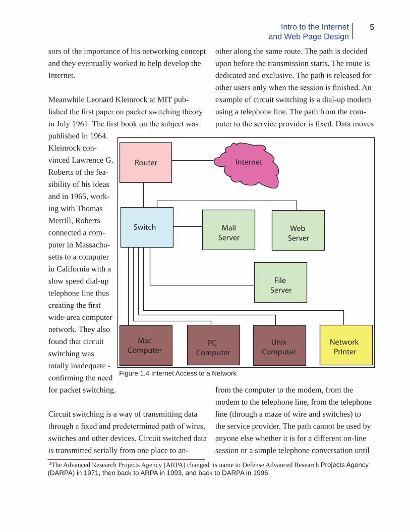
In 1993 The National Center for Supercom-puting Applications (NCSA) released the first version of their Mosaic browser. The software ran on an X Windows System computer which was popular with the research community. Shortly thereafter NCSA also released versions for the PC and MAC envi-ronments. The existence of these reliable, user-friendly browsers had an immediate impact on the spread of the web.
By the end of 1994, the web had 10,000 servers,
2,000 of which were commercial, and ten mil-lion users. In 1995 the International World-Wide Web Consortium (W3C) was founded to lead the web “to its fullest potential through development
Date Event
1962
1966
1969
1972
1973
1981
1982
1984
1990
1992
1993
1994
1995
1999
2000
2003
2005
2006
2007
Licklider concieves Internet concept
ARPA project begins
ARPA goes on line
E-mail introduced
TCP/IP designed
IBM introduces PC computer
Word “Internet” first used
Term “Cyberspace” developedApple introduces Mac computer
ARPAnet endsBerners-Lee creates the World-Wide Web
Term “Surfing the Internet” is coined
Mosaic browser introduced
Netscape founded
Windows 95 with browser released
AOL buys Netscape
10,000,000 domain names registered20,000,000 websites (doubling since Feb.)
5 billion instant messages per dayE-mail generates 400,000 terabytes per year
YouTube.com begins
Estimated 92 million websites
iTunes passes one billion downloads1.114 billion people use the Internet
Internet Timeline
Table 1.1 Source Webopedia: Brief Timeline of the Internet

9Intro to the Internetand Web Page Design
of common protocols that would promote its evolution and insure its operability.” Since then, the protocols have continued to be developed, standardized and enhanced.
When you launch a browser it requests and displays pages of information. The function of the browser is to interpret the program language of web pages and transform it into the words and graphics you see on your computer monitor. The language the browser interprets is called the Hypertext Markup Language (HTML). On each web page, words, phrases and even images are made into hyper links. Clicking on a link causes the browser to request and display another page which probably also contains links.
The web documents are stored on a so-called “Web Server” (see Figure 1.4). A Web Server is a computer intended to house and deliver web content. The computer is secured so that only authorized people can access it to make changes to the data. If you are on the same network as the Web Server, you may be able to save the data directly onto the Web Server computer (if authorized). If, however, you are not on the same network as the Web Server, you must connect to it remotely using a login and password specifi-cally set up for that purpose. In this case the data is sent to the server using the FTP protocol or Secure FTP (which requires FTP or SFTP soft-ware to be installed on your local computer).
Since data is sent over the Internet serially (one data bit at a time) it takes a specific amount of time for each file, image or other element to be
transmitted from one place to another. The larger the file, the longer the process takes. Because of this, in practical terms, it is better to keep the size of each individual file as small as possible so the transmission time is minimal. In design-ing web content we try to keep the size of each file as small as possible to improve the “down-load time.” To further help, the images and other media content of a web page are not saved as part of the HTML document but are linked to it so these items download separately which also improves efficiency.
Additionally, the browser saves a copy of the downloaded files on the local computer in a process called “caching.” When a file is cached on the local computer, if you want to see it again, the computer can call the file up from the local cache rather than having to download it again, thus saving more time. We can also save time by using an image on more than one page. The im-age can be displayed on multiple pages but only has to be downloaded once.
HTML
Hypertext Markup Language or HTML is the basic computer language of the web. It is usu-ally delivered over the Internet through either the HTTP protocol or e-mail. “Hypertext” usually refers to text displayed in a browser or e-mail program that will lead the user to other, related information as desired. Hypertext facilitates the dynamic organization of information through links and connections (called hyperlinks).

10 Chapter 1The Internet and the Web
As previously mentioned, HTML was developed in the early 1990s by Tim Berners-Lee who was an independent contractor at CERN. The original intent of HTML was to provide a means where-by scientific information could be shared among various researchers.
Berners-Lee’s proposal for HTML included 22 elements - 13 of which still exist in the cur-rent implementation. At the time he considered HTML to be an application of the Standard Gen-eralized Markup Language (SGML) developed by IMB in the 1960s.
The initial drafts of HTML expired in 1994 following which an HTML Working Group was formed. In 1995, the HTML Working Group completed “HTML 2.0” that was the first HTML specification intended to be treated as a standard against which future implementations would be based. There was in reality no “HTML 1.0;” the 2.0 designation was made to distinguish it from previous versions. Since 1996 HTML specifica-tions have been maintained with input from com-mercial software companies and W3C.
Basic HTML is a static markup language mean-ing that the content of pages created with it is static or not changing. Dynamic HTML is a col-lection of technologies used together to create in-teractive and animated web sites. These dynamic sites utilize a combination of static HTML, a client-side scripting language like JavaScript, a presentation definition language like CSS and the Document Object Model. In this book we will learn some basic HTML, XHTML and CSS as applied in various ways.
The commands and codes that make up HTML may be written in a text editing program such as Microsoft’s Notepad. However it is more com-mon today to utilize graphic layout software such as Adobe’s Dreamweaver in which the design of the web page is laid out visually by the designer while the program writes the actual code that makes up HTML behind the scenes.
As already discussed, HTML was initially envi-sioned as a means for sharing of scientific data so the original versions did not allow for any degree of sophistication as far as formatting text or graphics. Over time some graphic and limited text formatting capabilities have been added but to ensure that everyone continues to have ac-cess to web content, new versions of HTML and browser software need to be at least partially backwardly compatible. Therefore many of the original limitations of HTML remain and the web designer must be aware of and work with these limitations. We will learn about these re-strictions in more detail in later chapters.
Computer Monitors
In order to be an effective web designer, you need to have a basic understanding of the tech-nology used to display your web pages. Initially, computers were capable of only displaying textual and numeric information. In fact the first computers did not have any kind of graphic display. Rather, the results of their computations were displayed by a series of lights or on paper tape or punched cards. Eventually graphical displays (monitors) which were close relations

11Intro to the Internetand Web Page Design
of black and white television screens came into use. These displays were available in black and white, green and later even amber became com-mon. It was thought that green and amber were easier on the eyes of people who had to look at
their computer screen for extended periods of time.
With the adoption of graphical displays, comput-ers were now capable of displaying not only text and numbers but also images. Programmers and developers took advantage of the graphical ca-pabilities and began designing software applica-tions and protocols that could utilize and display the graphics. The first graphics were simple and primitive black and white images but over time, color came into use and display capabilities continued to be improved. Today’s high quality displays can effectively show full color images, video, animation and other graphic content.
Older monitors use CRT (tube) technology while new monitors use liquid crystals (LCD) or light
emitting diodes (LED). You can usually detect a CRT monitor because they are much deeper and heavier than the LCD or LED types due to the large glass tube that forms the display screen.
Monitors are described in terms of resolution or the number of individual dots of color (called pixels) they can display. Resolution is expressed in terms of the number of horizontal and vertical pixels, for example 800x600 pixels per inch (PPI). Resolution is affected by many factors including the size of the screen and the physical size of the pixels.
As technology has advanced and monitor size has increased, display standards and resolution have changed. Is it now common to find moni-tors that offer wide screen viewing for video editing, gaming and watching DVDs.
Table 1.2
Bit Depth Number of Colors1 2
(monochrome)2 4
(CGA)4 16
(EGA)8 256
(VGA)16 65,536
(High Color, XGA)24 16,777,216
(True Color, SVGA)
Figure 1.5 Monitor pixels
12 Chapter 1The Internet and the Web
Referring to Figure 1.5, If only the red pixels are illuminated, the screen will show red in that area, the same is true for the blue and green. If no pix-els are illuminated, the color is black and if all are illuminated equally to maximum brightness, the color will be white. Other color combinations are displayed by showing various amounts of the three colors. Your eye blends the colors together to produce the final color you see. The larger the number of colors a monitor can display, the larger it’s so called “bit depth.” Table 1.2 illus-trates some common bit depths.
Each monitor has a maximum resolution that it can display (native resolution) but it can also display lower resolutions. On a Windows PC, you can easily tell the resolution setting of the monitor by clicking the right mouse button on an open area of the desktop and selecting the prop-erties option. From the resulting menu, click the Settings tab. The resulting window will allow
you to see the current resolution settings (and make changes to them) as well as to see the color quality or bit depth.
Historically, most computer screens had an as-pect ratio of 4:3. This simply means the ratio of the width of the screen to its height is 4 to 3. For
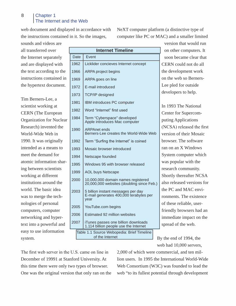
Table 1.3
Standard Resolution Typical UseXGA (Extended Graphics Array)
1024x768 15 -17 in. CRT 15 in. LCD
SXGA (Super XGA)
1280x1024 15-17 in. CRT15-19 in LCD
UXGA (Ultra XGA)
1600x1200 19-21 in CRT20 in. LCD
a wide screen monitor this ratio is typically16:9. Table 1.3 indicates some standard monitor reso-lutions and sizes.
It is important for the web designer to be aware of the screen resolution and aspect ratio because, these factors help determine how to design ef-fective web pages. For example, if we design a web page for 1024x768 resolution, people who only have an 800x600 PPI monitor cannot see the entire page on their screen and have to scroll both horizontally and vertically to see the com-plete page. On the other hand, a page designed at 800x600 PPI will be smaller than the available screen space when displayed on a monitor with higher resolution.
In practical terms, when designing static web pages, we usually design for the lowest resolu-tion we think our typical user will have on his computer monitor. Considering that most people will have a monitor capable of at least 800x600 PPI, we generally use 800x600 as our starting point. In the future, we will no doubt be able to raise that number to 1024x768 or higher as older computers and monitors are replaced.
Conclusion
Through this chapter we have had a brief look at the development and implementation of the Internet, the World-Wide Web, HTML and com-puter monitor technology. As you become more familiar with these concepts, you will be in a better position to converse intelligently with oth-ers about the development of web technologies

13Intro to the Internetand Web Page Design
Chapter Quiz
To help you access your understanding of the concepts presented in this chapter, answer the following questions:
1. What is a computer network?
2. What types of computer networks are there?
3. What is the Internet?
4. Briefly discuss the development of the Inter- net.
5. What is the World-Wide Web?
6. Why was the web developed?
7. What is a computer protocol?
8. What is meant by hypertext?
9. What is a link?
10. What is HTML?
11. For what applications is the HTTP protocol used? 12. What does monitor resolution mean?
13. How are colors created on a computer moni- tor?
14. What is the aspect ratio and why is it impor- tant?
and understand the restraints under which a web designer must work.

14 Chapter 1The Internet and the Web
ReferencesEuropean Organization for Nuclear Research. (2008). How the web began. Retrieved on September 10, 2008, from http://public.web.cern.ch/Public/en/About/WebStory-en.html.
Howe, W. (2007). An anecdotal history of the people and communities that brought about the Internet and the Web. Retrieved on August 25, 2008, from http://www.walthowe.com/navnet/history.html
How stuff works: How computer monitors work. Retrieved on September 15, 2008, from http://computer.howstuffworks.com/monitor.htm.
Leiner, B.M., Cerf, V.G., Clark, D.D., Kahn, R.E., Kleinrock, L., Lynch, D.C., Postel, J., Roberts, L.G. & Wolff, S. (2003). A brief history of the Internet. Internet Society retrieved on August 25, 2008, from http://www.isoc.org/internet/history/brief.shtml.
Sterling, B. (2008). Short history of the Internet. Retrieved on August 25, 2008, from http://w3.aces.uiuc.edu/AIM/scale/nethistory.html
Unuth, N. (2008). Circuit switching vs. packet switching. Retrieved on September 10, 2008, from http://voip.about.com/od/voipbasics/a/switchingtypes.htm.
WWW and HTML definitions from wikipedia.org. Retrieved on September 8, 2008.
Ch
apte
r 2
Planning for Web Design
16 Chapter 2Planning for Web Design
Introduction
Many web designers, including both the novice and experienced, create web con-
tent that ignores principles of good design. Their pages may contain busy colored backgrounds, a multitude of animated pictures, and/or many text styles. Devices such as reverses (light colored text on a dark background) are used too often and make reading the text difficult especially for people with disabilities. Much of the scholarship and practice of web design treats writing for the web as a simple transfer of traditional skills and processes typically seen in print documents to web pages; which can, under certain conditions, be effective but often is not. In addition, stud-ies have found that designers do not always see web design as a process or as connected to other communication forms. Rather, most designers cited technological strategies they needed to master, ignoring the content. Many complained that the technology did not speak their language. They would usually seek out someone who had designed something similar to what they were working on and then copy that design style for their own pages. These practices caused the de-signers to be more conservative in their designs and to produce many pages that resembled each other.
What then are some of the things that need to be considered to be effective in designing a web page? Throughout this chapter, strategies and practices that will help you become better at your job; that is to design and create unique, attractive, effective, easily navigable, and user-friendly web pages will be presented.
Planning
The first step in the creation of an effective web site is the planning phase. According to one expert, “Building a new web site or revamping an old one is not unlike working on that dream home, in that in both projects careful planning is essential.” Planning helps save time and money as well as helping to reduce the stress of the project. After the planning is complete, the im-plementation of the strategy is a fairly straight-forward task. There are several steps that should go into the planning process for a successful web site. These include:
1. Choosing a focus and keeping it simple. 2. Allowing plenty of time for planning and development. 3. Visiting web sites of similar type to see how others designed them.
Other questions that should be addressed in the planning phase include:
1. Who will be visiting the site and why? 2. How they will visit (browser, PDA, cell phone). 3. What are the goals and requirements for the site, are there any legal issues that need to be addressed (copyright, etc.). 4. How will the site be hosted.
One reason it is so difficult to create effective web content is that the audience or consumers who can view the site are from diverse, some-times international, backgrounds. As a result,

17Intro to the Internetand Web Page Design
things that appeal to some will not have inter-est to others. J. Dalgleish suggests five “doing areas” that may help to categorize what your customers want. These areas are:
1. Evaluate competing business and products 2. Select products and transact with e-service provider. 3. Get help. 4. Provide feedback. 5. Stay tuned in as e-customers.
When deciding among businesses or services, customers will often turn to web sites for infor-mation. Because of this, looking at competitor’s web sites can help with deciding how to design a site that will most effectively complete. The site needs to offer useful information in a well organized and easy to find way. It should not necessarily copy a competitor’s design, although viewing a competitor’s site could suggest things that may make your site more effective.
Site visitors have to construct the path they take through the site. In other words they create a context that is relevant to them in a personal way. To facilitate this, the use of site maps, search engines, etc. is effective. People will find the site irrelevant or intrusive if they do not receive information relevant to them from their visit.
Visitors to a site may need to seek help as part of their experience at a particular site. They may need to find out where to go, who to talk to, or how to resolve a problem. So provisions for fre-
quently asked questions and contacting the site owners/operators must be included. There also needs to be some kind of feedback mechanism that allows visitors to comment on their experi-ence at the site if they desire. Prompted feedback tends to be less useful unless the visitor receives something in return for his comments. Never the less, feedback in any form can be helpful in fine-tuning the site to be more successful.
Global Knowledge Training’s white paper “10 tips for creating your web site” suggests some additional areas of concern in web design includ-ing:
1. Accessibility. 2. Security. 3. Web server statistics. 4. Dynamic technology styles. 5. Effective use of appropriate design soft- ware. 6. Standards and browser independence. 7. Database access. 8. Using image editors. 9. Site planning, design and management. 10. Technological flexibility as the points that need to be addressed for successful web design.
On time, within scope, and within budget should be the project management motto these days.

18 Chapter 2Planning for Web Design
CONCERNS FOR PEOPLE WITH DIS-ABILITIES
The Americans with Disabilities Act has pre-scribed certain standards for web pages that the government and government contractors must abide by. Because of this, accessibility has be-come a big issue especially with such sites, but other commercial and personal sites could also benefit from making the content of their web sites more easily accessible and understandable especially by people with disabilities.
There are several reader programs for the dis-abled but if someone is only able to read the text of the site, they are missing much of the visual content. According to C. Sliwa:
The move from text-based to visu-ally oriented Web content has been tough on the blind, and now there’s a new threat on the horizon. The shift to dynamic “Web 2.0” technology, which Gartner Inc. predicts will be pervasive by the end of the year [2006], could exacerbate the problem of inaccessible sites (p.12).
Web 2.0 applications may make use of things such as Asynchronous JavaScript and XML (AJAX) and Dynamic HTML to update informa-tion in one part of a page, such as a table, with-out having to reload the complete page. Screen readers, magnifiers and other assistive technol-ogy may not know which parts of the page have changed if designers don’t include information that the assisting devices can handle.
To improve a site’s accessibility it is important to include alternate text for images using the “alt” tag in the HTML code. Additionally, tables applied to web pages should include table header text in the “<th>” tag. These topics will be cov-ered in a later chapter. Other things that can help improve accessibility include being careful with the use of colors that are hard for color blind people to distinguish. Red/green combinations are especially important to avoid. Also, the use of sound on the site should be done with care. Not everyone has speakers on their computer and there are people with hearing disabilities. Audio should not be used to convey the main message of the site, but rather to enhance it.
SECURITY AND OTHER
Security is important for a web site though not really a design concern so it will not be dis-cussed in great detail. However, the server soft-ware needs to be kept updated so the site cannot be hacked and the content compromised which could affect the overall design, effectiveness and look of the site.
Keeping track of site statistics is important to help assure the success of the site. Following the visitation trends on the site can help the designer find out if the site is effective or if changes need to be made. Using site tracking technology, the designer can see how many people visit the site, which pages are most popular, etc. These data can help the designer decide if modifications need to be made so that the site is more effective and attractive to visitors. There are several sites

19Intro to the Internetand Web Page Design
on the Internet that facilitate tracking of visitors. It usually involves including some special codes that are provided by the tracking company in your web pages. Each time the site is visited; the tracking code causes a message to be sent to the tracking company who then keeps track of the statistics and sends back a report to you.
Dynamic styles such as the use of Cascading Style Sheets (CSS) help with the control of the page layout and facilitate the ability to control multiple pages from a single file. CSS also al-lows the designer to create more sophisticated designs and interactivity than is allowed in HTML. When using dynamic styling as noted above, care must be take to assure site accessibil-ity.
The choice of the software used to design the web content may have a bearing on the effective-ness of the site. The software should be chosen to allow the creation and use of cross-platform files. The major scripting languages including ColdFusion, PHP, ASP, JSP, etc. should also be supported. Adobe Dreamweaver and Eclipse are a couple of the more popular and common ap-plications, although some designers still prefer to enter the HTML code manually using a text editor program such as Notepad.
When designing the web site, the finished pages should be checked on various browsers and on different computers to assure that the design is effective in multiple (cross-platform) environ-ments and for code validation. The most popu-lar current browsers include Internet Explorer,
Firefox, Opera and Safari. Increased use of CSS is helping with the multiple browser concerns. There is also a trend to use more JavaScript, flash animation, etc. which makes pages more dynamic and more interesting.
Static web pages are fine but they quickly be-come time intensive both for the developer and for the site visitors. Database-driven web sites can refresh their own data in order to present timely information in a way that a manually updated site cannot. A few well-programmed dynamic pages can replace thousands of static pages. The dynamic pages utilize server-side languages including ColdFusion, PHP, and ASP.
The actual text of the language used on the home page needs to be simple, direct and accessible. Jargon and technological terminology should be avoided or at least explained. Saturated color on web sites retains the same meaning it does in other contexts. Saturated color, especially prima-ry colors for example, is associated with children and with controversial subjects and issues ac-cording to a study by Cranny-Francis.
Visual Design
“The first rule of visual design is legibility”- so says B. Kovark. Highly textured backgrounds fighting colored headlines or text set in obscure fonts make for difficulty in understanding and defeat the purpose of the web site. The second rule according to Kovark is that size, font and style give important clues about the content of the site. Gothic fonts for example may indicate

20 Chapter 2Planning for Web Design
religious pages while western fonts may say something about equestrian web sites. Sans serif fonts convey a modern or straightforward im-pression while serif fonts may convey a tradi-tional feeling. An additional concern about fonts is that they are not embedded in the HTML web page. In order for a computer to display a font correctly, it must be installed on the local user’s computer. Since every computer does not have all possible fonts installed, not all computers can access or display every font a designer may wish to use. For this reason, text on a web page is usually limited to a serif font such as Times New
Roman or a sans serif font such as Ariel or Ta-homa (a relatively new font developed primarily for web use) because they are standard on most computers. Designers who wish to use other fonts are advised to create their text as an image using a program such as Photoshop and save it as an image file for placement on the web page.
Ideal Given
Real Given
Ideal New
Real New
Center
Figure 2.1. Based on Kress & Van Leeuwen model as cited by Cranny-Francis
The physical page layout is another important concern. As shown in figure 2.1, web design in western cultures closely follows the reading pat-tern of top to bottom – left to right. The center is the place of the greatest prominence. Items that appear on the left side are things that are “given” or known to the viewer either in the particular or the idea they represent while items on the right tend to be unfamiliar or new. On the top is the ‘ideal’ or the essence of the idea. The bottom is the place for the ‘real’ - meaning the everyday or material realization.
Using Cranny-Francis’ logic, the layout of figure 2.1 is culturally specific and maps the most conventional arrangement of items. Because of this, the model can be used innovatively to present material in unique and different ways. For example, placing a new item on the left side introduces it to the viewer in such a way as to control the newness – because it is in the ‘given’ position the viewer is led to believe that they al-ready know this. Conversely, placing something already known or familiar on the right side can give it a new or different look.
Spatiality is also related to the creation of mean-ing in a web site. Although a web site may be very colorful and visually complex, it may also contain a lot of free space. This space is referred to as white or negative space although it does not need to be white in color. Convention says that we do not have to, nor should we want to, use every free pixel of space. More open designs are often seen as higher quality and more presti-gious. Usually, the inexperienced designer will

21Intro to the Internetand Web Page Design
try to use all available space. Consider the open design on the cover of an up-scale magazine with its open and abundant space as compared to the cover of a “middle or lower class” tabloid where every available inch is filled (figure 2.2). Another aspect of spatial-ity is the use of borders or bound-aries. Borders or boundaries can be created with color, lines, shapes and text.
Communicators using the Internet to convey their messages make use of photographs, illustrations and diagrams. The ratio of images to text in web documents has been slowly increasing over the years. As the Internet has developed from a text only medium into the media-rich environment of the World Wide Web, there has been a dramatic increase in the use of visual elements online. C. Harrison informs us that “the important thing for professional communicators to understand is that readers/users no longer solely rely on text for comprehension; they absorb and process all that they see within a document to create mean-ing for themselves.”
The understanding of how text and images work together to create meaning and how images can enhance or detract from meaning can be ex-plained in the communication theory of Visual Social Semiotics. Semiotics is essentially the
study of signs and how humans assign meaning to these signs. Visual Social Semiotics theory identifies three types of images, icon, index and symbol (see figure 2.3). An image is an icon if it has a resemblance to a person or an object. Icons
can be paintings, photographs, illus-trations, etc. They may be anything from very simple to extremely complex. A com-mon icon on a web page is the
familiar house that represents the home
page. An index is an image that we recognize because it stands for something. An example is the upward pointing arrow on a web page that we understand to mean the top of the page. We usually require some kind of text to help us un-derstand the meaning of an index. So the arrow in this example would also have associated text that says “top of page” or something similar. A symbol is an image that has no obvious visual connection to the concept for which it stands. We know its meaning only because we have learned it through our own experiences or through the experiences of others. For example the word car does not look at all like an automobile but when we see the word, we understand what it means because we have learned it through experience.
Just as the Kress & Van Leeuwen model in figure 2.1 can help us in understanding the layout of
Figure 2.2 Open design from Life, more cluttered design from OK!

22 Chapter 2Planning for Web Design
the entire web page; it is also useful in helping understand the images placed thereon. According to C. Forceville (1999):
Pictures, including multimodal ‘texts,’ give significant information through the ways in which their elements are arranged. Three aspects are distin-guished: the ‘zone’ in which an element occurs (left/right, bottom/top, centre/margin); the ‘salience’ bestowed on it (via foregrounding/ backgrounding, relative size, colour, etc.); and ‘fram-ing’ devices such as vectors between participants (p. 166).
The understanding and selecting of images for use on a web site, in spite of all the theories, is still a rather interesting and subjective process. In an example cited by Harrison, choosing which
photograph of the Supreme Court building to use on its web site could have gone one of three ways. The photo chosen was an ant’s-eye view of the building making the building look large and imposing to suggest the importance of the court to the nation. Rejected photos included a level-eye view symbolizing that the court is on the same level as the average citizen and the bird’s-eye view suggesting that court was of lesser importance. If the designers had chosen one of the other images, the perceived message
of the web site could have been much differ-ent. Suffice it to say the image which conveyed the feeling intended by the web designers was carefully selected. Placement of images such as location on the page and size are also important considerations as previously noted.
The appropriate use of color on a web page can enhance functionality. Color can focus the user’s attention on a specific section of the page. For instance red may highlight a sale item or yellow may apply to something new. Color, especially bright color, should be used carefully. Too much use of bright color can be exhausting or dis-tracting. The use of color should be consistent throughout the web site. An example would be a banner that retains the same color and loca-tion on each page. Blue underlined text should be avoided because it is the default style of a link. And for best legibility, colors that provide a strong contrast between text and background should be used. Colors that are web-safe (cross-platform) should be selected. There are 216 of these cross-platform colors that are RGB light-source colors. The web safe colors are defined by the various shades of red, green and blue from which they are composed and are represented to the browser in hexadecimal values. In addition there are sixteen predefined colors such as white, silver, black, red, etc. that a browser can recog-nize directly by name.
Finally, there are three philosophies for web design as defined by Clint Eccher. These are usability, multimedia and mortised. These philosophies should be rated using the three
Figure 2.3

23Intro to the Internetand Web Page Design
factors of aesthetics, usability and functional-ity. The usability philosophy represents the ease of finding and processing information. In other words, this philosophy attempts to make a web site accessible to all users regardless of platform or browser. One way to do this is to strip the site down to bare essentials; eliminating most if not all images and relying mainly on text to convey the message of the web site. The mul-timedia philosophy is on the opposite side of the design spectrum from the usability philoso-phy. Multimedia sites use animation, audio and video to create more interesting and interactive sites. Mortised sites represent the philosophy of piecing together graphics, text and functionality (like forms) to make sites that are fast, flexible and usable. The designer needs to decide which philosophy will be most suitable for the purpose of the site they are designing.
Layout Principles
In order to create effective graphic designs, you need to understand a few basic visual design principles. These principles when properly applied to your web designs will facili-tate your designing of outstanding web content. These design principles are generic and can be applied to any area of design whether for print, web or other media.
The main concern you have as a web designer is how to allocate the available space effectively. Space (also referred to as white space or nega-tive space) is all we have to work with so you must learn to use it effectively. Your finished de-
sign is worthless unless it causes the site visitor to stop and view your web site. When someone first accesses your web site, you have only a few seconds to attract and hold her attention. If you fail to do so, she will not stay to enjoy what you have so painstakingly created but will instead find somewhere else more to her liking.
In a newspaper, the most important elements are placed above the fold so that when a paper sits on a table, those items are visible. On a web page, you should try to design so that the most important things occur on the first screen full of information, if your page is longer than one screen. Vertically scrolling to see additional in-formation is considered acceptable but horizontal scrolling is not. Things that should be placed on the first screen of a home page might include the name of the site, the primary message, an indica-tion of what the site is about, navigation features to get to other parts of the site and other informa-tion that is important for the site visitor including addresses and telephone numbers, etc.
Wendell Crow tells us that a good layout is like music from a fine orchestra. “It is harmonious, balanced, rhythmic, emphatic. It repeats themes and uses devices such as dynamic contrast to surprise and stimulate the audience.” So too is a web design. We must take advantage of the fol-lowing principles and use them effectively in the creation of our web content.
a. Balance – a sense of stability or equilibri- um. Balance can be either formal or infor- mal.
b. Contrast- differences in size, shape, color

24 Chapter 2Planning for Web Design
or other elements that promote interest and attract viewers.
c. Direction- positioning of elements to pro- mote the movement of the eye in the de- sired way. Illustrations may “point” to other items. Photos may be placed along an axis to suggest movement, etc.
d. Emphasis- an element or group is made to stand out by use of size, content, color or position.
e. Harmony- the use of similar line weight, shapes, and tones so they match well and are pleasing to look at.
f. Line- can delineate shape or show direc- tion, movement or emphasis.
g. Perspective- approximates the relative position of the elements as seen by the viewer. Can be used to create depth on a flat screen.
h. Point- the position on the page that holds the primary attention of the viewer. Should not be confused with the term used to describe the size of type. Can be real or imaginary.
i. Proportion- matching of shapes and sizes so they either blend or contrast effectively.
j. Rhythm- a sense of orderly but not boring repetition. Duplication of patterns or images for example.
k. Shape- shape can create depth or through size and proportion show importance or impact.
l. Sequence- a way of ensuring that reading follows a definite path. From left to right or top to bottom for example.
m. Texture- the visual “feel” of the design.
n. Tone- The range of light values from white
to black or from faint to saturated color.
o. Unity- the sense that all design elements belong to the design as a whole; elements are related to each other.
Figure 2.4 illustrates some of these design prin-ciples in the “thumbnail” form.
It should also be remembered that in western cultures, people are used to reading from left to right and from top to bottom. If you place con-tent in other ways, it could tend to confuse your site visitors. But is done effectively, can also create some unusual effects.
Every page has a mathematical center. This is the point midway from top to bottom and left to right. The mathematical center is, however, not necessarily the focal point of the page. When your eye first encounters a new page, it natu-rally falls on a place above and to the left of the mathematical center. The exact location is not as important as the principle behind it, but the optical center is located approximately 3/8 from the top of the page. You should take advantage of this natural aid and use it as the focal point or orientation center of your pages. If an element chosen for this location can stop the viewer, you are on your way to achieving an effective web page.
Checklist For Design
As you plan the design of a web site, in addition to the material already presented in this chapter, there are many things that you should consider.

25Intro to the Internetand Web Page Design
Figure 2.4

26 Chapter 2Planning for Web Design
The following checklist can help you to evalu-ate the quality and effectiveness of your own (or any) web site.
1. Is there a notable consistency in the site? In other words do all the pages appear to be re-lated? Things that can help with consistency include using the same header and/or footer on each page, placing a menu in the same location on each page, using similar colors and back-grounds on each page, staying with a similar layout style, etc.
2. Are all the pages finished? In the past, placing “under construction” messages and images was considered acceptable. But today, it is gener-ally accepted that web content is (or should be) always under revision and the use of “under construction” messages and images is redundant. The best rule of thumb to follow is that if your content is not complete and ready, don’t put it on line.
3. Do all the links work as they are supposed to? Check each link with a browser and be certain that they all do what they are supposed to. If you are making plans for a new page, it is acceptable to place the text or image that will eventually be the link to new content on a page but it should not be activated until the new page, is ready to go on line.
4. Don’t overwhelm the page with either text or images. Pages that are too complex are difficult to understand and invite the user/visitor to your site to leave and not come back. It is better to
break the content into several linked pages than to try including everything on one page. A good rule to follow is to place no more than about 200-300 words per page and to use some kind of device such as a horizontal rule between para-graphs to facilitate comprehension.
5. Requiring your users to scroll vertically is acceptable but forcing horizontal scrolling is considered by many to be poor design. Horizon-tal scrolling can be eliminated by designing your pages for the lowest screen resolution (refer to chapter one for a discussion on resolution). We usually design for a resolution of 800x600 ppi. If your content is such that vertical scrolling is necessary, try to limit the content to two or three full screens of information.
6. Work to keep download time to a minimum. If someone has to wait more than about three or four seconds for a page to download, they will usually become agitated, give up and go to another site. Since there are still those who rely on dial-up connections at 56K (speed of the connection measured in thousands of data bytes per second) for their Internet access, we usually try to keep the total size of the content for each page including the HTML page itself, associated images and other content to around 100K. Tech-niques for reducing the size of image files will be discussed in chapter four.
7. Is the site friendly to persons with visual or hearing disabilities (refer to the discussion earlier in the chapter)? If you use images as links, try to also include textual links in the page footer.

27Intro to the Internetand Web Page Design
Make sure the text is large enough to be easily seen. Avoid the use of reverses (light colored text on dark backgrounds) especially for body text. If you include sound files, make sure the page will be self-explanatory as much as possible without the audio.
8. Design for browser compatibility. Differ-ent browsers do not handle text and graphics the same way. You should test your designs on computers with different sizes and resolutions of monitors and using different browsers to en-sure compatibility. At the very least you should check your designs on both Internet Explorer and Firefox (since they are the predominant brows-ers on the PC platform), and on Safari and Opera on the Mac platform.
Following these steps plus the other information cov-ered in this chapter will go a long way toward helping you become an effective designer of web content.
Planning Tools
Now that you have some idea of the design considerations of a web page or web site, it is time to begin the actual planning process. As it turns out, the computer is a very good tool for executing graphic design but it is not a really good planning tool in most cases. Because of this, planning is usually done in the traditional way– through research and using a se-
ries of “thumbnail” and “rough” sketches to help visualize the look of the intended pages. Figure 2.4 is an example of thumbnail sketches while figure 2.5 is an example of a rough drawing. You should always begin any design project with a well created and documented plan. To implement the planning phase of a design project, the fol-lowing steps are suggested.
First you must know about the product, service or institution for which you are designing the web content. Is there a new product to intro-duce? Is there new or different information that the visitors to your web site will want or need to know? What specific features or information are important to convey, etc. Depending on who you are designing for, this may be information you are already know or you may need to do some
research to find out.
Next you need to under-stand the target audi-ence. You need to know what age group you are targeting, what socioeco-nomic factors are in play, what kinds of things they may be interested in, etc. You may need to
do some research to obtain this information or it may be data you already have. Using this data, you will be able to decide the best way to present your information to the potential audience. For instance, if you are targeting children and you require them to register on your site, you must be aware of laws regarding the collection and use of
Figure 2.5

28 Chapter 2Planning for Web Design
personal information and other applicable regu-lations. The content must be attractive and dy-namic to gain and hold their attention. Language and images used must be age appropriate, etc.
With your data collected and analyzed, you are ready to begin the actual design process. Begin by writing down the goals you have set for the web site. Make sure they are clearly stated. If you are not able to articulate your goals, you will have no way of accessing whether or not your design is effective. You will use the goals and re-fer back to them throughout the rest of the design and evaluation phases to be sure you accomplish what you started out to do.
Now begin thinking of ways you can format and organize the web site to help accomplish your goals. As you go through this process, it helps to begin making small hand-drawn sketch-es of your ideas. These sketches are usually referred to as “thumbnails” in graphic design. If you are designing for a client, you may want to involve him in this process. You can also discuss your ideas with others to see if what you are thinking makes sense to someone else or if there are things you have forgotten or overlooked.
Once you have the basic idea of what you want clearly established. You choose the thumbnails and ideas behind them that will best convey the information you want to present and refine them into more sophisticated designs called “rough drawings.” These drawings do not have to include body text or actual images but the place-ment of all design elements should be shown.
You should identify links; indicate how the vari-ous pages of your web site will work together, etc. In this stage you will usually refer back to
the basic layout principles of balance, unity, harmony, emphasis, and use the principles that will best help you convey your intended mes-sage. It also helps to make a kind of hand drawn flow chart in this stage of the design. The Chart is a kind of map that allows you to visually see how the site is going to be organized (figure 2.6). It may be fairly simple or extremely complex. Throughout the entire design process, you need to check back to make sure you are meeting your goals. You will also check with your client along the way to indicate your progress and receive approval.
The introductory page should provide the organi-zational focal point for the entire web site. Each subsequent page should be consistent as far as icons, banners, etc. are concerned. Logos should appear at the same location on each page. The
Introduction
Home
Links Events About Us
Figure 2.6

29Intro to the Internetand Web Page Design
content should match the visual feel to convey information as well as continuity effectively.
The site should be simple. Too many frames, animations, multiple fonts, sizes and colors tend to distract and confuse the viewer.
Follow principles of good navigation. Arrange your pages in a hierarchy. If someone has dif-ficulty navigating your site, they will leave and probably not come back. Make a link on each page that will return to the previous page as well as the home page and any other pages you want the visitor to be able to go to. Always put the links in the same place on all the pages. Be con-sistent with link colors. Use links in the body of the text to refer the reader to pages or other web sites where additional information can be found. Don’t let any page dead-end. Always provide a way out (link) of every page.
It is considered acceptable to look at other web sites and incorporate the layout ideas you find into your own web pages. It is not, however, ac-ceptable to use the actual content of those sites in your own site without first obtaining written permission. Violating copyrights is not an ac-ceptable practice in any venue.
If you have updated your site, let the visitors know where they can find the new information so they can decide if they want to view it right away.
Finally, TechRepublic lists 10 common web design mistakes to watch out for. These mistakes
are summarized below:
1. Failing to provide information that describes your web site. In other words, you should be clear and forthcoming about the purpose of the web site. Include a clear yet brief description on the first page or include it in an “About Us” link. You should even describe why the information may not be useful for some people.
2. Skipping “alt” and “title” attributes. Be sure to use these attributes for every link and image on your web site (refer to earlier discussions in this chapter).
3. Changing URLs for archived pages. When you create your pages, do so in a way that will allow you to move content into an archive with-out having to change the URL.
4. Not dating your content. You must continually update your content if you want return visitors. Date stamp each page somehow even if it is only putting “last modified on…” somewhere on the page. Also help readers to easily find new content some way such as creating a “new info” link, etc.
5. Creating busy, crowded pages. Keep your points short and relevant with links to more de-tailed information for people who want to pursue the topic in greater detail.
6. Going overboard with images. Decorative im-ages, except for banners and necessary branding, should be used as little as possible. Use images

30 Chapter 2Planning for Web Design
to illustrate content or when they themselves are the content you wish to provide. But don’t use images just to “pretty the pages up.”
7. Implementing link indirection, interception or redirection. Never prevent other web sites from linking directly to your content.
8. Making new content difficult to recognize or find. This item ties to item #4. Any web site whose content changes regularly should make the changes easily available to visitors.
9. Displaying thumbnails that are too small to be helpful. If you use thumbnails as links to im-age galleries, make sure the thumbnails are large enough so the reader can see what the full size image looks like.
10. Forgoing web page titles. This is also men-tioned elsewhere in this paper. Always set the title of each web page. However do not make the mistake of using the same title attribute for all the pages in your web site. Each page should have its own distinct title. Search engines iden-tify your web site by the page titles you use. Also when someone saves a bookmark, the browser uses the page title for the bookmark name.
Once you have completed the planning and de-sign phase, the implementation of the design will be a fairly easy and straight-forward process. To implement the design, you will need to secure photos, create illustrations, write copy and gather all the design elements you will use in order to implement the design. The actual design may be
done in a number of ways: you may decide to write the HTML code yourself or you may use a web design tool such as Adobe Dreamweaver. Photoshop can also be used to create web con-tent including photo pages. There are many ad-ditional design tools available.
With the completion and publishing of the design on the web, it is now a good time to evaluate the design to see if you were successful in reaching your goals. There are many ways of accomplish-ing this. For example you may want to include a feed-back page so site visitors can respond to your designs. You could also do surveys of your potential visitors. You should also review your original goals to see if you stayed on target with them throughout the process.
Clint Eccher discusses seven rules of web design that should be considered by anyone who desires to make an effective web site:
1. Just because you can does not mean that you should. 2. There is almost always an exception. 3. Users are the ultimate judge. 4. Crossover experiences should be sought. 5. Humility is the best approach. 6. It is impossible to please everyone. 7. Stay on top of standards and specifica- tions.
Conclusion

31Intro to the Internetand Web Page Design
Although the information presented in this chap-ter may at first seem overwhelming, given time and experience, it will become second nature to you. You will not use every concept or idea in every design; rather you will glean from the various suggestions the design concepts that will help you accomplish a specific project.
The rules and the concepts presented in this chapter, if followed, will help the novice and intermediate designer along their way to become a professional.
This chapter has attempted to suggest a few basic considerations that the beginning web designer should be aware of in order to facilitate their ef-forts in designing functional and attractive web content. You should now have a better under-standing of some of these concerns and strategies that will help you become a more successful. In subsequent chapters, you will learn the tools and skills necessary to facilitate the implementation of your web designs.

32 Chapter 2Planning for Web Design
Chapter Quiz1. Define a reverse and explain why it may not be effective for handicapped persons.
2. Discuss the importance of planning before imple- menting a web design.
3. List at least five items that should be considered during the web design phase. a. b.
c.
d.
e
4. What are the rules of good visual design?
5. Discuss five principles of layout; be able to sketch examples of each.
a. b. c.
d. e. 6. What is the difference between the mathematical and optical center?
7. Discuss the purpose of thumbnail and rough drawings.
8. Visit several web sites. Try to analyze each ac- cording to the information presented in the chap- ter. Which design principles are used, is there consistency between pages, what do you like, what don’t you like, how could you redesign it to make it better?
ApplicationBegin planning for your own web site:
a. Decide on a topic, content or theme. b. Define and try to understand the target audience. c. Set specific goals you want to accomplish with the design.
d. Visualize the structure of the web site. Create a flow chart.
e. Select the design principles you will use and begin making some thumbnail sketches. You will eventually want to settle on a sketch for each page. Remember to be consistent through out.
f. Create rough sketches of your ideas for each page.
g. Be able to justify why you have chosen to design your web site the way you have. Does it meet the criteria you defined earlier? If not, go back to the thumbnail stage and start over.
h. Begin collecting the information and images you will use.
* Do not begin the actual layout on the computer until you have completed the above steps.

33Intro to the Internetand Web Page Design
ReferencesAnderson, R.A. (2006). Exploring the art and technology of web design, Clifton Park, NY: Thompson
Baird, R.N., McDonald, D., Pittman, R.K., & Turnbull, A.T. (1993). The graphics of communication (6th Ed.), Fort Worth, TX: Harcourt Brace Jovanovich College Publishers.
Berger, A.A. (2008). Seeing is believing: An introduction to visual communication (3rd Ed.), New York: McGraw Hill.
Conover, T.E. (1995). Graphic Communications today (3rd Ed.), St. Paul, MN: West Publishing Company
Crow, W.C. (1986). Communication Graphics, Englewood, NJ: Prentice-Hall.
Cranny-Francis, A. (2006). Spinning a web site: Analyzing the textual strategies of a web page. Screen Edition, 43, 70-75.
Dalgleish, J. (2000). Customer-effective web sites, Upper Saddle River, NJ: ft.com
Eccher, C. (2004). Professional web design: Techniques and templates. Charles River Media
Forceville, C. (1999). Educating the eye?: Kress and Van Leeuwen’s Reading Images: The Grammar of Visual Design. Language and Literature, 8 (2), 163-177.
Harrison, C. (2003). Visual social semiotics: Understanding how still images make meaning. Technical Communication, 50 (1), 46-60.
Kaiser, S. (2006). Deliver first class web sites: 101 essential checklists, VIC Australia: Sitepoint.
Karper, E. (2005). “Ordinary people do this”: Rhetorical examinations of novice web design. Business Communication Quarterly, Sept., 340-344.
Kovark, B. (2002). Web design for the mass media, Boston: Allyn and Bacon.
Sliwa, C. (2006). Accessibility issue comes to a head. Computerworld, 40 (19), 1-15.
Ten tips for creating your web site. (2006). Global Knowledge Training LLC. Retrieved on June12, 2007, from http://www.globalknowledge.com.
10 common web design mistakes to watch out for (2007). TechRepublic. Retrieved on November 7, 2007, from http://techrepublic.com.com/2001-6240-0.html

34 Chapter 2Planning for Web Design
Page intentionally left blank

Ch
apte
r 3
Technical Considerations

36 Chapter 3Technical Considerations
Introduction
Designing for the web in the Communica-tion Graphics class (or any other class at
SUU) requires us to use the facilities provided by Southern Utah University. These facilities and resources include not only the computer and software but also the student web server and the campus network including your personal (F: drive) space on the network. There are certain re-quirements that you will need to be aware of and procedures that are necessary for you to follow as you design and publish your web content at SUU. In this chapter, these requirements and pro-cedures will be presented and discussed. URL’s and other preliminary technological concepts including file naming, restrictions and limitations will also be introduced and discussed.
Web Server
In order for web content to be accessible on the Internet, it must be placed on a special computer that has a connection to the Internet. This com-puter is referred to as a “web server” (Figure 3.1). The web server can “host” any number of individual web sites. The web server allows people the ability to access and view the infor-mation associated with a web site, but restricts unauthorized persons from making changes to the content.
If you are developing web content and the server is located remotely (Figure 3.2), in order for you to get your content to the server, you have two options. You must either send it to someone at
the remote location on a storage device of some kind (CD, etc.) to have them post it for you or you must send it yourself over the Internet. The use of the Internet to post web data to the server is the most common method. To facilitate this, a special computer program called an FTP (File Transfer Protocol) client is used. Some sites will require SFTP (a secure version of FTP). The FTP of SFTP software allows you to connect over the Internet to the remote web server and transfer the data to it. You must have an agreement with the organization that owns the server to host your web content before you can post data to it. They will provide you a user name and password to
Computer Web Server
ISP Internet
Figure 3.2
Web Server
Internet
Figure 3.1

37Intro to the Internetand Web Page Design
Computer Computer
File Server
Web Server
Router
Switch
Internet
Figure 3.3
connect to the remote server in order to post your data.
At SUU things are a little different. The student web server we will use is provided by SUU as part of the network infrastructure (Figure 3.3). Your personal link to the web server is created by simply making a folder in a specific location on the network server. Posting your web con-tent is no more complicated than saving it in the folder you will create. The web access you create will be available as long as you are a student at SUU. After you complete this class you will continue to have access to your web site and will be able to control and update it. As previously discussed, your web site should always be under development and updated as often as neces-sary to make sure the content is current. After completion of this class (or any other class that requires you to create web content at SUU) if you have no intention of maintaining and updat-ing your web site, you should delete it including all the associated files and folders. If you choose to continue to maintain the web site, you should be aware that when you graduate or leave the university, your personal student computer ac-count and any associated information including your web site will be deleted. Therefore if you want to retain copies of your documents, you will need to make the copies by the end of the semester in which you intend to leave the univer-sity.
As you will recall from chapter one, when the computer you are using is connected to a net-work, you may be granted access to all the re-
sources the network has to offer. The administra-tors determine and grant access to the resources an individual user can use. When you log into the SUU campus network as a student, one of the resources available to you is the student web server (figure 3.1). Access to the student web server is not automatic but gaining that access is a simple process that you need to accomplish yourself.
Every student at SUU has an account on the student server. The account is accessed with a unique user name and password. No one else has access to the account unless you give them your user name and password. For security purposes,

38 Chapter 3Technical Considerations
Content of a typical F: drive.
Figure 3.4
PC Computer Drive Letters
A: Floppy Drive B: Floppy Drive (can be reas- signed to another resource) C: Local Hard Drive D: CD or DVD drive E: 2nd CD, DVD or USB (flash drive) F: First network Drive ↓ Z: Last network Drive
Table 3.1
you should keep the password to your account private and change it periodically.
Associated with your student account is an area reserved specifically for you to store files and folders. This storage area is referred to as your “F: drive” (Figure 3.4). On a PC computer, stor-age devices are named according to the letters of the alphabet. Letters ‘A:’ through’ E:’ are reserved for storage on the local computer. For example, the C: drive is usually the local hard drive, A: and B: are usually reserved for remov-able media like floppy disks. D: and E: are for CD, DVD and USB devices (Table 3.1). Drive letters from F: through Z: are usually reserved for network resources.
Your F: drive is a network resource that is available to you wherever you go on campus to access the network. The storage space allotted to you in your F: drive is limited to a maximum of 100 Megabytes for all files and folders that you
have stored there. If you attempt to store more than the allotted space will accommodate, you will receive an error message from the system and will have to delete files and folders you no longer need or move them to a flash drive or CD-R before you can save new content.
Web Folder
The special web folder mentioned above is cre-ated on the F: drive. It has a specific name that must be used. If you do not use the correct name or create this folder in the F: drive, the connec-tion to the web server will not occur. The folder must be named “public_html” without the quota-tion marks. To create the “public_html” folder, do the following:
1. Log in to the student server. This can be done in any student lab on campus. Select the “My Computer” (Figure 3.5) icon on the desk top or click the start button and then select “My Com-puter” from the options listed.
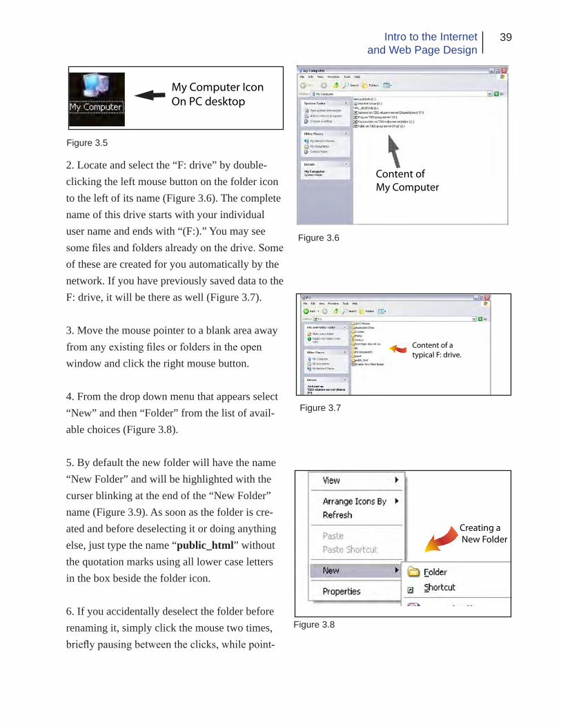
39Intro to the Internetand Web Page Design
My Computer IconOn PC desktop
Figure 3.5
2. Locate and select the “F: drive” by double-clicking the left mouse button on the folder icon to the left of its name (Figure 3.6). The complete name of this drive starts with your individual user name and ends with “(F:).” You may see some files and folders already on the drive. Some of these are created for you automatically by the network. If you have previously saved data to the F: drive, it will be there as well (Figure 3.7).
3. Move the mouse pointer to a blank area away from any existing files or folders in the open window and click the right mouse button.
4. From the drop down menu that appears select “New” and then “Folder” from the list of avail-able choices (Figure 3.8).
5. By default the new folder will have the name “New Folder” and will be highlighted with the curser blinking at the end of the “New Folder” name (Figure 3.9). As soon as the folder is cre-ated and before deselecting it or doing anything else, just type the name “public_html” without the quotation marks using all lower case letters in the box beside the folder icon.
6. If you accidentally deselect the folder before renaming it, simply click the mouse two times, briefly pausing between the clicks, while point-
Content of My Computer
Figure 3.6
Content of a typical F: drive.
Figure 3.7
Creating a New Folder
Figure 3.8

40 Chapter 3Technical Considerations
Figure 3.9
Figure 3.10
ing to the end of the name to re-select it then enter the correct name.
Figure 3.10 illustrates the “public_html” folder on the F: drive ready to use. All your web con-tent must be placed in this folder to make it ac-cessible on the Internet.
URL
The URL (Uniform Resource Locator), such as “http://www.suu.edu/hss/comm/contact.html,” is the complete address for a web site, or more specifically, for an individual HTML document on the specified web server. The URL is broken into various parts. The first part identifies the In-ternet protocol being used, such as the hypertext transfer protocol (HTTP) in the example above. In most cases, you can ignore the protocol if it is HTTP because modern browsers assume that you will be using HTTP unless specified other-wise. The second part of the address, “www.suu.edu” in this case, is the resource name. A domain name such as “suu.edu” or an “IP” address (In-ternet Protocol - consisting of a series of num-
bers that identify the server) such as 127.0.0.1 may be used. The protocol and resource names are generally not case sensitive. Following the resource name you may find additional names such as “/hss/comm/contact.html.” These speci-fy the folders and specific web pages that should be fetched. They are usually case sensitive.
Each class member has a unique URL. Your URL at SUU is as follows:
http://www.student.suu.edu/~username
Username is your individual user name - the one you use to log in to the SUU student network with. The ~ symbol (technically called tilde) is located to the left of the “1” key on your key board. For example, the instructor’s URL would be as follows:
http://www.student.suu.edu/~jacksonl
Your web site is viewable by anyone accessing the web anywhere in the world as long as they know the URL or run across it in a search en-gine.
Web Page Naming
A web page is a text document identified by the “html” (preferred) or “htm” file name extension for example “mypage.html.”
The first page of your web site, sometimes referred to as a home page, should always be named “index.html” (at least at SUU). Regard-

41Intro to the Internetand Web Page Design
less of what you may call it or what title it is given, it should always be saved using the name “index.html.”.Any other pages can be named anything you choose but keep the names as short as possible and do not use spaces or punctua-tion other than the hyphen and underscore. Web servers are often programed to look for files named index.html and load them unless another file name is specified in the URL. If no name is specified and the index.html file is not present, the server will usually return a page not found error. Although some servers will display a ge-neric information page when the specified URL is not found or available. Refer to Figure 3.11 for file naming examples.
Web Site Content
The HTML documents you make are only a part of the complete web page as displayed in a browser window. In reality an HTML document is just a plane text file that contains the mark-up language a browser uses to format the page and place items on the screen (Figure 3.12). In that sense, it is similar to an InDesign document in which fonts and images are not imbedded in the main file but are only linked to it.
Part of the linking process of an HTML file is the finding and displaying of images and media content in the browser window. For this reason, any images or other media you want displayed as part of your web page must be available to the web server. We accomplish this by placing all the images and other media we want on our web page in the same folder or sub-folder on the web
server. At SUU all this web content is placed in your “public_html” folder on the F: drive. This concept will become easier to understand as you work more and more with HTML files.
EXAMPLES OF ACCEPTABLE NAMES
index.htmlcontent.htmlphotos.htmlfamily_vacation.htmlfootball_scores.htmlbaloon_flight.jpgwater_fall.gifwinter-at-cedar-city.pngvacation-movie.avi
EXAMPLES OF UNACCEPTABLE NAMES
photos.family.jpg (too many periods)Girl’s night out.gif (spaces and ‘ mark)scary-movies!.mov (! mark)watch here*.png (space and *)tree.gif.gif (gif name repeated)the old family farm.html (spaces)jim roberts beats isaac hooper in fight.html (too long and spaces)
Figure 3.11
Figure 3.12

42 Chapter 3Technical Considerations
Figure 3.13
Not all image types will display in a web browser’s window. We limit the image types that will work to ones that utilize image com-pression. This enables us to make the files as small as possible without compromising quality which in turn allows for the fastest download speed possible. The main types of images used on web pages are the GIF, JPEG and PNG files. These image types are native to the browser. The characteristics and uses of each file type will be discussed in next chapter. Multi-media files such as video, flash and audio can also be used but usually require the installation of a special soft-ware “plug-in” in order to display these files.
Figure 3.13 shows a typical web folder and its contents. Note the file names and sub-folders.
You may want to create some pages of your web site, especially document pages containing forms in the Adobe PDF format. The advantage to this is that anyone with Adobe Reader can open a document across a broad range of hard-
ware and software, and it will look exactly as intended — with layout, fonts, links, and images intact. If you format the form correctly with the Adobe Acrobat application (not covered in this class), your forms can allow the viewer to fill in the information requested on his computer and then print or save it. A web page will link to a PDF form and browsers will open it. The only requirement is that the computer must have the Adobe Reader application installed. When some-one installs the Reader program, a plug-in is installed into the browser that enables it to open and display PDF files.
This plug-in concept also holds true for multi-media file types. For example in order for a browser to display a Flash animation, it must have the Flash plug-in installed. Quick Time must be installed to display Quick Time media files, etc.
SUU Guidelines
In general, you may want to become familiar with the SUU web guidelines found at http://www.suu.edu/it/webdev/. Although these requirements do not specifically relate to student web content, it is a good idea for you to become acquainted with requirements which, if you are designing for a club, organization or other entity, must be followed.
The following additional guidelines are provided by SUU web Services and apply to web content that officially represents the university. This
43Intro to the Internetand Web Page Design
information may also be helpful to you as you design web content for yourself :
ORGANIZATION:
It makes it a lot easier to work on your web site if you have it organized. One easy way to structure your information is to only put your html files in your main web folder. Then create sub-fold-ers for your images, PDF documents, etc.
STORAGE SPACE:
a. The web server is not a storage space. Everything that is in your web folder is accessible to people through the web. Even if you haven’t linked to it, files can be picked up in search engines and anyone can get to your personal items.
b. No one should have MP3 files or video on the web space, unless they have a specific use for it within their web site and it is not violating copy-right laws.
c. If you have used Photoshop to cre-ate graphics for your site, that’s great! But we don’t want the .psd files on the web server so store them elsewhere.
IMAGES
a. There are only 3 types of images that can be used on web pages - GIF, JPG & PNG. PNG isn’t used that often. Your images will most likely be GIF or JPG. GIF is used for simple line art and JPG is used for color intensive images (such as photographs).
b. The clip art found in Word or
WordPerfect are not web images. If you are desperate for some clip art, there are several web sites that offer free web clip art, just do a search for them. We do not encourage the use of clip art on official university pages.
CONTENT:
a. Web sites need to contain relevant content. You need to evaluate and analyze the content you want and need to provide for your audience. Rewrite materials so they are to the point and contain useful facts and information.
b. When getting ready to build a new web site or rebuild a site, you need to ask yourself some questions:
-- What is your goal in offering this web site?
-- Who are your key users? (or who do you want to be your key users?)
-- What do you want your users to get out of your site?
-- What do your users expect to get from your site?
TEXT NAVIGATION
Somewhere on each page, there should be text-based links to navigate the site. These text links should mirror the links that are on graphics.
USE META TAGS
A. Normally, search indices will use the first few lines of text from a docu-ment as a short description to display in a search result. Since this text is not

44 Chapter 3Technical Considerations
always applicable, use the <META> tag in the HTML code to provide a more ac-curate description of your web site.
B. Meta tags are placed inside the <head> section of the HTML code for the web page.
C. The description cannot contain HTML markup, and should be less than 1024 characters in length. To put a Meta description in a page, insert the following line of HTML in the header
o <META NAME=”description” CONTENT=”Your description here.”>
D. In the same way, extra keywords can be added. These keywords are used next to the ones found in the document. If a keyword is overused (some engines use an upper limit of 7 occurrences) the entire list will be ignored. To put Meta keywords into a page, insert the following line of HTML in the “header” of the document:
o <META NAME=”keywords” CONTENT=”Keyword, keyword, key-word”>
OTHER GUIDELINES:
A. The SUU web servers are not stor-age facilities. They are for web content only. Do not store non-web-related files in your “public_html” folder.
B. Do not “orphan” files on the web servers. If a special page is needed for a one-time event, then unlinked from the other pages but left on the server, it is still pulled up by the search engines. Remove these files completely from the server.
C. Everybody is encouraged to make pages that are accessible for people with disabilities.
D. Spell check and proofread your pages. To spell check in Dreamweaver, under the “Text” menu the last option is “Check Spelling.”
E. When using different fonts, keep in mind that just because a font is installed in the computer on which the page was built, this does not mean that same font is installed on every com-puter. Stick to standard typefaces. Web Services recommends sans-serif fonts such as Arial or Verdana. Those are the easiest to read on a monitor.
F. Frames are discouraged.
G. Do not make pages in which the user has to scroll horizontally. Make ti-tle bar images that would fit in 800x600 resolution.
H. Do not use overly patterned back-grounds. Dark and loud backgrounds lower visibility of a page.
I. Do not place counters on pages
J. Do not use blinking text
K. Avoid the “Click Here” syndrome. (This is an accessibility issue) Phrasing links in this way assumes the user is using a mouse. It is also redundant.
L. A hyperlink should be understand-able on its own. Pages must have de-scriptive text links. Similarly, things like “Information about X is available by following this link” are not permitted. A good way to check a page, read only the link text on the page, with none of
45Intro to the Internetand Web Page Design
the surrounding text. If it doesn’t make sense, change it.
M. No dead-end pages. Every page should have at least one link.
N. Do not put “Under Construction” on a page. If the page isn’t ready to be on the www, then don’t put it on the server. ALL Web pages are permanently under construction.
O. There is to be no advertising on the SUU student web pages (this is very important).
While these guidelines are specifically intended for official SUU web content, following them will help insure that your web site is as effective as it can be. Remember there is to be no advertis-ing or links to advertising on student web pages.
Accessibility
When designing a web site, it is always a good idea to make it accessible to persons with sight or even hearing disabilities. There are some simple things you can do to create a more acces-sible web site. Some of these have already been discussed and are repeated for emphasis. They include;
• Providing alternate text for all images. This is done using the “alt=” attribute of the <img> tag (discussed later).
• When using an image as a link, provide a cap-tion under the picture (or other text) that also is a text link to the same reference.
• Provide text links to complement any image map links on the page.
• Provide a text only version of the web page, or the entire web site, that is accessible from the main page.
• Provide phone numbers a person can call for personal assistance.
• Do not use the blinking text attributes or re-verses – white text on a dark background.
• Avoid using red/green color combinations. These are difficult for color blind people to dis-tinguish.
• Don’t use audio to provide essential informa-tion about the web content or at least also pro-vide an alternative text file for hearing disabled visitors.
Limitations
HTML does not allow for absolute positioning of either text or images. We work around this limi-tation by placing text and images in the cells of invisible tables (tables with no visible borders). HTML has the ability to stack layers on top of one another to try achieving absolute positioning but this does not work well in practical terms. Text can flow differently on different comput-ers and in different browsers so the exact length of a line of text can not be accurately predicted. This makes it difficult to place items in proper position relative to each other. In addition, some

46 Chapter 3Technical Considerations
browsers can get the layers mixed up. Layers can only be safely used for animated images. For these reasons, the use of tables is still the method of choice for placing elements - especially when text is to be associated with an image.
Different programming languages such as Java are used not only to place items but to control content, create special effects, generate reply capabilities, etc. but these languages are beyond the scope of this book.
Possibly the greatest limitation from a design point of view is text. HTML does not handle formatting text very well. Text size, font, color and treatment (bold, italic, underline) can be specified, however, text fonts are not embedded in the document. This means the actual font used must be installed on every computer that views the web page or it will not display correctly. For this reason, text is usually limited to Times New Roman/Palatino and Arial/Helvetica/Tahoma/Verdana since these are generic fonts that are installed on almost every PC and Mac computer. In practical terms, the sans-serif fonts usually display cleaner on a computer monitor that do the serifed fonts. In addition, text size is speci-fied in relationship to other text (or to the default size) and is not specified in points. For these reasons, if you need a special font, text treatment or size, you should create an image of the text in Photoshop using the font, treatment and size you want and then place the image on the web page - possibly with a transparent background rather than trying to insert the text directly onto the web page. The HTML file itself contains
the description of the web page including the tags (commands) that format the page and the text and pictures to be displayed in the browser window. It does not, however, contain the actual images. Images are stored on the web server and are transferred to the viewer’s computer sepa-rately. This means the images must be in your public_html folder or they will not be available to the viewer and a blank box will be displayed instead.
Since you may be using tables, it is important to note that most common browsers, Netscape, Firefox and Internet Explorer for example, handle tables differently. So if you use tables, be sure to test them on different browsers to be sure they are displaying correctly.
Another limitation is the connection speed of the computer. Some people still use a dial-up connection which, at best, allows a 56 Kbs data rate (30 Kbs is probably more realistic). For the designer, this means that you should try to keep the total amount of data required for each page to around 100 KB maximum. Any more than that and people may get tired of waiting for your page to load and will leave your web site.
Files and pictures that are transferred to some-one’s computer over the internet are put in a special folder on the local computer’s hard drive. We sometimes use the term “cache” for these files. Items stored on the local computer’s hard drive can be displayed much faster than new content can be delivered over the web. If the viewer’s computer detects that a photo has been

47Intro to the Internetand Web Page Design
downloaded and stored locally previously, it will load the cached image instead of downloading the image from the web again. Because of this, it is a good idea to use the same images across all your web pages. For example a logo from the first page is cached, then for any other pages that display the same logo, the image is called from the local computer’s hard drive instead of from the Internet. This process speeds up the viewer’s browsing of your web site and allows you to add new graphics to other pages while minimizing download time.
Conclusion
As you contemplate designing web pages at SUU please consider that what you put on your web site is not only available to everyone any-where in the world, but it is a reflection on the university community as a whole. If you post anything to the web site that could put the uni-versity in a bad light, the web site may be delet-ed and you may forfeit your privilege to use it.

48 Chapter 3Technical Considerations
Application
1. Using the information from this chapter, create the “public_html” folder in your personal F: drive on the student network.
2. Continue to plan and design your personal web content applying the concepts in this chapter to refine and edit as necessary.
3. Following the instructions for creating the public_html folder, create sub-folders inside the public_html folder in which to place your images, PDF files and other web content. Name these folders approprately.
Chapter Quiz
1. Visit the SUU Web Services web site at “http://suu.edu/it/webdev/” and closely review the information pertaining to your use of the student web servers.
2. How can you get your web content sent to a re-mote server?
3. To post web content at SUU, what special folder is required and in what location?
4. What is a URL? Discuss the parts.
5. Discuss some naming restrictions for web files.
6. What is an HTML file? What is imbedding?
7. What image types can be associated with a web page? Why?
8. What other types of content can be placed on a web page?

49Intro to the Internetand Web Page Design
References
SUU web policies and guidelines. Retrieved on October 10. 2008, from http://suu.edu/it/webdev/

50 Chapter 3Technical Considerations
Page intentionally left blank

Ch
apte
r 4
Image Editing &Preparation

52 Chapter 4Image Editing and Preparation
Introduction
In this chapter you will learn about images of various types and how to prepare them for use
on web pages. As you work through the chapter, you will need to use the student data files pro-vided on the class CD. The files are located in a folder called “Student Work Files.” These image files may be in various formats. As you follow the directions in this and subsequent chapters, you will learn the skills necessary to create effec-tive and attractive web content.
File Types
There are three main image file types you will use when creating web content. Photos used in web pages have traditionally been in either the “JPEG” or “GIF” format. More recently, the “PNG” format, including PNG-8 and PNG-24, and others have been introduced. These graphic formats compress the image data so the infor-mation can be transferred more quickly. Once on the other end, the browser decompresses the pictures for display on the monitor. The file storage size is a reflection of the actual image dimensions, the resolution, and amount and type of compression.
When you are preparing an image for use on a web page, you should always use a program such as Photoshop to optimize the image for web use. With an image open in Photoshop, you can select the “save for web and devices” option. This is gives you control of the image so you can tailor it for your exact needs. You can also use
the normal “save as” function and select the file type from the various choices but it is strongly recommended that you use the “save for web” function instead. If you use “save as” to save a GIF, PNG or JPEG image you will not have as much control of the image background transpar-ency, resolution, file size, compression, number of colors, animation, etc.
It is also important to remember that most com-puter monitors can only display images at up to about 72-92 pixels per inch so images saved for the web are usually limited to a resolution of 72 ppi. This also greatly reduces the storage size of the image and the time required for the image to move across the Internet. Names for images and photos used on web pages should conform to the same standard as the html pages; do not use punctuation marks except (_) and (-) or spaces in the file names and keep the names short if pos-sible.
The characteristics and uses of each of the three main image types will be discussed next.
JPEG
JPEG (pronounced JAY-peg) stands for Joint Photographic Experts Group, the name of the committee that created the standard. The JPEG standard specifies both how an image is com-pressed into a stream of bytes and decompressed back into an image, and the file format used.
JPEG compression is used in a number of file types. JPEG/Exif is the most common image

53Intro to the Internetand Web Page Design
format used by digital cameras and other pho-tographic image capture devices. Along with JPEG/JFIF, it is the most common format for storing and transmitting photographic images on the web. These format variations are often not distinguished, and are simply called JPEG.
JPEG compression is best used on photographs and paintings of realistic scenes with smooth variations of tone and color (continuous tone). For web usage, where the bandwidth used by an image is important, JPEG is a good photographic image format. But JPEG is not as well suited for line drawings and other textual or iconic graph-ics where the sharp contrasts between adjacent pixels can cause noticeable artifacts.
The compression method used in JPEG im-ages is usually “lossy” which means that some visual quality is lost in the process and cannot be restored. For this reason, it is usually not advisable to work on succeeding generations of a JPEG image where the file is compressed and then decompressed to be worked on. The resul-tant file is then saved (compressed) and opened (decompressed), manipulated in some way and compressed again (only to be decompressed and worked on still more).
There is also a “Progressive JPEG” format, in which data is compressed in multiple passes of progressively higher detail. This is ideal for large images that will be displayed while download-ing over a slow connection, allowing a reason-able preview after receiving only a portion of the data. But, progressive JPEGs are not widely
Figure 4.1 Minimal Compression - 59 K
Figure 4.2 Medium Compression - 38 K
Figure 4.3 Large amount of compression - 4 K

54 Chapter 4Image Editing and Preparation
supported, and even some software which does support them (such as some versions of Internet Explorer) only displays the image once it has been completely downloaded.
The JPEG format has two very distinct advan-tages. The first is that you are able to take a fairly large image, say 2 megabytes, and compress it down to a perhaps 50 kilobytes or smaller. The smaller file saves greatly on storage space and transmission time. The compression ratio can be as high as 20:1 with full color retained. The other advantage is that the JPEG format stores 24 bits/pixel of color information. This means the format will support about 16 million colors.
In practice, we will usually want to compress the image as much as possible without introducing any noticeable or objectionable artifacts such as image distortion and pixilation.
Figures 4.1 through 4.3 illustrate an image with varying amounts of compression along with the resultant file storage size. See if you can see any of the effects of compression on the image in the various versions.
GIF
A “GIF” or Graphics Interchange Format image is a bit-mapped image format that was intro-duced in 1987 by CompuServe and has since come into use on the web because of its wide support and portability. The name is usually pro-nounced “Jif” (like the peanut butter). Figures 4.4 through 4.6 illustrate several GIF images.
Figure 4.4 Examples of GIF images with transparent backgrounds
Figure 4.5 Example of an animated GIF image with the first frame visible
Figure 4.6 Examples of GIF images with solid back-grounds

55Intro to the Internetand Web Page Design
The format supports up to eight bits of color per pixel resulting in 256 distinct colors. The GIF image format is used for illustrations, small pictures, icons, clip art, roll-over effects, animations, and images that need a transparent background. The GIF format uses a different compression scheme than JPEG that is based on adjacent colors. It is lossless as far as informa-tion is concerned.
The GIF format has two very important features; it supports animated graphics, including roll-over effects, and transparency. To make part of an image transparent, one or more colors in the im-age are marked as chroma-key colors during the saving process. When the image is displayed in a browser window, the computer disables these colors and allows whatever is in the background to show through.
During the saving process, a GIF image is usu-ally converted to the “Indexed Color” mode. If you intend to work on a GIF in Photoshop, you will normally have to convert it to RGB before you can do much editing on it.
An image is animated in much the same way animated movies are made. Several different frames, layers or both are displayed in sequence producing the illusion of motion.
The GIF compression process was patented in 1985. Controversy over licensing agreements in-spired the development of the Portable Network Graphics (PNG) standard.
PNG
The PNG format was intended to replace the GIF format and to some extent the TIFF format. The PNG format has three advantages over the GIF format. First it supports alpha channels which can be used as masks to hide or reveal specific parts of an image (variable transparency). Sec-ond it allows gamma correction (cross platform control of image brightness). Third it enables two dimensional interlacing ( a method of pro-gressive display). In addition the PNG format compresses better than the GIF in most cases but the difference is not large enough to justify switching to the format on that basis alone. The format also supports up to 48 bits of color which makes is suited for photographic images.
The PNG format, on the other hand, makes no attempt to support animations so it is not an op-tion for making animated images.
In practice, the PNG format has many of the desirable features of both the JPEG and GIF for-mats but also suffers from some of the weakness of both as well. Because of this, the format is not as widely used on the web as the other two are. Although its use is increasing with time.
Other Image Types
The JPEG, GIF and PNG images are the only types you will be using for web content but there are many other image types. A few of the more common types include the following:

56 Chapter 4Image Editing and Preparation
PSD
The PSD format is the Photoshop native docu-ment format. When you are working on an im-age, you will normally want to save it in the PSD format and then convert a copy of the original to other formats for use on the web or for other applications.
The PSD format allows you the greatest flex-ibility in editing an image and when you save it; all the layers, masks, selections, paths, channels, etc. you create can also saved with the image. This makes subsequent editing easier. Tempo-rary items like the editing history are not saved regardless of the format you use.
The PSD format does not use image compres-sion so the files are usually fairly large but since no compression is used, the image quality is not affected by saving of multiple generations.
TIFF
TIFF or Tagged Image File Format is another format for storing of photograph and line im-ages. The format was originally created by the Aldus company for use in what were then called “Desktop Publishing” applications. Today the format is widely supported by many graphic ap-plications.
TIFF is a flexible, adaptable format for handling images and data within a single file. A TIFF file for example can be a container to a JPEG com-pressed image. The ability to store image data in
a lossless format makes the format useful as an image archive, because, unlike standard JPEG files, the TIFF using lossless compression (or none) may be edited and re-saved without losing image quality; other TIFF options include layers and pages.
The TIFF format is a good choice for saving scanned images.
EPS
EPS files (Encapsulated PostScript) are more-or-less self-contained, reasonably predictable PostScript documents that describe an image or drawing, that can be placed within another Post-Script document.
When the format was first created by Adobe, the only computers using the PostScript printing language were the Apple Mackintoshes. To make the files viewable on Windows systems, Adobe began including a TIFF file encoded into the EPS file. In order to take full advantage of the format, a printer must have PostScript capabilities.
Other file types are also available and are too numerous to discuss here. If you are interested in them, please do some research on your own.
Basic Photographic Touch-up
One of the first skills you will need when you begin to prepare images for web use is photo-graphic touch-up and repair. Abode® Photo-

57Intro to the Internetand Web Page Design
shop® is the computer application of choice for such work. In this book, it is assumed the reader has at least a basic understanding of Photoshop. We will use Photoshop CS 4 Extended but the proceedures will work with any recent version of the appliation if you remember that different versions handle commands differently in some instances.
The following steps are suggested for image cor-rection and repair. Usually you will complete the tasks in the order listed. Otherwise the results of one process could cause unintended changes to other aspects of the image making it necessary for you to redo some of your work. These steps are adapted from the Adobe Photoshop CS3 Classroom in a book.
1. Duplicate the original image. (Always work on a copy so you can recover the original later if necessary.)
2. Check the image quality and make sure the resolution is appropriate for the way you will use the image. A standard rule of thumb is to set the image resolution to 1.5 - 2.0 times the resolution of the output device you will be using. For web images this is usually 72 ppi.
3. Crop the image to its final size and orientation.
4. Repair flaws in scans of damaged photographs including rips, dust and stains.
5. Clean up the image and remove unwanted items using the clone stamp, healing brush and associated tools.
6. Use the Levels menu and associated Histo-gram to check for appropriate levels.
7. Adjust the overall contrast or tonal range of the image.
8. Remove any color casts using the “hue and saturation” and associated menus.
9. Adjust the color and tone in specific parts of the image to bring out highlights, shadows, mid-tones and desaturated colors. Use the dodge, burn, sponge and associated tools as necessary.
10. Sharpen the overall focus of the image using the unsharp filter.
You will gain practice in photo touch-up us-ing some practice files provided on the Student Work Files folder on the class CD, G: drive or the class web page. Please remember that all the images in the Student Work Files are protected by copyright. You should not use them for any purpose outside class assignments.
The following steps will guide you through the touch-up process:
1. Locate and launch the Adobe Photoshop appli-cation (in the future, it will be assumed that you have already opened the application unless stated otherwise).
2. At the top of the open Photoshop window, select File and then Open. (CTRL/CMD + O is the keyboard shortcut).

58 Chapter 4Image Editing and Preparation
3. Navigate to the location of the Student Work Files. Open the Chapt 4 folder. Find the Clair_after.jpg file and open it (figure 4.7). This file shows you what your work should look like when you have finished the touch-up. Now without closing the image, open Clair_before.jpg (Figure 4.8).
4. From the Control menu at the top of the screen, select Arrange Documents>2-UP (Fig-ure 4.9). This displays the before and after pho-tos side-by-side so you can look at and compare them with each other. Look for things that need to be corrected. For example the red in the eyes, the bald head in the foreground, the photogra-pher in the back ground, etc.
5. Now that you have some idea of what the image will look like after it is adjusted, you can close the Clair-after.jpg image.
6. Rather than working on the original image, you will work on a copy. In this way, if you make a major mistake, you can always go back to the unaltered original and start over.
Make sure the Clair_before image is selected then from the Image menu choose Duplicate. You may have to click the Show All Menu Items bar at the bottom of the menu to see the Duplicate menu. The Duplicate Image dialog box opens. Name the image something different than the original, then click OK (you can use the default “copy” name if you choose). The com-puter creates a copy of the original image.
Figure 4.7 after
Figure 4.8 before
Figure 4.9

59Intro to the Internetand Web Page Design
Now you can select the original image and close it without saving. It will be available to be used again if you should need to start over.
7. The copy needs to be saved before you go on. Regularly saving will insure that you don’t lose anything should a power failure or other mishap occur.
Save the copy on your flash drive. You already gave it a new name in the previous step so it only needs to be saved. In the Save As menu, make sure you are saving to your flash drive. Check that the name is as you want it and that the file type is set to “JPG.”
When you click Save, a JPEG Options box appears (Figure 4.10). Here you can adjust the image quality and decide if you want the image to be progressive or not (the section on JPEG images in this chapter discusses image quality). Later on, we will learn a different way to save images that gives us much greater control over the file size and image quality. Remember that the JPEG format introduces some loss into the image. To prevent that, you may want to save as a PSD image instead of the JPEG.
8. Now that the image is saved, we need to decided what resolution and pixel dimensions we need for the final image. We do this using the Image Size menu. Click Image>Image Size or Ctrl/Command + Alt/Option + I (Figure 4.11).
In the resolution field, you can see the resolution is already at 72 ppi. so that does not need to be
Figure 4.10
Figure 4.11
Hint: When preparing an image for a web page, it is advisable to choose a size that will allow the image to be displayed at as close to 100% scaling as possible. In practice plus or minus 10% is usually acceptable but if you try to make it larger than about 110% on the web page, the image will start to pixelate.

60 Chapter 4Image Editing and Preparation
changed. In the pixel dimensions area, you can see that the image size is 400 x 300 pixels. If we were to place this image at 100% scaling on a web page that is 800 x 600 pixels, the image would occupy one fourth of the entire page.
We also see that the size of the image is about 352K. This is the uncompressed size. With JPEG compression, the size may be much smaller depending on the quality selected in the saving operation
Enter 300 in the Pixel Width field and observe the changes in the Height, Image Size and Document Size fields.
Once you have seen the effects of the changes, click OK. The image is resized.
9. Now we need to crop the image to its finished size and proportions. The Crop tool (Figure 4.12) is located in the Tool Pallet. You can select it by clicking it with the mouse or by pressing the letter “C” on the keyboard (unless you have the type tool selected).
Using the crop tool draw a rectangle from the upper right to the lower left (Figure 4.13) of the image. Once you have released the mouse button, you can resize or move the crop area as needed.
When you are ready to finish the crop, press the Enter/Return key. If you decide not to crop after all, press the Esc key. If you make a mistake, you can select Edit>Undo or Ctrl/Command + Z.
Hint: You can also use Photo-shop to increase the size and resolution of an image. When you increase the image size or resolution, Photoshop uses a process called interpolation to fill in the missing informa-tion. The image quality will not be as good as if you have used a larger image with higher resolution to start with but in some cases you may not have that choice.
Figure 4.12 Crop Tool
Figure 4.13
Hint: There are other crop options as you can see from the Control Pallet at the top of the Photoshop window. You can set crop dimensions, resolution, etc. Be sure to clear the fields after you finish the crop.

61Intro to the Internetand Web Page Design
10. You can see that cropping has not only re-duced the file size but has also removed some of the undesirable elements from the photo (Figure 4.14).
Now we need to remove the “Red Eye” effect and fix any other flaws in our photo including the bald head and what is left of the photogra-pher in the background.
Lets start with “Red Eye” removal. First you need to zoom in on the image so you can clearly see the red in the eyes. Use either the Zoom tool or the Navigator Pallet to do this.
Red eye results from the light of a camera flash entering the eye and reflecting off the retina. The Red Eye reduction tool is in the same tool group as the Spot Healing brush. Find a tool that looks like a band-aid, point to it and hold down the mouse button until the hidden tools appear. Choose the Red Eye tool from the group. Now position the tool over the red part of one of the eyes and click the mouse button. In this case, you will probably see the eye and part of the face become notably darker. The Red Eye tool darkens the selected color and any other closely related colors. For this reason, the Red Eye re-duction tool works better on a higher resolution image.
Since the Red Eye tool did not work well in this case, you will need to undo the tool’s effects and perform the Red Eye reduction manually. Double click on the Foreground Color in the tool pallet. This activates the color picker. Place
Figure 4.14 Cropped Image
Figure 4.15

62 Chapter 4Image Editing and Preparation
a check mark in the “Only Web Colors” box and move the color range slider to the “blues” range (Figure 4.15). Now pick one of the medium gray-blue colors and click OK. Select the Paint Brush tool and set the brush diameter to one pix-el. Now with the image still zoomed in, use the paint brush to carefully change the color of a few of the red pixels in the eye to the medium gray-blue. Zoom out occasionally to be sure what you have done looks natural. If not, undo what you have done and try again with a darker or lighter color until you are satisfied with the result.
Next we need to cover the bald head. You will do this with the “Clone Stamp” tool from the tool pallet. The Clone Stamp tool resembles a rubber stamp.
The Clone Stamp tool allows you to copy parts of an image from one place to another. With the tool selected, set the brush diameter to a 17 pixel soft-edged brush (use the tool options menu or simply click the right mouse button in the image area). Leave the other options at their default settings.
Now you need to set a point of origin (Figure 4.16) - the place in the image you will be copy-ing. Position the tool on the right sleeve of the gown above the bald head. Now hold down the Alt/Option key and click the mouse button once.
Move the tool to the bald head, hold down the mouse button and begin drawing. You will notice a plus sign on the blue sleeve indicating the area that is being copied and see the color and texture
Figure 4.16
Figure 4.17

63Intro to the Internetand Web Page Design
from that area being applied to the image in the current location of the tool. Continue working the tool. You may need to reset the origin point and brush diameter several times to get the seats and sleeve texture just right. If you make a mis-take, just undo and repeat the action until you are satisfied with the result (Figure 4.17).
Now all that remains is to remove the photogra-pher on the other side of the picture. You can do that using the Clone Stamp tool as we just did or try the suggestion in the side bar to the right.
If there are small imperfections in the image you wish to correct, the Spot Healing brush works well. Just click the tool over the item you want corrected and the tool does the rest. This works wonders on small dust particles, and scratches as well as skin blemishes, etc.
11. Now that we have corrected the flaws in the image, we need to check the levels to see if the range of light to dark is correct. First flatten the image using the Layers menu.
The Histogram pallet can tell us if we need to make changes to the levels. The histogram shows us the amount of light and dark areas and color distribution in the image (Figure 4.18).
Looking at the histogram, we can see that the image has a lot of dark areas and not so many white. To even the image out a little, we use the Levels menu. The Levels menu is found by selecting Image>Adjustments>Levels or Ctrl/Command + L. From the Levels Pallet (Figure
An alternative to removing the photographer is to convert the background layer to a normal layer by renaming it then duplicating the layer by dragging it to the new Layer Icon in the Layer Pallet. Doing this will make a second layer that is identical to the first. Now hide the bottom layer and select the top layer. Then using the Eraser tool with a soft edge, carefully erase the photographer from the top layer. Now un-hide and select the bottom layer. Use the move tool to reposi-tion the bottom layer so the chairs show through the place you erased on the top layer. You simply need to align the chairs so they fit into the top layer correctly. When you are satisfied, you can flatten the image again from the Layers menu.
Figure 4.18
Figure 4.19

64 Chapter 4Image Editing and Preparation
4.20), you can now adjust the levels manually or automatically.
Try clicking the Auto button to have the com-puter make the adjustments for you. Notice the changes in the Histogram and the image itself. Now hold down the Alt/Option key. The Cancel button becomes a Reset button. Click the Reset button to undo the effect of the Auto Level cor-rection while leaving the menu open.
Beneath the histogram in the Levels Pallet, you see black, gray and white pointers. These allow you to manually change the levels. Point to the white pointer on the right and drag it toward the left. Notice the changes in the light levels of the photo. Choose a level that looks good to you and then do the same with the black and gray(mid tones) sliders. When you are satisfied, click OK.
Normally, the Auto Levels are sufficient es-pecially while you are learning. You can use these same techniques to correct the Contrast, Color and Color Balance of your photos. These Image>Adjustment menus give you great control over the final look of the image. Although the Clair image color looks OK the way it is, experi-ment with the Color, Contrast and other menus until you have a basic understanding of how they work.
Now suppose that you have a particular area of the image that you need to correct? Simply make a selection around that area and use the Adjust-ment menus as necessary to correct that part of the image. Using the Hue/Saturation Menu on a
Figure 4.20
Figure 4.21

65Intro to the Internetand Web Page Design
selection of an apple, for example, would allow you to change its color from green to red while maintaining the texture of the original.
12. With the corrections to our image complete, we now need to apply a sharpening filter. Many times when we scan a photograph, the scanner introduces a softening effect to the image. Heavy editing can also cause a blurring.
Because of this, the final step in our touch-up is to apply a sharpening filter that will help to cor-rect the effects of blurring in the image.
If you have anything selected, deselect it either by choosing Select>Deselect or pressing the Ctrl/Command + D keys.
Now from the Filters menu, select Sharpen>Unsharp Mask (Figure 4.21). You should immediately see the image sharpen. You can accept the defaults of the filter or use the sliders to change the way the filter works. If you sharpen too much, the image will become pixilated and unnatural looking. When you are satisfied, click OK.
13. With all the editing finished, it is time to save the image. First, save the file to your flash drive in the normal way. This gives you a copy in high resolution so you can re-open it and continue to work on or make changes to it as necessary.
Now we are going to save it for use on the web. To do this, we are going to use the “Save for Web & Devices” option found in the File menu.
Click on File>Save for Web & Devices. The resulting pallet is shown in Figure 4.22.
Along the top edge you will see four tabs: Origi-nal, Optimized, 2-up and 4-up. Click the 4-Up tab. This will cause the computer to display four versions of the image. In upper left, you will see the original image. The other three give you places to experiment with different optimiza-tions. The selected image window is surrounded by a border indicating the currently selected ver-sion (Figure 4.23).
Since this is a photograph, we will want to save it using the JPEG or alternately the PNG format. Look at the options on the right side. You will see a Preset: option. Make sure it is set to JPEG High. Now click on the upper right copy of the image to select it.
In the dialog box right below the Preset: make sure that JPEG is shown. If not change it. Now in the box below the previous box, select High if it is not already selected. This indicates a high quality or minimally compressed image.
Click on the lower left image. Change the image specifications to JPEG and Medium.
Repeat the process with the lower right image. This time selecting the Low quality option. Now compare each of the three optimized images with the original in the upper left. See if you can de-tect any noticeable or objectionable degradation in the image quality. Use the zoom tool found along the upper left edge of the window to help

66 Chapter 4Image Editing and Preparation
Figure 4.22
Figure 4.23

67Intro to the Internetand Web Page Design
you see the image quality better. Each time you click the zoom tool on the original image, the copies also zoom in (Figure 4.23).
In this case, you may not see much difference between the high and medium quality versions but there is noticeable distortion in the Low quality version.
You will also notice that beneath each image there is a box that gives you information about that version of the image. The storage size of the original is about 352K, the high quality is about 28K, the medium about 13K and the low about 9K. You will also see the approximate download time at 28Kbps.
For this image, we decide to use the medium quality because there is not that much noticeable difference between it and the high quality ver-sion but the file storage size is about half.
Just for the fun of it, you decide to see the effect of GIF compression on the image. Select the lower right photo then change the compression (under the Preset) to GIF and observe the result. The image quality changes as it is converted from 16 million to 256 colors. The file size also increases so there is no benefit to using the GIF format.
Using your mouse, click on the medium qual-ity image ( lower left) to select it. Make sure the Preset is still set to JPEG and Medium. Then click on the Save button. The Save Optimized As menu (Figure 4.24) opens.
Figure 4.24

68 Chapter 4Image Editing and Preparation
You use this menu in a similar manner as you use other save dialog boxes. First choose the Save In location. For web images, this will be your “public_html” folder on the network F: drive. Next, make sure you are using the cor-rect name for your image. Remember to not use spaces or punctuation in the name. Finally, in the Save as Type box, make sure that “Images Only (*.jpg)” is showing. Then click the Save button. The image is saved to the network drive and is now ready to place on a web page.
Conclusion
In this chapter you have learned about various image types and how to use the Photoshop pro-gram to touch up and optimize photographs for use on a web page.
You have also learned about the proper processes and the order in which to apply the various pro-cesses to most effectively touch-up and enhance images.
In future chapters you will learn to make back-ground images and textures, buttons, icons and animations and to use Photoshop to prepare web content including picture packages and web photo galleries as well as actual web pages.
Chapter QUIZ
1. What is meant by image optimization?
2. What are the three main image types used on web pages?
List the characteristics of each:
a.
b.
c.
3. Be familiar with the steps of basic image touch-up. Why should they be completed in order?
4. Begin selecting and preparing images for your own web content.

69Intro to the Internetand Web Page Design
Application
1. Find your own photograph that needs some touch-up and editing. If necessary, scan it then use the tools of Photoshop to make the necessary corrections and repairs.
2. Practice saving images for the web including the use of optimization, various file formats and treatments.
3. When you visit web sites, explore the images to see what format they are saved in and analyze why the designer chose the format that was used.
4. Select photographs you are going to use on your web pages. Prepare them correctly for use on the web. Save them until you need them for your web page design projects.

70 Chapter 4Image Editing and Preparation
ReferencesA basic introduction to PNG features. Retrieved on October 28, 2008, from http://libpng.org/pub/ png/pngintro.html.
Abode Photoshop CS3: Classroom in a book. Adobe Press 2007.
File type definitions courtesy Wikipedia.org. Retrieved on October, 30, 2008 from wikipedia.org.

71Intro to the Internetand Web Page Design
Ch
apte
r 5
Backgrounds, Textures & Buttons

72 Chapter 5Backgrounds, Textures & Buttons
Introduction
The use of background images and tex-tures on web pages in current practice is
not as common or popular as it once was. Al-though HTML and most browsers do support background images, current practice is to use a cleaner design with either a white or black background. Occasionally other colors are also used. The intent is to not overpower the design or the viewer with a background that is too busy or distracting. Backgrounds are also sometimes applied to table cells.
As previously mentioned, using a dark back-ground with light lettering is difficult for people in general to read so the use of these “reverses” should be limited to special circumstances. Ad-ditionally the text should be larger than normal to facilitate easier reading.
Icons, buttons and similar devices are commonly used on web pages to assist with navigation or provide emphasis. These are often saved in the GIF format.
In this chapter you will learn how to use Photo-shop to create backgrounds and textures as well as buttons and other small images.
Backgrounds & Textures
Backgrounds and textures are usually fairly small images. 150 to 200 pixels square is fairly
common. When these images are placed on a web page, the browser repeats the image over and over until the background is filled. The num-ber of times the image is repeated depends on the resolution of the monitor screen displaying the web page.
On a static web page, it is fairly difficult to have the background filled with only one copy of an image because the image is a fixed size while resolution of the monitor on which the page is displayed will vary from computer to computer. So on one screen, the image will display fine while on another with lower resolution, you may see only part of the image and on another with higher resolution, the image will repeat as neces-sary to fill the screen. Figures 5.1 and 5.2 show the same background image as displayed on monitors of two different resolutions.
Since you learned about photo editing including the re-sizing of images in the last chapter, in this section we will concentrate on creating back-ground textures.
Bricks
1. Start the Adobe Photoshop CS4 program on your computer. If you are working in the student lab, select the “ignore color profile” option if so prompted.
2. Create new image. From the File menu, select New or press Ctrl/Command + N on the key-board. In the new image dialog box, specify 200 pixels for both the height and width, 72 ppi

73Intro to the Internetand Web Page Design
Figure 5.1 High resolution monitor
Figure 5.2 Low resolution monitor
for the resolution, RGB for the color mode and White for the background. Specify a name if you wish and click OK.
3. Save the image as a PSD file on your flash drive before you proceed. You will want to save regularly so you don’t lose your work should something happen to your computer.
We will be making two different textures with this basic shape. The first will resemble brick while the second is more complex and will re-semble woven fabric.
4. First we will choose a color and fill the back-ground with it. On the tool pallet, double click the “Set foreground color” tool. The Color Picker appears (Figure 5.3).
Check the Only Web Colors box. This allows you to choose only colors that browsers will understand and display correctly. As you slide the pointer along the vertical color range bar, you will be able to select various ranges of color and can then click on the specific color you wish to use. You may also enter your color in the dialog box next to the “#” sign. The numbers and letters in this box represent the various amounts of red, green and blue color being mixed to create the color you want to use expressed in the hexadeci-mal code that browsers understand.
For this image, we chose to enter “cc9966” in the # dialog box. This produces a nice brown color just right for our bricks. After you have selected the color you want, click OK.
Figure 5.3

74 Chapter 5Backgrounds, Textures & Buttons
5. Now you need to apply the color you have chosen to your image background. You can do this in several different ways. First, you can go to the Edit menu, choose Fill then in the Use dialog box choose Foreground Color. Another and faster was is to hold down the ALT/Option key and press Backspace or Delete. You could also use the paintbrush and paint the area with the color.
6. Now that the background is colored, we are ready to apply the texture. Select Filter>Filter Gallery (Figure 5.4).
The Filter Gallery allows us to apply a variety of predefined filters to our image. As the pallet opens, you will see a menu. Near the right side of the screen. The last item in the list is Texture.
Click on the arrow next to the work Texture then select the Texturizer.
On the far right side, below the cancel button you see the Texturizer is selected. In the Tex-ture: box, change the type to Brick if it is not already showing.
Using the sliders, you can adjust the effect to your own preference. We chose 100% scaling and 5 for the Relief with Light from the Top. Once you are satisfied, select OK and the filter is applied to your image.
7. The texture is now finished and you can save it for use on a web page. Select File>Save For Web & Devices. After looking at the image
Figure 5.4
types, we decide that saving as a low quality JPEG will serve our purposes. Since this in-tended as a background, it does not need to be extremely high quality. The low quality JPEG image file will be about 4.5K which is great for our purposes.
Save the image to your “public_html” folder. Remember to save the original as a PSD to your flash drive in case you want to change it later.
Cloth
A cloth texture can be created with the Textur-izer filter as well but we want to do things a little differently to achieve a believable woven fabric look. From the Student Work Files open Tex-tured Cloth.psd. This is what your finished cloth will look like. Now close the file.
1. Create a new Grayscale document 200 x 200 pixels square at 72 ppi with a white background.
2. Choose Filter>Render>Difference Clouds. This will make the basic tones for a displacement

75Intro to the Internetand Web Page Design
map that we will use to give the cloth the uneven look we expect from hand-woven cloth.
3. Save the file to your flash drive using the name map.psd.
4. Select the entire image and press the Back-space or Delete key - first making sure that the background color is set to white. Then deselect.
5. Now choose Filter>Noise>Add Noise. The add noise filter opens (Figure 5.5).
Set the Amount to some high number (we used 200) and select Gaussian in the Distribution area. Click OK.
6. Rename the layer “Horizontal” by selecting Layer>New>Layer from Background and giving it the correct name or double click on the layer and type “Horizontal” in the New Layer Name box.
7. Duplicate the layer by dragging it to the New Layer icon in the Layer Pallet (Figure 5.6). The new layer will be named, Horizontal Copy. Double click on the Horizontal Copy layer’s name and change it to “Vertical.”
8. Hide the Horizontal layer and select the verti-cal. Then choose Filter>Blur>Motion Blur.
In the Motion Blur Pallet, change the angle to 90 and the Distance to about 30 (Figure 5.7). Click OK.
Figure 5.5
Figure 5.6
New Layer icon

76 Chapter 5Backgrounds, Textures & Buttons
Figure 5.7
9. Select and show the Horizontal layer. Hide the Vertical layer.
Apply the motion blur filter to the Horizontal layer. Change the angle to 0 degrees and leave the distance at 30. Click OK.
10. You are now ready to see the result of all your work. Make sure both layers are visible. Select which ever layer is on top.
At the top of the layers pallet, you will see the word “Normal” in a dialog box (Figure 5.6). This box allows you to change the Blending Mode of the layer. Changing the blending mode of a layer effects the way the selected layer inter-acts with the layer immediately below it.
Change the blending mode of the top layer to “Multiply.” The result should look like woven cloth. Now is a good time to save the file. Be sure to change the name so you don’t save over the “map” image saved earlier.
11. Flatten the image using either the layer menu or Layer Pallet. Then convert it to RGB. To change to RGB choose Image>Mode>RGB color.
12. Now we are going to add some color to make it look a little more realistic. Choose Image>Adjustments>Hue/Saturation (Figure 5.8). Locate the check box labeled Colorize and check it. We used a Hue of 42, Saturation of 26 and Lightness of +15 but feel free to experiment and choose the settings you like. Click OK.
Figure 5.8

77Intro to the Internetand Web Page Design
13. Next we are going to use the map image we created earlier to displace the pixels and give them a more random and hand-made look. Choose Filters>Distort>Displace. In the re-sulting dialog box make sure Stretch to fit and Repeat Edge Pixels are selected then click OK.
You are prompted to choose a displacement map. Navigate to the location you saved the map.psd image and choose it, then click Open. The map is applied to the image. The result should be some-thing similar to Figure 5.9.
In practice, as previously stated, background images are usually either not used or are trans-parent enough so as to not obscure the content of the web page. It is more common to use colored or image backgrounds in a table to emphasize or make it stand out from the rest of the page
14. Save your finished image in the Save for Web & Devices menu. Also save it as a PDS image to your flash drive. We will use it again in the next section.
Bars, Buttons, Etc. In the design of a web page, having navigation bars, buttons and icons is fairly common. These graphic items are usually small and are often saved as GIF images. In this section, we will make a few of these basic forms.
Navigation Bars
We will start with a simple Navigation bar.
Figure 5.9
Figure 5.10
Figure 5.11

78 Chapter 5Backgrounds, Textures & Buttons
From the student work files Chapter 5 open Nav bar.psd. This is what your finished ball will look like. Clove the file.
1. In Photoshop, open the cloth PSD image we made in the last section. This will be the basis of your bar.
2. Select the crop tool from the tool pallet. In the control menu at the top of the screen, set the tool options as follows (Figure 5.10): Width - 100 px, Height - 20 px leave the resolution field blank.
Now drag the crop tool on the image to select the area you will retain in the cropping process (Figure 5.11). The crop area is constrained to the dimensions you specified in the tool options. Complete the crop by pressing the Enter/Return key. Now clear the crop options so the tool will be ready to use for another function by clicking the Clear button.
3. Next we will give the bar a 3D look by apply-ing a layer effect. Since the layer is a background layer, we must first rename it to make it a normal layer. Background layers will not allow us to ap-ply layer effects to them.
In the Layer pallet, double click on the back-ground layer. The New layer menu appears. Name the layer “Bar” and click OK (Figure 5.12).
At the bottom of the layer pallet, you see the effects icon (fx). Click on the icon. From the drop-down menu, select Bevel and Emboss. The Layer Style menu appears (Figure 5.13).
Figure 5.13
Figure 5.12Effects Icon

79Intro to the Internetand Web Page Design
In the Structure box, change the Style to Emboss. Leave the other options as they are and click OK. You can add multiple styles to a layer by check-ing the boxes in the style area of the menu.
Embossing gives the bar a raised look and will make a nice effect for the navigation area on our web page.
4. Now we will add text layers containing the names we want associated with each bar.
Select black as the foreground color by pressing the “D” key or by double clicking the foreground color to open the color picker and choosing black from the menu.
Select the Horizontal Type tool from the tool pallet. Choose Verdana or Tahoma as the font, regular as the treatment and 12 points as the size.
Click on the left side of the Bar and type the word “Home” (Figure 5.14). Adjust the size and position to achieve a look you like.
Hide the “Home” layer and add additional type layers containing the text “Contact,” “About Me” and “Photos” in the same way. You should have four text layers.
5 Now save the image as “bars.psd” to your flash drive. You will be able to open it and make changes to the image later if necessary.
Hide all the type layers except the “Home” layer and the “Bar” layer. Select File>Save for Web
Figure 5.14
Figure 5.15

80 Chapter 5Backgrounds, Textures & Buttons
and Devices. Click on one of the Optimized views and change the image type to GIF (Figure 5.15). Experiment with the Lossy and Color settings to reduce the image size as much as possible without sacrificing image quality. We set Lossy to about 15 and number of Colors to about 8 which results in an image size of about 1.5K. When you are satisfied, click OK.
In the Save Optimized As menu, navigate to the “public_html” folder on your F: drive or other appropriate location and name your file “Home_Bar.gif.” Make sure the “Save as Type box” indicates “Images Only”
6. Now that you have saved the Home_Bar, repeat the process revealing the other type layers one at a time. Give them the names “About_Me_Bar,” Contact_Bar” and “Photos_Bar.” as appro-priate (Figure 5.16).
You should now have four navigation bars saved and ready to use on your web pages. Once placed on a web page, each image will be assigned its own hyper link which will allow the viewer to navigate the web site.
Buttons
A button although usually round or square can have any shape you want it to. These objects are fairly simple to create in Photoshop. For our example we will create a round button. Open button.psd from the student work files Chapter 5 folder to see an example of a completed button.
Figure 5.16
1. In the open Photoshop application, create a new image with the height and width both set at 50 pixels and resolution at 72 ppi.
2. Rename the background layer by double click-ing on it, accept the default name and click OK. Choose Select>Select All or press Ctrl/Com-mand + A and select Backspace or Delete to remove the background color.
3. From the Tool Pallet, choose the Elliptical Marquee tool (hidden under the Rectangular marquee).
Holding down the shift key to constrain the se-lection to a circle, make a selection that fills the image area (Figure 5.17).
4. Now we need to fill the circle with color. Choose Edit>Fill or Ctrl/Command +F5.
Figure 5.17

81Intro to the Internetand Web Page Design
In the Fill menu’s Use dialog box, choose Color. The Choose a Color pallet appears. Select a web safe color that appeals to you and click OK. Back in the Fill pallet, click OK as well.
If you would like, you can repeat this process with the Stroke. Choose Edit>Stroke, select a width and color then click OK. We used black with a width of two pixels (Figure 5.18).
5. We are going to make two versions of the but-ton so we need to duplicate the layer. In the Lay-ers Pallet, drag the layer to the new layer icon to duplicate it. Then rename one layer “Button Up” and the other “Button Down” (Figure 5.19).
6. In the Layers Pallet, Select the Button Up layer and hide the Button Down layer. Now click the Layer Effects icon (fx) and choose Bevel and Emboss from the options.
Change the Structure to Emboss and the Depth to 300% to make the 3D effect more pronounced. Change the Size and Softening to 15. This gives the button a nice rounded look. Feel free to ex-periment with the other settings. As a caution, do not add Drop Shadow, it could cause problems on the web page depending on how the button is used. When you are satisfied, Click OK. The result should look something like Figure 5.20.
7. In the Layers Pallet, hide the Button Up layer. Select and show the Button Down layer. Now click the Layer Effects Icon again and choose Bevel and Emboss. In the Structure area of the menu, change the Direction to Down. Leave the
Figure 5.18
Figure 5.19
Figure 5.20

82 Chapter 5Backgrounds, Textures & Buttons
other settings as they are. Click OK.
8. You now have two versions of the but-ton. Save the file to your flash drive as a PSD image to preserve the layers. Now select one layer and hide the other. Select File>Save for Web and Devices.
Select one of the Optimized views. In the Preset box, change the image type to GIF Figure 5.21). Make sure the Transparency box is checked. Experiment with reducing the number of colors until you start loosing image quality (our exam-ple was about 32).
Take the Eyedropper tool (from the left side of the pal-let), hold down the Shift key and click around the areas of the button you want to be transparent.
Beneath the Color Table locate the Maps Selected Colors to Transparent icon (looks like a small checker board) and click it one time (Figure 5.22).
Slick the Save button. Save the image to your F:\public_html folder or flash drive and name it button up or button down depending on which version you are working on.
Return to the image, hide the layer you just saved for Web and Devices and show the other.
Figure 5.21
Figure 5.22

83Intro to the Internetand Web Page Design
Now repeat the Save for Web and Devices opera-tions using the second layer. Name this button appropriately.
You should now have two versions of the but-ton ready to place on a web page. We made two versions of the button so you could use them in a roll-over effect if desired. Roll-over effects change an area of a web page when a mouse pointer is rolled over or clicked on it.
Icons
As discussed in chapter two, the term “icon” is used generically to mean an icon, symbol or index. These are usually small images used to convey information or facilitate web page navi-gation. Such images may be used as links to the home page, top of the page, bottom of the page, etc. Or they may just be used for decoration or to convey a mood or feeling.
Regardless of the use, the images are usually small (50-100 pixels) and may contain simple text and/or small illustrations. They can be cre-ated in either Adobe Illustrator or Photoshop. In reality, icons are just fancy buttons. The process of saving these images is the same as for the other images we have learned in this chapter.
The process of designing an icon will not be covered since they are similar to the bars and buttons already discussed.
Conclusion
In this chapter you have learned about the cre-ation and use of background images and textures as well as buttons and bars that can be used on a web page to improve the overall look and func-tionality of the web page.
There are many companies that sale these images commercially in collections and individually. There are also web sites that allow you to down load and use images free of charge. If you use images from the web, be sure you are not violat-ing copyright laws and that the images are free for your use.
In many cases, creating your own images is a better alternative, since you have more control over the final look of the images and don’t have to worry about copyright violations.

84 Chapter 5Backgrounds, Textures & Buttons
Application
By now you should have a good idea of the types of buttons, bars and icons you are going to need for your web site.
Use the tools of Adobe Photoshop and Illustra-tor to create the buttons, bars and icons you need for use on your web site. Save copies of each in the PSD format for future use or manipulation. Save the finished images using the Save for Web and Devices menu. Place the prepared images in your approprate web content folder (F:\pub-lic_html).
Chapter Quiz
1. Why are dark or overly patterned background images on a web page problematic or undesir-able? Where might they be used successfully?
2. Identify the texture effects available in the Photoshop Texturizer filters.
3. Discuss the differences between the Save As and Save for Web and Devices functions of Photoshop. Under what circumstances would you use each?
4. What is the difference between a button and an icon?
5. Why might we save more than one version of a button or icon?

85Intro to the Internetand Web Page Design
References
Poyssick, G. (2005). Essentials for design: Adobe Photoshop CS2 Level 1. Upper Saddle River, NJ: Prentice Hall.

86 Chapter 5Backgrounds, Textures & Buttons
Page intentionally left blank

Ch
apte
r 6
Animation with Photoshop
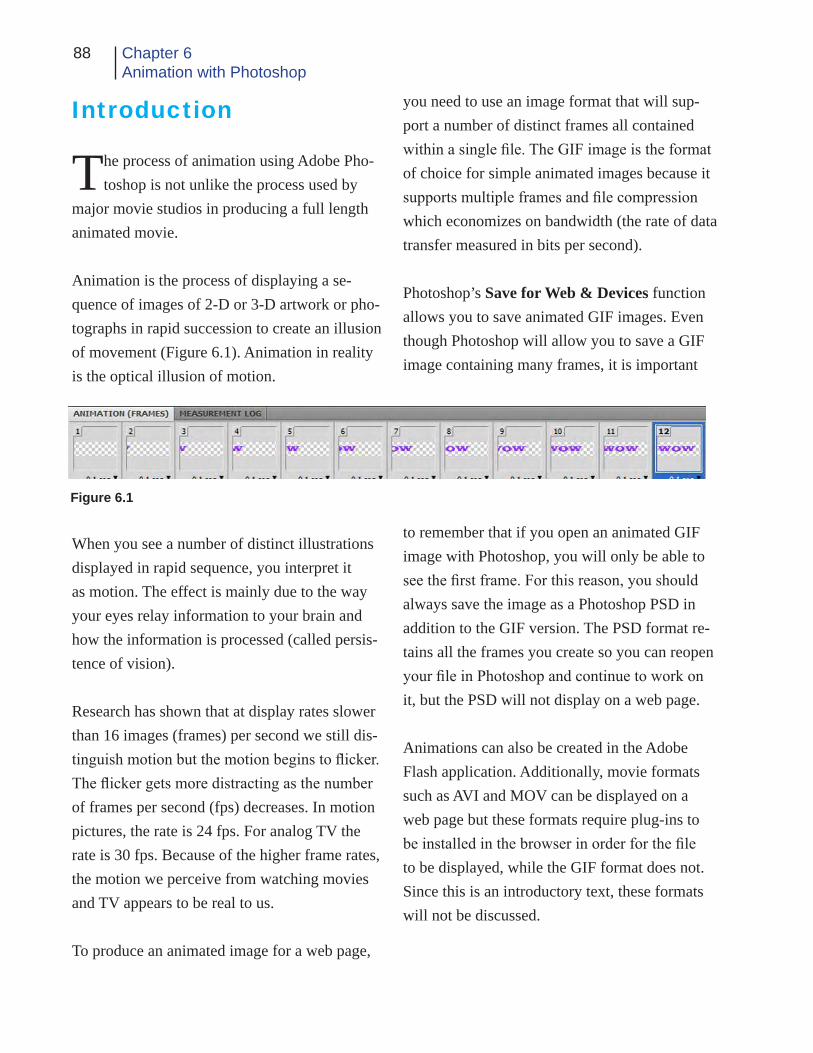
88 Chapter 6Animation with Photoshop
Introduction
The process of animation using Adobe Pho-toshop is not unlike the process used by
major movie studios in producing a full length animated movie.
Animation is the process of displaying a se-quence of images of 2-D or 3-D artwork or pho-tographs in rapid succession to create an illusion of movement (Figure 6.1). Animation in reality is the optical illusion of motion.
When you see a number of distinct illustrations displayed in rapid sequence, you interpret it as motion. The effect is mainly due to the way your eyes relay information to your brain and how the information is processed (called persis-tence of vision).
Research has shown that at display rates slower than 16 images (frames) per second we still dis-tinguish motion but the motion begins to flicker. The flicker gets more distracting as the number of frames per second (fps) decreases. In motion pictures, the rate is 24 fps. For analog TV the rate is 30 fps. Because of the higher frame rates, the motion we perceive from watching movies and TV appears to be real to us.
To produce an animated image for a web page,
you need to use an image format that will sup-port a number of distinct frames all contained within a single file. The GIF image is the format of choice for simple animated images because it supports multiple frames and file compression which economizes on bandwidth (the rate of data transfer measured in bits per second).
Photoshop’s Save for Web & Devices function allows you to save animated GIF images. Even though Photoshop will allow you to save a GIF image containing many frames, it is important
to remember that if you open an animated GIF image with Photoshop, you will only be able to see the first frame. For this reason, you should always save the image as a Photoshop PSD in addition to the GIF version. The PSD format re-tains all the frames you create so you can reopen your file in Photoshop and continue to work on it, but the PSD will not display on a web page.
Animations can also be created in the Adobe Flash application. Additionally, movie formats such as AVI and MOV can be displayed on a web page but these formats require plug-ins to be installed in the browser in order for the file to be displayed, while the GIF format does not. Since this is an introductory text, these formats will not be discussed.
Figure 6.1

89Intro to the Internetand Web Page Design
We will learn two ways to create animations in Photoshop. The first is called frame animation and the second time line animation.
Frame Animation
The first step in creating a frame animation using the Photoshop application is to find or make a suitable image. For our purposes we will make our own.
1. Open the Photoshop CS4 application. From the student Work Files folder, open the Chapt 6 sub-folder. Locate and open the example.psd document (Figure 6.2). This is an example of the type of file we will be making. Notice the layer menu. You see there are only two layers, the Background layer and the Type layer. The background layer is hidden so the image will be transparent for our web page.
If it is not already open, select the Animation pallet (Window>Show all Menu Items then choose Animation). The Animation pallet opens.
If the animation pallet does not look like Figure 6.1, locate the Convert to Fame Animation icon along the bottom left of the animation pallet and click it to convert to the frames mode (Fig-ure 6.3). Click Continue on the warning menu if it appears.
Now examine the animation’s frames in the animation pallet. You can see that each frame contains a variation of the same image. Click on a few of the frames one at a time. The image
Figure 6.2
Figure 6.3 Convert to Frames
Figure 6.4Play

90 Chapter 6Animation with Photoshop
in the document window changes accordingly. When the image is saved in the GIF format, the frames will be saved as separate images within the GIF image file. When the image is displayed on a web page, it is played back according to the conditions we have specified in the creation process.
At the bottom of the animation pallet, locate and click on the “Play” button (Figure 6.4) and watch the animation sequence as it is played.
Close the file without saving.
2. Create a new image (File>New or Ctrl/Com-mand + N).
In the New image menu, name the file “Pazzaz.” Set the width to 200 px and the height to 200 px. Set the resolution to 72 ppi. Click OK.
3. Select a web safe color using the Foreground Color tool in the Tool pallet. Then select the Type tool. Choose a fairly bold font (we chose Black Oak Std). Set the font size to 36 points.
Click on the left side of the image window and type the word “PAZZAZ” in the image window. If it does not fit, change the font and size until the text fits nicely (Figure 6.5). Save the image to your flash drive in the PSD format.
4. Make sure the animation pallet is open and set to the frames view (see step 1). Hide the background layer and verify that the type layer is selected.
Figure 6.5
Figure 6.6
Display Time
Figure 6.7
Move Type Layer

91Intro to the Internetand Web Page Design
In the animation pallet, you will see only one frame. Just as every image must have at least one layer, it must also have one frame. Think of this first frame as the default view. To make our animation, we just need to add additional frames and alter each successive one to be slightly dif-ferent that the one before and after it.
5. Click the arrow right below the frame window and change the time delay to 0.1 sec. this sets the length of time the frame will be visible before the next frame is shown (Figure 6.6).
6. Now you need to move the contents of the type layer out of sight (Figure 6.7).
Select the move tool from the tool pallet. Make sure the type layer is selected. Hold down the shift key and using the left arrow on your key-board move the content of the type layer until it is just out of view. You can move the layer with-out the using the shift key but holding it down moves the contents faster.
7. Next you will make a new frame. Initially this frame will be an exact copy of the original.
Locate the Duplicates Selected Frames icon in the animation pallet and click it once (Figure 6.8). This makes a copy of the first frame.
8. With the new frame selected in the animation pallet, make sure the type layer is still selected and use the move tool and right arrow on the keyboard to move the text back into view.
Figure 6.8Duplicate Frame
Looping
Figure 6.9Tween
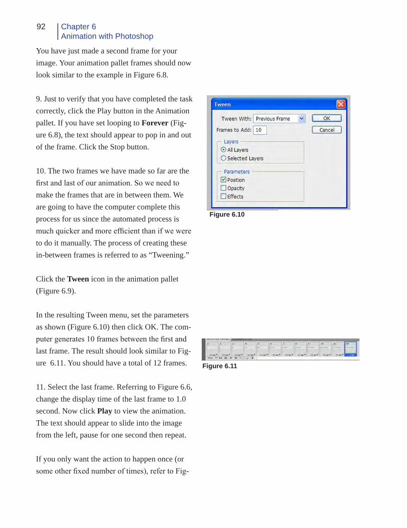
92 Chapter 6Animation with Photoshop
You have just made a second frame for your image. Your animation pallet frames should now look similar to the example in Figure 6.8.
9. Just to verify that you have completed the task correctly, click the Play button in the Animation pallet. If you have set looping to Forever (Fig-ure 6.8), the text should appear to pop in and out of the frame. Click the Stop button.
10. The two frames we have made so far are the first and last of our animation. So we need to make the frames that are in between them. We are going to have the computer complete this process for us since the automated process is much quicker and more efficient than if we were to do it manually. The process of creating these in-between frames is referred to as “Tweening.”
Click the Tween icon in the animation pallet (Figure 6.9).
In the resulting Tween menu, set the parameters as shown (Figure 6.10) then click OK. The com-puter generates 10 frames between the first and last frame. The result should look similar to Fig-ure 6.11. You should have a total of 12 frames.
11. Select the last frame. Referring to Figure 6.6, change the display time of the last frame to 1.0 second. Now click Play to view the animation. The text should appear to slide into the image from the left, pause for one second then repeat.
If you only want the action to happen once (or some other fixed number of times), refer to Fig-
Figure 6.10
Figure 6.11

93Intro to the Internetand Web Page Design
ure 6.8 and change the looping to a number that you want.
12. See if you can figure out how to make the text move out of the image toward the right us-ing the techniques you have learned so far.
Here is a hint: Duplicate the last frame, move the text in that frame so it is out of sight toward the right side. Change the delay time of the last two frames back to 0.1 seconds. Tween between the last frame and the previous frame using the same settings as we used for the first tweening opera-tion.
13. With the animation finished, it is time to save it. First save the file in its Photoshop PSD format using the File>Save function. Next select File>Save for Web & Devices.
In the Save for Web & Devices menu, select one of the optimized views. In the Preset box (Fig-ure 6.12) make sure GIF is set as the document type. You can also reduce the number of colors which will greatly reduce the size of the file. We chose two colors. Since we used a web safe color for the text, it is safe to select only two colors for this file. If your text disappears with a lower number of colors, increase the number of colors until the text reappears. The actual file size will be fairly small (about 6K for our example).
Remember the GIF file will contain all the frames of your animation so 6K is not too bad for a file size. Your file size may be larger if you added additional frames to move the text back
Figure 6.12
Figure 6.13

94 Chapter 6Animation with Photoshop
out of the image. Or if you chose more colors in the optimization process.
14. Click the Save button. In the Save Opti-mized As menu (Figure 6.13), Select the destina-tion you want to save the file in (F:\public_html or flash drive). Make sure the file name is the one you want to use. If not, change it.
In the Save as Type box, make sure “Images Only” is showing. Then click save.
15. Now it is time to check the finished file to see if the animation works like you expected.
Navigate to the location you saved the file. When you have found it, double click it. The file should open and you should see the animation play. If not, try opening it with a browser (for a Win-dows computer, right click, choose Open With and the select a browser from the list). The im-age is now ready to be placed on a web page.
Additional Example
The previous example animated text movement by changing the position of the type in each suc-cessive frame. You could have done the same thing manually by duplicating each successive frame and moving the type in the new frame slightly. If you wanted, you could also shift the vertical position of the type to make it appear to be coming from the top or bottom rather than the side.
Figure 6.14
Figure 6.15
Layer Opacity

95Intro to the Internetand Web Page Design
We will next explore an additional method of animation briefly: Fading in and out. The im-age you use for animation can be anything you choose. We only used type in the first example for convenience.
1. For the fading example, open Fade.psd (Fig-ure 6.14) from your Student Work Files>Chapter 6 folder. The background has already been removed for you.
2. Make sure your animation pallet is open.
3. Initially you see only one frame. We will du-plicate that frame in the same way we did for the first exercise (Figure 6.8). Locate the Duplicates Selected Frames icon and click it one time. Now you have two identical frames.
4. Set the display time of each frame to 0.1 sec-onds (Figure 6.6).
5. Change the looping (Figure 6.8) to Once.
6. Select the first frame in the animation pallet by clicking on it.
7. Locate the Layers pallet and change the Opacity of the first frame to 0% (Figure 6.15). Do not be alarmed if the opacity of the second frame also changes to zero. Since the second frame is a duplicate of the first, any changes to the first frame will initially affect the second.
8. Select the second frame in the animation pal-let. Then in the Layers pallet, change the layer
Figure 6.16
Figure 6.17

96 Chapter 6Animation with Photoshop
opacity back to 100%. Your frames should now look like Figure 6.16.
9. Now we will use the Tween function to generate the additional frames necessary for our animation.
Click the tween icon in the animation pallet (Fig-ure 6.9). Set the parameters as shown in Figure 6.17. Then click OK.
10. The computer generates 10 additional frames between the first and last frame.
11. Click the Play icon in the animation pallet. You should see the flower fade in without mov-ing.
It is possible to have the image both fade in and move by setting the appropriate actions in each individual frame.
12. To make the image fade out, duplicate the last frame, set its opacity in the Layers pallet to 0% and tween between the last frame and the previous frame using the same settings as in Step 9 above. Then set the display time of frame 12 to about 2 seconds. Now click on Frame 1 and then click the Play button. The flower fades in, pauses, and then fades out.
13. Save the image as a PSD. Then save as a GIF using the Save for Web & Devices menu in the appropriate location.
Figure 6.18
Timeline Animation
Next we will learn how to make an animation us-ing the Timeline animation functions in Photo-shop CS4.
Look at Figure 6.18. This is the Photoshop time line animation pallet.
1. Open Photoshop. If you do not have the Animation pallet open, open it from the Window menu. Window>Show All menu Items>Animation.
2. If the animation pallet does not look like the example shown in Figure 6.18 locate the Con-verts to Timeline Animation button at the lower left of the animation pallet and click it (Figure 6.19).
You are now ready to begin a timeline anima-tion..
3. The first step is to make a new image. Select
Figure 6.19Converts to timeline animation button

97Intro to the Internetand Web Page Design
File>New or use the keyboard shortcut. Make the image size 200 pixels by 100 pixels, 72 ppi resolution, RGB color. Name it “Float” Click OK.
4. Pick a color you like from the Tools pallet. Select a font and size you like (we chose a deep red, Showcard Gothic font, 24 pt.). Select the type tool and click in the image area. Type the word “Float” and position it near the upper right corner (Figure 6.20). Hide the background layer and make sure the type layer is selected.
5. Now look at the animation (time line) pallet (Figure 6.21). Along the bottom, you see the familiar play buttons but the rest of the pallet is different than the frame animation pallet.
The bold black numbers are the Time Code. The time code shows the current time position as indicated by the Time Ruler or Current Time Indicator (CTI). The time ruler is the blue diamond shape with the red line descending from it on the time line. The time code shows hours, minutes, seconds and frames. The frame rate is 30 fps (similar to TV). Locate the time ruler and drag it toward the right. Watch the result in the time code. Now return it to the starting (zero) position at the left.
The Zoom controls allow you to expand or con-tract the time line for easier viewing. The larger icon on the right allows you to zoom in. The smaller one on the left zooms out each time you click. The slider allows you to manually adjust the amount of zoom.
Figure 6.20
Figure 6.21
Time Code Timeline
Image Layer
Time Ruler
Zoom
Figure 6.22

98 Chapter 6Animation with Photoshop
The animation pallet also shows you the layers in your image. The currently selected layer is high-lighted. Since our image has only a background and type layer, we only see the type layer in the animation pallet. Just for fun, add a new layer to your image (Figure 6.22) using the layers pallet and watch what happens in the animation pallet. Then alternately select and deselect the two lay-ers and you can see the effect both in the image layers pallet and the animation pallet. When you are finished experimenting, delete the new layer by dragging it to the trash in the layers pallet.
6. We animate an image layer by first defining Key Frames for each layer. A key frame is the master or beginning frame for our animation and can also be used to define major steps along the way. We create the first key frame in the appro-priate location. Then we move the time ruler to a new location and change the layer in some way at that location the computer generates a new key frame and calculates all the actions needed to change the state of the image from the first key frame to the next key frame. This actually sounds more complicated than it is.
We have already located the text in the position we want it to be as the animation begins. So now we just need to set the first key frame for this position.
On the left side of the layer, you see a small arrowhead looking icon. This is called a Twirl-Down in Photoshop (Figure 6.23). When you click on the twirl-down the menu expands (Fig-ure 6.24) to show us the animation properties of
Figure 6.23
Twirl-Down
Figure 6.24
Figure 6.25
Key Frame marker

99Intro to the Internetand Web Page Design
the layer. In the expanded menu, you are able to choose the way the image is changed in the animation. In our case, we are going to change it by position.
Look at the Position property. On the left side, you see a little Stopwatch. When the spotwatch is not depressed there is no animation for that property. When it stopwatch is depressed, the property can be animated.
Make sure the time ruler is at the starting posi-tion (zero). Click on the stopwatch next to the Position property. You are telling Photoshop that you want this property to change over time (Figure 6.25).
When you click the stopwatch, the computer generates a key frame in the location of the time ruler. This tells Photoshop where the animation is to start and the state of the image at that loca-tion.
7. Now, drag the time ruler along the time line until you reach approximately the three second mark (Figure 6.26).
8. Using the move tool from the tool pallet, move the text in the image down toward the bot-tom and to the right so it resembles Figure 6. 27.
When you do this, Photoshop automatically adds a new key frame to the time line as shown in Figure 6.26.
9. Next drag the time ruler back to the starting
Figure 6.26
New Key Frame
Figure 6.27

100 Chapter 6Animation with Photoshop
position and press the Play button. You should see the text start at the top and move down and to the right. Click the stop button or the anima-tion will continue to play.
10. Now drag the time ruler to the 5 second posi-tion. Then using the move tool, position the text in the upper right corner of the image. A new key frame is generated. Move the time ruler back to the beginning and pay again to see the effect if you wish.
11. Next lets fade the text out. Make sure the time ruler is at the five second position.
Now locate and click the stopwatch next to the opacity property of the text layer in the anima-tion pallet. This creates a new opacity key frame at the location of the time ruler.
12. Move the time ruler to the seven second mark. In the layer menu, change the type layer’s opacity to 0%. Photoshop creates a new key frame.
Move the time ruler back to zero and click the play button. You can now relax and watch your animation. Be sure to click the stop button when the animation is finished.
13. Lets save it now so we can use it on our web page. Move the time ruler back to zero so we can see the text. Select File>Save for Web & De-vices.
Select one of the optimized views. Make sure
the preset is set to GIF. You will probably need at least four colors but experiment if you want in order to reduce the file size. If the text disappears,you have selected too few colors for the text to be seen.
When you are satisfied, click Save and then give the file a name and save it to the appropriate place.
Once back in the main Photoshop window, save the image as float.psd to preserve it in case you want to edit it again later. Remember that a GIF opened in Photoshop will only show the first frame of an animation.
Add a Layer
Just for fun, lets add a layer and animate it as well.
Figure 6.28
Figure 6.29

101Intro to the Internetand Web Page Design
1. In the float.psd image, click the twirl-down icon on the float layer in the animation pallet. This hides or collapses the animation options for the layer.
2. Move the time ruler back to zero if it is not there already. Using the Type tool, add some text to the image. In this case we added the word “UP” (Figure 6.28).
3. Now, look at the animation pallet. You should see the new text layer (Figure 6.29).
Click the twirl-down for the new layer.
3. You will follow the same procedure with this layer as you did with the first type layer.
Make sure the time ruler is still in the zero posi-tion. Click the stopwatch for the Position prop-erty on the new type layer. A new key frame is added.
4. Move the time ruler to the three second mark.
5. Use the move tool from the tool pallet to move the “UP” type layer to the top and right of the image. A new key frame is added.
6. Move the time ruler to five seconds. Then use the move tool to relocate the “UP” type layer down to the lower right corner.
7. Click the stopwatch for the opacity property of the layer. A new key frame is added.
8. Drag the time ruler to the seven second mark. Change the layer opacity to 0%.
9. Move the time ruler back to zero and click the play button. You should see both words moving then fading out.
10. Save the image.
Now lets suppose you decided that you put a key frame in the wrong place. You can either delete it or move it. To move a key frame simply point to it with your mouse, hold down the left button and drag it to the correct position.
To delete a key frame, simply point to it, click the right mouse button and choose “Delete Key Frames” from the drop down.
You can also delete all the key frames from a property by clicking again on the stopwatch next to that property (Position, Style, Opacity).
You could have the content of a layer hidden un-til a certain point on the time line if you choose. Then at that point, show the layer, add a key frame and animate the layer. Alternatively, you could have the layer visible until a certain point then hide it and continue with the animation.
You can also work with the layers in the frame animation mode in much the same way.
102 Chapter 6Animation with Photoshop
Conclusion
We have seen how Photoshop can be used to cre-ate simple animated images. Now it is up to you to explore the possibilities further.
Animations should be used on a web page to create interest or convey a message. The anima-tion should not be used as an end uto itself - to draw attention to itself so the viewer thinks “Oh what a clever animated image. I wonder why it is there?”
Animations should be used sparingly or they will defeat their purpose.
In the next chapter, you will be introduced to HTML, the computer language of the web.

103Intro to the Internetand Web Page Design
Chapter Quiz
1. What is animation?
2. What is meant by frame rate?
3. What is bandwidth?
4. Why is the GIF format used for saving ani-mated images?
5. What is meant by Tweening?
6. Why would you want to save your animated image in both PSD and GIF formats?
7. What is the difference between frame and timeline animation?
Application
Use the tools of Adobe Photoshop to create sev-eral different animated images of your own.
See if you can cause the image to both move and fade at the same time in the frame animation mode.
Can you figure out how you would do the fol-lowing:
a. Make a sunburst flash out on the screen.
b. Make a wheel appear to rotate.
c. Make a bird fly from one tree to another.
d. Have your name appear on the screen one letter at a time.
e. Show someone eating something and have the food gradually disappear.

104 Chapter 6Animation with Photoshop
References
Abode Photoshop CS3: Classroom in a book. Adobe Press 2007.
Oxford American Dictionary (1986). New York: Avalon Books
Wikipedia Definitions. Retrieved on November 18, 2008, from http://en.wikipedia.org

Ch
apte
r 7
HTML, XHTML & Style Sheets

106 Chapter 7HTML
Introduction
Now that all the preliminary items have been covered, it is time to begin the implemen-
tation of a web page using HTML, XHTML and Style Sheets.
We will assume that you are publishing your web content using the SUU Student Web Server and as such, the process is as simple as placing it all into the “public_html” folder of the student F:\ drive. Placing web content in this folder, as you will remember from chapter three, makes it available to the student web server and thus the web. If you have not previously created the public_html folder, you need to do so now, refer to chapter three for instructions.
If you are designing your web content away from SUU, you can still do so by simply creat-ing a temporary file on your flash drive or other appropriate place and placing your web content in it. Then when you are ready, you can copy the folder’s contents to the f:\public_html folder.
To publish web content through an ISP, you would create the content and then transfer it to the host server using either an FTP or SFTP ap-plication.
First Look
HTML
Hypertext Markup Language (HTML) and more recently Extensible Hypertext Markup Language
(XHTML) is the computer language of the web. You may be wondering why you need to learn HTML and XHTML in the first place.
Knowing them will enhance your productivity as a web developer. It will be easier to track down a problem in a web design if you know how the page is delivered to and displayed by the brows-er. Knowing a little “code” means you can work with a variety of applications rather than having to stick with just one. And knowing the code gives you greater control of the end result.
The coding process is fairly easy to learn. It just takes patience and practice. Think of using a calculator to solve a math problem. Everything works fine and we get great results. But some-times we don’t have or don’t want to use the cal-culator. The problem can still be solved by going back to the basics and doing the work by hand if we truly understand the math. The same is true for a web designer: We need to know the basics (HTML & XHTML) because we often have to go back to them to solve a particular problem an application can not handle.
STRUCTURE
HTML commands are usually referred to as “tags.” The tags are enclosed between the less-than (<) and greater-than (>) mathematical symbols (also referred to as brackets). So a com-plete tag may look something like the following: <img src=”photo.jpg” border=”0”>.
The first bracket is followed by the element

107Intro to the Internetand Web Page Design
which is a browser command, as follows: <img src=”pic.gif”>.
The element may be followed by one or more attributes like this: <img src=”pic,jpg” border=”10”>.
Attributes may have a value assigned to them. For example: <img src=”pic.gif” border=”10”>.
Some tags are complete by themselves while others require a beginning and ending to function properly. For example, the anchor tag, <a href=”page.html>, creates a link to the “page.html” document. Once we are finished with those elements, we must end them. A tag’s function is ended by adding the forward slash (/) character before the tag’s element: </a> for example. Note that the element but not the at-tributes are placed in the ending tag.
In a process called “Nesting” tags can be inserted between other tags. For example a division tag (<div>) can contain a series of paragraph tags (<p>) with their associated text or media. It is important that you are consistent with the use of these nested tags.
When writing or editing HTML code, we typi-cally use a text editing program rather than a word processor. In the Windows operating sys-tem “Notepad” is the program we usually use. In the Mac environment, a similar program is typically available.
1. On the Windows computer, click “Start>All Programs>Accessories>Notepad.” If Notepad is not available from the Accessories menu, you
Figure 7.1
can launch it by clicking “Start>Run.” Then in the Open dialog box type “Notepad” without the quotes and select OK.
2. Figure 7.1 shows the available menu items in the Notepad program. You will note that there are only five menu options. Of these, we will only use the File and Edit menus. Our purpose is text entry and editing only. We are not concerned with choosing fonts, sizes, formats, etc.
3. From the File menu choose Open. The Open
menu in Notepad looks like the Open menu of many other programs. Navigate to the Student Work files and open the “Chapter Seven>Web Example” folder. Do not be surprised if you don’t see any files listed. Since Notepad is a text editing application, the program is currently screening out all but “.txt” file types.
4. Referring to Figure 7.2, locate the “Files of
Type;” dialog box. It currently indicates “Text Documents (*.txt).” Click on the arrow associ-
Click HereFigure 7.2

108 Chapter 7HTML
Figure 7.4
Figure 7.3
Image tags

109Intro to the Internetand Web Page Design
ated with this dialog box and change the file type to “All Files.”
You should now be able to see all the files in the folder. Important: Whenever you are opening or saving an HTML file, you must first change the file type to “All Files” or it will not open or save correctly.
5. Locate the file named “index.html” and open it. Examine the file closely. At first it resembles a collection of jumbled words, symbols and phrases (Figure 7.3). The tags and text you see are what comprise the HTML code for the web page. You see no photos, text formatting or other structured content that you would expect in a web page. The HTML text document contains the commands understood by browsers and is used to construct and display a web page in the browser window. Images and media content are not a part of the HTML file (not embedded) but rather are linked to from it. The HTML code includes instructions on where the media are lo-cated (URLs) and how they should be displayed in the browser window.
6. Now that you have seen the HTML code that makes the page work. Lets look at the same file in a browser (Figure 7.4).
Launch a web browser (Internet Explorer, Firefox, Safari, etc.). From the “File” menu se-lect “Open” or press “Ctrl/Command + O”.
Navigate to the Student Work Files and select the “Chapter Seven>Web Example” folder. Locate the “index.html” file and open it.
Compare what you see in the browser window with what you saw in the Notepad window. Re-ferring to Notepad see if you can figure out how the browser is interpreting and displaying the HTML commands.
When you have finished your investigation, close the browser and Notepad applications.
In the page you just viewed, some of the tags have been “deprecated.” Deprecation means the tag is still usable in HTML but there are better ways of accomplishing the same task. The tag is older and its use in current web programming (XHTML) is not recommended.
XHTML
HTML was based on the Standard Generalized Markup Language (SGML). SGML was cre-ated with the intent that it be the one and only markup language. Everything from hieroglyph-ics to HTML can be defined using SGML. The problem then is that SGML is so broad and all-encompassing that it is difficult if not impos-sible for the average person to learn or use all its features.
Because of the challenges with SGML and therefore HTML, the W3C defined the Exten-sible Markup Language (XML). XML eliminates many SGML features that are not applicable to languages like HTML making them easier to understand. HTML version 4.01 is not XML compliant so XHMTL was created as a reforma-tion of HTML.

110 Chapter 7HTML
XHTML attempts to support all the rules of HTML using XHTML standards.
If this all sounds confusing, don’t let it worry you. By learning HTML, you are also learning the basics of XHTML. There are some differ-ences but they are mainly beyond the intent of this book.
CASCADING STYLE SHEETS
Style sheets are a way to manage the overall look of a publication. A style sheet controls the back-ground, text fonts, colors, location of items, etc.
Initially, HTML did not allow for style sheets; focusing on content rather than style. In 1996, the W3C proposed Cascading Style Sheets (CSS) for HTML.
In simple terms, a web page style is just a rule that tells the browser how to format and display the content of a particular tag.
There are three ways to implement style sheets: in-line style, document-level styles and exter-nal style sheets.
In-line styles just add a “style” attribute to a tag: <h1 style=”color: #0000ff”> for example makes the h1 size text blue. In-line styles are the sim-plest to way to apply “style” to a tag. But you must include the style attribute in every individu-al tag you want the style to apply to.
The power of style sheets is more evident when you place a list of rules in the head of
the document. The rules are enclosed in their own <style> tag and effect all the specified tags within the document. The contents of the style tag are not HTML or XHTML and therefore do not follow the same rules.
An external style sheet is the most powerful way of implementing styles. A single style sheet can be made that will control the look of your entire web site. The external style sheet can be linked to each document in which you want a specific style or number of styles applied.
In this book, we will only introduce you to basic style sheets so you can understand them. For a greater understanding, you can refer to the web or other text book resources. The http://www.csszengarden.com/ web site is a very good ex-ample of using CSS instead of tables to format a page.
First Web Page
Now that you have some basic idea of what HTML/XHTML is, it is time to see if you can implement your own web page using HTML/XHTML and style sheets.
Before beginning HTML programming, you need to copy a few files to your F:\public_html or other web folder. Open your Student Data Files. Look in the Student Work Files>Chapter Seven folder. There you will find a sub-folder called “images.” Open the images folder and copy all the files to your web folder (if you are not working in an SUU computer lab, you can

111Intro to the Internetand Web Page Design
Figure 7.5
make a folder to temporarily store your work on your flash drive and transfer the content to the F: drive later).
The web page we are making is based on the informal balance model we learned about in chapter two. The page will be for a Nature Orga-nization called “Lake Effects, LLC.”
As you go along, you will save our work and check it in a browser periodically so you can see the result of applying various HTML tags and styles to the design.
Please note that as you go along, you will prob-ably want to view your work in both Internet Explorer and Firefox which are the two most popular browsers. This will give you a feel for the differences between browsers and emphasize the importance of designing for multiple brows-ers and operating systems.
1. Start by making a rough drawing of the in-tended web page. The drawing shows us text and graphic placement but does not go into a lot of detail. A sample rough drawing for this page is shown in Figure 7.5.
The gray rectangles containing blue “Xs” indi-cate image locations. The first line of text toward the bottom will become the links used to navi-gate the web site. The bottom line of text serves two purposes. First it establishes copyright information and second, it forms a visual “end of page.”
If you wanted to go a step further, you could replace the rectangles with rough sketches of the photos or images that will be placed there but you should get the general idea from the rough drawing. Remember that these rough sketches are usually hand drawn but you could use a com-puter page layout program like InDesign if you choose.
2. If it is not already open, launch the Notepad or other text editing program. If necessary, select “File>New” to create a new text document.
In the document window, type the following HTML commands:
<!doctype html public “-//W3C//DTD HTML 4.0 Transitional//EN”> <html> </html>
The first tag identifies the document type and specifies the version of HTML the page is de-signed for. The next tag begins the HTML code of the web page while the last, indicates the
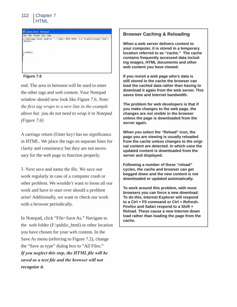
112 Chapter 7HTML
end. The area in between will be used to enter the other tags and web content. Your Notepad window should now look like Figure 7.6. Note: the first tag wraps to a new line in the example above but you do not need to wrap it in Notepad (Figure 7.6)
A carriage return (Enter key) has no significance in HTML. We place the tags on separate lines for clarity and consistency but they are not neces-sary for the web page to function properly.
3. Next save and name the file. We save our work regularly in case of a computer crash or other problem. We wouldn’t want to loose all our work and have to start over should a problem arise! Additionally, we want to check our work with a browser periodically.
In Notepad, click “File>Save As.” Navigate to the web folder (F:\public_html) or other location you have chosen for your web content. In the Save As menu (referring to Figure 7.2), change the “Save as type” dialog box to “All Files.” If you neglect this step, the HTML file will be saved as a text file and the browser will not recognize it.
Browser Caching & Reloading
When a web server delivers content to your computer, it is stored in a temporary location referred to as “cache.” The cache contains frequently accessed data includ-ing images, HTML documents and other web content you have viewed.
If you revisit a web page who’s data is still stored in the cache the browser can load the cached data rather than having to download it again from the web server. This saves time and Internet bandwidth.
The problem for web developers is that if you make changes to the web page, the changes are not visible in the browser unless the page is downloaded from the server again.
When you select the “Reload” icon, the page you are viewing is usually reloaded from the cache unless changes to the origi-nal content are detected. In which case the updated content is downloaded from the server and displayed.
Following a number of these “reload” cycles, the cache and browser can get bogged down and the new content is not downloaded or updated automatically.
To work around this problem, with most browsers you can force a new download. To do this, Internet Explorer will respond to a Ctrl + F5 command or Ctrl + Refresh. Firefox and Safari respond to a Shift + Reload. These cause a new Internet down load rather than loading the page from the cache.
Figure 7.6

113Intro to the Internetand Web Page Design
4. In the “File name” box enter the name “index.html” then select “Save.”
Since this will be the first (and only) page of our web site, we save it using the name: “index.html.” When you request a web page from a specific URL, the default name of the first HTML page is often “index.html.”
Your server administrator can tell you if you need to use a different name for the first page.
If the server does not find that file and another valid document is not specified, it will return an error message to the requesting computer.
5. Now we will use a browser to check your work and see if this simple web page is available on the web.
Open a browser and enter the URL. If you are saving to the F:\public_html folder at SUU, the URL will be: “http://www.student.suu.edu/~login name/.” The login name is the user name you use to log into your student account at SUU.
If you are not saving to the SUU F: drive, you can still access your file by selecting “File>Open” (CTRL + 0) in the browser and navigating to the location of your web content.
If you have followed the previous steps correctly, when you open the index.html file the browser should show you a blank white page. If you should get an error message, check your work
carefully and try again.
Minimize the browser but don’t close it. We will be using it often to check our work as we go along.
6. Back in Notepad add the following tags between the <html> and </html> tags already entered:
<head>
</head> <body>
</body>
Your Notepad window should now look like Figure 7. 7. Save the file. Click “File>Save” or “CTRL + S.”
If you should need to interrupt your work and come back later, you can reopen the file in Note-pad. Just remember to change the file type to “All Files” so you can see it to open it.
The tags we have entered so far are sometimes referred to as “skeletal tags” or “foundation tags”
Figure 7.7

114 Chapter 7HTML
because they form the skeleton or framework of the web page.
The <head> and </head> tags define the so- called “header” of the web page. The header generally contains information that is not visible in the browser window. This information can in-clude comments, metadata, styles and scripting.
Between the <body> and </body> tags is the information that forms the visible portion of the web page.
Now if you would like to, you can reopen your browser and reload the page. If you do, you will not see any change because we still have not en-tered any body content (see sidebar on page 112 for information on reloading and caching).
7. Every web page should have a title applied. To add the title to your web page, insert the follow-ing tags immediately below the <head> tag.
After adding the title tags in your Notepad win-dow, the content should appear as follows (The title tags are indented only for clarity):
<!doctype html public . . . <html> <head> <title>Lakes Effects, LLC</title></head> <body>
</body> </html>
Now save the file again and reload the browser.
This time, the title is added to the title bar at the top of the browser application. The window con-tent is still a blank white screen (Figure 7.8).
8. The next tag we will enter is also placed in the header. It is called the <meta> tag. Meta tag attri-butes define name/value pairs that associate the document. We will use the tag to specify “key-words.” When encountered by a search engine
on the web, keywords are used to categorize the document for use in a search engine.
Add the following tag directly below the title tag:
<meta name=”keywords” content=”lakes, environment, nature, fishing, recreation, wa-ter”>
(again ignore the text wrap in the example). Save the file. If you want to view it in the browser - go ahead but you will not see any visible change.
9. Next, we add some body content that is vis-ible.
Figure 7.8

115Intro to the Internetand Web Page Design
Referring to our rough drawing, you see that the title logo for the page is a graphic image. The tag used to insert an image on the page is: <img src=”URL/name”>. If the image is located in the same folder as our web page, you only need to enter the name; otherwise you have to enter the URL as well. In our case, the image is in the same folder as the HTML document so you don’t need the URL. You add the image tag immedi-ately below the body tag as shown:
</head> <body> <img src=”lake_logo.gif”>
</body> Once again, the tag is indented for clarity only. Note that in this case, there is no ending tag. Save the file and open, then reload the browser.
The Lake Effects logo graphic should now appear at the upper left corner of the browser window (Figure 7.9). By default, the image is Left aligned.
10. As you remember, there is no carriage return
or enter function in HTML. Therefore if you add additional items, the browser will attempt to display them on the same line as the logo graphic unless you specify otherwise.
To force a new line in the browser window, We use the Break (<br />) tag. The break tag forces the content following it onto a new line. The <br /> does not show in the browser window but its effect helps format the page.
Add a <br /> tag at the end of the image tag line.
</head> <body> <img src=”lake_logo.gif”><br /></body> </html>
11. Looking at the rough drawing, we see a block of text to the left of the main image. We are go-ing to make that area of text using the <div> tag. Add these tags and text to the Notepad page fol-lowing the <img src=”lake_logo.gif> as follows:
<img src=”lake_logo.gif”><br />
<!-- body text --> <div class=”bodytext”> <p> Welcome to the Lake Effects Web site.<br /> Lake Effects is a non-profit organization<br /> dedicated to the preservation of natural<br /> waterways and their many uses for<br /> recreation and conservation. </p> <p> Please take a few minutes to browse our<br /> site and become involved in this rapidly<br /> growing movement.
Figure 7.9

116 Chapter 7HTML
</p> </div>
</body> </html>
Your Notepad page now looks like Figure 7.10
The <!-- text --> tag is for making comments to ourselves that do not appear in the browser win-dow. You can place anything in the comment tag.
The <div> and </div>tags create a division or re-gion in the document. The division in this docu-
ment contains the body text. The “class” attribute creates an association that we will use later in styling the page.
The <p> and </p> tags format a paragraph.
Any text that is placed outside an HTML tag, is displayed as text in the browser window.
Save the file and reload the browser. Your page should look like Figure 7.11 in a browser.
12. Now you need to add a tag to place the large image (see the rough drawing of the design). The image tag is the same one used to insert the logo with the exception of the image name.
Add the second image tag to your HTML code and add the <br /> tag at the end of the image tag.
The HTML in Notepad should now look this:
<p>
Please take a few minutes to browse our<br /> site and become involved in this rapidly<br /> growing movement. </p> </div>
<img src=”lake.jpg” class=”Lake” bor-der=”0” alt=”Lake Photo”><br /><br />
Figure 7.10

117Intro to the Internetand Web Page Design
</body> </html>
The border=”0” attribute of the <img> tag specifies that there will be no border around the image. The alt=”Lake Photo” attribute sets the alternate text for the image. The class attribute creates a “class name” that we will use in the style sheet later on.
Save the HTML file and reload the browser. The web page now includes a photo of a lake directly below the text (Figure 7.12). It does not look like the rough drawing yet but it will when we add the style sheets later.
13. Now you will add the text that will become the various links used to navigate the rest of the web site. The “|” character (formally called a
vertical bar or pipe) is entered by pressing the shift and backslash keys (the key directly above the Enter key).
On a new line directly below the lake image tag, insert the following tags and text in Notepad:
<div class=”navbar”> | Water | Fish | Pollution | Volunteering | Con-tact Us| </div>
Save the HTML file.Figure 7.11
Figure 7.12

118 Chapter 7HTML
13. Before we look at the page in a browser again, we are going to add the final line of text.
Enter the following text below the last </div> tag (the “©” causes the copyright symbol to be displayed):
<div class=”footer”>© 2009 Lake Effects, LLC all rights reserved </div>
Save your work. Your Notepad screen should now look like Figure 7.13.
Reload the browser and look at the resulting web page. It should be similar to Figure 7.14
14. The next task is to form the links that will facilitate navigation of the web site.
Hyper links are created with the “Anchor” tags(<a attributes> and </a>). The text and/or im-ages placed between these two tags become the visible link on the web page. For this exercise, we will using textual links though you could also use images.
In the Notepad window, locate the line of text that says:
Figure 7.13

119Intro to the Internetand Web Page Design
Figure 7.14
“| Water | Fish | Pollution | Volunteering | Con-tact Us|.”
Position the curser between the first vertical bar and the word “Water.” Add the following content to the line:
| <a href=”water.html”>Water</a> | Fish | ...
Notice that the word “Water” is nested between the beginning <a> and ending </a> tags. This makes the word into a link. The attribute of the tag specifies that this anchor tag is a hyper-refer-ence and the web document “water.html” should be loaded if the link is selected. If the document referred to in the link is not in the same folder as the original HTML file, you must also specify the complete URL or folder before the document name.
For example the code: <a href=”http://www.lake.com/page2.html> would cause the document “page2.html” to be retrieved from the “www.lake.com” web site.
Save the HTML file and reload the browser. The word “Water” should now be blue in color and underlined indicating that it is a link.
15. Now repeat the process to create a link to the “Fish” page.
| <a href=”water.html”>Water</a> | <a href=”fish.html”>Fish </a>| Pollution |...
As you add tags to the line, it will become quite long. If you want to shorten the line for clarity by breaking it into two lines using the Enter/Return key, there is no effect on the HTML since the Enter/Return function is not an HTML com-mand.
Just for practice, add anchor tags to create links for the rest of the words on the line following the same procedure you have just completed for the “Pollution,” “Volunteering” and “Contact Us” text. You can decide what you want to name the referenced pages. Save the file and reload the browser.
All the words in the navigation bar should now be underlined and blue in color.
When you are ready to make the next page of the web site, you can follow the same procedure we

120 Chapter 7HTML
have just completed, using the appropriate con-tent for the new page. When saving the page in Notepad, give it the name you used in the anchor tag of the first page. For example “fish.html,” “water.html,” etc.
STYLE SHEET
16. Now that we have the content of our page in place, let’s see if we can use document-level style sheets to put everything into the correct locations.
The formatting information in a style sheet is called a rule. The style sheet is placed in the document header. In our page, we will place it right after the <meta> tag.
First we will apply a color to the text and back-ground. Insert the following tags just below the <meta> tag in the header:
<meta ...>
<style> body { color: #ff0000; background-color: #d8da3d } </style></head>
The first line begins the style sheet. The second says that we are adding a style for the <body> element. The third line (rule) changes the default text color to red (#ff0000). The fourth makes the background a greenish yellow color. See the ref-
erence section of the chapter for an explanation of color use in a web page. Our example shows two rules combined. Since they both effect the body of the document we can put them into one common rule.
In our example the word “body” is called a “selector” which tells the browser what part of the document is affected. The words “color” and “background-color” are called “properties” which specify what aspect of the layout is being set. The “#ff0000” and “#d8da3d” are the “val-ues” of the property style.
Again Save the HTML file and then reload the browser. The page should now look like Figure 7.15.
17. We will now add some placement rules to our style sheet.
<meta ...>
<style> body { position: relative; color: #ff0000; background-color: #d8da3d } </style>
</head>
The position rule specifies that the positioning of body of the page is relative to the positioning of the other elements on the page.

121Intro to the Internetand Web Page Design
Figure 7.15
18. Next we add a rule to the first <div> tag - the “bodytext” division (here is where the “class” part of the tag you entered earlier comes into play) like this:
<meta ...>
<style> body { position: relative; color: #ff0000; background-color: #d8da3d } .bodytext {
position: absolute; width: 19em; top: 7em; }</style>
Since you are styling the <div> tag whose “class” is bodytext you need only enter the class name preceded by the period in the style sheet. You could enter the rule as “div.bodytext” if you chose but it is not necessary.
Save the HTML file and reload the browser. There should not be a dramatic change in the way the page looks since we just established a location for the text that is very close to it’s original location .
One em unit in HTML is equal to the width of the text itself. So 19em is 19 times the width of the text, etc. We used absolute positioning of the text so as to force it to be at an exact location on the screen.
19. Now we will move the Lake image to its ap-propriate position. Add the following rule to the style sheet:
<style> body { position: relative; color: #ff0000; background-color: #d8da3d } .bodytext { position: absolute;

122 Chapter 7HTML
width: 19em; top: 7em; } .lake { position: relative; left: 22em; } </style>
Again, save the file and look at it in the reloaded browser. The lake should now be positioned to the right of the body text (Figure 7.16)..
By now you should be in the habit of saving and reloading after each change just to make sure you are still on the right track so we shouldn’t need to keep reminding you, it should be auto-matic.
20. We are nearly finished. All that remains is to move the navbar and footer into place and relo-cate the logo.
Add the following content to your style sheet:
<style> body { position: relative color: #ff0000; background-color: #d8da3d } .bodytext { position: absolute; width: 19em; top: 7em; } .lake {
padding-left: 20em } img { position: relative; left: 10em; } </style>
The logo moves into position.
20. Add the following rules to the style sheet:
<<style> body { position: relative color: #ff0000; background-color: #d8da3d } .bodytext { position: absolute; width: 19em; top: 7em; } .lake { position: relative left: 22em; } img {
Figure 7.16

123Intro to the Internetand Web Page Design
position: relative; left: 10em: } .navbar { position: relative left: 8em; } .footer { position: relative; left: 9em; } </style>
Again save and reload. The web page is now about complete (Figure 7.17). If you are using Firefox to view the page, the positioning may be a little off. We will fix that later. Just for the fun of it, try experimenting by changing the posi-tion values in the style sheet to see the effect in the browser window. Return the values to their original form when you have finished.
The complete HTML code is shown in Figure 7.18. If you have had problems with any of the steps so far, compare your Notepad HTML code to Figure 7.18 and make any necessary correc-tions.
Additions
Now that the web page is nearly finished, lets experiment with the style sheet a little to see the effect of applying different and additional styles and try an external style sheet to see how that works.
Figure 7.17BACKGROUND IMAGE
If it is not open, launch the Notepad application then navigate to your web folder and open the index.html file.
In the style sheet, change the body rule as fol-lows:
<style> body { color: #ff0000; position: relative; background-image: url(bg5.jpg); } .bodytext { position: absolute; Save the file and open it in a browser. The back-ground should have changed from the original greenish yellow color to the image you specified.
FONTS
You must be careful when applying fonts to your web pages. If the fonts you specify are not installed on the computer viewing the web page, you will get unexpected results. For this reason, we usually will specify a number of acceptable

124 Chapter 7HTML
Figure 7.18
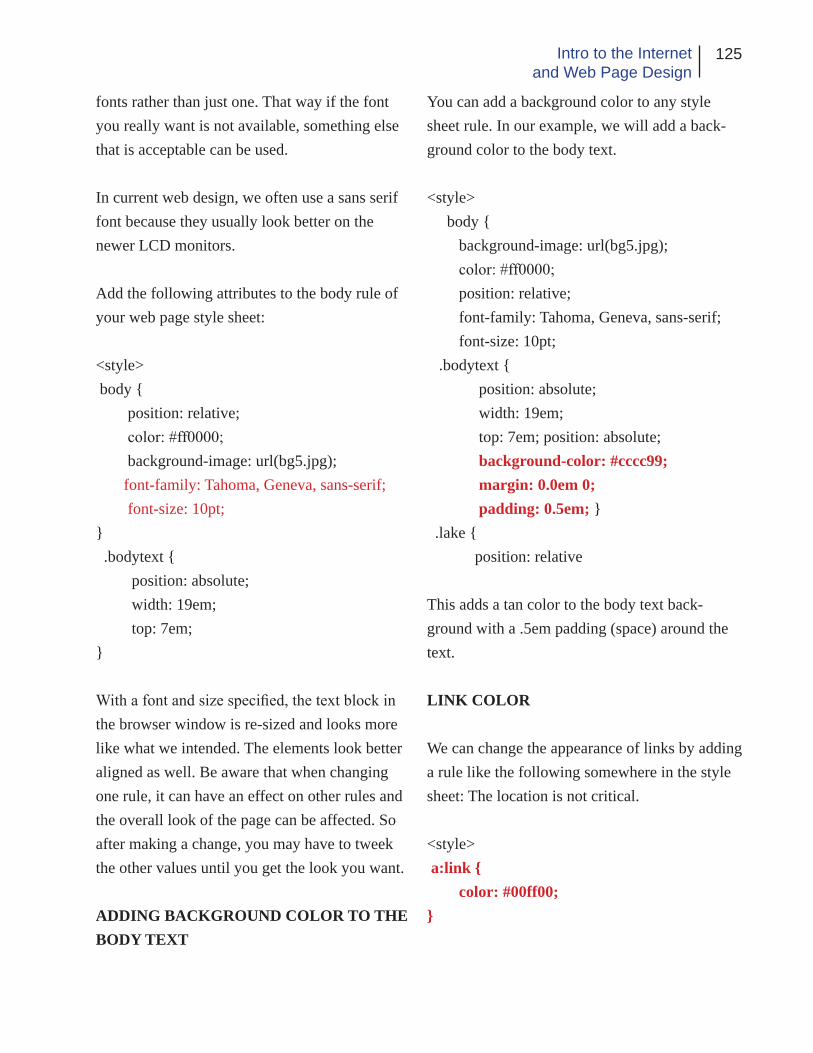
125Intro to the Internetand Web Page Design
fonts rather than just one. That way if the font you really want is not available, something else that is acceptable can be used.
In current web design, we often use a sans serif font because they usually look better on the newer LCD monitors.
Add the following attributes to the body rule of your web page style sheet:
<style> body { position: relative; color: #ff0000; background-image: url(bg5.jpg); font-family: Tahoma, Geneva, sans-serif; font-size: 10pt; } .bodytext { position: absolute; width: 19em; top: 7em; }
With a font and size specified, the text block in the browser window is re-sized and looks more like what we intended. The elements look better aligned as well. Be aware that when changing one rule, it can have an effect on other rules and the overall look of the page can be affected. So after making a change, you may have to tweek the other values until you get the look you want.
ADDING BACKGROUND COLOR TO THE BODY TEXT
You can add a background color to any style sheet rule. In our example, we will add a back-ground color to the body text.
<style> body { background-image: url(bg5.jpg); color: #ff0000; position: relative; font-family: Tahoma, Geneva, sans-serif; font-size: 10pt; .bodytext { position: absolute; width: 19em; top: 7em; position: absolute; background-color: #cccc99; margin: 0.0em 0; padding: 0.5em; } .lake { position: relative
This adds a tan color to the body text back-ground with a .5em padding (space) around the text.
LINK COLOR
We can change the appearance of links by adding a rule like the following somewhere in the style sheet: The location is not critical.
<style> a:link { color: #00ff00; }

126 Chapter 7HTML
This example turns the links on our page green.
External CSS
Now that we can consider our page complete, lets look at putting our style sheet into a separate document. An external style sheet is especially helpful if you want many web pages to share the same styles.
1. Make sure your index.html file is saved then select everything that is inside the <style> ele-ment. Do not copy the <style> or </style> tags, just the content between them (Figure 7.19).
2. Now cut the text using “File>Cut” or “Ctrl + X” which removes the selected text from the file.
3. Next, replace the <style> and </style> tags with the following <link> element:
<link rel=”stylesheet” href=”mystyle.css”>
Re-save the file using the same name (index.html).
4. In Notepad, select “File>New” or “CTRL + N” to create a new file.
5. In the new file’s window, select “CTRL + V” or “File>Paste.” The content you cut from the index.html file is pasted into the Notepad win-dow
6. Save the new file in the same web folder that you have been saving your index.html file.
Select File>Save As from the Notepad menu.
Change the Save as type dialog box to “All Files”
Enter the name: mystyle.css as the file name and save the file.
7. Now open a browser and from the “File>Open File” or “CTRL + O” menu, navi-gate to your web folder and select the “index.html file.” If you have saved in your F:\pub-lic_html folder, you can just enter your URL into the browser’s navigation window and the page should load.
Should your pages not be displaying correctly, Figure 7.19

127Intro to the Internetand Web Page Design
you will need to make changes to the style sheets. Try changing the position rules and pad-ding to see what effect those changes have on your page. The different browsers handle HTML tags differently so the look may not be the same on every browser. Newer browsers are coming closer to the same standard but concerns about copyright infringement require the developers of the programs to do things a little differently than others to avoid legal problems.
If you have saved the style sheet correctly, the page will look exactly like it did before. Now you can create additional web pages and link them to the same external style sheet.
It is also possible to have more than one style sheet linked to a document, if necessary. You would do this if you wanted a general over-all style for all your web pages but an additional special style for only one or two of the pages. Conclusion
The intent of this chapter has not been to give you an in depth knowledge of HTML/XHTML or style sheets but only to introduce you briefly to them. As you learn more about web design, spend time looking at the code as the content is being created and entered so you can gain a bet-ter understanding of how it all works.
You can also use your browser to look at the code from other web sites to analyze how the HTML is implemented in various ways to cre-ate interesting and informative web content.
Remember it is alright to get ideas from other people’s work but it is generally illegal to copy content including text, images and other items without written permission.
The last part of this chapter is a reference sec-tion in which some of the more common HTML/XHTML tags along with their attributes will be presented. Some additional information on style sheets will also be given. Finally, there will be a brief discussion of color as it relates to web pages and how color can be safely and effective-ly applied to web content.
Please note that when using style sheets it is very important to view your finished content on more than one browser and on several different com-puters to assure that the pages display the way you want them to.

128 Chapter 7HTML
HTML Tag SummaryThe following is a brief summary of some of the more common HTML tag and their attributes. Tags are not case sensitive but lower case is generally used for consistency. For a more detailed list of tags and attributes refer to an HTML text or online resources.
<a> ...</a> Designates start and destination of a hyperlink<a href=”url”> ... </a> Creates a hyperlink using that ever is placed between the tags <a href=”#name”>...</a> Links to a target location on the current page<a href=”url#name”>...</a> Links to a target location on a different page<a name=”name”>...</a> Sets a target location on a web page<a href=”mailto:e-mail”>...</a> Creates a link to an e-mail address
Anchor tag
<body>...</body> Contains the viewable portion of the document
Body tag
Reference Section
<div> ... </div> Defines a division in the document
Division tag
<h1> ... </h1> Enclosed text is a heading (size 1-6) 1 is the largest<h2> ... </h2> 6 is the smallest
<h5> ... </h5><h6> ... </h6>
Text Heading Size tags
<hr /> Creates a horizontal rule (line) Horizontal Rule tag
<head> ... </head> Defines the beginning and end of the document head
Document Heading tag
<br /> Creates a line break (similar to enter or return in a word processor)
Line Break tag

129Intro to the Internetand Web Page Design
<ol> ... </ol> Creates an ordered (numbered or lettered) list<li> ... </li> Item in the list
Ordered List tags
<ul> ... </ul> Creates an unordered (bulleted) list<li> ... </li> Item in the list
Unordered List tags
<table> ... </table> Creates a table<table ... border=”pixels” ...> ... </table> Sets cell border size <table ... cellspacing=”pixels” ...> ... </table> Sets space between cells<table ... cellpadding=”pixels” ...> ... </table> Sets space between cell border and content<table ... height=”pixels” or “%”> ... </table> Sets height of table<table ... width=”pixels” or “%”> ... </table> Sets width of table<td> ... </td> Defines a table data cell (used between the table tags<td colspan=”columns”> ... </td> Sets a cell to span columns<td rowspan=”rows”> ... </td> Sets a cell to span rows<td nowrap> ... </td> Prevents text lines in a cell from wrapping<tr> ... </tr> Defines a table row
Table Tags (note: some attributes may be depreciated)
*Tables are used primarily for numerical and statistical data
<img /> Displays an image in the document at the tag location<img src=”url” alt=”text”> Adds an image with an alternate text pop up <img src=”url” alt=”text” height=”pixels”> Sets height of image<img src=”url” alt=”text” width=”pixels”> Sets width of image
Image tag
<p> ... </p> Designates the beginning and end of a paragraph Paragraph tag
<blockquote> ... </blockquote> Enclosed text is quoted (left and right indent)<embed> ... </embed> Embeds an object into the page (multimedia)<html> ... </html> Placed at the beginning and end of the document<link> Creates a link to an external document (Style Sheet)<meta> Provides additional information about the document<object> ... </object> Places an object (multimedia) on a web page<script> ... </script> Adds a script such as javascript to the page<style> ... </style> Contains CSS information<title> ... </title> Indicates the title usually appears in the top bar of browser<!-- text --> A comment not displayed in the browser window
Misc. Tags
Note: There are many other tags available. Some of them have been discontinued or deprecated. Refer to a good, current HTML book or the W3C web site (www.w3.org) for a more complete summary and description.

130 Chapter 7HTML
Web Colors
The following colors are considered web safe. Most browsers will recognize the name of these sixteen colors as well as their hexadecimal code equivalent. When specifying these colors in a tag or style sheet, you can use either the actual name of the color (red, green, blue, etc.) or the equivalent hexadecimal code. Be aware that some browsers will not recognize color names so we usually just use the code to avoid problems.
Aqua – 00FFFF Gray- 999999 Navy – 009999 Silver – CCCCCC
Black – 000000 Green – 009900 Olive – 999900 Teal – 009999
Blue – 0000FF Lime – 00FF00 Purple – 990099 White – FFFFFF
Fuchsia – FF00FF Maroon – 990000 Red – FF0000 Yellow – FFFF00
Other colors may be specified but they must be specified using hexadecimal code rather than the color’s name.
The colors displayed in a browser window are in the sRGB color mode meaning the colors are a standard RGB (Red Green Blue) color scheme. Each of the three colors has a total of 256 levels. Zero is the minimum (meaning no color) and 255 is the maximum (meaning completely saturated or un-tinted color). So the total number of possible color combinations is well over 16 million (256 x 256 x 256).
To make the color specification easier for the computer, the levels of color are represented using the hexadecimal rather than the standard decimal format.
In the decimal format, we have ten possible numbers (0-9) in each place. When a place value is full, we move to the left with another place. We have place values of units, tens, hundreds, thousands, etc. In the hexadecimal format, we have sixteen possible numbers in each place. These numbers are represented by the numbers 0-9 and the letters A-F (representing the numbers 10-15). The place values are units, sixteen, two-hunderd fifty-six, etc. So the number 255 in decimal is written as “FF” in hexadecimal.
When specifying colors in hexadecimal we specify the amount of red, then green then blue. So the

131Intro to the Internetand Web Page Design
hexadecimal number “FFFFFF” tells the computer to use the maximum amount (255) of red, green and blue which yields the color “white.” FF0000 produces red, 00FF00 produces green and 0000FF produces blue. 000000 would give us black since there is no color in either red, green or blue. Re-member we are dealing with levels of light so no light in any of the three colors is black.
Different combinations of the hexadecimal code produce all the colors available. Here are some possible colors with their hexadecimal equivalents that you could try. When placing a hexadecimal code in an HTML tag or style, we proceed the code with the pound sign (#). An example might look like this: ”#220033.”
Iceblue – FFFFFF Aquamarine – 66FFCC Bisque – FFFFCC Brown – 993333 Chartreuse – 66FF00 Chocolate – 996600 Coral – FF6666 Cornsilk – FFFFCC Crimson – CC0033 Darkblue – 009999 Deepskyblue – 00CCFF Dimgray – 666666 Gold – FFCC00 Hotpink – FF66CC Khaki – FFCC99 Lemon – FFFFCC Limegreen – 33CC33 Magenta – FF00FF Navy – 009999 Orange – FF9900 Orchid – CC66CC Pink – FFCCC Salmon – FF9966 Seagreen – 339966 Sienna – 996633 Skyblue – 99CCFF Slateblue – 6666CC Tan – CCCC99 Thistle – CCCCCC Tomato – FF6633 Turquoise – 33FFCC Violet – FF99FF Wheat – FFCCCC Yellowgreen – 66CC33
Cascading Style Sheets
The current practice in web design is to make extensive use of cascading style sheets (CSS) to apply various styles and attributes to elements on a web page. There are two ways to create style sheets, by hand as we have done in this chapter or using a design tool such as Dreamweaver. Even if you use Dreamweaver or a similar application to make the style sheets for you, you may want or need to tweek them by hand so it is a good idea to learn a little about them.
Style sheets are rules that describe the stylistic attributes of one or more elements on a web page. A simple CSS rule may look like this:
h3 { color: #0000ff }

132 Chapter 7HTML
This rule would set the color of all level three headings in our web page to the color blue. The rule has two basic parts the “selector” and the “declaration.” The selector is the part before the left curly brace and the declaration is the part inside the braces.
The selector specifies what element is affected by the declaration. The declaration specifies what the effect will be. In this example only the h3 formatted text itself will be turned blue. There are other properties that could affect the background color, borders, etc.
The above selector is based on what type of element is selected (h3 in the example) so it is referred to as a “type selector.” Any HTML element can be used as a type selector.
The declaration has two parts, the “property” and the “value” as shown above. The property is the quality or characteristic that something possesses. The Value is a precise specification of the prop-erty.
In a rule, the curly braces ({ }) and colon ( : ) make it possible for the browser to distinguish between the selector, property and value.
When CSS was created, brevity was the goal. The intent was to make it easy to write and edit style sheets by hand and to make them load faster. So there are several ways to shorten the CSS including grouping of selectors. For example, the following rules:
H1 { font-weight: bold } H2 { font-weight: bold } H3 { font-weight: bold }
All have the same declaration; they all set the font to be bold. Since they are all identical, they can be grouped into a comma-separated list and we only have to write the declaration once:
H1, H2, H3, { font-style: bold }
h3 { color: #0000ff }
Selector Declaration
h3 { color: #0000ff }
Property Value

133Intro to the Internetand Web Page Design
Additionally, a selector may have more than one declaration such as the following example:
h1 { color: green } h1 { text-align: center }
In this case all h1 text is set to be green and centered. But we can accomplish the same thing by combining the selector and grouping the declarations like this:
h1 { color: green; text-align: center; }
All declarations must be contained within the curly braces and are separated by a semicolon. It is also suggested that each declaration be placed on its own line for clarity as in the example above.
For a style sheet to affect an HTML document, the two must be “glued” together or combined in such a way as to be able to work together to present the document in the way we intended. There are several ways of gluing but for brevity, only two will be discussed. The first is to apply a document-wide style sheet such as was done in the example presented in the chapter. This is accomplished by placing the rules between the <style< and </style> tags in the document header. The second is to create an external style sheet and link to it using the <link> tag as we also did in the chapter.
CSS was designed so that even if a browser does not understand style sheet, the content is still vis-ible although not formatted as we intended. If you are concerned that a browser is not CSS compat-ible, you can still design with the style sheet and place the rules for the style sheet inside a comment tag <!-- rules -->. That way older browsers ignore the content of the <style> tags and do not display the rules in the browser window.
This basic discussion should help you to understand style sheets. It is not intended as an all-encom-passing tutorial on the topic. If you need additional help on the subject there are many good books and online tutorials on the subject. Here are just a few:
http://www. w3.org/Style/Examples/011/firstcss, http://www.w3schools.com/ http://htmlhelp.com/

134 Chapter 7HTML
Here is a list of a few style sheet rules:
{ color: value } - refer to the section on color{ background: url(file name) } - the URL may be just the name of the file or it may be a complete URL including the domain name { background-color: value } - refer to the section on color{ font: 36pt serif } - specify font sizes in points or relative to other sizes{ font: family: values } - specific font names, place in quotes if name is more than one word { font-size: 36pt } - size in points{ font-style: value } - bold, italic, etc.{margin-top: 1em } - size in em units { margin-right: value } - size in em units{ margin-bottom: value } - size in em units{ margin-left: value } - size in em units{ padding: value } - space around an object - amount in em units {position: value} - position can be absolute, relative or fixed (see chapter exam- ples) used with position locators (left: 20em, etc.) { text-decoration: underline } - or other treatment{ text-indent: value } - in em units
Specific to Links
a:link { ... } - sets attributes for links a:visited { ... } - sets attributes for visited links a:hover { ... } - sets attributes for hovered links
There are many more rules - too many to include here. If you wish additional help and suggestions, please refer to the web references noted previously or to texts specifically written to handle CSS is-sues.

135Intro to the Internetand Web Page Design
Application
1. Try to apply your knowledge of HTML by de-signing a few different web pages of your own. Implement them using only HTML code you write yourself.
2. Visit a variety of web sites. Using the brows-er’s “View>Page Source” or equivalent menu, look at the listing of HTML codes. See if you can figure out how the code was implemented to create the pages.
3. Do an online search for “HTML Code.” Visit several of the web sites you found in your search. Use the materials presented to increase your knowledge of HTML programming.
4. Do an online search for Style Sheets or CSS. Continue to develop you knowledge of them.
Chapter Quiz1. What is HTML?
2. What is a tag?
3. In what form are the tags written?
4. What program is normally used to create HTML documents?
5. What is a style sheet?
6. How are style sheets used?
7. What is meant by browser caching?
8. Why is the first page of a web site usually named “index.html?”
9. What is a link?
10. What is hexadecimal code and why is it used?

136 Chapter 7HTML
References
CSS tutorial starting with HTML + CSS (2009). Retrieved on January 29, 2009, from http://www. w3c.org/Style/Examples/011/firstcss.
Dekker, F. & St. John, D. (2003). Basic HTML tag guide. Retrieved on January 12, 2009, from http://articles.techrepublic.com.com/5100-22_11-5074630.html
HTML Tags cheat sheet. Downloaded on January 9, 2009, from http://www.killersites.com/HTML_ CODES/index.jsp.
HTML Tags/Codes/Web page design. Downloaded on January 9, 2009, from http://www.web-source. net/html_codes_chart.htm
Lee, J. (2007) A quick reference guide of HTML tags and their attributes. Retrieved on January 12, 2009, from http://i.t.com.com/i/tr/downloads/home/jlee_TR_builder_html_tag_ref.pdf
Lie, H.W. & Bos, B. (1999). Cascading style sheets, designing for the web (2nd ed.). Upper Saddle River, NJ: Addison Wesley
Musciano, C. & Kennedy, B. (2000). HTML & XHTML: The definitive guide (4th ed.). Sebastopol, CA: O’Reilly & Associates
Niederst, J. (2000). HTML pocket reference. Sebastopol, CA: O’Reilly & Associates
Patton, Tony (2008). Can you be a self-respecting web developer without knowing HTML? Re- treived on September 23, 2008, from http://blogs.techrepublic.com.com/programming-and- development.

Ch
apte
r 8
Web Design With Photoshop

138 Chapter 8Web Design With Photoshop
Introduction
There are several commercial and some freeware applications that may be used to
create web documents. Among these applications we find Adobe Photoshop, which can be used not only to prepare images for the web, but can also be used to create web content and pages.
You should note that although web content can be created entirely from within Photoshop, in practice, it is not done as often as it once was. Web content generated by Photoshop makes extensive use of tables which in current practice are being replaced to a great extent with style sheets (see chapter seven). The topic is presented here to give you additional tools in your web design arsenal.
In this chapter you will lean how to use Photo-shop and a companion program, Adobe Bridge as web design tools. To begin, we will discuss the concept of slicing and from there, learn to use Photoshop’s slicing and layers features to create links and fully functional web pages. Finally, we will use the Adobe Bridge to create a web based photo gallery.
It is assumed that you already have a good general knowledge of Photoshop. If you need a refresher on layers, text and other Photoshop topics, please take the time to do that before proceeding with this chapter.
Slicing
As you have already learned, every Photoshop image must have at least one layer. In a like manner, every image also has at least one slice. However, as you will see, one slice is rather use-less as far as web design is concerned. Slices can be thought of as pieces of the whole image - just as a jigsaw puzzle has its own number of pieces. If one of the pieces is missing, the puzzle (or web content in this case) is not complete.
Image slices must be rectangular in shape. When you define a rectangular area in an image as a slice, Photoshop writes the HTML code neces-sary to contain the image data and align the slice with its counterparts.
After the slices are created, you can turn them into buttons or hot areas and have them assigned as links to other web content. They can be used to cut a large, high resolution image into smaller segments. The sliced image is then reassembled in the browser window to be displayed. Although slicing an image, contrary to popular belief,
Figure 8.1
User SliceAuto Slice
Auto Slice
Auto Slice

139Intro to the Internetand Web Page Design
does not reduce download time. Slices can also be used as a security feature to help prevent theft of your copyrighted images since they are cut into pieces rather than being downloaded as a whole.
There are five types of slices but we will worry about only two, those you make (User Slices) and those the computer makes (Auto Slices) to complete the slicing of the image. Figure 8.1 is an example of an image containing both user and auto slices.
Auto slices are identified by the gray icon in the upper left corner while user slices have a blue icon.
When you create a user slice,the computer auto-matically creates the other (auto) slices necessary to cover the rest of the image area. All areas of the image must be contained in either a user slice or an auto slice.
Now you will practice creating slices yourself.
1. In the Student Work Files folder, Chapter 8, locate and open the file “autumn.psd” in Photo-shop (Figure 8.2).
2. Select the Slice tool from the toolbox. In Pho-toshop CS4, The Slice tool is hidden under the Crop tool. To access it, position the curser over the Crop tool and hold the mouse button until the drop-down menu appears, then select the slice tool. In earlier versions, the Crop tool is located by itself in the Toolbox.
Figure 8.2
Figure 8.3
3. Make sure Slices are visible. From the View Menu select “Show>Slices.” You should now see a small gray icon in the upper left corner of the image.
Photoshop automatically numbers the slices to keep track of them. The first slice is an auto slice generated by the computer. The icon indicates the slice number and content (image content in this case).
4. Make sure you still have the slice tool select-ed. Locate the orange colored tree in the center

140 Chapter 8Web Design With Photoshop
of the photo. Position the curser above and to the left of the tree. Hold down the mouse button and drag diagonally down and to the right until you have enclosed the tree in the slice area. Release the mouse button (Figure 8.3).
The bounding box around the slice has seven handles, these can be used to adjust the size of the slice. The gold colored border indicates the slice is selected. The blue icon indicates a user generated image containing slice.
Notice that the computer has generated several additional auto slices. They are numbered from top to bottom, left to right.
5. In addition to creating slices manually, you can create them from a layer.
In the Layer Pallet, make sure Layer 1 is selected (the layer containing the text).
From the Layer menu, select “New Layer Based Slice.” Photoshop generates the slice and adds additional auto slices to your image (Figure 8.4).
Note that the layer-based slice has no adjustment handles around the bounding box. Layer based slices are not adjustable. Also notice the icon for the layer based slice is different than the user based slice icon.
6. Now lets make some adjustments to the slice around the tree. In the Toolbox, hold the mouse button down on the slice tool. When the drop down options appear, choose the “Slice Select”
Figure 8.4
tool.
Position the curser inside the tree slice and click the mouse button once. The slice is selected.
Using the Slice Select tool, point to one of the adjustment handles along the edge of the slice. Hold the mouse button down and drag the slice border to adjust it. Continue to adjust the slice borders until the visible portion of the tree is just contained within the slice (other parts of the im-age will be visible in the slice as well).
7. Now that we have the image sliced, we need to save it. The actual slices of the image are not generated until you save it for the web.
First save the image to your flash drive as a Pho-toshop PDS file so you can reopen it and make any necessary adjustments at a later time.
Now choose “Save for Web & Devices” from the File menu.
Notice that the Save for Web & Devices menu also has a Slice Select tool (located along the up-per left side of the screen). Choose this tool then look at one of the optimized views.

141Intro to the Internetand Web Page Design
Figure 8.5
Using the Slice Select tool click on one of the slices. Remember that slicing cuts the image up into pieces. Each slice can be optimized sepa-rately. For this example, we chose to use JPEG optimization for all the slices. Select each slice and make sure the optimization is set to JPEG.
Once the slices are all optimized, click the Save button. Then in the save dialog box (Figure 8.5) navigate to the location you want the slices saved (your flash drive or other appropriate loca-tion). Then assign a name. Make sure “Images Only (jpg)” is selected in the Save as Type box. Leave the other setting as they are and select save.
The image slices are saved to the location you specified and are in a folder called “images” that Photoshop generates to hold them.
8. Minimize the Photoshop application. Now us-ing “Windows Explorer” or “My Computer,” navigate to the location of the “images” folder and look inside (Figure 8.6).
There you see a series of JPEG images numbered consecutively. Open a few of the images and you will see that they are just pieces (slices) of the original photo.
Figure 8.6
Figure 8.7
Figure 8.8

142 Chapter 8Web Design With Photoshop
9. Without some way of reassembling the slices, they are not very useful. So we are going to go back into Photoshop’s “Save for Web & De-vices” menu and change the way the slices are saved.
Maximize Photoshop again then select File>Save for Web & Devices. You should not need to optimize again because Photoshop re-members the original settings you chose. Select “Save.”
Referring to Figure 8.7, this time change the “Save as Type” to “HTML and images.” Leave the other settings as they are and select save.
When prompted to “Replace Files,” choose “Re-place.”
10. Minimize or close Photoshop. Then navigate to the location you saved your files. You should see the original images folder and find a file named “autumn.html.” Double click the file.
The default browser will open and you will see the reassembled image in the browser window.
11. In the browser’s “View” menu, select “Page Source” or equivalent (Figure 8.8) to look at the HTML code Photoshop wrote to reconstruct the image. You can see that the web page consists of a table containing all the image slices that you just made.
If you wanted to use the sliced image in a dif-ferent web page, you could just copy the HTML
code starting at the beginning of the first <table> tag and ending at the last </table> tag then paste that code into the code of another web page in the location you want the image to be displayed. Close the view window.
In the browser’s main window, point to a part of the image and click the right mouse button. From the menu that appears, select “View Image” or equivalent. The browser opens a new page and displays the slice you were pointing to.
If you slice an image in to fairly small parts, it is difficult for someone viewing it to copy the entire image, thus protecting your copyright. In addition the slices - being small sections of the original image - will download over the web much more quickly enabling you to save band-width.
When you have finished exploring the file, close the browser.
Photoshop Web Site
As you have seen, Photoshop can be used to create web content by making slices and writing the HTML code necessary to display it in a web page.
The next logical step is to use Photoshop to cre-ate a fully functioning web site including links. To do this, we will be use a Photoshop file that has already been prepared for you. You will cre-ate the slices necessary and learn how to name them and create links in the slice areas.

143Intro to the Internetand Web Page Design
Figure 8.9
Figure 8.10
Photoshop is a very good tool for making an image into a complete web page but as you will see, there are some limitations as to what you can do with it.
1. In the Student Work Files, locate the file named “Photoshop Web Example.psd” in the Chapter 8 folder. Open the file in Photoshop (Figure 8.9). You may see a message indicating “some of the layers may need to be updated for vector based output.” If so, select “yes.”
2. Spend a little time looking over the image, pay special attention the Layers palette (Figure 8.10).
Notice the layer group named “Buttons.” Click on the twirl-down arrow to the right of the vis-ibility icon. The layer group expands to reveal four text layer subgroups. Each of these sub-groups contains one of the navigation buttons you see at the upper right of the image.
The hidden text layers allow you to have several different versions of the image which are re-vealed as you click on the visibility icons. Using the four different versions will allow us to make four different web pages that will all be linked to each other fairly easily.
Select the “Rocks” layer. The opacity of the “Rocks” layer is reduced to make that part of the image more suitable for a background.
The text line toward the bottom of the image that includes “Home, Info, Events and Contact,” will be made into links to help meet ADA require-

144 Chapter 8Web Design With Photoshop
ments and make the page more easily navigated by people with disabilities.
The image is 800 x 600 pixels in size and the resolution is set to 72 ppi. This will make the finished web page fit the monitor screen of most computers without any problem. On monitors with higher resolution, the image will occupy less of the total monitor screen area.
Slicing
3. For this web site, the links on all the pages will be identical and in the same location so cre-ating the links for one page will create them for all the pages since all four pages are just varia-tions of the same image. We will make the links by slicing the image and assigning each slice a URL and Alt text.
From the toolbox, select the Slice tool. Then us-ing the tool, create slices around the four naviga-tion buttons located toward the upper right of the image (Figure 8.11).
In a similar manner, create slices around the text toward the bottom center. Make a slice for each of the words “Home, Info, Events and Con-tact.” These slices will be a little more difficult to make because they are fairly small and some of the auto slices may obscure the words (Figure 8.12). If you make a mistake, select CTRL + Z, edit>undo or simply delete the slice and try again.
Once you have succeeded in creating all the slices, save the file as a PSD image.
Figure 8.11
Figure 8.12
Figure 8.13

145Intro to the Internetand Web Page Design
Making Links
4. Next we are going to select the button slices one at a time and assign them a URL and Alter-nate text.
In the toolbox, choose the Slice Select tool. Position the tool inside the slice containing the Home button and double click. The Slice Op-tions menu opens (Figure 8.13).
You will notice that the computer has named the slice. The default name is the name of the file followed by the slice number. Because this is a user slice, we need to rename it or there could be problems with the page working properly. Change the name of this slice to “index_3” or whatever number the computer has assigned to that slice.
In the next box, you will enter the URL of the web document you want the link to point to. In our case, we want this link to return to our first page which we will name “index.html.” There-fore, enter “index.html” (without the quotes) into the URL box. We don’t need to include the domain information because all the pages will be in the same folder.
Skip down to the Alt Tag box and enter “Home Page” in it. As you will remember the Alt at-tribute causes a tip to open when someone using Internet Explorer or a page reading application hovers a mouse pointer over the button.
Leave the other boxes as they are and click the OK button.
5. Repeat the process for the Info, Events and Contacts buttons.
Give the Info button the Name “index_5” or what ever number the slice is using. Name the URL “info.html” and the Alt Tag “Information Page.”
Give the Events button the URL “events.html” and the Alt Tag “Events Page” and Name the slice “index_7” or other number as appropriate
Give the Contact button the Name “index_ 9” or other number as appropriate, name the URL “contact.html” and the Alt Tag “Contact Infor-mation.”
Save the file.
6. Repeat the Slice Options procedure for the small slices you created over the text at the bot-tom of the image using the same URL and Alt Tag information you used on the buttons. Name the slices using the same pattern as the buttons above.
*Note: You do not need to rename the auto slic-es. Photoshop will do that for you automatically. If you accidently select an auto slice (gray icon), Photoshop promotes it to a user slice (blue icon). If that happens, then you will need to rename it but do not assign it a URL or Alt Text.
Again Save the file.
Creating the First Web Page

146 Chapter 8Web Design With Photoshop
7. Now we are ready to start saving the image as the pages of our web site. If you are working in a student lab at SUU, you can save the pages in your “F:\public_html” folder. If not, you can save the pages to your flash drive or other web folder you have made for the purpose.
Make sure any old web content is deleted from your web folder so the folder is empty (if you want to keep the old content, copy it to a flash drive).
In the image Layer pallet, look at the four text layers at the top of the stack. Hide all but the layer containing the text “For The Best Time...” (Figure 8.14).
This is the look we want for the first page of our web site. Save the image in this state because we will be changing the slice names for the other pages. Name it something like “First Page.psd.” This will preserve the state in case you want to come back to it later.
8. Select “File>Save for Web & Devices.”
Choose the Hand tool then click on the first Op-timized View window. Make select JPEG as the Optimization type.
With the Quality set at Medium or even Low, the size of the entire image is less than the 100K figure we are hoping to achieve for each page.
9. Click the Save button. In the Save menu, navigate to the web folder (“F:\public_html” or other location you have chosen).
Figure 8.15
Figure 8.16
Figure 8.14

147Intro to the Internetand Web Page Design
In the File Name box enter “index.html” (with-out the quotes).
Make sure the “Save as Type” box indicates “HTML and Images (*.html).” Leave the Set-tings and Slices boxes as they are (Figure 8.15) and click Save.
Photoshop generates the slices and HTML code and saves them in the location you chose.
Viewing the First Page
10. Using the Windows Explorer or My Com-puter, navigate to the folder containing the files and images.
Verify that the file “index.html” is there as well as the “images” folder containing the image slices (Figure 8.16).
11. If you have saved to the F:\public_html fold-er, launch a browser and input your URL “http://www.student.suu.edu/~username.” If not, simply double click on the index.html file. In the open browser window, you should see your first web page displayed (Figure 8.17). If not, recheck your steps and try again.
12. In the open browser window, point to the Home button. The curser should change to a hand indicating that the area is a link. Click the mouse button. Nothing happens because the link is pointing to the page you are currently viewing.
Point to another button and click. You get a
Figure 8.17
Figure 8.18
Figure 8.19

148 Chapter 8Web Design With Photoshop
“page not found” or similar error because you have not yet saved any other pages.
Close the browser.
Making Additional Pages With the first page successfully completed, we will now make the other web pages from varia-tions of the same image.
13. Return to the open image in Photoshop. In the Layer Pallet, hide the “For The Best...” text layer and show the “Rocks-Are-Us...” layer (Figures 8.18 - 8.19).
14. Open the options menu for each of the but-tons and text links by double clicking the slices with the Slice Select tool and change the names of the slices to “info_3,” “info_5,” “info_7,” etc. as appropriate.
Save the file as web page 2.psd or choose an-other name that is unique.
15. Select Save for Web & Devices. Optimize the image as you did for the first page. When you are satisfied, select Save.
In the Save menu, make sure you are still saving in the web folder. Give the file the name “info.html.” The name you give the file must be iden-tical to the name you used for the URL of the Info button in step five earlier.
Be sure the Save as Type box still indicates
“HTML and Images (*.html).” Click Save. If you get a Replace Files menu, it means there are some slices already saved with the same name as the new ones will have. It is usually fine to re-place spacer files (spacer.gif, spacer.jpg, etc.). If these are the only files you see, choose replace. Otherwise choose Cancel, go back to the im-age and rename the slices as necessary. Then try again. The new page is saved.
16. Now repeat the process for the Events Page. In the Photoshop layer pallet, hide “Rocks-Are-us...” layer and show the “Thanksgiving...” layer.
17. Rename the button and text slices “events_3,” “events_5,” etc.
18. Save the file as web page 3.psd. Select Save for Web & Devices. Repeat the optimization procedure then select Save.
19. Name this file “events.html.” Leave the other settings as for the previous two pages and select Save.
20. Finally, in the Layer pallet, hide the “Thanks-giving...” layer and show the “Pres: Rocky ...” layer.
Select each button and text slice. Rename them “contact_3,” “contact_5,” etc.
Save the file as “web page 4.psd.” Select Save for Web & Devices. After optimizing, save the file using the name “contact.html” while leaving the other parameters unchanged from the previ-ous pages.

149Intro to the Internetand Web Page Design
21. Now for the final test, reopen the browser and navigate to the URL or file location.
With the “index.html” page open in the browser, click on the buttons and text links to verify that the other pages will load and display correctly. If you get some unusual or unexpected content it is probably because you didn’t rename a slice properly.
If you are viewing the page on a monitor with greater than 800 x 600 ppi resolution, the image will appear in the upper left corner of the brows-er window and will be surrounded by white space along the right side and the bottom.
We could have accomplished the same task by making four separate pages in Photoshop, slic-ing them and saving them in our web folder. This would have allowed us to change the background image and location of the links on each page but the continuity between pages would be affected.
Although the techniques we have covered in this section can create fully functional web content, You can also copy the HTML code from the documents generated by Photoshop and paste it into other pages created in Dreamweaver or similar applications. If you do this, be sure you also copy the content of the images folder into the correct location or the slices will not display correctly.
Limitations
Creating web content with Photoshop in this way is fairly easy but you are limited to a fixed
size, as already noted, which can be a disadvan-tage. Also making links using slices limits you to rectangular areas which can be hard to work with. Text-based links are not possible nor are elliptical or polygonal areas. You also cannot easily embed multimedia into the page without additional editing in Dreamweaver or other web authoring application. In addition if you need to update the page, you have to completely redo it rather than just changing a few minor items. For these reasons and others that may occur to you, using Photoshop to create complete web pages is becoming less common.
Image Gallery
For our final task in this chapter, we will use Adobe Bridge as a tool to automatically gener-ate a web based Photo Gallery.
Unlike making web pages with slices, Adobe Bridge created image galleries make extensive use of Javascript. Without a program to write the code for us this task would be far beyond the scope of an introductory text.
The photo gallery is especially useful when you have a series of photographs that you want to display from within a web page. For this project we will be using a small collection of photos already prepared for the purpose. In practice, the web photo gallery will work best if you prepare all the photos before hand and place them in a common folder. For best results, the photos should all be the same size, orientation and reso-lution.

150 Chapter 8Web Design With Photoshop
Figure 8.21
The Adobe Bridge application is a separate ap-plication that you can access from within Photo-shop or you may run it by itself.
1. If you already have Photoshop CS4 running, locate and click the “Bridge” icon located along the top of the Photoshop interface (Figure 8.20). Alternatively, you can select File>Browse in Bridge.
Note: In older versions of Photoshop, you can make the Photo Gallery directly from within Photoshop by choosing “File>Automate>Web Photo Gallery.”
If Photoshop is not open, navigate to the loca-tion of the Adobe applications on your computer and select Adobe Bridge CS4. For example Start>Adobe Design Premium CS4>Adobe Bridge CS4.
If you have not used the Bridge application be-fore, take a minute to explore it and familiarize yourself with the interface (Figure 20.21).
The Bridge is a place where you can organize and keep track of the files and folders you use in the Adobe Creative Suit.
2. Click the Folders tab on the lift side of the Bridge window. Navigate to the Student work Files. Open the Chapter 8>Pics folder.
Bridge iconFigure 8.20

151Intro to the Internetand Web Page Design
The photos in the folder are of a worker on a radio tower and his view of the ground. We want these photos to be shown on a web page photo gallery.
The controls at the bottom right of the Bridge, allow you to change the way the images are dis-played. Use the slider to increase the size of the images so you can see them more clearly.
Our purpose is to prepare the photo gallery rather than to familiarize you extensively with the Bridge application. Therefore we will only introduce the menus necessary to complete our photo gallery. Just be aware that there are many additional things you can accomplish in the Bridge including batch renaming of files, editing the image metadata, rotating images, processing Camera Raw images, etc.
3. Since you are creating a Web Photo Gallery, the first thing is to select all the photos you want included in the gallery. Click on one of the photos. Then holding down the Shift key, click on the remaining photos until all are selected. Alternately, you can choose File>Select All.
4. Choose Window>Workspace>Output. Bridge displays the output panel at the right side of the window. The Folders panel remains visible on the left side (Figure 8.22).
5. At the top of the Output panel, select Web Gallery.
Choose a Galley type from the Template menu
Figure 8.23
Figure 8.24
Figure 8.22

152 Chapter 8Web Design With Photoshop
and a Thumbnail size from the Style menu (Fig-ure 8.23).
6. Make sure all the photos are still selected then click Refresh Preview to see the gallery in the Output Preview panel.
The Output Preview panel will display up to ten files.
7. Experiment with different Templates and Styles selecting Refresh Preview each time until you find the look you want to use (Figure 8.24).
8. You will now want to customize the gallery by entering the Title, Descriptions etc. in the Site Info, Color Palette and Appearance areas of the Output panel. Select Refresh Preview to update the preview information.
9. Once you are ready to publish the Photo Gal-lery, scroll to the bottom of the Output panel. There you will see the Create Gallery section (Figure 8.25).
There are two ways you can publish your photo gallery. The first is to use the Create Gallery menu to “FTP” the material to the appropriate web server. Simply enter the FTP Server’s URL, your username and password and the Folder for your content. When ready, select Upload.
For our purposes, we will save the gallery to a disk. Select the Save to Disk radio button.
Enter a name for the Gallery. Click the Browse
Figure 8.25
button and navigate to the location you have chosen to save your gallery.
Click Save. Bridge creates the gallery in the location you specified. The gallery is contained within a folder with the name you chose in the previous step.
Using Explorer or My Computer, navigate to the location you specified for saving the gallery. In the gallery folder, you will see an HTML file named “index.html” and a folder containing all the images and other resources necessary to make the gallery function. Double click the index.html file and it will open in the default browser.
Check to make sure it looks like you want it to and everything functions correctly. If not, go back to Bridge, change some output settings and re-save.

153Intro to the Internetand Web Page Design
You can use the photo gallery as a web site by itself or link to it from another page on your web site. At SUU, you would save the gallery to your F:\public_html folder. Then create the link from another web page using foldername/index.html or other appropriate URL.
Conclusion
The HTML code created by any of the proce-dures covered in this chapter can be opened in Dreamweaver, Notepad and a number of other editing applications allowing you the flexibility of tweaking or fine-tuning the HTML code and incorporating the content thusly created into other web documents.
For example, you may want to open a page cre-ated in Photoshop with Notepad to add a title, style sheet, etc.
Although not covered in this chapter, you can also make a Photoshop animation in part of your image, add slices, and make a page that includes both animation and links within Photoshop.
As we have seen, Photoshop is an additional tool that can be used not only for image editing but also for creating web content. The Adobe Bridge is also very useful as a web design tool especial-ly for organizing images and making web photo galleries.
As you contemplate the design of web docu-ments, you have many tools at your disposal. Which one you use for the task at hand will
depend to a great extent on what you are trying to accomplish. Which-ever tool you choose, try to use the most current practices so your content will be functional and adhere to current stan-dards for web design and HTML coding.
In the concluding chapter, you will learn the ba-sics of the Adobe Dreamweaver application.

154 Chapter 8Web Design With Photoshop
Application
1. Collect a number of photographs of your own - such as from a family outing, etc. and make them into a web photo gallery.
2. Use Photoshop to layout a complete web page including navigation buttons and possibly some animation. Slice the buttons to make links and save the image as a complete web page.
3. Use Photoshop to slice an image, copy the HTML code and paste it into another web docu-ment.
Chapter Quiz
1. What are slices?
2. What is the difference between a user slice and an auto slice?
3. What shape can a slice be?
4. Can there be areas in an image that are not contained within a slice?
5. What kind of optional information can you as-sign to a slice?
6. How are slices saved?
7. What are some of the limitations to making web content with Photoshop?
8. What is a web photo gallery?
9. Which applications can be used to create such a web photo gallery?

155Intro to the Internetand Web Page Design
References
Adobe Bridge Help (2009). Retrieved on January 30, 2009, from http://help.adobe.com/en_US/ Bridge/3.0/WSCF044571-2772-4d28-9EBD-2C9F46AF008A.html
Abobe Photoshop CS3: Classroom in a book (2007). San Jose, CA: Adobe Press
Poyssick, G. (2006). Essentials for Design: Adobe Photoshop CS2 level one. Upper Saddle River, NJ: Prentice Hall

156 Chapter 8Web Design With Photoshop
Page intentionally left blank

Ch
apte
r 9
Adobe Dreamweaver

158 Chapter 9Adobe Dreamweaver
Introduction
Adobe Dreamweaver CS4 is (arguably) one of the best tools currently available for
most web design projects. With Dreamweaver you can create very effective web content. Dreamweaver can be used to create a single web page or manage a complex web site contain-ing many individual pages. You can also create separate Cascading Style Sheets and a number of other types of web content.
Dreamweaver will allow you to create elements such as text, tables and interactive buttons or you may import them from other programs. Using Dreamweaver, you will undoubtedly want to create XHTML which is considered the current standard language of web pages. But the appli-cation will allow you to open, edit and convert HTML into XHTML as well.
Like other Adobe applications, learning to use Dreamweaver can be a fairly lengthy process because the application is so versatile. For our purposes, we will only be covering a few of the basics. The intent is to just familiarize you with the application.
First Look
You will begin learning about Dreamweaver by getting acquainted with the interface. Before do-ing so, open your Student Work Files>Chapter 9 folder and copy the photos to your web folder; you do not need to copy the RTF document. If you previously saved files in the web folder that
you no longer need, delete them so you don’t clutter the folder with unused files.
1. Click Start>All Programs>Adobe Design Premium CS4 (or other location where your application is located) and select Adobe Dream-weaver CS4 (you can complete the work in this chapter with CS3 if you remember that the pan-els and commands may be slightly different in the older version). As the application opens, you will see a screen resembling Figure 9.1.
This is the Dreamweaver interface. Notice the panels on the right side in a location similar to other Adobe applications. The welcome screen under the green banner at the center of the screen allows you to get started right away by opening a recent item, creating a new item or watching a tutorial about Dreamweaver on vari-ous topics. For now we will ignore it.
2. From the File menu, choose New.
3. In the New Document dialog box, choose the Blank Page category if necessary. In the Page Type column, select HTML. In the Layout
Figure 9.1

159Intro to the Internetand Web Page Design
Figure 9.2
column, select 2 column elastic, left side bar, header & footer. On the right side of the menu, make sure the “Doc Type” is set to XHTML 1.0 Transitional. We also want our CSS to be placed in the page header so verify that the “CSS Lay-out” is set to Add to Head. Then click Create (Figure 9.2). The elastic property of this page will allow it to shrink or grow as we edit the con-tent and as it displays on a computer monitor.
If you are creating an entire web site, you may want the CSS to be in a separate file so all the pages you make can utilize it.
Dreamweaver creates a new web page based on the template you selected. If necessary, click Design to switch to the Design view rather than the Code or Split Views (Figure 9.3).
You can use Dreamweaver to make a single page as we have done here or make a complete web
site. The items you see on the page you just cre-ated are “placeholders” used until you enter the actual content in the various areas of your page.
While you are learning Dreamweaver, you may want to use the templates whenever possible. Once you have more experience, you can create your own layouts.
4. Now that you have a new page created, you need to save it. Select File>Save navigate to your flash drive or web folder. Name the file index.html and select Save. If you have previ-ously saved a file with that name in the selected folder, it will be over-written.
5. Select the Code view (Figure 9.3) and scroll to the top of the page if necessary. As you can see, Dreamweaver has made a document-level style sheet for the page (Figure 9.4). The CSS is more complex than the one we made in chapter seven but the basic idea is still the same. The information between the /* and */ marks in the style sheet contain comments to the program-mer that do not effect the style or show in the
Figure 9.3
Figure 9.4

160 Chapter 9Adobe Dreamweaver
browser. In Dreamweaver, these comments can give you clues and suggestions about designing and using the style sheets more effectively.
You can work in the Design view (Figure 9.5), the Code view or the Split view that allows you to see both the code and the design. You can make changes in any of the views and Dream-weaver will update the others for you.
Re-select the Design view before proceeding.
Next Steps
Now that you have the basic template created and ready to use, we will begin to form a web page for a fictitious dude ranch we will call “The Old West Ranch.”
1. In the Title field of the Document tool bar, select the placeholder text, “Untitled Document,” and delete it. Enter The Old West Ranch and
Figure 9.6
Figure 9.7
press Enter (Figure 9.6).
2. Double click the placeholder text “Header” and replace it with the following phrase: Your dream vacation starts here... (Figure 9.6).
In Dreamweaver, you can select text in a number of ways. The process is similar to working in a word processor.
3. Put the curser in front of the placeholder text “Main Content.” Drag the curser across the text to select it. Then enter the phrase “Old West Ranch” (Figure 9.7). Save the file
4. Select and delete the remaining placeholder text in the main content area. Temporarily mini-mize Dreamweaver.
5. From Student Work Files folder, open the Old West Ranch.rtf document. Select the entire text and copy it to the clipboard by using Ctrl + C, Edit>Copy or other appropriate procedure depending on your computer.
Figure 9.5
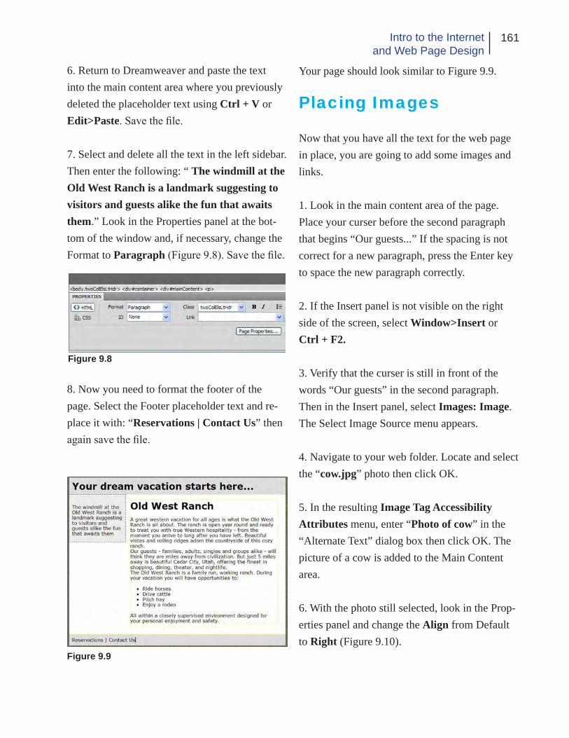
161Intro to the Internetand Web Page Design
Figure 9.8
6. Return to Dreamweaver and paste the text into the main content area where you previously deleted the placeholder text using Ctrl + V or Edit>Paste. Save the file.
7. Select and delete all the text in the left sidebar. Then enter the following: “ The windmill at the Old West Ranch is a landmark suggesting to visitors and guests alike the fun that awaits them.” Look in the Properties panel at the bot-tom of the window and, if necessary, change the Format to Paragraph (Figure 9.8). Save the file.
8. Now you need to format the footer of the page. Select the Footer placeholder text and re-place it with: “Reservations | Contact Us” then again save the file.
Figure 9.9
Your page should look similar to Figure 9.9.
Placing Images
Now that you have all the text for the web page in place, you are going to add some images and links.
1. Look in the main content area of the page. Place your curser before the second paragraph that begins “Our guests...” If the spacing is not correct for a new paragraph, press the Enter key to space the new paragraph correctly.
2. If the Insert panel is not visible on the right side of the screen, select Window>Insert or Ctrl + F2.
3. Verify that the curser is still in front of the words “Our guests” in the second paragraph. Then in the Insert panel, select Images: Image. The Select Image Source menu appears.
4. Navigate to your web folder. Locate and select the “cow.jpg” photo then click OK.
5. In the resulting Image Tag Accessibility Attributes menu, enter “Photo of cow” in the “Alternate Text” dialog box then click OK. The picture of a cow is added to the Main Content area.
6. With the photo still selected, look in the Prop-erties panel and change the Align from Default to Right (Figure 9.10).

162 Chapter 9Adobe Dreamweaver
The photo should now be located to the right of the paragraph. If the text appears to be covering the photo, press the F4 key twice. Save the file
F4 is a shortcut for View>Hide Panels and al-lows you to view your page without the panels in the way. Selecting it again restores the panels.
7. Position the curser before the text in the left side panel. Be careful not to select it or it will be replaced.
8. In the Insert panel, once again choose Im-age: Images. From your web folder choose the windmill.jpg photo and click OK. Add the word Windmill as the Alternate text and click OK. The Windmill photo is now added to the sidebar and your page should look like Figure 9.11.
9. Next we will use the text in the footer to make links. Select the entire word “Reservations.” Then look in the Properties panel and locate the Link dialog box. It is currently empty. Add the name of the web page that would be viewed if someone were to select the link. In our case name the link “reservations.html.” Click away from the text. The link turns blue with a blue underline.
Making a link that contains only the name of a
Figure 9.11
web page assumes that the page referred to in the link is located in the same folder as the originat-ing page.
10. Select the “Contact Us” text in the footer. Now in the Link dialog box of the Properties panel, enter the following for the URL: http://www.oldwestranch.com/contact.html.
When you link to a web document that is not in the same folder as the originating page, you must provide more information for the server to find the document. If the referred content is on a different server, the compete URL must be given.
You have now finished adding the content to your page - save it once more. In the next sec-tion, we will make some changes to the font and background. To do so, we will edit the style sheet.
When you place images in a web page, it is best to size them correctly in Photoshop or other
Figure 9.10

163Intro to the Internetand Web Page Design
Figure 9.12
image editing program first. When photos are placed into a web page using Dreamweaver, it is possible to change the display size by drag-ging the photo’s container to make it larger or smaller. But remember in doing so, you are not changing the physical size of the image, only its display size (zoom factor) is changed. Good de-sign practice is to not re-size a photo more than ±10% or quality will be lost.
CSS Changes
Now that the page is basically laid out, we want to change the background color of the entire page body. Rather that doing this in the XHTML code, we will edit the style sheet.
1. If the CSS Styles panel is not already open on the right side of the screen, choose Window>CSS Styles.
2. In the CSS Style panel, if necessary, click “All” to switch from the current mode. This al-lows you to see all the styles associated with the page (Figure 9.12).
3. If necessary, click the plus (+) to the left of the <style> tag in the All Rules window to expand it. Now you can see all the styles that are associ-ated with the page.
4. Select The “body” style then click on the Edit Rule icon at the bottom of the panel (looks like a pencil).
5. When the “CSS Rule definition for body” Figure 9.13
menu opens, look in the category column and be sure “Background” is highlighted (Figure 9.13).
6. Referring to Figure 9.13 locate the “Back-ground-color:” swatch and click it. Now using the eyedropper, click on a color from the color

164 Chapter 9Adobe Dreamweaver
picker. The color picker will immediately close after you select a color.
7. Now click “Apply.” The color of the body background area will change to reflect your color choice.
If you don’t like the color, click the color swatch again and repeat the process until you find a color or shade of gray you like (we used white).
8. Click OK then save the file.
When you are making changes to the CSS, it is helpful to save after each successful change. If you make a mistake on a subsequent change and can’t figure out how to undo it, you can always go back to the previously saved version and try again.
Press F4 to view the page without the panels. When you are finished looking, press F4 again to restore them.
9. Now lets insert a background photo behind the Header text. Click the mouse anywhere in the header text (Your Dream...).
10. Locate the “Tag selector” at the bottom of the document window (Figure 9.14). Then click “<div#header>.” This points to the <div> tag that formats this section (the header) of the page and has the ID of #header.
11. Return to the CSS Styles panel (Figure 9.15). Click Current to switch to the current mode.
Figure 9.14
Figure 9.15

165Intro to the Internetand Web Page Design
Figure 9.16
In the Summary for Selection window, select Background. Then in the Rules window, select “.twoColElsLtHdr #header.”
In order to see the complete names of the rules, it may be necessary for you to re-size the columns in the rule window. To do so, point to the column divider line. When you see the double headed ar-row, hold the mouse button down and drag to the right to re-size the columns.
12. Click the Edit Rule icon (pencil icon) at the bottom of the CSS Styles panel.
13. The CSS Rule definition for .twoColElsLtHdr #Header opens. In the Cat-egory column, make sure Background is se-lected. Click the Browse button at the end of the Background-Image: field.
14. Navigate to your web folder and select the photo “clouds.jpg” then click OK.
15. Back in the CSS Rules definition menu, click Apply. Do not close the menu. Move it out of the way if necessary so you can see the back-ground image applied to the header area.
Now you see that the text looks too dark because of the background. We will change that along with the font in the next steps.
16. In the CSS Rule definition menu, select Type in the Category column. You will now see a place to make changes to the type specification rule for the Header container (Figure 9.16).
17. Click the drop down arrow associated with the Font-family: specification and select “Georgia, Times New Roman, Times, serif” then click Apply again. The new font is applied to the text.
18. Still working in the Type category, locate the swatch next to the Color: specification and click it. Use the eyedropper to select “white” in the color picker. Click Apply one more time.
The text color changes to white. If you are not happy with the color, make changes as you desire. When you are satisfied with your choices, click OK. The save the file.
19. We will make one last change to the text. This time we will edit the text specification for the Main Content division.
Click the mouse anywhere in the text of the main content container (with the cow photo). Then in the Tag Selector (Figure 9.14), click the <div#mainContent> tag. All the text in the con-tainer should be selected and the other containers grayed out.

166 Chapter 9Adobe Dreamweaver
20. In the CSS Styles panel make sure the Current tab is still selected. Then in the Rules window, find and select the “.twoColElsLtHdr #mainContent” rule.
21. Now click the Edit Rule (pencil) icon.
Select Type in the Category column. From the Font-Size: list choose 14. Leave the measure-ment set to pixels. In Line-Height: enter 20. Then click Apply.
22. You may notice the text in the main container slightly crowding the left sidebar container. We will fix that next. In the Category column, select Box. The look in the Margin area. Change the Left: specification to 15. Leave the measurement units specification set to “em.” Click OK. The text moves away from the container margin and the CS Rule definition menu closes. Now save the file again.
23. The last thing we are going to do is change the size of the text in the sidebar to be more ap-propriate for a caption.
Click somewhere in the text under the windmill photo in the left sidebar. Then in the Tag selector, click on the <p> tag.
24. Now once again in the CSS Styles menu, make sure Current is still selected then in the Rules area, verify that “.twoColElsLtHdr #Sidebar 1 h3” is selected. Then click the Edit Rule icon.
25. In the Rule Definition menu, select 9 px for the Font-Size: and change the Font-family: to “Tahoma, Geneva, sans-serif.” Click OK then save the file.
Congratulations, you have completed your first Dreamweaver XHTML web page.
Before you close the application, lets look at your work in a browser to verify that it all works.
Choose File>Preview in Browser. Then in the sub-menu, select a browser from the list. Your page is opened and displayed in the browser window.
If you have been saving your work in your F:\public_html folder at SUU, open a browser and enter your URL (http://www.student.suu.edu/~username) to verify that the page is actu-ally published and available on the web.
As you have seen, designing with Dreamweaver is much easier than writing the XHTML code yourself. However there are times when we need to edit the code or a style sheet for a specific pur-pose so knowing a little XHTML and style sheet terminology is still desirable. In the next section you will gain additional experience designing with XHTML and CSS in Dreamweaver.

167Intro to the Internetand Web Page Design
External CSS & Site Building
Now that you are somewhat familiar with Dreamweaver, we are going to apply what you have learned to set up a web site using external CSS. For our examples we will be working with the templates and not adding content other than links since you already know how to do that. Our objective is to discover how to use a CSS to for-mat multiple pages and to set up and link several pages on your web site.
Since you will be mainly experimenting with templates and CSS, we suggest you not work in your F:\public_html folder because you do not intend for this material to be available on the web.
1. Create a folder on your flash drive to contain the web documents you will be working with in this section. Navigate to your flash drive using My Computer or Windows Explorer. Click the right mouse button in an open area away from other content. Select New>Folder from the menu. Name the folder Web_Site.
2. If it is not already open, launch the Dream-weaver application. Select File>New.
In the New Document dialog box, select “Blank Page.” In the Page Type column select “HTML.” In the Layout column, scroll to the bottom of the list and select “3 column liq-uid, header and footer.” For Doc Type, select “XHTML 1.0 Transitional.” Finally in the Lay-
out CSS dialog box, select “Create New File.” Then click the Create button (Figure 9.17).
3. In the resulting Save Style Sheet File As dia-log box, navigate to your flash drive’s Web_Site folder. Enter the name “main.css” as the name for your style sheet (you can use any name you like). Select the Save button (Figure 9.18).
Dreamweaver saves the CSS and creates the page (Figure 9.19).
For consistency, you will use the same layout for the other pages in your mock web site and will link those pages to the same CSS. But first we want to make a few changes to the current page and modify the style sheet.
4. Make the following changes to the current page.
• Change the Title to “Home Page” • Change the Header to “First Page” • Change the footer to “Page 2 | Page 3”
In the footer, select the text “Page 2.” In the Properties Menu, add the following to the Link box: “page_2.html” (without the quotes). Now select the text “Page 3” and add the Link “page_3.html” to the properties menu. Click in a different area of the page to deselect the text.
5. Select File>Save As. Make sure you are sav-ing to the Web_Site folder, then name the file index.html and click Save.

168 Chapter 9Adobe Dreamweaver
Figure 9.17
Figure 9.18
Figure 9.19

169Intro to the Internetand Web Page Design
6. Now you will make a few changes to the style sheet and later will see how these changes ap-ply to the other pages on your web site. As you proceed with these changes, refer to the previous sections if you have trouble.
First we will change the background color to white. In the CSS Styles panel, select the All button. In the All Rules window, click the (+) in front of main.css to expand the list.
Select the “body” rule from the expanded list and click the Edit Rule (pencil) icon.
7. In the CSS Rule menu, select the Background-Color swatch. Choose White from the color pick-er, then click OK. The background color changes to white.
8. Click somewhere in the text “First Page.” Lo-cate and select the <div#header> tag in the Tag Selector at the bottom of the document window.
In the CSS Styles panel, change to the Current view. Locate and select the “.thrColLiqHdr #header” rule then click the Edit Rule icon.
9. Choose the Type category, change the font to “Tahoma, Geneva, sans-serif.” Change the type color to Red.
In the Background category change the color to a medium blue (#09F or something you prefer). Click OK. The header text should now be red with a blue (or other color) background.
10. Click somewhere in the body text of the first paragraph in the center container (under Main Content). In the Tag Selector, click on the <p> tag.
11. In the CSS Styles panel, make sure the Cur-rent tab is still selected. We want to edit the content of the paragraph rather that the entire container so we need to add a new rule that per-tains only to the selected paragraph.
At the bottom of the panel to the left of the Edit Rule (pencil) icon is the New Rule icon (Figure 9.20). Click the New Rule icon.
The “New CSS Rule” menu appears. For this example, the default settings are fine so just click OK.
The Rule Definition menu now opens. Select the Type Category. Change the font to “Georgia, Times New Roman...” and the size to 16 px then click OK. Verify that the change applied only to the body text in the container.
12. Now you need to save the changes. Select “File>Save All.” Click OK if you get a second-ary menu.
13. With the first page template now ready and changes made to the CSS, we can proceed to make the other pages of your web site.
New RuleFigure 9.20

170 Chapter 9Adobe Dreamweaver
Select File>New. Use the same settings you used for the first page except in the Layout CSS dialog box. Change the CSS Layout to “Link to Existing File” (Figure 9.21).
Select the Attach Style Sheet icon (looks like a chain link) right below the Layout CSS dialog box.
14. In the resulting Attach External Style Sheet menu (Figure 9.22), select the Browse button.
Navigate to your Web_Site folder and select the main.css file. Click OK. If you receive a prompt that the file should be saved first, just click OK to the message.
Figure 9.21
Figure 9.22
Back in the Attach External Style Sheet menu, select OK.
This returns you the New Document menu. Locate and select the Create button. The new document is created and displayed in the docu-ment window.
You will notice that you now have two docu-ments open. You can switch between them by selecting the appropriate tab at the top of the document window.
15. Save and name the new page.
Make sure the new page is displayed. Change both the Title and Header to Page 2 then select File>Save As. Verify that you are saving to the Web_Site folder. Enter “page_2.html” as the page name then save.
It is important that you name this page the same as the name you used in the link of the index.html (first) page. If you don’t, the link will not work correctly.
16. Next we need to place links in the footer of the new page to facilitate navigation to the home page and the third page.
Select the word “Footer” in the footer of the new page. Replace it with the text: “Home | Page 3.”
Select the word “Home.” then look in the Prop-erties panel. To the right of the Link dialog box

171Intro to the Internetand Web Page Design
you see the Browse for Folder icon that resem-bles a file folder (Figure 9.23) select it.
In the Select File menu, choose index.html then click OK. This creates a link to the home page.
17. Select the Page 3 text and enter page_3.html in the Link dialog box. Save the file (File>Save).
18. Now repeat the process of making a new page one more time. To do this, repeat steps 13 and 14.
19. Change the Title and Header of this page to Page 3 . Save and name the document “page_3.html.” The the links on the other two pages that refer to this page will now function.
20. Make the links for this page. Replace the Footer text with “Home | Page 2.”
Select the word Home. Repeat the creation of the Home link from step 16.
Select “Page 2.” Click the Browse for Folders icon in the Link dialog. Choose “page_2.html” from the Web_Site folder content list. Click OK then save the file.
21. Return to the first page by clicking on its
Figure 9.23 Browse for Folders
tab above the document window, then select “File>Preview in Browser.” Select the browser you want from the list.
22. Once the browser opens the first page, click on the links to be sure the other pages load cor-rectly. Verify that the changes you made to the style sheet are reflected in each of the document pages. When you have finished looking chose the browser.
23. Back in Dreamweaver, select the Code view (Figure 9.24).
You see no style sheets. But you do see a <link> tag pointing to the main.css file.
In practice, there may be several style sheets associated with a web page. One may format the entire site while others may contain styles for the current page only. It is also becoming common to have separate style sheets that format a page for the web, print and handheld devices.
Now that you have the web site templates all created, you can return to each page individually
Figure 9.24

172 Chapter 9Adobe Dreamweaver
and add the content that you need for each page.
You do not have to use the same template for all the pages but you should strive for some degree of consistency so your web site is easier to navi-gate. Also remember to try designing to promote accessibility by handicapped individuals.
Save all your photos and multi-media in the Web_Site folder and place them into your web pages as appropriate. Test the pages in a browser occasionally to be sure they look the way you want. Once you have the web site function-ing correctly, you can copy the contents of the Web_site folder to your F:\public_html folder to publish the web site at SUU. If you are publish-ing to a remote server, you can use FTP or other appropriate software to publish your site.
Conclusion
In this chapter you have learned some of the basics of using the Adobe Dreamweaver applica-tion to design and create web content.
As already stated, the intent of the chapter was not to give you an in-depth knowledge of Dreamweaver but to whet your appetite a little so you will want to explore more about the ap-plication and web design on your own.
The placement of multi-media and creation of forms and other interactive contend is also be-yond the scope of the book but certainly within the capabilities of the Dreamweaver application.
Now that you have finished this book, you should have a basic understanding of what the Internet is and a beginning knowledge of how to design and implement web pages. The purpose of the book has not been to make you an expert web designer or completely knowledgeable about any of the software applications. We have only attempted to introduce you to the concepts of the Internet and web design. As a result of your studies, should you desire to explore the topics in greater detail, there are many excellent texts and courses available. Good luck in your future plans to become an expert at web design.

173Intro to the Internetand Web Page Design
Chapter Quiz
1. What type of web content can you make with Dreamweaver?
2. How are Dreamweaver templates helpful?
3. Can you work with CSS in Dreamweaver? How?
4. How is text entry in Dreamweaver like using a word processor?
5. How do you place a photo on a web page with Dreamweaver?
6. Can Dreamweaver be used to create and man-age a complete web site?
Application
1. Use Dreamweaver to open the file you created in chapter seven or another file created with CSS. Examine the page to see how the CSS is handled. Try your hand at editing the CSS in Dreamweav-er to see if you can successfully add rules and make other changes.
2. Create several different pages from the avail-able templates. Experiment with editing photos in Photoshop that are the correct size and orien-tation for the pages. Assemble the content add-ing your own text to make three or four different pages. Try your hand at linking them together. Test the outcome in a browser to see if every-thing works like you expected.
3. Use Dreamweaver to make a simple web site using external CSS. Modify the style sheet and see how it affects all the pages linked to it.

174 Chapter 9Adobe Dreamweaver
References
Adobe Systems (2007). Adobe Dreamweaver CS3: Classroom in a book. Berkeley, CA: Peachpit
Bishop, S., Shuman, J., & Waxer, B.M. (2006) The web collection revealed. Boston, MA: Thomson Course Technology.
Mohler, J.L., & Bowen, K. (2007). Exploring Dreamweaver 8. Clifton Park, NY: Delmar Learning

175Intro to the Internetand Web Page Design

Lance D. JacksonCommunication Technology Engineer
Department of CommunicationSouthern Utah University
351 West University Boulevard Phone: 4 35-586-7867Centrum 211H Fax: 435-865-8352Cedar City, Utah 84720 E-mail: [email protected]
EDUCATION
M.A. Southern Utah University (anticipated May 2009) Professional Communication (emphasis in Mass Communication)
Jackson, L.D. (2009). Introduction to the internet and web page design. Master’s project, Southern Utah University, Cedar City, Utah Project Director: Jon Smith
B.S. Southern Utah University, 1975 (Graduated with high academic honors) Industrial Technology (emphasis in Electronics Technology)
PROFESSIONAL EXPERIENCE
Communication Technology Engineer, Southern Utah University, 1978-Present
Broadcast Engineer/Electronics Technician, Southern Utah University, 1975-1978
COURSES TAUGHT
COMM 156 Radio Lab (I taught the class and supervised the students who operated the university owned radio station – no longer offered)
COMM 307 Technical Broadcasting (I created, and developed this course – no longer offered)
COMM 3070 Communication Graphics (Course emphasizes the use of the Adobe Cre- ative Suite)
UNIVERSITY SERVICE
Served on Communication Department Goals Revision committee 2008.
Served as a member of the SUU Teaching, Learning and Technology Roundtable (TLTR) from its inception through 2001.
vita continued
Served as a member of the Southern Utah University Academic Computer User’s Com-mittee (ACUC) from the inception of the committee though 1997.
Developed and currently help maintain the SUU Communication Department web site and the Masters of Professional Communication web site (http://www.suu.edu/hss/comm).
Help install and maintain hardware and software for the SUU radio and television facili-ties.
Principal writer of and filed the applications with the FCC that permit the SUU radio sta-tion to operate at its current frequency and power.
Assisted with the formation of EDNET, the Utah Educational Network including contrib-uting to the writing of the first statewide NTIA grant proposal.
HONORS/AWARDS
Elected to Golden Key International Honor Society, 2008
Nominated as SUU Outstanding Staff Employee for 2008
Listed in 2005-2006 Empire Who’s Who
Nominated to Who’s Who of Engineering Professionals three times
PROFESSIONAL LICENSES AND CERTIFICATIONS
CompTIA, A+ Computer Certification (2003)
FCC General Radiotelephone Operators Permit
Currently preparing for Adobe ACE certifications
OTHER
Experienced in Adobe Creative Suite Design Premium Software - Photoshop, InDesign, Illustrator & Dreamweaver
FCC Amateur Extra Class Amateur Radio License
Completed additional course work in Novell Network Administration, Cisco Networking Systems, Computer Programming, Computer Hardware and Teacher Education at SUU
APPENDIX
to
Introduction to the Internet and Web Page Design
A Master’s Degree Project
by
Lance D. Jackson

Introduction and History
This project was first started several years ago when I realized that although there are many
good text books available for Web page design and some that cover the layout and design theory.
There were relatively few if any that covered both topics. At that time, I began writing a paper to
hand out to the members of the Communication Graphics class at Southern Utah University, which I
teach.
The original pager was only a few pages long but over the course of years, it grew into a 63
page document covering several different topics. The idea of turning the work into an undergraduate
text book has occurred to me but I had never felt like I had the time to devote to the task.
With the opportunity to work on a master’s degree came the necessity of selecting a project
or thesis topic. Since I am an Amateur Radio Operator (Ham) , my first desire was to do a video
documentary on the history of Amateur radio in Southern Utah. This seemed natural because the
topic had never been addressed and because the father of television, Philo Farnsworth, was born and
raised in Beaver - just a few miles north and some of his descendents still live in the area. However
after considering the matter, I came to the realization that this was just the opportunity I was looking
for to turn my web design paper into the text book that I have desired to do.
Eventually, I presented the idea of the text book to Dr. Jon Smith, Chair of the SUU Com-
munication Department and chair of my Master’s committee. With his support, I selected committee
members based on their expertise in mass communication, advertising and web design. The commit-
tee consisted of Dr. Smith, Dr. Lionel Grady, Dr. Arthur Challis and Mr. Mark Walton, Director of
Web Development at SUU.

The committee first met on April 24, 2008 at which time the project was formally proposed
and approved. Actual work did not begin in earnest until mid August when permission was obtained
from the Adobe Corporation to use screen shots from their products in the text. I had initially hoped
to complete the project by the end of December 2008, but as that date approached, I realized that it
had been a gross underestimate on my part as to the amount of time the project would require.
Toward the end of Fall Semester, I had completed enough of the work to use in the Graph-
ics Class (the first four chapters) and to conduct a pilot study to see if the work was able to fill my
expectations and to ascertain whether the students would find it useful and functional. A copy of the
survey and results is included.
Writing continued throughout most of Spring 2009 Semester and the rough draft was pre-
sented to Dr. Smith for review and comments on March 30, 2009. The project defense is scheduled
for April 16, 2009.
The attached brief diary documents the work on the project which I estimate will have taken
somewhere in the vicinity of 550 to 700 hours to compete.

Master’s Degree Project Diary
April 24, 2008 – Today the project proposal was presented to the committee consisting of Jon Smith (Chair), Art Challis (member), Lionel Grady (member) and Mark Walton (ex-officio member). The project is to be a web design text (workbook) that will be used in the Comm Graphics class. Sug-gestions concerning the format were discussed. Concerns about copyright were discussed. Dr. Smith recommended that the committee be given updates on the progress of the work regularly.
The Microsoft and Adobe websites were searched retrieving copyright and permissions documents from both. These will be studied to determine what, if any, written permissions need to be obtained in order to use screen shots from specific applications in the book.
August 18, 2008 – Today I received permission from Adobe to use screen shots and partial screen shots from their applications in the project.
August 25, 2008 – Spent time looking at where I am and deciding on the next logical steps. Began research for the first chapter (history of the Internet).
September 2, 2008 – Began formatting the text using Adobe InDesign. Decided upon a format and layout for the design. Created several graphics for the text.
September 3, 2008 – Submitted design layout and formatting example to the committee for their comment and suggestions. Continued to develop graphics and write text.
September 4, 2008 – Continued working on text and graphics.
September 19, 2008 – Finished and submitted full rough draft of chapter to committee. Estimated time -70 hours to complete.
October 2, 2008 – Finished the second chapter and sent it to the committee. Estimated time - 40 hours to complete.
November 14, 2008 – Have finished chapter 4 and sent it to the committee. Have completed part of chapter 5 and will meet with the committee today to report on progress and receive further direction. Estimate of time spent so far 200 hrs.
Follow-up: the committee approved the direction the project is taking and gave the go ahead to con-tinue.
December 12, 2008 – Finished and submitted chapter 6 to the committee. It is anticipated that no more work will be done on the project until after the holidays.
January 9, 2009 – Have completed the instructional portion of chapter 7. Need to finish the reference section. Should be finished with it by next weekend. Set goal of finishing entire work by the end of February. Review, rewriting, introduction and index finished by end of March. Defense in early

April. Estimated time so far 300 hrs.
February 6, 2009 – Chapter 7 rough was rejected by Mark Walton due to omission of CSS topic. Revision underway. Chapter 8 completed and submitted to committee. Estimated time 400 hours.
February 13, 2009 - Chapter 7 revision finished and submitted to committee. Estimated time 420 hrs.
March 5, 2009 - Finished Chapter 9 and sent to committee. Estimated time 475 hours.
March 28, 2009 – Finished Submission documents. Estimated time 500 hours.
April 2, 2009 – Began working on the appendix to the project which will include an introduction and history along with supporting documents including permissions forms, survey of students who used the work, etc.

Introduction to the Internet and Web Page Design E-Book Survey
Introduction & Instructions
This survey concerns the E-Book “Introduction to the Internet and Web Page Design.” Once completed, it is intended that the book will become an integral part of the Communication Graphics class offered at SUU.
Please respond as honestly and completely as you can to the following questions. If you elect not to answer any question or if you decline participation in the survey, you may do so with no penalty. Do not put your name or any other personally identifying marks on the survey paper.
Please log in to the student computer system and navigate to the G:>Classes>Jackson folder. There you will find a PDF document named “Intro to Web Design.pdf.” Please open this document and refer to it as neces-sary during the survey. The survey concerns only the portion of the book that is finished. Please disregard any information or content from previous versions you may have seen that follow chapter six. The E-Book is a work in progress and your responses will help to make it better for future classes. If necessary please feel free to look at the book and become familiar with it, if you have not already done so, as you complete the survey. Place a check mark by your response to the following questions.
1. Were you aware of the existence of the E-Book before beginning this survey?
yes___ no___
2. If you were aware of the existence of the book prior to this survey, have you referred to it before?
yes___ no___ (if no then skip to question 7)
3. How many times would you estimate you have referred to the E-Book?
Once___ 2-4 times___ 5-7 times 8 or more times___
4. How thoroughly did you read the book?
Just skimmed it___ Read parts completely___ Read the entire book___
5. What is the main reason you read the book?
Thought it was required___ To get help with a class assignment___ Other___
6. How helpful did you find the book?
Not very helpful___ Somewhat helpful___ Very helpful___
7. The book is intended to provide theory, explanations and exercises to help you grasp the concepts presented. In this regard over-all, how effective do you think the book is?
Not Very Effective___ Somewhat Effective___ Very Effective___

8. How helpful are the figures and illustrations in the book in clarifying the content?
Not very helpful___ Somewhat helpful___ Very helpful___
9. Regarding the figures and illustrations, there are enough to clarify the meaning of the text.
Disagree___ Neither agree or disagree___ Agree___
10. Chapters one through three contain introductory and explanatory material along with some basic design theory. In your opinion, is the material . . .
Too technical___ Too simplistic___ Just right___
11. Chapters beyond the first three also contain step-by-step instructions for completion of various projects. How effective do you feel this instruction is?
Not very effective___ Somewhat effective___ Very effective___
12. With regard to the previous question, how clear do you feel the instruction given is?
Not very clear___ Somewhat clear___ Very clear___
13. Would you prefer to have the book available in printed or electronic format?
Printed___ Electronic___ Both___ No preference___
14. If you had the competed book, how likely would you be to keep it as a reference for future needs?
Not likely___ Somewhat likely___ Very likely___
15. Please take time to discuss your comments and suggestions about the book below.

Discussion on Survey Results
The majority of the respondents reported that the book was very helpful for them to learn the
concepts covered. The main negative comment was that the first few chapters were a little too techni-
cal.
I did not attempt to run a complete statistical analysis of the survey because I am aware that
the results are not generalizable due to the limited size of the sample. The work was also in a non-
competed state at the time and I did not feel that a scientific analysis would result in any significant
revelation that an informal review could disclose. Further the purpose of the survey was not to create
a detailed and thorough analysis but rather to ascertain a few student’s reactions to the work.
Attached at the end of the appendix are copies of the survey results for the committee or
interested parties to review.

Permission to Use Letter and Request
From: Joyce Fowler <[email protected]>To: Lance Jackson <[email protected]>Date: 8/18/2008 2:16 PMSubject: RE: Permission to use request
Hello Lance, thank you for your request. This constitutes the addendum to the full terms set form in the Permissions and trademark guidelines referenced below for reproduction of partial screen shots.Permission to use specific portions of a screen shot.You must first review and accept the terms of the Permissions and trademark guidelines found at http://www.adobe.com/misc/agreement.html and review and agree to the specific guidelines for Screen Shots.Your use may not include screen shots from any other third party material so there is no confusion as to which screen shots belong to Adobe vs. any other third party.You must include the following copyright attribution statement: “Adobe product screen shot(s) re-printed with permission from Adobe Systems Incorporated.”
If your use includes references to an Adobe product, the full name of the product must be referenced at the first and most prominent mention (Adobe(r) Photoshop(r)). When referencing any Adobe trademarks, please mark with a (tm) or (r) as indicated in the Adobe trademark database for general distribution<http://www.adobe.com/misc/linking.html>. If you are distributing materials exclusively in Japan, please contact Adobe<mailto:[email protected]> for a copy of the appropriate Adobe Trademark information for Japan.
If your use includes references to any Adobe trademarks, you should include the following trade-mark attribution statement: “[List of marks used, with “Adobe” first, if used, followed by other Adobe marks used, in alphabetical order] are either registered trademarks or trademarks of Adobe Systems Incorporated in the United States and/or other countries.” If relevant, please also review “Use of Adobe trademarks in titles of books.”We sincerely appreciate and thank you for your support of Adobe products. Please let me know if you have further questions. Sincerely, Joyce
----------------------------------------------------------------------------------------------------------------------From: Lance Jackson [mailto:[email protected]]Sent: Friday, August 15, 2008 1:36 PMTo: [email protected]: Permission to use request
Attached is a Permission to Use Form and example image.
I am a graduate student, Communication Technology Engineer and Adjunct Instructor of Communi-cation Graphics at Southern Utah University. For my graduate thesis (project) I plan to write a text on web design and introduction to the Internet. This text will include both design theory and practi-

cal applications to assist a beginning graphics design student in becoming familiar with the Internet and the design of basic (static) web pages and animated images. The text will include a section on the history of the Internet, basic design considerations, HTML, Adobe Dreamweaver and the use of Adobe Photoshop Extended to create simple animated GIF images and web content. It will also include information specific to the university as far as publishing web content is concerned.
I anticipate that the text will be published only for the students of Southern Utah University and to fulfill the thesis requirement for the graduate degree. Should you have questions concerning the intended use that are not answered by the application, please contact me.
Thank you for reviewing my request and responding as quickly as possible.
Lance JacksonComm Tech EngineerDept of CommunicationSouthern Utah University351 W. University Blvd.Cedar City, UT 84720
phone: 435 586 7867fax: 435 865 8352