Introduction to Information Visualizationzhao/infovis18/lectures/Introduction… · ·...
44
Introduction to Information Visualization
Transcript of Introduction to Information Visualizationzhao/infovis18/lectures/Introduction… · ·...

Introduction to InformationVisualization

References• Edward Tufte:
–The Visual Display of Quantitative Information
–Envisioning Information–Visual Explanation
• Dr. John Stasko’s Information Visualization class slides
• Dr. Jing Yang’s Information Visualization class slides

Data Explosion• Information technology is rapidly changing
our society and life– Computer, internet, iphone, facebook, youtube, GPS,…
• Also introduce huge amount of data• What is the quantitative measurement?
– A 2003 report from UC Berkeley– Instant messaging generates five billion messages a day (750GB), or
274 Terabytes a year. – Email generates about 400,000 terabytes of new information each
year worldwide. – The World Wide Web contains about 170 terabytes of information on
its surface; in volume this is seventeen times the size of the Library of Congress print collections.
– … …– See http://www2.sims.berkeley.edu/research/projects/how-much-
info-2003/ for details

Data Usage• How to use the data
–Make sense of the data–Help data mining and knowledge
discovery–Avoid overwhelming and clutter

Data to Human Perception• Data sources: Web, Books, Papers,
Game scores, Scientific data, Biotech, Shopping, Stock/finance
• Our ability –Vision: 100 MB/s–Ears: <100 b/s–Smell?–Taste?

Visual Perception• Highest bandwidth sense• Fast, parallel• Pattern recognition• Pre-attentive• Extends memory and cognitive
capacity• People think visually

Example• Count the number of 8s in the
following text:
124356428978301243256721352453691263813797802183745902

Example • Count the number of 8s in the
following text:
124356428978301243256721352453691263813797802183745902

Example• Which state has the highest income? Is there a
relationship between income and education? Are there any outliers?
Example courtesy of Chris North

Example• Which state has the highest income? Is there a
relationship between income and education? Are there any outliers?

Visualization• Present data in a vision friendly way
to promote people understand and gain insight from it– “Seeing is believing”– “A picture is worth a thousand words”
• The purpose of visualization is insight, not pictures

Visualization• Visualization - the use of computer-
supported, interactive visual representations of data to amplify cognition From [Card, Mackinlay Shneiderman ’98]
• A cognitive process not just graphics and images– Form a mental image of something– Internalize an understanding
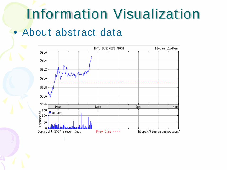
Information Visualization• About abstract data

Information Visualization• About numerical data

Information Visualization• About ordinal data
ThemeRiver: Visualizing Theme Changes Over Time [Havre et al. Infovis 00]

Information Visualization• About nominal data

Information Visualization• About structure data

Information Visualization• About space
From NASA

Information Visualization• About time
From City-Data.com

Information Visualization• About space and time
Figurative Map of the successive losses in men of the French Army in the Russian campaign 1812-1813.Drawn up by M. Minard, Inspector General of Bridges and Roads in retirement. Paris, November 20, 1869

Information Visualization• About change

Information Visualization• About motion and process
Illustration of magic turning a silver coin into a copper coin

What is Information Visualization• Analyzing, communicating, and
decision making“Of all method for analyzing and communicating statistical information, well-designed data graphics are usually the simplest and at the same time the most powerful” - E. Tufte

Story 1: Cholera• Location: London• Time: August and September 1854• Event: Cholera broke out in the
Broad Street area. Dr. John Snow suspected that the water supply was the cause.

Story 1: Cholera
Will these figures help?

Story 1: Cholera• Dr. Snow’s
approach

Story 1: Cholera• Dr. Snow’s conclusion
–The water pump at the Broad Street was contaminated
• The epidemic ended after the handle of that water pump was removed

Story 1: Cholera• Lessons:
1. Place data in appropriate context for accessing cause and effect
2. Make quantitative comparisons3. Consider alternative explanations and contrary cases

Story 2: Challenger
On January 28, 1986, the space shuttle Challenger exploded and seven astronauts died because two rubber O-rings leaked

Story 2: Challenger• Location: USA• Time: January 27,1986• Event: Engineers suspected that
rubber O-rings would fail due to cold weather the next day and requested to delay the launch. They submitted 13 charts to NASA to illustrate their viewpoint

Story 2: Challenger• The chart showed the effect, but does not shown
the possible cause, temperature• Six types of descriptions break the evidence up
into stupefying fragments

Story 2: Challenger• Blow-by and temperature for two
launches (there are other 22 cases left)

Story 2: Challenger• Engineers’ conclusion
–O-rings would fail due to cold weather the next day.
• NASA officers’ conclusion–They wouldn’t fail.
• Consequence: Challenger was launched the next day. O-rings failed. ...

Story 2: Challenger• What if this chart was used
E. Tufte

Information Visualization• It is about scale and dimensionality• Scale
–Essential problem in reasoning is comparison
–Comparisons must be enforced within scope of eye span
• Dimensionality–The world is multi-dimensional–The paper and computer is 2
dimensional

Weather of New York
The figure depicts 1,888 numbers

The Space Debris

The Cancer Maps

Information Visualization• Interactive exploration
–Want to show multiple different perspectives on the data
–A way to increase scalability and dimensionality

Information Visualization• Applications
–Document, images, videos, multimedia–Financial/business data– Internet information– Software

Stock Visualization• Visualization 1:
–Google finance - stock quotes– http://www.google.com/finance

Stock Visualization• Visualization 2:
–Smartmoney Map of Market http://www.smartmoney.com/map-of-the-market/

• Online American history textbook• http://www.digitalhistory.uh.edu/timeline/timelineO.cfm

The Need• In five years, 100 million people will
be using an information-visualization tool on a near-daily basis. And products that have visualization as one of their top three features will earn $1 billion per year
Ramana Rao, founder and chief technology officer, Inxight Software Inc., Sunnyvale, Calif


![ICS Summer School, Roscoff Introduction to Scientific Visualization · 2017. 5. 9. · Introduction [Scientific] visualization Chart junk (E. Tufte) Which of these visualizations](https://static.fdocuments.us/doc/165x107/60b7ce2d62e5f7154217588a/ics-summer-school-roscoff-introduction-to-scientiic-visualization-2017-5-9.jpg)