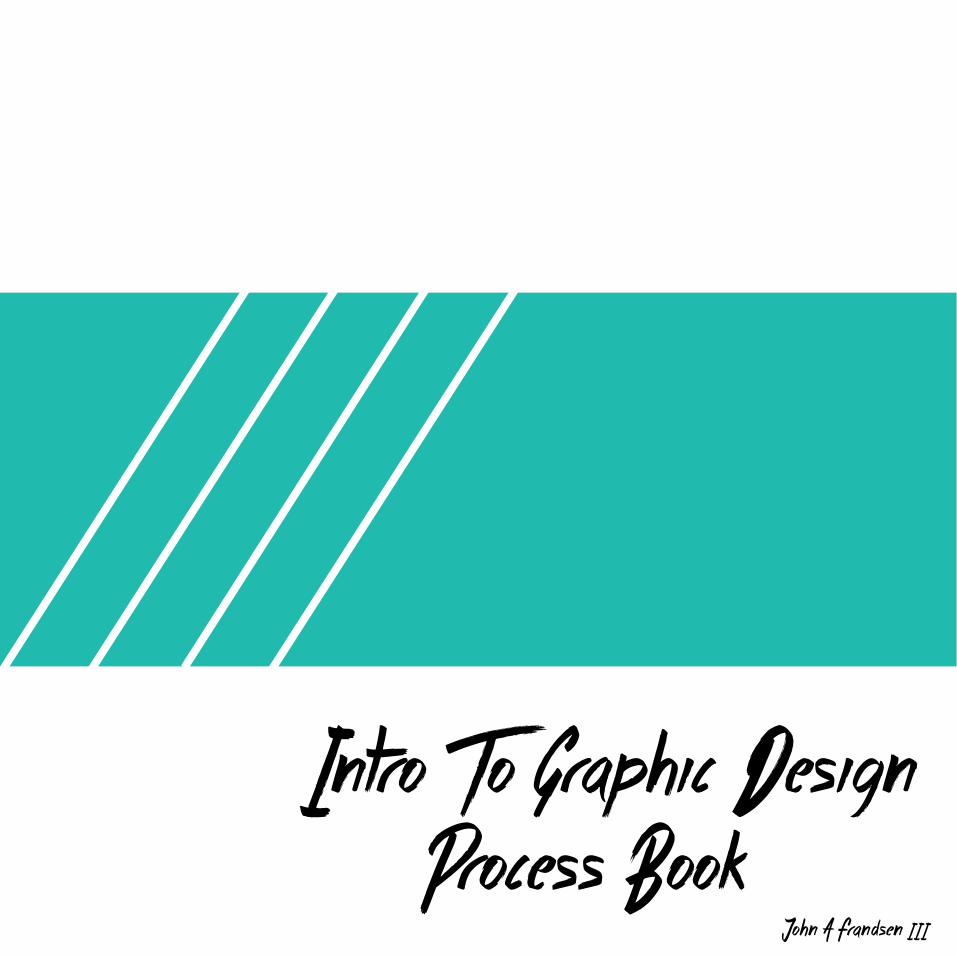
Intro To Graphic Design Process Book
15
Intro To Graphic Design Process Book John A Frandsen III
-
Upload
jfrandsen-iii -
Category
Documents
-
view
228 -
download
2
description
Â
Transcript of Intro To Graphic Design Process Book
Intro To Graphic Design Process Book
John A Frandsen III
01
C O N T E N T S
03
05
0709
11
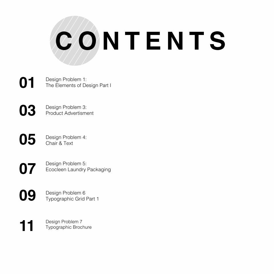
Design Problem 1:The Elements of Design Part I
Design Problem 3:Product Advertisment
Design Problem 4: Chair & Text
Design Problem 5:Ecocleen Laundry Packaging
Design Problem 6Typographic Grid Part 1
Design Problem 7Typographic Brochure
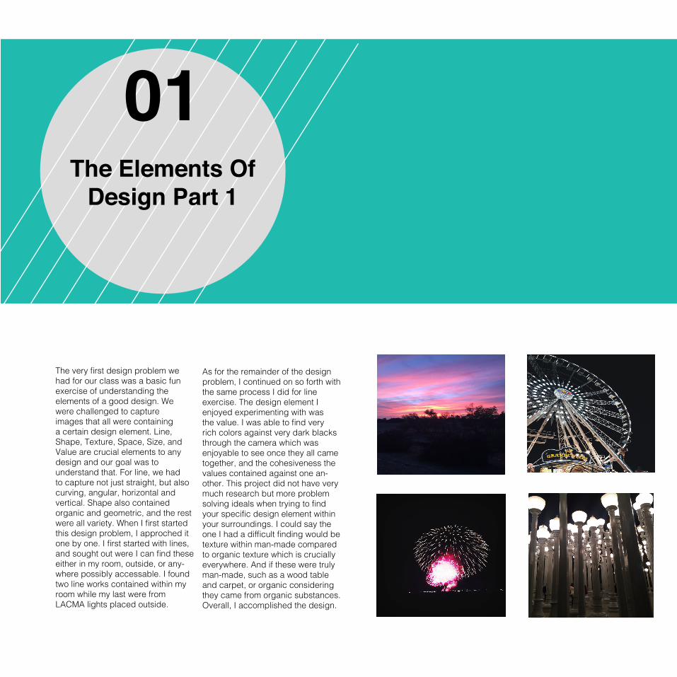
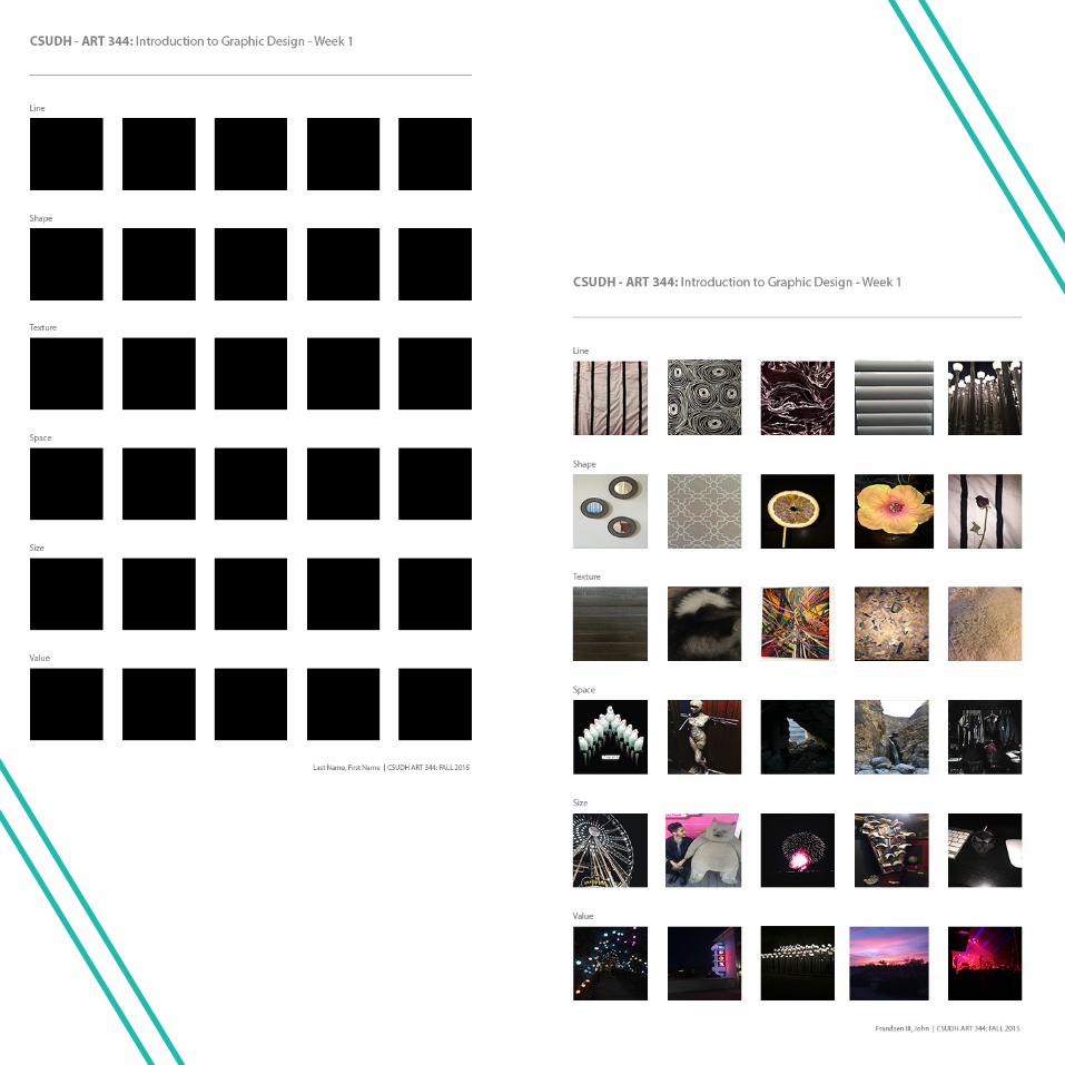
01The Elements Of
Design Part 1
The very first design problem we had for our class was a basic fun exercise of understanding the elements of a good design. We were challenged to capture images that all were containing a certain design element. Line, Shape, Texture, Space, Size, and Value are crucial elements to any design and our goal was to understand that. For line, we had to capture not just straight, but also curving, angular, horizontal and vertical. Shape also contained organic and geometric, and the rest were all variety. When I first started this design problem, I approched it one by one. I first started with lines, and sought out were I can find these either in my room, outside, or any-where possibly accessable. I found two line works contained within my room while my last were from LACMA lights placed outside.
As for the remainder of the design problem, I continued on so forth with the same process I did for lineexercise. The design element I enjoyed experimenting with was the value. I was able to find very rich colors against very dark blacks through the camera which was enjoyable to see once they all came together, and the cohesiveness the values contained against one an-other. This project did not have very much research but more problem solving ideals when trying to find your specific design element within your surroundings. I could say the one I had a difficult finding would be texture within man-made compared to organic texture which is crucially everywhere. And if these were truly man-made, such as a wood table and carpet, or organic considering they came from organic substances. Overall, I accomplished the design.
03Product
AdvertisementDesign
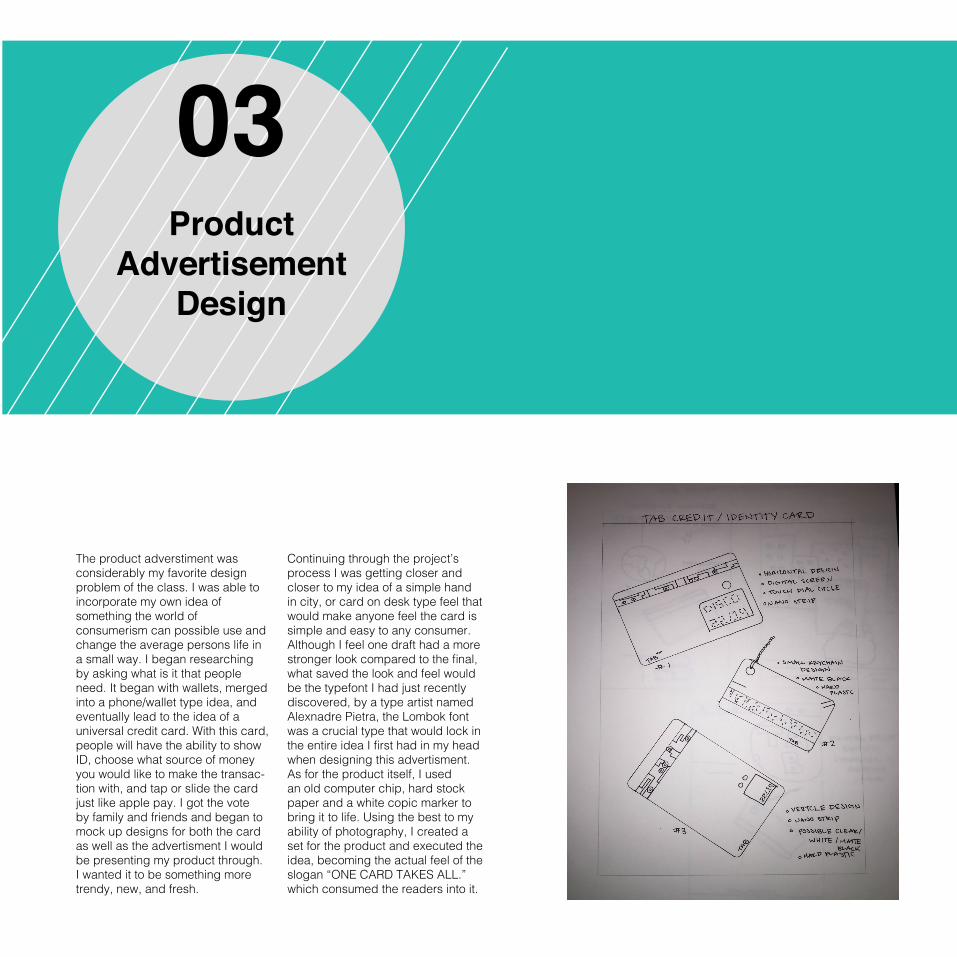
The product adverstiment was considerably my favorite design problem of the class. I was able to incorporate my own idea of something the world of consumerism can possible use and change the average persons life in a small way. I began researching by asking what is it that people need. It began with wallets, merged into a phone/wallet type idea, and eventually lead to the idea of a universal credit card. With this card, people will have the ability to show ID, choose what source of money you would like to make the transac-tion with, and tap or slide the card just like apple pay. I got the vote by family and friends and began to mock up designs for both the card as well as the advertisment I would be presenting my product through. I wanted it to be something more trendy, new, and fresh.
Continuing through the project’s process I was getting closer and closer to my idea of a simple hand in city, or card on desk type feel that would make anyone feel the card is simple and easy to any consumer. Although I feel one draft had a more stronger look compared to the final, what saved the look and feel would be the typefont I had just recently discovered, by a type artist named Alexnadre Pietra, the Lombok font was a crucial type that would lock in the entire idea I first had in my head when designing this advertisment. As for the product itself, I used an old computer chip, hard stock paper and a white copic marker to bring it to life. Using the best to my ability of photography, I created a set for the product and executed the idea, becoming the actual feel of the slogan “ONE CARD TAKES ALL.” which consumed the readers into it.
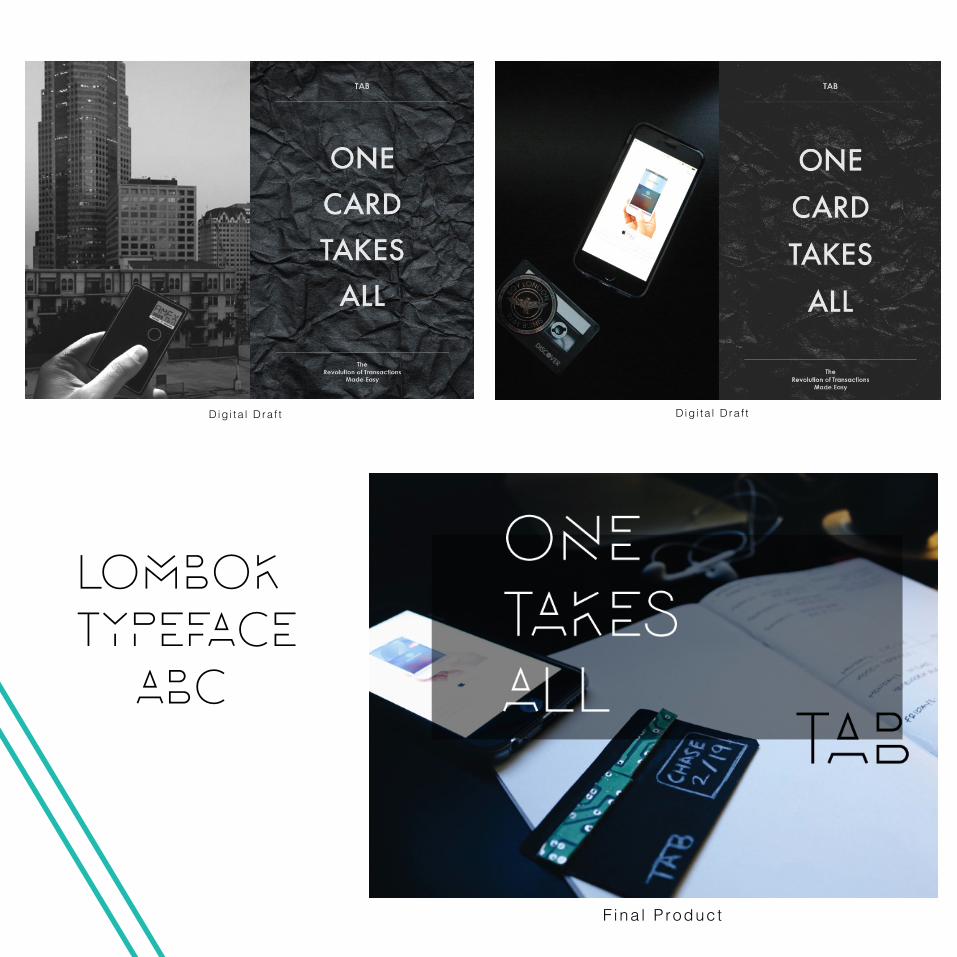
LOMBOKTYPEFACE ABC
Dig i ta l D ra f t D ig i ta l D ra f t
F i na l P roduc t
05Chair & Text
Design
The professor gave us an insight onto this project which is called “chair & text” before letting us go out and execute it ourselves which helped with a better understanding. Rather than it be a design that we need to create, our typography was being challenged as an aspect to the graphic design world. Here, we would learn how to create a symmetrical balance, asymetrical balance, contrast, rhythm, and a focal point. I used what I know about typography to its best ability, and wanted to challenge myself a bit more considering this design piece was a given, and not a creation of our own. Im a fan of minimalist designs and figured I can take that with me throughout this entire project as much as I can. One thing I learned was that few
of these balances can look the same while others can be completly different from one another. The most challenging one was asymet-rical balance considering theres so many possibilites you can go with it without it looking like another type compositional techniques. Considering the fact that the image was black and white was what helped create a majority of these compositions, such as vaule, unity, and rhythm. I first started by utilizing the text and creating the balance I needed, and from there make my way to the picture itself and how I can compliment the text. Overall the design problem helped me consid-er the different aspects to typogra-phy and its cruical need to aset the design of any artwork. The challenge was accepted and I found myself creating a good collage for this piece.
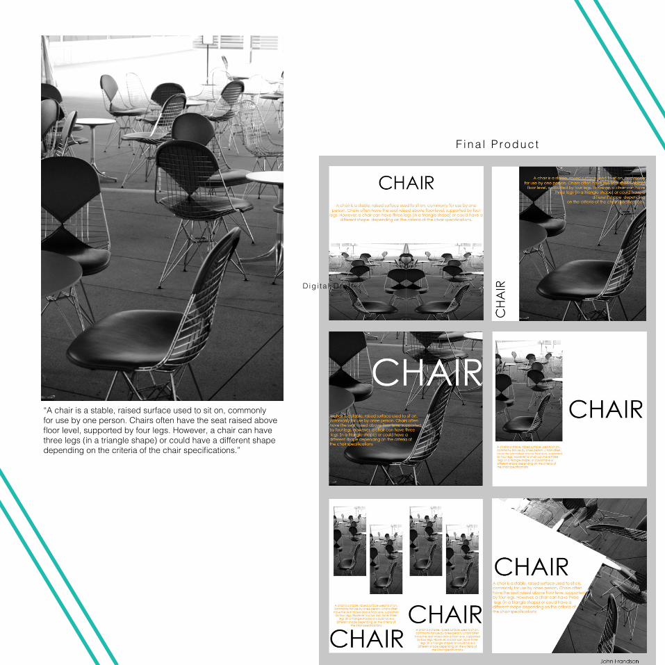
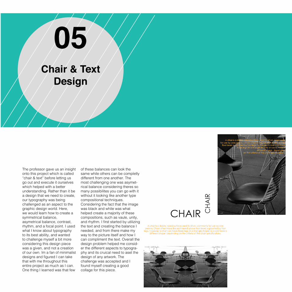
“A chair is a stable, raised surface used to sit on, commonly for use by one person. Chairs often have the seat raised above floor level, supported by four legs. However, a chair can have three legs (in a triangle shape) or could have a different shape depending on the criteria of the chair specifications.”
F ina l P roduc t
Dig i ta l D ra f t
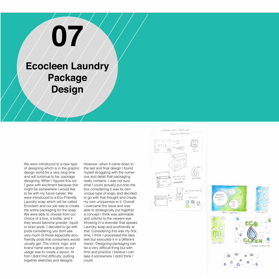
07Ecocleen Laundry
Package Design
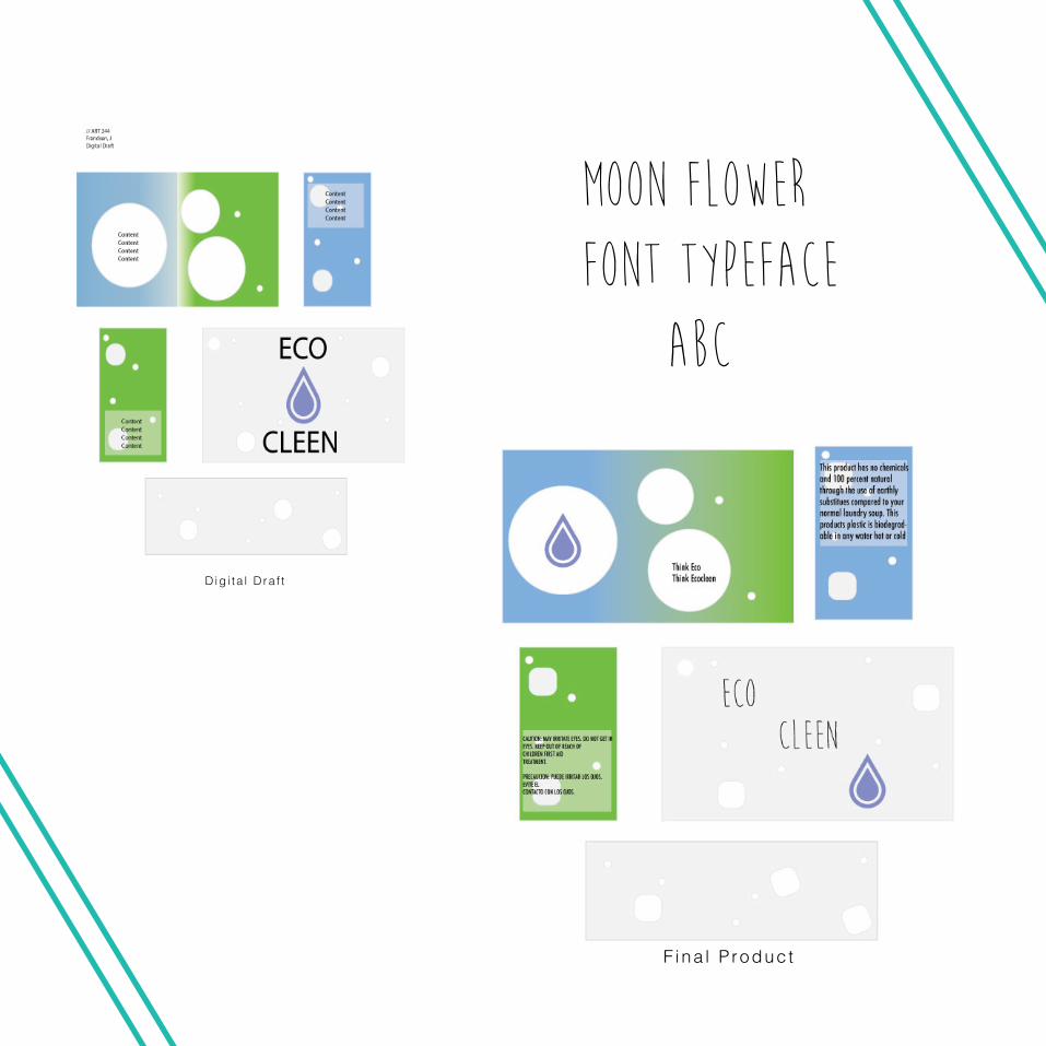
We were introduced to a new type of designing which is in the graphic design world for a very long time and will continue to be, package designing. When I figured this out I grew with excitment because this might be somewhere I would like to be with my future career. We were introduced to a Eco Friendly Laundry soap which will be called Ecocleen and our job was to create the entire packaging for the soap. We were able to choose from our choice of a box, a bottle, and if they would become powder, liquid, or even pods. I decided to go with pods considering you dont see very much of those especially eco-friendly pods that consumers would usually get. The colors, logo, and brand name were a given so our usage was to create a layout. At first I didnt find difficulty, putting together sketches and designs.
However, when it came down to the last and final design I found myself struggling with the numer-ous and detail that packaging really contains. I was not sure what I could actually put onto the box considering it was its own unique type of soap, and decided to go with that thought and create my own uniqueness to it. Overall I overcame the issue and was able to strategically put together a concept I think was admirable and colorful to the viewers eye throwing in a lavender that speaks Laundry soap and ecofriendly at that. Considering this was my first time, I think I processed the idea well but executed it in a different manor. Designing packaging can be a very difficult thing but with time and practice I believe I can take it somewhere I didnt think I could.
Dig i ta l D ra f t
F i na l P roduc t
MOOn Flower Font Typeface ABC
09Typographic Grid
Part 1
COMMON TYPOGRAPHIC DISEASES
Various forms of dysfunction appear among populations exposed to typography for long periods of time. Listed here are a number of frequently observed afflictions.
TypophiliaAn excessive attachment to and fascination with the shape of letters, often to the exclusion of other interests and object choices. Typophiliacs usually diepenniless and alone
TypophobiaThe irrational dislike of letterforms, often marked by a preference for icons, dingbats, and—in fatal cases—bullets and daggers. The fears of the typophobe can often be quieted (but not cured) by steady doses of Helvetica and Times Roman.
TypochondriaA persistent anxiety that one has selected the wrong typeface. This condition is often paired with okd (op-tical kerning disorder), the need to constantly adjust and readjust the space between letters.
TypothermiaThe promiscuous refusal to make a lifelong commit-ment to a single typeface—or even to five or six, as some doctors recommend. The typothermiac is constantly tempted to test drive "hot" new fonts, often without a proper license.
COMMON TYPOGRAPHIC DISEASES
Various forms of dysfunction appear among populations exposed to typography for long periods of time. Listed here are a number of frequently observed afflictions.
TypophiliaAn excessive attachment to and fascination with the shape of letters, often to the exclusion of other interests and object choices. Typophiliacs usually diepenniless and alone
TypophobiaThe irrational dislike of letterforms, often marked by a preference for icons, dingbats, and—in fatal cases—bullets and daggers. The fears of the typophobe can often be quieted (but not cured) by steady doses of Helvetica and Times Roman.
TypochondriaA persistent anxiety that one has selected the wrong typeface. This condition is often paired with okd (op-tical kerning disorder), the need to constantly adjust and readjust the space between letters.
TypothermiaThe promiscuous refusal to make a lifelong commit-ment to a single typeface—or even to five or six, as some doctors recommend. The typothermiac is constantly tempted to test drive "hot" new fonts, often without a proper license.
C O M M O N T Y P O -G R A P H I C D I S E A S E SCOMMON TY-P O G R A P H -IC DISEASESCOMMON TY-P O G R A P H -IC DISEASESCOMMON TY-P O G R A P H -IC DISEASESCOMMON TY-P O G R A P H -IC DISEASES
Various forms of dysfunction appear among populations exposed to
typography for long periods of time. Listed here are a number of frequently
observed afflictions.
COMMON TYPOGRAPHIC DISEASES
T Y P O P H I L L AAn excessive attachment to and fascination with the shape of letters, often to the exclusion of other interests and object choices. Typophiliacs usually diepenniless and alone
T Y P O P H O B I AThe irrational dislike of letterforms, often marked by a preference for icons, dingbats, and—in fa-tal cases—bullets and daggers. The fears of the typophobe can often be quieted (but not cured) by steady doses of Helvetica and Times Roman.
T Y P O C H O N D R I AA persistent anxiety that one has selected the wrong typeface. This condition is often paired with okd (optical kerning disorder), the need to constant-ly adjust and readjust the space between letters.
T Y P O T H E R M I AThe promiscuous refusal to make a lifelong com-mitment to a single typeface—or even to five or six, as some doctors recommend. The typothermiac is constantly tempted to test drive "hot" new fonts, often without a proper license.
Various forms of dysfunction appear among populations exposed to
typography for long periods of time. Listed here are a number of frequently
observed afflictions.
C O M M O N T Y P O -G R A P H I C D I S E A S E SCOMMON TY-P O G R A P H -IC DISEASESCOMMON TY-P O G R A P H -IC DISEASESCOMMON TY-P O G R A P H -IC DISEASESCOMMON TY-P O G R A P H -IC DISEASES
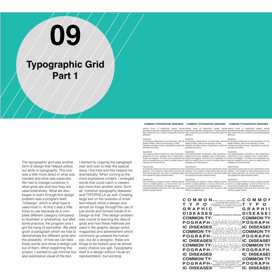
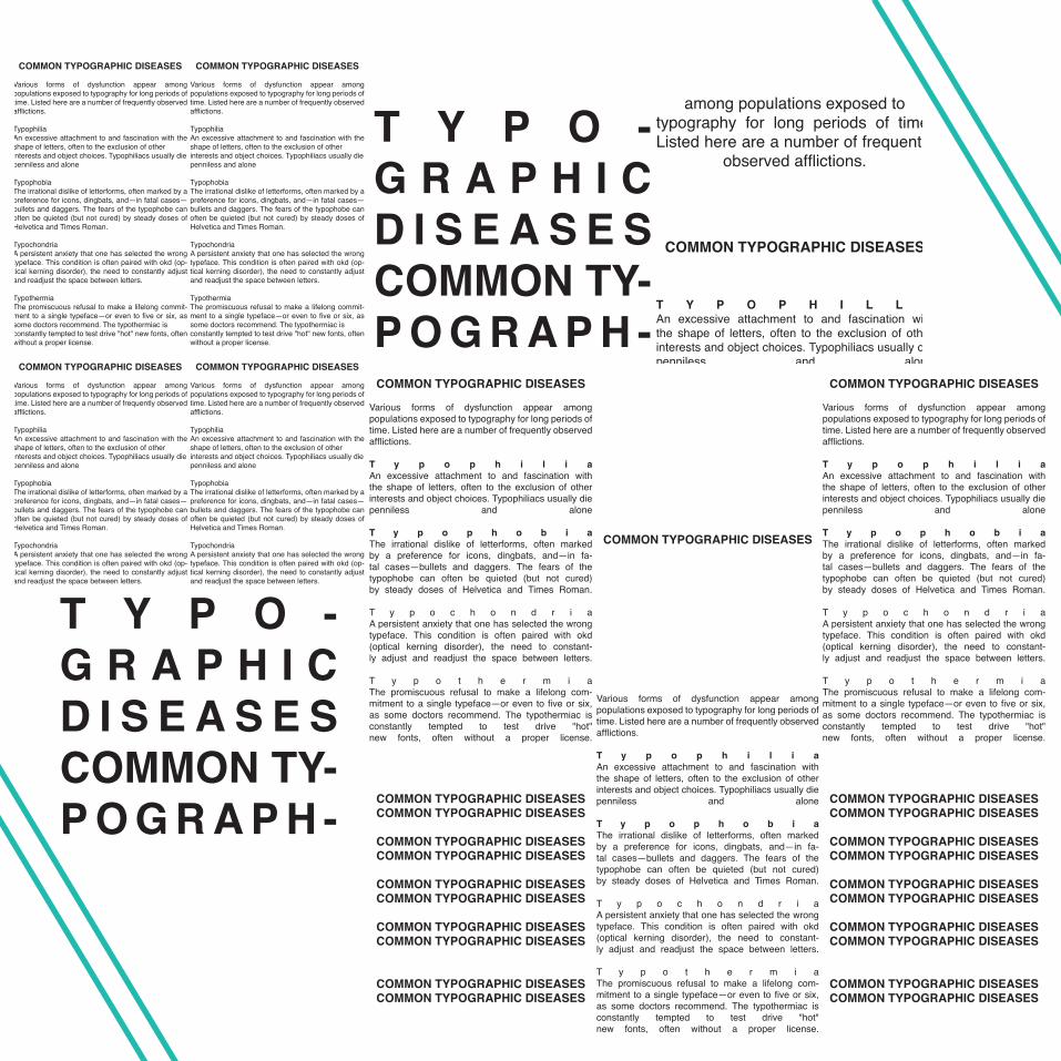
The typographic grid was another form of design that helped utitlize our skills in typography. This one was a little more direct in what was needed and what was expected. We had to indulge ourselves in what grids are and how they are used extensively. What we also began to learn through this design problem was a program itself, “inDesign” which is what type is used most in. At first it was a little tricky to use because its a com-plete different category compared to Illustrator or photoshop, but after some practice, the program and I got the hang of eachother. We were given a paragraph which we had to demonstrate the different grids and the possiblity of how we can take these words and show a design just out of them. When beginning this project, I wanted to use minimal but also expressive visual of the text.
I started by copying the paragraph over and over to help the spacial issue I first had and this helped me dramatically. When coming to the more expressive content, I enlarged words that could catch a viewers eye more than another word, Such as “common typography diseases”and TYPOPHILLA as well. Creating large text on the outsides of small text helped utilize a design and almost an image through the use of just words and formed inside of in-Design at that. This design problem was cruical to learning the idea of grids and how these methods are used in the graphic design world, magazines and advertisment which commonly go passed the human eye, but as a designer, these are things to be looked upon at almost every chance you get. Typography itself is a design without visual art representation, but wording.
COMMON TYPOGRAPHIC DISEASES
Various forms of dysfunction appear among populations exposed to typography for long periods of time. Listed here are a number of frequently observed afflictions.
TypophiliaAn excessive attachment to and fascination with the shape of letters, often to the exclusion of other interests and object choices. Typophiliacs usually diepenniless and alone
TypophobiaThe irrational dislike of letterforms, often marked by a preference for icons, dingbats, and—in fatal cases—bullets and daggers. The fears of the typophobe can often be quieted (but not cured) by steady doses of Helvetica and Times Roman.
TypochondriaA persistent anxiety that one has selected the wrong typeface. This condition is often paired with okd (op-tical kerning disorder), the need to constantly adjust and readjust the space between letters.
TypothermiaThe promiscuous refusal to make a lifelong commit-ment to a single typeface—or even to five or six, as some doctors recommend. The typothermiac is constantly tempted to test drive "hot" new fonts, often without a proper license.
COMMON TYPOGRAPHIC DISEASES
Various forms of dysfunction appear among populations exposed to typography for long periods of time. Listed here are a number of frequently observed afflictions.
TypophiliaAn excessive attachment to and fascination with the shape of letters, often to the exclusion of other interests and object choices. Typophiliacs usually diepenniless and alone
TypophobiaThe irrational dislike of letterforms, often marked by a preference for icons, dingbats, and—in fatal cases—bullets and daggers. The fears of the typophobe can often be quieted (but not cured) by steady doses of Helvetica and Times Roman.
TypochondriaA persistent anxiety that one has selected the wrong typeface. This condition is often paired with okd (op-tical kerning disorder), the need to constantly adjust and readjust the space between letters.
TypothermiaThe promiscuous refusal to make a lifelong commit-ment to a single typeface—or even to five or six, as some doctors recommend. The typothermiac is constantly tempted to test drive "hot" new fonts, often without a proper license.
COMMON TYPOGRAPHIC DISEASES
Various forms of dysfunction appear among populations exposed to typography for long periods of time. Listed here are a number of frequently observed afflictions.
T y p o p h i l i aAn excessive attachment to and fascination with the shape of letters, often to the exclusion of other interests and object choices. Typophiliacs usually diepenniless and alone
T y p o p h o b i aThe irrational dislike of letterforms, often marked by a preference for icons, dingbats, and—in fa-tal cases—bullets and daggers. The fears of the typophobe can often be quieted (but not cured) by steady doses of Helvetica and Times Roman.
T y p o c h o n d r i aA persistent anxiety that one has selected the wrong typeface. This condition is often paired with okd (optical kerning disorder), the need to constant-ly adjust and readjust the space between letters.
T y p o t h e r m i aThe promiscuous refusal to make a lifelong com-mitment to a single typeface—or even to five or six, as some doctors recommend. The typothermiac is constantly tempted to test drive "hot" new fonts, often without a proper license.
COMMON TYPOGRAPHIC DISEASES
Various forms of dysfunction appear among populations exposed to typography for long periods of time. Listed here are a number of frequently observed afflictions.
T y p o p h i l i aAn excessive attachment to and fascination with the shape of letters, often to the exclusion of other interests and object choices. Typophiliacs usually diepenniless and alone
T y p o p h o b i aThe irrational dislike of letterforms, often marked by a preference for icons, dingbats, and—in fa-tal cases—bullets and daggers. The fears of the typophobe can often be quieted (but not cured) by steady doses of Helvetica and Times Roman.
T y p o c h o n d r i aA persistent anxiety that one has selected the wrong typeface. This condition is often paired with okd (optical kerning disorder), the need to constant-ly adjust and readjust the space between letters.
T y p o t h e r m i aThe promiscuous refusal to make a lifelong com-mitment to a single typeface—or even to five or six, as some doctors recommend. The typothermiac is constantly tempted to test drive "hot" new fonts, often without a proper license.
COMMON TYPOGRAPHIC DISEASESCOMMON TYPOGRAPHIC DISEASES
COMMON TYPOGRAPHIC DISEASESCOMMON TYPOGRAPHIC DISEASES
COMMON TYPOGRAPHIC DISEASESCOMMON TYPOGRAPHIC DISEASES
COMMON TYPOGRAPHIC DISEASESCOMMON TYPOGRAPHIC DISEASES
COMMON TYPOGRAPHIC DISEASESCOMMON TYPOGRAPHIC DISEASES
COMMON TYPOGRAPHIC DISEASESCOMMON TYPOGRAPHIC DISEASES
COMMON TYPOGRAPHIC DISEASESCOMMON TYPOGRAPHIC DISEASES
COMMON TYPOGRAPHIC DISEASESCOMMON TYPOGRAPHIC DISEASES
COMMON TYPOGRAPHIC DISEASESCOMMON TYPOGRAPHIC DISEASES
COMMON TYPOGRAPHIC DISEASESCOMMON TYPOGRAPHIC DISEASES
COMMON TYPOGRAPHIC DISEASES
C O M M O N T Y P O -G R A P H I C D I S E A S E SCOMMON TY-P O G R A P H -IC DISEASESCOMMON TY-P O G R A P H -IC DISEASESCOMMON TY-P O G R A P H -IC DISEASESCOMMON TY-P O G R A P H -IC DISEASES
Various forms of dysfunction appear among populations exposed to
typography for long periods of time. Listed here are a number of frequently
observed afflictions.
COMMON TYPOGRAPHIC DISEASES
T Y P O P H I L L AAn excessive attachment to and fascination with the shape of letters, often to the exclusion of other interests and object choices. Typophiliacs usually diepenniless and alone
T Y P O P H O B I AThe irrational dislike of letterforms, often marked by a preference for icons, dingbats, and—in fa-tal cases—bullets and daggers. The fears of the typophobe can often be quieted (but not cured) by steady doses of Helvetica and Times Roman.
T Y P O C H O N D R I AA persistent anxiety that one has selected the wrong typeface. This condition is often paired with okd (optical kerning disorder), the need to constant-ly adjust and readjust the space between letters.
T Y P O T H E R M I AThe promiscuous refusal to make a lifelong com-mitment to a single typeface—or even to five or six, as some doctors recommend. The typothermiac is constantly tempted to test drive "hot" new fonts, often without a proper license.
Various forms of dysfunction appear among populations exposed to
typography for long periods of time. Listed here are a number of frequently
observed afflictions.
C O M M O N T Y P O -G R A P H I C D I S E A S E SCOMMON TY-P O G R A P H -IC DISEASESCOMMON TY-P O G R A P H -IC DISEASESCOMMON TY-P O G R A P H -IC DISEASESCOMMON TY-P O G R A P H -IC DISEASES
C O M M O N T Y P O -G R A P H I C D I S E A S E SCOMMON TY-P O G R A P H -IC DISEASESCOMMON TY-P O G R A P H -IC DISEASESCOMMON TY-P O G R A P H -IC DISEASESCOMMON TY-P O G R A P H -IC DISEASES
Various forms of dysfunction appear among populations exposed to
typography for long periods of time. Listed here are a number of frequently
observed afflictions.
COMMON TYPOGRAPHIC DISEASES
T Y P O P H I L L AAn excessive attachment to and fascination with the shape of letters, often to the exclusion of other interests and object choices. Typophiliacs usually diepenniless and alone
T Y P O P H O B I AThe irrational dislike of letterforms, often marked by a preference for icons, dingbats, and—in fa-tal cases—bullets and daggers. The fears of the typophobe can often be quieted (but not cured) by steady doses of Helvetica and Times Roman.
T Y P O C H O N D R I AA persistent anxiety that one has selected the wrong typeface. This condition is often paired with okd (optical kerning disorder), the need to constant-ly adjust and readjust the space between letters.
T Y P O T H E R M I AThe promiscuous refusal to make a lifelong com-mitment to a single typeface—or even to five or six, as some doctors recommend. The typothermiac is constantly tempted to test drive "hot" new fonts, often without a proper license.
Various forms of dysfunction appear among populations exposed to
typography for long periods of time. Listed here are a number of frequently
observed afflictions.
C O M M O N T Y P O -G R A P H I C D I S E A S E SCOMMON TY-P O G R A P H -IC DISEASESCOMMON TY-P O G R A P H -IC DISEASESCOMMON TY-P O G R A P H -IC DISEASESCOMMON TY-P O G R A P H -IC DISEASES
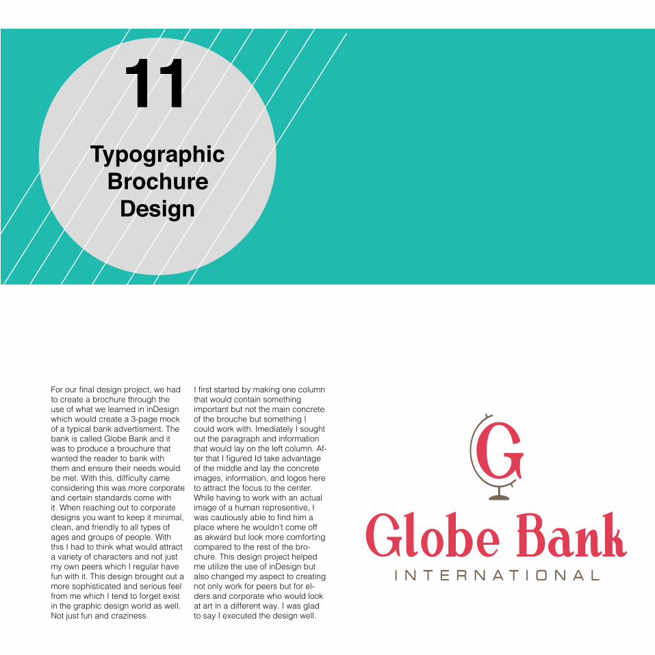
11Typographic
Brochure Design
For our final design project, we had to create a brochure through the use of what we learned in inDesign which would create a 3-page mock of a typical bank advertisment. The bank is called Globe Bank and it was to produce a brouchure that wanted the reader to bank with them and ensure their needs would be met. With this, difficulty came considering this was more corporate and certain standards come with it. When reaching out to corporate designs you want to keep it minimal, clean, and friendly to all types of ages and groups of people. With this I had to think what would attract a variety of characters and not just my own peers which I regular have fun with it. This design brought out a more sophisticated and serious feel from me which I tend to forget exist in the graphic design world as well. Not just fun and craziness.
I first started by making one column that would contain something important but not the main concrete of the brouche but something I could work with. Imediately I sought out the paragraph and information that would lay on the left column. Af-ter that I figured Id take advantage of the middle and lay the concrete images, information, and logos here to attract the focus to the center. While having to work with an actual image of a human representive, I was cautiously able to find him a place where he wouldn’t come off as akward but look more comforting compared to the rest of the bro-chure. This design project helped me utilize the use of inDesign but also changed my aspect to creating not only work for peers but for el-ders and corporate who would look at art in a different way. I was glad to say I executed the design well.
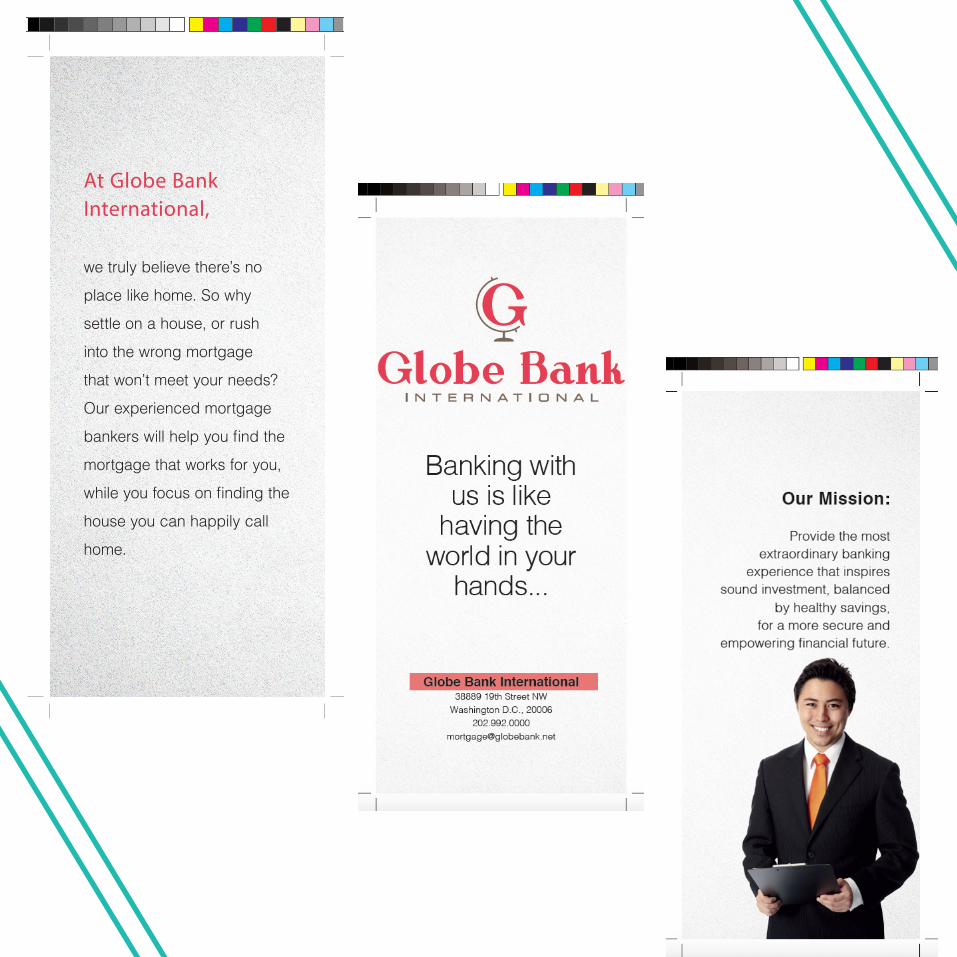
At Globe Bank International,
we truly believe there’s no
place like home. So why
settle on a house, or rush
into the wrong mortgage
that won’t meet your needs?
Our experienced mortgage
bankers will help you find the
mortgage that works for you,
while you focus on finding the
house you can happily call
home.
California State University Dominguez Hills Intro to Graphic Design Fall 2015
John Allen Frandsen III