Interpreting Digital Images
32
Interpreting Digital Images Global Systems Science July, 2003 Edition By John Pickle and Jacqueline Kirtley Contents 1. Three-Color Light ....................... 3 2: Pictures and Colors .................... 9 3: Exploring & Measuring Light .... 15 4: Displaying Invisible Light ......... 21 5: Using Analysis Tools ................ 23 6: Satellite Analysis ...................... 27 Acknowledgements ...................... 30
Transcript of Interpreting Digital Images

Global Systems Science Interpreting Digital Images 1
Interpreting Digital Images
Global
Systems
Science
July, 2003 Edition
By John Pickle and Jacqueline Kirtley
Contents
1. Three-Color Light ....................... 3
2: Pictures and Colors .................... 9
3: Exploring & Measuring Light .... 15
4: Displaying Invisible Light ......... 21
5: Using Analysis Tools ................ 23
6: Satellite Analysis...................... 27
Acknowledgements ...................... 30

2 Global Systems Science Interpreting Digital Images
Satellite image courtesy of the United States Geological Society (USGS) from their web site:
http://edcwww.cr.usgs.gov/earthshots/slow/tableofcontents
Interpreting Digital Images (IDI) is a partof the Global Systems Science (GSS)curriculum materials.http://lhs.berkeley.edu/GSS/
Copyright 2003 by the Regents of the University of California.All rights reserved.
IDI is a joint project of theMuseum of Science, Boston and Lawrence Hall of Science

Global Systems Science Interpreting Digital Images 3
1. Three-Color Light
Many of us were taught at a young age that the primary colors are red,
yellow, and blue. Our early experiences with color mixing were blending together
paints where yellow and blue make green and the three colors stirred together
make a color ranging from brown, gray, or black. From this we have two errors in
our understanding of color. First, primary colors can be mixed together to create
all other colors. Second, that red, yellow, and blue are the primary colors.
When we talk about primary colors, we generally think about
three colors which can be mixed together to create all of the colors
of the rainbow. Have you ever tried to make black out of your
red, yellow, and blue? Even more difficult—try to make
fluorescent pink, silver, or gold. Primary colors cannot make
all other colors, but they can make the most colors from
the fewest starting resources.
There are two sets of primary colors: one for pigment
(dyes and paints) and another for light. Look at the
printing process for the color pages of your local
newspaper or a color printer, you will see that the rainbow
of colors is created from four colors of ink: cyan, magenta,
yellow, and black. Modern printing has found that
combinations of cyan, magenta, and yellow (which are
very specific shades of blue, red, and yellow) can create
the maximum number of colors. When mixed together in equal
parts, the three create black (or gray). In printing, the black ink
has been added as a fourth color to use less ink. To see how this
works, take a microscope or magnifying glass to a color picture in the morning
paper or a magazine.
Introduction to Three-Color Light
What you will see up close is a series of
overlapping dots of various sizes and transparency
in those four colors. You may even see a newspaper
once in a while where the color layers were not
properly lined up so the images appear to be double
and the picture colors are not right.
In light, the primary colors are red, green, and
blue. Despite what you learned in paint, when you
mix yellow and blue light the result is white. Color
television and computer monitors use the three
primary colors of light to display thousands or
millions of different colors. If you now take your
magnifying glass to your computer monitor or
television, you will see a regular pattern of red,
green, and blue lines or dots. Each of these glows
at varying intensities, just as a color printer drops
varying amounts of ink. In both cases, what you
perceive is the mixing of the primary colors and up
to 16.8 million different colors on the screen.

4 Global Systems Science Interpreting Digital Images
The difference here is a matter of reflection and absorption. Pigment and
paint are substances that absorb specific wavelengths of light, subtracting them
from the light energy reflected by the surface. A blue painted surface will absorb
all colors of light except the blue, which it reflects back. The reflected light
reaches your eyes and you perceive the color blue. A colored light bulb or a
computer monitor is a light source which shines or adds light energy of specific
wavelengths. A red light bulb shines light directly to your eyes and you perceive
the color red.
Computer MonitorsA number of different technologies are used at present for computer displays
or monitors. The two most common are the cathode ray tube (CRT) and the liquid
crystal display (LCD; common in laptop computers). Here is a brief introduction
to the CRT, although this is only the tip of the iceberg.
A CRT consists of a negatively charged heated metal filament, called a
cathode, inside a glass vacuum tube. Coming out from the cathode is a ray of
electrons. A positively charged metal piece, called the anode, attracts the electron
beam and focuses it onto the screen at the front of the glass vacuum tube, which
is the front of the monitor. When excited by the beam, a coating of phosphors on
the screen glows. A color CRT has three electron beams and the screen is coated
with phosphors that glow in three different colors: red, green, and blue (RGB).
Each electron beam will excite only the dots or lines on the screen that have
been coated for its color (i.e. the beam for red excites the dots coated in a red
phosphor).
Naming ColorsPeople have given many names to the colors they see. When Isaac Newton
wrote down the colors he saw in the rainbow, he chose to break them out into
In the chart on the next page, guess the
combination of red, green, and blue intensity
values that would create the color in the
left column. Enter your guess in the TriColor
program and see what color is created.
Write what you would call that color in the
last column. If it doesn’t match, use the
extra lines to guess again.
seven names. We still use that list of names today, although you
may find it difficult to pick out the color indigo or the color violet
somewhere in the room.
There are a number of basic color names that people refer to:
red, orange, yellow, green, blue, purple, brown, white, and black.
But individual people may not agree on what to call a specific block
of color. Is it red, orange-red, salmon, burnt-sienna, or watermelon?
Naming or distinguishing between colors is a very subjective process.
As you study light and color throughout this course, you may find
that what you think is pure red has more blue in it than the computer’s
pure red. Don’t let that confuse you, when it comes to studying
color it is not the name of the color that matters most.
Roses are red,
Violets are blue,
How can I express them
In saturation, value, and hue?
Global Systems Science Interpreting Digital Images 5
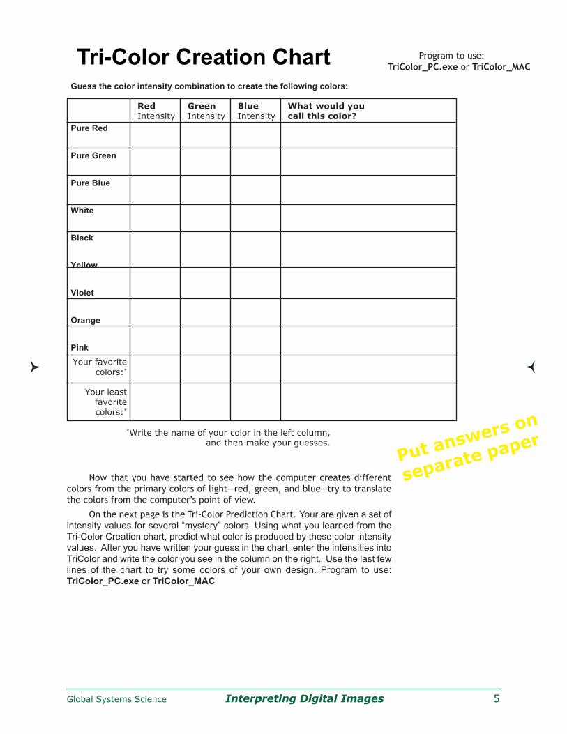
Now that you have started to see how the computer creates different
colors from the primary colors of light—red, green, and blue—try to translate
the colors from the computer’s point of view.
On the next page is the Tri-Color Prediction Chart. Your are given a set of
intensity values for several “mystery” colors. Using what you learned from the
Tri-Color Creation chart, predict what color is produced by these color intensity
values. After you have written your guess in the chart, enter the intensities into
TriColor and write the color you see in the column on the right. Use the last few
lines of the chart to try some colors of your own design. Program to use:
TriColor_PC.exe or TriColor_MAC
Put answers on
separate paper
Tri-Color Creation ChartGuess the color intensity combination to create the following colors:
Red Green Blue What would youIntensity Intensity Intensity call this color?
Pure Red
Pure Green
Pure Blue
White
Black
Yellow
Violet
Orange
Pink
Your favoritecolors:*
Your leastfavoritecolors:*
*Write the name of your color in the left column,and then make your guesses.
Program to use:
TriColor_PC.exe or TriColor_MAC

6 Global Systems Science Interpreting Digital Images
Tri-Color Prediction ChartRed Green Blue What color do you What color do youIntensity Intensity Intensity guess this is? see with TriColor?Value Value Value
100 100 0
0 100 100
100 0 100
75 75 75
50 50 50
25 25 25
100 50 50
100 50 0
100 0 50
50 100 50
0 100 50
0 50 100
75 50 25
Put answers on
separate paper

Global Systems Science Interpreting Digital Images 7
Tri-Color GameTest your understanding of how a computer creates color from intensities of red, green,
and blue with a little competition. Play the game against another student or against the computer.
Try to match the red, green, and blue intensities of the “secret” color. The software will keep
track of the number of guesses each player uses to match the secret color.
Program to use: Game_TriColor_PC.exe or Game_TriColor_MAC
Here is how you play:
1. Select the level of difficulty for your game. There are three levels of difficulty that
determine how close the guess color must be to the secret color in order for the colors
to ‘match’. On Easy, the guess must match the secret color to within 15% of each of the
3 color intensities; Medium is to within 10%; and Hard is to within 5% of the secret color.
2. Select your opponent from the menu button next to ‘Opponent’: “Play a Person” or
“Play the Computer.”
3. Click “Set Secret Color.” If you are playing a person, Player 1 enters 3 color intensity
values in the boxes on the secret color window that pops up. Player 2 should cover his/
her eyes or look away while Player 1 enters the numbers. If you are playing the computer,
a color is randomly set.
4. Try to reproduce the color: make the right box color the same color as the left box
color.
5. Once the color is matched, you can explore the colors that match for the level
selected by clicking on “Explore Matched Colors”, then you can switch roles and Player
2 will set a secret color.
6. Play as many rounds as time permits. Your scores appear at the bottom right corner
of the screen.
The winner is the player who took the LEAST number of tries to
match the colors.
Note: The game can be played with more than 2 players by dividing
players into team 1 and team 2.
On the following page, make a chart that summarizes the
“formulae” for common colors in terms of intensity values of the
three primary colors. Keep it handy—it will help you in interpreting
color digital images.

8 Global Systems Science Interpreting Digital Images
Tri-Color Reference ChartUse data that you’ve already collected as well as both software
programs (TriColor and Game_TriColor) to fill the color intensity values
on this chart.
Color Red Green BlueIntensity Intensity Intensity
Value Value Value
Black
White
Red
Yellow
Green
Cyan
Blue
Magenta
Orange
Purple
Brown
Pink
Light Gray
Medium Gray
Dark Gray
Color in Computer ImagesComputers use intensities of the colors
red, green, and blue to create a myriad of
different colors on our monitors. Throughout
this activity you have used percentages to
create over a million colors—primary color
intensities ranged on a scale of 0 to 100
percent. Most digital images use a binary
scale with 28 levels. Instead of 101 possible
intensity values, there are 28, or 256, possible
intensity values for each color. These images
can display over 16.8 million different colors.
Put answers on
separate paper

Global Systems Science Interpreting Digital Images 9
2: Pictures and Colors
Introduction to PixelsThe term pixel is a truncation of the phrase “picture element”
which is exactly what a pixel is. A pixel is the smallest block of color
in a digital picture. The term is also used for the smallest block of
color on your computer monitor. In fact, to run these activities we
recommend that you have the display setting for screen area on your
monitor set to at least 1024x768 pixels. What that means is that your
monitor has 786,432 blocks of colors arranged in rectangle with 1024
columns and 768 rows.
The resolution of an image refers to the number of pixels used
to display an image. A higher resolution image uses more pixels and
allows for more detail to be seen in the picture. Scanners and printers
will often advertise their resolution in dots per inch (dpi), which is
the number of pixels per inch that they are capable of recording or
depositing. A document printed at low resolution (fewer dpi) has
jagged steps of dots that make up a curve like the letter “O”. From
a high resolution printer (more dpi), that same letter looks like a
smooth circle.
Images of a rubber duck with large
pixels and with very small pixels.
You see color on things around you because light shines
into your eye, is received by the cones and rods of your retina,
and converted to electrochemical signals that are then processed
through your brain. A digital camera detects color because
light shines on sensors in your camera which are sensitive to
red, green, and blue. The number of sensors in the camera will
define the highest resolution possible for that camera.
A traditional film-based camera records an image onto a
chemically treated plastic. Digital cameras record the red,
green, and blue intensities for each pixel into a numerical file –
the values of color and position of the pixel are defined with
numbers. A number of different file types are used to compress
the data so the file takes up a minimal amount of computer
memory. To display the image on the computer screen, the
computer takes the red intensity value for a particular pixel
from the file and shines the red component of the pixel at that
amount at that place on the computer screen. It does the same
thing for the other two primary colors (green and blue) for every
pixel in the image.
Color Within a Digital Picture

10 Global Systems Science Interpreting Digital Images
Seeing Only One Color of Light
back at your data from Part 1, you will see that if
we remove blue from our white light, the color that
we are left seeing is yellow. The scattered blue
light leaves the sun looking yellow.
But we all know that the sky is not always blue.
At sunset and sunrise, the sky includes many more
colors from throughout the spectrum. You may have
picked up on the use of the word “efficient” above.
Other colors of light are scattered by our
atmosphere, but not as efficiently as the blue. When
the Sun is high in the sky, its light has a shorter
distance to travel through the atmosphere and the
blue light is scattered. When the sun is low in the
sky, the path is much longer and more colors of light
are scattered.
While the question “why is the sky blue?” is
one of general interest, the reason we are discussing
it here is to start thinking about the effect that our
atmosphere has on the light that travels through it.
If we are going to take an image from space of light
that shines from the Sun through the atmosphere
and is reflected back up to space, then we must
pay attention to what the atmosphere does to that
light on its travels.
When we talk about seeing only one color we are not referring to
the condition known as color blindness. People who are colorblind
have difficulty distinguishing between certain colors, for example red
and green, but they are still capable of perceiving light of both colors.
What we are talking about is if you could only see the small range of
light wavelengths that is called “red”. You would be unable to perceive
the spectrum of light including orange, yellow, green, blue, and violet.
In satellite images, each color is data of the image that provides
specific information. By turning off all of the light that is not red, we
can look solely at the information that red light provides. If we were
physically only able to see the range of light that is red, it would
appear more like a black and white image than a red and black image.
The use of black and white to view such information allows us to make
out details and differences in shade and intensity more easily.
Why is the Sky Blue?The Sun produces white light. White is the combination of all of
the colors of the rainbow. When we view sunlight through a prism, we
bend the colors so that they are separated. When sunlight shines
through our atmosphere, it is bent and scattered by particles. Our
atmosphere, because it is largely made up of nitrogen and oxygen, is
most efficient at scattering blue wavelengths of light. If you look
Images of rubber duck: above with complete set
of red, green, and blue colors, and below with
only red and blue colors

Global Systems Science Interpreting Digital Images 11
Question 2.1. How does the resolution of an image affect what you can see?
Why would you need more pixels to identify an image?
Question 2.2. When could you identify an image with large pixels? How
does resolution affect interpreting satellite images?
Pixel Count Chart
The number of pixels in an
image tells you the picture’s
resolution. More pixels
means a higher resolution,
allowing you to distinguish
more details in the picture.
PixelView can increase and decrease the resolution of the image, so that
you can see how many pixels are necessary to recognize the picture’s subject.
When you open an image, it will be at the lowest resolution: 2x2=4 pixels.
Increase the number of pixels until you can make out what the picture is.
Record the resolution needed to recognize the mystery pictures.
Program to use for the following exercises:
PixelView_PC.exe or PixelView_MAC
Mystery
Picture #
At what resolution can
you recognize the
subject of the picture?
What is the subject of this picture?
Color of a PixelThe word pixel comes from the phrase “picture element.” Each pixel displays
the color of a tiny region of the image, and that color is the average color for the
entire region. In the following tables you will look at the red, green, and blue
intensities of a large pixel and the smaller pixels that define the same region.
A. Open a mystery picture of your choice in PixelView. With the resolution at
the minimum, 2x2=4, show the pixel borders for 2x2. Move the cursor over
each pixel and write down the color intensity values shown in the lower, left
corner of PixelView.
B. Increase the resolution of the picture to 4x4=16. This time write down the
color intensity values for the four pixels that cover the same region as the
Upper Left pixel from the 2x2 resolution. In the last row, write the average
value of the column.
Put answers on
separate paper
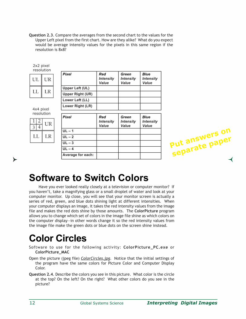
12 Global Systems Science Interpreting Digital Images
Question 2.3. Compare the averages from the second chart to the values for the
Upper Left pixel from the first chart. How are they alike? What do you expect
would be average intensity values for the pixels in this same region if the
resolution is 8x8?
Software to Switch ColorsHave you ever looked really closely at a television or computer monitor? If
you haven’t, take a magnifying glass or a small droplet of water and look at your
computer monitor. Up close, you will see that your monitor screen is actually a
series of red, green, and blue dots shining light at different intensities. When
your computer displays an image, it takes the red intensity values from the image
file and makes the red dots shine by those amounts. The ColorPicture program
allows you to change which set of colors in the image file shine as which colors on
the computer display—in other words change it so the red intensity values from
the image file make the green dots or blue dots on the screen shine instead.
Color CirclesSoftware to use for the following activity: ColorPicture_PC.exe or
ColorPicture_MAC
Open the picture (jpeg file) ColorCircles.jpg. Notice that the initial settings of
the program have the same colors for Picture Color and Computer Display
Color.
Question 2.4. Describe the colors you see in this picture. What color is the circle
at the top? On the left? On the right? What other colors do you see in the
picture?
Pixel Red Green Blue
Intensity Intensity Intensity
Value Value Value
Upper Left (UL)
Upper Right (UR)
Lower Left (LL)
Lower Right (LR)
Pixel Red Green Blue
Intensity Intensity Intensity
Value Value Value
UL – 1
UL – 2
UL – 3
UL – 4
Average for each:
2x2 pixelresolution
4x4 pixelresolution
Put answers on
separate paper

Global Systems Science Interpreting Digital Images 13
Question 2.5. Change the combinations of Picture and Computer Display colors.
What happens to the circle at the top? Can you make the picture have only
one yellow circle?
Seeing One ColorOpen the picture (jpeg file) MOSBuilding.jpg. This is a picture of the
tower of the Museum of Science, Boston, Massachusetts. Notice all of the
colors in this picture—the blue sky, the shades of red and brown in the brick,
the white tower, and the green trees. Imagine what things would look like if
your eyes could only see one color.
Question 2.6. What would this picture look like if we were blind to ALL colors
except red—that is if we could see ONLY red light? How would the image
look different in red than with all colors? Move your mouse over the picture
to see the red intensity values of pixels throughout the image.
Question 2.7. Change the view of this picture so that you can only see the red
intensity values of the image file. To do this, set all three Picture Color
choices to ‘Red’. What areas look bright in red light? Which areas look
dark?
Question 2.8. Now view the picture with only the blue light. How does the
picture look different? What details can you see better in the blue light?
What is visible in the red light?
Question 2.9. When all of the computer display colors show the red picture
color, why does the image appear black and white? If your eyes were only
able to see red, do you think that is what the world would look like?
Colors of the SkyOpen the picture AllSky.jpg. This is a picture of the sky using a camera
with a fish-eye lens, which allows most of the sky to be seen at once. This
picture is courtesy of Chuck Wilcox at the Museum of Science, Boston,
Massachusetts.
Now that you have learned so much about color and light, get to know
the colors in this picture. Move your mouse around the image and notice the
color intensity values throughout the picture. Change which picture colors are
seen in the computer display colors.
Question 2.10. Which of the three-color components (red, green, or blue) is
dominant in the sky? Which color contributes the least intensity to the
sky? See the contribution of a color by setting all of the computer display
colors to a single picture color.
Question 2.11. If the sky is blue because of tiny atmospheric particles scattering
blue light, why is the Sun yellow? Hint: this is a good time to take a look
back at the Tri-Color Reference Chart that you created in Part 1.
Question 2.12. If the Sun appears to be yellow, why do clouds appear so
white in the image? If you were riding on a satellite thousands of miles
above the Earth, what would be the color of the “sky” (or outer space) and
what would be the color of sunlight?
Put answers on
separate paper
Put answers on
separate paper
14 Global Systems Science Interpreting Digital Images
Open the picture sunset.jpg. This is a picture of the Sun
setting over the ocean. Here the sky is yellow and orange
while the clouds are dark. Use the ColorPicture program
to get to know the colors in this picture.
Question 2.13. Why is the color of the sky different at sunset
from the middle of the day? What about the clouds and
the Sun?
Question 2.14. What color is the dominant color of the water?
Where is the blue in this picture?
Put answers on
separate paper
Global Systems Science Interpreting Digital Images 15
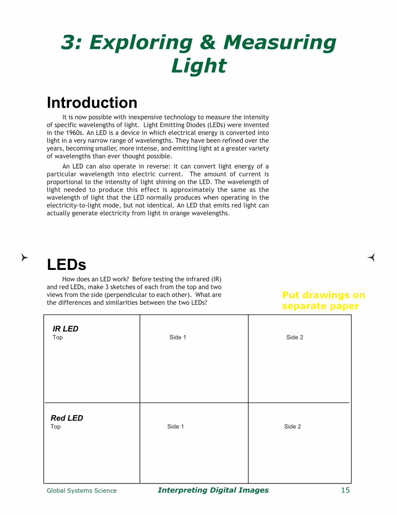
3: Exploring & MeasuringLight
IntroductionIt is now possible with inexpensive technology to measure the intensity
of specific wavelengths of light. Light Emitting Diodes (LEDs) were invented
in the 1960s. An LED is a device in which electrical energy is converted into
light in a very narrow range of wavelengths. They have been refined over the
years, becoming smaller, more intense, and emitting light at a greater variety
of wavelengths than ever thought possible.
An LED can also operate in reverse: it can convert light energy of a
particular wavelength into electric current. The amount of current is
proportional to the intensity of light shining on the LED. The wavelength of
light needed to produce this effect is approximately the same as the
wavelength of light that the LED normally produces when operating in the
electricity-to-light mode, but not identical. An LED that emits red light can
actually generate electricity from light in orange wavelengths.
IR LEDTop Side 1 Side 2
Red LEDTop Side 1 Side 2
Put drawings onseparate paper
LEDsHow does an LED work? Before testing the infrared (IR)
and red LEDs, make 3 sketches of each from the top and two
views from the side (perpendicular to each other). What are
the differences and similarities between the two LEDs?

16 Global Systems Science Interpreting Digital Images
The wavelength of light generated by the LED is controlled by the width of the
slot in the metal plate (visible from the side views). Light is emitted from the cup
at the top of the LED.
Testing the LEDs• Start with the red LED.
– Connect one 1.5 volt battery to the LED.
– Battery’s positive end connects to the LED’s longest wire.
– Battery’s negative end connects to the LED’s shortest wire.
NOTE: LEDs may be damaged or destroyed by using more than
one battery in series or by connecting them in reverse with the
positive charge going to the longest wire of the LED. It is customary
to use a red wire to connect to the positive end of a battery and
a black wire to the negative end.
When properly connected, red light will be emitted from the LED’s
top. See photos.
• Now the IR LED.
Repeat the procedure above.
Do you see anything emitted? Does the LED get warm when hooked up? Did
the Red LED?How can we see if it works? Interestingly, a digital
camera can detect IR. Use a digital camera
with an LCD screen to detect IR. Turn the
camera on, point it toward the top of the IR
LED after the battery is connected. What do
you see?
If you have a TV remote control handy, try
pointing it toward the camera, press a button
on the remote control. TV remotes work by
sending out pulses of IR.
Measuring Light withLEDs
• Connect the red alligator clip from the positive (long)
wire of the LED to the red wire of the multimeter.
Connect the black clip to other end of the LED and
to black wire of the multimeter. Connect the clip
in the same way as the photo in order to minimize
the chances of wires touching when using the
instrument.
• Turn on the multimeter to the voltmeter that
measures up to 2 volts.
• Point top of LED toward a bright light and observe
how much voltage the LED creates.

Global Systems Science Interpreting Digital Images 17
Angle of SensitivityUsing either a light bulb or a red laser, point the top of the LED toward the
light source. Slowly rotate the LED to see at what point the voltage on the
multimeter drops significantly. Measure this angle for the red LED. If using a red
laser, does the IR LED generate any electrical current? Use an incandescent light
to test the IR LED.
LED Angle of Sensitivity
Red
IR
If you have straws that fit over the LEDs, create a sleeve to let only light hit
the top of the LED. Test with the LEDs you just used. Does this affect the angle of
sensitivity?
Measure Light Sourcesin the ClassroomLocate several different types of light sources in the room. Regular light
bulbs (incandescent), fluorescent light bulbs, halogen bulbs, the source of light
for an optical scanner, LEDs on various electronic equipment. Using either tape
measures or the tile on the floor (typically 1 foot squares), systematically record
the current generated by several of these light sources from various distances
away.
Although these instruments cannot measure
the magnitude of red and IR light being emitted from
these light sources, are you surprised at how much
IR is given off by light bulbs? IR is heat energy and
does not contribute the visible light of a light source.
In that sense, IR is wasted energy for a visible light
source.
Light Source Distance Voltage from Red LED Voltage from IR LED
Measuring Light Sources in the Classroom
Put answers on
separate paper
Put answers on
separate paper

18 Global Systems Science Interpreting Digital Images
Measure Warm and Cold thingsHow much IR and red does your hand emit? How about a hot pad? Ice?
Use a box, place a warm or cold source in the box and place the LED into the
box with the LED still connected to the multimeter outside the box. Make sure
the top of the LED is pointing toward the object being measured. You may need
to use tape, string, or wire to hold the LED in place. You could also use a dark
closet and have a student hold the LED and another record the observation while
standing outside the closet.
Although our bodies do emit IR, the wavelengths are in the far or
thermal IR region. The IR being detected with these LEDs is in the near
IR region, which is generated from very hot light sources. All objects
emit light, but cooler objects emit light of longer wavelengths. Hotter
bodies emit light of shorter wavelengths. For example, blue stars are
hotter than red stars (blue is a shorter wavelength than red).
Warm and Cold Things
Object Voltage from Red LED Voltage from IR LED
Put answers on
separate paper
Measuring Reflection, Transmission,and Absorption
Although these instruments cannot measure
actual light magnitudes, they can be used to measure
the percentage of reflectance, transmittance, and
absorption of light from an object.
• First, determine that the object does not emit
light (test in dark room).
• Second, measure the voltage generated by
incoming light (use sunlight).
• Third, measure the voltage being reflected off
the object. The percent of light reflected is the
voltage from reflected light / voltage from
incoming light
• Fourth, if you can get behind the object, say it is a
leaf or a piece of paper or fabric, measure the
voltage of light traveling through the object. The
percent of light being transmitted through the
object is voltage from transmitted light / voltage
from incoming light
• Finally, the light being absorbed from the object is
Light absorbed = 100% - %reflected - %transmitted.

Global Systems Science Interpreting Digital Images 19
Measuring Reflection of Land CoversGo outside with your instruments, preferably on a sunny to partly cloudy day.
First, measure the intensity of the sunlight by pointing the LED toward the Sun.
Do not look directly at the Sun while doing this.
Estimate your pointing by either
(a) watching the voltage and move the LED to find the maximum value, or
(b) looking at the shadow of the LED on the ground—the smallest shadow of
LED will mean it’s pointing directly at Sun.
Second, point your LED at the ground and record the voltage and the surface type. If
you have a partly cloudy sky, continue to measure the intensity of sun light before
each measurement.
Measure a variety of surfaces. Record your observations and measurements.
SurfaceCover
Voltage ofRed LEDfromsunlight
Voltage ofRed LEDfromreflectedlight
ReflectRed Light[%]
Voltageof IR LEDfromsunlight
Voltage ofIR LEDfromreflectedlight
ReflectIR Light
[%]
Reflection of Land Covers
Put answers onseparate paper

20 Global Systems Science Interpreting Digital Images
Muskingum mines, Ohio1973, 1985, 1990, 1997
These images show coal mining in eastern Ohio. In these
images vegetation is red, water is black to dark blue, and the
mines are bright gray. Federal Law requires the restoration of
mined lands to their approximate original contours and that
reclaimed land support either the same or better land uses
than it supported before mining. To meet this requirement the
Muskingum mines, as well as other mines, are replanted to
grassland, for agricultural use. The mining company replaces
the topsoil, grades the soil, and applies grass seed and mulch.
Satellite images
LM1019032007324690 (Landsat 1 MSS, 3 September 1973)
LM5018032008519990 (Landsat 5 MSS, 18 July 1985)
LM5018032009022990 (Landsat 5 MSS, 17 August 1990)
LT5018032009718410 (Landsat 5 TM, 3 July 1997)
024009220810 (Landsat 4 TM, 26 July 1992)
http://edcwww.cr.usgs.gov/earthshots/slow/tableofcontents
1973 1985
19901997
Global Systems Science Interpreting Digital Images 21
4: Displaying Invisible Light
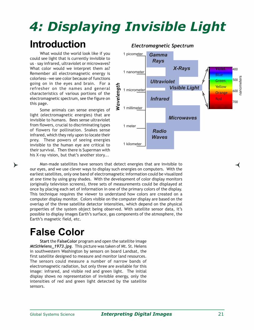
IntroductionWhat would the world look like if you
could see light that is currently invisible to
us – say infrared, ultraviolet or microwaves?
What color would we interpret them as?
Remember all electromagnetic energy is
colorless—we see color because of functions
going on in the eyes and brain. For a
refresher on the names and general
characteristics of various portions of the
electromagnetic spectrum, see the figure on
this page.
Some animals can sense energies of
light (electromagnetic energies) that are
invisible to humans. Bees sense ultraviolet
from flowers, crucial to discriminating types
of flowers for pollination. Snakes sense
infrared, which they rely upon to locate their
prey. These powers of seeing energies
invisible to the human eye are critical to
their survival. Then there is Superman with
his X-ray vision, but that’s another story...
Man-made satellites have sensors that detect energies that are invisible to
our eyes, and we use clever ways to display such energies on computers. With the
earliest satellites, only one band of electromagnetic information could be visualized
at one time by using gray shades. With the development of color display monitors
(originally television screens), three sets of measurements could be displayed at
once by placing each set of information in one of the primary colors of the display.
This technique requires the viewer to understand how colors are created on a
computer display monitor. Colors visible on the computer display are based on the
overlap of the three satellite detector intensities, which depend on the physical
properties of the system object being observed. With satellite sensor data, it’s
possible to display images Earth’s surface, gas components of the atmosphere, the
Earth’s magnetic field, etc.
False ColorStart the FalseColor program and open the satellite image
MtStHelens_1973.jpg. This picture was taken of Mt. St. Helens
in southwestern Washington by sensors on board Landsat, the
first satellite designed to measure and monitor land resources.
The sensors could measure a number of narrow bands of
electromagnetic radiation, but only three are available for this
image: infrared, and visible red and green light. The initial
display shows no representation of invisible energy, only the
intensities of red and green light detected by the satellite
sensors.
1 picometer
1 nanometer
1 micrometer
1 millimeter
1 meter
1 kilometer
Gamma
Rays
Ultraviolet
Infrared
Radio
Waves
X-Rays
Visible Light
MicrowavesW
avele
ngth
Electromagnetic Spectrum
na
no
me
ters
400
500
600
700
VioletVioletViolet
Blue
Green
Yellow
Orange
Red

22 Global Systems Science Interpreting Digital Images
Note that the initial settings of the software control buttons are:
Display: Red set for Satellite Sensor Energy: Red
Display: Green set for Satellite Sensor Energy: Green
Display: Blue set for Satellite Sensor Energy: none (off)
Just for a lark, try making the red satellite sensor energy show as display
color green and vice versa: green satellite sensor energy show as red display
color. What do you make of that? False colors!
Making the invisible visible. Infrared energy is invisible to human eyes but
is measured with one of the satellite sensors. We can assign this invisible energy
data to a computer display color as a “false color” that we can see. We can assign
it to any color: red, blue, green, yellow, cyan, or magenta. Try out different
display colors for the infrared measurements.
Question 4.1. In this “blue-less” world, what colors would you
expect to see? Do you see these all of these colors on this
image? What colors are seen and what colors are missing?
Question 4.2. How does the intensity of the infrared data compare to
that of the visible red and green light?
Characterization of Surface Reflectance.Use the following pictures to complete the table below. Change the way you
display the satellite data to see how much each set of measurements is contributing
to the combined intensities within the image.
MtStHelens_1973.jpeg : volcano in Washington State
Rondonia_1975.jpeg : tropical rain forest in Brazil
GreatSaltLakeUtah_1987.jpeg : city, lake, and desert in Utah
OrlandoDisney_1986.jpeg : city and large developed area in Florida
Common way to view Landsat imagery.Although Landsat measured many wavelengths of the electromagnetic spectrum,
three measurements are commonly used when viewing Landsat imagery: infrared,
red, and green. A commonly used false color scheme for viewing this type of Landsat
data is to make ALL the energies false color:
Display: Red set for Satellite Sensor Energy: Infrared
Display: Green set for Satellite Sensor Energy: Red
Display: Blue set for Satellite Sensor Energy: Green
Task: Using the FalseColor program, rank the intensities of reflected infrared, red,
and green light from the list of surfaces.
5 = maximum reflected values, 0 = no reflected light.
Surface Cover Infrared Visible Red Visible Green Color in Standard Landsat Imagery
Forest
Lawns
Crops
Water
Snow
Cloud
Rock / Soil
Buildings
Paved Roads
Put answers on
separate paper
Put answer on
separate paper

Global Systems Science Interpreting Digital Images 23
5: Using Analysis Tools
Use the selections within the menu button below
“Satellite Image Visualization” to examine the relative
intensities of infrared (IR), and Red (R) and Green (G)
light reflected from the Earth’s surface and displayed
in the image on your screen.
• 13 Visualizations
#1) Standard color composite of Landsat imagery
IR displayed in the computer display’s Red
Visible Red displayed in the computer’s Green
Visible Green displayed in the computer’s Blue
#2-7) IR, Red, or Green as Color or Gray: A color
or gray shade image of only one set of satellite
measured intensities. Gray shades allows
unbiased viewing of the intensities, and color
illustrates the actual contribution to the color
composite being displayed on the screen.
Use the remaining six visualizations to quickly see
which surface features reflect greater amounts of
IR, Red, or Green light.
#8-10) IR v R, IR v G, or R v G: Display the
difference between two sets of measurements
(A v B means Intensity A – B).
The color of the greater value is displayed, with bright
colors showing large differences and dark colors
indicating little difference.
IR is displayed as a shade of Gray; Red as a shade of
Red; and Green as a shade of Green
Example: using IR v R, if a pixel has 10% IR and 20%
Red, the difference is 10% and will be displayed in
the computer’s Red.
#11-13) Normalized versions of IR v R, IR v G, or R v G
The formula is
(Intensity A - Intensity B) / (Intensity A + Intensity B).
The color of the greater value is displayed:
IR is displayed as a shade of Gray
Red as a shade of Red; Green as a shade of Green
This formula tends to minimize difference in
illumination of the surface caused by shadows of
clouds and slope of the land surface that cause
uneven illumination of the surface by the Sun.
Example: using IR v R, if a pixel has 10% IR and 20%
Red, the normalized difference is 10% divided by
30% = 0.33. This value is scaled to 33 and will be
displayed in the computer’s Red. Compare this to
10 displayed earlier.
IntroductionIt’s time to apply the concepts of color, light, and images toward
understanding satellite images, one important type of digital image. So far we
have described land surface types, but now we’ll use analysis tools to examine
detailed values and lengths of features in satellite images.
As in any digital image, you can’t see anything smaller than a pixel in size.
If you look at this computer screen or a photograph with a magnifying glass, you
will see tiny blocks of a single color. Your eye doesn’t see these blocks as separate,
but as a continuous, flowing portion of the image. Even though pixels appear to
be small on the computer image, they actually represent a relatively large area
of real estate on a satellite image. The latest technology is producing satellite
images that can see very fine features on the Earth’s surface. As you look at
these images, can you see individual trees, rooftops, or roads?
What to Do Start the SurfaceType software application and open
‘MtStHelens_1973.jpeg’ by clicking the “Select Satellite Image” button. This
picture was taken of Mt. St. Helens in southwestern Washington in 1973. The
volcano violently erupted in 1983, creating dramatic changes to the vegetation
around the volcano.
Visualization Tools

24 Global Systems Science Interpreting Digital Images
Question 5.3. This image is oriented so that north
is up and east is to the right. The east-to-west
and north-to-south extents of the satellite image
are how many miles? What is the distance from
the upper-left corner to the lower-right corner
of the image? Hint: you will need to use the
Pythagorean Theorem if you are using the pixel
analysis tool or you may use the line length in
pixels output from the line analysis tool.
Question 5.4. What is the greatest distance across
the snow cover observed on Mt. St. Helens in
the lower left corner of the satellite image?
Question 5.5. What is the greatest width across
the lake observed in the left center of the
satellite image? What is the greatest length
across the lake?
Question 5.6. Using the line analysis tool, measure
the diameter of caldera formed by the eruption.
A caldera is the crater formed by a volcanic
explosion or by the collapse of a volcanic cone.
Find the location (x,y coordinates) of the center
of the caldera and compare this to the location
of the center of the volcano as seen in 1973.
Does this explain the direction where most of
the volcanic ash fell?
Combine this measurement with an interesting
measurement reported by on the USGS Earthshots
web site to estimate how large an area of solid rock
was turned into volcanic debris: “Before the
eruption, Mount St. Helens towered about a mile
above its base, but on 18 May 1980 its top slid away
in an avalanche of rock and other debris. When
finally measured on 1 July 1980, the mountain’s
height had been reduced by 1,313 feet— from 9,677
feet to 8,364 feet.” From Foxworthy and Hill, 1982,
p. 11. Lipman, Peter, W., and Mullineaux, Donal, R.,
(ed.), 1981, The 1980 Eruptions of Mount St. Helens:
Washington, U. S. Geological Survey Professional
Paper 1250, Washington, D. C. (844 p.), p. 134.
Analysis ToolsSelect tools from the menu button next to “Analysis Tool”.
Pixel Tool:
• Cross hair appears where click on the image
• Move by click and drag or with arrows next to x and y position
x increases from left to right
y increases from top to bottom
• Intensity of IR, red, and green light of pixel beneath center of cross hair
output
Line Tool:
• Yellow line appears when click and drag on the image
Blue circle at the end of line where cursor clicked
Red circle at the end of line where released mouse click
• Adjust end of line with arrows next to x and y position
x increases from left to right
y increases from top to bottom
• Length of line in pixels is output in lower left edge of the window.
Question 5.1. What are the maximum and minimum x and y values you can find on
the satellite image?
Question 5.2. Using the small white square, which represents one mile along each
edge, in the lower left of the image, what is the number of pixels that represents
1 mile? Assuming the edge of one pixel touches the edge of the neighboring
pixel, what is the size of one pixel? How many pixels represent 10 miles?

Global Systems Science Interpreting Digital Images 25
One way to identify different surface covers has been to compare the
intensity of the infrared to the visible light being reflected from the Earth’s
surface. An early technique was to subtract the visible red from the infrared
intensity. Since vegetation reflects more IR than visible light, the difference
between IR and red is an indication of vegetation cover—a sort of “Difference
Vegetation Index.” This works well for ground without steep slopes, but for
steep surfaces, there is a shadow effect: some areas reflect different intensities
of light just because of their slope. But the percent of light reflected is the
same, regardless of the intensity of light, so one way to eliminate the shadow/
slope problem is express the Difference Vegetation Index as percent by dividing
the difference between IR and red intensities by the total light being reflected.
This technique is called normalization, and the scheme, which is commonly
used to identify the amount of vegetation cover, is called the “Normalized
Difference Vegetation Index” or NDVI.
You will need to decide what to do when the intensity of infrared and
red light are both 0 since the sum of the intensities is zero and cannot be
used to divide the difference of intensities. Discuss your ideas in a group.
Using the 1973, 1983, and 1996 images of Mt. St. Helens fill in the
following table.
VegetationMeasurements

26 Global Systems Science Interpreting Digital Images
Question 5.7. What are the maximum and minimum values possible for
NDVI, provided you cannot divide the sum of the intensities when equal
to zero. Based on the colors observed on the Landsat imagery of Mt. St.
Helens, an NDVI value near the maximum value corresponds to what
type of land surface cover? What about for NDVI values near 0? And
what appears to produce NDVI values near the minimum value? Does this
technique appear to work for the satellite images of Mt. St. Helens?
Does it have problems?
Now that you have studied these three satellite images of Mt. St. Helens,
read the accompanying article provided by the United States Geological Survey
for a discussion of the observed changes around Mt. St. Helens. The article
and additional pictures and maps can be found on the Internet at
http://edcwww.cr.usgs.gov/earthshots/slow/MtStHelens/MtStHelens
Read the article on the colors observed on Landsat images. Do your
findings agree?
If possible, read the article that is provided on the Internet so the
many figures and illustrations are available in color and linked to the text.
The article is found at
http://edcwww.cr.usgs.gov/earthshots/slow/tableofcontents
These images show the rapid growth of Las Vegas, Nevada. This is by far the fastest-
growing metropolis in the United States. The population has grown in recent decades as
follows:
1964: 127,000 1986: 608,000
1972: 273,000 1992: 863,000 1997: 1,124,000
These are the same kind of standard false-color images that appear throughout Earthshots,
simulating color-infrared aerial photographs. Remember “RGB = NRG”: red, green, and
blue in the image represent how much near-infrared, red, and green solar energy the ground
reflects.
As the city expands you can see a sort of landcover succession through human construction.
• Pre-construction land appears medium gray-green indicating sparse desert vegetation, reddish
soils, and stone.
• Construction land appears brighter. Bulldozed soil, bare of vegetation, is very reflective.
• A young neighborhood appears medium green (medium green) again, perhaps a bit brighter
from all the reflective pavement and roofs. The trees are small, and some developments
now conserve water by landscaping with rock and desert plants rather than grass.
• An old neighborhood appears dark, brownish red, from the mature trees and more grass.
• Golf courses appear bright red because they are the most intense vegetation.
• Water appears almost blackbecause at this angle it scatters little light back to the Landsat
sensor.
Satellite images
The 1972, 1986 and 1994 scenes are from the NALC dataset.
LM1042035007225790 (Landsat 1 MSS, 13 September 1972)
LM5039035008625390 (Landsat 5 MSS, 10 September 1986)
LM5039035009225490 (Landsat 5 MSS, 10 September 1992)
Western Las Vegas in 1986 (above) and 1992 (below).
http://edcwww.cr.usgs.gov/earthshots/slow/Help-GardenCity/Help-GardenCity

Global Systems Science Interpreting Digital Images 27
6: Satellite AnalysisQuestion 6.1. How do you think the rain forests of the Earth are being destroyed?
Is it by insects? Drought? Large-scale forest fires?
Question 6.2. Do you think the United States lost much of its forests of the
1700s to 1800s in different ways compared to the rain forests?
Now that you see how to analyze vegetation in satellite images, you are
ready to use software that has automated calculation and graphing tools: the
VegetationAnalysis program. The analysis tools, which include pixel, line, and
area tools, are fashioned after those you already used. Clicking and/or dragging
the cursor on any of the images allows the selected tool to become active in an
identical fashion in the displayed series of satellite images. So if you see an
interesting feature in one satellite image and want to study it, you also get the
same type of analysis at the same location for each of the time-related satellite
images. There are many useful features in the VegetationAnalysis program,
and additional information is available in the ‘Help’ menu.
Getting StartedFirst, run VegetationAnalysis and select three
satellite images to work from the ‘File’ menu
Open ‘Rondonia_1975.jpeg’ file first, followed
by ‘Rondonia_1986.jpeg’ and then
‘Rondonia_1992.jpeg’.
Pick the earliest (oldest) picture first,
followed by the next oldest, and the most
recent image last. You will not be allowed
to continue if you pick images that are not
of the same area or not in increasing year.
A window will pop up that asks you to enter
the numerical value of the map scale value
visible in the lower left corner of each
satellite image.
In Rondonia_1975.jpeg, you will see the box
is 6 mi on a side, so type ‘6’ in the available
white box. The program will ask separately
for the unit (mi).
If you type an incorrect value, reload the 3
satellite images with the ‘Select Satellite
Images’ button. This calibrates the line and
area analysis tools.
Visualize VegetationUse the menu button to the right of ‘Visualization’ to
toggle between an RGB picture and a NDVI
enhancement.
NDVI Surface Cover
+1 Vegetation
0 Exposed soil or rock
-1 Water, snow, clouds
Page Setup and PrintTo print the images and graphs, first use
‘PageSetup’ in the File Menu (Mac users). Select
‘landscape’ printing and set scale to 75%.

28 Global Systems Science Interpreting Digital Images
Select one of three tools from the menu button to the right of ‘Analysis Tool.’
Point Analysis Tool• Explore intensities of infrared, red, and green light and the vegetation index,
NDVI, at the same pixel for each satellite image.
– Intensities are scaled from 0 to 100%
– Move the cross hair in three ways:
1) Click the mouse on an area of interest
2) Click and drag the mouse to an area of interest
3) Use the small up and down arrows along the upper-right edge
Line Analysis• Click and drag the cursor to draw a line.
– Move ends of line in similar way as the Point Tool.
• NDVI values for pixels along the line are graphed.
• Automatically calculates number of pixels along the line and length of line
• Average NDVI is calculated and color-coded by the year of each image.
– Move cursor to each satellite image to see yearly data on the graph.
– To see all data, move the cursor to the graph window.
Area Analysis• Click and drag the cursor to draw a rectangle.
– Move ends of line in similar way as the Point
and Line Tools.
• Creates histogram (graph) of NDVI values for all
pixels inside the rectangles.
– Histogram shows the percentage of values
within narrow ranges of NDVI values.
– Data viewed year by year when cursor moved
to each satellite image.
– By changing the range of min/max NDVI
values to calculate the percent of NDVI
values between the selected range.
• Automatically calculates number of pixels within
area and size of the area.
Question 6.3 What is the distance between roads
that run west to east on the satellite image.
Question 6.4. Draw a north-south line across these
east-west roads and describe how the vegetation
changes along the line. What are the average
or mean NDVI values along the line for each of
the 3 years? Compare you values to those
observed in your class.
Tools for Analyzing Satellite Images
Question 6.5. Create a box with corner #1 at x=363
and y=178 and corner #2 at x=378 and y=190.
How many square miles does this box cover?
How many pixels are within this box?
What surface features appear in this box for the
1986 and 1992 images?
What is the average of the NDVI values for all
pixels within the box for each of the three
images?
Put answers on
separate paper

Global Systems Science Interpreting Digital Images 29
Question 6.6. Create a box with corner #1 at x=66 and y=14 and corner #2 at
x=295 and y=141.
How many square miles does this box cover?
How many pixels are within this box?
What is the average of the NDVI values for all pixels within the box for 1975 to
1992?
Change the min NDVI value (white box in upper right corner) to 0.6 and click
the ‘Run’ button. From the graph that results, what is the percent NDVI
values within the box that fall within this range of NDVI values (0.6 to 1.0)
from 1975 to 1992?
Challenge. Use these satellite images and tools to describe how vegetation is
changing in this section of Brazilian rainforest from 1975 to 1992. Examine
the many features on the images, such as roads and villages, and explore how
vegetation changes within and near these features. Based on these
observations, what is your projection for the forest ground cover? In this
projection, consider how well the NDVI identifies the type of vegetation
covering the ground. Present your findings and your conclusions to the class.
ConclusionDiscuss the observations and conclusions of your classmates.
Is there agreement among views? Are there conflicting opinions and data?
Did your views of deforestation change after working with the satellite data?
What additional data would help complete any questions you still have about
deforestation in this area of Brazil?
These images show the Dallas - Fort Worth
metropolis, in northeast Texas. This city has grown
significantly in recent decades, from 2,378,000 in
1970 to 3,776,000 by 1988. These images show the
urban/suburban areas expanding into arable land
in the countryside.
Satellite images
LM1029037007407190 (Landsat 1 MSS, 12 March 1974)
LM5027037008908190 (Landsat 5 MSS, 22 March 1989)
Dallas,Texas1974
Dallas,Texas1989
30 Global Systems Science Interpreting Digital Images
AcknowledgementsWe would like to thank the talented people who have reviewed the written materials,
software activities, and/or hands-on activities. Their insightful comments and suggestions
have been incorporated in this version.
Staff at the Museum of Science
Cary Sneider, David Rabkin, Lesley Kennedy, Ling Hsaio, Emily Simpson, Michael Schiess,
Suzanne Spring, Nina Nolan, Ellen Busher, Loren Stolow, Alissa Flowers Nicol, Bill Wahler,
Adetunji Onamade, Marianne Dunne, Daisy Frederick, Marc Klureza, Susan Timberlake,
Ingeborg Endter, Bob Bonazoli, Matt Pacewicz, David Sittenfeld, Eric Workman, Carolyn
Kirdahy, Maureen McConnell, Sue Stoessel, David Cantor-Adams, Sharon Horrigan, Henry
Robinson, Lynn Baum, Jeannine Trezvant, Robert Greene, Marion Tomusiak, and Cathy
Clemens.
Visiting at the Museum of Science
Steve McDonald, UMASS Boston; Candace Julyan, Educator; Kathy Cunningham and
Matt Amengual, GIS specialists; Momcilo Babic, Plant Geneticist; Beth Nicholson,
Chairperson, Save the Harbor, Save the Bay; Teon Edwards, Remote Sensing Specialist
at TERC; Crystal Schaaf, Remote Sensing Scientist, Boston University; Bill Lawler,
education specialist in technology and computers; Dona Gartrell, President of The
Learning Community Group; Don McCasland, Educator, Blue Hill Observatory, Milton,
MA; Abbie Nguyen, Fenway High School, MA; Jack Sheridan, Science Supervisor for
Boston Public Schools; Jodi Davenport, PhD student in Perception, MIT; and Mary
O’Connor, Environmental Defense Fund
Maine Teachers through the Maine Mathematics and Science Alliance, Augusta, Maine
Page Keeley, Janre Mullins, Dalene Dutton, Tom Stocker, Laurie Haines, Tom Stocker,
Michael G. McGraw, Rachel Madison, Laurie Spooner, Deb Avalone-King, Marianne
Dubois, Kathy Hockman, Shawn Carlson, Ralph F. Keyes, Kelly Dole, Matthew Geary,
Kim Glidden, Susan Klemmer, Steven Knowles, and Harold B. Mosher
Remote Sensing Specialists, Atmospheric and Environmental Research, Inc., Lexington,MA
Gary Gustafson, Robert D’Entremont, Jennifer Hegarty, Alan Lipton, Mark Leidner,
and Rick Rosen.

Global Systems Science Interpreting Digital Images 31
http://edcwww.cr.usgs.gov/earthshots/slow/tableofcontents
A devastating nuclear accident happened at Chernobyl, Ukraine, on 26
April 1986. These images show the area around the nuclear power
plant approximately one month after the accident, and six years after
the accident. This area is near the common borders of Ukraine,
Belarus, and Russia.
The images clearly show farm abandonment. Agriculture appears as a
collage of bright red (growing crops) and white (highly reflective bare
ground). Many of these areas appear a flat tan-green in 1992,
indicating natural vegetation which has taken over the abandoned
fields. While the reactor was still on fire, all settlements within 30 km
were evacuated, including Pripyat (1986 population 45,000),
Chernobyl (1986 population 12,000), and 94 other villages (estimated
total population 40,000). As of 1992, this area remained almost
completely abandoned.
The radiation also affected wild plants and animals around Chernobyl.
Pine forests soon died, cattails grew three heads, and wild animals
declined in number. But in the coming years, as the short-lived
radionuclides decayed and the longer-lived contaminants settled deep
into the soil, the wildlife rebounded. Human abandonment also made
habitat available for birds, deer, rodents, wolves, boar and other
animals. These populations appear to be increasing despite the
extraordinarily high mutation rates caused by contamination in the
food chain and by one of the highest background radiation levels in the
world.3
Satellite images
LT5182024008615110 (Landsat 5 TM, 31 May 1986)
LT4182024009220810 (Landsat 4 TM, 26 July 1992)
Chernobyl, Ukraine
1986 (above), 1992 (below)

32 Global Systems Science Interpreting Digital Images
Computer Wavelength
Display of Satellite Sensor
Color Measurement
Standard convention Red Infrared
of color settings for Green Visible Red
Landsat imagery Blue Visible Green
http://edcwww.cr.usgs.gov/earthshots/slow/tableofcontents
Riyadh,
S a u d i
A r a b i a
1990
Riyadh,
S a u d i
Arabia
1972
These images show rapid growth in ’s cities and agricultural areas. Riyad,l capital of
Saudi Arabia, grew from about a population of half million in 1972 to almost two million
in 1990. Southeast of Riyadh, irrigation clearly increased due to the investment of part of
Saudi Arabia’s oil revenues in an effort to modernize agriculture.The smaller city of
Buraydah, northwest of Riyadh, shows the same pattern of urban growth and
agricultural development. From 1972 to 1986 the population of Buraydah almost tripled,
from 60,000 to about 180,000 people.
Satellite images
LM1178043007226890 (Riyadh, Landsat 1 MSS, 24 September 1972)
LT4165043009024310 (Riyadh, Landsat 4 TM, 31 August 1990)