Interactive Graphics for Visually Diagnosing Forest Classi ... › pdf › 1704.02502.pdf ·...
20
Interactive Graphics for Visually Diagnosing Forest Classifiers in R Natalia da Silva 1 , Dianne Cook 2 , and Eun-Kyung Lee 3 1 Department of Statistics, Iowa State University 2 Department of Econometrics and Business Statistics, Monash University 3 Department of Statistics, Ewha Womans University April 2017 Abstract This paper describes structuring data and constructing plots to explore forest classi- fication models interactively. A forest classifier is an example of an ensemble, produced by bagging multiple trees. The process of bagging and combining results from multiple trees, produces numerous diagnostics which, with interactive graphics, can provide a lot of insight into class structure in high dimensions. Various aspects are explored in this paper, to assess model complexity, individual model contributions, variable importance and dimension reduction, and uncertainty in prediction associated with individual observations. The ideas are applied to the random forest algorithm, and to the projection pursuit forest, but could be more broadly applied to other bagged ensembles. Interactive graphics are built in R, using the ggplot2, plotly, and shiny packages. 1 Introduction The random forest (RF) algorithm (Breiman 1996) was one of the first ensemble classifiers developed. It combines the predictions from individual classification and regression trees (CART) (Breiman et al. 1984), built by bagging observations (Breiman 1996). It also sam- ples variables at each tree node. These produce diagnostics in the form of uncertainty in predictions for each observation, importance of variables for the prediction, predictive error for future samples based on out-of-bag (OOB) case predictions, and similarity of observations based on how often they group together in the trees. Ensemble classifiers have grown in popularity (Dietterich 2000) (Talbot et al. 2009), and the basic ideas behind the random forest can be applied to virtually any type of model. arXiv:1704.02502v1 [stat.ML] 8 Apr 2017
Transcript of Interactive Graphics for Visually Diagnosing Forest Classi ... › pdf › 1704.02502.pdf ·...
Interactive Graphics for Visually Diagnosing ForestClassifiers in R
Natalia da Silva 1, Dianne Cook2, and Eun-Kyung Lee3
1Department of Statistics, Iowa State University2Department of Econometrics and Business Statistics, Monash University
3Department of Statistics, Ewha Womans University
April 2017
Abstract
This paper describes structuring data and constructing plots to explore forest classi-fication models interactively. A forest classifier is an example of an ensemble, producedby bagging multiple trees. The process of bagging and combining results from multipletrees, produces numerous diagnostics which, with interactive graphics, can provide alot of insight into class structure in high dimensions. Various aspects are exploredin this paper, to assess model complexity, individual model contributions, variableimportance and dimension reduction, and uncertainty in prediction associated withindividual observations. The ideas are applied to the random forest algorithm, andto the projection pursuit forest, but could be more broadly applied to other baggedensembles. Interactive graphics are built in R, using the ggplot2, plotly, and shinypackages.
1 Introduction
The random forest (RF) algorithm (Breiman 1996) was one of the first ensemble classifiersdeveloped. It combines the predictions from individual classification and regression trees(CART) (Breiman et al. 1984), built by bagging observations (Breiman 1996). It also sam-ples variables at each tree node. These produce diagnostics in the form of uncertainty inpredictions for each observation, importance of variables for the prediction, predictive errorfor future samples based on out-of-bag (OOB) case predictions, and similarity of observationsbased on how often they group together in the trees.
Ensemble classifiers have grown in popularity (Dietterich 2000) (Talbot et al. 2009), andthe basic ideas behind the random forest can be applied to virtually any type of model.
arX
iv:1
704.
0250
2v1
[st
at.M
L]
8 A
pr 2
017

The benefits for classification are reduced variability in predictive error, and the suite ofdiagnostics provides the potential for better understanding the class structure in the high-dimensional data space. The use of visualization on these diagnostics, in association withmultivariate data plots, completes the process to support a better understanding of theunderlying problem.
A conceptual framework for model visualization can be summarized in three strategies:(1) visualize the model in the data space, (2) look all members of a collection of a model and(3) explore the complete process of model fitting (Wickham et al. 2015). The first strategyis to explore how well the model captures the data characteristics (model in the data space),which contrasts determining if the model assumptions hold (data in the model space). Thesecond strategy is to look at a group of models instead of only the best. This strategy canoffer a broad understanding of the problem by comparing and contrasting possible models.The last strategy focuses on the exploration of the process of the model fit in addition tothe end result.
There has been some, but not a lot of, research on visualizing classification models. Ur-banek (2008) presents interactive tree visualization implemented in the java software calledKLIMT that include zooming, selection, multiple views, interactive pruning and tree con-struction as well as the interactive analysis of forests of trees using treemaps. Cutler andBreiman (2011) developed a java package called RAFT to visualize a forest classifier, thatincluded variable selection, parallel coordinate plots, heat maps and scatter plots of somediagnostics. Linking between plots is limited. Quach (2012) presents interactive forest vi-sualization using the R package iPlots eXtreme (Urbanek 2011), where several displaysare shown in the one window with some linking between them available. Silva and Ribeiro(2016) describes visualizing components of an ensemble classifier.
This paper describes structuring interactive graphics to facilitate visual exploration ofensemble classifiers, using RFs and projection pursuit forests (PPF) (da Silva et al. 2017)as examples. The PPF algorithm builds on the projection pursuit tree (PPtree) (Lee et al.2013) algorithm, which uses projection pursuit at each tree node to find the best linearcombination of variables to separate the classes. The visualization approach is consistentwith the framework in Wickham et al. (2015), and the implementation is built on the newestinteractive graphics available in R. The purpose is to provide readily available tools forusers to explore and improve ensemble fits, and obtain an intuition for the underlying classstructure in data. Interactive plots are a key component for model visualization that helpthe user see multivariate relationships and be more efficient in the model diagnosis. Multiplelevels of data are constructed for exploration: observation, model and ensemble summaries.
The paper is structured as follows. Section 2 describes the ensemble components to beaccessed. Section 3 maps the ensemble components to the visual elements. The web app isdescribed in 4 and further work is discussed in section 5.
2 Diagnostics in forest classifiers
The diagnostics typically available are:
• Out-of-bag error: For each model, in the ensemble, some cases of the original data arenot used. Predicting the response for these cases gives a better estimate for the errorof the model with future data. The OOB error rate is a measure for each model thatis combined in the ensemble, and is used to provide the overall error of the ensemble.
• Uncertainty measure for each observation: Across individual (classification) models wecan compute the proportion of times that a case is predicted to be each class. If a caseis always predicted to be the true class, there is no uncertainty about an observation.Cases that are proportionately predicted to be multiple classes indicate difficult toclassify observations. They may be important by indicating neighborhoods of the dataspace that would benefit from a more complex model, or more simply, they may beerrors in measurements in the data.
• Variable importance: Each model uses samples of variables. With this, the accuracy ofthe models can be compared when the variable is included or omitted. There are severalversions of statistics that use this to provide a measure of the variable importance forprediction.
• Similarity measure for pairs of observations: In each model, each pair of observationswill be either in the same terminal node or not. This is used to compute a proximitymatrix. Cluster analysis on this matrix can be used to follow up the classification toassess the original labeling. It may suggest improvements or mistakes in original labels.
In addition to these overall ensemble statistics, each component model has its own diag-nostics, measuring error, variables utilized, and class predictions. Visualization will enablethe individual models to be examined, relate these to the data and to their contribution tothe ensemble.
3 Mapping ensemble diagnostics to visual components
This section describes the mapping of diagnostics to visualizations. These are illustratedusing the Australian crabs data (Campbell and Mahon 1974). The data has 200 cases, 5predictors and 4 classes (combinations of species and sex, blue male, blue female, orange maleand orange female). The predictors are: FL (the size of the frontal lobe length, in mm), RW(rear width, in mm), CL (length of mid-line of the carapace, in mm), CW (maximum widthof carapace, in mm), BD (depth of the body; for females, measured after displacement of theabdomen, in mm). This is old data but it provides a good illustration of the visual methods.

3.1 Individual models: PPtree
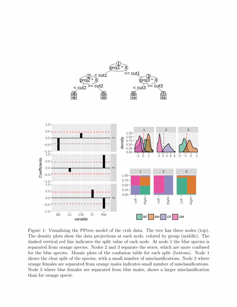
The PPF is composed of individual projection pursuit trees. Figure 1 shows a visual ensembleof plots of a tree model on the crab data. There are three nodes for the four class problem.The nodes of this tree are based on projections of the data, the coefficients of which formthe building block to calculate the variable importance. The density plot displays the dataprojection at each node, and the mosaic plot shows the confusion matrix for the nodes. Thepackage PPtreeViz provides visual tools to diagnose a PPtree model. The PPF builds onthese, and modified a little. The PPtree model is simpler than a regular classification tree,because the classes are mostly separated by combinations of variables – just three projectionsare needed to see the differences between the four classes.
3.2 Variable importance
The PPF algorithm calculates variable importance in two ways: (1) permuted importanceusing accuracy, and (2) importance based on projection coefficients of standardized variables.
The permuted variable importance is comparable with the measure defined in the classicalrandom forest algorithm. It is computed using the OOB sample for the tree k (B(k)) foreach Xj predictor variable. Then the permuted importance of the variable Xj in the tree kcan be defined as:
IMP (k)(Xj) =
∑i∈B(k) I(yi = y
(k)i )− I(yi = y
(k)i,Pj
)
|B(k)|
where y(k)i is the predicted class for observation i in tree k and y
(k)i,Pj
is the predicted classfor observation i in tree k after permuting the values for variable Xj. The global permutedimportance measure is the average importance over all the trees in the forest. This measureis based on comparing the accuracy of classifying OOB observations, using the true classwith permuted (nonsense) class.
For the second importance measure, the coefficients of each projection are examined. Themagnitude of these values indicates importance, if the variables have been standardized. Thevariable importance for a single tree is computed by a weighted sum of the absolute valuesof the coefficients across nodes. The weights takes the number of classes in each node intoaccount (Lee et al. 2013). Then the importance of the variable Xj in the PPtree k can bedefined as:
IMP(k)pptree(Xj) =
nn∑nd=1
|α(k)nd |clnd
Where α(k)nd is the projected coefficient for node nd, variable k, and nn the total number
of node partitions in the tree k.The global variable importance in a PPforest then can be defined in different ways. The
most intuitive is the average variable importance from each PPtree across all the trees in
proj1 * X1
< cut1 >= cut1
proj2 * X2
< cut2 >= cut2
4
4
3
5
proj3 * X3
< cut3 >= cut3
1
6
2
7
12
3
BD CL CW FL RW
−1.0
−0.5
0.0
0.5
1.0
−1.0
−0.5
0.0
0.5
1.0
−1.0
−0.5
0.0
0.5
1.0
variable
Coe
ffici
ents
1 2 3
−1 0 1 2 3 4 5 6 −2 −1 0 10.000.250.500.751.001.25
dens
ity
1 2 3
Left
Rig
ht
Left
Rig
ht
Left
Rig
ht0.00
0.25
0.50
0.75
1.00
BF BM OF OM
Figure 1: Visualizing the PPtree model of the crab data. The tree has three nodes (top).The density plots show the data projections at each node, colored by group (middle). Thedashed vertical red line indicates the split value of each node. At node 1 the blue species isseparated from orange species. Nodes 2 and 3 separate the sexes, which are more confusedfor the blue species. Mosaic plots of the confusion table for each split (bottom). Node 1shows the clear split of the species, with a small number of misclassifications. Node 2 whereorange females are separated from orange males indicates small number of misclassifications.Node 3 where blue females are separated from blue males, shows a larger misclassificationthan for orange specie.

the forest.
IMPppforest1(Xj) =
∑Kk=1 IMP
(k)pptree(Xj)
K
Alternatively we have defined a global importance measure for the forest as a weighted meanof the absolute value of the projection coefficients across all nodes in every tree. The weightsare based on the projection pursuit indexes in each node (Ixnd), and 1-(OOB-error of eachtree)(acck).
IMPppforest2(Xj) =
∑Kk=1 acck
∑nnnd=1
Ixnd|α(k)nd |
nn
K
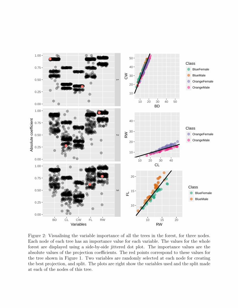
Figure 2 shows the absolute projection coefficient of the top three nodes for all the treesin a forest model. This information is displayed by a side-by-side jittered dot plot. Thered dots correspond to the absolute coefficient values for the tree model of Figure 1. Theforest was built using random samples of two variables for each node, hence there are twocoefficients for each node. At node 1, BD has a high value and CW contributes much less.The scatterplot at right shows these two variables and the resulting boundary between groupsthat this would produce. Node 2 uses CL and RW, and RW contributes the most to theseparation. The plot at right shows the boundary that is induced. Node 3 uses FL and RW,and this is a much more even contribution by the two variables. For each tree in the forestdifferent decision rules are defined, the resulting boundaries on the previous plots are basedon Rule 1 = m1
2+ m2
2, where m1 and m2 are the mean of the left and right groups at each
node.
3.3 Similarity of cases
For each tree, every pair of observations can be in the same terminal node or not. Tallyingthis up across all trees in a forest gives the proximity matrix, an n×n matrix of the proportionof trees that the pair share a terminal node. It can be considered to be a similarity matrix.
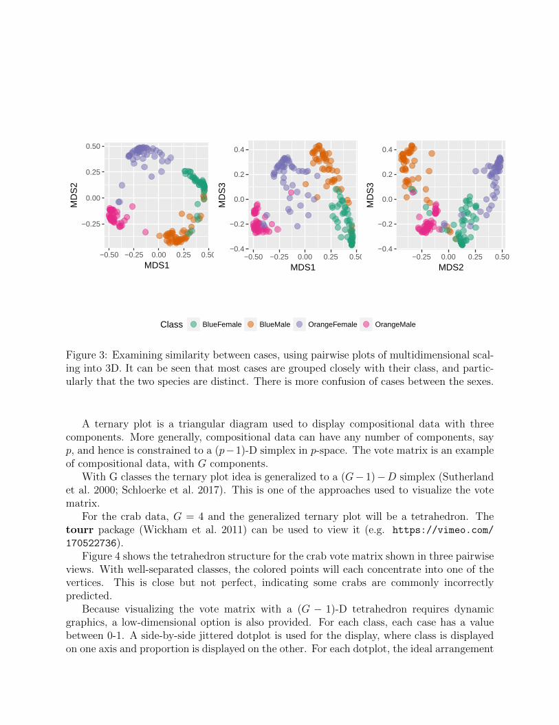
Multidimensional scaling (MDS) is used to reduce the dimension of this matrix, to viewthe similarity between observations. MDS transforms the data set into a low-dimensionalspace where the distances are approximately the same as in the full n dimensions. WithG groups, the low-dimensional space should be no more than G − 1 dimensions. Figure 3shows the MDS plots for the 3D space induced by the four groups of the crab data. Colorindicates the true species and sex. For this data two dimensions are enough to see the fourgroups separated quite well. Some crabs are clearly more similar to a different group, though,especially in examining the sex differences.
3.4 Uncertainty of cases
The vote matrix (n× p) contains the proportion of times each observation was classified toeach class, while oob. Two approaches to visualize the vote matrix information are used.
12
3
BD CL CW FL RW
0.00
0.25
0.50
0.75
1.00
0.00
0.25
0.50
0.75
1.00
0.00
0.25
0.50
0.75
1.00
Variables
Abs
olut
e co
effic
ient
10
20
30
40
50
10 20 30 40 50
BD
CW
Class
BlueFemale
BlueMale
OrangeFemale
OrangeMale
10
20
30
40
10 20 30 40
CL
RW
Class
OrangeFemale
OrangeMale
10
15
20
10 15 20
RW
FL
Class
BlueFemale
BlueMale
Figure 2: Visualising the variable importance of all the trees in the forest, for three nodes.Each node of each tree has an importance value for each variable. The values for the wholeforest are displayed using a side-by-side jittered dot plot. The importance values are theabsolute values of the projection coefficients. The red points correspond to these values forthe tree shown in Figure 1. Two variables are randomly selected at each node for creatingthe best projection, and split. The plots are right show the variables used and the split madeat each of the nodes of this tree.
−0.25
0.00
0.25
0.50
−0.50 −0.25 0.00 0.25 0.50
MDS1
MD
S2
−0.4
−0.2
0.0
0.2
0.4
−0.50 −0.25 0.00 0.25 0.50
MDS1
MD
S3
−0.4
−0.2
0.0
0.2
0.4
−0.25 0.00 0.25 0.50
MDS2
MD
S3
Class BlueFemale BlueMale OrangeFemale OrangeMale
Figure 3: Examining similarity between cases, using pairwise plots of multidimensional scal-ing into 3D. It can be seen that most cases are grouped closely with their class, and partic-ularly that the two species are distinct. There is more confusion of cases between the sexes.
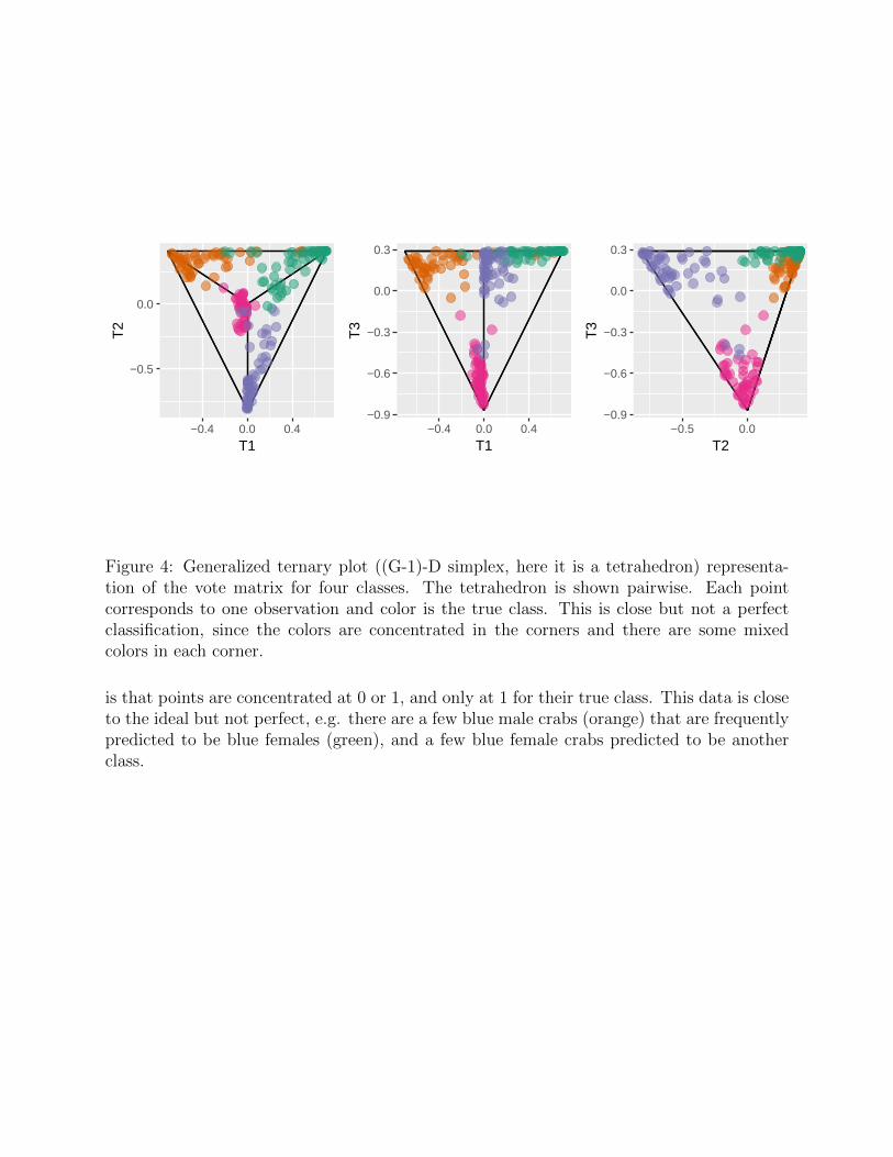
A ternary plot is a triangular diagram used to display compositional data with threecomponents. More generally, compositional data can have any number of components, sayp, and hence is constrained to a (p−1)-D simplex in p-space. The vote matrix is an exampleof compositional data, with G components.
With G classes the ternary plot idea is generalized to a (G− 1)−D simplex (Sutherlandet al. 2000; Schloerke et al. 2017). This is one of the approaches used to visualize the votematrix.
For the crab data, G = 4 and the generalized ternary plot will be a tetrahedron. Thetourr package (Wickham et al. 2011) can be used to view it (e.g. https://vimeo.com/
170522736).Figure 4 shows the tetrahedron structure for the crab vote matrix shown in three pairwise
views. With well-separated classes, the colored points will each concentrate into one of thevertices. This is close but not perfect, indicating some crabs are commonly incorrectlypredicted.
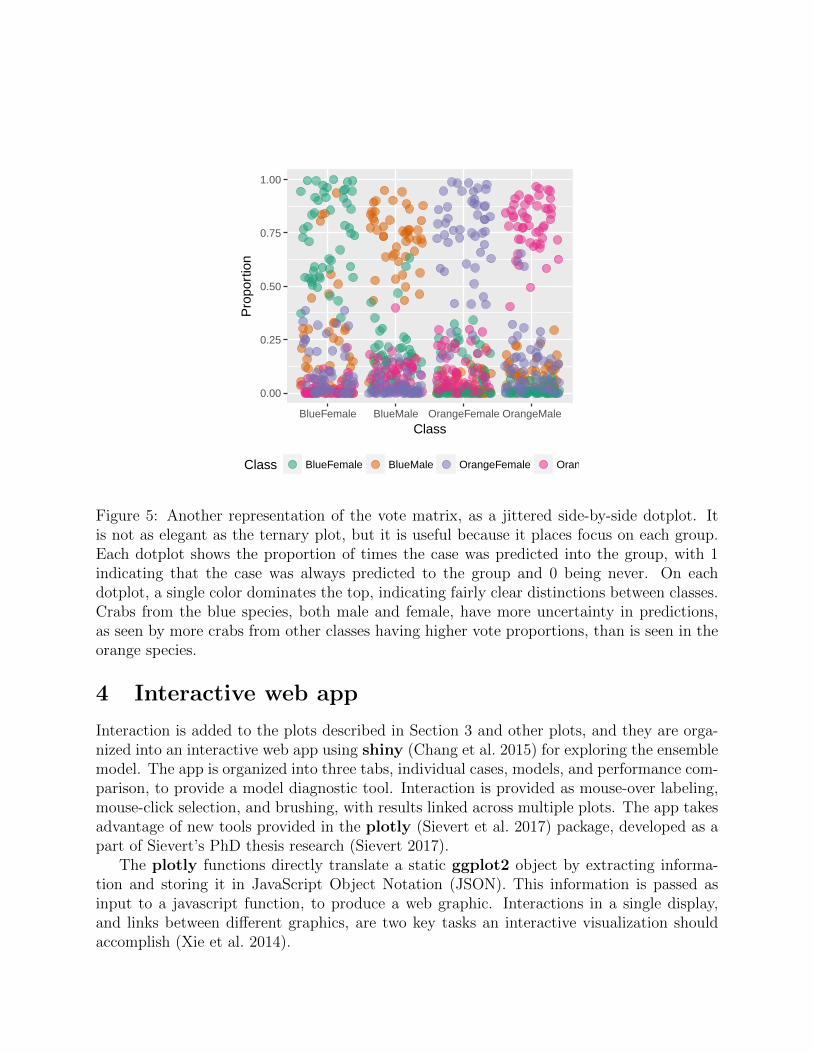
Because visualizing the vote matrix with a (G − 1)-D tetrahedron requires dynamicgraphics, a low-dimensional option is also provided. For each class, each case has a valuebetween 0-1. A side-by-side jittered dotplot is used for the display, where class is displayedon one axis and proportion is displayed on the other. For each dotplot, the ideal arrangement
−0.5
0.0
−0.4 0.0 0.4
T1
T2
−0.9
−0.6
−0.3
0.0
0.3
−0.4 0.0 0.4
T1
T3
−0.9
−0.6
−0.3
0.0
0.3
−0.5 0.0
T2
T3
Figure 4: Generalized ternary plot ((G-1)-D simplex, here it is a tetrahedron) representa-tion of the vote matrix for four classes. The tetrahedron is shown pairwise. Each pointcorresponds to one observation and color is the true class. This is close but not a perfectclassification, since the colors are concentrated in the corners and there are some mixedcolors in each corner.
is that points are concentrated at 0 or 1, and only at 1 for their true class. This data is closeto the ideal but not perfect, e.g. there are a few blue male crabs (orange) that are frequentlypredicted to be blue females (green), and a few blue female crabs predicted to be anotherclass.
0.00
0.25
0.50
0.75
1.00
BlueFemale BlueMale OrangeFemale OrangeMale
Class
Pro
port
ion
Class BlueFemale BlueMale OrangeFemale OrangeMale
Figure 5: Another representation of the vote matrix, as a jittered side-by-side dotplot. Itis not as elegant as the ternary plot, but it is useful because it places focus on each group.Each dotplot shows the proportion of times the case was predicted into the group, with 1indicating that the case was always predicted to the group and 0 being never. On eachdotplot, a single color dominates the top, indicating fairly clear distinctions between classes.Crabs from the blue species, both male and female, have more uncertainty in predictions,as seen by more crabs from other classes having higher vote proportions, than is seen in theorange species.
4 Interactive web app
Interaction is added to the plots described in Section 3 and other plots, and they are orga-nized into an interactive web app using shiny (Chang et al. 2015) for exploring the ensemblemodel. The app is organized into three tabs, individual cases, models, and performance com-parison, to provide a model diagnostic tool. Interaction is provided as mouse-over labeling,mouse-click selection, and brushing, with results linked across multiple plots. The app takesadvantage of new tools provided in the plotly (Sievert et al. 2017) package, developed as apart of Sievert’s PhD thesis research (Sievert 2017).
The plotly functions directly translate a static ggplot2 object by extracting informa-tion and storing it in JavaScript Object Notation (JSON). This information is passed asinput to a javascript function, to produce a web graphic. Interactions in a single display,and links between different graphics, are two key tasks an interactive visualization shouldaccomplish (Xie et al. 2014).
As Sievert (2017) describes one of the biggest difficulties for the app in order managelinking between plots is the data structure management for each widget. Each widget has itown data structure and interaction. Putting them into the structure of a shiny app facilitatesaccess to the widget data, and coordinates selections across multiple plots.
The fishcatch data (Puranen 2017) is used to illustrate the shiny app characteristics. Itcontains 159 observations, with 6 physical measurement variables, and 7 types of fish, allcaught from the same lake (Laengelmavesi) near Tampere in Finland. There are 35 bream,11 parkki, 56 perch, 17 pike, 20 roach, 14 smelt and 6 whitewish. The shiny app showingfishcatch data can be accessed at https://natydasilva.shinyapps.io/shinyppforest.
4.1 Individual cases
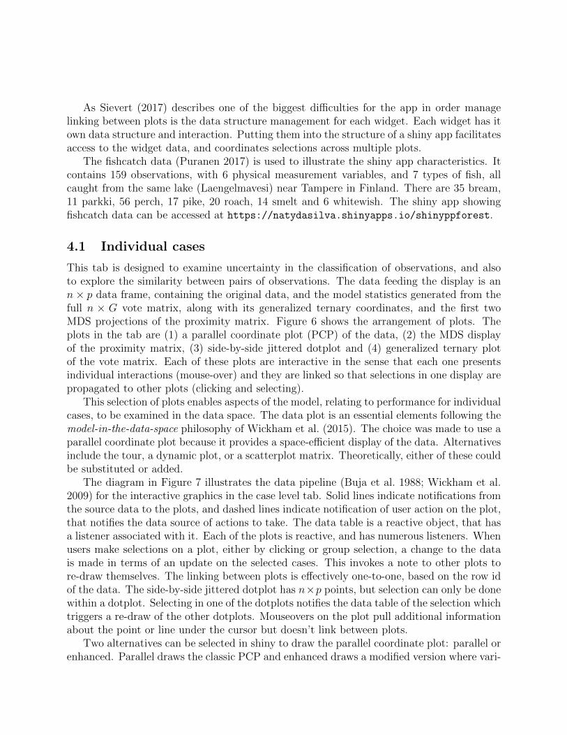
This tab is designed to examine uncertainty in the classification of observations, and alsoto explore the similarity between pairs of observations. The data feeding the display is ann× p data frame, containing the original data, and the model statistics generated from thefull n × G vote matrix, along with its generalized ternary coordinates, and the first twoMDS projections of the proximity matrix. Figure 6 shows the arrangement of plots. Theplots in the tab are (1) a parallel coordinate plot (PCP) of the data, (2) the MDS displayof the proximity matrix, (3) side-by-side jittered dotplot and (4) generalized ternary plotof the vote matrix. Each of these plots are interactive in the sense that each one presentsindividual interactions (mouse-over) and they are linked so that selections in one display arepropagated to other plots (clicking and selecting).
This selection of plots enables aspects of the model, relating to performance for individualcases, to be examined in the data space. The data plot is an essential elements following themodel-in-the-data-space philosophy of Wickham et al. (2015). The choice was made to use aparallel coordinate plot because it provides a space-efficient display of the data. Alternativesinclude the tour, a dynamic plot, or a scatterplot matrix. Theoretically, either of these couldbe substituted or added.
The diagram in Figure 7 illustrates the data pipeline (Buja et al. 1988; Wickham et al.2009) for the interactive graphics in the case level tab. Solid lines indicate notifications fromthe source data to the plots, and dashed lines indicate notification of user action on the plot,that notifies the data source of actions to take. The data table is a reactive object, that hasa listener associated with it. Each of the plots is reactive, and has numerous listeners. Whenusers make selections on a plot, either by clicking or group selection, a change to the datais made in terms of an update on the selected cases. This invokes a note to other plots tore-draw themselves. The linking between plots is effectively one-to-one, based on the row idof the data. The side-by-side jittered dotplot has n×p points, but selection can only be donewithin a dotplot. Selecting in one of the dotplots notifies the data table of the selection whichtriggers a re-draw of the other dotplots. Mouseovers on the plot pull additional informationabout the point or line under the cursor but doesn’t link between plots.
Two alternatives can be selected in shiny to draw the parallel coordinate plot: parallel orenhanced. Parallel draws the classic PCP and enhanced draws a modified version where vari-
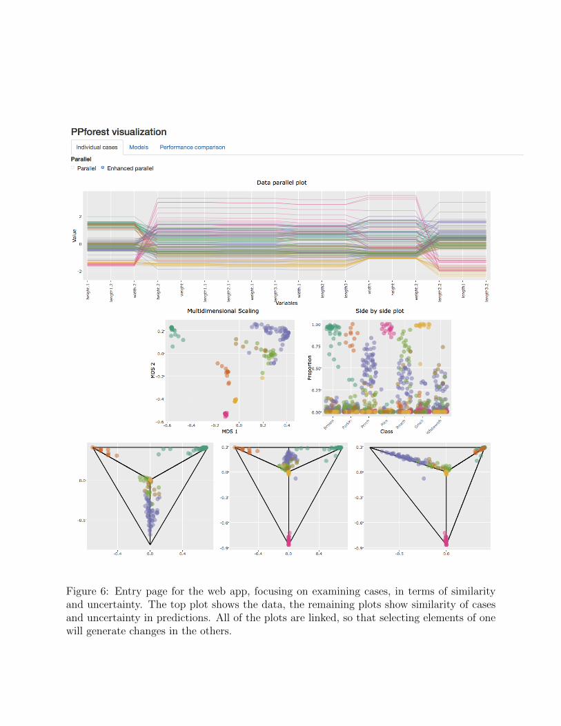
Figure 6: Entry page for the web app, focusing on examining cases, in terms of similarityand uncertainty. The top plot shows the data, the remaining plots show similarity of casesand uncertainty in predictions. All of the plots are linked, so that selecting elements of onewill generate changes in the others.
ables are repeated (Hurley and Oldford 2011). Because reading a PCP is really only possiblefor neighboring variables, the variables are repeated so that all variables are neighboring.
DATAListener
Mouse over
Mouse over
Mouse over
Mouse over
−0.6
−0.4
−0.2
0.0
0.2
−0.6 −0.4 −0.2 0.0 0.2 0.4MDS1
MDS2
−0.5
0.0
−0.4 0.0 0.4T1
T2
−0.9
−0.6
−0.3
0.0
0.3
−0.4 0.0 0.4T1
T3
−0.9
−0.6
−0.3
0.0
0.3
−0.5 0.0T2
T3
Select
Click
Click
Click
Select
Select
Click
nxp n
n
n
0.00
0.25
0.50
0.75
1.00
BlueFemale BlueMale OrangeFemale OrangeMaleClass
Proportion
Class BlueFemale BlueMale OrangeFemale OrangeMale
Shiny Gui
Figure 7: Schematic diagram illustrating the interactivity in and between plots for individuallevel exploration panel of the web app. From the data, the four plots are generated. Eachplot has a listener attached which collects user actions. When a user selects a point or linein any of the displays, it makes a change in the data which propagates updates to each ofthe plots.
4.2 Models
This second tab in the app focuses on teasing apart the forest to examine the qualities ofeach tree. For each tree, information on the variable importance, the projections used ateach node, and the OOB error is available. The data feeding into this tab is a list of models,along with the original data frame. The tree id is displayed when we mouse over the jitteredside-by-side plot. This information is useful because, based on the accuracy some trees couldbe pruned from the forest outside of the app.
Figure 8 is a screenshot of the models tab. There are five plots, with varying levels ofinteraction: (1) a jittered side-by-side dotplot showing variable importance for the top threenodes of all trees in the forest, (2) a static display of one tree, (3) a boxplot of OOB errorfor all trees, (4) a faceted density plot of projected data at each node of the tree, with splitpoint indicated by a vertical line, and (5) a mosaic plot showing the confusion matrix foreach node of the tree. The interaction is driven from the variable importance plot – whenthe user selects a point in that display, the corresponding tree, density displays and mosaicplots are drawn. The tree plot from the PPtreeViz is used to visualize the selected treestructure. Also highlighted are the variable importance values for each variable for each ofthe top three nodes, and the OOB error value for the tree on the boxplot.
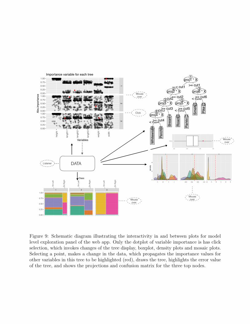
The diagram in Figure 9 illustrates the data pipeline for interactive graphics. The datasource is a PPforest object. Interaction is driven by the variable importance plot. Selectinga point triggers a change in the data, which cascades to re-draws of the other displays. Eachplot has some information available on mouse over.
4.3 Performance comparison
The third tab (Figure 10) examines the PPF fit, and compares the result with a RF fit.There are four displays for each type of model: (1) Variable importance for all trees in theforest (same as in the models tab), (2) an receiver operating characteristic curve (ROC)curve comparing sensitivity and specificity for each class, (3) OOB error by number of trees,to assess complexity, (4) overall variable importance. There is very little interaction on thistab. Users can select to focus on a subset of classes, or choose the importance measureto show. Being able to focus on class can help to better understand how well the modelperforms across classes, and can be especially useful for unbalanced data. Examining theOOB error by trees enables an assessment of how few trees might be used to provide anequally accurate prediction of future data.
The ROC is used to summarize the trade-off between sensitivity and specificity. The plotshows the sensitivity and specificity when a parameter of classifier is varied (Hastie et al.2011). The specificity and sensitivity was computed with the pROC package. If more thantwo classes are available a multi-class ROC analysis is needed. Several solutions have beenproposed for multi-class ROC. Some of the proposed reduced the multi-class problem to aset of binary problems. The approach used for a multi-class ROC analysis in this paper iscalled one-against-all (Allwein et al. 2000).
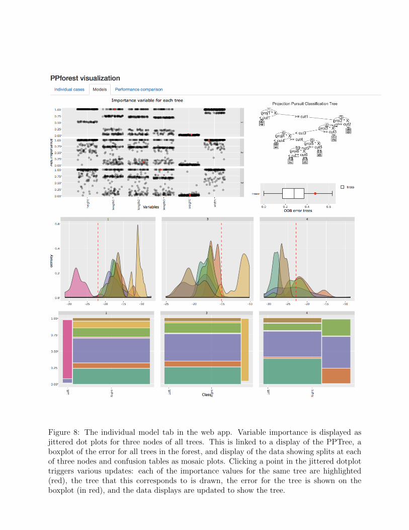
Figure 8: The individual model tab in the web app. Variable importance is displayed asjittered dot plots for three nodes of all trees. This is linked to a display of the PPTree, aboxplot of the error for all trees in the forest, and display of the data showing splits at eachof three nodes and confusion tables as mosaic plots. Clicking a point in the jittered dotplottriggers various updates: each of the importance values for the same tree are highlighted(red), the tree that this corresponds to is drawn, the error for the tree is shown on theboxplot (in red), and the data displays are updated to show the tree.
DATAListener
Mouse over
Mouse over
12
3
heig
ht
leng
th1
leng
th2
leng
th3
weig
ht
wid
th
0.000.250.500.751.00
0.000.250.500.751.00
0.000.250.500.751.00
Variables
Abs.
impo
rtanc
e
Importance variable for each tree
1 2 3
Dir:Left
Dir:Right
Dir:Left
Dir:Right
Dir:Left
Dir:Right
0.00
0.25
0.50
0.75
1.00
Class
trees
0.0 0.2 0.4 0.6OOB error trees
Projection Pursuit Classification Tree
proj1 * X1
< cut1 >= cut1
proj2 * X2
< cut2>= cut2
proj3 * X4
< cut3>= cut3
proj4 * X6
< cut4>= cut4
Whi
tew
ish8
Perc
h9
Brea
m7
proj5 * X5
< cut5>= cut5
Roa
ch
10
Park
ki
11
proj6 * X3
< cut6>= cut6
Smel
t12
Pike
13
Mouse over
Mouse over
Click
Figure 9: Schematic diagram illustrating the interactivity in and between plots for modellevel exploration panel of the web app. Only the dotplot of variable importance is has clickselection, which invokes changes of the tree display, boxplot, density plots and mosaic plots.Selecting a point, makes a change in the data, which propagates the importance values forother variables in this tree to be highlighted (red), draws the tree, highlights the error valueof the tree, and shows the projections and confusion matrix for the three top nodes.
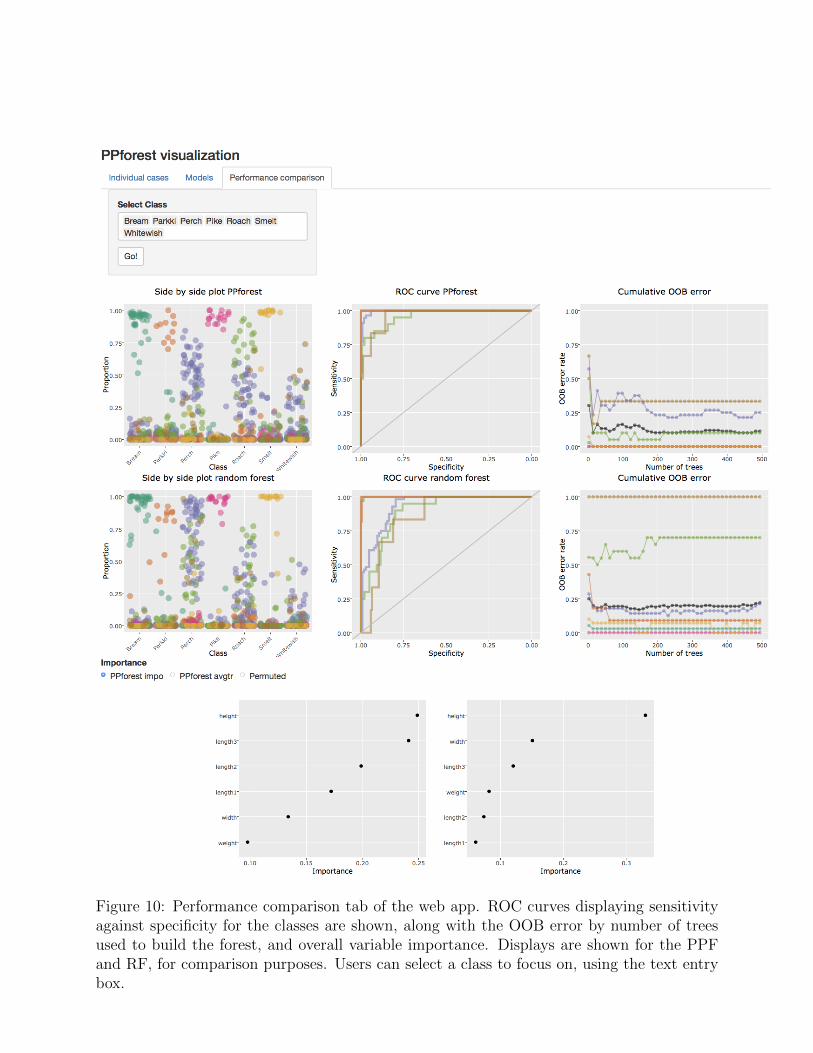
Figure 10: Performance comparison tab of the web app. ROC curves displaying sensitivityagainst specificity for the classes are shown, along with the OOB error by number of treesused to build the forest, and overall variable importance. Displays are shown for the PPFand RF, for comparison purposes. Users can select a class to focus on, using the text entrybox.

5 Discussion
Having better tools to open up black box models will provide for better understanding thedata, the model strengths and weaknesses, and how the model performs for future data. Thisvisualisation app provides a selection of interactive plots to diagnose PPF models. This shellcould be used to make an app for other ensemble classifiers. The philosophy underlying thecollection of displays is “show the model in the data space” explained in Wickham et al.(2015). It is not easy to do this, and to completely take this on would require plotting themodel in the p-dimensional data space. In the simplest approach, as taken here, it means tolink the model diagnostics to displays of the data. Then it is possible to probe and query,to obtain a better understanding, such as finding regions in the data that prove difficult tofit, and detract from the predictive accuracy, or that don’t adhere to model assumptions.
The app is implemented with new technology for interactive graphics provided by theplotly package. It is one of the first uses of these new tools.
One challenge to use plotly is that when layers with different data are created in a ggplot2,it is difficult to specify the unique keys required for linking with another plot.
There are many possible extensions to the app, that could help it to be a tool for modelrefinement: (1) Using the diagnostics to weed out under-performing models in the ensem-ble; (2) Identifying and boosting models that perform well, particularly if they do well forproblematic subsets of the data; (3) Problematic cases could be removed, and ensemblesre-fit; (4) Classes as a whole could be aggregated or re-organised as suggested by the modeldiagnostics, to produce a more effective hierarchical approach to the multiple class problem.Working within the R environment makes all of these desires available using command lineoutside the app, given the unique ids of models and cases can be exported from the app.
The app has helped to identify ways to improve the PPtree algorithm, and consequentlythe PPF model. These especially apply to multiclass problems. Multiple splits for the sameclass would enable nonlinear classifications. Split criteria tend to place boundaries too closeto some groups, due to heteroskedasticity being induced by aggregating classes. Forests arenot always better than their constituent trees, and if the trees can be built better, the forestwill provide stronger predictions.

References
Allwein, E. L., Schapire, R. E., and Singer, Y. (2000), “Reducing multiclass to binary: Aunifying approach for margin classifiers,” Journal of machine learning research, 1, 113–141.
Breiman, L. (1996), “Bagging predictors,” Machine learning, 24, 123–140.
Breiman, L., Friedman, J., Stone, C. J., and Olshen, R. A. (1984), Classification and regres-sion trees, CRC press.
Buja, A., Asimov, D., Hurley, C., and McDonald, J. A. (1988), “Elements of a viewingiipeline for data analysis,” in Dynamic graphics for statistics, eds. Cleveland, W. S. andMcGill, M. E., Monterey, CA: Wadsworth, pp. 277–308.
Campbell, N. A. and Mahon, R. J. (1974), “A multivariate study of variation in two speciesof rock crab of genus Leptograpsus,” Australian Journal of Zoology, 22, 417–425.
Chang, W., Cheng, J., Allaire, J., Xie, Y., and McPherson, J. (2015), “shiny: Web applica-tion framework for R, R package version 0.11,” .
Cutler, A. and Breiman, L. (2011), “RAFT: Random forest tool,” .
da Silva, N., Cook, D., and Lee, E.-K. (2017), “Projection pursuit classification randomforest,” https://github.com/natydasilva/PPforestpaper.
Dietterich, T. G. (2000), Ensemble methods in machine learning, New York: Springer Verlag,pp. 1–15.
Hastie, T. J., Tibshirani, R. J., and Friedman, J. H. (2011), The elements of statisticallearning: data mining, inference, and prediction, Springer.
Hurley, C. B. and Oldford, R. (2011), “Eulerian tour algorithms for data visualization andthe PairViz package,” Computational Statistics, 26, 613–633.
Lee, Y. D., Cook, D., Park, J.-w., Lee, E.-K., et al. (2013), “PPtree: Projection pursuitclassification tree,” Electronic Journal of Statistics, 7, 1369–1386.
Puranen, J. (2017), “Finland fish catch,” https://ww2.amstat.org/publications/jse/
jse_data_archive.htm.
Quach, A. T. (2012), “Interactive random forests plots,” .
Schloerke, B., Wickham, H., Cook, D., and Hofmann, H. (2017), “Escape from Boxland:Generating a library of high-dimensional geometric shapes,” The R Journal, https://
journal.r-project.org/archive/accepted.
Sievert, C. (2017), “Interfacing R with the web for accessible, portable, and contents inter-active data science,” .

Sievert, C., Parmer, C., Hocking, T., Chamberlain, S., Ram, K., Corvellec, M., and Despouy,P. (2017), plotly: Create interactive web-based graphs via plotly’s API, r package version1.1.0.
Silva, C. and Ribeiro, B. (2016), Visualization of individual ensemble classifier contributions,Cham: Springer International Publishing, pp. 633–642.
Sutherland, P., Rossini, A., Lumley, T., Lewin-Koh, N., Dickerson, J., Cox, Z., and Cook,D. (2000), “Orca: A visualization toolkit for high-dimensional data,” Journal of Compu-tational and Graphical Statistics, 9, 509–529.
Talbot, J., Lee, B., Kapoor, A., and Tan, D. S. (2009), “EnsembleMatrix: Interactive vi-sualization to support machine learning with multiple classifiers,” in Proceedings of theSIGCHI Conference on Human Factors in Computing Systems (CHI ’09), New York, NY,USA: Association for Computing Machinery, pp. 1283–1292.
Urbanek, S. (2008), “Visualizing trees and forests,” in Handbook of Data Visualization, eds.Chen, C., Hardle, W., and Unwin, A., Springer, Springer Handbooks of ComputationalStatistics, chap. III.2, pp. 243–264.
— (2011), “iPlots eXtreme: next-generation interactive graphics design and implementationof modern interactive graphics,” Computational Statistics, 26, 381–393.
Wickham, H., Cook, D., and Hofmann, H. (2015), “Visualizing statistical models: Removingthe blindfold,” Statistical Analysis and Data Mining: The ASA Data Science Journal, 8,203–225.
Wickham, H., Cook, D., Hofmann, H., Buja, A., et al. (2011), “tourr: An R package forexploring multivariate data with projections,” Journal of Statistical Software, 40, 1–18.
Wickham, H., Lawrence, M., Cook, D., Buja, A., Hofmann, H., and Swayne, D. F. (2009),“The plumbing of interactive graphics,” Computational Statistics, 24, 207–215.
Xie, Y., Hofmann, H., Cheng, X., et al. (2014), “Reactive programming for interactivegraphics,” Statistical Science, 29, 201–213.