Indigo
41
INDIGO IDENTITY MANUAL
-
Upload
emily-crawford -
Category
Documents
-
view
212 -
download
0
description
Graphic Standards Manual
Transcript of Indigo

INDIGO IDENTITY MANUAL


Contents
2 Introduction
3 Branding
4 Mission & Values
5 Logo
7 Preferred Usage
8 Accepted Usage
9 Incorrect Usage
10 Clear Space & Min. Size
11 Supplementary Mark
13 Color Palettes
15 Typeface
17 Applications
18 Billboard
19 Ads
21 Website
25 Email Signature
27 Stationery
29 Boathouse Signage
30 Vehicle Signage
31 Submarine Signage
33 Merchandise

T
There’s More to Explore.
Indigo Identity Manual

In today’s world a company’s graphic identity is strictly
defined by all of the visual associations with the brands name.
The impact of any logo heavily depends on consistent use
resulting in familiarity and strong impressions. Familiar logos are
not always read as words, but processed by the brain visually,
evoking a complex set of associations much more powerful
than words. The aim of this manual is to instruct on the useage
of our company’s logo to build a sold visual impression that is
consistent and therefore stronger overall.
Introduction
2

Indigo aspire to be one of the leading adventure and
aquatic research companies in the world. As a brand we
want to present an image that is both strong and unified,
that not only entices people to come close and learn more
about who we are and what we do but also to inspire
creativity, passion, optimism and fun in daily life. Layout and
apllications should be clean, forward thinking, filled with a
combination of white space and movement. We want to be
proceived as having a strong stand on where we are and
going.
Branding
Indigo Identity Manual

As a company, we at Indigo, strive to posess and continue
to acquie over time. Leadership. Collaboration. Integrity.
Accountability. Passion. Diversity. Quality.
Values
Our Roadmap starts with our mission, which is enduring.
It declares our purpose as a company and serves as the
standard against which we weigh our actions and decisions.
To make adverture dreams a reality for the world...To inspire
moments of optimism and happiness and wonder...To
create valuable advances in aquatic research and make a
difference along the way. Our vision is to be a great place
to work where people are inspired to be the best they can
be. To bring to the world an awe inspiring once in a lifetime
experience that satisfy people’s desires and needs. Our
dream is to nurture a winning network of customers and
supporters, so together we can create an enduring value.
And be a responsible citizen that makes a difference by
helping build and support sustainable communities.
Mission
4

Please note: Colors may not vary from those listed later in this manual, please see
pg. 13 for pantone, cmyk, and rbg color codes. The logo may not be hand drawn,
scanned or modified in any way. It should be reproduced only from electronic files.
Please Note
Indigo Identity Manual

Indigo’s logo is made up of one component, the logotype.
The style and adjustments made to the “INDIGO” text is
referred to as a logotype or logo. The logo is the core
element in our visual identity system. Its relative size,
positioning and color treatment are governed by the rules in
this guide and should be followed as such. Elements are not
to be used separately or combined with any other elements.
This signature has been specially designed for use by our
company and may not be changed in terms of pro- portion
or typeface. The logotype must be reproduced from official
artwork.
Logo
6

1
2
Preffered Usage 1 2
Primary LogoThis is the primary logo
and should be used in all
design aspects such as print,
web, etc when possible.
Please only fall back on
other design options when
necessary for quality and
specific design purposes.
TaglineThe use of the tagline,
“There’s more to explore”
may be used as a secondary
option. The only time the tag
line is permitted to be pulled
away from the logotype is
when it is used on top of
an image, see pg. 1 of the
manual as example.
Indigo Identity Manual

Accepted Usage 3 4 5
Single ColorWe understand that the use
of a gradient fill may not be
an acceptable application
in all situations, before
defaulting to black if possible
use the medium blue
pantone as a solid fill. Please
see Color Palette section for
the code.
BlackWhen color is an option it
is the only one accepted.
The black logotype should
only be used in black and
white only circumstances.
The black should always be
used a top a white or light
background.
WhiteWhen color is an option it
is the only one accepted.
The white logotype should
only be used in black and
white only circumstances.
The white should always be
used a top a black or dark
colored background.
3
4
5
8

Incorrect Usage 1
2
OutlinesNo outlines are to be applied of any kind
under any circumstance.
Unauthorized ColorsThe use of any other pantone colors other
then the ones listed isn’t approved.
3 Incorrect GradientGradient should be the same throughout,
no other treatments applied.
4 ShearA shear or tilt in any direction should
never be applied to the logotype.
5
6
Drop ShadowNo drop shadows of any kind should be
applied for any reason.
Bevels or EmbossingThe logotype should no be edited to
reflect a bevel or any embossing.
7 OpacityThe opacity of the logotype is not
permitted to fall below 100%.
8 Bark or Busy BackgroundsThe logotype should always be seen
clearly and dramatically.
9 SpacingThe spacing between the pieces should
not be altered in any way.
Indigo Identity Manual

Minimum SizeThe minimum-size the logo can
go is 1 inch in width for print.
In regards to on-screen uses,
the minimum-size logo should
be used is 100 pixels wide.
Clear SpaceX should always correspond
to the size of the height and
width of the O mark at the end.
Please note: The same distance
should be applied to the logo
incorporating the tagline.
x
x
xx
x
x
x x
10

Supplementary Mark-1
Asside for the primary and approved logo types the above circle has been approved for
use as a supplementary mark. This mark should never however be left alone to stand in as a
secondary logo for the brand. It should always be accomanied by the traditional logotype
setup as specified above. It is used for support only.
Please Note: This specific mark can only have a gradient, light gray, light blue or medium
blue fills. See the Color Palettes section for color codes. Opacity and rotation adjustments
are permitted and may be made on this mark.
Indigo Identity Manual

Supplementary Mark-2
Asside for the primary and approved logo types the above wave pattern has been
approved for use as a supplementary mark. This mark should never however be left alone
to stand in as a secondary logo for the brand. It should always be accomanied by the
traditional logotype setup as specified above. It is used for support only.
Please Note: This specific mark can only have a gradient, light gray, light blue or medium
blue fills. See the Color Palettes section for color codes. Opacity and rotation adjustments
are permitted and may be made on this mark.
12

Color PalettesBlues
Color PalettesWhite/Grays
Light BluePantone 647 C
CMYK: 96, 69, 24, 7
RGB: 18, 86, 135
Medium BluePantone 654 C
CMYK: 100, 86, 33, 23
RGB: 0, 52, 102
Dark BluePantone 2768 C
CMYK: 100, 90, 40, 47
RGB: 7, 31, 70
WhitePantone 647 C
CMYK: 96, 69, 24, 7
RGB: 18, 86, 135
Light GrayPantone 7541 C
CMYK: 11, 5, 7, 0
RGB: 224, 230, 230
Dark GrayPantone 422 C
CMYK: 39, 30, 32, 0
RGB: 162, 165, 164
Indigo Identity Manual

The gradient used in the logotype and other various aspects of supporting designs
is one of the most essential parts of the identity as a brand. The gradient settings
shown above incorporating the blue color palette seen to the left is the only
approved color application aside from other solids listed previously. No other
gradient should be used in association with out brand. It is to always be linear
and never a radial application.
Gradient
14

ITC KabelITC Kabel is the only approved secondary font, with the exception of Century
Gothic, regular or italic, in special cases. The only styles approved for usage are
book and medium. This is due to an attempt to keep the look of Indigo more
sleek throughout instead of bulky. Therefore. demi, bold and extrabold styles
may not be used.
Typefaces
Century GothicThe typeface used in the creation of the logotype is Century Gothic, bold. This
typeface is only used for the creation of the logotype, it may be used as the
secondary font only when the official secondary font, ITC Kabel is not available
or appropriate in certain circumstances. However the tagline should never be
used in this font, if used it should always be in ITC Kabel. Only the regular and
italic styles maybe used as secondary fonts.
Dark blue and dark gray from the Color Palettes are the preferred color choices
for supplementary text. However black and white are also approved in certain
circumstances. Black font may only be used on top of white or light backgrounds
and white may only be used on top of black and dark colored backgrounds.
This is to stay in keeping with Indigo’s clear and dramatic expression.
Font Colors
Indigo Identity Manual
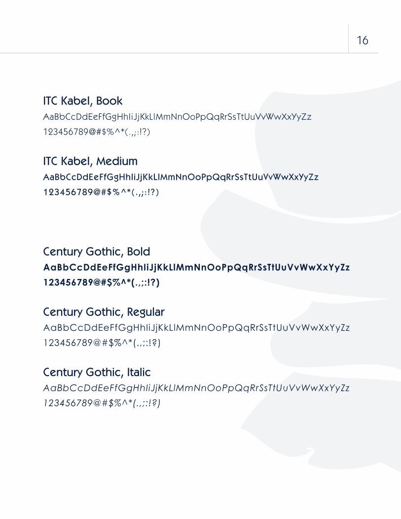
ITC Kabel, BookAaBbCcDdEeFfGgHhIiJjKkLlMmNnOoPpQqRrSsTtUuVvWwXxYyZz
123456789@#$%^*(.,;:!?)
ITC Kabel, MediumAaBbCcDdEeFfGgHhIiJjKkLlMmNnOoPpQqRrSsTtUuVvWwXxYyZz
123456789@#$%^*(.,;:!?)
Century Gothic, BoldAaBbCcDdEeFfGgHhIiJjKkLlMmNnOoPpQqRrSsTtUuVvWwXxYyZz
123456789@#$%^*(.,;:!?)
Century Gothic, RegularAaBbCcDdEeFfGgHhIiJjKkLlMmNnOoPpQqRrSsTtUuVvWwXxYyZz
123456789@#$%^*(.,;:!?)
Century Gothic, ItalicAaBbCcDdEeFfGgHhIiJjKkLlMmNnOoPpQqRrSsTtUuVvWwXxYyZz
123456789@#$%^*(.,;:!?)
16

The following are sample situations where the
logo and brand identity has been applied to
various representational products for furthering
the presence of our company. These applications
provide visible exposure for our company
in a variety of ways including print and web.
Consistent use is essential to unify our look and
all rules and regulations identified in this manual
previously should be enforced in all instances.
Applications
Billboard
Indigo Identity Manual

There’s more to explore.
The billboards should be a reflection of the Indigo style, both
refined and colorful. There should still he a good amount of
white space incorporated into the piece. The images, and
placement of objects may be altered but only if they are still in
keeping with the Indigo style and the restrictions defined
in this manual.
Billboard
18

THERE’S MORE TO EX PL OR E
Indigo Identity Manual

THERE’S MORE TO EX PL OR E
There’ s More to Ex pl ore.
The above are same ads that incorporate the Indigo style.
The use approved color palettes, have a good amount of
white space, use only approved fonts and use the logotype
and secondary marks correctly. While additional or newer ads
may be incorporated they should still abide by Indigo’s
style restrictions.
Ads
20

The above are sample designs of the opening page of the
website. They alternate between a link for “adventure” and
“science”, as shown on the right. For higher quality files see
digital copies.
Website
Home
Subs
Pr es s
Ph otos
Shop
Contact
Sponsors, Partne rs , Affiliates . Sessio ns. Brochure. Contact s.
Sear ch
There ’s More to Ex pl ore.
Adventure
Indigo Identity Manual

Home
Subs
Pr es s
Ph otos
Shop
Contact
Sponsors, Partne rs , Affiliates . Sessio ns. Brochure. Contact s.
Sear ch
There ’s More to Ex pl ore.
Science
Home
Subs
Pr es s
Ph otos
Shop
Contact
Sponsors, Partne rs , Affiliates . Sessio ns. Brochure. Contact s.
Sear ch
There ’s More to Ex pl ore.
Adventure
22

Home
Subs
Pr es s
Ph otos
Shop
Contact
Sponsors , Partne rs , Affiliates . Sessi on s. Brochure. Contact s.
Searc h
In the Press.
Lorem ipsum dolor sit amet, consectetur adipiscing elit. Proin ipsum metus, luctus et sagittis id, venenatis et
justo. Maecenas ac orci ipsum. Mauris placerat, quam ac dignissim euismod, odio mauris sodales leo, at
vulputate mi tellus ac nisi. Nam iaculis, enim enim nec ullamcorper aliquam, lorem dui tempor nulla, ut
scelerisque ligula massa at erat. Nam facilisis convallis nisi et ultrices. Morbi eget nibh est, eget tempus sem.
To read full article please click here: New York Times - Deep Diving
The New York Times.
Date: Nov. 15th, 2011
Section: Technology
Article: Deep Driving
Author: John Hancock
New York Times
USA Today
Boston Globe
The Post
Sponsors , Partn er s, Affiliate s. Sessio ns. Brochure. Contac ts .
Searc h
Our Submarines .
The Voyagern. This submarine is designed to hold two passangers and a pilot while exploring the depths of the
ocean. The voyager can travel as deep as 3300 feet (1000m) below the water’s surface. So whether your aim is
to experience an unforgettable underwater adventure or purse marine science research the Voyager can and will
accomidate. This 1 ton beauty will get you to the depths your heart desires.
Phasellus quis risus in dui fermentum tincidunt. Suspendisse a risus quis arcu venenatis pretium. Praesent ut
leo nulla, vel consequat felis. aliquam. Phasellus quis risus in dui fermentum tincidunt. Suspendisse a risus quis
Quick Facts.
Passangers: 3
Weight: 1 ton
Travel: 3300 feet
Home
Subs
Pr es s
Ph otos
Shop
Contact
The Voyager
The Xpedition
Supporting PgsSupportin pages should include Subs, Press, Photos, Shop,
and Contact. The colors and style of the website should
remanin consistent with the brand identity and standards.
Indigo Identity Manual

The above are all samples of
supporting pages for the wesite.
Once again, for higher quality
images please see digital files.
Style should be consistent.
All images used in coporation
with the webpages should have
the same tonality as the color
and shading used previously and
throughout or manual.
24

Above is the approved email signature. The Indigo logo should always be
placed first on the left, so it is seen first when reading left to right. A thin bar
should divide the logotype from the personal information. The ending of the bar
should coincide with the bottom of the listed information. Name is shown in ITC
Kabel Medium, followed by title in ITC Kabel Demi. A space would separate the
name and title from additional information such as phone number, fax number,
email and website. Colors chosen from palette, however logo must always be
the primary gradient fill. The addition of the secondary wave mark is optional.
This is the only mark that is permitted to accompany the signature.
Email Signature
NameTitle
PhoneFaxEmailwebsite
Breakdown of Information
26

Date
Name
Address
City, State, Zipcode
Dear Recipient,
Lorem ipsum dolor sit amet, consectetur adipiscing elit. Donec libero ante, adipiscing vel vulputate et,
condimentum consequat tortor. Aliquam tempor lacinia odio sit amet faucibus. Phasellus mollis hendrerit
dui, suscipit bibendum mauris semper posuere. Ut sit amet dolor et leo sagittis lobortis in nec dolor. Sed
tortor tortor, pellentesque id vehicula nec, aliquet pharetra ligula. Maecenas non nisl non magna feugiat
ornare. Donec sodales quam vel purus bibendum varius.
Aliquam pretium, mauris quis ultrices pretium, nulla libero commodo orci, in porttitor lectus odio ut
tortor. Nullam turpis purus, elementum sed pellentesque eget, consectetur eget eros. Nulla vel auctor
lectus. Suspendisse quis eros nunc, non vestibulum sapien. Phasellus consequat quam vel lorem porta
non semper enim pulvinar. Cras sit amet tellus et felis pulvinar fermentum. Donec tellus odio, egestas vitae
tincidunt at, accumsan quis leo.
Sed pellentesque est et nisi mollis pharetra. Quisque felis enim, rutrum non sollicitudin euismod, hen-
drerit a neque. Donec facilisis fermentum lorem eget tempor. Cum sociis natoque penatibus et magnis
dis parturient montes, nascetur ridiculus mus. Morbi feugiat elementum arcu, et semper lectus aliquet
quis. Maecenas id orci eu tortor sollicitudin dapibus. Maecenas nisi turpis, laoreet vel scelerisque eget,
ullamcorper at nibh. Sed et felis quam. Nam diam leo, posuere sed faucibus non, viverra ac felis. Integer
sagittis, leo blandit viverra mattis, eros risus ornare orci, in dictum velit eros porttitor mi. Vivamus aliquet
libero ut lectus blandit tempus. Nullam vehicula ultricies leo, semper suscipit risus mollis et. Aenean varius
luctus molestie. Maecenas consequat, dolor bibendum convallis posuere, mi sapien tristique neque, vitae
egestas massa lacus quis turpis. Pellentesque in augue non quam porttitor sagittis a at nisl.
Sincerely,
John E. Smith
1234 Wave Way San Diego, CA 45678
Stationary
Indigo Identity Manual

Please see samples on this page for stationary format. Format
for any of these items should not deviate from the template.
The font in all usage is ITC Kabel use either a 14 pt font sizing
with 23 pt leading or 10 pt font sizing with 16 pt leading for
information given in these documents, this maintains a unified
look.
Stationary
Name (First and Last)Address Line 1Address Line 2
1234 Wave Way San Diego, CA 45678
John SmithCreative Director
P 123-456-7890F 098-765-4321E [email protected]
28

Boathouse Signage
1
32
1. BoathouseTop of boathouse painted
light gray see Color Palettes for
pantone and color code, lower
painted white. Gradient logotype
placed right of the window.
Gradient secondary wave placed
on door descending into the
water.
2. Metal Wall GraphicThis is a metal wall graphic that
is raised off the wall. The front
has the gradient logo printed
on it. This graphic would be
used around the boathouse, in
places such as the office, garage,
science labs, etc.
3. Light FixturesThe above light fixtures above
would be used around the
boathouse as indoor and
outdoor lighting. It is made
out of a luminescent material
the bottom panel being white
with the top incorporating the
gradient fill.
Indigo Identity Manual

Official Indigo vehicles provide visible exposure for
the brand around town. The consistent use of the
visual identity on cars and trucks helps to unify our
fleet. The vehicles feature the wave secondary mark
in light gray displayed horizontally and the gradient
logotype will be placed on top on the driver and
passenger side doors. On vehicles with a dark base
paint color, the signature appears in the gradient
blue. On vehicles with a light base paint color, the
signature appears in the gradient blue.
Vehicle Signage
30

Submarine Signage
The VoyagerThe Voyager is a submarine targeted more towards
the individual/family adventures. It is designed for thrill
seekers to fulfill their fantasies. The gradient is ap-
plied horizontal instead of vertical and this is the only
exception that may be made with the direction of the
gradient, the reason for this is to cause the impression
of both forward and downward movement. Logotype
and sub type must be white.
VOYAGER
Indigo Identity Manual

The XpeditionThe Xpedition is a submarine targeted more towards
the scientific researchers. It is designed for student
and scientific studies to be conducted. The gradient
wave mark is applied horizontally on this sub with the
logotype and name applied in white.
32

MerchandiseTops
MerchandiseSweats
Indigo Identity Manual

MerchandiseAll merchandise must still reflect the same color palette and approved logotype standards
as stated previously in this manual. Secondary marks may also be used on these items
when held to their standards. The logotype may also be put on a 90 degree rotation on
merchandise but this is the only exception.
MerchandiseFlip Flops
MerchandiseDrinkware
34

MerchandiseKeychains
MerchandiseLicense Plate
MerchandiseHat
Indigo Identity Manual

36