Incepatori f hasura
137
VALUE SCALES Brenda Hoddinott F-01 BEGINNER: HATCHING When you can render sets of hatching lines well, you discover a very fast and simple way to achieve realistic shading in your drawings. Many different styles of hatching sets can be rendered, from lines that are very noticeable, to lines drawn so closely together that they look like a solid tone. This lesson is divided into the following three sections: EXAMINING HATCHED VALUES: Related terms and words are defined, and four different values demonstrate the simplicity of hatching. DRAWING BASIC HATCHING SETS: You make different values by placing the hatching lines either far apart or close together (varying the density). CREATING VALUE SCALES: A full range of values is rendered by: varying the density of the hatching lines, and the pressure used in holding pencils; and by using different grades of pencils. Have your drawing supplies close by so you can follow along with the simple exercises! Suggested supplies include 2H, HB, 2B, 4B and 6B pencils, vinyl and kneaded erasers, and drawing paper. 5 PAGES – 10 ILLUSTRATIONS This article is recommended for artists of all ages and abilities, as well as home schooling, academic and recreational fine art educators. Published by Hoddinott Fine Art Publishers, Halifax, NS, Canada – Revised 2006
-
Upload
simeona-florentina -
Category
Design
-
view
1.938 -
download
0
Transcript of Incepatori f hasura

VALUE SCALES Brenda Hoddinott
F-01 BEGINNER: HATCHING When you can render sets of hatching lines well, you discover a very fast and simple way to achieve realistic shading in your drawings. Many different styles of hatching sets can be rendered, from lines that are very noticeable, to lines drawn so closely together that they look like a solid tone.
This lesson is divided into the following three sections:
EXAMINING HATCHED VALUES: Related terms and words are defined, and four different values demonstrate the simplicity of hatching.
DRAWING BASIC HATCHING SETS: You make different values by placing the hatching lines either far apart or close together (varying the density).
CREATING VALUE SCALES: A full range of values is rendered by: varying the density of the hatching lines, and the pressure used in holding pencils; and by using different grades of pencils.
Have your drawing supplies close by so you can follow along with the simple exercises! Suggested supplies include 2H, HB, 2B, 4B and 6B pencils, vinyl and kneaded erasers, and drawing paper.
5 PAGES – 10 ILLUSTRATIONS This article is recommended for artists of all ages and abilities, as
well as home schooling, academic and recreational fine art educators.
Published by Hoddinott Fine Art Publishers, Halifax, NS, Canada – Revised 2006

Copyright to all articles, images, text, projects, lessons and exercises within this drawing class belong to Brenda Hoddinott and may not be reproduced or used for any commercial purposes whatsoever without the written permission of Brenda Hoddinott.
E-mail [email protected] Web site http://www.finearteducation.com or http://www.drawspace.com
2
EXAMINING HATCHED VALUES You become more comfortable with using shading in your drawings when you know how to draw value scales. Shading refers to the various shades of gray (values) in a drawing that make drawings look three-dimensional. Values are the different shades of gray created when you draw by varying the density of the shading lines, and the pressure used in holding various pencils. Value scale refers to the range of different values from light to dark or from dark to light.
Drawing value scales with hatching, requires lots of practice before you can experience success. Hatching is a series of lines (called a set) drawn closely together to give the illusion of values.
1) Squint your eyes and/or move back a little, and look at the four different sets of hatching lines in Illustration 01-01.
ILLUSTRATION 01-01 The first set (on the far left) has very few lines drawn far apart, creating the illusion of a light value. Each of the other sets appears to become progressively darker, until you get to the last one which is the darkest.
2) Try your hand at drawing random sets of parallel lines in your sketchbook. Take note of how you make these lines. You should try many different ways of moving your pencil, rotating your paper, or changing the angle of your lines, until you find the motions that are the most natural for you.
DRAWING BASIC HATCHING SETS In this exercise, you use a 2B pencil to practice drawing sets of parallel hatching lines far apart and closer together, to create four different values.
ILLUSTRATION 01-02
3) Draw the first set of hatching lines with very few lines. The old expression “few and far between” works well here. The lines are far apart and few in number.
ILLUSTRATION 01-03
4) Draw a second set of lines a little closer together than your first set. More lines are drawn in the second value than in the first. Hence, the overall value should look a little darker.

Copyright to all articles, images, text, projects, lessons and exercises within this drawing class belong to Brenda Hoddinott and may not be reproduced or used for any commercial purposes whatsoever without the written permission of Brenda Hoddinott.
E-mail [email protected] Web site http://www.finearteducation.com or http://www.drawspace.com
3
ILLUSTRATION 01-04
5) Draw a third set of parallel lines, closer together than in your first two sets. Note that there are many more lines than in the second set and the lines are much closer together.
ILLUSTRATION 01-05
6) Draw the fourth set of hatching lines very closely together. More lines make up the fourth hatching set and they are much closer together than in the first three. Also, not as much of the white paper is still showing through.
ILLUSTRATION 01-06 In Illustration 01-06, I show you a small sampling of hatching styles. Note the different types of hatching lines, such as curved and straight, and long and short. Try to imagine how you could apply each of these sets to something in a drawing.
7) Try drawing some sets of different styles of hatching lines in your sketchbook.
CREATING VALUE SCALES In this section, you discover how you can achieve a full range of values by varying both the density of the hatching lines and the pressure applied, while using pencils of different grades.
8) Practice hatching with each of your pencils and notice their differences. The 2H is very light (hardest) and the 2B is quite dark (softest). By letting your pencils do some of the work, you don’t need to press as hard with your pencil to achieve dark values, and you have more control doing light values. In the next exercise, you use three different pencils to help create various values. 2B works best for creating the dark values, HB is great for middle values, and 2H is ideal for light values.

Copyright to all articles, images, text, projects, lessons and exercises within this drawing class belong to Brenda Hoddinott and may not be reproduced or used for any commercial purposes whatsoever without the written permission of Brenda Hoddinott.
E-mail [email protected] Web site http://www.finearteducation.com or http://www.drawspace.com
4
9) Draw a value scale of seven different values. Using your 2H pencil, draw the first three values beginning with the lightest. With your HB pencil, draw the next two values. Use your 2B for the two darkest values. Keep practicing this value scale in your sketchbook until you can draw all seven different values. Then try this same exercise in reverse from dark to light.
ILLUSTRATION 01-07
ILLUSTRATION 01-08 Have a close look at these two sets of hatching lines and observe the following:
In the hatching example in the upper left, you can clearly see my hatching lines.
I draw my hatching lines very closely together in the lower right drawing, to create the illusion of a smooth, solid tone (without blending).
In this next exercise, your goal is to make seven different smooth values by drawing the hatching lines close together.
10) With 2H and HB pencils, begin with the lightest value, and draw the first three light values as in the next illustration.
11) Use your 2B, 4B and 6B pencils to draw the four darker values.
ILLUSTRATION 01-09
12) Draw a value scale of ten different values from light to dark.
ILLUSTRATION 01-10
13) Draw another value scale of ten different values from dark to light.

Copyright to all articles, images, text, projects, lessons and exercises within this drawing class belong to Brenda Hoddinott and may not be reproduced or used for any commercial purposes whatsoever without the written permission of Brenda Hoddinott.
E-mail [email protected] Web site http://www.finearteducation.com or http://www.drawspace.com
5
Practice drawing value scales every single day, until you can clearly distinguish ten different values!
Put the date on the back of your drawings each day so you can enjoy watching your skills improve.
BRENDA HODDINOTT - BIOGRAPHY As a self-educated teacher, visual artist, portraitist, forensic artist, and illustrator, Brenda Hoddinott utilizes diverse art media including graphite, technical pen, colored pencil, chalk pastel, charcoal, conté crayon, and oil paints.
My philosophy on teaching art is to focus primarily on the enjoyment aspects while gently introducing the technical and academic. Hence, in creating a
passion for the subject matter, the quest for knowledge also becomes enjoyable. >Brenda Hoddinott<
Born in St. John’s, Newfoundland, Brenda grew up in the small town of Corner Brook. She developed strong technical competencies with a personal commitment to self directed learning, and the aid of assorted “Learn to Draw” books. During Brenda’s twenty-five year career as a self-educated civilian forensic artist, numerous criminal investigation departments have employed Brenda’s skills, including Royal Canadian Mounted Police and municipal police departments. In 1992, Brenda was honored with a commendation from the Royal Canadian Mounted Police, and in 1994, she was awarded a Certificate of Membership from “Forensic Artists International”.
Her home-based art career included graphic design, and teaching recreational drawing and painting classes. As supervisor of her community’s recreational art department, Brenda hired and trained teachers, and designed curriculum for several children’s art programs. In 1998, Brenda chose to end her eighteen-year career as an art educator in order to devote more time to writing, drawing, painting, and developing her websites.
Drawspace http://www.drawspace.com incorporates her unique style and innovative approach to curriculum development. This site offers downloadable and printable drawing classes for students of all abilities from the age of eight through adult. Students of all ages, levels and abilities have praised the simple step-by-step instructional approach. This site is respected as a resource for fine art educators, home schooling programs, and educational facilities throughout the world.
LEARN-TO-DRAW BOOKS BY BRENDA HODDINOTT Drawing for Dummies (2003): Wiley Publishing, Inc., New, York, NY, this 336 page book
is available on various websites and in major bookstores internationally.
The Complete Idiot’s Guide to Drawing People (2004): Winner of the Alpha-Penguin Book of the Year Award 2004, Alpha - Pearson Education – Macmillan, Indianapolis, IN, this 360 page book is available on various websites and in major bookstores internationally.

HATCHING
Brenda Hoddinott F-02 BEGINNER: HATCHING
In this lesson, you outline three simple mountains and add shading with hatching. You create the four different values with a 2B pencil, by using a combination of the following two techniques:
Vary the density of the hatching lines by drawing them either far apart or close together.
Vary the pressure used while holding the pencil; you press lightly for the light values and a little harder for darker values.
This lesson is divided into the following two parts:
SKETCHING THREE MOUNTAINS: You sketch three overlapping mountains beginning with the one that is closest, and working back toward the distant mountain.
ADDING SHADING WITH HATCHING: The farther an object recedes into the distance, the lighter in value it seems to become. After shading the sky with a very light value, you then add shading to the mountains with hatching, beginning with the one in the background, and working toward the foreground, making each value progressively darker.
This project is recommended for artists and aspiring artists of all ages, as well as home schooling, academic and recreational fine art educators.
6 PAGES – 7 ILLUSTRATIONS Published by Hoddinott Fine Art Publishers, Halifax, NS, Canada, 2005 (Revised 2006)

Copyright to all articles, images, text, projects, lessons and exercises within this drawing class belong to Brenda Hoddinott and may not be reproduced or used for any commercial purposes whatsoever without the written permission of Brenda Hoddinott.
E-mail [email protected] Web sites http://www.finearteducation.com and http://www.drawspace.com
2
SKETCHING THREE MOUNTAINS In this section, you sketch three overlapping mountains beginning with the one that is closest, and working back toward the distant mountain and the sky. Overlapping is a technique that gives the illusion of depth in a drawing, and refers to the position of subjects in a composition, when one visually appears to be in front of another (or others).
1. Outline a horizontal rectangle (similar in shape to mine) as your drawing space. A horizontal rectangle is often referred to as a landscape format. Suggested sizes include 2 by 4 inches, or 3 by 6 inches.
2. Sketch the outline of the first mountain. This mountain is in the front, closer to the viewer than the other two.
ILLUSTRATION 02-01 The outline begins about three-quarters of the way toward the top of the left side of the rectangle, and meets the lower side approximately three-quarters of the way toward the right.
ILLUSTRATION 02-02
3. Outline a second mountain behind the first. Feel free to draw your mountains either more rounded or more jagged.

Copyright to all articles, images, text, projects, lessons and exercises within this drawing class belong to Brenda Hoddinott and may not be reproduced or used for any commercial purposes whatsoever without the written permission of Brenda Hoddinott.
E-mail [email protected] Web sites http://www.finearteducation.com and http://www.drawspace.com
3
4. Add a third mountain that appears to be behind the other two.
ILLUSTRATION 02-03
ADDING SHADING WITH HATCHING In this section, you begin by shading the sky. Then, you add shading to the mountains with hatching, beginning with the one in the background, and working toward the foreground, making each value progressively darker. This shading process creates a component of perspective known as atmospheric perspective.
Atmospheric perspective (sometimes called aerial perspective) refers to the visual depth created by various particles in the atmosphere. The farther an object recedes into the distance, the lighter in value it seems to become, and its edges and forms appear more blurred. Even on a clear day, your ability to see distant objects is decreased by an assortment of atmospheric components, such as minuscule particles of dust and/or pollen and/or tiny droplets of moisture. Your vision becomes even further diminished when the atmosphere is filled with haze, fog, smoke, rain or snow. Even fairly close-up objects can appear out of focus or almost invisible under certain conditions.
Shading refers to those parts of a drawing that have values (sometimes called tones), and is used to give the illusion of depth or three-dimensional reality. Hatching is a classical shading technique comprised of sets of lines drawn closely together to give the illusion of various values. Values are the different shades of gray created by varying the density of the lines, and the pressure used in holding the pencil.
In this section, you use a 2B pencil to render four different values, by combining two techniques:
Vary the density of the hatching lines by drawing them either far apart or close together.
Vary the pressure used while holding the pencil; you press lightly for the light values and a little harder for darker values.

Copyright to all articles, images, text, projects, lessons and exercises within this drawing class belong to Brenda Hoddinott and may not be reproduced or used for any commercial purposes whatsoever without the written permission of Brenda Hoddinott.
E-mail [email protected] Web sites http://www.finearteducation.com and http://www.drawspace.com
4
5. Press very lightly with your 2B pencil to draw the lightest hatching lines of the sky. The lines are far apart and few in number.
ILLUSTRATION 02-04
6. Use an HB pencil to add shading to the mountain in the distance. This mountain needs to be slightly darker than the sky; so, you need to press a little harder on your pencil, and also draw a few more hatching lines. However, keep in mind that the two closer mountains need to be even darker, so be careful not to make this shading too dark.
ILLUSTRATION 02-05

Copyright to all articles, images, text, projects, lessons and exercises within this drawing class belong to Brenda Hoddinott and may not be reproduced or used for any commercial purposes whatsoever without the written permission of Brenda Hoddinott.
E-mail [email protected] Web sites http://www.finearteducation.com and http://www.drawspace.com
5
7. Add shading to the second mountain with a 2B pencil. Press a little harder with your pencil, and add lots of hatching lines fairly close together.
ILLUSTRATION 02-06
8. Add shading to the mountain in the foreground with a 2B pencil. More lines make up the fourth hatching set, and they are much closer together than in the first three. Also, not much of the white paper is still showing through.
ILLUSTRATION 02-07

Copyright to all articles, images, text, projects, lessons and exercises within this drawing class belong to Brenda Hoddinott and may not be reproduced or used for any commercial purposes whatsoever without the written permission of Brenda Hoddinott.
E-mail [email protected] Web sites http://www.finearteducation.com and http://www.drawspace.com
6
BRENDA HODDINOTT - BIOGRAPHY As a self-educated teacher, visual artist, portraitist, forensic artist, and illustrator, Brenda Hoddinott utilizes diverse art media including graphite, technical pen, colored pencil, chalk pastel, charcoal, conté crayon, and oil paints.
My philosophy on teaching art is to focus primarily on the enjoyment aspects while gently introducing
the technical and academic. Hence, in creating a passion for the subject matter, the quest for
knowledge also becomes enjoyable. >Brenda Hoddinott<
Born in St. John’s, Newfoundland, Brenda grew up in the small town of Corner Brook. She developed strong technical competencies with a personal commitment to self directed learning, and the aid of assorted “Learn to Draw” books. During Brenda’s twenty-five year career as a self-educated civilian forensic artist, numerous criminal investigation departments have employed Brenda’s skills, including Royal Canadian Mounted Police and municipal police departments. In 1992, Brenda was honored with a commendation from the Royal Canadian Mounted Police, and in 1994, she was awarded a Certificate of Membership from “Forensic Artists International”.
Her home-based art career included graphic design, and teaching recreational drawing and painting classes. As supervisor of her community’s recreational art department, Brenda hired and trained teachers, and designed curriculum for several children’s art programs. In 1998, Brenda chose to end her eighteen-year career as an art educator in order to devote more time to writing, drawing, painting, and developing her websites.
Drawspace http://www.drawspace.com incorporates her unique style and innovative approach to curriculum development. This site offers downloadable and printable drawing classes for students of all abilities from the age of eight through adult. Students of all ages, levels and abilities have praised the simple step-by-step instructional approach. This site is respected as a resource for fine art educators, home schooling programs, and educational facilities throughout the world.
LEARN-TO-DRAW BOOKS BY BRENDA HODDINOTT Drawing for Dummies (2003): Wiley Publishing, Inc., New, York, NY, this 336 page book
is available on various websites and in major bookstores internationally.
The Complete Idiot’s Guide to Drawing People (2004): Winner of the Alpha-Penguin Book of the Year Award 2004, Alpha - Pearson Education – Macmillan, Indianapolis, IN, this 360 page book is available on various websites and in major bookstores internationally.

Brenda Hoddinott
F-03 BEGINNER: HATCHING Many artists struggle unnecessarily for years to create a full range of values with only one or two pencils, totally unaware of how pencils themselves can create different values. In this lesson, you create the illusion of depth in a mountain range, by using various grades of pencils. You will also utilize two components of perspective, overlapping and atmospheric perspective.
This lesson is divided into the following three parts:
INTRODUCTION: When you use a combination of several H and B pencils you can easily create a full range of values in your drawings.
SKETCHING ELEVEN MOUNTAINS: You sketch eleven overlapping mountains, beginning with the one that appears closest, and working back toward the distant mountain and the sky.
PENCILS BUILD A MOUNTAIN RANGE: You use 12 different grades of pencils to add shading to each section of the sky and mountain range to render the illusion of depth as created by atmospheric perspective.
Suggested supplies include white drawing paper, kneaded and vinyl erasers, a pencil sharpener, and 5H, 4H, 3H, 2H, HB, 2B, 3B, 4B, 5B, 6B, 7B and 8B pencils.
This project is recommended for artists and aspiring artists of all ages, as well as home schooling, academic and recreational fine art educators.
14 PAGES – 27 ILLUSTRATIONS Published by Hoddinott Fine Art Publishers, Halifax, NS, Canada, 2005 (Revised 2006)

Copyright to all articles, images, text, projects, lessons and exercises within this drawing class belong to Brenda Hoddinott and may not be reproduced or used for any commercial purposes whatsoever without the written permission of Brenda Hoddinott.
E-mail [email protected] Web sites http://www.finearteducation.com and http://www.drawspace.com
2
INTRODUCTION Many artists labor unnecessarily for years to create a full range of values with only one or two pencils, totally unaware of how pencils themselves can create different values. Generally speaking, H pencils work beautifully for light and middle values, and B pencils are best for middle and dark values. When you use a combination of several H and B pencils you can easily create a full range of values in your drawings.
Refer to the following two illustrations to get an idea of the goal of this lesson. Various grades of pencils help create the illusion of depth in the mountain range.
ILLUSTRATION 03-01 First of all, you will sketch a range of eleven mountains.
You will then add shading to each mountain with a different grade of pencil. You need 5H, 4H, 3H, 2H, HB, 2B, 3B, 4B, 5B, 6B, 7B and 8B pencils. 2H is the lightest (hardest), and the 8B is the darkest (softest).
ILLUSTRATION 03-02 In addition to using various grades of pencils, you will employ two components of perspective, overlapping and atmospheric perspective.
Overlapping is a technique that gives the illusion of depth in a drawing, and refers to the position of subjects in a composition, when one visually appears to be in front of another (or others).
Atmospheric perspective (sometimes called aerial perspective) refers to the visual depth created by various particles in the atmosphere. The farther an object recedes into the distance, the lighter in value it seems to become, and its edges and forms appear more blurred.
To learn more about the fundamentals of perspective, refer to lesson E-01 Basic Perspective for Beginners.

Copyright to all articles, images, text, projects, lessons and exercises within this drawing class belong to Brenda Hoddinott and may not be reproduced or used for any commercial purposes whatsoever without the written permission of Brenda Hoddinott.
E-mail [email protected] Web sites http://www.finearteducation.com and http://www.drawspace.com
3
SKETCHING ELEVEN MOUNTAINS In this section, you sketch eleven overlapping mountains beginning with the one that is closest and working back toward the distant mountain and the sky. When sketching overlapping objects, I generally find it easier to draw those in the foreground first.
1. Outline a horizontal rectangle, similar in shape to mine, as your drawing space. A drawing space (also called the drawing surface or drawing format) is the area in which you render a drawing within a specific perimeter. A horizontal rectangle is often referred to as a landscape format. You can either turn your drawing paper horizontally, or you can use a ruler to draw a rectangle as your drawing space. My drawing space is 3 by 5 inches.
As you continue through this section, try to draw the outlines of the mountains in approximately the same locations as in my sketches.
ILLUSTRATION 03-03
2. Sketch the outline of a mountain in the lower left corner of the drawing space. Use a 2H pencil and press very lightly so you don’t indent the paper.
ILLUSTRATION 03-04
3. Outline a second mountain behind the first. While it’s important to draw your mountains in approximately the same locations as mine, there’s no need to make their shapes exactly like mine. Feel free to draw them more rounded or jagged.

Copyright to all articles, images, text, projects, lessons and exercises within this drawing class belong to Brenda Hoddinott and may not be reproduced or used for any commercial purposes whatsoever without the written permission of Brenda Hoddinott.
E-mail [email protected] Web sites http://www.finearteducation.com and http://www.drawspace.com
4
ILLUSTRATION 03-05
4. Sketch the remaining nine mountains. Follow along with the following nine sketches (Illustrations 03-05 to 13).
ILLUSTRATION 03-06
ILLUSTRATION 03-07

Copyright to all articles, images, text, projects, lessons and exercises within this drawing class belong to Brenda Hoddinott and may not be reproduced or used for any commercial purposes whatsoever without the written permission of Brenda Hoddinott.
E-mail [email protected] Web sites http://www.finearteducation.com and http://www.drawspace.com
5
ILLUSTRATION 03-08
ILLUSTRATION 03-09
ILLUSTRATION 03-10
ILLUSTRATION 03-06

Copyright to all articles, images, text, projects, lessons and exercises within this drawing class belong to Brenda Hoddinott and may not be reproduced or used for any commercial purposes whatsoever without the written permission of Brenda Hoddinott.
E-mail [email protected] Web sites http://www.finearteducation.com and http://www.drawspace.com
6
ILLUSTRATION 03-11
ILLUSTRATION 03-12
ILLUSTRATION 03-13

Copyright to all articles, images, text, projects, lessons and exercises within this drawing class belong to Brenda Hoddinott and may not be reproduced or used for any commercial purposes whatsoever without the written permission of Brenda Hoddinott.
E-mail [email protected] Web sites http://www.finearteducation.com and http://www.drawspace.com
7
ILLUSTRATION 03-14
5. Neatly outline each mountain with the pencil that will be used for its shading. For example, the first one you drew in the lower left of the drawing space needs to be outlined with an 8B pencil, the one directly behind it with a 7B, and so on.
PENCILS BUILD A MOUNTAIN RANGE Artists have been drawing with graphite for centuries and even today it remains the most popular drawing medium. It has withstood the test of time for permanence, and lends itself beautifully to all styles of drawing.
In this section, you add shading to each section of the mountain range to render the illusion of depth as a result of various particles in the atmosphere. Shading is the process of adding values to a drawing so as to create the illusion of form and/or three-dimensional spaces. Feel free to use whatever style of shading you prefer, such as hatching or squirkling (I’ve used hatching).
ILLUSTRATION 03-15
6. Use an 8B pencil to add a very dark value to the closest mountain, in the lower left corner.

Copyright to all articles, images, text, projects, lessons and exercises within this drawing class belong to Brenda Hoddinott and may not be reproduced or used for any commercial purposes whatsoever without the written permission of Brenda Hoddinott.
E-mail [email protected] Web sites http://www.finearteducation.com and http://www.drawspace.com
8
7. Continue shading each mountain in sequence from the foreground to distant space. Use the pencils indicated in Illustration 03-14.
ILLUSTRATION 03-16 Use a 7B for this mountain
ILLUSTRATION 03-17 Use a 6B for this mountain

Copyright to all articles, images, text, projects, lessons and exercises within this drawing class belong to Brenda Hoddinott and may not be reproduced or used for any commercial purposes whatsoever without the written permission of Brenda Hoddinott.
E-mail [email protected] Web sites http://www.finearteducation.com and http://www.drawspace.com
9
Each mountain needs to be shaded a little lighter than the last. Hence, you may need to occasionally go back over some mountains and adjust their values a little. To make a mountain darker you need to press a little harder with your pencil, and to make the value lighter, you ease off on the pressure used. If a mountain seems way too dark, you can pat it with your kneaded eraser and redo the shading until you are happy with the results.
ILLUSTRATION 03-18 Use a 5B for this mountain
ILLUSTRATION 03-19 Use a 4B for this mountain

Copyright to all articles, images, text, projects, lessons and exercises within this drawing class belong to Brenda Hoddinott and may not be reproduced or used for any commercial purposes whatsoever without the written permission of Brenda Hoddinott.
E-mail [email protected] Web sites http://www.finearteducation.com and http://www.drawspace.com
10
ILLUSTRATION 03-20 Use a 3B for this mountain
ILLUSTRATION 03-13
ILLUSTRATION 03-21 Use a 2B for this mountain

Copyright to all articles, images, text, projects, lessons and exercises within this drawing class belong to Brenda Hoddinott and may not be reproduced or used for any commercial purposes whatsoever without the written permission of Brenda Hoddinott.
E-mail [email protected] Web sites http://www.finearteducation.com and http://www.drawspace.com
11
ILLUSTRATION 03-22 Use a HB for this mountain
ILLUSTRATION 03-23 Use a 2H for this mountain

Copyright to all articles, images, text, projects, lessons and exercises within this drawing class belong to Brenda Hoddinott and may not be reproduced or used for any commercial purposes whatsoever without the written permission of Brenda Hoddinott.
E-mail [email protected] Web sites http://www.finearteducation.com and http://www.drawspace.com
12
ILLUSTRATION 03-24 Use a 3H for this mountain
ILLUSTRATION 03-25 Use a 4H for this mountain

Copyright to all articles, images, text, projects, lessons and exercises within this drawing class belong to Brenda Hoddinott and may not be reproduced or used for any commercial purposes whatsoever without the written permission of Brenda Hoddinott.
E-mail [email protected] Web sites http://www.finearteducation.com and http://www.drawspace.com
13
ILLUSTRATION 03-26 Use a 5H to add shading to the sky
As a final touch, (if you want your drawing to look really neat), you can outline the edges of each mountain again with freshly sharpened pencils (as you did in step 6).
ILLUSTRATION 03-27

Copyright to all articles, images, text, projects, lessons and exercises within this drawing class belong to Brenda Hoddinott and may not be reproduced or used for any commercial purposes whatsoever without the written permission of Brenda Hoddinott.
E-mail [email protected] Web sites http://www.finearteducation.com and http://www.drawspace.com
14
BRENDA HODDINOTT - BIOGRAPHY As a self-educated teacher, visual artist, portraitist, forensic artist, and illustrator, Brenda Hoddinott utilizes diverse art media including graphite, technical pen, colored pencil, chalk pastel, charcoal, conté crayon, and oil paints.
My philosophy on teaching art is to focus primarily on the enjoyment aspects while gently introducing the technical and academic. Hence, in creating a passion for the subject matter,
the quest for knowledge also becomes enjoyable. >Brenda Hoddinott<
Born in St. John’s, Newfoundland, Brenda grew up in the small town of Corner Brook. She developed strong technical competencies with a personal commitment to self directed learning, and the aid of assorted “Learn to Draw” books. During Brenda’s twenty-five year career as a self-educated civilian forensic artist, numerous criminal investigation departments have employed Brenda’s skills, including Royal Canadian Mounted Police and municipal police departments. In 1992, Brenda was honored with a commendation from the Royal Canadian Mounted Police, and in 1994, she was awarded a Certificate of Membership from “Forensic Artists International”.
Her home-based art career included graphic design, and teaching recreational drawing and painting classes. As supervisor of her community’s recreational art department, Brenda hired and trained teachers, and designed curriculum for several children’s art programs. In 1998, Brenda chose to end her eighteen-year career as an art educator in order to devote more time to writing, drawing, painting, and developing her websites.
Drawspace http://www.drawspace.com incorporates her unique style and innovative approach to curriculum development. This site offers downloadable and printable drawing classes for students of all abilities from the age of eight through adult. Students of all ages, levels and abilities have praised the simple step-by-step instructional approach. This site is respected as a resource for fine art educators, home schooling programs, and educational facilities throughout the world.
LEARN-TO-DRAW BOOKS BY BRENDA HODDINOTT Drawing for Dummies (2003): Wiley Publishing, Inc., New, York, NY, this 336 page book
is available on various websites and in major bookstores internationally.
The Complete Idiot’s Guide to Drawing People (2004): Winner of the Alpha-Penguin Book of the Year Award 2004, Alpha - Pearson Education – Macmillan, Indianapolis, IN, this 360 page book is available on various websites and in major bookstores internationally.

HATCHING
Brenda Hoddinott F-06 BEGINNER: HATCHING
Whether you are trying hatching graduations for the very first time, or
simply wishing to improve your current skills in graduated shading techniques, this
lesson has something for you.
Graduations are the primary ingredient in realistic shading. Hatching graduations are rendered by varying the density of lines, varying the pressure used in holding pencils, and/or using different pencils. The main goal is to keep the transition between the different values flowing into one another as smoothly as possible.
This lesson is divided into the following three sections:
BASIC HATCHING GRADUATION: You render a simple method of graduated values by varying the density (placing lines either far apart or close together) of the hatching lines.
HATCHING GRADUATIONS: The process of hatching both smooth and textured graduations, by combining various methods of rendering different values, is demonstrated.
EXAMINING GRADUATIONS IN A DRAWING: A drawing of a Dalmatian is examined, and the hatching graduations are discussed.
Suggested drawing supplies include 2H, HB, 2B, 4B and 6B pencils, vinyl and kneaded erasers, and good quality drawing paper.
7 PAGES – 9 ILLUSTRATIONS This lesson is recommended for artists and aspiring artists of all levels and abilities, as well
as home schooling, academic and recreational fine art educators.
Published by Hoddinott Fine Art Publishers, Halifax, NS, Canada, 2005 (Revised 2006)

Copyright to all articles, images, text, projects, lessons and exercises within this drawing class belong to Brenda Hoddinott and may not be reproduced or used for any commercial purposes whatsoever without the written permission of Brenda Hoddinott.
E-mail [email protected] Web site http://www.finearteducation.com or http://www.drawspace.com
2
BASIC HATCHING GRADUATION In this section, you use a 2B pencil to draw a very simple graduation in which different values are rendered by drawing hatching lines of various lengths, either far apart or close together. Graduated shading (also known as a graduation or graduated values) is a continuous progression of different values from dark to light or from light to dark. Hatching is a series of lines (called a set) drawn closely together to give the illusion of values. Shading refers to the various shades of gray that make drawings look three-dimensional.
1. Before you begin to draw the graduation, take a few moments to find your natural hand movement. Draw several parallel lines. As you draw, take note of how you make these lines. Try many different ways of moving your pencil, rotating your paper, or changing the angle of your lines, until you find the motions that are the most natural for you.
2. Draw the first set of hatching lines a little more than halfway across your page. On the left side of your paper, press very lightly with your 2B pencil to draw the lightest lines far apart and few in number. As you get closer to the middle, draw more and more hatching lines closer together. By drawing the individual lines of your hatching in different lengths you can make the transition from one value to the next barely noticeable.
ILLUSTRATION 04-01
3. Draw more hatching lines progressively darker and closer together until you get to the end of your drawing space. Try adding a few more short hatching lines in between some of your lines if the transition between your values isn’t as smooth as you like.
ILLUSTRATION 04-02

Copyright to all articles, images, text, projects, lessons and exercises within this drawing class belong to Brenda Hoddinott and may not be reproduced or used for any commercial purposes whatsoever without the written permission of Brenda Hoddinott.
E-mail [email protected] Web site http://www.finearteducation.com or http://www.drawspace.com
3
4. Draw more hatching lines even closer together, until the end of your graduation is very dark. Begin making your lines closer together when you get two thirds of the distance toward the right. Note that many more lines make up the dark values, the lines are much closer together, and very little of the white paper is still showing.
ILLUSTRATION 04-03
HATCHING GRADUATIONS Before you begin this part of the lesson, practice hatching lines with each of your pencils and notice their differences. The 2H is the lightest (hardest) and the 6B is the darkest (softest). 2H works well for light values, HB and 2B are great for middle values, and 4B and 6B are very good for darker values. You combine the following three methods to render a smooth graduation:
Use different pencils to do some of the work for you. You have more control when attempting a smoothly drawn transition of values.
Vary the density of the lines.
Vary the pressure used in holding your pencils. Press lightly for the light values and a little harder for darker values.
1. On the left side of your paper, press lightly with your 2H pencil to draw the lightest hatching lines. As you get closer to the middle, make your hatching lines closer together and press a little harder with your pencil. Change to your HB and/or 2B pencils to make some middle values in your graduation. Continue to make your shading progressively darker as you move toward the right.
ILLUSTRATION 04-04

Copyright to all articles, images, text, projects, lessons and exercises within this drawing class belong to Brenda Hoddinott and may not be reproduced or used for any commercial purposes whatsoever without the written permission of Brenda Hoddinott.
E-mail [email protected] Web site http://www.finearteducation.com or http://www.drawspace.com
4
5. With your 2B and/or 4B pencils, draw progressively darker values as you get almost to the end of your drawing space.
ILLUSTRATION 04-05
6. With your 4B and 6B pencils draw the darkest values of your graduation. Make sure your pencils are freshly sharpened. Begin making your lines even closer together. Continue pressing a little harder with your pencils until the end of your graduation is very dark. 6B will create the very darkest values.
If you notice that the transition between your values isn’t as smooth as you like, you can improve it. Try adding a few more short hatching lines in between some others.
ILLUSTRATION 04-06
Have a peek at the smooth transition between the values in Illustration 04-07. The lines are barely noticeable because they are really close together. This close-up view of a graduation is rendered without blending; yet it almost looks like a solid tone. With patience, and lots of practice, you can also draw this type of graduation! Give it a try!
ILLUSTRATION 04-07
STEP SIX:

Copyright to all articles, images, text, projects, lessons and exercises within this drawing class belong to Brenda Hoddinott and may not be reproduced or used for any commercial purposes whatsoever without the written permission of Brenda Hoddinott.
E-mail [email protected] Web site http://www.finearteducation.com or http://www.drawspace.com
5
7. Use curved hatching lines to draw a graduated value scale of ten different values, from light to dark, illustrating the texture of hair. I divided the length of my drawing space into ten equal sections to guide me through the challenge of knowing when to make each value darker. Curved lines are created when a straight line curves (or bends). Examples of curved lines include the letters C and U. Texture is the surface detail of an object, as defined in a drawing with various shading techniques.
When drawing hair in a portrait of a human, or fur on the head of an animal, curved hatching lines need to follow the perceived contours of the forms of their heads. Form, as applied to drawing, is the illusion of the three-dimensional structure of a shape, such as a circle, square or triangle, created in a drawing with shading and/or perspective.
ILLUSTRATION 04-08
8. Practice drawing more graduations, working from light to dark, and then from dark to light. Your pencils play a major role in the smooth progression of your graduations. Beginners can generally make do nicely with only three or four different graphite pencils. The pencils I use most frequently are a 2H, HB, 2B, 4B and 6B. With a full set of pencils from 6H to 8B, the potential range of values you can render is infinite. Achieving a smooth transition between values makes the shading in a drawing look more realistic.
EXAMINING GRADUATIONS IN A DRAWING You can discover lots of ways to use graduations in your drawings, by examining the diverse shading techniques used by various artists. Art has become very accessible in recent years through galleries, art books, and the Internet. Take time to appreciate a diverse range of art and artists. With careful observation of the drawings by other artists, you gain invaluable information, which you can apply to your own drawings.
The shading in almost all my drawings is made up of various types of graduations. I find hatching graduations work beautifully to draw hair, fur, and lots of other textures, such as wood.
The drawing of a Dalmatian (on the next page) was shaded primarily with hatching graduations, which are especially noticeable in the background. Graduations also provide both the textures and values to the fur and accentuate the three-dimensional forms of her head and neck.

Copyright to all articles, images, text, projects, lessons and exercises within this drawing class belong to Brenda Hoddinott and may not be reproduced or used for any commercial purposes whatsoever without the written permission of Brenda Hoddinott.
E-mail [email protected] Web site http://www.finearteducation.com or http://www.drawspace.com
6
Note that the spots are not simply light and dark values, but rather, highly contrasting, graduated values which give a very realistic illusion of spots in her fur. Contrast measures the degree of difference between the light and dark values within shading, and creates the illusion of three-dimensions in a drawing.
ILLUSTRATION 04-09
Try and find time every single day, to practice drawing different types of graduations, working from light to
dark, and then from dark to light.

Copyright to all articles, images, text, projects, lessons and exercises within this drawing class belong to Brenda Hoddinott and may not be reproduced or used for any commercial purposes whatsoever without the written permission of Brenda Hoddinott.
E-mail [email protected] Web site http://www.finearteducation.com or http://www.drawspace.com
7
BRENDA HODDINOTT - BIOGRAPHY As a self-educated teacher, visual artist, portraitist, forensic artist, and illustrator, Brenda Hoddinott utilizes diverse art media including graphite, technical pen, colored pencil, chalk pastel, charcoal, conté crayon, and oil paints.
My philosophy on teaching art is to focus primarily on the enjoyment aspects while gently introducing the technical and
academic. Hence, in creating a passion for the subject matter, the quest for knowledge also becomes enjoyable.
>Brenda Hoddinott<
Born in St. John’s, Newfoundland, Brenda grew up in the small town of Corner Brook. She developed strong technical competencies with a personal commitment to self directed learning, and the aid of assorted “Learn to Draw” books. During Brenda’s twenty-five year career as a self-educated civilian forensic artist, numerous criminal investigation departments have employed Brenda’s skills, including Royal Canadian Mounted Police and municipal police departments. In 1992, Brenda was honored with a commendation from the Royal Canadian Mounted Police, and in 1994, she was awarded a Certificate of Membership from “Forensic Artists International”.
Her home-based art career included graphic design, and teaching recreational drawing and painting classes. As supervisor of her community’s recreational art department, Brenda hired and trained teachers, and designed curriculum for several children’s art programs. In 1998, Brenda chose to end her eighteen-year career as an art educator in order to devote more time to writing, drawing, painting, and developing her websites.
Drawspace http://www.drawspace.com incorporates her unique style and innovative approach to curriculum development. This site offers downloadable and printable drawing classes for students of all abilities from the age of eight through adult. Students of all ages, levels and abilities have praised the simple step-by-step instructional approach. This site is respected as a resource for fine art educators, home schooling programs, and educational facilities throughout the world.
LEARN-TO-DRAW BOOKS BY BRENDA HODDINOTT Drawing for Dummies (2003): Wiley Publishing, Inc., New, York, NY, this 336 page book
is available on various websites and in major bookstores internationally.
The Complete Idiot’s Guide to Drawing People (2004): Winner of the Alpha-Penguin Book of the Year Award 2004, Alpha - Pearson Education – Macmillan, Indianapolis, IN, this 360 page book is available on various websites and in major bookstores internationally.

Brenda Hoddinott F-05 BEGINNER: HATCHING
This project guides you through the process of setting up proportional guidelines, and using symmetry to draw the facial features and hair of a male anime character named Kobrah. Super simple hatching lines are then added to the face to create the illusion of three-dimensional reality.
The overall proportions of most anime adult faces are similar to those of a human child, giving the characters the appearance of having a childlike head attached to a mature adult body.
This lesson is divided into the following three sections:
INTRODUCTION: The term Manga encompasses a vast array of individual styles of drawing, which allows artists to use their creative license in the design of their characters’ faces, hairstyles, personalities, and clothing.
SETTING UP PROPORTIONS: I take you step by step through the process of setting up proportional guidelines on a frontal view of an adult male anime head, and sketching his facial features, ears, and hair within the proportional guidelines.
OUTLINING AND SHADING WITH HATCHING: You add the hair and more facial details, then outline the drawing with nice neat lines, and finally add shading with hatching.
If you choose to render this drawing completely in pencil you need: good quality white drawing paper, graphite pencils, kneaded and vinyl erasers, pencil sharpener, sandpaper block, and a ruler. If you plan to use a marker for the final version, you will also need a fine tip permanent marker, and you should use a drawing paper that is specifically designed for drawing with markers, rather than regular paper. You may even wish to add color to your drawing with such options as colored pencils or markers.
This project is recommended for artists from age 10 to adult, as well as home schooling, academic and recreational fine art educators.
17 PAGES – 21 ILLUSTRATIONS Published by Hoddinott Fine Art Publishers, Halifax, NS, Canada – 2004 (Revised 2006)

Copyright to all articles, images, text, projects, lessons and exercises within this drawing class belong to Brenda Hoddinott and may not be reproduced or used for any commercial purposes whatsoever without the written permission of Brenda Hoddinott.
E-mail [email protected] Web sites http://www.finearteducation.com and http://www.drawspace.com
- 2 -
INTRODUCTION The term Manga encompasses a vast array of individual styles of drawing, which allows artists to use their creative license in the design of their characters’ faces, hairstyles, personalities, and clothing. The eyes of anime characters generally appear disproportionately large, and are the most expressive part of their faces. The nose and mouth tend to be drawn small and simple so as to further emphasize the powerful expressions of the eyes and the facial area around the eyes.
Refer to the next drawing and become familiar with terms used to identify each part of an eye:
1. The arch-shaped group of hairs, above the eye, is known as an eyebrow.
2. A fold in the skin, above the eye is called an upper eyelid crease.
3. The upper eyelid is a movable fold of skin that opens and closes to protect the eyeball.
4. The white of the eye (the visible section of the eyeball) is light, but not really white.
5. A highlight is the brightest area where light bounces off the surface of the eye.
6. The pupil of an eye is the darkest circular shape within the iris.
7. The iris is the colored circular section of the eyeball surrounding the pupil.
8. The lower eyelid is a fold of skin protecting the lower section of the eyeball.
ILLUSTRATION 05-01
SETTING UP PROPORTIONS In this section, I take you step by step through the process of setting up proportional guidelines on a frontal view of an adult male anime head, and sketching his facial features, ears, and hair within the proportional guidelines. Proportion is the relationship in size of one component of a drawing to another or others. Keep in mind that the facial proportions of this adult manga character are very similar to those of a real life child.

Copyright to all articles, images, text, projects, lessons and exercises within this drawing class belong to Brenda Hoddinott and may not be reproduced or used for any commercial purposes whatsoever without the written permission of Brenda Hoddinott.
E-mail [email protected] Web sites http://www.finearteducation.com and http://www.drawspace.com
- 3 -
1. Use a ruler to draw a straight line down the center of your page (Line AB). Use an HB pencil, and keep your line very light so it can be easily erased. Line AB is a line of symmetry and provides you with a guideline for drawing both sides of the head the same size. Symmetry is balanced arrangement (sometimes referred to as a mirror image) of lines and shapes on opposite sides of an often-imaginary centerline. You simply measure various horizontal distances on either side of the line. Shape refers to the outward outline of a form. Basic shapes include circles, squares and triangles.
2. Choose two points along Line AB to be the total length of Kobrah’s head, and draw a horizontal line through each point. The greater the distance between these two points, the larger your drawing will be. The upper line (at point A) marks the location of the top of his head, and the lower line (at point B) marks the bottom of his chin.
3. Measure the total length of the vertical line AB (the total length of the head between points A and B), and mark the halfway point.
4. Draw a horizontal straight line (Line CD) through the point. Line CD divides the total length of the head in half.
ILLUSTRATION 05-02
5. Mark the halfway point along line AB (between Line CD and the horizontal line that marks the bottom of the chin), and then draw Line EF through the point.
Line EF divides the lower half of the head in half.
6. Mark the halfway point between Line EF, and the horizontal line at the bottom, and then draw a Line GH through the point.
Line GH divides the lower quarter of the head in half.

Copyright to all articles, images, text, projects, lessons and exercises within this drawing class belong to Brenda Hoddinott and may not be reproduced or used for any commercial purposes whatsoever without the written permission of Brenda Hoddinott.
E-mail [email protected] Web sites http://www.finearteducation.com and http://www.drawspace.com
- 4 -
ILLUSTRATION 05-03
7. Sketch the basic outline of the bottom half of Kobrah’s face with an HB pencil. Keep your lines very light so they can be easily erased. Use the line of symmetry (line AB) to provide you with a guideline for drawing both sides of his face the same size.
8. Lightly sketch the top and sides of the upper eyelids. Note that the tops are along line CD. Use the line of symmetry to help you draw both eyes the same size. Observe also that the eyes seem far apart.
ILLUSTRATION 05-04
9. Draw a curved line to mark the opening of the mouth in between lines EF and GH. A curved line is created when a straight line curves (or bends). Curved lines can be drawn thick or thin.
Note that this line is closer to line GH than EF. Leave space for his lower lip, the bottom of which will be even closer to line GH.
10. Add a tiny dark section, on each end of his mouth to mark the corners.

Copyright to all articles, images, text, projects, lessons and exercises within this drawing class belong to Brenda Hoddinott and may not be reproduced or used for any commercial purposes whatsoever without the written permission of Brenda Hoddinott.
E-mail [email protected] Web sites http://www.finearteducation.com and http://www.drawspace.com
- 5 -
ILLUSTRATION 05-05
11. Add a line under each eye to identify the location the edge of his lower eyelids.
12. Sketch another line under the opening of his mouth to mark the location of the bottom of his lower lip. This line is almost touching line GH.
ILLUSTRATION 05-06
13. Lightly sketch two V-shapes with slightly curved lines. The upper v-shape marks the place where his hair grows from the top of his head. The point of the V is at point A.
The lower V-shape identifies the outline of his hairline (commonly known as a widow’s peak).

Copyright to all articles, images, text, projects, lessons and exercises within this drawing class belong to Brenda Hoddinott and may not be reproduced or used for any commercial purposes whatsoever without the written permission of Brenda Hoddinott.
E-mail [email protected] Web sites http://www.finearteducation.com and http://www.drawspace.com
- 6 -
ILLUSTRATION 05-07
14. Add the outline of his hair on each side of his head. Remember to measure various horizontal distances on either side of the center line.
With lots of practice drawing manga faces, you won’t need to
draw the proportional lines with a ruler. You’ll be able to simply eyeball the lines and
distances in your mind.
ILLUSTRATION 05-08
15. Use angle lines to sketch the positions of the top and bottom of each of his ears. Angle lines occur when two straight lines meet (or join together).
The angle lines marking the tops of his ears begin on line CD and are drawn upward and outward from his face.
The angle lines marking the bottoms of his ears begin on line EF and are also drawn upward and outward.

Copyright to all articles, images, text, projects, lessons and exercises within this drawing class belong to Brenda Hoddinott and may not be reproduced or used for any commercial purposes whatsoever without the written permission of Brenda Hoddinott.
E-mail [email protected] Web sites http://www.finearteducation.com and http://www.drawspace.com
- 7 -
ILLUSTRATION 05-09
16. Draw partial circles to identify the positions of the irises of his eyes.
17. Draw the eyebrows. Observe their overall shapes, and the angles of the outlines.
Take note of how close together the center sections of the eyebrows are to one another.
ILLUSTRATION 05-10

Copyright to all articles, images, text, projects, lessons and exercises within this drawing class belong to Brenda Hoddinott and may not be reproduced or used for any commercial purposes whatsoever without the written permission of Brenda Hoddinott.
E-mail [email protected] Web sites http://www.finearteducation.com and http://www.drawspace.com
- 8 -
18. Draw a long thin triangular shape (the pupil) inside each iris.
19. Add two comma-shapes as the nostrils of the nose.
20. Lightly sketch the texture of the hair with curved lines. Watch closely the various directions in which the lines curve. Also, remember to keep your lines very light by applying very little pressure to your pencil as you draw.
ILLUSTRATION 05-11

Copyright to all articles, images, text, projects, lessons and exercises within this drawing class belong to Brenda Hoddinott and may not be reproduced or used for any commercial purposes whatsoever without the written permission of Brenda Hoddinott.
E-mail [email protected] Web sites http://www.finearteducation.com and http://www.drawspace.com
- 9 -
OUTLINING AND SHADING WITH HATCHING In this section you discover all the fun parts of this project. You first add more details to Kobrah’s face and hair, then outline the drawing with nice neat lines, and finally add some hatching lines. Anime cartoons tend to be rendered with thin neat lines. Keep a pencil sharpener and sandpaper block handy so you can easily keep your pencil points nice and sharp.
21. Erase your proportional guidelines, and redraw those sections of the sketch that have accidentally been erased. I softened the angular sections of the jaw and chin by making the lines more rounded.
ILLUSTRATION 05-12 ILLUSTRATION 05-13
Drawing symmetrical faces and heads becomes quite simple when you’ve devoted lots of time to practicing this skill. A couple of helpful hints include:
Try rotating your paper and looking at your drawing from different perspectives. This little trick often allows you insight into the problem areas.
Looking at the reflection of your drawing in a mirror will also help you to see areas in need of fixing.
22. Use your kneaded eraser to lighten the sketch lines of the hair until you can barely see them. Pat the sections gently with your kneaded eraser. Refer to the drawing on the next page.
23. Take your time and carefully redraw the hair, paying extra attention to the curved lines which outline its perimeters.

Copyright to all articles, images, text, projects, lessons and exercises within this drawing class belong to Brenda Hoddinott and may not be reproduced or used for any commercial purposes whatsoever without the written permission of Brenda Hoddinott.
E-mail [email protected] Web sites http://www.finearteducation.com and http://www.drawspace.com
- 10 -
ILLUSTRATION 05-14

Copyright to all articles, images, text, projects, lessons and exercises within this drawing class belong to Brenda Hoddinott and may not be reproduced or used for any commercial purposes whatsoever without the written permission of Brenda Hoddinott.
E-mail [email protected] Web sites http://www.finearteducation.com and http://www.drawspace.com
- 11 -
24. Add three strands of hair growing down onto Kobrah’s forehead. Note that one of the three strands is large and the other two are smaller. Also carefully observe the directions in which the lines curve.
25. Use your kneaded eraser to gently pat all your sketch lines until they are so light that you can barely see them.
ILLUSTRATION 05-15
In the final steps of this lesson, you add more details, and outline the entire character with a freshly sharpened dark pencil such as a 2B, or fine tip black marker. From there you may even want to add color to your drawing; you can color only the eyes or add color to the entire drawing.

Copyright to all articles, images, text, projects, lessons and exercises within this drawing class belong to Brenda Hoddinott and may not be reproduced or used for any commercial purposes whatsoever without the written permission of Brenda Hoddinott.
E-mail [email protected] Web sites http://www.finearteducation.com and http://www.drawspace.com
- 12 -
26. Outline Kobrah with dark, neat pencil lines or a fine tip black marker. Take note of the small sections of the pupils of the eyes that have been erased to make room for the highlights. Adjust your drawing accordingly.
ILLUSTRATION 05-16

Copyright to all articles, images, text, projects, lessons and exercises within this drawing class belong to Brenda Hoddinott and may not be reproduced or used for any commercial purposes whatsoever without the written permission of Brenda Hoddinott.
E-mail [email protected] Web sites http://www.finearteducation.com and http://www.drawspace.com
- 13 -
27. Use a 2H pencil to very lightly map the hatching lines on the hair, ears, face, and eyes. The light source in this drawing is from the right, so the shadow sections are mostly on the left. Light source is the direction from which a dominant light originates. The placement of this light source affects every aspect of a drawing. The light source tells you where to draw all the light values and shadows.
As you become more familiar with drawing cartoons, you may no longer need to draw your lines lightly before you finalize them with a dark pencil or marker.
ILLUSTRATION 05-17

Copyright to all articles, images, text, projects, lessons and exercises within this drawing class belong to Brenda Hoddinott and may not be reproduced or used for any commercial purposes whatsoever without the written permission of Brenda Hoddinott.
E-mail [email protected] Web sites http://www.finearteducation.com and http://www.drawspace.com
- 14 -
28. Draw the hatching lines with your dark pencil or fine tip marker. Take note of the top sections of his hair, keeping in mind that they need to be filled in very dark later. Don’t forget to draw the outlines of the highlights in his eyes. If you are using a pencil, keep it very sharp.
ILLUSTRATION 05-18

Copyright to all articles, images, text, projects, lessons and exercises within this drawing class belong to Brenda Hoddinott and may not be reproduced or used for any commercial purposes whatsoever without the written permission of Brenda Hoddinott.
E-mail [email protected] Web sites http://www.finearteducation.com and http://www.drawspace.com
- 15 -
29. Fill in the upper tips of his hair, his eyebrows, and the pupils of his eyes very darkly.
30. Add hatching lines to the inside sections of his nostrils.
31. Darken the outlines of his upper eyelids.
ILLUSTRATION 05-19

Copyright to all articles, images, text, projects, lessons and exercises within this drawing class belong to Brenda Hoddinott and may not be reproduced or used for any commercial purposes whatsoever without the written permission of Brenda Hoddinott.
E-mail [email protected] Web sites http://www.finearteducation.com and http://www.drawspace.com
- 16 -
ILLUSTRATION 05-20
If you wish, you can add color to his eyes with a fine tip marker or colored pencil.
You may even want to try adding color to the hair and face.
ILLUSTRATION 05-21

Copyright to all articles, images, text, projects, lessons and exercises within this drawing class belong to Brenda Hoddinott and may not be reproduced or used for any commercial purposes whatsoever without the written permission of Brenda Hoddinott.
E-mail [email protected] Web sites http://www.finearteducation.com and http://www.drawspace.com
- 17 -
BRENDA HODDINOTT - BIOGRAPHY As a self-educated teacher, visual artist, portraitist, forensic artist, and illustrator, Brenda Hoddinott utilizes diverse art media including graphite, technical pen, colored pencil, chalk pastel, charcoal, conté crayon, and oil paints.
My philosophy on teaching art is to focus primarily on the enjoyment aspects while gently introducing the technical and academic. Hence, in creating a passion for the subject matter,
the quest for knowledge also becomes enjoyable. >Brenda Hoddinott<
Born in St. John’s, Newfoundland, Brenda grew up in the small town of Corner Brook. She developed strong technical competencies with a personal commitment to self directed learning, and the aid of assorted “Learn to Draw” books. During Brenda’s twenty-five year career as a self-educated civilian forensic artist, numerous criminal investigation departments have employed Brenda’s skills, including Royal Canadian Mounted Police and municipal police departments. In 1992, Brenda was honored with a commendation from the Royal Canadian Mounted Police, and in 1994, she was awarded a Certificate of Membership from “Forensic Artists International”.
Her home-based art career included graphic design, and teaching recreational drawing and painting classes. As supervisor of her community’s recreational art department, Brenda hired and trained teachers, and designed curriculum for several children’s art programs. In 1998, Brenda chose to end her eighteen-year career as an art educator in order to devote more time to writing, drawing, painting, and developing her websites.
Drawspace http://www.drawspace.com incorporate her unique style and innovative approach to curriculum development. These sites offer downloadable and printable drawing classes for students of all abilities from the age of eight through adult. Students of all ages, levels and abilities have praised the simple step-by-step instructional approach. These sites are respected as a resource for fine art educators, home schooling programs, and educational facilities throughout the world.
LEARN-TO-DRAW BOOKS BY BRENDA HODDINOTT Drawing for Dummies (2003): Wiley Publishing, Inc., New, York, NY, this 336 page book
is available on various websites and in major bookstores internationally.
The Complete Idiot’s Guide to Drawing People (2004): Winner of the Alpha-Penguin Book of the Year Award 2004, Alpha - Pearson Education – Macmillan, Indianapolis, IN, this 360 page book is available on various websites and in major bookstores internationally.

OUTDOORS Brenda Hoddinott
F-06 BEGINNER: HATCHING Sketching is an action word, and you can only
learn this skill by actually sketching.
In this lesson, I first offer suggestions for putting together a portable studio for your outings. I then take you step-by -step through the process of rendering a sketch of an outdoor scene. The style you choose for sketching is a matter of personal choice. Some artists prefer lines, more prefer only shading, and others (like me) prefer a combination of values and lines.
INTRODUCTION: Outdoor enthusiasts often enjoy making art while enjoying their surroundings A quick sketch done on location from a portable studio provides an excellent reference for a more detailed drawing when you return to your home studio.
PACKING UP YOUR PORTABLE STUDIO: Sometimes, you may want to draw outdoors, and it’s convenient to have a set of drawing materials packed and ready to travel. In this section you explore various suggestions for planning your portable studio.
SETTING UP YOUR PLAN OF ACTION: The instructions in this lesson offer suggestions for rendering a sketch in three simple stages: sketch the overall composition of the scene proportionately correct; outline the shapes of important objects in the scene; and add values.
SKETCH PROPORTIONS: The first goal of sketching is to sketch a proportionately correct map of where the different parts of the scene are in relation to one another.
OUTLINE SHAPES: You focus on outlining the shapes of your subjects by implementing perspective, adding more details, and refining your drawing!
DEFINE VALUES: You implement your strategies, planning, and creative ideas into a completed sketch! Light affects the placement and value of every section of shading. A full range of values gives contrast between the light and the shadow areas.
14 PAGES – 27 ILLUSTRATIONS This project is recommended for artists from age 10 to adult, as well as home schooling,
academic and recreational fine art educators.
Published by Hoddinott Fine Art Publishers, Halifax, NS, Canada – 2004 (Revised 2006)

Copyright to all articles, images, text, projects, lessons and exercises within this drawing class belong to Brenda Hoddinott and may not be reproduced or used for any commercial purposes whatsoever without the written permission of Brenda Hoddinott.
E-mail [email protected] Web site http://www.finearteducation.com or http://www.drawspace.com
- 2 -
INTRODUCTION Outdoor enthusiasts often enjoy making art while enjoying their surroundings A quick sketch done on location from a portable studio provides an excellent reference for a more detailed drawing when you return to your home studio. A sketch is a quick, rough representation or outline of a planned drawing subject. A sketch can also be a completed work of art.
Only a few simple lines can quickly and efficiently illustrate the important shapes and values of any scene. The language of sketching can also serve to faithfully documents your formative years of artistic development. Sketching refers to the method used for creating a quick, rough representation or outline of a planned drawing subject.
The instructions provided in this lesson can apply to any sketching style. However, to help prepare you for sketching on your own, I have provided step-by-step illustrations of one of my own sketches. If you have little or no sketching experience, you are wise to draw along with my project. It’s easier to draw from another sketch than an actual scene.
PACKING UP YOUR PORTABLE STUDIO Sometimes, you may want to draw outdoors, and it’s convenient to have a set of drawing materials packed and ready to travel. In this section you explore various suggestions for planning your portable studio.
DRAWING SURFACE: Unless you have a really big knapsack, your kitchen table just won’t fit inside! Nonetheless, a lightweight portable surface, on which to draw when you’re out and about, is an integral part of your portable studio. If you prefer sheets of paper rather than a sketchbook, a drawing board is a wonderful portable surface. You can buy very reasonably priced boards in most art supply stores.
If you (or someone you know) are handy with tools, you can make your own; just cut a lightweight smooth material (such as plywood or Plexiglas) to any size you prefer, and sand it until it's smooth. Drawing paper then needs to be taped or clamped to the drawing board. At most art supply stores you can find special tapes, specifically designed for this purpose, or clamps which come in various sizes.
Sketching on large sheets of paper enhances your skills by allowing you the freedom of drawing from your shoulder rather than your wrist. Keep your wrist fairly still, and move your entire arm from your shoulder, to sketch long flowing marks in one continuous movement.
A large hardcover sketchbook is a great alternative to carrying a drawing board in that it comes with its own drawing surface, and depending on the size, may fit inside a brief case or knapsack.

Copyright to all articles, images, text, projects, lessons and exercises within this drawing class belong to Brenda Hoddinott and may not be reproduced or used for any commercial purposes whatsoever without the written permission of Brenda Hoddinott.
E-mail [email protected] Web site http://www.finearteducation.com or http://www.drawspace.com
- 3 -
PORTABLE EASEL: While many artists are comfortable in simply propping up their drawing surface; others like to use an easel. A sketchbook or drawing board can easily be set up on an easel, but you have to use your creativity to make sure it stays in place as you draw. A gust of wind or even the drawing process itself can easily tip an unsecured easel onto the ground and (gasp!) deposit the drawing into a big puddle of mud.
DRAWING MATERIALS: Fill up your pencil case with pencils, erasers, pencil sharpener, sandpaper blocks, and anything else you think you may need. Soft media, such as graphite, conté, or charcoal works best for sketching.
CARRYING CASE: You need something in which to carry your drawing materials. An old briefcase, knapsack, or a fabric bag with handles is great for holding supplies, including a small sketchbook and some paper. EXTRAS FOR THE PORTABLE ARTIST: Consider the following for customizing your portable drawing studio to suit your own individual needs:
You may want to carry an old blanket to sit on.
A viewfinder frame may come in very handy!
If you use large sheets of drawing paper, you need to bring your portfolio in which to store and protect your completed drawings and drawing paper.
A portable music player with headphones is helpful for blocking distracting noises. It also helps keep spectators from interrupting!
Plastic bags can protect your drawings (or you) in case of rain, and are great for sitting on if the ground is damp.
Bring along some beverages, snacks, and/or a lunch as well as some wipes or paper towels for clean-up.
You can also bring along a small camera to take photos of inspirational scenes and objects.
Depending on where you go, you may need bug repellant, and don’t forget your sunscreen!
SETTING UP YOUR PLAN OF ACTION Ok, so setting up and getting organized isn’t the most exciting element of anything. But as with most activities and projects, it’s a necessary evil! First of all, when planning to draw outdoors you need to take into consideration such factors as weather, lighting conditions, time of day, and the angle from which you wish to capture your subject. Then make your plans accordingly.
When you arrive at your destination, stroll around until you find the best location from which to draw. Look around and decide on a subject that you find incredibly intriguing; otherwise you may get bored before you’re halfway done.
Make sure your proposed project isn’t more than you can handle. If you’re a beginner to drawing, choose something very simple. You set yourself up for a frustrating experience by taking on a project beyond your current skill level.

Copyright to all articles, images, text, projects, lessons and exercises within this drawing class belong to Brenda Hoddinott and may not be reproduced or used for any commercial purposes whatsoever without the written permission of Brenda Hoddinott.
E-mail [email protected] Web site http://www.finearteducation.com or http://www.drawspace.com
- 4 -
Place yourself in a comfortable standing or seated position where the scene you plan to draw presents the best compositional options. Composition refers to the arrangement of the various facets of a drawing subject within the borders of a drawing space. A strong composition brings the eyes of the viewer into what the artist considers the most important elements. Set up your drawing materials and relax.
Before putting your pencil into motion, you need to work out the following:
Decide which medium and type of paper best suits your subject.
Try using your viewfinder frame to help you choose an ideal composition (Check out Lesson A-07: Making and Using a Viewfinder Frame in the Beginner section of my website).
Plan your drawing space. Drawing space (sometimes called a drawing format) refers to the area of a drawing surface within a specific perimeter. Choose an approximate size. Decide if your completed drawing should be horizontal or vertical, and whether a rectangular, square, oval, circular or another shaped format is more appropriate for your subject.
Look closely at your subject. Sketches are based on careful observation, and with practice they become quick and easy. A thorough visual examination of your subject is the most important ingredient for making great sketches.
Note the light source and pinpoint the highlights and shadows. Light source is the direction from which a dominant light originates. The placement of this light source affects every aspect of a drawing. The light source tells you where to draw all the light values and shadows. Squinting, to see the different values, often provides you with a map for sketching the shapes you see. Values are the different shades of gray created when you draw by varying both the density of the shading lines, and the pressure used in holding various pencils.
The method you choose for sketching is completely a matter of personal choice. Some artists prefer lines, more prefer only shading, and others (like me) prefer a combination of values and lines. Take time to experiment with different sketching methods. Your sketching style develops over time. Whatever method you prefer, is right for you.
Begin your sketch with very light simple lines to simply establish the scene on the drawing paper. Don’t erase any of these initial sketch lines. They show the actual drawing process and give character to the sketch. Simply make your final lines darker so they stand out more. Practice sketching with a pen so you won’t be tempted to erase any lines as you work. Working efficiently is more important than working fast. Continue looking at your subject, as you sketch. Identify specific shapes and visually measure the proportions. Shape refers to the outward outline of a form. Basic shapes include circles, squares and triangles. Proportion is the relationship in size of one component of a drawing to another or others.
The instructions in this lesson offer suggestions for rendering a sketch in three simple stages, based on my personal favorite style:
Sketch proportions: sketching the overall composition of the scene proportionately correct Outline shapes: outlining the shapes of important objects in the scene Define values: adding simple hatching lines to shade in the values

Copyright to all articles, images, text, projects, lessons and exercises within this drawing class belong to Brenda Hoddinott and may not be reproduced or used for any commercial purposes whatsoever without the written permission of Brenda Hoddinott.
E-mail [email protected] Web site http://www.finearteducation.com or http://www.drawspace.com
- 5 -
SKETCH PROPORTIONS The first goal of sketching is to very lightly sketch a proportionately correct map of where the different parts of the scene are in relation to one another.
1. Study your subject. Look at the contours and the proportions. Observe how all the parts in your scene interact with one another. Take note of the areas that you consider important.
2. Now look at your drawing paper and imagine this subject on your paper.
3. Observe which objects are in the foreground, middle ground and distant space, and note objects that overlap others. The foreground is the part of the scene that is closest to you. The middle ground is the space or section of the scene beyond the subjects in the foreground.
Distant space refers to the components of the scene that are farthest away such as a distant mountain range and/or the clouds in the sky.
4. Use loose sketch lines to draw the outlines of the shapes in the foreground. I have started by sketching a section of land and the trunk of the trees in the foreground of this scene.
Visually break the subject down into shapes and measure the proportions.
Draw slowly. Accuracy is more important than speed. Your speed will automatically improve the more you practice.

Copyright to all articles, images, text, projects, lessons and exercises within this drawing class belong to Brenda Hoddinott and may not be reproduced or used for any commercial purposes whatsoever without the written permission of Brenda Hoddinott.
E-mail [email protected] Web site http://www.finearteducation.com or http://www.drawspace.com
- 6 -
5. Choose what you consider to be the most important element(s) of the scene (focal point), and decide how to emphasize it within the composition. I have chosen the three trees in the foreground and the section of land from which they are growing. I’ll add extra detail to this section to emphasize it.
6. With simple sketch lines, indicate the basic shapes and outlines of the objects in your scene in proper proportion to one another. A few simple lines, along with careful observation of your drawing subject, can visually describe anything. For example, sometimes one curved line is all you need to record the curve of a section of land. Look for ways to define depth with overlapping and perspective. Fine detail isn’t as important as capturing the overall essence of your subject.
7. Continue adjusting your drawing until you are happy. Confirm that objects, spaces, and perspective elements are drawn correctly. Pay close attention to the shapes created by the negative space.
Check the relationships of objects to one another, observe that angles, sizes, and proportions are accurate, and adjust as needed.

Copyright to all articles, images, text, projects, lessons and exercises within this drawing class belong to Brenda Hoddinott and may not be reproduced or used for any commercial purposes whatsoever without the written permission of Brenda Hoddinott.
E-mail [email protected] Web site http://www.finearteducation.com or http://www.drawspace.com
- 7 -
OUTLINE SHAPES Your preliminary sketch is complete, everything is where it should be, and you’re happy with your composition. Time to focus on outlining the shapes of your subjects by implementing geometric perspective, adding more details, and refining your drawing!
8. Look at the objects in your composition and decide which would benefit from geometric perspective, such as buildings, fences, paths, or roads. Choose a viewpoint for the viewer of your drawing and work out the position of the horizon line. Plot the vanishing points, and draw objects according to the rules of perspective. No objects requiring geometric perspective are in my sketch.
9. Beginning with the foreground sketch the shapes of the various aspects of the scene, such as trees and foliage. The following illustrations take you through each step of my sketching process.
Keep in mind that this is my personal favorite process for sketching. You are a unique individual with your own preferences. Experiment with various sketching techniques until you find the style that works best for you!

Copyright to all articles, images, text, projects, lessons and exercises within this drawing class belong to Brenda Hoddinott and may not be reproduced or used for any commercial purposes whatsoever without the written permission of Brenda Hoddinott.
E-mail [email protected] Web site http://www.finearteducation.com or http://www.drawspace.com
- 8 -
10. Sketch in the shapes of the various sections of your scene that are in the middle ground and distant space.
A wide open space representing a lake is in the middle ground of this sketch. In the distant space you see the outlines of two hills, and above the hills is the sky.
Before you get into the really fun stuff, you now have one last chance to make any drastic changes. First, take a short break and then come back and have a fresh look at your drawing.

Copyright to all articles, images, text, projects, lessons and exercises within this drawing class belong to Brenda Hoddinott and may not be reproduced or used for any commercial purposes whatsoever without the written permission of Brenda Hoddinott.
E-mail [email protected] Web site http://www.finearteducation.com or http://www.drawspace.com
- 9 -
DEFINE VALUES This is it! The moment (or hour) you’ve been waiting for! Time to implement all your strategies, planning, and creative ideas into a completed sketch! When you sketch values, your eyes are your most important drawing tools.
Remember, light affects the placement and value of every section of shading. Keep in mind that a full range of values gives contrast between the light and the shadow areas. You can achieve different values by using various pencils, varying the density of the lines, and varying the pressure used in holding your pencils
11. Sit back (or step back) from your scene, relax and take a few moments to examine the section of your scene in the foreground. In addition to simply drawing what you see, you need to spend a few moments planning how you want your shading to look.
Decide what types of shading, such as hatching, squirkling, or crosshatching, best represent the subjects in your scene. In the interest of speed and simplicity, I prefer to use only hatching.
Take note of your dominant light source, and look for the brightest and darkest values.
Identify cast shadows in foreground objects, as potentially having the darkest values.
Choose the areas you want to draw in detail, such as your focal point, and plan strategies to best represent their various textures with shading
Experiment, with drawing the different types of textures you plan to use in your drawing, on a piece of scrap paper, before incorporating them into your actual drawing.
12. Beginning with the objects closest to you in the foreground section, use a full range of values to add shading.
Begin to add shading to define the forms of the objects in your drawing. Form, as applied to drawing, is the illusion of the three-dimensional structure of a shape, such as a circle, square or triangle, created in a drawing with shading and/or perspective.
The light is coming from the upper left in my sketch. Note the various values used to shade the leaves.

Copyright to all articles, images, text, projects, lessons and exercises within this drawing class belong to Brenda Hoddinott and may not be reproduced or used for any commercial purposes whatsoever without the written permission of Brenda Hoddinott.
E-mail [email protected] Web site http://www.finearteducation.com or http://www.drawspace.com
- 10 -
Remember to use various pencils to help you with the shading. I have used a 2B for the foreground sections.
Add stronger lines for some areas of the contour of the various components of your subject.
Note how the shading of the section of land graduates from light at the top to dark in the lower sections.
Take your time.
If you begin to tire or feel frustrated, take a break. When you return have a fresh look at your drawing and touch up anything you’re not happy with.
Have a peek at the shading I’ve added to the undersides of the foliage on the tree branches.
Step back from your drawing from time to time and have a look at the overall values.
You may need to make some areas lighter and others darker.
Examine how the shading of the tree trunks is darker on the right sides, which are in shadow and farther away from the light source.

Copyright to all articles, images, text, projects, lessons and exercises within this drawing class belong to Brenda Hoddinott and may not be reproduced or used for any commercial purposes whatsoever without the written permission of Brenda Hoddinott.
E-mail [email protected] Web site http://www.finearteducation.com or http://www.drawspace.com
- 11 -
With only a few simple hatching lines, I have indicated the values of the other sections of land in the foreground.

Copyright to all articles, images, text, projects, lessons and exercises within this drawing class belong to Brenda Hoddinott and may not be reproduced or used for any commercial purposes whatsoever without the written permission of Brenda Hoddinott.
E-mail [email protected] Web site http://www.finearteducation.com or http://www.drawspace.com
- 12 -
13. Add shading to the middle ground and distant space. Keep in mind that objects and spaces become lighter in value the farther they are away from you. Therefore, use lighter pencils to add shading to these sections.
Don’t be afraid to try different shading techniques. Drawings you don’t like, present opportunities to spot problems, and seek new ways of doing things. Even a totally disastrous drawing can teach you not to try that particular approach again!
Take note of the adorable little tree in the foreground created with only a few simple lines and shapes. A few horizontal hatching lines define the reflection of the trees and a few gentle ripples in the lake. Vertical hatching lines work better to sketch the values of the trees on the distant shoreline.
Save your sketches for later reflection. Your confidence grows when you reflect back on your drawings.
The more you practice - the faster your skills improve! Doing sketches on a regular basis trains your brain to see as an artist, which can be a lot of fun!.
The process of sketching quickly simply isn’t conducive to allowing your analytical left brain to kick in and begin analyzing what you are doing.
You may even find that your imaginative right brain likes to exercise its creative license and exaggerate certain areas of your subject. You may not even notice this is happening until you later examine your sketches.

Copyright to all articles, images, text, projects, lessons and exercises within this drawing class belong to Brenda Hoddinott and may not be reproduced or used for any commercial purposes whatsoever without the written permission of Brenda Hoddinott.
E-mail [email protected] Web site http://www.finearteducation.com or http://www.drawspace.com
- 13 -
Give some thought to what you wish to do with your completed drawing. You may wish to have it framed or simply store it
away in a safe place for future reference and reflection.
Keep in mind that the more you practice sketching the better and faster you become. On a good day, you may be creating
several different and wonderful sketches within an hour!
Sign your name, write today’s date on the back, and put a smile on your face.

Copyright to all articles, images, text, projects, lessons and exercises within this drawing class belong to Brenda Hoddinott and may not be reproduced or used for any commercial purposes whatsoever without the written permission of Brenda Hoddinott.
E-mail [email protected] Web site http://www.finearteducation.com or http://www.drawspace.com
- 14 -
BRENDA HODDINOTT - BIOGRAPHY As a self-educated teacher, visual artist, portraitist, forensic artist, and illustrator, Brenda Hoddinott utilizes diverse art media including graphite, technical pen, colored pencil, chalk pastel, charcoal, conté crayon, and oil paints.
My philosophy on teaching art is to focus primarily on the enjoyment aspects while gently introducing the technical and academic. Hence, in creating a passion for the subject matter,
the quest for knowledge also becomes enjoyable. >Brenda Hoddinott<
Born in St. John’s, Newfoundland, Brenda grew up in the small town of Corner Brook. She developed strong technical competencies with a personal commitment to self directed learning, and the aid of assorted “Learn to Draw” books. During Brenda’s twenty-five year career as a self-educated civilian forensic artist, numerous criminal investigation departments have employed Brenda’s skills, including Royal Canadian Mounted Police and municipal police departments. In 1992, Brenda was honored with a commendation from the Royal Canadian Mounted Police, and in 1994, she was awarded a Certificate of Membership from “Forensic Artists International”.
Her home-based art career included graphic design, and teaching recreational drawing and painting classes. As supervisor of her community’s recreational art department, Brenda hired and trained teachers, and designed curriculum for several children’s art programs. In 1998, Brenda chose to end her eighteen-year career as an art educator in order to devote more time to writing, drawing, painting, and developing her websites.
Drawspace http://www.drawspace.com incorporates her unique style and innovative approach to curriculum development. This site offers downloadable and printable drawing classes for students of all abilities from the age of eight through adult. Students of all ages, levels and abilities have praised the simple step-by-step instructional approach. This site is respected as a resource for fine art educators, home schooling programs, and educational facilities throughout the world.
LEARN-TO-DRAW BOOKS BY BRENDA HODDINOTT Drawing for Dummies (2003): Wiley Publishing, Inc., New, York, NY, this 336 page book
is available on various websites and in major bookstores internationally.
The Complete Idiot’s Guide to Drawing People (2004): Winner of the Alpha-Penguin Book of the Year Award 2004, Alpha - Pearson Education – Macmillan, Indianapolis, IN, this 360 page book is available on various websites and in major bookstores internationally.

Brenda Hoddinott
F07 BEGINNER: HATCHING With a focus on improving your observation skills, this project demonstrates how to draw a cone with a
funny face and a big fluffy pompom.
You add shading to the pompom with squirkling, and use diagonal hatching lines to finish the cone and face, and horizontal hatching lines for the cast shadow.
This lesson is divided into the following two sections:
OUTLINING CORNY WITH CURVED AND STRAIGHT LINES: You use neat lines to draw Corny; curved wiggly lines work well for his pompom, straight lines are perfect for the sides of the cone, and curved lines are used for the lower section of the cone and the facial features.
ADDING FORM AND TEXTURE WITH SHADING: You use three different values of squirkles to make the pompom appear fluffy and three-dimensional. Three values of hatching create a three-dimensional cone and realistic looking cartoon eyes.
Suggested supplies include 2H, HB, 2B, and 4B pencils, vinyl and kneaded erasers, a pencil sharpener, a sandpaper block, and good quality drawing paper.
7 PAGES - 20 ILLUSTRATIONS This lesson is recommended for artists of all ages and skill levels. The curriculum of this lesson can be easily implemented into instructional programs for home schooling, academic and recreational
learning environments.
Published by Hoddinott Fine Art Publishers, Halifax, NS, Canada – 2002 (Revised 2007)

Copyright to al l ar t icles, images, text , projects , lessons and exercises within this drawing class belong to Brenda Hoddinott and may no t be reproduced or used for any commercial purposes whatsoever wi thout the wri t ten permission of Brenda Hoddinott.
E-mail bhoddinott@hoddinott .com Web si tes ht tp: //www.finearteducation .com and ht tp://www.drawspace.com
2
Lines are comprised of three families, straight, angle, and curved, which can be combined to make line drawings.
Curved lines are created when a straight line curves (or bends). Curved lines can be drawn thick or thin.
Cone is a three-dimensional form based on a triangular shape, with a circular flat base that tapers uniformly to a point at the top.
Shape refers to the outward outline of a form. Basic shapes include circles, squares and triangles.
Forms are created in drawings by adding shading to transform a shape into three-dimensional structures, such as a circle becoming a sphere.
Shading refers to the various shades of gray (values) in a drawing that make drawings look three-dimensional.
Values are the different shades of gray created when you draw by varying both the density of the lines, and the pressure used in holding your pencils.
Diagonal lines are neither vertical nor horizontal, but rather, slant at various angles.
OUTLINING CORNY WITH CURVED AND STRAIGHT LINES In this section you use neat lines to draw Corny; curved wiggly lines work well for his pompom, straight lines are perfect for the sides of the cone, and curved lines are used for the lower section of the cone and the facial features.
1) Using wiggly lines and your HB pencil, draw a pompom in the upper section of your drawing paper. Don’t press too hard on your pencil; keep the lines light!
Figure 701
You can make your Corny cartoon any size you want, but make sure you leave space below the pompom for the cone. For example, he can have a big pompom and a tiny cone, or a tiny pompom and a big cone.
The wiggly lines make the pompom look fluffy rather than a solid hard looking shape.
Figure 702
2) Draw two diagonal lines extending downward from the pompom. Do not allow your diagonal lines to meet at a point (at the top). By leaving a little space between them, you create the illusion that the pompom is in front of the cone.
Try to draw the two straight diagonal lines without a ruler (I did). Make sure you leave a little room at the bottom of your drawing space to draw the curved line that is the lower section of the cone.

Copyright to al l ar t icles, images, text , projects , lessons and exercises within this drawing class belong to Brenda Hoddinott and may no t be reproduced or used for any commercial purposes whatsoever wi thout the wri t ten permission of Brenda Hoddinott.
E-mail bhoddinott@hoddinott .com Web si tes ht tp: //www.finearteducation .com and ht tp://www.drawspace.com
3
Figure 703
3) With your HB pencil, draw a curved line to connect the lower points of the diagonal lines. The place where each diagonal line meets the end of this curved line is not a sharp angle, but rather a rounded curve.
4) Draw two eyes and a mouth on your cone to give it some personality. Refer to Figures 704 to 710. Don’t worry if your eyes are a little higher or lower, or bigger or smaller than mine. You may even prefer to use your imagination and design a different face.
Figure 704 Figure 705
Figure 706
Figure 707
Figure 708 Figure 709
Figure 710
5) Check over your drawing and make sure that you are happy with everything. Refer to Figure 711. If you don’t like something, simply erase that section and redraw it.

Copyright to al l ar t icles, images, text , projects , lessons and exercises within this drawing class belong to Brenda Hoddinott and may no t be reproduced or used for any commercial purposes whatsoever wi thout the wri t ten permission of Brenda Hoddinott.
E-mail bhoddinott@hoddinott .com Web si tes ht tp: //www.finearteducation .com and ht tp://www.drawspace.com
4
Figure 713
Squirkling is an easy method of shading, in which randomly drawn curved lines (called squirkles) combine squiggles and scribbles with circles to create textured values.
Hatching is a series of lines (called a set) drawn closely together to give the illusion of values. The individual lines in hatching sets can be either far apart or close together.
Texture refers to the surface detail of an object in a drawing. The properties of a texture are identified with vision, a sense of touch, and a general knowledge of the subject.
Iris of an eye is the colored circular section of the eyeball surrounding the pupil.
Pupil of an eye is the darkest circular shape, within the iris, that adjusts its size under different lighting conditions.
Figure 712
Figure 714
Figure 711
Figure 713
ADDING FORM AND TEXTURE WITH SHADING In this section you use three different values of squirkles to make the pompom appear fluffy and three-dimensional. Three values of hatching create a three-dimensional cone and realistic looking cartoon eyes.
6) Add a light value to the pompom with squirkles and a 2H pencil.
7) Use hatching and a 2H to add a light value to the cone (Figure 713).
8) Add a light value to the irises of the eyes.
9) Use an HB pencil to add medium values to the pompom with squirkling.

Copyright to al l ar t icles, images, text , projects , lessons and exercises within this drawing class belong to Brenda Hoddinott and may no t be reproduced or used for any commercial purposes whatsoever wi thout the wri t ten permission of Brenda Hoddinott.
E-mail bhoddinott@hoddinott .com Web si tes ht tp: //www.finearteducation .com and ht tp://www.drawspace.com
5
Highlight is the brightest area of an object where light bounces off its surface (such as the surface of an eye).
White of the eye is the primary spherical section of the eye. In realistic portraits, it is light in value, but not white.
Figure 715
Figure 716
Figure 717
Figure 718
10) Add medium values to the cone and the irises of the eyes with an HB pencil.
11) Use a 2B to add darker values to the sections in shadow. Pretend a light is shining from the upper left. Hence, many sections on the right are in shadow.
Use squirkles for the pompom, and hatching for the cone and irises.
12) Use a freshly sharpened 2B pencil to neatly outline the pompom.
13) Sharpen the pencil again and outline the eyes. In cartoons, the whites of the eyes do not need to be shaded.

Copyright to al l ar t icles, images, text , projects , lessons and exercises within this drawing class belong to Brenda Hoddinott and may no t be reproduced or used for any commercial purposes whatsoever wi thout the wri t ten permission of Brenda Hoddinott.
E-mail bhoddinott@hoddinott .com Web si tes ht tp: //www.finearteducation .com and ht tp://www.drawspace.com
6
Figure 720
Figure 719
A cast shadow is a dark section on an object or/and surface that receives little or no light. The values of a cast shadow are darkest next to the object and become gradually lighter farther away.
14) Use your 4B pencil to fill in each pupil. Remember to leave the highlights (the tiny circles) white.
15) Outline the mouth. The opening of the mouth is simply a big curved line with two little curved lines on each end. The smaller curved line below the opening of the mouth represents the lower lip.
16) Sharpen your 2B pencil again and outline the sides and bottom of the cone. You can use a ruler if you wish!
17) Draw several horizontal hatching lines on the lower right as the shadow cast on the ground by Corny. The shadow appears darker the closer it is to Corny.
Sign your name, put the date on the back of your drawing paper, and give yourself a great big hug!
CHALLENGE Draw another cone character that has a completely different face. Be creative, you may even want to give him (or her) a funny hat instead of a pompom.

Copyright to al l ar t icles, images, text , projects , lessons and exercises within this drawing class belong to Brenda Hoddinott and may no t be reproduced or used for any commercial purposes whatsoever wi thout the wri t ten permission of Brenda Hoddinott.
E-mail bhoddinott@hoddinott .com Web si tes ht tp: //www.finearteducation .com and ht tp://www.drawspace.com
7
Brenda Hoddinott As a self-educated teacher, visual artist, portraitist, forensic artist, and illustrator, Brenda utilizes diverse art media including graphite, technical pen, colored pencil, chalk pastel, charcoal, conté crayon, and oil paints.
My philosophy on teaching art is to focus primarily on the enjoyment aspects while gently introducing the technical and academic. Hence, in creating a passion for the subject matter, the quest for knowledge also becomes enjoyable.
Brenda Hoddinott
Biography Born in St. John’s, Newfoundland, Brenda grew up in the small town of Corner Brook. She developed strong technical competencies with a personal commitment to self directed learning, and the aid of assorted “Learn to Draw” books. During Brenda’s twenty-five year career as a self-educated civilian forensic artist, numerous criminal investigation departments have employed Brenda’s skills, including Royal Canadian Mounted Police and municipal police departments. In 1992, Brenda was honored with a commendation from the Royal Canadian Mounted Police, and in 1994, she was awarded a Certificate of Membership from “Forensic Artists International”.
Her home-based art career included graphic design, and teaching recreational drawing and painting classes. As supervisor of her community’s recreational art department, Brenda hired and trained teachers, and designed curriculum for several children’s art programs. In 1998, Brenda chose to end her eighteen-year career as an art educator in order to devote more time to writing, drawing, painting, and developing her websites.
Drawspace http://www.drawspace.com incorporates her unique style and innovative approach to curriculum development. This site offers downloadable and printable drawing classes for students of all abilities from the age of eight through adult. Students of all ages, levels and abilities have praised the simple step-by-step instructional approach. This site is respected as a resource for fine art educators, home schooling programs, and educational facilities throughout the world.
Learn-to-draw books Drawing for Dummies: Wiley Publishing, Inc., New, York, NY, this 336 page book is available on various websites and in major bookstores internationally.
The Complete Idiot’s Guide to Drawing People: Winner of the Alpha-Penguin Book of the Year Award 2004, Alpha - Pearson Education – Macmillan, Indianapolis, IN, this 360 page book is available on various websites and in major bookstores internationally.

BASIC
Brenda Hoddinott
F-08 BEGINNER: HATCHING In this lesson, you use contour hatching to depict the illusion of depth, by transforming a circular shape into a three-dimensional form. Contour hatching is a series of curved lines (called a set) drawn closely together to give the illusion of values, and is ideal for rendering the illusion of three dimensional form.
This lesson is divided into the following three sections: INTRODUCTION: Related terms and words are defined, and two drawings are presented.
The first is shaded with straight hatching lines, and looks very flat and two-dimensional. The second is shaded with curved hatching lines that follow the perceived contours of a form; hence, the form looks three-dimensional.
USE YOUR NATURAL HAND MOVEMENTS: A critical aspect of achieving smooth shading with contour hatching is becoming aware of, and then utilizing your own natural hand movements. This section tells you how to find your most natural drawing motions.
DRAW A FORM WITH CONTOUR HATCHING: This exercise takes you through the process of using contour hatching to transform a circular shape into a three-dimensional form.
Suggested drawing supplies include good quality white drawing paper, HB and 2B graphite pencils, kneaded and vinyl erasers, a pencil sharpener, and a sandpaper block.
This project is recommended for artists from age 10 to adult with basic drawing skills, as well as home schooling, academic and recreational fine art educators of beginner-level students.
7 PAGES – 9 ILLUSTRATIONS Published by Hoddinott Fine Art Publishers, Halifax, NS, Canada – 2005 (Revised 2006)
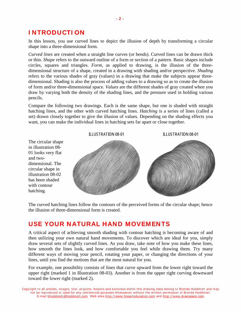
Copyright to all articles, images, text, projects, lessons and exercises within this drawing class belong to Brenda Hoddinott and may not be reproduced or used for any commercial purposes whatsoever without the written permission of Brenda Hoddinott.
E-mail [email protected] Web sites http://www.finearteducation.com and http://www.drawspace.com
- 2 -
INTRODUCTION In this lesson, you use curved lines to depict the illusion of depth by transforming a circular shape into a three-dimensional form.
Curved lines are created when a straight line curves (or bends). Curved lines can be drawn thick or thin. Shape refers to the outward outline of a form or section of a pattern. Basic shapes include circles, squares and triangles. Form, as applied to drawing, is the illusion of the three-dimensional structure of a shape, created in a drawing with shading and/or perspective. Shading refers to the various shades of gray (values) in a drawing that make the subjects appear three-dimensional. Shading is also the process of adding values to a drawing so as to create the illusion of form and/or three-dimensional space. Values are the different shades of gray created when you draw by varying both the density of the shading lines, and the pressure used in holding various pencils.
Compare the following two drawings. Each is the same shape, but one is shaded with straight hatching lines, and the other with curved hatching lines. Hatching is a series of lines (called a set) drawn closely together to give the illusion of values. Depending on the shading effects you want, you can make the individual lines in hatching sets far apart or close together.
ILLUSTRATION 08-01 ILLUSTRATION 08-01 The circular shape in illustration 08-01 looks very flat and two-dimensional. The circular shape in illustration 08-02 has been shaded with contour hatching.
The curved hatching lines follow the contours of the perceived forms of the circular shape; hence the illusion of three-dimensional form is created.
USE YOUR NATURAL HAND MOVEMENTS A critical aspect of achieving smooth shading with contour hatching is becoming aware of and then utilizing your own natural hand movements. To discover which are ideal for you, simply draw several sets of slightly curved lines. As you draw, take note of how you make these lines, how smooth the lines look, and how comfortable you feel while drawing them. Try many different ways of moving your pencil, rotating your paper, or changing the directions of your lines, until you find the motions that are the most natural for you.
For example, one possibility consists of lines that curve upward from the lower right toward the upper right (marked 1 in Illustration 08-03). Another is from the upper right curving downward toward the lower right (marked 2).

Copyright to all articles, images, text, projects, lessons and exercises within this drawing class belong to Brenda Hoddinott and may not be reproduced or used for any commercial purposes whatsoever without the written permission of Brenda Hoddinott.
E-mail [email protected] Web sites http://www.finearteducation.com and http://www.drawspace.com
- 3 -
The motions indicated in sets 1 and 2, work best for me and, as you can tell by the awkwardness of the lines in numbers 3 to 8, others are very unnatural to me.
Any of the stroking movements illustrated may be perfect for you, and of course you can also experiment with others. To take advantage of your natural hand movement, you need to continuously rotate your drawing paper as you draw. For example if I want my sets of lines (1 and 2) to curve in the opposite direction, I simply turn my paper upside-down to draw.
ILLUSTRATION 08-03
DRAW A FORM WITH CONTOUR HATCHING In this exercise, curved hatching lines are used to transform a circular shape into a three-dimensional form. ILLUSTRATION 08-04
1. Lightly sketch a circular shape with your HB pencil. No need to make your shape exactly like mine, but try to come close. Mine looks like a cross between a kidney bean, a potato, and a cocoon!
Keep your lines very light by pressing very gently with your pencil. The lines in this particular sketch seem dark; however, in reality the lines are so light that I can barely see them. I have made them darker in a computer program so you can see them.

Copyright to all articles, images, text, projects, lessons and exercises within this drawing class belong to Brenda Hoddinott and may not be reproduced or used for any commercial purposes whatsoever without the written permission of Brenda Hoddinott.
E-mail [email protected] Web sites http://www.finearteducation.com and http://www.drawspace.com
- 4 -
ILLUSTRATION 08-05
2. Add a few curved lines to map the directions in which the hatching lines will curve. As you work, pretend you are wrapping string around a circular form.
Always place a piece of clean paper under your hand as you draw.
Each time you work on a new section, remember to move your paper so it’s always under your hand.
This prevents you from smudging your drawing, and protects the paper from the oils in your skin.
ILLUSTRATION 08-06
3. Use curved hatching lines to add shading to the lower section of the circular shape. The hatching lines follow the perceived contours of the surface of the form.
The hatching lines are not long and continuous; rather they are of various lengths.
Also, remember to use your natural hand movement to help you render smoothly flowing curved lines.

Copyright to all articles, images, text, projects, lessons and exercises within this drawing class belong to Brenda Hoddinott and may not be reproduced or used for any commercial purposes whatsoever without the written permission of Brenda Hoddinott.
E-mail [email protected] Web sites http://www.finearteducation.com and http://www.drawspace.com
- 5 -
ILLUSTRATION 08-07 4. Continue adding shading that follows the
contours of the surface of the form. If your shading isn’t as smooth as you would like, you can touch it up.
To make lines lighter pat them with your kneaded eraser molded to a wedge shape.
You can make sections darker by drawing more short curved hatching lines in between others.
ILLUSTRATION 08-08
5. Switch to a freshly sharpened 2B pencil and add darker curved lines around the perimeter of the shape. This dark value will enhance the illusion of a three dimensional form.
The dark curved lines need to feather gently toward the lighter values in the center sections; hence, the curved hatching lines are raggedy and of various lengths.
Don’t forget to rotate your drawing paper!
Use a sandpaper block to keep the point of your pencil sharpened.

Copyright to all articles, images, text, projects, lessons and exercises within this drawing class belong to Brenda Hoddinott and may not be reproduced or used for any commercial purposes whatsoever without the written permission of Brenda Hoddinott.
E-mail [email protected] Web sites http://www.finearteducation.com and http://www.drawspace.com
- 6 -
6. Use an HB pencil to fill in lots more curved hatching lines until the surface of the form appears to be a medium value. The transition between the dark and medium values is very smooth. The curved hatching lines are barely noticeable because they are really close together with hardly any of the white paper still showing through.
7. Touch up any sections you aren’t happy with. Remember, if the transition between your values isn’t as smooth as you like, you can improve it. Try using a freshly sharpened HB pencil to add a few more short curved hatching lines in between others.
ILLUSTRATION 08-09
Practice drawing sets of contour hatching lines every chance you can find! With only half an hour a day of practice, there will be a
significant improvement in your drawings very soon.

Copyright to all articles, images, text, projects, lessons and exercises within this drawing class belong to Brenda Hoddinott and may not be reproduced or used for any commercial purposes whatsoever without the written permission of Brenda Hoddinott.
E-mail [email protected] Web sites http://www.finearteducation.com and http://www.drawspace.com
- 7 -
BRENDA HODDINOTT - BIOGRAPHY As a self-educated teacher, visual artist, portraitist, forensic artist, and illustrator, Brenda Hoddinott utilizes diverse art media including graphite, technical pen, colored pencil, chalk pastel, charcoal, conté crayon, and oil paints.
My philosophy on teaching art is to focus primarily on the enjoyment aspects while gently introducing the technical and academic. Hence, in creating a passion for the subject matter,
the quest for knowledge also becomes enjoyable. >Brenda Hoddinott<
Born in St. John’s, Newfoundland, Brenda grew up in the small town of Corner Brook. She developed strong technical competencies with a personal commitment to self directed learning, and the aid of assorted “Learn to Draw” books. During Brenda’s twenty-five year career as a self-educated civilian forensic artist, numerous criminal investigation departments have employed Brenda’s skills, including Royal Canadian Mounted Police and municipal police departments. In 1992, Brenda was honored with a commendation from the Royal Canadian Mounted Police, and in 1994, she was awarded a Certificate of Membership from “Forensic Artists International”.
Her home-based art career included graphic design, and teaching recreational drawing and painting classes. As supervisor of her community’s recreational art department, Brenda hired and trained teachers, and designed curriculum for several children’s art programs. In 1998, Brenda chose to end her eighteen-year career as an art educator in order to devote more time to writing, drawing, painting, and developing her websites.
Drawspace http://www.drawspace.com incorporate her unique style and innovative approach to curriculum development. These sites offer downloadable and printable drawing classes for students of all abilities from the age of eight through adult. Students of all ages, levels and abilities have praised the simple step-by-step instructional approach. These sites are respected as a resource for fine art educators, home schooling programs, and educational facilities throughout the world.
LEARN-TO-DRAW BOOKS BY BRENDA HODDINOTT Drawing for Dummies (2003): Wiley Publishing, Inc., New, York, NY, this 336 page book
is available on various websites and in major bookstores internationally.
The Complete Idiot’s Guide to Drawing People (2004): Winner of the Alpha-Penguin Book of the Year Award 2004, Alpha - Pearson Education – Macmillan, Indianapolis, IN, this 360 page book is available on various websites and in major bookstores internationally.

GRADUATIONS WITH
Brenda Hoddinott F-09 BEGINNER: HATCHING
In this lesson, you use curved hatching lines and smoothly rendered graduations to depict the illusion of depth, and illustrate light and shadows on a close-up segment of a form.
Graduations are the primary ingredient in realistic shading. When your goal is to create a smooth texture for a three-dimensional form, you need to keep the transition between the different values flowing into one another as smoothly as possible.
Curriculum is divided into the following sections:
RENDERING CONTOUR HATCHING: This section offers five helpful strategies to improve your ability to render smooth contour hatching including: discovering and using your natural hand movements, and using various pencils and drawing techniques.
SMOOTH GRADUATIONS WITH CONTOUR HATCHING: You use curved hatching lines to create a section of a three-dimensional form, and render smoothly rendered hatching graduations further accentuate the illusion of depth.
Suggested drawing supplies include good quality white drawing paper, graphite pencils, kneaded and vinyl erasers, and a pencil sharpener.
This project is recommended for artists with basic drawing skills, from age 12 to adult, as well as home schooling, academic and recreational fine art educators.
8 PAGES – 10 ILLUSTRATIONS Published by Hoddinott Fine Art Publishers, Halifax, NS, Canada – 2005 (Revised 2006)

Copyright to all articles, images, text, projects, lessons and exercises within this drawing class belong to Brenda Hoddinott and may not be reproduced or used for any commercial purposes whatsoever without the written permission of Brenda Hoddinott.
E-mail [email protected] Web site http://www.finearteducation.com or http://www.drawspace.com
- 2 -
RENDERING CONTOUR HATCHING Hatching is a series of lines (called a set) drawn closely together to give the illusion of values. Depending on the shading effects you want, you can make the individual lines in hatching sets far apart or close together. Contour hatching is a series of curved lines (called a set) drawn closely together to give the illusion of values, and is ideal for rendering the illusion of three dimensional form. Curved lines are created when a straight line curves (or bends). Curved lines can be drawn thick or thin. Values are the different shades of gray created when you draw by varying both the density of the shading lines, and the pressure used in holding various pencils. Form as applied to drawing, is the illusion of the three-dimensional structure of a shape, such as a circle, square or triangle, created in a drawing with shading and/or perspective.
The following five strategies may prove very helpful for improving your ability to render contour hatching:
1. USE DIFFERENT PENCILS TO DO SOME OF THE WORK: Your pencils play a major role in the smooth progression of your graduations. Graduated shading is a continuous progression of graduated values from dark to light or from light to dark. Beginners can generally make do nicely with only three or four different graphite pencils. The pencils I use most frequently are a 2H, HB, 2B, 4B, and 6B. The 2H is the lightest (hardest) and the 6B is the darkest (softest). 2H works well for light values, HB and 2B are great for middle values, and 4B and 6B are very good for darker values.
2. VARY THE DENSITY OF THE HATCHING LINES: Draw the curved hatching lines far apart and few in number for light values. For darker values, you draw more lines closer together; subsequently less of the white paper is still showing between the lines.
3. DRAW THE INDIVIDUAL HATCHING LINES DIFFERENT LENGTHS: The transition from one value to the next is barely noticeable when the lines vary in length. Try adding a few more short hatching lines in between others if the transition between your values isn’t as smooth as you like.
4. VARY THE PRESSURE USED IN HOLDING YOUR PENCILS: Press lightly for the really light values and a little harder for darker values.
5. USE YOUR NATURAL HAND MOVEMENTS: A critical aspect of achieving smooth graduations with contour hatching is utilizing your own natural hand movements. To discover which are ideal for you, simply draw several sets of slightly curved lines. As you draw, take note of how you make these lines, how smooth the lines look, and how comfortable you feel while drawing them. Try many different ways of moving your pencil, rotating your paper, or changing the directions of your lines, until you find the motions that are the most natural for you.
SMOOTH GRADUATIONS WITH CONTOUR HATCHING In this exercise, curved hatching lines create a section of a three-dimensional form, and smoothly rendered graduations further accentuate the illusion of depth by illustrating light and shadows.

Copyright to all articles, images, text, projects, lessons and exercises within this drawing class belong to Brenda Hoddinott and may not be reproduced or used for any commercial purposes whatsoever without the written permission of Brenda Hoddinott.
E-mail [email protected] Web site http://www.finearteducation.com or http://www.drawspace.com
- 3 -
ILLUSTRATION 09-01
1. Lightly sketch a small circular shape to represent the highlight section of a form. The center of this circular shape will be left white, and represents the section closest to the light source (which is from the upper right). Sketching refers to the method used for creating a quick, rough representation or outline of a planned drawing subject. A sketch can also be a completed work of art. Highlight refers to the brightest area of a form where light bounces off its surface and is usually the section closest to the light source. Light source is the direction from which a dominant light originates.
2. Add three curved lines to map the directions in which the hatching lines will curve.
ILLUSTRATION 09-02
ILLUSTRATION 09-03
3. Add light shading to the upper section of the map. The shading begins very light around the edge of the highlight and becomes gradually darker farther away from the light.

Copyright to all articles, images, text, projects, lessons and exercises within this drawing class belong to Brenda Hoddinott and may not be reproduced or used for any commercial purposes whatsoever without the written permission of Brenda Hoddinott.
E-mail [email protected] Web site http://www.finearteducation.com or http://www.drawspace.com
- 4 -
ILLUSTRATION 09-04
4. Continue adding shading that become progressively darker farther away from the light.
If your shading isn’t as smooth as you like, you can touch it up. To make lines lighter pat them with your kneaded eraser molded to a wedge shape. You can make sections darker by drawing more short curved hatching lines in between others.
ILLUSTRATION 09-05
Always place a piece of clean paper under your hand as you draw.
Each time you work on a new section, remember to move your paper so it’s always under your hand. This prevents you from smudging your drawing, and protects the paper from the oils in your skin.

Copyright to all articles, images, text, projects, lessons and exercises within this drawing class belong to Brenda Hoddinott and may not be reproduced or used for any commercial purposes whatsoever without the written permission of Brenda Hoddinott.
E-mail [email protected] Web site http://www.finearteducation.com or http://www.drawspace.com
- 5 -
ILLUSTRATION 09-06
5. Graduate the darkest shading downward to identify the shadow sections. The values are very dark because little light reaches a shadow area on a form.
ILLUSTRATION 09-07
6. Continue pressing a little harder with your pencils until the end of your graduation is very dark. 6B will create the very darkest values.
The transition between the hatching values is very smooth. The curved hatching lines in the darkest shadow sections are barely noticeable because they are really close together with hardly any of the white paper showing through.
As you add the dark shading, constantly check the transition between the different values and adjust the hatching lines as needed.

Copyright to all articles, images, text, projects, lessons and exercises within this drawing class belong to Brenda Hoddinott and may not be reproduced or used for any commercial purposes whatsoever without the written permission of Brenda Hoddinott.
E-mail [email protected] Web site http://www.finearteducation.com or http://www.drawspace.com
- 6 -
ILLUSTRATION 09-08
7. Add raggedy curved hatching lines to the lower section below the darkest shadow. The lines need to feather gently downward toward a lighter value. Switch to lighter (harder) pencils and make sure they are freshly sharpened.
ILLUSTRATION 09-09
Don’t forget that you can turn your drawing paper (or sketchbook) around as you draw.
At this point, you are setting the stage to add a rim of reflected light. From here, the shading will need to graduate lighter to indicate the light values.

Copyright to all articles, images, text, projects, lessons and exercises within this drawing class belong to Brenda Hoddinott and may not be reproduced or used for any commercial purposes whatsoever without the written permission of Brenda Hoddinott.
E-mail [email protected] Web site http://www.finearteducation.com or http://www.drawspace.com
- 7 -
ILLUSTRATION 09-10
8. Graduate the shading from the dark shadow into the section of reflected light. Use lighter pencils, make your lines farther apart, and press more lightly with your pencils until the end of your graduation is light.
9. Touch up any sections you aren’t happy with. If the transition between your values isn’t as smooth as you like, you can improve it.
Try using various grades of freshly sharpened pencils to add a few more short curved hatching lines in between some of your lines.

Copyright to all articles, images, text, projects, lessons and exercises within this drawing class belong to Brenda Hoddinott and may not be reproduced or used for any commercial purposes whatsoever without the written permission of Brenda Hoddinott.
E-mail [email protected] Web site http://www.finearteducation.com or http://www.drawspace.com
- 8 -
BRENDA HODDINOTT - BIOGRAPHY As a self-educated teacher, visual artist, portraitist, forensic artist, and illustrator, Brenda Hoddinott utilizes diverse art media including graphite, technical pen, colored pencil, chalk pastel, charcoal, conté crayon, and oil paints.
My philosophy on teaching art is to focus primarily on the enjoyment aspects while gently introducing the technical and academic. Hence, in creating a passion for the subject matter,
the quest for knowledge also becomes enjoyable. >Brenda Hoddinott<
Born in St. John’s, Newfoundland, Brenda grew up in the small town of Corner Brook. She developed strong technical competencies with a personal commitment to self directed learning, and the aid of assorted “Learn to Draw” books. During Brenda’s twenty-five year career as a self-educated civilian forensic artist, numerous criminal investigation departments have employed Brenda’s skills, including Royal Canadian Mounted Police and municipal police departments. In 1992, Brenda was honored with a commendation from the Royal Canadian Mounted Police, and in 1994, she was awarded a Certificate of Membership from “Forensic Artists International”.
Her home-based art career included graphic design, and teaching recreational drawing and painting classes. As supervisor of her community’s recreational art department, Brenda hired and trained teachers, and designed curriculum for several children’s art programs. In 1998, Brenda chose to end her eighteen-year career as an art educator in order to devote more time to writing, drawing, painting, and developing her websites.
Drawspace http://www.drawspace.com incorporates her unique style and innovative approach to curriculum development. This site offers downloadable and printable drawing classes for students of all abilities from the age of eight through adult. Students of all ages, levels and abilities have praised the simple step-by-step instructional approach. This site is respected as a resource for fine art educators, home schooling programs, and educational facilities throughout the world.
LEARN-TO-DRAW BOOKS BY BRENDA HODDINOTT Drawing for Dummies (2003): Wiley Publishing, Inc., New, York, NY, this 336 page book
is available on various websites and in major bookstores internationally.
The Complete Idiot’s Guide to Drawing People (2004): Winner of the Alpha-Penguin Book of the Year Award 2004, Alpha - Pearson Education – Macmillan, Indianapolis, IN, this 360 page book is available on various websites and in major bookstores internationally.
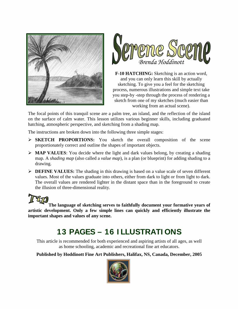
Brenda Hoddinott
F-10 HATCHING: Sketching is an action word, and you can only learn this skill by actually
sketching. To give you a feel for the sketching process, numerous illustrations and simple text take you step-by -step through the process of rendering a sketch from one of my sketches (much easier than
working from an actual scene).
The focal points of this tranquil scene are a palm tree, an island, and the reflection of the island on the surface of calm water. This lesson utilizes various beginner skills, including graduated hatching, atmospheric perspective, and sketching from a shading map.
The instructions are broken down into the following three simple stages:
SKETCH PROPORTIONS: You sketch the overall composition of the scene proportionately correct and outline the shapes of important objects.
MAP VALUES: You decide where the light and dark values belong, by creating a shading map. A shading map (also called a value map), is a plan (or blueprint) for adding shading to a drawing.
DEFINE VALUES: The shading in this drawing is based on a value scale of seven different values. Most of the values graduate into others, either from dark to light or from light to dark. The overall values are rendered lighter in the distant space than in the foreground to create the illusion of three-dimensional reality.
The language of sketching serves to faithfully document your formative years of artistic development. Only a few simple lines can quickly and efficiently illustrate the important shapes and values of any scene.
13 PAGES – 16 ILLUSTRATIONS This article is recommended for both experienced and aspiring artists of all ages, as well
as home schooling, academic and recreational fine art educators.
Published by Hoddinott Fine Art Publishers, Halifax, NS, Canada, December, 2005

Copyright to all articles, images, text, projects, lessons and exercises within this drawing class belong to Brenda Hoddinott and may not be reproduced or used for any commercial purposes whatsoever without the written permission of Brenda Hoddinott.
E-mail [email protected] Web site http://www.finearteducation.com or http://www.drawspace.com
2
SKETCH PROPORTIONS The goal in this section is to very lightly render a proportionately correct map of where the different parts of the scene are in relation to one another.
Proportion is the relationship in size of one component of a drawing to another or others. A sketch (noun) is a simple drawing that captures the integral aspects of a subject quickly and efficiently. To sketch (verb) refers to the process of rendering a sketch. ILLUSTRATION 10-01 1) Study the subject. Seeing is by far the most important step toward creating a proportionately correct sketch.
Pretend that this sketch is an actual scene. Look at the contours and proportions.
Contour lines are formed when the shared edges of spaces and/or objects meet. A contour drawing is comprised of lines that follow the contours of the edges of various components of a drawing subject.
Observe how all the components within the scene interact with one another.
A scene can be separated into foreground, middle ground, and distant space by overlapping (or layering) objects in front of one another. Identify which objects are closest to you, those that are farther away, and objects or parts of objects that overlap others.
Overlapping refers to a technique for creating the illusion of depth in a drawing by drawing a subject so it visually appears to be in front of another (or others). The foreground is the part of the scene that is closest to you. The middle ground is the space or section of the scene beyond the subjects in the foreground. Distant space refers to the components of the scene that are farthest away such as the distant mountain range and the sky.
The focal points of this tranquil scene are a palm tree, an island, and the reflection of the island on the surface of calm water.
Focal point is a term used to identify the most important elements in a drawing. Primary focal point is the most important center of interest (or focus) in a drawing. Secondary focal point(s) is a center of interest in a drawing composition that is significant, but not as important as the primary focal point.

Copyright to all articles, images, text, projects, lessons and exercises within this drawing class belong to Brenda Hoddinott and may not be reproduced or used for any commercial purposes whatsoever without the written permission of Brenda Hoddinott.
E-mail [email protected] Web site http://www.finearteducation.com or http://www.drawspace.com
3
ILLUSTRATION 10-02
2) Follow along with the following four illustrations and render a sketch of the scene. With simple sketch lines, indicate the basic shapes and outlines of the objects in your scene in proper proportion to one another.
Fine detail isn’t as important as capturing the overall essence of the subject.
ILLUSTRATION 10-03
As a beginner to sketching, you may want to draw slowly. Accuracy is more important than speed. Your speed will automatically improve the more you practice. A few simple lines, along with careful observation of your drawing subject, can visually describe anything.
For example, sometimes one curved line is all you need to record the curve of a tree or a section of land.

Copyright to all articles, images, text, projects, lessons and exercises within this drawing class belong to Brenda Hoddinott and may not be reproduced or used for any commercial purposes whatsoever without the written permission of Brenda Hoddinott.
E-mail [email protected] Web site http://www.finearteducation.com or http://www.drawspace.com
4
ILLUSTRATION 10-04 The mountains in the background appear smaller than the section of the island (on the right), which is actually much closer and smaller. Perspective is a visual illusion in which objects appear to become smaller the farther away they are from the viewer.
Pay close attention to the shapes created by the positive and negative spaces.
Positive space refers to the space occupied by the drawing subject and/or its (or his or her) various parts. Negative space refers to the background around and/or behind a drawing subject such as objects, people, or animals.
ILLUSTRATION 10-05
Continue adjusting your drawing until you are happy.
Check the relationships of objects to one another, and observe that angles, sizes, and proportions are accurate.
At this point, the preliminary sketch is complete and everything is where it should be.

Copyright to all articles, images, text, projects, lessons and exercises within this drawing class belong to Brenda Hoddinott and may not be reproduced or used for any commercial purposes whatsoever without the written permission of Brenda Hoddinott.
E-mail [email protected] Web site http://www.finearteducation.com or http://www.drawspace.com
5
MAP VALUES In this section you identify where the light and dark values belong, by creating a shading map. A shading map (also called a value map), is a plan (or blueprint) for adding shading to a drawing. The locations and sizes of the shapes of various values are identified and/or lightly outlined. Values are the different shades of gray created in a drawing by various means.
The shading in this drawing is based on a value scale of seven different values. Shading (noun) refers to the various values in a drawing that make images appear three-dimensional; (verb) the process of adding values to a drawing so as to create the illusion of texture, form and/or three-dimensional space. A value scale refers to the range of different values from light to dark or from dark to light.
The value scale in the next illustration is rendered with hatching. Hatching is a series of lines (called a set) drawn closely together to give the illusion of values. The individual lines in hatching sets can be either far apart or close together. Each different value is numbered from light to dark with numbers 1 to 7.
ILLUSTRATION 10-06
Compare the completed drawing (on the left) with the value map. Compare the numbers on the map (on the right) to the corresponding numbers of the values in the value scale (above). The palm tree isn’t illustrated in the map, but is shaded with several different darker values.
ILLUSTRATION 10-07 ILLUSTRATION 10-08

Copyright to all articles, images, text, projects, lessons and exercises within this drawing class belong to Brenda Hoddinott and may not be reproduced or used for any commercial purposes whatsoever without the written permission of Brenda Hoddinott.
E-mail [email protected] Web site http://www.finearteducation.com or http://www.drawspace.com
6
DEFINE VALUES In this section, the planned sketch is transformed into a completed sketch! Keep in mind that a full range of values gives contrast between the light and the shadow areas. You can achieve different values by using various pencils, varying the density of the lines, and varying the pressure used in holding your pencils.
Most of the values used to create the shading in this drawing graduate into others, either from dark to light or from light to dark. Graduated values (also called a graduation or graduated shading) is a continuous progression of values, from dark to light or light to dark. The goal of graduated shading is to keep the transitions between the different values flowing smoothly into one another (have a closer look at the graduated values in Illustration 10-07).
The process of shading is individual to each artist. Some artists prefer to work from light to dark and others work from dark to light. In this particular sketch, I worked from light to dark.
The overall values are rendered lighter in the distant space than in the foreground to give the illusion of depth to the sketch. This illusion is based on an element of perspective known as atmospheric perspective. Atmospheric perspective (also referred to as aerial perspective) refers to the visual depth created by particles in the atmosphere. The farther objects and/or people recede into the distance, the lighter in value they seem to become, and their edges and forms appear more blurred.
3) Refer to the following ten illustrations, as you add shading to the sketch with hatching graduations and a full range of values from 1 to 7.
ILLUSTRATION 10-09
Use various pencils to help create a full value scale, and subsequently a strong contrast of values. Contrast, the comparison of different values when put beside one another, is an invaluable tool for heightening the effects of a drawing composition.
I begin by adding the lightest value (1) to the sky and water with a 2H pencil.

Copyright to all articles, images, text, projects, lessons and exercises within this drawing class belong to Brenda Hoddinott and may not be reproduced or used for any commercial purposes whatsoever without the written permission of Brenda Hoddinott.
E-mail [email protected] Web site http://www.finearteducation.com or http://www.drawspace.com
7
ILLUSTRATION 10-10 The diagonal hatching lines of the upper section of the sky (2) are graduated down toward the light values by progressively applying a little less pressure with the 2H pencil.
The horizontal hatching lines, used for the water in the foreground (2), help create the illusion of ripples.
Remember to erase the horizontal line cutting through the island before you add shading.
ILLUSTRATION 10-11 A few simple hatching lines indicate the values of the mountain in the distant space (3), which is shaded with an HB pencil (press very lightly).
The three land masses are shaded differently according to their positions in the drawing.
The island is shaded with both HB and 2B pencils, and the tiny section of land in the foreground is rendered with 2B and 4B pencils.

Copyright to all articles, images, text, projects, lessons and exercises within this drawing class belong to Brenda Hoddinott and may not be reproduced or used for any commercial purposes whatsoever without the written permission of Brenda Hoddinott.
E-mail [email protected] Web site http://www.finearteducation.com or http://www.drawspace.com
8
ILLUSTRATION 10-12
The lighter values of the island (4) are shaded with an HB pencil.
Take your time. If you begin to tire or feel frustrated, take a break. When you return have a fresh look at your drawing and touch up anything you’re not happy with.
ILLUSTRATION 10-13
The reflection of the island in the water (5) is rendered with an HB pencil. The values used are slightly darker than the island itself at this stage.
The hatching lines of the reflection are horizontal rather than angular.
You may find it easier to add shading to the reflection by turning your drawing sideways (I did).

Copyright to all articles, images, text, projects, lessons and exercises within this drawing class belong to Brenda Hoddinott and may not be reproduced or used for any commercial purposes whatsoever without the written permission of Brenda Hoddinott.
E-mail [email protected] Web site http://www.finearteducation.com or http://www.drawspace.com
9
ILLUSTRATION 10-14
A layer of dark values is added to the land in the foreground (7) with a 2B pencil.
Currently, this style of sketching is my personal favorite. However, you are a unique individual with your own preferences. Therefore, you need to experiment with various sketching techniques until you find the style that works best for you!
ILLUSTRATION 10-15 Use a 4B pencil to add a few squiggly lines to the tiny section of land in the foreground. These lines represent small shrubs and foliage.
The shading of the trunk of the tree is lighter on the left, providing insight into the direction from which the light source originates (the left).
Light source is the direction from which a dominant light originates. A light source identifies where to draw the light and shadow areas of a drawing subject.

Copyright to all articles, images, text, projects, lessons and exercises within this drawing class belong to Brenda Hoddinott and may not be reproduced or used for any commercial purposes whatsoever without the written permission of Brenda Hoddinott.
E-mail [email protected] Web site http://www.finearteducation.com or http://www.drawspace.com
10
A 2B pencil works well to add shading to the dark shadow sections along the lower part of the island (6). The shading of the island graduates from light at the top to dark in the lower sections.
I’ve left a tiny horizontal sliver of light values to identify where the land meets the water. Also, I’ve used a freshly sharpened HB pencil to draw a few tiny trees and shrubs on the island.
The largest branches of the palm tree are added with curved lines and a 2B pencil.
ILLUSTRATION 10-16
Use freshly sharpened HB and 2B pencils and curved hatching lines to complete the smaller branches on the upper section of the palm tree. Refer to the close-up on the following page.
Observe how some branches are lighter than others, especially the ones that are farther away. In other words, the branches that are in the foreground are considerably darker in value. This illusion of depth is a result of atmospheric perspective.

Copyright to all articles, images, text, projects, lessons and exercises within this drawing class belong to Brenda Hoddinott and may not be reproduced or used for any commercial purposes whatsoever without the written permission of Brenda Hoddinott.
E-mail [email protected] Web site http://www.finearteducation.com or http://www.drawspace.com
11
ILLUSTRATION 10-17

Copyright to all articles, images, text, projects, lessons and exercises within this drawing class belong to Brenda Hoddinott and may not be reproduced or used for any commercial purposes whatsoever without the written permission of Brenda Hoddinott.
E-mail [email protected] Web site http://www.finearteducation.com or http://www.drawspace.com
12
Step back from your drawing and have a look at the overall values. You may need to make some areas lighter and others darker. To make a section darker, simply add more hatching lines in between the others. To make a section lighter, pat the lines gently with a kneaded eraser molded to a wedge or point.
Sign your name, write today’s date on the back, and put a smile on your face.
ILLUSTRATION 10-18
Don’t be afraid to try different shading techniques. Drawings you don’t like, present opportunities to spot problems, and seek new ways of doing things. Even a totally disastrous drawing can teach you not to try that particular approach again!

Copyright to all articles, images, text, projects, lessons and exercises within this drawing class belong to Brenda Hoddinott and may not be reproduced or used for any commercial purposes whatsoever without the written permission of Brenda Hoddinott.
E-mail [email protected] Web site http://www.finearteducation.com or http://www.drawspace.com
13
Keep in mind that the more you practice sketching the better and faster you become. On a good day, you may be creating several different and wonderful sketches within an hour!
BRENDA HODDINOTT - BIOGRAPHY As a self-educated teacher, visual artist, portraitist, forensic artist, and illustrator, Brenda Hoddinott utilizes diverse art media including graphite, technical pen, colored pencil, chalk pastel, charcoal, conté crayon, and oil paints.
Born in St. John’s, Newfoundland, Brenda grew up in the small town of Corner Brook. She developed strong technical competencies with a personal commitment to self directed learning, and the aid of assorted “Learn to Draw” books. During Brenda’s twenty-five year career as a self-educated civilian forensic artist, numerous criminal investigation departments have employed Brenda’s skills, including Royal Canadian Mounted Police and municipal police departments. In 1992, Brenda was honored with a commendation from the Royal Canadian Mounted Police, and in 1994, she was awarded a Certificate of Membership from “Forensic Artists International”.
Her home-based art career included graphic design, and teaching recreational drawing and painting classes. As supervisor of her community’s recreational art department, Brenda hired and trained teachers, and designed curriculum for several children’s art programs. In 1998, Brenda chose to end her eighteen-year career as an art educator in order to devote more time to writing, drawing, painting, and developing her websites.
Drawspace http://www.drawspace.com incorporates her unique style and innovative approach to curriculum development. This site offers downloadable and printable drawing classes for students of all abilities from the age of eight through adult. Students of all ages, levels and abilities have praised the simple step-by-step instructional approach. This site is respected as a resource for fine art educators, home schooling programs, and educational facilities throughout the world.
LEARN-TO-DRAW BOOKS BY BRENDA HODDINOTT Drawing for Dummies (2003): Wiley Publishing, Inc., New, York, NY, this 336 page book
is available on various websites and in major bookstores internationally.
The Complete Idiot’s Guide to Drawing People (2004): Winner of the Alpha-Penguin Book of the Year Award 2004, Alpha - Pearson Education – Macmillan, Indianapolis, IN, this 360 page book is available on various websites and in major bookstores internationally.

Brenda Hoddinott
FF --1111 BB EEGGIINNNNEE RR:: HH AATT CCHHIINNGG Tulips are among the most beautiful flowers and are also quite easy to draw.
In this project, you use slightly curved hatching lines of various values and lengths to draw a tulip, as well as a section of its stem and leaf. Detailed step-by-step instructions take you through every aspect of setting up proportions, establishing the shape of the individual parts, and adding shading to create depth.
Simple step-by-step directions are divided into the following four sections:
SKETCHING THE TULIP, LEAF, AND STEM: You first establish accurate proportions by sketching two triangles to represent the tulip and its leaf. You then transform the two triangles into a more realistic sketch.
TRANSFORMING A SKETCH INTO A CONTOUR DRAWING: Your goal is to establish a detailed contour drawing in preparation for adding shading.
LIGHT AND MEDIUM VALUES: You use 2H, HB, and 2B pencils and hatching graduations, to add light and medium values to your outline drawing.
DARK VALUES AND FINAL TOUCHES: With dark values added in layers on top of the light and medium values, the tulip begins to look three-dimensional.
Suggested supplies include 2H, HB, 2B, 4B and 6B pencils, vinyl and kneaded erasers, a pencil sharpener, a sandpaper block, and good quality drawing paper.
8 PAGES - 22 ILLUSTRATIONS This lesson is recommended for artists with basic drawing skills, including the shading technique of contour
hatching. The curriculum of this lesson is easily implemented into instructional programs for home schooling, academic and recreational learning environments.
Published by Hoddinott Fine Art Publishers, Halifax, NS, Canada, 2007

- 2 -
Copyright to al l ar t icles, images, text , projects , lessons, intel lectual property, and exercises within this document belong to Brenda Hoddinott and may no t be reproduced or used for any commercial purposes whatsoever without the wri t ten permission of Brenda Hoddinott .
E-mail [email protected] Web site http://www.finearteducation.com or http://www.drawspace.com
SKETCHING THE TULIP, LEAF, AND STEM In this section, you first establish accurate proportions by lightly sketching an angle line and a triangular shape. Angle lines occur when two straight lines meet (or join together). Shape refers to the outward outline of a form; basic shapes include circles, squares and triangles. You then render a rough sketch of the tulip and its leaf. A rough sketch is a quickly rendered drawing that illustrates the important elements of a subject with very few details.
1) Use an HB pencil to very lightly sketch a large triangle to represent the tulip. As you draw each side, note the size of each of the three angles, and the length of each side.
2) Draw an angle line on the lower left (Illustration 11-02). The angle line will be the leaf. It seems to overlap (be in front of) the large triangle.
3) Draw the oval-shape of a tulip approximately the size of the larger triangle. Refer to Illustration 11-03. The lower section is wider than the top, and the top is gently pointed upward. Keep your sketch lines light - you need to erase them later!
ILLUSTRATION 11-01 ILLUSTRATION 11-02 ILLUSTRATION 11-03
ILLUSTRATION 11-04 ILLUSTRATION 11-05 4) Add two short lines below
the tulip as its stem. These two lines are tilted at an angle rather than straight up and down.
5) Sketch the leaf. This leaf section is approximately the same size as the smaller triangle.

- 3 -
Copyright to al l ar t icles, images, text , projects , lessons, intel lectual property, and exercises within this document belong to Brenda Hoddinott and may no t be reproduced or used for any commercial purposes whatsoever without the wri t ten permission of Brenda Hoddinott .
E-mail [email protected] Web site http://www.finearteducation.com or http://www.drawspace.com
ILLUSTRATION 11-06 ILLUSTRATION 11-07 6) Draw a long oval-shape on
the left as a large petal. This petal is in front of the main section of the tulip.
7) Add the long tiny section of a petal on the right. This petal is mostly out of sight behind the main section.
8) Pat your lines gently with your kneaded eraser until you can barely see them.
TRANSFORMING A SKETCH INTO A CONTOUR DRAWING You’ve probably heard the old adage “A picture is worth a thousand words”. Hence, I’ve added numerous step-by-step illustrations to guide you through the various steps. The goal is to establish a detailed contour drawing in preparation for adding shading.
Contour drawing (also called a line drawing) is comprised of lines which follow the contours of various sections of a drawing subject and define the outlines of its forms. Form, as applied to drawing, is the illusion of the three-dimensional structure of a shape created in a drawing with shading and/or perspective. Shading refers to the various shades of gray (values) in a drawing that make the subject look three-dimensional. Perspective refers to the visual illusion created in a drawing in which objects appear to become smaller, the farther away they are from the viewer. Values are the different shades of gray created when you draw by varying both the density of the shading lines, and the pressure used in holding various pencils.
Use a freshly sharpened HB pencil. Draw slowly. Accuracy is more important than speed. Your speed will automatically improve the more you practice.
ILLUSTRATION 11-08 ILLUSTRATION 11-09
9) Draw a thin line around the leaf and large petal. Don’t simply draw over your sketch lines. Rather, examine my drawing closely, and draw new lines where you see them.

- 4 -
Copyright to al l ar t icles, images, text , projects , lessons, intel lectual property, and exercises within this document belong to Brenda Hoddinott and may no t be reproduced or used for any commercial purposes whatsoever without the wri t ten permission of Brenda Hoddinott .
E-mail [email protected] Web site http://www.finearteducation.com or http://www.drawspace.com
ILLUSTRATION 11-10 ILLUSTRATION 11-11
10) Draw the main body of the tulip with delicate, curved lines.
11) Add the outline of the stem with lines that curve slightly.
ILLUSTRATION 11-12
12) Outline the long thin section of the other petal on the right.
13) Check over your contour drawing and make changes to sections you aren’t happy with.
LIGHT AND MEDIUM VALUES In this section, you use 2H, HB, and 2B pencils and hatching graduations, to add light and medium values to your outline drawing.
Hatching is a series of lines (called a set) drawn closely together to give the illusion of values. Graduation (often called graduated shading) is a continuous progression of values from dark to light or light to dark. By drawing the light values first, you can then layer your medium shading on top of the light shading. This layering creates a nice smooth transition between different values.
Different values are created by using various grades of pencils, and varying the density of the lines and the pressure used in holding your pencils. For light lines you press very lightly with your pencil. Press a little harder to make darker lines.
To protect you drawing from smudging, place a piece of clean paper under your hand as you add shading. Each time you work on a new section, remember to move your paper so it’s always under your hand.

- 5 -
Copyright to al l ar t icles, images, text , projects , lessons, intel lectual property, and exercises within this document belong to Brenda Hoddinott and may no t be reproduced or used for any commercial purposes whatsoever without the wri t ten permission of Brenda Hoddinott .
E-mail [email protected] Web site http://www.finearteducation.com or http://www.drawspace.com
14) Use your 2H pencil to add the lightest values to the main section and large petal. The hatching lines are of various lengths and slightly curved to follow the contours of the form of the tulip (Figure 11-13). Hatching lines on the petal are more horizontal than vertical (Figure 11-14).
ILLUSTRATION 11-13 ILLUSTRATION 11-14
15) Add medium shading to the main section, the tiny petal on the right, and the stem. Use an HB pencil. The edges of the darker shading are not abrupt stops, but rather feathered (or ragged) to give a smoother appearance (Figure 11-15). Examine the small section of white on the upper section of the tiny petal on the right (Figure 11-16). Also, observe the section of the stem that is left white, to help make the stem look rounded rather than flat.
ILLUSTRATION 11-15 ILLUSTRATION 11-16

- 6 -
Copyright to al l ar t icles, images, text , projects , lessons, intel lectual property, and exercises within this document belong to Brenda Hoddinott and may no t be reproduced or used for any commercial purposes whatsoever without the wri t ten permission of Brenda Hoddinott .
E-mail [email protected] Web site http://www.finearteducation.com or http://www.drawspace.com
ILLUSTRATION 11-18
ILLUSTRATION 11-20
ILLUSTRATION 11-19
16) Add shading to the flat section of the leaf with your HB pencil. Before you begin, lightly draw a line close to the left to represent the edge of the leaf. Leave this section white for now.
DARK VALUES AND FINAL TOUCHES In this section, you build the darkest values in layers on top of the light and medium values. With a few final touches of darker values, the tulip looks realistic and three-dimensional.
17) Add darker shading to the lower section of the leaf with a 2B pencil (Figure 11-18).
18) Use an HB to add shading to the leaf’s edge.
19) Add medium values to the left side of the large petal with your HB (Figure 11-19).
20) Use a 4B to fill in the tiny dark section under the large petal.
21) Use a 2B to add darker shading to the upper section of the stem under the flower (Figure 11-20).
ILLUSTRATION 11-17

- 7 -
Copyright to al l ar t icles, images, text , projects , lessons, intel lectual property, and exercises within this document belong to Brenda Hoddinott and may no t be reproduced or used for any commercial purposes whatsoever without the wri t ten permission of Brenda Hoddinott .
E-mail [email protected] Web site http://www.finearteducation.com or http://www.drawspace.com
22) Use your 2B pencil to add more shading to the small section of the petal on the right. This shading is very dark close to the main section of the tulip, and graduates lighter toward the outer edge. Also a tiny section at the top is left white.
23) Use various pencils to add shading to the main section.
24) Add final touches to the shading if needed.
You can make areas lighter by patting them gently with the edge of your kneaded eraser. To make a section darker, simply add more hatching lines in between others.
Step back from your drawing and examine the graduations. Sometimes a short line, placed inside a space between two others, helps make the transition look smoother.
CHALLENGE Find or take a photo of a tulip from a slightly different angle than the one in this project (or you may prefer to draw from an actual flower). Render a detailed drawing using high contrast shading. Contrast measures the degree of difference between the light and dark values within shading. Your goal is to capture a full range of values from white to very dark as in my drawing of a tulip. Use the shading technique of contour hatching graduations demonstrated in this lesson.
ILLUSTRATION 11-21
ILLUSTRATION 11-22

- 8 -
Copyright to al l ar t icles, images, text , projects , lessons, intel lectual property, and exercises within this document belong to Brenda Hoddinott and may no t be reproduced or used for any commercial purposes whatsoever without the wri t ten permission of Brenda Hoddinott .
E-mail [email protected] Web site http://www.finearteducation.com or http://www.drawspace.com
BBrreenn ddaa HHoodddd iinnoo tt tt As a self-educated teacher, visual artist, portraitist, forensic artist, and illustrator, Brenda utilizes diverse art media including graphite, technical pen, colored pencil, chalk pastel, charcoal, conté crayon, and oil paints.
My philosophy on teaching art is to focus primarily on the enjoyment aspects while gently introducing the technical and academic. Hence, in creating a passion for the subject matter, the quest for knowledge also becomes enjoyable.
Brenda Hoddinott
BBiiooggrraapphhyy Born in St. John’s, Newfoundland, Brenda grew up in the small town of Corner Brook. She developed strong technical competencies with a personal commitment to self directed learning, and the aid of assorted “Learn to Draw” books. During Brenda’s twenty-five year career as a self-educated civilian forensic artist, numerous criminal investigation departments have employed Brenda’s skills, including Royal Canadian Mounted Police and municipal police departments. In 1992, Brenda was honored with a commendation from the Royal Canadian Mounted Police, and in 1994, she was awarded a Certificate of Membership from “Forensic Artists International”.
Her home-based art career included graphic design, and teaching recreational drawing and painting classes. As supervisor of her community’s recreational art department, Brenda hired and trained teachers, and designed curriculum for several children’s art programs. In 1998, Brenda chose to end her eighteen-year career as an art educator in order to devote more time to writing, drawing, painting, and developing her websites.
Drawspace http://www.drawspace.com incorporates her unique style and innovative approach to curriculum development. This site offers downloadable and printable drawing classes for students of all abilities from the age of eight through adult. Students of all ages, levels and abilities have praised the simple step-by-step instructional approach. This site is respected as a resource for fine art educators, home schooling programs, and educational facilities throughout the world.
LLeeaarrnn -- ttoo --ddrraaww bbooookkss Drawing for Dummies: Wiley Publishing, Inc., New, York, NY, this 336 page book is available on various websites and in major bookstores internationally.
The Complete Idiot’s Guide to Drawing People: Winner of the Alpha-Penguin Book of the Year Award 2004, Alpha - Pearson Education – Macmillan, Indianapolis, IN, this 360 page book is available on various websites and in major bookstores internationally.

Brenda Hoddinott
F12 BEGINNER: HATCHING
This fun project takes you step-by-step through the process of drawing a seahorse. You first sketch proportions, then outline the various contours, and finally add hatching lines.
This project is divided into the following three sections:
SETTING UP PROPER PROPORTIONS: You outline the seahorse proportionately correct with faint curved lines, in preparation for a more detailed contour drawing.
TURNING A SKETCH INTO A DRAWING: You make the various shapes of the seahorse look more realistic, by creating a contour drawing.
SHADING WITH SIMPLE HATCHING LINES: You use hatching lines to enhance the illusion of form by shading the sections in shadow.
Suggested drawing supplies include good quality drawing paper, an HB pencil, erasers, and a pencil sharpener.
9 PAGES – 27 ILLUSTRATIONS This lesson is recommended for artists from age 10 to adult, as well as students of home
schooling, academic and recreational fine art educators.
Published by Hoddinott Publishing for Drawspace.com, Halifax, NS, Canada - 2008

Copyright to all articles, images, text, projects, lessons and exercises within this document belong to Brenda Hoddinott and may not be reproduced or used for any commercial purposes whatsoever without the written permission of Brenda Hoddinott. E-mail [email protected] Web site http://www.drawspace.com
- 2 -
FIGURE 1201
ART SPEAK Drawing is the application of an art medium to a surface so as to produce a visual image that visually defines an artist’s choice of drawing subjects from his or her own unique perspective. Curved lines are created when a straight line curves (or bends). Proportion is the relationship in size of one component of a drawing to another or others. Shading refers to the various shades of gray in a drawing that create the illusion that subjects are three-dimensional. Shape refers to the outward outline of a form. Basic shapes include circles, squares and triangles. Sketch is a quick, representation or outline of a planned drawing subject. A sketch can also be a completed work of art. Contour drawing is a drawing comprised of lines that follow the contours of the edges of various components of a drawing subject.
FIGURE 1202
Remember; don’t press too hard with your pencils. Not only do these areas become impossible to erase or touch up, but they also leave dents in your paper.
SETTING UP PROPER PROPORTIONS In this section, you outline the seahorse proportionately correct with faint curved lines, in preparation for a more detailed contour drawing. Keep your sketch lines very light; most of them need to be erased before you finish.
As an aside, the lines in my actual drawing are much lighter than they appear here. I’ve darkened them in a computer imaging program so you can see them well.
1. Draw a circular shape in the upper left section of your drawing paper as the head.
Refer to Figure 1201. Make sure you leave plenty of room on your drawing paper for the body and tail.
2. Add a U-shape below and to the left of the head.
Refer to Figure 1202. This is the upper section of the snout.
3. Sketch a narrow shape with a wider part at the bottom as the lower section of the snout.
These lines indicate the shape of the head and face.
4. Draw a gently flowing curved line as the front of the seahorse’s body (Figure 1203).

Copyright to all articles, images, text, projects, lessons and exercises within this document belong to Brenda Hoddinott and may not be reproduced or used for any commercial purposes whatsoever without the written permission of Brenda Hoddinott. E-mail [email protected] Web site http://www.drawspace.com
- 3 -
FIGURE 1203
FIGURE 1204
ART SPEAK Form as applied to drawing, is the illusion of the three-dimensional structure of a shape, such as a circle, square or triangle, created in a drawing with shading and/or perspective.
FIGURE 1205
5. Sketch another curved line as the back of the body.
Refer to Figure 1204. 6. Add two more
curved lines to outline the tail.
The tail is narrower toward its end.
7. Add the curly section at the end of the tail.
Take you time - this part can be a little tricky.
TURNING A SKETCH INTO A DRAWING In this section you make the various shapes of the seahorse look more realistic by creating a contour drawing. You redraw the seahorse with nice neat lines that better show the under-forms of the skeletal structure.
8. Check over you sketch and change anything that doesn’t look quite right (Figure 1206).
9. Use your kneaded eraser to lighten all your sketch lines until they are so faint that you can barely see them.

Copyright to all articles, images, text, projects, lessons and exercises within this document belong to Brenda Hoddinott and may not be reproduced or used for any commercial purposes whatsoever without the written permission of Brenda Hoddinott. E-mail [email protected] Web site http://www.drawspace.com
- 4 -
FIGURE 1207
FIGURE 1208
FIGURE 1206
The seahorse in this project is not based on one specific species; rather it is a generic creature existing only in my imagination.
However, seahorses are not imaginary creatures (like mermaids, unicorns, or dragons). They are very real! More than 32 species of seahorses (a genus of fish) live in sheltered areas of shallow tropical and temperate waters throughout the world.
FIGURE 1209
10. Use a freshly sharpened HB pencil, and neat, thin lines to outline the shapes of the forms of the seahorse.
Refer to Figures 1207 to 1223.
Pay close attention to the directions in which the lines curve. Take your time; accuracy is more important than speed.
As you draw, don’t think about the subject of this drawing being a “horse”. Your memories of actual horses may influence the lines you draw. Rather, focus only on the lines themselves and the beauty of the curves of their contours.

Copyright to all articles, images, text, projects, lessons and exercises within this document belong to Brenda Hoddinott and may not be reproduced or used for any commercial purposes whatsoever without the written permission of Brenda Hoddinott. E-mail [email protected] Web site http://www.drawspace.com
- 5 -
FIGURE 1210
FIGURE 1211
FIGURE 1212
FIGURE 1213
FIGURE 1214

Copyright to all articles, images, text, projects, lessons and exercises within this document belong to Brenda Hoddinott and may not be reproduced or used for any commercial purposes whatsoever without the written permission of Brenda Hoddinott. E-mail [email protected] Web site http://www.drawspace.com
- 6 -
FIGURE 1218
FIGURE 1217
FIGURE 1215
FIGURE 1216
FIGURE 1219
FIGURE 1220
FIGURE 1221

Copyright to all articles, images, text, projects, lessons and exercises within this document belong to Brenda Hoddinott and may not be reproduced or used for any commercial purposes whatsoever without the written permission of Brenda Hoddinott. E-mail [email protected] Web site http://www.drawspace.com
- 7 -
FIGURE 1222
ART SPEAK Light source: is the direction from which a dominant light originates. The placement of this light source shows you where to draw all the values and shadows.
FIGURE 1223
FIGURE 1225
FIGURE 1224
SHADING WITH SIMPLE HATCHING LINES In this section you use hatching lines to enhance the illusion of form by shading the sections in shadow.
11. Use an HB pencil to add shading to the seahorse with hatching lines. Refer to Figures 1224 to 1227. The light source is from the upper left.
12. Then, give yourself a big hug!

Copyright to all articles, images, text, projects, lessons and exercises within this document belong to Brenda Hoddinott and may not be reproduced or used for any commercial purposes whatsoever without the written permission of Brenda Hoddinott. E-mail [email protected] Web site http://www.drawspace.com
- 8 -
FIGURE 1226
FIGURE 1227
Did you know?
Seahorses do not have scales like most fish; instead, the skeleton is covered with a thin skin.
Seahorses swim upright (not horizontally).
Male (not female) seahorses give birth - approximately 2-3 weeks after the female deposits her eggs into his pouch.
CHALLENGE Create another lesson based on this project. However, instead of a seahorse, try drawing a sea-unicorn!

Copyright to all articles, images, text, projects, lessons and exercises within this document belong to Brenda Hoddinott and may not be reproduced or used for any commercial purposes whatsoever without the written permission of Brenda Hoddinott. E-mail [email protected] Web site http://www.drawspace.com
- 9 -
BRENDA HODDINOTT - BIOGRAPHY As a self-educated teacher, visual artist, portraitist, forensic artist, and illustrator, Brenda Hoddinott utilizes diverse art media including graphite, technical pen, colored pencil, chalk pastel, charcoal, conté crayon, and oil paints.
My philosophy on teaching art is to focus primarily on the enjoyment aspects while gently introducing the technical and academic. Hence, in creating a passion for the subject matter, the quest for knowledge also
becomes enjoyable. >Brenda Hoddinott<
Born in St. John’s, Newfoundland, Brenda grew up in the small town of Corner Brook. She developed strong technical competencies with a personal commitment to self directed learning, and the aid of assorted “Learn to Draw” books. During Brenda’s twenty-five year career as a self-educated civilian forensic artist, numerous criminal investigation departments have employed Brenda’s skills, including Royal Canadian Mounted Police and municipal police departments. In 1992, Brenda was honored with a commendation from the Royal Canadian Mounted Police, and in 1994, she was awarded a Certificate of Membership from “Forensic Artists International”.
Her home-based art career included graphic design, and teaching recreational drawing and painting classes. As supervisor of her community’s recreational art department, Brenda hired and trained teachers, and designed curriculum for several children’s art programs. In 1998, Brenda chose to end her eighteen-year career as an art educator in order to devote more time to writing, drawing, painting, and developing her websites.
Drawspace http://www.drawspace.com incorporates her unique style and innovative approach to curriculum development. This site offers downloadable and printable drawing classes for students of all abilities from the age of eight through adult. Students of all ages, levels and abilities have praised the simple step-by-step instructional approach. This site is respected as a resource for fine art educators, home schooling programs, and educational facilities throughout the world.
LEARN-TO-DRAW BOOKS BY BRENDA HODDINOTT Drawing for Dummies: Wiley Publishing, Inc., New, York, NY, this 336 page book is
available on various websites and in major bookstores internationally.
The Complete Idiot’s Guide to Drawing People: Winner of the Alpha-Penguin Book of the Year Award 2004, Alpha - Pearson Education – Macmillan, Indianapolis, IN, this 360 page book is available on various websites and in major bookstores internationally.

Brenda Hoddinott
F13 BEGINNER: HATCHING
This project takes you step-by-step through the process of drawing a simple mug. You first sketch proportions, then outline the various contours, and finally add
hatching lines to the sections that are in shadow. By the process of elimination, the remaining sections are touched by the light.
If you have a mug, place it in front of you as you draw. Having the actual object to look at is a fantastic help in fine-tuning your observation skills.
This project is divided into the following three sections:
SKETCHING PROPORTIONS: You outline the mug proportionately correct with faint lines, in preparation for a more detailed contour drawing.
NEATLY OUTLINING A MUG: You redraw the mug with nice neat lines to make it look more realistic. Keep your pencil sharpener handy!
ADDING SHADING WITH HATCHING: You use hatching lines to enhance the illusion of form by shading the sections in shadow.
Suggested drawing supplies include good quality drawing paper, an HB pencil, erasers, and a pencil sharpener.
7 PAGES – 18 ILLUSTRATIONS This lesson is recommended for artists from age 10 to adult with basic hatching skills, as
well as students of home schooling, academic, and recreational fine art educators.
Published by Hoddinott Publishing for Drawspace.com, Halifax, NS, Canada - 2008

Copyright to all articles, images, text, projects, lessons and exercises within this document belong to Brenda Hoddinott and may not be reproduced or used for any commercial purposes whatsoever without the written permission of Brenda Hoddinott. E-mail [email protected] Web site http://www.drawspace.com
- 2 -
FIGURE 1301
ART SPEAK Drawing is the application of an art medium to a surface so as to produce a visual image that visually defines an artist’s choice of drawing subjects from his or her own unique perspective. Curved lines are created when a straight line curves (or bends). Proportion is the relationship in size of one component of a drawing to another or others. Shading refers to the various shades of gray in a drawing that create the illusion that subjects are three-dimensional. Shape refers to the outward outline of a form. Basic shapes include circles, squares and triangles. Sketch is a quick, representation or outline of a planned drawing subject. A sketch can also be a completed work of art. Contour drawing is a drawing comprised of lines that follow the contours of the edges of various components of a drawing subject. Form as applied to drawing, is the illusion of the three-dimensional structure of a shape, such as a circle, square or triangle, created in a drawing with shading and/or perspective. Light source is the direction from which a dominant light originates. The placement of this light source shows you where to draw all the values and shadows. Ellipse (looks like an oval shape) is a circle drawn in perspective. Perspective is a visual illusion in a drawing in which objects appear to become smaller, and recede into distant space, the farther away they are from the viewer.
SKETCHING PROPORTIONS If you can find a mug in your kitchen cupboard, place it in front of you as you draw. Having the actual object to look at is a fantastic help in fine-tuning your observation skills. Peek ahead to Figure 1304 and position your mug the same way.
You need your sketchbook, pencils, and erasers. Set aside at least an hour to do this project. Use your sketchbook horizontally.
In this section, you outline the mug proportionately correct with faint curved lines, in preparation for a more detailed contour drawing. Keep your sketch lines very light; you may want to erase some of them later. As an aside, the lines in my sketch are lighter than they appear here. Photoshop helped me make them darker.
1. Lightly sketch an oval (called an ellipse) in the upper left section of your sketchbook page with an HB pencil.
Refer to Figure 1301.
Position it in the upper left hand corner of your drawing space, to leave room on your paper for the rest of the mug and its handle.

Copyright to all articles, images, text, projects, lessons and exercises within this document belong to Brenda Hoddinott and may not be reproduced or used for any commercial purposes whatsoever without the written permission of Brenda Hoddinott. E-mail [email protected] Web site http://www.drawspace.com
- 3 -
FIGURE 1305
FIGURE 1302
FIGURE 1303
FIGURE 1304
2. Add the sides of the mug by sketching a straight line down from each end of the oval (Figure 1302).
3. Add a curved line along the bottom.
Now you have a mug without a handle.
4. Sketch the two ends of the handle.
Look closely at where the handle connects to the mug (Figure 1303).
Two curved lines, slightly inside the right edge of the mug, mark each end of the handle.
5. Sketch the two backward C-shapes, which complete the handle of the mug.
Sketch the outside one first (Figure 1303); then the inner one (Figure 1304).
NEATLY OUTLINING A MUG In this section you redraw the mug with nice neat lines to make it look more realistic.
Keep your pencil sharpener handy!
6. Use freshly sharpened pencils, and neat, thin lines to outline the shapes of the mug.
Refer to Figures 1305 to 1312. You may want to lighten your sketch lines (pat them gently with a kneaded eraser) before you begin.
The ends of the handle need to be a little wider than the rest of the handle (Figure 1305).

Copyright to all articles, images, text, projects, lessons and exercises within this document belong to Brenda Hoddinott and may not be reproduced or used for any commercial purposes whatsoever without the written permission of Brenda Hoddinott. E-mail [email protected] Web site http://www.drawspace.com
- 4 -
FIGURE 1307
FIGURE 1306
FIGURE 1309
FIGURE 1310
FIGURE 1308
FIGURE 1311
Don’t press hard with an HB pencil and dent your paper if you want a dark line. Instead press lightly with your 2B or 4B. You end up with a dark line that can still be partially erased.
By drawing lightly, mistakes are easier to fix. However, if your lines are very dark, the eraser may damage your paper.
Pay close attention to the directions in which the lines curve.
Take your time; accuracy is more important than speed.

Copyright to all articles, images, text, projects, lessons and exercises within this document belong to Brenda Hoddinott and may not be reproduced or used for any commercial purposes whatsoever without the written permission of Brenda Hoddinott. E-mail [email protected] Web site http://www.drawspace.com
- 5 -
FIGURE 1312
FIGURE 1313
FIGURE 1314
FIGURE 1315
Feel free to erase the remaining sketch lines, if you wish.
ADDING SHADING WITH HATCHING In this section you use hatching lines to enhance the illusion of form by shading the sections in shadow.
The primary light source in this drawing is from the front. However, as indicated by the arrow in Figure 1313, some light is also coming from the left.
The shading is darker on the right side of the mug, which is farther away from the secondary light source (on the left).
7. Use HB and 2B pencils to add shading to the mug with hatching.
Refer to Figures 1314 to 1318. Don’t forget the shading on the right edge of the handle and inside the rim on the left.

Copyright to all articles, images, text, projects, lessons and exercises within this document belong to Brenda Hoddinott and may not be reproduced or used for any commercial purposes whatsoever without the written permission of Brenda Hoddinott. E-mail [email protected] Web site http://www.drawspace.com
- 6 -
FIGURE 1316
FIGURE 1317
FIGURE 1318
Time to pat yourself on the back (again)!
You just completed a major project with hatching!
If you enjoyed drawing this mug,
find some other objects around your home to
draw.

Copyright to all articles, images, text, projects, lessons and exercises within this document belong to Brenda Hoddinott and may not be reproduced or used for any commercial purposes whatsoever without the written permission of Brenda Hoddinott. E-mail [email protected] Web site http://www.drawspace.com
- 7 -
BRENDA HODDINOTT - BIOGRAPHY As a self-educated teacher, visual artist, portraitist, forensic artist, and illustrator, Brenda Hoddinott utilizes diverse art media including graphite, technical pen, colored pencil, chalk pastel, charcoal, conté crayon, and oil paints.
My philosophy on teaching art is to focus primarily on the enjoyment aspects while gently introducing the technical and academic. Hence, in creating a passion for the subject matter, the quest for knowledge also
becomes enjoyable. >Brenda Hoddinott<
Born in St. John’s, Newfoundland, Brenda grew up in the small town of Corner Brook. She developed strong technical competencies with a personal commitment to self directed learning, and the aid of assorted “Learn to Draw” books. During Brenda’s twenty-five year career as a self-educated civilian forensic artist, numerous criminal investigation departments have employed Brenda’s skills, including Royal Canadian Mounted Police and municipal police departments. In 1992, Brenda was honored with a commendation from the Royal Canadian Mounted Police, and in 1994, she was awarded a Certificate of Membership from “Forensic Artists International”.
Her home-based art career included graphic design, and teaching recreational drawing and painting classes. As supervisor of her community’s recreational art department, Brenda hired and trained teachers, and designed curriculum for several children’s art programs. In 1998, Brenda chose to end her eighteen-year career as an art educator in order to devote more time to writing, drawing, painting, and developing her websites.
Drawspace http://www.drawspace.com incorporates her unique style and innovative approach to curriculum development. This site offers downloadable and printable drawing classes for students of all abilities from the age of eight through adult. Students of all ages, levels and abilities have praised the simple step-by-step instructional approach. This site is respected as a resource for fine art educators, home schooling programs, and educational facilities throughout the world.
LEARN-TO-DRAW BOOKS BY BRENDA HODDINOTT Drawing for Dummies: Wiley Publishing, Inc., New, York, NY, this 336 page book is
available on various websites and in major bookstores internationally.
The Complete Idiot’s Guide to Drawing People: Winner of the Alpha-Penguin Book of the Year Award 2004, Alpha - Pearson Education – Macmillan, Indianapolis, IN, this 360 page book is available on various websites and in major bookstores internationally.

Medieval
Brenda Hoddinott
F14 BEGINNER: HATCHING
The design of the medieval spoon in this project is from my imagination. However, it is a reasonable representation of many used by peasants during the Renaissance. Function was more important than perfectly smooth edges or symmetry.
This project is divided into the following three sections:
SKETCHING PROPORTIONS: You outline the spoon proportionately correct with faint curved lines, in preparation for a more detailed contour drawing.
NEATLY OUTLINING A MEDIEVAL SPOON: You redraw the spoon with nice neat lines to make it look more realistic. Keep your pencil sharpener handy!
ADDING SHADING WITH HATCHING: You use hatching lines to enhance the illusion of form by shading the sections in shadow.
Suggested drawing supplies include good quality drawing paper, 2B, HB, 2B, AND 4B pencils, kneaded and vinyl erasers, and a pencil sharpener.
7 PAGES – 14 ILLUSTRATIONS This lesson is recommended for artists from age 10 to adult with basic hatching skills, as
well as students of home schooling, academic, and recreational fine art educators.
Published by Hoddinott Publishing for Drawspace.com, Halifax, NS, Canada - 2008
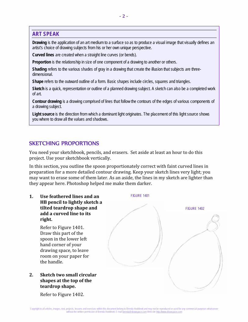
Copyright to all articles, images, text, projects, lessons and exercises within this document belong to Brenda Hoddinott and may not be reproduced or used for any commercial purposes whatsoever without the written permission of Brenda Hoddinott. E-mail [email protected] Web site http://www.drawspace.com
- 2 -
ART SPEAK Drawing is the application of an art medium to a surface so as to produce a visual image that visually defines an artist’s choice of drawing subjects from his or her own unique perspective. Curved lines are created when a straight line curves (or bends). Proportion is the relationship in size of one component of a drawing to another or others. Shading refers to the various shades of gray in a drawing that create the illusion that subjects are three-dimensional. Shape refers to the outward outline of a form. Basic shapes include circles, squares and triangles. Sketch is a quick, representation or outline of a planned drawing subject. A sketch can also be a completed work of art. Contour drawing is a drawing comprised of lines that follow the contours of the edges of various components of a drawing subject. Light source is the direction from which a dominant light originates. The placement of this light source shows you where to draw all the values and shadows.
FIGURE 1401
FIGURE 1402
SKETCHING PROPORTIONS You need your sketchbook, pencils, and erasers. Set aside at least an hour to do this project. Use your sketchbook vertically.
In this section, you outline the spoon proportionately correct with faint curved lines in preparation for a more detailed contour drawing. Keep your sketch lines very light; you may want to erase some of them later. As an aside, the lines in my sketch are lighter than they appear here. Photoshop helped me make them darker.
1. Use feathered lines and an HB pencil to lightly sketch a tilted teardrop shape and add a curved line to its right.
Refer to Figure 1401. Draw this part of the spoon in the lower left hand corner of your drawing space, to leave room on your paper for the handle.
2. Sketch two small circular shapes at the top of the teardrop shape.
Refer to Figure 1402.

Copyright to all articles, images, text, projects, lessons and exercises within this document belong to Brenda Hoddinott and may not be reproduced or used for any commercial purposes whatsoever without the written permission of Brenda Hoddinott. E-mail [email protected] Web site http://www.drawspace.com
- 3 -
FIGURE 1407
FIGURE 1405 FIGURE 1406
FIGURE 1403 FIGURE 1404 3. Use straight lines to sketch the handle.
Refer to Figure 1403.
4. Add an end to the handle.
Refer to Figure 1404.
Feel free to create your own design.
NEATLY OUTLINING A MEDIEVAL SPOON In this section you redraw the spoon with nice neat lines to make it look more realistic. Keep your pencil sharpener handy!
You may want to lighten your sketch lines (pat them gently with a kneaded eraser) before you begin.
5. Neatly outline the various shapes of the spoon with an HB pencil.
Refer to Figures 1405 to 1410.

Copyright to all articles, images, text, projects, lessons and exercises within this document belong to Brenda Hoddinott and may not be reproduced or used for any commercial purposes whatsoever without the written permission of Brenda Hoddinott. E-mail [email protected] Web site http://www.drawspace.com
- 4 -
FIGURE 1409
FIGURE 1410
FIGURE 1408
When you want a dark line, don’t press so hard with an HB pencil that you dent the paper. Instead, press lightly with your 2B or 4B. You end up with a dark line that can still be partially erased. By drawing lightly, mistakes are easier to fix. If your lines are very dark, the eraser may damage your paper.
When you are happy with your outline, you have the option of erasing your initial sketch.
Refer to Figure 1410.
ADDING SHADING WITH HATCHING In this section you use hatching lines to enhance the illusion of form by shading the sections in shadow.
The primary light source is from the upper right.

Copyright to all articles, images, text, projects, lessons and exercises within this document belong to Brenda Hoddinott and may not be reproduced or used for any commercial purposes whatsoever without the written permission of Brenda Hoddinott. E-mail [email protected] Web site http://www.drawspace.com
- 5 -
FIGURE 1411
FIGURE 1412
6. Use a 2H pencil and diagonal hatching lines to add very light values.
Refer to Figure 1411.
7. Press lightly with an HB pencil to add slightly darker shading.
Refer to Figure 1412.
Many of the darker lines are drawn in between the light ones.
8. Add middle values with freshly sharpened HB and 2B pencils.
Refer to Figure 1413 on the next page.
When possible, also draw these hatching lines in between others.

Copyright to all articles, images, text, projects, lessons and exercises within this document belong to Brenda Hoddinott and may not be reproduced or used for any commercial purposes whatsoever without the written permission of Brenda Hoddinott. E-mail [email protected] Web site http://www.drawspace.com
- 6 -
FIGURE 1413
FIGURE 1414
9. Add dark values in the shadow sections with a freshly sharpened 4B pencil.
Refer to Figure 1414. 10. Outline the spoon with
lines that vary in thickness and value (Use a 4B pencil).
11. Use a kneaded eraser to clean up any smudges.
Touch up any sections that you are not happy with and continue on to another project.

Copyright to all articles, images, text, projects, lessons and exercises within this document belong to Brenda Hoddinott and may not be reproduced or used for any commercial purposes whatsoever without the written permission of Brenda Hoddinott. E-mail [email protected] Web site http://www.drawspace.com
- 7 -
BRENDA HODDINOTT - BIOGRAPHY As a self-educated teacher, visual artist, portraitist, forensic artist, and illustrator, Brenda Hoddinott utilizes diverse art media including graphite, technical pen, colored pencil, chalk pastel, charcoal, conté crayon, and oil paints.
My philosophy on teaching art is to focus primarily on the enjoyment aspects while gently introducing the technical and academic. Hence, in creating a passion for the subject matter, the quest for knowledge also
becomes enjoyable. >Brenda Hoddinott<
Born in St. John’s, Newfoundland, Brenda grew up in the small town of Corner Brook. She developed strong technical competencies with a personal commitment to self directed learning, and the aid of assorted “Learn to Draw” books. During Brenda’s twenty-five year career as a self-educated civilian forensic artist, numerous criminal investigation departments have employed Brenda’s skills, including Royal Canadian Mounted Police and municipal police departments. In 1992, Brenda was honored with a commendation from the Royal Canadian Mounted Police, and in 1994, she was awarded a Certificate of Membership from “Forensic Artists International”.
Her home-based art career included graphic design, and teaching recreational drawing and painting classes. As supervisor of her community’s recreational art department, Brenda hired and trained teachers, and designed curriculum for several children’s art programs. In 1998, Brenda chose to end her eighteen-year career as an art educator in order to devote more time to writing, drawing, painting, and developing her websites.
Drawspace http://www.drawspace.com incorporates her unique style and innovative approach to curriculum development. This site offers downloadable and printable drawing classes for students of all abilities from the age of eight through adult. Students of all ages, levels and abilities have praised the simple step-by-step instructional approach. This site is respected as a resource for fine art educators, home schooling programs, and educational facilities throughout the world.
LEARN-TO-DRAW BOOKS BY BRENDA HODDINOTT Drawing for Dummies: Wiley Publishing, Inc., New, York, NY, this 336 page book is
available on various websites and in major bookstores internationally.
The Complete Idiot’s Guide to Drawing People: Winner of the Alpha-Penguin Book of the Year Award 2004, Alpha - Pearson Education – Macmillan, Indianapolis, IN, this 360 page book is available on various websites and in major bookstores internationally.

Brenda Hoddinott
F15 BEGINNER: HATCHING You can’t possibly make a mistake in this goofy project. The instructions are super simple and your only goal is to have fun!
This project is divided into the following four sections:
Outlining Wooly: You lightly sketch Wooly’s eyes and nose. Adding Wooly’s Wool: You give Wooly some wool. Adding Shading with Hatching: You add shading to Wooly’s eyes and nose. Challenge: Draw another Wooly Woo - from your imagination.
Suggested drawing supplies include HB, 2B, 4B, and 6B pencils, paper, kneaded and vinyl erasers, a pencil sharpener, and a sense of humor!
This project is recommended for artists from age 8 to adult, as well as students of home schooling, academic, and recreational fine art educators.
8 PAGES – 18 ILLUSTRATIONS
Published by Drawspace.com, Halifax, NS, Canada – 2009

Copyright to all articles, images, text, projects, lessons and exercises within this document belong to Brenda Hoddinott and may not be reproduced or used for any commercial purposes whatsoever without the written permission of Brenda Hoddinott. E-mail [email protected] Web site http://www.drawspace.com
- 2 -
ART SPEAK Drawing space (also called a drawing surface or a drawing format) is the area in which you render a drawing within a specific perimeter. It can be the shape of a sheet of paper itself, or a shape you outline on your paper, such as a square, rectangle, or circle.
Shape refers to the outward outline of a form. Basic shapes include circles, squares and triangles.
Figure 1501
TIP! Keep in mind that your dust bunny
doesn’t have to be a twin of mine!
She (or he) can be a distant cousin (a
VERY distant cousin)!
TIP! When you draw circles or circular
shapes rotate your paper and look at your drawing from
different perspectives.
This little trick often allows you find problem areas.
Figure 1502
OUTLINING WOOLY Okay! I confess! Yes - I spend a lot more time drawing than cleaning. Wooly Woo Noo is one of a big family of dust bunnies who lives in my home. (My two large dogs shed enough fur in a single day to make a warm fur coat for a bald cat!)
You can’t possibly make a mistake in this goofy project. The instructions are super simple and your only goal is to have fun!
1) First of all, draw a large square on your drawing paper (or in your sketchbook).
This helps you with the placement of everything in your drawing. Mine is 4 by 4 inches.
Figure 1501 shows you how tiny the eyes seem inside my drawing space – lots of room is left around his eyes to add Wooly’s wool!
2) Draw the outline of the shape of his two eyes (Figure 1502).
Use an HB pencil. Look at the two ovals that I have drawn. Notice that they are close together but not touching.
You may prefer to draw eyes that are a little different than mine.

Copyright to all articles, images, text, projects, lessons and exercises within this document belong to Brenda Hoddinott and may not be reproduced or used for any commercial purposes whatsoever without the written permission of Brenda Hoddinott. E-mail [email protected] Web site http://www.drawspace.com
- 3 -
ART SPEAK Curved lines are created when a straight line curves (or bends). Upper eyelid is a movable fold of skin that opens and closes to protect the eye. Iris is the colored circular section of the eyeball. Pupil of an eye is the darkest circular shape within the iris. Highlight is the brightest area where light bounces off the surface of the eye.
Figure 1504
Figure 1503
Figure 1505
Figure 1506
These two circles represent the irises of Wooly’s eyes.
3) Draw a curved line over the eye on the left (Figure 1503).
This line represents an upper eyelid.
4) Outline the other eyelid (on the right) (Figure 1504).
The two curved lines look like the upper part of a heart-shape.
The basic shapes are now in place, with plenty of space left for his wool (fuzz, fur, fluff, hair, or whatever you wish to call it).
5) Draw a U-shaped curved line as his nose (Figure 1505).
Examine my drawing to see where the ends of the U-shape touch his irises.
6) Add two more curved lines as the pupils of his eyes (Figure 1506).

Copyright to all articles, images, text, projects, lessons and exercises within this document belong to Brenda Hoddinott and may not be reproduced or used for any commercial purposes whatsoever without the written permission of Brenda Hoddinott. E-mail [email protected] Web site http://www.drawspace.com
- 4 -
Figure 1507
ART SPEAK Values are the different shades of gray you make when adding shading to a drawing.
Figure 1508
Figure 1509
7) Add two tiny circles in the upper right sections of his pupils (Figure 1507).
These little circles are the highlights of his eyes.
8) Draw two short curved lines between his eyes (Figure 1508).
Pretend that this dark shape in the center of his face is the center of a large circle.
9) Use your 4B pencil to fill in this little shape with a dark value (Figure 1509).
ADDING WOOLY’S WOOL In this section, you give Wooly some wool. I have given my dust bunny thick wool. You may choose to give yours thinner wool (or even curly wool).
10) Draw a few straight lines (outside the outlines of his eyes and nose) that are straight out from the dark shape (Figure 1510 on the next page).
These lines serve as guidelines, to help you draw the wool.
For these first few guidelines, you may use a ruler.
Think about how small children often draw the rays of light coming from the sun!

Copyright to all articles, images, text, projects, lessons and exercises within this document belong to Brenda Hoddinott and may not be reproduced or used for any commercial purposes whatsoever without the written permission of Brenda Hoddinott. E-mail [email protected] Web site http://www.drawspace.com
- 5 -
Figure 1510
Figure 1511
Figure 1512
TIP! Remember to rotate your paper
as you draw lines!
An HB pencil worked for me. I pressed very gently so the lines are faint.
11) Draw a whole bunch of straight lines (freehand) to represent his “fur”.
Refer to Figures 1511 to 1513.
I began with by pressing lightly with an HB pencils to draw long lines (Figure 1511).
Don’t use a ruler! Rather take this opportunity to improve your skills with drawing straight lines freehand.
Shorter lines are added in between others by pressing more firmly with an HB pencil (Figure 1512).

Copyright to all articles, images, text, projects, lessons and exercises within this document belong to Brenda Hoddinott and may not be reproduced or used for any commercial purposes whatsoever without the written permission of Brenda Hoddinott. E-mail [email protected] Web site http://www.drawspace.com
- 6 -
Figure 1514
Figure 1513
ART SPEAK Hatching is a series of lines (called a set) drawn closely together to give the illusion of values.
Figure 1515
More lines are added with a 2B pencil (Figure 1513).
Finally, I add several short lines with a 2B (Figure 1514).
The final set of lines fills in the remaining white spaces close to Wooly’s eyes and nose.
ADDING SHADING WITH HATCHING Finally – the best part of all! You add shading to Wooly’s eyes and nose with hatching lines.
12) With your HB pencil, shade in the right and left ends of both eyelids with curved hatching lines (Figure 1515).
The values become lighter toward the center sections of each eyelid. The darkest value is between the two eyes.

Copyright to all articles, images, text, projects, lessons and exercises within this document belong to Brenda Hoddinott and may not be reproduced or used for any commercial purposes whatsoever without the written permission of Brenda Hoddinott. E-mail [email protected] Web site http://www.drawspace.com
- 7 -
Figure 1517
Figure 1516
Figure 1518
13) Use your HB pencil again to add shading to the whites of the eyes and the nose.
Only a little bit shading is used for the upper sections of the whites of the eyes (Figure 1516).
Leave a small circular section of the nose white. This makes the nose look shiny (Figure 1517).
14) Use a 4B pencil to shade in the pupils (Figure 1518).
15) Finally, add a shadow section to the pupils (beneath the eyelids) with a 6B pencil.
CHALLENGE Time to put your new skills into action! Draw another Wooly Woo - from your imagination.
Change all parts of him (or her) to be completely different from the one you just finished.

Copyright to all articles, images, text, projects, lessons and exercises within this document belong to Brenda Hoddinott and may not be reproduced or used for any commercial purposes whatsoever without the written permission of Brenda Hoddinott. E-mail [email protected] Web site http://www.drawspace.com
- 8 -
BRENDA HODDINOTT As a self-educated teacher, visual artist, portraitist, forensic artist (retired), and illustrator, Brenda Hoddinott utilizes diverse art media including her favorites, graphite and paint.
Brenda is the author of Drawing for Dummies (Wiley Publishing, Inc., New York, NY) and The Complete Idiot’s Guide to Drawing People (Winner of the Alpha-Penguin Book of the Year Award 2004, Alpha - Pearson Education – Macmillan, Indianapolis, IN). She is currently writing two books on classical drawing.
My philosophy on teaching art is to focus primarily on the enjoyment aspects while gently introducing the technical and academic. Hence, in creating a
passion for the subject matter, the quest for knowledge also becomes enjoyable. >Brenda Hoddinott<
Born in St. John’s, Newfoundland, Brenda grew up in the small town of Corner Brook. She developed strong drawing and painting skills through self-directed learning.
During her twenty-five year career as a self-educated civilian forensic artist, various criminal investigation departments have employed Brenda’s skills, including the Royal Canadian Mounted Police. In 1992, Brenda was honored with a commendation from the Royal Canadian Mounted Police, and in 1994, she was awarded a Certificate of Membership from “Forensic Artists International”.
In 2003, Brenda retired from her careers as a forensic artist and teacher to work full time writing books and developing her website (Drawspace.com). This site is respected as a resource for fine art educators, home schooling programs, and educational facilities throughout the world.