IN CONVERSATION WITH COLOUR SYMPHONY
44
1 IN CONVERSATION WITH COLOUR SYMPHONY Group Exhibition
Transcript of IN CONVERSATION WITH COLOUR SYMPHONY

1
IN CONVERSATION WITH COLOUR SYMPHONY
Group Exhibition

INDEX
A word by the artist, Michèle Nigrini A Brief History of the Jan Rupert Art Centre
Leoni Aucamp
Kathy Botha
Katherine Bull
Arabella Caccia
Fawa Conradie
Ronél de Jager
Eve de Jong
Klara-Marie den Heijer
Nontokozo Dladla
Johannes du Plessis
Evert Esterhuizen
Debra Field
Adela Friedmann
St. John Fuller
Michaella Janse van Vuuren
Beate Jordaan and Quinton Lehnert
Sandra Lemmer
Babette Ludick
Cecilia Maartens
Odette Marais
Sharle Matthews
Johann Moolman
Darshana Nagar
Tracy Payne
Nathan Petersen
Sonya Rademeyer
Mark Rautenbach
Hannalie Taute
Guy Thesen
Marinus Uys
Theodor Van der Merwe
Ariana van Heerden
Marelise van Wyk
Sassa van Zyl
Elizabeth Vels
Rix Welmann
Caroline Wheeler
Buyer’s Guide & Payment Policy
In Conversation with Colour Symphony5 March – 5 September 2021
This exhibition opens a dialogue of 37 artist’s responses to South African artist Michéle Nigrini’s monumental colour theory panel produced in 1993.
It marks the first of the Rupert Museum’s public open calls and is done in collaboration with the Imibala Gallery.
Imibala Gallery | 30 Church Street, Graaff-Reinet
Jan Rupert Art Centre | Middelstraat, Graaff-Reinet
p8
p10
p12
p14
p18
p20
p22
p24
p26
p28
p30
p32
p34
p36
p38
p40
p42
p44
p48
p50
p52
p54
p56
p58
p60
p62
p64
p66
p68
p70
p72
p74
p76
p78
p80
p82
p84
p86

A word by the artist, Michèle Nigrini
It feels slightly surreal to see Colour Symphony here in Graaff-Reinet. It has assumed such a large part (literally) of my personal and professional life. Ironically, it was developed as a protest!
When I put forward the first proposal for my Masters, one of my professors warned me against the commerciality of using flowers as the theme. But I was determined to show that it was the interpretation of a theme that was important, not the theme itself, and that has actually become a rallying cry for me: the theme always just a starting point, a vehicle for using colour, line and mark.
I have also continued to explore the theory underpinning the panel: working with the 7 colour contrasts of Johannes Itten and various other colour strategies, presenting the work in an installation fashion to visually overwhelm the senses with colour play, using the colour wheel, and then drawing the viewer closer into the detail of the 395 individual paintings, offering a multi-level experience.
It took me a year to complete Colour Symphony. I designed it for the home studio in Clydesdale, Pretoria that I worked in, and then included it in my very first solo exhibition at the Bellville Art Association. Then I had the lucky break of Dr Anton Rupert buying most of the work on this exhibition, including the panel.
This gave me a lot of exposure in the media as well as to art collectors, and really kickstarted my career. I say it was a lucky break but, as with anything, you make your luck: I had the inspired thought to invite Dr Rupert to the exhibition but not in a million years did I expect him to attend!
So, it feels like a full circle to do a collaboration with Colour Symphony here in Graaff-Reinet. To see it hanging in this new format, surrounded by the forty works which are ‘in conversation’ with it is very exciting. I am delighted with the volume of responses as well as with the wide selection of genres and styles, ranging from animation to slow stitching to assemblages of recycled materials.
Some artists have adopted a formal, theoretical approach to both colour and construction, while others have a more emotional, intuitive response. I feel very honoured to have been able to eavesdrop on this ‘conversation’ by being invited to be part of the final selection panel of the works for the OPEN CALL.
The Rupert Museum suggested that I work together with some of the children from the community, to paint part of the wall outside the Jan Rupert Art Centre where the ‘In Conversation with Colour Symphony’ exhibition is being held. The walls were so white and pristine it felt a bit sacrilegious to do graffiti on them, but it was quite exciting! Being from the Free State, I have chosen to bring an interpretation of Litema here to Graaff-Reinet. Litema is a form of Sesotho mural art composed of decorative and symbolic geometric patterns. These murals sometimes represent what is happening inside the homestead, so here I have repeated the feel of the panel inside on the wall outside.
Speaking of OUTSIDE IN - I am also very privileged to have the concurrent solo exhibition at the Imibala Gallery. Nearly 27 years later, it was an interesting challenge to think how I would respond to Colour Symphony with a new body of work.
As a result of Lockdown, I now work at home, with an outside potting shed as one part of my studio. This environment has meant that I have been able to return to my original inspiration for Colour Symphony, and use the garden and the structures that surrounds me as a vehicle for exploring line and colour, bringing the outside in and presenting it in my usual style of ‘gestural expressionism’.
A scratch of coal, a line of ink, a splash of colour, applied with various unconventional tools such as twigs, flowers and reeds. I layer paint, accidental marks, symbols, letters: these are shoe prints on the path to the unpredictable outcome, but always part of the story. And then I systematically ‘curate’ my chaos’ to complete the image.
I hope that the new body of work shows that colour and mark remain central to my art, and that, after 27 years the theory has now become part of my DNA, it’s ingrained in my hand, in my mark making implements.
Details from the monumental 16 meter panel installation Colour Symphony, 1993 by Michéle Nigrini.
Details from the monumental 16 meter panel installation Colour Symphony, 1993 by Michéle Nigrini.
6
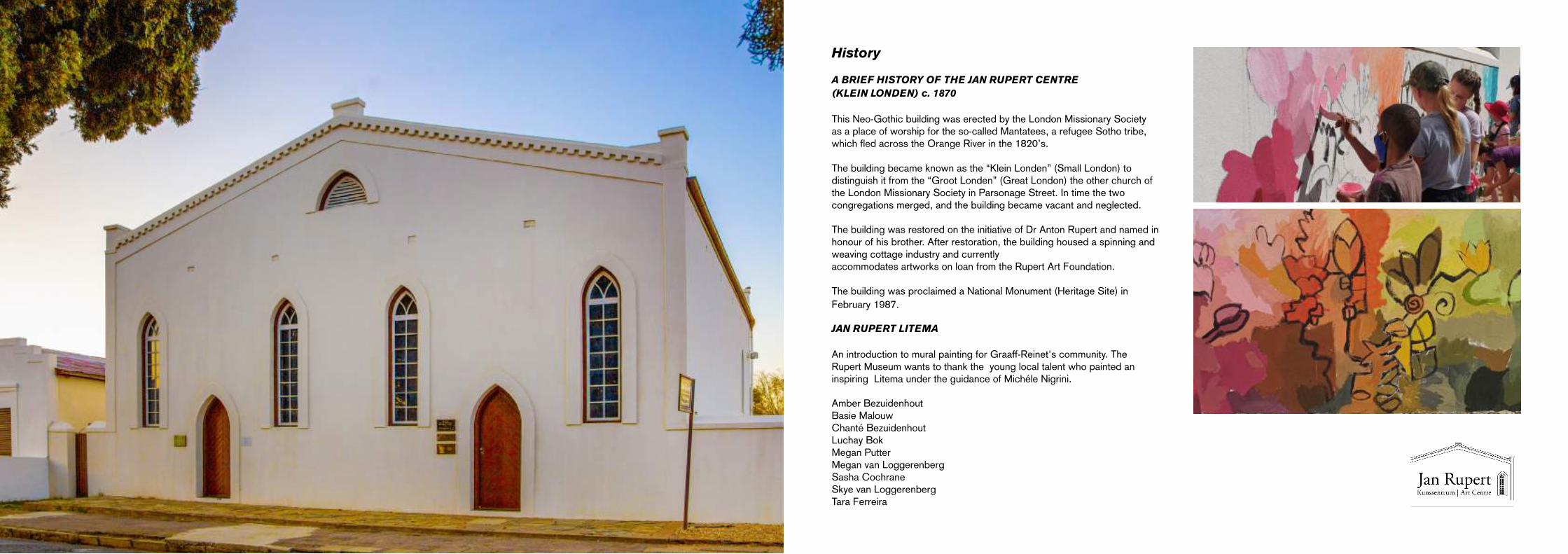
History
A BRIEF HISTORY OF THE JAN RUPERT CENTRE (KLEIN LONDEN) c. 1870
This Neo-Gothic building was erected by the London Missionary Society as a place of worship for the so-called Mantatees, a refugee Sotho tribe, which fled across the Orange River in the 1820’s.
The building became known as the “Klein Londen” (Small London) to distinguish it from the “Groot Londen” (Great London) the other church of the London Missionary Society in Parsonage Street. In time the two congregations merged, and the building became vacant and neglected.
The building was restored on the initiative of Dr Anton Rupert and named in honour of his brother. After restoration, the building housed a spinning and weaving cottage industry and currently accommodates artworks on loan from the Rupert Art Foundation.
The building was proclaimed a National Monument (Heritage Site) in February 1987.
JAN RUPERT LITEMA
An introduction to mural painting for Graaff-Reinet's community. The Rupert Museum wants to thank the young local talent who painted an inspiring Litema under the guidance of Michéle Nigrini.
Amber BezuidenhoutBasie MalouwChanté BezuidenhoutLuchay Bok Megan PutterMegan van Loggerenberg Sasha CochraneSkye van Loggerenberg Tara Ferreira

8 9
Leoni AucampInk glow (diptych)Ecoprint and natural dye on organic hemp68 x 48 cm 68 x 54 cm
R18,240
Ink Glow was created intuitively with the help of Nature’s Alchemy. I draw from natural dyes and corrosive processes to create my Fibre Art.
The natural fibres used are organic hemp, silk, and linen blend. My story is one of deep connection with nature. My love for colour brought me here. Firstly through oil painting - the mixing, the plying, the vision of a specific tone, and simply following impulse to achieve it.
Eco-printing adds an element of adventure and surprise while collecting, foraging, and dreaming up new impressions. It is a surprise when the bundle is revealed, it is pure alchemy.
I am a sorcerer over a boiling cauldron. What privilege it is to play and collaborate with nature in this way.
ECO-PRINTING is the transferral of natural foliage onto fabric and paper through a boiling and steaming process. AUCAMP.STUDIO collaborates with Nature to create unique, one-of-a-kind, single production products and art. Our ingredients – water, metals, foliage, organic fibre, fire, steam, passion, and love.
aucamp.studio
Detail

10 11
Kathy BothaImpulsive Spontaneity Oil on canvas on board 70 x 60 cm
R4,930
Impulsive Spontaneity is an outer manifestation of my own inner creative journey. It incorporates my perception of the Universe as a divinely energized field of infinite possibilities; and my belief that there is an underlying, in-dwelling creative force infusing all of life, including ourselves.
Colour brings a great deal of joy to my life and it is my wish to share my responses to colour through my paintings. As an artist l feel that colour is too powerful to ignore. Our responses to colour are immediate and visceral, and have profound effects on our emotional states, each interpretation being strongly individual.
My intention for this work is to create a kind of illusory space, both abstract and fixed in recognizable form. Texture is most apparent in my work. I begin by creating layers of texture and purposely allowing the forms to evolve as l work my way through the painting.
Image courtesy of the artist
Detail

12 13
Katherine BullInside OutBox containing pencil colour drawings on paperPaper size: 21 x 30 cm Box size: 23 x 31 x 2 cm
R41,070
Inside Out is a series of 38 meditative drawings in colour. Each drawing is created using a selection of seven coloured pencils and drawn while blindfolded.
These drawings are part of a stream of my studio practise in which I am exploring meditative drawing actions towards a more embodied presence in making. These chance colour investigations of my internal landscape of sensation are collectively housed in a box and can be paged through individually, or laid out in a grid by the viewer, to create their own colour field.
katherinebull.co.za

14 15
Arabella CacciaFlightBronze130 x 40 x 40 cm
R180,710
Flight is made up of 160 small pieces of bronze to form one abstract shape that alludes to a bird in flight, as suggested in the title.
There are visual links for the viewer to connect to the sources of the shapes used in the sculpture. It simultaneously draws our attention to the universality of all the natural forms found on earth and speaks to the interconnectedness of all things.
Images courtesy of Jaycene-Fay Ravenscroftarabellacaccia.com
Detail

16 17
Arabella CacciaOcean Chaff I (Left)Diasec paint on Hahnemühle cotton rag88 x 100 cm
R46,000
Ocean Chaff II (Right)Diasec paint on Hahnemühle cotton rag88 x 100 cm
R46,000
Ocean Chaff I & II use colour relationships which are inspired by the experience of snorkelling in the ocean, near where I live and work in Fish Hoek.
The colour of the kelp in the sunlight is set against the colour of light passing through the water. The colours that play on the surface of the water are juxtaposed with the colour of the blue sky above. The relationships between colours are used to create a flow of energy and direct a unique sensation or state of mind in the viewer.
Images courtesy of the artistarabellacaccia.com

18 19
Fawa ConradieI only have one match no.4Watercolour on vintage Saunders paper60 x 75 cm
R26,290
I only have one match no.4 contains “panels”, but they are 480 hand painted matches. They progress from top to bottom in terms of the degree each one has burnt. At the same time, they turn colder (blue) towards the left and warmer (red) towards the right. This literal description is just about where the conversation with Nigrini’s artwork ends.
My personal interpretation of this work is best described by Rachel Platten’s Fight Song: “Like a small boat on the ocean, setting big waves into motion . . . I might only have one match, but can make an explosion . . .”
We, as individual little matches each are able to simply have a small influence on others in our vicinity and yet we all possess the power to “burn down a city”.
To me, this is all about the power and significance of often overlooked “small things” in life.
Detail

20 21
Ronél de JagerBloom & Gloom I (Left)Oil on canvas90 x 67.5 cm
R27,000
Bloom & Gloom II (Right)Oil on canvas130 x 90 cm
R43,000
Bloom & Gloom I and II combine and connect the classical idea of vanitas of the17th and 18th century Dutch Old Masters’ still life flower paintings, with my interest in the abstraction of memory to a broader art historical context, I have portrayed the thought process and relationships visually and aesthetically between colours. I have done this in a similar way to Nigrini using inspiration from my flowers in my garden.
The image is rendered with loose, impressionistic brushwork. The marks of paint appear to have been dragged vertically, creating a sense of movement and instability. My subject is flowers and, using a modern digitising method, the image is at once abstract and recognisable. The result is a work which illustrates impermanence and the classical idea of vanitas — reminders of mortality and mutability.
Images courtesy of artistroneldejager.com
Detail

22 23
Eve de JongMount plastic (yellow)Wire mesh and melted plastic lids70 x 50 x 53 cm
R12,320
Mount plastic (white)Wire mesh and melted plastic lids70 x 50 x 53 cm
R9,040
Mount Plastic (yellow & white) speak to the environmental challenges we face in a way that is bright, engaging, and meaningful. The synthetic colourful “rock” sculptures juxtapose the concept of “natural” landscapes with the “artificial” plastic destined to be entombed in the earth.
Our sea and our land have become a dumping ground for waste. There is so much plastic, that even when it is supposedly recycled it sometimes ends up in the earth or sea. These plastic rocks remind us of the danger to the environment.
For every bottle top I reuse there is one bottle top less in the ever-growing landfill. The plastic I use, I personally recycle, and I also purchase from a validated recycling plant, which uses a community-based development approach.
The colour palette is deliberately monochromatic, and I am forced to work with the range of colours at hand, resulting in “natural” varia-tion, as with rocks themselves.
evedejong.com

24 25
Klara-Marie den HeijerATLASHandmade pigments and oil paint on canvas120 x 130 cm
R22,590
In ATLAS I have sought a psycho-geological approach to navigate the world of colour.
This is an oil painter’s celebration of colour. The work includes 624 squares painted with handmade pigments ground into a linseed oil binder. The pigments were extracted from found substances such as clay, earth, ochre, sand, bricks, and ash.
They were gathered from the places I have travelled to, as indicated by their colour names they come from various sites: Coetzenberg, Jonkershoek, Sossyskloof, Rustenburg Farm (Idas Valley), Helderberg, Theewaterskloof, Bergrivierdam, Bredasdorp, Nature’s Valley, Strandfontein (West Coast), Spektakelpas (Springbok), Hluhluwe, Kalahari, Moreletakloof (Pretoria), Jonkershoek, Namibia, Leuven (Belgium), Ganterschwil (Switzerland) and Pisa (Italy).
klaramariedenheijer.com
Index for painting

26 27
Nontokozo DladlaStained I (Left)Acrylic on paper42 x 29.7 cm
R9,860
Stained II (Right)Acrylic on paper59.4 x 42 cm
R12,320
Stained I & II are two pieces that are meant to express the effects of losing something or someone, that once, or perhaps will always mean something to us. No matter how hard we try to forget, the memory of what we have lost lingers on.
Sometimes we can reflect on our loss with pleasant thoughts, and sometimes we want to bury our heads in between our knees and erase even the smallest memories associated with what we have lost. We look for our lost lover in every new lover we come across, look for our long-lost friend in every new friendship we form, we search for these feelings we once felt in every experience.
As a result, we are left with holes that cannot be filled. It is when this happens that we know we have been stained, stained for life.
Detail

28 29
Johannes du PlessisAl lê die berge nog so blouAcrylic on canvas90 x 110 x 5 cm
R46,000
’n Landskap gebore uit die verlede,’n tydperk waar die vlaktes van die karoo sy bekoring homself kon ontdooi in prag en praal. Gee al jou aandag aan die kleinste, die minste, aan die ongelooflike, die onverklaarbare, die wysheid van die lewe op aarde, want môre mag dit nie meer daar wees nie.
Luister na moeder aarde, luister na die wind, luister na die reën, luister na die stilte om jou. Dit is wat die natuur jou vertel. Die mooi en goeie dinge in die lewe.Maar………Watervalle wat skeur deur rots en kraak, soekende die begin of die einde.
Stormagtige wolke wat saamdrom,’n geweldige mag wat heers. Wat ons nou sien, sal anders môre wees. Dié weet ons, want soveel konflik gaan nie met gevolge verby nie.
Die vlaktes krul en steier en erodeer onder die aanslag van blinde strome. In die verte bly die goue son in die omhelsing van twee blou berge, bly die goue vlakte wink. Maar die weg soontoe is onbekend.____
I use my intuition in my skill and across genres, this fusing together in an event waiting to happen. It is almost a mirror image, a prismatic expressionist depiction of our earth.

30 31
Evert Esterhuizen Graaff-Reinet; ‘n kortverhaalWatercolour on paper70 x 59 cm
R11,500
As an architect, the urban condition, I believe, is like the garden for Nigrini - something which I enjoy studying and surrounding myself in, but also something to which I can apply the mechanism of analysis as in Colour Symphony’s case.
In creating, Graaff-Reinet: ‘n kortverhaal, this process has brought a deeper understanding of the town’s morphology: from the integrated Boer-found “kerkdorp” to the historic discrimination. Graaff-Reinet, after Cape Town, was the first Karoo-dorp to have a grid-type town plan. This checkerboard arrangement was an example followed by most Karoo-towns with the Dutch Reformed Church as axial focus at the end of the main street.
In Graaff-Reinet’s case, the Church is quite a monumental, Edwardian building in highly festive neo-Gothic style, which presides over the town (Fransen, 2006). Historically, it is a place where the “haves” had opportunity and a future, while the “have nots” were doomed to a life on the side-lines.
On the one hand, the Dutch Reformed Church represents a stern paternal energy, while Spandou Kop, to the South West of the town, embodies a motherly sense of earthly protection and stable presence.
Detail
Sources:H. Franssen, Old Towns and Villages of the Cape, Jonathan BallPublishers, Cape Town 2006.

32 33
Debra FieldColour ConstellationWax encaustic and oil paint113 x 75 cm
R39,430
My basic understanding of colour, whether as vibration, light, pigment, or even sound, is that it is in large part a hugely personal experience. For me, each infinite shade feels more like a verb than a noun, in that it contains some inherent action - it demands or evokes a response. It cannot be itself – Alone.
Colour Constellation touches lightly on manipulating the viewer’s eye across the surface, on creating rhythmic passages, on causing visible and invisible windows of light and dark, on an unseen light playing across the surface, never keeping still. The work is mostly to be done by the viewer. There is no narrative, no theory, no theme, and no representational image.
It’s an “open-ended containment” offering something intangible and magical while my search laid bare in its incompleteness it invites the viewer to join in on the quest with me.
Detail

34 35
Adela FriedmannDream in ColourMixed media66 x 105 cm
R7,390
In Dream in Colour some colours collide while other colours merge. Hues manipulate one another in a human way. Each colour has a presence and strength of its own, brought out by the colour alongside it, on top of it or under it.
Excited lines rush across the paper mediating between triads. Movement and energy are created by speedy brushstrokes and lines. Coincidental meetings of colour create tension while purposeful placements of colours create order.
Life is full of contrasts, within people and their relationships. I love displaying those relationships with paint and colours and shapes and lines. People need people. There exists a beautiful human interdependence. We are designed to interact. We impact and communicate with each other the way colours do.

36 37
St John FullerColour Chart and found objects: BricksGiclee print110 x 70 cm
R9,860
Colour Chart and found objects: Bricks represents how for a number of years, I have been picking up pieces of brick from beaches. The intention has been to turn them into sculptures, and these pieces are my palette.
I have been slowly amassing the pieces in my garden, and some have already been turned into figurines. Those that I have included in this colour chart are pieces that are still waiting to be transformed. There is no guarantee that all the pieces will be used.
Therefore, in this way the chart is a record of the options available before the commencement of the work – it is a point from which to start.
Image courtesy of artiststjohnfuller.com
Detail

38 39
Michaella Janse van VuurenIn Memoriam (Top)Custom fabrics and electronics15 x 100 cm (hanging)
R24,640
Ode to the Orchestra (Bottom)Custom fabrics and electronics15 x 100 cm (hanging)
R24,640
Ode to the Orchestra can be interpreted as a literal translation of Nigrini’s work into sound.
The mask is an ode to the musicians, bands, and orchestras that bring so much joy and are now silenced and left without income. I tried to replace them with an electronic mask that can play the tones and the sounds of their instruments. A talented musician would be able to compose a symphony with the mask itself. A parallel can also be drawn with the electronics, as a finite set of basic components can be combined into an array of creative outputs.
In Memoriam uses the mask to play sounds missing from my Lockdown life. I miss the sounds I took for granted, children shouting and playing in the school grounds, the sounds of cutlery and conversation when dining together, musicians warming up before a performance, and people chatting in the streets of a busy city.
Detail from Ode to the Orchestra (Left)Images courtesy of artist

40 41
Beate Jordaan & Quinton LehnertColour in Motion Edition of 100Video (4:03 minutes)
R1,310
This is our first collaboration. Quinton’s medium of choice is drawing, digital drawing and printmaking, while Beate’s primary medium is video, animation, installation, and collage.
Colour in Motion combines Quinton’s digital drawings that play with abstract mark-making and textures in contrasting and complementary colours, Beate set them in motion through digital animation. Inspired by artist Len Lye (1901-1980) in works such as Kaleidoscope (1935), this work aims to expand on the exploration of colour and colour theory in contemporary digital mediums.
Transparent layers simulate breathing as they expand, contract, appear and disappear. Shifting from red to purple, the video invites the viewer to participate in its meditative, hypnotic, rhythmic transmutation of saturated colour through the rainbow.
Each drawing was made for a specific colour, allowing for pre-existing emotional connotations with colour to subconsciously influence how bright, soft, or detailed the abstract marks are in that drawing.
Images courtesy of the artists

42 43
Sandra LemmerMS SymphonyHandwoven handspun antique linen handembroidered with DMC cotton thread3 panels: 147 x 117 cm
R12,320
Michèle is my friend and inspiration, and the one who has been with me during hard times.
We were both in the process of planting our gardens when Michèle was diagnosed with MS. It was in this time that she made her Colour Symphony. When I first saw the work, it made me think of a DMC cotton display box with all the colours. I thought I would do something similar, using embroidery.
As the years passed MS started taking its toll, and my highly energetic friend had to divide her day into three – morning, afternoon, and evening – this is represented in the three panels of my work. Similarly, Michéle’s energy also came in sparks and bursts which is represented in the stitching in my embroidery work. This appears through many small stitches to convey the feeling of sporadic bouts of lots of energy and at times nothing.
MS Symphony is a work in progress as both Michèle’s and my lives are still works in progress. We are now at the greens. The oranges and yellows, the autumns of our lives, will follow. After that the darker period, the ending of our lives.
Detail

44 45
Babette LudickMediating environments I-IV Edition 2/3Photographs taken with ink and wax on lens. Images printed to gloss paper and framed in white box frames84 x 59 cm (framed size)
R4,110 each
There is not a day that goes by where I do not admire, reflect, or have an emotional experience related to the natural landscape or environment around me. I mostly focus on the small details, which create feelings of interconnectedness.
Mediating Environments (I-IV) & Warm Presence (I-V) explore how human versus nature relationships are perceived, experienced, and challenged when their natural everyday landscape is projected in an unusual scale and experienced in an ‘unnatural’ environment.
In doing this I aim to create an emotional experience, while emphasizing that everyday landscape experiences of the natural environment around us are crucial, healthy, and beneficial. There are two things that are noteworthy in my work: the obvious artificiality of the works but at the same time the natural aspect thereof, and the fact that the work is placed inside a building. We as humans are constantly invading nature to some extent, whether we realize it or not.

46 47
Warm Presence I-VI Edition 2/3Photographs taken with ink and wax on lens. Images printed to gloss paper and framed in white box frames84 x 59 cm (framed size)
R4,110 each
Images courtesy of the artist

48 49
Cecilia MaartensExulansis (triptych)Oil on wood40 x 120 cm
R19,710
The rhizome, due to its peculiar mode of growing, becomes a core metaphor to express the spontaneous aleatoric connection between memories, thoughts, feelings, and experience in my art.
Rhizomatic pathways, interpreting configurations of bittersweet memories, emotions, and feelings, as well as the psychological value of colour, are explored in Exulansis. The theme depicted is partially informed by John Koenig’s The Dictionary of Obscure Sorrows (2015). Koenig creates new emotive terms for familiar feelings with the intention to restore fullness or sadness (L. satis) to its original meaning. Such an intensive feeling that may be experienced in a personal voyage, is ‘exulansis’.
Exulansis is therefore the interpretation of such an intensive feeling or spiritual experience, by applying complementary colours to create suspense and excitement and juxtaposing warm and cold colours as an indication of doubt and disappointment.

50 51
Odette MaraisPianoOil on canvas59 x 84 cm
R23,000
In Piano, the cyclical shifts of light signal the passing of time. Reflection and shadow are my focus. My analytical manipulation and juxtaposition of tones and hues often results in blurring the line between abstraction and representation.
The concerns of my practise are primarily my materials and my process, I was especially inspired by Nigrini’s detailed, robust and very immediate exploration of colour theory which resonates with my own approach to image making.
Time and its transitory passing are a constant motif in my works. The selection of familiar domestic objects in this painting pertains to the personal and is also suggestive of a narrative, which is open to the viewer’s interpretation, but mostly they are formal compositional elements to explore, play and activate the surface of my canvas.
In opposition to the musical “buzz” in Nigrini’s composition, there is a silent “quiet” in Piano, that of a recently vacant room.

52 53
Sharle MatthewsVisual ChordsOil and collage on timber91 x 97 cm
R52,570
Visual Chords is a combination of line, shape, texture, pattern, and colour that create a rhythmic visual experience. This evokes an emotional response owing to tension and relationships thus creating pitch, rhythm, composition, harmony, tension, scale, movement, and contrast. My idea is for the work to be “read” from left to right, as one would do with a sheet of music. The work also draws from visual references, as in music instruments like piano keys, drums, cymbal, guitar, baton, strings, and sheet music.
This work is a physical entity that represents a sound. Colour and dark and light tones are either placed side by side or next to diffused greys to create rhythm, movement, and flow. The composition is dense in places and in others kinetic, like visual chords representing pitch, baritone, or the sound of a cymbal.
Detail

54 55
Johan MoolmanExterior Interior AmbulationSteel171 x 85 x 70 cm
R41,070
Exterior Interior Ambulation was created in steel, which was laser cut, arc welded and then painted. The construction process has been neutralized, therefore welding textures and paint application are not an aesthetic element.
Texture and other formal aesthetic qualities have been sublimated to focus on the content of the sculpture. Compositionally, the swirling linear and planar elements have been arranged to create balance, visually as well as physically.
It is intended that the essence of the sculpture is to form a focus for meditation, to evoke higher levels of perception and open dormant sources of awareness.
Detail

56 57
Darshana NagarTwo sides (diptych)Acrylic on canvas54 x 54 cm each
R16,430
Two sides represents the split we perceive in life between light and darkness, inside and outside, yin and yang, masculine and feminine, good and bad as well as life and death. It reminds us that while we all may have different personalities and behaviours, in the end they come together to make a whole.
In order to have a deeper understanding of life, the essential concept of duality must be grasped. Without recognising this concept, we are missing out on one of the most profound learning tools available.
Duality teaches us that every aspect of life is created from a balanced interaction of opposite and competing forces. Yet these forces are not just opposites, they are complementary. They do not cancel each other out, but merely balance each other.
Detail

58 59
Tracy PayneSolar Bi-PodsSoft pastel and pigment powder on Fabriano Rosapina18 drawings framed individually35 x 27cm each
R59,800
Eastern spirituality and the dual nature of life is a consistent thread running through my work. While in India, my attention was drawn to the aniconic representations of the Hindu deities Shiva and Shakti, the divine masculine and the divine feminine. This resonated with me profoundly!
Bringing these two seemingly opposed energies into balance and creating harmony has always been and still is my mission, which is known as the Sacred Marriage. By focusing on a different colour of the light spectrum for each suite, I experience the healing properties of colour.
For Solar Bi-Pods I chose to work with yellow, which is associated with our 3rd chakra located within the solar plexus, this chakra acts as the centre of personal power. I offer my work as a meditative tool, inviting contemplation with the hope of personal and planetary healing by bringing unbalanced duality into alignment and becoming one.
Image courtesy of Dimitri Otistracypayne.com

60 61
Nathan PetersenFaces Beneath Colour StrokesAcrylic on board15 paintings of 25 x 25 cm each
R13,550
Faces Beneath Colour Strokes focuses on the hardship and struggle that many endured during the time of the COVID-19 pandemic. The 15 paintings depict one face suggesting strong emotions and body gesture thus reflecting the artist’s experience and his desire to hold on to life.
One third of the paintings’ style are inspired by the colour, brush strokes and mark-making scale of Colour Symphony, each painting makes use of two main colours with one dominant colour serving as its focal point.
The visible faces withering away under the brush strokes of colour were painted with the focus on the passionate, leading or beginner artist who now struggles to make ends meet, searching for that touch of hope and wishing that the times we live in will soon be changing.

62 63
Sonya RademeyerSymphony StriataJapanese Koi colouring brush pen drawing on stretched canvas61.2 x 196 cm
R19,710
Symphony Striata explores a non-cognitive approach in which my embodied gestures reflect mark-making that speak to an intuitive response, both in colour and line-work. I have allowed myself to be informed by both the colour palette, which I have loosely responded to, as well as exploring my own visual attention to the overall work.
“Striata” are critical components of the motor and reward systems in the brain, forming the basis of cortical connections. Through the created line-work, new connections are made in Symphony Striata that, in themselves, create new computations or codes as to social interactions and possible new actions.
What might be the new interaction between Symphony Striata and Colour Symphony? How do these works now converse with each other, and can a new possible action come from this?
sonya-rademeyer.com
64 65
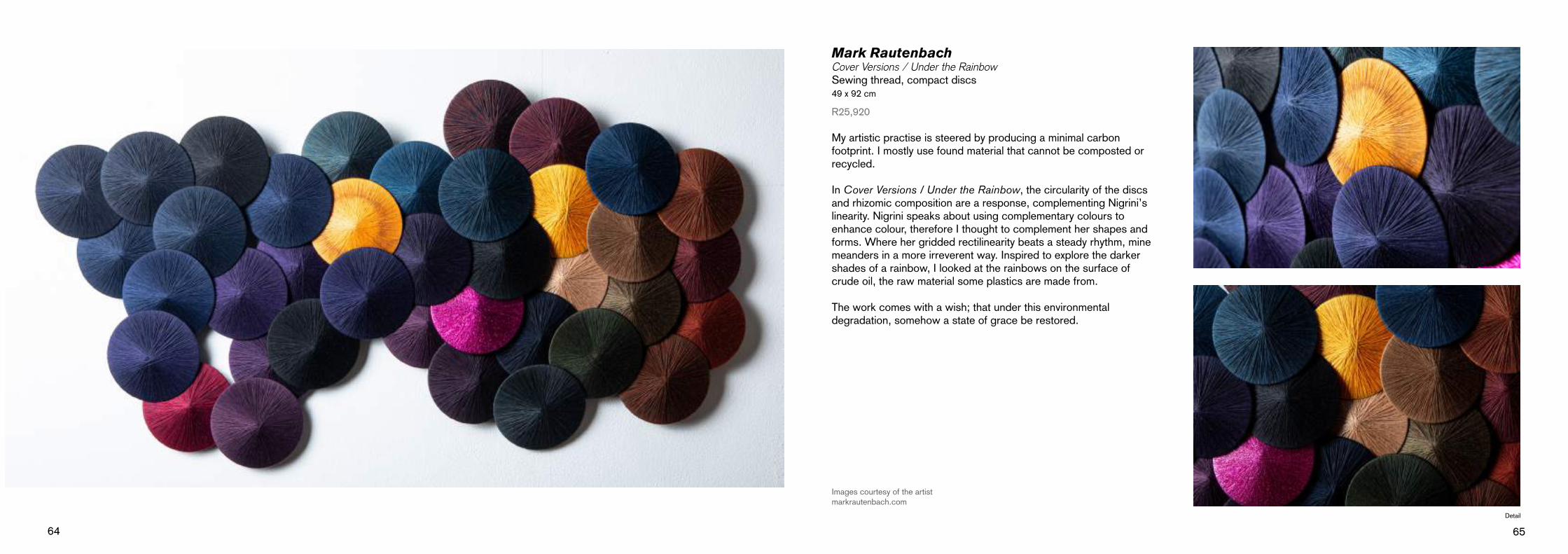
Mark RautenbachCover Versions / Under the RainbowSewing thread, compact discs49 x 92 cm
R25,920
My artistic practise is steered by producing a minimal carbon footprint. I mostly use found material that cannot be composted or recycled.
In Cover Versions / Under the Rainbow, the circularity of the discs and rhizomic composition are a response, complementing Nigrini’s linearity. Nigrini speaks about using complementary colours to enhance colour, therefore I thought to complement her shapes and forms. Where her gridded rectilinearity beats a steady rhythm, mine meanders in a more irreverent way. Inspired to explore the darker shades of a rainbow, I looked at the rainbows on the surface of crude oil, the raw material some plastics are made from.
The work comes with a wish; that under this environmental degradation, somehow a state of grace be restored.
Images courtesy of the artistmarkrautenbach.com
Detail

66 67
Hannalie TauteChange of plansCotton and acrylic thread & rubber82 x 70 cm
R30,800
Change of plans depicts moments in time – capturing instances in which a non-traditional medium (rubber) undergoes a violent process of change. The juxtaposition of delicate cotton thread with industrial discarded inner tubes is highlighted by embroidering items that can decay, such as flowers and flesh, with moments of violent disruption. The resulting organised chaos resembles our daily lives and external influences.
Like Nigrini, I was first inspired by toys. It is only much later that I turned my focus to botanicals and resonated with the quote: “Remember that a picture – before being a warhorse, a nude woman, or some anecdote – is essentially a plane surface covered with colours assembled in a certain order.” Maurice Denis.
This is exactly what happened, the re-arrangement of embroidery to resemble order.
Images courtesy of Kleinjan Groenewaldhannalietaute.com
Detail

68 69
Guy ThesenTrinities (Left)Carved supawood and oil paint 120 x 80 cm
R16,430
Light body (Right)Carved supawood and oil paint120 x 80 cm
R16,430
For Trinities & Light body, The underlying motivation for me doing these works has been the Lockdown and its sense of claustrophobia and confinement. By using a typical stained glass window shape, with bright, flat, glossy acrylic colours, and simple yet harmonious forms bordered by black lines, my aim is to pay tribute to pure sunlight and the full spectrum of colours.
Their ancient cultural symbolism, myth, meanings, and power to both heal and energize a person on a physical, emotional, and spiritual level allows us to discern objects around us more deeply through the myriad of hues, tints, tones, and shades.
Images courtesy of the artistguythesen.co.za

70 71
Marinus Uys#absenceCeramic18 x 14 cm
R820
In Nigrini’s work, the interaction and importance of colour in each tile creates meaning for the viewer, when viewed together with its counterparts. I noticed that the colour black as a separate tile was not created. However, it plays a critical role in each separate tile, being used to create a larger view.
The colour black is not a primary, secondary, or tertiary colour. In fact, black is not on the colour wheel because it is not considered a colour. Black absorbs all light in the colour spectrum and plays a critical part in the art world.
#absence has texture and detail that reflects the colours around it. It is up to the viewer to notice the flaws, but only upon closer examination.

72 73
Theodor van der MerweWeeds in my garden (triptych)Oil on paper30 x 27.5 cm
R19,710
I have a small courtyard garden and as a result I often must pull weeds out my garden. With Weeds in my garden, I wanted the viewer to see the beauty in weeds, and to question why they have been classified as undesirable. Many supposed ‘weeds’, like the Dandelion, have medicinal qualities and other uses which the gardener should reconsider before possibly removing this plant from their garden. I wanted to paint weeds in a new light.
The result, for me, is a microcosm – a world within a world. I feel that my work draws attention to weeds, makes us aware of them as plants, and hopefully helps the viewer to see them in a different light and with a different palette. I feel that this triptych then is a celebration of both the hardiness of weeds and their classification as an outsider to most gardens.
theodorvandermerweart.com

74 75
Ariana van HeerdenDead Zone #2 (triptych)Oil on canvas45 x 138 cm
R12,320
Dead Zone #2 represents ecological dead zones of the ocean are predominantly due to anthropogenic factors such as pollution and global warming that create hypoxic areas, in which the oxygen required to support marine life is depleted. Due to the decay of algae, elements such as nitrogen and phosphorus (the building blocks of single-celled organisms) increase and cause Cyanobacteria (also an algae) to bloom.
Cyanobacteria are a type of photosynthesising bacteria – they, along with plant-like diatoms (microscopic one-celled algae with silica-filled cell walls) and coccolithophores (with calcium carbonate plates) are some of fascinating phytoplankton that form the plankton community.
Trust us humans to upset the delicate balance required to keep the necessary algae flourishing. There are now over 700 identified dead zones. I aim to create awareness by seducing the viewer with colourful images that represent toxicity that make the invisible and insidious danger visible.
Image courtesy of the artist

76 77
Marelise van WykReview, react, relate I & IICollage - Small prints in matrix: drypoint on plastic,drypoint on Tetrapack and collagraph prints on Fabriano Rosapina.Larger print - Print from found plate retrieved from an antique shipwreck.70 x 100 cm
R23,000
As a printmaker, I am constantly challenging the boundaries of this traditionally tight and controlled medium. In Review, react, relate I & II each small fragment is unique, rather than part of an edition or series, denying the multiple – which is often a key characteristic of printmaking. Rather, the work is fragmented into a series of individual presentations, coming together to represent the whole. In this way I hope to activate a relationship to memories which can never be the complete story but as part of the collective come alive.
I became acutely aware of the close and continuous interaction between various elements within an artwork, between artist and art process, as well as, between artwork and viewer. While the artist manipulates art elements, materials, and techniques to create a specific outcome in an artwork, they are themselves manipulated by the artwork, which can spark new ideas and creations.
Images courtesy of the artistmarelisevw.wordpress.com
Detail

78 79
Sassa van ZylSecond LifePlastic mosiac120 x 120 cm
R8,210
I started collecting microplastics on the beach while walking my dog. The amount of plastic and cigarette butts I pick up daily, is appalling. It did not make sense just throwing it away as that would put the plastic back into the vicious cycle of landing in a landfill before being washed up on a beach again. After meticulously cleaning and sorting the microplastics, creating little trash art pictures was the next logical step, this is represented in Second Life.
The environmental benefit of recycled art is that it extends the useful life of materials and can reduce the amount of waste generated. I immediately felt a connection to Colour Symphony with the blocks of colour that were developing from my collection of microplastics.
Saving the planet is not just for superheroes anymore. Every person in the world can do it, armed with nothing but a water bottle and a collection bag.
Image courtesy of artist
Detail
80 81
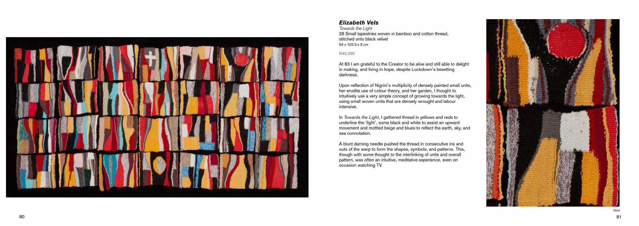
Elizabeth VelsTowards the Light28 Small tapestries woven in bamboo and cotton thread, stitched onto black velvet54 x 102.3 x 3 cm
R49,290
At 83 I am grateful to the Creator to be alive and still able to delight in making, and living in hope, despite Lockdown’s besetting darkness.
Upon reflection of Nigrini’s multiplicity of densely painted small units, her erudite use of colour theory, and her garden, I thought to intuitively use a very simple concept of growing towards the light, using small woven units that are densely wrought and labour intensive.
In Towards the Light, I gathered thread in yellows and reds to underline the ‘light’, some black and white to assist an upwardmovement and mottled beige and blues to reflect the earth, sky, and sea connotation.
A blunt darning needle pushed the thread in consecutive ins and outs of the warp to form the shapes, symbols, and patterns. This, though with some thought to the interlinking of units and overall pattern, was often an intuitive, meditative experience, even on occasion watching TV.
Detail

82 83
Rix WelmannEmbrace the dayBronze37 x 19 x 12 cm
R9,860
I have been drawing and painting the plants that surround me ever since making a lifestyle change and moving out of suburbia to Rooi-Els The aim was always to transform these two-dimensional visuals into colourful, personified sculptures.
Embrace The Day, is symbolic of how the fynbos has filled my soul and how the healing power of nature has been evident in our lives. I infuse human emotion into each plant so that the relationship between human and nature becomes one. This creates an interaction of energy and storytelling.
I love colour and always use many layers in my work to enable happy surface accidents to occur. It was really exciting to patinate this Leucadendron. The colour and mark making on this piece create a sense of playfulness that entice the viewer into a feeling of joy. The stance of the plant is a human one of embrace.
rixiart.co.za
Detail

84 85
I51.5 x 34.5 x 5 cm
R10,680
II42.5 x 32 x 5 cm
R9,960
III48.5 x 35.5 x 5 cm
R10,680
Caroline WheelerA Stitch in timeMix media - ceramic and fibre
Captured initially in observed sketches, A Stitch in Time is a series of works created after the relaxation of Level 5 and 4 Lockdown rules in South Africa. During this time, legislation prevented people leaving their residence and later limited outdoor activity to between 6 and 9 am, within a 5 km radius. The extended freedoms of Level 3 allowed me to rediscover the mountain paths, previously walked daily with my dog just a few kilometres from home. I sketched up close what I saw in nature – the waterfalls, now visible due to the seasonal change and whose beauty had previously been hidden by years of drought.
A Stitch in Time extracts and abstracts, from visual memory and observational drawing, the juxtaposition between strength and fragility in nature. An ever-changing landscape, that carries the marks and scars of time caused by wildfire, drought, flooding, and weathered erosion.
V33 x 32 x 5 cm
R9,040
IV40.5 x 33 x 5 cm
R9,040
carolinelwheeler.com

Interested and thinking of investing?
If you are interested and thinking of investing, please read through the buyer’s guide below. Any further enquiries can be directed the to the contacts provided.
What is for sale?All the artworks listed in this catalogue are for sale, with the exception of Michèle Nigrini’s Colour Symphony which is part of the Rupert Art Foundation’s permanent collection.
All sales are subject to availability and will follow a first come first serve system. All technical information (medium, size, and selling price) for each artwork has been provided within the catalogue. Please note, that the specifications of size are the dimensions of the actual artwork, unless specified, exclude frame size.
What is included in the selling price? The artwork is sold as is, all artworks are furnished with a hanging system, which can be either a frame or mounting. Details to the frame aesthetics can be shared upon buyer’s enquiry. 15% VAT is included, and all prices listed are in South African Rand.
What is excluded from the selling price? All specialized packaging and transport costs will be quoted on request. We are able to offer basic wrapping and on site collection at the Jan Rupert Art Centre at no additional cost. Transport cost will vary as it is dependent on the delivery destination, weight and size of the artwork.
Timeframe from purchase to delivery - [If I buy when will I get the artwork?]
Owing to the nature of the presentation of these artworks as a group exhibition, we aim to share them with the public audience for the full duration of the exhibition, therefore the artworks will be on display until 5 September 2021. If you are able to wait a bit for your latest addition to your collection, we can assist in shipping the piece at no cost to one of the main depots of our trusted courier, ready for collection by 25 September 2021. Depots situated in Johannesburg, Port Elizabeth, Pietermaritzburg, Durban, Cape Town, Stellenbosch and Bloemfontein.
However, we understand if a buyer would like the work immediate-ly, and we would be able to remove the artwork from exhibition to secure the sale and support the artist.
How can I purchase an artwork?We offer the following payment options:
In-House payments via Debit or Credit card – Mastercard and Visa (Card Machine available at the Jan Rupert Art Centre or Imibala Gallery, in Graaff-Reinet)
Direct cash deposit (Invoice with banking details will be provided)
Electronic Funds Transfer [EFT] (Invoice with banking details will be provided)
Insurance Policy (Post-Sale): The artwork will be fully insured on condition that the artwork re-mains on display for the entire duration of the group exhibition. The buyer will then enter into a loan agreement with the Rupert Museum. Insurance during transit will be covered if the shipping method, using our trusted couriers, to one of the main depots is agreed to by the buyer. Purchases being shipped immediately after the sale or before 5 September 2021, will need to be insured by the buyer.
All administration of sales are managed by the Imibala Gallery, Graaff-Reinet.
Please do not hesitate to contact Ros +27 (0)87 285 4810 | [email protected]
Any enquiries on the artist, artwork size and aesthetics, please be in direct contact with Audré at the Jan Rupert Art Centre +27 (0)49 892 6107 | [email protected]
“Colour directly influences the soul. Colour is the keyboard, the eyes are the hammers, the soul is the piano with many strings. The artist is the hand that plays, touching one key or another purposively, to cause vibrations in the soul.”Wassily Kandinsky
Details from the monumental 16 meter panel installation Colour Symphony, 1993 by Michéle Nigrini.