Image analysis
4
This magazine is a school magazine of early years, so this magazine appeals more to the parents rather than the children. The picture used is a happy mother and child, this is effective as it appeals to the target audience, it will be published for parents about their children and that they are being happy implies that their school is a safe and happy place to be. The picture also acts as the background so is very big and easily catches the eye of the readers
-
Upload
scottalden24 -
Category
Career
-
view
125 -
download
0
Transcript of Image analysis

This magazine is a school magazine of early years, so this magazine appeals more to the parents rather than the children. The picture used is a happy mother and child, this is effective as it appeals to the target audience, it will be published for parents about their children and that they are being happy implies that their school is a safe and happy place to be. The picture also acts as the background so is very big and easily catches the eye of the readers
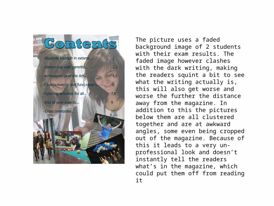
The picture uses a faded background image of 2 students with their exam results. The faded image however clashes with the dark writing, making the readers squint a bit to see what the writing actually is, this will also get worse and worse the further the distance away from the magazine. In addition to this the pictures below them are all clustered together and are at awkward angles, some even being cropped out of the magazine. Because of this it leads to a very un- professional look and doesn’t instantly tell the readers what’s in the magazine, which could put them off from reading it

This magazine cover uses the right age range person of a student. It is very effective that the person is in front of the title ‘college’ (Although being able to read the start and the end of the title we are still able to make out what it reads) however being behind the text. This layered effect works as it doesn’t seem like it is just a flat picture, rather giving it an effect that he is coming out of the magazine, it very interesting and so makes readers inquisitive and so reads it as opposed to just another picture

For a school sport magazineIt uses a professional cricketPlayer. This could be inspiringFor the readers of theMagazine, obviously they areinterested in sports so using a sports star gives them something to try and achieve. On the contrary of this however, it also seems out of place for a school magazine, as it uses a picture that has nothing to do with the school