I Am A Doer
112
√I AM_ √ SELECTED WORKS // KYLE MANNSCHRECK_ √ PART 2_
-
Upload
kyle-mannschreck -
Category
Documents
-
view
225 -
download
0
description
selected works_Kyle Mannschreck PART 2
Transcript of I Am A Doer
√CONTINUE TO PART 2_
√I AM_√
S E L E C T E D W O R K S / / K Y L E M A N N S C H R E C K _√
P A R T 2 _

√p . / / _ 0 9 0 _ t i t l e _ I A M A D O E R _ s e l e c t e d w o r k s _ K Y L E M A N N S C H R E C K c h a p t e r _ 1 2 3 4 5 6 7 8 9 1 0 1 1 1 2

√I AM_√
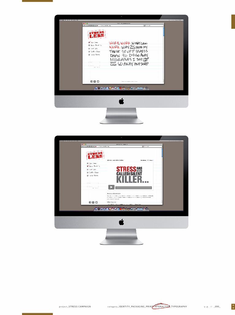
∏∏category_ I D E N T I T Y _ PA C K A G I N G _ P R I N T/ I N T E R A C T I V E _ T Y P O G R A P H Y p. / / _ 0 9 1 _√pro jec t_ S T R E S S C A M PA I G N


OBJECTIVE_
Create a campaign supporting the subject of your choice. Create an
effective website, mobile app, and collateral to support the campaign.
PROJECT BRIEF_
I chose to create a campaign focused around stress as a health and
personal issue. This will be a campaign to bring awareness to the health
issues related to stress and the importance of learning to manage stress.
The site will offer stress reduction techniques as well as tips from
others who have overcome stress. In small amounts stress can be helpful
but when not managed correctly stress can have dangerous effects on
your health and mental well being. I chose to aim the campaign at upper
class-men at the collegiate level and fresh college graduates diving into
the high stress of a new job. I chose to keep a more rough style bringing
in elements of the school or workplace.
//////////////////////////////////////////////////////////////////////////////////////////////////////////////////////////////////////////////////////////////////////////////////////////////////////////////////////////////////////////////////////////////////////////////////////////////////////////////////////////////////////////////////////
CHAPTER_
COURSE_
DURATION_
KEYWORDS_
07/12
Graphic Design 3
Weeks
Spastic
Youthful
Scholastic
PROJECT_
TERM_
DELIVERABLES_
Stress Campaign
Summer 2011
Website
Mobile Site
Collateral
CATEGORY_
INSTRUCTOR_
TYPEFACES_
Print/Interactive
Jenny Ji
1 2 3 4 5 6 7 8 9 1 0 1 1 1 2 1 3 1 4 1 5
Knockout
My Handwriting
Arial
_ ∂ ∂
√
√√
√
√
√
√
√
√
√ √
√
√07_√
∏∏c a t e g o r y _ I D E N T I T Y _ PA C K A G I N G _ P R I N T/ I N T E R A C T I V E _ T Y P O G R A P H Y p . // _ 0 9 3 _p r o j e c t _ S T R E S S C A M PA I G N √

√p . / / _ 0 9 4 _ t i t l e _ I A M A D O E R _ s e l e c t e d w o r k s _ K Y L E M A N N S C H R E C K c h a p t e r _ 1 2 3 4 5 6 7 8 9 1 0 1 1 1 2
∏∏c a t e g o r y _ I D E N T I T Y _ PA C K A G I N G _ P R I N T/ I N T E R A C T I V E _ T Y P O G R A P H Y p . // _ 0 9 5 _p r o j e c t _ S T R E S S C A M PA I G N √

√p . / / _ 0 9 6 _ t i t l e _ I A M A D O E R _ s e l e c t e d w o r k s _ K Y L E M A N N S C H R E C K c h a p t e r _ 1 2 3 4 5 6 7 8 9 1 0 1 1 1 2

c a t e g o r y _ I D E N T I T Y _ PA C K A G I N G _ P R I N T/ I N T E R A C T I V E _ T Y P O G R A P H Y p . // _ 0 9 7 _√ ∏∏p r o j e c t _ S T R E S S C A M PA I G N


c a t e g o r y _ I D E N T I T Y _ PA C K A G I N G _ P R I N T/ I N T E R A C T I V E _ T Y P O G R A P H Y p . // _ 0 9 9 _√ ∏∏p r o j e c t _ S T R E S S C A M PA I G N

√p . / / _ 1 0 0 _ t i t l e _ I A M A D O E R _ s e l e c t e d w o r k s _ K Y L E M A N N S C H R E C K c h a p t e r _ 1 2 3 4 5 6 7 8 9 1 0 1 1 1 2

c a t e g o r y _ I D E N T I T Y _ PA C K A G I N G _ P R I N T/ I N T E R A C T I V E _ T Y P O G R A P H Y p . // _ 1 0 1 _√ ∏∏p r o j e c t _ S T R E S S C A M PA I G N

√p . / / _ 1 0 2 _ t i t l e _ I A M A D O E R _ s e l e c t e d w o r k s _ K Y L E M A N N S C H R E C K c h a p t e r _ 1 2 3 4 5 6 7 8 9 1 0 1 1 1 2

√I AM_√
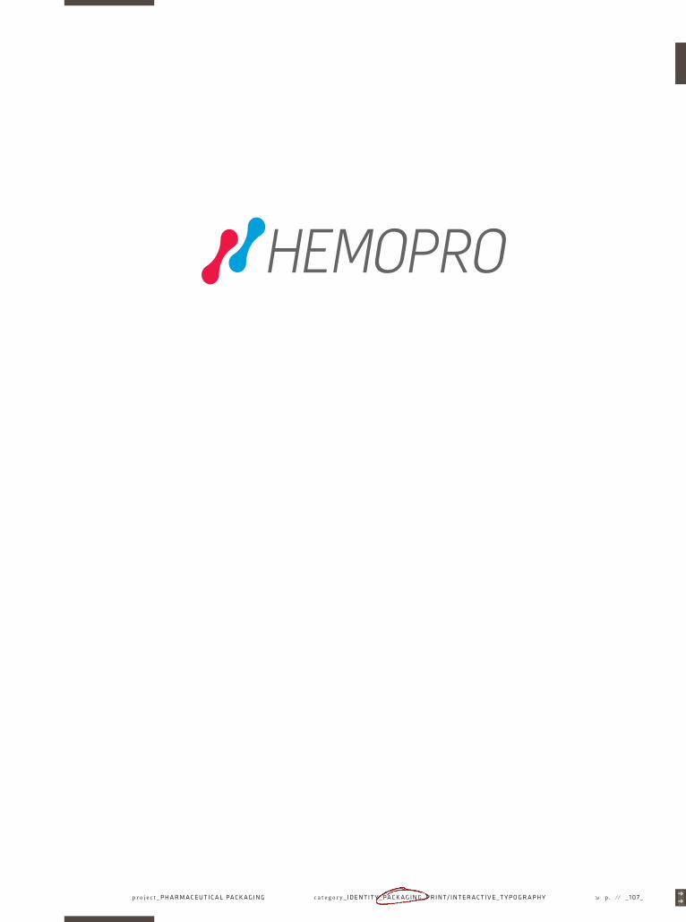
∏∏category_ I D E N T I T Y _ PA C K A G I N G _ P R I N T/ I N T E R A C T I V E _ T Y P O G R A P H Y p. / / _ 1 0 3 _√pro jec t_ P H A R M A C E U T I C A L PA C K A G I N G

OBJECTIVE_
Pick an existing health problem and design a packaging system around
it that helps to improve patients day–to–day life.
PROJECT BRIEF_
I chose to take on the ailment of chronic kidney disease. Chronic kidney
disease is a progressive loss in renal function over a period of months
or years. Once it has progressed to certain stages sufferers may require
dialysis up to three times a day just to survive. Traditionally this would
be done at a Hospital or Health Center. Chronic Kidney disease no longer
needs to run your life with the machines growing ever smaller and
the introduction of home-dialysis. With the introduction of our travel
supply kit people suffering from Chronic Kidney Disease will be more
mobile than ever before. I will be introducing a three day travel kit for
people placed on hemo–dialysis. The kit will include Saline Solution,
Heparin, Latex gloves, Gauze, Syringes, Disinfectant wipes, Face masks,
and Adhesive Strips and is to be used with a home-dialysis unit.
//////////////////////////////////////////////////////////////////////////////////////////////////////////////////////////////////////////////////////////////////////////////////////////////////////////////////////////////////////////////////////////////////////////////////////////////////////////////////////////////////////////////////////
CHAPTER_
COURSE_
DURATION_
KEYWORDS_
08/12
Packaging 3
Weeks
Sterile
Trustworthy
Innovative
PROJECT_
TERM_
DELIVERABLES_
Pharmaceutical Packaging
Fall 2012
Packaged Products
Travel Kit
CATEGORY_
INSTRUCTOR_
TYPEFACES_
Packaging
Thomas McNulty
1 2 3 4 5 6 7 8 9 1 0 1 1 1 2 1 3 1 4 1 5
Flama
_ ∂ ∂
√
√√
√
√
√
√
√
√
√ √
√
√p . / / _ 1 0 4 _ t i t l e _ I A M A D O E R _ s e l e c t e d w o r k s _ K Y L E M A N N S C H R E C K
√08_√
c h a p t e r _ 1 2 3 4 5 6 7 8 9 1 0 1 1 1 2


√p . / / _ 1 0 6 _ t i t l e _ I A M A D O E R _ s e l e c t e d w o r k s _ K Y L E M A N N S C H R E C K
10ml HEPARIN SOLUTION
Sterility guaranteed unless package is damaged or opened. Single Use Syringe. Dispose immediately after Use. Store in a cool, dry place.
5,000 UNITS PER mL HEPARIN SOLUTION IN DISPOSABLE SYRINGE
5040 Cerritos Ave.,Los Angeles, CA 90045
(310) 649–0707
HEMOPRO INTERNATIONAL
10ml SALINE SOLUTION
Sterility guaranteed unless package is damaged or opened. Single Use Syringe. Dispose immediately after Use. Store in a cool, dry place.
0.9% SODIUM CHLORIDE INJECTION IN DISPOSABLE SYRINGE
5040 Cerritos Ave.,Los Angeles, CA 90045
(310) 649–0707
HEMOPRO INTERNATIONAL
c h a p t e r _ 1 2 3 4 5 6 7 8 9 1 0 1 1 1 2
∏∏c a t e g o r y _ I D E N T I T Y _ PA C K A G I N G _ P R I N T/ I N T E R A C T I V E _ T Y P O G R A P H Y p . // _ 1 0 7 _√p r o j e c t _ P H A R M A C E U T I C A L PA C K A G I N G

√p . / / _ 1 0 8 _ t i t l e _ I A M A D O E R _ s e l e c t e d w o r k s _ K Y L E M A N N S C H R E C K c h a p t e r _ 1 2 3 4 5 6 7 8 9 1 0 1 1 1 2

∏∏c a t e g o r y _ I D E N T I T Y _ PA C K A G I N G _ P R I N T/ I N T E R A C T I V E _ T Y P O G R A P H Y p . // _ 1 0 9 _√p r o j e c t _ P H A R M A C E U T I C A L PA C K A G I N G

√p . / / _ 1 1 0 _ t i t l e _ I A M A D O E R _ s e l e c t e d w o r k s _ K Y L E M A N N S C H R E C K c h a p t e r _ 1 2 3 4 5 6 7 8 9 1 0 1 1 1 2

∏∏c a t e g o r y _ I D E N T I T Y _ PA C K A G I N G _ P R I N T/ I N T E R A C T I V E _ T Y P O G R A P H Y p . // _ 1 1 1 _p r o j e c t _ P H A R M A C E U T I C A L PA C K A G I N G √

√p . / / _ 1 1 2 _ t i t l e _ I A M A D O E R _ s e l e c t e d w o r k s _ K Y L E M A N N S C H R E C K c h a p t e r _ 1 2 3 4 5 6 7 8 9 1 0 1 1 1 2

√I AM_√
∏∏category_ I D E N T I T Y _ PA C K A G I N G _ P R I N T/ I N T E R A C T I V E _ T Y P O G R A P H Y p. / / _ 1 1 3 _√pro jec t_ PA P E R P RO M O T I O N
√p . / / _ 0 0 8 _ t i t l e _ I A M A D O E R _ s e l e c t e d w o r k s _ K Y L E M A N N S C H R E C K c h a p t e r _ 1 2 3 4 5 6 7 8 9 1 0 1 1 1 2

∏∏
OBJECTIVE_
Pick an existing line of paper on the market and create a system of
promotional materials, the bulk of which is to be a conceptual book
portraying the essence one of the papers' characteristics.
PROJECT BRIEF_
The paper line I chose to promote was the Vice Versa paper line by
Gmund. The paper line gets its name from it’s unique color palette made
up of 8 complementary dark, light color pairs. The company is held in
high regard for their unprecedented standards of beauty, quality, and
environmental consciousness. With the dualistic nature of the paper
line came the idea for a book showcasing opposite views on a common
issue and seeing that Gmund Paper is regarded for their environmental
consciousness the ever present issue of recycling felt like an appropriate
choice. I set out to create two books bound together, one side showcasing
the positive view of recycling, the other presenting a more pessimistic
view. Each book would utilize one half of each color pair in the paper line.
//////////////////////////////////////////////////////////////////////////////////////////////////////////////////////////////////////////////////////////////////////////////////////////////////////////////////////////////////////////////////////////////////////////////////////////////////////////////////////////////////////////////////////
CHAPTER_
COURSE_
DURATION_
KEYWORDS_
09/12
Typography 3
Weeks
Thought-provoking
Dualistic
Environmental
PROJECT_
TERM_
DELIVERABLES_
√
√√
√
√
√
√
√ √
√
√ √
Paper Promotion
Summer 2011
Promotional Book
Website
Paper Swatches
CATEGORY_
INSTRUCTOR_
TYPEFACES_
Typography
Ariel Grey
1 2 3 4 5 6 7 8 9 1 0 1 1 1 2 1 3 1 4 1 5
Swiss 721
Swiss 721 Rounded
Courier
_ ∂ ∂
√09_√
c a t e g o r y _ I D E N T I T Y _ PA C K A G I N G _ P R I N T/ I N T E R A C T I V E _ T Y P O G R A P H Y p . // _ 1 1 5 _p r o j e c t _ PA P E R P RO M OT I O N √

√p . / / _ 1 1 6 _ t i t l e _ I A M A D O E R _ s e l e c t e d w o r k s _ K Y L E M A N N S C H R E C K c h a p t e r _ 1 2 3 4 5 6 7 8 9 1 0 1 1 1 2


√p . / / _ 1 1 8 _ t i t l e _ I A M A D O E R _ s e l e c t e d w o r k s _ K Y L E M A N N S C H R E C K c h a p t e r _ 1 2 3 4 5 6 7 8 9 1 0 1 1 1 2

∏∏c a t e g o r y _ I D E N T I T Y _ PA C K A G I N G _ P R I N T/ I N T E R A C T I V E _ T Y P O G R A P H Y p . // _ 1 1 9 _p r o j e c t _ PA P E R P RO M OT I O N √

√p . / / _ 1 2 0 _ t i t l e _ I A M A D O E R _ s e l e c t e d w o r k s _ K Y L E M A N N S C H R E C K c h a p t e r _ 1 2 3 4 5 6 7 8 9 1 0 1 1 1 2

∏∏c a t e g o r y _ I D E N T I T Y _ PA C K A G I N G _ P R I N T/ I N T E R A C T I V E _ T Y P O G R A P H Y p . // _ 1 2 1 _p r o j e c t _ PA P E R P RO M OT I O N √

√p . / / _ 1 2 2 _ t i t l e _ I A M A D O E R _ s e l e c t e d w o r k s _ K Y L E M A N N S C H R E C K c h a p t e r _ 1 2 3 4 5 6 7 8 9 1 0 1 1 1 2

∏∏c a t e g o r y _ I D E N T I T Y _ PA C K A G I N G _ P R I N T/ I N T E R A C T I V E _ T Y P O G R A P H Y p . // _ 1 2 3 _p r o j e c t _ PA P E R P RO M OT I O N √

√p . / / _ 1 24 _ t i t l e _ I A M A D O E R _ s e l e c t e d w o r k s _ K Y L E M A N N S C H R E C K c h a p t e r _ 1 2 3 4 5 6 7 8 9 1 0 1 1 1 2

∏∏c a t e g o r y _ I D E N T I T Y _ PA C K A G I N G _ P R I N T/ I N T E R A C T I V E _ T Y P O G R A P H Y p . // _ 1 2 5 _p r o j e c t _ PA P E R P RO M OT I O N √

√p . / / _ 1 2 6 _ t i t l e _ I A M A D O E R _ s e l e c t e d w o r k s _ K Y L E M A N N S C H R E C K c h a p t e r _ 1 2 3 4 5 6 7 8 9 1 0 1 1 1 2

∏∏c a t e g o r y _ I D E N T I T Y _ PA C K A G I N G _ P R I N T/ I N T E R A C T I V E _ T Y P O G R A P H Y p . // _ 1 2 7 _p r o j e c t _ PA P E R P RO M OT I O N √

√p . / / _ 1 2 8 _ t i t l e _ I A M A D O E R _ s e l e c t e d w o r k s _ K Y L E M A N N S C H R E C K c h a p t e r _ 1 2 3 4 5 6 7 8 9 1 0 1 1 1 2

∏∏c a t e g o r y _ I D E N T I T Y _ PA C K A G I N G _ P R I N T/ I N T E R A C T I V E _ T Y P O G R A P H Y p . // _ 1 2 9 _p r o j e c t _ PA P E R P RO M OT I O N √

√p . / / _ 0 0 8 _ t i t l e _ I A M A D O E R _ s e l e c t e d w o r k s _ K Y L E M A N N S C H R E C K c h a p t e r _ 1 2 3 4 5 6 7 8 9 1 0 1 1 1 2
IS RECYCLING REALLY THE BEST OPTION? WHY NOT SAVE TIME, SEND IT TO THE LANDFILL.
LIVE LARGEUSE ONCETHROW OUT
REDUCEREUSERECYCLE
Thoughts on the Vice Versa paper line by Gmund
LIVE SUSTAINABLY, PRESERVE THE PLANET FOR OURFUTURE POSTERITY.
The Vice Versa paper line gets its name from it’s unique color pallette which is made up of 8 complementary dark and light color pairs. The name vice versa means this way and that way pertaining to different ways of looking at things. With this in mind along with the modern style of the paper we decided to make a book which features two different ways to look at a modern issue; the issue at hand, recycling. The colour palette throughout the book is inspired by the light–dark pairings of Vice Versa paper. The color pairs on order of light–dark are linteum and pinus, rivus and pelagus, menta and herbus, eboreus and crucum, lac and humus, rosa and vintum, albus and argentum, as well as ferrum and ebenum. We also thought recycling would be a pertinent subject keeping in mind the Gmund paper mills unprecedented standards of beauty, fine quality, and environmental consciousness. Gmund manufactures all of their fine papers chlorine free, pH neutral, fade resistant, and with only the sustainable raw materials. The mill also boasts an innovative ozone purification system which cleans their waste water, chemical free, returning it to drinking quality, and returning it to the nearby lake Tegernsee.

∏∏c a t e g o r y _ I D E N T I T Y _ PA C K A G I N G _ P R I N T/ I N T E R A C T I V E _ T Y P O G R A P H Y p . // _ 1 3 1 _p r o j e c t _ PA P E R P RO M OT I O N √

√p . / / _ 1 3 2 _ t i t l e _ I A M A D O E R _ s e l e c t e d w o r k s _ K Y L E M A N N S C H R E C K c h a p t e r _ 1 2 3 4 5 6 7 8 9 1 0 1 1 1 2

∏∏c a t e g o r y _ I D E N T I T Y _ PA C K A G I N G _ P R I N T/ I N T E R A C T I V E _ T Y P O G R A P H Y p . // _ 1 3 3 _p r o j e c t _ PA P E R P RO M OT I O N √

√p . / / _ 1 3 4 _ t i t l e _ I A M A D O E R _ s e l e c t e d w o r k s _ K Y L E M A N N S C H R E C K c h a p t e r _ 1 2 3 4 5 6 7 8 9 1 0 1 1 1 2
yearly1584 lbs
weekly30.5 lbs
daily4 lbs
AMERICAN WASTE STATISTICS
(per person)
lets keep our planet green
lets keep our planet green
16%
PLASTIC RESIN SALES BY MARKET
02LAND FILL
THISSIDE DOWN

∏∏c a t e g o r y _ I D E N T I T Y _ PA C K A G I N G _ P R I N T/ I N T E R A C T I V E _ T Y P O G R A P H Y p . // _ 1 3 5 _p r o j e c t _ PA P E R P RO M OT I O N √
01 PLAS TICS
LIVE LARGEUSE IT ONCETHROW IT AWAY
3
45
6
10
9
8
18868
66
60
181
7695
70
58
01PLASTIC RECYCLING
PLASTIC RECYCLING
FINDING EMPTY SPACE REALLY ISNT A PROBLEM.

√p . / / _ 1 3 6 _ t i t l e _ I A M A D O E R _ s e l e c t e d w o r k s _ K Y L E M A N N S C H R E C K c h a p t e r _ 1 2 3 4 5 6 7 8 9 1 0 1 1 1 2

√I AM_√
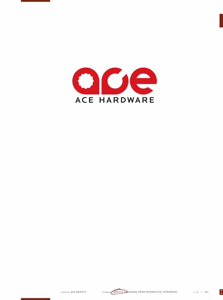
∏∏category_ I D E N T I T Y _ PA C K A G I N G _ P R I N T/ I N T E R A C T I V E _ T Y P O G R A P H Y p. / / _ 1 3 7 _√pro jec t_ A C E I D E N T I T Y

OBJECTIVE_
Chose a retail store and take it through a re–brand. Re–brand to include
logo, applications, store exterior, and store interior.
PROJECT BRIEF_
I chose to re–brand the last standing independently owned hardware
store, Ace Hardware. Each Ace store is independently owned and operat-
ed by local entrepreneurs – hard-working, passionate business owners
who are involved with and, many times, reside in the communities where
their stores are. Throughout its 85-year history, Ace has been known as
the helpful hardware place by both customers and communities. I felt
the existing logo failed to capture the friendly and helpful nature of the
business. I set out to refresh the current identity and branding system
without loosing too much existing equity. My aim was to reflect more of
the brands character as "the helpful place."
//////////////////////////////////////////////////////////////////////////////////////////////////////////////////////////////////////////////////////////////////////////////////////////////////////////////////////////////////////////////////////////////////////////////////////////////////////////////////////////////////////////////////////
CHAPTER_
COURSE_
DURATION_
KEYWORDS_
10/12
Identity 2
Weeks
HelpfulApproachableFriendly
PROJECT_
TERM_
DELIVERABLES_
√
√√
√
√
√
√
√ √
√
√ √
Ace Identity
Fall 2012
LogoApplicationsSignage
CATEGORY_
INSTRUCTOR_
TYPEFACES_
Identity
Thomas McNulty
1 2 3 4 5 6 7 8 9 1 0 1 1 1 2 1 3 1 4 1 5
Locator
_ ∂ ∂
√10_√
√p . / / _ 1 3 8 _ t i t l e _ I A M A D O E R _ s e l e c t e d w o r k s _ K Y L E M A N N S C H R E C K c h a p t e r _ 1 2 3 4 5 6 7 8 9 1 0 1 1 1 2
∏∏c a t e g o r y _ I D E N T I T Y _ PA C K A G I N G _ P R I N T/ I N T E R A C T I V E _ T Y P O G R A P H Y p . // _ 0 0 9 _√p r o j e c t _ R E TA I L I D E N T I T Y

√p . / / _ 1 4 0 _ t i t l e _ I A M A D O E R _ s e l e c t e d w o r k s _ K Y L E M A N N S C H R E C K c h a p t e r _ 1 2 3 4 5 6 7 8 9 1 0 1 1 1 2
∏∏c a t e g o r y _ I D E N T I T Y _ PA C K A G I N G _ P R I N T/ I N T E R A C T I V E _ T Y P O G R A P H Y p . // _ 1 41 _√p r o j e c t _ A C E I D E N T I T Y

√p . / / _ 1 4 2 _ t i t l e _ I A M A D O E R _ s e l e c t e d w o r k s _ K Y L E M A N N S C H R E C K c h a p t e r _ 1 2 3 4 5 6 7 8 9 1 0 1 1 1 2

∏∏c a t e g o r y _ I D E N T I T Y _ PA C K A G I N G _ P R I N T/ I N T E R A C T I V E _ T Y P O G R A P H Y p . // _ 1 4 3 _√p r o j e c t _ A C E I D E N T I T Y

√p . / / _ 1 4 4 _ t i t l e _ I A M A D O E R _ s e l e c t e d w o r k s _ K Y L E M A N N S C H R E C K c h a p t e r _ 1 2 3 4 5 6 7 8 9 1 0 1 1 1 2


√p . / / _ 1 4 6 _ t i t l e _ I A M A D O E R _ s e l e c t e d w o r k s _ K Y L E M A N N S C H R E C K c h a p t e r _ 1 2 3 4 5 6 7 8 9 1 0 1 1 1 2

∏∏c a t e g o r y _ I D E N T I T Y _ PA C K A G I N G _ P R I N T/ I N T E R A C T I V E _ T Y P O G R A P H Y p . // _ 1 4 7 _√p r o j e c t _ A C E I D E N T I T Y

√p . / / _ 1 4 8 _ t i t l e _ I A M A D O E R _ s e l e c t e d w o r k s _ K Y L E M A N N S C H R E C K c h a p t e r _ 1 2 3 4 5 6 7 8 9 1 0 1 1 1 2

√I AM_√
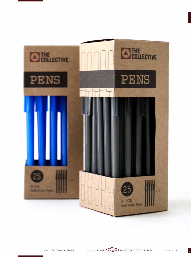
∏∏category_ I D E N T I T Y _ PA C K A G I N G _ P R I N T/ I N T E R A C T I V E _ T Y P O G R A P H Y p. / / _ 1 4 9 _√pro jec t_ CO L L E C T I V E PA C K A G I N G

√p . / / _ 0 0 8 _ t i t l e _ I A M A D O E R _ s e l e c t e d w o r k s _ K Y L E M A N N S C H R E C K c h a p t e r _ 1 2 3 4 5 6 7 8 9 1 0 1 1 1 2

OBJECTIVE_
Work in a collaborative effort to create a retail store and develop pack-
aging that run across multiple house and private brands. Take the store
from conceptualization all the way through realization.
PROJECT BRIEF_
Our group decided to create an art store we would be excited to shop at.
The brand would offer inspiration to artists of all experience levels and
levels of dedication. The store would host workshops and local art shows
as well as feature an in store café where patrons could collaborate and
become inspired. The store was broken down into four main categories
for packaging and branding purposes. The general supplies were classi-
fied under the name The Collective which is also the name of the store.
A children's line was born for the aspiring artist which would live under
the name of Primary. The bulk of the business would revolve around the
everyman and the weekend warrior coming in for supplies and shopping
for our mid-level brand under the name of Core. The professionals would
be catered to in our premium line called Apex and of course all patrons
could enjoy a little time at the Heart Café.
//////////////////////////////////////////////////////////////////////////////////////////////////////////////////////////////////////////////////////////////////////////////////////////////////////////////////////////////////////////////////////////////////////////////////////////////////////////////////////////////////////////////////////
CHAPTER_
COURSE_
DURATION_
KEYWORDS_
11/12
Packaging 4
Weeks
AdventurousExcitingOutdoorsy
PROJECT_
TERM_
DELIVERABLES_
Collective Packaging
Spring 2012
ProposalsIdentitiesPackaging
CATEGORY_
INSTRUCTOR_
TYPEFACES_
Packaging
Thomas McNulty
1 2 3 4 5 6 7 8 9 1 0 1 1 1 2 1 3 1 4 1 5
Various Typefaces
_ ∂ ∂
√
√√
√
√
√
√
√
√
√ √
√
√11_√
∏∏∏∏c a t e g o r y _ I D E N T I T Y _ PA C K A G I N G _ P R I N T/ I N T E R A C T I V E _ T Y P O G R A P H Y p . // _ 1 5 1 _p r o j e c t _ CO L L E C T I V E PA C K A G I N G √

√p . / / _ 1 5 2 _ t i t l e _ I A M A D O E R _ s e l e c t e d w o r k s _ K Y L E M A N N S C H R E C K c h a p t e r _ 1 2 3 4 5 6 7 8 9 1 0 1 1 1 2
A .
A .
B.
C .
D.
E.
//////////////////////////////////////////////////////////////////////////////////////////////////////////////////////////////////////////////////////////////////////////////////////////////////////////////////////////////////////////////////////////////////////////////////////////////////////////////////////////////////////////////////////
NAME_
DESCRIPTION_
The Collective
General brand offering common art supplies at a lower price point.
AUDIENCE_√
√
√ √
Everyone
CATEGORY_
Home Brand
//////////////////////////////////////////////////////////////////////////////////////////////////////////////////////////////////////////////////////////////////////////////////////////////////////////////////////////////////////////////////////////////////////////////////////////////////////////////////////////////////////////////////////
NAME_
DESCRIPTION_
Primary
Fun brand offering art supplies for children and the young at heart.
AUDIENCE_√
√
√ √
Children and Parents
CATEGORY_
Sub Brand
//////////////////////////////////////////////////////////////////////////////////////////////////////////////////////////////////////////////////////////////////////////////////////////////////////////////////////////////////////////////////////////////////////////////////////////////////////////////////////////////////////////////////////
NAME_
DESCRIPTION_
Core
Affordable brand offering solid art supplies for the weekend warriors.
AUDIENCE_√
√
√ √
Art Enthusiasts
CATEGORY_
Sub Brand
//////////////////////////////////////////////////////////////////////////////////////////////////////////////////////////////////////////////////////////////////////////////////////////////////////////////////////////////////////////////////////////////////////////////////////////////////////////////////////////////////////////////////////
NAME_
DESCRIPTION_
Apex
Sophisticated brand offering top shelf art supplies to professionals.
AUDIENCE_√
√
√ √
Professional Artists
CATEGORY_
Sub Brand
//////////////////////////////////////////////////////////////////////////////////////////////////////////////////////////////////////////////////////////////////////////////////////////////////////////////////////////////////////////////////////////////////////////////////////////////////////////////////////////////////////////////////////
NAME_
DESCRIPTION_
Heart Café
An in store café where artists and creatives can go to ideate and relax.
AUDIENCE_√
√
√ √
Artists & Creatives
CATEGORY_
Private Brand

∏∏∏∏c a t e g o r y _ I D E N T I T Y _ PA C K A G I N G _ P R I N T/ I N T E R A C T I V E _ T Y P O G R A P H Y p . // _ 1 5 3 _p r o j e c t _ CO L L E C T I V E PA C K A G I N G √
B.
C .
D.
E.


∏∏∏∏c a t e g o r y _ I D E N T I T Y _ PA C K A G I N G _ P R I N T/ I N T E R A C T I V E _ T Y P O G R A P H Y p . // _ 1 5 5 _√
Distributed By:
The Collective Creative Supplies
Portland, Oregon 65703-1037
Made in The United States of America
SOFTWHITE800 LUMENS
8000HOURS
LIGHTBULB
LIGHTBULB
14w
p r o j e c t _ CO L L E C T I V E PA C K A G I N G

√p . / / _ 1 5 6 _ t i t l e _ I A M A D O E R _ s e l e c t e d w o r k s _ K Y L E M A N N S C H R E C K c h a p t e r _ 1 2 3 4 5 6 7 8 9 1 0 1 1 1 2

∏∏∏∏c a t e g o r y _ I D E N T I T Y _ PA C K A G I N G _ P R I N T/ I N T E R A C T I V E _ T Y P O G R A P H Y p . // _ 1 5 7 _√p r o j e c t _ CO L L E C T I V E PA C K A G I N G
√p . / / _ 1 5 6 _ t i t l e _ I A M A D O E R _ s e l e c t e d w o r k s _ K Y L E M A N N S C H R E C K


√p . / / _ 1 6 0 _ t i t l e _ I A M A D O E R _ s e l e c t e d w o r k s _ K Y L E M A N N S C H R E C K c h a p t e r _ 1 2 3 4 5 6 7 8 9 1 0 1 1 1 2
PENSPENS
255
BLACKBall Point Pens
DIE CUT
xDistributed By:
The Collective Creative Supplies
Portland, Oregon 65703-1037
Made in The United States of America
∏∏∏∏c a t e g o r y _ I D E N T I T Y _ PA C K A G I N G _ P R I N T/ I N T E R A C T I V E _ T Y P O G R A P H Y p . // _ 1 6 1 _√p r o j e c t _ CO L L E C T I V E PA C K A G I N G

√p . / / _ 1 6 2 _ t i t l e _ I A M A D O E R _ s e l e c t e d w o r k s _ K Y L E M A N N S C H R E C K c h a p t e r _ 1 2 3 4 5 6 7 8 9 1 0 1 1 1 2


∏∏∏∏p . // _ 1 6 5 _√c a t e g o r y _ I D E N T I T Y _ PA C K A G I N G _ P R I N T/ I N T E R A C T I V E _ T Y P O G R A P H Y


∏∏∏∏c a t e g o r y _ I D E N T I T Y _ PA C K A G I N G _ P R I N T/ I N T E R A C T I V E _ T Y P O G R A P H Y p . // _ 1 6 7 _√
Fifty C
olored Pen
cilsS
HA
RP
EN
ED F
ifty
Col
ored
Pen
cils
SH
AR
PE
NE
D
Fifty Colored Pencils S H A R P E N E D
C is for
COLOREDPENCILS
Assorted Colors Include:
Conforms toASTM D 4236
AP
ART & CR
EATIVE MATERIALS INSTITUTE C
ERTI
FIED
TM
THE COLLECTIVE CREATIVE SUPPLIESPORTLAND, OREGON 97209-1037
503 22241 2010 COLLECTIVEART.COMMADE IN THE UNITED STATES OF AMERICA
Sharpened Pencils50C O L O R S R I C H C O L O R N O N - T O X I C
High-performance colored pencils are water-soluble and easy to blend, for an unlimited range of shades. Vibrant color oating provides easier identification and color differentiation.
p r o j e c t _ CO L L E C T I V E PA C K A G I N G

√p . / / _ 0 0 8 _ t i t l e _ I A M A D O E R _ s e l e c t e d w o r k s _ K Y L E M A N N S C H R E C K c h a p t e r _ 1 2 3 4 5 6 7 8 9 1 0 1 1 1 2
∏∏∏∏c a t e g o r y _ I D E N T I T Y _ PA C K A G I N G _ P R I N T/ I N T E R A C T I V E _ T Y P O G R A P H Y p . // _ 1 6 9 _√
Pt
CO
RE
Wat
erco
lor
Pai
nt is
bri
llia
nt, m
atte
r,
non-
toxi
c, o
paqu
e w
ater
colo
r. U
se fo
r po
ster
art,
fing
er p
aint
ing,
art
s &
cra
fts,
pri
ntm
akin
g,pa
inti
ng a
nd w
indo
w s
igns
.
DIR
EC
TIO
NS:
Sha
ke w
ell b
efor
e us
ing.
Thi
n an
d cl
ean
up w
ith
wat
er. R
emov
e in
ner
seal
from
cap
bef
ore
init
ial u
se. D
o no
t use
on
win
dow
s th
at a
re c
hipp
ed o
r cr
acke
d. F
or b
est r
esul
ts o
ngl
ass,
use
CO
RE
Win
dow
Pre
p pr
ior
to a
pply
ing.
Dis
trib
uted
By:
The
Col
lect
ive
Cre
ativ
e S
uppl
ies
Por
tlan
d, O
rego
n 65
703-
1037
Mad
e in
The
Uni
ted
Sta
tes
of A
mer
ica
WATERCOLORPAINT 16
FL
OZ
| 473
ml
ARTIST’S
WAT
ERCO
LOR
PA
INT
AR
TIS
T’S
MAT
TEG
RE
EN
#08951
GR
AP
HIT
EP
ENCI
LS
AR
TIST
’S
ARTIST’S
Dr
GRAPHITEPENCILS
12ct
CORE graphite pencilsfeature artist qualitygraphite that easily lays down and blends onmost forms of paper.
F
2H
HB
2B
3B
4B
5B
6B
7B
8B
9B
BB
12 COMPRESSION LEVELS
Dis
trib
uted
By:
The
Col
lect
ive
Por
tlan
d, O
rego
n 65
703
503-
943-
6767
ww
w.t
heco
llec
tive
.com
Mad
e in
US
A
p r o j e c t _ CO L L E C T I V E PA C K A G I N G

√p . / / _ 1 7 0 _ t i t l e _ I A M A D O E R _ s e l e c t e d w o r k s _ K Y L E M A N N S C H R E C K c h a p t e r _ 1 2 3 4 5 6 7 8 9 1 0 1 1 1 2

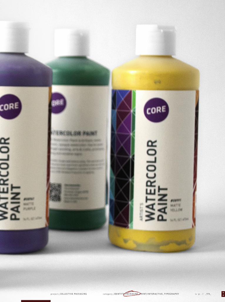
∏∏∏∏c a t e g o r y _ I D E N T I T Y _ PA C K A G I N G _ P R I N T/ I N T E R A C T I V E _ T Y P O G R A P H Y p . // _ 1 7 3 _√p r o j e c t _ CO L L E C T I V E PA C K A G I N G

√p . / / _ 1 74 _ t i t l e _ I A M A D O E R _ s e l e c t e d w o r k s _ K Y L E M A N N S C H R E C K c h a p t e r _ 1 2 3 4 5 6 7 8 9 1 0 1 1 1 2
Ad
USES: Matte fixative for charcoal, pastel, pencil drawings and sketches. Prevents smudges and finger prints. Protects artworks, drawings, layouts, type proofs, photographs, blue-prints, maps, documents, typing carbons, models, signs, ceramics, etc. Colorless, non-yellowing flexible.
DIRECTIONS - USE WITH ADEQUATE VENTILATION. 1. Clean and dry surface. Remove dirt, grease, ect. Dull glossy surfaces. 2. Use outdoors or in a well-ventilated area when temperature is 65-90°F (18-32°C). 3. Cover nearby area to protect from spray mist. 4. Shake well for at least 1 min. listening for the rattle of the mixing ball. Shake frequently during application. 5. Hold can 8-10 inches from surface. Move back and forth releasing button after each stroke. Two (2) thin coats are recommended. Recoat within 4 hours or after 36 hours, otherwise paint may wrinkle or lift. Dry to handle in one hour. 6. If spray button clogs, remove button from can and run knife edge through slit at end of spray button stem. DO NOT insert pins or other sharp objects into valve opening of can. 7. To prevent clogging after use, turn cap upside down and press spray head for three seconds.
CAUTIONAvoid contact with eyes, skin and clothing. May cause eye irritation. Do not take internally. Wash thouroughly after
handling. KEEP OUT OF REACH OF CHILDREN. For additional information consult the Material Safety Data Sheet.
EMERGENCY MEDICAL TELEPHONE: 1-888-345-5732
CONTAINS: ACETONE, XYLENE
10.75 OZ | 305gFIN
AL
FIX
ATIV
E
FINAL FIXATIVE
FOR PASTEL,CHARCOAL AND PENCILNON-YELLOWING
DANGER!EXTREMELYFLAMMABLE HARMFUL VAPORIF INGESTEDCONTENTSUNDER PRESSURE
Ad10.75 OZ | 305gSPR
AY M
OU
NT
SUPER 77 CRAFT AND DISPLAYADHESIVE
DANGER!EXTREMELYFLAMMABLE HARMFUL VAPORIF INGESTEDCONTENTSUNDER PRESSURE
USES: CORE Super 77 Spray Mount to mount signs, lettering, fabrics, cork, etc. Bond foam, cardboard, plastic sheeting, foil, almost any lightweight material. Also bonds glitter, sand, seed, mount leaft, shell, butterfly specimens, collage, and decoupage.
DIRECTIONS - USE WITH ADEQUATE VENTILATION. 1. Clean and dry surface. Remove dirt, grease, ect. Dull glossy surfaces. 2. Use outdoors or in a well-ventilated area when temperature is 65-90°F (18-32°C). 3. Cover nearby area to protect from spray mist. 4. Shake well for at least 1 min. listening for the rattle of the mixing ball. Shake frequently during application. 5. Hold can 8-10 inches from surface. Move back and forth releasing button after each stroke. Two (2) thin coats are recommended. Recoat within 4 hours or after 36 hours, otherwise paint may wrinkle or lift. Dry to handle in one hour. 6. If spray button clogs, remove button from can and run knife edge through slit at end of spray button stem. DO NOT insert pins or other sharp objects into valve opening of can. 7. To prevent clogging after use, turn cap upside down and press spray head for three seconds.
CAUTIONAvoid contact with eyes, skin and clothing. May cause eye irritation. Do not take internally. Wash thouroughly after
handling. KEEP OUT OF REACH OF CHILDREN. For additional information consult the Material Safety Data Sheet.
EMERGENCY MEDICAL TELEPHONE: 1-888-345-5732
SUPER 77 PROFESSIONAL STRENGTH
SPRAY MOUNT
Pt
CORE Watercolor Paint is brilliant, matter, non-toxic, opaque watercolor. Use for posterart, finger painting, arts & crafts, printmaking,painting and window signs.
DIRECTIONS: Shake well before using. Thin and clean up with water. Remove inner seal from cap before initial use. Do not use on windows that are chipped or cracked. For best results onglass, use CORE Window Prep prior to applying.
WAT
ERCO
LOR
PAIN
T
16 FL OZ | 473mlAR
TIS
T’S
WATERCOLOR PAINTARTIST’S
Distributed By:The CollectivePortland, Oregon 65703503-943-6767www.thecollective.comMade in USA
MATTEGREEN
#08951
Pt
CORE Watercolor Paint is brilliant, matter, non-toxic, opaque watercolor. Use for posterart, finger painting, arts & crafts, printmaking,painting and window signs.
DIRECTIONS: Shake well before using. Thin and clean up with water. Remove inner seal from cap before initial use. Do not use on windows that are chipped or cracked. For best results onglass, use CORE Window Prep prior to applying.
WAT
ERCO
LOR
PAIN
T
16 FL OZ | 473mlAR
TIS
T’S
WATERCOLOR PAINTARTIST’S
Distributed By:The CollectivePortland, Oregon 65703503-943-6767www.thecollective.comMade in USA
Distributed By:The CollectivePortland, Oregon 65703503-943-6767www.thecollective.comMade in USA
Distributed By:The CollectivePortland, Oregon 65703503-943-6767www.thecollective.comMade in USA
MATTEPURPLE
#08961

∏∏∏∏c a t e g o r y _ I D E N T I T Y _ PA C K A G I N G _ P R I N T/ I N T E R A C T I V E _ T Y P O G R A P H Y p . // _ 1 7 5 _√p r o j e c t _ CO L L E C T I V E PA C K A G I N G

√p . / / _ 1 7 6 _ t i t l e _ I A M A D O E R _ s e l e c t e d w o r k s _ K Y L E M A N N S C H R E C K c h a p t e r _ 1 2 3 4 5 6 7 8 9 1 0 1 1 1 2
+ Q u a l i t y h o g b r i s t l e s
+ U n r i v a l l e d p e r f o r m a n c e
+ R e s i l i e n t h a i r
+ S a t i n m a t t e h a n d l e
Brush set / / H i g h e s t q u a l i t y h o g b r u s h s e t
5 oil / acrylic brushes
P R O F E S S I O N A L S E R I E S
+ A r c h i v a l q u a l i t y i n k
+ C h e m i c a l l y s t a b l e
MICRO PEN / / Wa t e r a n d f a d e p r o o f f i n e l i n e s
6 fine+2 brush pens
0 . 0 5
0 . 1
0 . 3
0 . 5
0 . 8
1 . 0
B S
B M
P R O F E S S I O N A L S E R I E S
P 020298712#
P 020298712#

∏∏∏∏c a t e g o r y _ I D E N T I T Y _ PA C K A G I N G _ P R I N T/ I N T E R A C T I V E _ T Y P O G R A P H Y p . // _ 0 0 9 _p r o j e c t _ R E TA I L PA C K A G I N G √
P R O F E S S I O N A L S E R I E S
WAT
ErCO
LOR
+ 140lbs. (300 gsm)
+ 12 sheets
+ Cold press paper
+ Heavy weight
+ Acid Free
// Ideal for a variety of watercolor and other
9x12 Watercolor paper
9x12
Conforms toASTM D 4236
AP
AR
T &
CR
EA
TIVE MATERIALS INSTIT
UT
E C
ER
TIF
IED
TM
GRADE A
THE COLLECTIVE
1214 Northwest Couch StreetPortland, OR 97209
DRAW
ING P R O F E S S I O N A L S E R I E S
+ 50 lb. (74 gsm)
+ 30 sheets
+ Heavyweight paper
+ Made in Japan
+ Acid Free
// Good for woodblock or lino printing
9x12 Drawing pad
9x12
Conforms toASTM D 4236
AP
AR
T &
CR
EA
TIVE MATERIALS INSTIT
UT
E C
ER
TIF
IED
TM
GRADE A
THE COLLECTIVE
1214 Northwest Couch StreetPortland, OR 97209
DRAW
ING P R O F E S S I O N A L S E R I E S
+ 50 lb. (74 gsm)
+ 30 sheets
+ Heavyweight paper
+ Made in Japan
+ Acid Free
// Good for woodblock or lino printing
11x14 Drawing pad
9x12
Conforms toASTM D 4236
AP
AR
T &
CR
EATIVE MATERIALS IN
STITU
TE
CE
RT
IFIE
D
TM
GRADE A
THE COLLECTIVE
1214 Northwest Couch StreetPortland, OR 97209
ACRY
LIC P R O F E S S I O N A L S E R I E S
+ 148 lbs. (400 gsm)
+ For acrylic painting
+ Textured paper
+ Heavy weight
+ Acid Free
//Designed especially for the acrylic painter
9x12 Acrylic paper
9x12
Conforms toASTM D 4236
AP
AR
T &
CR
EA
TIVE MATERIALS INSTIT
UT
E C
ER
TIF
IED
TM
GRADE A
THE COLLECTIVE
1214 Northwest Couch StreetPortland, OR 97209
ACRY
LIC P R O F E S S I O N A L S E R I E S
+ 148 lbs. (400 gsm)
+ For acrylic painting
+ Textured paper
+ Heavyweight
+ Acid Free
//Designed especially for the acrylic painter
11x14 Acrylic paper
9x12
Conforms toASTM D 4236
AP
AR
T &
CR
EA
TIVE MATERIALS INSTIT
UT
E C
ER
TIF
IED
TM
GRADE A
THE COLLECTIVE
1214 Northwest Couch StreetPortland, OR 97209
P R O F E S S I O N A L S E R I E S
WAT
ErCO
LOR
+ 140 lb. (300 gsm)
+ 12 sheets
+ Cold press paper
+ Heavy weight
+ Acid Free
// Ideal for a variety of watercolor and other
11x14 Watercolor paper
9x12
Conforms toASTM D 4236
AP
AR
T &
CR
EATIVE MATERIALS IN
STITU
TE
CE
RT
IFIE
D
GRADE A
THE COLLECTIVE
1214 Northwest Couch StreetPortland, OR 97209
∏∏category_ I D E N T I T Y _ PA C K A G I N G _ P R I N T/ I N T E R A C T I V E _ T Y P O G R A P H Y p. / / _ 1 7 7 _√pro jec t_ CO L L E C T I V E PA C K A G I N G

√p . / / _ 1 78 _ t i t l e _ I A M A D O E R _ s e l e c t e d w o r k s _ K Y L E M A N N S C H R E C K c h a p t e r _ 1 2 3 4 5 6 7 8 9 1 0 1 1 1 2


√p . / / _ 1 8 0 _ t i t l e _ I A M A D O E R _ s e l e c t e d w o r k s _ K Y L E M A N N S C H R E C K


∏∏∏∏c a t e g o r y _ I D E N T I T Y _ PA C K A G I N G _ P R I N T/ I N T E R A C T I V E _ T Y P O G R A P H Y p . // _ 1 8 3 _√
+ Q u a l i t y h o g b r i s t l e s
+ U n r i v a l l e d p e r f o r m a n c e
+ R e s i l i e n t h a i r
+ S a t i n m a t t e h a n d l e
Brush set / / H i g h e s t q u a l i t y h o g b r u s h s e t
5 oil / acrylic brushes
P R O F E S S I O N A L S E R I E S
+ A r c h i v a l q u a l i t y i n k
+ C h e m i c a l l y s t a b l e
MICRO PEN / / Wa t e r a n d f a d e p r o o f f i n e l i n e s
6 fine+2 brush pens
0 . 0 5
0 . 1
0 . 3
0 . 5
0 . 8
1 . 0
B S
B M
P R O F E S S I O N A L S E R I E S
P 020298712#
P 020298712#
p r o j e c t _ CO L L E C T I V E PA C K A G I N G

√p . / / _ 1 8 4 _ t i t l e _ I A M A D O E R _ s e l e c t e d w o r k s _ K Y L E M A N N S C H R E C K c h a p t e r _ 1 2 3 4 5 6 7 8 9 1 0 1 1 1 2

√I AM_√
∏∏category_ I D E N T I T Y _ PA C K A G I N G _ P R I N T/ I N T E R A C T I V E _ T Y P O G R A P H Y p. / / _ 1 8 5 _√pro jec t_ VA R I O U S I D E N T I T I E S

√p . / / _ 1 8 6 _ t i t l e _ I A M A D O E R _ s e l e c t e d w o r k s _ K Y L E M A N N S C H R E C K c h a p t e r _ 1 2 3 4 5 6 7 8 9 1 0 1 1 1 2

∏∏category_ I D E N T I T Y _ PA C K A G I N G _ P R I N T/ I N T E R A C T I V E _ T Y P O G R A P H Y p. / / _ 1 8 7 _√pro jec t_ VA R I O U S I D E N T I T I E S

√p . / / _ 1 8 8 _ t i t l e _ I A M A D O E R _ s e l e c t e d w o r k s _ K Y L E M A N N S C H R E C K c h a p t e r _ 1 2 3 4 5 6 7 8 9 1 0 1 1 1 2

∏∏category_ I D E N T I T Y _ PA C K A G I N G _ P R I N T/ I N T E R A C T I V E _ T Y P O G R A P H Y p. / / _ 1 8 9 _√pro jec t_ VA R I O U S I D E N T I T I E S

√p . / / _ 1 9 0 _ t i t l e _ I A M A D O E R _ s e l e c t e d w o r k s _ K Y L E M A N N S C H R E C K c h a p t e r _ 1 2 3 4 5 6 7 8 9 1 0 1 1 1 2
goodearth
REIREIREI
REIREIREI
REIREIREI
REI REI REI
REI REI REI
REI REI REI

∏∏category_ I D E N T I T Y _ PA C K A G I N G _ P R I N T/ I N T E R A C T I V E _ T Y P O G R A P H Y p. / / _ 1 9 1 _√pro jec t_ VA R I O U S I D E N T I T I E S

goodearth
√p . / / _ 1 9 2 _ t i t l e _ I A M A D O E R _ s e l e c t e d w o r k s _ K Y L E M A N N S C H R E C K c h a p t e r _ 1 2 3 4 5 6 7 8 9 1 0 1 1 1 2

∏∏category_ I D E N T I T Y _ PA C K A G I N G _ P R I N T/ I N T E R A C T I V E _ T Y P O G R A P H Y p. / / _ 1 9 3 _√pro jec t_ VA R I O U S I D E N T I T I E S

√p . / / _ 1 9 4 _ t i t l e _ I A M A D O E R _ s e l e c t e d w o r k s _ K Y L E M A N N S C H R E C K c h a p t e r _ 1 2 3 4 5 6 7 8 9 1 0 1 1 1 2

∏∏category_ I D E N T I T Y _ PA C K A G I N G _ P R I N T/ I N T E R A C T I V E _ T Y P O G R A P H Y p. / / _ 1 9 5 _√pro jec t_ VA R I O U S I D E N T I T I E S

√p . / / _ 1 9 6 _ t i t l e _ I A M A D O E R _ s e l e c t e d w o r k s _ K Y L E M A N N S C H R E C K
//////////////////////////////////////////////////////////////////////////////////////////////////////////////////////////////////////////////////////////////////////////////////////////////////////////////////////////////////////////////////////////////////////////////////////////////////////////////////////////////////////////////////////
THANK YOU_
Chamindri Wijimanne, Tom McNulty, Roland Young, and Mary Scott
for the help developing my skills and changing the way I look at the
world. Thanks to Rita Borselli for starting me on the path to design and
the support along the way. Thanks to Max Delegeane and Josh Garn for
keeping me sane throughout my time in San Francisco. Thank you Cindy,
Dave, and Mary Jo for your love and support.
SPECIAL THANKS_
Special thanks goes out to mom, dad, and Dean for always pushing me to
be my best, their unrelenting love and support, and for making me the
person I am today.
√
√