How bad UX can make you hungry – Deliveroo case study
43
How bad UX can make you hungry www.fabiocatapano.com [email protected] Portfolio Contact me @fabiocatapano Twitter
-
Upload
fabio-catapano -
Category
Design
-
view
2.184 -
download
0
Transcript of How bad UX can make you hungry – Deliveroo case study

How bad UX can make you hungry
www.fabiocatapano.com [email protected] Contact me
@fabiocatapanoTwitter

The delivery was made to my office. Everything went well.

But…

Last Friday I was at home and I used Deliveroo’s service for the second time…

xxx
The first screen is pretty straightforward. I like it!
Let’s start…

xxx
This is the address where I want my food to be delivered to…

xxx
…and yes, please! I want my food Today at 21:00 :)

xxx
Looking forward for this…

xxx
I suppose it will show me some surrounding restaurants…
Looking forward for this…

xxx
Yes, this is correct!
…I suppose it will show me some surrounding restaurants…

xxx
…and yes again, this is correct!

xxx
List of available restaurants, nice…

xxxType of food
List of available restaurants, nice…

xxxType of food
List of available restaurants, nice…
Distance and how long it takes for delivery…

xxxType of food
List of available restaurants, nice…
I’m ready! I’m ordering some Indian food tonight!
… in 40 mins everything will be setup for a movie and
food…
Distance and how long it takes for delivery…

The menu and CTA is clear

… this is correct…The menu and CTA is clear

… and my order too…
… this is correct…The menu and CTA is clear

… I’m ready to checkout!

Do you remember? I already used Deliveroo once.

Do you remember? I already used Deliveroo once.
Five months ago, at work.

So let’s log in for the check out process…
Do you remember? I already used Deliveroo once.
Five months ago, at work.

YYY
My card details look fine…
XXXX XXXX XXXX XXXX
E3XXX
00006 19

XXX
I confirm and I’m ready to pay

DONE!
In 40 minutes my food should be here.

50 minutes later…

65 minutes later…

… maybe I should check my order…

xxx
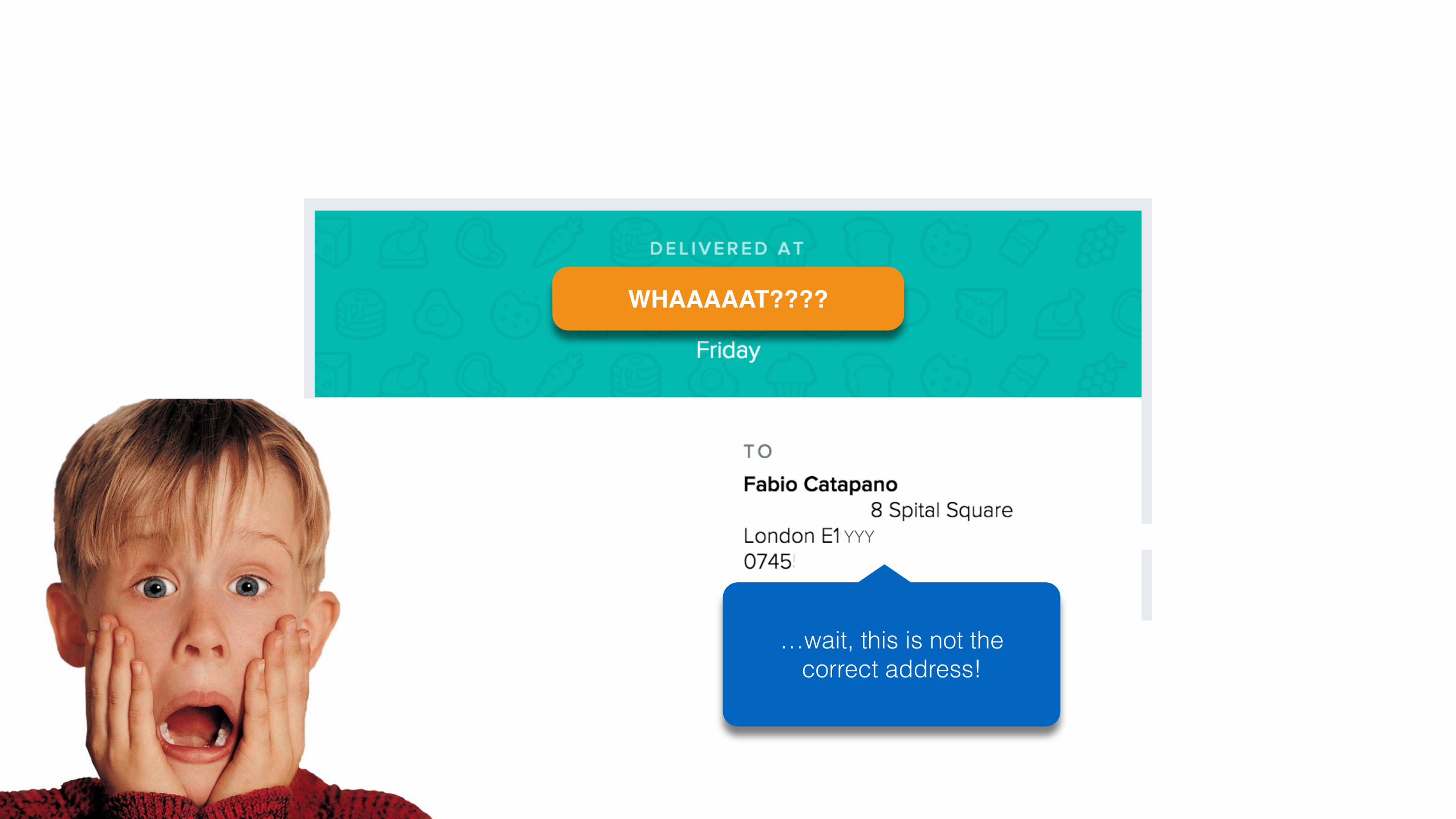
YYY
WHAAAAAT????
xxx
YYY
WHAAAAAT????
…wait, this is not the correct address!

Something went wrong… but what?

Something went wrong… but what?
xxx
First step everything looks fine…

Something went wrong… but what?
xxx
This is my house postcode.
First step everything looks fine…
… second screen looks fine too…

Something went wrong… but what?
xxx
This is my house postcode.
First step everything looks fine…
… second screen looks fine too…
The check out screen!
This is wrong! It’s my office address!
xxx
xxx
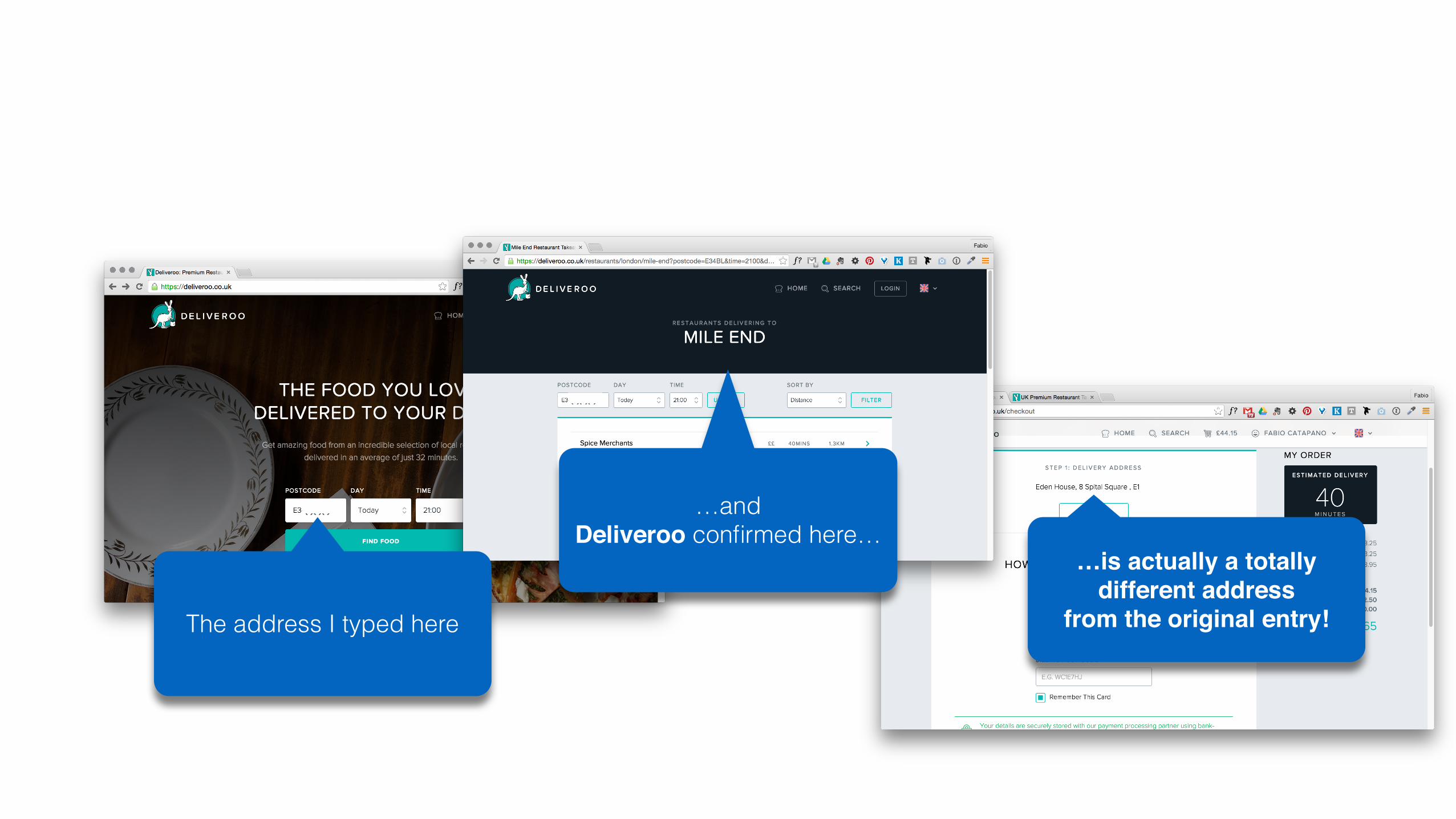
The address I typed here
…and Deliveroo confirmed here…
…is actually a totally different address
from the original entry!

xxx
xxx
The address I typed here
…and Deliveroo confirmed here…
…is actually a totally different address
from the original entry!

After I logged in, Deliveroo’s system pre fielded my previous address as default.
The one used for the first time, five months ago, this happened to be my office address…

… the food was delivered to my office reception and I was left at home with an empty stomach…
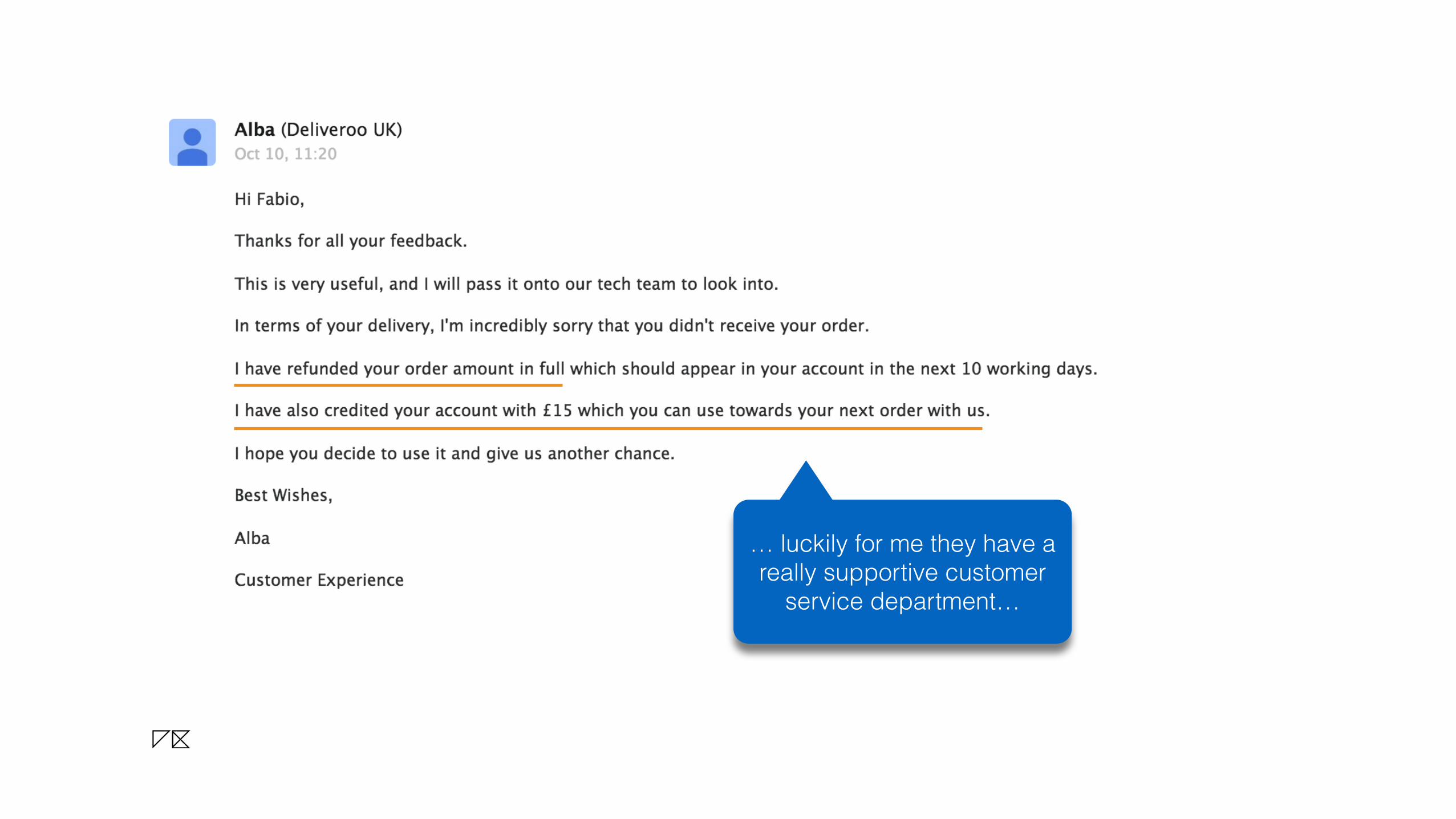
… luckily for me they have a really supportive customer
service department…

… luckily for me they have a really supportive customer
service department… Thank you Alba! I’m going to
use your service again…

… luckily for me they have a really supportive customer
service department… Thank you Alba! I’m going to
use your service again…
… and I will double check my address! More than once!