Hooked on Data Videos: Assessing the Effect ofAnimation ... · animation and pictographs on viewer...
9
Hooked on Data Videos: Assessing the Effect of Animation and Pictographs on Viewer Engagement Fereshteh Amini University of Manitoba Winnipeg, Manitoba [email protected] Nathalie Henry Riche, Bongshin Lee Microsoft Research Redmond, Washington {nath,bongshin}@microsoft.com Jason Leboe-McGowan, Pourang Irani University of Manitoba [email protected] [email protected] ABSTRACT Pictographic representations and animation techniques are com- monly incorporated into narrative visualizations such as data videos. General belief is that these techniques may enhance the viewer experience, thus appealing to a broad audience and enticing the viewer to consume the entire video. However, no study has formally assessed the effect of these techniques on data insight communi- cation and viewer engagement. In this paper, we first propose a scale-based questionnaire covering five factors of viewer engage- ment we identified from multiple application domains such as game design and marketing. We then validate this questionnaire through a crowdsourcing study on Amazon’s Mechanical Turk to assess the effect of animation and pictographs in data videos. Our results reveal that each technique has an effect on viewer engagement, impacting different factors. In addition, insights from these studies lead to design considerations for authoring engaging data videos. CCS CONCEPTS • Human-centered computing → Visualization design and eval- uation methods; KEYWORDS Information Visualization, Narrative Visualization, Data Video, An- imated Infographic, Animation, Pictograph, Engagement. ACM Reference Format: Fereshteh Amini, Nathalie Henry Riche, Bongshin Lee, and Jason Leboe- McGowan, Pourang Irani. 2018. Hooked on Data Videos: Assessing the Effect of Animation and Pictographs on Viewer Engagement. In AVI ’18: 2018 International Conference on Advanced Visual Interfaces, AVI ’18, May 29-June 1, 2018, Castiglione della Pescaia, Italy. ACM, New York, NY, USA, 9 pages. https://doi.org/10.1145/3206505.3206552 1 INTRODUCTION Data videos and animated infographics have gained new promi- nence among journalists, marketers, and government agencies as a compelling way for communicating data-driven facts to a broad Permission to make digital or hard copies of all or part of this work for personal or classroom use is granted without fee provided that copies are not made or distributed for profit or commercial advantage and that copies bear this notice and the full citation on the first page. Copyrights for components of this work owned by others than ACM must be honored. Abstracting with credit is permitted. To copy otherwise, or republish, to post on servers or to redistribute to lists, requires prior specific permission and/or a fee. Request permissions from [email protected]. AVI ’18, May 29-June 1, 2018, Castiglione della Pescaia, Italy © 2018 Association for Computing Machinery. ACM ISBN 978-1-4503-5616-9/18/05. . . $15.00 https://doi.org/10.1145/3206505.3206552 audience. This has resulted in efforts for designing and developing authoring tools to further facilitate their creation [3, 4]. The build- ing blocks of data videos are individual data-driven clips (or data clips), each targeting a specific insight [3]. These videos heavily rely on data visualizations, and various creative design techniques are incorporated into the visualizations to engage the viewers and sustain their attention [2]. Designers often use animation tech- niques to attract viewers’ attention and keep them engaged [11]. In addition, icon-based and pictographic representations commonly replace standard charts in data videos to elicit viewers’ engage- ment through personification of otherwise abstract data. However, the effect of these design strategies on viewer engagement and communication of the data has rarely been explored. Although visual designers have been incorporating animation and pictographic representations to make visualizations more com- pelling [12, 15, 20], researchers have drawn contradictory conclu- sions regarding their effectiveness. While there is strong intuition about the usefulness of motion to communicate [16], studies have shown that animation can be distracting and challenging to in- terpret [31]. Similarly, researchers have argued that pictographs and icon-based representations may distract from the data itself, merely contributing to an accumulation of “chart junk”[36]. On the other hand, empirical work has shown that including pictures and illustrations in data visualizations positively affects memorability [6] and can lead to better recall [8]. More recently, Haroz et al. [18] have distinguished visual embellishments from pictographs representing data, and have concluded that only the latter can be beneficial by enticing people to inspect visualizations more closely. In addition to the lack of consensus on the effects of anima- tion and pictographs, findings from the literature are not directly applicable to data videos. Moreover, their effects have not been tested on viewer engagement, an important factor determining the effectiveness and impact of a narrative visualization [24]. To this aim, we have composed a quick and easy-to-use scale-based ques- tionnaire covering five factors impacting viewer engagement in data videos: (1) affective involvement, (2) enjoyment, (3) aesthetics, (4) focused attention, and (5) cognitive involvement. Focusing on pictographic representations and animations to setup and create a visualization scene, we used our questionnaire and conducted a series of studies through the Amazon’s Mechanical Turk platform. Our results suggest that, although both animation and pictographic representations can elicit viewer engagement, they do so through different facets of viewer engagement. Furthermore, our results reveal a possible interaction role for congruent combinations of pictographs and setup animation in stimulating viewer engagement and viewer comprehension of the communicated information.
Transcript of Hooked on Data Videos: Assessing the Effect ofAnimation ... · animation and pictographs on viewer...
Hooked on Data Videos: Assessing the Effect ofAnimation and Pictographs on Viewer EngagementFereshteh Amini
University of ManitobaWinnipeg, Manitoba
Nathalie Henry Riche,Bongshin Lee
Microsoft ResearchRedmond, Washington
{nath,bongshin}@microsoft.com
Jason Leboe-McGowan,Pourang Irani
University of [email protected]
ABSTRACTPictographic representations and animation techniques are com-monly incorporated into narrative visualizations such as data videos.General belief is that these techniques may enhance the viewerexperience, thus appealing to a broad audience and enticing theviewer to consume the entire video. However, no study has formallyassessed the effect of these techniques on data insight communi-cation and viewer engagement. In this paper, we first propose ascale-based questionnaire covering five factors of viewer engage-ment we identified frommultiple application domains such as gamedesign and marketing. We then validate this questionnaire througha crowdsourcing study on Amazon’s Mechanical Turk to assessthe effect of animation and pictographs in data videos. Our resultsreveal that each technique has an effect on viewer engagement,impacting different factors. In addition, insights from these studieslead to design considerations for authoring engaging data videos.
CCS CONCEPTS• Human-centered computing → Visualization design and eval-uation methods;
KEYWORDSInformation Visualization, Narrative Visualization, Data Video, An-imated Infographic, Animation, Pictograph, Engagement.ACM Reference Format:Fereshteh Amini, Nathalie Henry Riche, Bongshin Lee, and Jason Leboe-McGowan, Pourang Irani. 2018. Hooked on Data Videos: Assessing theEffect of Animation and Pictographs on Viewer Engagement. In AVI ’18:2018 International Conference on Advanced Visual Interfaces, AVI ’18, May29-June 1, 2018, Castiglione della Pescaia, Italy. ACM, New York, NY, USA,9 pages. https://doi.org/10.1145/3206505.3206552
1 INTRODUCTIONData videos and animated infographics have gained new promi-nence among journalists, marketers, and government agencies asa compelling way for communicating data-driven facts to a broad
Permission to make digital or hard copies of all or part of this work for personal orclassroom use is granted without fee provided that copies are not made or distributedfor profit or commercial advantage and that copies bear this notice and the full citationon the first page. Copyrights for components of this work owned by others than ACMmust be honored. Abstracting with credit is permitted. To copy otherwise, or republish,to post on servers or to redistribute to lists, requires prior specific permission and/or afee. Request permissions from [email protected] ’18, May 29-June 1, 2018, Castiglione della Pescaia, Italy© 2018 Association for Computing Machinery.ACM ISBN 978-1-4503-5616-9/18/05. . . $15.00https://doi.org/10.1145/3206505.3206552
audience. This has resulted in efforts for designing and developingauthoring tools to further facilitate their creation [3, 4]. The build-ing blocks of data videos are individual data-driven clips (or dataclips), each targeting a specific insight [3]. These videos heavilyrely on data visualizations, and various creative design techniquesare incorporated into the visualizations to engage the viewers andsustain their attention [2]. Designers often use animation tech-niques to attract viewers’ attention and keep them engaged [11]. Inaddition, icon-based and pictographic representations commonlyreplace standard charts in data videos to elicit viewers’ engage-ment through personification of otherwise abstract data. However,the effect of these design strategies on viewer engagement andcommunication of the data has rarely been explored.
Although visual designers have been incorporating animationand pictographic representations to make visualizations more com-pelling [12, 15, 20], researchers have drawn contradictory conclu-sions regarding their effectiveness. While there is strong intuitionabout the usefulness of motion to communicate [16], studies haveshown that animation can be distracting and challenging to in-terpret [31]. Similarly, researchers have argued that pictographsand icon-based representations may distract from the data itself,merely contributing to an accumulation of “chart junk”[36]. On theother hand, empirical work has shown that including pictures andillustrations in data visualizations positively affects memorability[6] and can lead to better recall [8]. More recently, Haroz et al.[18] have distinguished visual embellishments from pictographsrepresenting data, and have concluded that only the latter can bebeneficial by enticing people to inspect visualizations more closely.
In addition to the lack of consensus on the effects of anima-tion and pictographs, findings from the literature are not directlyapplicable to data videos. Moreover, their effects have not beentested on viewer engagement, an important factor determining theeffectiveness and impact of a narrative visualization [24]. To thisaim, we have composed a quick and easy-to-use scale-based ques-tionnaire covering five factors impacting viewer engagement indata videos: (1) affective involvement, (2) enjoyment, (3) aesthetics,(4) focused attention, and (5) cognitive involvement. Focusing onpictographic representations and animations to setup and createa visualization scene, we used our questionnaire and conducted aseries of studies through the Amazon’s Mechanical Turk platform.Our results suggest that, although both animation and pictographicrepresentations can elicit viewer engagement, they do so throughdifferent facets of viewer engagement. Furthermore, our resultsreveal a possible interaction role for congruent combinations ofpictographs and setup animation in stimulating viewer engagementand viewer comprehension of the communicated information.
AVI ’18, May 29-June 1, 2018, Castiglione della Pescaia, Italy F. Amini et al.
Figure 1: Example use of setup animation to build trend visualization: pictograph (top), standard line chart (bottom).
Our research contributions are threefold: (1) the developmentof an easy-to-use engagement scale to assess viewer engagementin data videos, (2) an empirical study, assessing the effects of setupanimation and pictographs on viewer engagement, and (3) guidancefor the design of engaging data videos.
2 RELATEDWORK2.1 Data VideosTechnological advances have facilitated the design and creation ofnew forms of media and innovative techniques for communicatinginsights extracted from data. Film and video-based data stories (e.g.,data videos) are recognized among the seven genres of narrativevisualization [33]. Their ability to appeal to mass audiences andcommunicate a wide range of data insights in a short period oftime, has made them popular among data journalists and has at-tracted the attention of researchers in the field. Data videos havealso been studied from the perspective of film narratives, a mediumthat bears significant similarity with data videos. Amini et al. [2]examined 50 data videos and teased apart the various dimensionsof data videos with respect to narratives in film or cinematography.Their results show that data videos use various presentation stylesto attract and maintain viewer attention. The growing interest indata videos has also inspired efforts for design and development ofauthoring tools to further facilitate their creation [3, 4]. While priorwork has shed light on the possibilities of data videos, their struc-tural constituents, and design techniques, their effects on viewerengagement and communication of data has not been studied. Inparticular, it is not clear whether incorporating animation and iconsin the data visualizations can elicit viewer engagement and helpwith comprehension of data insights being communicated.
2.2 Animated Data VisualizationsAnimation in data visualization can take many different roles [11].Most commonly, it has been used to facilitate the perception ofdifferent changes in data visualization [16]. Researchers have ques-tioned the benefits of animation [37], whereas, others have showedits effectiveness [39]. Heer and Robertson [19] investigated theeffectiveness of animated transitions between common statisticaldata graphics, finding that animated transitions can improve graph-ical perception. Robertson et al. [31], compared GapMinder likeanimations with trace visualizations and small multiples. Their
results indicated that while participants find animated trend visu-alizations enjoyable and exciting, they can be challenging to use,leading to many errors. In this paper, we focus on a class of ani-mation techniques commonly used in narrative visualizations toattract and maintain viewer attention by animating the creation ofa visualization scene [3]. We refer to this subset of animation tech-niques as setup animation. Figure 1 shows examples screenshotsdemonstrating such animation technique.
2.3 Phictographs and Icon-BasedVisualizations
Simple pictographic elements have been used to encode varioustypes of information including numerical data [10, 20]. For exam-ple, unit pictographs include symbols, each representing a fixedquantity, that are stacked to provide an intuitive representationof a total amount (Figure 1-top). Amini et al. [3] have identifiedseveral different icon-based representations commonly used in thedata videos. We consider icon-based representations included intheir taxonomy to design the data clips used in our study. The usesand benefits of icon-based visualizations have been debated. Someconsidered visual embellishments as chart junk [36]. Boy et al. [9]investigated the impact of using anthropomorphized data graphicsover standard charts and did not find differences in their effects onviewers’ empathy. On the contrary, Bateman et al. [6] reported anempirical study showing that visual embellishments could improvelong-term recall. Similarly, Borkin et al. [8] found that people canbetter recall pictorial visualizations. Borgo et al. [7] found occa-sional impact on working and long-term memory performance forvisualizations with embedded images. More recent studies haveshown positive effects of bar chart embellishments on data commu-nication [34] as well as benefits of pictographs representing datathrough enticing people to inspect visualizations more closely [18].
Our work studies the impact of pictographs representing data onthe viewer engagement and communication of data in data videos.
2.4 Viewer EngagementIn HCI, user engagement has been viewed in the context of flowand fluid interaction, leading to satisfying and pleasurable emotions[35]. It has also been defined as the emotional, cognitive, and behav-ioral connection that exists between a person and an object [5, 32].Engagement is also believed to be the positive user experience as-sociated with being captivated and motivated to use an interface
Hooked on Data Videos AVI ’18, May 29-June 1, 2018, Castiglione della Pescaia, Italy
Attribute Description #.Items
Example Statements
AffectiveInvolvement
The interest in expending emotional energy and evoking deep feelingsabout the stimulus
2 This video triggered my emotions.
Enjoyment A consequence of cognitive and affective involvement and may be broadlydefined as a pleasurable affective response to a stimulus
5 This video was fun to watch.I’d recommend its viewing to myfriends.
Aesthetics The visual beauty or the study of natural and pleasing (or aesthetic) stimulus 3 I liked the graphics in this video.This video was visually pleasing.
FocusedAttention
The state of concentrating on one stimulus without getting distracted byall others
2 I found my mind wandering whilethe video was being played.
CognitiveInvolvement
The interest in learning and thinking about the information communicatedthrough the stimulus
3 I found the content easy to under-stand.
Table 1: The description of five engagement attributes with example questionnaire statements, which are used in our study(Section 4). The complete list of items is available at our website, datavideo-engmtscale.github.io.
[27]. Additionally, terms such as flow, presence, transportation,immersion, enjoyment, and playfulness are closely related to theconcept of viewer engagement [13, 17, 22, 23]. Our scope of engage-ment is in the context of data videos as the combination of viewer’ssubjectively reported levels for different attributes of engagement.
Several approaches for assessing engagement have been pro-posed in various disciplines. O’Brien and Toms [28] posited a rangeof user- and system-specific attributes of user engagement in thedesign of interactive systems: aesthetics, affect, interest, motiva-tion, novelty, perceived time, focused attention, challenge, control,and feedback. Their measures emphasize users’ emotional responseand reaction, and the concentration of mental activity. The visual-ization community has primarily focused on measuring durationand number of interactions with a visual display [9, 32]. Saket etal. have explored subjective reaction cards to capture user feel-ings [32]. Mayer [25] has looked at audience engagement from theperspective of journalists and newsrooms. Drawing on empiricalresearch with users of data visualizations, Kennedy et al. [21] iden-tify six social and contextual factors that affect engagement. Ourstudy focuses on audience engagement at the data story dissemina-tion phase. We consider different viewer characteristics as possiblevariables influencing viewer engagement with data videos.
3 ENGAGEMENT SCALE DEVELOPMENTOur goal was to construct a single questionnaire (with a smallnumber of items) as a simple measurement tool for capturing arange of engagement characteristics after viewing data videos.
3.1 Initial Engagement ScaleWe first looked into existing questionnaires from related disciplinessuch as game design, user interface design, psychology, HCI, com-munication and marketing, storytelling, and multimedia design[22, 26, 28, 38]. We compiled a list of statements capturing poten-tially relevant attributes of viewer engagement and eliminated thosethat did not apply to data videos as they were focused on a specificcontext (e.g., Parasocial interaction in game design). We identi-fied 53 statements (available at datavideo-engmtscale.github.io),covering the five engagement attributes (Table 1).
3.2 Refining Engagement ScaleTo further examine the appropriateness and utility of the resultingscale, we conducted a study using the 53 item questionnaire tocompare each item’s ratings on the engagement scale.
3.2.1 Study Design. We designed two drastically different datavideos on the topic of drug use including or lacking animationand pictographic representations. We posit that such animatedvisualizations yield higher levels of engagement in the viewers. Thefirst video consisted of static slide deck with textual descriptionsand tabular representation to communicate facts based on data. Thesecond video was designed to be more engaging by using short titlesand animated icon-based visualizations to communicate the samedata-driven facts. Videos had equal number of data clips organizedin the same order to create a longer sequence and were 1.5 minutesin duration. We ran a between-subject study, where participantsview a single video and fill out the engagement questionnaire. Werecruited 50 undergraduate students (aged 18-27) from a university’spsychology department.
3.2.2 Procedure. On a website hosting the experiment, partic-ipants viewed a page with the details about the experiment andwhat is expected of them. Once ready, they proceeded to watchthe video, one at a time. We slightly reworded statements in thecompiled engagement questionnaire to make sure they are suit-able for data videos. The questionnaire items were entered into theonline Qualtrics platform. We also included a short demographicquestionnaire at the end as well as a simple question at the begin-ning of the survey about the content of the video. This questionserved as a gotcha measure for identifying random responses fromparticipants who may not have paid attention to the video. Uponplayback ending, the embedded Qualtrics questionnaire appearedbelow the video. Participants were asked to provide their scorefor each survey item on a seven-point Likert scale, ranging fromstrongly disagree (1) to strongly agree (7). Participants were givennotice before the automatic playback to prepare for watching anauto-played video for 1.5 minutes.
AVI ’18, May 29-June 1, 2018, Castiglione della Pescaia, Italy F. Amini et al.
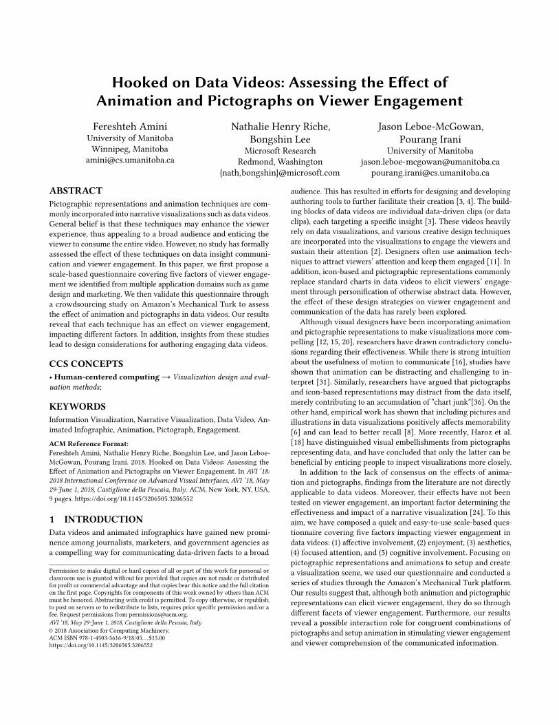
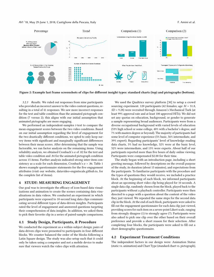
Figure 2: Example last frame screenshots of clips for different insight types: standard charts (top) and pictographs (bottom).
3.2.3 Results. We ruled out responses from nine participantswho provided an incorrect answer to the video content questions, re-sulting in a total of 41 responses. We saw more incorrect responsesfor the text and table condition than the animated pictograph con-dition (7 versus 2); this aligns with our initial assumption thatanimated pictographs are more engaging.
We performed an independent-samples t-test to compare themean engagement scores between the two video conditions. Basedon our initial assumption regarding the level of engagement forthe two drastically different conditions, we opted to only keep sur-vey items with significant and marginally significant differencesbetween their mean scores. After determining that the sample wasfactorable, we ran factor analysis on the remaining items. Usingreliability analysis, we obtained Cronbach’s α of .82 for the text andtable video condition and .84 for the animated pictograph conditionacross 15 items. Further analysis indicated strong inter-item con-sistency as a scale for each dimension, Cronbach’s α > .86. Table 1shows example questionnaire statements for the five engagementattributes (visit our website, datavideo-engmtscale.github.io, forthe complete list of items).
4 STUDY: MEASURING ENGAGEMENTOur goal was to investigate the efficacy of icon-based data visual-izations and animation to create the scenes containing data visu-alizations in data videos. We conducted an experiment in whichparticipants were exposed to 10-second long data clips communi-cating several different types of data-driven insights. Participantsrated the level of engagement and answered questions targetingtheir comprehension of data insights. In addition, we asked themto pick their favorite clip in a series of paired-sample comparisons.
4.1 Study Design, Participants, & ProcedureWe conducted the experiment as a within-subject design; pairs ofdata-driven clips were presented to participants in four differentblocks. We counter balanced the order of the blocks following aLatin Square design. The study was also setup such that it couldonly be taken using a computer and not a mobile device to makesure that viewers watch the video clips with attention.
We used the Qualtrics survey platform [30] to setup a crowdsourcing experiment. 120 participants (42 females; age M = 31.8,SD = 9.28) were recruited through Amazon’s Mechanical Turk (atleast 99% approval rate and at least 100 approved HITs). We did notset any quotas on education, background, or gender to generatea sample representing broad audiences. Participants were from adiverse occupational background with varied levels of education(53% high school or some college, 40% with a bachelor’s degree, and7%withmasters degree or beyond). Themajority of participants hadsome level of computer experience (5% basic, 56% intermediate, and39% expert). Regarding participants’ level of knowledge readingdata charts, 3% had no knowledge, 32% were at the basic level,52% were intermediate, and 13% were experts. About half of ourparticipants reported more than five hours of daily online viewing.Participants were compensated $2.00 for their time.
The study began with an introduction page, including a shortgreeting message, followed by descriptions on the overall purposeof the study, its duration (about 15 minutes), and expectations fromthe participants. To familiarize participants with the procedure andthe types of questions they would receive, we included a practiceblock. At the beginning of each block, we informed participantsabout an upcoming short video clip being played for 10 seconds. Asingle data clip, randomly chosen from the block, played back to theparticipants without a playback controller. Participants were thendirected to a page with a question about the content of the videothey just viewed. We repeated the same steps for the second dataclip in the block. At the end of each block, participants were asked tofill out the engagement questionnaire for each data clip just viewed,providing scores for each item on a seven-point Likert scale, rangingfrom strongly disagree (1) to strongly agree (7). Participants werealso asked to pick one clip over the other based on their overallpreference and provide a short reason for their selection. Aftercompleting four blocks, the participants were asked to fill out ashort demographic questionnaire.
4.2 Experiment Treatment ConditionsThe independent factors in our design were: Animation Status(static vs. animation) and Chart Type (standard chart vs. pictograph),
Hooked on Data Videos AVI ’18, May 29-June 1, 2018, Castiglione della Pescaia, Italy
giving us four conditions: (C1) static chart, (C2) static pictograph,(C3) animated chart, and (C4) animated pictograph. We consideredfour main insight types [3]: (1) Single value percentage, (2) Trend,(3) Single value comparison, and (4) Multiple attributes comparison.Figure 2 shows screenshot examples of clips used in the study.
All versions of the data clips were made to look similar to opti-mize treatment equivalence and to better attribute the effects to theuse of setup animation or pictographs. We describe the measureswe took to achieve treatment equivalency as follows:
Auditory Stimuli: According to the recent statistics on onlinevideo viewing, 85% of Facebook videos are watched without sound[1]. Motivated by this phenomenon and to focus on visual stimuli,we opted not to include voice-overs or background music.DataVisualizations:The types of standard charts and pictographswe used to visualize data varied based on the type of insight beingcommunicated. Standard charts included pie, line, bar, and clus-tered bar charts. Pictographic representations included colored pic-tographs, unit-based pictographs, and filling icon. The color palettewe used (from the DataClips tool) contained seven distinctly differ-ent colors and accounted for color blindness.Data Clip Duration: All video clips were 10 seconds long andauto-played to make sure the exposure time was equal across allconditions. In cases of clips lacking setup animation, we displayedthe static visualizations for 10 seconds. Participants were clearlyinformed before each stimuli exposure that they should expect“viewing a chart” for 10 seconds.Look and Feel:We opted to keep similar ratio of ink to white. Thelayout for organizing components in the clips was kept consistentto provide similar look and feel. Depending on the size and type ofthe data visualization used, there was a short title placed on top orto the left of the chart explaining the content of the chart (Figure 2).For all data clips, we used the same font style and size (Times NewRoman, 12 pt, black) with white background to guarantee legibility.
4.3 Study Material and MeasuresFor this study, we targeted elemental video segments or data clips.As a building block of data videos, data clips communicate a sin-gle data-driven insight using data representations, and can be se-quenced together to form a data video. By focusing on these smallerunits, we sought to avoid potential confounding effects as a result ofsequencing strategy or narrative structure employed in data videos.
The dataset we used to create the data video clips was reverseengineered based on the animated infographics created by theexperts in a US governmentwebsite as well as a data video publishedby the Guardian [14] on drug use. The selected topic was of generalinterest and included several different insights on different aspectsof drug use. Due to our within-subject design, we had to vary datainsights for each clip. To account for possible bias as a result oftopic preference, we extracted equivalent data insights from thesame drug use dataset. For example, in an experimental block, adata clip presented cigarette use trend among the youth over theyears, while the other showed the trend of Marijuana use amongyouth over the same time period.
We created a total of 16 data clips using DataClips [3], a web-based data clips authoring tool. To best fit the 16:9 aspect ratio ofthe video player used in Qualtrics, we rendered all video clips with720p at 1280x720 resolution. All materials used in the study can befound in our accompanying website.
We selected seven items (Table 1) from the 15-items engagementquestionnaire we have developed (Section 3). In addition to keepingthe questionnaire short, we wanted to include only the statementsthat are applicable to data clips. For example, “I responded emotion-ally” was eliminated in favor of “The video triggered my emotions”since the latter scored higher under the affective involvement at-tribute. We also removed the item “I lost track of time” because itmeasures focused attention of viewers when they are exposed tothe stimuli for an extended period of time.
4.4 ResultsOf the original 120 responses from Amazon’s Mechanical Turk,seven were rejected and re-run because they were deemed to berandom responses by the participants as a result of failure to cor-rectly answer all four gotcha questions. Further investigation ofanswers to the engagement questionnaire lead to removal of oneother response consisting of all sevens (i.e., “strongly agree”), indi-cating the lack of enough attention. The remaining responses werea total of 119. Average completion time was 13.3 minutes. Scoresfrom the practice block were ignored in our analysis of the results.
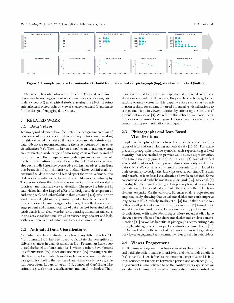
We conducted a series of repeated-measures ANCOVA modelsthat included variables from the demographic questionnaire (e.g.,age, online viewing, learning style) as covariates. The first modeltested the effects of pictographs and setup animation on each en-gagement factor. Similarly, we tested the effects of each conditionon viewers’ overall preference. To do so, we analyzed participantsselections in the pairwise comparison question. Furthermore, weperformed a qualitative analysis on participants’ comments pro-vided for justifying their selection. Finally, we investigated theeffects of each condition on the communication of data insightsby analyzing answers given to the comprehension questions. Alleffects were analyzed at a 95% confidence-level. Throughout ouranalysis, we investigated the source of possible interaction effectsby submitting participants’ scores for the two ChartType conditionsto separate ANOVAs, treating AnimationStatus as a within-subjectfactor. Table 2 summarizes the significant main and interactioneffects we found in the statistical analysis.
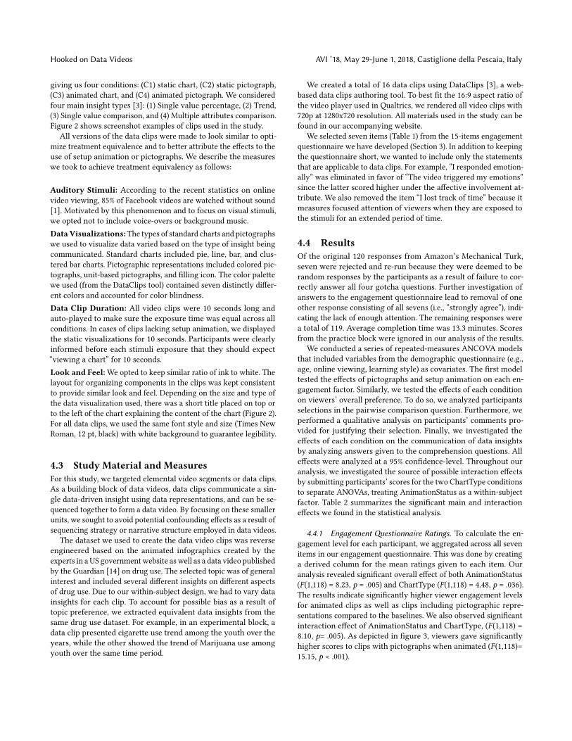
4.4.1 Engagement Questionnaire Ratings. To calculate the en-gagement level for each participant, we aggregated across all sevenitems in our engagement questionnaire. This was done by creatinga derived column for the mean ratings given to each item. Ouranalysis revealed significant overall effect of both AnimationStatus(F (1,118) = 8.23, p = .005) and ChartType (F (1,118) = 4.48, p = .036).The results indicate significantly higher viewer engagement levelsfor animated clips as well as clips including pictographic repre-sentations compared to the baselines. We also observed significantinteraction effect of AnimationStatus and ChartType, (F (1,118) =8.10, p= .005). As depicted in figure 3, viewers gave significantlyhigher scores to clips with pictographs when animated (F (1,118)=15.15, p < .001).
AVI ’18, May 29-June 1, 2018, Castiglione della Pescaia, Italy F. Amini et al.
Regarding the effects of the covariates, we found that averagedaily online viewingwas associatedwith higher viewer engagementlevels in clips that included animated visualizations. Additionally,viewers reporting higher level of education and experience withexcel-like charts were less engaged with pictographs. Results con-trolling for other covariates (e.g., age, gender) did not substantiallydiffer between our ANCOVA and simple ANOVA models.
In subsequent analyses, we submitted participants’ ratings foreach of the five engagement dimensions to repeated-measuresANOVAs, treatingAnimationStatus andChartType aswithin-subjectfactors. Figure 3 shows the mean ratings collected for each engage-ment factor separated by data clip condition.Affective Involvement: We found a significant main effect ofboth AnimationStatus (F (1,118) = 5.134, p = .025) and ChartType(F (1,118) = 5.097, p = .026), in that ratings of affective involvementwere higher for data clips that contained either animations or icon-based data visualizations. We also found a significant interactioneffect of AnimationStatus and ChartType (F (1,118) = 9.52, p = .003).Similar to the overall engagement levels, affective involvementratings were significantly higher for clips containing pictographsin the animated condition (F (1,118) = 9.54, p = .002).Enjoyment: We calculated the overall enjoyment score as a meanof scores given to the two complementary statements for measuringthe enjoyment factor (Table 1). Our analysis yielded no main effectsof either AnimationStatus or ChartType. However, our analysisrevealed a significant interaction effect of AnimationStatus andChartType (F (1,118) = 9.828, p = .002). With setup animation, dataclips containing pictographs received significantly higher ratingsthan the ones containing standard charts (F (1,118) = 9.33, p = .003).We were surprised to see significantly higher enjoyment ratingsfor data clips with standard charts in the static condition comparedto pictographs (F (1,118) = 6.35, p = .01).Aesthetics: Using the aggregated aesthetics preference score fromthe two complementary statements (Table 1), we obtained signif-icant main effects of both AnimationStatus, F (1,118) = 11.119, p= .001 and ChartType, F (1,118) = 6.358, p = .01. As expected, par-ticipants viewed data clips containing animations and icon-baseddata visualizations as more aesthetically appealing. We also foundsignificant main effect of AnimationStatus x ChartType interaction,F (1,118) = 10.809, p = .001. Data clips containing pictographs were
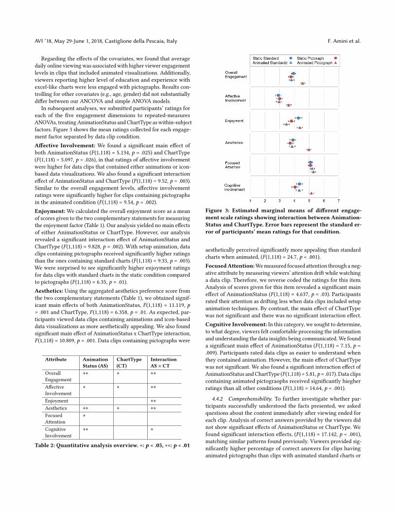
Attribute AnimationStatus (AS)
ChartType(CT)
InteractionAS × CT
OverallEngagement
∗∗ ∗ ∗∗
AffectiveInvolvement
∗ ∗ ∗∗
Enjoyment ∗∗
Aesthetics ∗∗ ∗ ∗∗
FocusedAttention
∗
CognitiveInvolvement
∗∗ ∗
Table 2: Quantitative analysis overview. ∗: p < .05, ∗∗: p < .01
Figure 3: Estimated marginal means of different engage-ment scale ratings showing interaction between Animation-Status and ChartType. Error bars represent the standard er-ror of participants’ mean ratings for that condition.
aesthetically perceived significantly more appealing than standardcharts when animated, (F (1,118) = 24.7, p < .001).FocusedAttention:Wemeasured focused attention through a neg-ative attribute by measuring viewers’ attention drift while watchinga data clip. Therefore, we reverse coded the ratings for this item.Analysis of scores given for this item revealed a significant maineffect of AnimationStatus (F (1,118) = 4.637, p = .03). Participantsrated their attention as drifting less when data clips included setupanimation techniques. By contrast, the main effect of ChartTypewas not significant and there was no significant interaction effect.Cognitive Involvement: In this category, we sought to determine,to what degree, viewers felt comfortable processing the informationand understanding the data insights being communicated.We founda significant main effect of AnimationStatus (F (1,118) = 7.15, p =.009). Participants rated data clips as easier to understand whenthey contained animation. However, the main effect of ChartTypewas not significant. We also found a significant interaction effect ofAnimationStatus andChartType (F (1,118) = 5.81, p = .017). Data clipscontaining animated pictograophs received significantly hiegherratings than all other conditions (F (1,118) = 14.64, p < .001).
4.4.2 Comprehensibility. To further investigate whether par-ticipants successfully understood the facts presented, we askedquestions about the content immediately after viewing ended foreach clip. Analysis of correct answers provided by the viewers didnot show significant effects of AnimationStatus or ChartType. Wefound significant interaction effects, (F (1,118) = 17.142, p < .001),matching similar patterns found previously. Viewers provided sig-nificantly higher percentage of correct answers for clips havinganimated pictographs than clips with animated standard charts or
Hooked on Data Videos AVI ’18, May 29-June 1, 2018, Castiglione della Pescaia, Italy
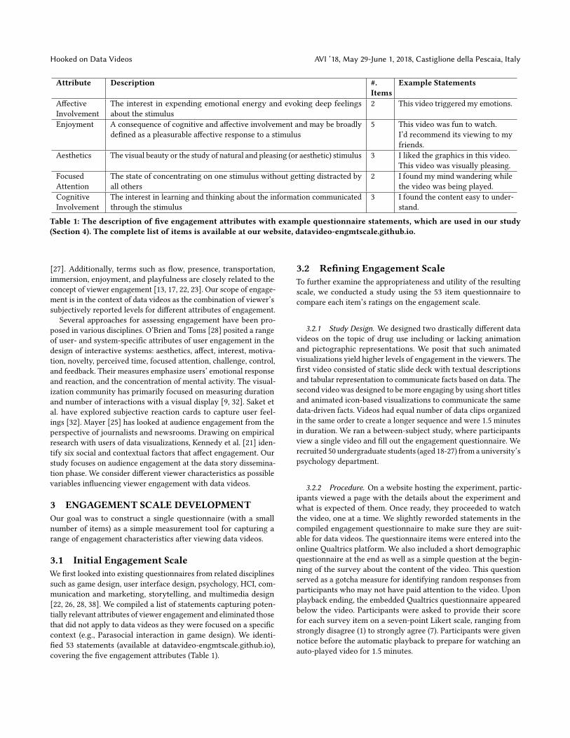
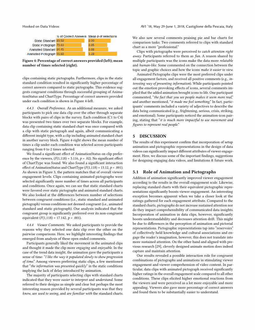
Figure 4: Percentage of correct answers provided (left);meannumber of times selected (right).
clips containing static pictographs. Furthermore, clips in the staticstandard condition resulted in significantly higher percentage ofcorrect answers compared to static pictographs. This evidence sug-gests congruent conditions through successful grouping of Anima-tionStatus and ChartType. Percentage of correct answers providedunder each condition is shown in Figure 4-left.
4.4.3 Overall Preference. As an additional measure, we askedparticipants to pick one data clip over the other through separateblocks with pairs of clips in the survey. Each condition (C1 to C4)was presented two times over two separate blocks. For example,data clip containing static standard chart was once compared witha clip with static pictograph and again, albeit communicating adifferent insight type, with a clip including animated standard chartin another survey block. Figure 4-right shows the mean number oftimes a clip under each condition was selected across participantsranging from 0 to 2 times selected.
We found a significant effect of AnimationStatus on clip prefer-ence by the viewers, (F (1,118) = 5.116, p = .02). No significant effectof ChartType was found. We also found a significant interactioneffect of AnimationStatus and ChartType (F (1,118) = 13.12, p < .001).As shown in Figure 3, the pattern matches that of overall viewerengagement levels. Clips containing animated pictographs wereselected significantly more number of times across all participantsand conditions. Once again, we can see that static standard chartswere favored over static pictographs and animated standard charts.We also looked at the differences between number of selectionsbetween congruent conditions (i.e., static standard and animatedpictograph) versus conditions not deemed congruent (i.e., animatedstandard and static pictograph). Our analysis indicated that thecongruent group is significantly preferred over its non-congruentequivalent (F (1,118) = 17.142, p < .001).
4.4.4 Viewer Comments. We asked participants to provide thereasons why they selected one data clip over the other on thepairwise comparisons. Here, we highlight interesting findings thatemerged from analysis of these open ended comments.
Participants generally liked the movement in the animated clipsand thought it made the clip more engaging and enjoyable. In thecase of the trend data insight, the animation gave the participants asense of time: “I like the way it populated slowly to show progressionof time.” Among viewers preferring static clips, a few mentionedthat “the information was presented quickly” in the static conditionsimplying the lack of delay introduced by animation.
The majority of participants selecting clips with standard chartsindicated that they were easier to interpret and understand. Somereferred to their designs as simple and clear but perhaps the mostinteresting reason provided by several participants was that theyknow, are used to seeing, and are familiar with the standard charts.
We also saw several comments praising pie and bar charts forcomparison tasks. Two comments referred to clips with standardchart as a more “professional.”
Clips with pictographs were perceived to catch attention rightaway. Participants referred to them as fun. A reason shared bymultiple participants was the icons make the data more relatableand human-like. Some commented on the connection between thetopic and graphic choices and how the icons make it easier to view.
Animated Pictographs clips were the most preferred clips underall engagement factors, and received all positive comments (e.g., in-teresting way of presenting information). While participants pointedout the emotion provoking effects of icons, several comments im-plied that the added animation brought icons to life. One participantcommented, “the fact that you see people makes it seem more real,”and another mentioned, “it made me feel something.” In fact, partic-ipants’ comments included a variety of adjectives to describe thedata being communicated (e.g., frightening, serious, crisis, striking,and emotional). Some participants noticed the animation-icon pair-ing, stating that “it is much more impactful to use movement andfigures to represent real people.”
5 DISCUSSIONThe results of this experiment confirm that incorporation of setupanimation and pictographic representations in the design of datavideos can significantly impact different attributes of viewer engage-ment. Here, we discuss some of the important findings, suggestionsfor designing engaging data videos, and limitations & future work.
5.1 Role of Animation and PictographsAddition of animation significantly improved viewer engagementaccording to the results in the overall engagement scale. Likewise,replacing standard charts with their equivalent pictographic repre-sentations significantly boosts viewer engagement. An interestingexception becomes apparent when we take a closer look at theratings gathered for each engagement attribute. Compared to thestandard charts, pictographs do not increase sustained attention nordo they impact comprehensibility of communicated data insights.Incorporation of animation in data clips, however, significantlyboosts understandability and decreases attention drift. This mightbe due to differences in the perception of animation and pictorialrepresentations. Pictographic representations tap into “reservoirs”of collectively held knowledge and cultural associations and en-gage the reader’s imagination, however, this does not translate intomore sustained attention. On the other hand and aligned with pre-vious research [29], cleverly designed animate motion does indeedcapture and maintain attention.
Our results revealed a possible interaction role for congruentcombinations of pictographs and animations in stimulating viewerengagement and viewer comprehension of video content. In par-ticular, data clips with animated pictograph received significantlyhigher ratings in the overall engagement scale compared to all otherconditions. These clips elicited higher emotional reactions fromthe viewers and were perceived as a lot more enjoyable and moreappealing. Viewers also gave more percentage of correct answersand found them to be substantially easier to understand.
AVI ’18, May 29-June 1, 2018, Castiglione della Pescaia, Italy F. Amini et al.
To our surprise, standard chart clips received higher ratings inseveral engagement attributes and significantly higher in cognitiveinvolvement and enjoyment compared to clips in the presenceof one of the two design strategies (i.e., static pictographs andanimated standard charts). A possible explanation based on viewercomments is the ubiquity of static standard charts in data analysisand presentation tools. People find them more professional andsuitable for communicating data-driven insights without any delaysintroduced through the addition of setup animation.
5.2 Design SuggestionsBased on the results of our engagement study, we suggest thefollowing considerations for incorporating setup animation andicon-based visualizations in data videos:
5.2.1 KnowYour Audience. Data videos and animated pictographsare commonly created to appeal to broad audiences. If, however,they are intended for a more specific group of viewers, paying at-tention to their information consumption habits, level of education,sets of skills, and experiences can go a long way. This finding agreeswith prior work on audience research in which contextual, socialand cultural factors have been shown to affect users’ engagementwith data visualizations [21]. For example, if a data video is to beconsumed by online viewers with broad backgrounds, combina-tion of animation and pictographs can be an effective candidatefor engaging more viewers. Whereas, pictographic representationsare less impactful in data videos created and shared within a moreprofessional organization, in which viewers would have more ex-perience with commonly used data analysis and presentation tools.
5.2.2 Leverage Static Standard Charts’ Strength. Despite the factthat we see evidence in positive effects of both animation and pic-tographs on viewer engagement, static standard charts can still en-gage the viewers. Data clips with static standard charts appear to beas engaging or more engaging than their animated or pictographicrepresentations through several of the engagement dimensions.Therefore, by incorporating such standard charts even without theaddition of animation features, designers can take advantage ofviewers’ learned skills in reading and interpreting these charts.
5.2.3 Use Setup Animations with Care. When the informationbeing communicated through data videos requires focused attentionfrom the viewers, we suggest incorporation of setup animation toavoid attention drift. Gradual building of the visualization scene indata clips showed to also help viewers comprehend the informationbetter. On the other hand, beware of the delay introduced as aresult of such animations and avoid their excessive use. Viewersmay potentially perceive them as annoying.
5.2.4 Connect to Viewers with Pictographs. Pictographic repre-sentations are able to provoke viewers’ emotions by bringing data tolife. The addition of animation to pictographs results in a congruentcombination that can significantly boost viewer engagement.
5.3 Limitations and Future WorkIn this study, we targeted elemental video segments or data clipsdesigned to communicate a single data-driven insight. This decisionwas made based on the lesson learned from our pilot study for
the engagement development scale. By focusing on these smallerunits, we sought to avoid potential confounding effects due to thesequencing strategy or narrative structure employed in the datavideos. The drawback associated with this design is that our resultsmay not be generalizable to data videos, in which multiple dataclips are sequenced together. Future studies are needed to furtherexplore the effects of sequencing strategies or narrative structureused in data videos on viewer engagement.
We also acknowledge limitations in our stimuli design. We de-cided to vary the types of data insights communicated throughvideo clips to cover a wide range of data clips. We, however, optednot to control for this factor since counterbalancing the conditionswould explode the number of required data clips. Another limita-tion is the amount of viewer exposure to each stimulus. As we keptthe auto playback of the video clips to 10 seconds, data clips withstatic visualizations had the advantage of longer exposure to allvisualization components, whereas in the animated clips, viewershad to wait for the visualizations to get built. Lastly, we ignoredpotential effects as a result of topic familiarity and preference. Afew comments from the viewers, indicated that they picked a dataclip because they related to the topic more. For example, one par-ticipant picked the clip with data on marijuana and wrote “I smokemarijuana.” Future studies can investigate effects of topic choice bypossibly controlling for this factor based on gathered knowledgeon viewer’s topic familiarity and topic preferences.
Finally, our work is the first step to develop a scale to evaluateviewer engagement in data videos. We have collected initial datato refine the scale and ensure that it provided an efficient anddiscriminating basis for evaluating differences in participants’ viewson data videos with or without setup animations and icon-basevisualizations. The scale has shown to be inherently effective to theextent that it revealed differences in participants’ judgments aboutthe data videos as we reported in the results section. As next steps,we can run studies based on findings from established research onother effective factors impacting viewer engagement and furthervalidate the engagement scale.
6 CONCLUSIONIn this paper, we identified two design techniques commonly incor-porated into data videos to engage viewers: (1) animation to setupand build a data visualization scene and (2) pictographic represen-tations replacing standard charts. Through a crowd-sourced onlinestudy, we explored the effects of these two techniques on viewerengagement and understandability of data-driven clips. We foundthat both animation and pictographic representation can boost un-derstandability of data insights, and significantly impact differentattributes of viewer engagement. While pictographs elicited viewerengagement by triggering more emotions and were significantlymore appealing compared to standard charts, addition of animationto pictographs intensified such effects. Furthermore, animation asa design technique was successful in increasing focused attention,which is key in keeping the viewers engaged throughout the view-ing of data video. We also highlighted results suggesting possibleeffects of viewers’ expertise, education, and online viewing patternsand concluded with discussion and summary of design suggestionsfor designing more engaging data videos.
Hooked on Data Videos AVI ’18, May 29-June 1, 2018, Castiglione della Pescaia, Italy
7 ACKNOWLEDGEMENTThis research was partially funded by Microsoft Research and anNSERC grant awarded to Pourang Irani.
REFERENCES[1] 85 percent of Facebook video is watched without sound [n. d.]. https://digiday.
com/media/silent-world-facebook-video. ([n. d.]).[2] Fereshteh Amini, Nathalie Henry Riche, Bongshin Lee, Christophe Hurter, and
Pourang Irani. 2015. Understanding data videos: Looking at narrative visualiza-tion through the cinematography lens. In Proceedings of the 33rd Annual ACMConference on Human Factors in Computing Systems. ACM, 1459–1468.
[3] Fereshteh Amini, Nathalie Henry Riche, Bongshin Lee, Andres Monroy-Hernandez, and Pourang Irani. 2017. Authoring data-driven videos with dataclips.IEEE transactions on visualization and computer graphics 23, 1 (2017), 501–510.
[4] Animaker, Make Animated Videos on Cloud for free [n. d.]. https://www.animaker.com. ([n. d.]).
[5] Simon Attfield, Gabriella Kazai, Mounia Lalmas, and Benjamin Piwowarski. 2011.Towards a science of user engagement (position paper). InWSDM workshop onuser modelling for Web applications. 9–12.
[6] Scott Bateman, Regan L Mandryk, Carl Gutwin, Aaron Genest, David McDine,and Christopher Brooks. 2010. Useful junk?: the effects of visual embellishmenton comprehension and memorability of charts. In Proceedings of the SIGCHIConference on Human Factors in Computing Systems. ACM, 2573–2582.
[7] Rita Borgo, Alfie Abdul-Rahman, Farhan Mohamed, Philip W Grant, Irene Reppa,Luciano Floridi, and Min Chen. 2012. An empirical study on using visual em-bellishments in visualization. IEEE Transactions on Visualization and ComputerGraphics 18, 12 (2012), 2759–2768.
[8] Michelle A Borkin, Azalea AVo, Zoya Bylinskii, Phillip Isola, Shashank Sunkavalli,Aude Oliva, and Hanspeter Pfister. 2013. What makes a visualization memorable?IEEE Transactions on Visualization and Computer Graphics 19, 12 (2013), 2306–2315.
[9] Jeremy Boy, Francoise Detienne, and Jean-Daniel Fekete. 2015. Storytelling ininformation visualizations: Does it engage users to explore data?. In Proceedingsof the 33rd Annual ACM Conference on Human Factors in Computing Systems.ACM, 1449–1458.
[10] Willard Cope Brinton. 1917. Graphic methods for presenting facts. Engineeringmagazine company.
[11] Fanny Chevalier, Nathalie Henry Riche, Catherine Plaisant, Amira Chalbi, andChristophe Hurter. 2016. Animations 25 Years Later: New Roles and Opportuni-ties. In Proceedings of the International Working Conference on Advanced VisualInterfaces. ACM, 280–287.
[12] Fanny Chevalier, Romain Vuillemot, and Guia Gali. 2013. Using concrete scales:A practical framework for effective visual depiction of complex measures. IEEEtransactions on visualization and computer graphics 19, 12 (2013), 2426–2435.
[13] Yellowlees Douglas and Andrew Hargadon. 2000. The pleasure principle: im-mersion, engagement, flow. In Proceedings of the eleventh ACM on Hypertext andhypermedia. ACM, 153–160.
[14] Drug use: 20 things you might not know [n. d.]. https://www.theguardian.com/society/datablog/video/2012/mar/15/drugs-use-animation-20-facts. ([n. d.]).
[15] T Todd Elvins. 1997. VisFiles: presentation techniques for time-series data. ACMSIGGRAPH Computer Graphics 31, 2 (1997), 14–16.
[16] Danyel Fisher. 2010. Animation for Visualization: Opportunities and Draw-backs. O’Reilly Media. https://www.microsoft.com/en-us/research/publication/animation-for-visualization-opportunities-and-drawbacks/
[17] MC Green, TC Brock, and SD Livingston. 2004. Transportation and enjoyment.Unpublished data (2004).
[18] Steve Haroz, Robert Kosara, and Steven L Franconeri. 2015. Isotype visualization:Workingmemory, performance, and engagement with pictographs. In Proceedingsof the 33rd annual ACM conference on human factors in computing systems. ACM,
1191–1200.[19] Jeffrey Heer and George Robertson. 2007. Animated transitions in statistical data
graphics. IEEE transactions on visualization and computer graphics 13, 6 (2007),1240–1247.
[20] Nigel Holmes. 2000. Pictograms: A view from the drawing board or, what I havelearned from Otto Neurath and Gerd Arntz (and jazz). Information design journal10, 2 (2000), 133–143.
[21] Helen Kennedy, Rosemary Lucy Hill, William Allen, and Andy Kirk. 2016. Engag-ing with (big) data visualizations: Factors that affect engagement and resultingnew definitions of effectiveness. First Monday 21, 11 (2016).
[22] Jane Lessiter, Jonathan Freeman, Edmund Keogh, and Jules Davidoff. 2001. Across-media presence questionnaire: The ITC-Sense of Presence Inventory. Pres-ence: Teleoperators and virtual environments 10, 3 (2001), 282–297.
[23] Andrés Lucero, Jussi Holopainen, Elina Ollila, Riku Suomela, and EvangelosKarapanos. 2013. The playful experiences (PLEX) framework as a guide forexpert evaluation. In Proceedings of the 6th International Conference on DesigningPleasurable Products and Interfaces. ACM, 221–230.
[24] Narges Mahyar, Sung-Hee Kim, and Bum Chul Kwon. 2015. Towards a taxonomyfor evaluating user engagement in information visualization. In Workshop onPersonal Visualization: Exploring Everyday Life, Vol. 3. 2.
[25] Joy Mayer. 2011. A culture of audience engagement in the news industry. Universityof Missouri-Columbia.
[26] Daniel K Mayes and James E Cotton. 2001. Measuring engagement in videogames: A questionnaire. In Proceedings of the human factors and ergonomicssociety annual meeting, Vol. 45. SAGE Publications Sage CA: Los Angeles, CA,692–696.
[27] Heather L O’Brien and Elaine G Toms. 2008. What is user engagement? Aconceptual framework for defining user engagement with technology. Journal ofthe Association for Information Science and Technology 59, 6 (2008), 938–955.
[28] Heather L O’Brien and Elaine G Toms. 2010. The development and evaluation ofa survey to measure user engagement. Journal of the Association for InformationScience and Technology 61, 1 (2010), 50–69.
[29] Jay Pratt, Petre V Radulescu, Ruo Mu Guo, and Richard A Abrams. 2010. ItâĂŹsalive! Animate motion captures visual attention. Psychological Science 21, 11(2010), 1724–1730.
[30] Qualtrics: The Leading Research Experience Software [n. d.]. . ([n. d.]).[31] George Robertson, Roland Fernandez, Danyel Fisher, Bongshin Lee, and John
Stasko. 2008. Effectiveness of animation in trend visualization. IEEE Transactionson Visualization and Computer Graphics 14, 6 (2008).
[32] Bahador Saket, Alex Endert, and John T Stasko. 2016. Beyond Usability andPerformance: A Review of User Experience-focused Evaluations in Visualization..In BELIV. 133–142.
[33] Edward Segel and Jeffrey Heer. 2010. Narrative visualization: Telling storieswith data. IEEE transactions on visualization and computer graphics 16, 6 (2010),1139–1148.
[34] Drew Skau, Lane Harrison, and Robert Kosara. 2015. An evaluation of the impactof visual embellishments in bar charts. In Computer Graphics Forum, Vol. 34.Wiley Online Library, 221–230.
[35] Alistair Sutcliffe. 2009. Designing for user engagement: Aesthetic and attractiveuser interfaces. Synthesis lectures on human-centered informatics 2, 1 (2009), 1–55.
[36] Edward R. Tufte. 1986. The Visual Display of Quantitative Information. GraphicsPress, Cheshire, CT, USA.
[37] Barbara Tversky, Julie BauerMorrison, andMireille Betrancourt. 2002. Animation:can it facilitate? International journal of human-computer studies 57, 4 (2002),247–262.
[38] Judith Lynne Zaichkowsky. 1985. Measuring the involvement construct. Journalof consumer research 12, 3 (1985), 341–352.
[39] Douglas E Zongker and David H Salesin. 2003. On creating animated presen-tations. In Proceedings of the 2003 ACM SIGGRAPH/Eurographics symposium onComputer animation. Eurographics Association, 298–308.