HISTOGRAMS
28
HISTOGRAMS Representing Data
description
HISTOGRAMS. Representing Data. Why use a Histogram. When there is a lot of data When data is Continuous a mass, height, volume, time etc Presented in a Grouped Frequency Distribution Often in groups or classes that are UNEQUAL . NO GAPS between Bars. Histograms look like this. - PowerPoint PPT Presentation
Transcript of HISTOGRAMS

HISTOGRAMSRepresenting Data

Why use a Histogram When there is a lot of data When data is
Continuous a mass, height, volume, time etc
Presented in a Grouped Frequency Distribution Often in groups or classes that are UNEQUAL

Continuous data
NO GAPS between Bars
Histograms look like this......

Bars may be different in width
Determined by Grouped Frequency Distribution
AREA is proportional to FREQUENCY
NOT height, because of UNEQUAL classes!
So we use FREQUENCY DENSITY = Frequency Class width
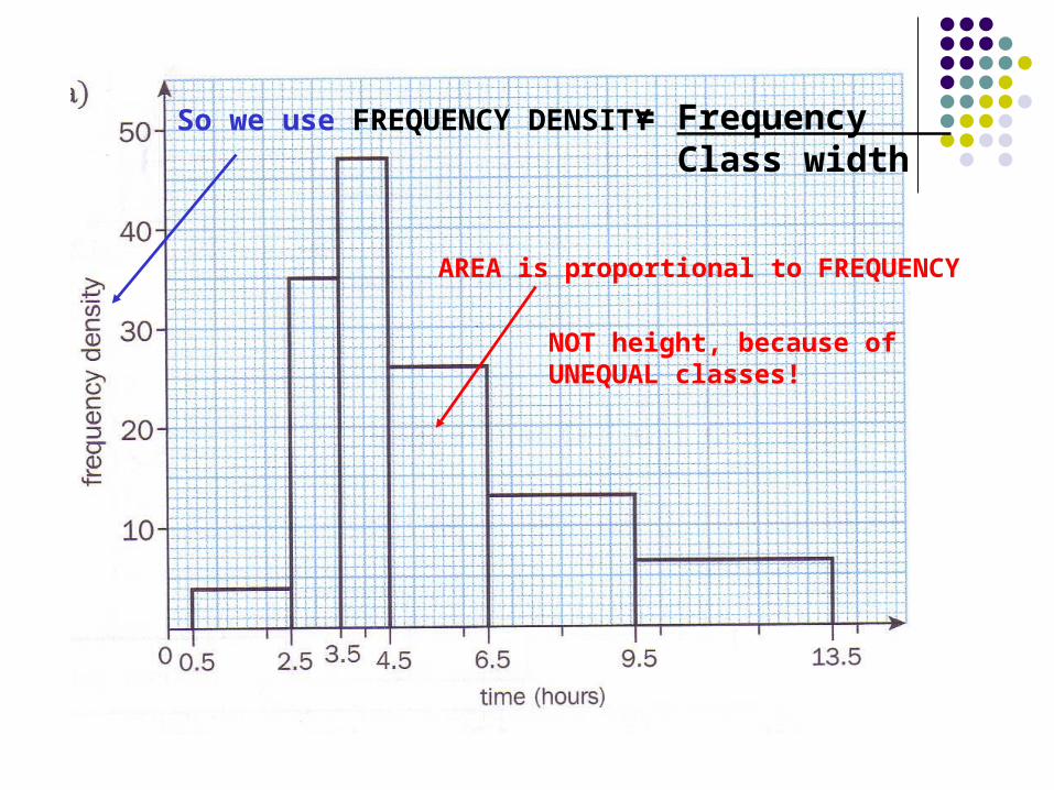
Grouped Frequency Distribution
Speed, km/h
0< v ≤40 40< v ≤50 50< v ≤60 60< v ≤90 90< v ≤110
Frequency 80 15 25 90 30
Classes
These classes are well defined there are no gaps !

Drawing Sensible Scales Bases of rectangles correctly aligned
Plot the Class Boundaries carefully Heights of rectangles needs to be correct
Frequency Density

Speed, kph 0< v ≤40 40< v ≤50 50< v ≤60 60< v ≤90 90< v ≤110
Frequency 80 15 25 90 30
Frequency Density
Class width 40 10 10 30 20
2.0 1.5 2.5 3.0 1.5
Frequency Densities

0 4020 60 80 100 120
3.0
2.0
1.0
Freq
Den
s
Speed (km/h)
Frequency = Width x Height
Frequency = 40 x 2.0 = 80

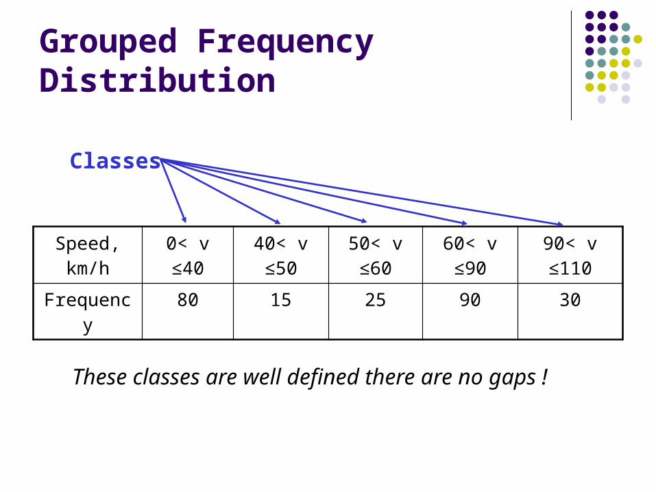
Grouped Frequency Distribution
Time taken (nearest minute)
5-9 10-19 20-29 30-39 40-59
Freq 14 9 18 3 5
Speed, kph 0< v ≤40 40< v ≤50 50< v ≤60 60< v ≤90 90< v ≤110
Frequency 80 15 25 90 30
ClassesNo gaps
GAPS! Need to adjust to Continuous
Ready to graph

Adjusting Classes
Class Widths
Time taken (nearest minute)
5-9 10-19 20-29 30-39 40-59
Freq 14 9 18 3 5
9½4½ 19½ 29½ 39½ 59½
105 10 10 20
Frequency DensityTime taken
(nearest minute) 5-9 10-19 20-29 30-39 40-59
Freq 14 9 18 3 5Class width 5 10 10 10 20
Frequency Density 2.8 0.9 1.8 0.3 0.25
Drawing Sensible Scales Bases correctly aligned
Plot the Class Boundaries Heights correct
Frequency Density
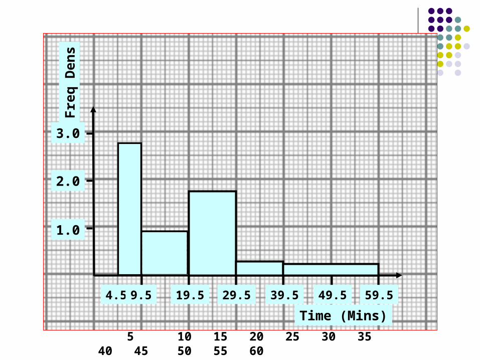
4.5 19.59.5 29.5 39.5 49.5 59.5
3.0
2.0
1.0
Freq
Den
s
Time (Mins) 5 10 15 20 25 30 35 40 45 50 55 60
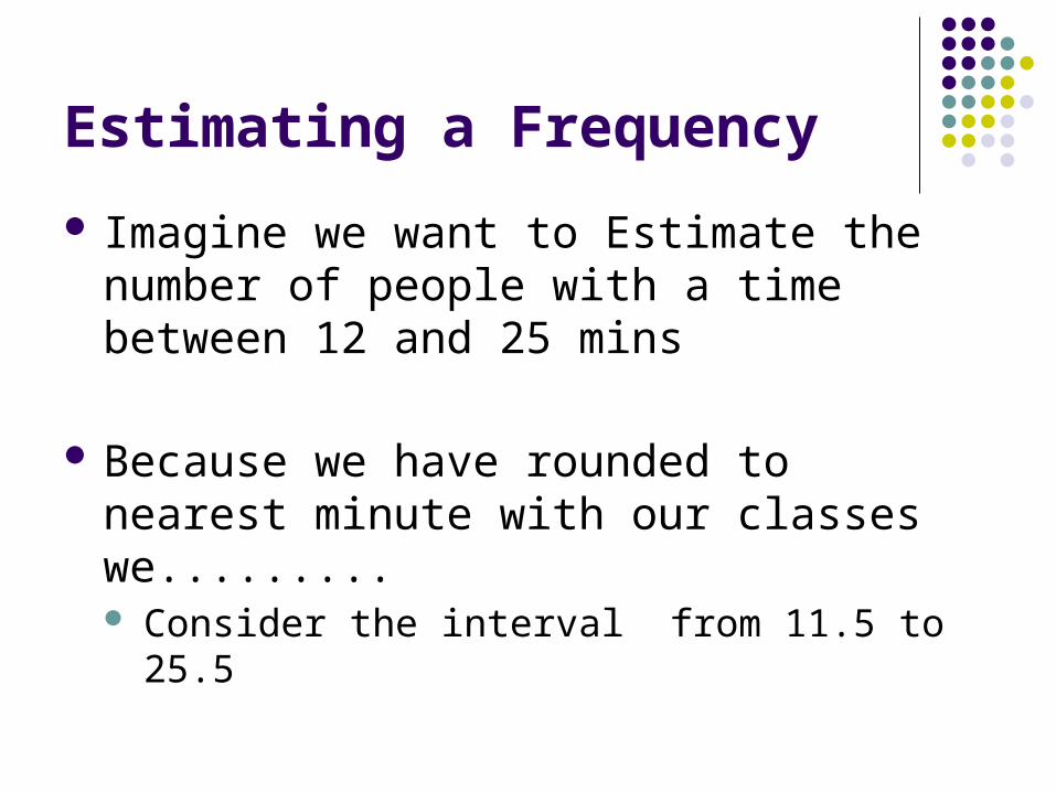
Estimating a Frequency Imagine we want to Estimate the number of
people with a time between 12 and 25 mins
Because we have rounded to nearest minute with our classes we......... Consider the interval from 11.5 to 25.5

4.5 19.59.5 29.5 39.5 49.5 59.5
3.0
2.0
1.0
Freq
Den
s
Time (Mins)
11.5 25.5
Frequency = 0.9 x 8 = 7.2
Frequency = 1.8 x 6 = 10.8
Total Frequency = 18
FD Width
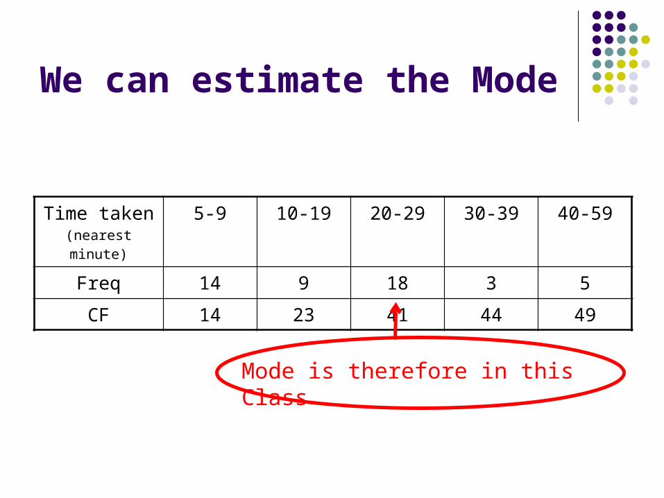
We can estimate the Mode
Time taken (nearest minute)
5-9 10-19 20-29 30-39 40-59
Freq 14 9 18 3 5
CF 14 23 41 44 49
Mode is therefore in this Class
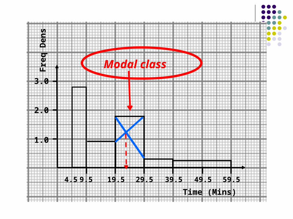
4.5 19.59.5 29.5 39.5 49.5 59.5
3.0
2.0
1.0
Freq
Den
s
Time (Mins)
Modal class

…and the other one?
Simpler to plot No adjustments required – class widths friendly No ½ values
Estimation from the EXACT values given No adjustment required Estimate 15 to 56 would use 15 and 56!
Appear LESS OFTEN in the exam
Speed, kph 0< v ≤40 40< v ≤50 50< v ≤60 60< v ≤90 90< v ≤110
Frequency 80 15 25 90 30
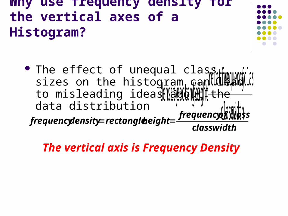
Why use frequency density for the vertical axes of a Histogram?
The effect of unequal class sizes on the histogram can lead to misleading ideas about the data distribution
widthclassclass offrequency relativeheight rectangledensity
widthclassclass offrequency
heightrectangle densityfrequency
The vertical axis is Frequency Density
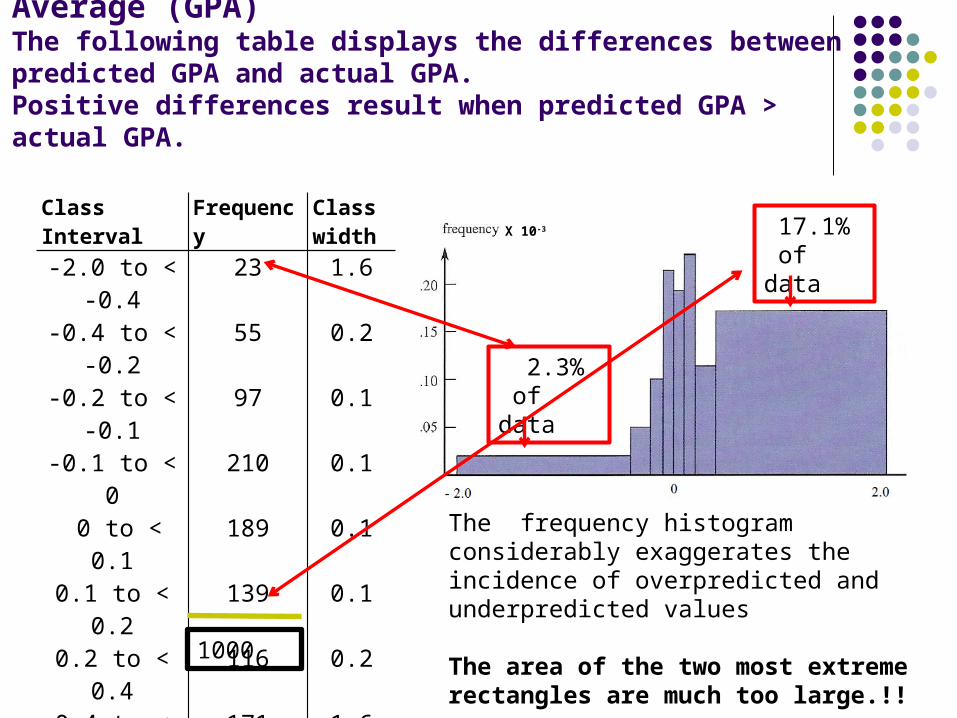
Example: Misprediction of Grade Point Average (GPA)The following table displays the differences between predicted GPA and actual GPA. Positive differences result when predicted GPA > actual GPA.
Class Interval Frequency Class width
-2.0 to < -0.4 23 1.6
-0.4 to < -0.2 55 0.2
-0.2 to < -0.1 97 0.1
-0.1 to < 0 210 0.1
0 to < 0.1 189 0.1
0.1 to < 0.2 139 0.1
0.2 to < 0.4 116 0.2
0.4 to < 2.0 171 1.6
The frequency histogram considerably exaggerates the incidence of overpredicted and underpredicted values
The area of the two most extreme rectangles are much too large.!!
X 10-3
1000
2.3% of data
17.1% of data
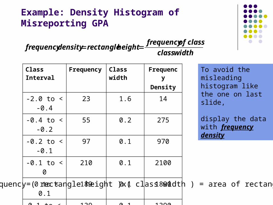
Example: Density Histogram of Misreporting GPA
Class Interval Frequency Class width FrequencyDensity
-2.0 to < -0.4 23 1.6 14
-0.4 to < -0.2 55 0.2 275-0.2 to < -0.1 97 0.1 970
-0.1 to < 0 210 0.1 2100
0 to < 0.1 189 0.1 1890
0.1 to < 0.2 139 0.1 1390
0.2 to < 0.4 116 0.2 580
0.4 to < 2.0 171 1.6 107
widthclassclass offrequency
heightrectangle densityfrequency
Frequency=( rectangle height )x( class width ) = area of rectangle
To avoid the misleading histogram like the one on last slide,
display the data with frequency density
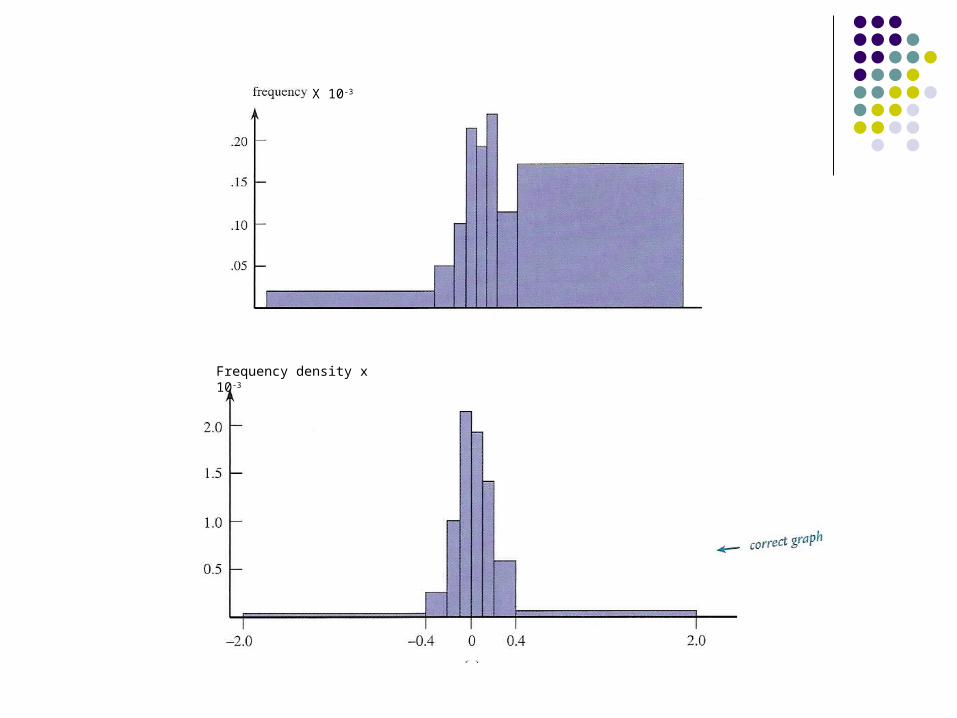
X 10-3
Frequency density x 10-3

Chap 2-24
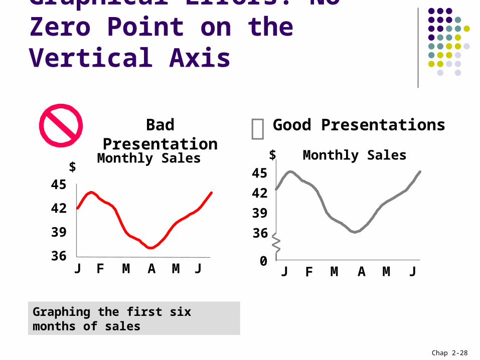
Principles of Excellent Graphs The graph should not distort the data. The graph should not contain unnecessary things
(sometimes referred to as chart junk). The scale on the vertical axis should begin at zero. All axes should be properly labelled. The graph should contain a title. The simplest possible graph should be used for a
given set of data.
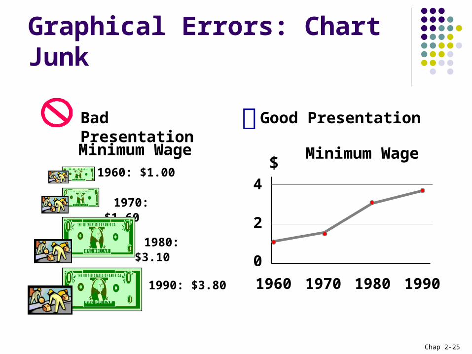
Chap 2-25
Graphical Errors: Chart Junk
1960: $1.00
1970: $1.60
1980: $3.10
1990: $3.80
Minimum Wage
Bad Presentation
Minimum Wage
0
2
4
1960 1970 1980 1990
$
Good Presentation

Chap 2-26
Graphical Errors: No Relative Basis
A’s received by students.
A’s received by students.
Bad Presentation
0
200
300
FD UG GR SR
Freq.
10%
30%
FD UG GR SR
FD = Foundation, UG = UG Dip, GR = Grad Dip, SR = Senior
100
20%
0%
%
Good Presentation

Chap 2-27
Graphical Errors: Compressing the Vertical Axis
Good PresentationQuarterly Sales Quarterly Sales
Bad Presentation
0
25
50
Q1 Q2 Q3 Q4
$
0
100
200
Q1 Q2 Q3 Q4
$
Chap 2-28
Graphical Errors: No Zero Point on the Vertical Axis
Monthly Sales
36
39
42
45
J F M A M J
$
Graphing the first six months of sales
Monthly Sales
0
394245
J F M A M J
$
36
Good PresentationsBad Presentation