
Heuristic Evaluation Nielsen and others. Overview Introduction –Evaluation Plans, Acceptance...
48
Heuristic Evaluation Nielsen and others
-
Upload
annabella-conley -
Category
Documents
-
view
235 -
download
6
Transcript of Heuristic Evaluation Nielsen and others. Overview Introduction –Evaluation Plans, Acceptance...

Heuristic Evaluation
Nielsen and others
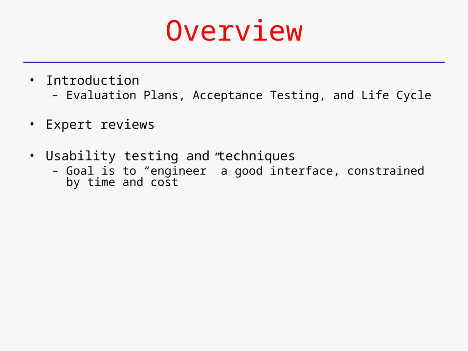
Overview
• Introduction– Evaluation Plans, Acceptance Testing, and Life Cycle
• Expert reviews
• Usability testing and techniques– Goal is to “engineer” a good interface, constrained by time and cost
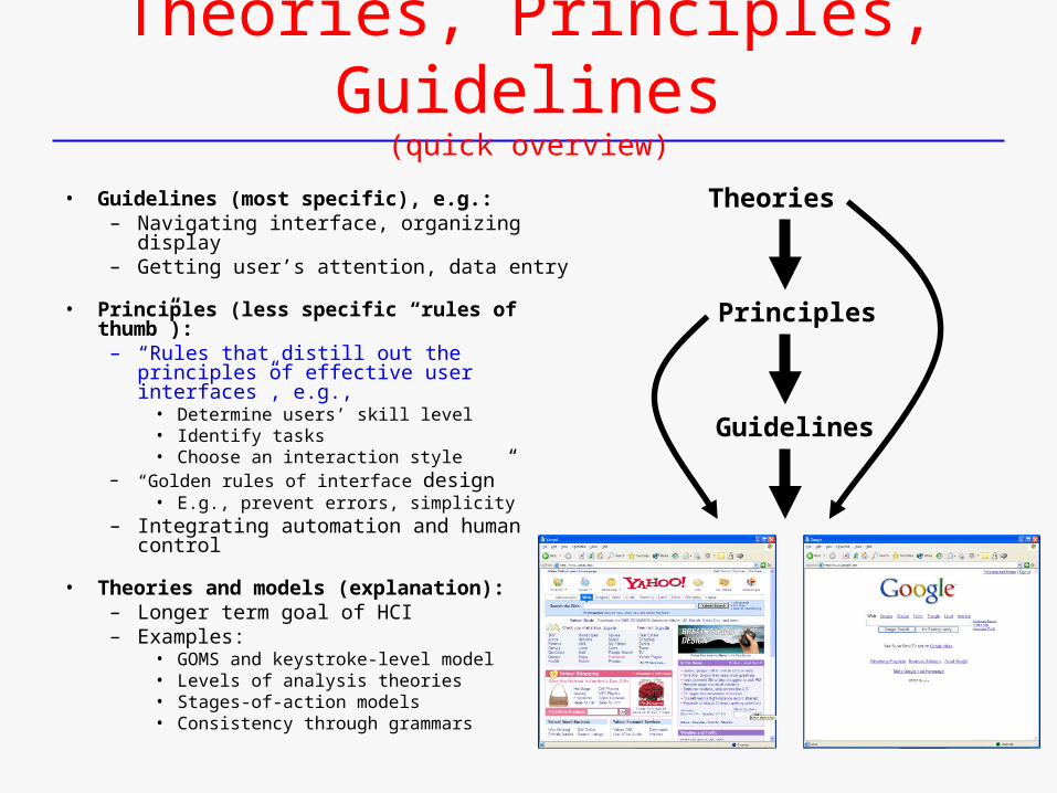
Theories, Principles, Guidelines(quick overview)
• Guidelines (most specific), e.g.:– Navigating interface, organizing display– Getting user’s attention, data entry
• Principles (less specific “rules of thumb”):– “Rules that distill out the principles of
effective user interfaces”, e.g.,• Determine users’ skill level• Identify tasks• Choose an interaction style
– “Golden rules of interface design”• E.g., prevent errors, simplicity
– Integrating automation and human control
• Theories and models (explanation):– Longer term goal of HCI– Examples:
• GOMS and keystroke-level model• Levels of analysis theories• Stages-of-action models• Consistency through grammars
Theories
Guidelines
Principles
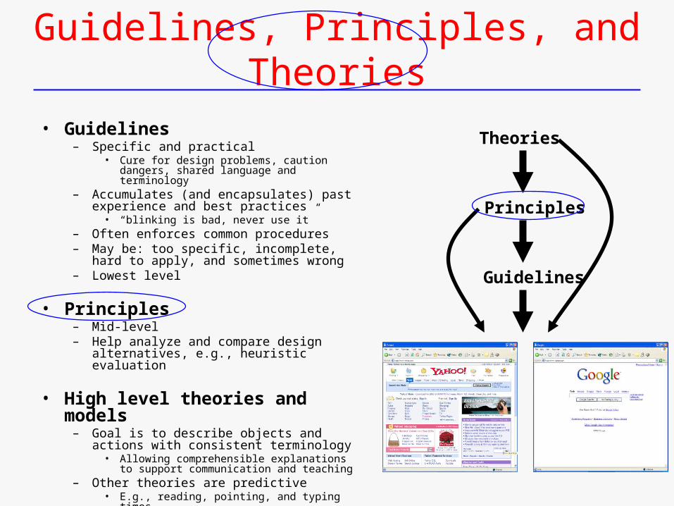
Guidelines, Principles, and Theories
• Guidelines– Specific and practical
• Cure for design problems, caution dangers, shared language and terminology
– Accumulates (and encapsulates) past experience and best practices
• “blinking is bad, never use it”– Often enforces common procedures– May be: too specific, incomplete, hard to
apply, and sometimes wrong– Lowest level
• Principles– Mid-level– Help analyze and compare design
alternatives, e.g., heuristic evaluation
• High level theories and models– Goal is to describe objects and actions with
consistent terminology• Allowing comprehensible explanations to
support communication and teaching– Other theories are predictive
• E.g., reading, pointing, and typing times
Theories
Guidelines
Principles
Principles – Overview, 1
• Term “principles” somewhat arbitrarily chosen …
• Use term “guidelines”, as in “platform specific guidelines”
• Use term “principles”, as in “ higher-level usability principles”– Or, “usability guidelines or heuristics”– More fundamental, widely applicable, and enduring than guidelines
• Help designers choose design alternatives
• Help evaluators find problems in interfaces– “heuristic evaluation”
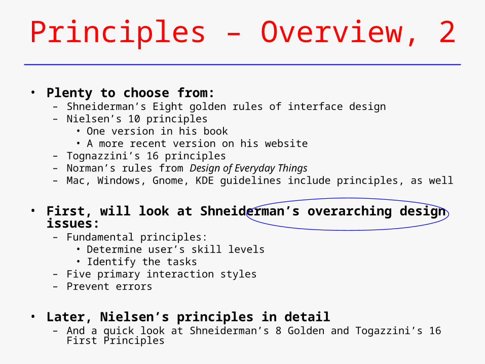
Principles – Overview, 2
• Plenty to choose from:– Shneiderman’s Eight golden rules of interface design– Nielsen’s 10 principles
• One version in his book• A more recent version on his website
– Tognazzini’s 16 principles– Norman’s rules from Design of Everyday Things– Mac, Windows, Gnome, KDE guidelines include principles, as well
• First, will look at Shneiderman’s overarching design issues:– Fundamental principles:
• Determine user’s skill levels• Identify the tasks
– Five primary interaction styles– Prevent errors
• Later, Nielsen’s principles in detail– And a quick look at Shneiderman’s 8 Golden and Togazzini’s 16 First Principles
Evaluation
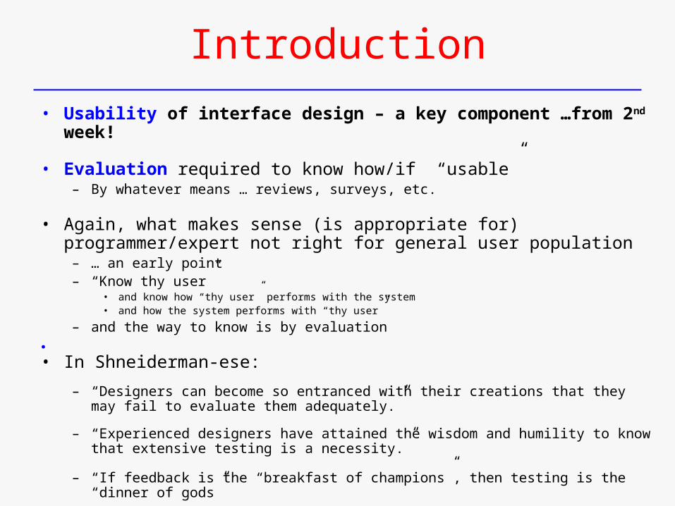
Introduction
• Usability of interface design – a key component …from 2nd week!
• Evaluation required to know how/if “usable”– By whatever means … reviews, surveys, etc.
• Again, what makes sense (is appropriate for) programmer/expert not right for general user population
– … an early point – “Know thy user”
• and know how “thy user” performs with the system• and how the system performs with “thy user”
– and the way to know is by evaluation
• In Shneiderman-ese:
– “Designers can become so entranced with their creations that they may fail to evaluate them adequately.”
– “Experienced designers have attained the wisdom and humility to know that extensive testing is a necessity.”
– “If feedback is the “breakfast of champions”, then testing is the “dinner of gods”
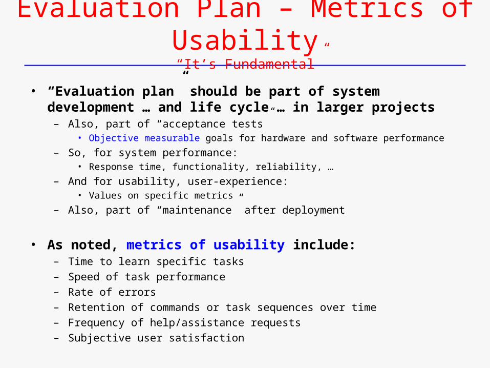
Evaluation Plan – Metrics of Usability “It’s Fundamental”
• “Evaluation plan” should be part of system development … and life cycle … in larger projects
– Also, part of “acceptance tests”• Objective measurable goals for hardware and software performance
– So, for system performance:• Response time, functionality, reliability, …
– And for usability, user-experience:• Values on specific metrics
– Also, part of “maintenance” after deployment
• As noted, metrics of usability include:– Time to learn specific tasks– Speed of task performance– Rate of errors– Retention of commands or task sequences over time– Frequency of help/assistance requests– Subjective user satisfaction
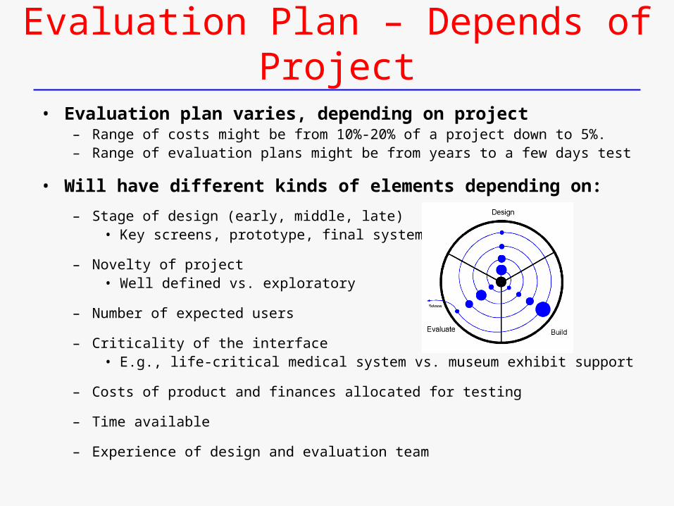
Evaluation Plan – Depends of Project
• Evaluation plan varies, depending on project– Range of costs might be from 10%-20% of a project down to 5%.– Range of evaluation plans might be from years to a few days test
• Will have different kinds of elements depending on:
– Stage of design (early, middle, late) • Key screens, prototype, final system
– Novelty of project • Well defined vs. exploratory
– Number of expected users
– Criticality of the interface • E.g., life-critical medical system vs. museum exhibit support
– Costs of product and finances allocated for testing
– Time available
– Experience of design and evaluation team

But, Testing is not a Panacea, so …
• Nonetheless, testing can’t eliminate all problems
• In essence, plan for remaining problems/challenges• As part of evaluation plan!
• Cost of eliminating error (or enhancing performance) does not increase linearly
• I.e., the obvious things are easy, the hard require more resources to refine
• Design/cost decision made about what amount of costs to allocate
• Still, some things extremely hard to test
• E.g., user performance under stress
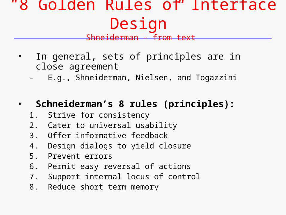
“8 Golden Rules of Interface Design”Shneiderman – from text
• In general, sets of principles are in close agreement– E.g., Shneiderman, Nielsen, and Togazzini
• Schneiderman’s 8 rules (principles):1. Strive for consistency2. Cater to universal usability3. Offer informative feedback4. Design dialogs to yield closure5. Prevent errors6. Permit easy reversal of actions7. Support internal locus of control8. Reduce short term memory
Jakob Nielsen(and his guidelines – or principles)
Jakob Nielsen(and his guidelines – or principles)
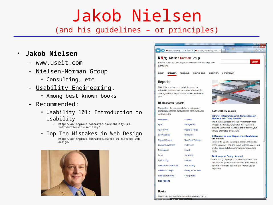
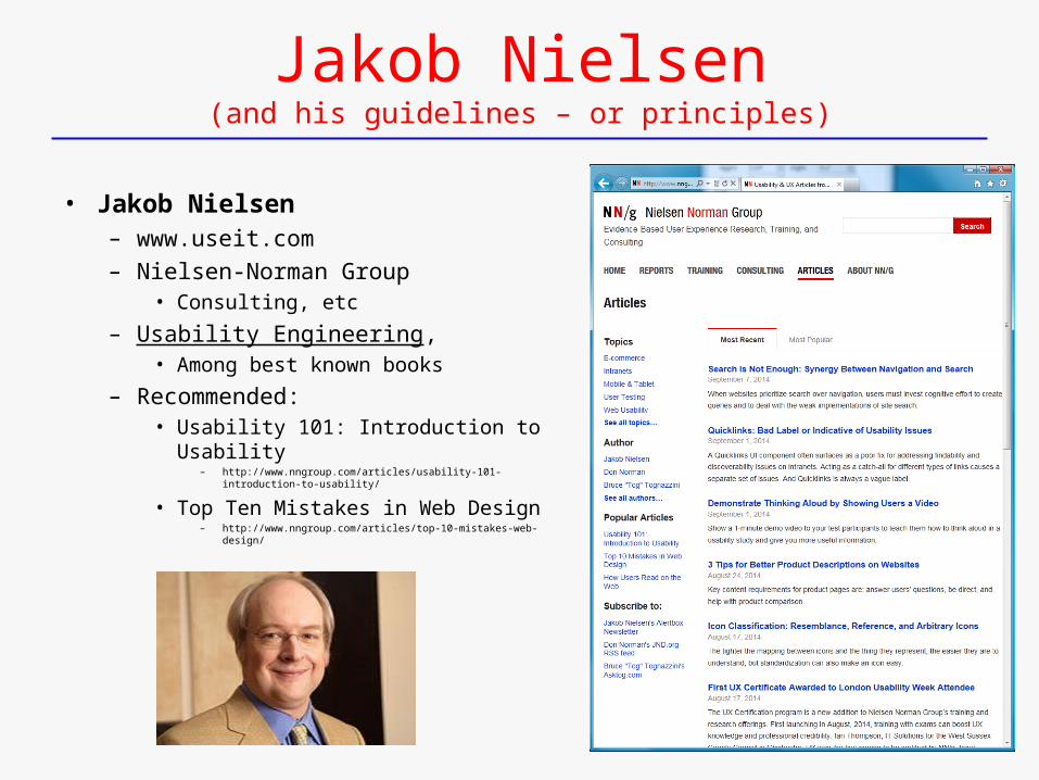
• Jakob Nielsen– www.useit.com
– Nielsen-Norman Group• Consulting, etc
– Usability Engineering, • Among best known books
– Recommended:• Usability 101: Introduction to Usability
– http://www.nngroup.com/articles/usability-101-introduction-to-usability/
• Top Ten Mistakes in Web Design– http://www.nngroup.com/articles/top-10-mistakes-web-design/
Jakob Nielsen(and his guidelines – or principles)
• Jakob Nielsen– www.useit.com
– Nielsen-Norman Group• Consulting, etc
– Usability Engineering, • Among best known books
– Recommended:• Usability 101: Introduction to Usability
– http://www.nngroup.com/articles/usability-101-introduction-to-usability/
• Top Ten Mistakes in Web Design– http://www.nngroup.com/articles/top-10-mistakes-web-design/
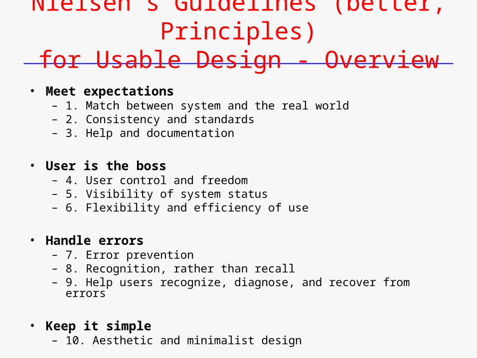
Nielsen’s Guidelines (better, Principles)for Usable Design - Overview
• Meet expectations– 1. Match between system and the real world– 2. Consistency and standards– 3. Help and documentation
• User is the boss– 4. User control and freedom– 5. Visibility of system status– 6. Flexibility and efficiency of use
• Handle errors– 7. Error prevention– 8. Recognition, rather than recall– 9. Help users recognize, diagnose, and recover from errors
• Keep it simple– 10. Aesthetic and minimalist design
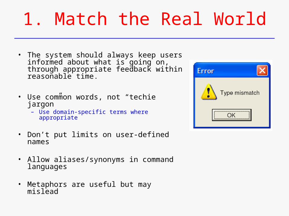
1. Match the Real World
• The system should always keep users informed about what is going on, through appropriate feedback within reasonable time.
• Use common words, not “techie jargon”– Use domain-specific terms where appropriate
• Don’t put limits on user-defined names
• Allow aliases/synonyms in command languages
• Metaphors are useful but may mislead
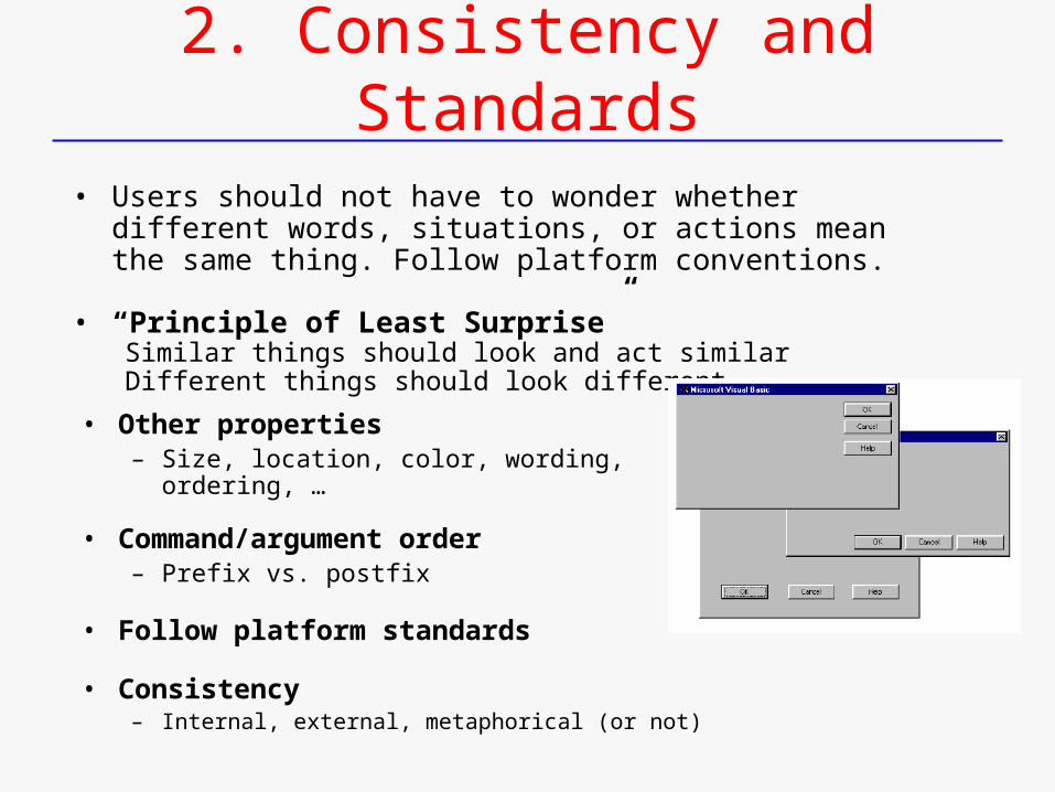
2. Consistency and Standards
• Other properties– Size, location, color, wording, ordering, …
• Command/argument order– Prefix vs. postfix
• Follow platform standards
• Consistency– Internal, external, metaphorical (or not)
• Users should not have to wonder whether different words, situations, or actions mean the same thing. Follow platform conventions.
• “Principle of Least Surprise”Similar things should look and act similarDifferent things should look different
3. Help and Documentation
• Even though it is better if the system can be used without documentation, it may be necessary to provide help and documentation.
– Any such information should be easy to search, focused on the user's task, list concrete steps to be carried out, and not be too large.
• Users don’t read manuals– Prefer to spend time working toward task goals, not learning about system
• But manuals and online help are vital– Usually when user is frustrated or in crisis
• Help should be:– Searchable– Context-sensitive– Task-oriented– Concrete– Short
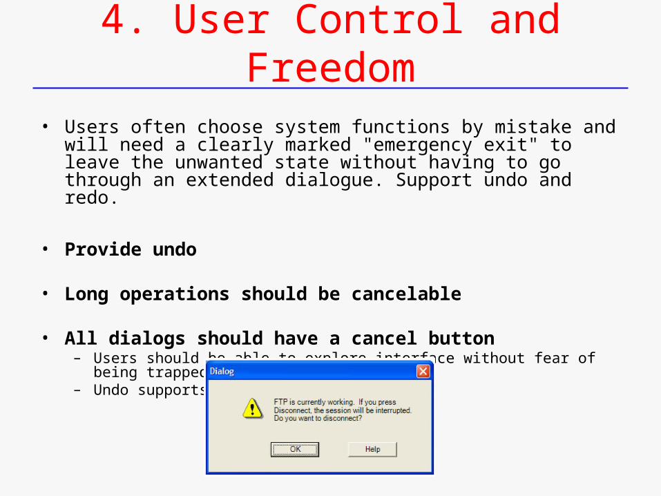
4. User Control and Freedom
• Users often choose system functions by mistake and will need a clearly marked "emergency exit" to leave the unwanted state without having to go through an extended dialogue. Support undo and redo.
• Provide undo
• Long operations should be cancelable
• All dialogs should have a cancel button– Users should be able to explore interface without fear of being trapped in a corner– Undo supports exploration
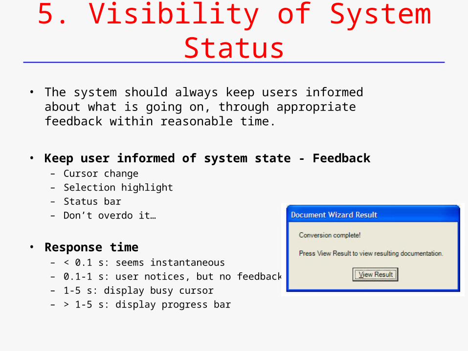
5. Visibility of System Status
• The system should always keep users informed about what is going on, through appropriate feedback within reasonable time.
• Keep user informed of system state - Feedback– Cursor change– Selection highlight– Status bar– Don’t overdo it…
• Response time– < 0.1 s: seems instantaneous– 0.1-1 s: user notices, but no feedback needed– 1-5 s: display busy cursor– > 1-5 s: display progress bar
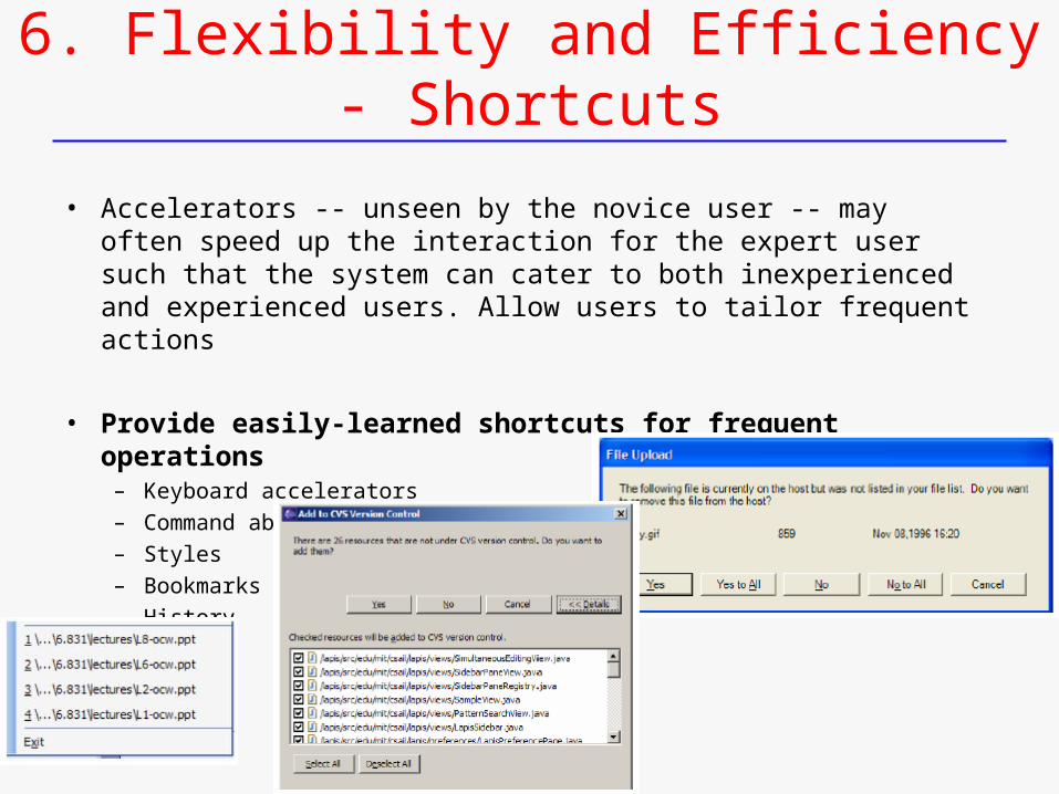
6. Flexibility and Efficiency - Shortcuts
• Accelerators -- unseen by the novice user -- may often speed up the interaction for the expert user such that the system can cater to both inexperienced and experienced users. Allow users to tailor frequent actions
• Provide easily-learned shortcuts for frequent operations– Keyboard accelerators– Command abbreviations– Styles– Bookmarks– History
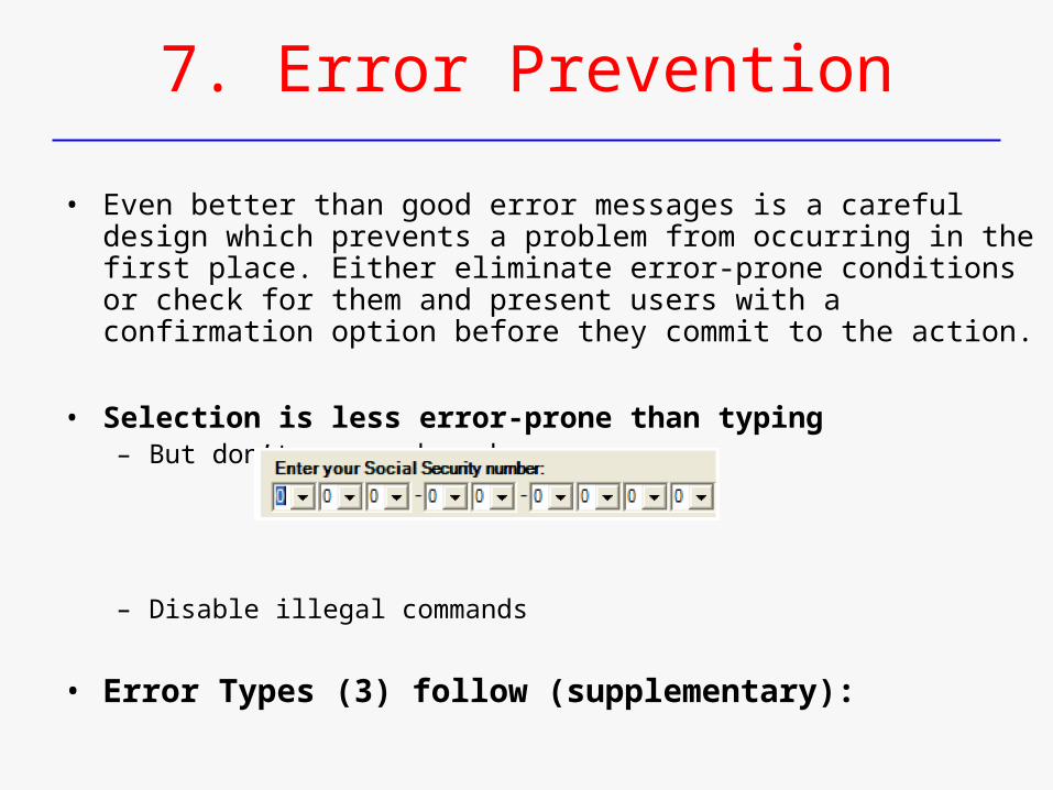
7. Error Prevention
• Even better than good error messages is a careful design which prevents a problem from occurring in the first place. Either eliminate error-prone conditions or check for them and present users with a confirmation option before they commit to the action.
• Selection is less error-prone than typing– But don’t go overboard…
– Disable illegal commands
• Error Types (3) follow (supplementary):
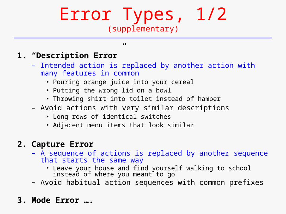
Error Types, 1/2(supplementary)
1. “Description Error”– Intended action is replaced by another action with many features in
common• Pouring orange juice into your cereal• Putting the wrong lid on a bowl• Throwing shirt into toilet instead of hamper
– Avoid actions with very similar descriptions• Long rows of identical switches• Adjacent menu items that look similar
2. Capture Error– A sequence of actions is replaced by another sequence that starts the
same way• Leave your house and find yourself walking to school instead of where you
meant to go– Avoid habitual action sequences with common prefixes
3. Mode Error ….
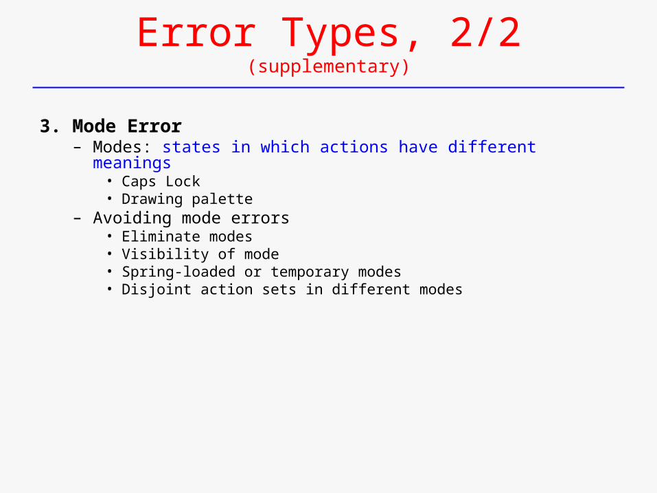
Error Types, 2/2(supplementary)
3. Mode Error– Modes: states in which actions have different meanings
• Caps Lock• Drawing palette
– Avoiding mode errors• Eliminate modes• Visibility of mode• Spring-loaded or temporary modes• Disjoint action sets in different modes
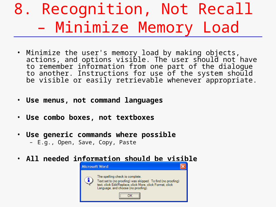
8. Recognition, Not Recall – Minimize Memory Load
• Minimize the user's memory load by making objects, actions, and options visible. The user should not have to remember information from one part of the dialogue to another. Instructions for use of the system should be visible or easily retrievable whenever appropriate.
• Use menus, not command languages
• Use combo boxes, not textboxes
• Use generic commands where possible – E.g., Open, Save, Copy, Paste
• All needed information should be visible
9. Help users recognize, diagnose, and recover from errors
• Error messages should be expressed in plain language (no codes), precisely indicate the problem, and constructively suggest a solution.
• Be precise - restate user’s input– Not “Cannot open file”, but “Cannot open file named paper.doc”
• Give constructive help– why error occurred and how to fix it
• Message should be polite and nonblaming– Not “fatal error”, not “illegal”
• Hide technical details until requested– E.g., “address referenced …”
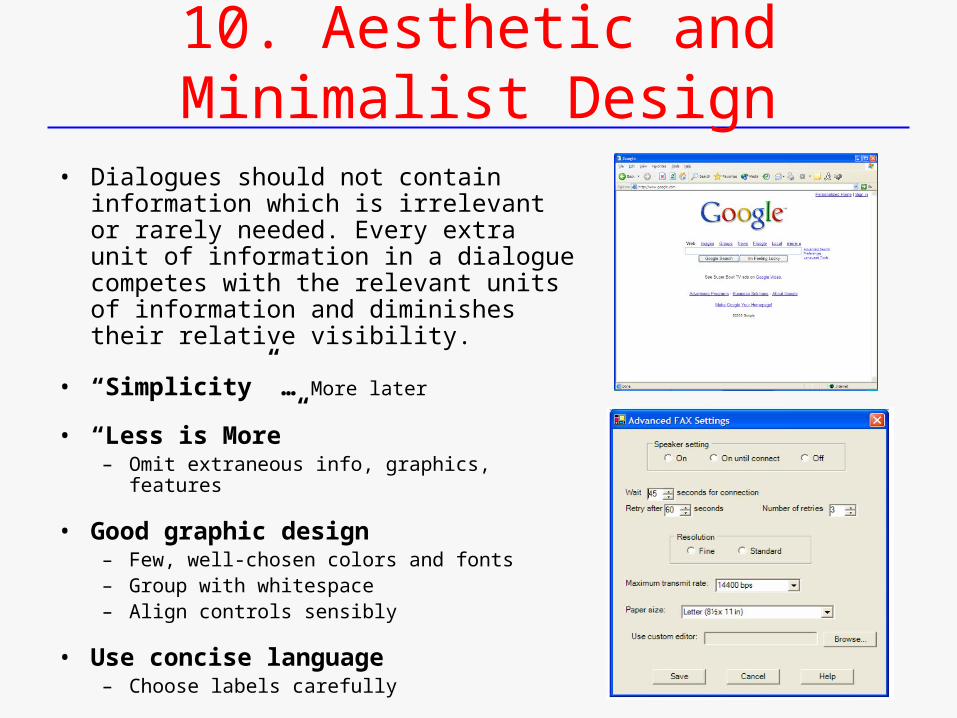
10. Aesthetic and Minimalist Design
• Dialogues should not contain information which is irrelevant or rarely needed. Every extra unit of information in a dialogue competes with the relevant units of information and diminishes their relative visibility.
• “Simplicity” … More later
• “Less is More”– Omit extraneous info, graphics, features
• Good graphic design– Few, well-chosen colors and fonts– Group with whitespace– Align controls sensibly
• Use concise language– Choose labels carefully
Again,
“8 Golden Rules of Interface Design”Shneiderman
• In general, sets of principles are in close agreement– E.g., Shneiderman, Nielsen, and Togazzini
• Schneiderman’s 8 rules (principles):1. Strive for consistency2. Cater to universal usability3. Offer informative feedback4. Design dialogs to yield closure5. Prevent errors6. Permit easy reversal of actions7. Support internal locus of control8. Reduce short term memory
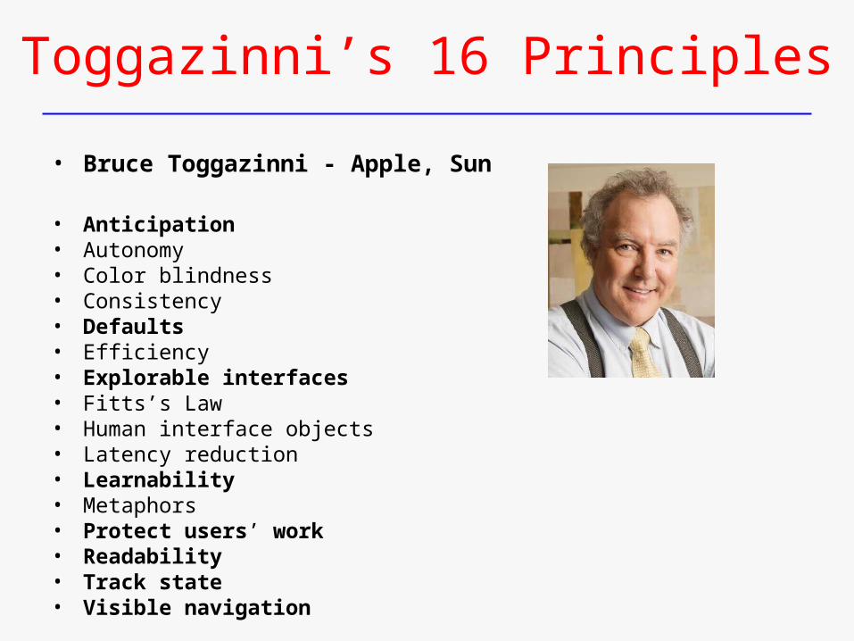
Toggazinni’s 16 Principles
• Bruce Toggazinni - Apple, Sun
• Anticipation• Autonomy• Color blindness• Consistency• Defaults• Efficiency• Explorable interfaces• Fitts’s Law• Human interface objects• Latency reduction• Learnability• Metaphors• Protect users’ work• Readability• Track state• Visible navigation
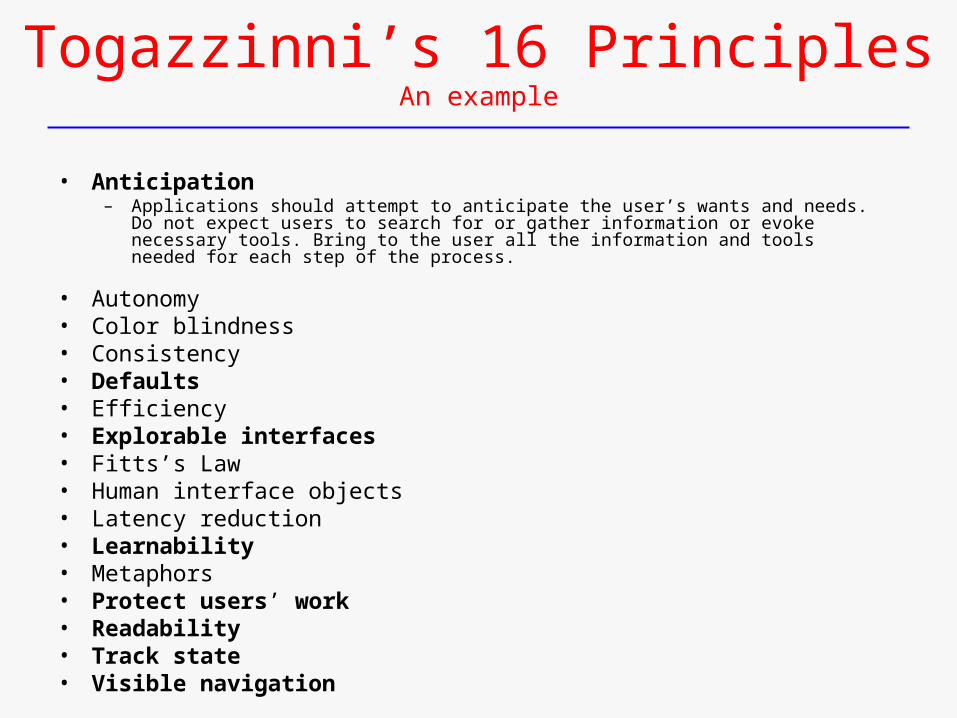
Togazzinni’s 16 PrinciplesAn example
• Anticipation– Applications should attempt to anticipate the user’s wants and needs. Do not expect
users to search for or gather information or evoke necessary tools. Bring to the user all the information and tools needed for each step of the process.
• Autonomy• Color blindness• Consistency• Defaults• Efficiency• Explorable interfaces• Fitts’s Law• Human interface objects• Latency reduction• Learnability• Metaphors• Protect users’ work• Readability• Track state• Visible navigation
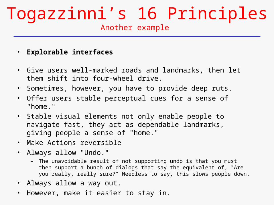
Togazzinni’s 16 PrinciplesAnother example
• Explorable interfaces
• Give users well-marked roads and landmarks, then let them shift into four-wheel drive.
• Sometimes, however, you have to provide deep ruts.
• Offer users stable perceptual cues for a sense of "home."
• Stable visual elements not only enable people to navigate fast, they act as dependable landmarks, giving people a sense of "home."
• Make Actions reversible
• Always allow "Undo." – The unavoidable result of not supporting undo is that you must then support a bunch of
dialogs that say the equivalent of, "Are you really, really sure?" Needless to say, this slows people down.
• Always allow a way out.
• However, make it easier to stay in.
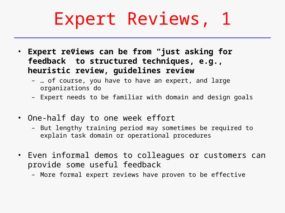
Expert Reviews, 1
• Expert reviews can be from “just asking for feedback” to structured techniques, e.g., heuristic review, guidelines review
– … of course, you have to have an expert, and large organizations do– Expert needs to be familiar with domain and design goals
• One-half day to one week effort– But lengthy training period may sometimes be required to explain task domain or
operational procedures
• Even informal demos to colleagues or customers can provide some useful feedback
– More formal expert reviews have proven to be effective
Expert Reviews, 2
• Can be scheduled at several points in development process – When experts are available– When design team is ready for feedback
• Different experts tend to find different problems in an interface– 3-5 expert reviewers can be highly productive, as can complementary usability
testing
• Caveats:– Experts may not have an adequate understanding of task domain or user
communities– Conflicting advice– Even experienced expert reviewers have great difficulty knowing how typical
users, especially first-time users will really behave
Expert Review Techniques
• Heuristic evaluation– General review for adherence of interface to principles of successful design, e.g., Nielsen
• E.g., “error messages should be informative”, “feedback provided”
– Adherence to some theory or model, e.g., object-action model
• Guidelines review– Check for conformance with guidelines– Given complexity of guidelines, can be significant effort
• Consistency inspection – E.g., of interface terminology, fonts, color schemes, input/output format
• Formal usability inspection/review – as part of SE process– Structure forum for critiqueing (if not courtroom style …)– Might be occasion to request exception for guideline deviation
• Bird’s-eye view of interface – By, e.g., full set of printed screens on wall– Inconsistencies, organization, etc. more evident
• Cognitive walkthrough …
Heuristic EvaluationRecall, Nielsen’s Heuristics
• Meet expectations – 1. Match the real world– 2. Consistency & standards – 3. Help & documentation
• User is boss – 4. User control & freedom – 5. Visibility of system status – 6. Flexibility & efficiency
• Errors – 7. Error prevention – 8. Recognition, not recall– 9. Error reporting, diagnosis, and recovery
• Keep it simple – 10. Aesthetic & minimalistic design
Heuristic Evaluationcf. Nielsen, useit.com article
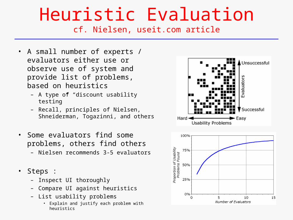
• A small number of experts / evaluators either use or observe use of system and provide list of problems, based on heuristics
– A type of “discount usability testing”– Recall, principles of Nielsen,
Shneiderman, Togazinni, and others
• Some evaluators find some problems, others find others
– Nielsen recommends 3-5 evaluators
• Steps :– Inspect UI thoroughly– Compare UI against heuristics – List usability problems
• Explain and justify each problem with heuristics
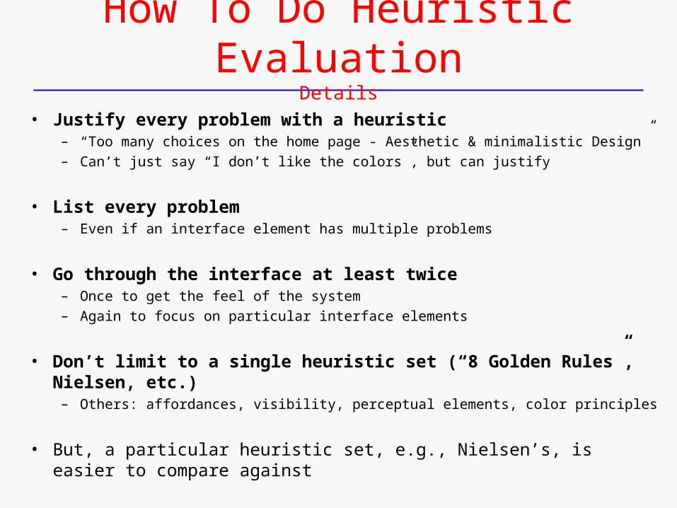
How To Do Heuristic EvaluationDetails
• Justify every problem with a heuristic– “Too many choices on the home page - Aesthetic & minimalistic Design”– Can’t just say “I don’t like the colors”, but can justify
• List every problem – Even if an interface element has multiple problems
• Go through the interface at least twice – Once to get the feel of the system – Again to focus on particular interface elements
• Don’t limit to a single heuristic set (“8 Golden Rules”, Nielsen, etc.) – Others: affordances, visibility, perceptual elements, color principles
• But, a particular heuristic set, e.g., Nielsen’s, is easier to compare against
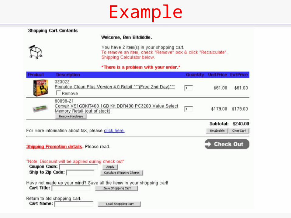
Example
• .
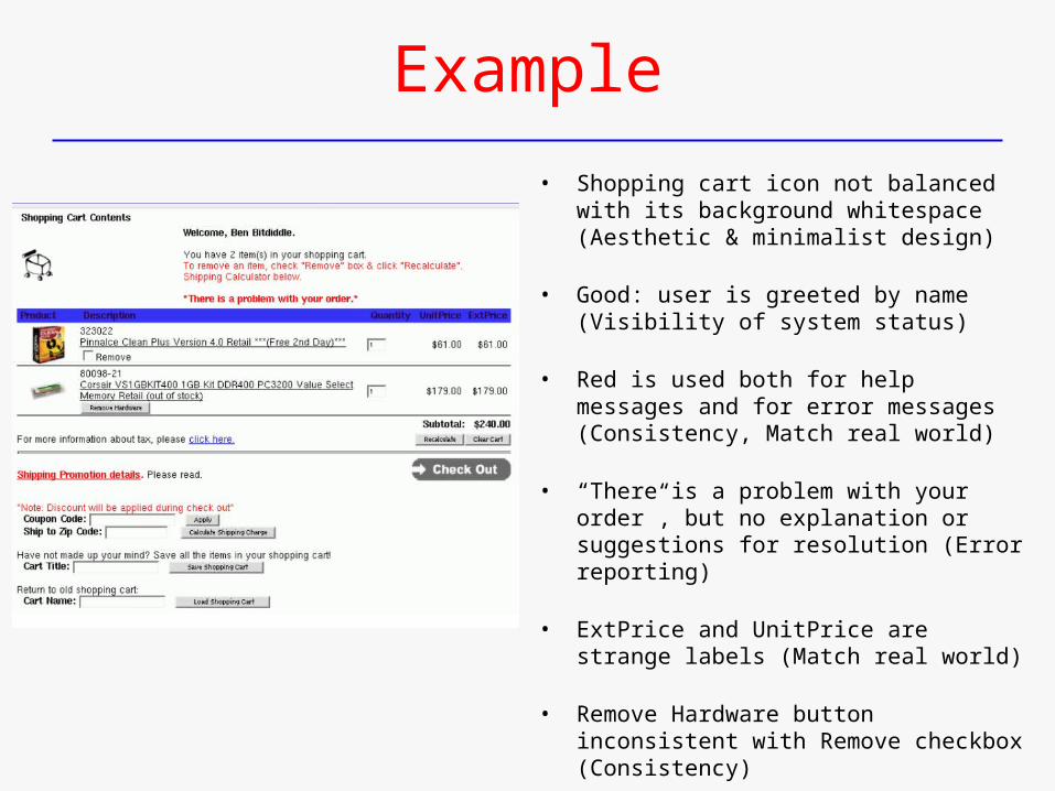
Example
• Shopping cart icon not balanced with its background whitespace (Aesthetic & minimalist design)
• Good: user is greeted by name (Visibility of system status)
• Red is used both for help messages and for error messages (Consistency, Match real world)
• “There is a problem with your order”, but no explanation or suggestions for resolution (Error reporting)
• ExtPrice and UnitPrice are strange labels (Match real world)
• Remove Hardware button inconsistent with Remove checkbox (Consistency)
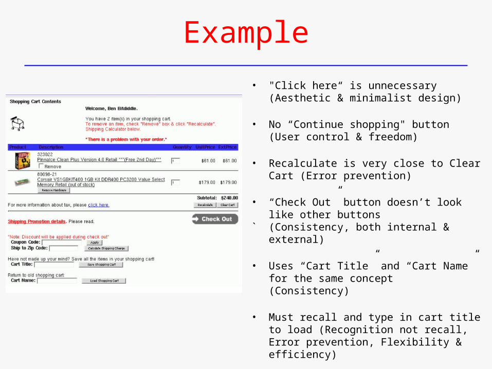
Example
• "Click here“ is unnecessary (Aesthetic & minimalist design)
• No “Continue shopping" button (User control & freedom)
• Recalculate is very close to Clear Cart (Error prevention)
• “Check Out” button doesn’t look like other buttons
` (Consistency, both internal & external)
• Uses “Cart Title” and “Cart Name” for the same concept (Consistency)
• Must recall and type in cart title to load (Recognition not recall, Error prevention, Flexibility & efficiency)
Heuristic Evaluation is Not User Testing
• Evaluators not the user either – Maybe closer to being a typical user than the coder/developer is, though
• Analogy: code inspection vs. testing
• Heuristic evaluation finds problems that user testing often misses– E.g., inconsistent fonts
• But user testing is the “gold standard” for usability
Hints for Better Heuristic Evaluation
• Use multiple evaluators – Different evaluators find different problems– The more the better, but diminishing returns– Nielsen recommends 3-5 evaluators
• Alternate heuristic evaluation with user testing– Each method finds different problems– Heuristic evaluation is cheaper
• Use “observer” with evaluator– Adds cost, but cheap enough anyway– Take notes– Provide domain guidance, where needed
• It’s OK for observer to help evaluator
• As long as the problem has already been noted
• This wouldn’t be OK in a user test
Writing Good Heuristic Evaluations(fyi)
• Heuristic evaluations must communicate well to developers and managers
• Include positive comments as well as criticisms– “Good: Toolbar icons are simple, with good contrast and few colors (minimalist
design)”
• Be tactful– Not: “the menu organization is a complete mess”– Better: “menus are not organized by function”
• Be specific– Not: “text is unreadable”– Better: “text is too small, and has poor contrast (black text on dark green
background)”
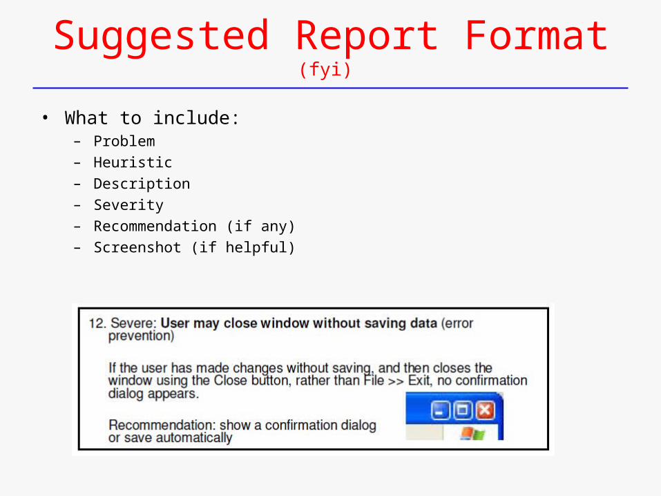
Suggested Report Format(fyi)
• What to include: – Problem – Heuristic– Description– Severity – Recommendation (if any) – Screenshot (if helpful)
End
• Materials from:– Shneiderman publisher site:
• http://wps.aw.com/aw_shneider_dtui_4 &5/
– John Klemmer’s Intro. to HCI Design course• http://hci.stanford.edu/courses/cs147/
– MIT OpenCourseware, Robert Miller’s User Interface Design and Implementation• http://ocw.mit.edu/OcwWeb/Electrical-Engineering-and-Computer-Science/6-831Fall-2004/
CourseHome/index.htm