A Melbourne Datathon 2017 Kaggle entry · A Melbourne Datathon 2017 Kaggle entry ...

HEALTH INSURANCE
MARKET: SHARING
YOUR WORK WITH THE
KAGGLE COMMUNITY
ABSTRACT
An introduction to kernels and short codes
provided by users on Kaggle.com. The guide is
prepared by undergraduate students majoring
in Economics at Rice University for
undergraduate students majoring in the Social
Sciences.
Instructor: Natalia Sizova Rice University

Note: There have been small changes at Kaggle.com since the time this document was initially
compiled. In particular, the term “kernel” is now used instead of “script.” Some screenshots in
this document still feature “script.”
Health Insurance Market: Sharing Your Work with the Kaggle
Community
The standard way to share your work with the Kaggle community is to exchange “kernels”,
formerly known as “scripts”. This handout will provide you with an overview of how to use these
kernels.
Why would you need to use kernels? As we know, we go to Kaggle.com to find data and perform
data analysis. To share your analysis or look at others’ analyses, we use Kaggle kernels. Kernels
just refer to the pieces of codes that you write. You can look at others’ kernels to understand what
analyses they have done with their dataset, and you can run those kernels on Kaggle.com to
replicate their findings.
In this way, you can learn more about Kaggle data sets with little to no additional coding. It saves
you the trouble of downloading data or installing software, and anyone in the Kaggle community
can use this function to share their data analysis results more conveniently.
To give you a thorough understanding of how to work with Kaggle Kernels, we will show you an
example based on dataset Health Insurance Marketplace. We will explain how to view other
contributors’ kernels and replicate their analysis procedures. We will also teach you how to submit
your kernels and share it with the Kaggle community.
Before we actually start working with scripts, we will first take a look at the dataset from Health
Insurance Marketplace. To find it, first click on the “Datasets” button in the top menu bar of your
Kaggle home page. You will see a list of featured datasets.

Click on the tab “All” to view the entire list of datasets available. Use the search window to find
the dataset we want, “Health Insurance Marketplace,” which currently looks like this:
When you click on it, you will see a description page of the dataset. On this page, you can
download the data, or you can view others’ scripts (kernels) and discussions.
Take some time to look over the main overview page and read through all the descriptions. This
page lists a few exploration questions for you to consider. We will focus on one of them: How do
plan rates and benefits vary across states? Keep this question in mind as we start analyzing the
dataset.
Download the data by clicking on the “Download Data” (currently “Download”) button at the top
menu bar. Open the file after it finishes downloading; it may take a while since the package is a
bit large. You will find the following data files:

Rate.csv is the only file we will be using for this handout, but feel free to look at the descriptions
of other datasets to understand how rate.csv is created from the raw data. To open Rate.csv, use
Stata instead of Excel, since Excel sometimes has problems viewing such a huge dataset.
Depending on your computer’s memory, Stata may take a few minutes to open this dataset.
Each entry in this dataset represents a single health insurance plan with the 24 variables showing
the characteristics related to the specific plan. If you look at the side bar on the right in Stata, you
can find all these variables as shown below. Don't worry about having to know all of them. We
mainly need three of them for our analysis: businessyear, statecode, and individualrate. Other
peripheral variables will be introduced along the way.
businessyear — a number indicating the business year of the health insurance plan.
statecode — a two-letter abbreviation for the name of the State of the plan, e.g., AZ, FL.
individualrate — a numerical value showing the rate of the health insurance plan.
To answer the previous exploration question of how plan rates and benefits vary across states, we
will use these three variables and follow the kernel written by Ruonan Ding. Now is when we start
using KERNELS!
To find her work specifically related to this dataset, go to the homepage of our Health Insurance
Marketplace dataset. Click on “Kernels” on the top menu bar. You will then see a list of kernels
shared by other Kaggle users related to this dataset.

Find Ruonan Ding’s script named “Plans and Carriers by State” and click on it1. You will then
see her codes and findings as shown below:
1 You can also search for this kernel using the main search window, which reads “Search Kaggle” at the top of the
web page.

You can find all the graphs plotted under the codes or under the “Output” tab. We will only
focus on the State Map, which is the second graph:
Next, look at the kernel in the black shaded area and click on “show more” to display all the codes.
We will only go through the first trunk and the third part, as we only want to plot the state map.
We will go over them line by line to understand what each line is trying to do. Do not worry about
the specific syntax; simply focus on the flow of the analysis instead.
1. The first few lines import all the packages we need in order to produce the graphical outputs.
2. Then we import the .csv file directly from Kaggle and name it “RawRateFile”.
3. To process the data, we first extract all data from the year 2015 and name this subset rate2015.
4. Then we start removing unnecessary data and create the subset IndividualOption. We first
remove all the plans that correspond to the “Family Option.” Next, because all the individual plans
with missing rates information are assigned the rate value of 9999, we can remove them by
library(ggplot2)
library(dplyr)
library(maps)
library(scales)
library(ggthemes)
RawRateFile<- read.csv('../input/Rate.csv', header = T, sep= ',',
stringsAsFactors = F)
rate2015 <- subset(RawRateFile, BusinessYear == "2015")

retaining those plans that have rates lower than 9000. Lastly, we remove some unwanted variables
to speed up the analysis process later.
5. We select the four variables that we want to use later.
6. We create another dataset, bystatecount, to describe the properties of individual options by state.
We calculate the means and medians of the individual rates within each state, which will be needed
later when we plot the state map. There are also two other variables, Carriers, which denotes the
number of healthcare carriers available in each state, and PlanOffered, which denotes the number
of different healthcare plans available in each state. However, we will not need those for plotting
the map.
7. The next line does not alter the data but displays the first few entries together with their
headings for you to see what the dataset looks like.
When we actually run the code later, you will see a display of bystatecount as shown below.
8. We will then skip the next part and look at the part named “Graph2”. In this step, we match the
variable StateCode from our own dataset bystatecount and state.abb, which is a built-in dataset in
R. Then, we get the lower case names of those states and name them region.
IndividualOption <- subset(rate2015, (rate2015$Age != "Family Option" &
rate2015$IndividualRate < "9000"),
select = c(BusinessYear:IndividualTobaccoRate))
bystate <- IndividualOption %>%
select(StateCode, IssuerId, PlanId, IndividualRate)
bystatecount<-bystate %>%
group_by(StateCode) %>%
summarize(Carriers = length(unique(IssuerId)),
PlanOffered = length(unique(PlanId)),
MeanIndRate= mean(IndividualRate),
MedianIndRate = median(IndividualRate)) %>% arrange(desc(PlanOffered))
head(bystatecount)

We then display the dataset bystatecount. It should look as shown below.
9. To load the map, we first create this data frame with the map information of all states.
10. Then, we process the longitudes and latitudes of each state for plotting the colors later.
11. Next, we combine this new dataset, us_state_map, with the old bystatecount with information
of average individual rates and match them according to the region names. We’ll name the
combined dataset mapdata.
12. Then we start plotting the graph using mapdata. These lines determine each state’s location on
the map using longitudes and latitudes and draw the shapes (polygons) of the states. Then we
assign darker shades of red to states with higher median individual rates and lighter shades to the
states with lower median individual rates. The states with missing values are shown in white by
default.
13. Now we think of p here as the base graph and add additional layers of aesthetic features onto
this base to produce p1, p2, and p3. p1 includes the plot title and the legend title. p2 presents the
#Graph2 –
#get state names
bystatecount$region<-tolower(state.name[match(bystatecount$StateCode,state.abb)])
head(bystatecount)
us_state_map = map_data('state')
statename<-group_by(us_state_map, region) %>%
summarise(long = mean(long), lat = mean(lat))
mapdata <- left_join(bystatecount, us_state_map, by="region")
p <- ggplot()+geom_polygon(data=mapdata, aes(x=long, y=lat, group = group,
fill=mapdata$MedianIndRate),colour="white")+
scale_fill_continuous(low = "thistle2", high = "darkred", guide="colorbar")
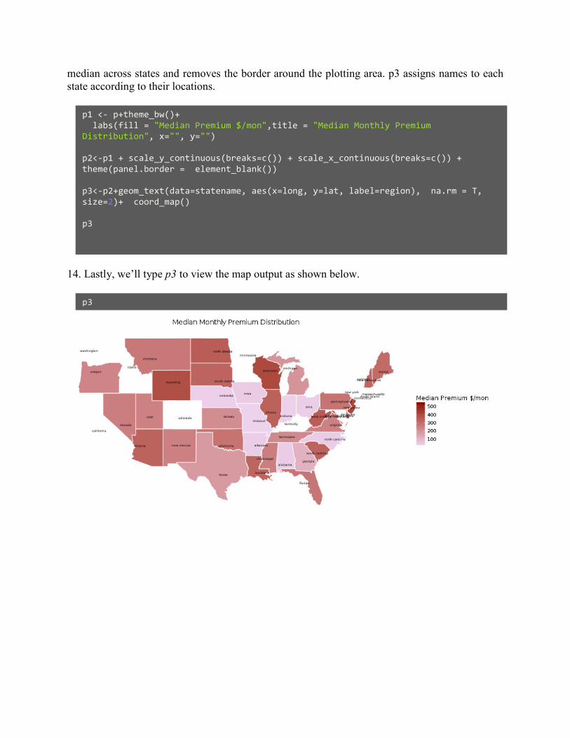
median across states and removes the border around the plotting area. p3 assigns names to each
state according to their locations.
14. Lastly, we’ll type p3 to view the map output as shown below.
p1 <- p+theme_bw()+
labs(fill = "Median Premium $/mon",title = "Median Monthly Premium
Distribution", x="", y="")
p2<-p1 + scale_y_continuous(breaks=c()) + scale_x_continuous(breaks=c()) +
theme(panel.border = element_blank())
p3<-p2+geom_text(data=statename, aes(x=long, y=lat, label=region), na.rm = T,
size=2)+ coord_map()
p3
p3

Next, we are going to replicate Ruonan’s kernel in Kaggle Kernels and produce our own graph!
To copy and run her kernel, we first have to create a new empty script (kernel). Go to the previous
dataset page below and click on the blue button on the right that says New Script (which will soon
be changed to New Kernel).
You will then see the page below for writing kernels on Kaggle. You might need to undergo a
verification procedure if you are a new user. The left panel is for you to input your codes while
the right panel is for you to see the output.
Choose a title and the coding language R. Copy paste the code from Ruonan’s kernel in the left
black window. Press “Run.” It will take some time, but the output will appear in the “Output” tab:

You can also copy codes automatically by pressing “Fork Script” (or “Fork Kernel”) button that
appears with each posted kernel.