Hallmarks of High Performance - caplink.org
53
Hallmarks of High Performance: Exploring the Relationship between Clinical, Financial and Operational Excellence at America’s Health Centers Prepared by Capital Link , 2016
Transcript of Hallmarks of High Performance - caplink.org
Hallmarks of High Performance: Exploring the Relationship between Clinical, Financial and Operational Excellence at America’s Health Centers
Prepared by Capital Link , 2016
ii | Hallmarks of High Performance © 2016 Capital Link
Acknowledgements
This project was supported by the Health Resources and Services Administration (HRSA) of the U.S. Department of Health and Human Services (HHS) under cooperative agreement number U30CS09741, Training and Technical Assistance National Cooperative Agreement (NCA) for $1,062,500 to support the delivery of individual technical assistance as well as educational presentations and publications, such as this document. This information or content and conclusions are those of the author and should not be construed as the official position or policy of, nor should any endorsements be inferred by HRSA, HHS, or the U.S. Government.
Capital Link is a national, non-profit organization that has worked with hundreds of health centers and Primary Care Associations over the past 15 years to plan capital projects, finance growth, and identify ways to improve performance. We provide innovative advisory services and extensive technical assistance with the goal of supporting and expanding community-based health care. Established in the late 1990s as a joint effort of the National Association of Community Health Centers (NACHC), several state-based Primary Care Associations (PCAs), and the Bureau of Primary Health Care, Capital Link grew out of the community health center family and continues to support it through creative capital development and analytic activities. For more information, visit www.caplink.org.
© 2016 Capital Link Hallmarks of High Performance | iii
Table of Contents
Executive Summary 1Key Findings 1
Introduction 4
Section 1: Quality Awardees Financial and Operational Performance 5Overview of the Cohorts 5
Total Operating Revenue 6
Overview of the Findings 6
Operating Margin 6Bottom Line Margin 7Days Cash on Hand 8Current Ratio 9Long-Term Debt to Equity 10Revenue and Expenses 10Total Operating Revenue and Expenses per Patient 11Personnel Expense as a Percent of Total Operating Revenue 12Facility Expense as a Percentage of Total Operating Revenue 13Percent of Fixed Assets that are Depreciated 14Revenue Mix 14Net Patient Service Revenue per Patient and per Visit 15Grant and Contract Revenue per Patient 16Grant Mix 17Patient and Service Mix 18Percent of Patients Best Served in a Language Other than English 19Payer Mix: Patients and Collections 20Utilization (Visits per Patient) 21Medical Provider Productivity 23Staffing Mix 23Medical Provider Mix: Mid-Level to Physician Ratio 24
Section II: Financial and Quality Leader Cohort Analysis 26High Performer Cohort Characteristics 26
Total Operating Revenue 26
iv | Hallmarks of High Performance © 2016 Capital Link
High Performer Findings 27
Statewide Cost of Living 27Operating Margin 28Days Cash on Hand 29Current Ratio 30Days in Net Patient Receivables 30Long-Term Debt to Equity 31Revenue Mix 32Operating Revenue and Expense per Patient 33NPSR per Patient and per Visit 33Payer Mix: Patients and Collections 35Personnel-Related Expense as a Percent of Total Operating Revenue 36Percent of Depreciated Fixed Assets 37Medical Provider Productivity 38Utilization (Visits per Patient) 38Enabling Visits per Patient 39Patient Mix 40Staffing Mix 41Mid-level to Physician Ratio 42Pediatric Patients as Percent of Total Patients 43Management Tenure (Months per FTE) 44
Conclusion 45Appendix A: Description of Quality Awardees and High Performers 45
Budget Size 46Urban Versus Rural 46Medicaid Expansion State 46HRSA Region 47
Appendix B: Methodology 48
© 2016 Capital Link Hallmarks of High Performance | 1
Executive Summary
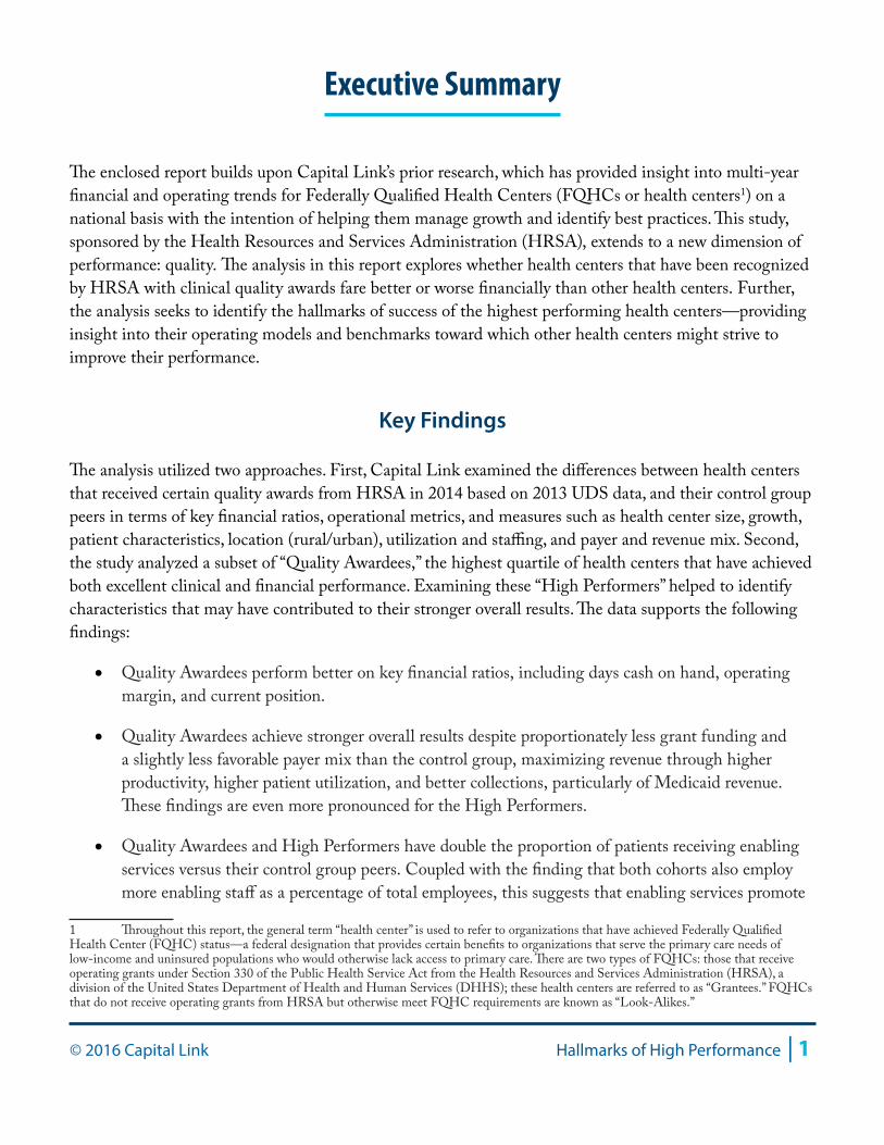
The enclosed report builds upon Capital Link’s prior research, which has provided insight into multi-year financial and operating trends for Federally Qualified Health Centers (FQHCs or health centers1) on a national basis with the intention of helping them manage growth and identify best practices. This study, sponsored by the Health Resources and Services Administration (HRSA), extends to a new dimension of performance: quality. The analysis in this report explores whether health centers that have been recognized by HRSA with clinical quality awards fare better or worse financially than other health centers. Further, the analysis seeks to identify the hallmarks of success of the highest performing health centers—providing insight into their operating models and benchmarks toward which other health centers might strive to improve their performance.
Key Findings
The analysis utilized two approaches. First, Capital Link examined the differences between health centers that received certain quality awards from HRSA in 2014 based on 2013 UDS data, and their control group peers in terms of key financial ratios, operational metrics, and measures such as health center size, growth, patient characteristics, location (rural/urban), utilization and staffing, and payer and revenue mix. Second, the study analyzed a subset of “Quality Awardees,” the highest quartile of health centers that have achieved both excellent clinical and financial performance. Examining these “High Performers” helped to identify characteristics that may have contributed to their stronger overall results. The data supports the following findings:
• Quality Awardees perform better on key financial ratios, including days cash on hand, operating margin, and current position.
• Quality Awardees achieve stronger overall results despite proportionately less grant funding and a slightly less favorable payer mix than the control group, maximizing revenue through higher productivity, higher patient utilization, and better collections, particularly of Medicaid revenue. These findings are even more pronounced for the High Performers.
• Quality Awardees and High Performers have double the proportion of patients receiving enabling services versus their control group peers. Coupled with the finding that both cohorts also employ more enabling staff as a percentage of total employees, this suggests that enabling services promote
1 Throughout this report, the general term “health center” is used to refer to organizations that have achieved Federally Qualified Health Center (FQHC) status—a federal designation that provides certain benefits to organizations that serve the primary care needs of low-income and uninsured populations who would otherwise lack access to primary care. There are two types of FQHCs: those that receive operating grants under Section 330 of the Public Health Service Act from the Health Resources and Services Administration (HRSA), a division of the United States Department of Health and Human Services (DHHS); these health centers are referred to as “Grantees.” FQHCs that do not receive operating grants from HRSA but otherwise meet FQHC requirements are known as “Look-Alikes.”
2 | Hallmarks of High Performance © 2016 Capital Link
a stronger engagement with patients that helps these health centers achieve better clinical outcomes.
• In particular, Quality Awardees and High Performers serve a larger proportion of patients who are best served in a language other than English, which may indicate a greater depth of enabling services devoted to translation and language accessibility that in turn contribute to strong clinical and financial outcomes.
• Quality Awardees show differences in staffing structure that may shed light on their operating models. In addition to employing more enabling services staff, they employ a greater proportion of physicians as compared to mid-level providers and a lower proportion of administrative and facility staff. The lower proportion of overhead staffing costs may be the result of economies of scale present for Quality Awardees, who tend to have larger operating budgets than the control group.
• High Performers had even larger operating budgets than their peers. In 2014, they had median total revenue of $14.3 million versus $13.7 million for all Quality Awardees and $9.9 million for the control group. Further, High Performers are more likely to be located in states with a lower cost of living.
• High Performers have an even greater ability than Quality Awardees to control costs through more productive provider staff and a more regular investment in facilities, which may lower maintenance costs. In particular, High Performers spend a significantly lower percentage of their revenues on employment-related expenses, which may be influenced by their more predominant location in lower-cost states.
• Higher productivity levels at High Performers may be, in part, related to their higher level of pediatric patients who require frequent, shorter visits.
To summarize, the results of this analysis show that it is possible to reach quality targets while also performing well financially. Quality Awardee health centers achieve key quality targets and invest more in enabling staff and services, but are also able to produce strong financial results through revenue maximization, efficient medical care teams, and higher utilization through positive engagement with patients. The data further indicates that the highest performers have a greater ability to control costs—in particular, staffing costs—even though they are more heavily staffed with generally higher-cost physicians.
The High Performer health centers in this study can be looked to as models for future sustainability, as they are able to achieve along two dimensions that are often thought to be in opposition to one another: cost and quality. Through a combination of managing costs and maximizing revenues, High Performers remained strong financially while investing the most in enabling services to support the patient population.
The addition of more services to provide patients with a comprehensive and holistic approach to their health is crucial for the transitioning payment environment, as health outcomes will eventually be the key driver of revenue, particularly as Accountable Care Organizations become the dominant operating model.

© 2016 Capital Link Hallmarks of High Performance | 3
In addition, as health centers move toward a payment environment where they are reimbursed on a per-patient basis rather than through a fee-for-service model, it will become important to reevaluate the role of productivity in financial viability. While in a fee-for-service environment productivity drives revenue, in a managed care or global payment environment, visits drive cost. High Performers are well-positioned even as health centers transition to new payment models, given their aptitude for controlling costs while performing well on quality metrics as measured by HRSA.
4 | Hallmarks of High Performance © 2016 Capital Link
Introduction
Health centers are experiencing greater demands on their services as health reform implementation proceeds, often necessitating growth and operational transformation. As their role as key providers of primary care increases, health centers need to assess their current performance and develop strategies for improvement. Prior field-building studies have provided health centers, Primary Care Associations, and other stakeholders with insight into financial and operational trends. This analysis furthers our knowledge by examining the operating models, strategies, and practices of high-performing health centers to better understand the factors that work for and against the co-occurrence of strong clinical performance and financial sustainability.
This research sought to answer the following questions for the first time:
1. Do health centers that excel in providing high-quality patient care do better or worse than other health centers financially?
2. What are the characteristics of health centers that achieve both high-quality and strong financial results?
3. What do high-performing health centers do differently or better than their peers?
The first section of this study describes results from two cohorts of health centers for which Capital Link possessed a full complement of audits from 2010 to 2013: 180 of the 371 health centers that will be referred to in this report as “Quality Awardees” (health centers that received either a Health Center Quality Leader or National Quality Leader award from HRSA in 2014 based on 2013 UDS data), and a control group comprised of 362 of the remaining 831 health centers that did not receive an award2. Through an analysis of Uniform Data System (UDS)3 data and audited financial results, we explore and discuss how clinical high performance and financial sustainability interrelate.
The second section highlights the common operational, demographic, financial, or other characteristics that have allowed the most successful centers to thrive. These “High Performers” received HRSA quality awards in 2014 and performed in the top quartiles along two key financial benchmarks: operating margin and days cash on hand. There were 45 High Performers for which Capital Link had a full set of audits; this group was compared to the control group along operational and financial indicators, also using UDS and audited financial data. More information on the methodology for creating the cohorts is included in Appendix B of this report.
2 In addition to Health Center Quality Leader and National Quality Leader awards, in 2014 HRSA also made Quality Improvement Awards using UDS data, based on improved clinical performance from 2012 to 2013. Because this group of awards was more about improvement than performance, these health centers were not included in the Quality Awardee cohort.3 Each year, Health Center Program grantees and Look-Alikes report on their performance using the measures defined in the Uniform Data System (UDS).
© 2016 Capital Link Hallmarks of High Performance | 5
Section 1: Quality Awardees Financial and Operational Performance
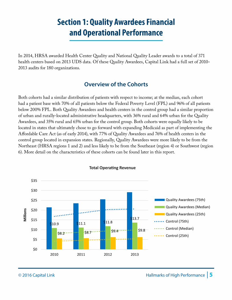
In 2014, HRSA awarded Health Center Quality and National Quality Leader awards to a total of 371 health centers based on 2013 UDS data. Of these Quality Awardees, Capital Link had a full set of 2010-2013 audits for 180 organizations.
Overview of the Cohorts
Both cohorts had a similar distribution of patients with respect to income; at the median, each cohort had a patient base with 70% of all patients below the Federal Poverty Level (FPL) and 96% of all patients below 200% FPL. Both Quality Awardees and health centers in the control group had a similar proportion of urban and rurally-located administrative headquarters, with 36% rural and 64% urban for the Quality Awardees, and 35% rural and 65% urban for the control group. Both cohorts were equally likely to be located in states that ultimately chose to go forward with expanding Medicaid as part of implementing the Affordable Care Act (as of early 2014), with 77% of Quality Awardees and 76% of health centers in the control group located in expansion states. Regionally, Quality Awardees were more likely to be from the Northeast (HRSA regions 1 and 2) and less likely to be from the Southeast (region 4) or Southwest (region 6). More detail on the characteristics of these cohorts can be found later in this report.
$10.9 $11.1 $11.8 $13.7
$8.2 $8.7 $9.4 $9.8
$0
$5
$10
$15
$20
$25
$30
$35
2010 2011 2012 2013
Mill
ions
Quality Awardees (75th)
Quality Awardees (Median)
Quality Awardees (25th)
Control (75th)
Control (Median)
Control (25th)
Total Operating Revenue
6 | Hallmarks of High Performance © 2016 Capital Link
As shown in the chart above, Quality Awardees had somewhat larger operating budgets than the control group, with a median total revenue of $13.7 million in 2013, as compared to $9.8 million for the control group.
Total Operating Revenue
Charts in this report, including the operating revenue chart above, illustrate data for Quality Awardee health centers at the median as well as for the 25th and 75th percentiles throughout the four-year review period. The same percentile results for the control group are included for comparison purposes and appear as dotted lines.
Overview of the Findings
As indicated in the following charts, Quality Awardees had stronger financial performance than health centers in the control group with respect to operating margin, days cash on hand, and current position. Both cohorts had similar results for revenue per visit (both total operating revenue and net patient service revenue), but higher revenue per patient. Personnel expense as a proportion of total operating revenue was comparable between Quality Awardees and the control group. These results suggest that the Quality Awardees cohort as a whole is financially successful mostly by maximizing its revenues, as this cohort also has greater costs per patient than its peers in the control group. Higher productivity and patient utilization (visits per user) also speak to the ability of Quality Awardees to maximize revenues. Quality Awardees are also more likely to have a more diverse patient base with respect to greater language needs. The charts in this section illustrate these findings and trends.
Operating MarginChange in Operating Net Assets / Total Operating Revenue
The operating margin is perhaps the most telling indicator of financial health, as it succinctly explains the proportion of operating revenue that is left over after all expenses are covered. Any operating surplus can then be reinvested into the organization in the form of expanded programming, building reserves, or capital investment. As a target benchmark, Capital Link recommends a minimum range of at least 1% to 3% for health centers.
There is a clear difference between the Quality Awardees and the control group with respect to performance along the operating margin benchmark. At the median, the Quality Awardees ended most fiscal years with a 2.5% operating margin, although this measure was at its peak in 2010, the first year of the analysis period. The control group had somewhat weaker performance, with a four-year average operating margin of 1.6%, compared to an average of 2.8% for the Quality Awardees group. This 1.2-point difference can make an important impact in financial standing for an organization. For example, for a health center with a budget of $10 million, a 1.2 percentage point increase in margin would mean an extra
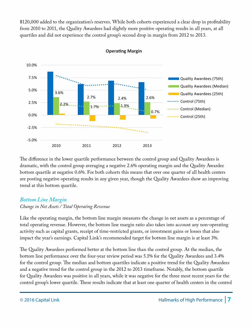
© 2016 Capital Link Hallmarks of High Performance | 7
$120,000 added to the organization’s reserves. While both cohorts experienced a clear drop in profitability from 2010 to 2011, the Quality Awardees had slightly more positive operating results in all years, at all quartiles and did not experience the control group’s second drop in margin from 2012 to 2013.
The difference in the lower quartile performance between the control group and Quality Awardees is dramatic, with the control group averaging a negative 2.6% operating margin and the Quality Awardee bottom quartile at negative 0.6%. For both cohorts this means that over one quarter of all health centers are posting negative operating results in any given year, though the Quality Awardees show an improving trend at this bottom quartile.
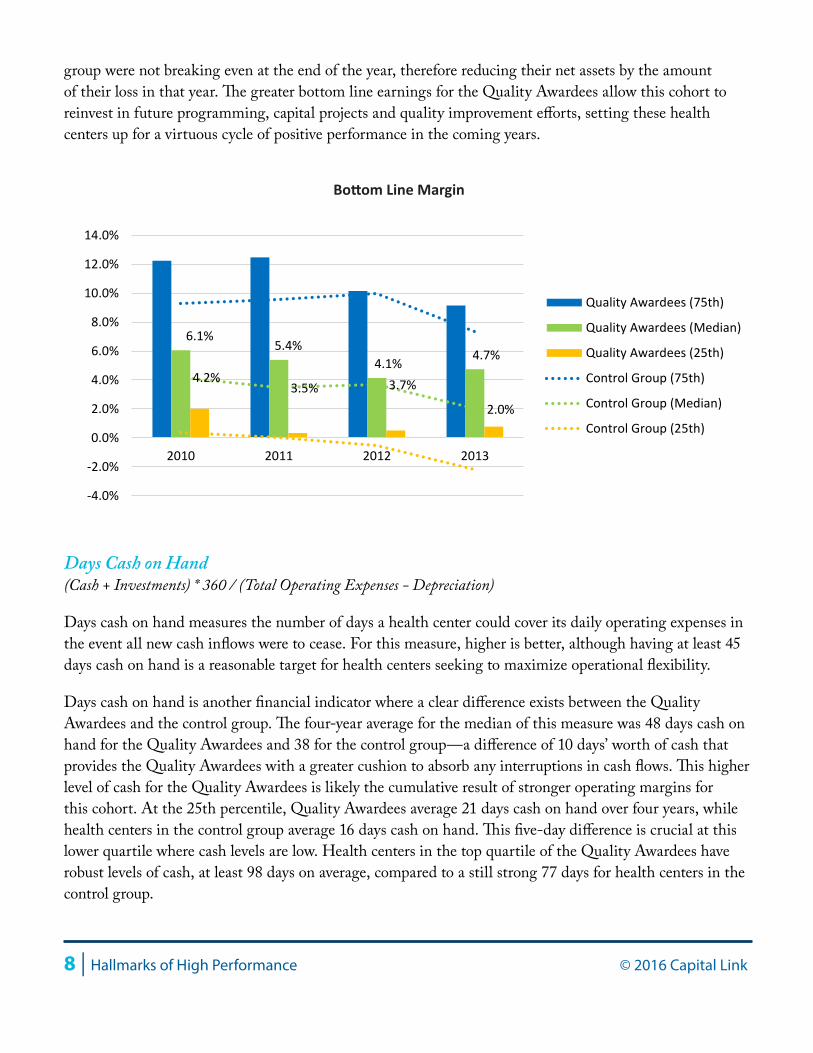
Bottom Line MarginChange in Net Assets / Total Operating Revenue
Like the operating margin, the bottom line margin measures the change in net assets as a percentage of total operating revenue. However, the bottom line margin ratio also takes into account any non-operating activity such as capital grants, receipt of time-restricted grants, or investment gains or losses that also impact the year’s earnings. Capital Link’s recommended target for bottom line margin is at least 3%.
The Quality Awardees performed better at the bottom line than the control group. At the median, the bottom line performance over the four-year review period was 5.1% for the Quality Awardees and 3.4% for the control group. The median and bottom quartiles indicate a positive trend for the Quality Awardees and a negative trend for the control group in the 2012 to 2013 timeframe. Notably, the bottom quartile for Quality Awardees was positive in all years, while it was negative for the three most recent years for the control group’s lower quartile. These results indicate that at least one quarter of health centers in the control
3.6%2.7% 2.4% 2.6%
2.2% 1.7% 1.9%0.7%
-5.0%
-2.5%
0.0%
2.5%
5.0%
7.5%
10.0%
2010 2011 2012 2013
Quality Awardees (75th)
Quality Awardees (Median)
Quality Awardees (25th)
Control (75th)
Control (Median)
Control (25th)
Operating Margin
8 | Hallmarks of High Performance © 2016 Capital Link
group were not breaking even at the end of the year, therefore reducing their net assets by the amount of their loss in that year. The greater bottom line earnings for the Quality Awardees allow this cohort to reinvest in future programming, capital projects and quality improvement efforts, setting these health centers up for a virtuous cycle of positive performance in the coming years.
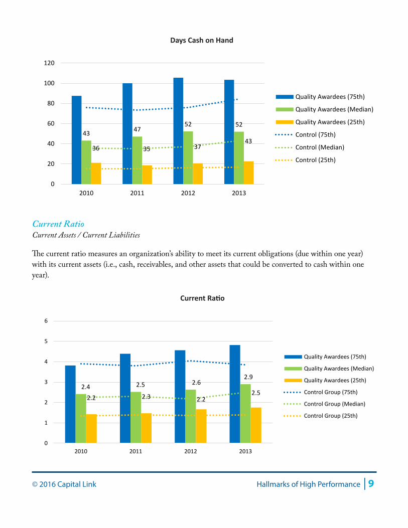
Days Cash on Hand(Cash + Investments) * 360 / (Total Operating Expenses - Depreciation)
Days cash on hand measures the number of days a health center could cover its daily operating expenses in the event all new cash inflows were to cease. For this measure, higher is better, although having at least 45 days cash on hand is a reasonable target for health centers seeking to maximize operational flexibility.
Days cash on hand is another financial indicator where a clear difference exists between the Quality Awardees and the control group. The four-year average for the median of this measure was 48 days cash on hand for the Quality Awardees and 38 for the control group—a difference of 10 days’ worth of cash that provides the Quality Awardees with a greater cushion to absorb any interruptions in cash flows. This higher level of cash for the Quality Awardees is likely the cumulative result of stronger operating margins for this cohort. At the 25th percentile, Quality Awardees average 21 days cash on hand over four years, while health centers in the control group average 16 days cash on hand. This five-day difference is crucial at this lower quartile where cash levels are low. Health centers in the top quartile of the Quality Awardees have robust levels of cash, at least 98 days on average, compared to a still strong 77 days for health centers in the control group.
Quality Awardees (75th)
Quality Awardees (25th)
6.1%5.4%
4.1% 4.7%
4.2%3.5% 3.7%
2.0%
-4.0%
-2.0%
0.0%
2.0%
4.0%
6.0%
8.0%
10.0%
12.0%
14.0%
2010 2011 2012 2013
Quality Awardees (75th)
Quality Awardees (Median)
Quality Awardees (25th)
Control Group (75th)
Control Group (Median)
Control Group (25th)
Bottom Line Margin
© 2016 Capital Link Hallmarks of High Performance | 9
Current RatioCurrent Assets / Current Liabilities
The current ratio measures an organization’s ability to meet its current obligations (due within one year) with its current assets (i.e., cash, receivables, and other assets that could be converted to cash within one year).
43 4752 52
36 35 3743
0
20
40
60
80
100
120
2010 2011 2012 2013
Quality Awardees (75th)
Quality Awardees (Median)
Quality Awardees (25th)
Control (75th)
Control (Median)
Control (25th)
Days Cash on Hand
2.4 2.5 2.62.9
2.2 2.3 2.22.5
0
1
2
3
4
5
6
2010 2011 2012 2013
Quality Awardees (75th)
Quality Awardees (Median)
Quality Awardees (25th)
Control Group (75th)
Control Group (Median)
Control Group (25th)
Current Ratio
10 | Hallmarks of High Performance © 2016 Capital Link
Health centers in the Quality Awardees cohort have a current ratio that averages 2.6 at the median, compared to an average of 2.3 for the median health center in the control group. This slightly stronger liquidity for the Quality Awardees is mostly due to their higher cash position, as both cohorts have nearly identical performance along the measures of days in all receivables and days in accounts payable, the two other main drivers of the current ratio.
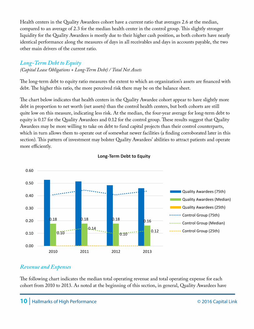
Long-Term Debt to Equity(Capital Lease Obligations + Long-Term Debt) / Total Net Assets
The long-term debt to equity ratio measures the extent to which an organization’s assets are financed with debt. The higher this ratio, the more perceived risk there may be on the balance sheet.
The chart below indicates that health centers in the Quality Awardee cohort appear to have slightly more debt in proportion to net worth (net assets) than the control health centers, but both cohorts are still quite low on this measure, indicating less risk. At the median, the four-year average for long-term debt to equity is 0.17 for the Quality Awardees and 0.12 for the control group. These results suggest that Quality Awardees may be more willing to take on debt to fund capital projects than their control counterparts, which in turn allows them to operate out of somewhat newer facilities (a finding corroborated later in this section). This pattern of investment may bolster Quality Awardees’ abilities to attract patients and operate more efficiently.
Revenue and Expenses
The following chart indicates the median total operating revenue and total operating expense for each cohort from 2010 to 2013. As noted at the beginning of this section, in general, Quality Awardees have
0.18 0.18 0.18 0.16
0.100.14
0.100.12
0.00
0.10
0.20
0.30
0.40
0.50
0.60
2010 2011 2012 2013
Quality Awardees (75th)
Quality Awardees (Median)
Quality Awardees (25th)
Control Group (75th)
Control Group (Median)
Control Group (25th)
Long-Term Debt to Equity
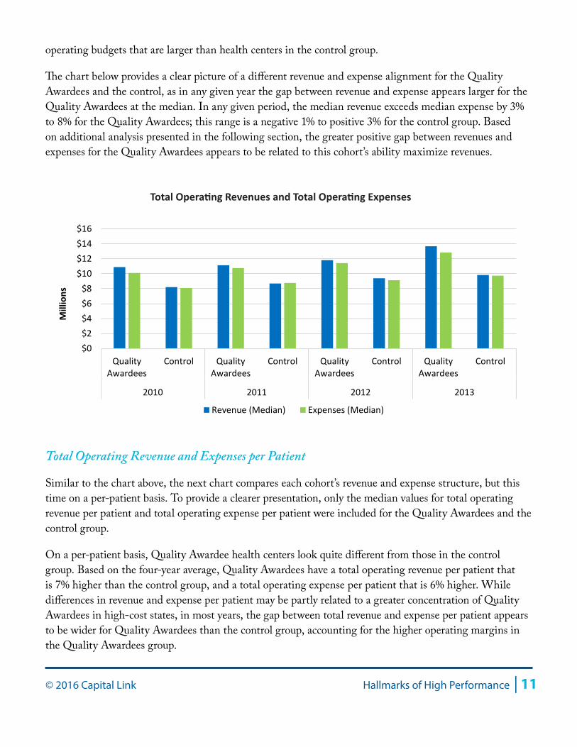
© 2016 Capital Link Hallmarks of High Performance | 11
operating budgets that are larger than health centers in the control group.
The chart below provides a clear picture of a different revenue and expense alignment for the Quality Awardees and the control, as in any given year the gap between revenue and expense appears larger for the Quality Awardees at the median. In any given period, the median revenue exceeds median expense by 3% to 8% for the Quality Awardees; this range is a negative 1% to positive 3% for the control group. Based on additional analysis presented in the following section, the greater positive gap between revenues and expenses for the Quality Awardees appears to be related to this cohort’s ability maximize revenues.
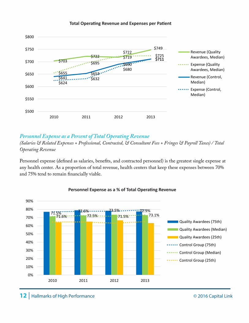
Total Operating Revenue and Expenses per Patient
Similar to the chart above, the next chart compares each cohort’s revenue and expense structure, but this time on a per-patient basis. To provide a clearer presentation, only the median values for total operating revenue per patient and total operating expense per patient were included for the Quality Awardees and the control group.
On a per-patient basis, Quality Awardee health centers look quite different from those in the control group. Based on the four-year average, Quality Awardees have a total operating revenue per patient that is 7% higher than the control group, and a total operating expense per patient that is 6% higher. While differences in revenue and expense per patient may be partly related to a greater concentration of Quality Awardees in high-cost states, in most years, the gap between total revenue and expense per patient appears to be wider for Quality Awardees than the control group, accounting for the higher operating margins in the Quality Awardees group.
$0$2$4$6$8
$10$12$14$16
QualityAwardees
Control QualityAwardees
Control QualityAwardees
Control QualityAwardees
Control
2010 2011 2012 2013
Mill
ions
Revenue (Median) Expenses (Median)
Total Operating Revenues and Total Operating Expenses
12 | Hallmarks of High Performance © 2016 Capital Link
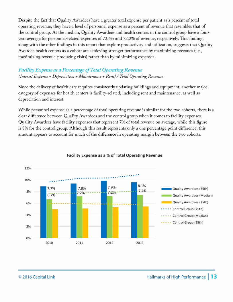
Personnel Expense as a Percent of Total Operating Revenue(Salaries & Related Expenses + Professional, Contracted, & Consultant Fees + Fringes & Payroll Taxes) / Total Operating Revenue
Personnel expense (defined as salaries, benefits, and contracted personnel) is the greatest single expense at any health center. As a proportion of total revenue, health centers that keep these expenses between 70% and 75% tend to remain financially viable.
$703 $722 $719
$749
$655
$695
$722 $725
$641 $653
$690 $711
$624 $632
$680
$711
$500
$550
$600
$650
$700
$750
$800
2010 2011 2012 2013
Revenue (QualityAwardees, Median)
Expense (QualityAwardees, Median)
Revenue (Control,Median)
Expense (Control,Median)
Total Operating Revenue and Expenses per Patient
71.5% 72.6% 73.5% 72.9%71.6% 72.5% 71.5% 73.1%
0%
10%
20%
30%
40%
50%
60%
70%
80%
90%
2010 2011 2012 2013
Quality Awardees (75th)
Quality Awardees (Median)
Quality Awardees (25th)
Control Group (75th)
Control Group (Median)
Control Group (25th)
Personnel Expense as a % of Total Operating Revenue
© 2016 Capital Link Hallmarks of High Performance | 13
Despite the fact that Quality Awardees have a greater total expense per patient as a percent of total operating revenue, they have a level of personnel expense as a percent of revenue that resembles that of the control group. At the median, Quality Awardees and health centers in the control group have a four-year average for personnel-related expenses of 72.6% and 72.2% of revenue, respectively. This finding, along with the other findings in this report that explore productivity and utilization, suggests that Quality Awardee health centers as a cohort are achieving stronger performance by maximizing revenues (i.e., maximizing revenue-producing visits) rather than by minimizing expenses.
Facility Expense as a Percentage of Total Operating Revenue(Interest Expense + Depreciation + Maintenance + Rent) / Total Operating Revenue
Since the delivery of health care requires consistently updating buildings and equipment, another major category of expenses for health centers is facility-related, including rent and maintenance, as well as depreciation and interest.
While personnel expense as a percentage of total operating revenue is similar for the two cohorts, there is a clear difference between Quality Awardees and the control group when it comes to facility expenses. Quality Awardees have facility expenses that represent 7% of total revenue on average, while this figure is 8% for the control group. Although this result represents only a one percentage point difference, this amount appears to account for much of the difference in operating margin between the two cohorts.
6.7% 7.2% 7.2% 7.4%7.7% 7.8% 7.9% 8.1%
0%
2%
4%
6%
8%
10%
12%
2010 2011 2012 2013
Quality Awardees (75th)
Quality Awardees (Median)
Quality Awardees (25th)
Control Group (75th)
Control Group (Median)
Control Group (25th)
Facility Expense as a % of Total Operating Revenue
14 | Hallmarks of High Performance © 2016 Capital Link
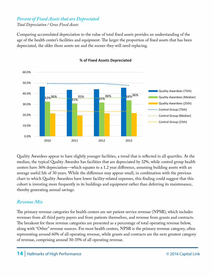
Percent of Fixed Assets that are DepreciatedTotal Depreciation / Gross Fixed Assets
Comparing accumulated depreciation to the value of total fixed assets provides an understanding of the age of the health center’s facilities and equipment. The larger the proportion of fixed assets that has been depreciated, the older those assets are and the sooner they will need replacing.
Quality Awardees appear to have slightly younger facilities, a trend that is reflected in all quartiles. At the median, the typical Quality Awardee has facilities that are depreciated by 32%, while control group health centers have 36% depreciation—which equates to a 1.2 year difference, assuming building assets with an average useful life of 30 years. While the difference may appear small, in combination with the previous chart in which Quality Awardees have lower facility-related expenses, this finding could suggest that this cohort is investing more frequently in its buildings and equipment rather than deferring its maintenance, thereby generating annual savings.
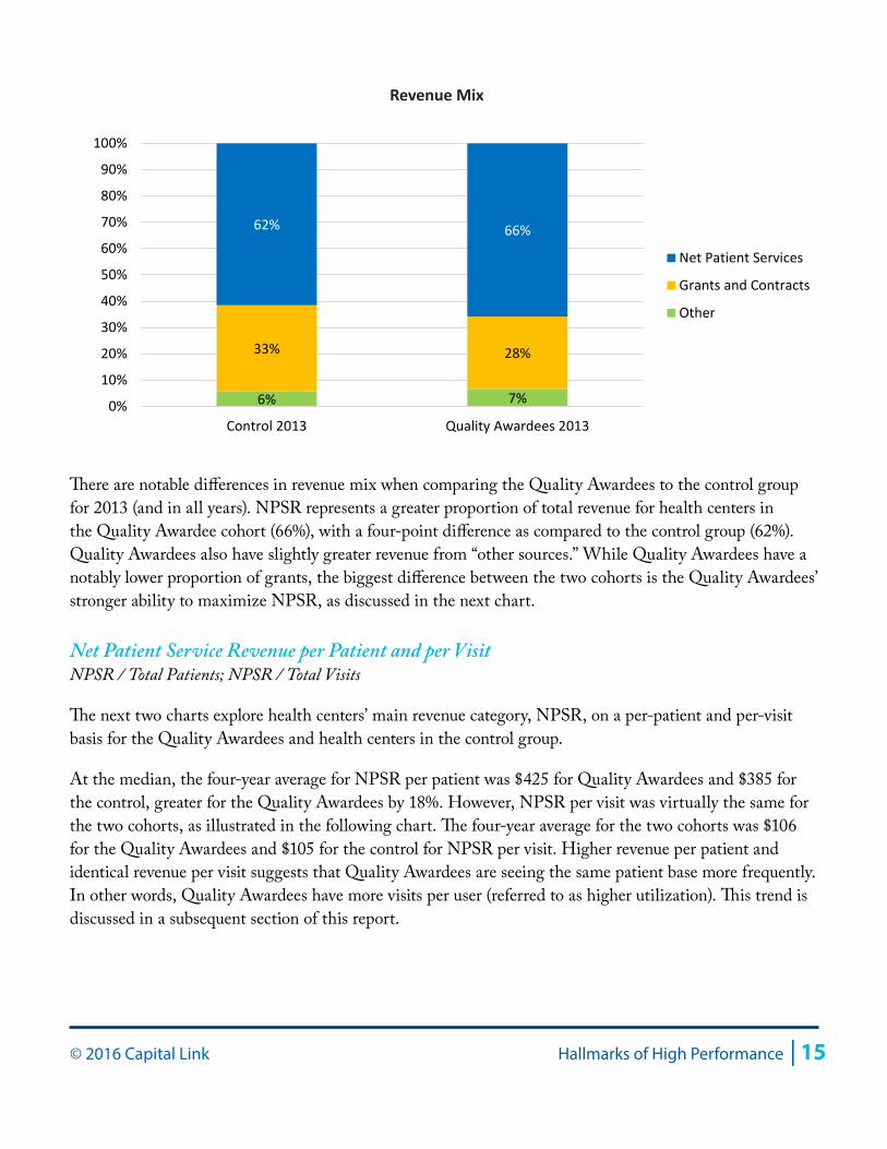
Revenue Mix
The primary revenue categories for health centers are net patient service revenue (NPSR), which includes revenues from all third party payers and from patients themselves, and revenue from grants and contracts. The breakout for these revenue categories are presented as a percentage of total operating revenue below, along with “Other” revenue sources. For most health centers, NPSR is the primary revenue category, often representing around 60% of all operating revenue, while grants and contracts are the next greatest category of revenue, comprising around 30-35% of all operating revenue.
32% 31% 32% 34%36% 35% 36% 36%
0.0%
10.0%
20.0%
30.0%
40.0%
50.0%
60.0%
2010 2011 2012 2013
Quality Awardees (75th)
Quality Awardees (Median)
Quality Awardees (25th)
Control Group (75th)
Control Group (Median)
Control Group (25th)
% of Fixed Assets Depreciated
© 2016 Capital Link Hallmarks of High Performance | 15
There are notable differences in revenue mix when comparing the Quality Awardees to the control group for 2013 (and in all years). NPSR represents a greater proportion of total revenue for health centers in the Quality Awardee cohort (66%), with a four-point difference as compared to the control group (62%). Quality Awardees also have slightly greater revenue from “other sources.” While Quality Awardees have a notably lower proportion of grants, the biggest difference between the two cohorts is the Quality Awardees’ stronger ability to maximize NPSR, as discussed in the next chart.
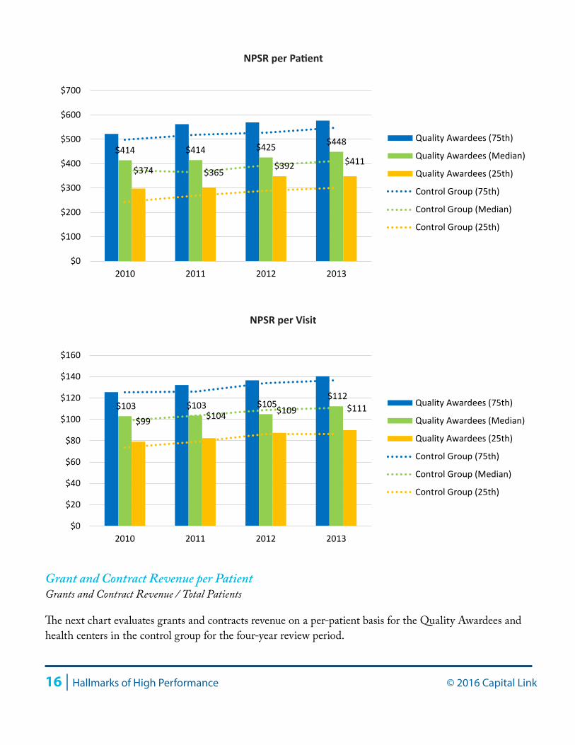
Net Patient Service Revenue per Patient and per VisitNPSR / Total Patients; NPSR / Total Visits
The next two charts explore health centers’ main revenue category, NPSR, on a per-patient and per-visit basis for the Quality Awardees and health centers in the control group.
At the median, the four-year average for NPSR per patient was $425 for Quality Awardees and $385 for the control, greater for the Quality Awardees by 18%. However, NPSR per visit was virtually the same for the two cohorts, as illustrated in the following chart. The four-year average for the two cohorts was $106 for the Quality Awardees and $105 for the control for NPSR per visit. Higher revenue per patient and identical revenue per visit suggests that Quality Awardees are seeing the same patient base more frequently. In other words, Quality Awardees have more visits per user (referred to as higher utilization). This trend is discussed in a subsequent section of this report.
6% 7%
33% 28%
62% 66%
0%
10%
20%
30%
40%
50%
60%
70%
80%
90%
100%
Control 2013 Quality Awardees 2013
Net Patient Services
Grants and Contracts
Other
Revenue Mix
16 | Hallmarks of High Performance © 2016 Capital Link
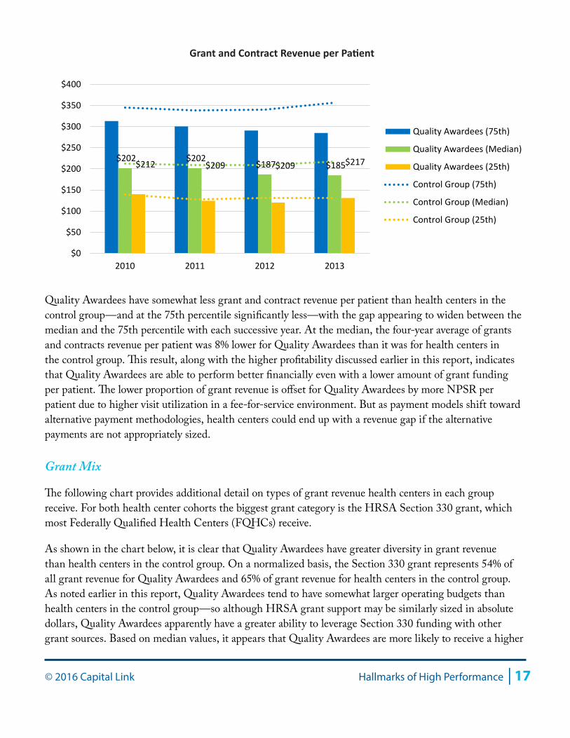
Grant and Contract Revenue per PatientGrants and Contract Revenue / Total Patients
The next chart evaluates grants and contracts revenue on a per-patient basis for the Quality Awardees and health centers in the control group for the four-year review period.
$414 $414 $425 $448
$374 $365$392 $411
$0
$100
$200
$300
$400
$500
$600
$700
2010 2011 2012 2013
Quality Awardees (75th)
Quality Awardees (Median)
Quality Awardees (25th)
Control Group (75th)
Control Group (Median)
Control Group (25th)
NPSR per Patient
$103 $103 $105 $112
$99 $104 $109 $111
$0
$20
$40
$60
$80
$100
$120
$140
$160
2010 2011 2012 2013
Quality Awardees (75th)
Quality Awardees (Median)
Quality Awardees (25th)
Control Group (75th)
Control Group (Median)
Control Group (25th)
NPSR per Visit
© 2016 Capital Link Hallmarks of High Performance | 17
Quality Awardees have somewhat less grant and contract revenue per patient than health centers in the control group—and at the 75th percentile significantly less—with the gap appearing to widen between the median and the 75th percentile with each successive year. At the median, the four-year average of grants and contracts revenue per patient was 8% lower for Quality Awardees than it was for health centers in the control group. This result, along with the higher profitability discussed earlier in this report, indicates that Quality Awardees are able to perform better financially even with a lower amount of grant funding per patient. The lower proportion of grant revenue is offset for Quality Awardees by more NPSR per patient due to higher visit utilization in a fee-for-service environment. But as payment models shift toward alternative payment methodologies, health centers could end up with a revenue gap if the alternative payments are not appropriately sized.
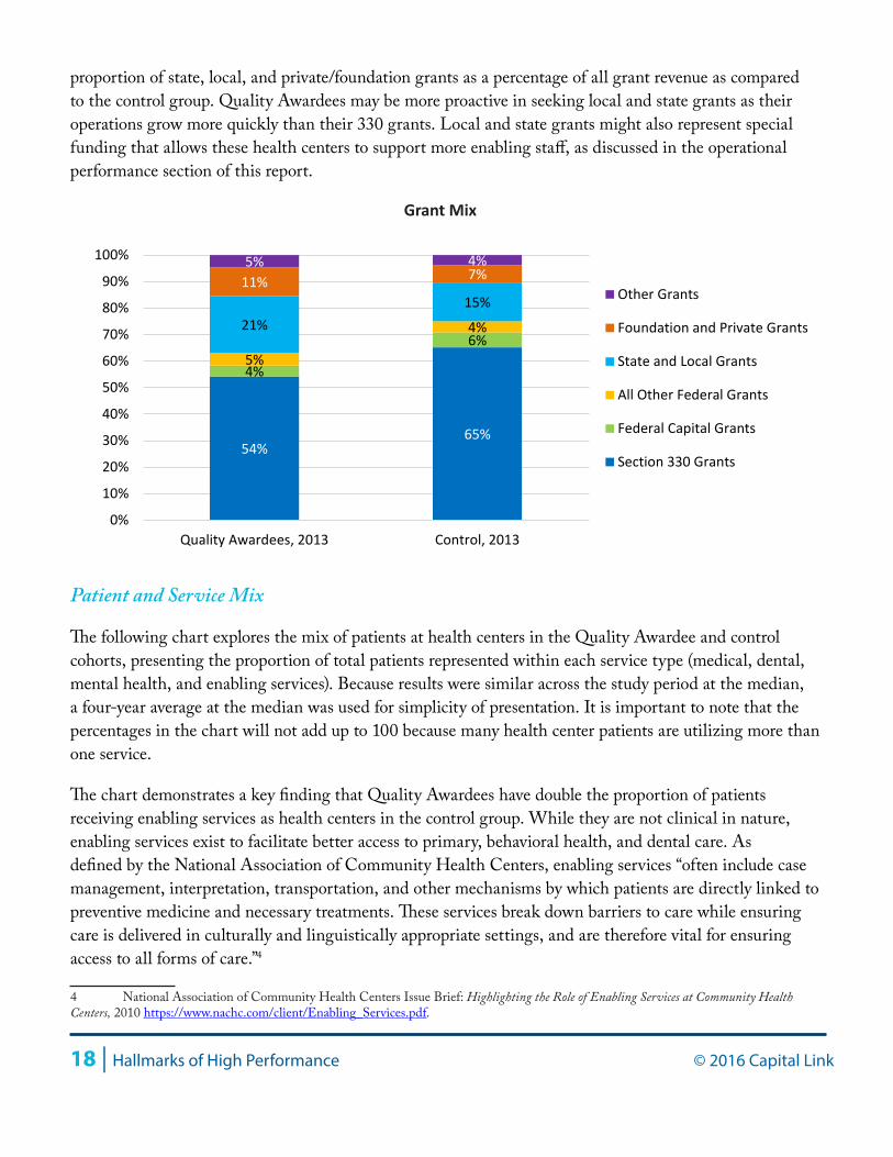
Grant Mix
The following chart provides additional detail on types of grant revenue health centers in each group receive. For both health center cohorts the biggest grant category is the HRSA Section 330 grant, which most Federally Qualified Health Centers (FQHCs) receive.
As shown in the chart below, it is clear that Quality Awardees have greater diversity in grant revenue than health centers in the control group. On a normalized basis, the Section 330 grant represents 54% of all grant revenue for Quality Awardees and 65% of grant revenue for health centers in the control group. As noted earlier in this report, Quality Awardees tend to have somewhat larger operating budgets than health centers in the control group—so although HRSA grant support may be similarly sized in absolute dollars, Quality Awardees apparently have a greater ability to leverage Section 330 funding with other grant sources. Based on median values, it appears that Quality Awardees are more likely to receive a higher
$202 $202 $187 $185 $212 $209 $209 $217
$0
$50
$100
$150
$200
$250
$300
$350
$400
2010 2011 2012 2013
Quality Awardees (75th)
Quality Awardees (Median)
Quality Awardees (25th)
Control Group (75th)
Control Group (Median)
Control Group (25th)
Grant and Contract Revenue per Patient
18 | Hallmarks of High Performance © 2016 Capital Link
proportion of state, local, and private/foundation grants as a percentage of all grant revenue as compared to the control group. Quality Awardees may be more proactive in seeking local and state grants as their operations grow more quickly than their 330 grants. Local and state grants might also represent special funding that allows these health centers to support more enabling staff, as discussed in the operational performance section of this report.
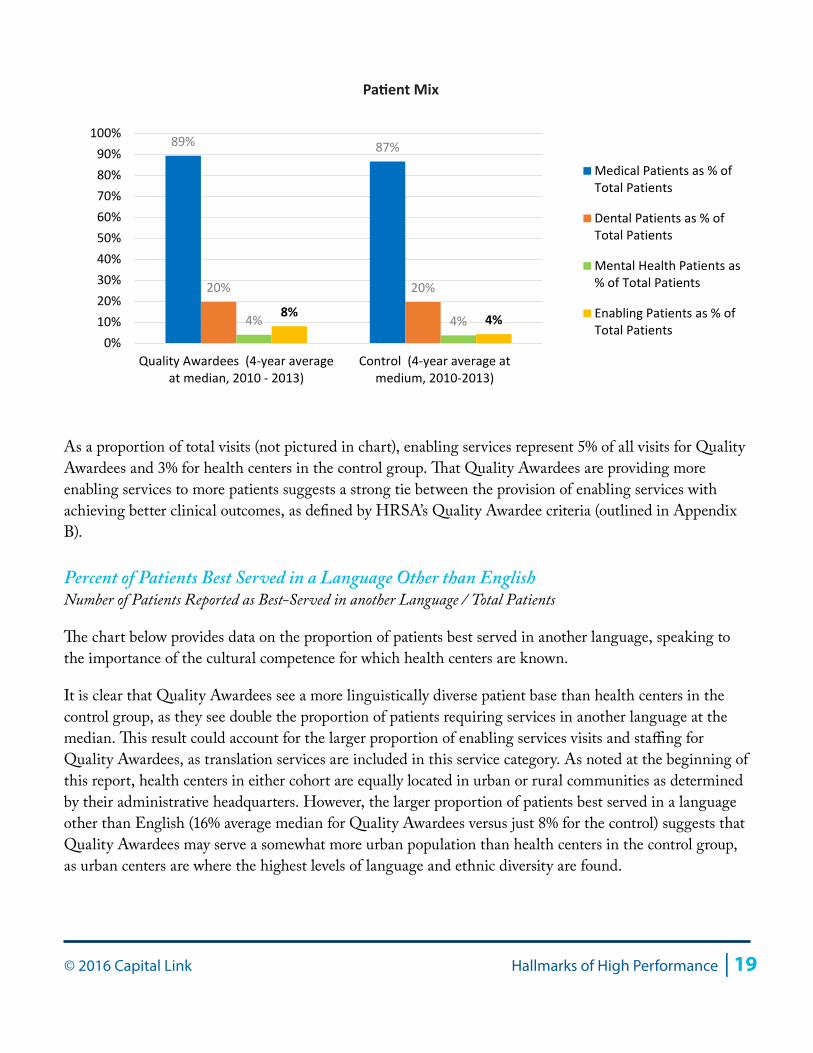
Patient and Service Mix
The following chart explores the mix of patients at health centers in the Quality Awardee and control cohorts, presenting the proportion of total patients represented within each service type (medical, dental, mental health, and enabling services). Because results were similar across the study period at the median, a four-year average at the median was used for simplicity of presentation. It is important to note that the percentages in the chart will not add up to 100 because many health center patients are utilizing more than one service.
The chart demonstrates a key finding that Quality Awardees have double the proportion of patients receiving enabling services as health centers in the control group. While they are not clinical in nature, enabling services exist to facilitate better access to primary, behavioral health, and dental care. As defined by the National Association of Community Health Centers, enabling services “often include case management, interpretation, transportation, and other mechanisms by which patients are directly linked to preventive medicine and necessary treatments. These services break down barriers to care while ensuring care is delivered in culturally and linguistically appropriate settings, and are therefore vital for ensuring access to all forms of care.”4
4 National Association of Community Health Centers Issue Brief: Highlighting the Role of Enabling Services at Community Health Centers, 2010 https://www.nachc.com/client/Enabling_Services.pdf.
54% 65%
4%
6% 21%
15% 11% 7% 5% 4%
5%
4%
0%
10%
20%
30%
40%
50%
60%
70%
80%
90%
100%
Quality Awardees, 2013 Control, 2013
Other Grants
Foundation and Private Grants
State and Local Grants
All Other Federal Grants
Federal Capital Grants
Section 330 Grants
Grant Mix
© 2016 Capital Link Hallmarks of High Performance | 19
As a proportion of total visits (not pictured in chart), enabling services represent 5% of all visits for Quality Awardees and 3% for health centers in the control group. That Quality Awardees are providing more enabling services to more patients suggests a strong tie between the provision of enabling services with achieving better clinical outcomes, as defined by HRSA’s Quality Awardee criteria (outlined in Appendix B).
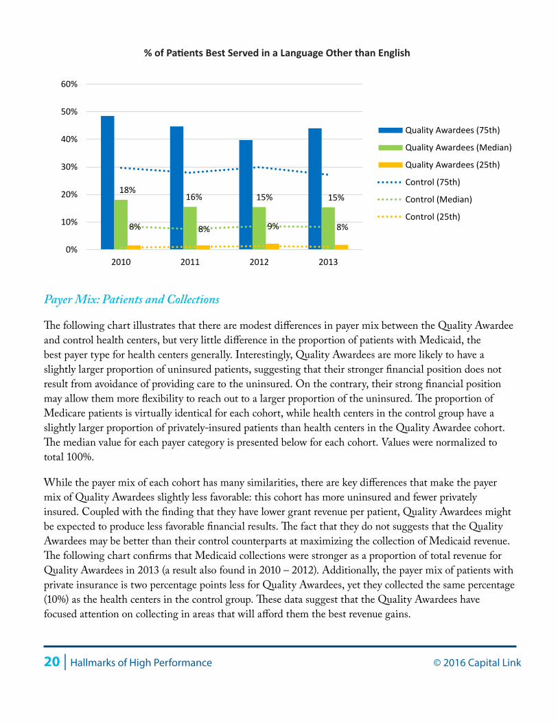
Percent of Patients Best Served in a Language Other than EnglishNumber of Patients Reported as Best-Served in another Language / Total Patients
The chart below provides data on the proportion of patients best served in another language, speaking to the importance of the cultural competence for which health centers are known.
It is clear that Quality Awardees see a more linguistically diverse patient base than health centers in the control group, as they see double the proportion of patients requiring services in another language at the median. This result could account for the larger proportion of enabling services visits and staffing for Quality Awardees, as translation services are included in this service category. As noted at the beginning of this report, health centers in either cohort are equally located in urban or rural communities as determined by their administrative headquarters. However, the larger proportion of patients best served in a language other than English (16% average median for Quality Awardees versus just 8% for the control) suggests that Quality Awardees may serve a somewhat more urban population than health centers in the control group, as urban centers are where the highest levels of language and ethnic diversity are found.
8% 4%
89% 87%
20% 20%
4% 4% 0%
10%20%30%40%50%60%70%80%90%
100%
Quality Awardees (4-year averageat median, 2010 - 2013)
Control (4-year average atmedium, 2010-2013)
Medical Patients as % ofTotal Patients
Dental Patients as % ofTotal Patients
Mental Health Patients as% of Total Patients
Enabling Patients as % ofTotal Patients
Patient Mix
20 | Hallmarks of High Performance © 2016 Capital Link
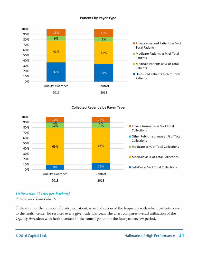
Payer Mix: Patients and Collections
The following chart illustrates that there are modest differences in payer mix between the Quality Awardee and control health centers, but very little difference in the proportion of patients with Medicaid, the best payer type for health centers generally. Interestingly, Quality Awardees are more likely to have a slightly larger proportion of uninsured patients, suggesting that their stronger financial position does not result from avoidance of providing care to the uninsured. On the contrary, their strong financial position may allow them more flexibility to reach out to a larger proportion of the uninsured. The proportion of Medicare patients is virtually identical for each cohort, while health centers in the control group have a slightly larger proportion of privately-insured patients than health centers in the Quality Awardee cohort. The median value for each payer category is presented below for each cohort. Values were normalized to total 100%.
While the payer mix of each cohort has many similarities, there are key differences that make the payer mix of Quality Awardees slightly less favorable: this cohort has more uninsured and fewer privately insured. Coupled with the finding that they have lower grant revenue per patient, Quality Awardees might be expected to produce less favorable financial results. The fact that they do not suggests that the Quality Awardees may be better than their control counterparts at maximizing the collection of Medicaid revenue. The following chart confirms that Medicaid collections were stronger as a proportion of total revenue for Quality Awardees in 2013 (a result also found in 2010 – 2012). Additionally, the payer mix of patients with private insurance is two percentage points less for Quality Awardees, yet they collected the same percentage (10%) as the health centers in the control group. These data suggest that the Quality Awardees have focused attention on collecting in areas that will afford them the best revenue gains.
18%16% 15% 15%
8% 8% 9% 8%
0%
10%
20%
30%
40%
50%
60%
2010 2011 2012 2013
Quality Awardees (75th)
Quality Awardees (Median)
Quality Awardees (25th)
Control (75th)
Control (Median)
Control (25th)
% of Patients Best Served in a Language Other than English
© 2016 Capital Link Hallmarks of High Performance | 21
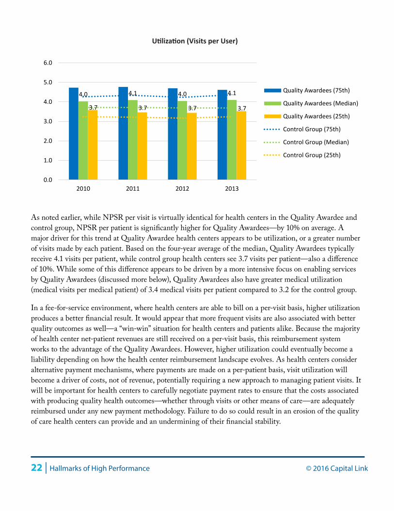
Utilization (Visits per Patient)Total Visits / Total Patients
Utilization, or the number of visits per patient, is an indication of the frequency with which patients come to the health center for services over a given calendar year. The chart compares overall utilization of the Quality Awardees with health centers in the control group for the four-year review period.
37% 34%
41% 42%
9% 9%
13% 15%
0%10%20%30%40%50%60%70%80%90%
100%
Quality Awardees Control
2013 2013
Privately Insured Patients as % ofTotal Patients
Medicare Patients as % of TotalPatients
Medicaid Patients as % of TotalPatients
Uninsured Patients as % of TotalPatients
Patients by Payer Type
9% 13%
69% 66%
10% 10% 1% 2%
10% 10%
0%10%20%30%40%50%60%70%80%90%
100%
Quality Awardees Control
2013 2013
Private Insurance as % of TotalCollections
Other Public Insurance as % of TotalCollections
Medicare as % of Total Collections
Medicaid as % of Total Collections
Self-Pay as % of Total Collections
Collected Revenue by Payer Type
22 | Hallmarks of High Performance © 2016 Capital Link
As noted earlier, while NPSR per visit is virtually identical for health centers in the Quality Awardee and control group, NPSR per patient is significantly higher for Quality Awardees—by 10% on average. A major driver for this trend at Quality Awardee health centers appears to be utilization, or a greater number of visits made by each patient. Based on the four-year average of the median, Quality Awardees typically receive 4.1 visits per patient, while control group health centers see 3.7 visits per patient—also a difference of 10%. While some of this difference appears to be driven by a more intensive focus on enabling services by Quality Awardees (discussed more below), Quality Awardees also have greater medical utilization (medical visits per medical patient) of 3.4 medical visits per patient compared to 3.2 for the control group.
In a fee-for-service environment, where health centers are able to bill on a per-visit basis, higher utilization produces a better financial result. It would appear that more frequent visits are also associated with better quality outcomes as well—a “win-win” situation for health centers and patients alike. Because the majority of health center net-patient revenues are still received on a per-visit basis, this reimbursement system works to the advantage of the Quality Awardees. However, higher utilization could eventually become a liability depending on how the health center reimbursement landscape evolves. As health centers consider alternative payment mechanisms, where payments are made on a per-patient basis, visit utilization will become a driver of costs, not of revenue, potentially requiring a new approach to managing patient visits. It will be important for health centers to carefully negotiate payment rates to ensure that the costs associated with producing quality health outcomes—whether through visits or other means of care—are adequately reimbursed under any new payment methodology. Failure to do so could result in an erosion of the quality of care health centers can provide and an undermining of their financial stability.
4.0 4.1 4.0 4.1
3.7 3.7 3.7 3.7
0.0
1.0
2.0
3.0
4.0
5.0
6.0
2010 2011 2012 2013
Quality Awardees (75th)
Quality Awardees (Median)
Quality Awardees (25th)
Control Group (75th)
Control Group (Median)
Control Group (25th)
Utilization (Visits per User)
© 2016 Capital Link Hallmarks of High Performance | 23
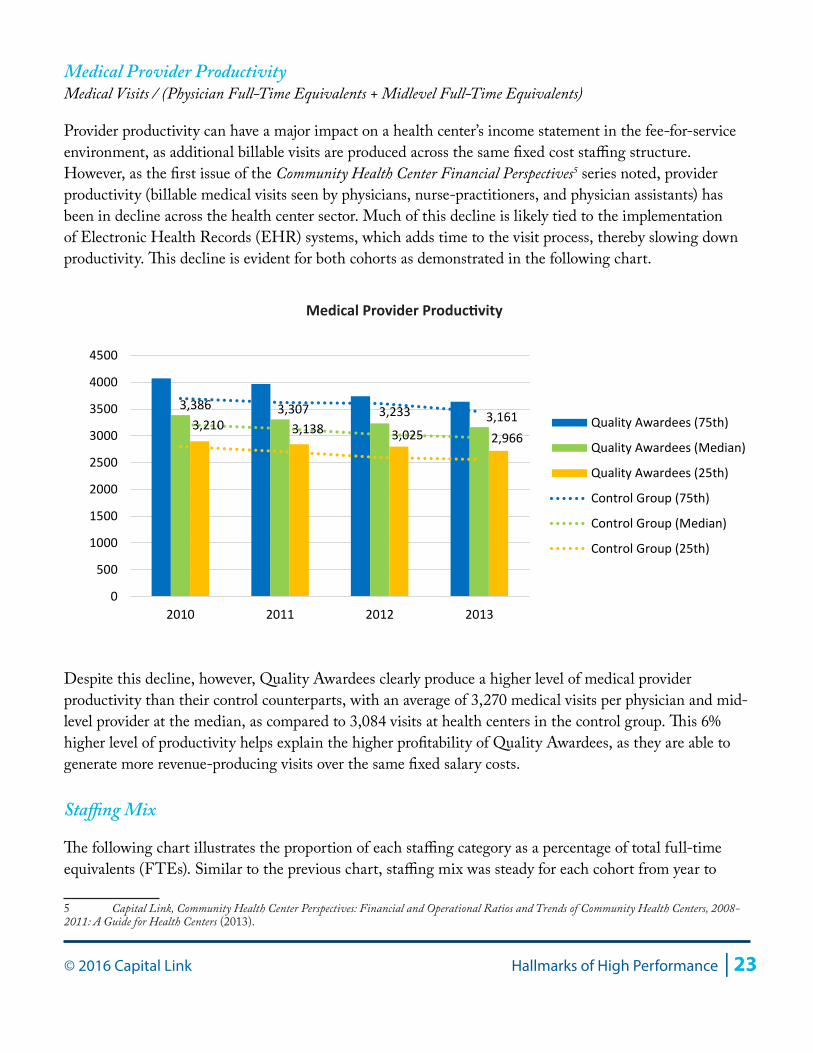
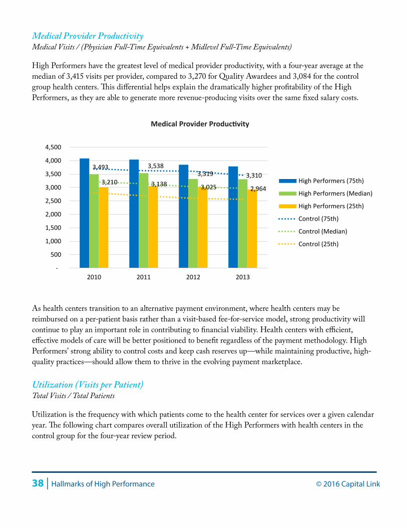
Medical Provider ProductivityMedical Visits / (Physician Full-Time Equivalents + Midlevel Full-Time Equivalents)
Provider productivity can have a major impact on a health center’s income statement in the fee-for-service environment, as additional billable visits are produced across the same fixed cost staffing structure. However, as the first issue of the Community Health Center Financial Perspectives5 series noted, provider productivity (billable medical visits seen by physicians, nurse-practitioners, and physician assistants) has been in decline across the health center sector. Much of this decline is likely tied to the implementation of Electronic Health Records (EHR) systems, which adds time to the visit process, thereby slowing down productivity. This decline is evident for both cohorts as demonstrated in the following chart.
Despite this decline, however, Quality Awardees clearly produce a higher level of medical provider productivity than their control counterparts, with an average of 3,270 medical visits per physician and mid-level provider at the median, as compared to 3,084 visits at health centers in the control group. This 6% higher level of productivity helps explain the higher profitability of Quality Awardees, as they are able to generate more revenue-producing visits over the same fixed salary costs.
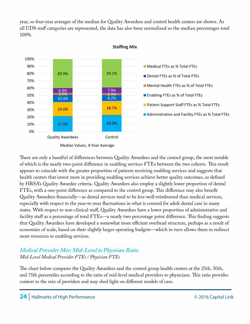
Staffing Mix
The following chart illustrates the proportion of each staffing category as a percentage of total full-time equivalents (FTEs). Similar to the previous chart, staffing mix was steady for each cohort from year to
5 Capital Link, Community Health Center Perspectives: Financial and Operational Ratios and Trends of Community Health Centers, 2008-2011: A Guide for Health Centers (2013).
3,386 3,307 3,233 3,1613,210 3,138 3,025 2,966
0
500
1000
1500
2000
2500
3000
3500
4000
4500
2010 2011 2012 2013
Quality Awardees (75th)
Quality Awardees (Median)
Quality Awardees (25th)
Control Group (75th)
Control Group (Median)
Control Group (25th)
Medical Provider Productivity
24 | Hallmarks of High Performance © 2016 Capital Link
year, so four-year averages of the median for Quality Awardees and control health centers are shown. As all UDS staff categories are represented, the data has also been normalized so the median percentages total 100%.
There are only a handful of differences between Quality Awardees and the control group, the most notable of which is the nearly two-point difference in enabling services FTEs between the two cohorts. This result appears to coincide with the greater proportion of patients receiving enabling services and suggests that health centers that invest more in providing enabling services achieve better quality outcomes, as defined by HRSA’s Quality Awardee criteria. Quality Awardees also employ a slightly lower proportion of dental FTEs, with a one-point difference as compared to the control group. This difference may also benefit Quality Awardees financially—as dental services tend to be less-well-reimbursed than medical services, especially with respect to the year-to-year fluctuations in what is covered for adult dental care in many states. With respect to non-clinical staff, Quality Awardees have a lower proportion of administrative and facility staff as a percentage of total FTEs—a nearly two percentage point difference. This finding suggests that Quality Awardees have developed a somewhat more efficient overhead structure, perhaps as a result of economies of scale, based on their slightly larger operating budgets—which in turn allows them to redirect more resources to enabling services.
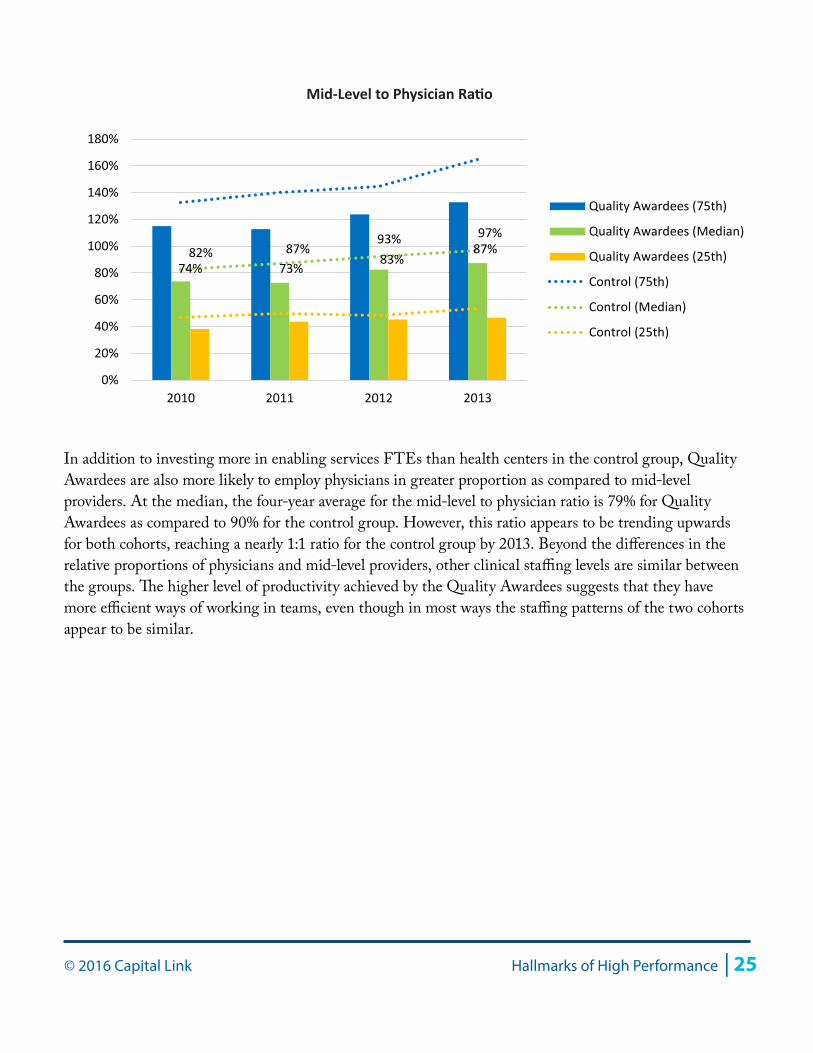
Medical Provider Mix: Mid-Level to Physician RatioMid-Level Medical Provider FTEs / Physician FTEs
The chart below compares the Quality Awardees and the control group health centers at the 25th, 50th, and 75th percentiles according to the ratio of mid-level medical providers to physicians. This ratio provides context to the mix of providers and may shed light on different models of care.
21.5% 23.3%
19.0% 18.7%
10.0% 8.2% 2.5% 2.4% 6.9% 7.9%
39.9% 39.1%
0%
10%
20%
30%
40%
50%
60%
70%
80%
90%
100%
Quality Awardees Control
Median Values, 4-Year Average
Medical FTEs as % Total FTEs
Dental FTEs as % of Total FTEs
Mental Health FTEs as % of Total FTEs
Enabling FTEs as % of Total FTEs
Patient Support Staff FTEs as % Total FTEs
Administrative and Facility FTEs as % Total FTEs
Staffing Mix
© 2016 Capital Link Hallmarks of High Performance | 25
In addition to investing more in enabling services FTEs than health centers in the control group, Quality Awardees are also more likely to employ physicians in greater proportion as compared to mid-level providers. At the median, the four-year average for the mid-level to physician ratio is 79% for Quality Awardees as compared to 90% for the control group. However, this ratio appears to be trending upwards for both cohorts, reaching a nearly 1:1 ratio for the control group by 2013. Beyond the differences in the relative proportions of physicians and mid-level providers, other clinical staffing levels are similar between the groups. The higher level of productivity achieved by the Quality Awardees suggests that they have more efficient ways of working in teams, even though in most ways the staffing patterns of the two cohorts appear to be similar.
74% 73%83%
87%82% 87%93% 97%
0%
20%
40%
60%
80%
100%
120%
140%
160%
180%
2010 2011 2012 2013
Quality Awardees (75th)
Quality Awardees (Median)
Quality Awardees (25th)
Control (75th)
Control (Median)
Control (25th)
Mid-Level to Physician Ratio
26 | Hallmarks of High Performance © 2016 Capital Link
Section II: Financial and Quality Leader Cohort Analysis
In order to identify the characteristics of health centers that provide both high-quality care and have achieved the strongest financial performance, Capital Link examined a subcategory of the Quality Awardees, made up of 45 health centers. These “High Performers” were defined as those Quality Awardees performing in the highest quartiles for two financial indicators: days cash on hand and operating margin (refer to Appendix B for more information). This section reports results from an analysis of the High Performers as compared to the control group and other Quality Awardees.
High Performer Cohort Characteristics
At the median for 2013, High Performers had total revenue of $14.3 million, compared to $13.7 million for Quality Awardees and $9.9 million for the control group. The somewhat larger budget size for High Performers highlights the link between size, financial strength and quality outcomes. While the range of results supports the fact that strong outcomes can and do occur for health centers across a range of budget sizes, it would appear that economies of scale do matter and that the benefits of size in part enables the highest performing health centers to deliver strong clinical outcomes while maintaining financial stability.
Total Operating Revenue
High Performers had a slightly more impoverished patient base than the other two cohorts; at the median in 2013, High Performers had a patient base with 74% of all patients living below poverty, compared to 70% for Quality Awardees and control health centers; however, 97% of all High Performer patients were low-income (below 200% FPL), similar to the 96% proportion for the other two cohorts. High Performers had a similar proportion of urban and rurally located administrative headquarters to the other cohorts but with a slightly more urban presence, with 33% rural and 67% urban, compared to 36% rural and 64% urban for the Quality Awardees and 35% rural and 65% urban for the control group. Interestingly, while High Performers are still more likely to be located in states that chose to expand Medicaid eligibility in 2014, High Performers were less heavily concentrated in these states than the other Quality Awardees or the control cohort. Sixty-three percent of High Performers were located in Medicaid expansion states, as compared to 77% of Quality Awardees as a group and 76% of the control group. Regionally, High Performers were less likely than the other two cohorts to be from New England (HRSA Region 1) and California, Nevada, and Arizona (HRSA Region 9). Health centers in the High Performers cohort were more likely to be from New York and New Jersey (HRSA Region 2); the upper mountain states of Colorado, Wyoming, and the Dakotas (HRSA Region 8); and the Southwest (HRSA Region 6: Texas, New Mexico, and Oklahoma). More detail on the characteristics of these cohorts can be found in Appendix A.
© 2016 Capital Link Hallmarks of High Performance | 27
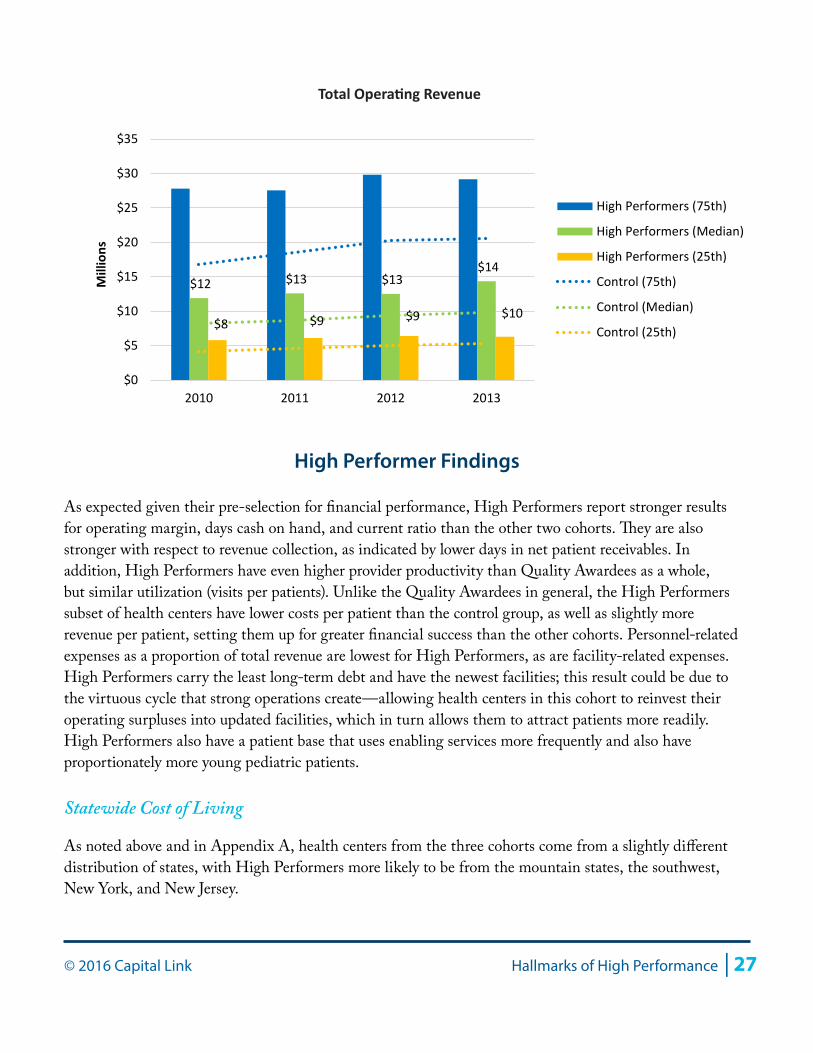
High Performer Findings
As expected given their pre-selection for financial performance, High Performers report stronger results for operating margin, days cash on hand, and current ratio than the other two cohorts. They are also stronger with respect to revenue collection, as indicated by lower days in net patient receivables. In addition, High Performers have even higher provider productivity than Quality Awardees as a whole, but similar utilization (visits per patients). Unlike the Quality Awardees in general, the High Performers subset of health centers have lower costs per patient than the control group, as well as slightly more revenue per patient, setting them up for greater financial success than the other cohorts. Personnel-related expenses as a proportion of total revenue are lowest for High Performers, as are facility-related expenses. High Performers carry the least long-term debt and have the newest facilities; this result could be due to the virtuous cycle that strong operations create—allowing health centers in this cohort to reinvest their operating surpluses into updated facilities, which in turn allows them to attract patients more readily. High Performers also have a patient base that uses enabling services more frequently and also have proportionately more young pediatric patients.
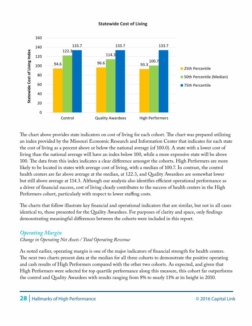
Statewide Cost of Living
As noted above and in Appendix A, health centers from the three cohorts come from a slightly different distribution of states, with High Performers more likely to be from the mountain states, the southwest, New York, and New Jersey.
$12 $13 $13 $14
$8 $9 $9 $10
$0
$5
$10
$15
$20
$25
$30
$35
2010 2011 2012 2013
Millions
High Performers (75th)
High Performers (Median)
High Performers (25th)
Control (75th)
Control (Median)
Control (25th)
Total Operating Revenue
28 | Hallmarks of High Performance © 2016 Capital Link
The chart above provides state indicators on cost of living for each cohort. The chart was prepared utilizing an index provided by the Missouri Economic Research and Information Center that indicates for each state the cost of living as a percent above or below the national average (of 100.0). A state with a lower cost of living than the national average will have an index below 100, while a more expensive state will be above 100. The data from this index indicates a clear difference amongst the cohorts. High Performers are more likely to be located in states with average cost of living, with a median of 100.7. In contrast, the control health centers are far above average at the median, at 122.3, and Quality Awardees are somewhat lower but still above average at 114.3. Although our analysis also identifies efficient operational performance as a driver of financial success, cost of living clearly contributes to the success of health centers in the High Performers cohort, particularly with respect to lower staffing costs.
The charts that follow illustrate key financial and operational indicators that are similar, but not in all cases identical to, those presented for the Quality Awardees. For purposes of clarity and space, only findings demonstrating meaningful differences between the cohorts were included in this report.
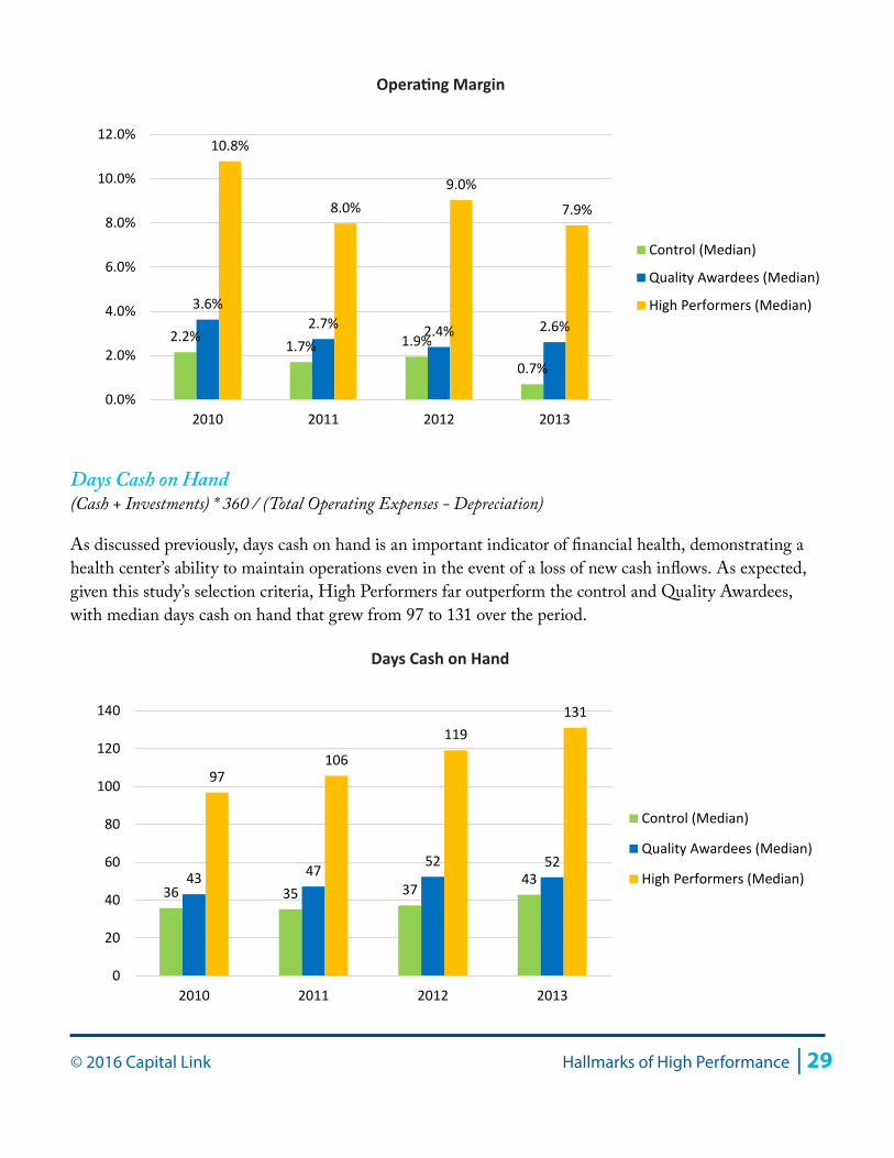
Operating MarginChange in Operating Net Assets / Total Operating Revenue
As noted earlier, operating margin is one of the major indicators of financial strength for health centers. The next two charts present data at the median for all three cohorts to demonstrate the positive operating and cash results of High Performers compared with the other two cohorts. As expected, and given that High Performers were selected for top quartile performance along this measure, this cohort far outperforms the control and Quality Awardees with results ranging from 8% to nearly 11% at its height in 2010.
94.6 96.6 93.3
122.3 114.3
100.7
133.7 133.7 133.7
0
20
40
60
80
100
120
140
160
Control Quality Awardees High Performers
Stat
ewid
e Co
st o
f Liv
ing
Inde
x
25th Percentile
50th Percentile (Median)
75th Percentile
Statewide Cost of Living
© 2016 Capital Link Hallmarks of High Performance | 29
Days Cash on Hand (Cash + Investments) * 360 / (Total Operating Expenses - Depreciation)
As discussed previously, days cash on hand is an important indicator of financial health, demonstrating a health center’s ability to maintain operations even in the event of a loss of new cash inflows. As expected, given this study’s selection criteria, High Performers far outperform the control and Quality Awardees, with median days cash on hand that grew from 97 to 131 over the period.
2.2%1.7% 1.9%
0.7%
3.6%2.7% 2.4% 2.6%
10.8%
8.0%9.0%
7.9%
0.0%
2.0%
4.0%
6.0%
8.0%
10.0%
12.0%
2010 2011 2012 2013
Control (Median)
Quality Awardees (Median)
High Performers (Median)
Operating Margin
36 35 37 43 43 47
52 52
97 106
119 131
0
20
40
60
80
100
120
140
2010 2011 2012 2013
Control (Median)
Quality Awardees (Median)
High Performers (Median)
Days Cash on Hand
30 | Hallmarks of High Performance © 2016 Capital Link
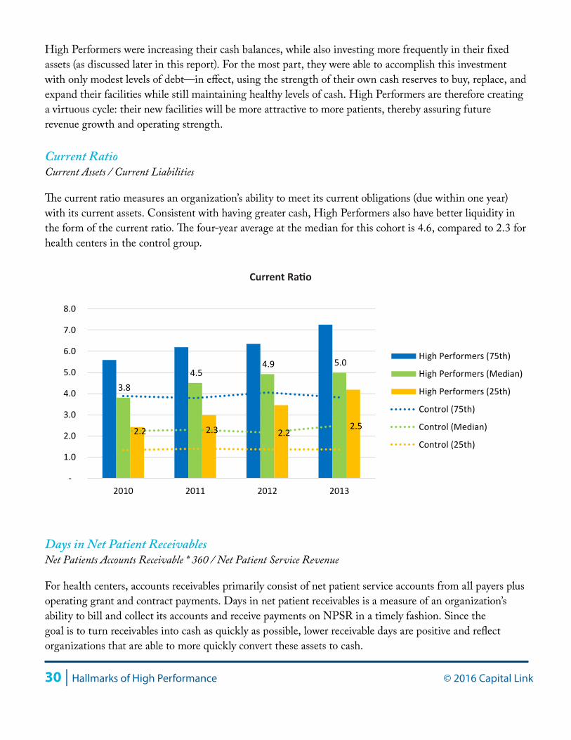
High Performers were increasing their cash balances, while also investing more frequently in their fixed assets (as discussed later in this report). For the most part, they were able to accomplish this investment with only modest levels of debt—in effect, using the strength of their own cash reserves to buy, replace, and expand their facilities while still maintaining healthy levels of cash. High Performers are therefore creating a virtuous cycle: their new facilities will be more attractive to more patients, thereby assuring future revenue growth and operating strength.
Current RatioCurrent Assets / Current Liabilities
The current ratio measures an organization’s ability to meet its current obligations (due within one year) with its current assets. Consistent with having greater cash, High Performers also have better liquidity in the form of the current ratio. The four-year average at the median for this cohort is 4.6, compared to 2.3 for health centers in the control group.
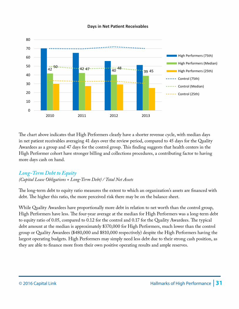
Days in Net Patient ReceivablesNet Patients Accounts Receivable * 360 / Net Patient Service Revenue
For health centers, accounts receivables primarily consist of net patient service accounts from all payers plus operating grant and contract payments. Days in net patient receivables is a measure of an organization’s ability to bill and collect its accounts and receive payments on NPSR in a timely fashion. Since the goal is to turn receivables into cash as quickly as possible, lower receivable days are positive and reflect organizations that are able to more quickly convert these assets to cash.
3.8 4.5
4.9 5.0
2.2 2.3 2.2 2.5
-
1.0
2.0
3.0
4.0
5.0
6.0
7.0
8.0
2010 2011 2012 2013
High Performers (75th)
High Performers (Median)
High Performers (25th)
Control (75th)
Control (Median)
Control (25th)
Current Ratio
© 2016 Capital Link Hallmarks of High Performance | 31
The chart above indicates that High Performers clearly have a shorter revenue cycle, with median days in net patient receivables averaging 41 days over the review period, compared to 45 days for the Quality Awardees as a group and 47 days for the control group. This finding suggests that health centers in the High Performer cohort have stronger billing and collections procedures, a contributing factor to having more days cash on hand.
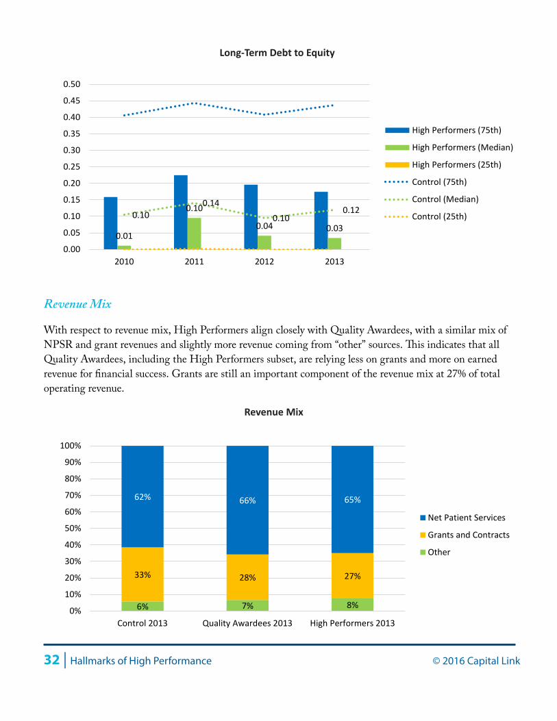
Long-Term Debt to Equity (Capital Lease Obligations + Long-Term Debt) / Total Net Assets
The long-term debt to equity ratio measures the extent to which an organization’s assets are financed with debt. The higher this ratio, the more perceived risk there may be on the balance sheet.
While Quality Awardees have proportionally more debt in relation to net worth than the control group, High Performers have less. The four-year average at the median for High Performers was a long-term debt to equity ratio of 0.05, compared to 0.12 for the control and 0.17 for the Quality Awardees. The typical debt amount at the median is approximately $370,000 for High Performers, much lower than the control group or Quality Awardees ($480,000 and $810,000 respectively) despite the High Performers having the largest operating budgets. High Performers may simply need less debt due to their strong cash position, as they are able to finance more from their own positive operating results and ample reserves.
42 42 40 39 50 47 48
45
0
10
20
30
40
50
60
70
80
2010 2011 2012 2013
High Performers (75th)
High Performers (Median)
High Performers (25th)
Control (75th)
Control (Median)
Control (25th)
Days in Net Patient Receivables
32 | Hallmarks of High Performance © 2016 Capital Link
Revenue Mix
With respect to revenue mix, High Performers align closely with Quality Awardees, with a similar mix of NPSR and grant revenues and slightly more revenue coming from “other” sources. This indicates that all Quality Awardees, including the High Performers subset, are relying less on grants and more on earned revenue for financial success. Grants are still an important component of the revenue mix at 27% of total operating revenue.
0.01
0.10
0.04 0.030.10
0.140.10
0.12
0.00
0.05
0.10
0.15
0.20
0.25
0.30
0.35
0.40
0.45
0.50
2010 2011 2012 2013
High Performers (75th)
High Performers (Median)
High Performers (25th)
Control (75th)
Control (Median)
Control (25th)
Long-Term Debt to Equity
6% 7% 8%
33% 28% 27%
62% 66% 65%
0%
10%
20%
30%
40%
50%
60%
70%
80%
90%
100%
Control 2013 Quality Awardees 2013 High Performers 2013
Net Patient Services
Grants and Contracts
Other
Revenue Mix
© 2016 Capital Link Hallmarks of High Performance | 33
Operating Revenue and Expense per Patient
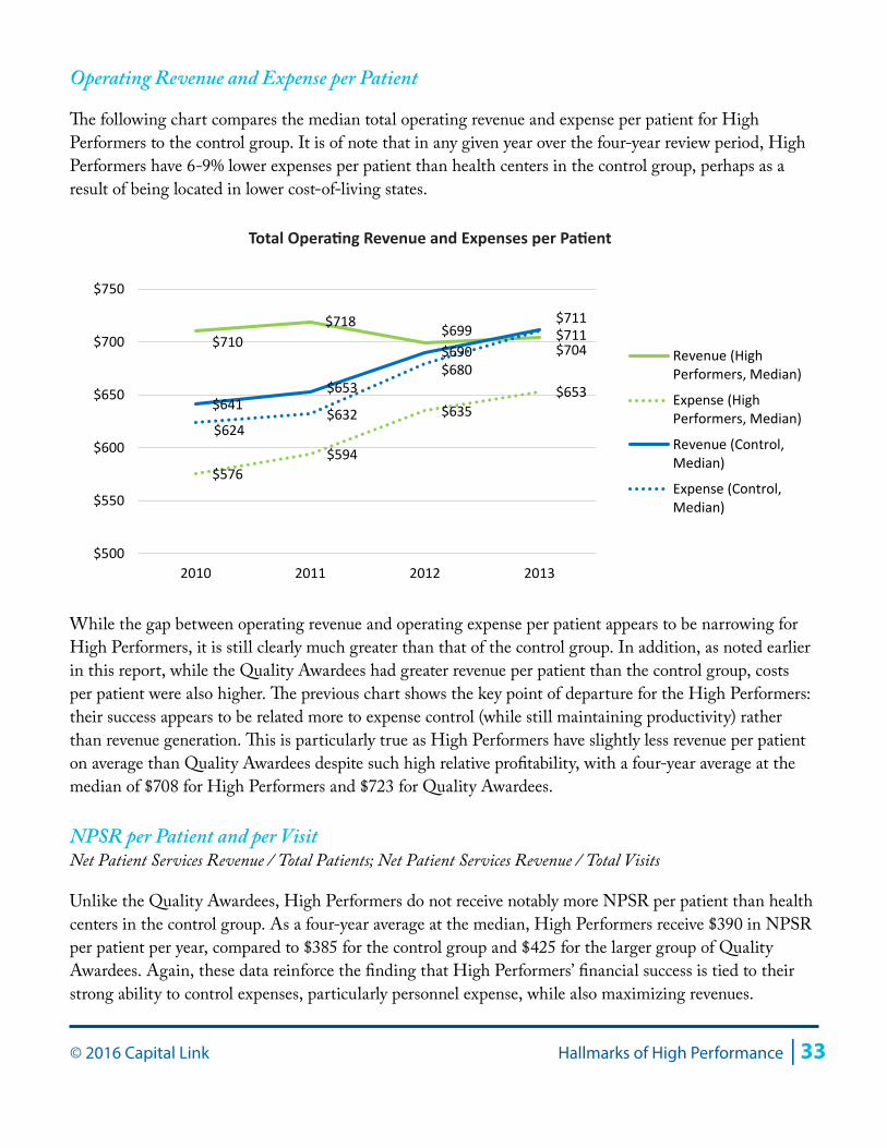
The following chart compares the median total operating revenue and expense per patient for High Performers to the control group. It is of note that in any given year over the four-year review period, High Performers have 6-9% lower expenses per patient than health centers in the control group, perhaps as a result of being located in lower cost-of-living states.
While the gap between operating revenue and operating expense per patient appears to be narrowing for High Performers, it is still clearly much greater than that of the control group. In addition, as noted earlier in this report, while the Quality Awardees had greater revenue per patient than the control group, costs per patient were also higher. The previous chart shows the key point of departure for the High Performers: their success appears to be related more to expense control (while still maintaining productivity) rather than revenue generation. This is particularly true as High Performers have slightly less revenue per patient on average than Quality Awardees despite such high relative profitability, with a four-year average at the median of $708 for High Performers and $723 for Quality Awardees.
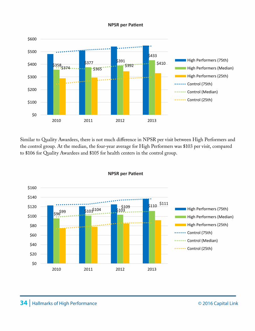
NPSR per Patient and per VisitNet Patient Services Revenue / Total Patients; Net Patient Services Revenue / Total Visits
Unlike the Quality Awardees, High Performers do not receive notably more NPSR per patient than health centers in the control group. As a four-year average at the median, High Performers receive $390 in NPSR per patient per year, compared to $385 for the control group and $425 for the larger group of Quality Awardees. Again, these data reinforce the finding that High Performers’ financial success is tied to their strong ability to control expenses, particularly personnel expense, while also maximizing revenues.
$710 $718 $699
$704
$576 $594
$635 $653
$641 $653
$690 $711
$624 $632
$680
$711
$500
$550
$600
$650
$700
$750
2010 2011 2012 2013
Revenue (HighPerformers, Median)
Expense (HighPerformers, Median)
Revenue (Control,Median)
Expense (Control,Median)
Total Operating Revenue and Expenses per Patient
34 | Hallmarks of High Performance © 2016 Capital Link
Similar to Quality Awardees, there is not much difference in NPSR per visit between High Performers and the control group. At the median, the four-year average for High Performers was $103 per visit, compared to $106 for Quality Awardees and $105 for health centers in the control group.
$358 $377 $391 $433
$374 $365 $392 $410
$0
$100
$200
$300
$400
$500
$600
2010 2011 2012 2013
High Performers (75th)
High Performers (Median)
High Performers (25th)
Control (75th)
Control (Median)
Control (25th)
NPSR per Patient
$96 $101 $103 $111
$99 $104 $109 $110
$0
$20
$40
$60
$80
$100
$120
$140
$160
2010 2011 2012 2013
High Performers (75th)
High Performers (Median)
High Performers (25th)
Control (75th)
Control (Median)
Control (25th)
NPSR per Patient
© 2016 Capital Link Hallmarks of High Performance | 35
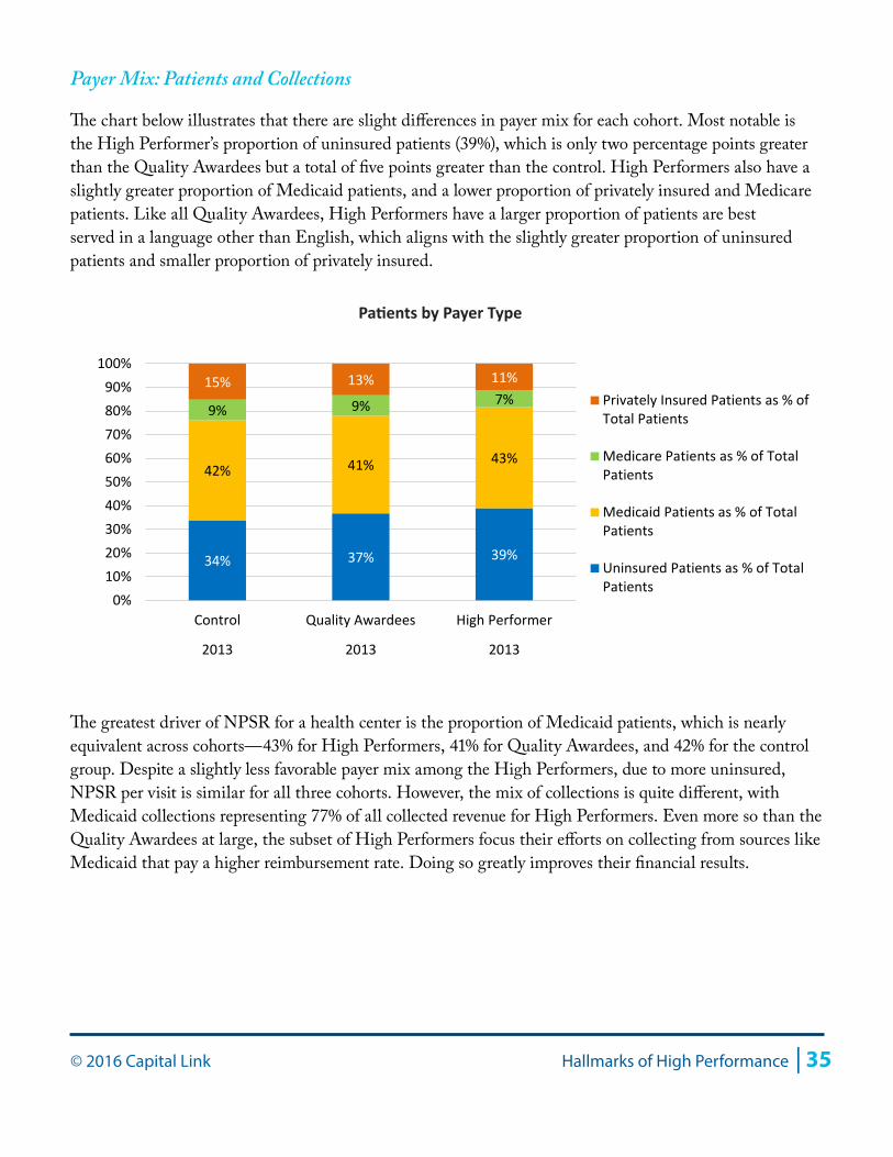
Payer Mix: Patients and Collections
The chart below illustrates that there are slight differences in payer mix for each cohort. Most notable is the High Performer’s proportion of uninsured patients (39%), which is only two percentage points greater than the Quality Awardees but a total of five points greater than the control. High Performers also have a slightly greater proportion of Medicaid patients, and a lower proportion of privately insured and Medicare patients. Like all Quality Awardees, High Performers have a larger proportion of patients are best served in a language other than English, which aligns with the slightly greater proportion of uninsured patients and smaller proportion of privately insured.
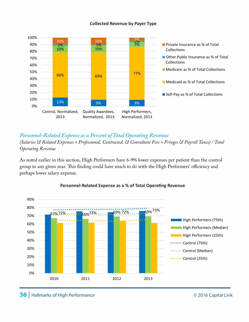
The greatest driver of NPSR for a health center is the proportion of Medicaid patients, which is nearly equivalent across cohorts—43% for High Performers, 41% for Quality Awardees, and 42% for the control group. Despite a slightly less favorable payer mix among the High Performers, due to more uninsured, NPSR per visit is similar for all three cohorts. However, the mix of collections is quite different, with Medicaid collections representing 77% of all collected revenue for High Performers. Even more so than the Quality Awardees at large, the subset of High Performers focus their efforts on collecting from sources like Medicaid that pay a higher reimbursement rate. Doing so greatly improves their financial results.
34% 37% 39%
42% 41% 43%
9% 9% 7% 15% 13% 11%
0%10%20%30%40%50%60%70%80%90%
100%
Control Quality Awardees High Performer
2013 2013 2013
Privately Insured Patients as % ofTotal Patients
Medicare Patients as % of TotalPatients
Medicaid Patients as % of TotalPatients
Uninsured Patients as % of TotalPatients
Patients by Payer Type
36 | Hallmarks of High Performance © 2016 Capital Link
Personnel-Related Expense as a Percent of Total Operating Revenue(Salaries & Related Expenses + Professional, Contracted, & Consultant Fees + Fringes & Payroll Taxes) / Total Operating Revenue
As noted earlier in this section, High Performers have 6-9% lower expenses per patient than the control group in any given year. This finding could have much to do with the High Performers’ efficiency and perhaps lower salary expense.
13% 9% 9%
66% 69% 77%
10% 10% 7% 2% 1% 2% 10% 10% 5%
0%
10%
20%
30%
40%
50%
60%
70%
80%
90%
100%
Control, Normalized,2013
Quality Awardees,Normalized, 2013
High Performers,Normalized, 2013
Private Insurance as % of TotalCollections
Other Public Insurance as % of TotalCollections
Medicare as % of Total Collections
Medicaid as % of Total Collections
Self-Pay as % of Total Collections
Collected Revenue by Payer Type
67% 66% 69% 69%72% 72% 72% 73%
0%
10%
20%
30%
40%
50%
60%
70%
80%
90%
2010 2011 2012 2013
High Performers (75th)
High Performers (Median)
High Performers (25th)
Control (75th)
Control (Median)
Control (25th)
Personnel-Related Expense as a % of Total Operating Revenue
© 2016 Capital Link Hallmarks of High Performance | 37
High Performers have a notably lower proportion of personnel-related expense as a proportion of total operating revenue than the control group or the Quality Awardees. At the median, High Performers averaged 68%, well below Capital Link’s recommended range of 70% to 75%. This result appears to be a combination of higher medical productivity, which produces more revenue per provider and less expense per patient, and the greater likelihood of High Performers being located in states with a lower cost of living, where the range of provider salaries may be lower than the other cohorts.
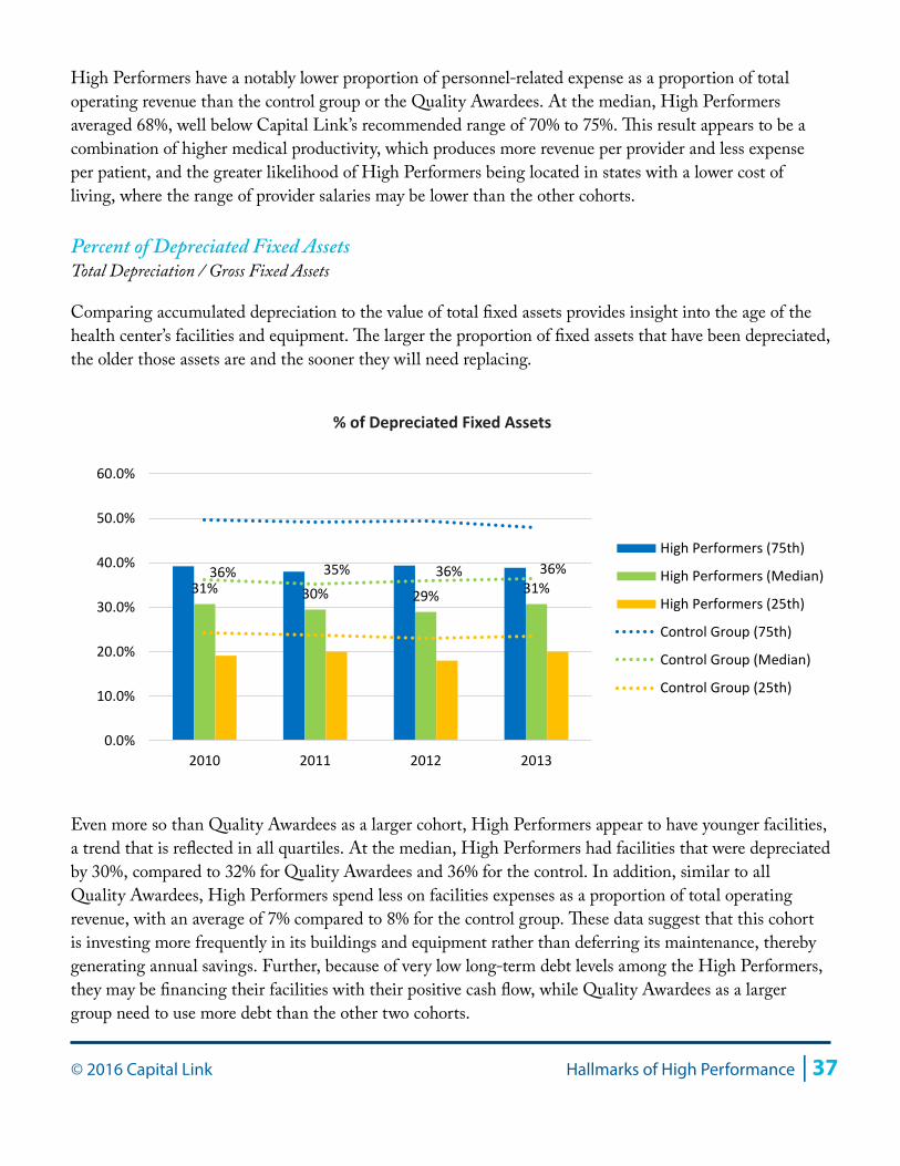
Percent of Depreciated Fixed AssetsTotal Depreciation / Gross Fixed Assets
Comparing accumulated depreciation to the value of total fixed assets provides insight into the age of the health center’s facilities and equipment. The larger the proportion of fixed assets that have been depreciated, the older those assets are and the sooner they will need replacing.
Even more so than Quality Awardees as a larger cohort, High Performers appear to have younger facilities, a trend that is reflected in all quartiles. At the median, High Performers had facilities that were depreciated by 30%, compared to 32% for Quality Awardees and 36% for the control. In addition, similar to all Quality Awardees, High Performers spend less on facilities expenses as a proportion of total operating revenue, with an average of 7% compared to 8% for the control group. These data suggest that this cohort is investing more frequently in its buildings and equipment rather than deferring its maintenance, thereby generating annual savings. Further, because of very low long-term debt levels among the High Performers, they may be financing their facilities with their positive cash flow, while Quality Awardees as a larger group need to use more debt than the other two cohorts.
31% 30% 29% 31%36% 35% 36% 36%
0.0%
10.0%
20.0%
30.0%
40.0%
50.0%
60.0%
2010 2011 2012 2013
High Performers (75th)
High Performers (Median)
High Performers (25th)
Control Group (75th)
Control Group (Median)
Control Group (25th)
% of Depreciated Fixed Assets
38 | Hallmarks of High Performance © 2016 Capital Link
Medical Provider ProductivityMedical Visits / (Physician Full-Time Equivalents + Midlevel Full-Time Equivalents)
High Performers have the greatest level of medical provider productivity, with a four-year average at the median of 3,415 visits per provider, compared to 3,270 for Quality Awardees and 3,084 for the control group health centers. This differential helps explain the dramatically higher profitability of the High Performers, as they are able to generate more revenue-producing visits over the same fixed salary costs.
As health centers transition to an alternative payment environment, where health centers may be reimbursed on a per-patient basis rather than a visit-based fee-for-service model, strong productivity will continue to play an important role in contributing to financial viability. Health centers with efficient, effective models of care will be better positioned to benefit regardless of the payment methodology. High Performers’ strong ability to control costs and keep cash reserves up—while maintaining productive, high-quality practices—should allow them to thrive in the evolving payment marketplace.
Utilization (Visits per Patient)Total Visits / Total Patients
Utilization is the frequency with which patients come to the health center for services over a given calendar year. The following chart compares overall utilization of the High Performers with health centers in the control group for the four-year review period.
3,493 3,538 3,319 3,310
3,210 3,138 3,025 2,964
-
500
1,000
1,500
2,000
2,500
3,000
3,500
4,000
4,500
2010 2011 2012 2013
High Performers (75th)
High Performers (Median)
High Performers (25th)
Control (75th)
Control (Median)
Control (25th)
Medical Provider Productivity
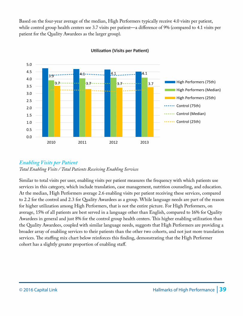
© 2016 Capital Link Hallmarks of High Performance | 39
Based on the four-year average of the median, High Performers typically receive 4.0 visits per patient, while control group health centers see 3.7 visits per patient—a difference of 9% (compared to 4.1 visits per patient for the Quality Awardees as the larger group).
Enabling Visits per PatientTotal Enabling Visits / Total Patients Receiving Enabling Services
Similar to total visits per user, enabling visits per patient measures the frequency with which patients use services in this category, which include translation, case management, nutrition counseling, and education. At the median, High Performers average 2.6 enabling visits per patient receiving these services, compared to 2.2 for the control and 2.3 for Quality Awardees as a group. While language needs are part of the reason for higher utilization among High Performers, that is not the entire picture. For High Performers, on average, 15% of all patients are best served in a language other than English, compared to 16% for Quality Awardees in general and just 8% for the control group health centers. This higher enabling utilization than the Quality Awardees, coupled with similar language needs, suggests that High Performers are providing a broader array of enabling services to their patients than the other two cohorts, and not just more translation services. The staffing mix chart below reinforces this finding, demonstrating that the High Performer cohort has a slightly greater proportion of enabling staff.
3.9 4.1 4.1 4.1
3.7 3.7 3.7 3.7
0.0
0.5
1.0
1.5
2.0
2.5
3.0
3.5
4.0
4.5
5.0
2010 2011 2012 2013
High Performers (75th)
High Performers (Median)
High Performers (25th)
Control (75th)
Control (Median)
Control (25th)
Utilization (Visits per Patient)
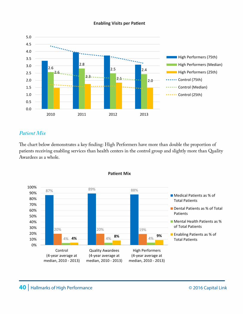
40 | Hallmarks of High Performance © 2016 Capital Link
Patient Mix
The chart below demonstrates a key finding: High Performers have more than double the proportion of patients receiving enabling services than health centers in the control group and slightly more than Quality Awardees as a whole.
2.62.8
2.5 2.42.62.3 2.1 2.0
0.0
0.5
1.0
1.5
2.0
2.5
3.0
3.5
4.0
4.5
5.0
2010 2011 2012 2013
High Performers (75th)
High Performers (Median)
High Performers (25th)
Control (75th)
Control (Median)
Control (25th)
Enabling Visits per Patient
4% 8% 9%
87% 89% 88%
20% 20% 19%
4% 4% 4%
0%10%20%30%40%50%60%70%80%90%
100%
Control(4-year average at
median, 2010 - 2013)
Quality Awardees(4-year average at
median, 2010 - 2013)
High Performers(4-year average at
median, 2010 - 2013)
Medical Patients as % ofTotal Patients
Dental Patients as % of TotalPatients
Mental Health Patients as %of Total Patients
Enabling Patients as % ofTotal Patients
Patient Mix
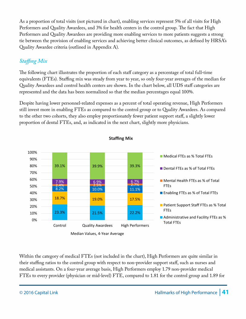
© 2016 Capital Link Hallmarks of High Performance | 41
As a proportion of total visits (not pictured in chart), enabling services represent 5% of all visits for High Performers and Quality Awardees, and 3% for health centers in the control group. The fact that High Performers and Quality Awardees are providing more enabling services to more patients suggests a strong tie between the provision of enabling services and achieving better clinical outcomes, as defined by HRSA’s Quality Awardee criteria (outlined in Appendix A).
Staffing Mix
The following chart illustrates the proportion of each staff category as a percentage of total full-time equivalents (FTEs). Staffing mix was steady from year to year, so only four-year averages of the median for Quality Awardees and control health centers are shown. In the chart below, all UDS staff categories are represented and the data has been normalized so that the median percentages equal 100%.
Despite having lower personnel-related expenses as a percent of total operating revenue, High Performers still invest more in enabling FTEs as compared to the control group or to Quality Awardees. As compared to the other two cohorts, they also employ proportionately fewer patient support staff, a slightly lower proportion of dental FTEs, and, as indicated in the next chart, slightly more physicians.
Within the category of medical FTEs (not included in the chart), High Performers are quite similar in their staffing ratios to the control group with respect to non-provider support staff, such as nurses and medical assistants. On a four-year average basis, High Performers employ 1.79 non-provider medical FTEs to every provider (physician or mid-level) FTE, compared to 1.81 for the control group and 1.89 for
23.3% 21.5% 22.2%
18.7% 19.0% 17.5%
8.2% 10.0% 11.1% 2.4% 2.5% 2.7% 7.9% 6.9% 6.7%
39.1% 39.9% 39.3%
0%
10%
20%
30%
40%
50%
60%
70%
80%
90%
100%
Control Quality Awardees High Performers
Median Values, 4-Year Average
Medical FTEs as % Total FTEs
Dental FTEs as % of Total FTEs
Mental Health FTEs as % of TotalFTEs
Enabling FTEs as % of Total FTEs
Patient Support Staff FTEs as % TotalFTEs
Administrative and Facility FTEs as %Total FTEs
Staffing Mix
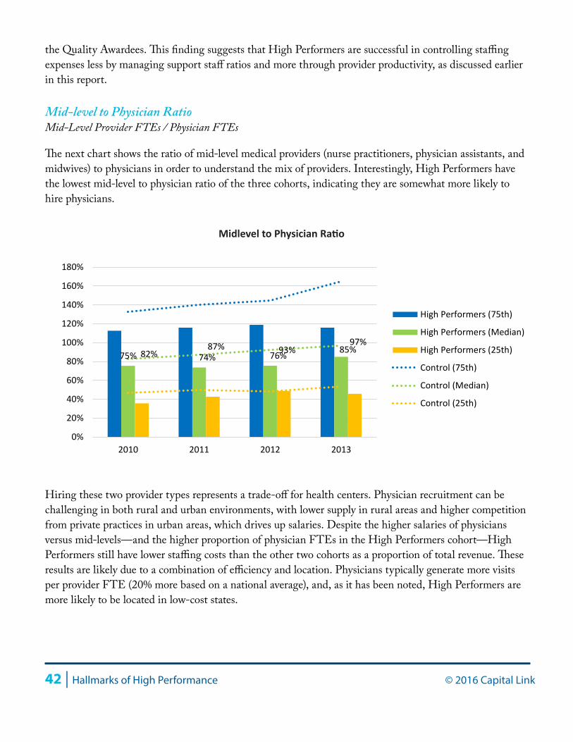
42 | Hallmarks of High Performance © 2016 Capital Link
the Quality Awardees. This finding suggests that High Performers are successful in controlling staffing expenses less by managing support staff ratios and more through provider productivity, as discussed earlier in this report.
Mid-level to Physician RatioMid-Level Provider FTEs / Physician FTEs
The next chart shows the ratio of mid-level medical providers (nurse practitioners, physician assistants, and midwives) to physicians in order to understand the mix of providers. Interestingly, High Performers have the lowest mid-level to physician ratio of the three cohorts, indicating they are somewhat more likely to hire physicians.
Hiring these two provider types represents a trade-off for health centers. Physician recruitment can be challenging in both rural and urban environments, with lower supply in rural areas and higher competition from private practices in urban areas, which drives up salaries. Despite the higher salaries of physicians versus mid-levels—and the higher proportion of physician FTEs in the High Performers cohort—High Performers still have lower staffing costs than the other two cohorts as a proportion of total revenue. These results are likely due to a combination of efficiency and location. Physicians typically generate more visits per provider FTE (20% more based on a national average), and, as it has been noted, High Performers are more likely to be located in low-cost states.
75% 74% 76% 85% 82% 87% 93%
97%
0%
20%
40%
60%
80%
100%
120%
140%
160%
180%
2010 2011 2012 2013
High Performers (75th)
High Performers (Median)
High Performers (25th)
Control (75th)
Control (Median)
Control (25th)
Midlevel to Physician Ratio
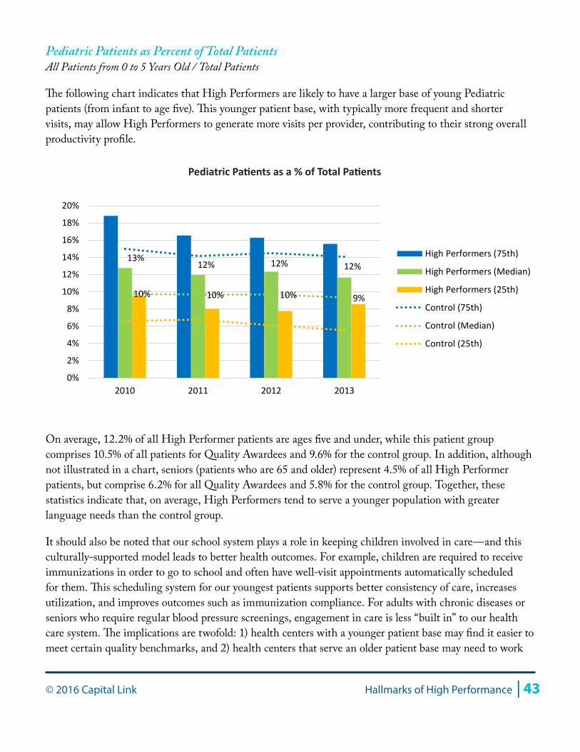
© 2016 Capital Link Hallmarks of High Performance | 43
Pediatric Patients as Percent of Total PatientsAll Patients from 0 to 5 Years Old / Total Patients
The following chart indicates that High Performers are likely to have a larger base of young Pediatric patients (from infant to age five). This younger patient base, with typically more frequent and shorter visits, may allow High Performers to generate more visits per provider, contributing to their strong overall productivity profile.
On average, 12.2% of all High Performer patients are ages five and under, while this patient group comprises 10.5% of all patients for Quality Awardees and 9.6% for the control group. In addition, although not illustrated in a chart, seniors (patients who are 65 and older) represent 4.5% of all High Performer patients, but comprise 6.2% for all Quality Awardees and 5.8% for the control group. Together, these statistics indicate that, on average, High Performers tend to serve a younger population with greater language needs than the control group.
It should also be noted that our school system plays a role in keeping children involved in care—and this culturally-supported model leads to better health outcomes. For example, children are required to receive immunizations in order to go to school and often have well-visit appointments automatically scheduled for them. This scheduling system for our youngest patients supports better consistency of care, increases utilization, and improves outcomes such as immunization compliance. For adults with chronic diseases or seniors who require regular blood pressure screenings, engagement in care is less “built in” to our health care system. The implications are twofold: 1) health centers with a younger patient base may find it easier to meet certain quality benchmarks, and 2) health centers that serve an older patient base may need to work
13%12% 12% 12%
10% 10% 10% 9%
0%
2%
4%
6%
8%
10%
12%
14%
16%
18%
20%
2010 2011 2012 2013
High Performers (75th)
High Performers (Median)
High Performers (25th)
Control (75th)
Control (Median)
Control (25th)
Pediatric Patients as a % of Total Patients
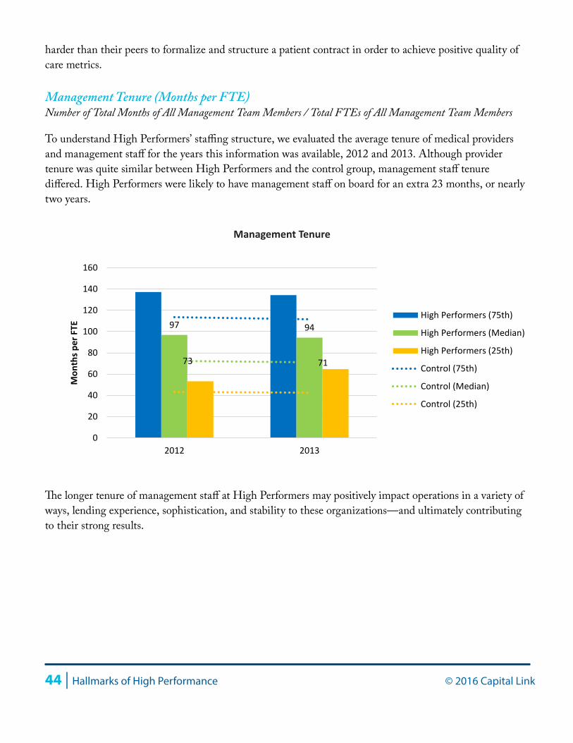
44 | Hallmarks of High Performance © 2016 Capital Link
harder than their peers to formalize and structure a patient contract in order to achieve positive quality of care metrics.
Management Tenure (Months per FTE)Number of Total Months of All Management Team Members / Total FTEs of All Management Team Members
To understand High Performers’ staffing structure, we evaluated the average tenure of medical providers and management staff for the years this information was available, 2012 and 2013. Although provider tenure was quite similar between High Performers and the control group, management staff tenure differed. High Performers were likely to have management staff on board for an extra 23 months, or nearly two years.
The longer tenure of management staff at High Performers may positively impact operations in a variety of ways, lending experience, sophistication, and stability to these organizations—and ultimately contributing to their strong results.
97 94
73 71
0
20
40
60
80
100
120
140
160
2012 2013
Mon
ths p
er F
TE
High Performers (75th)
High Performers (Median)
High Performers (25th)
Control (75th)
Control (Median)
Control (25th)
Management Tenure
© 2016 Capital Link Hallmarks of High Performance | 45
Conclusion
This study clearly indicates that health centers are able to reach quality targets while also performing well financially. Quality Awardee health centers demonstrate that they can hit key quality benchmarks and also achieve stronger financial results through revenue maximization, efficient medical care teams, and higher utilization through positive engagement with patients through enabling services. The data further shows that the highest performers have a greater ability to control costs, particularly staffing costs, and that the location of High Performers in relatively lower cost-of-living states may contribute to stronger results.
The High Performer health centers in this study can be looked to as models for future sustainability for their ability to perform well along the two dimensions of cost and quality. Through a combination of managing costs and maximizing revenues, High Performers remained strong financially while investing the most in enabling services to support their patient populations. Better margins among the High Performers were achieved primarily through lower personnel-related expenses, which were at or below 70% of total operating revenue. Revenue maximization was achieved through greater utilization, but perhaps more importantly from targeting collections from higher reimbursement payers. Also, because of their superior financial performance and ample operating margins, High Performers invest more regularly in their facilities, all while taking on less debt.
These findings suggest the need for a deeper dive into how High Performer operating models differ from that of the control group or from Quality Awardees as a broader group. More analysis at the level of the individual organization is needed in order to understand the role that leadership plays in these health centers’ success and to bring more detailed recommendations to the field on controlling costs without compromising quality. More services focused on providing patients with a comprehensive and holistic approach to their health are crucial, particularly as health outcomes become the key revenue driver with the increasing prevalence of Accountable Care Organizations. Finally, as health centers move towards a payment environment where they are reimbursed on a per-patient basis rather than through a fee-for-service model, it will become important to reevaluate the role of productivity in financial viability. While in a fee-for-service environment productivity drives revenue, in a capitated environment visits drive cost. High Performers are well-positioned to respond to new payment models given their aptitude for controlling costs while performing well on quality metrics as measured by HRSA.
Appendix A: Description of Quality Awardees and High Performers
Below are comparative charts that provide more context as to the size, region, and location of health centers in each of the three cohorts: Quality Awardees, High Performers, and the control group.
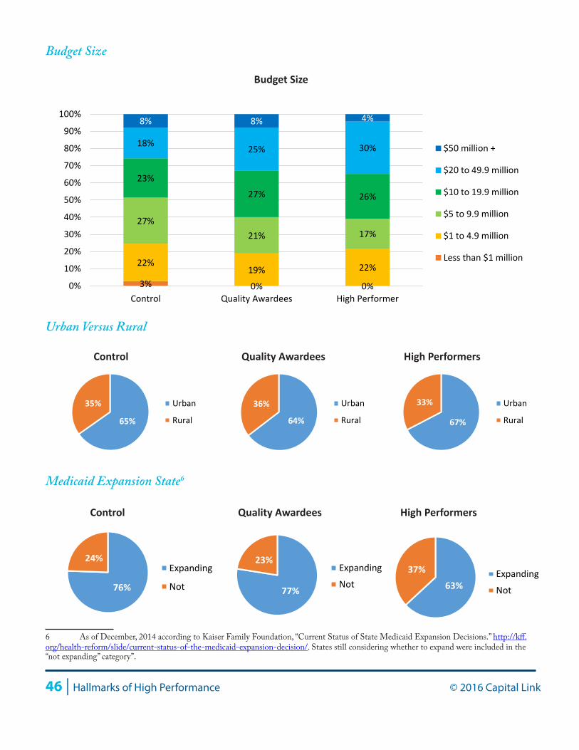
46 | Hallmarks of High Performance © 2016 Capital Link
Budget Size
Urban Versus Rural
Medicaid Expansion State6
6 As of December, 2014 according to Kaiser Family Foundation, “Current Status of State Medicaid Expansion Decisions.” http://kff.org/health-reform/slide/current-status-of-the-medicaid-expansion-decision/. States still considering whether to expand were included in the “not expanding” category”.
3% 0% 0%
22% 19% 22%
27% 21% 17%
23%
27% 26%
18% 25% 30%
8% 8% 4%
0%
10%
20%
30%
40%
50%
60%
70%
80%
90%
100%
Control Quality Awardees High Performer
$50 million +
$20 to 49.9 million
$10 to 19.9 million
$5 to 9.9 million
$1 to 4.9 million
Less than $1 million
Budget Size
Control Quality Awardees High Performers
65%
35% Urban
Rural 64%
36% Urban
Rural 67%
33% Urban
Rural
Control Quality Awardees High Performers
76%
24% Expanding
Not 77%
23% Expanding
Not 63% 37% Expanding
Not
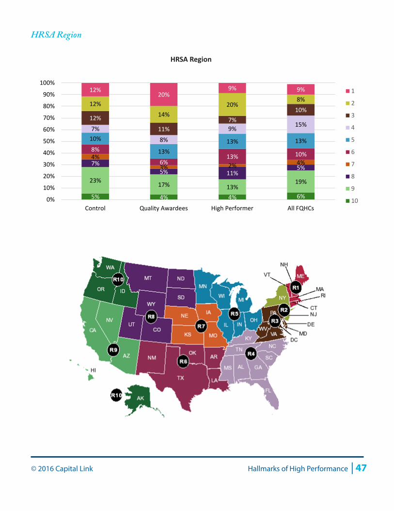
© 2016 Capital Link Hallmarks of High Performance | 47
HRSA Region
5% 4% 4% 6%
23% 17% 13% 19%
7% 5% 11%
5%
4% 3% 2% 4%
8%
6% 13% 10%
10%
13% 13% 13%
7%
8%
9% 15% 12%
11% 7%
10% 12%
14% 20%
8% 12%
20% 9% 9%
0%
10%
20%
30%
40%
50%
60%
70%
80%
90%
100%
Control Quality Awardees High Performer All FQHCs
1
2
3
4
5
6
7
8
9
10
HRSA Region
48 | Hallmarks of High Performance © 2016 Capital Link
Appendix B: Methodology
To obtain the first cohort, all of the 2014 Health Center Quality Leaders (361 health centers) and National Quality Leaders (57 health centers) were collected into one group and, for the purposes of analysis, were referred to as Quality Awardees (more information on the HRSA quality awards is included at the end of this section). In addition, a control group was selected from health centers that did not receive either of the above quality designations by HRSA in 2014. The analysis and charts in the enclosed report represent all of the health centers in each of the cohorts (Quality Awardees and the control group) for which Capital Link had audits for all four years of the study period, that of 2010 through 2013. Of the 371 unique Quality Awardees, Capital Link had a complete audit set for 180 health centers (49%). Of the 831 health centers in the control group, Capital Link had 362 (44%).
For the more selective second group designated “High Performers,” the Quality Awardees were further analyzed based on performance along two key financial benchmarks: days cash on hand and operating margin for 2010 through 2013. A four-year average was taken for both financial indicators and from these two four-year averages, health centers belonging to the 75th, 50th, and 25th quartiles were determined. If the days cash average was above the 75th, then the health center was given a score of 4. If between the 75th and 50th, then it was scored 3. If between the 50th and 25th, it was scored as 2. If below the 25th, it was scored as 1. Similarly, the operating margin average quartiles were found and the individual centers scored. Then the score from the days cash calculation and the score from the operating margin were summed. Those health centers with summed scores of 7 or 8 were selected for the High Performers group. From this analysis 46 health centers were identified that met the criteria of scoring 7 or 8, that is, those having the best performance based on the combination of these financial indicators. These health centers were then analyzed along other financial indicators (days in accounts payable and NPSR growth) for another round of filtering; from this process one health center was discarded due to repeated years of NPSR declines (and also patient declines), leaving 45 in the High Performers group.
Limitations to this study include sample size, regional distribution, and data sources. Slightly less than half of each cohort was represented in this study, with 44% of all control group health centers (those that did not receive a 2014 quality award based on 2013 UDS data) and 49% of Quality Awardees represented. A larger proportion of health centers represented might have resulted in slightly different conclusions.
Some HRSA regions were also slightly over- and underrepresented when comparing the control group to all health centers nationally. In particular, HRSA Regions 2 (New York and New Jersey, 3 (New England), and 9 (California, Arizona and Nevada) were slightly overrepresented while Regions 4 (Southeastern states) and 5 (Midwestern states) were particularly underrepresented.
Finally, while UDS data is helpful as a broad-based data source to which all health centers report annually, this resource still has some limitations. When used with audited data which aligns on a fiscal year (ending at any month of the year), UDS data falls on a calendar year, which makes comparison of audited data to UDS operational data at times difficult. In addition, unlike financial data, UDS data are not by and
© 2016 Capital Link Hallmarks of High Performance | 49
large audited, making the data included slightly less reliable with respect to accuracy and consistency from year to year. In December of 2014, HRSA announced its 2014 Health Center Quality Improvement Awards, which were based on 2013 UDS data. Four categories of awards and corresponding funding were announced, including EHR Reporters, Clinical Quality Improvers, Health Center Quality Leaders and National Quality Leaders. We selected the Health Center Quality Leaders and National Quality Leaders to comprise the Quality Awardee cohort because these were the two categories of awards that spoke to clinical outcomes and benchmarks, rather than electronic health records (EHR) usage or improvement in clinical quality. As defined by HRSA, awards in these two categories were made as follows7:
• 2014 Health Center Quality Leaders were awarded based upon 2013 UDS data. These awards were given to the top 30% of all health centers that achieved “the best overall clinical outcomes.” The outcomes HRSA evaluated were based on the average adjusted quartile ranking of twelve Quality of Care Measures for which data is collected in the UDS report8. The final pool of 2014 Health Center Quality leaders totaled 361 organizations.
• 2014 National Quality Leaders were also awarded based upon 2013 UDS data but calculated differently. As it did for the Health Center Quality Leaders, HRSA measured health center performance along the same 12 criteria (grouped by Chronic Disease Management, Preventive Care, and Perinatal/Prenatal Care). However, instead of evaluating the adjusted quartile ranking, each of the 12 outcomes were compared to specific numeric benchmarks (e.g., the percent of patients with diabetes control had to be over 84%). Only health centers that outperformed all 12 benchmarks received National Quality Leader awards.
It should be noted that the quality metrics used by HRSA to select awardees may not provide a full depiction of all aspects of “quality care.” However, these metrics are nevertheless broadly applied on a consistent basis across all health centers nationally, making them suitable criteria for the creation of Quality Awardee and High Performer cohorts.
One additional limitation of this report is that the Quality Awardee and control groups were in no way adjusted for patient demographics, revenue mix, or any other organizational characteristics. However, as noted earlier in this report, the patient income distribution, urban/rural status, and Medicaid expansion state status of the two cohorts were quite similar.
7 Quality Awardees metrics defined by HRSA in a BPHC Presentation dated December 18, 2014.8 More information on quality of care adjusted quartile rankings can be found at http://bphc.hrsa.gov/datareporting/reporting/ranking.html