Group One Data Visualization Spring 2005 Doctor of Professional Studies in Computing CSIS School of...
26
Group One Data Visualization Spring 2005 Doctor of Professional Studies in Computing CSIS School of Computer Science and Information Systems
-
date post
21-Dec-2015 -
Category
Documents
-
view
213 -
download
0
Transcript of Group One Data Visualization Spring 2005 Doctor of Professional Studies in Computing CSIS School of...

Group OneData Visualization
Spring 2005
Doctor of Professional Studies in Computing
CSIS School of Computer Science
and Information Systems

I. Overview
II. Foundations of Visualization
III. Visualization and KDD
IV. I Can See Clearly Now
V. XmdvTool Demonstration with ISBSG Case Study
Agenda

Visualize"to form a mental vision, image, or picture of (something not visible or present to sight, or of an abstraction); to make visible to the mind or imagination"[The Oxford English Dictionary, 1989]
Many Variations "Visualization":1) Visualization in Scientific Computing (Scientific Visualization)2) Information Visualization3) Software Visualization
I. Overview

Running Man

Fish Eating Boat

I. Foundations of Visualization


III. Visualization and KDD
• Knowledge Discovery from Databases– Data Processing
– Machine Learning
– Evaluation
– Visualization
• Experiments may be nested• Approach Advocated by YALE
– Yet Another Learning Environment
– http://www-ai.cs.uni-dortmund.de/SOFTWARE/YALE

IV. I Can See Clearly Now
•Data generation is exploding, particularly dimensional data
•Visualization takes place in context; tools and functionality are driven by user needs and objectives
•Yang, et al provide an excellent baseline list of core and advanced techniques for consideration
•Keim introduces an interesting 3-dimention view linking data type, interaction technique, and display type
Key Points:

•How much new information per person? According to the Population Reference Bureau, the world population is 6.3 billion, thus almost 800 MB of recorded information is produced per person each year. It would take about 30 feet of books to store the equivalent of 800 MB of information on paper.
•Information explosion? We estimate that new stored information grew about 30% a year between 1999 and 2002
•The World Wide Web contains about 170 terabytes of information on its surface; in volume this is seventeen times the size of the Library of Congress print collections.
•Instant messaging generates five billion messages a day (750GB), or 274 Terabytes a year. •Email generates about 400,000 terabytes of new information each year worldwide.
Data Growth Factoids:

Managerial Snap-shot
Interactive reporting
“What If" analysis
What Next ?What should
I do ?
“Richness” of Information
Use
/need
Visualization takes place in context – different users with different needs have different requirement and techniques.

Prescribed action: Alerts and notifications
Managerial Snap-shot
Interactive reporting
“What If" analysis
What Next ?What should
I do ?
Managed Metrics: Scorecard & Dashboards
Enterprise Reporting: Navigation needs and reliable information
Mutli-dimensional “speed of thought”
Analysis and predictive values
“Richness” of Information
Use
/need
Typic
al O
utp
ut
Inte
ract
ion
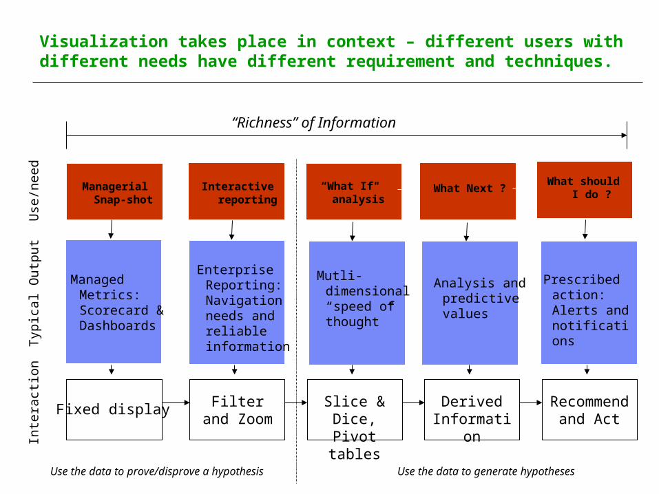
Fixed display Filter and Zoom
Slice & Dice, Pivot tables
Derived Information
Recommend and Act
Visualization takes place in context – different users with different needs have different requirement and techniques.
Prescribed action: Alerts and notifications
Managerial Snap-shot
Interactive reporting
“What If" analysis
What Next ?What should
I do ?
Managed Metrics: Scorecard & Dashboards
Enterprise Reporting: Navigation needs and reliable information
Mutli-dimensional “speed of thought”
Analysis and predictive values
“Richness” of Information
Use
/need
Typic
al O
utp
ut
Inte
ract
ion
Fixed display Filter and Zoom
Slice & Dice, Pivot tables
Derived Information
Recommend and Act
Visualization takes place in context – different users with different needs have different requirement and techniques.
Use the data to prove/disprove a hypothesis Use the data to generate hypotheses

•Filter – reduce the amount of data to increase focus
•Distortion – enlarge some part of a display to examine details
•Zooming and Panning – enlarge, make smaller, move through display
•Manual Pixel re-ordering – top to bottom, bottom to top
•Comparing – create/examine relationships
•Refining – generate a new, focused display of data subset
Yang, et al identify Core Navigation Tool:

•Showing names – mouse-overs
•Layer re-ordering – ordering of overlapping data
•Manual relocation – separation of overlapping data
•Extent Scaling – interactive, proportional resizing
•Dynamic Masking – hiding of irrelevant data
•Automatic Shifting – automatic overlap reduction
Yang, et al identify Advance Navigation Tool:

Keim creates a 3-dimentional chart that relates interaction technique, type of data, and visualization technique

Simple data
Complex data
Breakdown and examination of Keim model

Breakdown and examination of Keim model
Interaction and manipulation techniques, similar to Yang

Breakdown and examination of Keim model
Recommended display type (some of which we will see in the demos)

V. XmdvTool Demonstration with ISBSG Case Study
• Tool Available at http://davis.wpi.edu/~xmdv• Methods
– Scatterplots– Glyphs– Parallel Cordinates– Dimensional Stacking
• N-D Brush– Highlight– Mask– Values– Average

Source of Case Study
• The International Software Benchmarking Standards Group– Mission – Help Improve Management of IT Resources
Through a Public Repository– Produces – ISBSG Estimating, Benchmarking &
Research Suite (Release 8 in 2003) of Data and Tools– Academic Use – Free or Nominal Charge– Web Site – www.isbsg.org
• Same Source As Team One’s Data Mining Project

Composition of Study File
• 451 New Development Projects
• Fields– Size in Adjusted Function Points– Duration in Months– Maximum Team Size– Work Effort in Hours– Project Delivery Rate