Grid Value Report Final - ANLEC...
47
Transcript of Grid Value Report Final - ANLEC...


Disclaimer This analysis for this report was completed on 30th of June 2017 and therefore the Report does not take into account events or circumstances arising after that time. The authors of the Report take no responsibility to update the Report.
The Report’s modelling considers only a limited set of input assumptions which should not be considered entirely exhaustive. Modelling inherently requires assumptions about future behaviours and market interactions, which may result in forecasts that deviate from actual events. There will usually be differences between estimated and actual results, because events and circumstances frequently do not occur as expected, and those differences may be material. The authors of the Report take no responsibility for the modelling presented to be considered as a definitive account.
The authors of the Report highlight that the Report does not constitute investment advice or a recommendation to you on your future course of action. The authors provide no assurance that the scenarios modelled will be accepted by any relevant authority or third party.
Conclusions in the rReport are based, in part, on the assumptions stated and on information which is publicly available. No listed author, company or supporter of this Report, nor any member or employee thereof undertakes responsibility in any way whatsoever to any person in respect of errors in this Report arising from information that may be later be proven to be incorrect.
In the preparation of this Report the authors have considered and relied upon information sourced from a range of sources believed after due enquiry to be reliable and accurate. The authors have no reason to believe that any information supplied, or obtained from public sources, was false or that any material information has been withheld.
The authors do not imply and it should not be construed that they have verified any of the information provided, or that the author’s enquiries could have identified any matter which a more extensive examination might disclose.
While every effort is made by the authors to ensure that the facts and opinions contained in this document are accurate, the authors do not make any representation about the content and suitability of this information for any particular purpose. The document is not intended to comprise advice, and is provided “as is” without express or implied warranty. Readers should form their own conclusion as to its applicability and suitability. The authors reserve the right to alter or amend this document without prior notice.
Authors:
Andy Boston, Red Vector Geoff Bongers, Gamma Energy Technology Stephanie Byrom, Gamma Energy Technology Iain Staffell, Imperial College London
How to reference this report: Boston, A., Bongers, G., Byrom, S. and Staffell, I. (2017), Managing Flexibility Whilst Decarbonising Electricity - the Australian NEM is changing, Gamma Energy Technology P/L, Brisbane, Australia.
Financial Support: The authors wish to acknowledge financial assistance provided through Australian National Low Emissions Coal Research and Development (ANLEC R&D). ANLEC R&D is supported by Australian Coal Association Low Emissions Technology Limited and the Australian Government through the Clean Energy Initiative.
About Red Vector:
Red Vector is a UK Limited Company that provides an energy consulting service based on Andy Boston’s 30 years experience in the energy industry starting with the nationalised CEGB, through privatisation firstly with PowerGen and thence E.ON, and finally with the Energy Research Partnership.
www.redvector.co.uk
About Gamma Energy Technology P/L:
Gamma Energy Technology P/L is an independent energy consulting service, offering a range of technical and support services, including but not limited to power generation technology.
Gamma Energy Technology P/L is proud to contribute to the on-going discussions on energy in Australia as we seek to solve the trilemma of energy supply - to assure energy system security and affordability so that emissions reduction targets are delivered.
www.powerfactbook.com.au
www.gamma-energy-technology.com.au

The pathway to gradual decarbonisation of the NEM raises a number of questions and concerns. This study has modelled scenarios that deliver an operable grid, able to keep the lights on, rather than simply stacking capacity to meet demand. The conclusions from the report “Managing Flexibility Whilst Decarbonising Electricity: the Australian NEM is Changing” are drawn from an exploration of the following questions:
What is needed to maintain a secure and stable grid?
Can planners focus on a limited set of technologies?
What benefits accrue through the NEM to the individual states?
How can we compare the costs of different technologies?
Four key messages emerge from this study. Each tackles an often-quoted myth surrounding the energy system.


Page V
Table of Contents 1 Introduction ...................................................................................................................... 1
1.1 Modelling Energy and Grid Services ....................................................................................... 2 2 MEGS Modelling the Existing NEM ................................................................................. 3
2.1 Queensland ............................................................................................................................. 3 2.2 New South Wales .................................................................................................................... 4 2.3 Victoria .................................................................................................................................... 4 2.4 Tasmania ................................................................................................................................ 5 2.5 South Australia ........................................................................................................................ 5 2.6 Key Messages from 2015 Data ............................................................................................... 6
3 Tools to Interpret the MEGS Modelling Results ............................................................... 7 3.1 The Load Duration Curve ........................................................................................................ 7 3.2 Decarbonisation Pathway Curve ............................................................................................. 8 3.3 Effect of Weather .................................................................................................................... 8
4 MEGS Modelling Technology Scenarios ....................................................................... 10 4.1 Base Case ............................................................................................................................. 10 4.2 Technology options to decarbonise the grid ......................................................................... 10 4.3 Technology Options – Conclusions ....................................................................................... 12
5 MEGS Case studies ....................................................................................................... 13 5.1 Base Case ............................................................................................................................. 13 5.2 Decarbonisation pathway to 2030 – renewables .................................................................. 13 5.3 Decarbonisation pathway to 2050 ......................................................................................... 17 5.4 Decarbonisation pathway to 2050 – an alternative hybrid solution ....................................... 17
6 Value of Grid Services ................................................................................................... 20 7 Experience of Other Grids ............................................................................................. 21
7.1 Great Britain .......................................................................................................................... 21 7.2 Germany ............................................................................................................................... 22
Appendices .......................................................................................................................... 25 1 Grid services .................................................................................................................. 26
1.1 Grid services terminology ...................................................................................................... 26 2 Modelling Philosophy ..................................................................................................... 28
2.1 Background ........................................................................................................................... 28 2.2 Modelling Method .................................................................................................................. 29
3 Data and Assumptions ................................................................................................... 31 3.1 Technology Cost ................................................................................................................... 31 3.2 Fuel and Carbon ................................................................................................................... 31 3.3 Regional Data – Demand and Inertia .................................................................................... 32 3.4 Interconnectors ..................................................................................................................... 32 3.5 Renewables Ninja ................................................................................................................. 33 3.6 Capacity Credit ...................................................................................................................... 34
4 NEM Interconnectors ..................................................................................................... 35 4.1 Interconnector congestion ..................................................................................................... 35 4.2 Congestion and the dispatch process within the NEM .......................................................... 36 4.3 Summary: the consequences of congestion ......................................................................... 38

Page VI
Tables and Figures List of Figures Figure 1: Comparing actual and modelled generation (MW) for Queensland ..................................................... 3 Figure 2: Comparing actual and modelled generation (MW) for New South Wales ........................................... 4 Figure 3: Comparing actual and modelled generation (MW) for Victoria ............................................................ 4 Figure 4: Comparing actual and modelled generation (MW) for Tasmania ........................................................ 5 Figure 5: Comparing actual and modelled generation (MW) for South Australia ................................................ 5 Figure 6: Construction of load duration curve ..................................................................................................... 7 Figure 7: The load duration curve with mid-merit and peaking plant .................................................................. 7 Figure 8: Example of a decarbonisation pathway chart ...................................................................................... 8 Figure 9: Effect of weather on cost and emissions ............................................................................................. 9 Figure 10: Pathway to decarbonisation using renewables ................................................................................ 10 Figure 11: Pathway to decarbonisation using gas ............................................................................................ 11 Figure 12: Pathway to decarbonisation using new build coal with CCS ........................................................... 12 Figure 13: Base case load duration, capacity and typical week’s schedule for NEM ....................................... 13 Figure 14: Finkel Report– 2030 scenario (EIS case) ........................................................................................ 14 Figure 15: QLD generation pattern for Finkel 2030 scenario ............................................................................ 15 Figure 16: NSW generation pattern for Finkel 2030 scenario ........................................................................... 15 Figure 17: VIC generation pattern for Finkel 2030 scenario ............................................................................. 16 Figure 18: TAS generation pattern for Finkel 2030 scenario ............................................................................ 16 Figure 19: SA generation pattern for Finkel 2030 scenario .............................................................................. 16 Figure 20: MEGS view of the NEM for Finkel 2050 Scenario ........................................................................... 17 Figure 21: Mixed generation, cost effective solution for 2050 ........................................................................... 19 Figure 22: German electricity production and exports, week 25 2017 .............................................................. 23 Figure 23: Daily electricity production by generation type, week 26 2017 ........................................................ 23 Figure 24: Electricity import and export of Germany to its neighbours in 2015 ................................................ 24 Figure 25: MEGS model comparison to other methodologies .......................................................................... 29 Figure 26: Map showing the locations of wind and solar farms simulated in this study .................................... 34 Figure 27: Interconnectors in the NEM ............................................................................................................. 35 Figure 28: Differences in NEM wholesale electricity prices .............................................................................. 37 List of Tables Table 1: Wind drought within the NEM ............................................................................................................... 9 Table 2: Options for first step from 2030 onwards ............................................................................................ 18 Table 3: Options for second step after choosing CCS retrofit. .......................................................................... 18 Table 4: MEGS illustrates the value of grid services ........................................................................................ 20 Table 5: Timeframes for ensuring grid stability and security ............................................................................. 27 Table 6: Plant cost data (2017) ......................................................................................................................... 31 Table 7: Fuel cost data (2017) .......................................................................................................................... 32 Table 8: Regional data ...................................................................................................................................... 32 Table 9: Interconnector data ............................................................................................................................. 33
Page 1
1 Introduction Australia’s National Electricity Market (NEM) is changing. The changes are driven through both policy interventions by State and Federal Governments, and by international commitments made in Paris. Rising electricity prices are also resulting in changes being driven from the bottom-up, with some consumers now wanting their own generation and storage options, to feel self-sufficient and in control of cost and reliability. This raises a number of questions and concerns for both the existing generation fleet and new technologies that might be added to the grid.
• What is needed to maintain a secure and stable grid?
• Can planners focus on a limited set of technologies to deliver the desired outcomes?
• What benefits accrue through the NEM to the states each with their unique characteristics?
• How can we compare the costs of different technologies?
• How does all this assist in decarbonisation?
• At what cost is the transformation to consumer and Australia’s competitive position?
The United Kingdom (UK) has faced similar issues with its ambitious plan to heavily decarbonise the grid by 2030; UK-based Energy Research Partnership (ERP) sought to examine the issue.1 It built its own model of the grid, which specifically included the need for grid services beyond a simple energy-modelling tool. Its results showed that the value of power generation technologies are very dependent on the nature of the grid to which they are being added.
The Australian NEM grid is very different to that in the UK, so conclusions from that study cannot be applied directly to the NEM. The NEM is an “islanded” grid that consists of five state grids that have relatively weak interconnections. Furthermore, each state is unique with a different set of resources for generation and different demand shapes.
This current study has two key objectives. Firstly, it seeks to build upon the work of the Energy Research Partnership (ERP) by adapting its modelling methodology to be suitable for the NEM and validating it against historic data. To do this, the ERP methodology was incorporated in a new model for the NEM. It was integrated with Renewables Ninja,2 a weather simulation tool that was set up for the Australian climate.
Secondly, this study aims to begin to answer some of the big questions above, and share some of the preliminary insights to contribute to the debate around energy futures.
At the heart of its philosophy is ensuring that the decarbonising scenarios assessed deliver an operable grid that can keep the lights on. This is an approach that goes beyond conventional energy models of just stacking energy assets to meet demand. The report seeks to share the initial findings to stimulate debate around the best solutions for the specific issues of the states participating in the NEM, and the objectives of the Federal Government.
1 Energy Research Partnership (2015) Managing Flexibility Whilst Decarbonising the GB Electricity System, London, UK. 2 Pfenninger, S., & Staffell, I. (2016) Long-term patterns of European PV output using 30 years of validated hourly reanalysis and satellite data, Energy 114, 1251-1265.
Page 2
There are boundaries to this study, specifically:
• There is no intention to forecast electricity prices. The main financial output is the total system cost. This is the money that needs to be recovered from the consumers to pay for the system, including annualised capital cost of new build assets as well as on-going fixed costs and costs incurred by running generation. Prices may be related to capital asset cost, but are subject to many other influences outside the scope of this work.
• There is no intention to develop a blueprint for the perfectly optimised system. This would be dependent on study-specific objectives and constraints. Many constraints are political in nature and so no attempt is made to forecast these. However, the report examines possible future scenarios based on ones proposed for the NEM and a series of “what-happens-if” case studies to illustrate effects and explore the boundaries of a sensible system.
• This study is not a comprehensive exploration of the issues. The scenarios modelled are used as examples to demonstrate the capabilities of the modelling and stimulate debate.
This study was financially supported by the Australian National Low Emissions Coal Research and Development (ANLEC R&D).
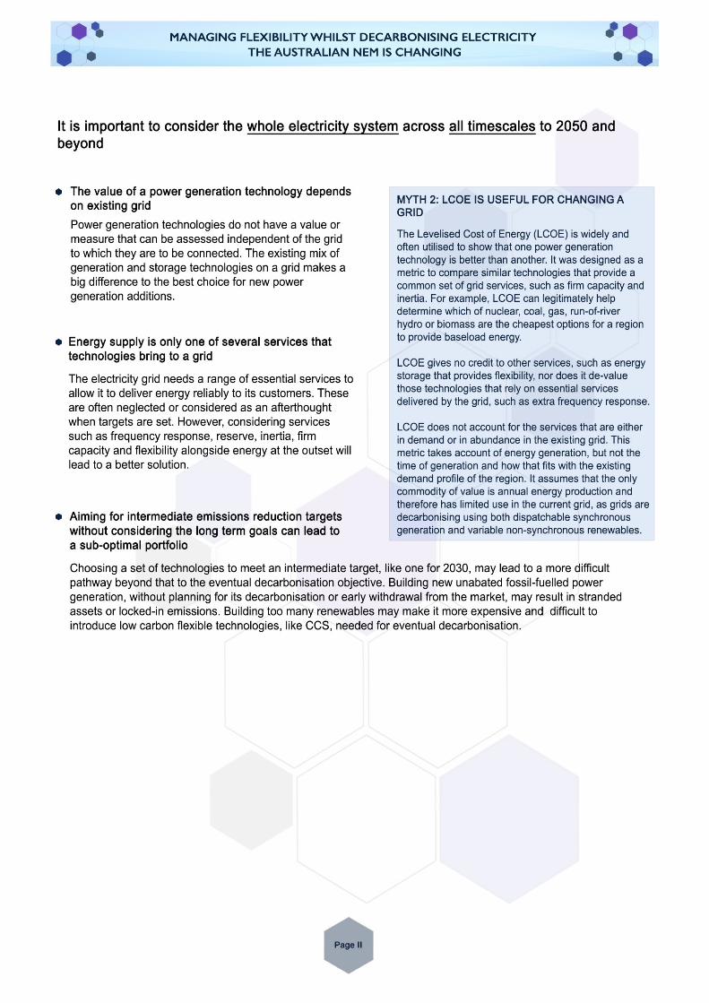
1.1 Modelling Energy and Grid Services The NEM model developed for this study takes into account the grid services provided by the various electricity generation technologies together with simple energy balancing. It challenges current paradigms for understanding the total system cost for electricity supply. Conventional modelling approaches make simple comparisons using traditional metrics, like levelised cost of electricity (LCOE), which do not take into account the grid system requirements. This modelling safeguards the resilience of a grid by maintaining a minimum level of inertia and seeking to ensure that the operator has the frequency control tools needed to maintain a stable grid.3
The model at the heart of the work reported here is MEGS – Modelling Energy and Grid Services. It is a regional electricity system model that ensures there is sufficient firm capacity to meet demand, while the grid operator has sufficient services to maintain grid supply and stability.
It follows a similar solution methodology to BERIC (Balancing Energy, Reserve, Inertia and Capacity), a model used by the ERP in the UK to model flexibility in the system on the UK mainland.1 Both were written by the same author, but MEGS has additional features that includes the ability to model the following:
• Regions with interconnects that can carry energy and reserve services
• Resource limited hydro
• Short term storage
• An integrated approach with the output of Renewables Ninja,2 a resource that, for a given region, simulates demand and available hydro, wind and PV for historic weather years.
The goal of MEGS is to show the least system-cost mix of generation that satisfies both a demand constraint and a grid services constraint. Detail on the modelling methodology of MEGS can be found in Appendix 2.
3 Jenkins, J.D. & Thernstrom, S. (2017) Deep Decarbonization of the Electric Power Sector: Insights from Recent Literature, Energy Innovation Reform Project.
Page 3
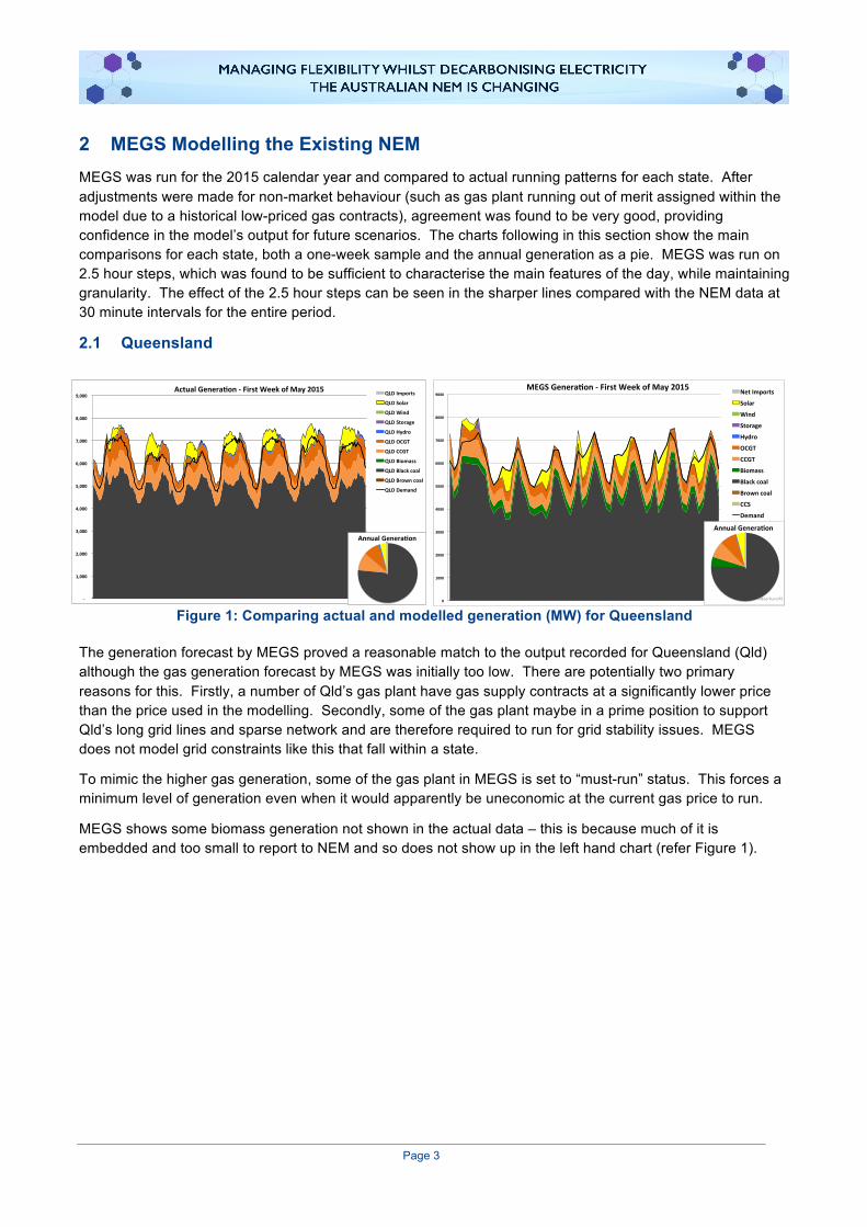
2 MEGS Modelling the Existing NEM MEGS was run for the 2015 calendar year and compared to actual running patterns for each state. After adjustments were made for non-market behaviour (such as gas plant running out of merit assigned within the model due to a historical low-priced gas contracts), agreement was found to be very good, providing confidence in the model’s output for future scenarios. The charts following in this section show the main comparisons for each state, both a one-week sample and the annual generation as a pie. MEGS was run on 2.5 hour steps, which was found to be sufficient to characterise the main features of the day, while maintaining granularity. The effect of the 2.5 hour steps can be seen in the sharper lines compared with the NEM data at 30 minute intervals for the entire period.
2.1 Queensland
Figure 1: Comparing actual and modelled generation (MW) for Queensland
The generation forecast by MEGS proved a reasonable match to the output recorded for Queensland (Qld) although the gas generation forecast by MEGS was initially too low. There are potentially two primary reasons for this. Firstly, a number of Qld’s gas plant have gas supply contracts at a significantly lower price than the price used in the modelling. Secondly, some of the gas plant maybe in a prime position to support Qld’s long grid lines and sparse network and are therefore required to run for grid stability issues. MEGS does not model grid constraints like this that fall within a state.
To mimic the higher gas generation, some of the gas plant in MEGS is set to “must-run” status. This forces a minimum level of generation even when it would apparently be uneconomic at the current gas price to run.
MEGS shows some biomass generation not shown in the actual data – this is because much of it is embedded and too small to report to NEM and so does not show up in the left hand chart (refer Figure 1).
0
1000
2000
3000
4000
5000
6000
7000
8000
9000
MEGSGenera4on-FirstWeekofMay2015NetImports
Solar
Wind
Storage
Hydro
OCGT
CCGT
Biomass
Blackcoal
Browncoal
CCS
Demand
AnnualGenera4on
MEGSRun075-
1,000
2,000
3,000
4,000
5,000
6,000
7,000
8,000
9,000ActualGenera8on-FirstWeekofMay2015 QLDImports
QLDSolar
QLDWind
QLDStorage
QLDHydro
QLDOCGT
QLDCCGT
QLDBiomass
QLDBlackcoal
QLDBrowncoal
QLDDemand
AnnualGenera8on
Page 4
2.2 New South Wales
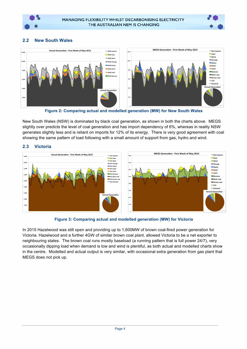
Figure 2: Comparing actual and modelled generation (MW) for New South Wales
New South Wales (NSW) is dominated by black coal generation, as shown in both the charts above. MEGS slightly over predicts the level of coal generation and has import dependency of 6%, whereas in reality NSW generates slightly less and is reliant on imports for 12% of its energy. There is very good agreement with coal showing the same pattern of load following with a small amount of support from gas, hydro and wind.
2.3 Victoria
Figure 3: Comparing actual and modelled generation (MW) for Victoria
In 2015 Hazelwood was still open and providing up to 1,600MW of brown coal-fired power generation for Victoria. Hazelwood and a further 4GW of similar brown coal plant, allowed Victoria to be a net exporter to neighbouring states. The brown coal runs mostly baseload (a running pattern that is full power 24/7), very occasionally dipping load when demand is low and wind is plentiful, as both actual and modelled charts show in the centre. Modelled and actual output is very similar, with occasional extra generation from gas plant that MEGS does not pick up.
0
1000
2000
3000
4000
5000
6000
7000
8000MEGSGenera3on-FirstWeekofMay2015 NetImports
Solar
Wind
Storage
Hydro
OCGT
CCGT
Biomass
Blackcoal
Browncoal
CCS
Demand
AnnualGenera3on
MEGSRun077-
1,000
2,000
3,000
4,000
5,000
6,000
7,000
8,000
9,000ActualGenera8on-FirstWeekofMay2015 VICImports
VICSolar
VICWind
VICStorage
VICHydro
VICOCGT
VICCCGT
VICBiomass
VICBlackcoal
VICBrowncoal
VICDemand
AnnualGenera8on
-
2,000
4,000
6,000
8,000
10,000
12,000ActualGenera4on-FirstWeekofMay2015 NSWImports
NSWSolar
NSWWind
NSWStorage
NSWHydro
NSWOCGT
NSWCCGT
NSWBiomass
AnnualGenera4on
0
2000
4000
6000
8000
10000
12000MEGSGenera0on-FirstWeekofMay2015 NetImports
Solar
Wind
Storage
Hydro
OCGT
CCGT
Biomass
Blackcoal
Browncoal
CCS
Demand
AnnualGenera0on
MEGSRun077

Page 5
2.4 Tasmania
Figure 4: Comparing actual and modelled generation (MW) for Tasmania
The large portion of hydro generation and nominal thermal generation makes Tasmania quite different from the other states. Hydro is scheduled to over-produce at peaks to export via the Bass Link to Victoria. Tasmania draws in imports during low demand periods to enable the inflexible Victorian brown coal to run baseload. Although small in terms of generation and demand, Tasmania acts as a key provider of flexibility to the rest of the NEM. MEGS models this behaviour well.
AEMO recommends that at least 7.5GW.s of inertia be available,4 MEG models this as the minimum in each state, however the model suggests this was not achievable in Tasmania. It should be noted, however, a lower inertia is acceptable, within a region, so long as the system has smaller generation units and/or faster acting Frequency Control Ancillary Services (FCAS). In Tasmania, the system is secure against the loss of the Bass Link through the use of fast loss disconnection services contracted with an aluminium smelter.
2.5 South Australia
Figure 5: Comparing actual and modelled generation (MW) for South Australia
South Australia (SA) is a very different profile to other NEM regions. Wind farm development has given it a generation profile strongly dependent on weather. The effect can be seen in the charts above where an average windy day is followed by a period with no wind, ending with four very windy days. SA is absolutely dependent on, and makes good use of the interconnectors to Victoria.
4 AEMO (2016). National Transmission Network Development Plan. www.aemo.com.au/Electricity/National-Electricity-Market-NEM/Planning-and-forecasting/National-Transmission-Network-Development-Plan (Accessed July 2017).
-
500
1,000
1,500
2,000
2,500ActualGenera2on-FirstWeekofMay2015 TASImports
TASSolar
TASWind
TASStorage
TASHydro
TASOCGT
TASCCGT
TASBiomass
TASBlackcoal
TASBrowncoal
TASDemand
AnnualGenera2on
0
500
1000
1500
2000
2500MEGSGenera.on-FirstWeekofMay2015 NetImports
Solar
Wind
Storage
Hydro
OCGT
CCGT
Biomass
Blackcoal
Browncoal
CCS
Demand
AnnualGenera.on
MEGSRun077
0
500
1000
1500
2000
2500MEGSGenera.on-FirstWeekofMay2015 NetImports
Solar
Wind
Storage
Hydro
OCGT
CCGT
Biomass
Blackcoal
Browncoal
CCS
Demand
AnnualGenera.on
MEGSRun077-
500
1,000
1,500
2,000
2,500ActualGenera2on-FirstWeekofMay2015 SAImports
SASolar
SAWind
SAStorage
SAHydro
SAOCGT
SACCGT
SABiomass
SABlackcoal
SABrowncoal
SADemand
AnnualGenera2on

Page 6
The interconnectors are a source of coal and gas fired power generation supply during shortfalls of renewables, and export during periods of excess. Victoria then is acting as a “purveyor of flexibility”, transferring it from Tasmanian hydro and moving it into SA.
MEGS predicts the pattern well although the pie chart seems to suggest it slightly under-predicts the brown coal generation. However this coal plant (Northern Power Station) has now been decommissioned and does not feature in future runs.
2.6 Key Messages from 2015 Data • Coal fired power generation during 2015 supplied more than 80% of the demand across the NEM.
• Coal and gas fired power generators are relied upon to provide the grid services to maintain stable operation.
• MEGS is able to reliably model both energy supply and grid service criteria faithfully consistent with the actual dispatch experienced in 2015.
• The NEM operates as 5 separate grids that are only weakly interconnected.
• The regional grid service requirements are different. For both Tasmania and SA, the inertia criteria used by other states could not be applied due to the lack of high inertia fossil generation in these states.
• SA is highly reliant on the dispatchable generators in other states to maintain stability for its grid.
• Tasmania’s hydro plant is an important source of flexibility for the rest of the NEM, although Tasmania is a net importer of power.
• Significant changes have occurred to the NEM grid since 2015. The closures of Northern Power Station in South Australia and Hazelwood in Victoria have changed both market conditions and grid vulnerability to disruptive instability.

Page 7
3 Tools to Interpret the MEGS Modelling Results 3.1 The Load Duration Curve Many of the results presented make use of the Load Duration Curve. These are compiled by a sorting process along the x-axis of the NEM’s 17,520 half-hourly trading periods. The period with the highest demand is shown on the left and the minimum demand period on the right. This gives a simple curve with a negative or zero slope at all points. The load for a given period is shown on the y-axis. The left hand chart of Figure 6 illustrates this for a system with a peak demand of 850MW and minimum around 380MW.
This can then be augmented to illustrate the annual share of energy supplied by each technology. For example, a new curve could be constructed from “demand net of PV output”. This is shown as the grey area in the centre chart of Figure 6. The difference between the original demand curve and the “demand – PV” is coloured yellow and this area represents the annual PV output. Wind is treated in the same manner by being netted off from the demand and then resorted. In this report, its energy output will be coloured green, but is not shown in this simple example.
The right hand plot in Figure 6 shows the baseload plant that runs 24/7 in black. This is a simple rectangle as output is constant. Although it could be placed anywhere in the grey area, conventionally the high merit plant is shown at the bottom of the chart.
Figure 6: Construction of load duration curve
Further plant can be added to illustrate different generation technologies or plant types, generally working from high load factor plant nearer the bottom, to peaking plant higher up. Note how the shapes are distinctive; plant running either at full load or minimum stable generation (MSG), will appear as the orange slice. Mid-merit plant runs with load factors between 20% and 70% and often follows load, so could be any shape (refer to Figure 7). Peaking plant will generally occupy a small triangle on the left. In all cases, the area represents the energy generated by that plant
Figure 7: The load duration curve with mid-merit and peaking plant
This format neatly demonstrates the running pattern of different plant over the year, and shows the effect of renewable generation on the demand profile. In summary, high load factor plant are shown at the bottom and peaking plant nearer the top. Renewables are at the very top and can be thought of as being netted off the demand to reshape the curve for dispatchable plant below.
0
100
200
300
400
500
600
700
800
900
DemandShapesortedfromhighesttolowest
0
100
200
300
400
500
600
700
800
900
Newdemandwithsolarne5edoff&re-sorted
0
100
200
300
400
500
600
700
800
900
NowshowingBaseloadplant
0
100
200
300
400
500
600
700
800
900
"Must-Run"atfullload(le1)toMSG(right)
0
100
200
300
400
500
600
700
800
900
Mid-meritloadfollowing
0
100
200
300
400
500
600
700
800
900
Peak

Page 8
3.2 Decarbonisation Pathway Curve The contribution of a particular electricity generation technology to decarbonising the grid is examined in the results section using decarbonisation pathway curves. To generate these curves, multiple runs of MEGS are undertaken to examine the effect of progressively adding one type of generation plant. The curves plot the grid carbon intensity (x-axis) and total system cost (y-axis) – refer to Figure 8 for a worked example.
The costs modelled here are the annualised costs of capital for new plant, and all fixed and operating costs going forward. No attempt has been made to calculate the depreciation and debt repayment costs of prior investments, which will be the same for all scenarios. Generally, the base case will be shown at the origin, and successive plots in steps of new build will be illustrated as points on a line moving away from the origin.
Figure 8: Example of a decarbonisation pathway chart
For example, in Figure 8, the total system cost starts in the bottom left for the base case, and as 5GW of mixed renewables are successively added to the system, it makes progress on decarbonisation but also increases cost. The points represent scenarios with different plant mixes, as illustrated with the inset pie charts on the right hand plot. The aim of decarbonisation is to move to the right, at the lowest cost (flattest line). Ideally costs would go down, but there is no pathway that has been discovered through this modelling that achieves such a reduction in the absence of subsidy or other intervention in the economics (markets, etc.).
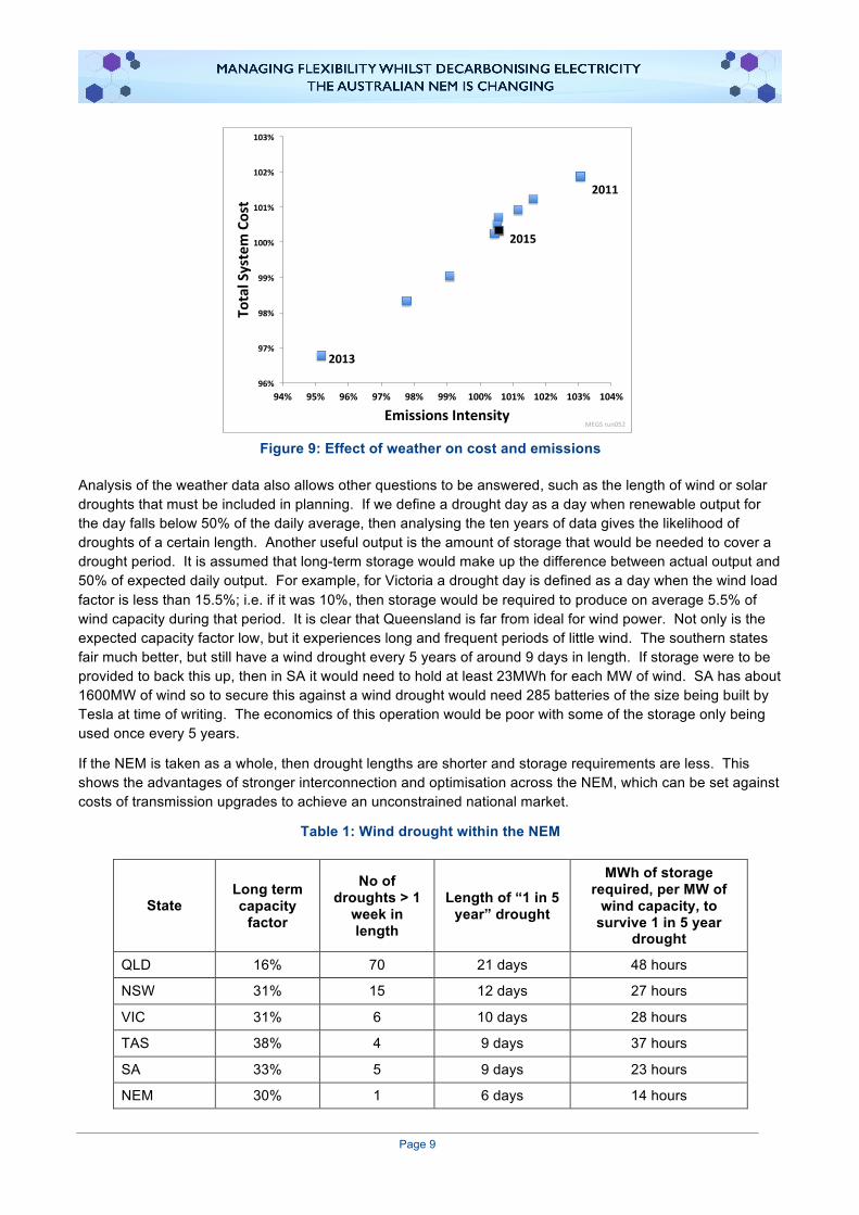
3.3 Effect of Weather With access to 10 years of consistent weather data, simulated renewables output from Renewables Ninja2 (Imperial College software), and simultaneous market data from the NEM, it is possible to do some analysis on the effect weather has on key parameters for each year.
Figure 9 plots the Total System Cost (TSC) against the carbon intensity for a scenario with high renewables growth (14GW extra for both PV and wind). There’s a clear correlation as a year with high renewables output would reduce both carbon and cost through saved fuel burn. The year with highest renewable output is 2013, which resulted in emissions 5% less than average, and costs 3% lower. 2011 was a poor year for renewable generation, whereas 2015 was a very typical year. This validates the use of weather data from 2015 for the much of the analysis as a typical year for renewable generation.
-10%
0%
10%
20%
30%
40%
50%
-10% -5% 0% 5% 10% 15% 20% 25% 30% 35%-10%
0%
10%
20%
30%
40%
50%
-10% 0% 10% 20% 30% 40%
IncreaseinCosts
Reduc8oninEmissions
Today
Futurescenario
+5GWofrenewables
+10GWofrenewables
Page 9
Figure 9: Effect of weather on cost and emissions
Analysis of the weather data also allows other questions to be answered, such as the length of wind or solar droughts that must be included in planning. If we define a drought day as a day when renewable output for the day falls below 50% of the daily average, then analysing the ten years of data gives the likelihood of droughts of a certain length. Another useful output is the amount of storage that would be needed to cover a drought period. It is assumed that long-term storage would make up the difference between actual output and 50% of expected daily output. For example, for Victoria a drought day is defined as a day when the wind load factor is less than 15.5%; i.e. if it was 10%, then storage would be required to produce on average 5.5% of wind capacity during that period. It is clear that Queensland is far from ideal for wind power. Not only is the expected capacity factor low, but it experiences long and frequent periods of little wind. The southern states fair much better, but still have a wind drought every 5 years of around 9 days in length. If storage were to be provided to back this up, then in SA it would need to hold at least 23MWh for each MW of wind. SA has about 1600MW of wind so to secure this against a wind drought would need 285 batteries of the size being built by Tesla at time of writing. The economics of this operation would be poor with some of the storage only being used once every 5 years.
If the NEM is taken as a whole, then drought lengths are shorter and storage requirements are less. This shows the advantages of stronger interconnection and optimisation across the NEM, which can be set against costs of transmission upgrades to achieve an unconstrained national market.
Table 1: Wind drought within the NEM
State Long term capacity
factor
No of droughts > 1
week in length
Length of “1 in 5 year” drought
MWh of storage required, per MW of
wind capacity, to survive 1 in 5 year
drought
QLD 16% 70 21 days 48 hours
NSW 31% 15 12 days 27 hours
VIC 31% 6 10 days 28 hours
TAS 38% 4 9 days 37 hours
SA 33% 5 9 days 23 hours
NEM 30% 1 6 days 14 hours
96%
97%
98%
99%
100%
101%
102%
103%
94% 95% 96% 97% 98% 99% 100% 101% 102% 103% 104%
TotalSystemCost
EmissionsIntensity
2015
2013
2011
MEGSrun052

Page 10
4 MEGS Modelling Technology Scenarios 4.1 Base Case Due to the significant changes that have occurred in the NEM since 2015, for comparison purposes, a base case was chosen that best reflected the NEM grid portfolio and conditions in 2017. This is done by choosing the Base Case very much like the 2015 test model in Section 5.1, except with Hazelwood (1600MW Brown Coal), Northern (520MW Brown Coal) and Torrens A (480MW Gas Steam) now decommissioned. Gas price was increased to $12/GJ. These changes bring the system more in line with today’s (2017) situation as a starting point, but still based on 2015 weather data – a “typical” or “ordinary” year.
4.2 Technology options to decarbonise the grid A number of different generation technologies have been proposed as being able to decarbonise the grid. MEGS was used to examine three options: renewables, combined cycle gas, and supercritical coal with carbon capture and storage. For each technology group, new capacity was added in steps to explore the pathway to a lower carbon system. The Base Case is the starting point and reference for these series. The three pathways are explored in the following section.
4.2.1 Renewables
Figure 10: Pathway to decarbonisation using renewables (black curve – left axis, red curve – right axis, black square – capacity stack, right hand bar chart)
In this scenario, a mixture of renewables is added to the grid, supported by some battery storage. Each point on the black line, moving away from the origin, represents an additional 15GW of capacity added, distributed amongst the States according to their demand and suitability for PV or wind (i.e. most PV is added up north, most wind down south). The capacity additions include a small amount (10% by capacity) of 4-hour battery storage, which was found to be the optimum amount in terms of total system cost. Alongside the capacity additions, as much coal plant is decommissioned as possible without compromising grid security. The slope of the line is the cost of abatement – this is shown as the red curve.
The first step results in a reduction in carbon emissions of around 17% at a cost of $75/tCO2. However, successive steps see a diminishing return for emissions reductions and an accelerating cost, which makes for a rapidly increasing abatement cost, reaching about $230/tCO2 after emissions have been reduced by 60%.
0
20
40
60
80
100
120
140
160
180
200
0%
20%
40%
60%
80%
100%
120%
140%
160%
180%
200%
0% 10% 20% 30% 40% 50% 60% 70% 80% 90% 100%
CostofA
batemen
t$/ton
neCO2(Red
)
IncreaseinTotalSystemCost(Black)
EmissionsReducKon 0
20000
40000
60000
80000
100000NewSolar
Solar
Wind
NewStorage
Storage
Hydro
OCGT
NewCCGT
CCGT
Biomass
NewBlackCoal
Blackcoal
Browncoal
CCS
MEGSrun082

Page 11
The bar chart shows the capacity on the system by step four (marked on the chart with the black square), which achieves an emissions reduction of 55%. This required an additional 27GW each of wind and solar. This is equivalent to building Australia’s largest wind farm 68 times over and the largest solar park 270 times over.
4.2.2 Gas
Figure 11: Pathway to decarbonisation using gas (thin red and black lines from Figure 10)
The second option modelled was to build combined cycle gas turbines (CCGT), which is a high efficiency way of generating electricity from gas. They are as reliable as coal, so can replace it on a like-for-like basis in terms of power and grid services delivery. Each step represents the addition of 5GW of CCGT distributed between QLD, NSW and VIC. The other two states already have a low emissions intensity due to their high renewables grid mix, so adding gas here would achieve little in terms of decarbonisation.
To aid comparison, the chart shows the results for the renewable scenario as thin faint lines. The addition of unabated gas to the system initially makes good progress, displacing coal and hence reducing emissions. However, after 23GW have been added, all the existing coal has been closed and no further progress is made, as gas is now the technology with the highest emissions on the grid. After this, further progress can only be made by switching tactics and adding a lower emission technology to displace the gas plant just built, or by adding CCS to reduce its emissions. The cost of abatement is initially more expensive than adding renewables, but unlike renewables, it is constant until nearly all the coal has been replaced.
The bar chart shows the scale of change for step four. It achieves the same effect as the 60GW renewables scenario, at the same cost with just 20GW of combined cycle plant, but it requires almost the complete closure of the existing coal fleet.
0
20
40
60
80
100
120
140
160
180
200
0%
20%
40%
60%
80%
100%
120%
140%
160%
180%
200%
0% 10% 20% 30% 40% 50% 60% 70% 80% 90% 100%
CostofA
batemen
t$/ton
neCO2(Red
)
IncreaseinTotalSystemCost(Black)
EmissionsReducKon 0
20000
40000
60000
80000
100000NewSolar
Solar
Wind
NewStorage
Storage
Hydro
OCGT
NewCCGT
CCGT
Biomass
NewBlackCoal
Blackcoal
Browncoal
CCS
MEGSrun082

Page 12
4.2.3 New Build CCS
Figure 12: Pathway to decarbonisation using new build coal with CCS (thin red and black lines from Figure 10)
The final chart in this series shows the effect of building coal with Carbon Capture and Storage (CCS). The initial steps are more expensive than renewables, but the abatement cost curve crosses over around 45%, after which renewables becomes a more expensive way of decarbonising the system. Of all the options explored, CCS offers the potential to go the furthest, achieving 80% emissions reduction. The scenario modelled was for brown and black coal to be built complete with CCS, but gas CCS is also an option and would be about the same cost as coal at a gas price of $12/GJ.
4.3 Technology Options – Conclusions Three scenarios for technology additions have been explored to examine the limitations of each at decarbonising the NEM, without an attempt to examine an optimum solution.
• The effectiveness of carbon abatement and the value to the system of a technology vary significantly according to how much of that technology is already on the system. This is most noticeable with the renewables scenario with an exponential-like cost curve. The other technologies also have very marked inflexions. Hence no simple metric which assumes linear behaviour and is independent of the grid (like LCOE), can adequately describe the benefit a technology brings.
• Of the three, the renewables mix is the cheapest for the initial steps towards decarbonisation, at less that $80/tCO2 abated. However, its costs rapidly increase, as renewables find they suffer diminishing returns compounded by increasing costs of integration. Both the gas and the coal-CCS scenarios were cheaper at decarbonising the system beyond a 45% reduction from today’s emission level.
• New coal that is prepared for future CO2 storage delivers immediate near term grid stability services while also securing the path to lowest cost carbon abatement in the long term.
• Given these conclusions, it is likely that a hybrid solution produces the least cost pathway to decarbonisation. Coal with CCS has a crucial role to play to deliver the services required for deep decarbonisation in the long term.
0
20
40
60
80
100
120
140
160
180
200
0%
20%
40%
60%
80%
100%
120%
140%
160%
180%
200%
0% 10% 20% 30% 40% 50% 60% 70% 80% 90% 100%
CostofA
batemen
t$/ton
neCO2(Red
)
IncreaseinTotalSystemCost(Black)
EmissionsReducKon 0
20000
40000
60000
80000
100000NewSolar
Solar
Wind
NewStorage
Storage
Hydro
OCGT
NewCCGT
CCGT
Biomass
NewBlackCoal
Blackcoal
Browncoal
CCS
MEGSrun082

Page 13
5 MEGS Case studies The Finkel Report5 on the Australian electricity system included modelling a decarbonisation pathway to 2050 with a staging post at 2030. A similar scenario has been modelled in MEGS, in addition to an alternative “hybrid pathway”, incorporating CCS with renewables. These are examined in the following sections and compared with the Base Case.
5.1 Base Case The Load Duration curve, capacity stack and a typical week are shown for the Base Case 2017 run in Figure 13. These can be compared directly with the results in the following sections.
The starting point is dominated by coal with only a small penetration of renewables. Much of the coal is baseload, with some load following for about a third of the black coal fleet. Grid stability issues (other than in SA) are easily solved with support from the fossil plant.
Figure 13: Base case load duration, capacity and typical week’s schedule for NEM
5.2 Decarbonisation pathway to 2030 – renewables The second 15GW step in the renewables scenario described in Section 4.2.1 (refer specifically to Figure 10), is very similar to the blueprint examined in the Finkel Report for 2030. The MEGS model examined how flexible various power plants may need to operate, the provision of grid services and an examination of the operability of the system with 44% renewables. To generate this level of renewable output in MEGS, a new build of 13GW each of wind and PV, supported by an extra 2.5GW of battery storage, was required. This is very similar profile to that used in the Finkel Report – 12GW of wind and 15GW of solar (the latter including a small amount of integrated storage) in the Energy Intensity Scheme (EIS) scenario.
5 Finkel (2017). Independent Review into the Future Security of the National Electricity Market: Blueprint for the Future, Commonwealth of Australia.
0
5000
10000
15000
20000
25000
30000
35000
100% 75% 50% 25% 0%
Deman
d&Gen
era2
on(M
W)
Propor2onofTime
Noenergylostthroughcurtailmentofwindandsolar
0
10000
20000
30000
40000
50000
60000
70000
80000
Capa
city(M
W)
NewSolar
Solar
Wind
NewStorage
Storage
Hydro
OCGT
NewCCGT
CCGT
Biomass
NewBlackCoal
Blackcoal
Browncoal
CCS
MEGSrun0860
5000
10000
15000
20000
25000
30000
Gene
ra2o
n(M
W)
FRI SAT SUN MON TUE WED THU

Page 14
Figure 14: Finkel Report– 2030 scenario (EIS case)
Figure 14 shows the overall pattern for the NEM. The renewables have been able to displace coal to reduce emissions as designed; shown by the larger areas of green (wind) and yellow (solar) and reduced black (black coal) area compared to the base case illustrated in Figure 13. There is now a small but significant amount of curtailment of renewables. This is not a problem in itself but represents energy that has been paid for but is not utilised. Emissions are reduced by 32%, which is larger than the 28% reduction predicted in the Finkel Report. This may in part be due to MEG’s slight overestimation of coal generation in the base case.
With confidence that MEGS is producing a good representation of the Finkel 2030 scenarios, it is worthwhile having a look at what this means for the operation of plant within the States. It will be seen from what follows that the different resources and history make each state unique leading to diversity across the NEM.
0
5000
10000
15000
20000
25000
30000
35000
0% 25% 50% 75% 100%
Deman
d&Gen
era2
on(M
W)
Propor2onofTime
significantamountofenergylostthroughcurtailmentofwindandsolar
0
10000
20000
30000
40000
50000
60000
70000
80000
Capa
city(M
W)
NewSolar
Solar
Wind
NewStorage
Storage
Hydro
OCGT
NewCCGT
CCGT
Biomass
NewBlackCoal
Blackcoal
Browncoal
CCS
MEGSrun0840
5000
10000
15000
20000
25000
30000
Gene
ra2o
n(M
W)
FRI SAT SUN MON TUE WED THU
Page 15
5.2.1 State by State Analysis of the Finkel 2030 Scenario
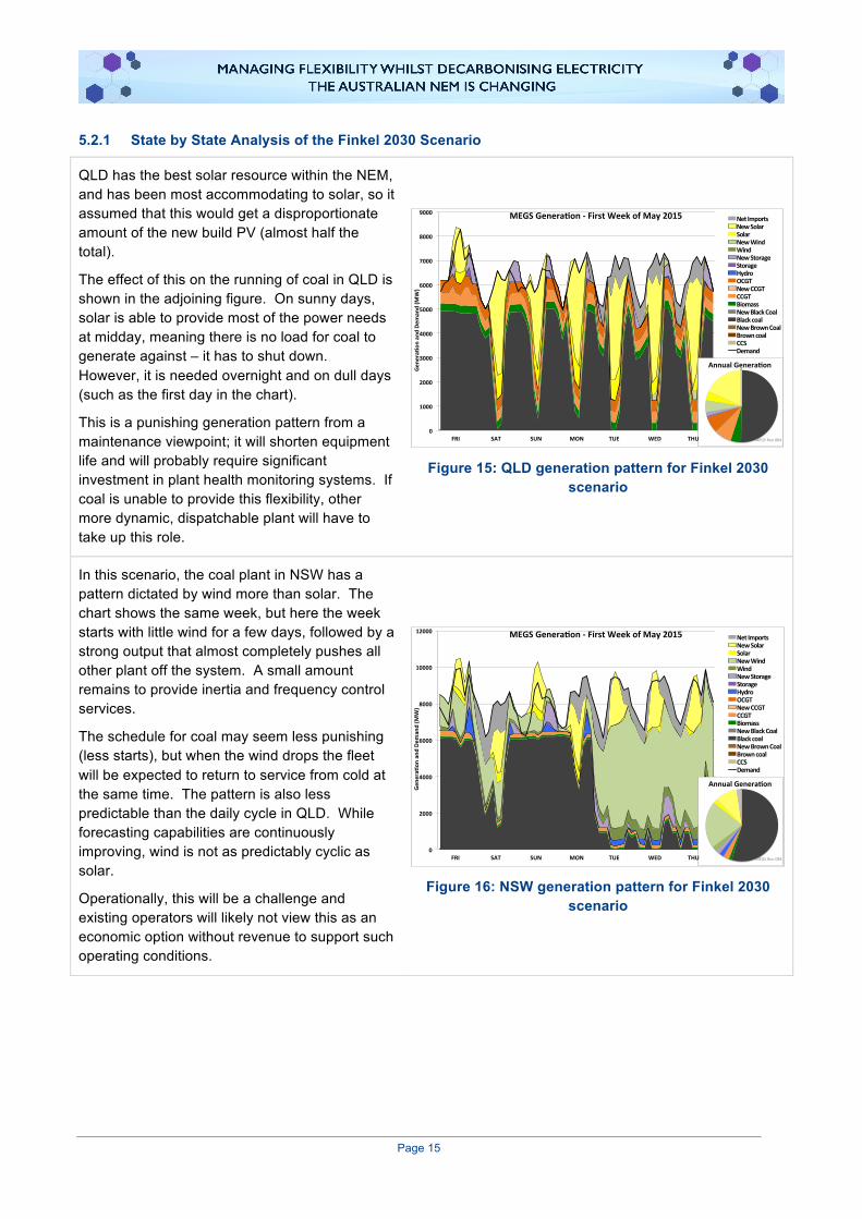
QLD has the best solar resource within the NEM, and has been most accommodating to solar, so it assumed that this would get a disproportionate amount of the new build PV (almost half the total).
The effect of this on the running of coal in QLD is shown in the adjoining figure. On sunny days, solar is able to provide most of the power needs at midday, meaning there is no load for coal to generate against – it has to shut down. However, it is needed overnight and on dull days (such as the first day in the chart).
This is a punishing generation pattern from a maintenance viewpoint; it will shorten equipment life and will probably require significant investment in plant health monitoring systems. If coal is unable to provide this flexibility, other more dynamic, dispatchable plant will have to take up this role.
Figure 15: QLD generation pattern for Finkel 2030 scenario
In this scenario, the coal plant in NSW has a pattern dictated by wind more than solar. The chart shows the same week, but here the week starts with little wind for a few days, followed by a strong output that almost completely pushes all other plant off the system. A small amount remains to provide inertia and frequency control services.
The schedule for coal may seem less punishing (less starts), but when the wind drops the fleet will be expected to return to service from cold at the same time. The pattern is also less predictable than the daily cycle in QLD. While forecasting capabilities are continuously improving, wind is not as predictably cyclic as solar.
Operationally, this will be a challenge and existing operators will likely not view this as an economic option without revenue to support such operating conditions.
Figure 16: NSW generation pattern for Finkel 2030 scenario
0
1000
2000
3000
4000
5000
6000
7000
8000
9000
Gen
era1
onand
Dem
and(M
W)
MEGSGenera1on-FirstWeekofMay2015 NetImportsNewSolarSolarNewWindWindNewStorageStorageHydroOCGTNewCCGTCCGTBiomassNewBlackCoalBlackcoalNewBrownCoalBrowncoalCCSDemand
AnnualGenera1on
MEGSRun084FRI SAT SUN MON TUE WED THU
0
2000
4000
6000
8000
10000
12000
Gene
ra-o
nan
dDe
man
d(M
W)
MEGSGenera-on-FirstWeekofMay2015 NetImportsNewSolarSolarNewWindWindNewStorageStorageHydroOCGTNewCCGTCCGTBiomassNewBlackCoalBlackcoalNewBrownCoalBrowncoalCCSDemand
AnnualGenera-on
MEGSRun084FRI SAT SUN MON TUE WED THU

Page 16
VIC is also dominated by wind, but in contrast to NSW and QLD, it is assumed that the existing brown coal plant here is inflexible and unable to shutdown and restart. Its cheaper fuel also means it is more cost effective to run through at minimum stable generation than black coal would be, as can be seen in the plot.
VIC is the “energy trader”, taking power from SA when it’s windy and re-exporting to NSW and TAS. In windless periods, these power flows reverse, using some of the power for its own needs, having permanently lost some of its baseload coal.
Figure 17: VIC generation pattern for Finkel 2030 scenario
TAS continues its role as the provider of swing generation, but additionally it has some wind power to export when available. It has changed from a net importer to a net exporter, but still takes imports from time to time when it is optimal for the system to send surplus power to TAS.
In effect TAS has become that battery for the system that is intermittently topped up with wind.
Figure 18: TAS generation pattern for Finkel 2030 scenario
SA also has an interesting, but different, story to tell. Here solar energy is relatively poor, but wind resource is good, so it is almost completely dominated by wind.
SA makes strong use of its interconnector, exporting during windy periods and importing cheaper coal power via Victoria when not. It uses its gas plant for frequency control services, and to provide sufficient inertia in the region, despite the level of wind generation.
The new storage assists with a small amount of balancing, especially filling in the evening peak as solar output declines.
Figure 19: SA generation pattern for Finkel 2030 scenario
0
1000
2000
3000
4000
5000
6000
7000
8000
Gene
ra0o
nan
dDe
man
d(M
W)
MEGSGenera0on-FirstWeekofMay2015 NetImportsNewSolarSolarNewWindWindNewStorageStorageHydroOCGTNewCCGTCCGTBiomassNewBlackCoalBlackcoalNewBrownCoalBrowncoalCCSDemand
AnnualGenera0on
MEGSRun084FRI SAT SUN MON TUE WED THU
0
500
1000
1500
2000
2500
Gene
ra+o
nan
dDe
man
d(M
W)
MEGSGenera+on-FirstWeekofMay2015 NetImportsNewSolarSolarNewWindWindNewStorageStorageHydroOCGTNewCCGTCCGTBiomassNewBlackCoalBlackcoalNewBrownCoalBrowncoalCCSDemand
AnnualGenera+on
MEGSRun084FRI SAT SUN MON TUE WED THU
0
500
1000
1500
2000
2500
3000
Gene
ra,o
nan
dDe
man
d(M
W)
MEGSGenera,on-FirstWeekofMay2015 NetImportsNewSolarSolarNewWindWindNewStorageStorageHydroOCGTNewCCGTCCGTBiomassNewBlackCoalBlackcoalNewBrownCoalBrowncoalCCSDemand
AnnualGenera,on
MEGSRun084FRI SAT SUN MON TUE WED THU

Page 17
5.3 Decarbonisation pathway to 2050 One option for the continued decarbonisation of the system is to continue to deploy renewables as envisaged by the Finkel Report. The energy intensity scheme (EIS) scenario takes the system to a renewables penetration of 70%. This matches step 5 of the renewables scenario in Section 4.2.1 (refer specifically to Figure 10) explored by MEGS, so it is useful to explore the implications that come from the modelling.
Figure 20: MEGS view of the NEM for Finkel 2050 Scenario
The first thing to note is that there is a large amount of energy that is curtailed due to lack of demand. It would not be easy or cheap to solve this problem with a very large amount of storage, as the excess energy comes as the result of a run of windy days (as illustrated by the weekly chart above) separated from the periods when it could usefully be deployed. This means that it is necessary to overbuild renewables to achieve the desired penetration level. The centre chart shows that MEGS needed 68GW of renewables to achieve this, supported by 7GW of new storage. The Finkel Report 2050 scenario has 60GW of new build.
It is possible that the modelling behind the Finkel Report has not taken due consideration of the scale of curtailment and the need for grid services across each region of the NEM. Additionally, the level of flexibility embedded in the MEGS model for coal-fired power generation could increase the generation capacity requirement for renewables. These unknowns will affect the level of curtailment and emissions.
The solution here is costly, the cost of abatement of renewables in the last step getting to this point is $234/tCO2, which is indicative of a sub optimal approach. The following section looks at an alternative hybrid solution, choosing the most cost effective pathway at each stage.
5.4 Decarbonisation pathway to 2050 – an alternative hybrid solution The decarbonisation pathways described in Section 4.2 showed us that we should expect renewables to get progressively more expensive, so it would be worth taking stock at 2030 and looking for other options. There are five options explored (shown in Table 2) along with the starting point (as per the EIS 2030 scenario – Finkel Report).
0
5000
10000
15000
20000
25000
30000
35000
40000
100% 75% 50% 25% 0%
Deman
d&Gen
era3
on(M
W)
Propor3onofTime
Hugeamountofenergylostthroughcurtailmentofwindandsolar
0
20000
40000
60000
80000
100000
120000
140000
Capa
city(M
W)
NewSolar
Solar
Wind
NewStorage
Storage
Hydro
OCGT
NewCCGT
CCGT
Biomass
NewBlackCoal
Blackcoal
Browncoal
CCS
MEGSrun0880
10000
20000
30000
40000
50000
Gene
ra3o
n(M
W)
FRI SAT SUN MON TUE WED THU

Page 18
Table 2: Options for first step from 2030 onwards
Technology added Capacity addition (GW)
CO2 reduction from original
baseline
Cost increase from original
baseline
Abatement cost for next step
($/tCO2)
Starting point: Renewables build to 2030 32% 43%
1. Renewables mix 15 48% 70% 101
2. Gas CCGT 5 47% 68% 105
3. Super critical coal 5 37% 55% 168
4. New Coal CCS 5 52% 85% 128
5. Retrofit Coal CCS 56 52% 76% 99
The most cost effective option for the next step (highlighted in orange in Table 2) is retrofitting coal with CCS. This option is adopted in the model and the next step is from a system with the Finkel Report 2030 renewables scenario incorporating the conversion retrofit of 7GW of coal to CCS. This facilitates low emissions generation capable of grid service provision. At this point, it is also assumed that there is no more coal that is suitable for retrofit (only the highest efficiency stations are suitable), hence this option is not available for the next modelling step.
Table 3: Options for second step after choosing CCS retrofit.
Technology added Capacity addition (GW)
CO2 reduction from original
baseline
Cost increase from original
baseline
Abatement cost next step ($/tCO2 )
Renewables build to 2030 + Retrofit CCS 52% 76%
1. Renewables mix 15 67% 105% 115
2. Gas CCGT 5 65% 100% 107
3. Super critical coal 5 56% 89% 184
4. New Coal CCS 5 70% 117% 137
For this step, the addition of Gas CCGT was the most cost effective option. This process can continue, but at this point the system has passed the 2050 decarbonisation level achieved in section 5.2 of 62%, through a mix of renewables, coal CCS and gas, on a cost optimal pathway. The final step was $107/tCO2 a significantly more cost effective option than the renewables only approach of $234/tCO2.
6 This 5GW of added capacity is the result of approximately 7GW of unabated coal plant retrofit with post combustion capture.
Page 19
Figure 21: Mixed generation, cost effective solution for 2050
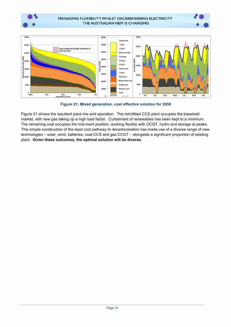
Figure 21 shows the resultant plant mix and operation. The retrofitted CCS plant occupies the baseload market, with new gas taking up a high load factor. Curtailment of renewables has been kept to a minimum. The remaining coal occupies the mid-merit position, working flexibly with OCGT, hydro and storage at peaks. This simple construction of the least cost pathway to decarbonisation has made use of a diverse range of new technologies – solar, wind, batteries, coal-CCS and gas CCGT – alongside a significant proportion of existing plant. Given these outcomes, the optimal solution will be diverse.
0
5000
10000
15000
20000
25000
30000
35000
100% 75% 50% 25% 0%
Deman
d&Gen
era2
on(M
W)
Propor2onofTime
someenergylostthroughcurtailmentofwindandsolar
0
10000
20000
30000
40000
50000
60000
70000
80000
Capa
city(M
W)
NewSolar
Solar
Wind
NewStorage
Storage
Hydro
OCGT
NewCCGT
CCGT
Biomass
NewBlackCoal
Blackcoal
BrownCoal
CCS
MEGSrun0840
5000
10000
15000
20000
25000
30000
Gene
ra2o
n(M
W)
FRI SAT SUN MON TUE WED THU
Page 20
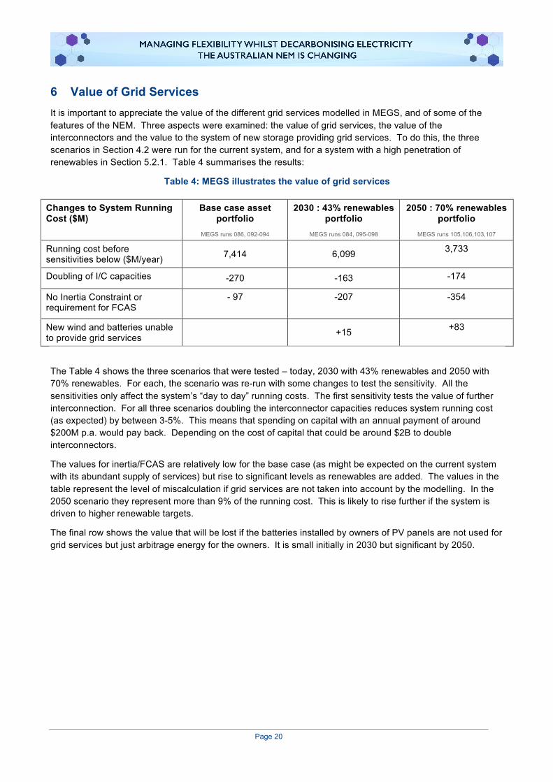
6 Value of Grid Services It is important to appreciate the value of the different grid services modelled in MEGS, and of some of the features of the NEM. Three aspects were examined: the value of grid services, the value of the interconnectors and the value to the system of new storage providing grid services. To do this, the three scenarios in Section 4.2 were run for the current system, and for a system with a high penetration of renewables in Section 5.2.1. Table 4 summarises the results:
Table 4: MEGS illustrates the value of grid services
Changes to System Running Cost ($M)
Base case asset portfolio
MEGS runs 086, 092-094
2030 : 43% renewables portfolio
MEGS runs 084, 095-098
2050 : 70% renewables portfolio
MEGS runs 105,106,103,107
Running cost before sensitivities below ($M/year) 7,414 6,099 3,733
Doubling of I/C capacities -270 -163 -174
No Inertia Constraint or requirement for FCAS
- 97
-207
-354
New wind and batteries unable to provide grid services +15 +83
The Table 4 shows the three scenarios that were tested – today, 2030 with 43% renewables and 2050 with 70% renewables. For each, the scenario was re-run with some changes to test the sensitivity. All the sensitivities only affect the system’s “day to day” running costs. The first sensitivity tests the value of further interconnection. For all three scenarios doubling the interconnector capacities reduces system running cost (as expected) by between 3-5%. This means that spending on capital with an annual payment of around $200M p.a. would pay back. Depending on the cost of capital that could be around $2B to double interconnectors.
The values for inertia/FCAS are relatively low for the base case (as might be expected on the current system with its abundant supply of services) but rise to significant levels as renewables are added. The values in the table represent the level of miscalculation if grid services are not taken into account by the modelling. In the 2050 scenario they represent more than 9% of the running cost. This is likely to rise further if the system is driven to higher renewable targets.
The final row shows the value that will be lost if the batteries installed by owners of PV panels are not used for grid services but just arbitrage energy for the owners. It is small initially in 2030 but significant by 2050.
Page 21
7 Experience of Other Grids The electricity challenges currently faced by all levels of Australian governments is not unique. Two different national systems have been examined below to highlight this. Great Britain has some similarities to the Australian system, with a diverse generation portfolio and a relatively low, but growing, level of renewable penetration. Germany is often seen as a flagship for a high renewable penetration system, but like Australia, has a seemingly unshakable high dependence on coal.
7.1 Great Britain In 2008 the UK became the first country to set a legally binding target to decarbonise the energy system and set up an independent body to advise on the pathway and monitor progress. This organisation, the Committee on Climate Change, advised early on that the electricity system should be decarbonised first, preferably down to 50g/kWh by 2030. To date the UK government has accepted the carbon budgets set by the CCC and aims to decarbonise the electricity system by 2030 although with a central target of 100g/kWh.
Since the early 1990s the carbon intensity of the grid has been steadily reducing through a combination of low carbon support programmes and good fortune. Renewables and nuclear have been encouraged through a number of support schemes over this period and the availability of cheap gas in the 1990s combined with a market restructuring led to the “dash for gas”, which replaced a large proportion of coal generation. In the last decade EU restrictions around SOx, NOx and other pollutants has restricted generation from remaining coal and last year the government announced that there would be no unabated coal generation post 2025. All EU generators are subject to the Emissions Trading Scheme which puts a price on Carbon. Although the price is low in the UK it is supplemented by taxes to a level of around $35/tonne.
It was in this context that the Energy Research Partnership, with a mixed membership of industrials, SMEs, government departments, academics and NGOs, set about examining how the deep decarbonisation envisaged could be achieved. The focus was on the grid serving the UK mainland and the effects of a continued growth of variable renewables.1
There are a number of similarities between the NEM and the UK grid:
• They both have a peak demand around 50GW.
• The NEM is completely isolated. The UK has only weak interconnections with continental Europe and Ireland.
• They have both seen a growth of wind and solar, the UK having 14%, compared to 8% penetration for the NEM.
There are some notable differences between the NEM and the UK electricity market:
• There are very few binding constraints within the UK grid. There is a constraint on flows between England and Scotland but these are being overcome by “bootstrap” undersea cables.
• There is little hydro.
On the whole the UK is a relevant case study for the NEM, with a number of similarities but being slightly further down the decarbonisation path. Therefore the conclusions from the ERP study are worth noting. These were developed by analysing the results of the forerunner of MEGS which was written specifically to examine these issues:
• Firm low carbon capacity (such as nuclear, biomass or CCS) is needed to decarbonise fully.
• The value of technologies can only be assessed though whole system modelling.
• Grid services are becoming increasingly scarce and need markets to develop new suppliers.

Page 22
7.2 Germany Germany is a world leader in the installation of weather dependant renewable power generation technologies, with 51GW of wind and 42GW of solar installed in a 200GW capacity grid (up from 138GW in 2010), designed to meet a demand that ranges from 40-80GW.7 It has achieved this via the adoption of a strong combined energy and climate policy since 2007, with the aim to transform the German energy system. The stated aims of the Energiewende is for the transformation to be:
• cost-effective, consumer friendly and efficient, • environmentally compatible, and • increasingly generated from renewable sources.8
Alongside the promotion of renewable generation is the nuclear phase out programme mandated by the government after the 2011 Fukishima disaster.8 Additionally some 10GW of new lignite plant has been added to the German system since 2010. From 2010 to 2017, the following changes have occurred:
• A large increase in intermittent renewables from 32% to 47% of installed capacity.
• A reduction in nuclear from 20GW to 10GW, and eventually to zero by 2022.
• The closure of some new gas plant.
• A huge reliance on interconnectors to sell excess renewable and import requirements.
Since 2008, Germany has doubled their installed capacity of renewables, but have only seen a decrease in emissions by 7% in that period. Emissions levels have only decreased in the last three of six years.9
Germany’s renewable electricity production typically meets 50% or less of the total demand on the system, despite this however, large amounts of the renewable energy electricity is exported to neighbouring countries via large interconnections. This is shown in Figure 22,7 where solar and wind output is highly correlated with exports to neighbouring countries. Without strong interconnectors and receptive grids, this would lead to significant curtailment of renewable production.
7 Fraunhoffer Institute (2017) Energy Charts, https://www.energy-charts.de/power_inst.htm. (Accessed 2017). 8 Hake J.F, W. Fischer, S. Venghaus & C. Weckenbrock (2015) The German Energiewende – History and Status Quo, Forschungszentrum Jülich, Institute of Energy and Climate Research 9 The Economist (2017) Is Germany's Energiewende cutting GHG emissions?, http://www.eiu.com/industry/article/1205236504/is-germanys-energiewende-cutting-ghg-emissions/2017-03-20. (Accessed 2017).

Page 23
Figure 22: German electricity production and exports, week 25 2017
The thermal (coal, gas fired and nuclear) based electricity remains a very significant portion of Germany’s electricity production – even during high renewable generation periods (refer to Figure 23).7 While some of the thermal plants reduce or cease production regularly, the low flexibility, high CO2 emitting lignite based power plants continue to generate at high levels. This is in part due to the ability to export electricity to neighbouring markets in periods of over generation, and the physical characteristics of large thermal plants. Without a disptachable low-emissions electricity source and strong interconnections, deep decarbonisation is likely to be extremely complex and expensive.
Figure 23: Daily electricity production by generation type, week 26 2017
The German electricity grid is embedded in a much larger network with large interconnectors into 9 surrounding countries. This has a major impact into the operation of the German network, with large amounts of inertia guaranteed as well as other grid services able to be shared. This reduces the native German requirements for grid services, and results in smoothing wind and solar output over a large geographic area beyond Germany’s boarders, see Figure 24.7

Page 24
Figure 24: Electricity import and export of Germany to its neighbours in 2015
In summary, the German experience does not provide much technical evidence on how Australia, as a whole or states individually, could deal with very high levels of renewable penetration as:
• the actual levels of penetration remain lower than the goals in most Australian jurisdictions.
• the level of actual and planned interconnections between Australian regions remains small.
• as each state increases its own renewable penetration, its ability to rely on other jurisdictions for grid support is limited.
• Australia does not have the benefit of being a small part of a large, synchronous generation system.
However, a key learning is that to facilitate an energy transformation of the scale required, strong energy and climate policy at multiple levels of government is required for an extended period of time.

Page 25
Appendices

Page 26
1 Grid services The NEM spans Australia’s eastern and southern states and is one of the largest interconnected grids in the world, spanning 4,500 kilometres. However, in addition to the delivery of electricity, there are technical requirements to ensure a stable grid. Frequency Control Ancillary Services (FCAS) are used to maintain the frequency on the grid at any point in time, close to fifty cycles per second (50Hz) as required by the NEM frequency standards.
1.1 Grid services terminology To “keep the lights on”, the power system needs to be secure. It should be able to operate within defined technical limits, despite an incident such as loss of a major transmission line or large generator. It also needs to be reliable by having enough capacity to supply demand. The Australian Energy Market Operator (AEMO) is responsible for maintaining power system security and reliability in accordance with standards and guidelines.
A secure system: The power system is in a secure and safe operating state if it is capable of withstanding the failure of a single network element or generating unit. Security events are caused by sudden equipment failure (often associated with extreme weather or bushfires) that results in the system operating outside of defined technical limits, such as voltage and frequency.10
A reliable system: A reliable power system has sufficient generation and network capacity to meet the consumer load in that region. Reliability events are caused by insufficient generation or network capacity to meet consumer load. Reliability events due to insufficient generation and interconnector capacity are usually predicted ahead of time by supply and demand forecasting.10
Unserved Energy: A measure of the amount of black-out suffered by consumers. It is the total energy demand in MWh that was not met as a result of customers being involuntary cut off from supplies.
Inertia: The ability of the system to resist changes in frequency is determined by the inertia of the power system. Inertia is provided as a consequence of having spinning generators, motors and other devices that are synchronised to the frequency of the system. Historically, inertia has been provided in the NEM by large amounts of synchronous generators, such as coal and gas-fired power stations and hydro plant.
However, many new generation technologies, such as wind turbines and PV panels, are not synchronised to the grid, have low or no physical inertia, and are therefore, currently limited in their ability to dampen rapid changes in frequency.
Rate of change of frequency (RoCoF): The rate at which the frequency changes determines the amount of time that is available to arrest the decline or increase in frequency before it moves outside of the permitted operating bounds. AEMO may constrain the power system to reduce the size of a potential contingency and minimise the resulting initial frequency change. Alternatively, an increase in the level of inertia in the power system would permit the occurrence of larger contingencies for a given level of initial RoCoF.10
System strength: Non-synchronous generators provide little contribution to system strength. System strength is a measure of the current that would flow into a fault at a given point in the power system. Reduced system strength in certain areas of the network may mean that generators are no longer able to meet technical standards and may be unable to remain connected to the power system at certain times.10
10 AEMC (2017) Delivering a more stable power system to keep the lights on. www.aemc.gov.au/News-Center/What-s-New/Announcements/DELIVERING-A-MORE-STABLE-POWER-SYSTEM-TO-KEEP-THE. (Accessed 2017)
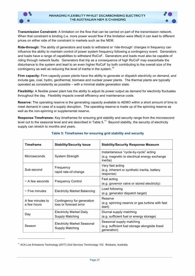
Page 27
Transmission Constraint: A limitation on the flow that can be carried on part of the transmission network. When that constraint is binding (i.e. more power would flow if the limitation were lifted) it can lead to different prices on either side of the constraint in markets such as the NEM.
Ride-through: The ability of generators and loads to withstand or ‘ride-through’ changes in frequency can influence the ability to maintain control of power system frequency following a contingency event. Generators and loads have a range of capabilities to withstand RoCoF. Generators and loads must also be capable of riding through network faults. Generators that trip as a consequence of high RoCoF may exacerbate the disturbance to the system and lead to an even higher RoCoF by both contributing to the overall size of the contingency as well as reducing the level of inertia in the system.10
Firm capacity: Firm capacity power plants have the ability to generate or dispatch electricity on demand, and include gas, coal, hydro, geothermal, biomass and nuclear power plants. The thermal plants are typically operated as consistently as possible – with a minimal stable generation state.
Flexibility: A flexible power plant has the ability to adjust its power output as demand for electricity fluctuates throughout the day. Flexibility impacts overall efficiency and maintenance costs.
Reserve: The operating reserve is the generating capacity available to AEMO within a short amount of time to meet demand in case of a supply disruption. The operating reserve is made up of the spinning reserve as well as the non-spinning or supplemental reserve.
Response Timeframes: Key timeframes for ensuring grid stability and security range from the microsecond level out to the seasonal level and are described in Table 5.11 Beyond stability, the security of electricity supply can stretch to months and years.
Table 5: Timeframes for ensuring grid stability and security
Timeframe Stability/Security Issue Stability/Security Response Measure
Microseconds System Strength Instantaneous “cycle-by-cycle” acting (e.g. magnetic to electrical energy exchange inertia)
Sub-second Frequency rapid rate-of-change
Very fast acting (e.g. inherent or synthetic inertia, battery response)
~ A few seconds Frequency Control Fast acting (e.g. governor valve or stored electricity)
~ Five minutes Electricity Market Balancing Load following (e.g. generator dispatch target)
A few minutes to a few hours
Contingency for generation loss or forecast error
Reserve (e.g. spinning reserve or gas turbine with fast start)
Day Electricity Market Daily Supply Matching
Diurnal supply matching (e.g. sufficient fuel or energy storage)
Season Electricity Market Seasonal Supply Matching
Seasonal supply matching (e.g. sufficient fuel storage alongside fossil generation)
11 ACA Low Emissions Technology (2017) Grid Services Terminology 102. Brisbane, Australia.

Page 28
2 Modelling Philosophy The NEM model developed for this study takes into account the grid services provided by the various electricity generation technologies together with simple energy balancing. It challenges current paradigms for understanding the total system cost for electricity supply. Conventional modelling approaches make simple comparisons made using traditional metrics, like levelised cost of electricity (LCOE), which do not take into account the grid system requirements. This modelling defines the resilience of a grid by its level of inertia and seeks to ensure that the operator can maintain a stable grid.
2.1 Background The model at the heart of the work reported here is MEGS – Modelling Energy and Grid Services. It is a regional electricity system model that ensures there is sufficient firm capacity to meet demand and that the grid operator has sufficient services to maintain grid supply and stability.
It follows a similar solution methodology to BERIC (Balancing Energy, Reserve, Inertia and Capacity), a model used by Energy Research Partnership in the UK to model flexibility in the system on the UK mainland.1 Both were written by the same author, but MEGS has additional features that includes the ability to model the following:
• Regions with interconnects that can carry energy and reserve services
• Resource limited hydro
• Short term storage
• Weather-dependent renewable energy technologies (wind and solar PV) by soft-linking to the Renewables Ninja model.2
MEGS departs from more traditional modelling as it captures the requirement and supply of grid services beyond the need to match generation with demand (net of imports). This need has come about because in a grid that is transitioning towards low emission renewables (especially wind and PV), there is increasing requirement on system operators to have access to the frequency response, reserve and inertia services. The conventional sources of these services are being lost as fossil-fuelled power generation is being displaced from the system.
Historically, due to high levels of synchronous generation on the grid, the cost of these has been small and mostly neglected, and some services, like inertia, have been supplied for free. However, this is no longer the case as weather-dependent renewables have the potential to both increase demand for and reduce supply of these services. Figure 25 shows how MEGS compares to other modelling techniques.
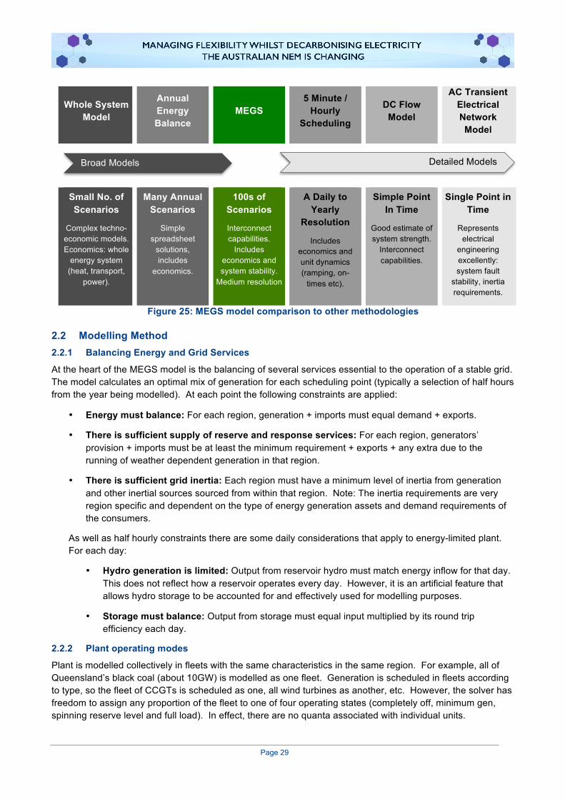
Page 29
Whole System Model
Annual Energy Balance
MEGS 5 Minute /
Hourly Scheduling
DC Flow Model
AC Transient Electrical Network Model
Small No. of Scenarios
Complex techno-economic models. Economics: whole
energy system (heat, transport,
power).
Many Annual Scenarios
Simple spreadsheet
solutions, includes
economics.
100s of Scenarios
Interconnect capabilities.
Includes economics and system stability.
Medium resolution
A Daily to Yearly
Resolution
Includes economics and unit dynamics (ramping, on-
times etc).
Simple Point In Time
Good estimate of system strength.
Interconnect capabilities.
Single Point in Time
Represents electrical
engineering excellently: system fault
stability, inertia requirements.
Figure 25: MEGS model comparison to other methodologies
2.2 Modelling Method 2.2.1 Balancing Energy and Grid Services
At the heart of the MEGS model is the balancing of several services essential to the operation of a stable grid. The model calculates an optimal mix of generation for each scheduling point (typically a selection of half hours from the year being modelled). At each point the following constraints are applied:
• Energy must balance: For each region, generation + imports must equal demand + exports.
• There is sufficient supply of reserve and response services: For each region, generators’ provision + imports must be at least the minimum requirement + exports + any extra due to the running of weather dependent generation in that region.
• There is sufficient grid inertia: Each region must have a minimum level of inertia from generation and other inertial sources sourced from within that region. Note: The inertia requirements are very region specific and dependent on the type of energy generation assets and demand requirements of the consumers.
As well as half hourly constraints there are some daily considerations that apply to energy-limited plant. For each day:
• Hydro generation is limited: Output from reservoir hydro must match energy inflow for that day. This does not reflect how a reservoir operates every day. However, it is an artificial feature that allows hydro storage to be accounted for and effectively used for modelling purposes.
• Storage must balance: Output from storage must equal input multiplied by its round trip efficiency each day.
2.2.2 Plant operating modes
Plant is modelled collectively in fleets with the same characteristics in the same region. For example, all of Queensland’s black coal (about 10GW) is modelled as one fleet. Generation is scheduled in fleets according to type, so the fleet of CCGTs is scheduled as one, all wind turbines as another, etc. However, the solver has freedom to assign any proportion of the fleet to one of four operating states (completely off, minimum gen, spinning reserve level and full load). In effect, there are no quanta associated with individual units.
Detailed Models Broad Models

Page 30
2.2.3 Scenarios
A typical model run will encompass a year of operation with a set of generation assets that are used to meet the demand for energy and grid services. As the purpose of this modelling is to explore decarbonisation scenarios, most runs will incorporate new low emissions plant which has been built to displace high carbon power generation and thus reduce emissions overall.
To allow the rapid exploration of a set of scenarios, there is a pre-processor which sets up a series of runs with different levels of new generation for each run. This work has included a study of the effectiveness of the new capacity at displacing existing generation without reducing grid security. MEGS uses the results of this to decommission the optimal amount of existing high carbon power generation for each new build scenario. Some of the results presented are based on these series of MEGS runs, which can cover 10-20 scenarios. For example, MEGS can be set up to explore the addition of PV to the system in steps of 15GW, whilst decommissioning a mixture of black and brown coal. For each model step, it will build PV in each region as determined by the input data and remove the maximum amount of coal plant possible without increasing the likelihood of blackouts.

Page 31
3 Data and Assumptions 3.1 Technology Cost There were 66 rows of plant data in the model, with the costs of the new plant types that were built in the model or decommissioned listed in Table 6. All other plant costs played little part in the operation of MEGS, as most were a constant offset for all model runs. The cost of capital was 9% for all plant types and was annuitised over 30 years. The low battery cost was to take account of its recent rapid decline in cost, but is consistent with Jacobs12 in their modelling for the Finkel Report.13 Where relevant, all other cost and assumptions are in agreement with the Australian Power Generation Technology Report.14
Table 6: Plant cost data (2017)
Plant Type Capex ($/kW)
Fixed OPEX ($kW/yr)
Variable Cost $/MWh – excl fuel
Full Load Efficiency
Existing Black Coal - 58 1.4 34%
Existing Brown Coal - 55 3.0 24%
New CCS Black Coal 7,000 55 9 30%
New CCS Brown Coal 8,500 65 11 26%
Retrofit CCS Black Coal 3,860 70 11 23%
Retrofit CCS Brown Coal 4,700 65 14 17%
New CCGT 1,450 20 1.5 50%
New Black Coal 3,000 45 2.5 40%
New Brown Coal 3,850 55 3.0 36%
New Wind 1,950 60 0 -
New Solar 2,100 35 0 -
New Battery (4 hour) 800 0 0 90% cycle
3.2 Fuel and Carbon To ensure a low carbon plant with high running cost operated in a high merit position, the model included a subsidy to force that running regime. For example, if there were no subsidy mechanism, a coal with CCS plant would not displace an unabated coal fired power plant. To ensure the low emissions aspect of CCS is valued, the algorithm picks it to run ahead of unabated coal by introducing this subsidy. This mimics the effect of any scheme that penalises carbon emissions (or promotes low carbon intensity) such as CET, EIS, carbon trading or a carbon tax, which are all similar ways to achieve this end. At the end of the model run, the original unsubsidised costs are used to calculate the total system cost reported in the results.
The cost of fuel is given in Table 7 below. For capture plant, there was an additional cost of carbon storage of $15/tCO2.
12 Jacobs (2016) Projections of uptake of small-scale systems, AEMO 2016 13 Finkel (2017) Independent Review into the Future Security of the National Electricity Market: Blueprint for the Future,
Commonwealth of Australia 2017 14 CO2CRC (2015), Australian Power Generation Technology Report 2015.

Page 32
Table 7: Fuel cost data (2017)
Fuel Cost
($/GJ) Carbon intensity
kg CO2/GJ
Black Coal 3.0 92
Brown Coal 1.4 95
Gas 12 56
Diesel 21 70
3.3 Regional Data – Demand and Inertia Annual energy demand was assumed to be the same in all model runs – there was no growth or decline to 2030. Demand shape was derived from the 2015 metered data reported by the NEM: consumer demand net of embedded solar, most of which is behind the meter. Renewables Ninja was used to estimate this “hidden” generation based on the known installed capacity and historic weather data (as described in 3.5), which was then added back to the NEM data to derive the gross consumer demand.
Minimum inertia levels were estimated based on not exceeding a ROCOF of 2 Hz/s for the loss of 600 MW of generation or import using the standard relationship below.
Minimum Inertia = 50Hz/2 x Largest Loss/ROCOF
For South Australia and Tasmania, lower values were allowed. South Australia struggled to meet its minimum inertia for many model runs, so an import restriction was imposed on the interconnector to allow it to run securely with lower inertia. Tasmania would not normally be secure against disconnection of Bass Link, but it is understood that fast acting load disconnection services that act within a cycle (20ms) of the interconnector tripping allows it to run at significantly lower inertia levels than would otherwise be secure.
Table 8: Regional data
State Peak Demand
(MW) Minimum Inertia Limit
(MW.s)
QLD 8,831 7,500
NSW 12,667 7,500
VIC 8,659 7,500
TAS 1,657 2,500
SA 2,918 5,000
3.4 Interconnectors All links had a nominal cost of $1/MWh for transfers of energy. This low but non-zero value prevents unphysical circulating flows and represents the cost of the small losses on the transmission grid, but does not restrict interstate flows. The model is insensitive to its exact value, so no attempt was made to model this more precisely. Links could be used to transfer energy or reserve services, provided the sum did not exceed the capacity. Reserve could always be transferred in the opposite direction to energy flow up to the link capacity, irrespective of flow. The following values were used for the interconnectors:
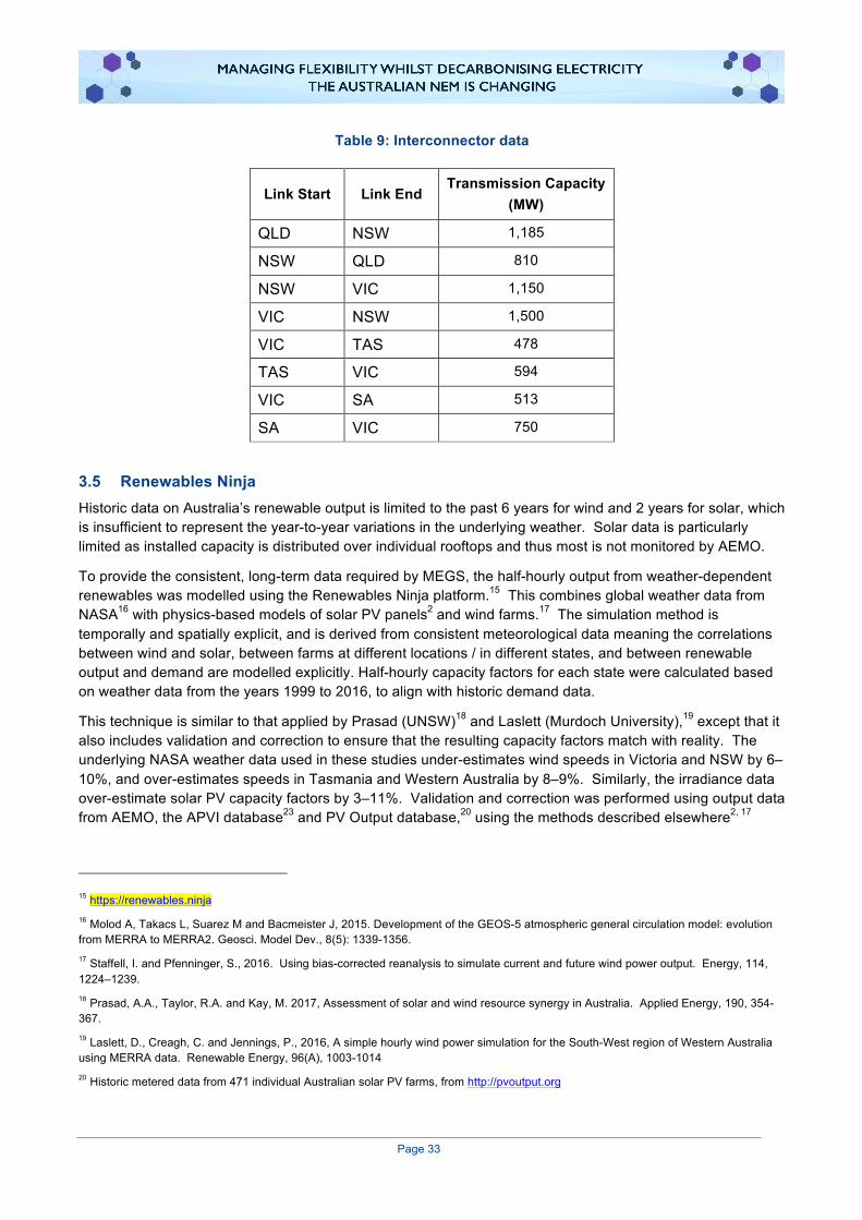
Page 33
Table 9: Interconnector data
Link Start Link End Transmission Capacity
(MW)
QLD NSW 1,185
NSW QLD 810
NSW VIC 1,150
VIC NSW 1,500
VIC TAS 478
TAS VIC 594
VIC SA 513
SA VIC 750
3.5 Renewables Ninja Historic data on Australia’s renewable output is limited to the past 6 years for wind and 2 years for solar, which is insufficient to represent the year-to-year variations in the underlying weather. Solar data is particularly limited as installed capacity is distributed over individual rooftops and thus most is not monitored by AEMO.
To provide the consistent, long-term data required by MEGS, the half-hourly output from weather-dependent renewables was modelled using the Renewables Ninja platform.15 This combines global weather data from NASA16 with physics-based models of solar PV panels2 and wind farms.17 The simulation method is temporally and spatially explicit, and is derived from consistent meteorological data meaning the correlations between wind and solar, between farms at different locations / in different states, and between renewable output and demand are modelled explicitly. Half-hourly capacity factors for each state were calculated based on weather data from the years 1999 to 2016, to align with historic demand data.
This technique is similar to that applied by Prasad (UNSW)18 and Laslett (Murdoch University),19 except that it also includes validation and correction to ensure that the resulting capacity factors match with reality. The underlying NASA weather data used in these studies under-estimates wind speeds in Victoria and NSW by 6–10%, and over-estimates speeds in Tasmania and Western Australia by 8–9%. Similarly, the irradiance data over-estimate solar PV capacity factors by 3–11%. Validation and correction was performed using output data from AEMO, the APVI database23 and PV Output database,20 using the methods described elsewhere2, 17
15 https://renewables.ninja 16 Molod A, Takacs L, Suarez M and Bacmeister J, 2015. Development of the GEOS-5 atmospheric general circulation model: evolution from MERRA to MERRA2. Geosci. Model Dev., 8(5): 1339-1356. 17 Staffell, I. and Pfenninger, S., 2016. Using bias-corrected reanalysis to simulate current and future wind power output. Energy, 114, 1224–1239. 18 Prasad, A.A., Taylor, R.A. and Kay, M. 2017, Assessment of solar and wind resource synergy in Australia. Applied Energy, 190, 354-367. 19 Laslett, D., Creagh, C. and Jennings, P., 2016, A simple hourly wind power simulation for the South-West region of Western Australia using MERRA data. Renewable Energy, 96(A), 1003-1014 20 Historic metered data from 471 individual Australian solar PV farms, from http://pvoutput.org
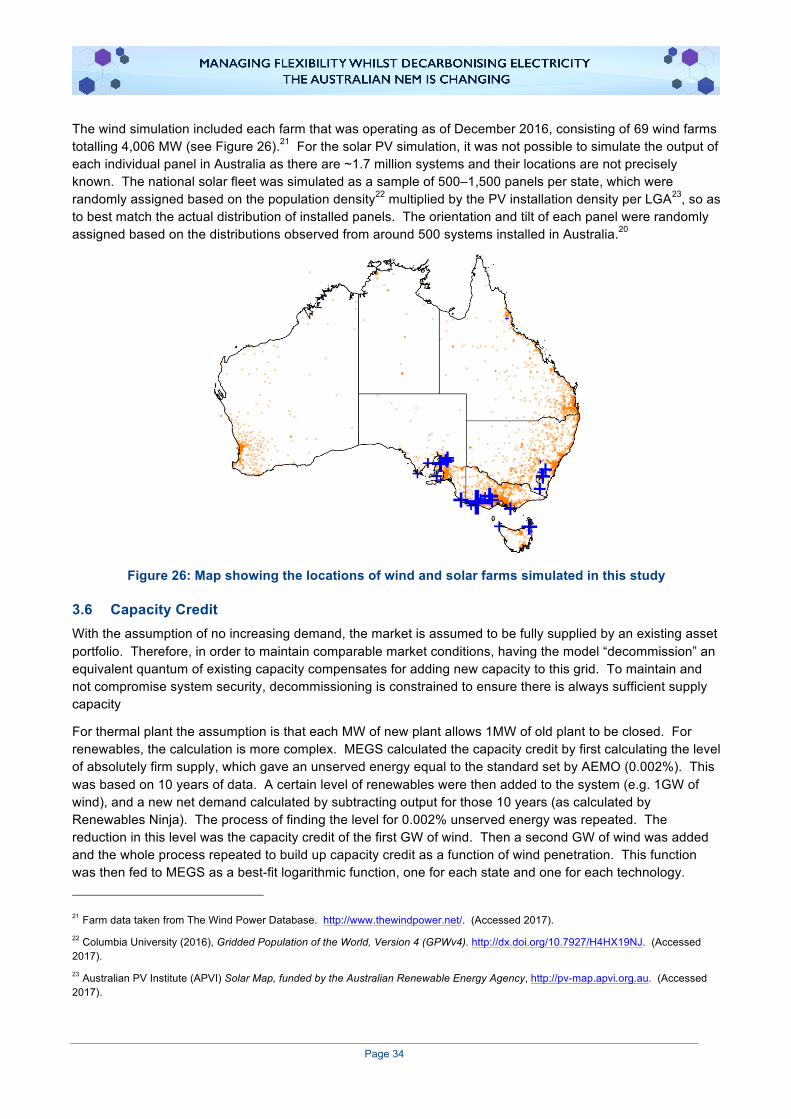
Page 34
The wind simulation included each farm that was operating as of December 2016, consisting of 69 wind farms totalling 4,006 MW (see Figure 26).21 For the solar PV simulation, it was not possible to simulate the output of each individual panel in Australia as there are ~1.7 million systems and their locations are not precisely known. The national solar fleet was simulated as a sample of 500–1,500 panels per state, which were randomly assigned based on the population density22 multiplied by the PV installation density per LGA23, so as to best match the actual distribution of installed panels. The orientation and tilt of each panel were randomly assigned based on the distributions observed from around 500 systems installed in Australia.20
Figure 26: Map showing the locations of wind and solar farms simulated in this study
3.6 Capacity Credit With the assumption of no increasing demand, the market is assumed to be fully supplied by an existing asset portfolio. Therefore, in order to maintain comparable market conditions, having the model “decommission” an equivalent quantum of existing capacity compensates for adding new capacity to this grid. To maintain and not compromise system security, decommissioning is constrained to ensure there is always sufficient supply capacity
For thermal plant the assumption is that each MW of new plant allows 1MW of old plant to be closed. For renewables, the calculation is more complex. MEGS calculated the capacity credit by first calculating the level of absolutely firm supply, which gave an unserved energy equal to the standard set by AEMO (0.002%). This was based on 10 years of data. A certain level of renewables were then added to the system (e.g. 1GW of wind), and a new net demand calculated by subtracting output for those 10 years (as calculated by Renewables Ninja). The process of finding the level for 0.002% unserved energy was repeated. The reduction in this level was the capacity credit of the first GW of wind. Then a second GW of wind was added and the whole process repeated to build up capacity credit as a function of wind penetration. This function was then fed to MEGS as a best-fit logarithmic function, one for each state and one for each technology. 21 Farm data taken from The Wind Power Database. http://www.thewindpower.net/. (Accessed 2017). 22 Columbia University (2016), Gridded Population of the World, Version 4 (GPWv4). http://dx.doi.org/10.7927/H4HX19NJ. (Accessed 2017). 23 Australian PV Institute (APVI) Solar Map, funded by the Australian Renewable Energy Agency, http://pv-map.apvi.org.au. (Accessed 2017).

Page 35
4 NEM Interconnectors The NEM consists of five interconnected electrical regions – Queensland, New South Wales, Victoria, South Australia and Tasmania (refer to Figure 27). The regions are connected together electrically via interconnectors and operate as “one market with multiple regions.”
Figure 27: Interconnectors in the NEM
The NEM includes generator plants, high voltage transmission lines, transformers and distribution lines on the supply side of its infrastructure. The demand side is made up of consumers in manufacturing plants, factories, offices and homes. While each region contains both major generation and demand centres, consumers may be supplied with electricity produced by any generator or combination of generators in the NEM. Interconnectors are used to import electricity into a particular region when the price of electricity in an adjoining region is low enough to displace local supply, or when local supply cannot meet demand.
4.1 Interconnector congestion Since supply and demand is kept in balance in ‘real-time’ and the connections between suppliers and consumers have limitations, congestion occurs from time to time. Congestion occurs because there are physical limits to the transmission infrastructure of the grid. There are also security limits that are imposed to
Page 36
maintain the integrity of the grid. It is important that the interconnectors are operated within their capacity to maintain the physical and operational security of the grid.
The interconnector limits are broadly characterised by thermal and stability limits:
• Thermal limits refer to the physical properties of the transmission lines, for example, as electricity is transmitted through a line, heat is generated – which causes the lines to sag. The limits of a line’s sag relate to minimum distances that a line must maintain from the ground. Other infrastructure, such as transformers, also has thermal limits driven by the degradation of insulation at high temperature.
• Stability limits refer to the ability of the system to withstand loss of generation or transmission infrastructure. For example a system is usually operated to at least an n-1 standard, meaning any one piece of infrastructure can be unexpectedly lost and the remaining system will remain within its limits. These limits are usually lower than thermal limits and are dependent on the state of the system, so can change minute by minute.
Hence congestion is specific to electricity flow, transmission capabilities and a specific point in time. Within the NEM, congestion may emerge within one 5-minute dispatch interval and be gone before the next, or last for much longer periods of time.
In theory, congestion may be eliminated if significant additions to interconnectors are constructed; however this comes at additional cost. Congestion is therefore a result of both physical and economic constraints.
4.2 Congestion and the dispatch process within the NEM Congestion manifests itself in both physical aspect and the financial aspect of the NEM.24
AEMO manages the physical aspect of the market, determining which generators will generate how much electricity via a dispatch process. This dispatch process is broken down into five-minute dispatch intervals. Each of these intervals need to be the least-cost combination of generation available with the price and quantity put forward by the market participants; this needs to be achieved within predefined parameters for maintaining system security.
4.2.1 Congestion and the dispatch process
The information characterising the systems capability, security and reliability is contained in set of “network constraint equations” used by AEMO. A network constraint is thus the limitation imposed on the dispatch relating to the physical capability of the transmission network taking into account system security requirements. In calculating the least-cost feasible dispatch, some factors may be adjusted or ‘controlled’ and others are fixed or given.
Congestion can be defined as occurring when there is a binding network constraint. A network constraint is considered to “bind” when it has a direct and limiting impact on dispatch. This congestion may occur when particular transmission limits have been reached and the system cannot accommodate increased power flow. This congestion can be viewed as occurring at a particular point or system boundary. Congestion may also be viewed as a constraining influence of a network limit on the optimality of generation dispatch. For equations that incorporate an interconnector (more than 75% of them do), the binding of the constraint would affect generation dispatch in at least two regions of the NEM.
24 This section is relies heavily on an excellent paper which, while a little dated, explains the complexity of interconnectors and congestion. It is available on the web - http://www.aemc.gov.au/Markets-Reviews-Advice/Congestion-Management-Review - Appendix A
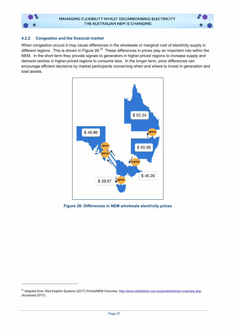
Page 37
4.2.2 Congestion and the financial market
When congestion occurs it may cause differences in the wholesale or marginal cost of electricity supply in different regions. This is shown in Figure 28.25 These differences in prices play an important role within the NEM. In the short term they provide signals to generators in higher-priced regions to increase supply and demand centres in higher-priced regions to consume less. In the longer term, price differences can encourage efficient decisions by market participants concerning when and where to invest in generation and load assets.
Figure 28: Differences in NEM wholesale electricity prices
25 Adapted from: Red Dolphin Systems (2017) PocketNEM Overview, http://www.reddolphin.com.au/pocketnem/pn-overview.php (Accessed 2017).

Page 38
4.3 Summary: the consequences of congestion In summary, there are both direct and indirect as well as short and long term consequences of congestion.
Direct consequences include:
• Higher system cost o The most direct impact of congestion is that more expensive generators have to be
dispatched to meet demand than otherwise would be the case. Ultimately the consumer will pay for this.
• System security issues o Congestion increases the likelihood of system security and supply reliability issues.
Indirect consequences include:
• Trading risks for participants o Congestion increases trading risks (both physical and financial) – and depending on how the
generators respond leads to short and long term reduced economic efficiency.
• Uncertainty for investors o Congestion may weaken economic signals that support efficient investment decisions
regarding generation, demand and transmission assets.
• Sub optimal location of assets o Generation and other assets maybe located to relieve congestion rather than a more logical
location for sourcing the fuel or cooling water.