Graphing in Science. Why do we graph? Visual representation of data “Short hand” for presenting...
22
Graphing in Science
-
Upload
lambert-ford -
Category
Documents
-
view
217 -
download
0
Transcript of Graphing in Science. Why do we graph? Visual representation of data “Short hand” for presenting...

Graphing in Science

Why do we graph?
• Visual representation of data
• “Short hand” for presenting large amounts of information at once
• Easier to visualize trends than by just using numbers or figures
• More organized way of showing information

Types of Graphs: Data TableHeight (cm) of Jr. High Students by Grade
7th 8th 9th140 152 160144 155 166144 160 162150 166 180155 150 175130 152 177133 144 152152 155 188140 155 159140 180 166141 182 165172 169 166180 160 167166 160 152154 160 184155 155 170138 175 170166 153 162181 140 166154 145 180
• Used to organize data collected
• Easily make transition from raw numbers into a visual representation

Types of Graphs: Bar Graph
• Shows data as a side-by-side comparison
• X axis is usually used to plot independent variable
• Y axis is usually used to plot dependent variable

Types of Graphs: Line Graph
• Usually shows a change over time or distance
• X axis is used to plot independent variable (time, distance, etc.)
• Y axis plots the dependent variable

Types of Graphs: Pie Chart
• Shows parts of a whole (percentages)
• Must have all data available and no groups can share any data
• Example: Can’t use a circle graph to show athletes by sport at TH Bell
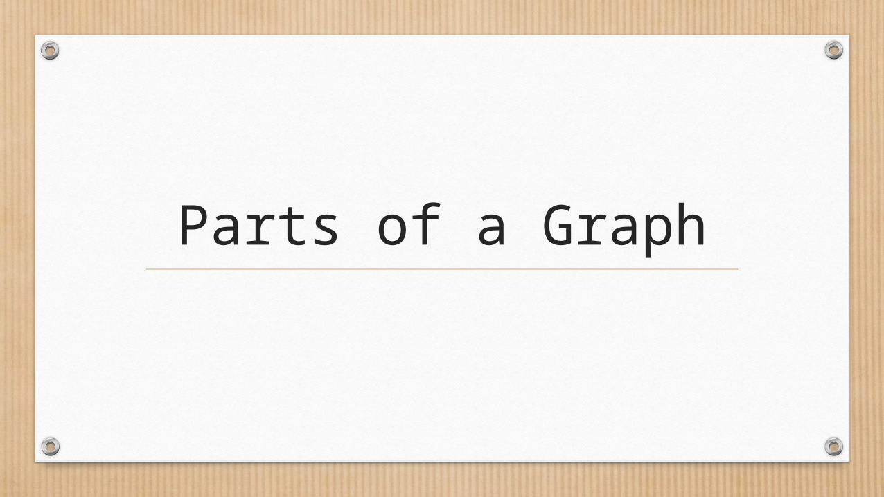
Parts of a Graph

Graph Title
Y Axis Label- Include units
X Axis LabelLegend

Graph TitleY
Axi
s L
ab
el
LegendX Axis Label

Data Label
Data Label
Data Label
Data Label
Data Label
Graph Title

Graphing Basics

D-TAILSD-TAILS is an acronym used to help you remember everything you
need to create a successful graph.

D-TAILS
• Data covers 50% of the graph area and is accurately placed.
YES!!!NO!!!

D-TAILSTitle
Includes what the graph is about and both the manipulated and responding variables.
Hours of Sleep vs. Quiz Scores

D-TAILSAxis Labels – manipulated
variable is always on the x-axis and responding variable is always on the y-axis
Hours of Sleep vs. Quiz Scores
Sleep
Qu
iz S
core
s
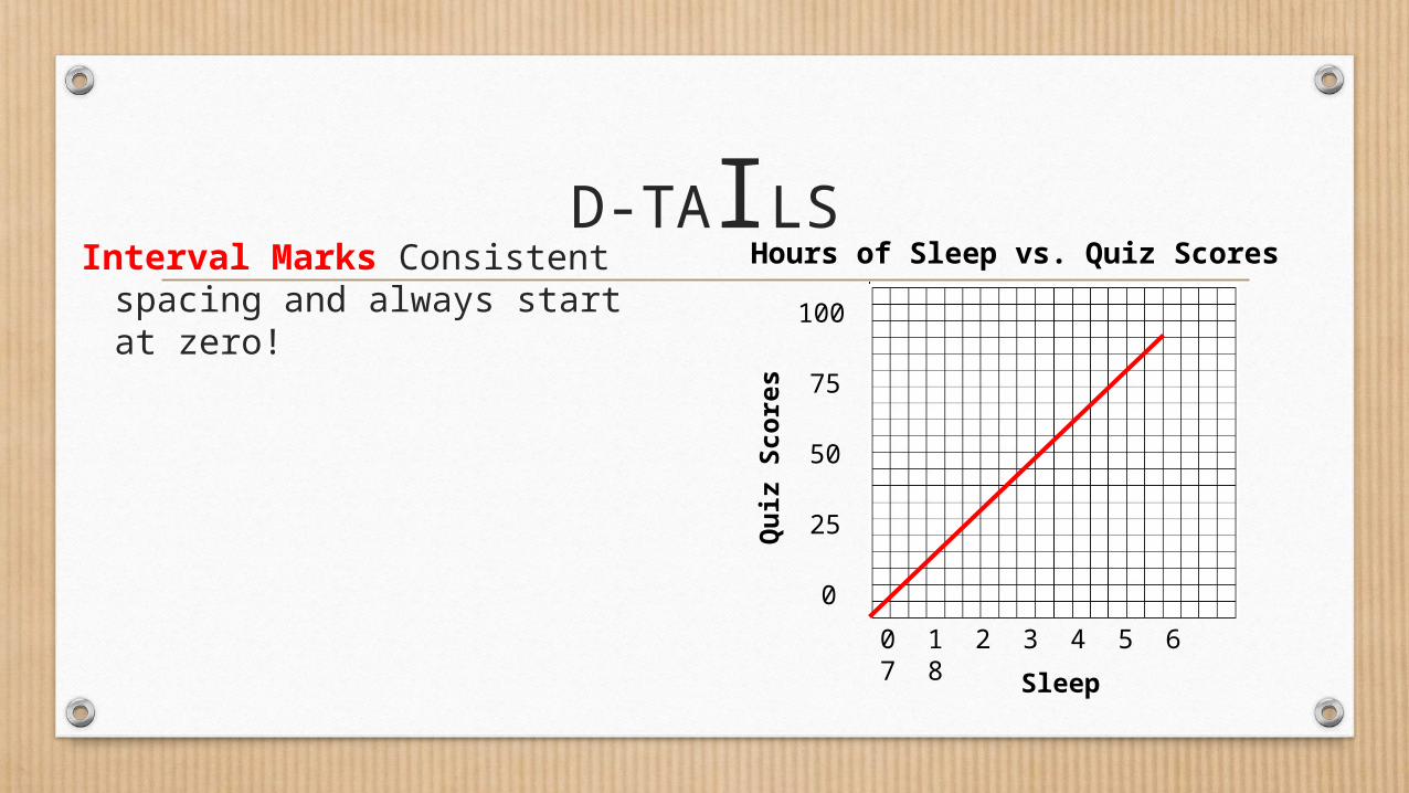
D-TAILSInterval Marks Consistent
spacing and always start at zero!
Hours of Sleep vs. Quiz Scores
Sleep
Qu
iz S
core
s
0 1 2 3 4 5 6 7 8
100
75
50
25
0

D-TAILSLabel Units
In ( ) after the axis label, include the proper units (if there are units)
Hours of Sleep vs. Quiz Scores
Sleep (hrs)
Qu
iz S
core
s (%
)
0 1 2 3 4 5 6 7 8
100
75
50
25
0

D-TAILSScale
Always go by an even scale.
Ex: 1,2,3,4
NOT
1,2,4,8
Hours of Sleep vs. Quiz Scores
Sleep (hrs)
Qu
iz S
core
s (%
)
0 1 2 3 4 5 6 7 8
100
75
50
25
0

DRY/MIX• Y axis runs
vertical
(↑) “DRY”• X axis runs
horizontal
( →) “MIX”
Y-axis
X-axis

• After drawing a graph, write a data analysis statement:
This graph shows that as mv increases, rv
D-TAILS

Always draw a trend line (do NOT connect the dots) to show the mv/rv relationship.
Describe the Relationship

Describe the Relationship