Graphics Are To Business What Hobbits Are To Shire
20
Graphics are to business what hobbits are to shire Elements to improve visuals for maximum business conversions
-
Upload
logodesignguru -
Category
Design
-
view
706 -
download
0
Transcript of Graphics Are To Business What Hobbits Are To Shire

Graphics are to business what hobbits are to shire
Elements to improve visuals for maximum business conversions

3 Visual elements that appeals to your customers

Element # 1: Effective Visuals
• People love visual content, and the more enriching the content, the deeper and more impactful the impression that your content will make.

Element # 2: Meaningful Visuals
• Your customers like messages that they can relate to – and that help them relate to something that’s meaningful to them. Good visual imagery stands out and gets remembered.

Element # 3: Engaging Visuals
• Engaging visuals will not only communicate something useful about your product to your audience, but it also lets them know that you want to communicate with them and that you care about their opinions
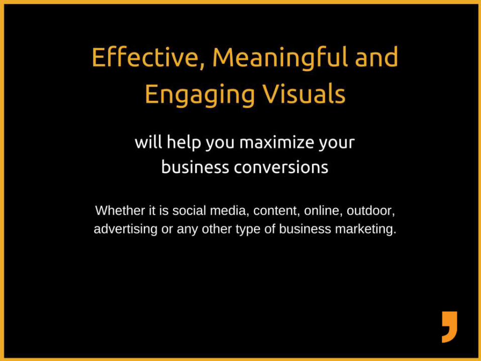
Effective, meaningful and engaging visualswill help you maximize your business conversions. Whether, it is social media, content, online, outdoor, advertising or any other type of business marketing

Brochure Design

Efficient Inefficient
Engaging, effective and meaningful Poor use of visuals and futile font choice
Color and font choices are visually appealing Uncomprehensive message
Comprehensible message Unstructured design

Social Media Image

Efficient Inefficient
Social media images are visually effective and
meaningful.
Engaging images but not visually appealing.
Colors, graphics and fonts selected for visuals
guarantees maximum attention
The colors tones selected are making the entire
page dull.
Comprehensible message Redundant graphics used.

Pamphlet Design

Efficient Inefficient
Intelligent use of typography Content is all in capital letters
Effective color palette is used Colors are too dull & text is loud
Message is clear and readable. Design structure doesn’t go with the grids and lines

Infographics

Efficient Inefficient
Structured and effective graphics Inappropriate use of fonts
Design spaces are intelligently used Ineffective color palette
Fonts belong to same typeface family Message is scattered and unstructured
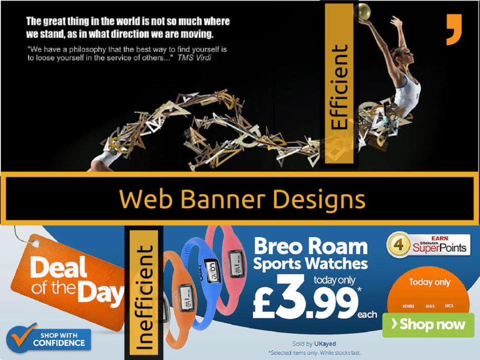
Web Banner

Efficient Inefficient
Meaningful and visually effective to grab
maximum attention
Banner is too loud for display
Colors are visually appealing Too many colors and messages that would confuse
the audience
Effects are complementing the fonts Company name and message is unclear

Billboard

Efficient Inefficient
Effective, engaging and meaningful Poor use of color combinations
Creatively designed The content is unreadable
Images are clearly explaining the message Inappropriate font choice and font color

• References:

Hope you liked the presentation
• Please share your opinions with us