Graphical Analysis Tutorial Version GA 3.2. Entering Data Enter your independent (x) data and...
16
Graphical Analysis Graphical Analysis Tutorial Tutorial Version GA 3.2 Version GA 3.2
-
Upload
corey-obrien -
Category
Documents
-
view
214 -
download
0
Transcript of Graphical Analysis Tutorial Version GA 3.2. Entering Data Enter your independent (x) data and...
Graphical AnalysisGraphical AnalysisTutorialTutorial
Version GA 3.2Version GA 3.2

Entering DataEntering Data
Enter your independent (x) data and dependent (y) data into the columns shown
By double-clicking on the “X” and the “Y”, you can enter the label and units – see next page
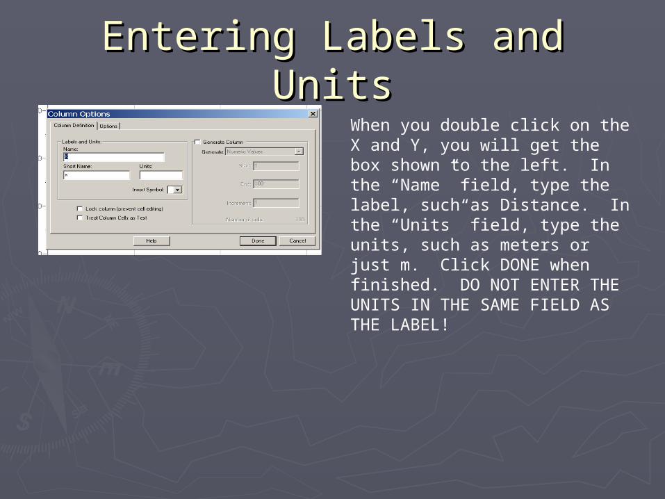
Entering Labels and UnitsEntering Labels and UnitsWhen you double click on the X and Y, you will get the box shown to the left. In the “Name” field, type the label, such as Distance. In the “Units” field, type the units, such as meters or just m. Click DONE when finished. DO NOT ENTER THE UNITS IN THE SAME FIELD AS THE LABEL!
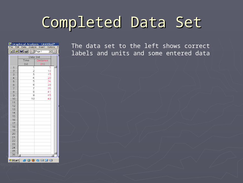
Completed Data SetCompleted Data SetThe data set to the left shows correct labels and units and some entered data
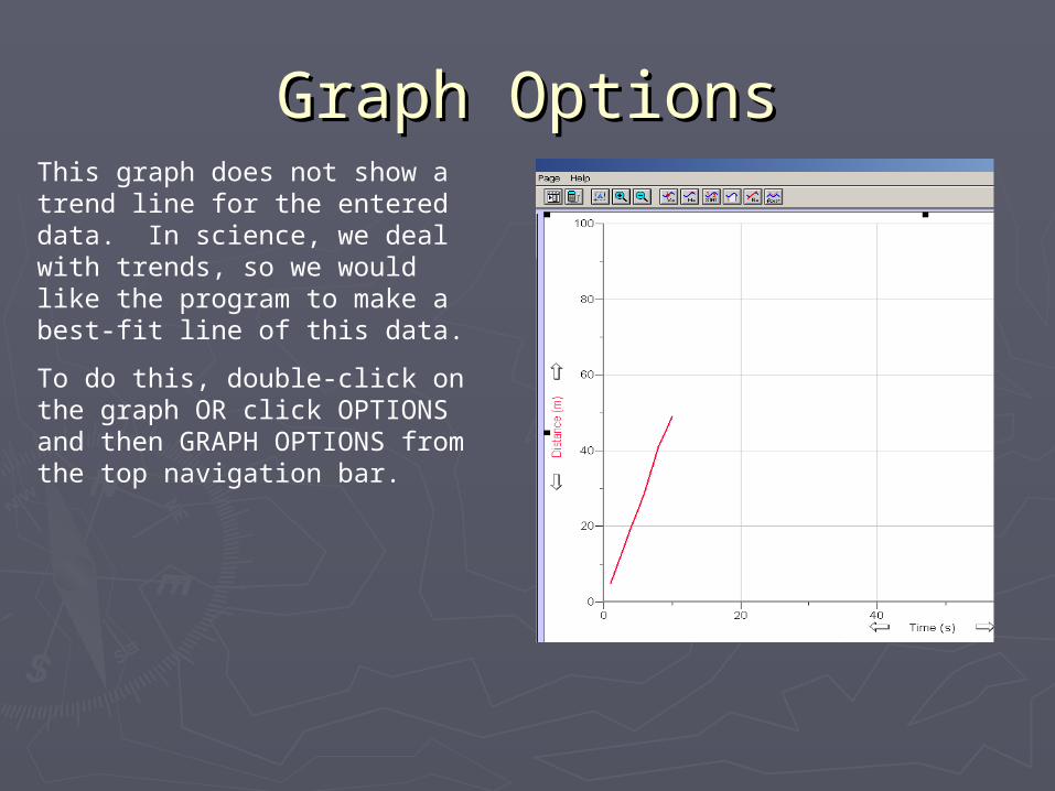
Graph OptionsGraph OptionsThis graph does not show a trend line for the entered data. In science, we deal with trends, so we would like the program to make a best-fit line of this data.
To do this, double-click on the graph OR click OPTIONS and then GRAPH OPTIONS from the top navigation bar.

Graph Options - continuedGraph Options - continuedThis screen gives a lot of options for the graph.
Turn ON Point Protectors
Turn OFF Connect Points
Type a title for the graph in the Title field. Use the y vs x format for the title; in this case it would be Distance vs Time.
You can also change the style of the grid, but the default is fine.
Graph Options - continuedGraph Options - continued
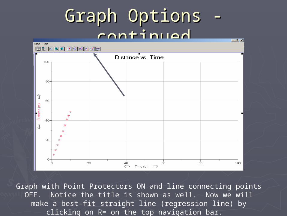
Graph with Point Protectors ON and line connecting points OFF. Notice the title is shown as well. Now we will make a best-fit
straight line (regression line) by clicking on R= on the top navigation bar.
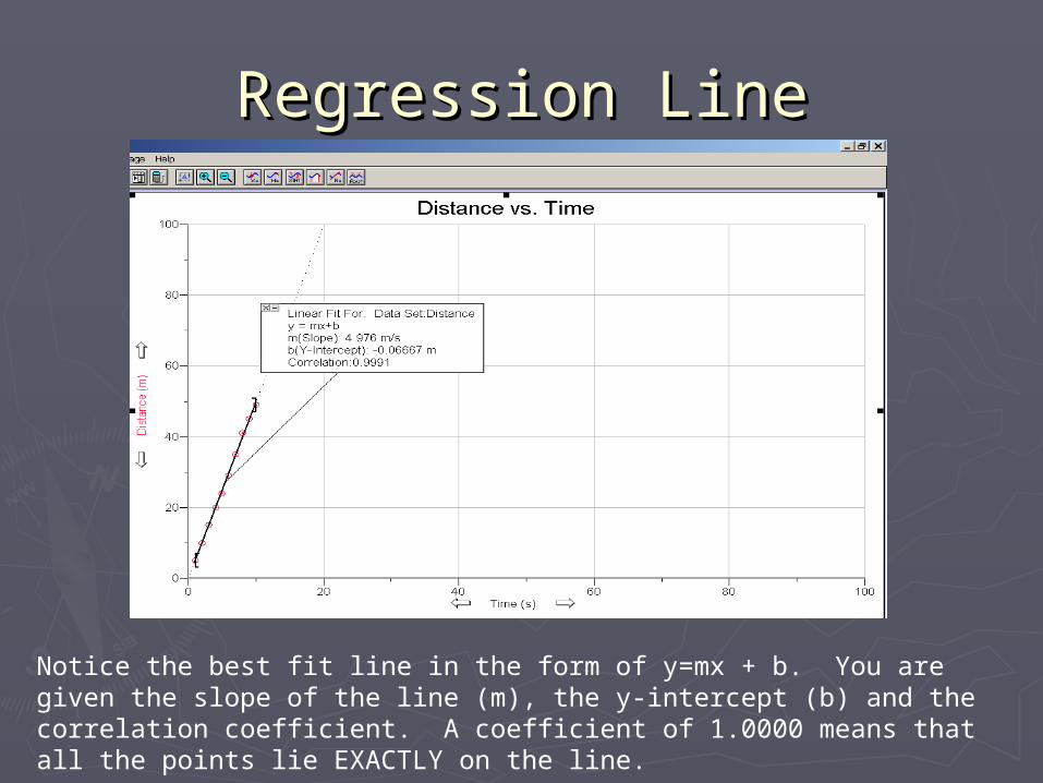
Regression LineRegression Line
Notice the best fit line in the form of y=mx + b. You are given the slope of the line (m), the y-intercept (b) and the correlation coefficient. A coefficient of 1.0000 means that all the points lie EXACTLY on the line.

Scaling OptionsScaling OptionsDouble click on the graph and open the AXES OPTIONS tab.
You can change the scaling of the graph here. Right now it is autoscaled larger; you can also manually scale or just autoscale, which usually works best.
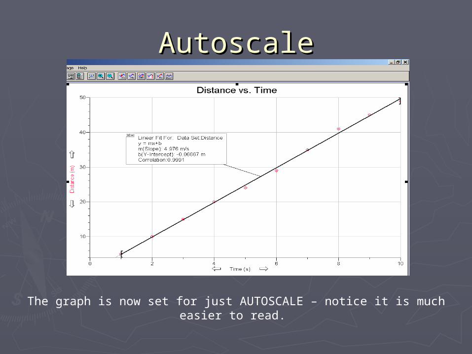
AutoscaleAutoscale
The graph is now set for just AUTOSCALE – notice it is much easier to read.
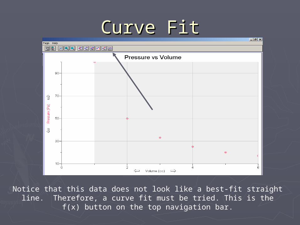
Curve FitCurve Fit
Notice that this data does not look like a best-fit straight line. Therefore, a curve fit must be tried. This is the f(x) button on the top
navigation bar.
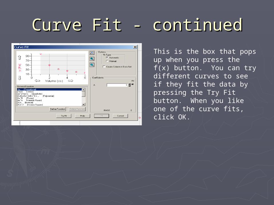
Curve Fit - continuedCurve Fit - continuedThis is the box that pops up when you press the f(x) button. You can try different curves to see if they fit the data by pressing the Try Fit button. When you like one of the curve fits, click OK.

Curve Fit - continuedCurve Fit - continued
This is what the fit looks like after you choose OK. You will also get a statistics box with the equation of the line. You should always make sure, whether a regression line or curve fit, that ALL the points have been selected to be part of the line. If some points are omitted, click at the origin and drag into the upper right hand corner to select all
data points, and then try the fit again.
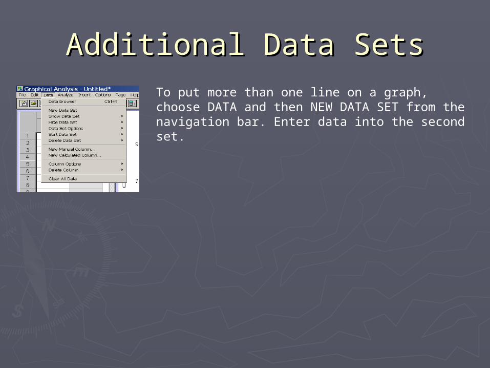
Additional Data SetsAdditional Data SetsTo put more than one line on a graph, choose DATA and then NEW DATA SET from the navigation bar. Enter data into the second set.
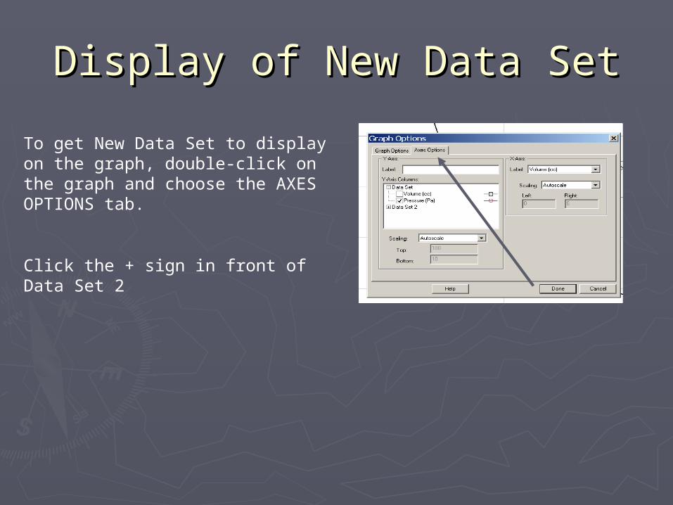
Display of New Data SetDisplay of New Data Set
To get New Data Set to display on the graph, double-click on the graph and choose the AXES OPTIONS tab.
Click the + sign in front of Data Set 2

Display of New Data SetDisplay of New Data Set
Check the second box so that it matches the checked box for Data Set 1.
Now both lines will show up on the graph.