Graphic Standards - Williams · PDF fileLogos are the most visible form of an...
18
Updated 2.29.12 Graphic Standards
Transcript of Graphic Standards - Williams · PDF fileLogos are the most visible form of an...

Updated 2.29.12
Graphic Standards

Brand Integrity
Communicating our brand consistently at every point of contact is an important part of our future success. In order to ensure the Williams brand is used correctly, we have created new graphic standards. This reference provides an effective means to guard the integrity of our brand in all its uses.

3 Logo Usage
4 Incorrect Logo Usage
5 Tagline
6 Dynamic Ring Graphic
7 Corporate Color Palette
8 Typography – External Use
9 Typography – Digital and Internal Use
10 Imagery Principles
Core Brand Elements

Logos are the most visible form of an organization’s
brand identity and equity. They identify the values
and qualities associated with Williams. Logo usage
should be managed carefully to ensure the integrity
of the overall brand.
The Williams logo is made up of two elements: the
Williams Logotype and the Twin Rings graphic.
Since the typeface was customized, it should not
be reproduced by hand or substituted with a similar
typeface. The Williams logo must be reproduced only
from authorized logo originals.
When applying the Williams logo, it is vital to
maintain all clear space rules, minimum size
considerations, color applications and proper
proportions.
Logo Usage
Clear space equals the height of the lowercase “s”. No written information or other logos should appear within this space with the exception of the tagline.
The logo may be reversed on a dark-colored background, but should not be placed on a background with a value of less than 30% black.
The logo may also be reproduced at 100% black. When the one-color logo is used, it should not be placed on a background with a value of more than 30% black.
On black backgrounds, PMS Black 6 should be reversed to white. To give the Twin Rings greater contrast, 80% PMS 300 instead.
Logo size should not be less than a width of .625”.
PMS 300
PMS Black 6
3

Da alignam rent molesti sit
aeceperibus. Ulparci
autatem et doluptae seque mor.
Williams
Incorrect Logo Usage
Do not separate the Logotype from the Twin Rings.
Do not modify the Twin Rings or replace the Williams Logotype with an alternate typeface.
Do not substitute another name for Williams or add the Twin Rings to any product or project.
Do not distort the proportions of the Williams logo.
Do not use the Williams logo as part of any sentence or slogan.
Do not dimensionalize the Williams logo (actual 3D elements are acceptable for signage). Also, do not add highlights or shadows.
Do not place the two-color logo on colored backgrounds or patterns.
Do not alter the logo colors. Only those noted on the previous page are acceptable.
4

The Williams tagline, “We make energy happen.”
communicates Williams’ “roll-up-the-sleeves and get
things done” culture and “we don’t just talk about it;
we make it happen” attitude. Using the term “energy”
states what Williams does in a generic sense, but
in the context of the brand stories and supporting
material, could be interchanged with other key actions.
These stories communicate how Williams makes
energy happen via three key attributes: access,
reliability and enhancing value. Williams’ world-class
assets provide access to the best resource plays in
North America. We connect those resources to the
markets that use them.
The tagline can stand alone as a signature to
body copy or be directly placed with the Williams
logo. When used with the logo, there are three
orientations: right, left and stacked. The tagline can
be used in either PMS 300 or PMS Cool Gray 11.
Tagline 5

The Dynamic Ring Graphic is a design element used
to create vibrancy and motion in our communications
and can be used in a multitude of ways.
As a photo border, it adds life and energy supporting
the tagline and Williams’ culture. It can also be used
as a stand-alone background element in 1-color or
4-color applications.
If used in 4-color applications, the primary
background color should be PMS 300.
Dynamic Ring Graphic 6
We’re investing billions IN NORTH AMERICA.Williams’ expertise and ability to aid in developing resources literally span North America. We’re investing billions of dollars to help our customers maximize the value of oil sands in Alberta, Canada, shale gas in the eastern United States and crude oil and natural gas in the Gulf of Mexico. At Williams, we continue to build the large-scale infrastructure North America relies on for its way of life. That is our tradition. And we remain true to it.
We make energy happen.™
(800) WILLIAMS | williams.com © 2012 The Williams Companies, Inc.

OrangeBlue Green
YellowBlack Gray
CORPORATE COLORS SUPPORT COLORS
Color is a vital consideration in our communication
efforts. A balanced and vivid color palette has been
designated for the variety of applications that must be
considered. Williams colors consist of the corporate
color palette accented by a series of support colors.
PMS 300 and PMS Black 6 are the two official
corporate colors that should be used in all
communication materials. When possible, the official
colors should always be PMS colors.
The four support colors are a collection of hues
selected to both complement and contrast the
official Williams corporate colors. PMS, CMYK,
and RGB values have been provided for consistency
and convenience.
Corporate Color Palette
1520, 50, 100, 0244, 145, 30
300100, 45, 0, 00, 121, 193
37745, 0, 100, 25120, 162, 47
1160, 15, 100, 0255, 210, 0
Black 60, 0, 0, 1000, 0, 0
Cool Gray 110, 0, 0, 70113, 112, 115
Pantone® Matching System Color 4-Color Process Equivalent RGB Value
7

There are thousands of typefaces available to
printers, advertising agencies and design firms. To
ensure consistency, the external typography listed
here must be used for any printed or electronic
materials developed for external use (anything
created for public viewing).
While many typefaces may be appropriate, the
Helvetica font family should be used to preserve
brand consistency.
Helvetica Light is preferred for text usage; however,
Helvetica Light Condensed may be more appropriate
for publications with multi-column formats where the
lines of type are shorter.
Recognizing there are times when a sans serif
is not as appropriate, the Minion Pro family of
classic serif typefaces has been designated as
the preferred selection.
ABCDEFGHIJKLMNOPQRSTUVWXYZ
abcdefghijklmnopqrstuvwxyz
0123456789!@#$%&*
HELVETICA LIGHT CONDENSED
ABCDEFGHIJKLMNOPQRSTUVWXYZ
abcdefghijklmnopqrstuvwxyz
0123456789!@#$%&*
HELVETICA ROMAN
ABCDEFGHIJKLMNOPQRSTUVWXYZ
abcdefghijklmnopqrstuvwxyz
0123456789!@#$%&*
ABCDEFGHIJKLMNOPQRSTUVWXYZ
abcdefghijklmnopqrstuvwxyz
0123456789!@#$%&*
ABCDEFGHIJKLMNOPQRSTUVWXYZ
abcdefghijklmnopqrstuvwxyz
0123456789!@#$%&*
ABCDEFGHIJKLMNOPQRSTUVWXYZ
abcdefghijklmnopqrstuvwxyz
0123456789!@#$%&*
MINION PRO REGULAR
HELVETICA BOLD ITALIC
MINION PRO CONDENSED MINION PRO SEMIBOLD ITALIC
Typography – External Use 8

The fonts for effective digital and internal use are
more limited and were chosen based on fonts readily
available to employees and the public.
Arial and Times New Roman should be used
instead of Helvetica and Minion Pro. These fonts are
appropriate for general business documents and
other forms of internal communications, including
email (both internal and external).
These fonts will also be used for news releases,
electronic newsletters, email broadcasts, Microsoft
Word documents and the Williams website.
ABCDEFGHIJKLMNOPQRSTUVWXYZ
abcdefghijklmnopqrstuvwxyz
0123456789!@#$%&*
ARIAL
ABCDEFGHIJKLMNOPQRSTUVWXYZ
abcdefghijklmnopqrstuvwxyz
0123456789!@#$%&*
TIMES NEW ROMAN
Typography – Digital and Internal Use 9

Strong angles, unusual perspectives and attention
to detail in our photography help create a distinct
personality for Williams. Imagery should be engaging
and make a statement. It should truly represent who
we are, what we do and why we care.
Bold, rich colors create a visually exciting experience
for the viewer as the images paint a picture of
what Williams stands for. Photos where the subject
is looking directly into the camera engage the
viewer, while wide shots place the subject in their
unique environment.
In addition to photos, renderings and diagrams
can also be used especially when discussing
projects or products.
All of these principles are useful in telling our story.
10Imagery Principles

12 Print Advertising
13 Website
14 Tradeshow Booth
15 Wearables and Promotional Items
16 Vehicle Graphics
Application Examples

12Print Advertising
We’re investing billions IN NORTH AMERICA.Williams’ expertise and ability to aid in developing resources literally span North America. We’re investing billions of dollars to help our customers maximize the value of oil sands in Alberta, Canada, shale gas in the eastern United States and crude oil and natural gas in the Gulf of Mexico. At Williams, we continue to build the large-scale infrastructure North America relies on for its way of life. That is our tradition. And we remain true to it.
We make energy happen.™
(800) WILLIAMS | williams.com © 2012 The Williams Companies, Inc.
A LITTLE HELPwith lots of heart.
Join us. When it comes to helping our neighbors in need, a little help can go a long way. That’s why we’re proud to support the Muscular Dystrophy Association in its efforts to fund worldwide research, comprehensive healthcare and valuable support. It’s one way we pitch in to make our community a better place.
We make energy happen.™
(800) WILLIAMS | www.williams.com

http://www.williams.com
Williams
13Website

14Tradeshow Booth
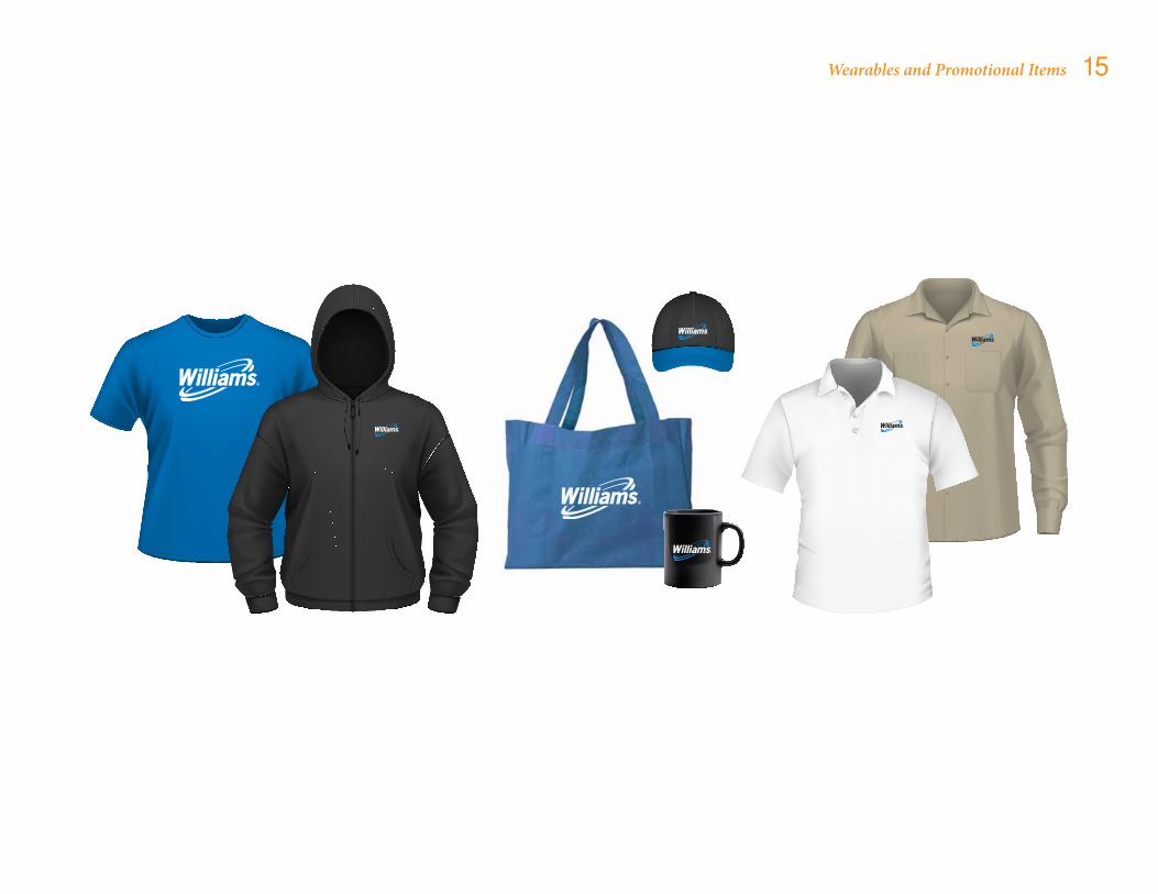
15Wearables and Promotional Items

16Vehicle Graphics