GRAPHIC DESIGN AND PRINTING PORTFOLIO...GRAPHIC DESIGN AND PRINTING PORTFOLIO
Upload
courtney-dransfieldCategory
view
214download
1description

Courtney Dransfield

To live a creative life we must lose our fear of being wrong.
Joseph Chilton Pearce

Contents
Infographics Residential Astoria
Investigation An Education in Colour
Branding Strategy Madame Roland Narrative Courtney Dransfield
4
12
17
22

4
Astoria the Beautiful
Infographics
Of the ten areas given to us for this project I chose
Astoria, Queens. Usually vising the neighborhood for
the thrift stores, it was a pleasant surprise to discover
how beautiful its residential area is. Being of
Macedonian decent also helped me to connect to
the area and it’s strong Eastern European culture.

5
I Think In PicturesAs part of the project I took documentational photos.
I was drawn to the colour pallets of the houses,
reminding me of Australia and the beaches. I began
to see Astoria as a residential area, recognizing shapes
and style of homes I would expect in more rural areas.
I noted down the materials used, the colours and
their location with in the area as points of significance.
Think left and think right and think low and think high.

6
Do You Talk To Yourself ?
I Do.The project allowed me to look at Astoria from many
different perspectives. What materials were used
in the exteriors of the homes, housing prices, the size
of the population, the population’s origin and the types
of housing in those countries. These skethces were
inspired by the buildings themselves, by traditional infographs and the shapes of the countries of origin.
I like nonsense, it wakes up the brain cells.
Oh, the thinks you can think up if only you try!

7
Let’s Go For a Walk
Part 1In this map I wanted to show the varying
architectural styles of the houses. For
consistency, I used colours directly taken from
the houses themselves through out the
project. I also think that they’re really beautiful. 1 2
3
5 4
1
2
36
5 4
36th
st
35th
st
37th
st
38th
st
Stei
nway
41st
st
Broadway
34th ave
Residential AstoriaSeen Through the Lense of Housing Extoriors and Locational Prevalance
You have brains in your head. You have feet in your shoes.
Fantasy is a necessary ingredient in living.

8
Your Place or Mine?
Part 2This infograph was created in order to show a
number of pieces of information in a coherent
and beautiful way. I wanted to show the architectural
themes of the exteriors of the houses, how the
home prices varied from street to street and how they
compared with the housing prices in Eastern Europe.
800
700
600
500
400
300
200
100
36th st 37th st 38th st Alabania Bosnia Bulgaria
Slates
Bricks
Bricks & Slates
Many Colours
One Colour
House Exteriors
Residential Astoria
HousingPrice
(’000s)
Astoria, Queens Orignins of Inhabitants in Astoria, Queens
Seen Through the Lense of Housing Prices and Housing Exteriors
Not here not there..
You can steer yourself any direction you choose.

9
House Proud
Part 3In this infograph I focused on the exteriors of the
homes. Inspired by infographs from Good Design,
I used a mathematical approach to show the
popularity of certain architectural trends in the area.
Residential AstoriaSeen Through the Lense of Housing Exteriors and Their Prevalency
Slates
Bricks
Bricks & Slates
Many Colours
One Colour
Exterior Saturation in the Area
100%
80%
60%
50%
Why fit in...
...not anywhere.

10
Bulgarian Feta
Part 4Again comparing and contrasting Astoria,
a small location, to Bulgaria, Bosnia and Albania,
where space is abound, really intrigued me. At
first difficult to visualise, adding a constraint
was a helpful tool. Seeing the audience for this
project as being youth in the area meant
making the aesthetics as approachable as possible . Bulgaria110, 910 sq km
Bosnia51, 129 sq km
Albania28, 748 sq km
Astoria283 sq km
90
80
70
60
50
40
30
20
10
CountrySize
(’000s)
Residential AstoriaSeen Through the Lense of Inhabitants Native Country Sizes and Its Own
This book is to read...
...when you were born to stand out?

11
Part 5
Organic Modernism
This was one of my favorite pieces from the project
inspired by th style of organic modernism.
Following the theme of compare and contrast,
I used one colour for Astoria and many for the
origin countries. Simple outlines were used to
give the viewer an idea of what the houses would
look like with out over saturating the eye.
Bosnia
AlbaniaBulgaria
Astoria
Residential AstoriaSeen Through the Lense of Inhabitants’ Native Country Homes and Those in Astoria
So the writer who breeds more words than he needs, is making a chore for the reader who reads.
...in bed.
12
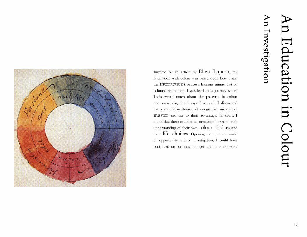
An Education in C
olourA
n InvestigationInspired by an article by Ellen Lupton, my
fascination with colour was based upon how I saw
the interactions between humans mimic that of
colours. From there I was lead on a journey where
I discovered much about the power in colour
and something about myself as well. I discovered
that colour is an element of design that anyone can
master and use to their advantage. In short, I
found that there could be a correlation between one’s
understanding of their own colour choices and
their life choices. Opening me up to a world
of opportunity and of investigation, I could have
continued on for much longer than one semester.

13
Visual MemoryAt the outset, this project was made part of our
everyday lives and I looked for inspiration in many
mediums. On the left we have an image of Chris Ofili’s Afrodizzia that I learnt about in high
school and on the right we have an image by
Todd Selby from his website The Selby
where he has taken a photo of a local produce
market in Mexico. Both manifested from my
past and present visual compendium.
You’ll miss the best things...

14
Video. Easier.
Writing. Hard.
During this process I found certain tools helpful
in filtering, understanding and rehashing the
information that I was discovering. This included
a video journal where I felt as though I made
most of my head way in figuring out the end product.
I posted my research and thought processes onto
a blog that also turned out to be a wonderfully
helpful management tool. The blog is
aneducationincolour.com, if you care to have a look.
Sometimes the questions are complicated...
...if you keep your eyes shut.

15
This is a Living ProjectDuring this project that I realised how fortunate I
am to have had an education that allowed me to
understand what certain colour means to me and how
they affect me. What I wanted people to simply start a
conversation about colour, alone or with a friend.
The provocation was a subliminal campaign
to advertise the colours in peoples lives. Here are
examples of the two different campaigns. One to
make people think about how they name a colour
and the other was to make them contemplate
their own individuality through colour.
I know, up on top you are seeing great sights,
...and the answers are simple.

16
Help the Children LearnInspired by CHAD in Philadelphia, a design school
is changing children’s lives through art, I wanted to
educate people in understanding one’s own colour pallet.
I designed a short manual, initially geared toward
children between the ages of 4 and 13, that gave a
simple description as how to create one’s own colour
pallet. Later, realising that it could be used by anyone.
A person’s a person, no matter how small.
but down here at the bottom we, too, should have rights.

17
Madam
e RolandA
Branding Strategy
Madame Roland is a female historical figure
from the French Revolution that was lost in time.
Project Continua is an organisation that strives
to bring Madame Roland and women with her similar
historical influence into the education system for K-12
students. In order to make this a smoother transition
I created a branding strategy, transforming the
traditional way female historical figures are depicted
in textbooks to a contemporary web based presence.

18
Seeing PotentialFemale historical figures that are seen as both
influtential and inspiring are few and far between. The
challenge was to bring these images into a current
format and aesthetic. Too often historical figures
are left in the style of their context and are unable to
truly connect with their immediate audience. Hence, my
mission was set. Streamlined, fresh and fun.
Think and wonder,

19
Found in TranslationThis logo is a fusion of contemporary aesthetics and
historical symbology. specifically cameos and coats of
arms. The target audience is teenage girls between the
ages of 12 and 18. The mission was to be feminine,
strong and representative of Madame Roland.
The logo alludes to an insitution similar to that
of a university or club. The manifestations the logo,
like a patch, can allow for a community experience.
M RM
R
wonder and think.
Fantasy is a necessary ingredient in living,

20
NavigationA friend told me that one of the hardest parts of
learning history in high school was not being able
to connect historical figures with time periods,
concepts and events. These symbols are representations
of those dots. By seeing these symbols parallel
to each other the sudent is given a holistic point
of view of the information they’re recieving.
From left to right: Writing, Bio, French Revolution, Scholars, Love Story, Democracy, New Knowledge, Republicanism, Intellectual Circle, Workers Rights and Manhattan.
FEL
it’s a way of looking at life through the wrong end of a telescope.
There’s no limit to how much you’ll know,

21
Digital AgeThe concept of Project Conitnua is an online
compendium of hundreds of female historical
figures. I decided to design a possible reimagination
of the site. Considering the target audience,
social media sites such as Facebook, Tumblr
and Instagram were inspirations. The aesthetic
clean and approachable with muted tones
and a retro font. Here we see the home page,
the Bio page and the Intellectual Circle pages.
Today was good. Today was fun. Tomorrow is another one.
depending on far beyond zebra you go.

22
Courtney Dransfield
Along the route to the present day I spent a month in
Bali learning about clothing production in 2010
and spent a semester interning at Opening Ceremony in their showroom in 2011. Now,
after working for a year on my own projects with
LANDED, I am looking to gain experience
from those who are established in their own industries and make a valuable contribution to that company.
In 2008 I was accepted into Parsons but had to take my
first semester off so I decided to go to Barcelona
to learn Spanish and experience a new city by myself.
By 2009 I was back in New York, in the Design and Management Program at Parsons and
working as a costume designer for student films.
From the second day in town I began assisting the
owner of a restaurant and spent most of 2007 and 2008
working with him. Those years were times of learning
not only about restaurants, chefs and interior decorating but about how to run a business.
Sydney was originally my home but there have
been many since then. I grew up on the beach, first
in Cronulla and then in Bondi. I attended a school
called Ascham where I was introduced to discipline,
drive
and visual arts. 3 months after finishing
high school, I left for New York City.
A Narrative
24
Don’t cry because it’s over.
Smile because it happened.
A small thanks to Dr Seuss who provided the narrative quotes and the finale piece above.